Contents Pages
11
Contents Pages Lynley Sykes
Transcript of Contents Pages

Contents PagesLynley Sykes

Terroriser Contents Page
The page is full and has no gaps or spaces all the areas are filled either to promote something or advertise an article or event that is happening. Also the titles are large and clear this makes it easier for a potential customer or reader to locate a particular type of article with ease and also makes it more user friendly for them to navigate.
The colour scheme is plain but is typical for the rock music genre the black and red are both typical and represent themes or ideas that are typical of rock music. This could be something like black representing darkness or anarchy this colour is also typical of rock bands to be associated with, red is a colour which might mean extreme emotion such as passion, or the colour might simply be symbolic of blood.
The columns are all the same colour and make the magazine look neat it also helps the audience or potential buyer to easily see the page numbers this makes the magazine more user friendly. These columns also use contrast very well the black text on white background makes the font stand out and thus easier to read for the customer or potential buyer.
The images are small but visually captivating they are also relevant to the genre and embody the stereotypical rock genre person. The image on the rights title is ‘Philip H. Anselmo and the Illegal's’ the way that the person in the photo is situated makes him look menacing and tough. This makes the images an the text look like they go together which makes the magazine appear more professional. The clothing and the fact that the tattoos are showing is to make the image appeal to the target audience who would most likely dress or enjoy the same type of clothing and be interested in or have tattoos. This shows that the magazine has thought about the audience and who the magazine must appeal to.
This analysis has helped me to understand a good layout of a contents page, I particularly like the way that the information is spread over two pages this would give me more room to work with and therefore add more features on this section of the magazine.


Kerrang contents Page
The colour scheme on this contents page is simple but colours like yellow and black are typically used in rock magazines as both have meaning and represent something in the rock world. For example the yellow in the magazine might represent ‘yellow tape’ (Which is typical of authorities to use to section off an area) this might indicate a disregard for authorities or it might be the magazines was of telling the audience that this specific genre is off limits for people who are not interested in the music or people featured. Either way this colour is typically used in this genre of music.
The layout of the magazine is very simple but makes the page appear neat and professionals the columns help with this as they keep the text organised and makes it easier for the reader to locate an article that interests them. The small images and black boxes with yellow font help to break up the magazine. The small subtitles in the columns look pasted in which might represent the none formal nature of the music genre. And the smaller images in the help to give the audience an idea of what each article is about.
The main image is slightly odd but might represent something about the artists, the colours used remind me of skulls so these particular artists might be interested in and their music might be themed around. They are also drinking this is presumably alcohol which once again goes with the idea that rock genres care little for what people think. The whole objective behind this type of image for a contents page is to highlight the main article and to show something about the artists that are being advertised. In this case I think the image shows something about the artists music and their ideology in a way. The way they are dressed might be to be unconventional and different rather than following stereotypes that are set about rock bands.
The contents page have been created to appeal to a very niche audience namely the people who are interested in the rock music genre, Even the text and colours are representative of the genre and would help to make the magazine appeal to the target audience. As they will most likely be interested in the same things that are being shown on the magazine pages. So they might dress the same way or have the same ideologies that are represented in t he images and pages that are presented to them.
This page is very synergetic and shows that the layout was thought of and planned which makes the magazine professional. In this magazines case the same colours are used in nearly every edition this leaves a well recognised image to the audience to look out for when they look at the contents page, this can be a good indicator that a magazine is well known among the public and therefore that the magazine itself will make money.
From analysing this magazine contents page I have discovered that the layout is very important and the symbolism involved in the image and colours used is very important when creating a magazine. Also the page layout should be good and clear to make the magazine easier for the audience to read and look through.

Terroriser Contents Page
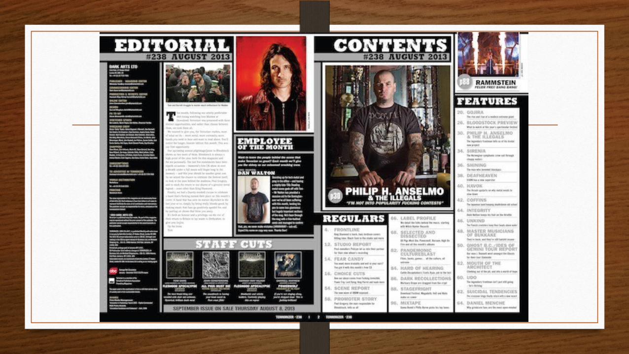
The colour scheme in this contents page is very simple the main colours being black and white the simplicity makes it look neat and eye catching which makes it appealing to the audience as it is more user friendly and easier for them to find articles that they would find interesting for them. Also black is a colour that is associated with rock music and therefore suits the genre of music well and makes it more appealing for the audience who would probably like this colour and the meaning it implies.
In this magazine there does not seem to be a single main image, instead there are several image of varying sizes to highlight certain artists and or articles that are available for the audience to read. However even these small images are symbolic of the music genre. The larger image on the right side of the magazine shows a few people standing together in what I must assume is a music band. The body language seems defensive with the arms crossed, this makes the person in the centre appear to be the dominant character in this group. Also the person at the back seems to have a very open stance which makes him look powerful and confident this also makes me think he is an important member . The clothing the artists are wearing is very casual which might appeal to the target audience as this is most likely something they like to wear themselves.
The layout is very simple with the use of columns and strategically placed images it makes the magazine look professional and slick in appearance. This adds to the synergy on both pages as and makes the magazine look more professional and appealing to the eye.
From this I have learned that contents pages that have a simple layout are not particularly bad and sometimes have a good effect on the magazine as a whole. I also like the idea of having two pages for the contents page as this gives me more room to work with however this would mean that I have to take more images of different people which might be hard to do. I liked the simple colour scheme and use of columns on this page and would like to create a well laid out and neat contents page when I get to the creation purposes.


Rock Sound Contents Page
• The main image on this page is large and takes up half of the page this makes the page look more decorative than functional which might appeal to readers more as it also has a pull quote on the bottom this allows the readers to get an idea of what the artist might be thinking and what the article might be about. This would be appealing because it this person might have a large following of fans already which would meant that lots of people would be interested in the quote and the image would draw attention to the article quickly and this might mean that there will be more purchases of the magazine.
• The colour scheme is very simple and eye catching as the colours contrast well. The black is a typical colour used in a rock magazine as it is a colour that is stereotypical of the music genre, the blue might make the magazine look cold or it might simply be to help create contrast on the background that is used on the magazine.
• There is a single column on the page but the article titles are quite large and are of well known bands like ‘slipknot and ‘a day to remember’ this would instantly draw attention to the articles as there might be a large following for each one. The different types of rock music would draw in a wider audience as there would be more people interested in the magazine as a result of there being such a wide audience that would find the magazine and its articles appealing.
• I have learned that a large image can be effective in a double page spread and make the page look interesting and appealing right away also using simple techniques like large text to highlight well known bands would make the magazine look more appealing and be more interesting to the audience. It would also make it easier for them to find an article that suites them and therefore create a magazine that would appeal to a much wider audience.


Terroriser Contents Page
• On this particular contents page there is not a single main image in this there are several images which highlight who/what an article will be about. In my opinion the ‘Hell’ image is the main image as I find it to be eye catching and draws me to that page in particular. From looking at the main images we can say that the colour scheme was made around the images rather than the images taken to suit a colour scheme that has already been picked out. The colours used on this double page spread are dark and make the text stand out on the background which is white. On the double page spread the articles have been split up into columns which have a larger title which highlights the type of articles that will be shown on the pages shown. For example. The one title that says regulars would be for the audience who purchase the magazine regularly and (or) always read about a particular person or articles. This caters for the target market well as it shows the regular audience where to find things they are used to finding and or always read about. It also however caters for audiences new to this magazine as the columns are all well titled which allows them to discover what articles the magazine may hold and if it is of any interest to the.