Media coursework kerrang radial analysis
3
The title of the magazine “KERRANG!” is well known enough for it to be behind the main image and still be recognised. It is in it’s usual bold, capital letter font, with lines going through the letters giving the illusion that glass is breaking; this style has connotations of rebellion and reflects the magazine’s rock genre accurately. The font could also imply loud music, of a possibly violent nature. The magazine’s masthead includes two features, both including conventional exclamation marks to fit in with the style of the title and add a theme of excitement to the articles. These are possibly used to entice the reader into buying the magazine for these specific articles. One of the two masthead features has Metallica! In large letters, targeting a certain audience (Metallica fans). The colours mainly used are red, orange, yellow and black, which have connotations of danger, further enhancing the rock/rebellious theme of the magazine. The main anchorage text is “Hot Shots” so these warm palette colours could also be connotations of the main feature. It also shows “Oli Sykes Presents” drawing readers in due to the famous celebrity seeming to be a large part of the main feature. The main image of Oli Sykes takes up the majority of the page, showing his significance and that he is what the main feature will be based on. The medium shot of the model has been airbrushed, so that the target audience may aspire to be/look like him; whilst also enhancing his reputation. His tattoos and hair also create the stereotypical “rock punk” image that Kerrang! Is trying to create. Beneath this, the adjectives “best, weirdest, most eye-popping” The mise-en-scene for Kerrang! Magazine portrays busy crowds and lots going on, due to the many cover lines and pictures all in one small space. Also, the bright splashes of colour suggest loudness and fun. All pictures included are of famous rock artists, which widens the target audience because most people will known who the artists are and even if they don’t normally enjoy the rock genre, they may purchase the magazine just to A unique convention of this magazine is the free posters they offer in each issue. This is likely to draw in buyers because they feel they are getting extra freebies for their money. Because the posters are offered in every issue, they could also be seen as collectables to some purchasers. It also has small previews of the posters, which targets certain fans of certain artists. If the posters are included in the magazine, it also makes the magazine seem thicker and more cost worthy, because it creates the illusion of more pages and possibly more articles.
-
Upload
mollister -
Category
Social Media
-
view
35 -
download
0
Transcript of Media coursework kerrang radial analysis
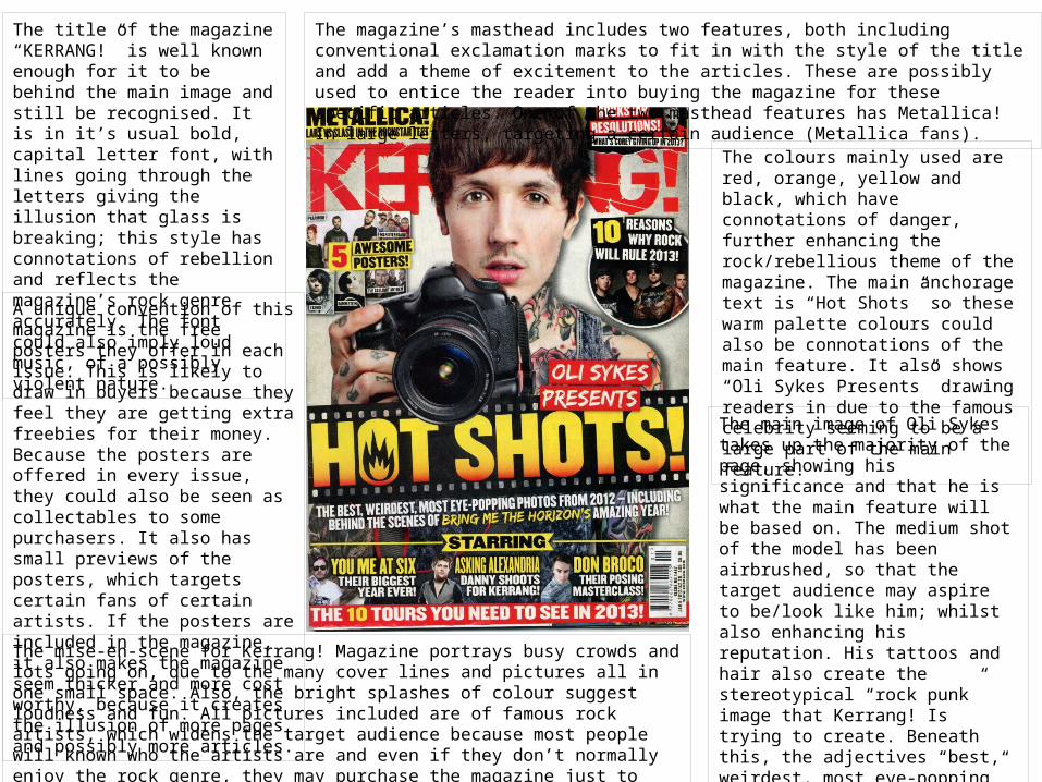
The title of the magazine “KERRANG!” is well known enough for it to be behind the main image and still be recognised. It is in it’s usual bold, capital letter font, with lines going through the letters giving the illusion that glass is breaking; this style has connotations of rebellion and reflects the magazine’s rock genre accurately. The font could also imply loud music, of a possibly violent nature.
The magazine’s masthead includes two features, both including conventional exclamation marks to fit in with the style of the title and add a theme of excitement to the articles. These are possibly used to entice the reader into buying the magazine for these specific articles. One of the two masthead features has Metallica! In large letters, targeting a certain audience (Metallica fans).
The colours mainly used are red, orange, yellow and black, which have connotations of danger, further enhancing the rock/rebellious theme of the magazine. The main anchorage text is “Hot Shots” so these warm palette colours could also be connotations of the main feature. It also shows “Oli Sykes Presents” drawing readers in due to the famous celebrity seeming to be a large part of the main feature.
The main image of Oli Sykes takes up the majority of the page, showing his significance and that he is what the main feature will be based on. The medium shot of the model has been airbrushed, so that the target audience may aspire to be/look like him; whilst also enhancing his reputation. His tattoos and hair also create the stereotypical “rock punk” image that Kerrang! Is trying to create. Beneath this, the adjectives “best, weirdest, most eye-popping” are used to grab the reader’s attention by using hyperbole.
The mise-en-scene for Kerrang! Magazine portrays busy crowds and lots going on, due to the many cover lines and pictures all in one small space. Also, the bright splashes of colour suggest loudness and fun. All pictures included are of famous rock artists, which widens the target audience because most people will known who the artists are and even if they don’t normally enjoy the rock genre, they may purchase the magazine just to read about a certain artist featured on the cover.
A unique convention of this magazine is the free posters they offer in each issue. This is likely to draw in buyers because they feel they are getting extra freebies for their money. Because the posters are offered in every issue, they could also be seen as collectables to some purchasers. It also has small previews of the posters, which targets certain fans of certain artists. If the posters are included in the magazine, it also makes the magazine seem thicker and more cost worthy, because it creates the illusion of more pages and possibly more articles.
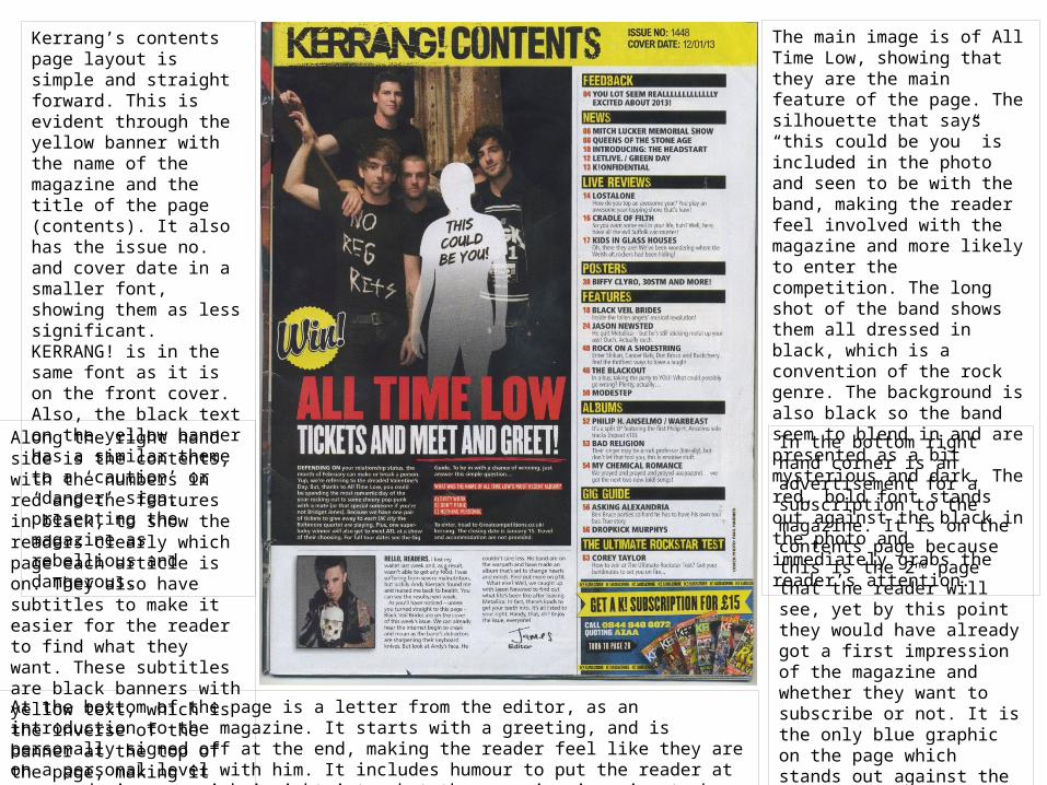
Kerrang’s contents page layout is simple and straight forward. This is evident through the yellow banner with the name of the magazine and the title of the page (contents). It also has the issue no. and cover date in a smaller font, showing them as less significant. KERRANG! is in the same font as it is on the front cover. Also, the black text on the yellow banner has a similar theme to a ‘caution’ or ‘danger’ sign, presenting the magazine as rebellious and dangerous.
The main image is of All Time Low, showing that they are the main feature of the page. The silhouette that says “this could be you” is included in the photo and seen to be with the band, making the reader feel involved with the magazine and more likely to enter the competition. The long shot of the band shows them all dressed in black, which is a convention of the rock genre. The background is also black so the band seem to blend in and are presented as a bit mysterious and dark. The red, bold font stands out against the black in the photo and immediately grabs the reader’s attention.
In the bottom right hand corner is an advertisement for a subscription to the magazine. It is on the contents page because this is the 2nd page that the reader will see, yet by this point they would have already got a first impression of the magazine and whether they want to subscribe or not. It is the only blue graphic on the page which stands out against the black, white and yellow colour scheme. However, it still includes KERRANG!’s usual yellow banner and black font.
At the bottom of the page is a letter from the editor, as an introduction to the magazine. It starts with a greeting, and is personally signed off at the end, making the reader feel like they are on a personal level with him. It includes humour to put the reader at ease and gives a quick insight into what the magazine is going to be about.
Along the right hand side is the contents, with the numbers in red and the features in black, to show the readers clearly which page each article is on. They also have subtitles to make it easier for the reader to find what they want. These subtitles are black banners with yellow text, which is the inverse of the banner at the top of the page, making it effective.

The title of the article, is “less alcohol, less drugs and less dodgy women!” This is a quote from the main article and gives the reader a quick clue as to what the article is going to be about. From this quote, I can tell that the article is going to be about the members of Metallica sorting themselves out and coming clean. This also means that they will be reflecting on the past and how they were before, suggesting some gossip and personal secrets will be revealed in this article, making the reader want to read the whole article. The words, “alcohol”, “drugs”, and “dodgy women” are in bold, because they are important things in the article and these words once again reflect the stereotypical “rock & roll” life style that Metallica are seeming to quit.
The main image of the band takes up a whole page and shows them as significant and important. It shows each band member’s facial expressions; each different and mysterious due to not smiling and one even wearing sunglasses. All of the band are wearing black, which is a convention of the rock genre, paired with long hair and beards. They are leaning on each other and posing close together, showing a close friendship between each member.
The introduction to the article has a graphic that looked painted on, and is again black; it looks reckless and effortless, implying that this is what the band is like. The band’s name “Metallica” is in a lighter colour to the rest of the introduction, as is “how do they do it?”, so that these pieces of text stand out to the reader and give them an insight into what the article will be based on, just by reading a couple of words. KERRANG! is shortened down to K!, making it seem less formal to the reader.
The pieces of text that have a white background with black text are the questions from other rock/metal artists to the band. It has a picture of who has asked the question and which band member is answering it. It makes the article more interesting to read by having one artist ask another artist questions about music, and also they will know more about it than an usual interviewer would, so more in depth questions and answers can be included. By the article being an interview, it allows the reader to see deeper into the band’s personal life because they are answering in their words, rather than someone writing about them or answering for them.