Kerrang Article analysis
7
Kerrang! Feature Article analysis • 2 pages per slide.
-
Upload
rumbleroar -
Category
Social Media
-
view
125 -
download
0
Transcript of Kerrang Article analysis

Kerrang! Feature Article analysis
• 2 pages per slide.

Analysis – page 1+2
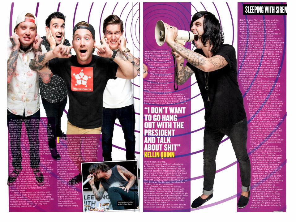
The text in the article is a summary, and includes introducing the band and the artist and setting the interview to place.
The purple and yellow is a common colour pallet running throughout the article, which is different to the red on the front cover.
The image corresponds to that on the front cover, as it has connotations of loud noise with the use of a megaphone.
The model is typical of the rock genre as he has tattoos and dark hair and wearing dark clothing. The image contrasts with the bright background to make the image stand out.
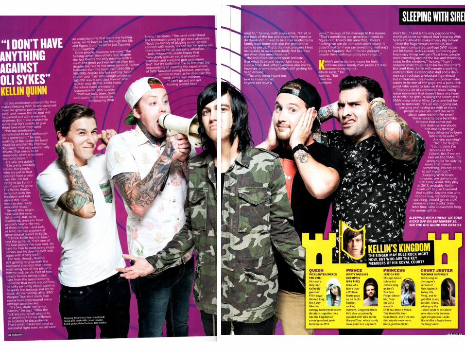
Analysis- Page 3 + 4The image goes across both pages, and keeps the purple and yellow theme, and the loud connotations, as the main singer is separated from the rest of the band, who are blocking their ears to add to the loud connotations.
Also, there is an image from the band playing live, to show the band performing.
Furthermore, there is a large quote to signify interesting parts in the article, and to show one of the topics covered in the interview.
They also have the name of the band running throughout the article, so the audience know how important the band is to the rock industry.

Analysis Page 5+6Again, the image covers the double page, and the main singer is central , showing he is leader in the band.
There is a big quote again on this page, covering a well known twitter argument involving the band, to show the magazine takes in aspects of social media with their interviews.
The colour scheme runs throughout, but the main model is wearing slightly different clothing to the other pictures to add variation in the article.
The yellow castle, discussing other artists in other bands who are involved with the band bring a slight bit of light humour to the serious article, so the readers have a relief after such a long, and serious article.