Kerrang contents
1
The Kerrang! Contents page is usually full of information and pictures, informing the readers on what will be inside. In this particular magazine, the contents list is across the bottom half of the page, and the main image is in the top of the page. This image shows the band ‘Bring me the Horizon’, which is one of the main features inside. On top of this image, there are two images of pages inside the magazine. This shows the reader what they are buying, and also, if the reader likes the bands that are shown in the contents page, they are more likely to read on. Also overlapping the main image is the yellow title ‘contents’ with the white issue number, and the date. This contents page has used black, red, white and yellow for its The names of the bands are in bold, which again, makes it easier and quicker to find something specific. ‘30 Seconds to mars poster special’ makes this issue seem ‘special’ and will therefore interest the reader. The red page numbers are clear and easy to read, and the cover stories are written over a black star with a red background. This makes them stand out and easy to find. At the bottom right of the page is a black section, which includes an advertisement for a subscription deal, and for the magazine to be ‘delivered to your door’. The font is white, with a yellow phone number. This section also included three images of other Kerrang! magazines, which clearly show the
-
Upload
mollyjohnsonasmedia -
Category
News & Politics
-
view
92 -
download
0
Transcript of Kerrang contents
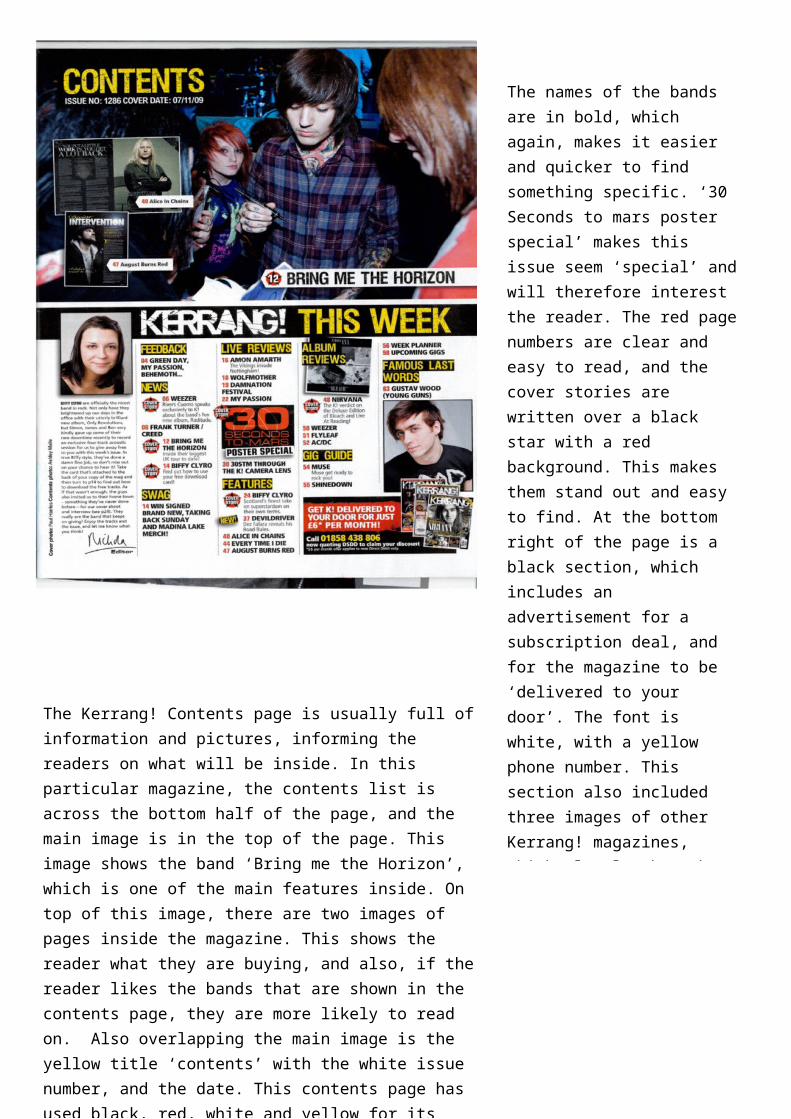
The Kerrang! Contents page is usually full of information and pictures, informing the readers on what will be inside. In this particular magazine, the contents list is across the bottom half of the page, and the main image is in the top of the page. This image shows the band ‘Bring me the Horizon’, which is one of the main features inside. On top of this image, there are two images of pages inside the magazine. This shows the reader what they are buying, and also, if the reader likes the bands that are shown in the contents page, they are more likely to read on. Also overlapping the main image is the yellow title ‘contents’ with the white issue number, and the date. This contents page has used black, red, white and yellow for its colour scheme, although lots of other colours are used because of the colour photographs. The actual contents list shows clearly what is featured in this ‘Kerrang!’ magazine. For instance, there sub headings with different sections. These sections include feedback, news, swag, live reviews, features, album reviews, gig guide, and famous last words. This is useful, as it would be easier and quicker to find something specific.
The names of the bands are in bold, which again, makes it easier and quicker to find something specific. ‘30 Seconds to mars poster special’ makes this issue seem ‘special’ and will therefore interest the reader. The red page numbers are clear and easy to read, and the cover stories are written over a black star with a red background. This makes them stand out and easy to find. At the bottom right of the page is a black section, which includes an advertisement for a subscription deal, and for the magazine to be ‘delivered to your door’. The font is white, with a yellow phone number. This section also included three images of other Kerrang! magazines, which clearly show the reader what they will be getting if they pay for the magazine monthly. This is aimed at fans of the magazine, who already buy it regularly, and who would benefit from a monthly deal. Also, on the left of the page there is a personal comment from the editor, and an image of her face. This comment talks about the magazine and gives a short explanation about what will be inside this particular issue.