Kerrang case study
10
The Music Magazine Industry 1. What is the music press? The music press is the advertisement and promotion of solo artists, upcoming artists, bands or producers in the music industry. The press can range from being written press (magazines/newspapers) to the radio or online websites. In addition to this, the music press is useful for informing audiences of any upcoming events or concerts revolving around music. They do this through a balanced use of pictures, fonts and texts to attract their target audiences. 2. What are the aims and objectives of the music press? What are its purpose? The music press has many aims and objectives which they try to achieve when producing music magazines in particular. For example, they use the press to promote and advertise the latest updates concerning new artists and bands. They are also there to build a liaison between artists and their fans. They are responsible for the advertisement of the latest events or opportunities in the music industry. Therefore, they target audiences that enjoy music by covering stories such as the latest music awards show. It also plays a small role in the development and introduction of music careers. This means that people who wish to have a career in the music industry would read a music magazine for inspiration, and to find out how to make it in the music industry. Overall it is there to provide entertainment and engagement for its readers. 3. What is the relationship of the music press to the music industry? The music press and the music industry work very closely with each other, having a symbiotic relationship, which means that it is a mutually beneficial relationship. The music press plays the role of being the informer within society regarding all things concerning the music industry. The target audience is drawn in to the music magazine as it promoting all aspects associated with the latest music. Realistically, the music industry would be non- profitable without the music press due to the fact that if the music was not advertised and promoted properly, then it would not be successful as audiences would not know where to find the latest updates and information on the music industry. 4. Why are the music publications attractive to advertisers? Music publications are attractive to advertisers due to the balanced amount of information, text, and images placed effectively throughout the magazine. For example, advertises will be willing to pay for their artists or products to be advertised in a music publication because they know that the people that buy and read the music magazines would see their cover story,
-
Upload
megoreilly -
Category
Business
-
view
51 -
download
0
Transcript of Kerrang case study
The Music Magazine Industry1. What is the music press? The music press is the advertisement and promotion of solo artists, upcoming artists, bands or producers in the music industry. The press can range from being written press (magazines/newspapers) to the radio or online websites. In addition to this, the music press is useful for informing audiences of any upcoming events or concerts revolving around music. They do this through a balanced use of pictures, fonts and texts to attract their target audiences. 2. What are the aims and objectives of the music press? What are its purpose? The music press has many aims and objectives which they try to achieve when producing music magazines in particular. For example, they use the press to promote and advertise the latest updates concerning new artists and bands. They are also there to build a liaison between artists and their fans. They are responsible for the advertisement of the latest events or opportunities in the music industry. Therefore, they target audiences that enjoy music by covering stories such as the latest music awards show. It also plays a small role in the development and introduction of music careers. This means that people who wish to have a career in the music industry would read a music magazine for inspiration, and to find out how to make it in the music industry. Overall it is there to provide entertainment and engagement for its readers. 3. What is the relationship of the music press to the music industry? The music press and the music industry work very closely with each other, having a symbiotic relationship, which means that it is a mutually beneficial relationship. The music press plays the role of being the informer within society regarding all things concerning the music industry. The target audience is drawn in to the music magazine as it promoting all aspects associated with the latest music. Realistically, the music industry would be non-profitable without the music press due to the fact that if the music was not advertised and promoted properly, then it would not be successful as audiences would not know where to find the latest updates and information on the music industry. 4. Why are the music publications attractive to advertisers?Music publications are attractive to advertisers due to the balanced amount of information, text, and images placed effectively throughout the magazine. For example, advertises will be willing to pay for their artists or products to be advertised in a music publication because they know that the people that buy and read the music magazines would see their cover story, article or image and therefore it is a useful way of promotion. Additionally, like the film industry, the music industry does not target one specific age range. For example, the music magazine Kerrang centres itself around the genre of rock music, therefore it is not targeted to a specific age as people from ages 10 -60 enjoy rock music. However, if an advertiser wanted to promote their product or person according to a certain target audience, then the music industry is able to offer them a wide range of magazines which are based around different things. For example, the Top Of The Pops music magazine is targeted towards young teenage girls and targets their music preferences.
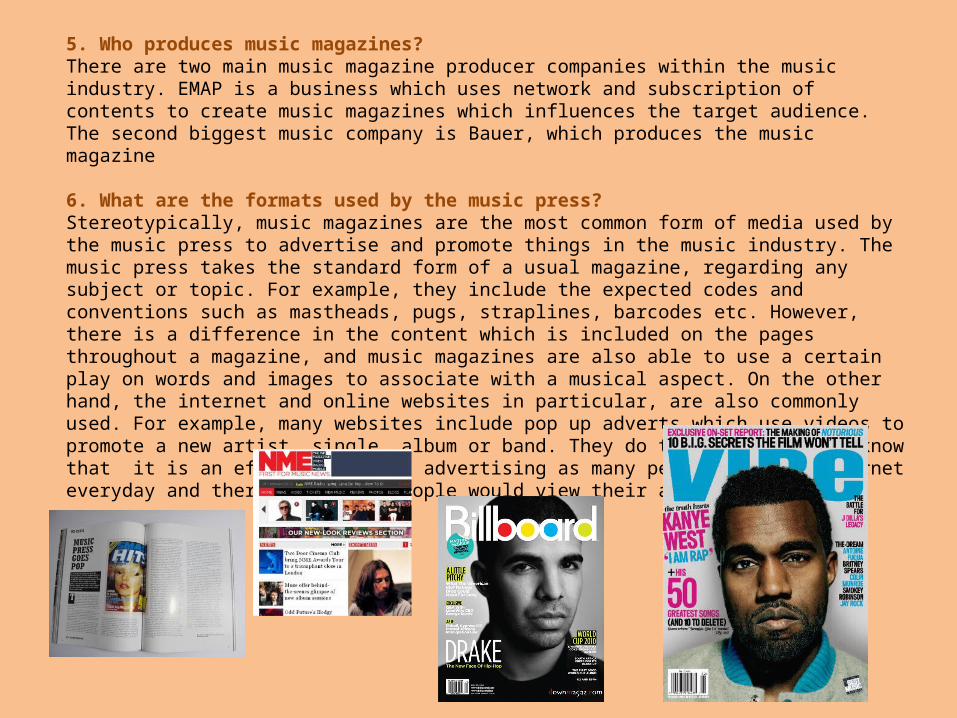
5. Who produces music magazines?There are two main music magazine producer companies within the music industry. EMAP is a business which uses network and subscription of contents to create music magazines which influences the target audience. The second biggest music company is Bauer, which produces the music magazine
6. What are the formats used by the music press?Stereotypically, music magazines are the most common form of media used by the music press to advertise and promote things in the music industry. The music press takes the standard form of a usual magazine, regarding any subject or topic. For example, they include the expected codes and conventions such as mastheads, pugs, straplines, barcodes etc. However, there is a difference in the content which is included on the pages throughout a magazine, and music magazines are also able to use a certain play on words and images to associate with a musical aspect. On the other hand, the internet and online websites in particular, are also commonly used. For example, many websites include pop up adverts which use videos to promote a new artist, single, album or band. They do this because they know that it is an effective way of advertising as many people use the internet everyday and therefore, many people would view their advertisement.
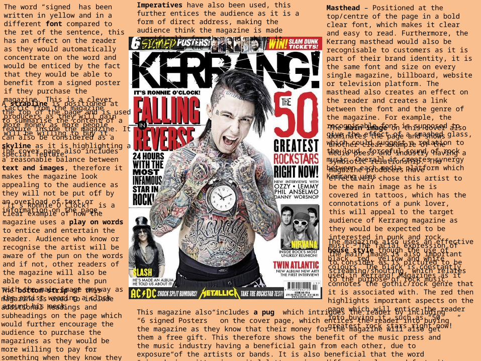
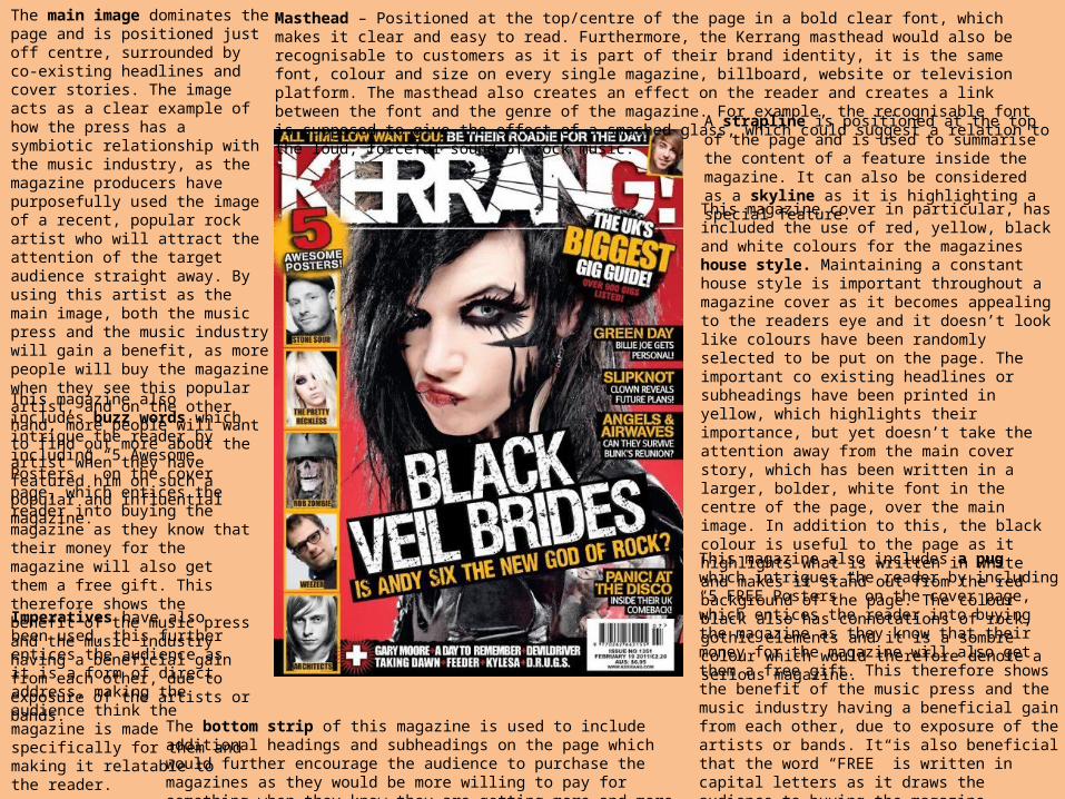
Masthead – Positioned at the top/centre of the page in a bold clear font, which makes it clear and easy to read. Furthermore, the Kerrang masthead would also be recognisable to customers as it is part of their brand identity, it is the same font and size on every single magazine, billboard, website or television platform. The masthead also creates an effect on the reader and creates a link between the font and the genre of the magazine. For example, the recognisable font is supposed to give the effect of a smashed glass, which could suggest a relation to the loud, forceful sound of rock music. Overall it creates synergy between each media platform which Kerrang uses. The main image on this cover also dominates the page and shows another clear example of the media press and industry having a symbiotic relationship. The magazine producers have effectively chose this artist to be the main image as he is covered in tattoos, which has the connotations of a punk lover, this will appeal to the target audience of Kerrang magazine as they would be expected to be interested in punk and rock music. The facial expression of the main image is also important to consider as is pictured to be screaming/shouting, which relates to the purpose of rock music.
“It’s Ronnie O’Clock!” is a clear example of how the magazine uses a play on words to entice and entertain the reader. Audience who know or recognise the artist will be aware of the pun on the words and if not, other readers of the magazine will also be able to associate the pun with the main image anyway as the artist wearing a clock around his neck.
The word “signed” has been written in yellow and in a different font compared to the ret of the sentence, this has an effect on the reader as they would automatically concentrate on the word and would be enticed by the fact that they would be able to benefit from a signed poster if they purchase the magazine. This is a clever tactic from the magazine producers as they will gain more money as more people will be willing to buy it.
Imperatives have also been used, this further entices the audience as it is a form of direct address, making the audience think the magazine is made specifically for them and making it relatable to the reader.
The cover page also includes a reasonable balance between text and images, therefore it makes the magazine look appealing to the audience as they will not be put off by an overload of text or information on the page.
The bottom strip of this magazine is used to include additional headings and subheadings on the page which would further encourage the audience to purchase the magazines as they would be more willing to pay for something when they know they are getting more and more information or entertainment out of it.
A strapline is positioned at the top of the page and is used to summarise the content of a feature inside the magazine. It can also be considered as a skyline as it is highlighting a special feature.
The magazine also uses an effective house style though the use of black, red, yellow and white colours. The black is constantly used in Kerrang! Magazines as it connotes the gothic/rock genre that it is associated with. The red then highlights important aspects on the page which will entice the reader into buying it, such as “50 greatest rock stars right now!”
This magazine also includes a pug which intrigues the reader by including “6 signed Posters” on the cover page, which entices the reader into buying the magazine as they know that their money for the magazine will also get them a free gift. This therefore shows the benefit of the music press and the music industry having a beneficial gain from each other, due to exposure of the artists or bands. It is also beneficial that the word “signed” is written in capital letters, in a different colour and font; it draws the audience to buying the magazine.
Masthead – Positioned at the top/centre of the page in a bold clear font, which makes it clear and easy to read. Furthermore, the Kerrang masthead would also be recognisable to customers as it is part of their brand identity, it is the same font, colour and size on every single magazine, billboard, website or television platform. The masthead also creates an effect on the reader and creates a link between the font and the genre of the magazine. For example, the recognisable font is supposed to give the effect of a smashed glass, which could suggest a relation to the loud, forceful sound of rock music.
The main image dominates the page and is positioned just off centre, surrounded by co-existing headlines and cover stories. The image acts as a clear example of how the press has a symbiotic relationship with the music industry, as the magazine producers have purposefully used the image of a recent, popular rock artist who will attract the attention of the target audience straight away. By using this artist as the main image, both the music press and the music industry will gain a benefit, as more people will buy the magazine when they see this popular artist, and on the other hand, more people will want to find out more about the artist when they have featured him on such a popular and influential magazine.
This magazine cover in particular, has included the use of red, yellow, black and white colours for the magazines house style. Maintaining a constant house style is important throughout a magazine cover as it becomes appealing to the readers eye and it doesn’t look like colours have been randomly selected to be put on the page. The important co existing headlines or subheadings have been printed in yellow, which highlights their importance, but yet doesn’t take the attention away from the main cover story, which has been written in a larger, bolder, white font in the centre of the page, over the main image. In addition to this, the black colour is useful to the page as it highlights what is written in white and makes it stand out from the red background of the page. The colour black also has connotations of rock, gothic elements and it is a sombre colour which would therefore denote a serious magazine.
This magazine also includes buzz words which intrigue the reader by including “5 Awesome Posters” on the cover page, which entices the reader into buying the magazine as they know that their money for the magazine will also get them a free gift. This therefore shows the benefit of the music press and the music industry having a beneficial gain from each other, due to exposure of the artists or bands.
The bottom strip of this magazine is used to include additional headings and subheadings on the page which would further encourage the audience to purchase the magazines as they would be more willing to pay for something when they know they are getting more and more information or entertainment out of it.
Imperatives have also been used, this further entices the audience as it is a form of direct address, making the audience think the magazine is made specifically for them and making it relatable to the reader.
This magazine also includes a pug which intrigues the reader by including “5 FREE Posters” on the cover page, which entices the reader into buying the magazine as they know that their money for the magazine will also get them a free gift. This therefore shows the benefit of the music press and the music industry having a beneficial gain from each other, due to exposure of the artists or bands. It is also beneficial that the word “FREE” is written in capital letters as it draws the audience to buying the magazine.
A strapline is positioned at the top of the page and is used to summarise the content of a feature inside the magazine. It can also be considered as a skyline as it is highlighting a special feature.

This magazine also includes a pug which intrigues the reader by including “5 FREE Posters” on the cover page, which entices the reader into buying the magazine as they know that their money for the magazine will also get them a free gift. This therefore shows the benefit of the music press and the music industry having a beneficial gain from each other, due to exposure of the artists or bands. It is also beneficial that the word “FREE” is written in capital letters as it draws the audience to buying the magazine.
The font of the main heading has been printed in green and is instantly recognisable to rock or punk lovers. By using such a popular band, the magazine will attract the attention of readers straight away and will entice them to buy the magazine as they will want to know the information on the band. The green colour also stands out from the rest of the sombre, grey and dull house colours that have been used on the background and the clothing of the band.
Buzz words such as “Plus!” and “Exclusive” have been used on this magazine cover to excite the reader and address them as if there is something in the magazine that will be exclusive to them and they will not be able to find anywhere else or in any other magazine. This therefore shows the benefit of the music press and the music industry having a beneficial gain from each other, due to exposure of the artists or bands.
Imperatives have also been used, this further entices the audience as it is a form of direct address, making the audience think the magazine is made specifically for them and making it relatable to the reader.
A barcode is included on the page so that shops are able to take care of stock control and audiences will be able to identify how much the magazine will cost.
The strapline is used at the bottom of the page and is highlighted through the use of a red box which will stand out to the reader and catch their attention, it will also offer additional information on the magazine and what is included inside.
The masthead effectively stands out from the rest of the page and it also creates an onomatopoeic effect and the font creates the look of smashed glass.
Punctuation and capital letters are also important on this magazine cover as it creates excitement for the consumer and looks appealing/interesting to read.
The artist who are used as the main image hold a direct mode of address, making eye contact with the reader, drawing them in to the magazine.
The text that is positioned underneath the cover line is called anchorage text, as it gives additional information regarding the main image and its headline.
The magazine cover maintains a constant house style; green is used to associated with the cover line of the band, black is used to connote the rock/gothic/emo genre of the magazine and red is used to reinforce the importance and excitement associated with the stories on the page.
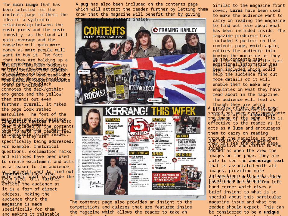
Similar to the magazine front cover, Lures have been used to make the audience want to carry on reading the magazine to find out more about what has been included inside. The magazine producers have included 5 posters on the contents page, which again, entices the audience into buying the magazine as they will be happy about the fact that they have a free gift after their purchase.
On the contents page, additional information has been included which would help the audience find out more details or it will enable them to make any enquiries on what they have read about in the magazine. The audience will feel as though they are being directly addressed through the use of the imperative word “Call” or “Get”.
The main image that has been selected for the contents page furthers the idea of a symbiotic relationship between the music press and the music industry, as the band will gain coverage and the magazine will gain more money as more people will want to buy it. The fact that they are holding up a British flag also suggests a link between the British background of the band, and the British target audience that is included.
Linguistic devices have also been included on the contents page to make the reader feel as though they are specifically being addressed. For example, rhetorical questions, exclamation marks and ellipses have been used to create excitement and acts as a teaser to the audience, so they will want to find out more about what is inside the magazine.
Imperatives have also been used, this further entices the audience as it is a form of direct address, making the audience think the magazine is made specifically for them and making it relatable to the reader.
A preview of the double page spread has been overlapped onto the image of the band. This is effective to the reader as it acts as a lure and encourages them to carry on reading through the magazine so that they can see the double page spread.
The contents page also maintains the house style of yellow and black, which makes the feature headings stand out. The black connotes the dark/gothic/ emo genre and the yellow then stands out even further, overall, it makes the page look rather masculine. The font of the masthead and main headings on the page remain constant, making it easily recognisable to the reader.
A pug has also been included on the contents page which will attract the reader further by letting them know that the magazine will benefit them by giving them some free posters inside.
The contents page also provides an insight to the competitions and quizzes that are featured inside the magazine which allows the reader to take an interactive role.
The contents page becomes informative and useful to the reader as when the view the images on the page, they are able to see the anchorage text that is associated with all images, providing more information on the article or highlighting a feature.
An editorial message has been positioned in the bottom left hand corner which gives a brief insight to what is so special about this particular magazine issue and what the reader should expect. This can be considered to be a unique selling point as the editor is claiming that this magazine is different from the rest.
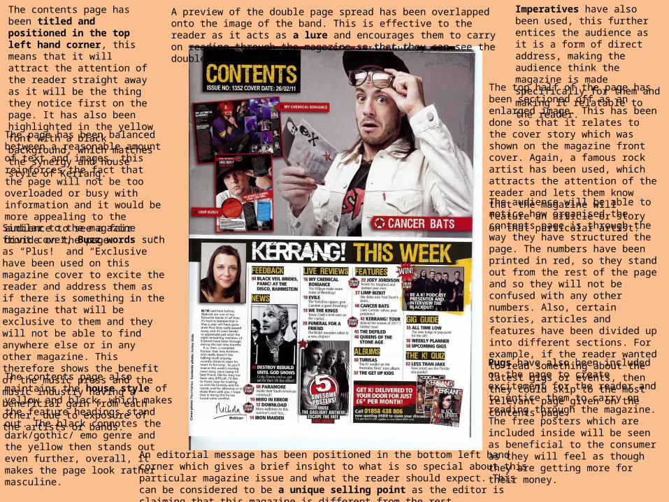
The contents page has been titled and positioned in the top left hand corner, this means that it will attract the attention of the reader straight away as it will be the thing they notice first on the page. It has also been highlighted in the yellow font with a black background, which matches the synergy and house style of Kerrang.
The page has been balanced between a reasonable amount of text and images, this reinforces the fact that the page will not be too overloaded or busy with information and it would be more appealing to the audience to see a fair divide on the page.
The top half of the page has been sectioned off as an enlarged image. This has been done so that it relates to the cover story which was shown on the magazine front cover. Again, a famous rock artist has been used, which attracts the attention of the reader and lets them know that the magazine will feature an article or story on that particular artist.
Imperatives have also been used, this further entices the audience as it is a form of direct address, making the audience think the magazine is made specifically for them and making it relatable to the reader.
Similar to the magazine front cover, Buzz words such as “Plus!” and “Exclusive” have been used on this magazine cover to excite the reader and address them as if there is something in the magazine that will be exclusive to them and they will not be able to find anywhere else or in any other magazine. This therefore shows the benefit of the music press and the music industry having a beneficial gain from each other, due to exposure of the artists or bands.
The audience will be able to notice how organised the contents page is through the way they have structured the page. The numbers have been printed in red, so they stand out from the rest of the page and so they will not be confused with any other numbers. Also, certain stories, articles and features have been divided up into different sections. For example, if the reader wanted to read something about the latest gigs or events, then they could skip to the most relevant page given on the contents page.
The contents page also maintains the house style of yellow and black, which makes the feature headings stand out. The black connotes the dark/gothic/ emo genre and the yellow then stands out even further, overall, it makes the page look rather masculine.
Pugs have also been included on the page to create excitement for the reader and to entice them to carry on reading through the magazine. The free posters which are included inside will be seen as beneficial to the consumer as they will feel as though they are getting more for their money.
A preview of the double page spread has been overlapped onto the image of the band. This is effective to the reader as it acts as a lure and encourages them to carry on reading through the magazine so that they can see the double page spread.
An editorial message has been positioned in the bottom left hand corner which gives a brief insight to what is so special about this particular magazine issue and what the reader should expect. This can be considered to be a unique selling point as the editor is claiming that this magazine is different from the rest.
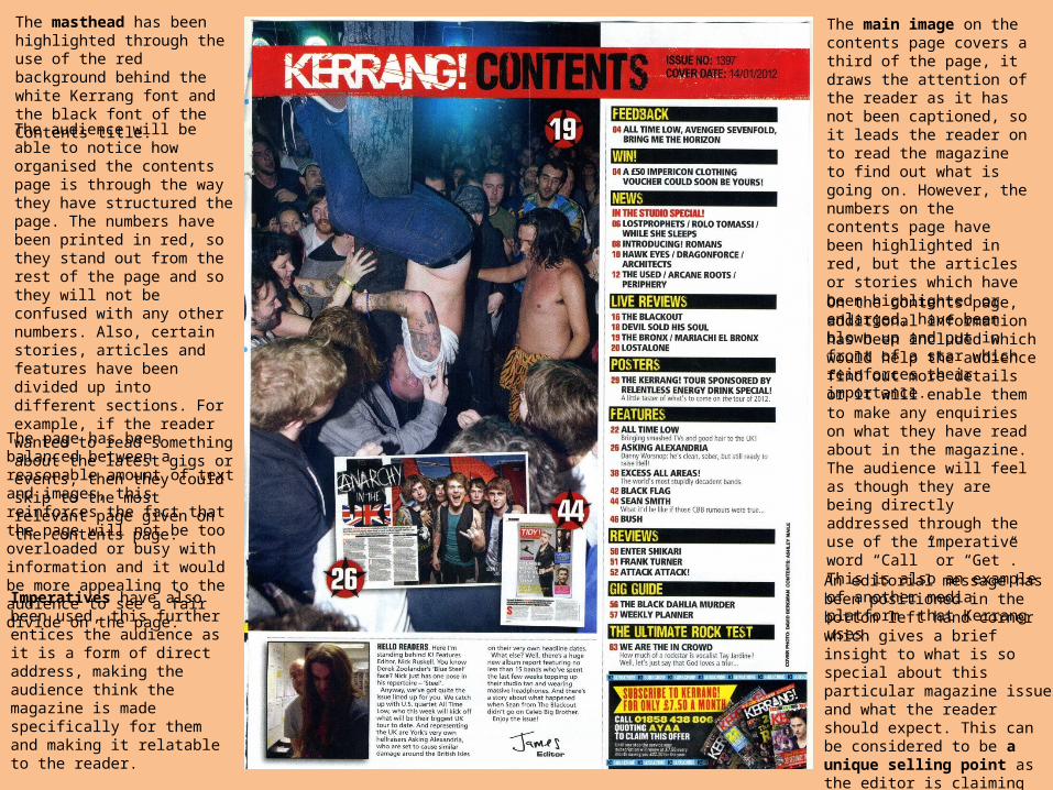
The masthead has been highlighted through the use of the red background behind the white Kerrang font and the black font of the Contents title.
The audience will be able to notice how organised the contents page is through the way they have structured the page. The numbers have been printed in red, so they stand out from the rest of the page and so they will not be confused with any other numbers. Also, certain stories, articles and features have been divided up into different sections. For example, if the reader wanted to read something about the latest gigs or events, then they could skip to the most relevant page given on the contents page.
The main image on the contents page covers a third of the page, it draws the attention of the reader as it has not been captioned, so it leads the reader on to read the magazine to find out what is going on. However, the numbers on the contents page have been highlighted in red, but the articles or stories which have been highlighted or enlarged, have been blown up and put in front of a star which reinforces their importance.
The page has been balanced between a reasonable amount of text and images, this reinforces the fact that the page will not be too overloaded or busy with information and it would be more appealing to the audience to see a fair divide on the page.
On the contents page, additional information has been included which would help the audience find out more details or it will enable them to make any enquiries on what they have read about in the magazine. The audience will feel as though they are being directly addressed through the use of the imperative word “Call” or “Get”. This is also an example of another media platform that Kerrang uses.
An editorial message has been positioned in the bottom left hand corner which gives a brief insight to what is so special about this particular magazine issue and what the reader should expect. This can be considered to be a unique selling point as the editor is claiming that this magazine is different from the rest.
Imperatives have also been used, this further entices the audience as it is a form of direct address, making the audience think the magazine is made specifically for them and making it relatable to the reader.
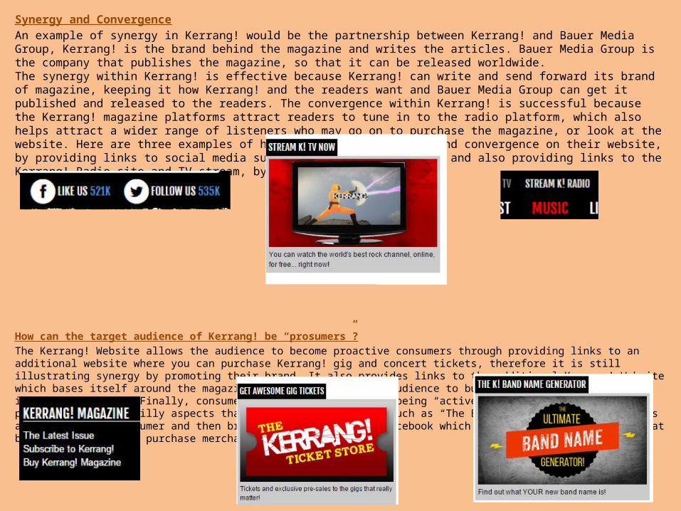
Synergy and ConvergenceAn example of synergy in Kerrang! would be the partnership between Kerrang! and Bauer Media Group, Kerrang! is the brand behind the magazine and writes the articles. Bauer Media Group is the company that publishes the magazine, so that it can be released worldwide.The synergy within Kerrang! is effective because Kerrang! can write and send forward its brand of magazine, keeping it how Kerrang! and the readers want and Bauer Media Group can get it published and released to the readers. The convergence within Kerrang! is successful because the Kerrang! magazine platforms attract readers to tune in to the radio platform, which also helps attract a wider range of listeners who may go on to purchase the magazine, or look at the website. Here are three examples of how Kerrang! uses synergy and convergence on their website, by providing links to social media such as Twitter and Facebook and also providing links to the Kerrang! Radio site and TV stream, by using the K! brand.
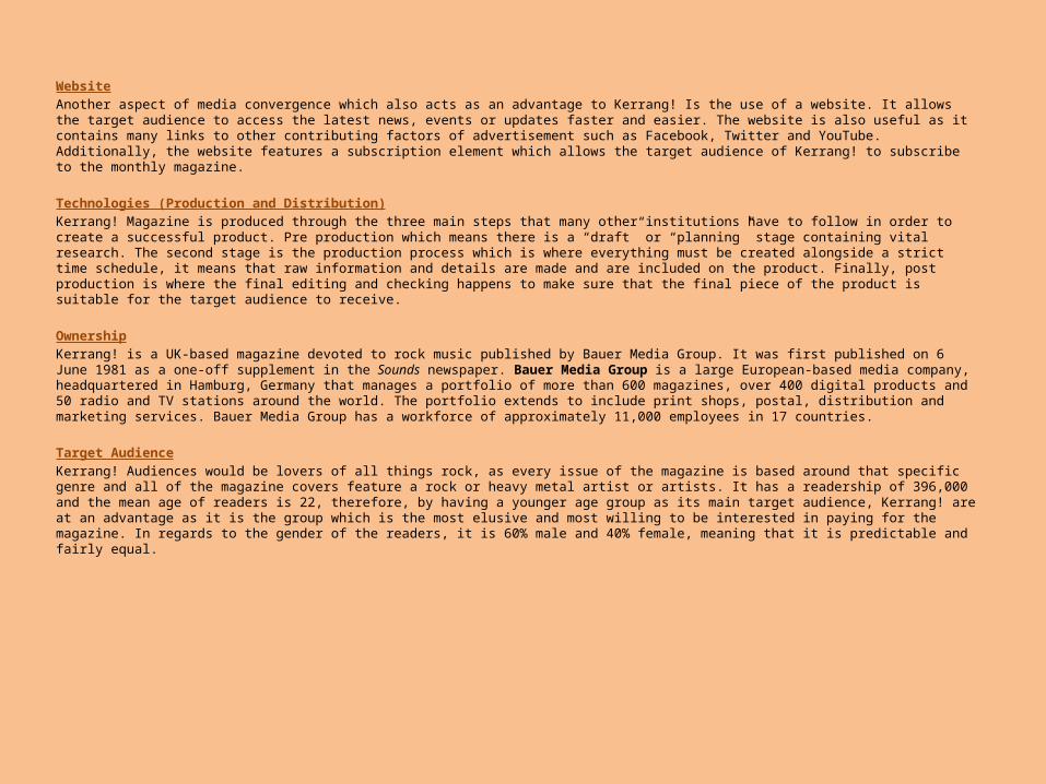
How can the target audience of Kerrang! be “prosumers”?The Kerrang! Website allows the audience to become proactive consumers through providing links to an additional website where you can purchase Kerrang! gig and concert tickets, therefore it is still illustrating synergy by promoting their brand. It also provides links to the additional Kerrang! Website which bases itself around the magazine, enabling the target audience to buy or subscribe to the latest issues of Kerrang!. Finally, consumers would find themselves being “active” on the website as they can participate on the silly aspects that the website includes, such as “The Brand Generator” which selects a brand for the consumer and then brings them to a link on Facebook which suggests that they “Like” that brands page, or even purchase merchandise.
WebsiteAnother aspect of media convergence which also acts as an advantage to Kerrang! Is the use of a website. It allows the target audience to access the latest news, events or updates faster and easier. The website is also useful as it contains many links to other contributing factors of advertisement such as Facebook, Twitter and YouTube. Additionally, the website features a subscription element which allows the target audience of Kerrang! to subscribe to the monthly magazine.
Technologies (Production and Distribution)Kerrang! Magazine is produced through the three main steps that many other institutions have to follow in order to create a successful product. Pre production which means there is a “draft” or “planning” stage containing vital research. The second stage is the production process which is where everything must be created alongside a strict time schedule, it means that raw information and details are made and are included on the product. Finally, post production is where the final editing and checking happens to make sure that the final piece of the product is suitable for the target audience to receive.
Ownership Kerrang! is a UK-based magazine devoted to rock music published by Bauer Media Group. It was first published on 6 June 1981 as a one-off supplement in the Sounds newspaper. Bauer Media Group is a large European-based media company, headquartered in Hamburg, Germany that manages a portfolio of more than 600 magazines, over 400 digital products and 50 radio and TV stations around the world. The portfolio extends to include print shops, postal, distribution and marketing services. Bauer Media Group has a workforce of approximately 11,000 employees in 17 countries.
Target AudienceKerrang! Audiences would be lovers of all things rock, as every issue of the magazine is based around that specific genre and all of the magazine covers feature a rock or heavy metal artist or artists. It has a readership of 396,000 and the mean age of readers is 22, therefore, by having a younger age group as its main target audience, Kerrang! are at an advantage as it is the group which is the most elusive and most willing to be interested in paying for the magazine. In regards to the gender of the readers, it is 60% male and 40% female, meaning that it is predictable and fairly equal.