Kerrang Magazine Deconstruction
6
Kerrang! Magazine Deconstruction 2
-
Upload
bethhupchurchh -
Category
Art & Photos
-
view
134 -
download
0
Transcript of Kerrang Magazine Deconstruction
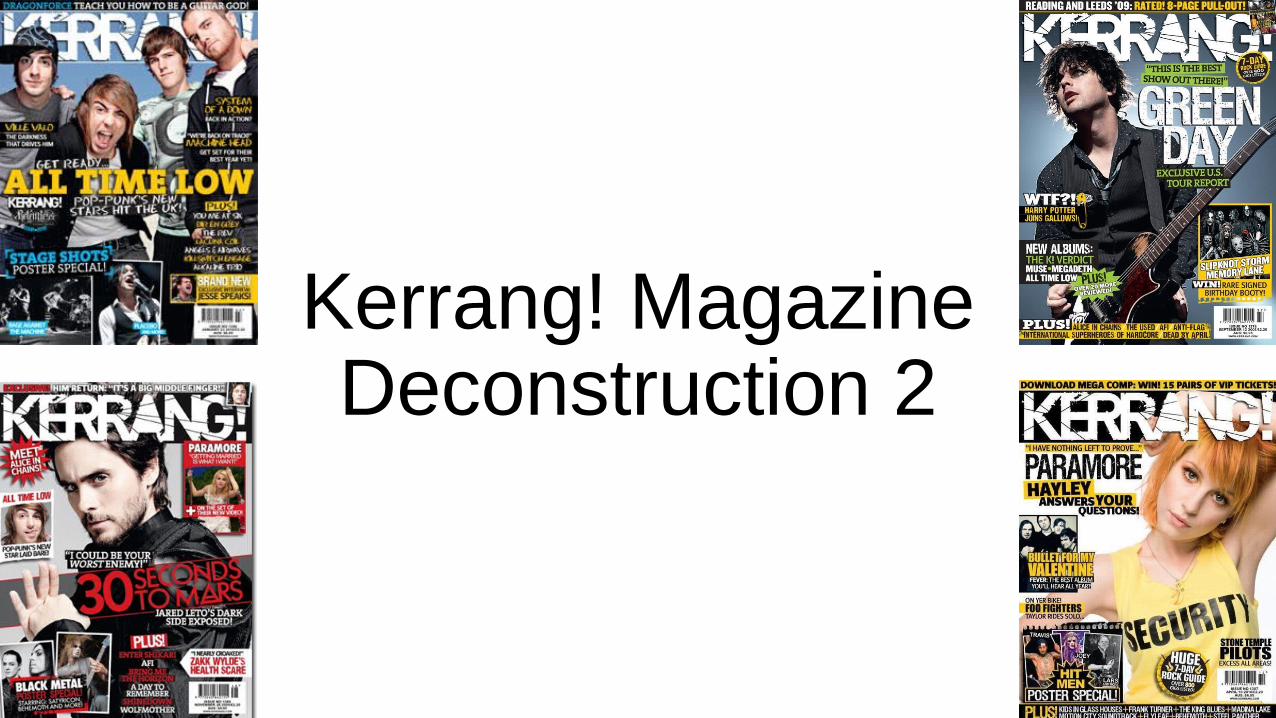
Kerrang! MagazineDeconstruction 2
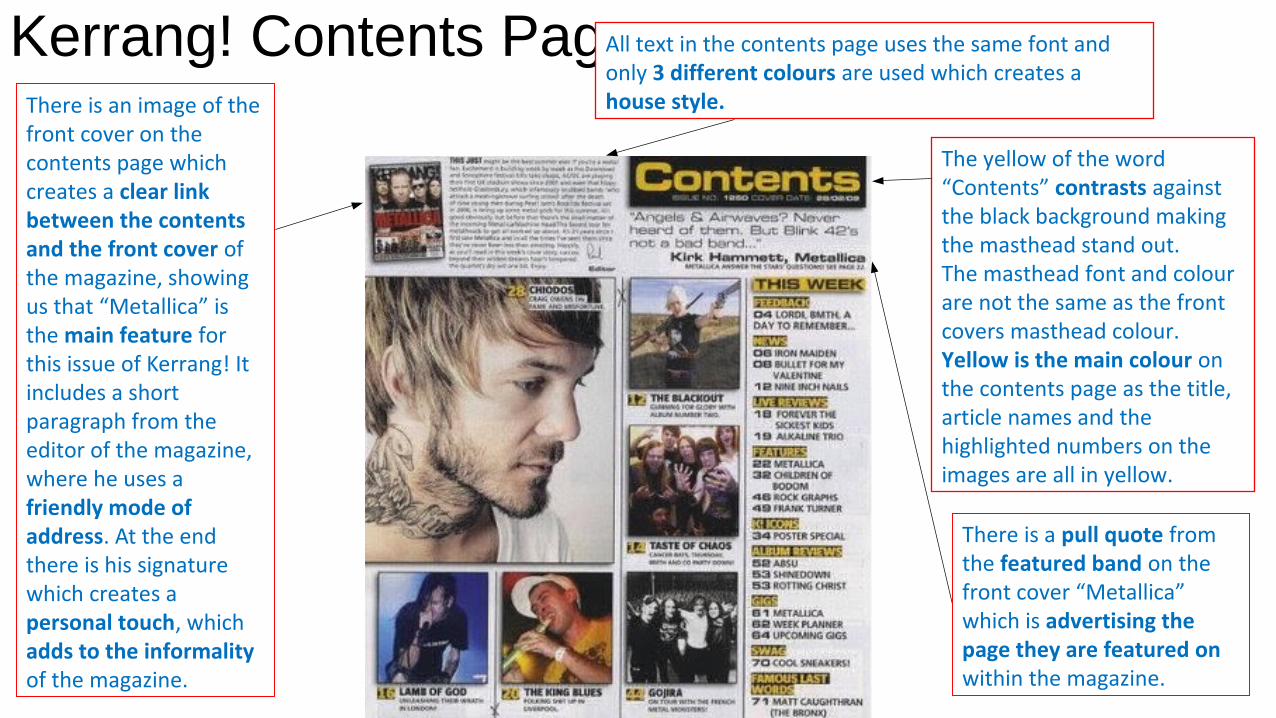
Kerrang! Contents PageThere is an image of the front cover on the contents page which creates a clear link between the contents and the front cover of the magazine, showing us that “Metallica” is the main feature for this issue of Kerrang! It includes a short paragraph from the editor of the magazine, where he uses a friendly mode of address. At the end there is his signature which creates a personal touch, which adds to the informality of the magazine.
All text in the contents page uses the same font and only 3 different colours are used which creates a house style.
The yellow of the word “Contents” contrasts against the black background making the masthead stand out. The masthead font and colour are not the same as the front covers masthead colour. Yellow is the main colour on the contents page as the title, article names and the highlighted numbers on the images are all in yellow.
There is a pull quote from the featured band on the front cover “Metallica” which is advertising the page they are featured on within the magazine.

Kerrang! Contents PageThe main image used is the main article in the magazine. The image is large enough to draw peoples attention to it, which is what the magazine wants the readers to see.There are more smaller images around the main image which are also articles included within the magazine. Under each image there is a caption stating what the article is about.
The name of each band is written in block capitals and is in a black bold font on a white background making it stand out to the reader. Next to the band name is the page number in yellow allowing the reader to skip to a particular page to find this article.
The layout of the contents page has been split up into 4 different columns.The contents column text mainly includes names of different bands. This is to attract readers attention to their favourite bands, so they will then purchase the magazine.
The house style of the magazine (yellow, white & black) are neutral colours and aren’t considered to be masculine or feminine colours which Is because the magazines target audience are for rock and heavy metal fans which could attract either gender.
Kerrang! Double Page Spread
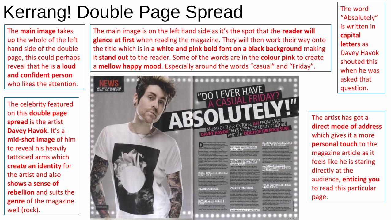
The celebrity featured on this double page spread is the artist Davey Havok. It’s a mid-shot image of him to reveal his heavily tattooed arms which create an identity for the artist and also shows a sense of rebellion and suits the genre of the magazine well (rock).
The main image takes up the whole of the left hand side of the double page, this could perhaps reveal that he is a loud and confident person who likes the attention.
The main image is on the left hand side as it’s the spot that the reader will glance at first when reading the magazine. They will then work their way onto the title which is in a white and pink bold font on a black background making it stand out to the reader. Some of the words are in the colour pink to create a mellow happy mood. Especially around the words “casual” and “Friday”.
The word “Absolutely” is written in capital letters as Davey Havok shouted this when he was asked that question.
The artist has got a direct mode of address which gives it a more personal touch to the magazine article as it feels like he is staring directly at the audience, enticing you to read this particular page.

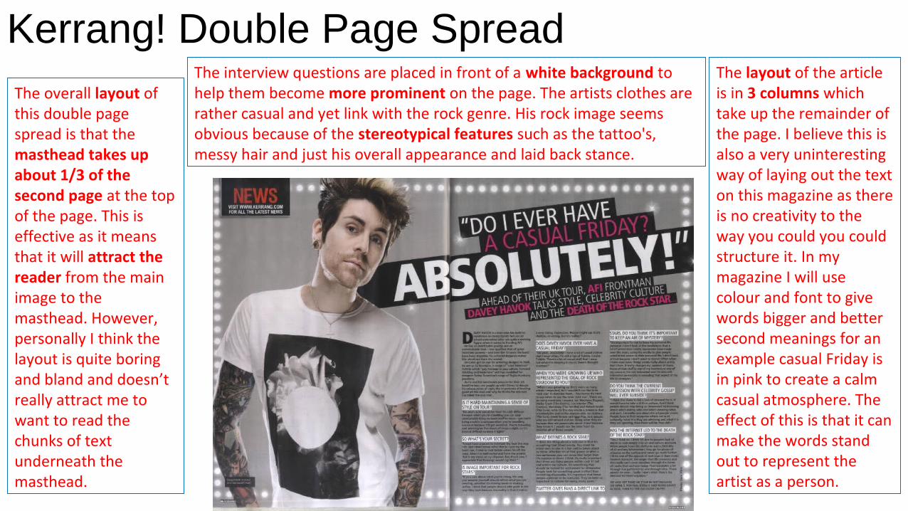
Kerrang! Double Page SpreadThe overall layout of this double page spread is that the masthead takes up about 1/3 of the second page at the top of the page. This is effective as it means that it will attract the reader from the main image to the masthead. However, personally I think the layout is quite boring and bland and doesn’t really attract me to want to read the chunks of text underneath the masthead.
The layout of the article is in 3 columns which take up the remainder of the page. I believe this is also a very uninteresting way of laying out the text on this magazine as there is no creativity to the way you could you could structure it. In my magazine I will use colour and font to give words bigger and better second meanings for an example casual Friday is in pink to create a calm casual atmosphere. The effect of this is that it can make the words stand out to represent the artist as a person.
The interview questions are placed in front of a white background to help them become more prominent on the page. The artists clothes are rather casual and yet link with the rock genre. His rock image seems obvious because of the stereotypical features such as the tattoo's, messy hair and just his overall appearance and laid back stance.