Evaluation q 2
10
How does your media product represent particular social groups? Question 2. Billy Ingram
-
Upload
billybetterknow -
Category
Technology
-
view
23 -
download
0
Transcript of Evaluation q 2
How does your media product represent particular social groups?
Question 2.
Billy Ingram
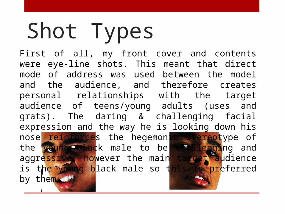
Shot TypesFirst of all, my front cover and contents were eye-line shots. This meant that direct mode of address was used between the model and the audience, and therefore creates personal relationships with the target audience of teens/young adults (uses and grats). The daring & challenging facial expression and the way he is looking down his nose reinforces the hegemonic stereotype of the young black male to be challenging and aggressive; however the main target audience is the young black male so this is preferred by them.
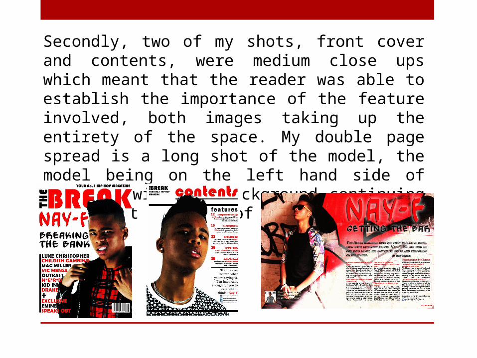
Secondly, two of my shots, front cover and contents, were medium close ups which meant that the reader was able to establish the importance of the feature involved, both images taking up the entirety of the space. My double page spread is a long shot of the model, the model being on the left hand side of the page with the background continuing throughout the rest of the spread.
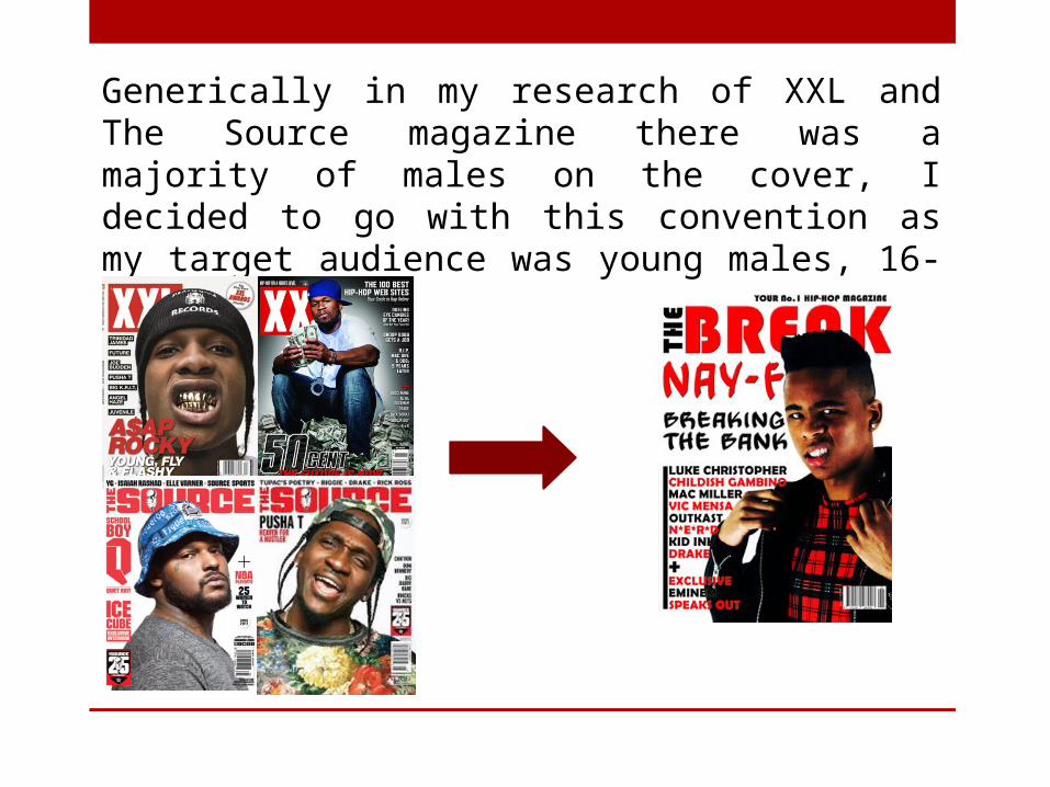
Generically in my research of XXL and The Source magazine there was a majority of males on the cover, I decided to go with this convention as my target audience was young males, 16-26.
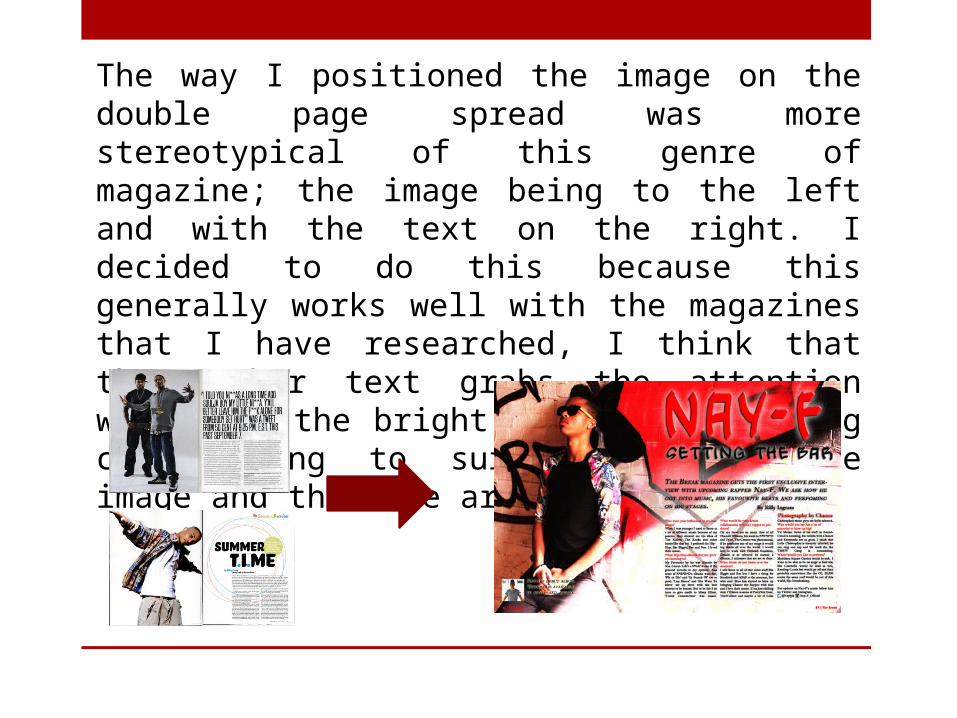
The way I positioned the image on the double page spread was more stereotypical of this genre of magazine; the image being to the left and with the text on the right. I decided to do this because this generally works well with the magazines that I have researched, I think that the anchor text grabs the attention well with the bright and bold lettering contributing to surveillance of the image and then the article.
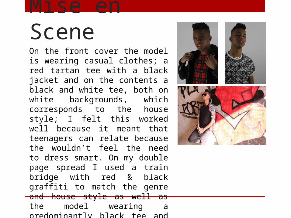
Mise en SceneOn the front cover the model is wearing casual clothes; a red tartan tee with a black jacket and on the contents a black and white tee, both on white backgrounds, which corresponds to the house style; I felt this worked well because it meant that teenagers can relate because the wouldn’t feel the need to dress smart. On my double page spread I used a train bridge with red & black graffiti to match the genre and house style as well as the model wearing a predominantly black tee and black joggers. I decided against the stereotypical negatives when I came to props, e.g. smoking or drinking.
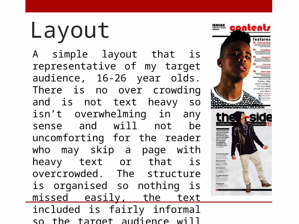
LayoutA simple layout that is representative of my target audience, 16-26 year olds. There is no over crowding and is not text heavy so isn’t overwhelming in any sense and will not be uncomforting for the reader who may skip a page with heavy text or that is overcrowded. The structure is organised so nothing is missed easily, the text included is fairly informal so the target audience will not lose attention without the loss of the professionalism.
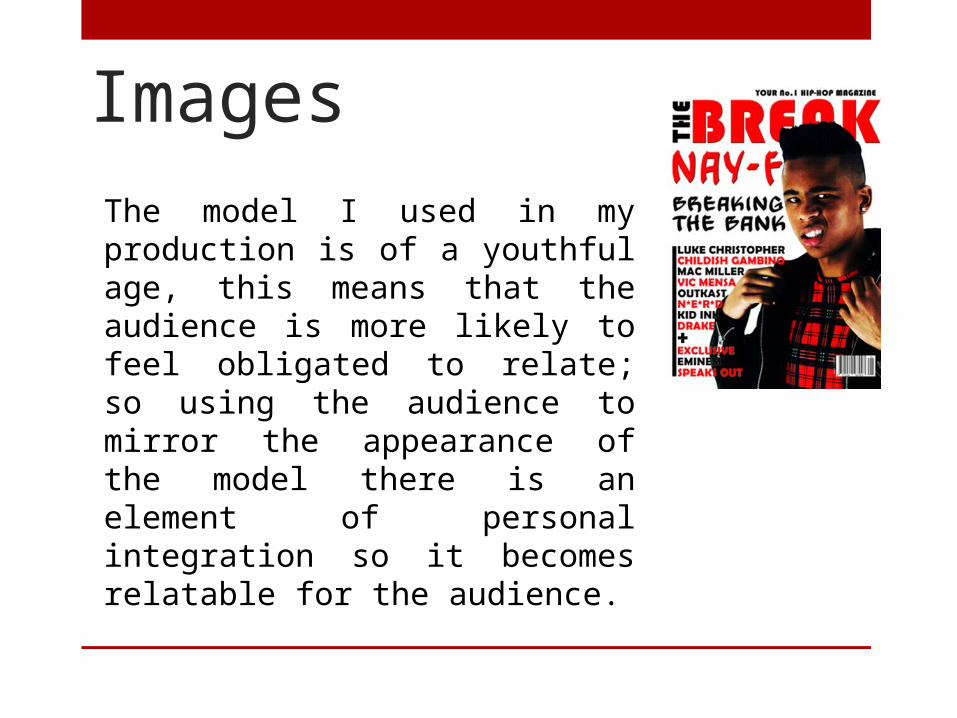
ImagesThe model I used in my production is of a youthful age, this means that the audience is more likely to feel obligated to relate; so using the audience to mirror the appearance of the model there is an element of personal integration so it becomes relatable for the audience.
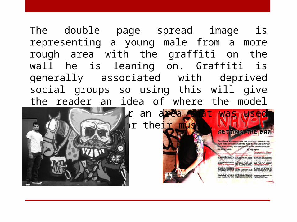
The double page spread image is representing a young male from a more rough area with the graffiti on the wall he is leaning on. Graffiti is generally associated with deprived social groups so using this will give the reader an idea of where the model either grew up or an area that was used as inspiration for their music.
IdeologyAs a final representation my product did the following; the prioritised reception theory is the ability to relate between the audience and their age to the artist featured. This ability plus aspiration would create a personal relationship that entices the fan and potentially creates a fan base the teenage artists are representing other youths which makes the audience want to read about their potential. This was done by the shot positioning (close shots including direct mode of address and confident poses) as well as the informality of the text(equal language codes with the audience like XXL who grab their audience through relating). Through this they would get the message how I intended them to receive it.