Evaluation q 7
17
Looking back at your preliminary task, what do you feel you have learnt in the progressing from it to the full product?
-
Upload
yasminfrancis96 -
Category
Art & Photos
-
view
139 -
download
0
Transcript of Evaluation q 7
Looking back at your preliminary
task, what do you feel you have
learnt in the progressing from it to
the full product?
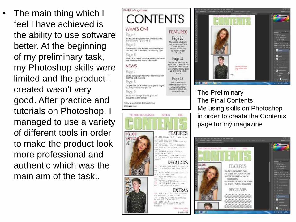
• The main thing which I
feel I have achieved is
the ability to use software
better. At the beginning
of my preliminary task,
my Photoshop skills were
limited and the product I
created wasn't very
good. After practice and
tutorials on Photoshop, I
managed to use a variety
of different tools in order
to make the product look
more professional and
authentic which was the
main aim of the task..
The Preliminary
The Final Contents
Me using skills on Photoshop
in order to create the Contents
page for my magazine
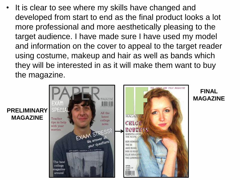
• It is clear to see where my skills have changed and
developed from start to end as the final product looks a lot
more professional and more aesthetically pleasing to the
target audience. I have made sure I have used my model
and information on the cover to appeal to the target reader
using costume, makeup and hair as well as bands which
they will be interested in as it will make them want to buy
the magazine.
PRELIMINARY
MAGAZINE
FINAL
MAGAZINE
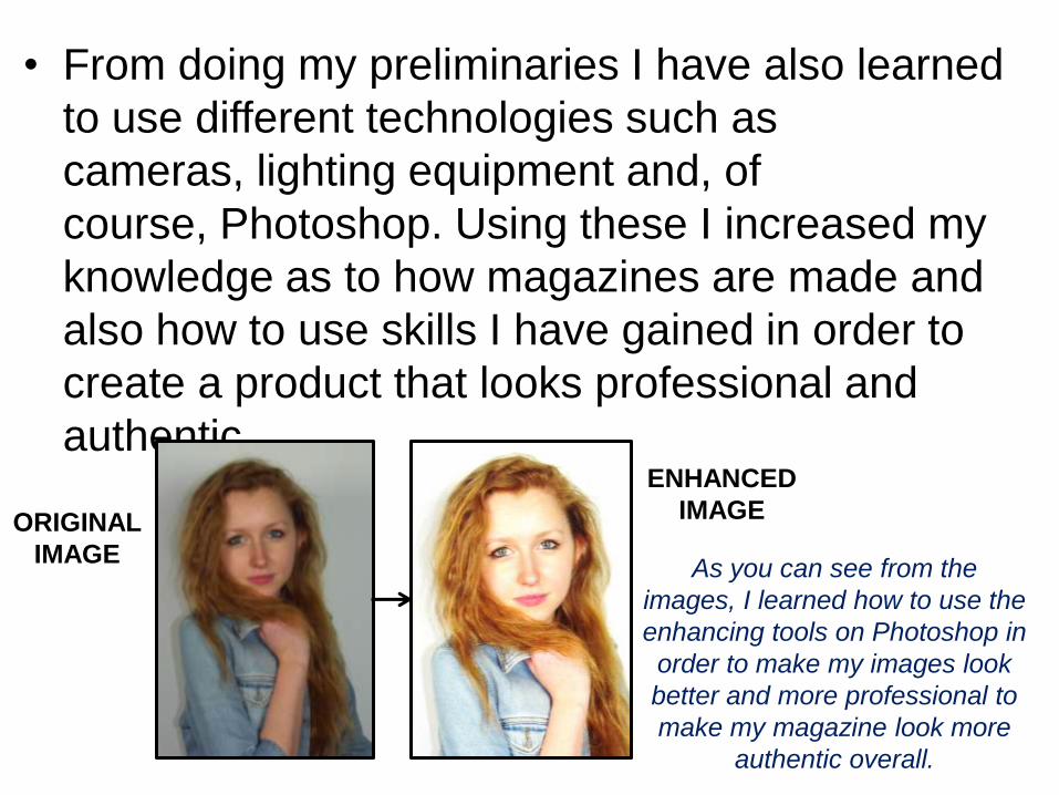
• From doing my preliminaries I have also learned
to use different technologies such as
cameras, lighting equipment and, of
course, Photoshop. Using these I increased my
knowledge as to how magazines are made and
also how to use skills I have gained in order to
create a product that looks professional and
authentic.
ORIGINAL
IMAGE
ENHANCED
IMAGE
As you can see from the
images, I learned how to use the
enhancing tools on Photoshop in
order to make my images look
better and more professional to
make my magazine look more
authentic overall.
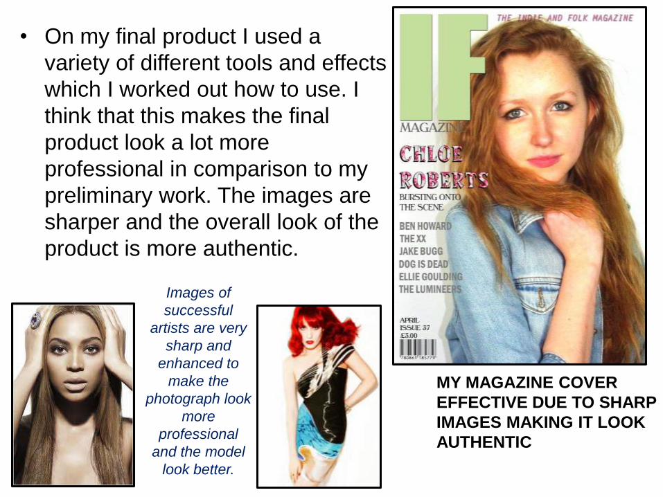
• On my final product I used a
variety of different tools and effects
which I worked out how to use. I
think that this makes the final
product look a lot more
professional in comparison to my
preliminary work. The images are
sharper and the overall look of the
product is more authentic.
MY MAGAZINE COVER
EFFECTIVE DUE TO SHARP
IMAGES MAKING IT LOOK
AUTHENTIC
Images of
successful
artists are very
sharp and
enhanced to
make the
photograph look
more
professional
and the model
look better.
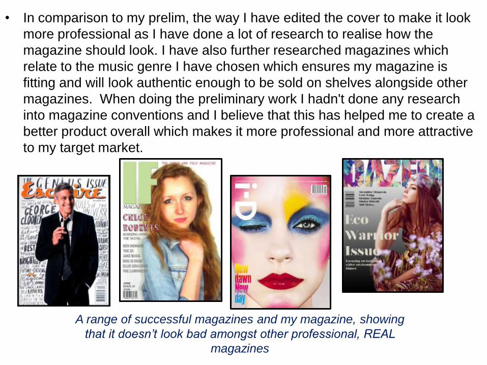
• In comparison to my prelim, the way I have edited the cover to make it look
more professional as I have done a lot of research to realise how the
magazine should look. I have also further researched magazines which
relate to the music genre I have chosen which ensures my magazine is
fitting and will look authentic enough to be sold on shelves alongside other
magazines. When doing the preliminary work I hadn't done any research
into magazine conventions and I believe that this has helped me to create a
better product overall which makes it more professional and more attractive
to my target market.
A range of successful magazines and my magazine, showing
that it doesn’t look bad amongst other professional, REAL
magazines
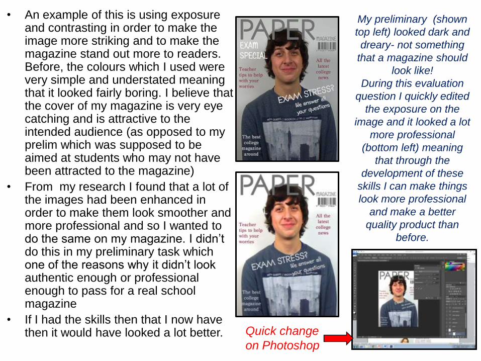
• An example of this is using exposure and contrasting in order to make the image more striking and to make the magazine stand out more to readers. Before, the colours which I used were very simple and understated meaning that it looked fairly boring. I believe that the cover of my magazine is very eye catching and is attractive to the intended audience (as opposed to my prelim which was supposed to be aimed at students who may not have been attracted to the magazine)
• From my research I found that a lot of the images had been enhanced in order to make them look smoother and more professional and so I wanted to do the same on my magazine. I didn’t do this in my preliminary task which one of the reasons why it didn’t look authentic enough or professional enough to pass for a real school magazine
• If I had the skills then that I now have then it would have looked a lot better.
My preliminary (shown
top left) looked dark and
dreary- not something
that a magazine should
look like!
During this evaluation
question I quickly edited
the exposure on the
image and it looked a lot
more professional
(bottom left) meaning
that through the
development of these
skills I can make things
look more professional
and make a better
quality product than
before.
Quick change
on Photoshop
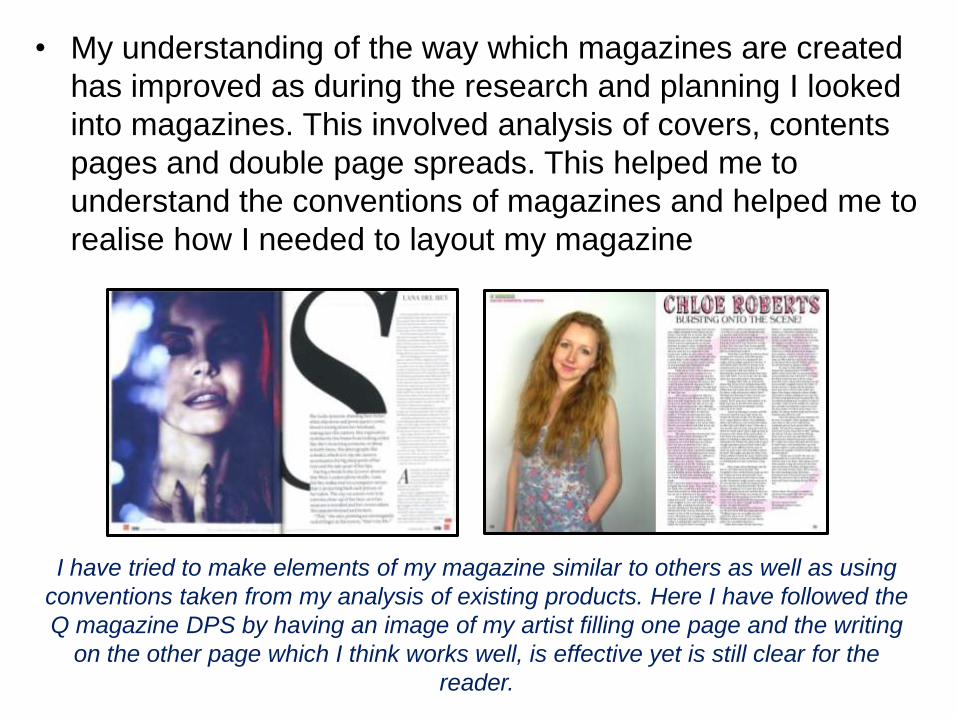
• My understanding of the way which magazines are created
has improved as during the research and planning I looked
into magazines. This involved analysis of covers, contents
pages and double page spreads. This helped me to
understand the conventions of magazines and helped me to
realise how I needed to layout my magazine
I have tried to make elements of my magazine similar to others as well as using
conventions taken from my analysis of existing products. Here I have followed the
Q magazine DPS by having an image of my artist filling one page and the writing
on the other page which I think works well, is effective yet is still clear for the
reader.
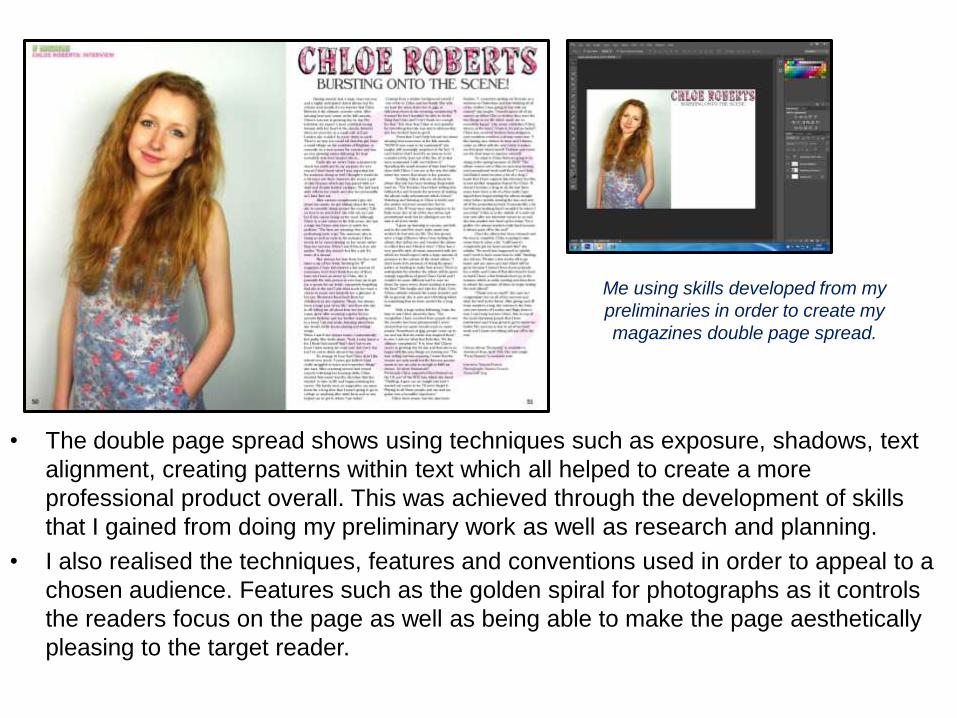
• The double page spread shows using techniques such as exposure, shadows, text
alignment, creating patterns within text which all helped to create a more
professional product overall. This was achieved through the development of skills
that I gained from doing my preliminary work as well as research and planning.
• I also realised the techniques, features and conventions used in order to appeal to a
chosen audience. Features such as the golden spiral for photographs as it controls
the readers focus on the page as well as being able to make the page aesthetically
pleasing to the target reader.
Me using skills developed from my
preliminaries in order to create my
magazines double page spread.

• My knowledge grew further during planning when I was creating
drawn plans and computer versions of the plan. Working out where
everything would look best and what i wanted it to look like overall
was challenging however with time and practice I became a lot
more aware of the layout of my magazine and how i wanted to
make it look. This then helped me achieve my final product
Cover design drawn
and then scanned into
the computer. This
was used as a
template when
designing my draft
magazine.
Draft magazine following the
design draft template
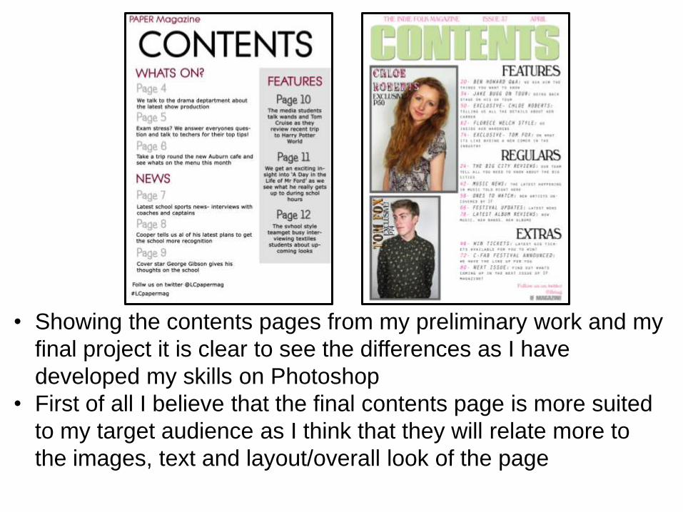
• Showing the contents pages from my preliminary work and my
final project it is clear to see the differences as I have
developed my skills on Photoshop
• First of all I believe that the final contents page is more suited
to my target audience as I think that they will relate more to
the images, text and layout/overall look of the page

• I think that my preliminary work is
quite boring and does not relate
well to the target audience of school
students as they will be more likely
to want to look at something
exciting and fun (full of pictures,
text, stories, etc) and therefore
doesn't fit the target audience well.
• School students don’t enjoy looking
at things which are really boring and
therefore this wouldn’t appeal to my
audience
• However, I think that the stories and
features that I have shown on the
contents page to be within the
magazine would be appealing to
them as they would want to read
these things. I took this forward and
used exciting features that would
appeal to my target audience in my
final magazine
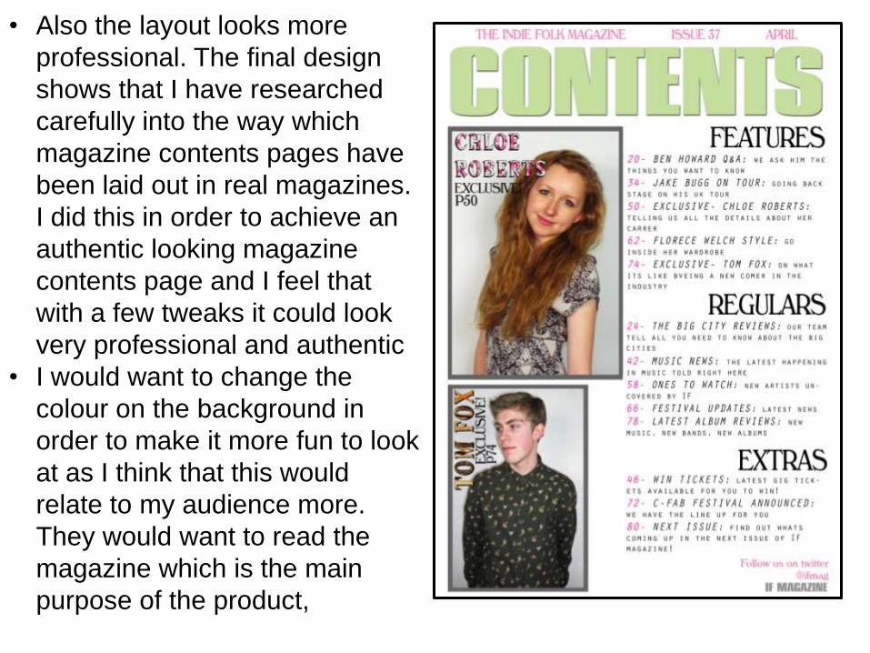
• Also the layout looks more
professional. The final design
shows that I have researched
carefully into the way which
magazine contents pages have
been laid out in real magazines.
I did this in order to achieve an
authentic looking magazine
contents page and I feel that
with a few tweaks it could look
very professional and authentic
• I would want to change the
colour on the background in
order to make it more fun to look
at as I think that this would
relate to my audience more.
They would want to read the
magazine which is the main
purpose of the product,
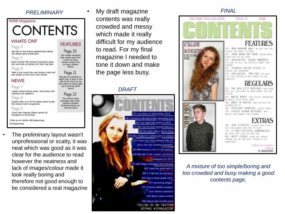
• The preliminary layout wasn't
unprofessional or scatty, it was
neat which was good as it was
clear for the audience to read
however the neatness and
lack of images/colour made it
look really boring and
therefore not good enough to
be considered a real magazine
• My draft magazine
contents was really
crowded and messy
which made it really
difficult for my audience
to read. For my final
magazine I needed to
tone it down and make
the page less busy.
A mixture of too simple/boring and
too crowded and busy making a good
contents page,
DRAFT
PRELIMINARY FINAL
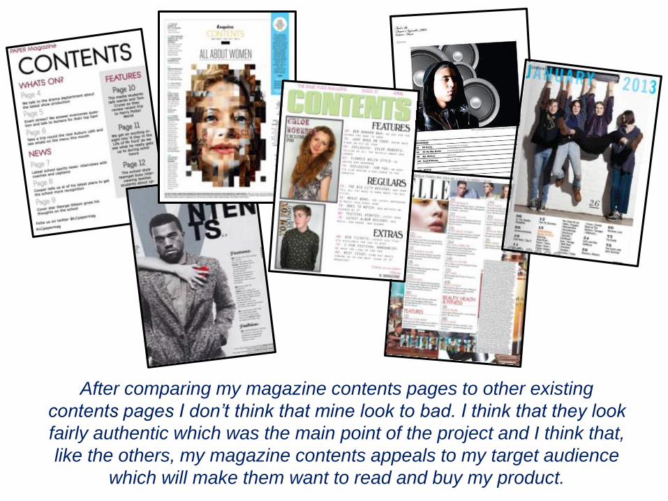
After comparing my magazine contents pages to other existing
contents pages I don’t think that mine look to bad. I think that they look
fairly authentic which was the main point of the project and I think that,
like the others, my magazine contents appeals to my target audience
which will make them want to read and buy my product.
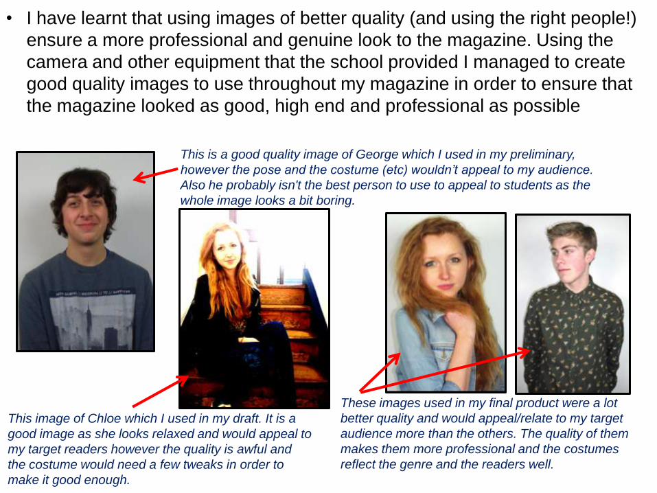
• I have learnt that using images of better quality (and using the right people!)
ensure a more professional and genuine look to the magazine. Using the
camera and other equipment that the school provided I managed to create
good quality images to use throughout my magazine in order to ensure that
the magazine looked as good, high end and professional as possible
This is a good quality image of George which I used in my preliminary,
however the pose and the costume (etc) wouldn’t appeal to my audience.
Also he probably isn't the best person to use to appeal to students as the
whole image looks a bit boring.
This image of Chloe which I used in my draft. It is a
good image as she looks relaxed and would appeal to
my target readers however the quality is awful and
the costume would need a few tweaks in order to
make it good enough.
These images used in my final product were a lot
better quality and would appeal/relate to my target
audience more than the others. The quality of them
makes them more professional and the costumes
reflect the genre and the readers well.
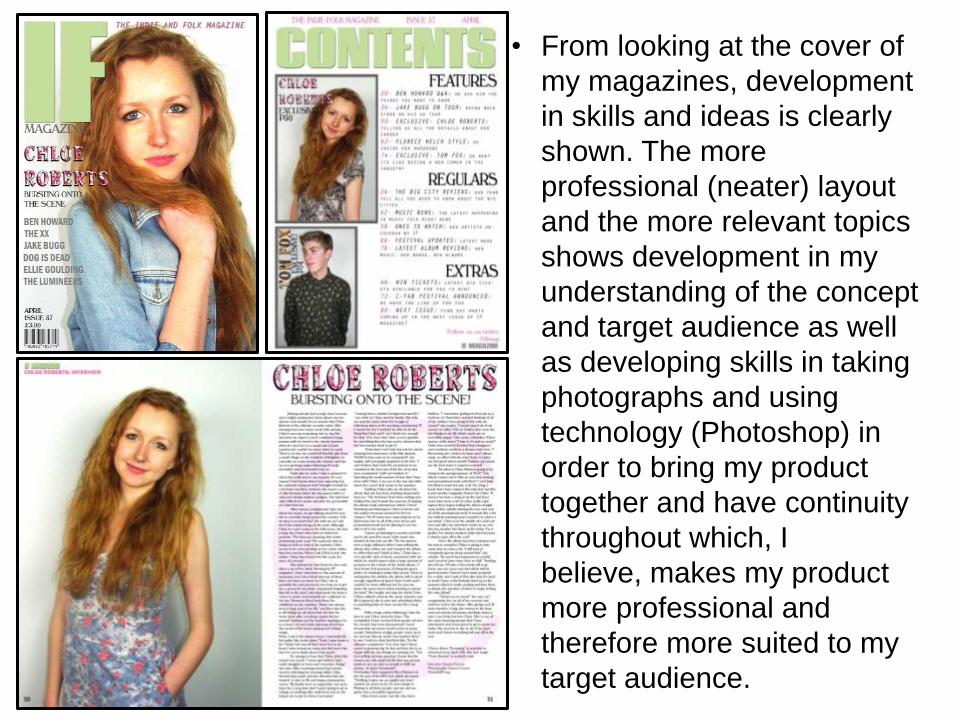
• From looking at the cover of
my magazines, development
in skills and ideas is clearly
shown. The more
professional (neater) layout
and the more relevant topics
shows development in my
understanding of the concept
and target audience as well
as developing skills in taking
photographs and using
technology (Photoshop) in
order to bring my product
together and have continuity
throughout which, I
believe, makes my product
more professional and
therefore more suited to my
target audience.