


Languages
Pages
Legal


67TH AUSTRALIAN BOOK DESIGN AWARDS 2019

Published byThe Australian Book Designers AssociationPO Box 1390Carlton VIC [email protected]
All text in catalogue copyright© ABDA 2019
ISBN-13: 978-0-9925639-4-3
Catalogue DesignHazel Lam | @hazellam___Internal IllustrationsJess Cruickshank | jesscruickshank.comPrintingMcPherson’s Printing GroupPaper SupplierMcPherson’s Printing Group
E S T 2 0 1 4
B O O K O F D E L I G H T S
67TH A
USTRALIAN BOOK DESIGN AWARDS 2019The

Silver Sponsors
POSTPRE-PRESS GROUP
Est.1979
Bronze Sponsors
SplittingImage
SplittingImage
Platinum Sponsors
Gold Sponsors
Copper Sponsors

Contents The 1010 Printing Best Designed Series (including Classics) 104
The Stocksy United Best Designed Independent Book 110
The Hardie Grant Books Best Designed Fully- Illustrated Book under $50 118
The Best Designed Fully Illustrated Book over $50 126
The Post Pre-press Group Best Designed Cookbook 134
The Penguin Random House Australia Emerging Designer of the Year 24
The Penguin Random House Australia Best Designed Children’s Illustrated Book 32
The HarperCollins Publishers Australia Best Designed Children’s Fiction Book 40
The Stocksy United Best Designed Young Adult Cover 48
The Jacky Winter Group Best Designed Children’s/Young Adult Series 54
The Egans Asset Management Best Designed Educational Primary/Secondary Book 62
Sponsors 4
Presidents’ Report 8
Acknowledgements 12
The Committee 14
The Judges 18
Designers’ Choice 2019 20
Designers’ Choice 2018 22
The Egans Asset Management Best Designed Educational Tertiary Book 70
The Booktopia Best Designed Commercial Fiction Cover 78
The Alamy Best Designed Literary Fiction Cover 84
The HarperCollins Publishers Australia Best Designed Autobiography/ Biography/Memoir/Non-Fiction Cover 90
The RMIT University Best Designed Non-Fiction Book (including Scholarly and Reference) 96

9
Presidents’ Report
In the first-ever joint Presidents’ Report, we want to focus on community. ABDA might have started off the back of the awards themselves, but over
the past six years it’s been the people that have made the association what it is today. Committee members – past and present, members, sponsors and those that connect with us online from near and far – are always at the heart of everything we do, together making up who ABDA is in 2019.
We’ve watched the continual growth of the ABDA community as our membership continues to expand, with a special focus on being more inclusive to those in the wider book-making world, not just designers. In 2019 we also introduced student memberships, inviting young, curious talent at a tertiary level to get more involved in what we do (at a student-friendly rate) and encouraging the next generation of Australian Book Designers.
Celebrating our CommunityThis year we decided to take it up a notch, holding the 2019 ABDA Awards in the Gallery Room of the State Library of NSW for the first time.
Shortlisted within this catalogue are the best-designed books published in Australia between 1 January and 31 December 2018, as judged by our panel of designers and design lovers: Hazel Lam, Hugh Ford, Astred Hicks, Helene Byfield of Kinokuniya Sydney, Clare Terry from Shillington Education and international judge Jamie Keenan (see their profiles on the following pages). A big THANK YOU to all of you for generously volunteering your time and expertise.
Overall there was less confusion about categories from the judges this year, although the category ‘General Non-Fiction Book (including Scholarly
8
and Reference)’ still proved difficult to equally assess one book against the other. Some changes and additional clarification will be needed here in future, as well as for some of the educational categories. Also noted, and being considered for 2020, is a ‘Children’s Non-Fiction Illustrated Book’ category.
Community EventsPeter Long and Amy Daoud continued to turn out a stellar schedule of events in 2018–19, to get our community more involved offline.
Risograph workshops in both Melbourne and Sydney, with Tree Paper Comics and The Rizzeria respectively, were such a runaway success that more are on the cards for late 2019. The response from members to our street poster collaboration with the Emerging Writers’ Festival was similarly overwhelming – special thanks to Peter for coordinating the setup and packdown of 14 typographic artworks at two central Melbourne locations.
Looking to engage those outside the existing, urbanised ABDA community, we also partnered with the Indigenous Literacy Foundation (ILF) in late 2018, with committee members Alissa Dinallo, Amy Daoud and Hazel Lam running a book design workshop with seven talented girls from remote NT and WA communities at the National Centre of Indigenous Excellence in Sydney. We were blown away by the girls’ talent and are looking forward to working with the ILF again in the future.
Other highlights from the year include a panel discussion on book design at the NGV Art Book Fair and, of course, our annual, bi-coastal end-of-year drinks.

10 11
Our Online CommunityABDA showcases continued in 2018–19 with poster designs from the Emerging Writers’ Festival and a separate showcase on original typography from our members. Over on the ABDA blog, Andy Warren also ran a full content calendar with Q&As from members like typesetter Megan Ellis, new ‘Hot Desk’ insights into the everyday routine of designers like Lisa White and Amy Daoud, and a rundown of our favourite cover designs from 2018.
Exciting news the website development front – we’re hoping to offer our members the option to edit their own profiles through a standard login function in the not-too-distant future. Watch this space.
On the social side of things, once again Reg Abos engaged us all with fresh-to-death content across our platforms. Many thanks to an impressive list of guest ’grammers who took over the ABDA insta-account over the past 12 months, offering a neverending stream of interesting and diverse book design-related posts, as well as to those members who employed our ever popular #ABDAfeature.
Community Survey UpdateFollowing on from our 2018 survey in the health of the Australian Book Design Industry, it was agreed at the AGM last August that ABDA, in communication with the Australian Publishers Association (APA), would prepare a sample contract and brief for designers and publishers to use and share as ‘best practice’ guides.
Sandy Cull, Mary Callahan and Peter Long have volunteered to put a framework together for these, which will be shared with members prior to the 2019 AGM, with further discussion about use to follow.
Thanks again to Reg Abos for creating a series of easy to understand infographics explaining the survey results, which are available to view on our website.
The Future of our CommunityHot on the heels of our student membership announcement, we’re planning to introduce student prizes to the 2020 ABDA Awards, an exciting move that has us all feeling positive about the future of book design. More details will be announced mid-2019, allowing design educators around the country enough time to engage their students on projects that meet the entry, and judging, criteria.
We’d like to take this opportunity to thank our hard-working manager, Jen Toogood, and our fellow committee members – Hazel Lam, Amy Daoud, Hannah Janzen, Reg Abos, Andy Warren, Jessica Lowe and Peter Long – for your unwavering commitment to ABDA throughout the year. Being a volunteer committee member requires a particularly high level of dedication and engagement, so thank you for giving up your precious time and energy for the greater good of book designers everywhere.
Finally, don’t hesitate to get involved or become a part of the ABDA community throughout the year, in whatever way you can or want. There’s never a shortage of things we’d love help with, so don’t be afraid to reach out by email, phone or social.
Mark Campbell and Alissa Dinallo President and Vice President

1312
Acknowledgements
The ABDA committee firstly wish to thank our 2019 sponsors for ensuring that the awards are a fixture of the publishing calendar again this year. To our new sponsors – Stocksy and Smith Street Books – welcome to the ABDA family. To our returning sponsors, especially those that have been around since day one, thanks for believing in what we do and for continuing to support the Australian book design community. Your generous assistance helps make it possible to celebrate and showcase the best in Australian book design.
Thanks must next go to our loyal members for being the reason we do what we do every month. We especially appreciate those who have contributed to our website and our social platforms, attended our events and generally provided guidance and input throughout the year.
Individual special thanks goes to: Roger Dedman, our resident mathematician, for his awards scoring system. Hazel Lam and Jessica Cruickshank for their decadently detailed catalogue design this year. Nicola Robinson for editing and proofing the catalogue, and everyone at McPherson’s Printing Group for bringing the whole beautiful object to life. Jen Toogood, our manager, for keeping the committee on track each month. Todd and Jo Wright of Humming Group for their website expertise and support.

1514
The Committee
Mark Campbell – PresidentMark is Head of Design at HarperCollins ANZ. Over the past decade he has worked in design and project management across theatre, film, television, events, advertising and animation, and been a regular guest speaker for the Small Press Network, RMIT and the Melbourne Writers’ Festival. Previous roles include Business Development Manager for Dumbo Feather magazine, and Design Manager for Hardie Grant Books.
Alissa Dinallo – Vice PresidentAlissa is an award-winning designer with a love for all things typography. Previously an in-house designer at both Allen & Unwin and Penguin Random House Australia, Alissa now runs her own design studio from Surry Hills in Sydney, working with publishers from across Australia and internationally. She has served as vice-president of the Australian Book Designers Association since 2017.
Regine Abos – SecretaryReg is an award-winning designer and lecturer who runs the design consultancy Studio Regina. Her passion and expertise lie in book design, having worked extensively with publishers such as Oxford University Press, Black Dog Books (an imprint of Walker Books) and UNICEF. Reg also lectures in Data Visualisation, her other big passion. She runs a blog called Collected, where she designs info graphics on everything from hot chocolates she consumes to the songs stuck in her head.
Hazel Lam – TreasurerHazel is an award-winning Senior Book Designer at HarperCollins ANZ, where she entered the publishing industry in 2013. Her experience includes fiction, non-fiction, illustrated books, children’s picture books and YA. In her previous life she worked in motion graphics, broadcast design, magazine publishing and advertising for clients in both Sydney and London. Hazel won ABDA’s Emerging Designer of the Year Award in 2018.
Amy DaoudAmy is a freelance book designer based in Sydney. Her publishing career began in 2011 when she joined Walker Books Australia where she spent six and a half years creating covers and internal design for children’s illustrated books, junior fiction and young adult titles. In 2016, Amy was shortlisted for the Young Designer of the Year at the Australian Book Design Awards.
Hannah JanzenHannah is a Sydney-based book designer with an eye for detail and a passion for great design and typography. After working in a design studio for five years across a wide range of publishing clients and genres including: fiction, non-fiction, illustrated books, cookbooks, textbooks, children’s picture books and YA, she has freelanced for the last six years, specialising in children’s books. Hannah was named Young Designer of the Year in 2012 at the Australian Book Design Awards.

1716
Peter LongPeter has been designing books for more than 15 years, and until recently was Senior Designer at Black Inc. Books and the Art Director of The Monthly magazine. Before books he designed mostly for stage and film. He is also a filmmaker; the short film A Telephone Call for Genevieve Snow, which he wrote and directed, won the Silver Lion for the best short film at the Venice Film Festival.
Jessica LoweJessica is an award-winning art director and graphic designer, specialising in book and magazine design. With over 14 years of industry experience, she has worked in both studio and client-side environments, most recently as Designer at The Australian Ballet and currently as Design Manager at Hardie Grant Books. She is also Publisher of art and interiors journal Cat People.
Andy WarrenAndy is an award-winning Melbourne-based designer. After graduating from RMIT in 2013, Andy interned then eventually worked as a designer at Hardie Grant Books. Working across a range of non-fiction titles, the work produced led Andy to be awarded Young Designer of the Year in 2017. Andy is now working in-house at Five Mile as Senior Designer.

1918
The Judges
The ABDA Committee is pleased to introduce the judges of the 2019 Australian Book Design Awards. With experience across a wide range of publishing, design, academic and retail platforms, we’re thrilled to have them on board to uncover the best and brightest, most original and beautiful designs of the last year.
Jamie Keenan worked in-house for Jonathan Cape and Vintage before going freelance. Since then he has worked for British, American, European and Australian publishers and his work has been shortlisted for the AIGA 50 Covers competition in the US and the D&AD Annual in the UK numerous times. He has talked about and exhibited his work at the V&A in London, the School of Visual Arts in New York and the BNO in Amsterdam. He is also a co-founder of the Academy of British Cover Design.
Helene Byfield has been in the book industry for over 15 years, and currently works as a Manager/Buyer at Books Kinokuniya, Sydney’s largest bookstore.
Hugh Ford is a designer and illustrator with over 20 years experience working both freelance and in-house. Previously Senior Designer and then Design Manager at Murdoch Books, he now runs his own freelance design and illustration business. He also owns a baseball signed by country music legend, Kenny Rogers.
Astred Hicks is a freelance book designer whose distinctive work for a number of publishing houses covers fiction, non-fiction and education, with a special emphasis on young adult fiction. She is (sometimes) a lecturer in graphic design and was the lead author of the popular text for tertiary students, {Graphic Design} Australian Style Manual. Astred has won a number of book design awards during her 14-year career in publishing. Recently she has branched out into illustration and several of her hand-illustrated books have been published, with more in the pipeline.
Clare Terry is the Director of Shillington Australia. Initially trained as an interior designer, Clare made the transition to graphic design over 18 years ago and has never looked back. A designer with a love of clever ideas, simply and beautifully executed, she cut her design teeth working in the property sector for a boutique Sydney studio. Over the years Clare has been lucky to work in various industries across a broad spectrum of clients, forming strong and lasting relationships with like-minded creatives. Clare also teaches at international design college, Shillington.
Hazel Lam is an award-winning Senior Book Designer at HarperCollins ANZ, where she entered the publishing industry in 2013. Her experience includes fiction, non-fiction, illustrated books, children’s picture books and YA. In her previous life she worked in motion graphics, broadcast design, magazine publishing and advertising for clients in both Sydney and London. Hazel won ABDA’s Emerging Designer of the Year Award in 2018.

2020
Designers’ Choice 2019 as voted by members
We would like to extend our heartfelt thanks to the
sponsors of The Designers’ Choice Awards for 2019.
21
Designer
Title
Publisher
Cover of the Year 2019
The Booktopia
Designer
Title
Publisher
Book of the Year 2019
The Hachette
Designer
Title
Publisher
Children’s/Young Adult Book of the Year 2019
McPherson’s Printing Group

2222
Designers’ Choice 2018 as voted by members.
23
Cover of the Year 2018
Children’s/Young Adult Book of the Year 2018
NGV Triennial 2017Designer: Dirk Hiscock
Publisher: National Gallery of Victoria
Book of the Year 2018The Trauma Cleaner
Designer: W.H. ChongPublisher: Text Publishing
Under the Love UmbrellaDesigner: Allison Colpoys
Publisher: Scribble Kids’ Books, an imprint of Scribe Publications
The Booktopia
The Hachette
McPherson’s Printing Group

24
Our judges commented that it was nearly impossible to split the two finalists for this category.
According to the judges, Jessica Horrocks cleverly communicates the style and content of the books through her design; her folio gave a sense of how diverse she is as designer, able to find a cohesive balance between type and image across all her work. Of particular note was the texture and venn diagram cookie used on The Helpline cover design. One judge commented that ‘Jessica’s covers are not only impressive individually, they also demonstrate how comfortable she is working in different styles on different genres, producing something that’s entirely appropriate each time, combined with her individual take on things. I think she’s already gone beyond the stage of “emerging”’.
Similarly, our judges thought Louisa Maggio’s work was stunning to see as a collection, with one calling her Tim Winton cover ‘iconic’. They commented that she shows an accomplished versatility, commerciality, and a portfolio filled with ‘confidence and vision across a range of genres’. Specific mentions went to her illustration work in A Zero Waste Life, for the beautiful pace created through the book, as well as the cover design for The Arsonist, which one judge called ‘a really striking and clever piece of design’.
Jessica Horrocks
Louisa Maggio
WINNER
SHORTLISTED
Emerging Designer of the Year 2019
Penguin Random House Australia

EM
ER
GIN
G D
ESI
GN
ER
OF
TH
E Y
EA
R 2
019:
JE
SSIC
A H
OR
RO
CK
S
EM
ER
GIN
G D
ESI
GN
ER
OF
TH
E Y
EA
R 2
019:
JE
SSIC
A H
OR
RO
CK
S
WINNER WINNER
Find You in the Dark Books that Saved My Life
Internal Design: Text (based on Simon & Schuster’s edition)Photographer: Henry Steadman/
Arcangel and iStockPublisher: Text PublishingPrinter: Griffin Press
Internal Design: Jessica HorrocksPhotographer: Ralph Smith/Getty, iStock and ShutterstockIllustration: iStock
Typesetting: Typography StudioPublisher: Text PublishingPrinter: Griffin Press
Designer: Jessica HorrocksDesigner: Jessica Horrocks
26 27

EM
ER
GIN
G D
ESI
GN
ER
OF
TH
E Y
EA
R 2
019:
JE
SSIC
A H
OR
RO
CK
S
EM
ER
GIN
G D
ESI
GN
ER
OF
TH
E Y
EA
R 2
019:
JE
SSIC
A H
OR
RO
CK
S
WINNER WINNER
Our Life in the Forest The Helpline
Internal Design: Jessica HorrocksPhotographer: iStock Illustration: iStock
Typesetting: J&M TypesettingPublisher: Text PublishingPrinter: Griffin Press
Internal Design: Jessica HorrocksPhotographer: iStock & ShutterstockIllustration: Simon Barnard and Jessica Horrocks
Typesetting: J&M TypesettingPublisher: Text PublishingPrinter: Griffin Press
Designer: Jessica HorrocksDesigner: Jessica Horrocks
28 29

EM
ER
GIN
G D
ESI
GN
ER
OF
TH
E Y
EA
R 2
019
EM
ER
GIN
G D
ESI
GN
ER
OF
TH
E Y
EA
R 2
019
SHORTLISTED SHORTLISTED
30 31
A Zero Waste Life Cover Design: Louisa MaggioInternal Design: Louisa MaggioIllustration: Louisa Maggio and Melissa StefanovskiTypesetting: Louisa MaggioPublisher: Vintage Books, an imprint of Penguin Random House AustraliaPrinter: McPherson’s Printing Group
The ArsonistCover Design: Louisa MaggioTypesetting: Midland TypesettersPublisher: Hamish Hamilton, an imprint of Penguin Random House AustraliaPrinter: Griffin Press
Stasiland Cover Design: Louisa MaggioInternal Design: Unknown (first edition in 2002 published with Text)Publisher: Penguin Random House AustraliaPrinter: Griffin Press
The Shepherd’s Hut Cover Design: Louisa MaggioInternal Design: Samantha JayaweeraPublisher: Hamish Hamilton, an imprint of Penguin Random House AustraliaPrinter: Griffin Press

32
Some judges stated that they were surprised to see only three titles shortlisted in this category, but noted the final three were very strong contenders that show how diverse and competitive the Children’s Illustrated Book category is. All three books were beyond beautiful in their own way, bringing something different and unique to the genre, which made choosing a winner difficult. One judge commented that ‘interestingly this category is evidence of the changing design demographic … Gen X and Y parents are no longer willing to sacrifice their “hip” sensibilities to become parents, creating a market for edgy and well-designed children’s books’.
Although obviously intended for children, Rhyme Cordial (designed by Miriam Rosenbloom and Antonia Pesenti) was ‘the type of book that would appeal to anyone’, according to one judge. ‘Its interactive element is a great way of enticing children (or anyone else) to pick it up and the book’s images, typography and format all work together beautifully to create something that’s more than “just” a book’. Of note was the elegant, quirky simplicity of the illustrations and typography, which accompanied the cheeky content and the fold-out pages that reflect surprises in the text, as well as the format and how the book felt physically.
The judges noted a wonderful feeling of nostaglia within Allison Colpoys’s design for All the Ways to be Smart, through the illustration style and colour palette. One judge commented that ‘it feels very familiar, and like something I would have enjoyed reading over and over again as a child’, while another noted ‘the feeling of joy and energy on every page’. The illustrations were called ‘timeless’, with many comments on the ‘infinite things to discover on each page turn’, as well as the finishes, the pace, the flow of the pages and the clever, striking use of a Pantone orange ink.
Cicada, designed by Shaun Tan, was thought to be the most traditional book of the three. Our judges praised the use of an emotive, engaging artwork on every page and the thoughtful type design, which complements the tone of the book perfectly.
CicadaDesigner Shaun Tan Publisher Lothian Children’s Books, an imprint of Hachette Australia
Rhyme CordialDesigners: Miriam Rosenbloom and Antonia PesentiPublisher: Scribble Kids’ Books, an imprint of Scribe Publications
All the Ways to be Smart Designer: Allison ColpoysPublisher: Scribble Kids’ Books, an imprint of Scribe Publications
JOINTWINNERS
SHORTLIST
Best Designed Children’s Illustrated Book
The Penguin Random House Australia

BE
ST D
ESI
GN
ED
CH
ILD
RE
N’S
IL
LU
STR
AT
ED
BO
OK
34
BE
ST D
ESI
GN
ED
CH
ILD
RE
N’S
IL
LU
STR
AT
ED
BO
OK
35
WINNER
Rhyme Cordial
Publisher: Scribble Kids’ Books, an imprint of Scribe PublicationsInternal Designers: Miriam Rosenbloom and Antonia Pesenti
Illustrator: Antonia PesentiTypesetter: Miriam RosenbloomPrinter: Leo Paper Group
Designers: Miriam Rosenbloom and Antonia Pesenti

WINNER
All the Ways to be Smart
Publisher: Scribble Kids’ Books, an imprint of Scribe Publications Internal Designer: Allison Colpoys
Illustrator: Allison ColpoysTypesetter: Allison ColpoysPrinter: Imago
Designer: Allison Colpoys
BE
ST D
ESI
GN
ED
CH
ILD
RE
N’S
IL
LU
STR
AT
ED
BO
OK
BE
ST D
ESI
GN
ED
CH
ILD
RE
N’S
IL
LU
STR
AT
ED
BO
OK
36 37

BE
ST D
ESI
GN
ED
CH
ILD
RE
N’S
IL
LU
STR
AT
ED
BO
OK
38
SHORTLIST
Cicada
Publisher: Lothian Children’s Books, an imprint of Hachette AustraliaInternal Designer: Shaun Tan
Illustrator: Shaun TanPrinter: Toppan Leefung Printing Limited
Designer: Shaun Tan

40
Every aspect of His Name Was Walter, designed by Jessica Cruickshank, had been considered, according to one of our judges, from the visual to the tactile. They commented on the intricate detail and thought put into the execution of the cover design and production, with some noting that the interiors are just as delightful. One judge thought the design might have been targeting adults even more than children.
The judges thought that Sophie Beer and Imogen Stubbs’ design for The Peacock Detectives had a ‘lovely textural quality to it and a sense of mystery that seems just right for the age group’. One commented that they ‘couldn’t go past the colour palette and love how seamlessly the typography sits with the illustration’, while another thought the use of hand-drawn type and illustrations was great as it created ‘a sense of mystery and humour that is perfect for the age group’.
Yours Troolie, Alice Toolie, designed by Grace West, ‘does an amazing job of disguising what must have been a huge amount of work, to make us feel we’re really seeing someone’s diary of private scribbles and thoughts’, according to one of our judges. ‘It appears honest, authentic and incredibly detailed’, resulting in ‘a book that looks like the designer has really enjoyed putting it together – their hard work and enthusiasm jumps off each page’.
The personality in Romina Panetta’s design for Brindabella had been captured beautifully, according one judge, in the nostalgic use of illustration and gorgeous typesetting in a brown hue, which was ‘a welcome change and a nice touch’. Others commented on the lovely, simple use of illustrations, or that they liked that ‘this book looks like a bit of an older reader, but the type is set so it encourages younger readers’.
The Peacock DetectivesDesigners: Sophie Beer and Imogen StubbsPublisher: Text Publishing Yours Troolie, Alice Toolie Designer: Grace WestPublisher: Allen & Unwin Australia
BrindabellaDesigner: Romina PanettaPublisher: Allen & Unwin Australia
His Name Was WalterDesigner: Jessica CruickshankPublisher: Angus & Robertson, an imprint of HarperCollins Publishers Australia
WINNER
SHORTLIST
Best Designed Children’s Fiction Book
The HarperCollins Publishers Australia

BE
ST D
ESI
GN
ED
CH
ILD
RE
N’S
FIC
TIO
N B
OO
K
BE
ST D
ESI
GN
ED
CH
ILD
RE
N’S
FIC
TIO
N B
OO
K
His Name Was Walter
Publisher: Angus & Robertson, an imprint of HarperCollins Publishers AustraliaInternal Designer: Hazel Lam
Illustrator: Jessica CruickshankTypesetter: Kirby JonesPrinter: McPherson’s Printing Group
WINNER
Designer: Jessica Cruickshank
42 43

Yours Troolie, Alice Toolie
Designer Grace West
Publisher: Allen & Unwin AustraliaInternal Designer: Grace WestIllustrator: Grace West
Typesetter: Grace WestPrinter: McPherson’s Printing GroupB
EST
DE
SIG
NE
D C
HIL
DR
EN
’S F
ICT
ION
BO
OK
44
The Peacock Detectives
Publisher: Text PublishingInternal Designer: Imogen StubbsIllustrator: Sophie Beer
Typesetter: J&M TypesettingPrinter: Griffin Press
Designers: Sophie Beer and Imogen Stubbs
BE
ST D
ESI
GN
ED
CH
ILD
RE
N’S
FIC
TIO
N B
OO
K
45
SHORTLIST SHORTLIST

BE
ST D
ESI
GN
ED
CH
ILD
RE
N’S
FIC
TIO
N B
OO
K
46
Brindabella
Publisher: Allen & Unwin AustraliaInternal Designer: Romina PanettaIllustrator: Andrew Joyner
Typesetter: Romina PanettaPrinter: McPherson’s Printing Group
SHORTLIST
Designer: Romina Panetta

48
Depth and intrigue shone through Imogen Stubbs’ beautiful design for The Art of Taxidermy. The judges made note of how the stunning illustrations connected so well with typography. One judge commented on how well the design speaks to its audience whilst still alluding to the book’s theme of loss in a subtle way.
The striking the cover of Bonesland, designed by Josh Durham, was commended for its unique simplicity in style and colour. One judge commented, ‘It feels fresh, new, bold and intriguing … making me want to pick it up and read the blurb’.
Lenny’s Book of Everything, designed by Sandy Cull, was described as ‘aspirational’ by one judge. ‘Borrowing from commercial fiction design style it is complemented with the beautiful eagle cut-out. This is a really clever feature that helps bring the design back to a young adult level, inspiring thoughts of adventure and freedom’.
The cover of The Bogan Mondrian, designed by Joanna Hunt, plays the really clever trick of being bright, bold and colourful whilst still looking poignant. With its cleverly refined colour palette, one judge commented, ‘It manages to combine all its elements to form a beautiful, cohesive cover’.
BoneslandDesigner: Josh Durham, Design by CommitteePublisher: Text Publishing Lenny’s Book of EverythingDesigner: Sandy CullPublisher: Allen & Unwin
The Bogan MondrianDesigner: Joanna HuntPublisher: University of Queensland Press
The Art of TaxidermyDesigner: Imogen StubbsPublisher: Text Publishing
WINNER
SHORTLIST
Best Designed Young Adult Cover
The Stocksy United

BoneslandDesigner: Josh Durham, Design by Committee
Publisher: Text PublishingInternal Designer: Imogen StubbsIllustrator: Josh Durham, Design
by CommitteeTypesetter: J&M TypesettingPrinter: Griffin Press
SHORTLIST
BE
ST D
ESI
GN
ED
CH
ILD
RE
N’S
FIC
TIO
N B
OO
K
51
BE
ST D
ESI
GN
ED
YO
UN
G A
DU
LT
CO
VE
R
BE
ST D
ESI
GN
ED
YO
UN
G A
DU
LT
CO
VE
R
WINNER
The Art of Taxidermy
Publisher: Text PublishingInternal Designer: Imogen StubbsIllustrator: Edith Rewa
Typesetter: Text PublishingPrinter: Griffin Press
Designer: Imogen Stubbs
50 51

BE
ST D
ESI
GN
ED
YO
UN
G A
DU
LT
CO
VE
R
52
The Bogan MondrianDesigner: Joanna Hunt
Publisher: University of Queensland PressInternal Designer: Joanna HuntIllustrator: Joanna Hunt
Typesetter: Post Pre-press GroupPrinter: McPherson’s Printing Group
SHORTLIST
Lenny’s Book of Everything
Publisher: Allen & UnwinInternal Designer: Sandy CullIllustrator: Nicholas Jones
Typesetter: Midland TypesettersPrinter: Griffin Press
SHORTLIST
Designer: Sandy Cull
BE
ST D
ESI
GN
ED
YO
UN
G A
DU
LT
CO
VE
R
53

54
Our judges loved the selection in this category, commenting on the wide variety and ‘less-predictable design choices, which make them really stand out and feel special’.
Pooja Desai’s thoughtful design for Pups!, had ‘such a lovely feel to it’ according to one judge. ‘The colours are keeping to Sophie’s illustrations and the patterns are subtle but complement the illustrations perfectly. The typography is fun and as a series they look fantastic. I love the quarter bind with the thoughtful detail on the spine’. Judges also commented on the ‘strong series energy’, playful type and layout, and how the slightly irregular/paper cut-out typeface works in harmony with the illustrations. ‘Both the designer and illustrator clearly had a lot of fun with these books and they take the reader along for the ride’.
The Nicola Berry series, designed by Evi O., had a ‘beautiful and thoughtful design’ according to one judge. ‘All the details in the illustrations, which hint at the adventure in the story, are highlighted with delicate gold foil scattered across the cover’. Many commented on the ‘use of colour to differentiate each book’ and the ‘little details in each of the illustrations that complement the carefully handcrafted type’. The covers were engaging individually, but as a series the book designs are delightful, intricate and unexpected, with the finishes making it a recognisable series in a crowded space.
Kristy Lund-White’s design for Real Pigeons was ‘vibrant, fun and reflected the feel of the stories’, noted one judge. ‘I like the format of this book, it’s almost square and allows more space for energetic type and quirky images while still having enough white space so it doesn’t feel cramped. Contemporary font choices help make this a series for modern young readers’.
Many judges loved the quirky, calm simplicity and retro colour palette of Kirby Armstrong’s design for Upside Down Sid, which allowed the artwork to stand out. ‘The negative space and light backgrounds would make this series stand out in a crazy busy children’s book market’ commented one judge, while another noted that ‘the paper stock and matt finish give it a luxurious feel’.
Nicola BerryDesigner: Evi O., Evi O. StudioPublisher: Pan Australia, an imprint of Pan Macmillan Australia Upside Down SidDesigner: Kirby ArmstrongPublisher: Little Hare, an imprint of Hardie Grant Egmont
Real PigeonsDesigner: Kristy Lund-WhitePublisher: Hardie Grant Egmont
Pups! Designer: Pooja DesaiPublisher: Little Hare, an imprint of Hardie Grant Egmont
WINNER
SHORTLIST
Best Designed Children’s/Young Adult Series
The Jacky Winter Group

BE
ST D
ESI
GN
ED
CH
ILD
RE
N’S
/Y
OU
NG
AD
UL
T S
ER
IES
BE
ST D
ESI
GN
ED
CH
ILD
RE
N’S
/Y
OU
NG
AD
UL
T S
ER
IES
WINNER
Pups!
Publisher: Little Hare, an imprint of Hardie Grant EgmontInternal Designer: Pooja Desai
Illustrator: Sophie BeerTypesetter: Pooja DesaiPrinter: Hung Hing Printing Co.
Designer: Pooja Desai
56 57

BE
ST D
ESI
GN
ED
CH
ILD
RE
N’S
/Y
OU
NG
AD
UL
T S
ER
IES
58
Upside Down SidDesigner: Kirby Armstrong
Publisher: Little Hare, an imprint of Hardie Grant EgmontInternal Designer: Kirby Armstrong
Illustrator: Dylan ShearsbyTypesetter: Kirby ArmstrongPrinter: Asia Pacific Offset
SHORTLIST
Nicola Berry
Publisher: Pan Australia, an imprint of Pan Macmillan Australia Internal Designer: Evi O., Evi O. Studio
Illustrator: Evi O., Evi O. StudioTypesetter: Kirby JonesPrinter: McPherson’s Printing Group
SHORTLIST
Designer: Evi O., Evi O. Studio
59
BE
ST D
ESI
GN
ED
CH
ILD
RE
N’S
/Y
OU
NG
AD
UL
T S
ER
IES

60
Real Pigeons
Publisher: Hardie Grant EgmontInternal Designer: Kristy Lund-WhiteIllustrator: Ben Wood
Typesetter: Kristy Lund-White Printer: McPherson’s Printing Group
SHORTLIST
Designer: Kristy Lund-White
BE
ST D
ESI
GN
ED
CH
ILD
RE
N’S
/Y
OU
NG
AD
UL
T S
ER
IES

62
The judges found it hard to reach a decision in this category, with four completely different books designed and intended for completely different purposes. Some books felt more commercial, with a magazine or a catalogue-style design, and one judge commented that they ‘struggled to find any that was truly surprising or edgy in terms of education design’. One elaborated, ‘This is a market that is demanding new ways to inform … this generation of students consume design so differently to previous ones and are ready to be engaged, but there seems to be no movement from publishers to change from very old formulas of what has worked. Designers can therefore try to make the content engaging but if the pedagogy is not being revised the design interface and reader engagement will never evolve. I look forward to viewing this category in years to come and been blown away by design innovation.’
In Early Harvest (Dreams edition), judges agreed that designer Regine Abos had done an amazing job of ‘taking lots of disparate elements to create one unified object’. ‘This is a great example of a designer going way above and beyond the call of duty, and the end result shows it was well worth it’, commented one judge. Others called the design ‘versatile’ and ‘playful’ for an educational subject, noting that ‘the designer did a great job creating a cohesive look with 15 different editors!’ The end result is a book that ‘surprises and delights at every turn’.
The fun page design of The Upside-down History of Down Under, designed by Bruno Herfst, with fun, fluoro illustrations and highlights make it a clearly stand out, according to one judge. ‘The design is overall very cohesive and the cover is bold, fun and very pick-up-able’, while the ‘splashes of orange in the internal design keeps it interesting’. Other judges called it fun, playful and cheeky, with a ‘great font choice complementing the illustrations perfectly’.
The simplicity of Regine Abos’s design for Obento Deluxe Student Book 5e was a hit with the judges, with one commenting on the good balance between the English and Japanese words and the ‘bright, fun design featuring a Japanese lunchbox on the cover and manga-style illustrations inside’.
Macmillan Essential English QCE Units 1&2, designed by Kim Ferguson, featured a bold cover and ‘an engaging use of photography and colour’ that ‘flows nicely through the internal design’. One judge commented on the simple design, calling it ‘modern’ and ‘appealing’.
The Upside-down History of Down UnderDesigner: Bruno HerfstPublisher: Penguin Random House Australia Obento Deluxe Student Book 5eDesigner: Regine Abos Publisher: Cengage Learning Australia
Macmillan Essential English QCE Units 1&2Designer: Kim FergusonPublisher: Macmillan Education Australia
Early Harvest (Dreams edition)Designer: Regine AbosPublisher: 100 Story Building
WINNER
SHORTLIST
Best Designed Educational Primary/Secondary Book
The Egans Asset Management

BE
ST D
ESI
GN
ED
ED
UC
AT
ION
AL
PR
IMA
RY
/SE
CO
ND
AR
Y B
OO
K
65
BE
ST D
ESI
GN
ED
ED
UC
AT
ION
AL
PR
IMA
RY
/SE
CO
ND
AR
Y B
OO
KWINNER
Early Harvest (Dreams edition)
Publisher: 100 Story BuildingInternal Designer: Regine AbosIllustrator: Rosemary Fung (cover),
various illustrators (interiors)Typesetter: Regine AbosPrinter: Printgraphics Printgreen
Designer: Regine Abos
64

BE
ST D
ESI
GN
ED
ED
UC
AT
ION
AL
PR
IMA
RY
/SE
CO
ND
AR
Y B
OO
K
66
Obento Deluxe Student Book 5eDesigner: Regine Abos
Publisher: Cengage Learning AustraliaInternal Designer: Leigh Ashforth, Watershed Art & DesignIllustrators: David Lovegrove, Makoto Koji
& Guy Holt (maps)Typesetter: Nikki M GroupPrinter: China Translation & Printing Services
SHORTLIST
The Upside-down History of Down Under
Publisher: Penguin Random House AustraliaInternal Designer: Bruno Herfst
Illustrator: Terry DentonTypesetter: In-housePrinter: Leo Paper Products
SHORTLIST
Designer: Bruno Herfst
BE
ST D
ESI
GN
ED
ED
UC
AT
ION
AL
PR
IMA
RY
/SE
CO
ND
AR
Y B
OO
K
67

BE
ST D
ESI
GN
ED
ED
UC
AT
ION
AL
PR
IMA
RY
/SE
CO
ND
AR
Y B
OO
K
68
Publisher: Macmillan Education AustraliaInternal Designer: Kim FergusonIllustrator: Jess Racklyeft
Typesetter: Polar DesignPrinter: Central Printing
SHORTLIST
Designer: Kim Ferguson
Macmillan Essential English QCE Units 1&2

70
Like the Primary/Secondary category, our judges again pondered whether design is becoming a conversation at the beginning of the project and at the end. Would help explore new depth in this market where it has slightly plateaued? The shortlisted books are certainly ‘accomplished, well-designed textbooks’, commented one judge, ‘but they are not pushing design or bringing anything new to the category’.
Architecture in its Continuums, designed by Stuart Geddes, was a clear standout in this category according to our judges, with one calling it ‘the future of textbook design’. An ‘innovative and well thought out design for an important subject’, it ‘perfectly fuses the text with the ideograms in a way that each complements the other’. The judges particularly commented on the thought that has gone into the production values: ‘from the clear perspex dust jacket, to the internal flat-book photography, it is a very cohesive and contemporary package’. Also of note were the stock and font choices, layout, colour palette and image treatment, as well as ‘the contrast between the grey paper stock and the off-white stock, and the lay-flat binding that allows the book to open completely flat’.
Our judges noted the mellow, calming, colour palette and sophisticated internal design in Life Span Human Development 3e by Chris Starr. Similarly, they were drawn to the striking cover of Entrepreneurship: Theory/Process/Practice 5e, designed by Jennai Lee Fai.
Learning Through Play, designed by Miranda Costa, featured a simple and calming design according to our judges, who noted that sometimes textbooks can be overly complicated in their box styles. The colour and spots on the cover flowed well through to the internals.
Life Span Human Development 3e Designer: Chris Starr, MakeWorkPublisher: Cengage Learning Australia Entrepreneurship: Theory/Process/Practice 5e Designer: Jennai Lee FaiPublisher: Cengage Learning Australia
Learning Through PlayDesigner: Miranda CostaPublisher: Oxford University Press
Architecture in its ContinuumsDesigner: Stuart GeddesPublisher: Uro Publications
WINNER
SHORTLIST
Best Designed Educational Tertiary Book
The Egans Asset Management

BE
ST D
ESI
GN
ED
ED
UC
AT
ION
AL
TE
RT
IAR
Y B
OO
K
73
BE
ST D
ESI
GN
ED
ED
UC
AT
ION
AL
TE
RT
IAR
Y B
OO
KWINNER
Architecture in its Continuums
Publisher: Uro PublicationsInternal Designer: Stuart Geddes
Typesetter: Stuart GeddesPrinter: 1010 Printing
Designer: Stuart Geddes
72

BE
ST D
ESI
GN
ED
ED
UC
AT
ION
AL
TE
RT
IAR
Y B
OO
K
74
SHORTLISTSHORTLIST
BE
ST D
ESI
GN
ED
ED
UC
AT
ION
AL
TE
RT
IAR
Y B
OO
K
75
Life Span Human Development 3e Entrepreneurship: Theory/
Process/Practice 5e Designer: Chris Starr, MakeWork Designer: Jennai Lee Fai
Publisher: Cengage Learning AustraliaInternal Designer: Leigh Ashforth, Watershed Art & Design
Typesetter: MPS LimitedPrinter: China Translation & Printing Services
Publisher: Cengage Learning AustraliaInternal Designer: Stella VassiliouTypesetter: Cenveo Publisher Services
Printer: China Translation & Printing Services

BE
ST D
ESI
GN
ED
ED
UC
AT
ION
AL
TE
RT
IAR
Y B
OO
K
76
Publisher: Oxford University PressInternal Designer: Sue DaniTypesetter: Newgen Knowledge Works
Private LimitedPrinter: Sheck Wah Tong Printing Press
SHORTLIST
Designer: Miranda CostaLearning Through Play

78
For Josh Durham’s cover Dinner with the Dissidents, one judge noted that the design ‘uses lots of the conventions of commercial fiction (big, bold type and bright colours) and yet still manages to create a really clever cover that hints at deception and conflict without resorting to shadowy figures or smoking guns’. They loved the emotive, human element of handwritten typography and that ‘it’s ripped away from the original cover in a violent, revealing way. It makes the type underneath feel naked and shocked’ creating a suggestive design that ‘cleverly sets the tone for things to come’.
More than one judge commented on the friendly, approachable, ‘highly instagram-able’ cover design for The Way Things Should Be, by Alissa Dinallo, which would be ‘an important factor for marketing and communication these days. Being able to grab audiences across media, not just bookshelves, is a necessity now especially in the commercial book category’. Judges liked the design rationale about an abstract country wedding, the playful colour palette, the use of neon and the interaction between type and graphic, resulting in a more ‘international style’, with large type stacking down the cover.
Riding the fore-wave of a ‘type and flowers’ trend, Hazel Lam’s cover design for The Lost Flowers of Alice Hart was ‘a beautiful example of the style’ according to one judge, calling it an enticing and harmonious pairing between iIlustrator and designer. Delicate typography intertwines with beautiful illustrations, with the added touch of a subtle foil and spot gloss elevating the cover. A striking, iconic cover that will ‘no doubt start it’s own trend’.
Lisa White’s cover for Unbreaking the Girl was hailed by our judges as an ‘expressive and thought-provoking design’. Simple and bold, the design is very eye-catching, and reflects the theme of the book well.
The Way Things Should BeDesigner: Alissa DinalloPublisher: Echo Publishing Australia The Lost Flowers of Alice HartDesigner: Hazel LamPublisher: Fourth Estate, an imprint of HarperCollins Publishers Australia
Unbreaking the GirlDesigner: Lisa White Publisher: Naked Eye Creative
Dinner with the DissidentsDesigner: Josh Durham, Design by CommitteePublisher: Affirm Press
WINNER
SHORTLIST
Best Designed Commercial Fiction Cover
The Booktopia

The Way Things Should BeDesigner: Alissa Dinallo
Publisher: Echo Publishing AustraliaInternal Designer: Shaun Jury
Typesetter: Shaun JuryPrinter: Griffin Press
SHORTLIST
BE
ST D
ESI
GN
ED
CH
ILD
RE
N’S
FIC
TIO
N B
OO
K
81
BE
ST D
ESI
GN
ED
CO
MM
ER
CIA
L F
ICT
ION
CO
VE
R
BE
ST D
ESI
GN
ED
CO
MM
ER
CIA
L F
ICT
ION
CO
VE
R
WINNER
Dinner with the Dissidents
Publisher: Affirm PressInternal Designer: Josh Durham, Design by CommitteeIllustrator: Josh Durham,
Design by CommitteeTypesetter: In-housePrinter: Griffin Press
Designer: Josh Durham, Design by Committee
80 81

BE
ST D
ESI
GN
ED
CO
MM
ER
CIA
L F
ICT
ION
CO
VE
R
82
Unbreaking the GirlThe Lost Flowers of Alice HartDesigner: Lisa White Designer: Hazel Lam
Publisher: Naked Eye CreativeInternal Designer: Critical Mass ConsultingIllustrator: Lisa White
Typesetter: Critical Mass ConsultingPrinter: Hang Tai Printing
SHORTLIST
Publisher: Fourth Estate, an imprint of HarperCollins Publishers AustraliaInternal Designer: Hazel Lam
Illustrator: Edith RewaTypesetter: Kirby JonesPrinter: McPherson’s Printing Group
SHORTLIST
BE
ST D
ESI
GN
ED
CO
MM
ER
CIA
L F
ICT
ION
CO
VE
R
83

84
One of our judges noted that literary covers are a category that ‘pave the way for design’, breaking new ground and taking risks. Another judge commented on millennial pink being here to stay.
Judges were excited by Brett Weekes and Rosetta Lake Mills’ design for Apple and Knife, and how it manages to shrug off the conventions of cover design, making for a striking and intriguing design that just makes you want to pick it up and read more. One judge commented on the restrained type treatment, which worked beautifully with this evocative and memorable image and colour palette.
Allison Colpoy’s design for Felix Culpa was described as a ‘beautiful object’, from its use of bright Pantone colours to the shock of the case and bright endpapers. One judge commented: ‘There’s a quite a lot going on and yet somehow everything works in unison to create an odd piece of design perfectly suited to the unusual nature of the book itself’.
Josh Durham’s design for A Superior Spectre was described as ‘striking, fantastical, intriguing and slightly sinister’. Judges commented on how well Josh was able to deliver intense moodiness through simplistic design cues.
Judges noted the ‘beautiful soft palette’ of Laura Thomas’s design for The Dictionary of Animal Languages ‘contrasting perfectly with the bold black text’.
Felix CulpaDesigner: Allison ColpoysPublisher: Scribe Publications A Superior SpectreDesigner: Josh Durham, Design by CommitteePublisher: Ventura Press
The Dictionary of Animal LanguagesDesigner: Laura ThomasPublisher: Scribe Publications
Apple and KnifeDesigners: Brett Weekes and Rosetta Lake MillsPublisher: Brow Books
WINNER
SHORTLIST
Best Designed Literary Fiction Cover
The Alamy

SHORTLIST
BE
ST D
ESI
GN
ED
CH
ILD
RE
N’S
FIC
TIO
N B
OO
K
87
BE
ST D
ESI
GN
ED
LIT
ER
AR
Y F
ICT
ION
CO
VE
R
BE
ST D
ESI
GN
ED
LIT
ER
AR
Y F
ICT
ION
CO
VE
R
WINNER
Apple and Knife
Photographer: Percy CaceresTypesetters: Brett Weekes and Christopher Black Printer: McPherson’s Printing Group
Designers: Brett Weekes and Rosetta Lake Mills
86 87
Felix CulpaDesigner: Allison Colpoys
Publisher: Scribe PublicationsInternal Designer: Allison ColpoysIllustrator: Allison Colpoys
Typesetter: Allison ColpoysPrinter: CPI Group
Publisher: Brow BooksInternal Designers: Brett Weekes and Christopher BlackIllustrator: Lee Lai

The Dictionary of Animal Languages
BE
ST D
ESI
GN
ED
LIT
ER
AR
Y F
ICT
ION
CO
VE
R
88
Designer: Laura Thomas
Publisher: Scribe PublicationsInternal Designer: Laura Thomas
Typesetter: Laura ThomasPrinter: Griffin Press
SHORTLIST
A Superior Spectre
Publisher: Ventura PressInternal Designer: WorkingTypeIllustrator: Josh Durham,
Design by CommitteeTypesetter: WorkingTypePrinter: Griffin Press
SHORTLIST
Designer: Josh Durham, Design by Committee
BE
ST D
ESI
GN
ED
LIT
ER
AR
Y F
ICT
ION
CO
VE
R
89

90
Judges thought Josh Durham’s Magic was a beautifully intricate, unique and engaging cover with a striking combination of looseness and finer details in the illustration. One judge commented: ‘The contrast in the sizes of the images and typography, combined with the colour scheme, really drag you in. It’s appealing and a bit unsettling at the same time. It’s like a cross between a circus poster and a surrealist painting. It does what all good book covers should do and makes you want to pick the book up to find out what the book is all about’. Another said: ‘The strength of imagery, and richness of colour makes this a very beautiful cover. The fine detail keeps your eyes searching for clues’.
The Power of Hope, designed by Hazel Lam, was ‘incredibly tactile’ according to one judge, adding ‘the powerful type won me over!’
Astred Hicks designed ‘thought-provoking custom type’ for the No Country Woman, with the strong colours making for a eye-catching cover.
Judges loved the contrast of the bold typography against the organic and emotive art featured on Mandy Braddick and Debra Billson’s cover design for A Long Way from No Go. They thought that the evocative, striking design places the book nicely on the shelf of Indigenous memoirs.
The Power of HopeDesigner: Hazel LamPublisher: HarperCollins Publishers Australia No Country WomanDesigner: Astred Hicks, Design CherryPublisher: Hachette Australia
A Long Way from No Go Designers: Mandy Braddick, Wojamin Design and Debra BillsonPublisher: Wild Dingo Press
MagicDesigner: Josh Durham, Design by CommitteePublisher: Transit Lounge Publishing
WINNER
SHORTLIST
Best Designed Autobiography/Biography/ Memoir/Non-Fiction Cover
The HarperCollins Publishers Australia

The Power of Hope
SHORTLIST
BE
ST D
ESI
GN
ED
CH
ILD
RE
N’S
FIC
TIO
N B
OO
K
93
BE
ST D
ESI
GN
ED
AU
TO
BIO
GR
APH
Y/B
IOG
RAP
HY
/ME
MO
IR/N
ON
-FIC
TIO
N C
OV
ER
BE
ST D
ESI
GN
ED
AU
TO
BIO
GR
APH
Y/B
IOG
RAP
HY
/ME
MO
IR/N
ON
-FIC
TIO
N C
OV
ERWINNER
Magic
Illustrator: Josh Durham, Design by CommitteeTypesetter: Cannon TypesettingPrinter: McPherson’s Printing Group
Designer: Josh Durham, Design by Committee
92 93
Designer: Hazel Lam
Publisher: HarperCollins Publishers AustraliaInternal Designer: Hazel Lam
Typesetter: Kirby JonesPrinter: McPherson’s Printing Group
Publisher: Transit Lounge PublishingInternal Designer: Josh Durham, Design by Committee

A Long Way from No Go
BE
ST D
ESI
GN
ED
AU
TO
BIO
GR
APH
Y/B
IOG
RAP
HY
/ME
MO
IR/N
ON
-FIC
TIO
N C
OV
ER
94
Designers: Mandy Braddick, Wojamin Design and Debra Billson
Publisher: Wild Dingo PressInternal Designer: Michael Mysik
Typesetter: Michael MysikPrinter: Griffin Press
SHORTLIST
No Country Woman
Typesetter: BookhousePrinter: McPherson’s Printing Group
SHORTLIST
Designer: Astred Hicks, Design Cherry
BE
ST D
ESI
GN
ED
AU
TO
BIO
GR
APH
Y/B
IOG
RAP
HY
/ME
MO
IR/N
ON
-FIC
TIO
N C
OV
ER
95
Publisher: Hachette AustraliaInternal Designer: Bookhouse

96
Overall our judges commented on how tricky it was to judge this category, as the range of book styles varied greatly.
Michelle Macintosh’s design for Tokyo is a great match of design and subject matter. Judges noted that this kind of book could easily have been overworked. ‘It treats what could be quite dense information in a balanced and sympathetic way’. It was also described as bright and inviting: ‘This book reflects the vibrancy and fun of Tokyo. The design of this book suits the market for this title perfectly’.
Not With Ink, but with Blood and Tears, designed by Trisha Gardner, ‘employs such a clever format for a dual language book and somehow deals with the dark subject matter in such a way, that it’s restrained and respectful while still being something so beautiful that it draws you in’, according to one judge.
‘Simple and effective’ was how one of our judges described Louisa Maggio’s design for The Arsonist.
One judge described Peter Long and Vivien Valk’s design for The Western Front Diaries of Charles Bean as a ‘beautiful book with a weighty subject but an even weightier mass’, questioning whether this ‘should be a consideration taken when planning the book - is this too much for someone to easily access?’
Not with Ink, but with Blood and TearsDesigner: Trisha GarnerPublisher: Real Film and Publishing The ArsonistDesigner: Louisa MaggioPublisher: Hamish Hamilton, an imprint of Penguin Random House Australia
The Western Front Diaries of Charles BeanDesigners: Peter Long and Vivien ValkPublisher: UNSW Press, NewSouth Books
TokyoDesigner: Michelle MackintoshPublisher: Plum, an imprint of Pan Macmillan Australia
WINNER
SHORTLIST
Best Designed Non-Fiction Book (including Scholarly
and Reference)
The RMIT University

BE
ST D
ESI
GN
ED
NO
N-F
ICT
ION
BO
OK
(IN
CLU
DIN
G S
CH
OLA
RLY
AN
D R
EFE
RE
NC
E)
99
BE
ST D
ESI
GN
ED
NO
N-F
ICT
ION
BO
OK
(IN
CLU
DIN
G S
CH
OLA
RLY
AN
D R
EFE
RE
NC
E) WINNER
Tokyo
Publisher: Plum, an imprint of Pan Macmillan AustraliaInternal Designer: Michelle Mackintosh
Illustrator: Michelle MackintoshTypesetter: Pauline HaasPrinter: 1010 Printing
Designer: Michelle Mackintosh
98

BE
ST D
ESI
GN
ED
NO
N-F
ICT
ION
BO
OK
(IN
CLU
DIN
G S
CH
OLA
RLY
AN
D R
EFE
RE
NC
E)
100
SHORTLISTSHORTLIST
BE
ST D
ESI
GN
ED
NO
N-F
ICT
ION
BO
OK
(IN
CLU
DIN
G S
CH
OLA
RLY
AN
D R
EFE
RE
NC
E)
101
Not with Ink, but with Blood and Tears
The ArsonistDesigner: Trisha Garner
Publisher: Real Film and PublishingDesigner: Trisha GarnerInternal Designer: Trisha Garner
Typesetter: Trisha GarnerPrinter: Bambra and Whites Law Bindery
Publisher: Hamish Hamilton, an imprint of Penguin Random House AustraliaInternal Designer: Midland Typesetters
Typesetter: Midland TypesettersPrinter: Griffin Press
Designer: Louisa Maggio

BE
ST D
ESI
GN
ED
NO
N-F
ICT
ION
BO
OK
(IN
CLU
DIN
G S
CH
OLA
RLY
AN
D R
EFE
RE
NC
E)
102
Publisher: UNSW Press, NewSouth BooksInternal Designer: Vivien Valk
Typesetter: Vivien ValkPrinter: 1010 Printing
SHORTLIST
Cover Designer: Peter Long
The Western Front Diaries of Charles Bean

104
Michelle Mackintosh’s work on the Topia series was described as being ‘bold, bright and very playful’. Each title was successful in creating a strong, recognisable series. One judge commented: ‘The Topia books stood out for the sheer amount of blood, sweat and tears (I’m assuming!) that has been poured in to each and every page’.
The Cordite Series 3, designed by Zoe Sadokierski, was highly commended for its incredible balance of bold typography and moody imagery. One judge commented, ‘Anyone can put big type on a book, to help it sell. But to do that and still make a beautiful cover takes some doing …’
Josh Durham’s design for the Dr Pimms series was described as ‘bold and clever’. The details of the illustrations were said to perfectly complement the limited colour palette. One judge commented: ‘The subtle but distinct differences in each of the illustrations are great as a full jacket and you get a strong sense of adventure and mystery’.
Another judge commented on the bold type and colour in W.H. Chong’s design for the Jack Irish series, saying that the books were strong as a collection.
Dr Pimm’s Designer: Josh Durham, Design by CommitteePublisher: Echo Publishing Jack IrishDesigner: W.H. ChongPublisher: Text Publishing
TopiaDesigner: Michelle MackintoshPublisher: Smith Street Books Cordite Books Series 3Designer: Zoë SadokierskiPublisher: Cordite Books
JOINTWINNERS
SHORTLIST
Best Designed Series (including Classics)
The 1010 Printing

BE
ST D
ESI
GN
ED
SE
RIE
S (I
NC
LU
DIN
G C
LA
SSIC
S)
BE
ST D
ESI
GN
ED
SE
RIE
S (I
NC
LU
DIN
G C
LA
SSIC
S)
WINNER WINNER
Topia
Publisher: Smith Street BooksInternal Designer: Michelle MackintoshIllustrator: Alice Oehr
Typesetters: Kirby Jones and Heather Menzies, Studi031 GraphicsPrinter: C&C Offset Printing
Designer: Michelle MackintoshCordite Books Series 3
Publisher: Cordite BooksInternal Designers: Zoë Sadokierski and Kent MacCarter
Illustrator: Zoë SadokierskiTypesetter: Kent MacCarterPrinter: McPherson’s Printing Group
Designer: Zoë Sadokierski
106 107

BE
ST D
ESI
GN
ED
SE
RIE
S (I
NC
LU
DIN
G C
LA
SSIC
S)
108
Jack IrishDesigner: W.H. Chong
Publisher: Text PublishingInternal Designer: W.H. ChongIllustrator: W.H. Chong
Typesetter: J&M TypesettingPrinter: Griffin Press
SHORTLIST
Dr Pimm’s
Publisher: Echo PublishingInternal Designer: Josh Durham, Design by Committee
Illustrator: Josh Durham, Design by CommitteeTypesetter: Shaun JuryPrinter: Griffin Press
SHORTLIST
Designer: Josh Durham, Design by Committee
109
BE
ST D
ESI
GN
ED
SE
RIE
S (I
NC
LU
DIN
G C
LA
SSIC
S)

110
‘A really vibrant and refreshing category from a design and production point of view,’ remarked one judge in regard to the Independent category. ‘Each book pushed the conventional and traditional trade publishing envelope in some way.’
Jenny Grigg’s design for Material Literacy was described as, ‘more of an artwork than a book – an absolute privilege to experience these pages’. The design and production are described as ‘breathtaking’ while one judge commented, ‘please show me a more beautifully designed PhD thesis, I will wait. With a ‘thoughtful creamy rich paper stock choice used on the elegant cover and reoccurring as a belly band, this design is commanding in its simplicity whilst the internal design gives weight and shows a loving experience with the subject’.
Duncan Blachford’s design of Klee Mutations pushed to the limits of readability but still has a sense of structure and order. One judge commented, ‘the stuffiness of old school textbooks has been revived in this design, while an aspect of Dadaism has been applied to punk it up a little’.
Making Faces – A Jewellery Playbook, designed by Stuart Geddes and Žiga Testen, was described as ‘surprising and intriguing’. Another judge thought: ‘This beautifully thought-out design is accompanied by inspiring and inventive experiments in production and materials which echo the philosophy of the author of this short-run publication’.
Judges were particularly drawn to the wood block type for the page numbers used in Kristian Molloy’s Night Music: ‘Making them the illustrative element was a clever idea’.
Klee Mutations: Generative Mistranslation as Pedagogical Design StrategyDesigner: Duncan BlachfordPublisher: Tempo Haus Making Faces – A Jewellery Playbook Designers: Stuart Geddes and Žiga TestenPublisher: Manon van Kouswijk
Night Music Designer: Kristian MolloyPublisher: Black Giraffe Press
Material Literacy: The Significance of Materials in Graphic Design Ideation, A Practice-based EnquiryDesigner: Jenny GriggPublisher: Jenny Grigg (self-published)
WINNER
SHORTLIST
Best Designed Independent Book
The Stocksy United

BE
ST D
ESI
GN
ED
IN
DE
PE
ND
EN
T B
OO
K
113
BE
ST D
ESI
GN
ED
IN
DE
PE
ND
EN
T B
OO
KWINNER
Material Literacy: The Significance of Materials in Graphic Design Ideation, A Practice-based Enquiry
Publisher: Jenny Grigg (self-published)Internal Designer: Jenny GriggIllustrators: Jenny Grigg and David Lancashire
Photographers: Jenny Grigg and Matthew StantonTypesetter: Jenny GriggPrinter: Press Print
Designer: Jenny Grigg
112

Klee Mutations: Generative Mistranslation as Pedagogical Design Strategy
BE
ST D
ESI
GN
ED
IN
DE
PE
ND
EN
T B
OO
K
114
SHORTLISTSHORTLIST
BE
ST D
ESI
GN
ED
IN
DE
PE
ND
EN
T B
OO
K
115
Making Faces – A Jewellery Playbook
Designer: Duncan Blachford
Publisher: Tempo HausInternal Designer: Duncan Blachford
Typesetter: Duncan BlachfordPrinter: Multiple printers
Publisher: Manon van KouswijkInternal Designers: Stuart Geddes and Žiga TestenTypesetters: Stuart Geddes and
Žiga TestenPrinter: Print Shop, PrintGraphics and CMYK Hub
Designer: Stuart Geddes and Žiga Testen

BE
ST D
ESI
GN
ED
IN
DE
PE
ND
EN
T B
OO
K
116
Publisher: Black Giraffe PressInternal Designer: Kristian MolloyTypesetters: Shivani Cathie Broughton
and Matt Tilbury Printer: Digitalpress
SHORTLIST
Designer: Kristian MolloyNight Music

Leaf Supply: A Guide to Keeping Happy House PlantsDesigner: Lauren CamilleriPublisher: Smith Street Books Love SucksDesigner: Astred Hicks, Design CherryPublisher: Smith Street Books
Places We SwimDesigner: Evi O., Evi O. StudioPublisher: Hardie Grant Travel, an imprint of Hardie Grant Egmont
Chromatopia: An Illustrated History of ColourDesigner: Evi O., Evi O. StudioPublisher: Thames & Hudson Australia
Escher X nendo | Between Two WorldsDesigner: Dirk HiscockPublisher: National Gallery of Victoria
WINNER
SHORTLIST
Best Designed Fully Illustrated Book under $50
The Hardie Grant Books
118
Stunning, clever and considered, Escher X nendo: Between Two Worlds, designed by Dirk Hiscock, was the clear frontrunner for most of our judges, with one calling it ‘a thoughtful design which reflects the exhibition and the content’, and another stating that the design ‘creates the perfect synergy of the two artists’. Other points of note were the ‘minimal colour palette’, the beautiful layout ‘allowing the striking artworks to shine’, and ‘the clever use of blocks for the placement of text’.
Every page of Lauren Camilleri’s design for Leaf Supply is ‘thoughtfully and carefully treated’ said one judge, with ‘beautiful tone and pace created throughout this design’.
For Love Sucks, Astred Hicks created a design that was unique, human, quirky and fun, according to our judges, where ‘each spread was unique and a joy to look at’. One judge commented that ‘you can see the love that has been poured into each page’, with another stating that ‘the essence of each quote is beautifully represented in the hand lettering and illustrations’. A third judge said ‘it looks like a ridiculous amount of hard work, but it’s time well spent’.
Places We Swim, designed by Evi O., featured beautifully nostalgic photography coupled with a sophisticated and refined design.
One judge called the design of Chromatopia (by Evi O., Evi O. Studio) ‘strong and understated’, with another commenting that ‘the internals are rather like an apothecary - it seems as though drawers have been opened to reveal where, and how, colour pigments are hiding’.

BE
ST D
ESI
GN
ED
FU
LLY
ILL
UST
RAT
ED
BO
OK
UN
DE
R $
50
121
BE
ST D
ESI
GN
ED
FU
LLY
ILL
UST
RAT
ED
BO
OK
UN
DE
R $
50WINNER
Escher X nendo | Between Two Worlds
Publisher: National Gallery of VictoriaInternal Designer: Dirk HiscockPhotographer: Nendo Studio
Typesetter: Dirk HiscockPrinter: 1010 Printing
Designer: Dirk Hiscock
120

BE
ST D
ESI
GN
ED
FU
LLY
ILL
UST
RAT
ED
BO
OK
UN
DE
R $
50
122
SHORTLIST
Leaf Supply: A Guide to Keeping Happy House Plants
Designer: Lauren Camilleri
Publisher: Smith Street BooksInternal Designer: Lauren CamilleriPhotographer: Luisa Brimble
Typesetter: Lauren CamilleriPrinter: C&C Offset Printing
SHORTLIST
BE
ST D
ESI
GN
ED
FU
LLY
ILL
UST
RAT
ED
BO
OK
UN
DE
R $
50
123
Love Sucks
Publisher: Smith Street BooksInternal Designer: Astred Hicks, Design CherryIllustrator: Emma Munger
Typesetter: Astred Hicks, Design CherryPrinter: C&C Offset Printing
Designer: Astred Hicks, Design Cherry

BE
ST D
ESI
GN
ED
FU
LLY
ILL
UST
RAT
ED
BO
OK
UN
DE
R $
50
124
Publisher: Hardie Grant Travel, an imprint of Hardie Grant EgmontInternal Designer: Evi O., Evi O. StudioPhotograper: Dillon Seitchik-Reardon
Typesetter: Kerry Cooke, Eggplant CommunicationsPrinter: Leo Paper Group
SHORTLIST
Designer: Evi O., Evi O. StudioPlaces We Swim
SHORTLIST
BE
ST D
ESI
GN
ED
FU
LLY
ILL
UST
RAT
ED
BO
OK
UN
DE
R $
50
125
Chromatopia: An Illustrated History of Colour
Publisher: Thames & Hudson AustraliaInternal Designer: Evi O., Evi O. StudioPhotographer: Adrian Lander
Typesetter: Evi O., Evi O. StudioPrinter: R.R. Donnelley
Designer: Evi O., Evi O. Studio
126
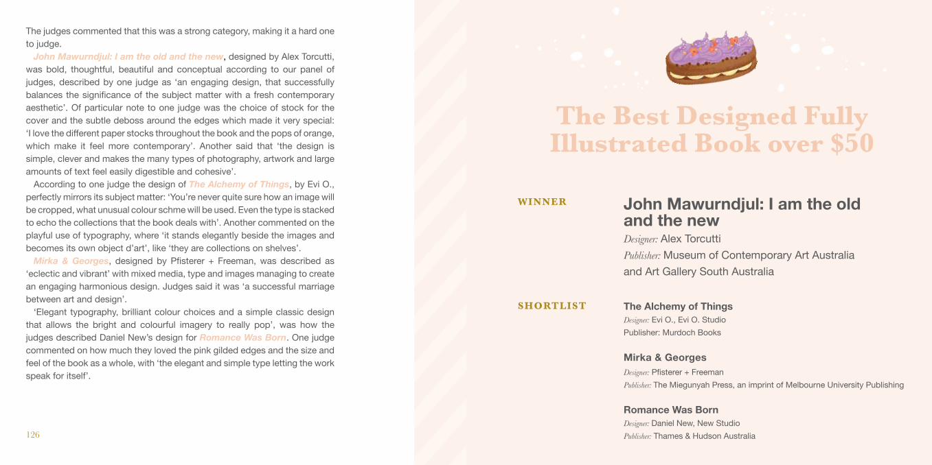
The judges commented that this was a strong category, making it a hard one to judge.
John Mawurndjul: I am the old and the new, designed by Alex Torcutti, was bold, thoughtful, beautiful and conceptual according to our panel of judges, described by one judge as ‘an engaging design, that successfully balances the significance of the subject matter with a fresh contemporary aesthetic’. Of particular note to one judge was the choice of stock for the cover and the subtle deboss around the edges which made it very special: ‘I love the different paper stocks throughout the book and the pops of orange, which make it feel more contemporary’. Another said that ‘the design is simple, clever and makes the many types of photography, artwork and large amounts of text feel easily digestible and cohesive’.
According to one judge the design of The Alchemy of Things, by Evi O., perfectly mirrors its subject matter: ‘You’re never quite sure how an image will be cropped, what unusual colour schme will be used. Even the type is stacked to echo the collections that the book deals with’. Another commented on the playful use of typography, where ‘it stands elegantly beside the images and becomes its own object d’art’, like ‘they are collections on shelves’.
Mirka & Georges, designed by Pfisterer + Freeman, was described as ‘eclectic and vibrant’ with mixed media, type and images managing to create an engaging harmonious design. Judges said it was ‘a successful marriage between art and design’.
‘Elegant typography, brilliant colour choices and a simple classic design that allows the bright and colourful imagery to really pop’, was how the judges described Daniel New’s design for Romance Was Born. One judge commented on how much they loved the pink gilded edges and the size and feel of the book as a whole, with ‘the elegant and simple type letting the work speak for itself’.
The Alchemy of ThingsDesigner: Evi O., Evi O. StudioPublisher: Murdoch Books Mirka & GeorgesDesigner: Pfisterer + FreemanPublisher: The Miegunyah Press, an imprint of Melbourne University Publishing
Romance Was Born Designer: Daniel New, New StudioPublisher: Thames & Hudson Australia
John Mawurndjul: I am the old and the newDesigner: Alex TorcuttiPublisher: Museum of Contemporary Art Australia and Art Gallery South Australia
WINNER
SHORTLIST
The Best Designed Fully Illustrated Book over $50

BE
ST D
ESI
GN
ED
FU
LLY
ILL
UST
RAT
ED
BO
OK
OV
ER
$50
129
BE
ST D
ESI
GN
ED
FU
LLY
ILL
UST
RAT
ED
BO
OK
OV
ER
$50
WINNER
John Mawurndjul: I am the old and the new
Publisher: Museum of Contemporary Art Australia and Art Gallery South AustraliaInternal Designer: Alex Torcutti
Photographer: VariousTypesetter: Alex TorcuttiPrinter: Peachy Print
Designer: Alex Torcutti
128

BE
ST D
ESI
GN
ED
FU
LLY
ILL
UST
RAT
ED
BO
OK
OV
ER
$50
130
SHORTLISTSHORTLIST
BE
ST D
ESI
GN
ED
FU
LLY
ILL
UST
RAT
ED
BO
OK
OV
ER
$50
131
The Alchemy of Things
Mirka & GeorgesDesigner: Evi O., Evi O. Studio
Publisher: Murdoch BooksInternal Designer: Evi O., Evi O. StudioPhotographer: Michael Wee
Typesetter: Evi O., Evi O. StudioPrinter: Leo Paper Group
Publisher: The Miegunyah Press, an imprint of Melbourne University PublishingInternal Designer: Pfisterer + Freeman
Photographer: Robyn Lea PhotographyTypesetter: Pfisterer + FreemanPrinter: 1010 Printing
Designer: Pfisterer + Freeman

BE
ST D
ESI
GN
ED
FU
LLY
ILL
UST
RAT
ED
BO
OK
OV
ER
$50
132
Publisher: Thames & Hudson AustraliaInternal Designer: Daniel New, New StudioPhotographer: Various (refer to book)
Typesetter: Daniel New, New Studio Printer: 1010 Printing
SHORTLIST
Designer: Daniel New, New StudioRomance Was Born

134
Another tough category, our judges commented, with some very clever, bold and unexpected results. One judge noted that not one cover has a picture of food on a plate, and that almost all were either illustrative or typographic.
From the Earth, designed by Daniel New, is ‘beautiful and boldly something else – more art book than cookbook’, according to one judge. ‘It appears to have drawn inspiration from botanical illustration catalogues wof old, though uses beautifully photographed images instead of drawings’, said another. Others called it ‘a fine art book masquerading as a cookbook’ and ‘an insightful way to study vegetables’. One judge said that ‘it has definitely achieved the designer’s intent to create a modern version of an old illustrated botanical book. The design is classic and simple and really lets the stunning photography stand out and speak for itself.’ Others admired the ‘level of finesse in typography, photography and production’, making special mention of the matte-black book-block and the confident use of space, making for ‘a truly sophisticated cookbook’.
Judges loved the bold colours, shapes and typography employed in Evi O.’s design for Tokyo Local, calling it clever, humourous, contemporary and quirky. One judge noted the ‘subtle nod to Japan with the inclusion of the sun and the typography choices’, while another called it ‘accessible and easy to use’.
‘Inviting and joyful’, were two words that one judge used to describe Murray Batten’s design for Little Korea, noting they loved that it was ‘inspired by packaging without being too derivative’. One judge commented: ‘It really takes you into the Korean culture and is a little bit crazy. I love the use of the emojis and icons, and every detail of the book is unique and well thought out: the colour palette, the icons used next to the page numbers, even the balance between recipe photos and photos of Korea’.
The Book of Vermouth, designed by Lauren Bonkowski, is ‘an enticing package’, according to one judge: ‘The layout explores ideas I’ve not see often in a cookbook, with some pages looking more like a typography textbook, which I find it exciting’. Graphic and bold illustrations sit beautifully alongside clever product shots that look like they belong in a fashion shoot.
Tokyo Local: Cult Recipes from the Streets that Make the CityDesigner: Evi O., Evi O. StudioPublisher: Smith Street Books Little KoreaDesigner: Murray BattenPublisher: Smith Street Books
The Book of Vermouth Designer: Lauren BonkowskiPublisher: Hardie Grant Books
From the EarthDesigner: Daniel New, New StudioPublisher: Hardie Grant Books
WINNER
SHORTLIST
Best Designed Cookbook
The Post Pre-press Group

BE
ST D
ESI
GN
ED
CO
OK
BO
OK
137
BE
ST D
ESI
GN
ED
CO
OK
BO
OK
WINNER
From the Earth
Publisher: Hardie Grant BooksInternal Designer: Daniel New, New StudioPhotographer: Brett Stevens
Illustrator: Susannah BlaxillPrinter: 1010 Printing
Designer: Daniel New, New Studio
136

Tokyo Local: Cult Recipes from the Streets that Make the City
BE
ST D
ESI
GN
ED
CO
OK
BO
OK
138
SHORTLISTSHORTLIST
BE
ST D
ESI
GN
ED
CO
OK
BO
OK
139
Little Korea
Designer: Evi O., Evi O. Studio
Publisher: Smith Street BooksInternal Designer: Evi O., Evi O. StudioPhotographer: Alana Dimou
Illustrator: Evi O., Evi O. StudioTypesetter: Evi O., Evi O. StudioPrinter: C&C Offset Printing
Publisher: Smith Street BooksInternal Designer: Murray BattenPhotographer: Billy LawIllustrators: Murray Batten and iStock
Typesetter: Heather Menzies, Studio 31 GraphicsPrinter: C&C Offset Printing
Designer: Murray Batten

BE
ST D
ESI
GN
ED
CO
OK
BO
OK
140
Publisher: Hardie Grant BooksInternal Designer: Lauren BonkowskiPhotographer: Jack Hawkins
Illustrator: Lauren BonkowskiTypesetter: Patrick CannonPrinter: Leo Paper Group
SHORTLIST
Designer: Lauren BonkowskiThe Book of Vermouth
The Australian Book Designers Association thanks McPherson’s Printing Group for their
support of the printing of this catalogue.
Top Related