Unit 21 evaluation
9
UNIT 21: EVALUATION
-
Upload
georgia123456789 -
Category
Documents
-
view
58 -
download
0
Transcript of Unit 21 evaluation
UNIT 21:EVALUATIO
N
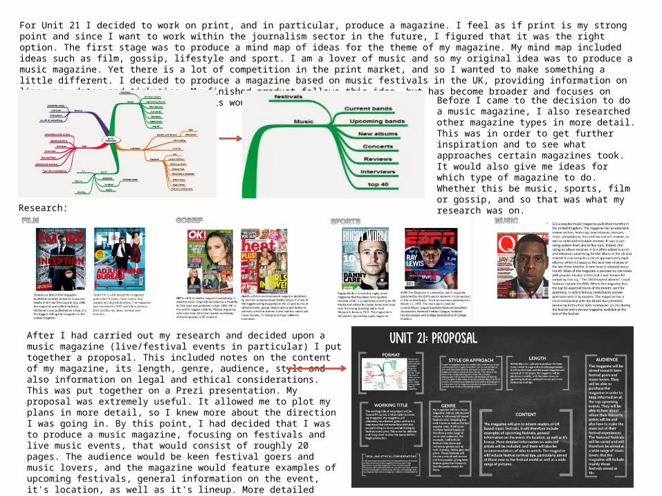
For Unit 21 I decided to work on print, and in particular, produce a magazine. I feel as if print is my strong point and since I want to work within the journalism sector in the future, I figured that it was the right option. The first stage was to produce a mind map of ideas for the theme of my magazine. My mind map included ideas such as film, gossip, lifestyle and sport. I am a lover of music and so my original idea was to produce a music magazine. Yet there is a lot of competition in the print market, and so I wanted to make something a little different. I decided to produce a magazine based on music festivals in the UK, providing information on line ups, dates and ticketing. My finished product follows this idea, but has become broader and focuses on live music events in general, as this would allow more content.
Before I came to the decision to do a music magazine, I also researched other magazine types in more detail. This was in order to get further inspiration and to see what approaches certain magazines took. It would also give me ideas for which type of magazine to do. Whether this be music, sports, film or gossip, and so that was what my research was on.
Research:
After I had carried out my research and decided upon a music magazine (live/festival events in particular) I put together a proposal. This included notes on the content of my magazine, its length, genre, audience, style and also information on legal and ethical considerations. This was put together on a Prezi presentation. My proposal was extremely useful. It allowed me to plot my plans in more detail, so I knew more about the direction I was going in. By this point, I had decided that I was to produce a music magazine, focusing on festivals and live music events, that would consist of roughly 20 pages. The audience would be keen festival goers and music lovers, and the magazine would feature examples of upcoming festivals, general information on the event, it's location, as well as it's lineup. More detailed information on selected artists would be included, and there will also be recommendations of who to watch.
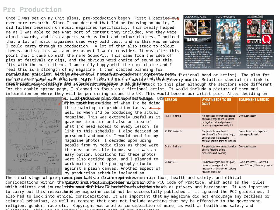
Once I was set on my unit plans, pre-production began. First I carried out even more research. Since I had decided that I’d be focusing on music, I did further research on music magazines specifically. This really helped me as I was able to see what sort of content they included, who they were aimed towards, and also aspects such as font and colour choices. I noticed that a lot of music magazines used very bold text, and so this was an idea I could carry through to production. A lot of them also stuck to colour themes, and so this was another aspect I would consider. It was after this point that I came up with the name SoundPit. This came from the idea of pits at festivals or gigs, and the obvious word choice of sound as this fits with the music theme. I am really happy with the name choice and I feel this is a strength of my magazine. I then started planning for particular articles. Within the unit I needed to produce a contents page, a front cover and a double page spread. My original plan stated that my front page would feature the logo of my magazine & it’s name
Pre Production
‘Sound Pit’, as well as a picture that I had taken myself (a picture of a fictional band or artist). The plan for the contents page was to have it split into different parts: featured, every month, Metallica special (in link to them headlining reading) and an others category. I roughly stuck to this plan although the sections were different. For the double spread page, I planned to focus on a fictional artist. It would include a picture of them and information on where they will be performing around the UK. This would become our artist pick. After deciding on the content of my magazine, I sketched a plan for my front page. Drawing is not my strong point, however it gave me a rough idea of how I’d lay everything out. I also produced a production schedule. This gave
me an idea of when I’d be doing the remaining pre production tasks, as well as when I’d be producing the actual magazine. This was extremely useful as it gave me structure and also an idea of what I’d need access to every lesson. In link to this schedule, I also decided on personnel and models I would need for my magazine photos. I decided upon using people from my media class as these were the most accessible to me, so it was an easy option. Locations for these photos were also decided upon, and I planned to work mainly in the photography studio against a plain canvas. Another aspect of my production schedule included an equipment list. I would need a camera, tripod and Photoshop. Planning all of this was definitely beneficial within the unit. The final stage of pre-production was to do in depth research on laws, health and safety, and ethical considerations within the print
industry. I focused a lot on the PCC Code of Practice, which acts as the ‘rules’ which editors and journalists must follow. This includes aspects such as privacy and harassment. It was important to carry out this research as my magazine could not be successfully published if it ignored the PCC guidelines. I also had to look into ethical considerations. It was important that my magazine did not encourage any reckless or criminal behaviour, as well as content that does not include anything that may be offensive to the government, religion, gender, race etc. Copyright was another consideration of mine, as well as health and safety and clearances. This was an extremely important part of pre production.
…Pre ProductionI am extremely happy with how my pre-production went. I feel as if I managed my time really well, and this was down to having a
schedule in place. I think that I came up with some really good ideas during this time, and they helped me to produce a successful final magazine. It also meant that my actual production was a lot faster and organised, as I had plans in place. Although I am happy with my pre-production and the ideas inspired from it, my final magazine differs somewhat, and my plans for content were altered slightly.
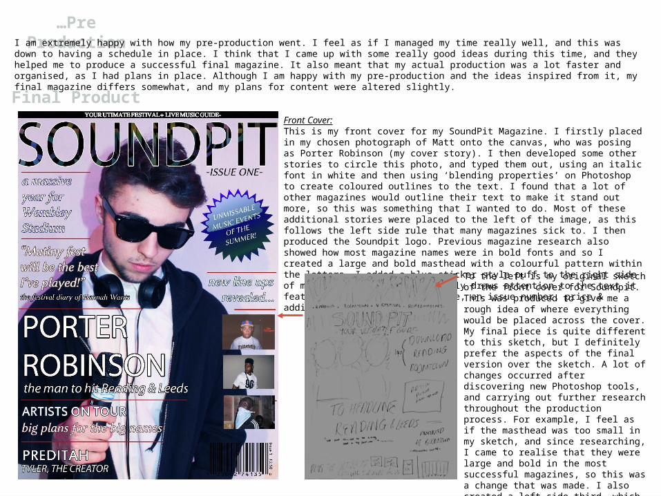
Final ProductFront Cover:This is my front cover for my SoundPit Magazine. I firstly placed in my chosen photograph of Matt onto the canvas, who was posing as Porter Robinson (my cover story). I then developed some other stories to circle this photo, and typed them out, using an italic font in white and then using ‘blending properties’ on Photoshop to create coloured outlines to the text. I found that a lot of other magazines would outline their text to make it stand out more, so this was something that I wanted to do. Most of these additional stories were placed to the left of the image, as this follows the left side rule that many magazines sick to. I then produced the Soundpit logo. Previous magazine research also showed how most magazine names were in bold fonts and so I created a large and bold masthead with a colourful pattern within the letters. I added a blue sticker style puff to the right side of my magazine and this instantly draws attention to the text it features. I also added a barcode, an issue number, price & additional images.To the left is my original sketch of the
front cover for Soundpit. This was produced to give me a rough idea of where everything would be placed across the cover. My final piece is quite different to this sketch, but I definitely prefer the aspects of the final version over the sketch. A lot of changes occurred after discovering new Photoshop tools, and carrying out further research throughout the production process. For example, I feel as if the masthead was too small in my sketch, and since researching, I came to realise that they were large and bold in the most successful magazines, so this was a change that was made. I also created a left side third, which was not a clear plan within my sketch.
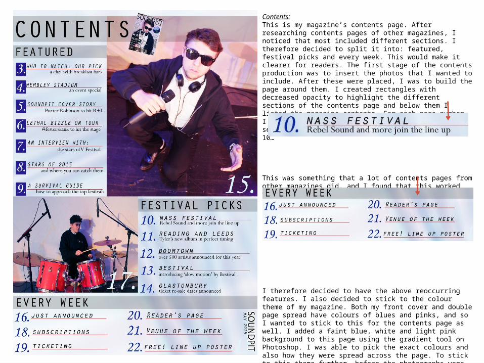
Contents:This is my magazine’s contents page. After researching contents pages of other magazines, I noticed that most included different sections. I therefore decided to split it into: featured, festival picks and every week. This would make it clearer for readers. The first stage of the contents production was to insert the photos that I wanted to include. After these were placed, I was to build the page around them. I created rectangles with decreased opacity to highlight the different sections of the contents page and below them I listed the magazine contents. For each page number, I decided to give a page title and then a brief sentence. For example, this is the listing for page 10…
This was something that a lot of contents pages from other magazines did, and I found that this worked well. I separated the title and the sentence with a red line using the line tool. Another aspect that magazine research taught me is that it is important to have reoccurring features of the magazine…
I therefore decided to have the above reoccurring features. I also decided to stick to the colour theme of my magazine. Both my front cover and double page spread have colours of blues and pinks, and so I wanted to stick to this for the contents page as well. I added a faint blue, white and light pink background to this page using the gradient tool on Photoshop. I was able to pick the exact colours and also how they were spread across the page. To stick to this theme further, before the photographs were placed onto the canvas, they were edited. I brought out the blues and pinks using the colour balance section on Photoshop. This made them fit into the page especially well. Another tool I used was the shape tool. This was used to produce the blue blocks around some of the page numbers.
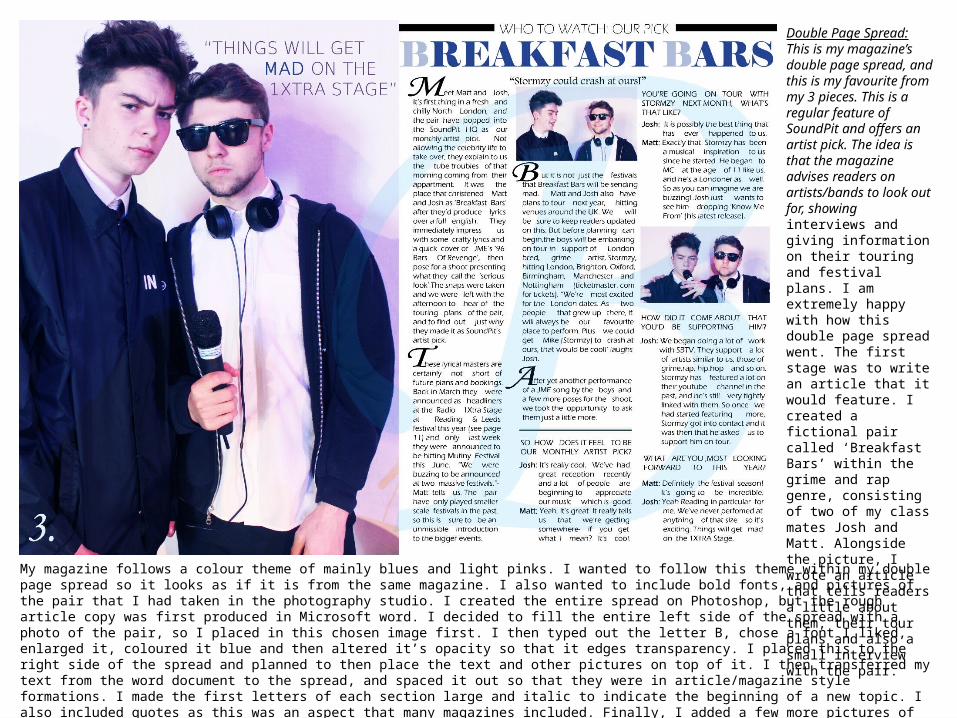
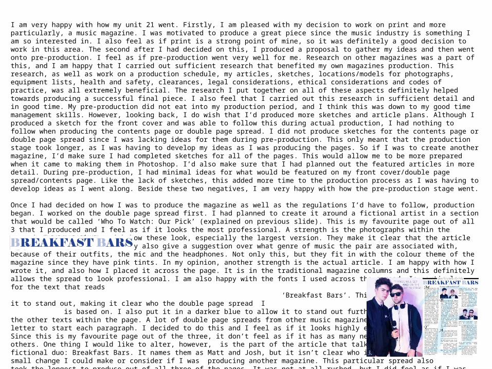
Double Page Spread:This is my magazine’s double page spread, and this is my favourite from my 3 pieces. This is a regular feature of SoundPit and offers an artist pick. The idea is that the magazine advises readers on artists/bands to look out for, showing interviews and giving information on their touring and festival plans. I am extremely happy with how this double page spread went. The first stage was to write an article that it would feature. I created a fictional pair called ‘Breakfast Bars’ within the grime and rap genre, consisting of two of my class mates Josh and Matt. Alongside the picture, I wrote an article that tells readers a little about them, their tour plans and also a small interview with the pair.
My magazine follows a colour theme of mainly blues and light pinks. I wanted to follow this theme within my double page spread so it looks as if it is from the same magazine. I also wanted to include bold fonts, and pictures of the pair that I had taken in the photography studio. I created the entire spread on Photoshop, but the rough article copy was first produced in Microsoft word. I decided to fill the entire left side of the spread with a photo of the pair, so I placed in this chosen image first. I then typed out the letter B, chose a font I liked, enlarged it, coloured it blue and then altered it’s opacity so that it edges transparency. I placed this to the right side of the spread and planned to then place the text and other pictures on top of it. I then transferred my text from the word document to the spread, and spaced it out so that they were in article/magazine style formations. I made the first letters of each section large and italic to indicate the beginning of a new topic. I also included quotes as this was an aspect that many magazines included. Finally, I added a few more pictures of the music pair. I am extremely happy with how this double page spread has turned out and I feel as if it looks very professional, and ties in with my other pages.
I am very happy with how my unit 21 went. Firstly, I am pleased with my decision to work on print and more particularly, a music magazine. I was motivated to produce a great piece since the music industry is something I am so interested in. I also feel as if print is a strong point of mine, so it was definitely a good decision to work in this area. The second after I had decided on this, I produced a proposal to gather my ideas and then went onto pre-production. I feel as if pre-production went very well for me. Research on other magazines was a part of this, and I am happy that I carried out sufficient research that benefited my own magazines production. This research, as well as work on a production schedule, my articles, sketches, locations/models for photographs, equipment lists, health and safety, clearances, legal considerations, ethical considerations and codes of practice, was all extremely beneficial. The research I put together on all of these aspects definitely helped towards producing a successful final piece. I also feel that I carried out this research in sufficient detail and in good time. My pre-production did not eat into my production period, and I think this was down to my good time management skills. However, looking back, I do wish that I’d produced more sketches and article plans. Although I produced a sketch for the front cover and was able to follow this during actual production, I had nothing to follow when producing the contents page or double page spread. I did not produce sketches for the contents page or double page spread since I was lacking ideas for them during pre-production. This only meant that the production stage took longer, as I was having to develop my ideas as I was producing the pages. So if I was to create another magazine, I’d make sure I had completed sketches for all of the pages. This would allow me to be more prepared when it came to making them in Photoshop. I’d also make sure that I had planned out the featured articles in more detail. During pre-production, I had minimal ideas for what would be featured on my front cover/double page spread/contents page. Like the lack of sketches, this added more time to the production process as I was having to develop ideas as I went along. Beside these two negatives, I am very happy with how the pre-production stage went.
Once I had decided on how I was to produce the magazine as well as the regulations I’d have to follow, production began. I worked on the double page spread first. I had planned to create it around a fictional artist in a section that would be called ‘Who To Watch: Our Pick’ (explained on previous slide). This is my favourite page out of all 3 that I produced and I feel as if it looks the most professional. A strength is the photographs within the spread. I am very happy with how these look, especially the largest version. They make it clear that the article is on an artist/music duo. They also give a suggestion over what genre of music the pair are associated with, because of their outfits, the mic and the headphones. Not only this, but they fit in with the colour theme of the magazine since they have pink tints. In my opinion, another strength is the actual article. I am happy with how I wrote it, and also how I placed it across the page. It is in the traditional magazine columns and this definitely allows the spread to look professional. I am also happy with the fonts I used across the spread. In particular, for the text that reads ‘Breakfast Bars’. This is very bold and allows it to stand out, making it clear who the double page spread I is based on. I also put it in a darker blue to allow it to stand out further. I am also happy with the other texts within the page. A lot of double page spreads from other music magazines used an enlarged italic letter to start each paragraph. I decided to do this and I feel as if it looks highly effective and professional. Since this is my favourite page out of the three, it don’t feel as if it has as many negative points as the others. One thing I would like to alter, however, is the part of the article that talks about the names of the fictional duo: Breakfast Bars. It names them as Matt and Josh, but it isn’t clear who is who, and this is just asmall change I could make or consider if I was producing another magazine. This particular spread also took the longest to produce out of all three of the pages. It was not at all rushed, but I did feel as if I was spending a little too much time on producing the actual written article. If I was to produce another magazine, I’d ensure that I made more plans for the article during pre-production so I knew in hindsight exactly what I’d be writing about. This would make the writing process a lot faster. Beside these negatives, I am extremely happy with my double page spread. It is definitely my favourite out of the three pages that I produced for SoundPit and it is the one I am proudest of.

I then went on to produce the contents page. I wanted to produce this before the front cover as it would allow me to decide on what stories would need to be shown on the front. I am happy with how this particular page turned out, however I feel as if it is the weakest out of the three that I have produced. One strength is how the contents is clearly split into different sections. I followed this advice from other music magazines, and I find that this allows it to look professional, as well as making it clearer to the reader. I am also happy with the way I highlighted these sections- using blocks with a decreased opacity and a title within them. In my opinion, this looks effective and successful. I also find that the screenshot of the front cover towards the top is a good aspect of the contents page. This allows the contents page to relate back to the issue it is focused on. Although this is not necessary, it is a feature that a lot of other contents pages of magazines will have, and is an effective addition to the page.Another strength, I feel, is the fonts I have used across the page. The different sizes and styleshave allowed certain sections to be separated from each other. For example, I have used larger text to highlight the start of a section, and then I have used smaller text to list those pages within that section, followed by even smaller text to discuss those pages further. I am happy that this has created a professional appearance, and I feel as if overall, my font choices have been successful. Although I can gather some positives from my contents page, I am not happy with a lot of it. One negative is the photographs I have used. If I was to begin production of SoundPit again, I would have taken a lot more photographs of different people. I feel as if I have used the same subjects/fictional artists too much, and that my magazine is too dominated by images of my class mates Josh and Matt, even if they are posing as different people within the photos. So taking photographs of other people would allow me to have more choice when putting together the pages. I think that this contents page would have looked a lot better if I had used different photographs, of different people as well. It may also look better to just have used one main picture instead. I could have used one large photograph of a fictional artist and built the contents page around that instead. I have since seen contents pages that have done this, and I definitely find that these look a lot more professional. Another visual negative is that the red lines that feature in the page vary in size. Although this is hardly noticeable, it highlights that I most likely rushed a little too much, and should have spent more time perfecting the page. This was definitely the quickest page to produce, and this is maybe why it is my least favourite. Despite it’s negatives, I am reasonably happy with how it turned out and it simply allows me to see what I’d do differently next time.
Finally, I produced the front cover of SoundPit. I feel as if this went well and looks quite professional. One strength is the main cover photo. I am extremely happy with this shot, and I find that it successfully advertises/presents the magazine as a MUSIC magazine. My aim was to make the genre of the magazine clear through the front cover, and In my opinion I have achieved this, with the photograph being a big part of that. I am also happy with the fonts I used. The masthead is bold and bright, allowing it to stand out, and the cover stories are clear due to coloured outlines. I am glad that I decided to use fonts and tools to do this, as this means that the front cover is a stand out overall. I am also happy with the colours I used within the front cover. All of my pages follow a theme of light blues and pinks, and this page in particular sticks to it extremely well. Finally, I am happy that the cover shows a clear genre and target audience. The photograph and the stories surrounding it, as well as the masthead all reference a music magazine, and this makes it clear that it is a magazine aimed towards music lovers. The story types and the texts: ‘your ultimate festival and live music guide’ and ‘unmissable music events of the summer’ then tells readers that it focuses on the live music events. So I am happy with how clear my ideas are. One negative of the front cover is that I feel it is slightly overcrowded. It features a lot of stories, and also pictures, and I am concerned that it is just a little too busy. If I was to re-create this front cover, I’d most likely remove some aspects and make it a little less crowded. I’d also alter some of the texts. During production, I purposely started sentences without capital letters as I felt that this created a laid back effect. But now looking at the front cover, this looks highly unprofessional and this is definitely something I’d avoid doing in a re-production. Also, the artists names and festival names begin with capitals, and so this mix of capitals and lower case definitely does not work. Apart from this, I am very happy with how my front cover turned out.
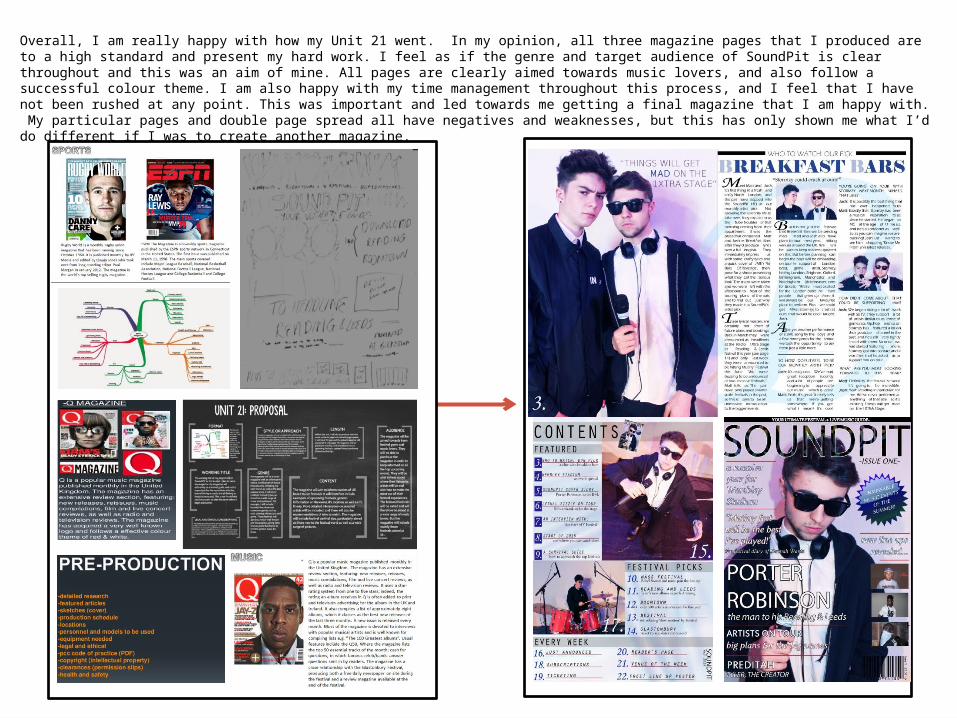
Overall, I am really happy with how my Unit 21 went. In my opinion, all three magazine pages that I produced are to a high standard and present my hard work. I feel as if the genre and target audience of SoundPit is clear throughout and this was an aim of mine. All pages are clearly aimed towards music lovers, and also follow a successful colour theme. I am also happy with my time management throughout this process, and I feel that I have not been rushed at any point. This was important and led towards me getting a final magazine that I am happy with. My particular pages and double page spread all have negatives and weaknesses, but this has only shown me what I’d do different if I was to create another magazine.