Unit 18 evaluation
3
Unit 18 Evaluation My group consist of me and Michael our product is called Vitality gum, our slogan is “All the vitality, double the taste” we chose the “Vitality” because it means energy and we chose our slogan because it rolled of the tongue and sounded professional, we started with our advertising company which we named British Television Marketing, the name worked because it made it seem like we created it for adverts around Britain. The colors that we were going to choose were red and blue but we changed it to a green colour because we thought it was better suited as green resembles Healthiness. We used a variety of programs while creating our product, we used Photoshop to create our adverts website advert also we used Prezi to create our presentation. Overall I like our gum design and the design of our adverts, except the magazine advert, if I could do it again I would make the packaging bigger, so you can see it clearly. In my opinion, it looks like a real gum packaging but the adverts are a little rushed and could probably look better. 1. Open Photoshop and enter the correct size 2. I then put a background in that I 3. Then I got the picture of our gum and put it on top of background. 4. Next I typed up our slogan in appropriate
-
Upload
hahahadetonate -
Category
Technology
-
view
46 -
download
0
Transcript of Unit 18 evaluation

Unit 18 Evaluation
My group consist of me and Michael our product is called Vitality gum, our slogan is “All the vitality, double the taste” we chose the “Vitality” because it means energy and we chose our slogan because it rolled of the tongue and sounded professional, we started with our advertising company which we named British Television Marketing, the name worked because it made it seem like we created it for adverts around Britain. The colors that we were going to choose were red and blue but we changed it to a green colour because we thought it was better suited as green resembles Healthiness.
We used a variety of programs while creating our product, we used Photoshop to create our adverts website advert also we used Prezi to create our presentation. Overall I like our gum design and the design of our adverts, except the magazine advert, if I could do it again I would make the packaging bigger, so you can see it clearly. In my opinion, it looks like a real gum packaging but the adverts are a little rushed and could probably look better.
1. Open Photoshop and enter the correct size for an A4 sheet.
2. I then put a background in that I liked.
3. Then I got the picture of our gum and put it on top of background.
4. Next I typed up our slogan in appropriate colors.
5. I put our logo on the background, at the top so it could be seen easily.
6. I then put the image of the person holding our gum at the bottom.

We followed our storyboard to a certain extent, but we changed a few things, some of it we couldn’t do because we didn’t have the correct equipment, however, we followed the storyboard to the best of our abilities.
For our advert, I helped film everything, as well as helping a little with the editing I helped with some of the slow motion effects, we put our product name in the bottom left corner and the slogan at the top.
6. I then put the image of the person holding our gum at the bottom.
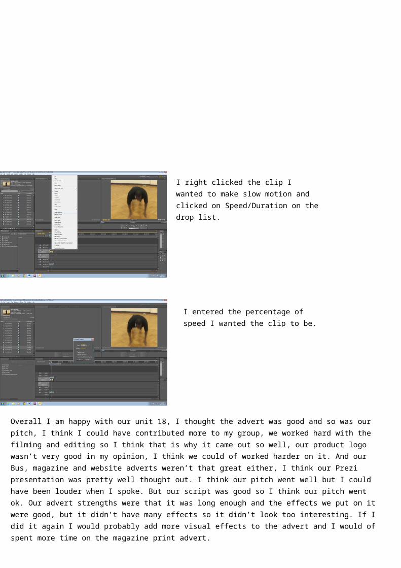
I right clicked the clip I wanted to make slow motion and clicked on Speed/Duration on the drop list.
I entered the percentage of speed I wanted the clip to be.
Overall I am happy with our unit 18, I thought the advert was good and so was our pitch, I think I could have contributed more to my group, we worked hard with the filming and editing so I think that is why it came out so well, our product logo wasn’t very good in my opinion, I think we could of worked harder on it. And our Bus, magazine and website adverts weren’t that great either, I think our Prezi presentation was pretty well thought out. I think our pitch went well but I could have been louder when I spoke. But our script was good so I think our pitch went ok. Our advert strengths were that it was long enough and the effects we put on it were good, but it didn’t have many effects so it didn’t look too interesting. If I did it again I would probably add more visual effects to the advert and I would of spent more time on the magazine print advert.