Sketchbook 4 - Modernism and PostModernism
45
Form follows function An exploration of Modernism and Post Modernism Alice Wells U1255598
-
Upload
alice-wells -
Category
Documents
-
view
247 -
download
2
description
Modernism and PostModernism sketchbook
Transcript of Sketchbook 4 - Modernism and PostModernism
Form follows functionAn exploration of Modernism and
Post Modernism
Alice WellsU1255598
ModernismIntroduction
Graphic design is really a product of Modernism. According to A History of Graphic Design by Philip B. Meggs, it was coined in 1922 by William Addison Dwiggins, a book designer. He basically used the term to de-scribe his activities. “A graphic designer is someone who brings structural order and visualform to printed com-
munications.” Of course, today it is not just limited to print. Whereever you see text and image, someone or some people have organized the visuals. The internet, television, film, computer graphics, clothing, and of course printed
matter can be included in the definition of graphic design. If you look at visual communication before 1900 and after 1900, there will be a noticeable difference. Modern graphic design’s roots can be found in Modern Art.
Modernism was a reductive movement. Form was simplified as a way to break from pictorial representation. The beginning of the 20th century was the start of radical political, social, cultural and
economic changes, the time of radical scientific and technological advances. Life was being changed forever by the inventions of the automobile, airplane, motion pictures, WW1 shook Europe off of its foundations. New ways of thinking were needed. Marxist theory was the basis of some of their political, social and economic
changes. There was a rise of radical political revolutions that spawned the rise of Nazi Germany, Fascist Italy, Communist Russia. The visual artist felt that the traditions of the past did not represent the time they were living
in. Pictorial representation could not capture the changes of the times, thus Modernism was created.
Developments began to give a new meaning to what was termed “modernism”: It embraced discontinuity, rejecting smooth change in everything from biology to fictional character development and filmmaking.It
approved disruption, rejecting or moving beyond simple realism in literature and art, and rejecting or dramatically altering tonality in music.
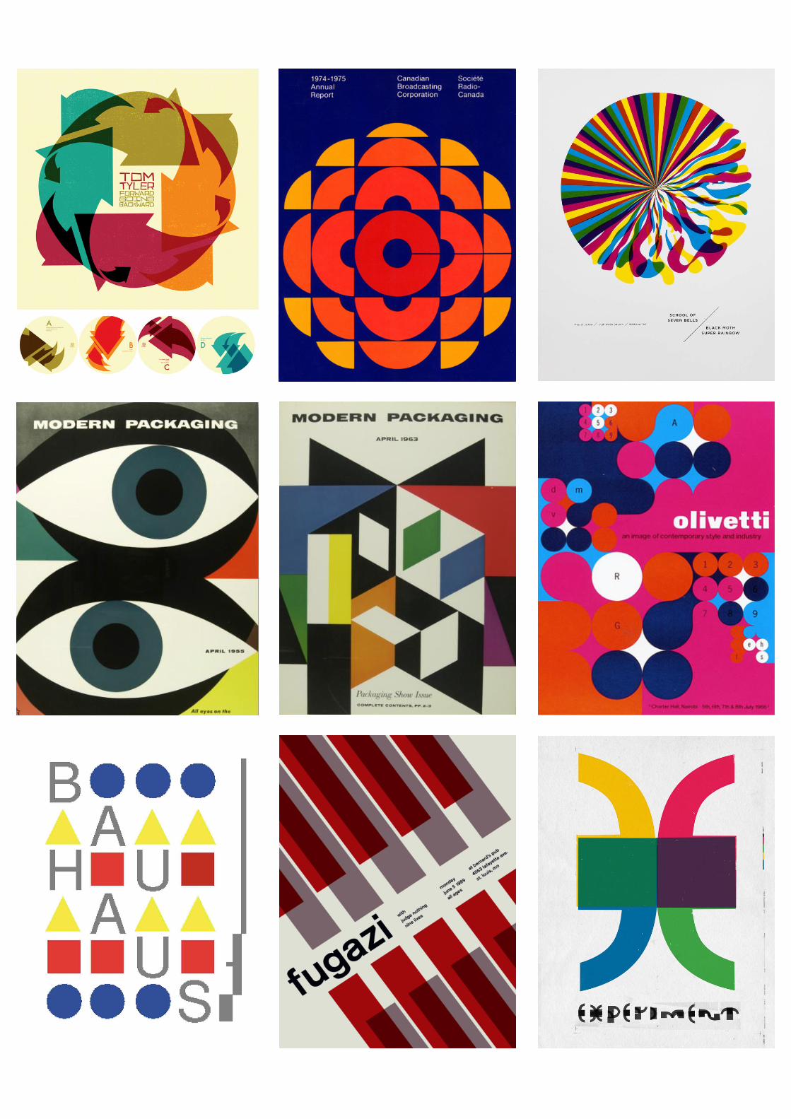
Certain movements such as Expressionism, Fauvism, Cubism, Futurism, Dada, Surrealism, De Stijl, Suprematism and Constructivism. Expressionism and Fauvism didn’t have much influence on graphic design. It
was perhaps considered too primal or subjective. The other movements do seem to have some kind of analytical structure even if some of it looked crude or primitive.Modernism, while still “progressive”,
increasingly saw traditional forms and traditional social arrangements as hindering progress, and therefore recast the artist as a revolutionary, overthrowing rather than enlightening.
Modernist art style derived from the influences of Cubism, most notably the work of Picasso. Modernist art was all about fragmentation versus order, the abstract and the symbolic. The newfound ‘machine aesthetic’
contradicted the old romantic, traditional styles, instead focusing on sharp lines, multi-facets and the lack of a human element. Thus Modernism, which had been a minority taste before the war, came to define the 1920s. It
appeared in Europe in such critical movements as Dada and then in constructive movements such as surrealism, as well as in smaller movements such as the Bloomsbury Group, which included British
novelists Virginia Woolf and E. M. Forster. Again, impressionism was a precursor: breaking with the idea of national schools, artists and writers adopted ideas of international movements. Surrealism, cubism, and Bau-
haus, are all examples of movements that rapidly found adopters far beyond their geographic origins.
“A style or movement in the arts that aims to break with classical and traditional forms”
Movementswithin and around Modernism
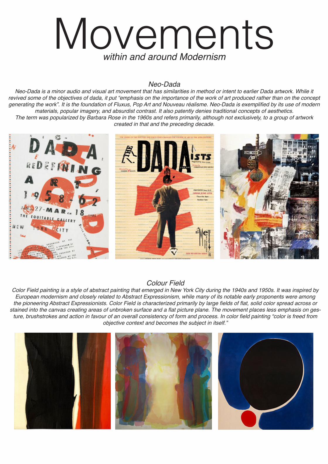
Neo-DadaNeo-Dada is a minor audio and visual art movement that has similarities in method or intent to earlier Dada artwork. While it
revived some of the objectives of dada, it put “emphasis on the importance of the work of art produced rather than on the concept generating the work”. It is the foundation of Fluxus, Pop Art and Nouveau réalisme. Neo-Dada is exemplified by its use of modern
materials, popular imagery, and absurdist contrast. It also patently denies traditional concepts of aesthetics.The term was popularized by Barbara Rose in the 1960s and refers primarily, although not exclusively, to a group of artwork
created in that and the preceding decade.
Colour FieldColor Field painting is a style of abstract painting that emerged in New York City during the 1940s and 1950s. It was inspired by
European modernism and closely related to Abstract Expressionism, while many of its notable early proponents were among the pioneering Abstract Expressionists. Color Field is characterized primarily by large fields of flat, solid color spread across or
stained into the canvas creating areas of unbroken surface and a flat picture plane. The movement places less emphasis on ges-ture, brushstrokes and action in favour of an overall consistency of form and process. In color field painting “color is freed from
objective context and becomes the subject in itself.”
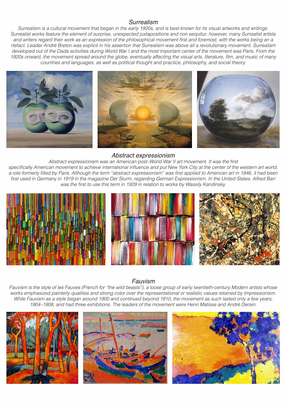
Abstract expressionismAbstract expressionism was an American post–World War II art movement. It was the first
specifically American movement to achieve international influence and put New York City at the center of the western art world, a role formerly filled by Paris. Although the term “abstract expressionism” was first applied to American art in 1946, it had been first used in Germany in 1919 in the magazine Der Sturm, regarding German Expressionism. In the United States, Alfred Barr
was the first to use this term in 1929 in relation to works by Wassily Kandinsky.
SurrealismSurrealism is a cultural movement that began in the early 1920s, and is best known for its visual artworks and writings.
Surrealist works feature the element of surprise, unexpected juxtapositions and non sequitur; however, many Surrealist artists and writers regard their work as an expression of the philosophical movement first and foremost, with the works being an a
rtefact. Leader André Breton was explicit in his assertion that Surrealism was above all a revolutionary movement. Surrealism developed out of the Dada activities during World War I and the most important center of the movement was Paris. From the
1920s onward, the movement spread around the globe, eventually affecting the visual arts, literature, film, and music of many countries and languages, as well as political thought and practice, philosophy, and social theory.
FauvismFauvism is the style of les Fauves (French for “the wild beasts”), a loose group of early twentieth-century Modern artists whose works emphasized painterly qualities and strong color over the representational or realistic values retained by Impressionism.
While Fauvism as a style began around 1900 and continued beyond 1910, the movement as such lasted only a few years, 1904–1908, and had three exhibitions. The leaders of the movement were Henri Matisse and André Derain.

Dada1920’s modernism
A brief historyDada began as a literary movement in 1916, when the poet Hugo Ball started the Cabaret Voltaire in Zurich. Despite
Dadaists declaring themselves, “anti-art”, they made lasting contributions to graphic design. Their work is characterized by chance placement and absurd titles.
Elements of the Dada movementThe Dadaists also introduced the concept of photomontage, combining parts of photographs to create new images. Dada artists
and writers stood for anything and everything that contradicted convention and tradition. Profoundly affected by the horrors of the First World War, their attitude was one of cynicism and disillusion. In place of aestheticism and beauty, they championed
randomness and disorder. In place of meaning they advocated nonsense. And in place of order, they espoused anarchy. Posters of the period displayed deliberately chaotic layouts - text read in all different directiojns and there were characteristically
profligate combinatiojns of fonts, symbold, and hand-drawn letterforms. Typography
Bold, condensed, sans-serif typefaces are typical of Dadaist graphic design, as are one-off hand-drawn letterforms. Text was rarely laid out in left-to-right reading blocks. Instead, designers experimented with expressive layouts in which type read
veritcally or diagonally, often in broken measures and overlapping itself.Colour
Black and red are the colours to start with if you are trying to capture the feel of Dadaist design. Set blocks of type in two contrasting colours and experiment with positioning them seemingly at random seems to be the best way to achieve the Dadaist
look with arranging things within a confined space. Muted yellow and orange, blues or browns are sometimes used as a background or for blocking-in areas of colour.
Like constructivists , Dada designs were created using typfe, rules, and geometric shapes. Layouts followed the ethic of disorder, and did not adhere to any rigid grid system. However, a degree of regularity crept in as Dadaist ideas were absorbed
by commercial artists. Typical Dada-inspired typographic arrangements. The rules are there to be broken: type can be orientated in any direction, or overlaid so the lines of text interact with each other. Legibility takes second place to ideology.
De Stijl1920’s modernism
A brief history De Stijl (the style) was founded in 1917 by the Dutch designer, painter and writer Theo van Doesburg, who edited the
movement’s journal of the same name. De Stijl dedicated itself to a utopian future that rejected extravagance in favour of economy. De Stijl was presented initially by the Netherlands’ most influential architect, H.P Berlage, who defined the concept as “unity in plurality.” Berlage subscribed to the belief that all design should serve the community spiritually as well as functionality.
De Stijl design was rigidly mathematical, aiming at total abstraction, paring the design back to simple geometric shapes constructed with primary colours. One of van Deosburg’s colleagues, Piet Mondrian, applied these princples of orderliness and precision to his art. Followers of the movement who practiced graphic design introduced the ideals into the commercial world
through advertising and packaging, and its influence on contemporary design has been widespread.
Colour: De Stijl design was based on the rectangle. The colours used were black, white and grey, and the three primary colours. Fonts :Many simplified geometric typefaces have been introduced by contemporary type foundaries to evoke the essence of De
Stijl.
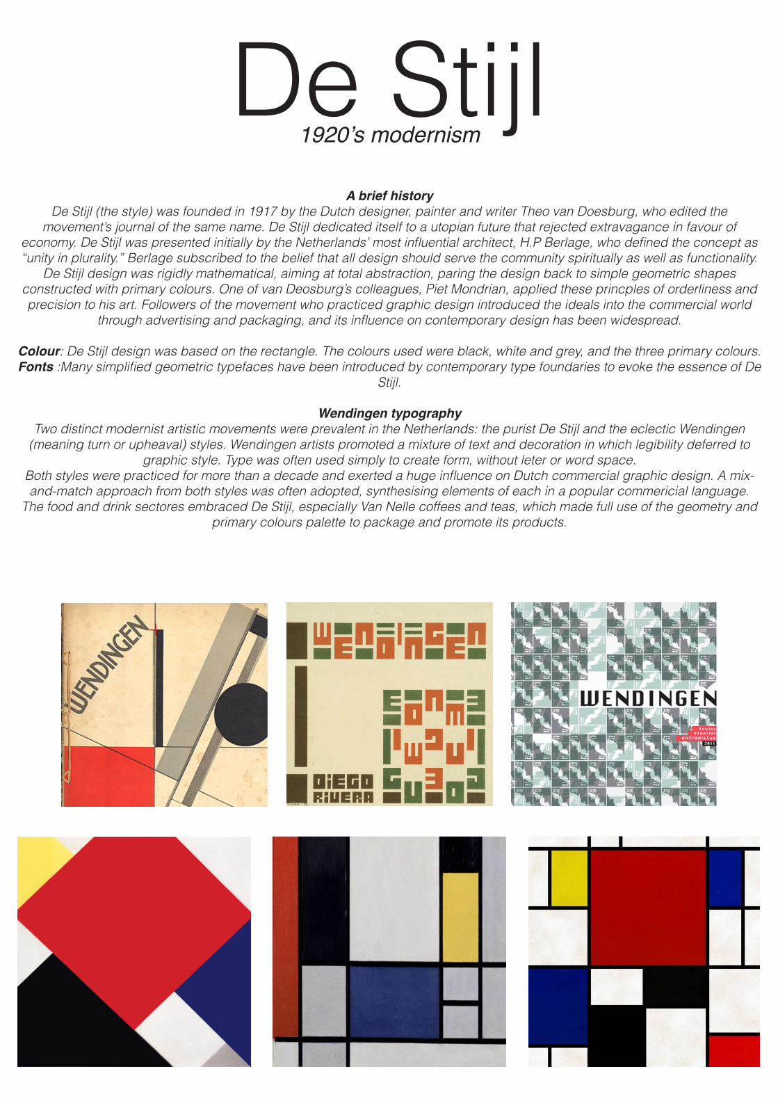
Wendingen typographyTwo distinct modernist artistic movements were prevalent in the Netherlands: the purist De Stijl and the eclectic Wendingen
(meaning turn or upheaval) styles. Wendingen artists promoted a mixture of text and decoration in which legibility deferred to graphic style. Type was often used simply to create form, without leter or word space.
Both styles were practiced for more than a decade and exerted a huge influence on Dutch commercial graphic design. A mix-and-match approach from both styles was often adopted, synthesising elements of each in a popular commericial language.
The food and drink sectores embraced De Stijl, especially Van Nelle coffees and teas, which made full use of the geometry and primary colours palette to package and promote its products.
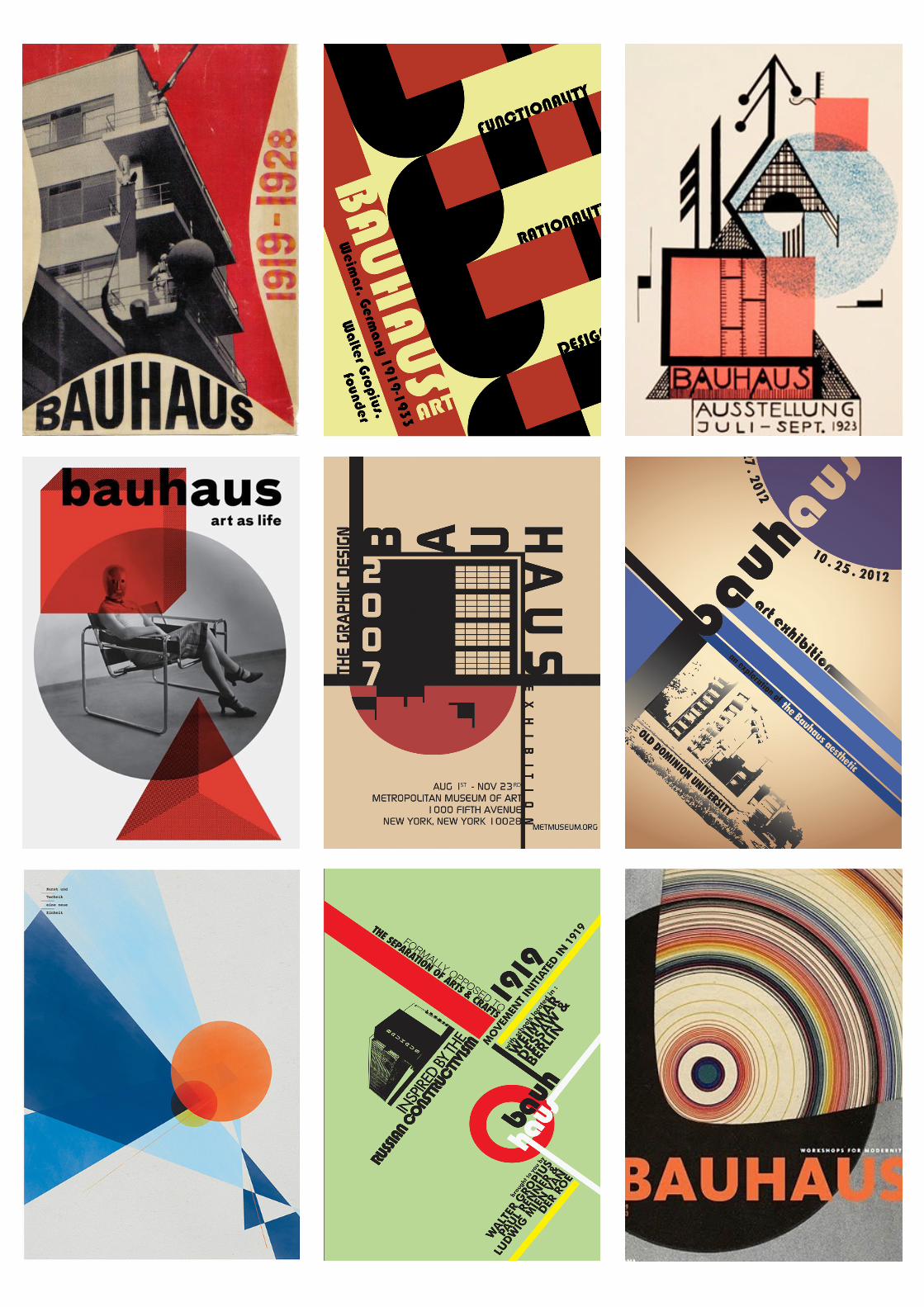
BauhausHistory of Bauhaus
When the staatliches Bauhaus opened its doors in Weimar on April 1st 1919, no one could have predicted what a huge influence it would have on contemporary design. Under the directorship of Walter Gropius, the school’s progressive teaching
practices and passion for functionality spanned the creative disciplines. Everything from architecture and graphics to furniture and product design were shaped by this new-found modern aesthetic. It wasn’t until the appointment of Laszlo Moholy-Nagy in
1923, who introduced the revolutionary idea of New Typography to the school, that graphic design and, more specifically, typography began to play a central role. After designing the catalog for the 1923 Bauhaus exhibition and taking over the
typography of the Bauhaus’ book, Moholy-Nagy went onto develop the school’s distinct identity.
ColourColour was used sparingly by the Bauhaus designers. Posters and display material were created using neutral backgrounds with spot colour added by text, rules, and geometric shapes. The variation in colour was kept to a minimum, with only two or
three colours used at one time.
FontsFirst attending the Bauhaus as a student, Herbert Bayer became a member of staff in 1925, teaching the principles of modern typography. Bayer advocated what he called Kleinschreibug (small writing), which used all lowercase letters for text, and only capitals for display design. In 1926 Bayer designed the celebrated Universal typeface, based on the circle. There are several
contemporary digital sans-serif typefaces that reflect the essence of fonts used by the New Typographers. Though designed in 1936 for the German Institute for Industrial Standards as the standard of font for the areas of technology, traffic, administration
and business. Din uses a legible, straightforward design that closely resembles the hand-drawn letters of the previous decade.
Swiss DesignThis progressive, radical movement in graphic design is not concerned with the graphic design in Switzerland, but rather with the new style that had been proposed, attacked and defended in the 1920s in Switzerland. Keen attention to detail, precision,
craft skills, system of education and technical training, a high standard of printing as well as a clear refined and inventive lettering and typoraphy laid out a foundation for a new movement that has been exported worldwide in 1960s to become an
international style.
Emerging from the modernist and constructivist ideals, the Swiss Style can be defined as an authentic pursue for simplicity – the beauty in the underlines of a purpose, not beauty as a purpose in itself. The principle “form follows function” became a battle-cry
of Modernist architects after the 1930s. As a consequence of this principle, most of the Swiss Style craft is devoted to the minimal elements of style such as typography and content layout rather than on textures and illustrations.
GridsGrid lines form the foundation for Swiss style design and they present a sense of uniformity to the viewers. It serves as a frame-
work for designers to organize their information and make it more presentable to the viewers. When grids are used, it gives a defined structure to the page and makes it easy to group related information. It also gives an overall balance to the entire design
and makes it appealing as well as user-friendly.
White spacesWhite spaces are essential for any design because it helps the mind perceive different groups of information. The right amount of white spaces at the right places can create a first good impression and this can motivate any visitor to read through the web page and linger on it for a longer period of time. So, white spaces are vital for a good design and the Swiss style design lays a lot of emphasis on it. This style advocates the use of extensive white spaces between texts to differentiate them and to give a
boost to the overall quality of the design. It also suggests the use of white spaces between images to enhance the look of the page.
Structured DesignThe cornerstone of Swiss style is structured design. Websites that follow this style should use a high amount of definition lists and
other HTML structure elements. There are a wide variety of uses for these elements and most design styles tend to avoid using a good part of these elements. However, these elements are vital for Swiss style and the more you incorporate, the better will be
the outcome.
MinimalisticThe Swiss artists are well-known for their minimalistic and elementary approach to design and this design naturally follows that
trend. This design is all about simplicity expressed in the most attractive manner. Designs based on the Swiss style use the least number of elements required to create the best designs.
FontsFonts are the most defining aspect of Swiss style. The developers of this style believed that an attractive image can be created using precise words, the best typeface and the designs will be an ample proof that they will hit the bull’s eye! Most Swiss artists prefer to use the sans-serif typefaces to give a sense of clarity and universality to the design. Different font sizes and typefaces were used in a single design to bring more depth and to act as a true avenue of expression. Also, differing font sizes were used
to group different kinds of information and it added more readability to the design.
ImagesImages and photos are surprise elements of the Swiss design. The Swiss artists felt that photos are better ways to portray an
idea than illustrations and drawings. It also opened up numerous possibilities for the designers to incorporate unique photos into their design. This improved the aesthetics of the design and brought in a unique versatility to it.
Introduction to Swiss Graphic Design features
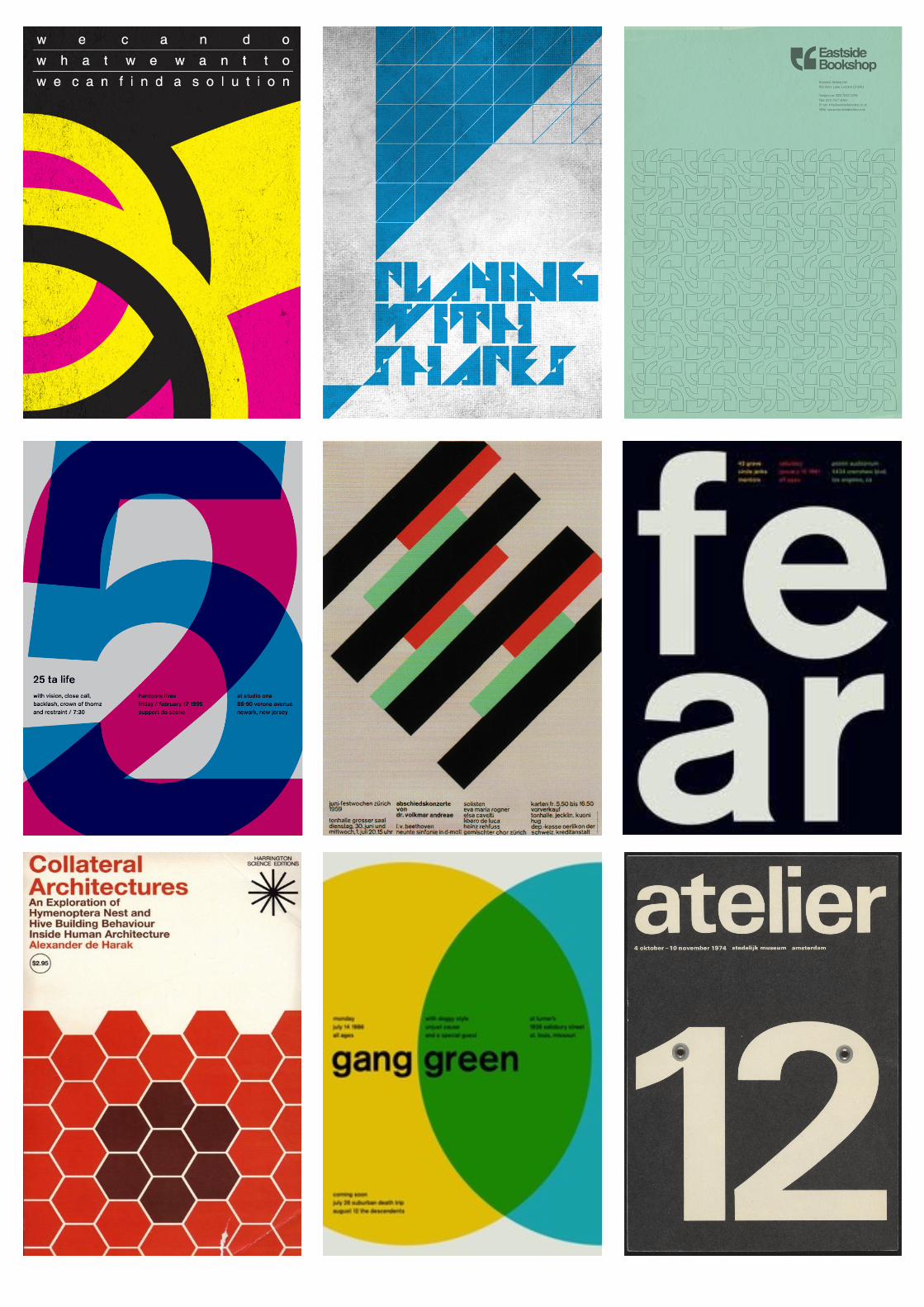
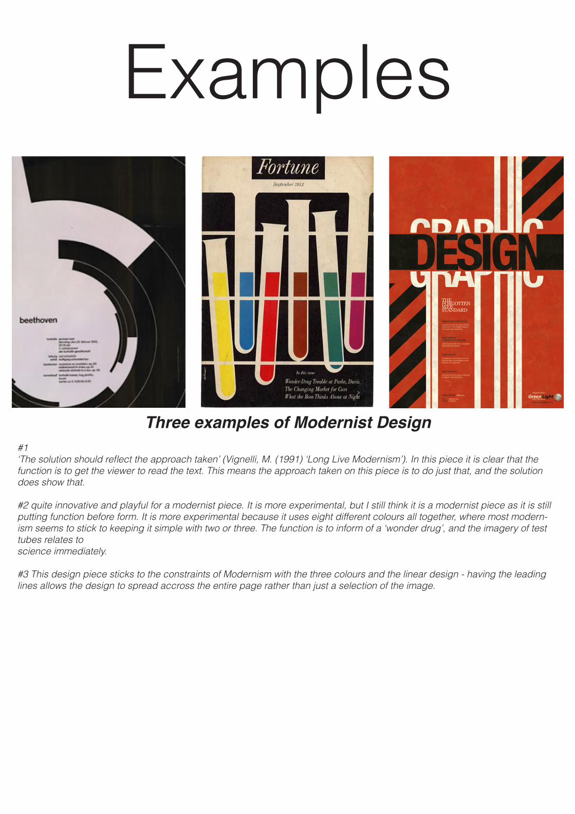
Three examples of Modernist Design#1‘The solution should reflect the approach taken’ (Vignelli, M. (1991) ‘Long Live Modernism’). In this piece it is clear that the function is to get the viewer to read the text. This means the approach taken on this piece is to do just that, and the solution does show that.
#2 quite innovative and playful for a modernist piece. It is more experimental, but I still think it is a modernist piece as it is still putting function before form. It is more experimental because it uses eight different colours all together, where most modern-ism seems to stick to keeping it simple with two or three. The function is to inform of a ‘wonder drug’, and the imagery of test tubes relates to science immediately.
#3 This design piece sticks to the constraints of Modernism with the three colours and the linear design - having the leading lines allows the design to spread accross the entire page rather than just a selection of the image.
Examples
PostModernism1975 - 1990
The term postmodernism was first used to descirbe architectural designs that amplify and distort established code.”Postmodernism” was made to criticize the glass box structures of the Swiss/International period. Embracing art, architecture,
fashion, graphic design, furtiture, postmodernism. One of the major influences within the Postmodernism movement is the punk movement. It was often used to create band
promotions. The loose arbitrary collage approach would later inspire postmodern artists. Some postmodern designers were inspired by the torn paper collage approach combined with loose, spontaneous brush
stroked used in this and other music promotions.Low budger club promotions often appropraite existing art, producing the edgy look. A postmodern approach to art thus rejects the distinction between low and high art forms.
The postmodern creator, in turn, is free to combine any elements or styles in a work, even in ways that are counter to or irrelevant to the apparent function of the object.
Postmodern style is often characterized by eclecticism, digression, collage, pastiche, irony, the return of ornament and historical reference, and the appropriation of popular media. Some artistic movements commonly called postmodern are pop art,
architectural deconstructivism, magical realism in literature, maximalism, and neo-romanticism.
It rejects rigid genre boundaries and promotes parody, irony, and playfulness, commonly referred to as jouissance (enjoyment -as the french are lacking in the english word, it has been left untranslated) by postmodern theorists. Unlike modern art, postmodern art does not approach this fragmentation as somehow faulty or undesirable, but rather celebrates it. As the
gravity of the search for underlying truth is relieved, it is replaced with ‘play’. As postmodern icon David Byrne, and his band Talking Heads said: “Stop making sense.”
Post-modernity, in attacking the perceived elitist approach of Modernism, sought greater connection with broader audiences. This is often labelled “accessibility” and is a central point of dispute in the question of the value of postmodern art. It has also embraced the mixing of words with art, collage and other movements in modernity, in an attempt to create more multiplicity of medium and message. Much of this centers on a shift of basic subject matter: postmodern artists regard the mass media as a
fundamental subject for art, and use forms, tropes, and materials - such as banks of video monitors, found art, and depictions of media objects - as focal points for their art. Where Andy Warhol furthered the concept with his appropriation of common popular symbols and “ready-made” cultural artifacts, bringing the previously mundane or trivial onto the previously hallowed ground of
high art.Postmodernism’s critical stance is interlinked with presenting new appraisals of previous works. The works of the Dada
movement received greater attention, as did collagists such as Robert Rauschenberg, whose works were initially considered unimportant in the context of the modernism of the 1950s, but who, by the 1980s, began to be seen as seminal.
Post-modernism also elevated the importance of cinema in artistic discussions, placing it on a peer level with the other fine arts. This is both because of the blurring of distinctions between “high” and “low” forms, and because of the recognition that cinema
represented the creation of simulacra which was later duplicated in the other arts. Davor Džalto, for example, attacks the postmodern positions in art and culture generally, confronting a sustainable personal identity, together with notions of creativity,
freedom and communion, to the postmodern deconstruction of any metaphysical identity. But in the critique he stresses a positive role of postmodern views for a further historical, cultural and artistic development.
A brief history
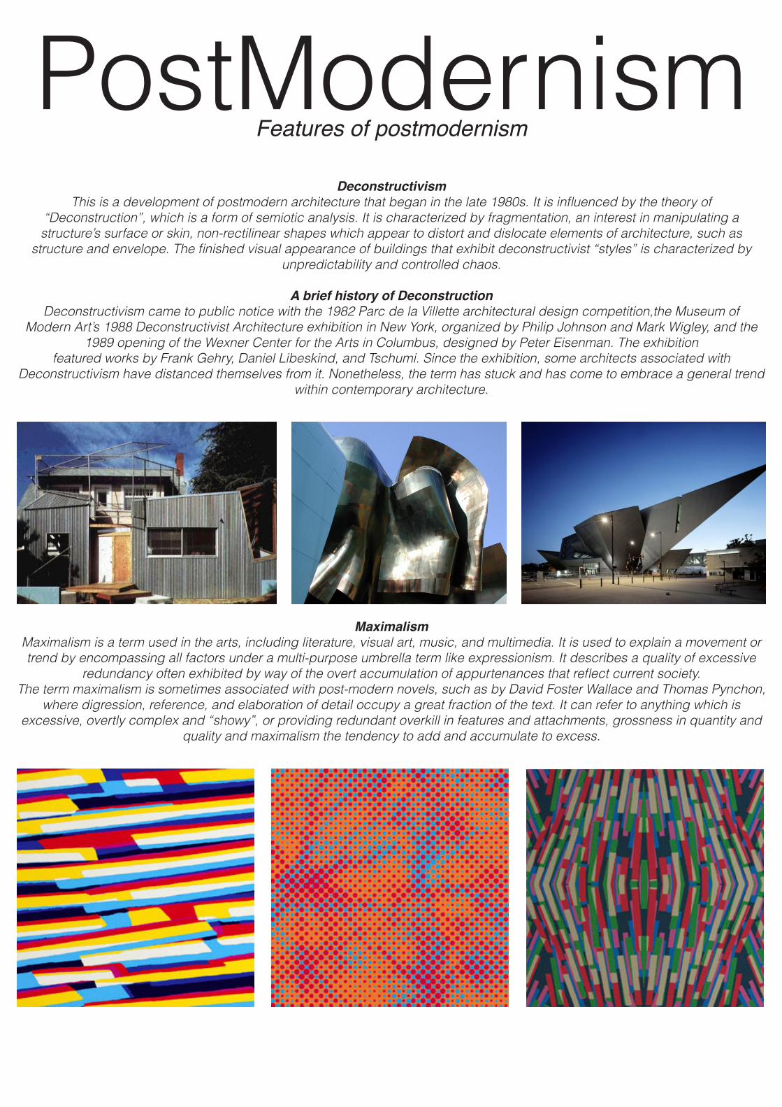
PostModernismFeatures of postmodernism
Deconstructivism This is a development of postmodern architecture that began in the late 1980s. It is influenced by the theory of
“Deconstruction”, which is a form of semiotic analysis. It is characterized by fragmentation, an interest in manipulating a structure’s surface or skin, non-rectilinear shapes which appear to distort and dislocate elements of architecture, such as
structure and envelope. The finished visual appearance of buildings that exhibit deconstructivist “styles” is characterized by unpredictability and controlled chaos.
A brief history of DeconstructionDeconstructivism came to public notice with the 1982 Parc de la Villette architectural design competition,the Museum of
Modern Art’s 1988 Deconstructivist Architecture exhibition in New York, organized by Philip Johnson and Mark Wigley, and the 1989 opening of the Wexner Center for the Arts in Columbus, designed by Peter Eisenman. The exhibition
featured works by Frank Gehry, Daniel Libeskind, and Tschumi. Since the exhibition, some architects associated with Deconstructivism have distanced themselves from it. Nonetheless, the term has stuck and has come to embrace a general trend
within contemporary architecture.
MaximalismMaximalism is a term used in the arts, including literature, visual art, music, and multimedia. It is used to explain a movement or trend by encompassing all factors under a multi-purpose umbrella term like expressionism. It describes a quality of excessive
redundancy often exhibited by way of the overt accumulation of appurtenances that reflect current society. The term maximalism is sometimes associated with post-modern novels, such as by David Foster Wallace and Thomas Pynchon,
where digression, reference, and elaboration of detail occupy a great fraction of the text. It can refer to anything which is excessive, overtly complex and “showy”, or providing redundant overkill in features and attachments, grossness in quantity and
quality and maximalism the tendency to add and accumulate to excess.
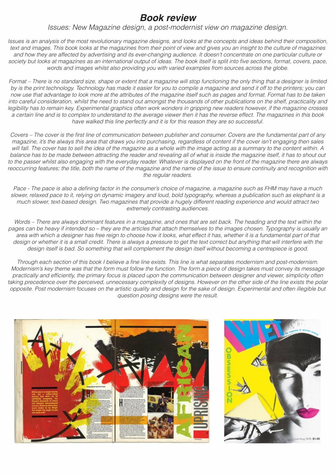
Book reviewIssues: New Magazine design, a post-modernist view on magazine design.
Issues is an analysis of the most revolutionary magazine designs, and looks at the concepts and ideas behind their composition, text and images. This book looks at the magazines from their point of view and gives you an insight to the culture of magazines
and how they are affected by advertising and its ever-changing audience. It doesn’t concentrate on one particular culture or society but looks at magazines as an international output of ideas. The book itself is split into five sections, format, covers, pace,
words and images whilst also providing you with varied examples from sources across the globe.
Format – There is no standard size, shape or extent that a magazine will stop functioning the only thing that a designer is limited by is the print technology. Technology has made it easier for you to compile a magazine and send it off to the printers; you can now use that advantage to look more at the attributes of the magazine itself such as pages and format. Format has to be taken
into careful consideration, whilst the need to stand out amongst the thousands of other publications on the shelf, practicality and legibility has to remain key. Experimental graphics often work wonders in gripping new readers however, if the magazine crosses
a certain line and is to complex to understand to the average viewer then it has the reverse effect. The magazines in this book have walked this line perfectly and it is for this reason they are so successful.
Covers – The cover is the first line of communication between publisher and consumer. Covers are the fundamental part of any magazine, it’s the always this area that draws you into purchasing, regardless of content if the cover isn’t engaging then sales will fall. The cover has to sell the idea of the magazine as a whole with the image acting as a summary to the content within. A
balance has to be made between attracting the reader and revealing all of what is inside the magazine itself, it has to shout out to the passer whilst also engaging with the everyday reader. Whatever is displayed on the front of the magazine there are always reoccurring features; the title, both the name of the magazine and the name of the issue to ensure continuity and recognition with
the regular readers.
Pace - The pace is also a defining factor in the consumer’s choice of magazine, a magazine such as FHM may have a much slower, relaxed pace to it, relying on dynamic imagery and loud, bold typography, whereas a publication such as elephant is a
much slower, text-based design. Two magazines that provide a hugely different reading experience and would attract two extremely contrasting audiences.
Words – There are always dominant features in a magazine, and ones that are set back. The heading and the text within the pages can be heavy if intended so – they are the articles that attach themselves to the images chosen. Typography is usually an
area with which a designer has free reign to choose how it looks, what effect it has, whether it is a fundamental part of that design or whether it is a small credit. There is always a pressure to get the text correct but anything that will interfere with the
design itself is bad. So something that will complement the design itself without becoming a centrepiece is good.
Through each section of this book I believe a fine line exists. This line is what separates modernism and post-modernism. Modernism’s key theme was that the form must follow the function. The form a piece of design takes must convey its message practically and efficiently, the primary focus is placed upon the communication between designer and viewer, simplicity often
taking precedence over the perceived, unnecessary complexity of designs. However on the other side of the line exists the polar opposite. Post modernism focuses on the artistic quality and design for the sake of design. Experimental and often illegible but
question posing designs were the result.
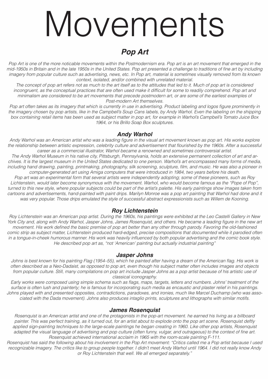
MovementsPop Art
Pop Art is one of the more noticable movements within the Postmodernism era. Pop art is an art movement that emerged in the mid-1950s in Britain and in the late 1950s in the United States. Pop art presented a challenge to traditions of fine art by including imagery from popular culture such as advertising, news, etc. In Pop art, material is sometimes visually removed from its known
context, isolated, and/or combined with unrelated material.The concept of pop art refers not as much to the art itself as to the attitudes that led to it. Much of pop art is considered
incongruent, as the conceptual practices that are often used make it difficult for some to readily comprehend. Pop art and minimalism are considered to be art movements that precede postmodern art, or are some of the earliest examples of
Post-modern Art themselves. Pop art often takes as its imagery that which is currently in use in advertising. Product labeling and logos figure prominently in the imagery chosen by pop artists, like in the Campbell’s Soup Cans labels, by Andy Warhol. Even the labeling on the shipping box containing retail items has been used as subject matter in pop art, for example in Warhol’s Campbell’s Tomato Juice Box
1964, or his Brillo Soap Box sculptures.
Andy WarholAndy Warhol was an American artist who was a leading figure in the visual art movement known as pop art. His works explore
the relationship between artistic expression, celebrity culture and advertisement that flourished by the 1960s. After a successful career as a commercial illustrator, Warhol became a renowned and sometimes controversial artist.
The Andy Warhol Museum in his native city, Pittsburgh, Pennsylvania, holds an extensive permanent collection of art and ar-chives. It is the largest museum in the United States dedicated to one person. Warhol’s art encompassed many forms of media, including hand drawing, painting, printmaking, photography, silk screening, sculpture, film, and music. He was also a pioneer in
computer-generated art using Amiga computers that were introduced in 1984, two years before his death.Pop art was an experimental form that several artists were independently adopting; some of these pioneers, such as Roy
Lichtenstein, would later become synonymous with the movement. Warhol, who would become famous as the “Pope of Pop”, turned to this new style, where popular subjects could be part of the artist’s palette. His early paintings show images taken from cartoons and advertisements, hand-painted with paint drips. Marilyn Monroe was a pop art painting that Warhol had done and it
was very popular. Those drips emulated the style of successful abstract expressionists such as Willem de Kooning.
Roy LichtensteinRoy Lichtenstein was an American pop artist. During the 1960s, his paintings were exhibited at the Leo Castelli Gallery in New
York City and, along with Andy Warhol, Jasper Johns, James Rosenquist, and others. He became a leading figure in the new art movement. His work defined the basic premise of pop art better than any other through parody. Favoring the old-fashioned
comic strip as subject matter, Lichtenstein produced hard-edged, precise compositions that documented while it parodied often in a tongue-in-cheek humorous manner. His work was heavily influenced by both popular advertising and the comic book style.
He described pop art as, “not ‘American’ painting but actually industrial painting”
Jasper JohnsJohns is best known for his painting Flag (1954–55), which he painted after having a dream of the American flag. His work is often described as a Neo-Dadaist, as opposed to pop art, even though his subject matter often includes images and objects from popular culture. Still, many compilations on pop art include Jasper Johns as a pop artist because of his artistic use of
classical iconography.Early works were composed using simple schema such as flags, maps, targets, letters and numbers. Johns’ treatment of the surface is often lush and painterly; he is famous for incorporating such media as encaustic and plaster relief in his paintings.
Johns played with and presented opposites, contradictions, paradoxes, and ironies, much like Marcel Duchamp (who was asso-ciated with the Dada movement). Johns also produces intaglio prints, sculptures and lithographs with similar motifs.
James RosenquistRosenquist is an American artist and one of the protagonists in the pop-art movement. he earned his living as a billboard painter. This was perfect training, as it turned out, for an artist about to explode onto the pop art scene. Rosenquist deftly
applied sign-painting techniques to the large-scale paintings he began creating in 1960. Like other pop artists, Rosenquist adapted the visual language of advertising and pop culture (often funny, vulgar, and outrageous) to the context of fine art.
Rosenquist achieved international acclaim in 1965 with the room-scale painting F-111.Rosenquist has said the following about his involvement in the Pop Art movement: “Critics called me a Pop artist because I used recognizable imagery. The critics like to group people together. I didn’t meet Andy Warhol until 1964. I did not really know Andy
or Roy Lichtenstein that well. We all emerged separately.”

DesignersModernist
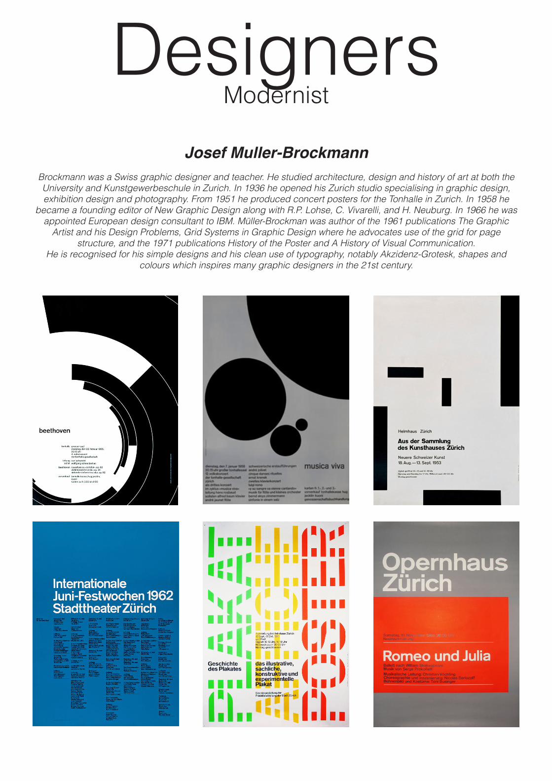
Josef Muller-BrockmannBrockmann was a Swiss graphic designer and teacher. He studied architecture, design and history of art at both the University and Kunstgewerbeschule in Zurich. In 1936 he opened his Zurich studio specialising in graphic design, exhibition design and photography. From 1951 he produced concert posters for the Tonhalle in Zurich. In 1958 he
became a founding editor of New Graphic Design along with R.P. Lohse, C. Vivarelli, and H. Neuburg. In 1966 he was appointed European design consultant to IBM. Müller-Brockman was author of the 1961 publications The Graphic
Artist and his Design Problems, Grid Systems in Graphic Design where he advocates use of the grid for page structure, and the 1971 publications History of the Poster and A History of Visual Communication.
He is recognised for his simple designs and his clean use of typography, notably Akzidenz-Grotesk, shapes and colours which inspires many graphic designers in the 21st century.
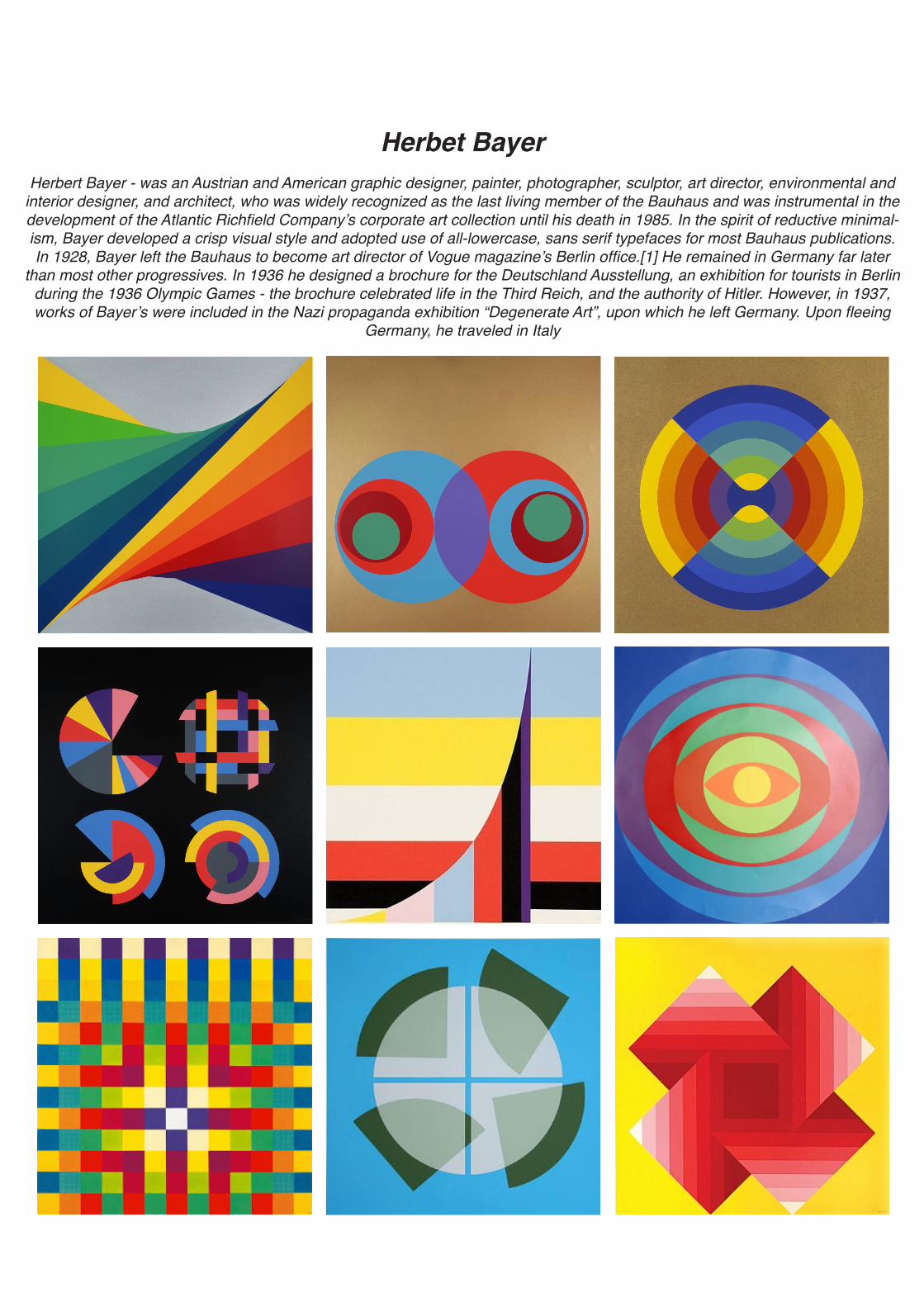
Herbet BayerHerbert Bayer - was an Austrian and American graphic designer, painter, photographer, sculptor, art director, environmental and
interior designer, and architect, who was widely recognized as the last living member of the Bauhaus and was instrumental in the development of the Atlantic Richfield Company’s corporate art collection until his death in 1985. In the spirit of reductive minimal-ism, Bayer developed a crisp visual style and adopted use of all-lowercase, sans serif typefaces for most Bauhaus publications.In 1928, Bayer left the Bauhaus to become art director of Vogue magazine’s Berlin office.[1] He remained in Germany far later
than most other progressives. In 1936 he designed a brochure for the Deutschland Ausstellung, an exhibition for tourists in Berlin during the 1936 Olympic Games - the brochure celebrated life in the Third Reich, and the authority of Hitler. However, in 1937, works of Bayer’s were included in the Nazi propaganda exhibition “Degenerate Art”, upon which he left Germany. Upon fleeing
Germany, he traveled in Italy
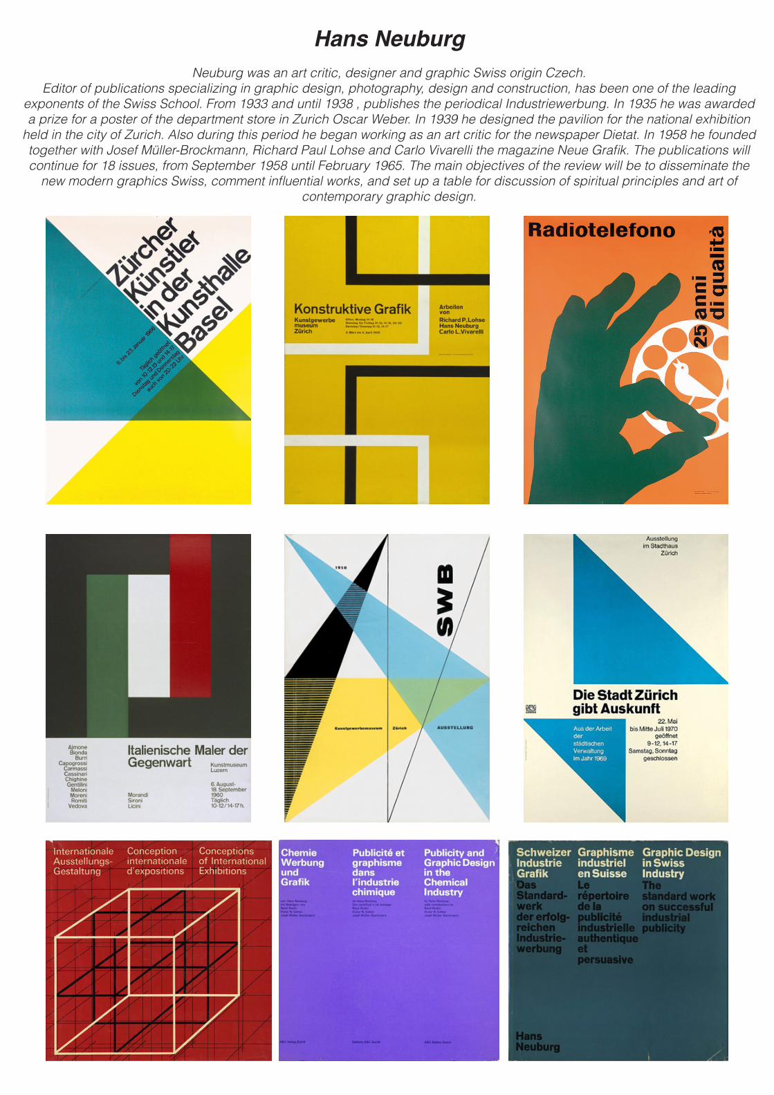
Hans NeuburgNeuburg was an art critic, designer and graphic Swiss origin Czech.
Editor of publications specializing in graphic design, photography, design and construction, has been one of the leading exponents of the Swiss School. From 1933 and until 1938 , publishes the periodical Industriewerbung. In 1935 he was awarded a prize for a poster of the department store in Zurich Oscar Weber. In 1939 he designed the pavilion for the national exhibition
held in the city of Zurich. Also during this period he began working as an art critic for the newspaper Dietat. In 1958 he founded together with Josef Müller-Brockmann, Richard Paul Lohse and Carlo Vivarelli the magazine Neue Grafik. The publications will continue for 18 issues, from September 1958 until February 1965. The main objectives of the review will be to disseminate the
new modern graphics Swiss, comment influential works, and set up a table for discussion of spiritual principles and art of contemporary graphic design.
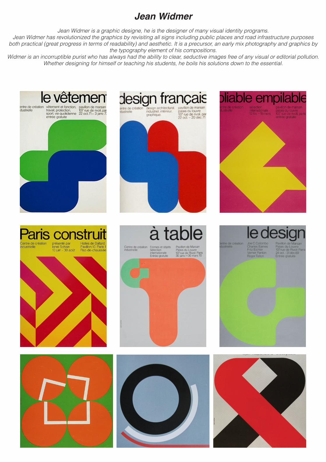
Jean WidmerJean Widmer is a graphic designe, he is the designer of many visual identity programs.
Jean Widmer has revolutionized the graphics by revisiting all signs including public places and road infrastructure purposes both practical (great progress in terms of readability) and aesthetic. It is a precursor, an early mix photography and graphics by
the typography element of his compositions. Widmer is an incorruptible purist who has always had the ability to clear, seductive images free of any visual or editorial pollution.
Whether designing for himself or teaching his students, he boils his solutions down to the essential.
DesignersPost modernist
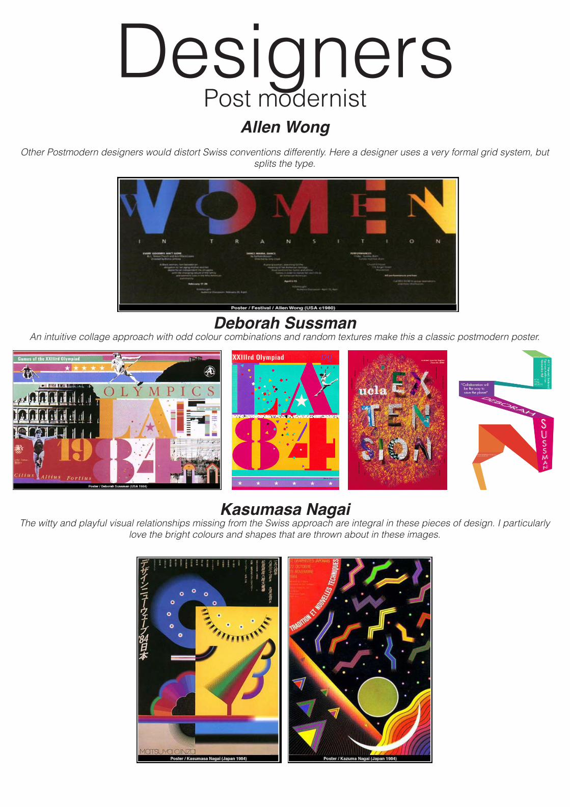
Allen WongOther Postmodern designers would distort Swiss conventions differently. Here a designer uses a very formal grid system, but
splits the type.
Deborah SussmanAn intuitive collage approach with odd colour combinations and random textures make this a classic postmodern poster.
Kasumasa NagaiThe witty and playful visual relationships missing from the Swiss approach are integral in these pieces of design. I particularly
love the bright colours and shapes that are thrown about in these images.
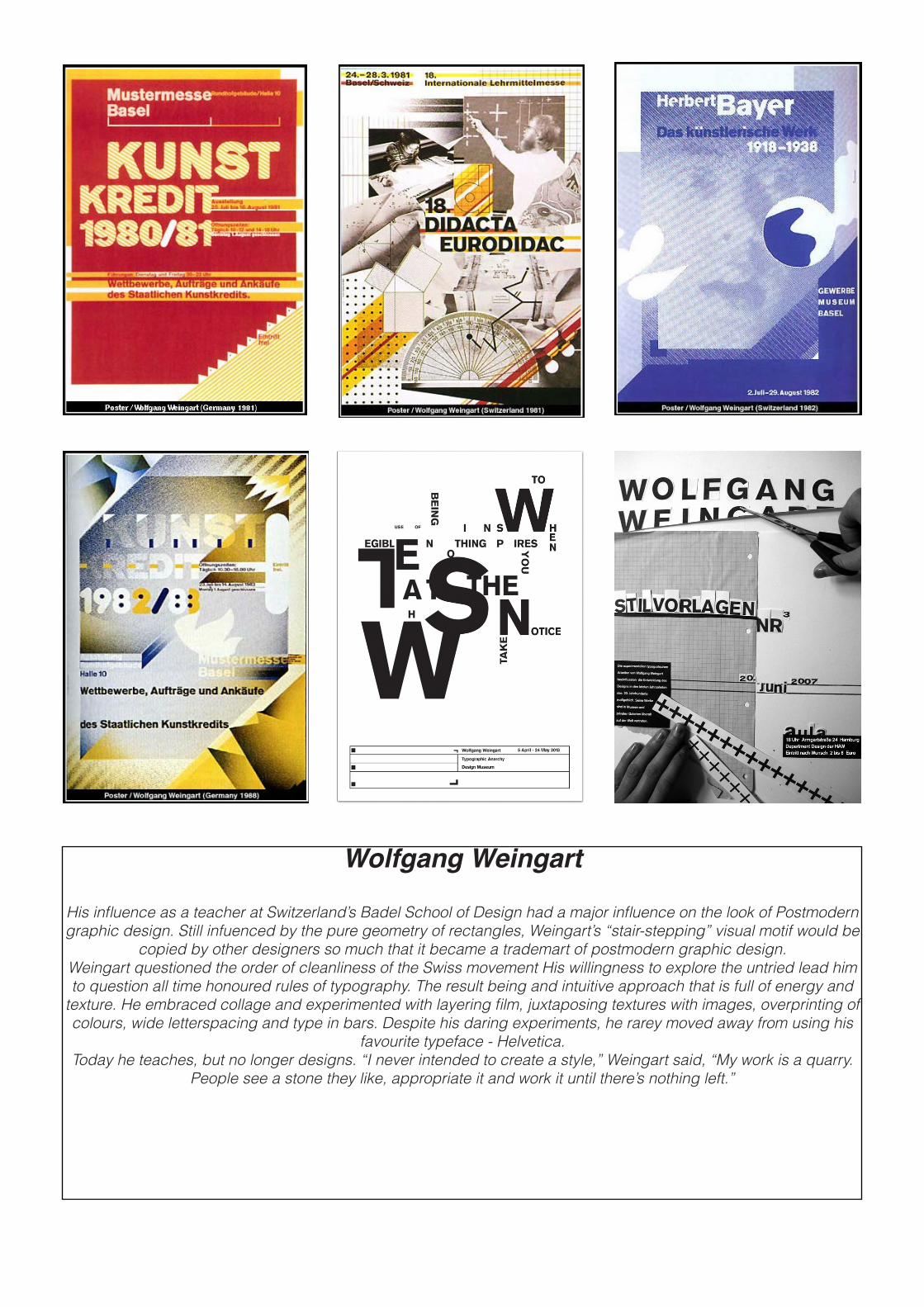
Wolfgang Weingart
His influence as a teacher at Switzerland’s Badel School of Design had a major influence on the look of Postmodern graphic design. Still infuenced by the pure geometry of rectangles, Weingart’s “stair-stepping” visual motif would be
copied by other designers so much that it became a trademart of postmodern graphic design.Weingart questioned the order of cleanliness of the Swiss movement His willingness to explore the untried lead him to question all time honoured rules of typography. The result being and intuitive approach that is full of energy and
texture. He embraced collage and experimented with layering film, juxtaposing textures with images, overprinting of colours, wide letterspacing and type in bars. Despite his daring experiments, he rarey moved away from using his
favourite typeface - Helvetica. Today he teaches, but no longer designs. “I never intended to create a style,” Weingart said, “My work is a quarry.
People see a stone they like, appropriate it and work it until there’s nothing left.”
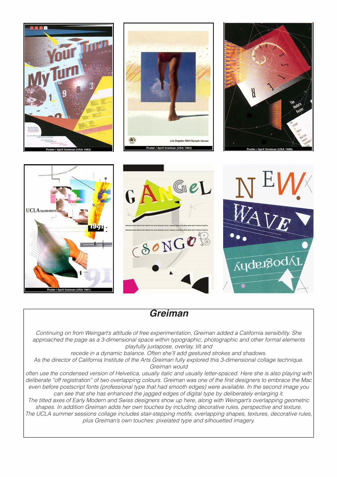
Greiman
Continuing on from Weingart’s attitude of free experimentation, Greiman added a California sensibility. She approached the page as a 3-dimensional space within typographic, photographic and other formal elements
playfully juxtapose, overlay, tilt and recede in a dynamic balance. Often she’ll add gestured strokes and shadows.
As the director of California Institute of the Arts Greiman fully explored this 3-dimensional collage technique. Greiman would
often use the condensed version of Helvetica, usually italic and usually letter-spaced. Here she is also playing with deliberate “off registration” of two overlapping colours. Greiman was one of the first designers to embrace the Mac even before postscript fonts (professional type that had smooth edges) were available. In the second image you
can see that she has enhanced the jagged edges of digital type by deliberately enlarging it. The tilted axes of Early Modern and Swiss designers show up here, along with Weingart’s overlapping geometric
shapes. In addition Greiman adds her own touches by including decorative rules, perspective and texture. The UCLA summer sessions collage includes stair-stepping motifs, overlapping shapes, textures, decorative rules,
plus Greiman’s own touches: pixelated type and silhouetted imagery.
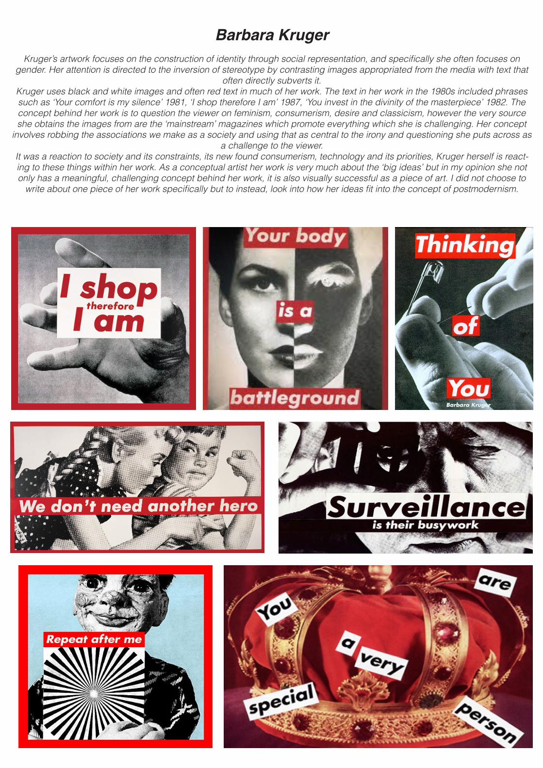
Barbara KrugerKruger’s artwork focuses on the construction of identity through social representation, and specifically she often focuses on
gender. Her attention is directed to the inversion of stereotype by contrasting images appropriated from the media with text that often directly subverts it.
Kruger uses black and white images and often red text in much of her work. The text in her work in the 1980s included phrases such as ‘Your comfort is my silence’ 1981, ‘I shop therefore I am’ 1987, ‘You invest in the divinity of the masterpiece’ 1982. The concept behind her work is to question the viewer on feminism, consumerism, desire and classicism, however the very source she obtains the images from are the ‘mainstream’ magazines which promote everything which she is challenging. Her concept
involves robbing the associations we make as a society and using that as central to the irony and questioning she puts across as a challenge to the viewer.
It was a reaction to society and its constraints, its new found consumerism, technology and its priorities, Kruger herself is react-ing to these things within her work. As a conceptual artist her work is very much about the ‘big ideas’ but in my opinion she not only has a meaningful, challenging concept behind her work, it is also visually successful as a piece of art. I did not choose to
write about one piece of her work specifically but to instead, look into how her ideas fit into the concept of postmodernism.

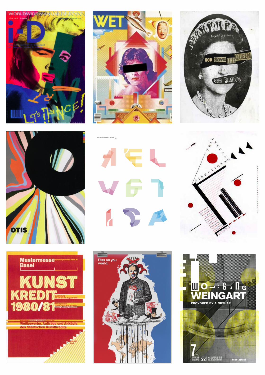
HeadersExisting Magazine Headers
i-D is a British magazine dedicated to fashion, music, art and youth cultureDazed and Confused is a british magazine the topics that are covered include music, fashion, film, art, and literature.
These are a few examples of the magazines that I have been looking at to see if there is something to base my magazine layout on. I feel as though the continuity of both the i-D and Dazes & Confused magazines is something
that I want to repeat within my magazine aswell. The simple yet effective header is something that I have looked at in particular. Starting with i-D, the image itself looks like a smile with a closed left eye - which is reflected within the im-
age that is on the front cover of every issue.
And following on to the Dazed and Confused magazines, there is always the same header on each issue, it can be filled in or glammed up but the sizing and positioning staying the same is what is always recognisable about that
particular magazine - and it is why I love both magazine designs individually.
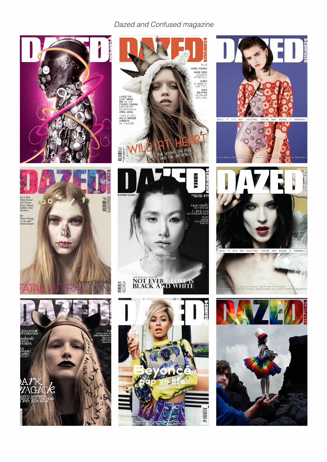
Dazed and Confused magazine
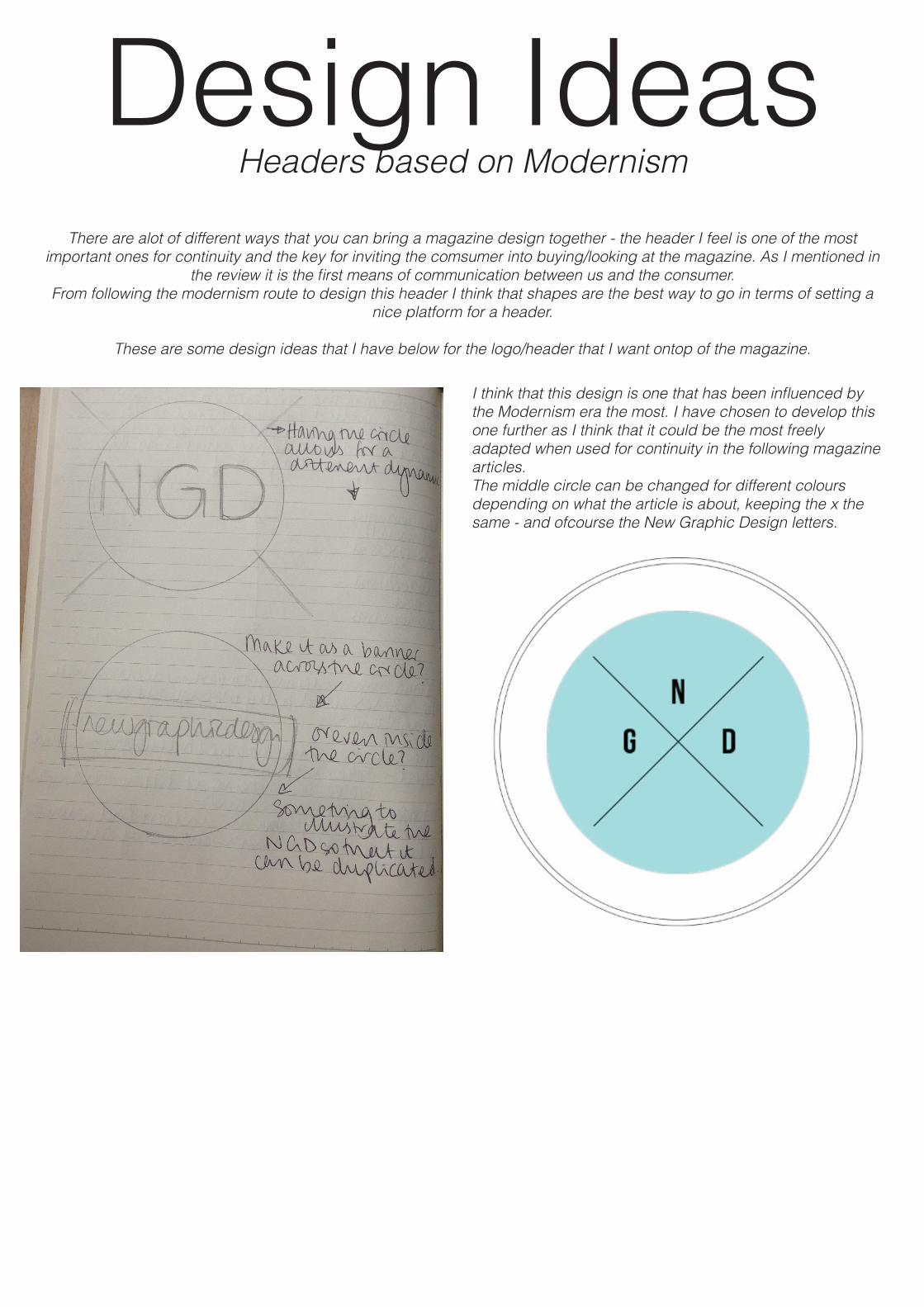
Design IdeasHeaders based on Modernism
There are alot of different ways that you can bring a magazine design together - the header I feel is one of the most important ones for continuity and the key for inviting the comsumer into buying/looking at the magazine. As I mentioned in
the review it is the first means of communication between us and the consumer.From following the modernism route to design this header I think that shapes are the best way to go in terms of setting a
nice platform for a header.
These are some design ideas that I have below for the logo/header that I want ontop of the magazine.
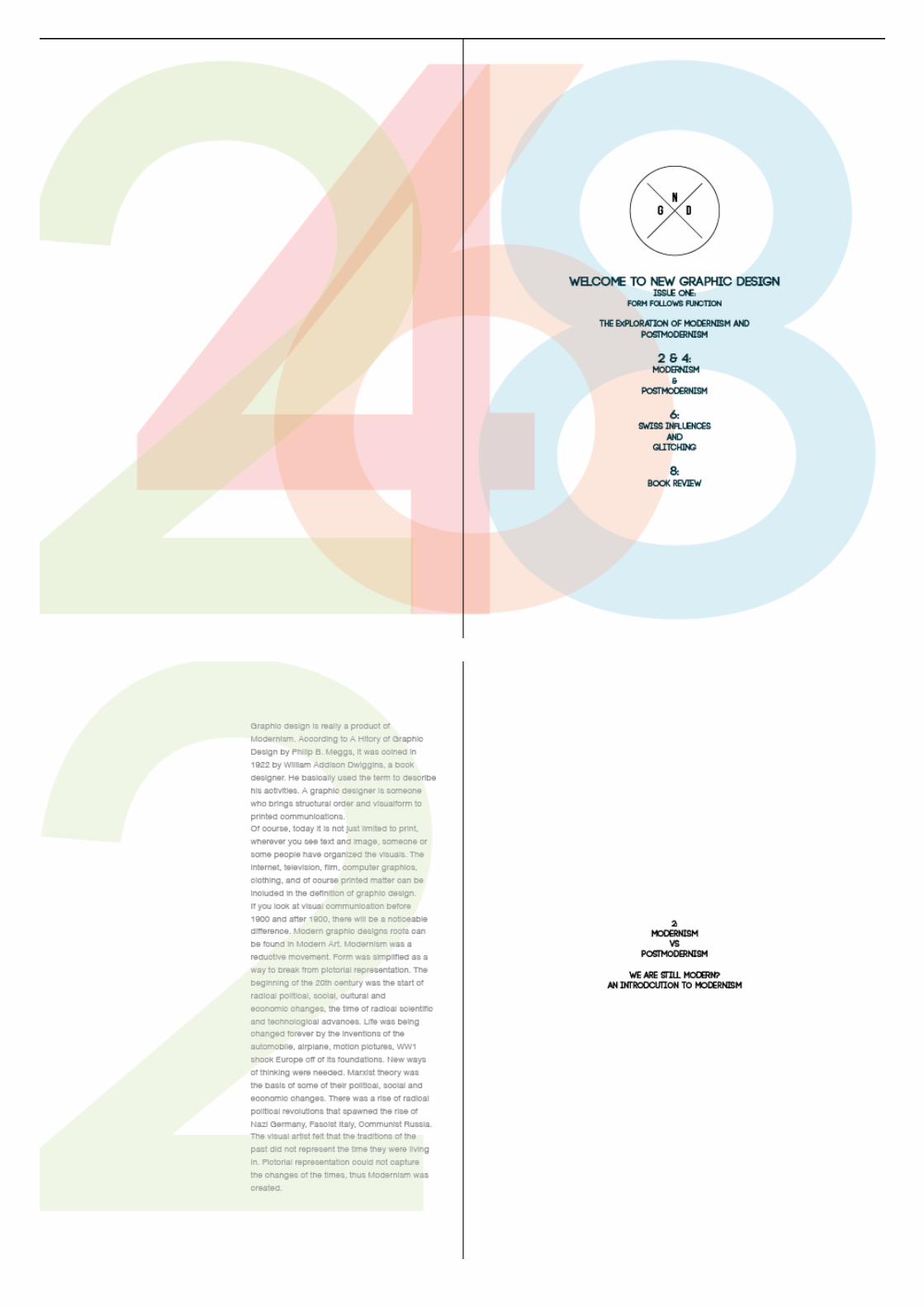
I think that this design is one that has been influenced by the Modernism era the most. I have chosen to develop this one further as I think that it could be the most freely adapted when used for continuity in the following magazine articles. The middle circle can be changed for different colours depending on what the article is about, keeping the x the same - and ofcourse the New Graphic Design letters.
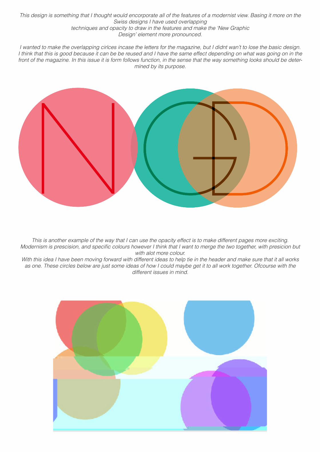
This design is something that I thought would encorporate all of the features of a modernist view. Basing it more on the Swiss designs I have used overlapping
techniques and opacity to draw in the features and make the ‘New Graphic Design’ element more pronounced.
I wanted to make the overlapping cirlces incase the letters for the magazine, but I didnt wan’t to lose the basic design. I think that this is good because it can be be reused and I have the same effect depending on what was going on in the front of the magazine. In this issue it is form follows function, in the sense that the way something looks should be deter-
mined by its purpose.
This is another example of the way that I can use the opacity effect is to make different pages more exciting. Modernism is prescision, and specific colours however I think that I want to merge the two together, with presicion but
with alot more colour. With this idea I have been moving forward with different ideas to help tie in the header and make sure that it all works
as one. These circles below are just some ideas of how I could maybe get it to all work together. Ofcourse with the different issues in mind.
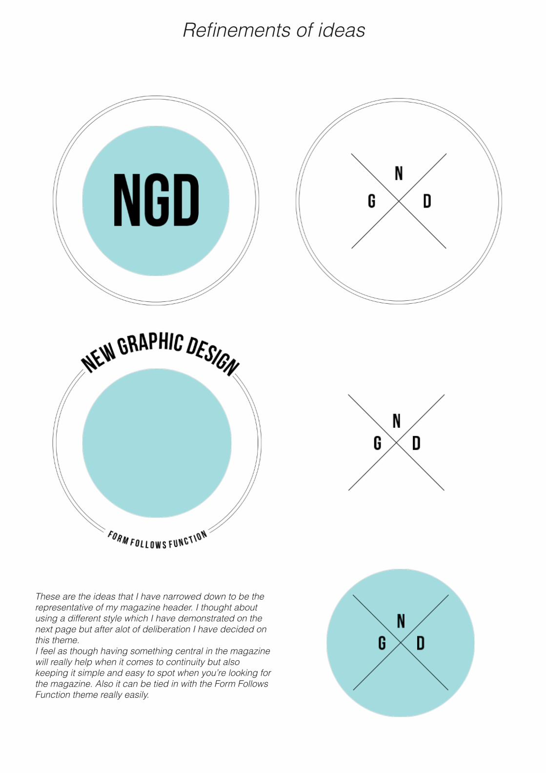
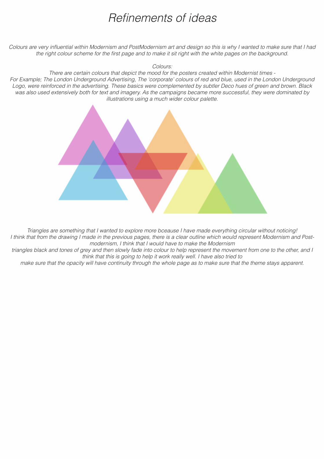
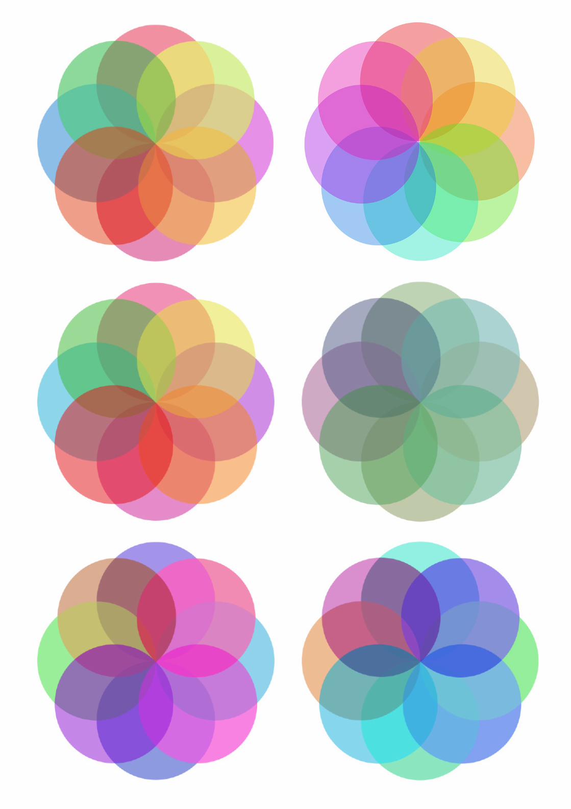
Refinements of ideas
These are the ideas that I have narrowed down to be the representative of my magazine header. I thought about using a different style which I have demonstrated on the next page but after alot of deliberation I have decided on this theme. I feel as though having something central in the magazine will really help when it comes to continuity but also keeping it simple and easy to spot when you’re looking for the magazine. Also it can be tied in with the Form Follows Function theme really easily.
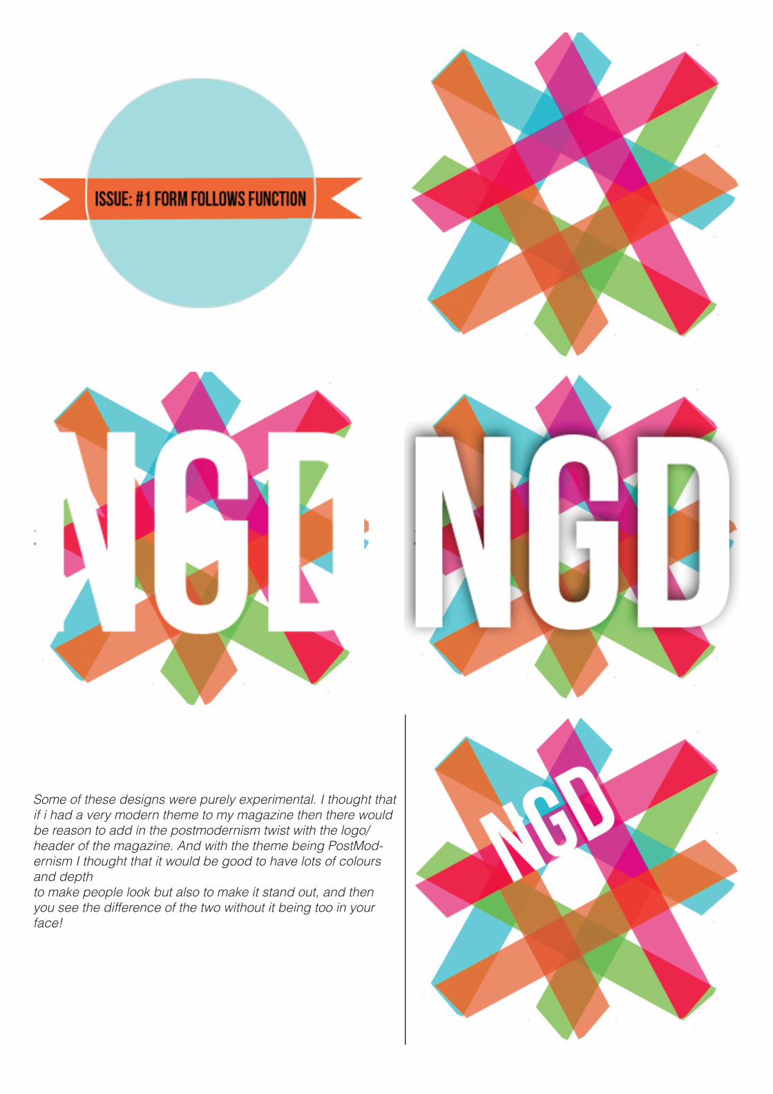
Some of these designs were purely experimental. I thought that if i had a very modern theme to my magazine then there would be reason to add in the postmodernism twist with the logo/header of the magazine. And with the theme being PostMod-ernism I thought that it would be good to have lots of colours and depthto make people look but also to make it stand out, and then you see the difference of the two without it being too in your face!
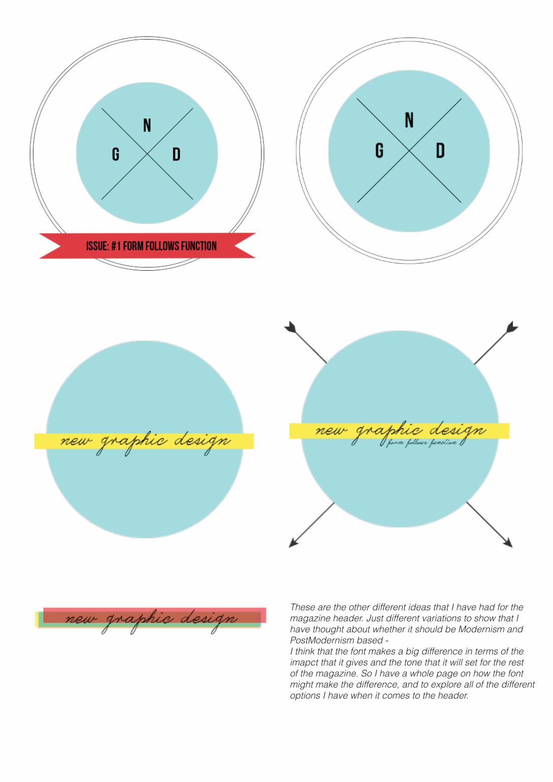
These are the other different ideas that I have had for the magazine header. Just different variations to show that I have thought about whether it should be Modernism and PostModernism based - I think that the font makes a big difference in terms of the imapct that it gives and the tone that it will set for the rest of the magazine. So I have a whole page on how the font might make the difference, and to explore all of the different options I have when it comes to the header.
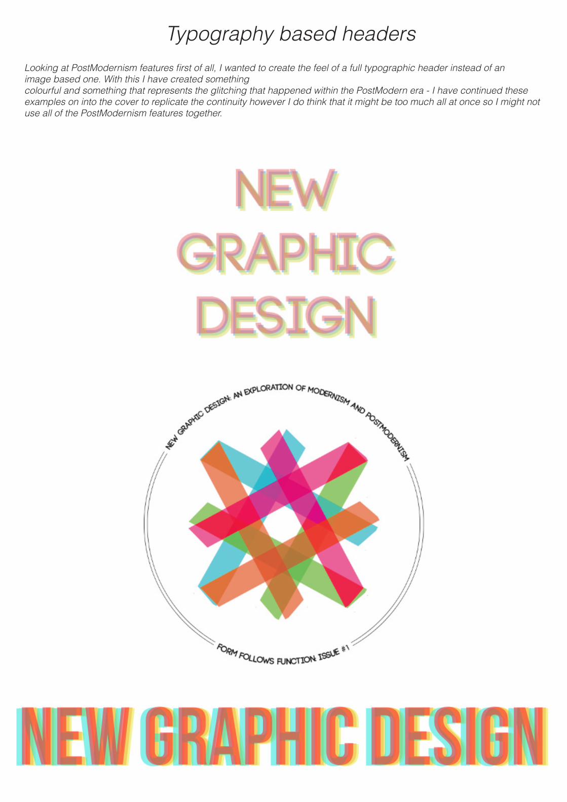
Typography based headersLooking at PostModernism features first of all, I wanted to create the feel of a full typographic header instead of an image based one. With this I have created something colourful and something that represents the glitching that happened within the PostModern era - I have continued these examples on into the cover to replicate the continuity however I do think that it might be too much all at once so I might not use all of the PostModernism features together.
Design IdeasCover, and pages inside
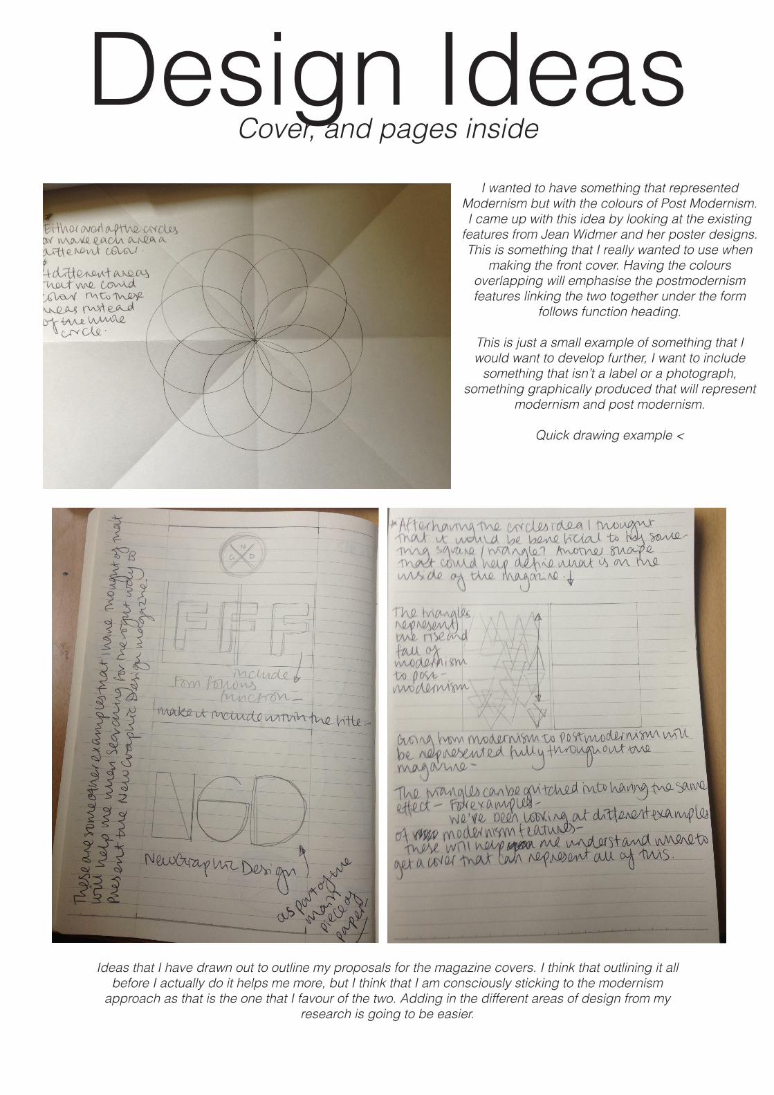
I wanted to have something that represented Modernism but with the colours of Post Modernism.I came up with this idea by looking at the existing
features from Jean Widmer and her poster designs.This is something that I really wanted to use when
making the front cover. Having the colours overlapping will emphasise the postmodernism features linking the two together under the form
follows function heading.
This is just a small example of something that I would want to develop further, I want to include
something that isn’t a label or a photograph, something graphically produced that will represent
modernism and post modernism.
Quick drawing example <
Ideas that I have drawn out to outline my proposals for the magazine covers. I think that outlining it all before I actually do it helps me more, but I think that I am consciously sticking to the modernism
approach as that is the one that I favour of the two. Adding in the different areas of design from my research is going to be easier.
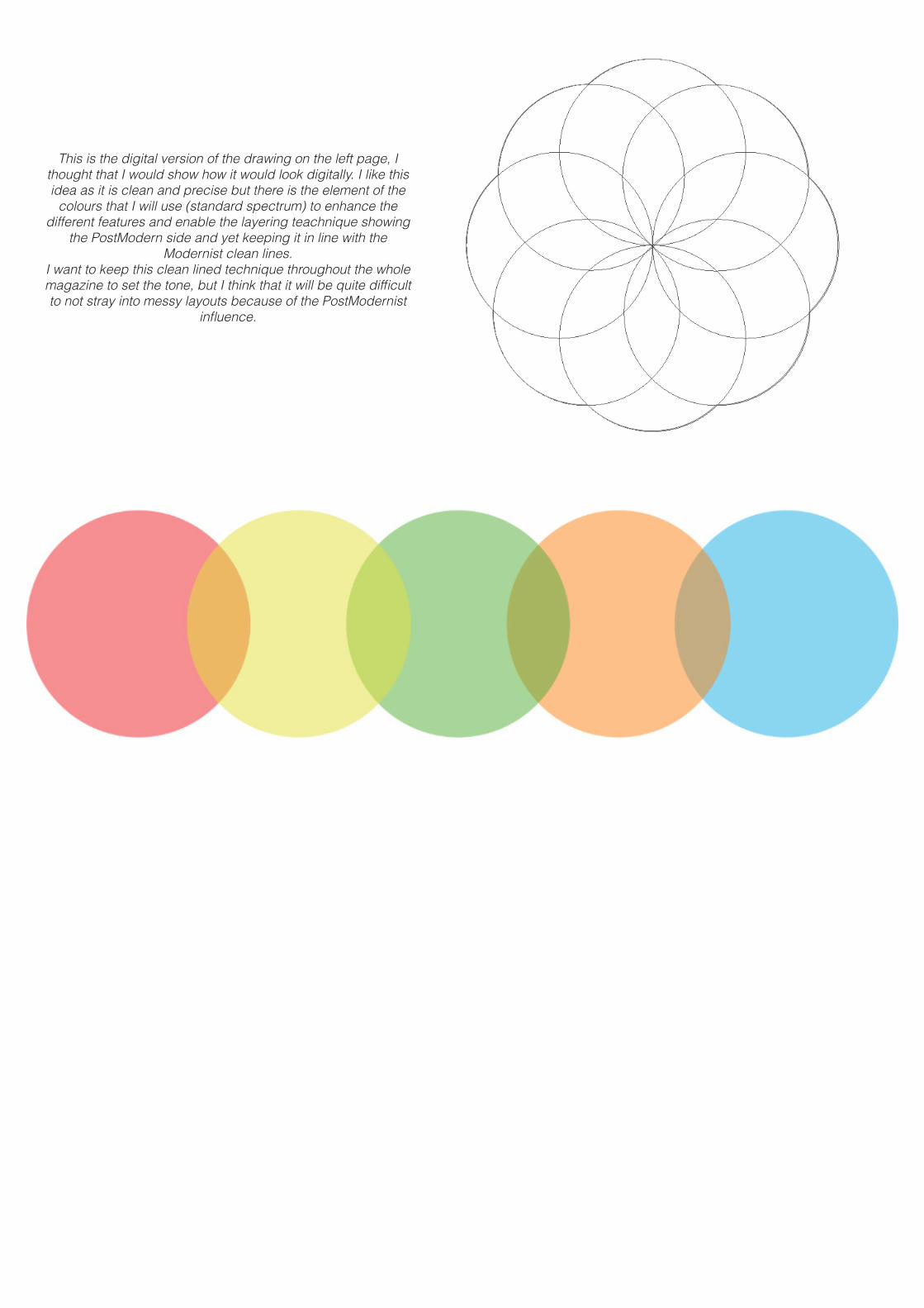
This is the digital version of the drawing on the left page, I thought that I would show how it would look digitally. I like this idea as it is clean and precise but there is the element of the
colours that I will use (standard spectrum) to enhance the different features and enable the layering teachnique showing
the PostModern side and yet keeping it in line with the Modernist clean lines.
I want to keep this clean lined technique throughout the whole magazine to set the tone, but I think that it will be quite difficult to not stray into messy layouts because of the PostModernist
influence.
Refinements of ideas
Colours are very influential within Modernism and PostModernism art and design so this is why I wanted to make sure that I had the right colour scheme for the first page and to make it sit right with the white pages on the background.
Colours:There are certain colours that depict the mood for the posters created within Modernist times -
For Example; The London Underground Advertising, The ‘corporate’ colours of red and blue, used in the London Underground Logo, were reinforced in the advertising. These basics were complemented by subtler Deco hues of green and brown. Black was also used extensively both for text and imagery. As the campaigns became more successful, they were dominated by
illustrations using a much wider colour palette.
Triangles are something that I wanted to explore more bceause I have made everything circular without noticing!I think that from the drawing I made in the previous pages, there is a clear outline which would represent Modernism and Post-
modernism, I think that I would have to make the Modernism triangles black and tones of grey and then slowly fade into colour to help represent the movement from one to the other, and I
think that this is going to help it work really well. I have also tried tomake sure that the opacity will have continuity through the whole page as to make sure that the theme stays apparent.
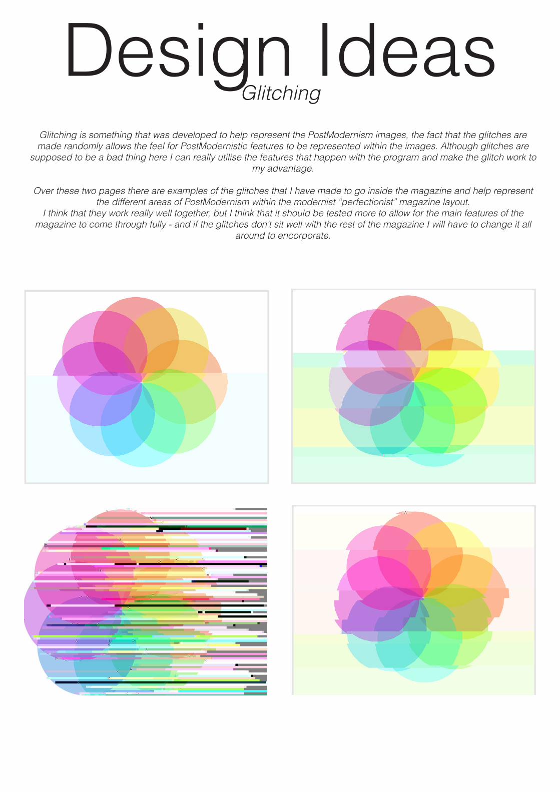
Design IdeasGlitching
Glitching is something that was developed to help represent the PostModernism images, the fact that the glitches are made randomly allows the feel for PostModernistic features to be represented within the images. Although glitches are
supposed to be a bad thing here I can really utilise the features that happen with the program and make the glitch work to my advantage.
Over these two pages there are examples of the glitches that I have made to go inside the magazine and help represent the different areas of PostModernism within the modernist “perfectionist” magazine layout.
I think that they work really well together, but I think that it should be tested more to allow for the main features of the magazine to come through fully - and if the glitches don’t sit well with the rest of the magazine I will have to change it all
around to encorporate.
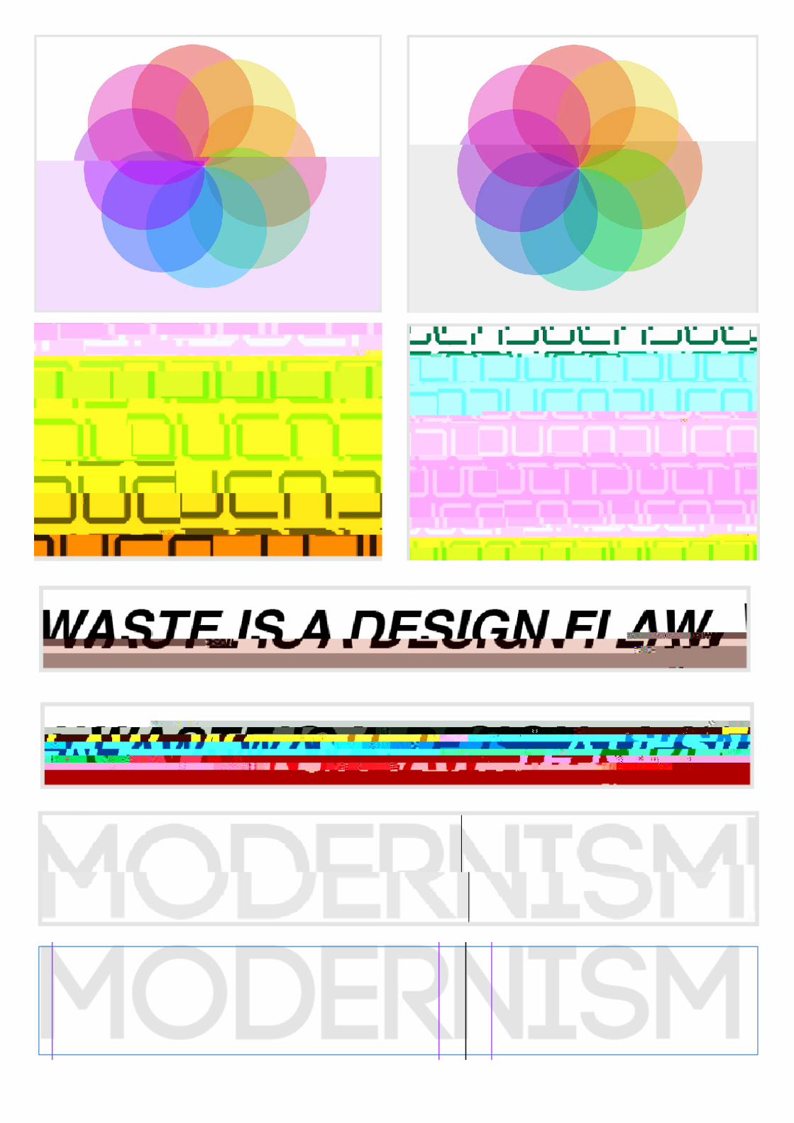
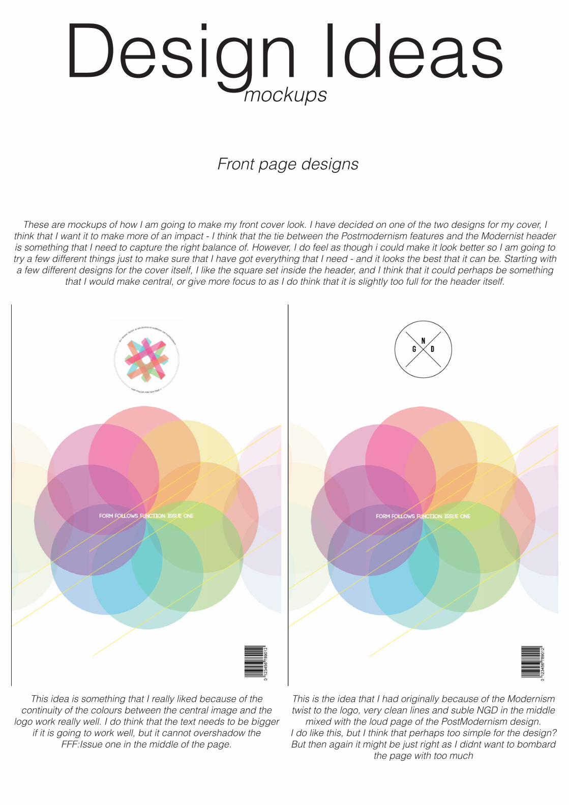
Design Ideasmockups
These are mockups of how I am going to make my front cover look. I have decided on one of the two designs for my cover, I think that I want it to make more of an impact - I think that the tie between the Postmodernism features and the Modernist header is something that I need to capture the right balance of. However, I do feel as though i could make it look better so I am going to try a few different things just to make sure that I have got everything that I need - and it looks the best that it can be. Starting with a few different designs for the cover itself, I like the square set inside the header, and I think that it could perhaps be something
that I would make central, or give more focus to as I do think that it is slightly too full for the header itself.
Front page designs
This idea is something that I really liked because of the continuity of the colours between the central image and the
logo work really well. I do think that the text needs to be bigger if it is going to work well, but it cannot overshadow the
FFF:Issue one in the middle of the page.
This is the idea that I had originally because of the Modernism twist to the logo, very clean lines and suble NGD in the middle
mixed with the loud page of the PostModernism design. I do like this, but I think that perhaps too simple for the design? But then again it might be just right as I didnt want to bombard
the page with too much

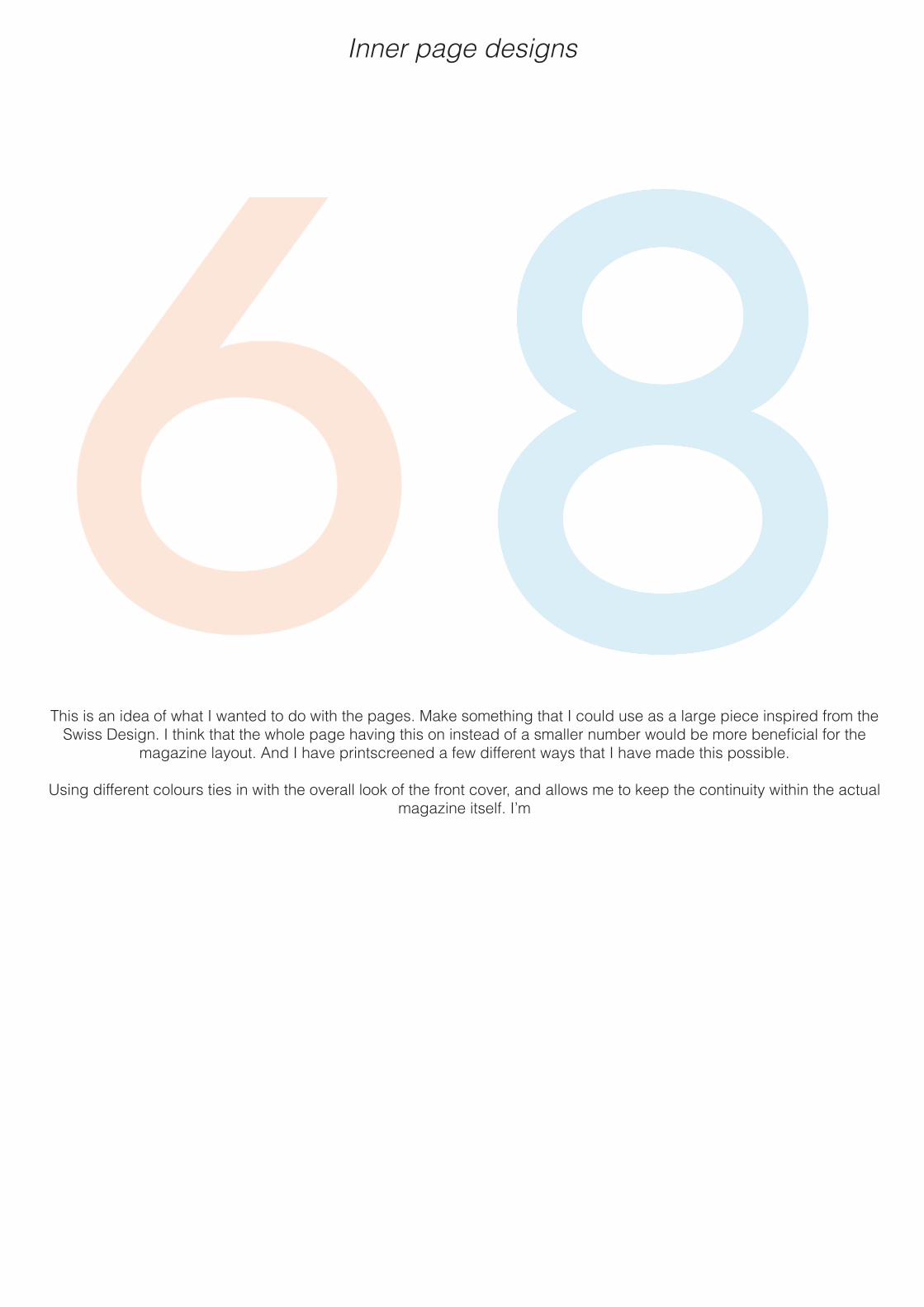
Inner page designs
This is an idea of what I wanted to do with the pages. Make something that I could use as a large piece inspired from the Swiss Design. I think that the whole page having this on instead of a smaller number would be more beneficial for the
magazine layout. And I have printscreened a few different ways that I have made this possible.
Using different colours ties in with the overall look of the front cover, and allows me to keep the continuity within the actual magazine itself. I’m


![Realism, Modernism, Postmodernism - Jeremy Hawthorn[1]](https://static.fdocuments.in/doc/165x107/557211d2497959fc0b8f8c7f/realism-modernism-postmodernism-jeremy-hawthorn1.jpg)