Notes on nonseasonal ARIMA models - Duke Peoplernau/Notes_on_nonseasonal_ARIMA_mode… · Notes on...
21
1 1. THE GENERAL THEORY So far we have looked at several different classes of models that might be used to predict a time series from its own history: regression models that use lags and differences, random walk models, exponential smoothing models, and seasonal adjustment. It might seem as though there is just a “grab bag” of different types of models, each with its own set of rules and statistical procedures, and that when you need to forecast a particular time series, you just line up a bunch of suspects and pick the one with the best error stats. (Of course, when doing this you should not let the computer make the decision for you. You should follow good practices for performing descriptive analysis up front, considering the need for variable transformations, checking the significance of coefficients, and looking for non-random or non-linear or non-constant or non-normal patterns in the residuals later on, etc.) However, all of these types of models are special cases of a more general class of time series models known as ARIMA models, and there is a systematic set of rules for determining which ARIMA model ought to be used to predict any given time series. If you know this, then in principle the only model-type option you need to use in the Forecasting procedure in Statgraphics is the ARIMA option. 1 The construction of a non-seasonal ARIMA model and its forecasts proceeds in the following steps: 2 1. Determine whether your original time series needs any nonlinear transformation(s) such as logging and/or deflating and/or raising-to-some-power in order to be converted to a form where its local random variations are consistent over time and generally symmetric in appearance. In particular, the local random variations should have a relatively constant variance over time and they should not be too “spiky”, i.e., the peaks should not be noticeably sharper than the troughs, if possible. (Here I am referring only to nonseasonal data. If there is a seasonal pattern, it will typically be spiky-looking, which is OK. I’ll discuss seasonal models later.) Apply whatever transformation(s) appears to be needed, if any. This is exactly the same logic we have already used to transform variables before fitting regression models or time series models in order to end up with residuals which are normally distributed and whose variance is constant over time. 1 Actually, this isn’t quite true: if you want to use seasonal adjustment as part of your model, you can’t do that in conjunction with the ARIMA option. 2 (c) 2014 by Robert Nau, all rights reserved. This version 10/30/2014. Main web site: people.duke.edu/~rnau/forecasting.htm Notes on nonseasonal ARIMA models Robert Nau Fuqua School of Business, Duke University
Transcript of Notes on nonseasonal ARIMA models - Duke Peoplernau/Notes_on_nonseasonal_ARIMA_mode… · Notes on...

1
1. THE GENERAL THEORY
So far we have looked at several different classes of models that might be used to predict a time
series from its own history: regression models that use lags and differences, random walk models,
exponential smoothing models, and seasonal adjustment. It might seem as though there is just a
“grab bag” of different types of models, each with its own set of rules and statistical procedures,
and that when you need to forecast a particular time series, you just line up a bunch of suspects
and pick the one with the best error stats. (Of course, when doing this you should not let the
computer make the decision for you. You should follow good practices for performing descriptive
analysis up front, considering the need for variable transformations, checking the significance of
coefficients, and looking for non-random or non-linear or non-constant or non-normal patterns in
the residuals later on, etc.) However, all of these types of models are special cases of a more
general class of time series models known as ARIMA models, and there is a systematic set of rules
for determining which ARIMA model ought to be used to predict any given time series. If you
know this, then in principle the only model-type option you need to use in the Forecasting
procedure in Statgraphics is the ARIMA option.1
The construction of a non-seasonal ARIMA model and its forecasts proceeds in the following
steps:2
1. Determine whether your original time series needs any nonlinear transformation(s)
such as logging and/or deflating and/or raising-to-some-power in order to be
converted to a form where its local random variations are consistent over time and
generally symmetric in appearance. In particular, the local random variations should
have a relatively constant variance over time and they should not be too “spiky”, i.e., the
peaks should not be noticeably sharper than the troughs, if possible. (Here I am referring
only to nonseasonal data. If there is a seasonal pattern, it will typically be spiky-looking,
which is OK. I’ll discuss seasonal models later.) Apply whatever transformation(s)
appears to be needed, if any. This is exactly the same logic we have already used to
transform variables before fitting regression models or time series models in order to end
up with residuals which are normally distributed and whose variance is constant over time.
1 Actually, this isn’t quite true: if you want to use seasonal adjustment as part of your model, you can’t do that in
conjunction with the ARIMA option. 2(c) 2014 by Robert Nau, all rights reserved. This version 10/30/2014.
Main web site: people.duke.edu/~rnau/forecasting.htm
Notes on nonseasonal ARIMA models
Robert Nau
Fuqua School of Business, Duke University

2
2. Let Y denote the time series you end up with after step 1. If Y is still “nonstationary”
at this point, i.e., if it has a linear trend or a nonlinear or randomly-varying trend or
exhibits random-walk behavior, then apply a first-difference transformation, i.e.,
construct a new variable that consists of the period-to-period changes in Y. This series
would be called Y_DIFF1 in RegressIt or DIFF(Y) in Statgraphics if you constructed it
using a formula. (You don’t actually have to do it this way—Statgraphics or other software
with ARIMA procedures will make it easy for you.)
3. If it STILL looks non-stationary after a first-difference transformation, which may
be the case if Y was a relatively smoothly-varying series to begin with, then apply
another first-difference transformation i.e., take the first-difference-of-the-first
difference. This the so-called “second difference” of Y, and it would be called
Y_DIFF1_DIFF1 in RegressIt or DIFF(DIFF(Y)) in Statgraphics if you constructed it with
formulas. Let “d” denote the total number of differences that were applied in getting
to this point, which will be either 0, 1, or 2. (Note: Y_DIFF1_DIFF1 is not the same as
Y_DIFF2 in RegressIt. It has to be constructed in two steps. But again, if you are using
the ARIMA model option in Statgraphics, you don’t have to create additional variables—
just specify that the order of differencing is 2 rather than 1.)
4. Let y denote the “stationarized” time series you have at this stage. (If d=0, then y is
the same as Y.) A stationarized time series has no trend, a constant variance over time,
and constant “wiggliness” over time, i.e., its random variations have a qualitatively similar
pattern at all points in time if you squint at the graph. In technical terms, this means that
its autocorrelations are constant over time. Then the ARIMA equation for predicting y
takes the following form:
Forecast for y at time t = constant
+ weighted sum of the last p values of y
+ weighted sum of the last q forecast errors
…where “p” and “q” are small integers and the weights (coefficients) may be positive or
negative. In theory, the optimal forecasting equation for any stationary time series can be
written in this form. In most cases either p is zero or q is zero, and p+q is less than or
equal to 3, so there aren’t very many terms on the right-hand-side of this equation.
The constant term may or may not be assumed to be equal to zero. The lagged values of
y that appear in the equation are called “autoregressive” (AR) terms, and the lagged values
of the forecast errors are called “moving-average” (MA) terms.
In more formal Greek-letter terms, the equation for the predicted value of y in period t,
based on data observed up to period t-1, looks like this:
3
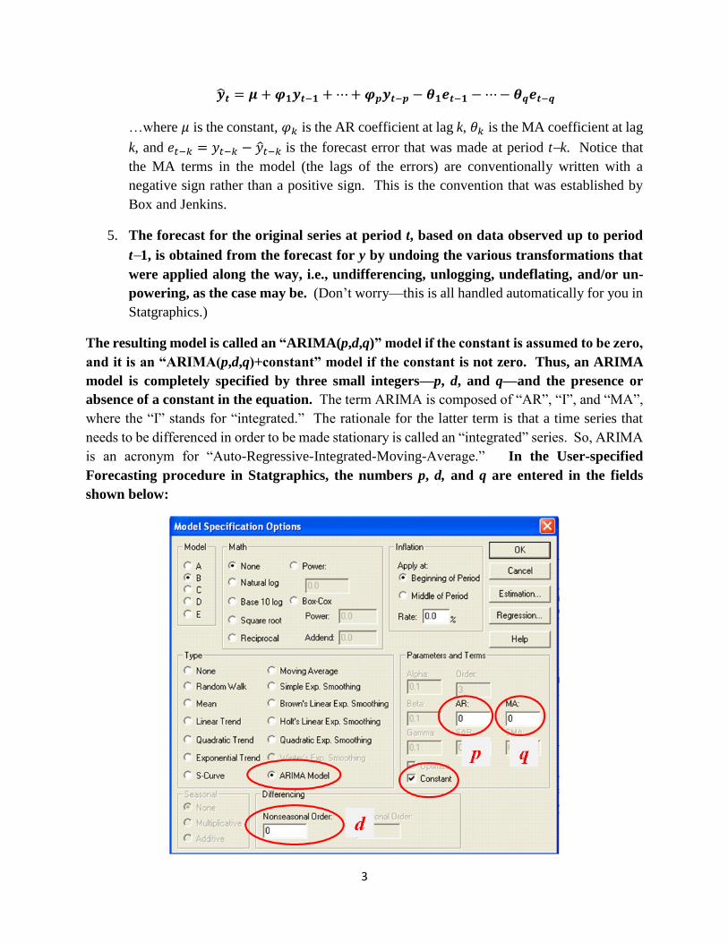
�̂�𝒕 = 𝝁 + 𝝋𝟏𝒚𝒕−𝟏 +⋯+𝝋𝒑𝒚𝒕−𝒑 − 𝜽𝟏𝒆𝒕−𝟏 −⋯− 𝜽𝒒𝒆𝒕−𝒒
…where 𝜇 is the constant, 𝜑𝑘 is the AR coefficient at lag k, 𝜃𝑘 is the MA coefficient at lag
k, and 𝑒𝑡−𝑘 = 𝑦𝑡−𝑘 − �̂�𝑡−𝑘 is the forecast error that was made at period tk. Notice that
the MA terms in the model (the lags of the errors) are conventionally written with a
negative sign rather than a positive sign. This is the convention that was established by
Box and Jenkins.
5. The forecast for the original series at period t, based on data observed up to period
t1, is obtained from the forecast for y by undoing the various transformations that
were applied along the way, i.e., undifferencing, unlogging, undeflating, and/or un-
powering, as the case may be. (Don’t worry—this is all handled automatically for you in
Statgraphics.)
The resulting model is called an “ARIMA(p,d,q)” model if the constant is assumed to be zero,
and it is an “ARIMA(p,d,q)+constant” model if the constant is not zero. Thus, an ARIMA
model is completely specified by three small integers—p, d, and q—and the presence or
absence of a constant in the equation. The term ARIMA is composed of “AR”, “I”, and “MA”,
where the “I” stands for “integrated.” The rationale for the latter term is that a time series that
needs to be differenced in order to be made stationary is called an “integrated” series. So, ARIMA
is an acronym for “Auto-Regressive-Integrated-Moving-Average.” In the User-specified
Forecasting procedure in Statgraphics, the numbers p, d, and q are entered in the fields
shown below:

4
The tricky step in this procedure is step 4, in which you determine the values of p and q that should
be used in the equation for predicting the stationarized series y. One way is to just try to some
standard combinations of p and q that often come up in practice (which are discussed below), but
there is a systematic procedure for determining the values they ought to have, which is based on
looking at plots of the autocorrelations and partial autocorrelations of y.
You’re already familiar with autocorrelations: the autocorrelation of y at lag k is the correlation
between y and itself lagged by k periods, i.e., it is the correlation between yt and yt-k. In RegressIt
terminology, this is the correlation between the series y and the series y_LAGk., and in Statgraphics
terminology it is the correlation between y and LAG(y,k).
The partial autocorrelation of y at lag k is the coefficient of y_LAGk in a regression of y on
y_LAG1, y_LAG2, …, up to y_LAGk. Thus, the partial autocorrelation of y at lag 1 is the same
as the autocorrelation of y at lag 1. The partial autocorrelation of y at lag 2 is the coefficient of
y_LAG2 in a regression of y on y_LAG1 and y_LAG2, and so on. The way to interpret the partial
autocorrelation at lag k is that it is the amount of correlation between y and y_LAGk that is not
explained by lower-order autocorrelations. For example, if y is positively correlated with itself
lagged by one period, then this already implies some degree of positive correlation between y and
itself lagged by 2 periods, because if y is positively correlated with itself lagged by one period,
then yt is positively correlated with yt-1, and yt-1 is positively correlated with yt-2, and so on.
Therefore, yt can be expected to be positively correlated with yt-2 on the basis of the lag-1
correlation. The partial autocorrelation of y at lag 2 is the amount of correlation between yt and
yt-2 that is not already explained by the fact that yt is correlated with yt-1 and yt-1 is correlated with
yt-2.
Now, here are the rules for determining p and q from the plots of autocorrelations and partial
autocorrelations:
i. If the ACF plot “cuts off sharply” at lag k (i.e., if the autocorrelation is significantly
different from zero at lag k and extremely low in significance at the next higher lag and
the ones that follow), while there is a more gradual “decay” in the PACF plot (i.e. if
the dropoff in significance beyond lag k is more gradual), then set q=k and p=0. This
is a so-called “MA(q) signature.”
ii. On the other hand, if the PACF plot cuts off sharply at lag k while there is a more
gradual decay in the ACF plot, then set p=k and q=0. This is a so-called “AR(p)
signature.”
iii. If there is a single spike at lag 1 in both the ACF and PACF plots, then set p=1 and q=0
if it is positive (this is an AR(1) signature), and set p=0 and q=1 if it is negative (this is
an MA(1) signature).
Here are a couple examples of patterns that you might see. On the left are time series and ACF
and PACF plots for a series with a clear AR(2) signature, i.e., an autoregressive model that includes

5
lags 1 and 2. There are two positive spikes in the PACF and a more gradual decay pattern in the
ACF. In the ACF plot, only the autocorrelations at lags 1 and 2 are highly significant—as are the
partial autocorrelations at lags 1 and 2 in the PACF plot—but the important thing is that higher-
order autocorrelations decline gradually while the partial autocorrelations cut off sharply at lag 2.
On the right are the corresponding plots for a series with a clear MA(1) signature: the ACF cuts
off sharply at lag 1 while the PACF decays more gradually.
Another characteristic feature of these two sets of plots is that the low-order autocorrelations are
positive for the series with the AR signature while they are negative for the series with the MA
signature. This is not always the case, but it is very common.
So, the way the game is played in step 4 is to look at the ACF and PACF plots for y and see
if there is a clear AR or MA signature. If there is, you have a very good guess of the values of
p and q that ought to be used, and usually one of them is zero and the other is a small number (1
or 2, occasionally 3).
Having made a good guess as to the correct values of p and q, you then try fitting a model with
these values (i.e., you enter them in the appropriate boxes on the Forecasting panel in Statgraphics)
and you look at the ACF and PACF plots of the residuals. If you have correctly identified the
model, you should not see any significant “spikes” in the autocorrelations or partial
autocorrelations of the residuals, especially at the first few lags. If you are looking at 20
MA(1) signature: 1 spike in ACF (which
is usually negative) and gradual decay in
PACF (usually from below)
AR(2) signature: spikes at lags 1 and 2 in PACF
(the first of which is usually positive), and
gradual decay in ACF (usually from above)

6
autocorrelations, there may be a few that are technically significant, i.e., outside the red 95% bands,
but what matters is whether this happens at the first few lags and whether there is any sort of
systemic pattern in the autocorrelations or partial autocorrelations.
Also, if you have correctly identified the model, the highest-order AR or MA coefficient should
be significantly different from zero according to the usual standard for a regression model,
i.e., it should have a t-stat greater than 2 in magnitude and correspondingly a P-value less
than 0.05. In applying this test, you only look at the highest order coefficient, not the lower-
order ones. (The lower ones are included automatically—you can’t get rid of them.) For example,
if you have fitted an AR(2) model (p=2), then you only care about the significance of the AR(2)
coefficient, not the AR(1) coefficient.
If the residual ACF and PACF look good and the highest-order coefficient is significant, then you
probably have identified the correct model, or at least there are no obvious corrections that ought
to be made. (Possibly you should try a model with one more order of differencing or one less
order of differencing—I’ll say more about that later.) If the ACF and PACF plot look good but
the highest-order coefficient is NOT significant, then you should try reducing p or q by 1, as the
case may be. For example, if you started out with p=2 and q=0, and you find that the AR(2)
coefficient does not turn out to be significant and the model otherwise looks good, then you should
try p=1 and q=0 instead. Probably you will get equally good results and have a simpler model.
Now, what if there ARE some significant residual autocorrelations or partial autocorrelations at
the first few lags? The rules here are the following:
(i) If there is a “spike” at a low-order lag in the residual ACF plot, then you
should increase q by 1 and re-fit the model. For example, if you started out with
q=1 and you find a spike at lag 2 in the residual ACF plot, then you should try q=2
instead.
(ii) Conversely, if there is a spike at a low-order lag in the PACF plot, you should
increase p by 1 and re-fit the model. However, when applying this rule, don’t
worry about lags higher than 3 unless you are dealing with physics or engineering
data rather than business or economic data.
You should virtually never have to use a value of p or q larger than 3 in an ARIMA model for a
business application, and in most cases they are less than 3. Also, the sum of p and q will generally
be no larger than 3, and usually only one of the two will be non-zero. You should try to avoid
using “mixed” models in which there are both AR and MA coefficients, except in very special
cases. 3
3 An exception to this is that If you are working with data from physics or engineering applications, you may encounter
mixed ARIMA(p,0,p-1) models for values of p that are 2 or larger. This model describes the discrete-time behavior
of a system that is governed by a p-order linear differential equation, if that means anything to you. For example, the
7
So, altogether, the rule for analyzing the residual ACF and PACF plots is this:
Spikes in the residual ACF plot at lags 1, 2, or 3 signify a need for a higher value of q, and
spikes in the residual PACF plot at lags 1, 2, or 3 indicate a need for a higher order of p.
If you decide to add any more terms to your model on the basis of the residual ACF and PACF
plots, just change one thing at a time, i.e., increase p by 1 or increase q by 1, and re-run the model
to see what the effect is before going any further. In general, you should try to keep the model as
simple as possible.
2. THE COOKBOOK
The technical guidelines of the previous section can be distilled into the following simpler set of
rules
(i) First determine whether a nonlinear transformation such as logging or deflating is necessary to
straighten out exponential growth curves and/or stabilize the variance (i.e., to make the local
random variations in the series roughly the same in magnitude from beginning to end). If so, then
apply the transformation. The natural log transformation and fixed-rate deflation transformations
are model options in the Forecasting procedure in Statgraphics.
(ii) If the series looks nonstationary at this point—i.e., if it displays a trend or random-walk
behavior—set the order of nonseasonal differencing to 1. If it still displays a trend or is only
slowly mean-reverting after one order of differencing, don’t immediately apply another order of
differencing, but keep it in mind for later on (step (vi) below).
(iii) Look at the ACF and PACF plots of the series you have at this point. If you don’t see any
significant autocorrelations, then stop—you’re done! You’ve identified either a mean model or a
random walk model, depending on whether you used 0 or 1 order of differencing in getting to this
point.
(iv) If you do see some significant autocorrelations, and if the first one or two bars on the ACF
plot are significant and negative, followed by a fairly sharp cutoff, while the PACF plot shows a
more gradual decay pattern from below, that is a clear sign that you need at least one MA term
(i.e., q=1 or q=2). On the other hand, if the first one or two bars on the PACF plot are significant
and positive, followed by a fairly sharp cutoff, while the ACF plot shows a more gradual decay
pattern from above, that is a clear sign that you need at least one AR term (i.e., p=1 or p=2). If
you see one of these two patterns, enter a 1 in the MA box or the AR box, depending on which one
it is. If you already have a 1 there, make it a 2. Fit the model and look at the ACF and PACF plots
motion of a mass on a spring that is subjected to normally distributed random shocks is described by an ARIMA(2,0,1)
model if it is observed in discrete time. If two such systems are coupled together, you would get an ARIMA(4,0,3)
model.

8
and time series plot of the residuals. If any of the first one or two bars are significant in the ACF
or PACF plot, apply the same reasoning as above to determine whether to increase the MA order
or AR order by one more. You should not go above 2 except in very rare circumstances. Also,
you should use only AR coefficients or only MA coefficients except in very rare circumstances, i.e.,
either the MA order will be zero or the AR order will be zero. (Occasionally one of them will be
2 and the other will be 1, but not very often.)
(v) Do not pay any attention to isolated spikes in the ACF or PACF plot beyond lag 3 if you are
working with nonseasonal data. You are mainly interested in the first few autocorrelations and
partial autocorrelations. Beyond that, you don’t look at individual autocorrelations—you just look
to see if there is some systematic pattern.
(vi) If the residuals of the model you converged on in step (iv) do not look quite stationary—e.g.,
if there is a sort of “wave” pattern or other nonrandom pattern in the residuals, then you may want
to increase the order of differencing. Also, if you have one or more AR coefficients in the model
at this point, add their values together and check to see if it is very close to 1 (say, on the order of
0.95 or more). If so, that is also a sign that you should try a higher order of differencing. If you
see either of these patterns, set the MA and AR orders back to zero and increase the order of
differencing from 0 to 1 if the current value is 0, and increase it from 1 to 2 if the current value is
1. If you have 2 differences at this point, uncheck the “Constant” box. (You should not include a
constant term in a model with 2 orders of differencing.) Now click OK to fit this model (which
will have only differences and no AR or MA coefficients) and look at the ACF and PACF of the
residuals. Go back to steps (iii) and (iv) at this point and apply the same reasoning to determine
whether you need to add AR or MA coefficients.
(vii) Each time you fit a model, you should look at the t-stat and P-value of the highest-order AR
coefficient and highest-order MA coefficient, in order to check their significance. For example, if
there are two AR coefficients, you should only check the significance of the AR(2) coefficient. If
it is not significant by the usual regression standards (i.e., if its t-stat is less than 2), you should
probably decrease the AR order by 1 or decrease the MA order by 1, as the case may be.
(viii) Beware of “overdifferencing” as well as “underdifferencing.” If you have one or more MA
coefficients in the model, add their values together and see if it is very close to 1 (say, greater than
0.95). If so, that is a sign that you may have taken one order of differencing too many. If so,
reduce the order of differencing by 1 and also reduce the MA order by 1 and re-fit the model.
(ix) Ideally you will end up with a fairly simple model whose highest-order coefficients are
significant and which has no significant residual autocorrelations and shows no signs of under- or
over-differencing. Also, you should check the residual normal probability plot (which is one of
the pane options behind the residual plot) to make sure it looks OK, as with any type of forecasting
model. If it’s not OK, you may need to take closer look at outliers and/or reconsider the need for
a data transformation.

9
3. THE COMMON NON-SEASONAL ARIMA MODELS
The previous section sketched the “cookbook” approach for identifying the appropriate ARIMA
model for any given time series. However, in practice there are a relatively small number of model
types that are encountered, and most of them are models we have seen before. We now just have
a more systematic way of classifying them, and we have a single modeling tool that can be used
for fitting all of them and tweaking them to improve their performance, if necessary. Here are the
nonseasonal ARIMA models that you most often encounter:
• ARIMA(0,0,0)+c = mean (constant) model
• ARIMA(0,1,0) = random walk model
• ARIMA(0,1,0)+c = random-walk-with-drift model (geometric RW if log transform
was used)
• ARIMA(1,0,0)+c = regression of Y on Y_LAG1 (1st-order autoregressive model)
• ARIMA(2,0,0)+c = regression of Y on Y_LAG1 and Y_LAG2 (2nd-order autoregressive
model)
• ARIMA(1,1,0)+c = regression of Y_DIFF1 on Y_DIFF1_LAG1 (1st-order AR model
applied to first difference of Y)
• ARIMA(2,1,0)+c = regression of Y_DIFF1 on Y_DIFF1_LAG1 & Y_DIFF1_LAG2
(2nd-order AR model applied to 1st difference of Y)
• ARIMA(0,1,1) = simple exponential smoothing model
• ARIMA(0,1,1)+c = simple exponential smoothing + constant linear trend
• ARIMA(1,1,2) = linear exponential smoothing with damped trend (leveling off)
• ARIMA(0,2,2) = generalized linear exponential smoothing (including Holt’s model)
If you understand the properties of the models whose names are on the right-hand-sides of these
identities (as I hope you do by now), you will often have a pretty good idea of which ARIMA
models you ought to try, even before you start looking at ACF and PACF plots. The ACF and
PACF plots and the ARIMA model options just provide you with tools for “fine-tuning” these
models. For example, if you fit an SES model by specifying it as an ARIMA(0,1,1) model, and
you find that there is a spike at lag 2 in the residual ACF plot, this suggests that you should increase
q from 1 to 2, getting an ARIMA(0,1,2) model. Probably this will not make a huge difference in
the error stats, but it probably won’t overfit the data data either, so there is no harm in doing it if
the MA(2) coefficient turns out to be statistically significant. Notice that most of these models

10
have only one or two AR or MA terms and they are generally pure AR models or pure MA models,
not mixed AR-MA models.
To fit an ARIMA model in Statgraphics, click the “ARIMA model” button on the model options
panel in the forecasting procedure, and enter the values of p, d, and q in the boxes label “AR”,
“Nonseasonal Order”, and “MA”, respectively. Check the “Constant” box to include a constant in
the equation.
You can do all your work inside the forecasting procedure if you wish, but in principle you ought
to do some descriptive analysis (in the Descriptive Methods procedure in Statgraphics) before
selecting the first model to test. The following section gives an illustration of how such an analysis
might proceed.
4. AN EXAMPLE
Consider a time series called “units,” which supposedly refers to weekly unit sales of some product
over 150 weeks. (Actually, this is simulated data—it is way too smooth to be real—but it makes
a good illustration anyway.) Suppose you begin your analysis by going to the Descriptive Methods
procedure and drawing the time series plot, ACF plot, and PACF plot, and they come out looking
like this:

11
The series is obviously nonstationary—it has a strong upward trend—but there does not appear to
be a need for a nonlinear data transformation. A strongly trended series will always have very
large positive autocorrelations at all low-order lags and a single spike at lag 1 in the PACF. This
is the signature of a series that probably needs to be differenced at least once in order to be made
stationary. So, let’s use the right-mouse-button adjustment options to increase the order of
differencing from 0 to 1:

12
The plots will now look like this:

13
This is an AR signature: the first few autocorrelations are positive and the PACF cuts off
more sharply than the ACF. The number of significant spikes in the PACF is either 1 or 2.
(The lag-2 PACF is barely outside the red bands.) However, the time series plot only shows very
slow mean-reversion, so it is not entirely clear that the series is really stationary at this point.
Perhaps the next higher order of differencing should be considered. We’ll try that later, but for
the moment, let’s go to the Forecasting procedure and try an ARIMA(1,1,0)+c model, i.e., a model
with 1 order of nonseasonal differencing and an AR(1) term and a constant linear trend.
When fitting ARIMA models, you should click the “Graphs” button on the toolbar and turn on
the residual time series plot and residual PACF plot as well as the time sequence plot:

14
The ARIMA model specifications and the resulting plots look like this:
The ACF plot and PACF plot look pretty “flat”, although the first few values are all positive and
some of them are right around the 95% band. The residual plot also does not look completely
random. There is a pattern of slow mean reversion rather than pure “noise,” i.e., the local mean
value of the residuals tends to wander away from zero for long stretches of time. I would call
this a “borderline nonstationary” pattern. This sort of pattern might be interpreted either as a “weak
AR signature” or as an indication that a higher order of differencing is needed. (It’s a “weak” AR
signature because there is a systematic pattern of positive autocorrelation but the values are barely
significant.)
The model’s forecasts into the future extend along a straight line whose slope is the average trend
over the whole series. This is what you always get in an ARIMA model that includes 1 order of
differencing and a constant term. (The forecasts for the first few periods into the future will not

15
lie exactly along the trend line if the model includes AR coefficients, but they will quickly
converge to it.)
The model summary report looks like this:
The AR(1) coefficient is fairly significant (t=4), and the “Mean” (which is the estimated trend per
period when a single order of differencing has been used) is also significant (t=2.56) as we might
have guessed from the original plot. The RMSE is 1.376 and the MAPE is a tiny number, 0.46%,
reflecting the smoothness of the series. (The “estimated white noise standard deviation” is just
another name for the RMSE here. This is traditional ARIMA jargon.)
The “mean” and the “constant” are not the same thing if a model has autoregressive coefficients.
The mean is the mean of the stationarized series. The constant is the “mu” term () in the ARIMA
equation, which is analogous to the intercept in a regression equation. The constant is equal to the
mean multiplied by 1 minus the sum of the AR coefficients. For example, in this case we have
0.2875 = (10.3126)*0.4183. The important thing to keep in mind that if an order of differencing
has been used, then the mean, not the constant, is the estimated trend per period. If no differencing
has been used, then the mean is just the mean of the series itself.

16
These results are not “bad,” although the borderline-nonstationary pattern in the residuals suggests
that we ought to consider either adding the next higher AR term (set p=2) or else go to the next
higher level of differencing. If we set p=2:
…we now have an ARIMA(2,1,0)+c model, and the plots and model summary report come out
looking like this:
The first few autocorrelations have gotten slightly smaller, but the residual time series plot looks
about the same. The AR(2) coefficient is barely significant (t=2.08) and the RMSE is almost the
same (1.35 to three significant digits, rather than 1.38). So, this is not really an improvement. We
should prefer the ARIMA(1,1,0)+c model on the grounds of simplicity.

17
Because of the borderline-nonstationary appearance of the series after one nonseasonal
difference, we ought to consider using a second difference. So, let’s go back to the Descriptive
Methods procedure and see what the plots look like with d=2:
This is an MA(1) signature: there is a single negative spike in the ACF plot and a decay
pattern (from below) in the PACF plot. This is what you often see when you go to the next
higher order of differencing when the previous pattern was one of weak positive autocorrelation.
So, there is a clear indication that we should set q=1 (and p=0) if we are going to use d=2. Also,
with 2 orders of differencing we should NOT include a constant term. (A constant term with 2
orders of differencing would introduce a quadratic trend in the forecasts, which is rarely a good
idea.) Altogether, this reasoning yields an ARIMA(0,2,1) model, which is a special case of a
linear exponential smoothing model.

18
The MA(1) coefficient is large (0.75) and highly significant, which was to be expected, given the
large magnitude of the lag-1 autocorrelation of the twice-differenced series. (When there is a
negative spike in the ACF at lag 1, you always get a positive value for the MA(1) coefficient.)
However, the error stats are basically the same as those of the other models (the RMSE is 1.37 in
comparison to 1.38 and 1.35 for the others, and the MAPE’s are also virtually the same) , and the
residual time series and ACF plot look pretty much like those of the previous model. The residual
time series plot looks slightly more like “pure noise” in the sense of having a local mean that is
closer to zero at all points in time, although there is still a hint of slow mean reversion.
The forecasts of this model extend along a straight line, as did those of the previous model, but for
this model the slope of the line is an estimate of the local trend, not the global trend. In this
case the local trend appears slightly smaller than the global trend, so the trend in the forecasts is
not quite as steep for this model as it was for the previous two models. Notice that the confidence
limits for forecasts are much wider for this model—in fact, they widen with a “trumpet” shape

19
instead of a sideways-parabola shape. This is characteristic of ARIMA models with 2 orders of
nonseasonal differencing, as well as characteristic of linear exponential smoothing models. This
model assumes that there is a randomly-varying local trend rather than a constant local trend,
which makes the future look much more uncertain. (Both of these models are quite different from
a simple-trend-line model. In both of them the trend line that is extrapolated into the future
anchored is upon a weighted average of recent values rather than anchored in the center of the
data.)
One more thing that should be done here is to hold out some data and do an out-of-sample-
validation of all three models. If we hold out the last 30 points (20% of the sample), we get the
following results:
Interestingly, the error stats of all models in the validation period are much better than in the
estimation period, which evidently means that the data has been less noisy in the recent past than
in the more distant past. Sometimes this happens. The validation-period statistics of the models
are all virtually identical. Under-the-hood these models are all very similar in how they generate
one-step-ahead forecasts. They only differ significantly in their implications for trend
extrapolation.
20
Which of the three models is best? They give nearly identical results (including unrealistically
tiny MAPE’s!) in terms of their one-step-ahead forecast errors, so the choice needs to be made on
the basis of other considerations. The important difference between models A and C is that model
A assumes a constant long-term trend while model C assumes a time-varying local trend. If you
want the model to try to estimate the local trend, then model C might be the best choice as long as
you are not forecasting too far into the future. However, if you think that there really is a constant
trend over the long run, and if you are forecasting farther into the future, then model A might be
preferred.
5. SUMMARY
This contrived example is rather simplistic and doesn’t lead to a “slam-dunk” conclusion about the
best model, but it illustrates the general kind of reasoning that is used when fitting ARIMA models,
and it also illustrates some of the patterns that you typically see in ACF and PACF plots along the
way. Time series that have trends or random-walk patterns are always strongly positively
autocorrelated. This looks like a very strong AR signature, but it is actually a sign of
“underdifferencing,” i.e., the series needs to be differenced to be made stationary. If you apply
one or more first-difference transformations, the autocorrelations are reduced and
eventually become negative, and the signature changes from an AR signature to an MA
signature. An AR signature is often the signature of a series that is “slightly underdifferenced,”
while an MA signature is often the signature of a series that is “slightly overdifferenced.” If you
apply one difference too many, you will get a very strong pattern of negative autocorrelation. You
should be careful to avoid overdifferencing the data—if the lag-1 autocorrelation is zero or
negative at the current order of differencing, the series almost certainly does not need a
higher order of differencing. Also, you should generally avoid using both AR and MA terms
in the same nonseasonal ARIMA model: they may end up working against each other and
merely canceling each other’s effects.
The graphic on the following page illustrates this “spectrum” of possibilities and the modeling
steps that move you back and forth in it (adding or removing differences, adding AR or MA terms).
The idea is to end up in the middle, with residuals that are “white noise.” It is not ALWAYS the
case that an AR signature is one of positive autocorrelation lag 1 and an MA signature is one of
negative autocorrelation at lag 1, but this is most often what you see.
When you apply this sort of reasoning, you will quickly converge on one or two models that appear
to be appropriate. If two models with different orders of differencing give very similar results for
one-step-ahead forecasts, then you should choose among them on the basis of other reasons, such
as their implicit assumptions about the nature of short- or long-term trends in the data. Most of
the time you will end up with one of the common types of ARIMA models listed in section 3, and
most of these are models we have already studied under other names. However, the ARIMA
procedure provides a nice unifying framework for fitting all these models and fine-tuning them.

21
Also, the ARIMA procedure has a few other bells and whistles, such as an option for adding
independent variables to the forecasting equation, yielding a hybrid regression/time-series model.
Here’s a map of the spectrum of autocorrelation patterns you may see in your data, and how to
move back and forth in it by changing the model specifications until the residuals of the model are
in the center: white noise. These pictures are not the only possibilities—you may see more
interesting patterns in your data—but the same general principles will apply.