Final evaulation
10
Evalutation part1 I have chosen three young male artist around the age of 17 represent each page my magazine wearing urban clothes(jacket ,necklace/chains ,hats). This is because the magazine’s target audience mainly young teenagers and adults between the age of 13 to 25.
-
Upload
benszy123 -
Category
Entertainment & Humor
-
view
76 -
download
0
Transcript of Final evaulation

Evalutation part1
I have chosen three young male artist around the age of 17 represent each page my magazine wearing urban
clothes(jacket ,necklace/chains ,hats). This is because the magazine’s target audience mainly young teenagers and
adults between the age of 13 to 25.

.Inspiration from this magazine.Two artist or more on it .Simular background.Both are simple no much on the page but still informative.Catchy titles dispite all the writing and other stuff
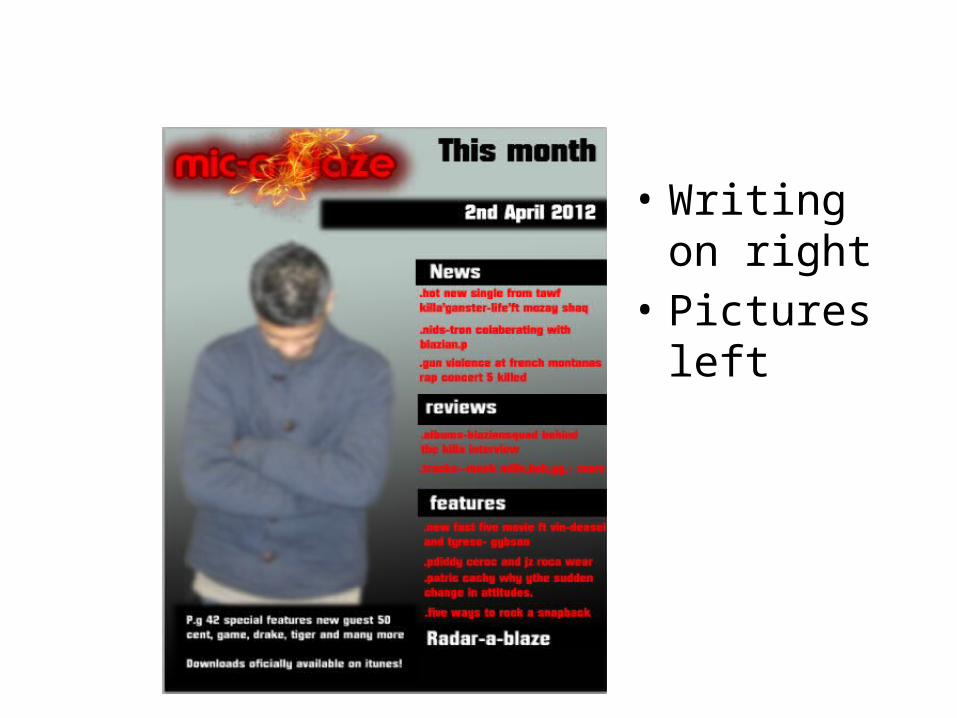
• Writing on right
• Pictures left


Evaluation part fonts + target audience
• In my opinion, I'm very confident that I have represented the hip-hop genre very well because the usage of the large title “mic-a-blaze” + subtitle “hip hop on new levelz” respectively helped create a flash and eye catchy theme which is what hip-hop portrays with its music. Furthermore the follows generic convention of a which is currently on shelves therefore the target audience can still relate it. I also tried challenging the conventions by wide range of colours, using all sorts of effects and images.

Evaluation part3 language
• For the main title I used “mic-a-blaze” which is a very strong metaphoric phrase which emphasises on good the artists/rappers and how they set the microphone alight just by singing. In the magazine I used slang/colloquial “new levelz” “rated A* S**T”, “HOT new single” language because young teenagers/adults love using it and makes it is easier for my magazine to read communicate with the audience. Further more I used a lot quotes because they are from role their role models allowing them to follow them. Another reason for using quotes is beacues they cachy.

Distribution
• The media institution that will distribute my magazine are video game shops or music shops like HMV, Game, cornershops or blockbuster, this is because majority of my targeted audience regularly visit these shops making it easy and perfect for distribution.

Evalution part 5 Process of production
• From the process of production I’ve learnt how to use Photoshop effectively to my advantage e.g. (background, font size and colour and general effects like shading and lightening).

Evalution part6 Preliminary task to real task
• From the preliminary task leading to the real task I have learnt a great deal. This includes thing such as adding colours to my pages, cropping images and laying them out so they look better. In addition to this generally learnt how maintain your magazine and keeping it looking proffesional.
evaluation part 7 Areas of improves.
• I think that I could have improved on colour usage and used more to show Enovation and originality instead of using the same old black, red and white.
• I could have improved a bit on cropping the images.
• I could have used a bit more camera shots instead of just using medium and close up shots

![Final evaulation[12]](https://static.fdocuments.in/doc/165x107/55c2eae6bb61eba5708b4673/final-evaulation12.jpg)