Evaulation Q2
6
Evaluation Q2: How effective is the COMBINATION of your main products and ancillary tasks?
-
Upload
deeowens96 -
Category
Social Media
-
view
54 -
download
0
Transcript of Evaulation Q2
Evaluation Q2:How effective is the
COMBINATIONof your main productsand ancillary tasks?
PRODUCTION
In real industry, the same production team would produce both my print products and my documentary. A marketing team at the film company would source material from the film to produce the poster and send out publicity ‘packs’ to magazines so that they can complete their reviews.
The poster has to correctly represent the film, as my documentary has a professional feel to it I would need to also connote this in my print products. This would include keeping the colours consistent and not having to many different bright colours as it may look childlike, which is certainly not what I aim for my print products.
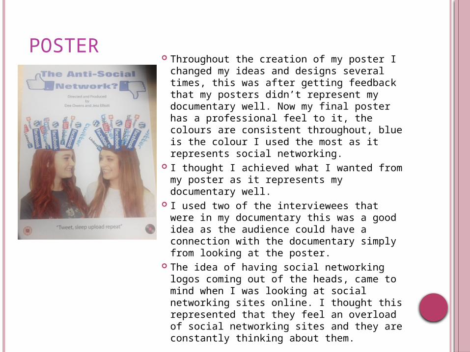
POSTER Throughout the creation of my poster I
changed my ideas and designs several times, this was after getting feedback that my posters didn’t represent my documentary well. Now my final poster has a professional feel to it, the colours are consistent throughout, blue is the colour I used the most as it represents social networking.
I thought I achieved what I wanted from my poster as it represents my documentary well.
I used two of the interviewees that were in my documentary this was a good idea as the audience could have a connection with the documentary simply from looking at the poster.
The idea of having social networking logos coming out of the heads, came to mind when I was looking at social networking sites online. I thought this represented that they feel an overload of social networking sites and they are constantly thinking about them.
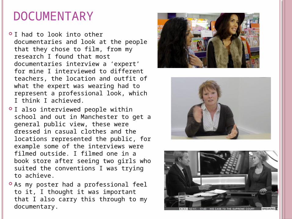
DOCUMENTARY I had to look into other documentaries
and look at the people that they chose to film, from my research I found that most documentaries interview a ‘expert’ for mine I interviewed to different teachers, the location and outfit of what the expert was wearing had to represent a professional look, which I think I achieved.
I also interviewed people within school and out in Manchester to get a general public view, these were dressed in casual clothes and the locations represented the public, for example some of the interviews were filmed outside. I filmed one in a book store after seeing two girls who suited the conventions I was trying to achieve.
As my poster had a professional feel to it, I thought it was important that I also carry this through to my documentary.
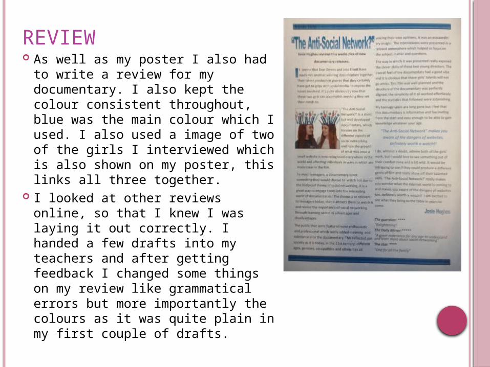
REVIEW As well as my poster I also had to
write a review for my documentary. I also kept the colour consistent throughout, blue was the main colour which I used. I also used a image of two of the girls I interviewed which is also shown on my poster, this links all three together.
I looked at other reviews online, so that I knew I was laying it out correctly. I handed a few drafts into my teachers and after getting feedback I changed some things on my review like grammatical errors but more importantly the colours as it was quite plain in my first couple of drafts.
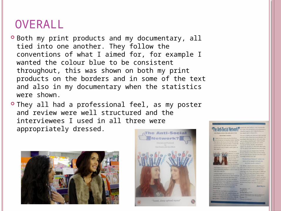
OVERALL Both my print products and my documentary, all
tied into one another. They follow the conventions of what I aimed for, for example I wanted the colour blue to be consistent throughout, this was shown on both my print products on the borders and in some of the text and also in my documentary when the statistics were shown.
They all had a professional feel, as my poster and review were well structured and the interviewees I used in all three were appropriately dressed.

![Final evaulation[12]](https://static.fdocuments.in/doc/165x107/55c2eae6bb61eba5708b4673/final-evaulation12.jpg)