Working with Charts › ... › viewer_6_charts.pdf · Pie charts consist of a circle (“pie”)...
89
Copyright 2016 Silvon Software, Inc. All rights reserved. (Last Revised: October 2016) 1 Working with Charts Stratum.Viewer 6 Getting Started Tasks Additional Information • Access to Charts • Introduction to Charts • Overview of Chart Types • Quick Start - Adding a Chart to a View • Create a Chart with Data Wizard • Copy a Chart • Drill Down in a Chart • Export Charts to Excel • Format Axis • Format Chart • Format Chart Area • Format Chart Legend • Format Chart Titles • Format Chart Type • Format Data Points • Format Series • Hide or Show a Chart • Hide or Show the Grid for a Chart • Remove a Chart • Save a Chart Windows • Chart Data Wizard Window • Color Window • Display Options Window • Export to Excel Open / Save Prompt • Export to Excel Worksheet • Format Chart Area Window • Format Chart Axis Window • Format Chart Data Points Window • Format Chart Legend Window • Format Chart Series Window • Format Chart Strip Line Window • Format Chart Title Window • Format Chart Window • Grid • Grid Toolbar • View Explorer Advanced Concepts • Format Chart Axis Strip Lines • Rearrange Series Displayed in Chart • Remove Data Points from a Chart • Remove Series from a Chart • Static vs. Dynamic Charts FAQ's • Why Can't I Create a Dual Axis Chart? • Why Doesn't a Second Chart Type in a Combinational Chart Display? Definitions • Data Points
Transcript of Working with Charts › ... › viewer_6_charts.pdf · Pie charts consist of a circle (“pie”)...

Copyright 2016 Silvon Software, Inc. All rights reserved. (Last Revised: October 2016) 1
Working with Charts Stratum.Viewer 6
Getting Started Tasks Additional Information
• Access to Charts
• Introduction to Charts
• Overview of Chart Types
• Quick Start - Adding a Chart to a View
• Create a Chart with Data Wizard
• Copy a Chart
• Drill Down in a Chart
• Export Charts to Excel
• Format Axis
• Format Chart
• Format Chart Area
• Format Chart Legend
• Format Chart Titles
• Format Chart Type
• Format Data Points
• Format Series
• Hide or Show a Chart
• Hide or Show the Grid for a Chart
• Remove a Chart
• Save a Chart
Windows
• Chart Data Wizard Window
• Color Window
• Display Options Window
• Export to Excel Open / Save Prompt
• Export to Excel Worksheet
• Format Chart Area Window
• Format Chart Axis Window
• Format Chart Data Points Window
• Format Chart Legend Window
• Format Chart Series Window
• Format Chart Strip Line Window
• Format Chart Title Window
• Format Chart Window
• Grid
• Grid Toolbar
• View Explorer
Advanced Concepts
• Format Chart Axis Strip Lines
• Rearrange Series Displayed in Chart
• Remove Data Points from a Chart
• Remove Series from a Chart
• Static vs. Dynamic Charts
FAQ's
• Why Can't I Create a Dual Axis Chart?
• Why Doesn't a Second Chart Type in a Combinational Chart Display?
Definitions
• Data Points

2 Working with Charts
• Interval
• Interval Offset
• Markers
• Scaling
• Series
• Strip Line
Getting Started
Access to Charts Your user profile level controls what you can do with Stratum.Viewer charting.
User Profile Level
Views & Charts
Run Insert/Edit Show/Hide Remove Casual
Advanced
View Administrator
Security Administrator
Note: Casual users can run a view with a chart attached, but they cannot insert, edit, or remove a chart.
Introduction to Charts Charts communicate information visually, and they make it easy for you to see comparisons, patterns, and trends in data. For instance, rather than having to analyze several columns of worksheet numbers, you can see at a glance whether sales are rising or falling over a given period of time, or how the actual sales compare to the projected sales. Sometimes, your data needs to be presented in a chart to help identify trends.
Stratum.Viewer’s charting functionality supports over 15 different chart types, dual axis charts, and charts that show totaling and All Others summary data. You can chart all rows and columns of data by clicking the Insert New Chart
icon and making a few quick selections in the Chart Wizard. You can also control many formatting characteristics in the chart and the area surrounding the chart. In addition, you can create multiple charts for a view, display or hide each one, or even hide the grid and display only the chart(s) for a view.

Copyright 2016 Silvon Software, Inc. All rights reserved. (Last Revised: October 2016) 3

4 Working with Charts
Overview of Chart Types Choosing the correct chart type and the correct information is the key to a successful chart. A good chart easily conveys a message and uses an appropriate chart type. A bad chart contains too many data points or series; contains disperse data so the scaling is meaningless; or contains data that is very similar so everything looks the same. Stratum.Viewer supports the following chart types:
Area Bar Bubble Column Combinational Doughnut Line Pie Point Spline Spline Area Stacked Area Stacked Area (100%) Stacked Bar Stacked Bar (100%) Stacked Column Stacked Column
(100%) Step Line
Area / Line Charts Line and Area charts show continuous data revealing trends and relationships between data points. If you want to emphasize trends themselves over quantities, use a line chart. Use an Area chart to show the trend of one or more series over time with an emphasis on quantities. An example of a Line chart follows.
Area charts show trends in values, just as line charts do, but they also show the relation of parts to the whole and to each other. The Area chart consists of one or more lines drawn on a grid with the areas in between filled in. With this solid look, Area charts convey more emphasis on quantities. If creating an Area chart, plot at least two series. You should not combine positive and negative values in an area chart - the values should be all positive or all negative.

Copyright 2016 Silvon Software, Inc. All rights reserved. (Last Revised: October 2016) 5
Bar/Column Charts Bar or column charts are good when you’re plotting data that spans many periods of time, or has large fluctuations from time period to time period. They can be used to show how something changes over time or to compare items. The height of the column or the length of the bar corresponds to the amount being compared. You can combine positive and negative values – negative numbers appear as columns extending below the horizontal axis. You should consider using a Bar chart when you have multiple sets and want to highlight the progression of values with a set. The vertical bars of a Column chart type effectively display a trend, and the horizontal bars of a Bar chart type work best when you don’t want to communicate a trend.

6 Working with Charts
Pie / Doughnut Charts Pie charts consist of a circle (“pie”) divided into two or more sections (“slices”) and are not drawn on any type of grid. Use a Pie chart to chart a single series when your primary message is the relationship of the parts to the whole represented as percentages at a set point in time. . Within a Pie chart, each data point is represented by a “slice” of the pie, and the entire pie represents a single series.
Doughnut charts show each category’s part of the whole. Just like the pie chart, it must be clearly marked to easily tell what each slice represents. They are used to compare a small number of values, and it is best when the value of each component is not similar.
Recommendation: To keep the Pie chart readable and allow easy comparisons, avoid dividing the pie into more than six or seven pieces, and plot either all positive or all negative values.
Additional Chart Types
Bubble Chart Bubble charts let you chart three variables in two dimensions. All three variables are independent, and you choose what displays on the X axis, Y axis, and bubble size. The size of each bubble is typically used to represent importance. For example; the Return % could be the X axis, the Gross Margin % is the Y axis, and the Sales Amount is the size of the bubble.
Point Chart A Point chart shows the relationship between two sets of numeric values. Other chart types have values along one axis and data points in the other. Point charts have numeric values plotted along both axes, displaying the relationship between the two variables.

Copyright 2016 Silvon Software, Inc. All rights reserved. (Last Revised: October 2016) 7
Stacked Charts Stacked charts allow the comparison of different sets of data (series) across the same set of data (data points). They show segments of totals based on the amount or percentage of the total. Only a few items can be effectively displayed in each stack. Each stack is a data point, and each portion of the stack is a series. The following Stacked chart types are supported:
• Stacked Column Chart
• Stacked Bar Chart
• Stacked Bar (100%) Chart
• Stacked Column (100%) Chart
• Stacked Area (100%) Chart
Combinational Charts A Combinational chart uses two or more chart types in the same chart area to emphasize that the chart contains different sets of information. For example, you could use a column chart to display sales data and a line chart to display budget data. Each chart type is defined individually. An example of a Combinational chart follows:
8 Working with Charts
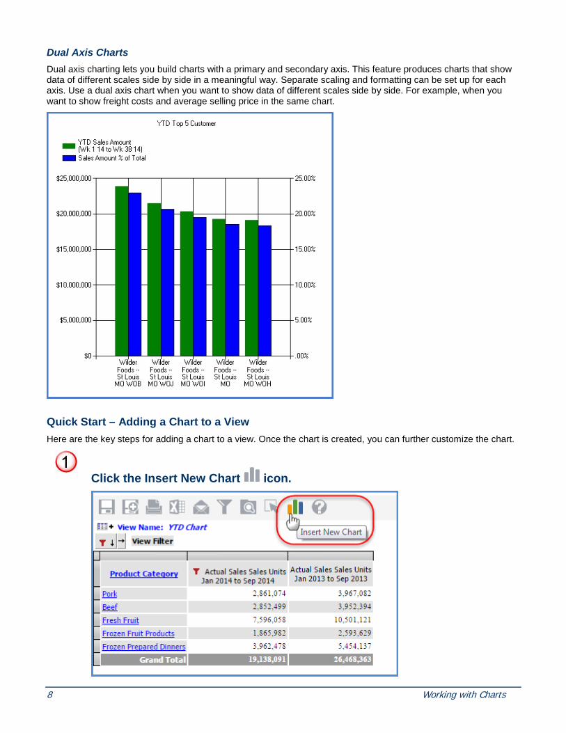
Dual Axis Charts Dual axis charting lets you build charts with a primary and secondary axis. This feature produces charts that show data of different scales side by side in a meaningful way. Separate scaling and formatting can be set up for each axis. Use a dual axis chart when you want to show data of different scales side by side. For example, when you want to show freight costs and average selling price in the same chart.
Quick Start – Adding a Chart to a View Here are the key steps for adding a chart to a view. Once the chart is created, you can further customize the chart.
Click the Insert New Chart icon.

Copyright 2016 Silvon Software, Inc. All rights reserved. (Last Revised: October 2016) 9
Choose the chart type and click Finish.
All grid rows and columns are charted.

10 Working with Charts
Tasks
Create a Chart with Data Wizard
1. Access the Chart Data Wizard in one of two ways:
Click the Insert New Chart icon .
OR
Right-click anywhere in the view grid. From the pop-up menu, choose Insert then Chart.
2a. In the Chart Data Wizard (Step 1 of 3) - Series window, choose the chart type, whether series are from rows or columns, three dimensional, and dynamic or static. If series are dynamic, you also have the option of including Total and All Others data. See Chart Data Wizard (Step 1 of 3) – Series.
2b. If you selected series to be static, options display to select the values for the series. Click Add to open an additional selection window. See Chart Data Wizard (Step 1b of 3) – Static Series. Highlight the rows or columns in the grid and then click Select. Verify the correct data is selected, and click Done.
3a. Click Next to define the chart’s data points. In the Chart Data Wizard (Step 2 of 3) – Data Points window, choose whether the data points are dynamic or static. If data points are dynamic, you also have the option of including Total and All Others data. See Chart Data Wizard (Step 2 of 3) – Data Points.
3b. If you selected data points to be static, options display to select the values for the data points. Click Add to open an additional selection window. See Chart Data Wizard (Step 2b of 3) – Static Data Points. Highlight the rows or columns in the grid and then click Select. Verify the correct data is selected, and click Done.
4. Click Next to define the style of the chart’s title, axes, and legend.
5. Click Finish.
Note: Once the chart is created, you can further customize the chart.
Copy a Chart
1. Press CTRL while right-clicking within a chart area to access the browser context menu.
2. Choose Copy to copy to the Clipboard.

Copyright 2016 Silvon Software, Inc. All rights reserved. (Last Revised: October 2016) 11
Drill Within in a Chart You can drill within a chart just like you can within a view grid. If a drill-down is available, a pop-up label informs you of the drill to level.
• Click on the series within the chart and the drill will be performed. • When you drill within a chart, the drilling is also performed on the view grid.
Export Charts to Excel
1. From the grid toolbar, click Export to Excel .
OR
Right-click the view name in the grid and select Excel from the pop-up menu.

12 Working with Charts
2. Once the export file has been created, you will be prompted to open or save the file.
• The grid data and the chart data display on separate Excel spreadsheet tabs.

Copyright 2016 Silvon Software, Inc. All rights reserved. (Last Revised: October 2016) 13
Format Chart Axis
1. Access the Format Chart Axis window by right-clicking anywhere in the chart area and choosing Format, then Axis, and then Primary Horizontal or Primary Vertical from the pop-up menu.
Note: If the chart is Dual Axis, then there is an additional option for Secondary Axis.
2 Click the General folder and format the general properties such as axis arrows, the frequency of the grid lines displayed, whether additional outside margins are displayed, and if there is a minimum or maximum limit.
3. Click the Labels folder and adjust the visibility of the axis label, the style and format, as well as font and scaling.
4. Click the Grid Lines folder and adjust the axis grid lines. Determine the style, color, and width of the grid lines.
5. Click the Strip Lines folder and select an existing strip line to highlight some information included in the chart, create a new strip line, or edit or delete an existing one.
6. Click the Title folder and adjust the axis title and positioning. Determine the font style, color, and size.
7. Click OK.
Note: Changes can be made on all the various folders (General, Labels, Grid Lines, Strip Lines, and Title) and the save will apply to all changes.
Format Chart
1. Access the Format Chart window in one of two ways:
In view explorer, right-click an individual chart title and choose Format then Chart from the pop-up menu.
OR
Right-click anywhere on the chart and choose Format then Chart from the pop-up menu.
2. Click the General folder and format the general properties. Specify the chart name, chart type (see image below for available chart types), whether the chart is visible or not, and whether the chart displays in 3D or not.
14 Working with Charts
3. Click the Background folder and adjust the background of the chart. It could be filled with a solid color, a gradient fill, a textured fill, or even an image.
4. Click the Border folder and adjust the border of the chart. Determine the style, color and width of the border.
5. Click OK.
Note: Changes can be made on all the various folders (General, Background, and Border) and the save will apply to all changes.
Format Chart Area
1. Access the Format Chart Area window in one of two ways:
In view explorer, right-click the Charts folder or an individual chart title and choose Format then Chart Area from the pop-up menu.
OR
Right-click anywhere in the chart area. From the pop-up menu, choose Format then Chart Area.
2. In the Format Chart Area window, click the General folder and edit the size, positioning, and antialiasing (smoothness) of the chart area.
3. Click the Background folder and adjust the background of the chart area. It could be filled with a solid color, a gradient fill, a textured fill, or even an image.
4. Click the Border folder and adjust the border of the chart area. Determine the style, color and width of the border.
5. Click OK.
Note: The chart area applies to all charts included in the view. Changes can be made on all the various folders (General, Background, Border) and the save will apply to all changes.
Format Chart Legend
1. Access the Format Chart Legend window by right-clicking anywhere in the chart area and choosing Format then Legend from the pop-up menu.
2 Click the General folder and format the general properties such as whether the legend is visible or not, the style (row, column, table), the position of the legend, and the amount of text you want to display on a single line.
3. Click the Background folder and adjust the background of the chart legend. It could be filled with a solid color, a gradient fill, a textured fill, or even an image.
4. Click the Border folder and adjust the border of the chart legend. Determine the style, color and width of the border.

Copyright 2016 Silvon Software, Inc. All rights reserved. (Last Revised: October 2016) 15
5. Click the Font folder and adjust the font of the chart legend. Determine the font style, color and size.
6. Click OK.
Note: Changes can be made on all the various folders (General, Background, Border, Font) and the save will apply to all changes.
Format Chart Title
1. Access the Format Chart Title window in one of two ways:
In view explorer, right-click the chart title and choose Format then Title from the pop-up menu.
OR
Right-click the chart title in the Chart Area. From the pop-up menu, choose Format then Title.
2. In the Format Chart Title window, click the General folder and format the general properties.
• Edit the Caption (chart title). • Adjust the Alignment to be Center, Left, or Right. • Define the Style. • Add a Tool Tip Caption, which will display when the mouse hovers over the chart title.
3. Click the Background folder and adjust the background of the chart title. It could be filled with a solid color, a gradient fill, a textured fill, or even an image.
4. Click the Border folder and adjust the border of the chart title. Determine the style, color and width of the border.
5. Click the Font folder and adjust the font of the chart title. Determine the font style, color and size.
6. Click OK.
Note: Changes can be made on all the various folders (General, Background, Border, Font) and the save will apply to all changes.
Format Chart Type
1. Access the Chart Type field from one of two windows:
Right-click anywhere on the chart and choose Data Wizard from the pop-up menu.
OR
Right-click anywhere on the chart and choose Format then Chart from the pop-up menu.

16 Working with Charts
2. Specify the chart type. See Overview of Chart Types for more information on the various chart types.
3. Within the Data Wizard, click Finish; or within the Format Chart window, click OK to refresh the chart in the newly selected chart type.
Format Data Points
1. Access the Format Chart Data Point window one of two ways:
Right-click on the data point and choose Format then Data Point from the pop-up menu.
OR
Click the Data Points folder within the Format Chart Series window, select the desired data point, and click Edit.
Note: Formatting options for chart data points are only available if data points are defined as static. Dynamic data points cannot be formatted.
2. In the Format Chart Data Point window, click the General folder and edit the data points’ color.
3. Click the Axis Label folder and adjust the automatic or custom caption.
4. Click the Label folder and customize the value label used for the selected data point. Specify whether the label displays, how the value is formatted, and an automatic or custom caption.
5. Click the Legend folder to maintain what displays in the legend for the selected data point. Within this window, you determine whether the legend is visible and also an additional caption to label the data point.
6. Click OK.
Note: Changes can be made on all the various folders (General, Axis Label, Label, Legend) and the save will apply to all changes.

Copyright 2016 Silvon Software, Inc. All rights reserved. (Last Revised: October 2016) 17
Format Series
1. Access the Format Chart Series window by right-clicking a series in the chart legend or within the chart and selecting Format then Series from the pop-up menu.
Note: Formatting options for chart series are only available if series are defined as static. Dynamic series cannot be formatted.
2. In the Format Chart Series window, click the General folder and edit the series’ color, chart type, and the plotting of the series (Primary or Secondary axis).
3. Click the Border folder and adjust the border of the series. Determine the style, color, and width of the border.
4. If the data points are also static, click the Data Points folder to edit or delete the static data points. See Format Data Points.
5. Click the Legend folder to maintain what displays in the legend for the selected series. Within this window, you determine whether the legend is visible and also an additional caption to label the series.
6. Click the Line folder. If the chart type is a Line, Spline, or Step Line, you can control the style and width of the lines within the chart.
7. Click the Markers folder and define the color, size, style, and interval frequency of the chart markers which are used to highlight data points within a series.
8. Click OK.
Note: Changes can be made on all the various folders (General, Border, Data Points, Legend, Line, Markers) and the save will apply to all changes.
Hide or Show a Chart
Hide Use one of these options:
• Right-click anywhere within the chart area then choose Hide.
OR
• Right-click the chart name displayed in view explorer then choose Hide.
Show
1. Right-click the chart name displayed in view explorer.
2. Choose Show.
Note: To get a hidden chart to redisplay, you must use view explorer.

18 Working with Charts
Hide or Show the Grid for a Chart
Hide
• Click the Display Options icon in the view toolbar.
• De-select the Show Grid checkbox in the Display Options window.
• Click OK.
Show
• Click the Display Options icon in the view toolbar.
• Select the Show Grid checkbox in the Display Options window.
• Click OK.
Remove a Chart
1. Right-click anywhere within the chart area then choose Remove.
2. Choose Chart to remove the active chart, or All Charts to remove all of the charts included in the view.
OR
1. Right-click the chart name displayed in view explorer.
2. Choose Chart to remove the active chart, or All Charts to remove all of the charts included in the view.
Save a Chart You can save a view which contains any of the following combinations:
• Grid only
• Grid and a chart
• Chart only
• Grid and multiple charts
• Multiple charts only
1. Click the Save As icon to save the chart as part of a new view, or click the Save icon to save the chart as part of the current view.

Copyright 2016 Silvon Software, Inc. All rights reserved. (Last Revised: October 2016) 19
Windows
Chart Data Wizard Window There are three main windows to the chart wizard. There is a window to define the chart type and the series, a window to define data points, and a window to set up basic style elements such as the title and axes labels.
• Chart Data Wizard (Step 1 of 3) – Series
• Chart Data Wizard (Step 1b of 3) – Static Series
• Chart Data Wizard (Step 2 of 3) – Data Points
• Chart Data Wizard (Step 2b of 3) – Static Data Points
• Chart Data Wizard (Step 3 of 3) - Style
Chart Data Wizard (Step 1 of 3) - Series
Chart Type – Determines the chart type. The following are chart types supported by Stratum.Viewer: Area, Bar, Bubble, Column, Combinational, Doughnut, Line, Pie, Point, Spline, Spline Area, Stacked Area, Stacked Area (100%), Stacked Bar, Stacked Bar (100%), Stacked Column, Stacked Column (100%), and Step Line.
Series From – Series are a group of related items (data points) that are included in a chart. Series can be created from either the rows or columns of the view grid.
3D – Select this checkbox if you want the chart to be three dimensional.

20 Working with Charts
Series: Dynamic – All grid rows or columns will be charted when the series are dynamic.
Totals and All Others – Options are provided for showing Totals and All others data when series are dynamic. Dynamic series will graph all rows or columns displayed in the view grid.
Notes: Series and data points can be a mixture of dynamic or static in your chart. For example, series could be dynamic while data points are static.
Series: Static – If the series are static, only the selected rows or columns from the grid will be charted. If you select Static, options display to select the values for the series. Clicking Add opens an additional selection window. See Chart Data Wizard (Step 1b of 3) – Static Series.
Next, Finish, Cancel – Click Next to define the chart’s data points, Finish to complete the chart without further customization, or Cancel to close the Chart Data Wizard without creating a chart.

Copyright 2016 Silvon Software, Inc. All rights reserved. (Last Revised: October 2016) 21
Chart Data Wizard (Step 1b of 3) – Static Series
Chart Type – The selected chart type is displayed here. When the chart type is set to “Combinational”, Chart Type must be defined for each series. Chart type is display only for all other chart types.
Values – Displays the static series for the chart. To add new series, click Select within the Chart Data Wizard window, the highlighted measure items or members from the grid are added as static series for the chart and display in this area.
Copy Data Point From – If you edit an existing chart and are adding a new series, you can use the “Copy Data Point From” property to create data points for the new series. This is useful when adding a new series and you want the data points for the new series to be the same as those for an existing series.
Select – Clicking Select will add the selected rows or columns from the Viewer grid as series for the chart.
Done – Click Done to complete the process of defining the static series and redisplay the Chart Data Wizard (Step of 1 of 3) – Series window with the static series identified. You can reorganize the

22 Working with Charts
positioning of the static series within the chart using the Up or Down arrow buttons within the newly displayed window.
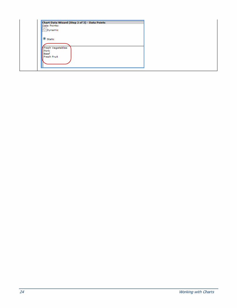
Chart Data Wizard (Step 2 of 3) – Data Points
Data Points: Dynamic– Data points can be created from either the rows or columns of the grid. If series were defined from the rows, then data points will be the grid’s columns, and vice versa. All grid rows or columns will be charted for dynamic data points.
Totals and All Others – Options are provided for showing Totals and All others data when data points are dynamic. Dynamic data points will graph all rows or columns displayed in the view grid.
Data Points: Static – If the data points are static, only the selected rows or columns will be charted. If you select Static, options display to select the values for the data points. Clicking Add opens an additional selection window similar to the window for static series. See Chart Data Wizard (Step 1b of 3) – Static Data Points.

Copyright 2016 Silvon Software, Inc. All rights reserved. (Last Revised: October 2016) 23
Chart Data Wizard (Step 2b of 3) – Static Data Points
Y-Values – Displays the static data points for the chart. To add new data points, click Select within the Chart Data Wizard window, and the selected members or measure items display in this area.
X-Values {Optional} – You can optionally add data points to the X axis. Highlight the static data points (rows or columns) in the grid. Once you click Select, the measure items display in this area.
Select – Clicking Select (in both the Y-Values and the X-Values area) will add the selected rows or columns from the Viewer grid as data points for the chart. Clear – Clears any values currently selected and displayed on the window.
Done – Click Done to complete the process of defining the static data points and redisplay the Chart Data Wizard (Step of 2 of 3) – Data Points window with the static data points identified.
24 Working with Charts

Copyright 2016 Silvon Software, Inc. All rights reserved. (Last Revised: October 2016) 25
Chart Data Wizard (Step 3 of 3) - Style
Titles – Customize the look of the chart titles. The Chart Title defaults to the view title. The X-Axis Title is the label for the horizontal axis. The Y-Axis Title is the label for the vertical axis.
Axes – Use this area of the window to hide the axis labels. They are displayed by default.
Legend – Use this area of the window to control the visibility and positioning of the chart legend. The chart’s legend can display at the top, bottom, left, or right of the chart area.

26 Working with Charts
Color Window
Selected Color – The color selected from the basic color palette displays here.
Custom – To define your own custom color, click the Custom button and click the desired color from the provided palette. The Custom / Basic button works as a toggle switching between the two different versions of the window.
OK – Click OK to accept your color selection and close the window.
Cancel – Click Cancel to ignore any selections and close the window.

Copyright 2016 Silvon Software, Inc. All rights reserved. (Last Revised: October 2016) 27
Display Options Window
Lock Rows and Columns – Select this option to “lock” captions and level related data in rows and columns when scrolling through view results. Captions for levels, attribute relationships, and measure items will remain visible and locked in position at all times as you scroll through a view to look at measure item values. In the following example, items in the areas marked by the letter A will remain in a locked and visible position as you scroll up, down, left, or right to see the rest of the level members, Actual Sales Amount, and Percent of Total data in the view (the area marked by letter B).
28 Working with Charts
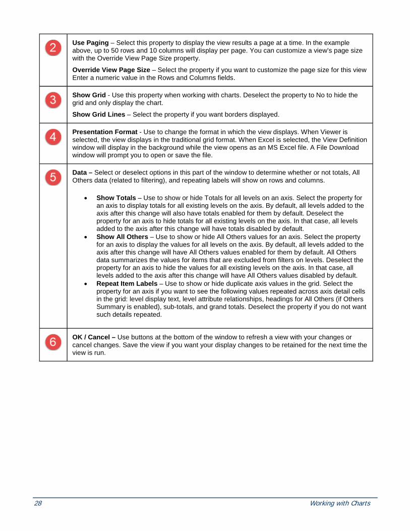
Use Paging – Select this property to display the view results a page at a time. In the example above, up to 50 rows and 10 columns will display per page. You can customize a view’s page size with the Override View Page Size property.
Override View Page Size – Select the property if you want to customize the page size for this view Enter a numeric value in the Rows and Columns fields.
Show Grid - Use this property when working with charts. Deselect the property to No to hide the grid and only display the chart.
Show Grid Lines – Select the property if you want borders displayed.
Presentation Format - Use to change the format in which the view displays. When Viewer is selected, the view displays in the traditional grid format. When Excel is selected, the View Definition window will display in the background while the view opens as an MS Excel file. A File Download window will prompt you to open or save the file.
Data – Select or deselect options in this part of the window to determine whether or not totals, All Others data (related to filtering), and repeating labels will show on rows and columns.
• Show Totals – Use to show or hide Totals for all levels on an axis. Select the property for an axis to display totals for all existing levels on the axis. By default, all levels added to the axis after this change will also have totals enabled for them by default. Deselect the property for an axis to hide totals for all existing levels on the axis. In that case, all levels added to the axis after this change will have totals disabled by default.
• Show All Others – Use to show or hide All Others values for an axis. Select the property for an axis to display the values for all levels on the axis. By default, all levels added to the axis after this change will have All Others values enabled for them by default. All Others data summarizes the values for items that are excluded from filters on levels. Deselect the property for an axis to hide the values for all existing levels on the axis. In that case, all levels added to the axis after this change will have All Others values disabled by default.
• Repeat Item Labels – Use to show or hide duplicate axis values in the grid. Select the property for an axis if you want to see the following values repeated across axis detail cells in the grid: level display text, level attribute relationships, headings for All Others (if Others Summary is enabled), sub-totals, and grand totals. Deselect the property if you do not want such details repeated.
OK / Cancel – Use buttons at the bottom of the window to refresh a view with your changes or cancel changes. Save the view if you want your display changes to be retained for the next time the view is run.

Copyright 2016 Silvon Software, Inc. All rights reserved. (Last Revised: October 2016) 29
Export to Excel Open / Save Prompt
Open - Opens the file as a Microsoft Excel workbook. Grid data and charts display as separate worksheets within the workbook.
Save / Save As – Identify the file save location.

30 Working with Charts
Export to Excel Worksheet These examples show how view data is exported to Excel. This view has both a grid and a chart included.

Copyright 2016 Silvon Software, Inc. All rights reserved. (Last Revised: October 2016) 31
The file name contains the view name and date of the export. The grid is displayed starting in the first cell of the Excel worksheet. The worksheet that contains the contents of the grid is named using up to the first 27 characters of the view name. All rows and columns of the view are exported. If the grid is not visible in the view, then it will not be included in the export file.

32 Working with Charts
The worksheet that contains the charts associated with the view is named using up to the first 27 characters of the view name followed by a dash mark and the letter ‘C’. The chart is an embedded image in a separate worksheet and displays the identical size of the chart(s) in the view. If there were more than one chart, they would all display as one image on the chart worksheet.
Note: When exporting view data into Excel, only the values, images, and conditional formatting will be brought into the workbook. For example, any sorted or filtered data in the view will be carried over in that state to the worksheet but the Stratum.Viewer sort and filter functionality and icons will not be carried over. You will need to use Excel sort and filter functionality if you want to modify the data further in the worksheet. Any value such as subtotals, grand totals, calculated measures, etc, will not be a formula but simply the value displayed within Stratum.Viewer.
Copyright 2016 Silvon Software, Inc. All rights reserved. (Last Revised: October 2016) 33
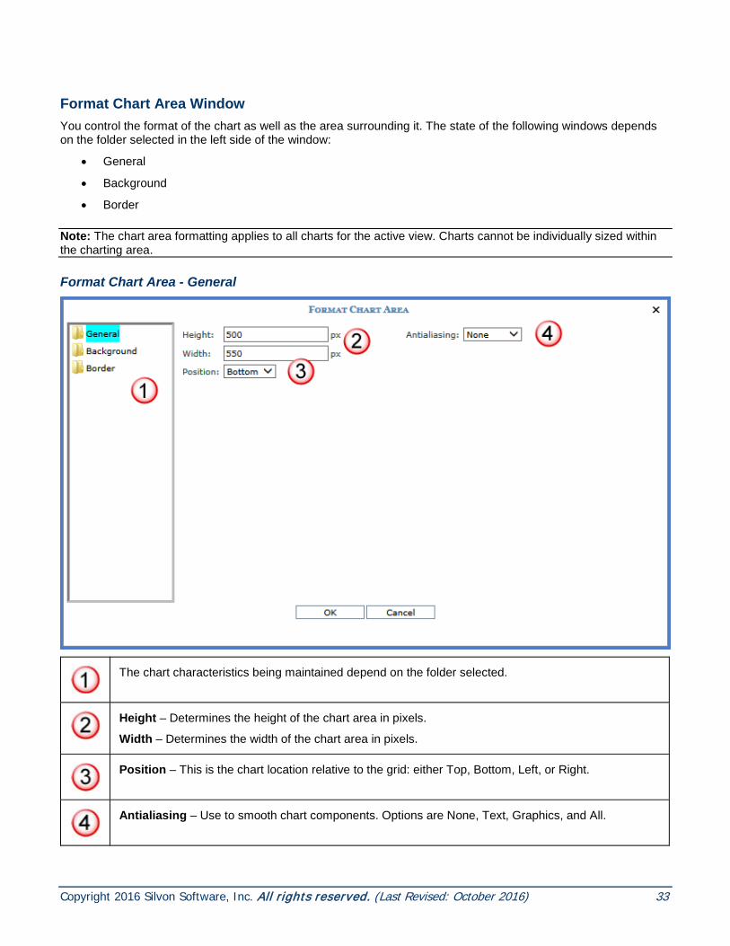
Format Chart Area Window You control the format of the chart as well as the area surrounding it. The state of the following windows depends on the folder selected in the left side of the window:
• General
• Background
• Border
Note: The chart area formatting applies to all charts for the active view. Charts cannot be individually sized within the charting area.
Format Chart Area - General
The chart characteristics being maintained depend on the folder selected.
Height – Determines the height of the chart area in pixels.
Width – Determines the width of the chart area in pixels.
Position – This is the chart location relative to the grid: either Top, Bottom, Left, or Right.
Antialiasing – Use to smooth chart components. Options are None, Text, Graphics, and All.
34 Working with Charts
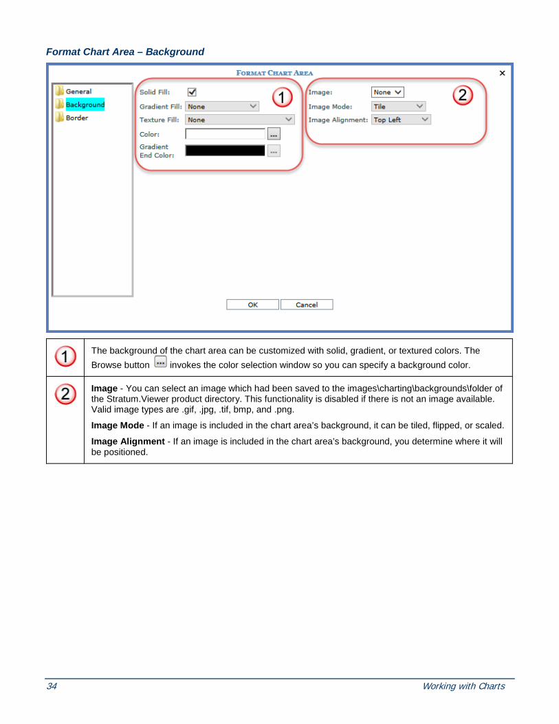
Format Chart Area – Background
The background of the chart area can be customized with solid, gradient, or textured colors. The Browse button invokes the color selection window so you can specify a background color.
Image - You can select an image which had been saved to the images\charting\backgrounds\folder of the Stratum.Viewer product directory. This functionality is disabled if there is not an image available. Valid image types are .gif, .jpg, .tif, bmp, and .png.
Image Mode - If an image is included in the chart area’s background, it can be tiled, flipped, or scaled.
Image Alignment - If an image is included in the chart area’s background, you determine where it will be positioned.

Copyright 2016 Silvon Software, Inc. All rights reserved. (Last Revised: October 2016) 35
Format Chart Area – Border
Style – If a style is selected, the Color and Width properties are enabled. Styles to choose from are Dash, Dash Dot, Dash Dot Dot, Dot, and Solid. You must select a width and color for the specified border style to be visible.
Width - Specify a width of 1 to 10 for the chart area’s border.
Color – The Browse button invokes the color selection window so you can specify a border color for the area surrounding the charts.
Format Chart Axis Window You can control the format of both the vertical and the horizontal axis. The state of the following windows depends on the folder selected in the left side of the window:
• General
• Labels
• Grid Lines
• Strip Lines
• Title
36 Working with Charts
Format Chart Axis – General
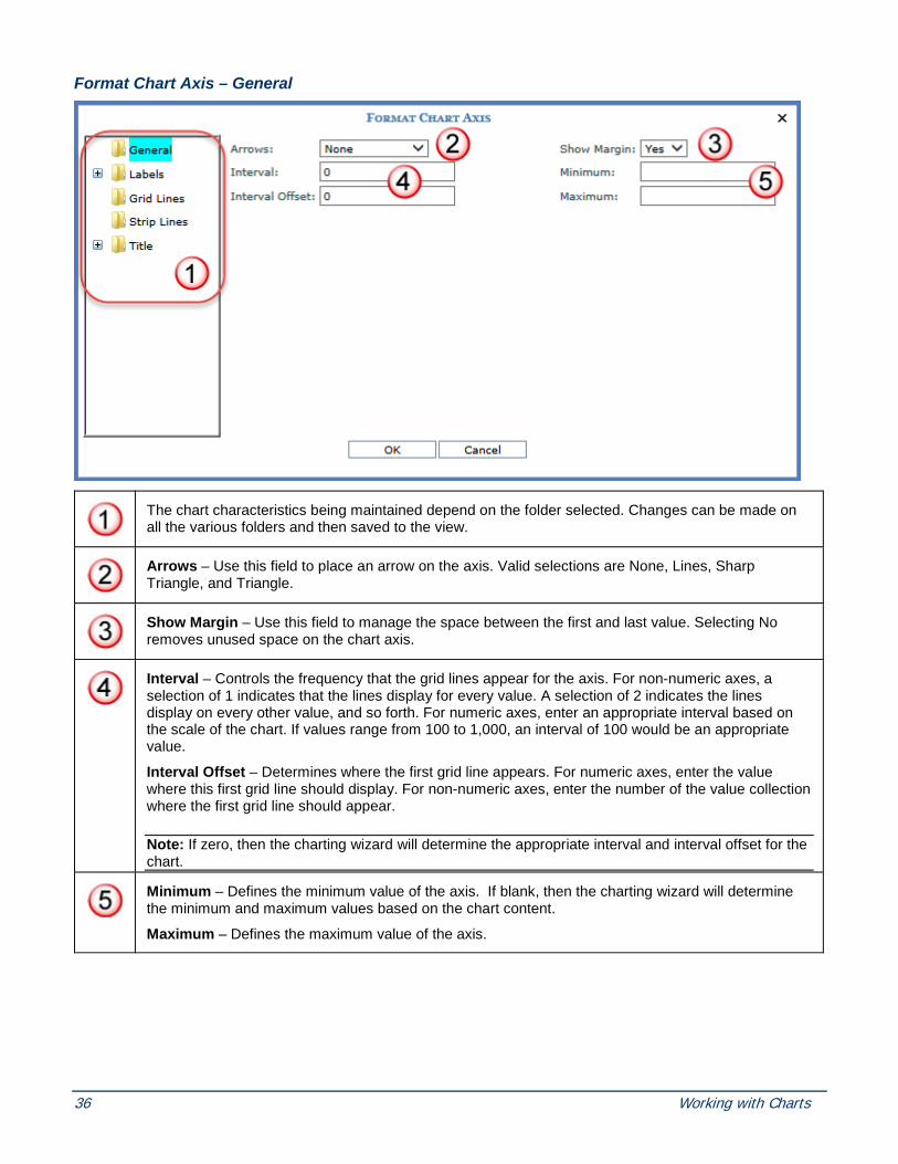
The chart characteristics being maintained depend on the folder selected. Changes can be made on all the various folders and then saved to the view.
Arrows – Use this field to place an arrow on the axis. Valid selections are None, Lines, Sharp Triangle, and Triangle.
Show Margin – Use this field to manage the space between the first and last value. Selecting No removes unused space on the chart axis.
Interval – Controls the frequency that the grid lines appear for the axis. For non-numeric axes, a selection of 1 indicates that the lines display for every value. A selection of 2 indicates the lines display on every other value, and so forth. For numeric axes, enter an appropriate interval based on the scale of the chart. If values range from 100 to 1,000, an interval of 100 would be an appropriate value.
Interval Offset – Determines where the first grid line appears. For numeric axes, enter the value where this first grid line should display. For non-numeric axes, enter the number of the value collection where the first grid line should appear.
Note: If zero, then the charting wizard will determine the appropriate interval and interval offset for the chart.
Minimum – Defines the minimum value of the axis. If blank, then the charting wizard will determine the minimum and maximum values based on the chart content.
Maximum – Defines the maximum value of the axis.

Copyright 2016 Silvon Software, Inc. All rights reserved. (Last Revised: October 2016) 37
Format Chart Axis – Labels; General
Auto Fit Style – Controls the positioning of the axis labels. Charting wizard validates the selection and ultimately determines the best style to use. Valid selections are shown below:
Visible – Controls whether or not the axis labels are visible.
Format – Select from options like #.00, #.00%, and As Is to determine the format of numeric axis labels.
Truncate – Choose Yes to shorten the labels when there is not enough room for them to display. By default, the labels are not truncated. The charting wizard validates selection and ultimately determines the extent to which the label is truncated.

38 Working with Charts
Format Chart Axis – Labels; Font
Angle – Enter an angle number at which the axis labels are to display. Valid range is -90 to 90. If Auto Fit Style was not defined on the General folder, the angle entered here is always applied. If Auto Fit Style was defined, angle entered here may be used if the charting wizard determines the auto fit angle would not be properly displayed.
Name - Choose the font type for the axis. The Browse button invokes the Select Fonts window so you can specify a font type.
Style – Choose whether the axis label is bold, italic, underline, or regular font.
Color – Choose the color of the axis label font. The Browse button invokes the color selection window so you can specify a color.
Size – An axis font size of 12 or less is recommended.

Copyright 2016 Silvon Software, Inc. All rights reserved. (Last Revised: October 2016) 39
Format Chart Axis – Labels; Scaling
Interval – Controls the frequency that the labels appear for the axis. A selection of 1 indicates that the labels display for every value. A selection of 2 indicates the labels display on every other value, and so forth.
Interval Offset – Determines where the first label appears.
Note: If zero, then the charting wizard will determine the appropriate interval and interval offset for the chart.

40 Working with Charts
Format Chart Axis – Grid Lines
Line Style – Defines the style of the grid lines for this axis. Styles to choose from are Dash, Dash Dot, Dash Dot Dot, Dot, None, and Solid. You must select a color for the specified border style to be visible.
Line Width - Specify a width of 1 to 10 for the axis grid lines.
Line Color – The Browse button invokes the color selection window so you can specify a line color.

Copyright 2016 Silvon Software, Inc. All rights reserved. (Last Revised: October 2016) 41
Format Chart Axis – Strip Lines
Strip Lines – Select a strip line from the drop down list to highlight some information included in the chart. For more information, see Format Chart Axis Strip Lines.
New - Access the Format Chart Strip Line window so a new strip line can be defined. See the Format Chart Axis Strip Lines topic for more information.
Edit - Edit the selected strip line. Button only available when a strip line is selected.
Delete - Delete the selected strip line. Button only available when a strip line is selected.

42 Working with Charts
Format Chart Axis – Title; General
Alignment - If a title is included, you determine where it will be positioned. Valid options are Center, Far, and Near.
Title – Enter a caption labeling the axis.
Format Chart Axis – Title; Font

Copyright 2016 Silvon Software, Inc. All rights reserved. (Last Revised: October 2016) 43
Name - Choose the font type for the axis title. The Browse button invokes the Select Fonts window so you can specify a font type.
Size – An axis font size of 12 or less is recommended.
Color – Choose the color of the axis title font. The Browse button invokes the color selection window so you can specify a color.
Style – Choose whether the axis title is bold, italic, underline, or regular font.
Format Chart Data Point Window You control the format of a chart’s static data points. The state of the following windows depends on the folder selected in the left side of the window. Edits must be made to each data point individually. Changes can be made on all the various folders and all edits will apply to the selected data point.
• General
• Axis Label
• Label
• Legend
Note: If the series are static, then formatting will be applied only to the data point in the selected series. If series are dynamic, then the data point formatting is applied to all series for the selected data point.
Format Chart Data Point - General

44 Working with Charts
The data point’s characteristics being maintained depend on the folder selected.
Color – The Browse button invokes the color selection window so you can specify the color of the data point.
Note: When no color is specified the Charting wizard will assign a color to the data point.
Format Chart Data Point – Axis Label
Auto Caption – This controls the label that appears in the axis for the selected data point. If set to Yes, the axis label for the static data point comes from the caption displayed in the view grid.
Custom Caption – If Auto Caption is No, then a custom caption can be entered in this field. The custom caption will label the data point within its axis.

Copyright 2016 Silvon Software, Inc. All rights reserved. (Last Revised: October 2016) 45
Format Chart Data Points – Label
Visible - You control whether or not a label is visible for the selected data point. If set to Yes, the specified label will be displayed next to the data point within the chart.
Auto Caption – Valid selections for a data point label are Value, Text, and No. If it is set to value, then the data point’s value from the grid will display using the specified Format String. If set to No, you can enter a custom caption in the Custom Caption field. If set to Text, the data point’s caption from the grid displays as the label.
Format String – Use this field to select a format for the data to be displayed if Auto Caption is set to “Value.” Choose how you want to format the chart’s data label by selecting one from the drop down list. Available format strings are dependent on your implementation, but some examples may be “As Is” “#.00” or “#.00%.”
Custom Caption – If Auto Caption is No, then a custom caption can be entered in this field.

46 Working with Charts
Format Chart Data Point - Legend
Visible - You control the legend entry for the selected data point by choosing Yes or No.
Auto Caption – If set to Yes, the legend label for the data point comes from the view grid.
Custom Caption – If Auto Caption is No, then a custom caption can be entered in this field. The custom caption defined for the data point will display in the legend.
Format Chart Legend Window You control the format of the chart legend as well as the area surrounding it. The state of the following windows depends on the folder selected in the left side of the window:
• General
• Background
• Border
• Font

Copyright 2016 Silvon Software, Inc. All rights reserved. (Last Revised: October 2016) 47
Format Chart Legend - General
The chart legend characteristics being maintained depend on the folder selected.
Visible - You control whether or not the legend is visible within the chart area.
Style - Determines the legend style. Options are Column, Row, and Table.
Position - Choose Bottom, Left, Right, or Top to determine the positioning of the chart legend in relationship to the chart.
Alignment – Choose left, right, or center from the drop-down list to determine how the chart legend is aligned.
Text Wrap Threshold - Determines how many characters display before wrapping to next line.

48 Working with Charts
Format Chart Legend – Background
The background of the chart legend can be customized with solid, gradient, or textured colors. The Browse button invokes the color selection window so you can specify a background color.
Image - You can select an image which had been saved to the images\charting\backgrounds\folder of the Stratum.Viewer product directory. This functionality is disabled if there is not an image available. Valid image types are .gif, .jpg, .tif, bmp, and png.
Image Mode - If an image is included in the chart legend, it can be tiled, flipped, or scaled.
Image Alignment - If an image is included in the chart legend, you determine where it will be positioned.

Copyright 2016 Silvon Software, Inc. All rights reserved. (Last Revised: October 2016) 49
Format Chart Legend – Border
Style – If a style is selected, the Color and Width properties are enabled. Styles to choose from are Dash, Dash Dot, Dash Dot Dot, Dot, and Solid. You must select a width and color for the specified border style to be visible.
Width - Specify a width of 1 to 10 for the chart legend border.
Color – The Browse button invokes the color selection window so you can specify a border color.

50 Working with Charts
Format Chart Legend – Font
Name and Size - Choose a font type and font size for the chart legend.
Color and Style - The Browse button invokes the color selection window so you can specify a font color. You can also make the font bold, italic, or underlined.
Format Chart Series Window You control the format of a chart’s static series. The state of the following windows depends on the folder selected in the left side of the window. Edits must be made to each series individually. Changes can be made on all the various folders and all edits will apply to the selected series.
• General
• Border
• Data Points (only available when data points are static)
• Legend
• Line
• Markers
Copyright 2016 Silvon Software, Inc. All rights reserved. (Last Revised: October 2016) 51
Format Chart Series - General
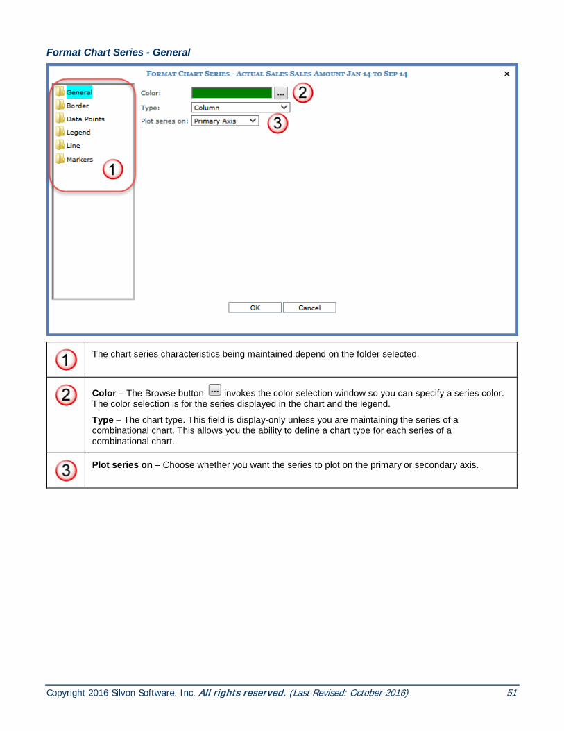
The chart series characteristics being maintained depend on the folder selected.
Color – The Browse button invokes the color selection window so you can specify a series color. The color selection is for the series displayed in the chart and the legend.
Type – The chart type. This field is display-only unless you are maintaining the series of a combinational chart. This allows you the ability to define a chart type for each series of a combinational chart.
Plot series on – Choose whether you want the series to plot on the primary or secondary axis.
52 Working with Charts
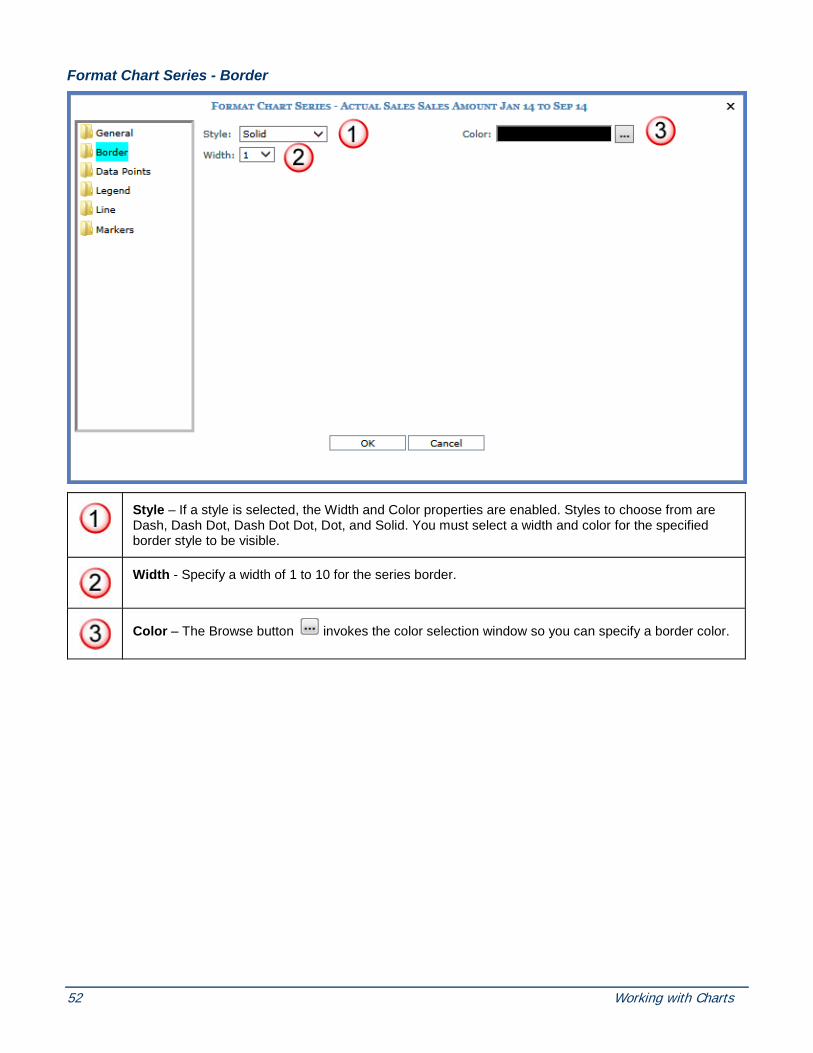
Format Chart Series - Border
Style – If a style is selected, the Width and Color properties are enabled. Styles to choose from are Dash, Dash Dot, Dash Dot Dot, Dot, and Solid. You must select a width and color for the specified border style to be visible.
Width - Specify a width of 1 to 10 for the series border.
Color – The Browse button invokes the color selection window so you can specify a border color.
Copyright 2016 Silvon Software, Inc. All rights reserved. (Last Revised: October 2016) 53
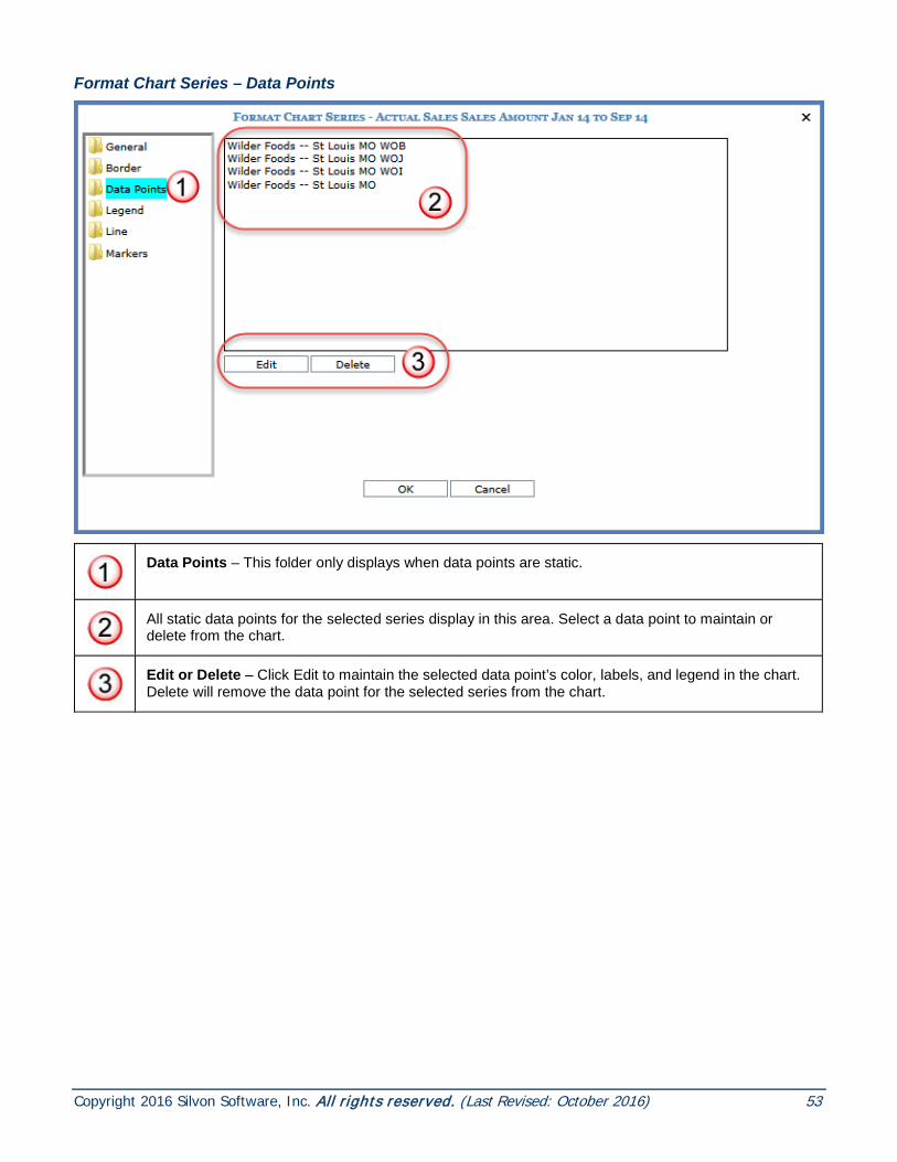
Format Chart Series – Data Points
Data Points – This folder only displays when data points are static.
All static data points for the selected series display in this area. Select a data point to maintain or delete from the chart.
Edit or Delete – Click Edit to maintain the selected data point’s color, labels, and legend in the chart. Delete will remove the data point for the selected series from the chart.

54 Working with Charts
Format Chart Series - Legend
Visible - You control whether or not the legend is visible within the chart area.
Auto Caption – If set to Yes, the legend label for the series comes from the caption displayed in the view grid.
Custom Caption – If Auto Caption is No, then a custom caption can be entered in this field. The custom caption defined for the series will display in the legend.

Copyright 2016 Silvon Software, Inc. All rights reserved. (Last Revised: October 2016) 55
Format Chart Series – Line
Note: Line folder is only available if the series being formatted is for a Line, Spline, or Step Line chart.
Style – If a style is selected, the Width property is enabled. Styles to choose from are Dash, Dash Dot, Dash Dot Dot, Dot, and Solid.
Width - Specify a width of 1 to 10 for the chart series line.

56 Working with Charts
Format Chart Series – Markers
Border Color – The Browse button invokes the color selection window so you can specify a border color for the marker
Color – The Browse button invokes the color selection window so you can specify a marker color.
Size – Specify a marker size by selecting one from the drop-down list.
Style – Marker styles to choose from are: Circle, Cross, Diamond, Square, Star 10, Star 4, Star 5, Star 6, Triangle, and None.
Interval – Controls the frequency of the displayed markers for the selected series. An interval of 1 will have a marker at each data point. An interval of 3 will display a marker for every third data point, and so forth. If a marker has been defined, but no Interval is specified then markers will display at every data point.
Format Chart Strip Line Window A strip line can be used to highlight information. It could indicate a point at which values are acceptable, or it could mark a point that needs attention. The state of the following windows depends on the folder selected in the left side of the window:
• General
• Background
• Border
• Title

Copyright 2016 Silvon Software, Inc. All rights reserved. (Last Revised: October 2016) 57
Format Chart Strip Line – General
The chart characteristics being maintained depend on the folder selected. Changes can be made on all the various folders (General, Background, Border, Title) and then saved to the view.
Caption – Use this field to specify a strip line caption. You control the position of the caption from the Title folder on this window. See Format Chart Strip Line – Title; General.
Interval – Controls the frequency that the strip lines appear for the axis. For non-numeric axes, a selection of 1 indicates that the lines display for every value. A selection of 2 indicates the lines display on every other value, and so forth. For numeric axes, enter an appropriate interval based on the scale of the chart. If values range from 100 to 1,000, an interval of 100 would be an appropriate value.
Interval Offset – Determines where the first strip line appears. For numeric axes, enter the value where this first grid line should display. For non-numeric axes, enter the number of the value collection where the first grid line should appear.
Tool Tip Caption – Specified text will display when mouse hovers over strip line in the chart.
Width – Determines the width of the strip line based on the scale of the axis.

58 Working with Charts
Format Chart Strip Line – Background
The background of the strip line can be customized with solid, gradient, or textured colors. The Browse buttons invoke the color selection windows so you can specify a solid or gradient background color. The background is only visible when the strip line defined is wide enough to distinguish between a border and a background.
Image - You can select an image which had been saved to the images\charting\backgrounds\folder of the Stratum.Viewer product directory. This functionality is disabled if there is not an image available. Valid image types are .gif, .jpg, .tif, bmp, and .png.
Image Mode - If an image is included in the strip line background, it can be tiled, flipped, or scaled.
Image Alignment - If an image is included in the strip line background, you determine where it will be positioned.

Copyright 2016 Silvon Software, Inc. All rights reserved. (Last Revised: October 2016) 59
Format Chart Strip Line – Border
Style – A border can be defined for the strip line. If a style is selected, the Color and Width properties are enabled. Styles to choose from are Dash, Dash Dot, Dash Dot Dot, Dot, and Solid. You must select a width and color for the specified border style to be visible.
Width - Specify a width of 1 to 10 for the chart legend border.
Color – The Browse button invokes the color selection window so you can specify a border color.

60 Working with Charts
Format Chart Strip Line – Title; General
Axis Alignment – This selection affects the placement of the strip line caption. The placement depends on which axis is being utilized. Valid options are; Near, Center, and Far. Far is the default.
Other Axis Alignment – This alignment selection affects the placement of the Strip Line caption for the opposite axis. Valid options are; Near, Center, and Far. Near is the default.
Angle – This is the angle at which the strip line caption appears in the chart. Valid options are; 0, 90, 180, 270. “0” is the default.

Copyright 2016 Silvon Software, Inc. All rights reserved. (Last Revised: October 2016) 61
Format Chart Strip Line – Title; Font
Font - Choose the font type for the strip line caption. The Browse button invokes the Select Fonts window so you can specify a font type.
Size – A font size of 12 or less is recommended.
Color – Choose the color of the strip line caption font. The Browse button invokes the color selection window so you can specify a color.
Style – Choose whether the strip line caption is bold, italic, underline, or regular font.

62 Working with Charts
Format Chart Title Window You control the chart title text as well as any formatting dealing with the text and the area surrounding it. The state of the following windows depends on the folder selected in the left side of the window:
• General
• Background
• Border
• Font
Format Chart Title - General
The chart title characteristics being maintained depend on the folder selected.
Caption - This is the title of the chart. It defaults to the view title. The title area extends across the width of the entire chart area.
Alignment – Choose left, right, center from the drop-down list to determine the position of the chart title.
Style - Determines the font style for the title. Options are Embed, Emboss, Frame, and Shadow.
Tool Tip Caption - Specified text will display when the mouse hovers over the chart title.

Copyright 2016 Silvon Software, Inc. All rights reserved. (Last Revised: October 2016) 63
Format Chart Title – Background
The background of the chart title can be customized with solid, gradient, or textured colors. The title background extends across the width of the entire chart area. The Browse button invokes the color selection window so you can specify a background color.
Image - You can select an image which had been saved to the images\charting\backgrounds\folder of the Stratum.Viewer product directory. This functionality is disabled if there is not an image available. Valid image types are .gif, .jpg, .tif, bmp, and png.
Image Mode - If an image is included in the chart title, it can be tiled, flipped, or scaled.
Image Alignment - If an image is included in the chart title, you determine where it will be positioned.
64 Working with Charts
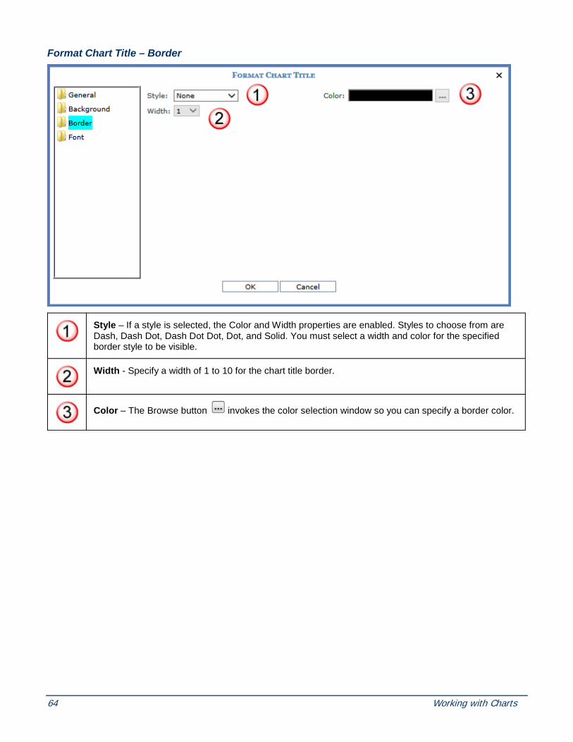
Format Chart Title – Border
Style – If a style is selected, the Color and Width properties are enabled. Styles to choose from are Dash, Dash Dot, Dash Dot Dot, Dot, and Solid. You must select a width and color for the specified border style to be visible.
Width - Specify a width of 1 to 10 for the chart title border.
Color – The Browse button invokes the color selection window so you can specify a border color.

Copyright 2016 Silvon Software, Inc. All rights reserved. (Last Revised: October 2016) 65
Format Chart Title – Font
Name and Size - Choose a font type and font size for the chart title. A font of less than 16 is recommended for the chart title.
Color and Style - The Browse button invokes the color selection window so you can specify a font color. You can also make the font bold, italic, or underlined.

66 Working with Charts
Format Chart Window You control the format of the chart as well as the area surrounding it. The state of the following windows depends on the folder selected in the left side of the window:
• General
• Background
• Border
• Series
Format Chart - General
The chart characteristics being maintained depend on the folder selected.
Note: The Series folder does not display for dynamic charts.
Name – Determines the unique name to be associated with the chart. The name defaults to Chart #. For example, Name will default to Chart 0 for the first chart added to a view, to Chart 1 for the next chart, and so on. This is different from the chart title, which defaults to the view name; the chart title is what displays within the chart area and within the view explorer Charts folder.
Type - Determines the chart type. Options are Area, Bar, Bubble, Column, Combinational, Doughnut, Line, Pie, Point, Spline, Spline Area, Stacked Area, Stacked Area (100%), Stacked Bar, Stacked Bar (100%), Stacked Column, Stacked Column (100%), and Step Line. Refer to the Overview of Chart Types for definitions of each chart type.
Visible - You control whether or not the chart is visible. If you select No to hide the chart, it can be made visible again via view explorer. For more information, see the Hide a Chart topic.
3D – You control whether or not the chart displays three dimensional.

Copyright 2016 Silvon Software, Inc. All rights reserved. (Last Revised: October 2016) 67
Format Chart– Background
The background of the chart can be customized with solid, gradient, or textured colors. The Browse button invokes the color selection window so you can specify a background color.
Image - You can select an image which had been saved to the images\charting\backgrounds\folder of the Stratum.Viewer product directory. This functionality is disabled if there is not an image available. Valid image types are .gif, .jpg, .tif, bmp, and .png.
Image Mode - If an image is included in the chart background, it can be tiled, flipped, or scaled.
Image Alignment - If an image is included in the chart background, you determine where it will be positioned.

68 Working with Charts
Format Chart– Border
Style – A border can be defined for the chart. If a style is selected, the Color and Width properties are enabled. Styles to choose from are Dash, Dash Dot, Dash Dot Dot, Dot, and Solid. You must select a width and color for the specified border style to be visible.
Width - Specify a width of 1 to 10 for the chart legend border.
Color – The Browse button invokes the color selection window so you can specify a border color.

Copyright 2016 Silvon Software, Inc. All rights reserved. (Last Revised: October 2016) 69
Format Chart– Series If the series has been defined as static for the chart, you can change the order that the series appear in the chart as well as access formatting options for each series. The Series folder does not display for dynamic charts.
All of the chart’s series display in this area and are available to select for maintenance, deletion, or reordering.
Reorder Buttons – Clicking the Up Arrow button moves the selected series up one position at a
time. Clicking the Down Arrow button moves the selected series down one position at a time.
- Accesses the Format Series window for the selected series.
- Deletes the select series and any associated data points.

70 Working with Charts
Grid See also Grid Toolbar.
Rows and Columns - The grid displays levels along the rows and columns axis. You can create views with levels on one axis (rows or columns) or levels on both axes. You can set up a view such that header and detail cells for rows and columns (areas A and B in previous image) lock in place while you scroll through measure item values in the view (area 2 in previous image). See also Display Options Window.
• Header Cells - Header cells contain captions of levels and attribute relationships. In the above image, the row levels are Region and Customer Ship-To. The column level is Sales Dir. The other header cells are for their attribute relationships that were selected for display in the view. Users can customize captions for levels and attribute relationships in their views.
• Detail Cells - Detail cells contain level member and attribute relationship values. In this example, the member values for first level on rows are 330 and 331. That set of cells is known as the display text. Next are the values for the Rgn Long Description attribute relationship. You have the option of designating an attribute relationship as the display text rather than the member value. The detail cells on the columns axis show the 231 member and Helen Briggs attribute relationship value.
• Pop-up Menus - Right-click objects to display actions that you can take related to that object or axis, such as editing hierarchies.
• Drag and Drop Enabled - You can drag and drop levels and attribute relationships to change their order. Drag and drop within the grid or between the grid and view explorer.

Copyright 2016 Silvon Software, Inc. All rights reserved. (Last Revised: October 2016) 71
• Drill Path and Drilldown View Links - If multiple levels have been defined for an axis, you can click on links in the grid to drill between levels. You can drill on level names (drill by header) or members (drill by detail). If a drilldown view has been assigned to an axis, the last level in the drilldown path for that axis will be a link -- click a link to display the drilldown view.
• Sort and Filter Icons - Icons display next to grid objects that have been sorted or filtered. Pop-up labels display the sort and filter details when the cursor is moved over the
respective icon.
Measure Items - Measure items can be assigned to one axis, either rows or columns. If you create any distinct calculated measure items, you can position them before all other measure items or after all other measure items.
• Double-click Enabled and Pop-up Menus - You can double-click captions of regular measure items to access the Edit Measure Item window and double-click captions of calculated measure items to access the Expression window for editing purposes. You can also right-click measure items to display all actions that you can take related to that object or axis, such as inserting additional measure items.
• Drag and Drop Enabled - You can drag and drop measure items to change their order. Drag and drop within the grid or between the grid and view explorer.
• Drill Path and Drilldown View Links - If a drilldown view has been assigned to the measure item axis, the measure items will display as links. Click a link to display the drilldown view. The grid shown above doesn’t have a drilldown view assigned to its measure items axis. Here is what the grid would look like had a drilldown view been assigned.
• Sort and Filter Icons - Icons display next to measure items that have been sorted or filtered . Pop-up labels display the sort and filter details when the cursor is moved over the respective icon.
Totals - Grand totals and sub-totals are displayed in darker grey rows and columns. Totals can be displayed for some, all, or no objects in the view. You can control totals by measure items, individual levels, or an entire axis. Grand Totals that are on the same axis as measure items can be sorted and filtered. Use the Display Options window as a shortcut to control all totals on rows and columns.
View Name - Displays the view name. Right-click to display actions that you can take related to the overall grid, such as exporting to excel. Axis Icons - An icon exists for rows and columns .

72 Working with Charts
• Filters and Related Icons – Click an axis icon to open the Expression window and set up a filter for an axis. Icons display next to an axis icon after an axis has been filtered. Pop-up labels display the filter details when the cursor is moved over the icon.
• Pop-up Menus - Right-click to display a menu with options to edit or clear filters.
View Filter - If you used this section to apply a filter to the entire grid, levels used in the filter will display here.
• Filters and Related Icons – Click a level in the view filter to access windows for adding or editing a filter. Icons display next to levels in the view filter after a level has been filtered. Pop-up labels display the filter details when the cursor is moved over the icon.
• Pop-up Menus - Right-click the View Filter header or levels in it to display actions that you can take related to that object or section of the grid, such as filtering levels in that section.
Grid Toolbar
Toolbar Icons -
• Save and Save As - Click the respective buttons to save the active view or create a new view from the active view. The Save button will be disabled in certain cases, such as for users who are running global views and have a casual or advanced level of access for the application. Those users cannot save changes to global views, but they can use the Save As button to save changed views as shared views or their own personal views.
• Display Options - Click to open the Display Options window. Use it to control properties for the view grid. You can control items such as whether or not row and columns headers are locked, the page size of the view, and the display of totals and all others values. Save the view if you want your display changes to be retained for the next time the view is run.
• Print - Click to print the active page of the view.
• Export to Excel - Click to initiate an export of the view and chart to Microsoft Excel.
• Email View - Click to access the window for emailing views.
• Change Filters - Click to access the window for adding, clearing, or changing filters.
• Show / Hide View Explorer - Click to show or hide view explorer. This button does not display if you have a casual level of access for the application.
• Show Prompt Window - Click to access the View Prompt window for parameters. This button only displays if parameters exist for the view.
• Insert New Chart - Click to access a wizard for creating charts for the active view.
• Execute the Update Plan Process - This icon only displays in the toolbar if the Planning property for the view is set to Yes. After making planning changes in a view, click

Copyright 2016 Silvon Software, Inc. All rights reserved. (Last Revised: October 2016) 73
this icon to update the Analysis Services and Stratum storage databases for your environment with those planning changes.
• Help - Click to access help that is specific to working in views.
Paging Controls - Use the rows and columns paging arrows to move between pages of multi-page views. Controls are active only when there are multiple pages on rows and columns respectively.
Show All – Click to display all rows and all columns of the view. This option is only available when paging is enabled in a view and all rows or columns of the view do not fit on a single page. For example, if a view is set up to display 50 rows and 10 columns at a time then the Show All option would display if there is more than one page for the view. The Show All option will be displayed or hidden based on the current state of a view as it refreshes after filtering, drilling, or other changes made by a user.

74 Working with Charts
View Explorer
The elements in view explorer are organized into a tree structure that has expandable/collapsible folders. Folders are described in the following table. Color-coding is used throughout to help you distinguish which items will be visible in the grid and which are hidden.
• Items in blue text – Any items currently shown in the grid. Their Visible property is “Yes” in their Properties window.
• Items in black text – Any items that are not actively shown in the grid, but that have a Visible property of “Yes.” This means they will display in the grid once you reach them in the drill down path for the view.
• Items in grey text – Any items that have a Visible property of “No.” For levels, this means they will not display in the grid as you drill through it. Attribute relationships, measure items, and charts displayed in grey text also will not display in the grid. You can right-click on them anytime and select Show to make change their Visible property.

Copyright 2016 Silvon Software, Inc. All rights reserved. (Last Revised: October 2016) 75
When you click an item, it is highlighted in a bright blue box like the view name, “Customer Ship-To Sales,” in the above example. When double-clicked, the Properties window of the active item opens at the bottom of the view explorer as shown in the above example. You can also right-click to invoke a pop-up menu of actions to take on items from view explorer.
View name folder – displays the name of the view. Double-click to access the Properties window for editing basic properties like the Name, Type, Planning, View Group properties, and when the view was last used or updated. Administrators can use the Owner property to change the owner of a view.
Parameter Groups folder – for parameter groups and parameters within each group. As you insert groups and parameters, they will display under this folder. Each group and parameter has a related Properties window. You can drag and drop groups and parameters within each group to rearrange them.
Grid folder – The folders for Rows, Columns, View Filters, and Measure Items are organized under the Grid folder. From the Grid folder, you can access a Grid Properties window which determines if the grid is visible and if paging is enabled for the grid display.
Rows and Columns folders – All of the included levels and attribute relationships, grouped by hierarchy, display appropriately in the Rows and Columns folder. You can move hierarchies along with their levels and attribute relationships between the Rows, Columns, or View Filter by dragging and dropping them within view explorer or into the grid from view explorer. Properties windows exist for hierarchies, levels, and attribute relationships in these folders. Use them to hide or show items, set up filters or sorting, control the display of totals and All Others value defaults, etc.
• Hierarchies – This image displays next to the names of hierarchies.
• Levels – Blue boxes next to a level indicate the level it is based for all the levels in its hierarchy. For example, a level with one box next to it would be the first level for its hierarchy. A level with two boxes next to it would be the second level available in its hierarchy, and so forth.
• Attribute Relationships – This image displays next to the names of attribute relationships for levels.
View Filter folder – Levels included in the view filter. Setting up a view filter requires a level to be in the View Filter section and then applying a filter to that level. Drag or drop the desired level(s) into the View Filter section of the grid or into the View Filter folder of view explorer.
Measure Items folder – All measure items defined for this view display in the folder. You can edit, insert, remove and hide measure items from this folder. The Time Range controls the type of measure items that you can set up for the view – either measure items with time ranges (Yes) or measure items without time ranges (No). You can also use the Properties windows for individual measure items to change their caption, images, conditional formatting, pop-up labels, hyperlinks, filtering, sorting, totals, etc.
• Regular Measure Item – This image displays next to regular measure items.
• Calculated Measure Item – This image displays next to calculated measure items.
• Distinct Calculated Measure Item – This image displays next to distinct calculated measure Items.
Presentation folder – The properties for this folder are used to set the default presentation format for the view (either Viewer or Excel) and to determine whether or not users will be prompted to choose the presentation format before the view opens for them.
Chart folder – The Chart folder displays the names of any charts that you have created for a view. Charts displayed in blue are currently visible in the grid. Charts displayed in grey are hidden.

76 Working with Charts
Charts can be dragged and dropped in the folder to change the order in which they display in the grid.
Advanced Concepts
Format Chart Axis Strip Lines
1. Access the Format Chart Strip Line window from one of two ways:
Right-click on a displayed strip line and choose Format then Strip Line from the pop-up menu.
OR
Right-click anywhere in the chart area and choose Format, then Axis, then Primary Horizontal or Primary Vertical from the pop-up menu. From the Format Chart Axis window, click the Strip Lines folder and click New to create a new strip line, or Edit to maintain an existing one.
2 Click the General folder and format the general properties such as caption, frequency of strip line, tool tip caption, and strip line width.
3. Click the Background folder and adjust the background of the strip line. It could be filled with a solid color, a gradient fill, a textured fill, or even an image.
4. Click the Border folder and adjust the border of the strip line. Determine the style, color, and width of the border.
5. Click the Title folder and adjust the strip line caption positioning and angle. Determine the font style, color, and size.
6. Click OK.
Note: Changes can be made on all the various folders (General, Background, Border, Title) and the save will apply to all changes.

Copyright 2016 Silvon Software, Inc. All rights reserved. (Last Revised: October 2016) 77
The following is an example of a strip line displayed at 5000000 Interval Offset; Interval is zero which means it does not repeat. The caption “Sales Goals” is positioned at a 90 angle and the positioning is Far.
Rearrange Series Displayed in Chart If the series are static, their position within the chart can be adjusted. Controls are available in the Chart Data Wizard and the Format Chart window to rearrange the series.
1. Access the series positioning from one of two windows:
Right-click anywhere on the chart and choose Data Wizard from the pop-up menu.
OR
Right-click anywhere on the chart and choose Format then Chart from the pop-up menu and then Series.
2. The static series display in the area below the Static radio button. Highlight the series to move and click the Up
arrow button to move it up one position at a time. Click the down arrow button to move it down one position at a time.
3. Click Finish to display the chart.
The next page shows an example of when you may want to reposition a static series. The 2014 data was selected first, but it isn’t visible in the chart because it is less than the 2013 data. When 2013 data is moved to the first position, both series are visible in the area chart.
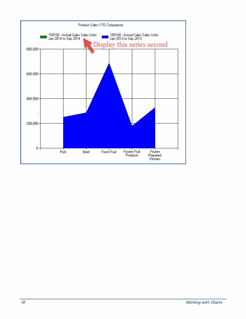
78 Working with Charts

Copyright 2016 Silvon Software, Inc. All rights reserved. (Last Revised: October 2016) 79

80 Working with Charts
Remove Data Points from a Chart
Note: The data points must be static to be able to remove them from the chart.
1. Right-click the data point you want to remove in the chart area.
2. Select Remove then Data Point from the pop-up menu that displays.
3. Chart is automatically refreshed with the removed data point no longer displayed.
OR
1. Right-click the static series and choose Format then Series from the pop-up menu that displays.
2. Click the Data Points folder within the Format Chart Series window.
3. From the list of data points, highlight the one to delete.

Copyright 2016 Silvon Software, Inc. All rights reserved. (Last Revised: October 2016) 81
4. Click Delete.
5. Click OK to process your selection and redisplay the chart with the deleted data point no longer displayed.
OR
1. From the Chart Data Wizard, (Step 2 of 3) – Data Points window, select the Data Points to be removed and click Remove or Remove All to remove all of the Data Points.
Note: The data point is deleted only from the chart and not from the actual view definition.
Remove Series from a Chart
Note: The series must be static to be able to remove them from the chart.
1. Right-click the series you want to remove in either the legend or chart area.
2. Select Remove then Series from the pop-up menu that displays.
3. Chart is automatically refreshed with the removed series no longer displayed.
OR
1. Within the Chart Data Wizard (Step 1 of 3) window, highlight the desired series.

82 Working with Charts
2. Click Remove.
3. Click Finish to redisplay the chart with the removed series no longer displayed.
Note: The series is removed only from the chart and not from the actual view definition.
Static vs. Dynamic Charts
Dynamic Charting A dynamic chart is linked to the view data to determine the series and data points. This means that the chart’s series and data points will change as the view’s rows and columns change. Because the chart is dependent on the grid contents, the entire grid will be included in the chart. Dynamic charts should be used when the rows or columns of the chart will change. For example, you want to see the top 5 customers. Those customers will probably change, so dynamic charting should be used.
If the series are dynamic, they will always adjust to all the values displayed in the grid. If the data points are defined as dynamic, there is limited formatting for them because they are always changing in the chart.
Note: There is a maximum of 400 rows and 400 columns when charting dynamically.
Note: Indicators or images associated with a measure item will not be charted. Only values will be included in a chart.
Static Charting Use static charts when you want the chart to include specific rows or columns from the view. For example, you select Product A, B, and C and Actual Sales and Forecasted Sales. The chart will always chart for those specific products and the specific sales and forecast information.
Here are a few other characteristics of static charts:
• You can have any combination of static or dynamic series and data points in your chart.
• Static series have additional formatting options. See Format Series for those options.
• Static data points have additional formatting options. See Format Data Points for those options.
• Combinational chart and dual axis chart must have static series. A static series is required in order to specify chart type and axis for each series. This is done from the Format Series window. Data points can be dynamic or static.
• Changing the order of the rows and columns in the grid does not affect the order of static series or data points in the chart.
• Changing the rows or columns that are visible in the grid does not affect any associated static series or data point’s visibility in the chart.

Copyright 2016 Silvon Software, Inc. All rights reserved. (Last Revised: October 2016) 83
Frequently Asked Questions (FAQ’s)
Why Can't I Create a Dual Axis Chart? The series for a chart must be static, and more than one series must exist if you want to create a dual axis chart. When you are setting up your chart, set series to static and select more than one series. Then access the Format Chart Series window to set the axis for each series.

84 Working with Charts
Why Doesn't a Second Chart Type in a Combinational Chart Display? This can occur if you are setting up a Combinational chart with static data points but did not specify data points for each series. If a series does not have any data points, then they will not display in the chart.

Copyright 2016 Silvon Software, Inc. All rights reserved. (Last Revised: October 2016) 85
Definitions
Data Points Data points are items of information to chart about each series. Data points can be created from either the rows or columns of the grid. In this chart the Date Points, Fresh Vegetables, Pork, Beef, Fresh Fruit, Frozen Fruit Products, and Frozen Prepared Dinners are from the rows of the grid. The series Actual Sales Units 2014 and Actual Sales Units 2013 are from the columns.

86 Working with Charts
Interval You have the ability to control the interval of the axis grid lines, axis labels, strip lines, and chart markers for charts. The interval defines the amount of space between each object (grid line, label, strip line and markers) and additional objects repeat at each interval value. The Interval, Interval Offset, and Width properties for a chart are all proportional to the scale of the axis.
Interval Offset You have the ability to control the interval offset of the axis grid lines, axis labels and strip lines. The interval offset defines the starting value point for the object (grid lines, axis labels and strip line) to appear. The Interval, Interval Offset, and Width properties for a chart are all proportional to the scale of the axis.
Markers Chart markers are used to highlight data points within a series. You specify the frequency that they display. They could display at every data point, every other, every third, and so forth. A marker could display as a star, diamond, square, etc.
Scaling Scaling refers to the intervals at which axis grid lines, axis labels or strip lines display in charts.

Copyright 2016 Silvon Software, Inc. All rights reserved. (Last Revised: October 2016) 87
Series Series are a group of related items (data points) that are included in a chart. Series can be created from either the rows or columns of the grid. In this chart, the Series, Actual Sales Units 2014 and Actual Sales Units 2013 are from the columns of the grid. The data points, Fresh Vegetables, Pork, Beef, Fresh Fruit, Frozen Fruit Products, and Frozen Prepared Dinners are from the rows of the grid.

88 Working with Charts

Copyright 2016 Silvon Software, Inc. All rights reserved. (Last Revised: October 2016) 89
Strip Line A strip line can be used to highlight information in a chart. It could indicate a point at which values are acceptable, or it could mark a point that needs attention.