Section 2.2: Bar Charts and Pie Charts - KSU | Faculty Webfacultyweb.kennesaw.edu/jdemaio/MATH 2332...
13
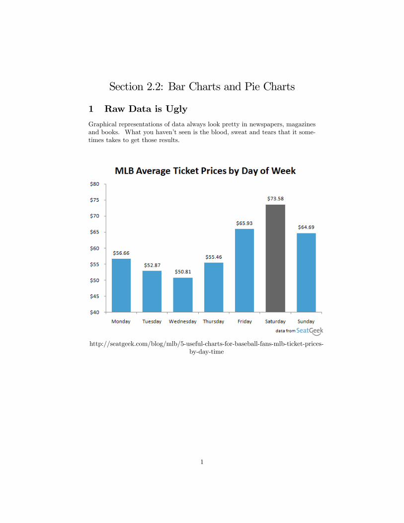
Section 2.2: Bar Charts and Pie Charts 1 Raw Data is Ugly Graphical representations of data always look pretty in newspapers, magazines and books. What you havent seen is the blood, sweat and tears that it some- times takes to get those results. http://seatgeek.com/blog/mlb/5-useful-charts-for-baseball-fans-mlb-ticket-prices- by-day-time 1
Transcript of Section 2.2: Bar Charts and Pie Charts - KSU | Faculty Webfacultyweb.kennesaw.edu/jdemaio/MATH 2332...
Section 2.2: Bar Charts and Pie Charts
1 Raw Data is Ugly
Graphical representations of data always look pretty in newspapers, magazinesand books. What you haven�t seen is the blood, sweat and tears that it some-times takes to get those results.
http://seatgeek.com/blog/mlb/5-useful-charts-for-baseball-fans-mlb-ticket-prices-by-day-time
1
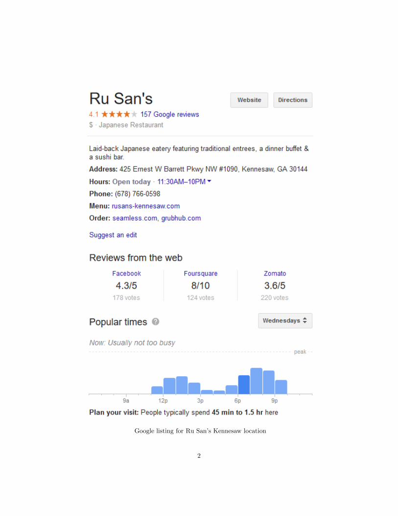
Google listing for Ru San�s Kennesaw location
2
The previous examples are informative graphical displays of data. They allstarted life as bland data sets.
2 Bar Charts
Bar charts are a visual way to organize data. The height or length of a bar rep-resents the number of points of data (frequency distribution) in a particularcategory. One can also let the bar represent the percentage of data (relativefrequency distribution) in a category.
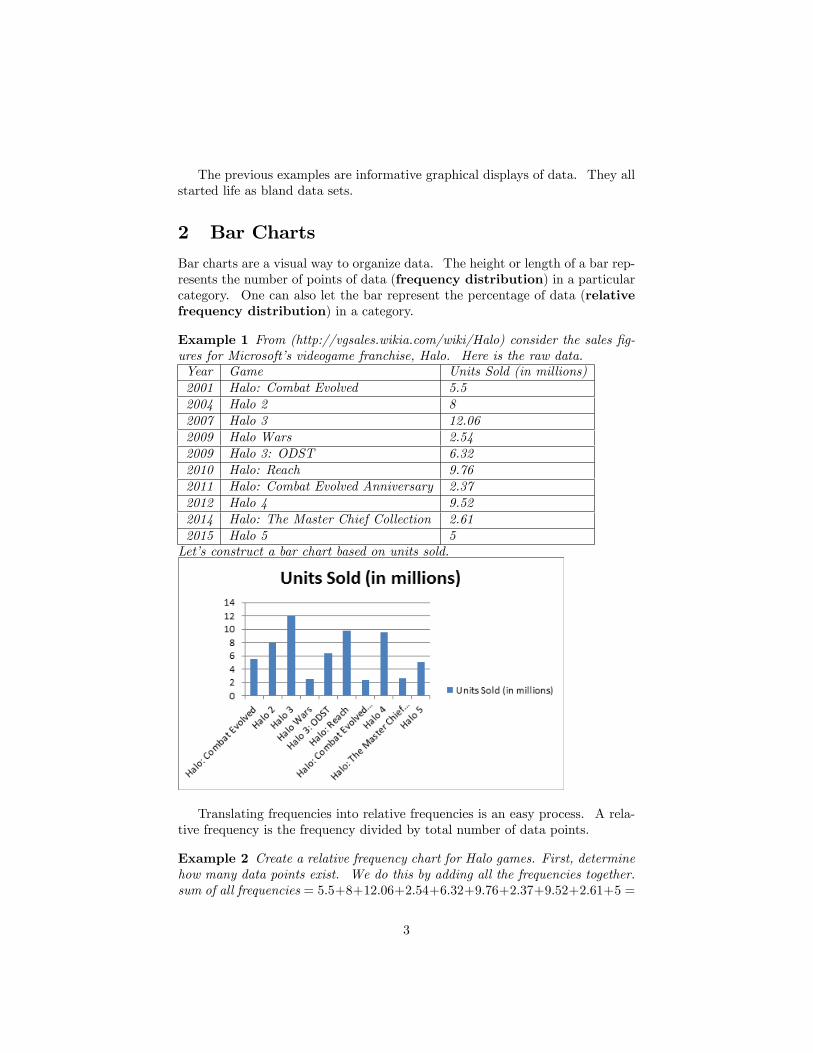
Example 1 From (http://vgsales.wikia.com/wiki/Halo) consider the sales �g-ures for Microsoft�s videogame franchise, Halo. Here is the raw data.Year Game Units Sold (in millions)2001 Halo: Combat Evolved 5.52004 Halo 2 82007 Halo 3 12.062009 Halo Wars 2.542009 Halo 3: ODST 6.322010 Halo: Reach 9.762011 Halo: Combat Evolved Anniversary 2.372012 Halo 4 9.522014 Halo: The Master Chief Collection 2.612015 Halo 5 5Let�s construct a bar chart based on units sold.
Translating frequencies into relative frequencies is an easy process. A rela-tive frequency is the frequency divided by total number of data points.
Example 2 Create a relative frequency chart for Halo games. First, determinehow many data points exist. We do this by adding all the frequencies together.sum of all frequencies = 5:5+8+12:06+2:54+6:32+9:76+2:37+9:52+2:61+5 =
3
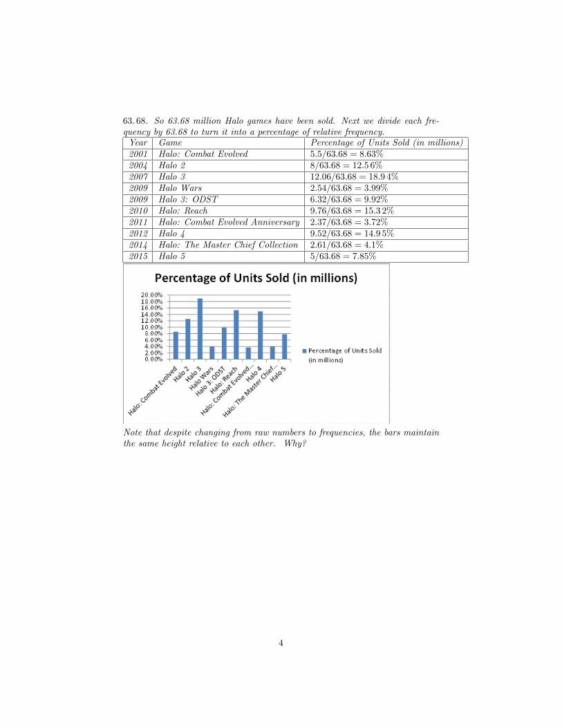
63: 68. So 63.68 million Halo games have been sold. Next we divide each fre-quency by 63.68 to turn it into a percentage of relative frequency.Year Game Percentage of Units Sold (in millions)2001 Halo: Combat Evolved 5:5=63:68 = 8:63%2004 Halo 2 8=63:68 = 12:5 6%2007 Halo 3 12:06=63:68 = 18:9 4%2009 Halo Wars 2:54=63:68 = 3:99%2009 Halo 3: ODST 6:32=63:68 = 9:92%2010 Halo: Reach 9:76=63:68 = 15:3 2%2011 Halo: Combat Evolved Anniversary 2:37=63:68 = 3:72%2012 Halo 4 9:52=63:68 = 14:9 5%2014 Halo: The Master Chief Collection 2:61=63:68 = 4:1%2015 Halo 5 5=63:68 = 7:85%
Note that despite changing from raw numbers to frequencies, the bars maintainthe same height relative to each other. Why?
4
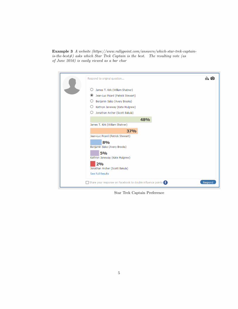
Example 3 A website (https://www.rallypoint.com/answers/which-star-trek-captain-is-the-best#) asks which Star Trek Captain is the best. The resulting vote (asof June 2016) is easily viewed as a bar char
Star Trek Captain Preference
5
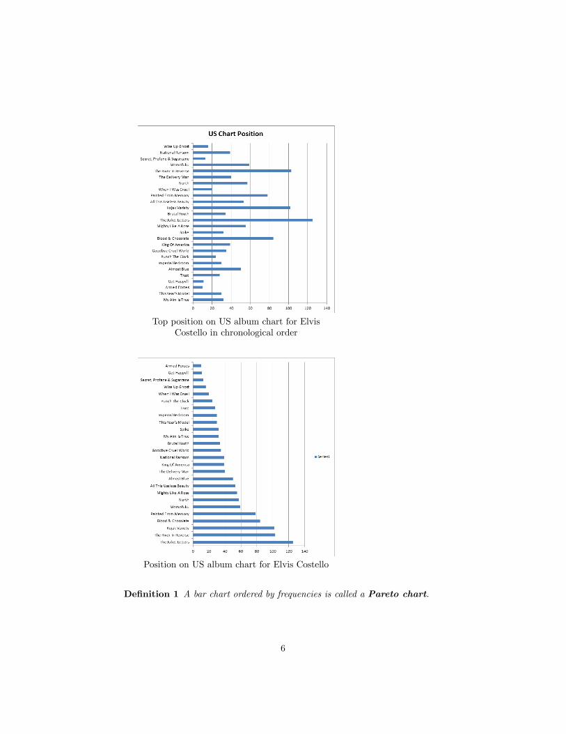
Top position on US album chart for ElvisCostello in chronological order
Position on US album chart for Elvis Costello
De�nition 1 A bar chart ordered by frequencies is called a Pareto chart.
6
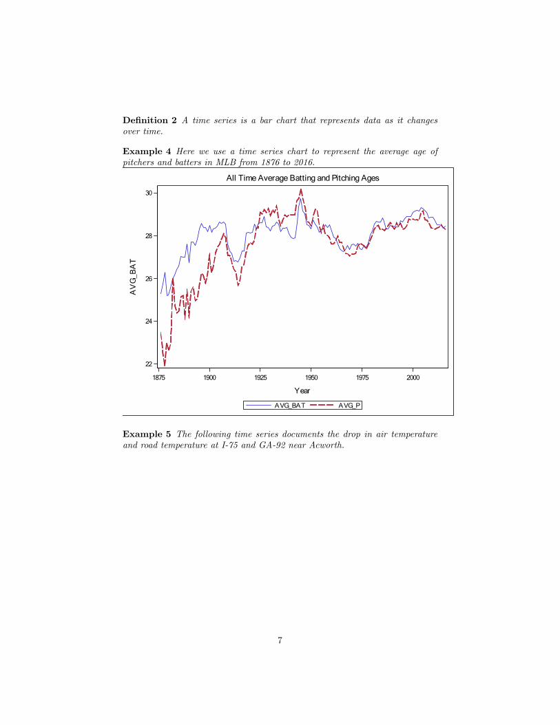
De�nition 2 A time series is a bar chart that represents data as it changesover time.
Example 4 Here we use a time series chart to represent the average age ofpitchers and batters in MLB from 1876 to 2016.
1875 1900 1925 1950 1975 2000
Year
22
24
26
28
30
AV
G_B
AT
AVG_PAVG_BAT
All Time Average Batting and Pitching Ages
Example 5 The following time series documents the drop in air temperatureand road temperature at I-75 and GA-92 near Acworth.
7
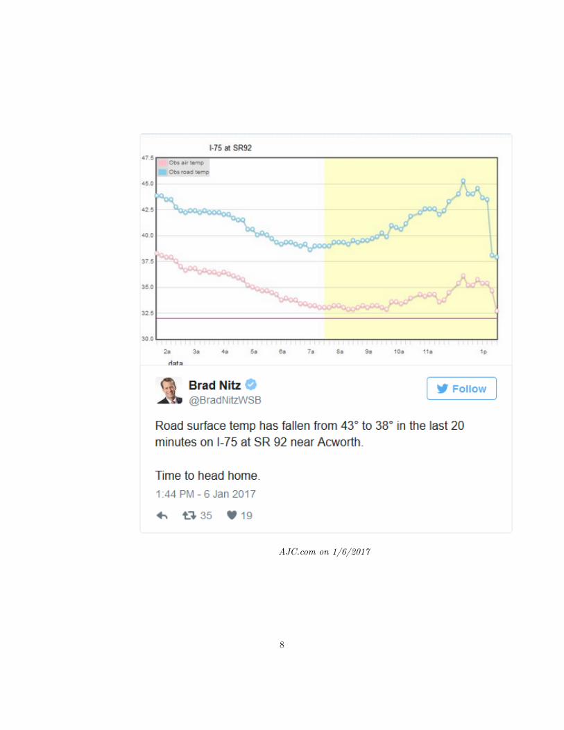
AJC.com on 1/6/2017
8
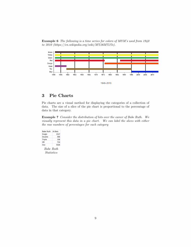
Example 6 The following is a time series for colors of M&M�s used from 1940to 2010 (https://en.wikipedia.org/wiki/M%26M%27s).
3 Pie Charts
Pie charts are a visual method for displaying the categories of a collection ofdata. The size of a slice of the pie chart is proportional to the percentage ofdata in that category.
Example 7 Consider the distribution of hits over the career of Babe Ruth. Wevisually represent this data in a pie chart. We can label the slices with eitherthe raw numbers of percentages for each category
Babe Ruth At BatsSingle 1517Double 506Triple 136HR 714Out 5526
Babe RuthStatistics
9
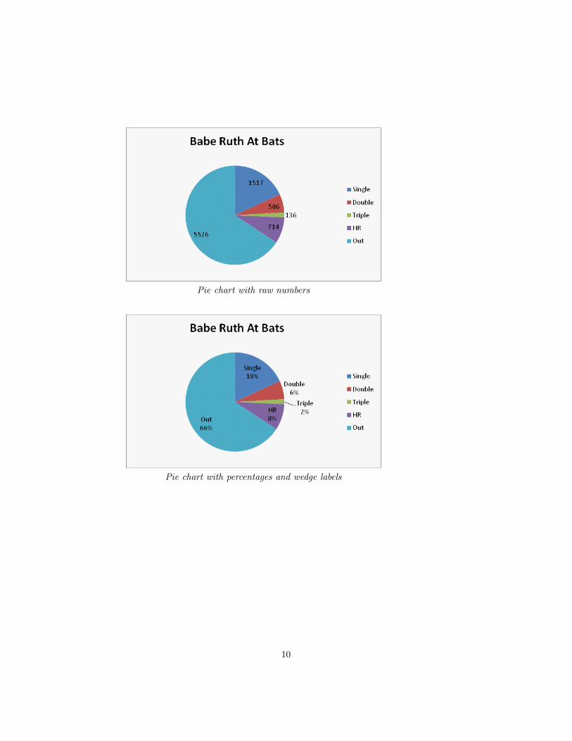
Pie chart with raw numbers
Pie chart with percentages and wedge labels
10
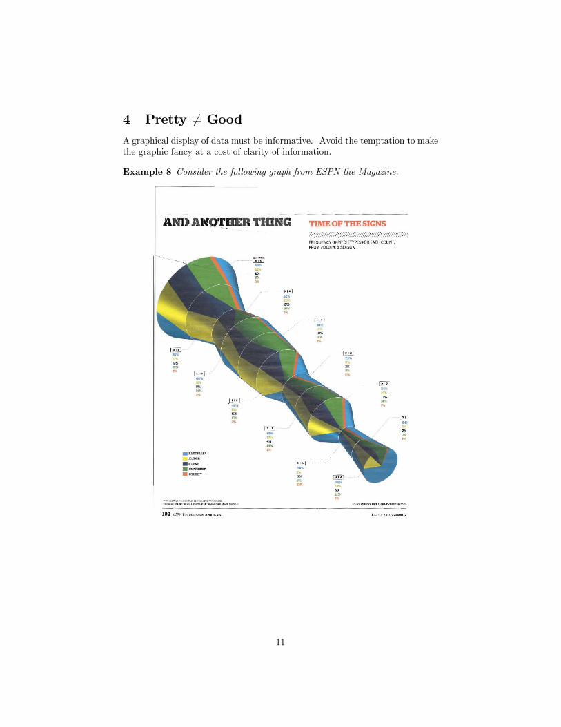
4 Pretty 6= Good
A graphical display of data must be informative. Avoid the temptation to makethe graphic fancy at a cost of clarity of information.
Example 8 Consider the following graph from ESPN the Magazine.
11
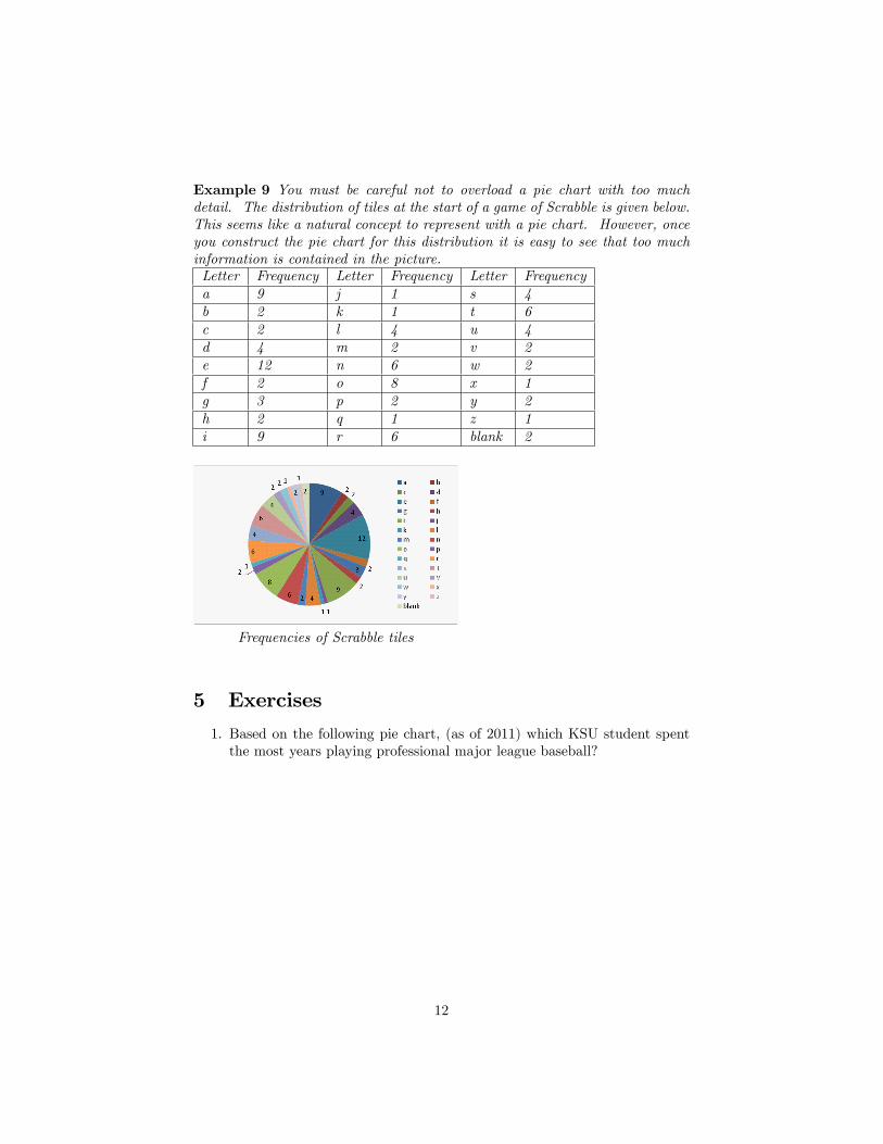
Example 9 You must be careful not to overload a pie chart with too muchdetail. The distribution of tiles at the start of a game of Scrabble is given below.This seems like a natural concept to represent with a pie chart. However, onceyou construct the pie chart for this distribution it is easy to see that too muchinformation is contained in the picture.Letter Frequency Letter Frequency Letter Frequencya 9 j 1 s 4b 2 k 1 t 6c 2 l 4 u 4d 4 m 2 v 2e 12 n 6 w 2f 2 o 8 x 1g 3 p 2 y 2h 2 q 1 z 1i 9 r 6 blank 2
Frequencies of Scrabble tiles
5 Exercises
1. Based on the following pie chart, (as of 2011) which KSU student spentthe most years playing professional major league baseball?
12
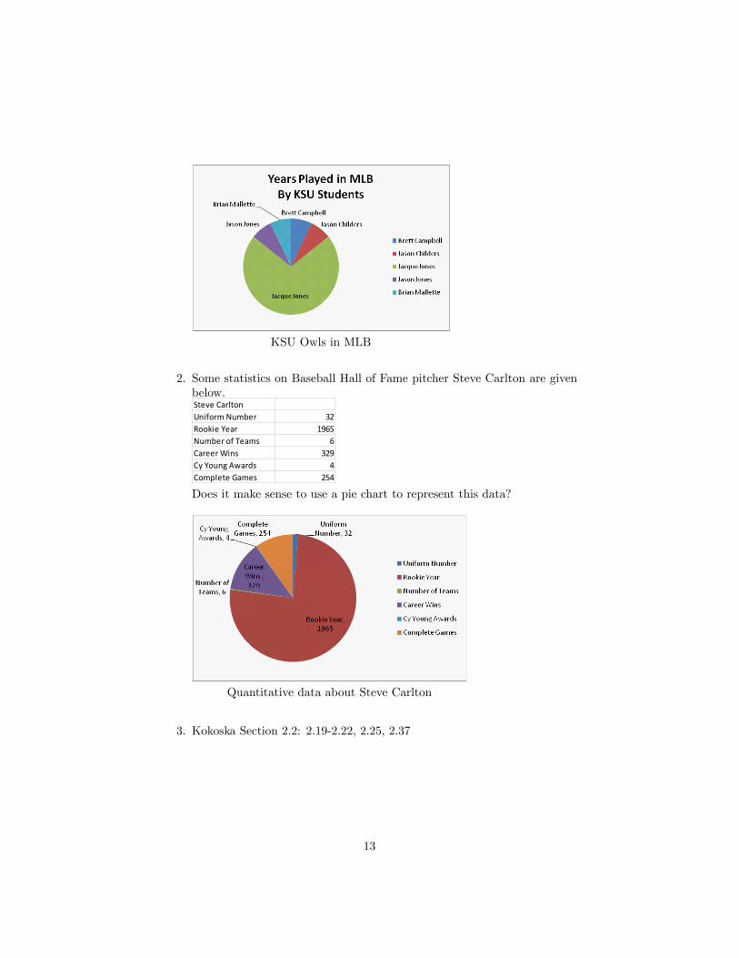
KSU Owls in MLB
2. Some statistics on Baseball Hall of Fame pitcher Steve Carlton are givenbelow.Steve CarltonUniform Number 32Rookie Year 1965Number of Teams 6Career Wins 329Cy Young Awards 4Complete Games 254
Does it make sense to use a pie chart to represent this data?
Quantitative data about Steve Carlton
3. Kokoska Section 2.2: 2.19-2.22, 2.25, 2.37
13