Visual Aid Etiquettes: For Effective Presentation
28
Visual Aid Etiquettes: For Effective Presentation By: Manali Rathi
-
Upload
kylee-watson -
Category
Documents
-
view
34 -
download
1
description
Visual Aid Etiquettes: For Effective Presentation. By: Manali Rathi. Keys to the Successful Presentation. Think of your audience Make it clear Why should visual aids be used? Things to be considered. Objective: Learning Outcome. - PowerPoint PPT Presentation
Transcript of Visual Aid Etiquettes: For Effective Presentation
Visual Aid Etiquettes: For Effective Presentation
By: Manali Rathi
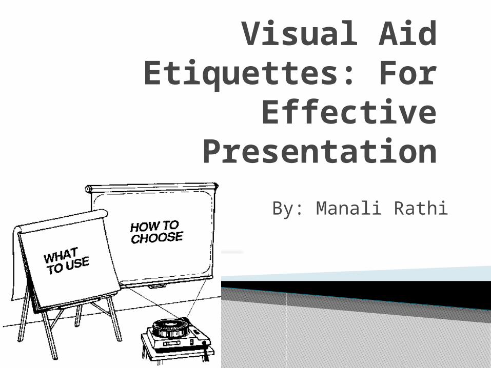
Think of your audience
Make it clear
Why should visual aids be used?
Things to be considered
Keys to the Successful Presentation
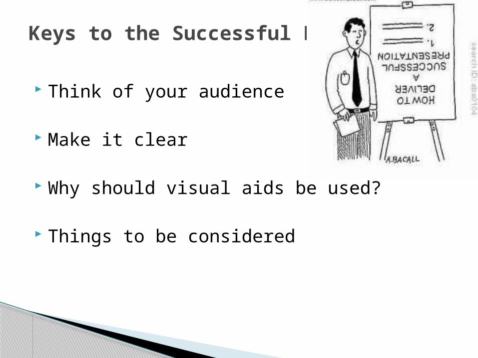
To understand the relevance of visual aid & Visual Aid etiquettes
To understand different visual aids used during presentation
Do’s & Don'ts of using visual aids for making effective presentation
Objective: Learning Outcome

Use visuals whenever possible Good visuals are: –Visible –Clear –Simple
Why should Visual Aids to be used????
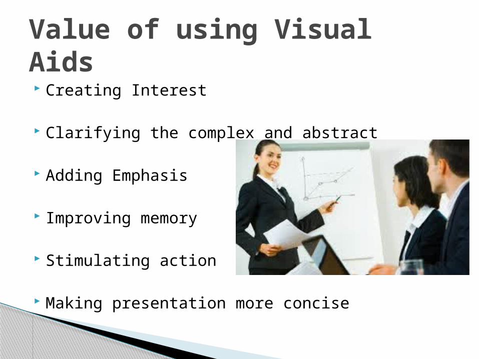
Creating Interest
Clarifying the complex and abstract
Adding Emphasis
Improving memory
Stimulating action
Making presentation more concise
Value of using Visual Aids

Good Points Low-tech Easy to add to More contact with
audience More interactive
Bad Points Can only use once Can’t add graphics Can be hard to
read Hard to see
Flipcharts and Whiteboards

Don’t hide! Don’t keep your back towards the audience Draw lines if needed Pay attention to colour Call ahead to check on facilities Stick to a few key points
Flipcharts and Whiteboard Tips
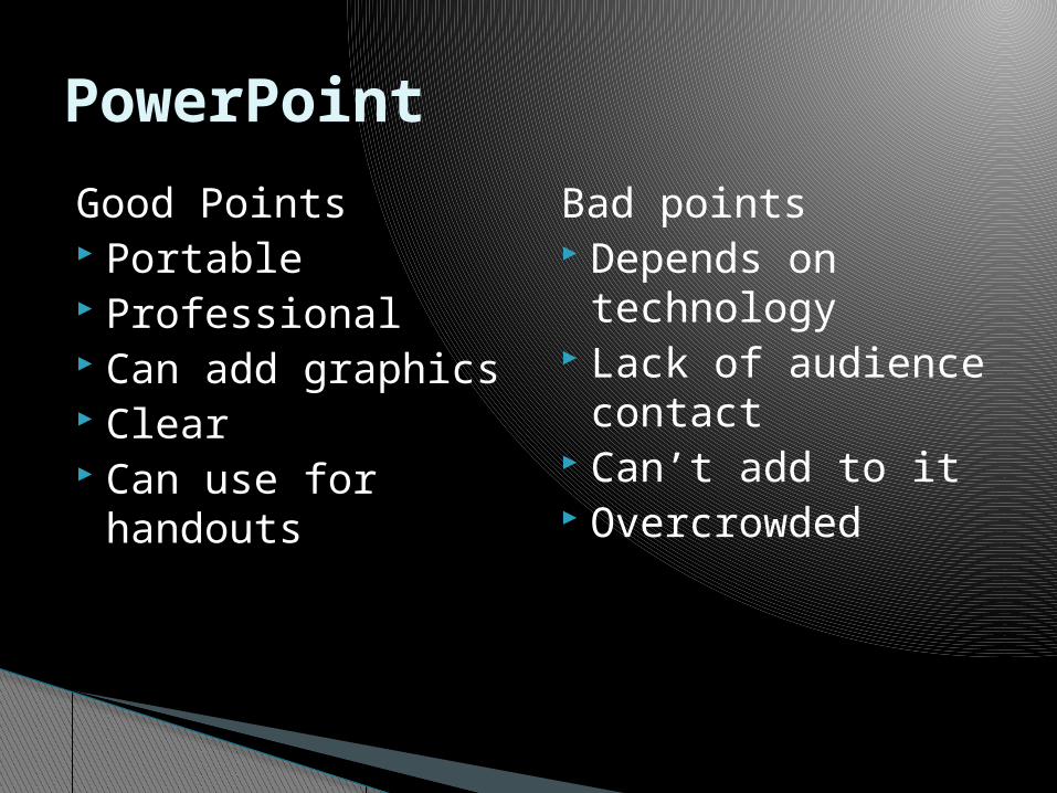
Good Points Portable Professional Can add graphics Clear Can use for
handouts
Bad points Depends on
technology Lack of audience
contact Can’t add to it Overcrowded
PowerPoint
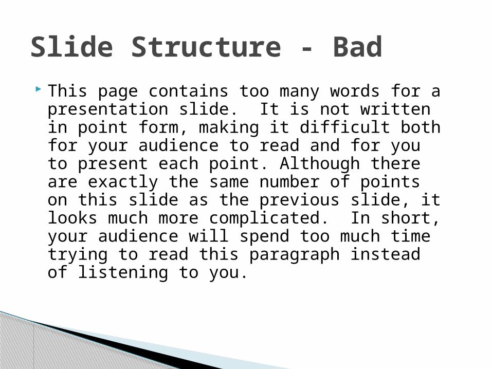
This page contains too many words for a presentation slide. It is not written in point form, making it difficult both for your audience to read and for you to present each point. Although there are exactly the same number of points on this slide as the previous slide, it looks much more complicated. In short, your audience will spend too much time trying to read this paragraph instead of listening to you.
Slide Structure - Bad

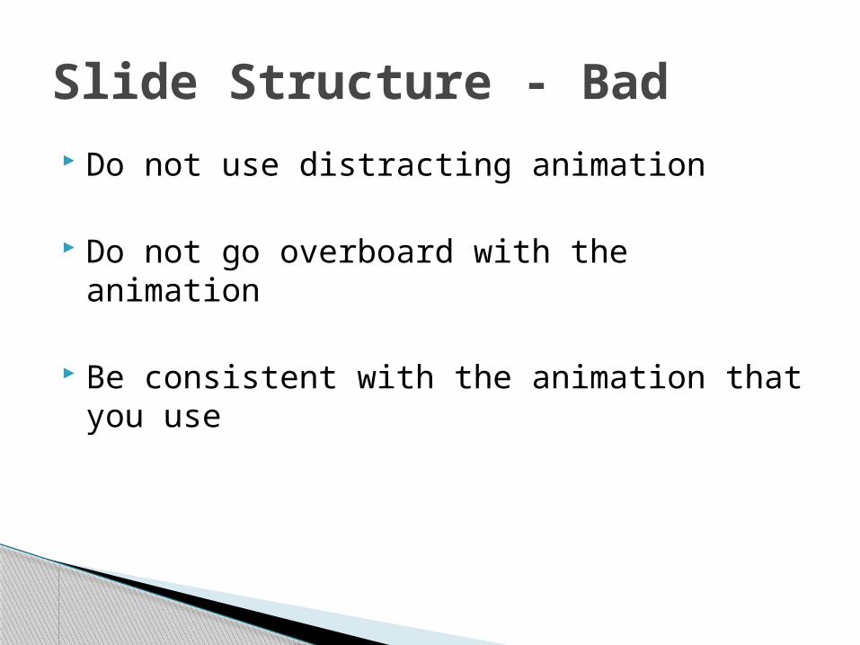
Do not use distracting animation
Do not go overboard with the animation
Be consistent with the animation that you use
Slide Structure - Bad
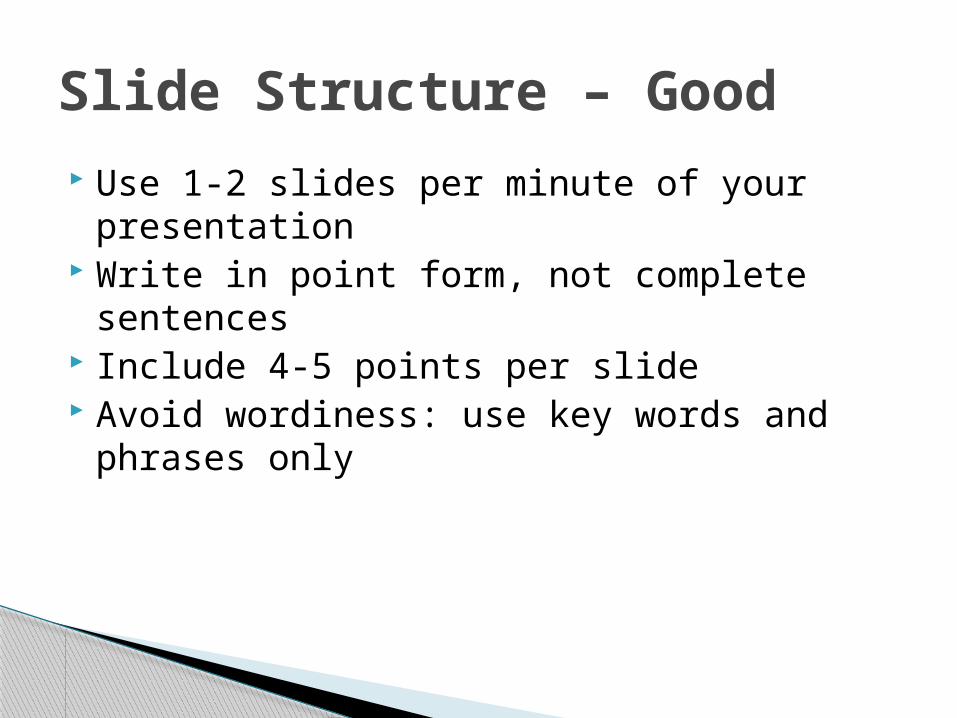
Use 1-2 slides per minute of your presentation
Write in point form, not complete sentences Include 4-5 points per slide Avoid wordiness: use key words and phrases
only
Slide Structure – Good
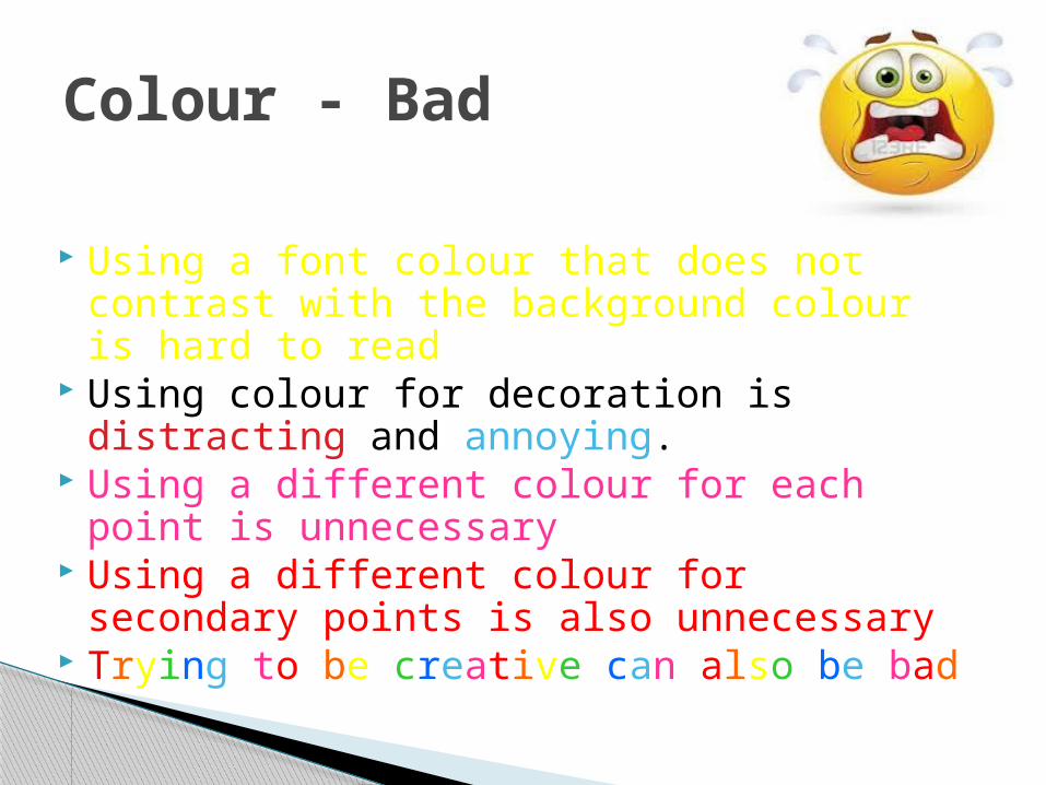
Using a font colour that does not contrast with the background colour is hard to read
Using colour for decoration is distracting and annoying.
Using a different colour for each point is unnecessary
Using a different colour for secondary points is also unnecessary
Trying to be creative can also be bad
Colour - Bad
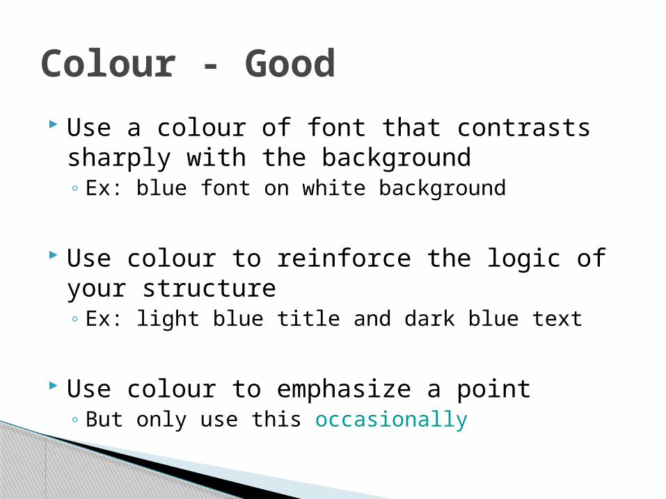
Use a colour of font that contrasts sharply with the background◦ Ex: blue font on white background
Use colour to reinforce the logic of your structure◦ Ex: light blue title and dark blue text
Use colour to emphasize a point◦ But only use this occasionally
Colour - Good

Use colors that are pleasing Do not use red type Use a high contrast between words/graphics
and background (i.e., dark background with light font OR light background with dark font)
Don’t use too many colors or highlights Using too many colors will confuse the
audience If you emphasize everything, you emphasize
nothing
Use colour well

If you use a small font, your audience won’t be able to read what you have written
CAPITALIZE ONLY WHEN NECESSARY. IT IS DIFFICULT TO READ
Don’t use a complicated font
Fonts - Bad
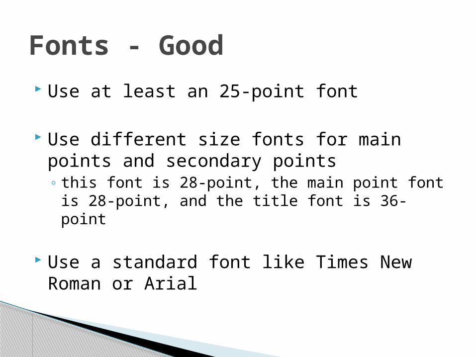
Use at least an 25-point font
Use different size fonts for main points and secondary points◦ this font is 28-point, the main point font is 28-
point, and the title font is 36-point
Use a standard font like Times New Roman or Arial
Fonts - Good
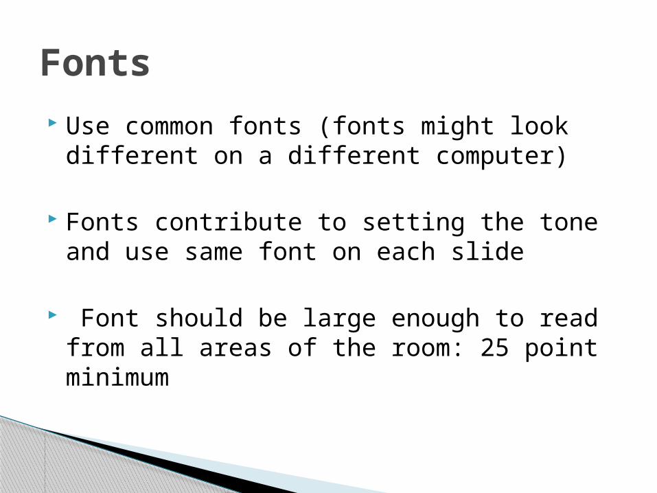
Use common fonts (fonts might look different on a different computer)
Fonts contribute to setting the tone and use same font on each slide
Font should be large enough to read from all areas of the room: 25 point minimum
Fonts

Avoid backgrounds that are distracting or difficult to read from
Always be consistent with the background that you use
Background – Bad
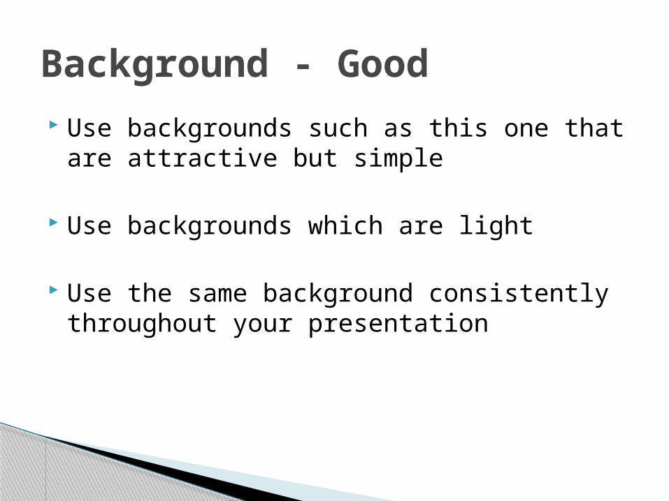
Use backgrounds such as this one that are attractive but simple
Use backgrounds which are light
Use the same background consistently throughout your presentation
Background - Good
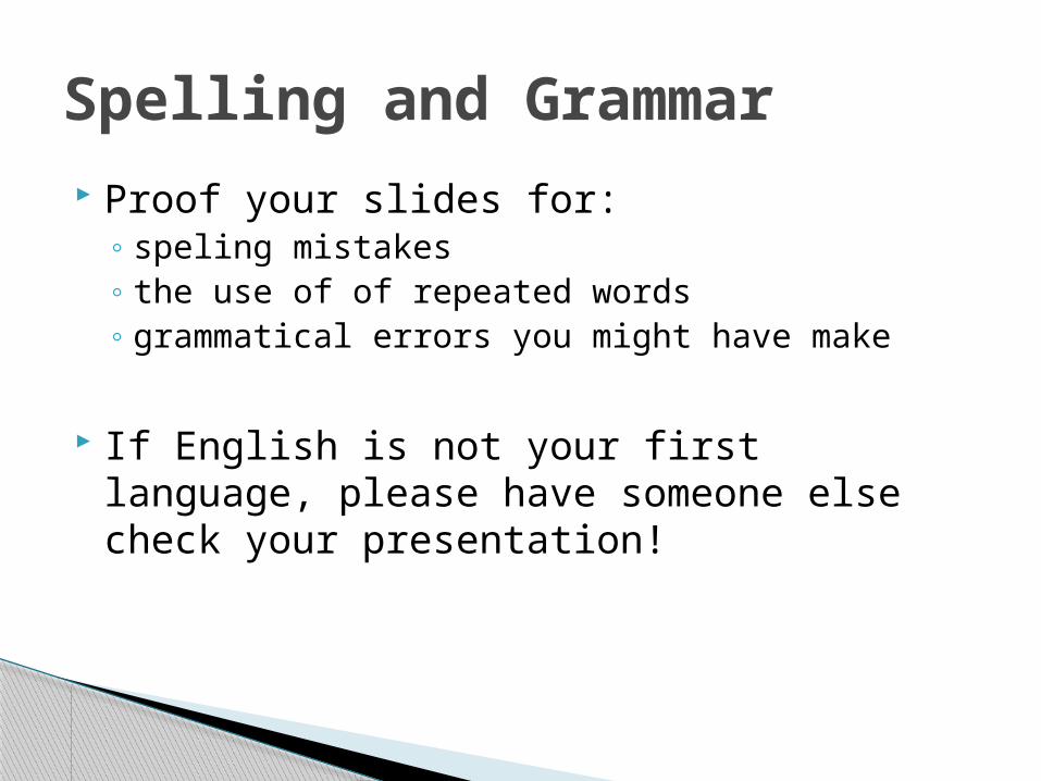
Proof your slides for:◦ speling mistakes◦ the use of of repeated words◦ grammatical errors you might have make
If English is not your first language, please have someone else check your presentation!
Spelling and Grammar

Technical aspects :
–Media clips and the PPT file in the same directory
–Mouse, keyboard & projector –Speakers and players –Plan B (What if technology fails?)
Delivering Your Presentation

Power point Karaoke
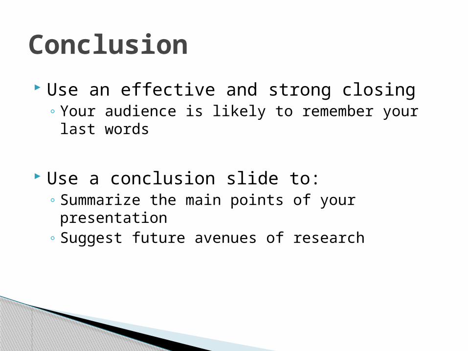
Use an effective and strong closing◦ Your audience is likely to remember your last
words
Use a conclusion slide to:◦ Summarize the main points of your presentation◦ Suggest future avenues of research
Conclusion
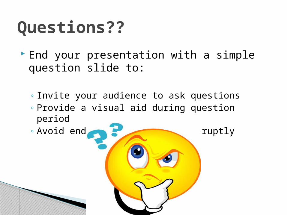
End your presentation with a simple question slide to:
◦ Invite your audience to ask questions◦ Provide a visual aid during question period◦ Avoid ending a presentation abruptly
Questions??
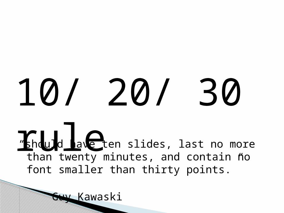
“should have ten slides, last no more than twenty minutes, and contain no font smaller than thirty points.”
Guy Kawaski
10/ 20/ 30 rule
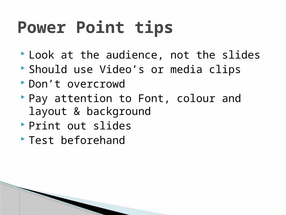
Look at the audience, not the slides Should use Video’s or media clips Don’t overcrowd Pay attention to Font, colour and layout &
background Print out slides Test beforehand
Power Point tips
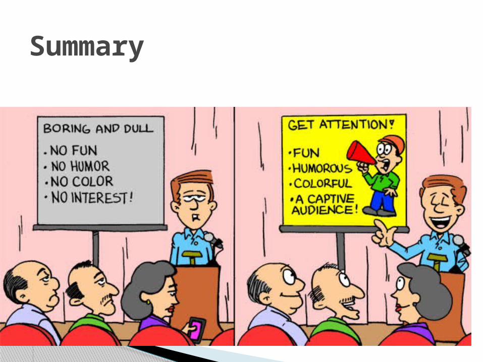
Summary