User testing of an adaptation of fishbone diagrams to ...
9
RESEARCH ARTICLE Open Access User testing of an adaptation of fishbone diagrams to depict results of systematic reviews Gerald Gartlehner 1,2* , Marie-Therese Schultes 2,3 , Viktoria Titscher 2 , Laura C. Morgan 1 , Georgiy V. Bobashev 1 , Peyton Williams 1 and Suzanne L. West 1 Abstract Background: Summary of findings tables in systematic reviews are highly informative but require epidemiological training to be interpreted correctly. The usage of fishbone diagrams as graphical displays could offer researchers an effective approach to simplify content for readers with limited epidemiological training. In this paper we demonstrate how fishbone diagrams can be applied to systematic reviews and present the results of an initial user testing. Methods: Findings from two systematic reviews were graphically depicted in the form of the fishbone diagram. To test the utility of fishbone diagrams compared with summary of findings tables, we developed and pilot-tested an online survey using Qualtrics. Respondents were randomized to the fishbone diagram or a summary of findings table presenting the same body of evidence. They answered questions in both open-ended and closed-answer formats; all responses were anonymous. Measures of interest focused on first and second impressions, the ability to find and interpret critical information, as well as user experience with both displays. We asked respondents about the perceived utility of fishbone diagrams compared to summary of findings tables. We analyzed quantitative data by conducting t- tests and comparing descriptive statistics. Results: Based on real world systematic reviews, we provide two different fishbone diagrams to show how they might be used to display complex information in a clear and succinct manner. User testing on 77 students with basic epidemiological training revealed that participants preferred summary of findings tables over fishbone diagrams. Significantly more participants liked the summary of findings table than the fishbone diagram (71.8% vs. 44.8%; p < .01); significantly more participants found the fishbone diagram confusing (63.2% vs. 35.9%, p < .05) or indicated that it was difficult to find information (65.8% vs. 45%; p < .01). However, more than half of the participants in both groups were unable to find critical information and answer three respective questions correctly (52.6% in the fishbone group; 51.3% in the summary of findings group). Conclusions: Fishbone diagrams are compact visualizations that, theoretically, may prove useful for summarizing the findings of systematic reviews. Initial user testing, however, did not support the utility of such graphical displays. Keywords: Evidence summary, Fishbone diagram, Systematic review, Visualization, Summary of findings, User testing * Correspondence: [email protected] 1 RTI International, 3040 East Cornwallis Rd, Research Triangle Park, Durham, NC 27709, USA 2 Department for Evidence-based Medicine and Clinical Epidemiology, 3500 Krems, Austria Full list of author information is available at the end of the article © The Author(s). 2017 Open Access This article is distributed under the terms of the Creative Commons Attribution 4.0 International License (http://creativecommons.org/licenses/by/4.0/), which permits unrestricted use, distribution, and reproduction in any medium, provided you give appropriate credit to the original author(s) and the source, provide a link to the Creative Commons license, and indicate if changes were made. The Creative Commons Public Domain Dedication waiver (http://creativecommons.org/publicdomain/zero/1.0/) applies to the data made available in this article, unless otherwise stated. Gartlehner et al. BMC Medical Research Methodology (2017) 17:169 DOI 10.1186/s12874-017-0452-z
Transcript of User testing of an adaptation of fishbone diagrams to ...

RESEARCH ARTICLE Open Access
User testing of an adaptation of fishbonediagrams to depict results of systematicreviewsGerald Gartlehner1,2*, Marie-Therese Schultes2,3, Viktoria Titscher2, Laura C. Morgan1, Georgiy V. Bobashev1,Peyton Williams1 and Suzanne L. West1
Abstract
Background: Summary of findings tables in systematic reviews are highly informative but require epidemiologicaltraining to be interpreted correctly. The usage of fishbone diagrams as graphical displays could offer researchers aneffective approach to simplify content for readers with limited epidemiological training. In this paper we demonstratehow fishbone diagrams can be applied to systematic reviews and present the results of an initial user testing.
Methods: Findings from two systematic reviews were graphically depicted in the form of the fishbone diagram. Totest the utility of fishbone diagrams compared with summary of findings tables, we developed and pilot-tested anonline survey using Qualtrics. Respondents were randomized to the fishbone diagram or a summary of findings tablepresenting the same body of evidence. They answered questions in both open-ended and closed-answer formats; allresponses were anonymous. Measures of interest focused on first and second impressions, the ability to find andinterpret critical information, as well as user experience with both displays. We asked respondents about the perceivedutility of fishbone diagrams compared to summary of findings tables. We analyzed quantitative data by conducting t-tests and comparing descriptive statistics.
Results: Based on real world systematic reviews, we provide two different fishbone diagrams to show how they mightbe used to display complex information in a clear and succinct manner. User testing on 77 students with basicepidemiological training revealed that participants preferred summary of findings tables over fishbone diagrams.Significantly more participants liked the summary of findings table than the fishbone diagram (71.8% vs. 44.8%; p < .01);significantly more participants found the fishbone diagram confusing (63.2% vs. 35.9%, p < .05) or indicated that it wasdifficult to find information (65.8% vs. 45%; p < .01). However, more than half of the participants in both groups wereunable to find critical information and answer three respective questions correctly (52.6% in the fishbone group; 51.3%in the summary of findings group).
Conclusions: Fishbone diagrams are compact visualizations that, theoretically, may prove useful for summarizing thefindings of systematic reviews. Initial user testing, however, did not support the utility of such graphical displays.
Keywords: Evidence summary, Fishbone diagram, Systematic review, Visualization, Summary of findings, User testing
* Correspondence: [email protected] International, 3040 East Cornwallis Rd, Research Triangle Park, Durham,NC 27709, USA2Department for Evidence-based Medicine and Clinical Epidemiology, 3500Krems, AustriaFull list of author information is available at the end of the article
© The Author(s). 2017 Open Access This article is distributed under the terms of the Creative Commons Attribution 4.0International License (http://creativecommons.org/licenses/by/4.0/), which permits unrestricted use, distribution, andreproduction in any medium, provided you give appropriate credit to the original author(s) and the source, provide a link tothe Creative Commons license, and indicate if changes were made. The Creative Commons Public Domain Dedication waiver(http://creativecommons.org/publicdomain/zero/1.0/) applies to the data made available in this article, unless otherwise stated.
Gartlehner et al. BMC Medical Research Methodology (2017) 17:169 DOI 10.1186/s12874-017-0452-z
BackgroundSystematic reviews gather, describe, synthesize, andevaluate evidence on a wide range of topics in healthcare, many of which are complex and multi-faceted. Thetraditional approach to presenting such complexity is todevelop multiple summary tables that describe the de-sign of the studies, present results, and assess the qualityof evidence. Such tables are often dense and do notallow readers to grasp the findings “at a glance” but in-stead require review of numerous pages of summary ta-bles and large parts of the full evidence report [1].Summary of findings tables such as those proposed by
the Grading of Recommendations Assessment, Develop-ment and Evaluation (GRADE) Working Group [2], havebecome important tools to summarize results of system-atic reviews and present the certainty of findings. Theysignificantly improve readers’ overall understanding andtheir ability to find critical information compared withhaving data only in text [3].Nevertheless, to be interpreted correctly, summary of
findings tables require familiarity with some concepts ofclinical epidemiology and with grading the certainty ofthe evidence. To address such limitations, a simplifica-tion of the content using graphical displays could pro-vide an excellent approach for enhancing presentation toreaders with limited epidemiological training [4].Fishbone diagrams were first proposed by Kaoro Ishi-
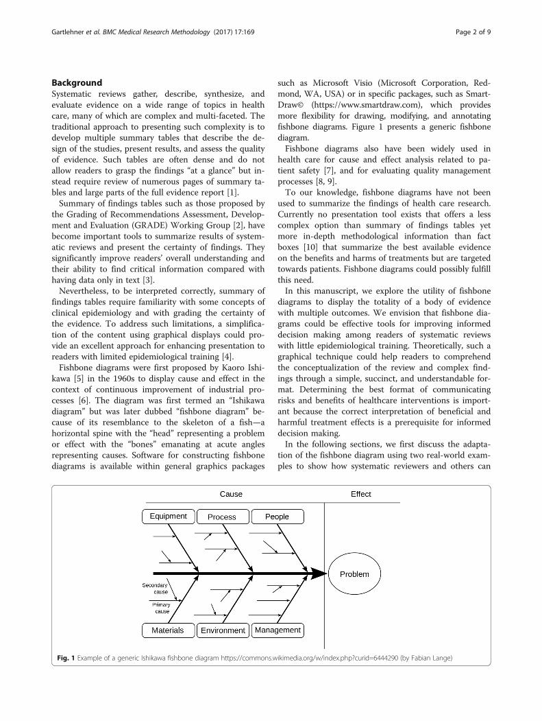
kawa [5] in the 1960s to display cause and effect in thecontext of continuous improvement of industrial pro-cesses [6]. The diagram was first termed an “Ishikawadiagram” but was later dubbed “fishbone diagram” be-cause of its resemblance to the skeleton of a fish—ahorizontal spine with the “head” representing a problemor effect with the “bones” emanating at acute anglesrepresenting causes. Software for constructing fishbonediagrams is available within general graphics packages
such as Microsoft Visio (Microsoft Corporation, Red-mond, WA, USA) or in specific packages, such as Smart-Draw© (https://www.smartdraw.com), which providesmore flexibility for drawing, modifying, and annotatingfishbone diagrams. Figure 1 presents a generic fishbonediagram.Fishbone diagrams also have been widely used in
health care for cause and effect analysis related to pa-tient safety [7], and for evaluating quality managementprocesses [8, 9].To our knowledge, fishbone diagrams have not been
used to summarize the findings of health care research.Currently no presentation tool exists that offers a lesscomplex option than summary of findings tables yetmore in-depth methodological information than factboxes [10] that summarize the best available evidenceon the benefits and harms of treatments but are targetedtowards patients. Fishbone diagrams could possibly fulfillthis need.In this manuscript, we explore the utility of fishbone
diagrams to display the totality of a body of evidencewith multiple outcomes. We envision that fishbone dia-grams could be effective tools for improving informeddecision making among readers of systematic reviewswith little epidemiological training. Theoretically, such agraphical technique could help readers to comprehendthe conceptualization of the review and complex find-ings through a simple, succinct, and understandable for-mat. Determining the best format of communicatingrisks and benefits of healthcare interventions is import-ant because the correct interpretation of beneficial andharmful treatment effects is a prerequisite for informeddecision making.In the following sections, we first discuss the adapta-
tion of the fishbone diagram using two real-world exam-ples to show how systematic reviewers and others can
Fig. 1 Example of a generic Ishikawa fishbone diagram https://commons.wikimedia.org/w/index.php?curid=6444290 (by Fabian Lange)
Gartlehner et al. BMC Medical Research Methodology (2017) 17:169 Page 2 of 9

use this graphical technique. Second, we summarize theresults of a user testing exercise comparing a fishbonediagram with a GRADE summary of findings table.
MethodsConcept of the fishbone diagram to summarize evidenceof systematic reviewsIn our adaptation of the fishbone graphic, the “head”represents the overall balance between benefits andharms of an intervention or of competing interventions.The bones of the fish represent individual outcomes thatare critical or important to balance the overall benefitsand harms of the interventions. The proximity of thebones to the head reflects the importance of outcomesfor decision making. GRADE, for example, recommendsranking the relative importance of outcomes when de-veloping guidelines. Each bone (representing an out-come) can include additional explanatory factors such asa plain language summary of the effect, the number ofstudies, the magnitude of treatment effects, or other fac-tors that influence the certainty (strength) of a body ofevidence.We applied the basic fishbone schematic to two sys-
tematic reviews [11, 12] that differed in key ways, so thatwe could illustrate the applications for various kinds oftopics, patient populations, interventions, and outcomes.To understand whether the fishbone could usefullysummarize comparative treatments that might form thebasis of a clinical practice guideline, we took the findingsfrom a systematic review of randomized controlled trials(RCTs) of preoperative anemia management versus usualcare (“anemia fishbone”, Fig. 2) [11]. To evaluate the ap-plicability and utility of fishbone graphics for preventiveservices, we selected an umbrella systematic review onthe benefits and risks of mammography screening(“screening fishbone”, Fig. 3) [12].For each fishbone diagram, we used and simplified in-
formation from the summary of findings table in eachsystematic review to populate the bones of the fish. Oneresearcher populated each fishbone diagram initially; asecond researcher evaluated the accuracy of the sum-mary data. If discrepancies arose, the investigators ar-rived at a final version through consensus discussion oradjudication by a third researcher.
Target audienceWe envision as the target audience for fishbone dia-grams, health professionals with some epidemiologicaltraining but who are not facile with comprehension ofcomplex summary of findings tables.
User testingThe goal of user testing was to compare the utility of afishbone diagram to convey results of a systematic
review with that of a GRADE summary of findings table.We conducted the user testing in English in January2017 using Qualtrics, an electronic web-based surveytool. All answers were anonymous. Additional File 1 pre-sents the structure of the survey as a flow diagram.We pilot-tested the survey on health services re-
searchers and revised the final version accordingly; thepilot data were not included in the final analyses. Exceptfor initial impressions (see below) and demographicdata, all items in the survey were in a forced-choice for-mat. To allow for a mixed-methods approach in dataanalysis, we used both open-ended and closed answeringformats. The Danube University Institutional ReviewBoard determined that ethics approval was not requiredfor anonymous user testing.We used the “anemia fishbone” described above and
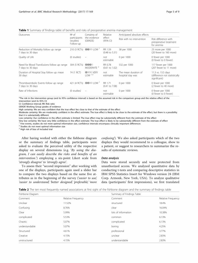
presented in Fig. 2 as the example in the survey. TheGRADE summary of findings table (Table 1) presentedmore detailed data than the fishbone diagram. Add-itional File 2 presents the final version of the survey.
SampleWe used a nonrandom, purposive sample of studentswho were enrolled in a health sciences bachelor programor in a health management master’s program. All stu-dents had a basic understanding of clinical epidemiology.Because they had not been previously introduced to fish-bone diagrams or summary of findings tables, we pro-vided a brief introduction to the main concepts at thebeginning of user testing. Respondents completed usertesting via an online survey during regular class hours;however, participation was voluntary.
MeasuresWe were interested in four distinct measures for com-paring the fishbone and the summary of findings table(Table 2): 1) Initial impressions; 2) Ability to find and in-terpret critical information; 3) Perceived utility; and 4)Second impression after using either the fishbone dia-gram or the summary of findings table.To gather participants’ first impressions, we asked
them to comment on their initial reactions when firstviewing the two displays by writing down three spontan-eous thoughts for the fishbone diagram and the sum-mary of findings table. In addition, we had participantsuse a visual analog scale with a slider bar to compare thetwo displays based on five attributes (‘easier to use’, ‘eas-ier to understand’, ‘better designed’, ‘preferable’, ‘more con-fusing’). The middle position indicated a neutral attitude.To continue with the questionnaire, the slider bars hadto be clicked on by the participants and either moved orleft in the neutral position.To assess the ability to find and interpret critical infor-
mation, we randomized participants to work either with
Gartlehner et al. BMC Medical Research Methodology (2017) 17:169 Page 3 of 9

the fishbone diagram or the summary of findings table.The participants were given a brief summary text thatintroduced the topic (preoperative anemia management)represented in the two displays. In a first step, partici-pants had to choose the correct conclusion that couldbe drawn from the display (see Additional File 2 for de-tails). In a second step, they had to answer three
multiple-choice questions that required finding andinterpreting data presented in the displays; only one an-swer per item was correct. Participants could alsochoose an “I don’t know” option. Because we were alsointerested in the participants’ speed of navigating thedisplays, we tracked the time from loading the page toproviding the final answer for this section.
Fig. 2 Fishbone diagram of benefits and risks of preoperative anemia management
Fig. 3 Fishbone diagram of benefits and risks of mammography screening vs. no screening
Gartlehner et al. BMC Medical Research Methodology (2017) 17:169 Page 4 of 9
After having worked with either the fishbone diagramor the summary of findings table, participants wereasked to evaluate the perceived utility of the respectivedisplay on several dimensions (e.g. ‘By using the dia-gram, I can easily describe the risks and benefits of anintervention.’) employing a six-point Likert scale from‘strongly disagree’ to ‘strongly agree’.To assess their “second impression” after working with
one of the displays, participants again used a slider barto compare the two displays based on the same five at-tributes as in the beginning of the survey (‘easier to use’,‘easier to understand’, ‘better designed’, ‘preferable’, ‘more
confusing’). We also asked participants which of the twodisplays they would recommend to a colleague, show toa patient, or suggest to researchers to summarize the re-sults of systematic reviews.
Data analysisData were stored securely and were protected fromunauthorized access. We analyzed quantitative data byconducting t-tests and comparing descriptive statistics inIBM SPSS Statistics Insert for Windows version 24 (IBMCorp. Armonk, New York, USA). To analyze qualitativedata (participants’ first impressions), we first translated
Table 2 The ten most frequently named associations at first sight of the fishbone diagram and the summary of findings table
Fishbone Diagram Summary of Findings Table
Comment Relative Frequency Comment Relative Frequency
Unclear 11.52% structured 18.4%
Confusing 8.76% clear 16.04%
Clear 5.99% lots of information 10.38%
complicated 5.53% common 6.13%
Chaotic 5.07% complicated 6.13%
understandable 5.07% boring 4.25%
Structured 4.61% professional 3.77%
Creative 4.15% unclear 2.83%
unstructured 4.15% understandable 2.83%
Table 1 Summary of findings table of benefits and risks of preoperative anemia management
Outcomes № ofparticipants(studies)Follow-up
Certainty ofthe evidence(GRADE)
Relativeeffect(95% CI)
Anticipated absolute effects
Risk with no intervention Risk difference withpreoperative treatmentfor anemia
Reduction of Mortality follow up: range7 days to 30 days
210 (3 RCTs) ⨁⨁◯◯ LOW 1 RR 1.59(0.48 to 5.31)
38 per 1000 23 more per 1000(20 fewer to 160 more)
Quality of Life (0 studies) – notestimable
0 per 1000 0 fewer per 1000(0 fewer to 0 fewer)
Need for Blood Transfusions follow up: range7 days to 30 days
304 (5 RCTs) ⨁⨁⨁◯MODERATE 2
RR 0.78(0.61 to 1.02)
532 per 1000 117 fewer per 1000(207 fewer to 11 more)
Duration of Hospital Stay follow up: mean30 days
74 (1 RCT) ⨁◯◯◯ VERYLOW 1,3
notestimable
The mean duration ofhospital stay was
11.3 vs. 13.5 days(difference not statisticallysignificant)
Thromboembolic Events follow up: range7 days to 30 days
421 (4 RCTs) ⨁⨁◯◯ LOW 1 RR 1.71(0.41 to 7.08)
0 per 1000 0 fewer per 1000(2 fewer to 40 more)
Rate of Infections (0 studies) – notestimable
0 per 1000 0 fewer per 1000(0 fewer to 0 fewer)
*The risk in the intervention group (and its 95% confidence interval) is based on the assumed risk in the comparison group and the relative effect of theintervention (and its 95% CI)CI: Confidence interval; RR: Risk ratioGRADE Working Group grades of evidenceHigh certainty: We are very confident that the true effect lies close to that of the estimate of the effectModerate certainty: We are moderately confident in the effect estimate: The true effect is likely to be close to the estimate of the effect, but there is a possibilitythat it is substantially differentLow certainty: Our confidence in the effect estimate is limited: The true effect may be substantially different from the estimate of the effectVery low certainty: We have very little confidence in the effect estimate: The true effect is likely to be substantially different from the estimate of effect1 Few events, studies do not meet optimal information size, confidence intervals encompass clinically important differences2 Studies do not meet optimal information size3 High risk of bias of included trial
Gartlehner et al. BMC Medical Research Methodology (2017) 17:169 Page 5 of 9

comments expressed in German into English and listedall data in Microsoft Excel, version 15.32 (MicrosoftCorporation, Redmond Washington, USA). Then, westandardized synonyms and similar associations (e.g.‘easy understanding’ and ‘easy to understand’ to ‘under-standable’). Two raters carried out the translation andstandardization of data consecutively and controlledeach other’s work. Finally, we calculated the relative fre-quencies of associations.
ResultsWe first illustrate the use of fishbone diagrams throughthe two topics described above. We then present resultsof the user testing based on the anemia fishbone.
Example 1: Systematic review on preoperative anemiamanagementA professional society commissioned this systematic re-view as background for a panel developing clinical prac-tice guidelines [11]. The anemia fishbone (Fig. 2) depictsthe entire body of evidence from this review. The headof the fish represents the comparison of interest, namelythe balance of benefits and risks of preoperative anemiamanagement versus no management. Following theGRADE approach, the guideline panel selected six out-comes that they deemed critical or important for clinicaldecisionmaking; each bone represents an outcome. Crit-ical outcomes are closer to the head than less importantoutcomes. A solid line between the fish spine and theoutcome indicates that the review identified eligible evi-dence; dotted lines symbolize the lack of evidence (i.e.,the review detected no eligible studies).Each bone representing an outcome also provides a
brief plain-language summary of the results and presentskey characteristics of the evidence for that outcome: thenumber of trials, the total number of participants inthese trials, the magnitude of effect in absolute and rela-tive risks, and the certainty of evidence according toGRADE methods. For example, the panel ranked reduc-tion of mortality and quality of life as critical outcomes,so both are close to the head. The evidence for reducedmortality consisted of three RCTs with a total of 210participants. The pooled result of the three trials yieldedan indeterminate effect estimate with wide confidenceintervals including both benefits and harms (relative risk[RR] 1.59; 95% confidence interval [CI] 0.48, 5.31). Theteam that conducted the review graded the certainty ofevidence as low. Because no evidence was available forquality of life, a dotted line is used. By contrast, theguideline panel rated the rate of infections and durationof hospital stay as important (but not critical) outcomes.Consequently, they are located close to the tail.
Example 2: Umbrella systematic review onmammography screeningThis example attempts to approximate the process of aninternational organization developing recommendationsfor mammography screening. Because of applicabilityconcerns when relying on results only from RCTs, theguideline panel had commissioned a systematic reviewof systematic reviews (sometimes called an umbrella re-view) of both RCTs and observational studies [13].The guideline panel had selected eight outcomes they
deemed critical or important for decisionmaking. In ourfishbone diagram, we depict the evidence for high-resource settings from both RCTs and observationalstudies in a parallel manner. By drawing the diagram thisway, we can help users not only view important charac-teristics of each outcome but also compare findings onthe same outcomes based on each body of eviden-ce—RCTs and observational studies. Additional File 3presents the corresponding summary of findings table.
Results of user testingThe sample for user testing comprised 77 students. Most(75%) of the participants were female and were aged be-tween 18 and 40 years (median = 22 years). All partici-pants completed the survey. Additional File 4 presentssupplementary information on user testing.
First impressionParticipants’ first impressions of the displays favored sum-mary of findings tables over fishbone diagrams. Out of217 comments initially noted by participants, the mostfrequent associated with the fishbone diagram were‘unclear’ (11.52%), ‘confusing’ (8.78%), and ‘clear’ (5.99%).From the 212 initial reactions for the summary of findingstable, the most frequent ones were ‘structured’ (18.4%),‘clear’ (16.04%), and ‘lots of information’ (10.38%). Table 2summarizes the ten most frequent comments for eachdisplay.Figure 4 presents ratings of pre-determined attributes
directly comparing the two displays after getting a firstimpression (light blue) and after having worked with ei-ther of the two displays (dark blue). Rectangles representmean ratings. The middle position (0) indicates a neutralattitude. Overall, results favor the summary of findingstable over the fishbone diagram and did not change sub-stantially after having worked with either display. Add-itional File 4 presents box plots depicting thedistribution of answers for each attribute.
Ability to find critical informationAfter participants had been randomized to either thefishbone diagram or the summary of findings table, theywere asked to pick an overall conclusion and to answerthree questions that required them to find and interpret
Gartlehner et al. BMC Medical Research Methodology (2017) 17:169 Page 6 of 9

facts from the displays (e.g., Preoperative anemia man-agement is favored the most by outcomes concerning: a)reduction of mortality, b) quality of life, c) need for bloodtransfusions, d) duration of hospital stay). When askedto pick a correct overall conclusion, 68.4% of partici-pants from the fishbone group and 71.8% from the sum-mary of findings group provided the correct answer. Ofthose who picked the correct conclusion, participants inthe fishbone group were on average 26 s faster in deter-mining the correct answer (154.5 s vs. 180.8 s; differencenot statistically significant). However, more than half ofthe participants in each group were unable to answerthe three questions correctly that required finding andinterpreting facts (52.6% in the fishbone group; 51.3% inthe summary of findings group). Of those who pickedthe correct options, participants in the fishbone groupwere on average 26 s faster in deciding on the answers(123.2 s vs. 149.3 s) than those using the summary offindings table. The difference, however, was notstatistically significant. More detailed results on the cor-rect choice of options in each group can be found inAdditional File 4.
Perceived utilityAfter working with the fishbone diagram or the sum-mary of findings table, participants’ assessments of theperceived utility differed significantly between the twodisplays for some of the items. More participants usingthe summary of findings tables than the fishbone dia-grams agreed with the statement ‘Overall, I liked thediagram/table’ (p < .01; combining strongly agree/agree/slightly agree options: 71.8% vs. 44.8%). By comparison,significantly more participants using the fishbone dia-grams agreed with the statements ‘It was hard to findthe information I was interested in’ (p < .01; combiningstrongly agree/agree/slightly agree options: 65.8% vs.45%;) and ‘The information in the diagram/table was
confusing’ (p < .05; combining strongly agree/agree/slightly agree options: 63.2% vs. 35.9%).Additional File 4 summarizes the perceived utility
comparing fishbone diagrams with summary of findingstables. Overall, the perceived utility was better for sum-mary of findings tables. Consequently, more participantswould recommend summary of findings tables to a col-league (53.2% vs. 11.7%) or to a systematic reviewer(74.0% vs. 7.8%). Fewer participants, however, would rec-ommend summary of findings tables than fishbone dia-grams to patients (23.4% vs. 31.2%).
DiscussionThe concept of fishbone diagrams has been used in healthcare for decades for cause and effect analysis related to pa-tient safety and for evaluating quality management pro-cesses. We presented two adaptations of a fishbonediagram to display large volumes of evidence in systematicreviews. The diagrams provide information-rich graphicsthat can supplement the complex and detailed tables thatusually summarize the findings of systematic reviews. Weenvisioned fishbone diagrams as a useful tool for peoplewith some epidemiological training but not enough famil-iarity with complex summary of findings tables.User testing, however, revealed that students with
basic training in clinical epidemiology found fishbone di-agrams complicated and difficult to understand. Partici-pants rated the perceived utility of summary of findingstables as better than that of fishbone diagrams. A some-what surprising result, however, was that more than halfof the participants in each group were unable to answerall three factual questions correctly. This finding con-firms that summary of findings tables, despite theirwidespread use, are not an ideal way to convey keypoints about evidence to readers of systematic reviewswith little epidemiological training.An important reason for the unfavorable results con-
cerning fishbone diagrams is probably that most
Fig. 4 Direct comparison of fishbone diagrams with summary of findings tables before and after working with one of them
Gartlehner et al. BMC Medical Research Methodology (2017) 17:169 Page 7 of 9

participants were confronted with this concept for the firsttime. We briefly explained the basic idea of fishbone dia-grams before user testing but this could probably notovercome the fact that participants were more familiarwith tables. The unfavorable ratings, however, pertain tofirst impressions and the perceived utility only. When wetested how well participants can detect and interpret factspresented in fishbone diagrams or summary of findings ta-bles, no substantial differences were identified.Our user testing has several limitations. First, by sur-
veying students unfamiliar with the concept of fishbonediagrams, we probably placed fishbone diagrams at a dis-advantage compared with summary of findings tables.Had participants received some training in the usage offishbone diagrams, the perceived utility might have beenbetter. We did not provide training so as to emulateusual situations in which systematic reviews are used.The average reader who might confront a fishbone dia-gram in a systematic review would likely lack training inthe diagram usage. Second, the participants of user test-ing comprised of students who had at least one coursein clinical epidemiology and evidence-based medicine.Clinicians and decision-makers who read systematic re-views might not have this background knowledge. Theapplicability of our findings to other populations withdifferent educational backgrounds, therefore, is unclear.Third, we conducted the pilot test in health services re-searchers, some of whom had many years of experiencewith conducting and interpreting evidence syntheses. Thefact that the pilot population had more experience withevidence syntheses than the actual population in the usertests could have contributed to a potential lack of under-standing of the purpose of the user test. We cannot ruleout a certain extent of measurement error because partici-pants may have misunderstood our questions.Despite the unfavorable results of the user test, we still
believe that fishbone diagrams, in general, have the po-tential to convey the facts of systematic reviews in astructured and efficient manner. The fishbone diagramis a flexible tool; users can adapt it in numerous waysbased on the details of the systematic review or theneeds of the users (e.g., guideline developers, clinicians).For example, by juxta-positioning results from RCTs andobservational studies in our mammography fishbonediagram, we allow for a quick comparison of effects fromRCTs and observational studies which can help readersgauge potential issues with applicability of results fromRCTs. With its easily modifiable structure, the number ofbones for any given systematic review topic can be in-creased or reduced depending on whether the focus isnarrowed or expanded. Additionally, researchers canexperiment with and test other graphical elements tocharacterize numerous pieces of information, such asthe types of studies summarized, the quality of the
evidence, or the magnitude of the overall effect. Suchelements can include color, line width (varying thick-nesses), and line type (e.g., solid or dotted). The timeinvestment to create fishbone diagrams is comparableto the time to create a summary of findings table, par-ticularly when an existing template can be used. Com-pared with summary of findings tables, however, thespace to present results in fishbone diagrams is limited.Outcomes on benefits and harms, therefore, need to belimited to those that are most relevant to patients andmost important for decisionmaking. The GRADEWorking Group, for example, recommends limiting thenumber of outcomes to no more than seven [14], anamount that can be easily accommodated within a fish-bone diagram.Clearly, further work is needed to enhance the useful-
ness of fishbone diagrams for the field of evidence-basedpractice and systematic reviews. In much the same waythat survey instruments or health communications tech-niques are tested through focus groups and cognitiveinterviewing, different kinds of fishbone diagrams mayusefully be examined through these techniques. Findingthe most comprehensible presentation formats for specifictarget groups is crucial because fully understanding themagnitude of benefits and risks is the prerequisite for anyinformed decision.
ConclusionsInitial user testing of fishbone diagrams as compact vi-sualizations for presenting the essence of a systematicreview did not support the utility of such graphical dis-plays. The low proportions of correct answers of usersof fishbone diagrams and summary of findings tables,however, indicate a general problem with the effective-ness of conveying key points about evidence in system-atic reviews.
Additional files
Additional file 1: Flow chart. Flow Diagram of Survey Word File (figure)(DOCX 26 kb)
Additional file 2: Survey. Survey Word File (DOCX 29 kb)
Additional file 3: Mammography. Summary of Findings Table forMammography Screening Word File (DOCX 51 kb)
Additional file 4: Supplementary Results. Supplementary Results of UserTesting Word File (DOCX 107 kb)
AbbreviationsCI: Confidence interval; RCT: Randomized controlled trial; RR: Relative risk
AcknowledgmentsWe would like to thank Jennifer Uhrig, PhD and Kathleen N. Lohr, PhD fromRTI-International, and Mirjam Jenny from the Harding Center for Risk Literacyfor helpful advice during user testing. We are grateful to 77 students fromthe Karl Landsteiner University of Health Sciences and the IMC University ofApplied Sciences in Krems, Austria for participating in the user tests.
Gartlehner et al. BMC Medical Research Methodology (2017) 17:169 Page 8 of 9
FundingThe work was supported by internal funding from RTI International andDanube University Krems. The funding body had no influence on the designof the study, the collection, analysis, and interpretation of data, and onwriting the manuscript.
Availability of data and materialsThe datasets from user testing are available from the corresponding authoron reasonable request.
Authors’ contributionsConception and design: LCM, SLW, GG, GVB. Survey programing and testing:PW, MTS. User testing and acquisition of data: MTS, VT, PW, GG, SLW. Analysisand interpretation of data: MTS, VT, PW, GG. Drafting paper: GG, MTS, LCM,SLW. Making critical revisions for important intellectual content: VT, PW, GVB,SLW. All authors read and approved the final manuscript.
Ethics approval and consent to participateThe Danube University Institutional Review Board determined that ethicsapproval was not required. All students provided verbal informed consentand had sufficient time to consider participation in the study. Writteninformed consent was deemed unnecessary because no personal risk wasinvolved and written consent is not normally sought for anonymous surveys.
Consent for publicationNot required.
Competing interestsAuthors declare that they have no financial or non-financial competinginterests.
Publisher’s NoteSpringer Nature remains neutral with regard to jurisdictional claims inpublished maps and institutional affiliations.
Author details1RTI International, 3040 East Cornwallis Rd, Research Triangle Park, Durham,NC 27709, USA. 2Department for Evidence-based Medicine and ClinicalEpidemiology, 3500 Krems, Austria. 3Department of Maternal and ChildHealth, Gillings School of Global Public Health, University of North Carolina atChapel Hill, Chapel Hill, NC 27599, USA.
Received: 30 May 2017 Accepted: 5 December 2017
References1. McCormack L, Sheridan S, Lewis M, Boudewyns V, Melvin CL, Kistler C, Lux
LJ. Cullen K. Communication and dissemination strategies to facilitate theuse of health-related evidence: Lohr KN; 2013.
2. Guyatt GH, Thorlund K, Oxman AD, Walter SD, Patrick D, Furukawa TA,Johnston BC, Karanicolas P, Akl EA, Vist G. GRADE guidelines: 13. Preparingsummary of findings tables and evidence profiles—continuous outcomes.J Clin Epidemiol. 2013;66(2):173–83.
3. Rosenbaum SE, Glenton C, Oxman AD. Summary-of-findings tables inCochrane reviews improved understanding and rapid retrieval of keyinformation. J Clin Epidemiol. 2010;63(6):620–6.
4. Garcia-Retamero R, Cokely ET. Designing visual aids that promote riskliteracy: a systematic review of health research and evidence-based designheuristics. Hum Factors. 2017:0018720817690634.
5. Ishikawa K, DJ L. What is total quality control?: the Japanese way, vol. 215.Englewood Cliffs, NJ: Prentice-Hall; 1985.
6. Kelleher K: Cause-and-effect diagrams: plain and simple; 1995.7. Byers JF, White SV: Patient safety: principles and practice: springer
publishing company; 2004.8. Juran JM, Gryna FM: Juran’s quality control handbook fourth edition:
McGraw-hill, 0–07–033176-6, United States of America; 1988.9. Donaldson MS, Harris-Wehling J, Lohr KN: Medicare: new directions in
quality assurance proceedings: national academies press; 1991.10. McDowell M, Rebitschek FG, Gigerenzer G, Wegwarth O. A simple tool for
communicating the benefits and harms of health interventions. MDM Policy& Practice. 2016;1(1):2381468316665365.
11. Glechner A, Gartlehner G, Nußbaumer B, Kozek-Langenecker S. Perioperativeanemia management: a systematic review and meta-analysis. Wien MedWochenschr. 2014;164(15–16):330–41.
12. WHO position paper on mammography screening [http://apps.who.int/iris/bitstream/10665/137339/1/9789241507936_eng.pdf?ua=1&ua=1].
13. Smith V, Devane D, Begley CM, Clarke M. Methodology in conducting asystematic review of systematic reviews of healthcare interventions. BMCMed Res Methodol. 2011;11(1):15.
14. Guyatt GH, Oxman AD, Kunz R, Atkins D, Brozek J, Vist G, Alderson P, GlasziouP, Falck-Ytter Y, Schunemann HJ. GRADE guidelines: 2. Framing the questionand deciding on important outcomes. J Clin Epidemiol. 2011;64(4):395–400.
• We accept pre-submission inquiries
• Our selector tool helps you to find the most relevant journal
• We provide round the clock customer support
• Convenient online submission
• Thorough peer review
• Inclusion in PubMed and all major indexing services
• Maximum visibility for your research
Submit your manuscript atwww.biomedcentral.com/submit
Submit your next manuscript to BioMed Central and we will help you at every step:
Gartlehner et al. BMC Medical Research Methodology (2017) 17:169 Page 9 of 9