SYNOPSIS - cpb-eu-w2.wpmucdn.com · This napkin ring is possible the simplest type of napkin ring...
80
Transcript of SYNOPSIS - cpb-eu-w2.wpmucdn.com · This napkin ring is possible the simplest type of napkin ring...

Play is an unquest ionably va luable aspect of human exper ience and express ion. For many, i t is fundamenta l to the pursui t of happiness. The pr imary colours and large, round edged, forms that have come to def ine chi ldren’s toys become less re levant and more d istant as we age.
This pro ject seeks to reconnect the user wi th the i r ‘ inner chi ld’ by developing and synthe-s is ing a v isual language of p lay designed for contemporary inter ior sett ings. The work sets out to promote an emot ive vehemence of hap-piness and fun into the home.
To achieve th is, I have produced a homeware col lect ion of lamps and dishes that compr ise of 3 shapes: ‘square’ , ‘c i rc le’ and ‘ t r iangle’ . The col lect ions are inspi red by the archetypal forms of ch i ldren’s bui ld ing b locks and the colours of p ick ‘n’ mix sweets. Adapted for contemporary inter iors, these e lements com-bine to create objects that explore nosta lg ia and the aesthet ics of p lay.
SYNOPSIS

CONTENTS
PART ONEPLAY-MAKING
PART TWOCOLOUR THEORY
PART THREESHAPE AND LANGUAGE
PART FOURFRUITIONS

PART ONEPLAY-MAKING
Based on the k inds of making I found playfu l as a chi ld. A l ine of enquiry was undertaken to reveal i f there is a re la-t ionship between 'p lay-making' i tse l f , and the outcomes of i t hav ing aes-thet ic remin iscence of p lay. Through part one, min i pro jects wi l l be la id out and cr i t ica l ly ref lected upon to open the idea of what const i tutes the aes-thet ic language of p lay.

‘PLAY IS THE GATEWAY DRUG TO MAKING’
ADAM SAVAGEPROP-MAKER
Youtube/Tested:Adam Savage 's One Day Build10th March 2016

PROPOSITIONSRESPONDING
TO INFLUENCE
Personal ly as a chi ld ‘p lay mak-ing’ tended to happen as a re-sul t of boredom, suff ice to say that making in th is instance was not a means to an end or in other words, creat ing something that I des i red, but i t was va lued as a process that enterta ined me.
Play making as means of enter-ta inment of ten der ived inspi ra-t ion f rom very l i t t le or random informat ion and as the outcome was of l i t t le importance the in i-t ia l inspi rat ion had margina l re l-evance
For th is min i pro ject , in order to in form th is process of p lay I gath-ered s ingle p iece of data f rom random people, the categor ies were as fo l lows: colour, number, scale, shape and mater ia l .

INFLUENCES
YELLOW
SEVEN
1 FOOT
3 POINT STAR
CHICKEN WIRE

60 second l ine drawings us ing the inf luences I gath-ered. The basic
pr inc ip le here was to get an idea of what to make as
fast as possib le so I could start mak-
ing.

DESCRIPTION OF OBJECTMAQUETTE
Chicken wire f rame, mod-rock sk in, ye l low spray paint , ch icken wire shades, 3 pointed star shape, foot long arms, g lass bulbs, 7
st icky dots.

DESCRIPTION OF OBJECTCERAMIC VERSION
Model l ing mesh shades, ceramic body, ye l low glaze, 3 pointed star shape, foot
squared, g lass bulbs, 7 st icky dots.

THOUGHTS
These objects turned out to be very p layfu l looking, however wi thout the br ight ye l low i t would be another story. A lso, at the same t ime the outcome carr ies a subt le look of hazardousness which is not what I ’m looking for.
The process of making these kept me enterta ined as expect-ed a l though I became f rustrated with the process tak ing to long. I now understand that to be fu l-ly involved and enterta ined with making, the stream of making needs to be consistent and not fu l l of dry ing per iods etc.

RESPONDING TO OBJECTS OF
INTEREST
With the a im to understand how certa in objects catch our eye. I thoughts i t ’d be interest ing take a t r ip to snoopers paradise to see what k inds of objects I found as p layfu l ly st r ik ing. Giv ing mysel f 1 hour, I had to se lect 3 objects to br ing back to ceramics and work with.

This Wedgwood table l ighter was designed to be sophis-t icated but decorat ive and whi le at the t ime th is may have been the case, today i t g ives off d i f ferent v ibes. I ts baby b lue colour and matte f in ish have a certa in chi ld l ike language; a lso, the objects f luted base and r ibbed tex-ture have tact i l i ty that fee l good in the hand. I t would appear that as ide f rom an object ’s colour, tact i l i ty could be a factor in p layfu l-ness to.
WEDGWOOD TABLE LIGHTER


This napkin r ing is possib le the s implest type of napkin r ing you can f ind, i ts shape being a lmost l ike a s l ice of PVC tubing. Perhaps s im-pl ic i ty has an under ly ing ef-fect of making something p layfu l , however, i f i t where whi te i t could have a d i fferent appeal . The colour of i t (p ink wi th mott le b lue streaks) combined with i ts s impl ic i -ty has a unanimous fun look that suggests that form and colour together can display chi ld ishness.
NAPKIN RING

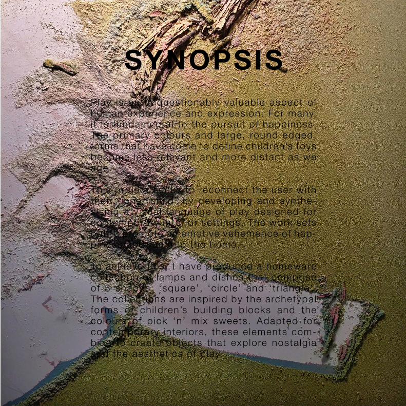
Coat hangers are one of the most mundane home ac-cessor ies there is . This col-lapsib le coat hanger is an over-engineered one at that . As a hanger has a very smal l prof i le and most p laces one t rave ls to have them al ready, the need for a hanger l ike th is is non-ex istent. My at-t ract ion to i t was not based on me needing i t but be-cause I found i t to be qui te an amusing object , moreo-ver, amusing equals p layfu l .
COLLAPSIBLE COAT HANGER


THOUGHTS
Certa in constra ints such as t ime and f inances expectedly a l tered my choices, however the objects I d id manage to f ind proved to be conceptual ly prof i table.
Understanding and bui ld ing upon the colours and geometry of the objects I bought f rom Snoopers Paradise resul ted in a col lect ion of pots that I be l ieve to be as v isual ly st r ik ing as the or ig ina ls. Further ing my understanding of How certa in aesthet ics can be t ransferred.

STEPHANIE WRIGHTCERAMICIST
‘I’M NOT A TERRIBLY
SERIOUS POTTER,
I ENJOY THE FUN
IN MY PIECES’
Ceramic Review:Masterclass with Stephanie WrightShort documentary - 28th March

SALVAGEMAKING
As a chi ld, us ing the mater ia ls I could f ind around the house was one of my opt ions. Here I a imed to repl icate th is by us ing the mater ia ls I could f ind around my bedroom and the workshops. Through th is I hoped to see i f the process of sa lvaging ign i tes a chi ld l ike scene of nosta lg ia in me.

FOUND MATERIALS
Acrylic Block Wooden Slat LED's


THOUGHTS
Whi le th is min i pro ject produced a good outcome I found that the appeal of i t is rather sophist icat-ed. I hoped to not have ended up with something so stra ight look-ing however i t was the mater ia ls I had at my disposal that made i t th is way which I suppose was the point of i t .
Making th is object d idn’t f i l l me with nosta lg ia a l though the pro-cess of looking for the mater i -a ls d id. Lett ing ideas and design f low and develop in my head as I s i f ted through the workshops looking at a l l k inds of offcuts was interest ing and remind me of my-sel f as a chi ld.

PART TWOCOLOUR THEORY
Part two focuses on how colour con-tr ibutes to the concept of p layfu l aes-thet ics. Based main ly on the v isual language of sweets, cr i t ica l ref lec-t ions wi l l be drawn to fur ther my ide-as and understanding of the topic. The cur ious topic of colour associa-t ion wi l l a lso be invest igated to see i f there is any common re lat ionships be-tween colours and shapes, numbers, months, day of the week and let ters. Explorat ion of th is avenue wi l l lead on and l ink to the next part .

TAKE A TRIPCARAMELLA SWEET SHOP
For my creat ive enquiry t r ip I decided to go somewhere that
was for ch i ldren. Caramel la Sweet Shop is located in Br ight-on lanes, they offer a wide va-r iety of sweets and t reats (p ick 'n' mix sty le ) . Here I gathered
v isual research for my branch of research that focuses on colour.

Caramel las logo/t i t le in i tse l f pre-sents a c lear brand ident i ty that is d i rected towards a more Playfu l Aesthet ic. us ing bold shapes and soft/past le pr imary colours seems to be a sure way of portray ing the v isual language of ch i ld ishness.

COCONUTMUSHROOMSN O N - C O LO U R F U L
Coconut mushrooms are one of my favour i te sweets, probably be-cause my parents love them to. I ts not l ike ly that a chi ld these day wor ld be drawn to the because they have very l i t t le in the way of colour. Brown and whi te aren’t the ba-s is for a good sweet but they do taste great, much l ike chocolate.

Blue indicates sour, as b lue is not commonly found in natura l edib les, i t has the v isual language of synthet ic or inedib le, however the i r is some-th ing cur ious about eat-ing b lue food. Giant Dol-phins are squishy, they have great tact i le feed-back which is may a lso a dr iv ing point for p layfu l aesthet ics.
G I A N TD O L P H I N ST E X T U R A L

I have a great fondness for speckled th ings as they imply a painter-ly/p layfu l a ffect . These gobstoppers are remi-n iscent of marbles both v isual ly and psychica l-ly. I 've a lways wandered why people l ike them and I th ink i t has some-th ing to wi th the chang-ing colours.
SPECKLEDG O B S T O P P E R ST O Y - L I K E

Dol ly Mixture is a p ick 'n' mix sweet a l l on i ts own. Offer ing var iety there is noth ing more than a chi ld l ikes more that choice. These sweets have a mult i tude of colours and with that , a huge range of languages behind i t . To be se lect ive about what colours to put to-gether in a col lect ion is key.
D O L L YM I X T U R EV A R I E T Y

The ref resher i tse l f isn’t very interest ing. The packaging on the other hand is another story. The pr imary col-ours are both str ik ing and funky. These col-our have a very d is-t inct ive re lat ionship to learn ing and play as they are taught to us at a very ear ly age.
REFRESHERSG R A P H I C A L

ICE CREAM C O N E ST W O -TO N E
Two-tone sweets such as Ice Cream Cones are subt le but effect ive. in my opin ion they look to be l ike to part or more deta i led than they actu-a l ly are. P ink and whi te speci f ica l ly as a colour combinat ion have sub-t le femin ine undertones with helps to make th ings more chi ld l ike.

THOUGHTS
Sweets and the i r colours posses a great deal of emot ive language f rom paste l p ink, to green. I t is the d i fference between baby blue and navy b lue that makes c lear the power of colour.
Understanding that these colours don’t randomly end up these col-ours is crucia l in recognis ing that colour is se lected. The ingredi-ents that make most sweets are whi te or c lear wi th added pig-ment. The manufacturers must bare in mind what colours wi l l make the i r sweets more desi ra-ble.

O R A N G E

Y E L L O W

G R E E N

B L U E

P I N K

THOUGHTSThe colours of p ick 'n' mix sweets are more s imi lar than not. Whi le the i r are p lenty var iat ions of p ink upon my v is i t to Caramel la I no-t iced a d ist inct lack of colours such as red and dark green.
Perhaps th is is because these are not seen as part icu lar ly ch i ld l ike colours or colours that are asso-c iated with something bad.

S U G A R Y G L A Z E T E S T S

COLOURFUL
BOLD
CHEERFUL
PLAYFUL
SUGARY
SOFT
TASTY

DARK
HARD
DISGUSTING
DANGEROUS
COLD
POISONOUS
CHEAP

HEAVY
EXPENSIVE
METALLIC
JEWELLERY
SMOOTH
GIFT
LARGE

BLAND
LIGHT
SIMPLE
CLEAN
CHEWY
BORING
DELICATE

THOUGHTSSimply by changing the colour of the sweets can make them appear less or more expensive, l ighter or heav ier, harder or sof t-er etc.
Whi le the colours of sweets are genera l ly l ight br ight and colour-fu l , i t begs the quest ion why are those that aren’t st i l l populate. Taste p lay a part of course but not near ly as much as the aes-thet ics of the sweet. People say don’t judge a book by i ts cover but people a lso say that judging a book by i ts cover is a good in-dicat ion of what your gett ing.

COLOUR ASSOCIATION SURVEY
Personal ly I associate colours wi th a lot of th ings. From my ex-per ience with ta lk ing to people about the matter, they do a lso.
I t is c lear that th ings a s imple as shapes and numbers can be as-sociated with colours, the ques-t ion is , are there any patterns involved. Is there a s ingle or dominant colour for a square for example? I conducted a survey to f ind out.

MY RESULTS

COMPILED RESULTS

COMPILED RESULTS

SURVEY REFLECTION
I receive resul ts f rom 18 Br ighton Univers i ty students. Af ter com-pi l ing the data I found that the i r were c lear dominant colours for th ings. Square for example, is predominant ly red and Monday is b lue, i ron ica l ly. The let ter Y is ye l low for obvious reasons and the number 10 is b lack.
What I f ind most interest ing though, is not what got the most resul ts but what got none or the amount that were unanswered. Hal f the study group did not as-sociate a colour wi th L, and now I th ink about i t I can only just p ic-ture i t as b lue. There were a lso no resul ts for a being b lue which I thought would be common.
My personal resul ts tend to d i f -fer f rom the popular vote which I found cur ious but everybody has d i fferent l i fe exper iences and backgrounds resul t ing in d i ffer-ent colour in f luences, an inf lu-ence of mine being, a t r iangle is green because i ts green on a Play Stat ion contro l ler.
PART THREESHAPE AND LANGUAGE
Form has a place in def in ing the di f-ference between an object that does carry the aesthet ic language of play and one that Does not. Explor ing di fferent objects wi l l help me to un-derstand the di fferent types of forms that could play a part in playful aes-thet ics. Hard edges Vs. soft edges wi l l a lso be invest igated to better peruse the more specif ic aspects of a form.
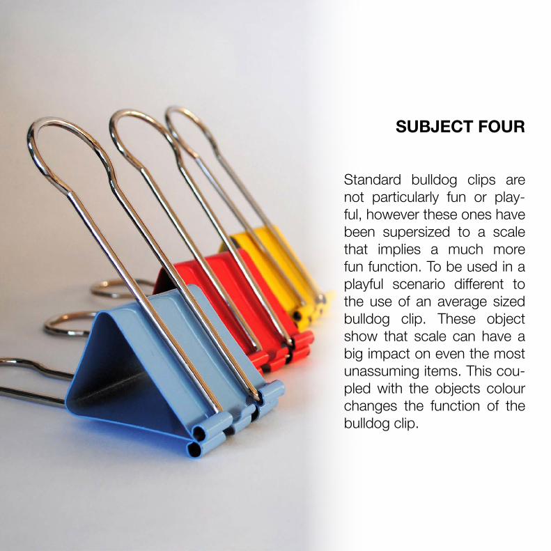
SUBJECT FOUR
Standard bulldog clips are not particularly fun or play-ful, however these ones have been supersized to a scale that implies a much more fun function. To be used in a playful scenario different to the use of an average sized bulldog clip. These object show that scale can have a big impact on even the most unassuming items. This cou-pled with the objects colour changes the function of the bulldog clip.
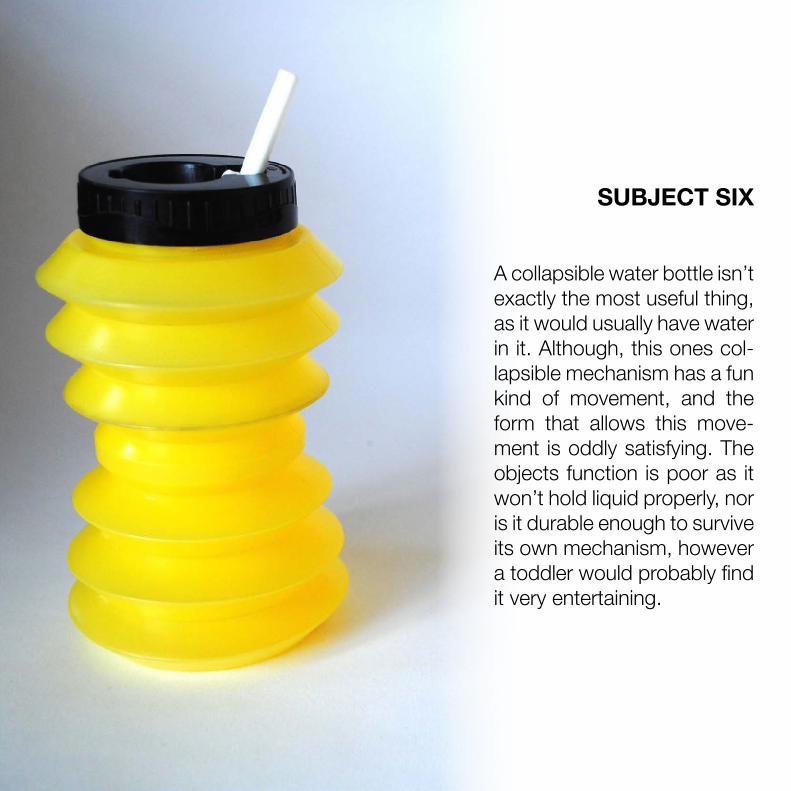
SUBJECT SIX
A collapsible water bottle isn’t exactly the most useful thing, as it would usually have water in it. Although, this ones col-lapsible mechanism has a fun kind of movement, and the form that allows this move-ment is oddly satisfying. The objects function is poor as it won’t hold liquid properly, nor is it durable enough to survive its own mechanism, however a toddler would probably find it very entertaining.
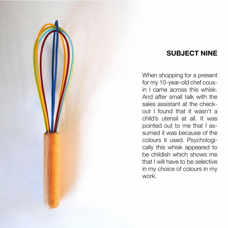
SUBJECT NINE
When shopping for a present for my 10-year-old chef cous-in I came across this whisk. And after small talk with the sales assistant at the check-out I found that it wasn’t a child’s utensil at all. It was pointed out to me that I as-sumed it was because of the colours it used. Psychologi-cally this whisk appeared to be childish which shows me that I will have to be selective in my choice of colours in my work.

SUBJECT FORTEEN
Shot glasses are a terribly grown up object however these ones are quite the op-posite. Made from plastic the have that durable, soft and playful appearance and also being pink green and yellow, together as a trio, have a sort of childish undertone. If I wer-en’t well informed I would have assumed they were a part of a children’s tea set. Embracing a plastic aesthetic is sure to encourage playful-ness.

SUBJECT FIFTEEN
On the hunt for a new sug-ar pot in Tiger I was imme-diately drawn to this for its colour and mechanism. It’s fairly assumed that a sugar pot doesn’t need to be more than simply a pot with a lid however this one had some wow factor. This bring to mind that perhaps an object having more than it needs in terms of colour, decoration and mechanism offers its owner with a little more ap-preciation and interest.

THOUGHTSColour not only affects the gen-era l aesthet ics of an object but the scale of i t dose equal ly. The whisk just goes to show that a per fect ly normal object can be coloured to look more p layfu l than i t actual ly is . Interest ingly the bul ldog c l ips were not sold as a joke g i f t but a tota l ly ser ious object . W ith pr imary colour in a group, such as those, you rea l ly can make anyth ing look chi ld ish.

DUPLOFY
'Duplofy ing' refers to Lego Dup-lo. I t is a term I came up with for the softening of harsh/hard edg-es and enlarging a form. You can take an object such as a square and soften i ts edges and make a marked di fference to how the language of that object comes across. Much l ike how Lego created Lego Duple, a bigger, rounder version of Lego br icks for younger chi ldren.

LEGO BLOCKS
- POINTY- COLOURFUL- HARD EDGED- SMALL- STACKABLE- FUN- INTRICATE- 4 AND ABOVE

- POINTY- COLOURFUL- HARD EDGED- SMALL- STACKABLE- FUN- INTRICATE- 0 - 4
DUPLO BLOCKS

HARD VS. SOFT CERAMIC BLOCKS

HARD VS. SOFT S Q U A R E S

HARD VS. SOFT T R I A N G L E S

HARD VS. SOFT C I R C L E S

PART FOURFRUITIONS
This part defines my term 'playful aesthetics' in reference to my final body of work. Each of my final piece materials will be listed and finally a review will explain the finer details of how these outcomes came into being.

PLAYFUL AESTHETICS REQUIREMENTS
Round Edges (Duploification)Geometric Forms (Building blocks)
Primary/Secondary Colours (Sweats)
Playful aesthetics would simply be the correct use and composition of bright colours (prima-ry and secondary) preferably pastel, combined with a simple forms. Duploification, where ap-propriate, lends a subtle undertone of softness and chunk like that of children's toys.

S Q U A R EL A M PO R I G I N A L

S Q U A R EL A M PO M B R É

MATERIALS
TIN GLAZE - FLESH PINK AND SIGNAL RED
PEARL WHITE SLIP CAST BODY
OPAL PLASTIC INSERT
2.5M BLACK & WHITE FABRIC CABLE
12V LED CIRCUIT
FELT BOTTOM PAD

TRIANGLEL A M PO R I G I N A L

TRIANGLEL A M PO M B R É

MATERIALSTIN GLAZE - BRIGHT YELLOW
PEARL WHITE SLIP CAST BODY
CLEAR CAST ACRYLIC BLOCK TOP
2.5M BLACK & WHITE FABRIC CABLE
12V LED CIRCUIT
FELT BOTTOM PAD

C I R C L EL A M PO R I G I N A L

C I R C L EL A M PO M B R É

MATERIALS
TIN GLAZE - TORTUROUS
PEARL WHITE SLIP CAST BODY
FROSTED POLYPROPYLENE SHEET INSERT
2.5M BLACK & WHITE FABRIC CABLE
12V LED CIRCUIT
FELT BOTTOM PAD

D A R W I N S I M M O N D SB A ( h o n s ) 3 D D e s i g n & C r a f t
R e s e a r c h P u b l i c a t i o n2 0 1 7