
MAL-001 – BAR GRAPHS AND PIE CHARTS. 1 Bar charts MAL-001 STATISTICS Representing and interpreting...
29
MAL-001 – BAR GRAPHS AND PIE CHARTS
-
Upload
flora-hensley -
Category
Documents
-
view
227 -
download
3
Transcript of MAL-001 – BAR GRAPHS AND PIE CHARTS. 1 Bar charts MAL-001 STATISTICS Representing and interpreting...

MAL-001 –
BAR GRAPHS
AND PIE CHARTS

1 Bar charts
MAL-001 STATISTICS
Representing and interpreting data
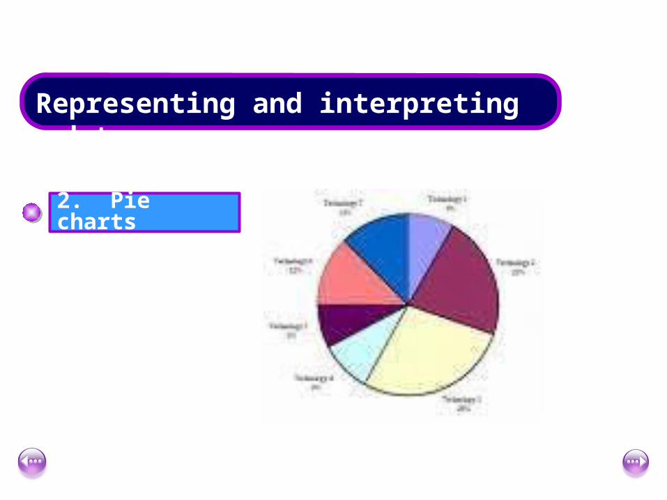
2 Pie charts
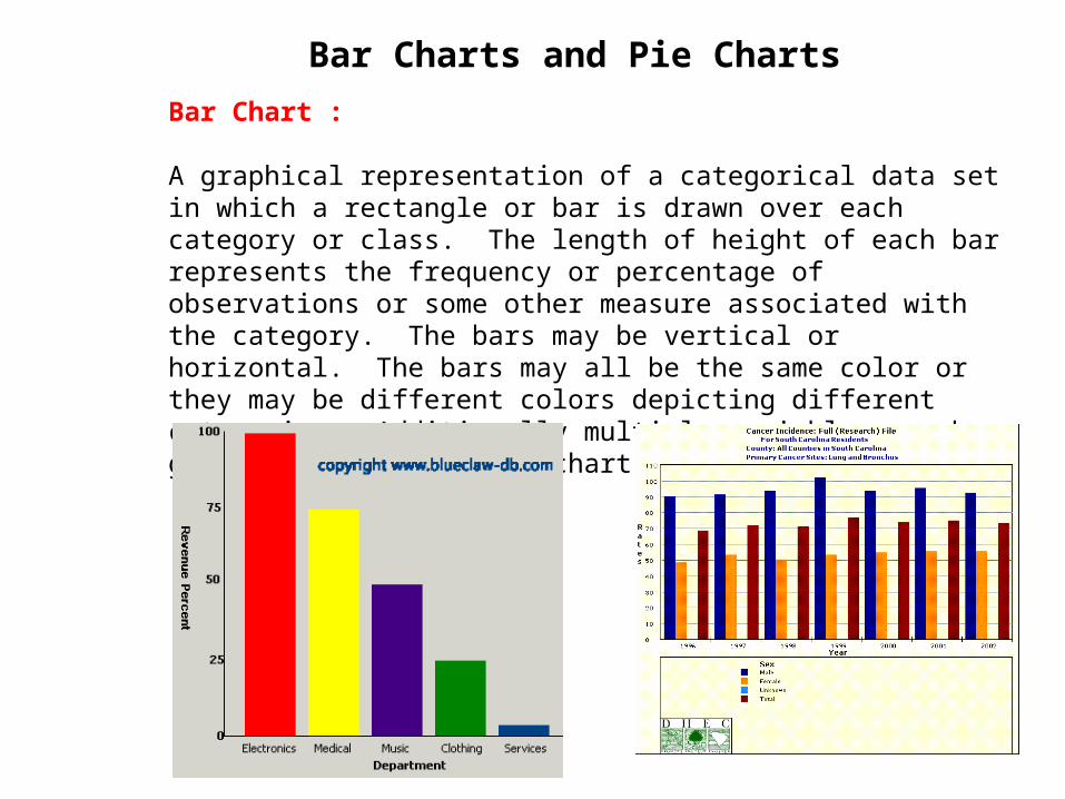
Bar Charts and Pie Charts
Bar Chart : A graphical representation of a categorical data set in which a rectangle or bar is drawn over each category or class. The length of height of each bar represents the frequency or percentage of observations or some other measure associated with the category. The bars may be vertical or horizontal. The bars may all be the same color or they may be different colors depicting different categories. Additionally multiple variables can be graphed on the same bar chart.
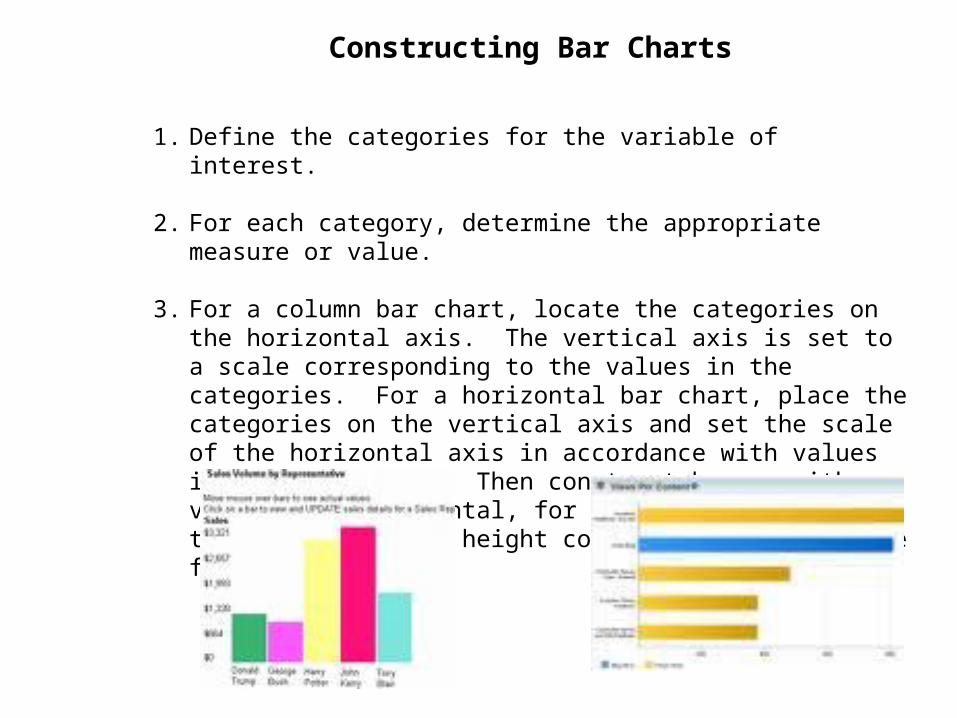
Constructing Bar Charts
1. Define the categories for the variable of interest.
2. For each category, determine the appropriate measure or value.
3. For a column bar chart, locate the categories on the horizontal axis. The vertical axis is set to a scale corresponding to the values in the categories. For a horizontal bar chart, place the categories on the vertical axis and set the scale of the horizontal axis in accordance with values in the categories. Then construct bars, either vertical or horizontal, for each category such that the length or height corresponds to the value for the category.
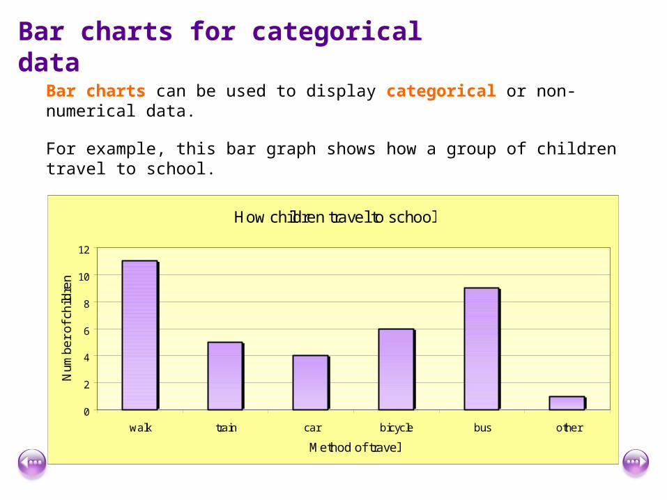
Bar charts for categorical data
Bar charts can be used to display categorical or non-numerical data.
For example, this bar graph shows how a group of children travel to school.
How children travel to school
0
2
4
6
8
10
12
walk train car bicycle bus other
Method of travel
Num
ber
of c
hild
ren
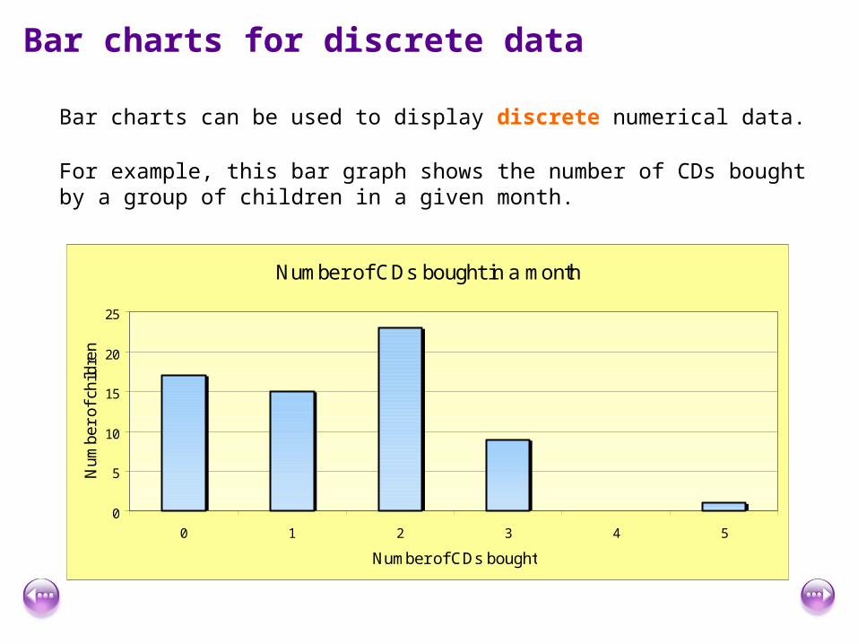
Bar charts for discrete data
Bar charts can be used to display discrete numerical data.
For example, this bar graph shows the number of CDs bought by a group of children in a given month.
Number of CDs bought in a month
0
5
10
15
20
25
0 1 2 3 4 5
Number of CDs bought
Num
ber
of c
hild
ren
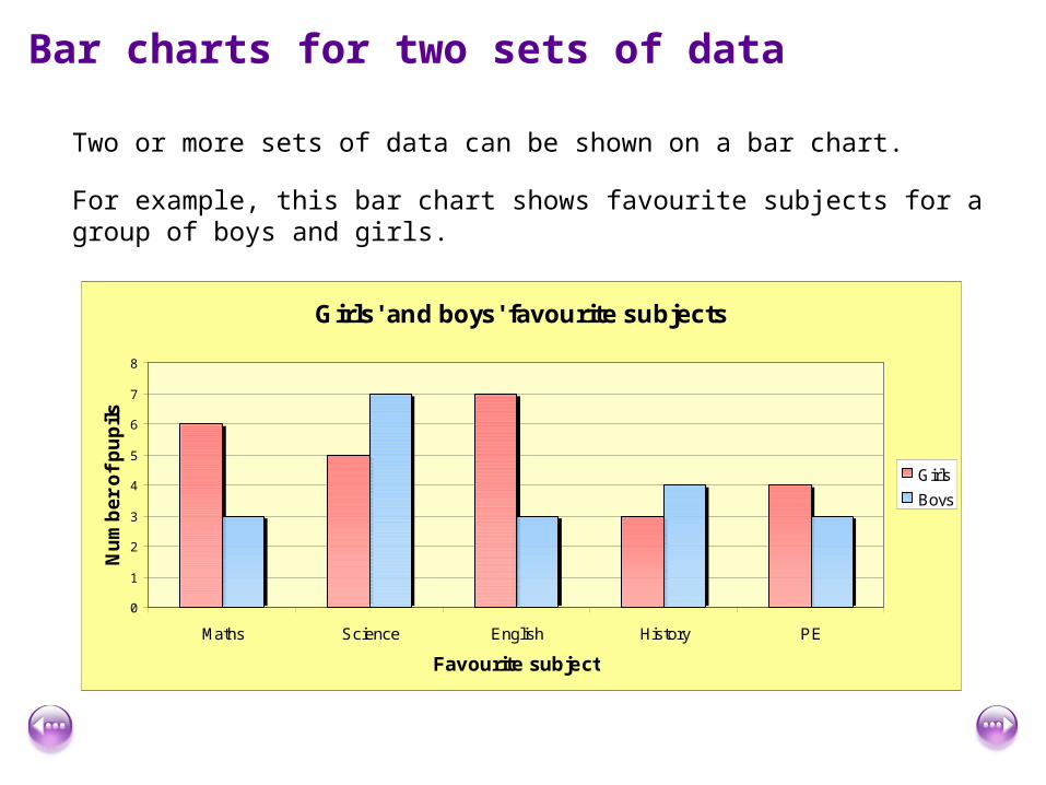
Bar charts for two sets of data
Two or more sets of data can be shown on a bar chart.
For example, this bar chart shows favourite subjects for a group of boys and girls.
Girls' and boys' favourite subjects
0
1
2
3
4
5
6
7
8
Maths Science English History PE
Favourite subject
Nu
mb
er
of
pu
pil
s
Girls
Boys
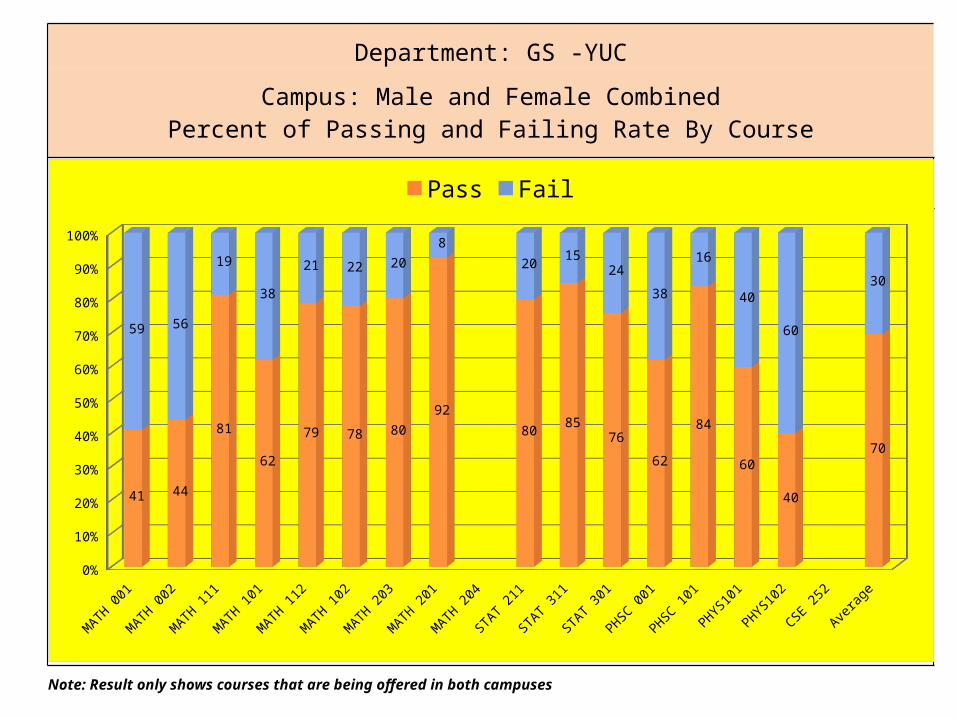
Department: GS -YUC
Campus: Male and Female CombinedPercent of Passing and Failing Rate By Course
Note: Result only shows courses that are being offered in both campuses
MATH 001
MATH 002
MATH 111
MATH 101
MATH 112
MATH 102
MATH 203
MATH 201
MATH 204
STAT 2
11
STAT 3
11
STAT 3
01
PHSC 001
PHSC 101
PHYS101
PHYS102
CSE 252
Averag
e0%
10%
20%
30%
40%
50%
60%
70%
80%
90%
100%
41 44
81
62
79 78 8092
8085
76
62
84
60
40
70
59 56
19
38
21 22 208
2015
24
38
16
40
60
30
Pass Fail
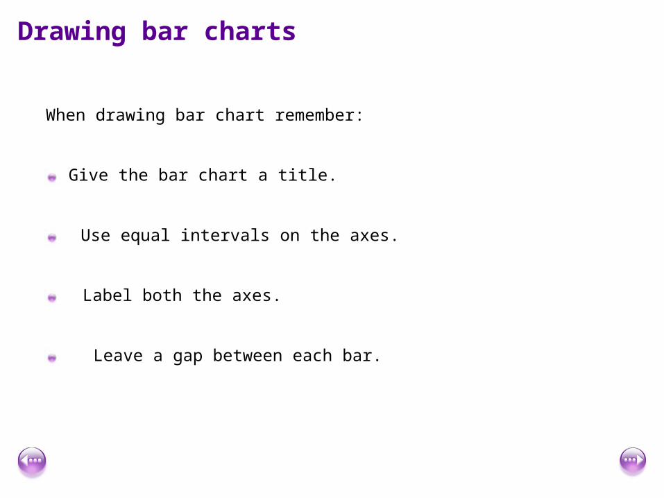
Drawing bar charts
When drawing bar chart remember:
Give the bar chart a title.
Label both the axes.
Use equal intervals on the axes.
Leave a gap between each bar.
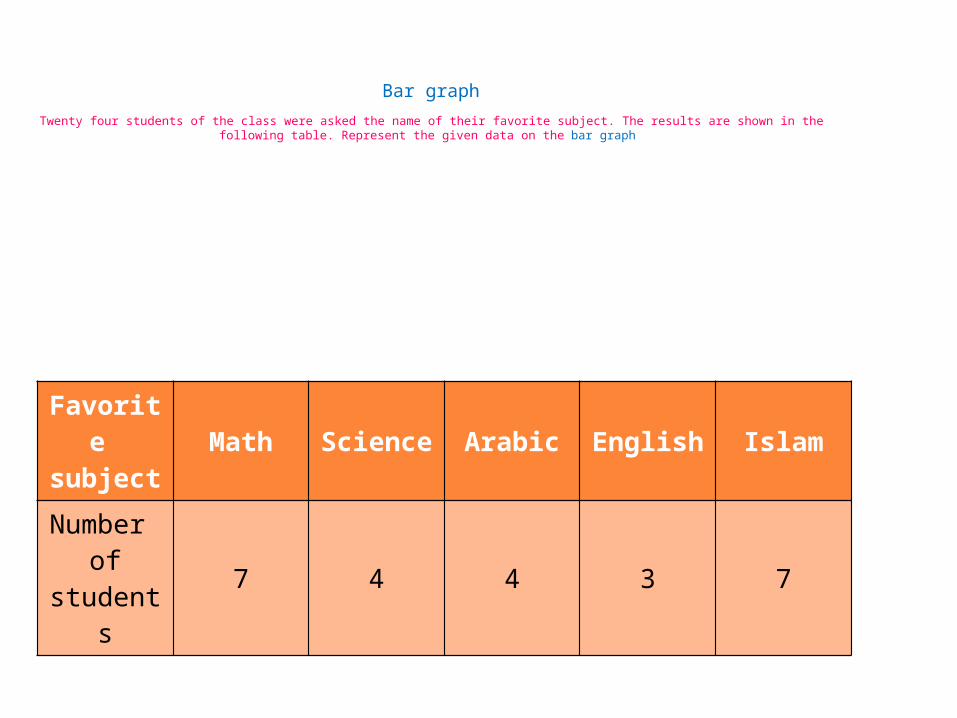
Bar graph
Twenty four students of the class were asked the name of their favorite subject. The results are shown in the following table. Represent the given data on the bar graph
Favorite subject
Math Science Arabic English Islam
Number of students
7 4 4 3 7
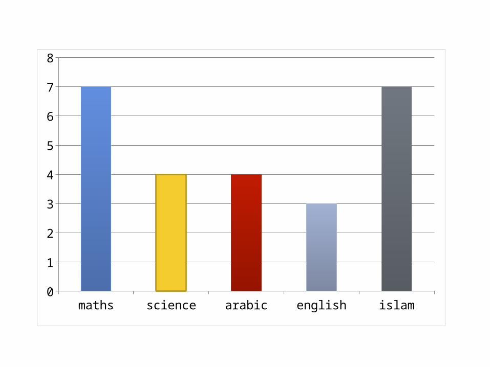
maths science arabic english islam0
1
2
3
4
5
6
7
8
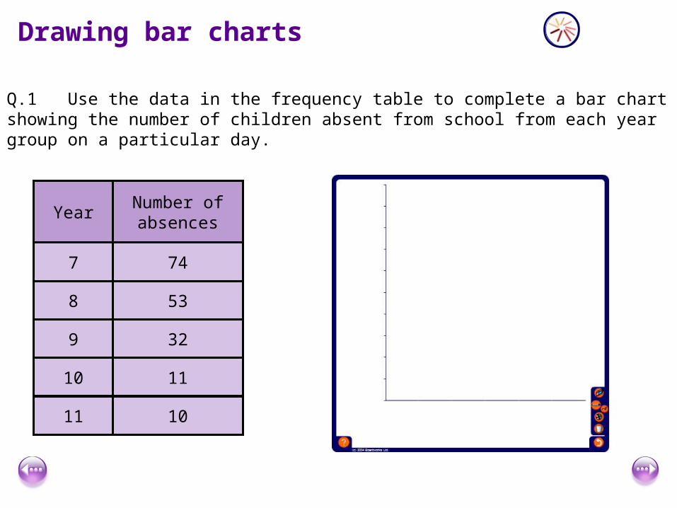
Drawing bar charts
Q.1 Use the data in the frequency table to complete a bar chart showing the number of children absent from school from each year group on a particular day.
Year Number of absences
7 74
8 53
9 32
10 11
11 10
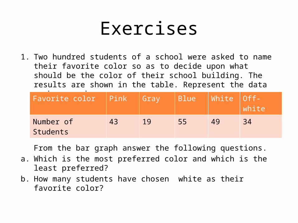
Exercises1. Two hundred students of a school were asked to name their favorite
color so as to decide upon what should be the color of their school building. The results are shown in the table. Represent the data on bar graph.
From the bar graph answer the following questions.a. Which is the most preferred color and which is the least preferred?b. How many students have chosen white as their favorite color?
Favorite color Pink Gray Blue White Off-white
Number of Students 43 19 55 49 34
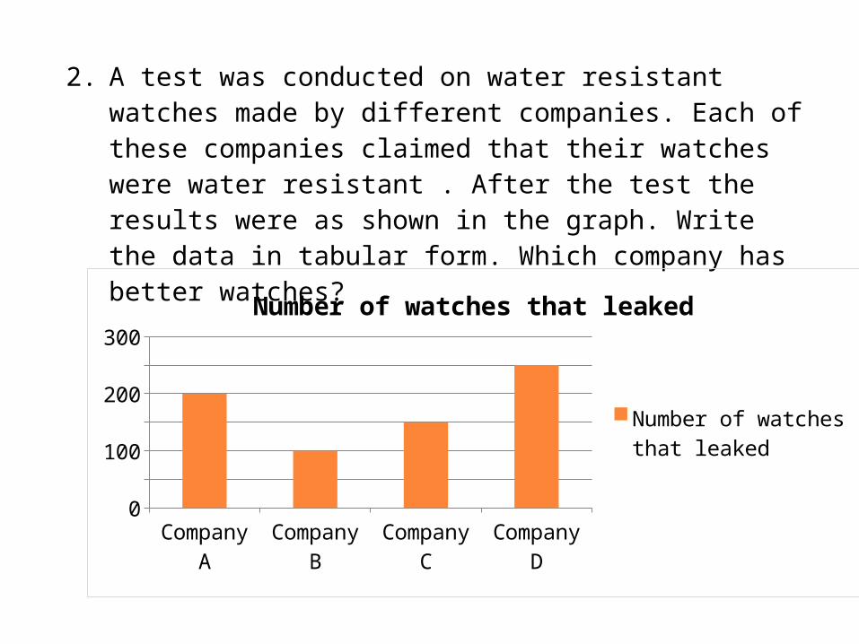
2. A test was conducted on water resistant watches made by different companies. Each of these companies claimed that their watches were water resistant . After the test the results were as shown in the graph. Write the data in tabular form. Which company has better watches?
Company A Company B Company C Company D0
50
100
150
200
250
300
Number of watches that leaked
Number of watches that leaked
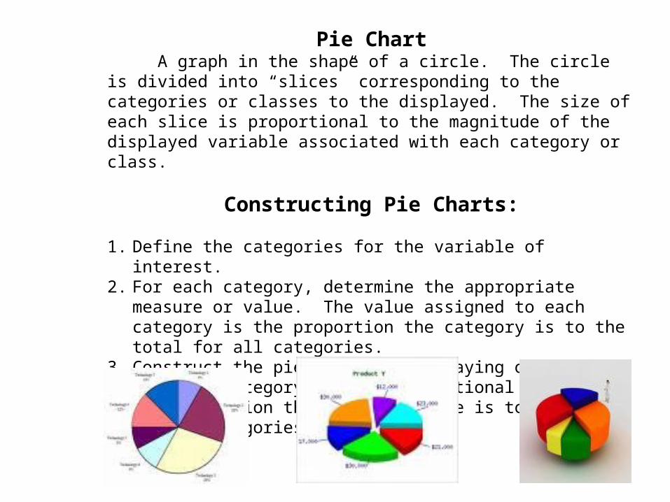
Pie Chart A graph in the shape of a circle. The circle is divided into “slices” corresponding to the categories or classes to the displayed. The size of each slice is proportional to the magnitude of the displayed variable associated with each category or class.
Constructing Pie Charts:
1. Define the categories for the variable of interest.2. For each category, determine the appropriate measure or
value. The value assigned to each category is the proportion the category is to the total for all categories.
3. Construct the pie chart by displaying one slice for each category that is proportional in size to the proportion the category value is to the total of all categories.
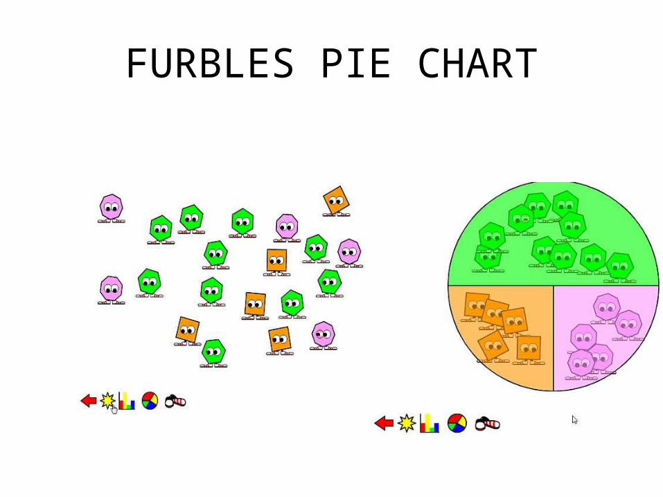
FURBLES PIE CHART
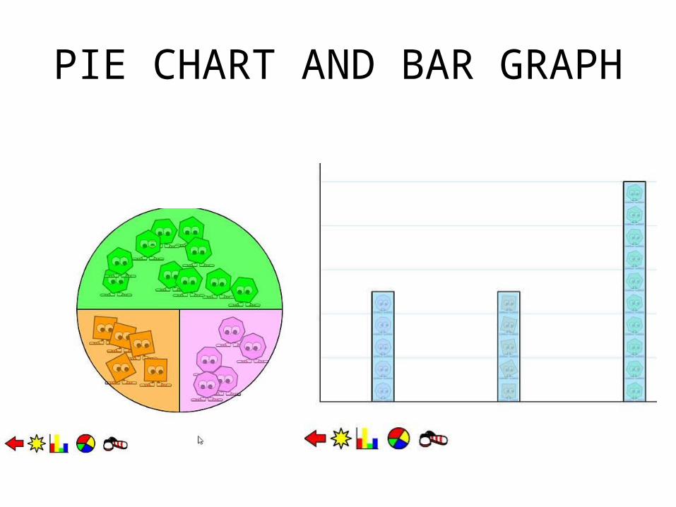
PIE CHART AND BAR GRAPH
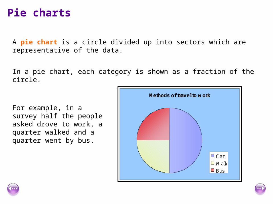
Pie charts
A pie chart is a circle divided up into sectors which are representative of the data.
In a pie chart, each category is shown as a fraction of the circle.
For example, in a survey half the people asked drove to work, a quarter walked and a quarter went by bus.
Methods of travel to work
Car
Walk
Bus
Pie charts
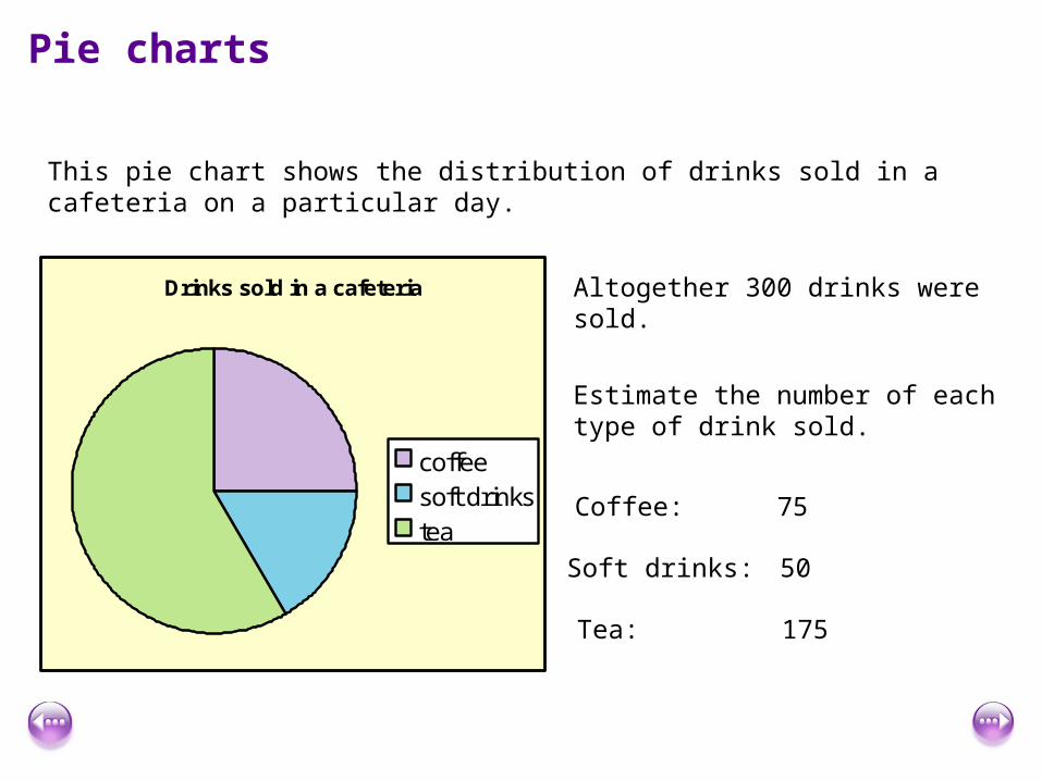
This pie chart shows the distribution of drinks sold in a cafeteria on a particular day.
Altogether 300 drinks were sold.
Estimate the number of each type of drink sold.
Coffee: 75
Soft drinks: 50
Tea: 175
Drinks sold in a cafeteria
coffeesoft drinkstea
Pie charts
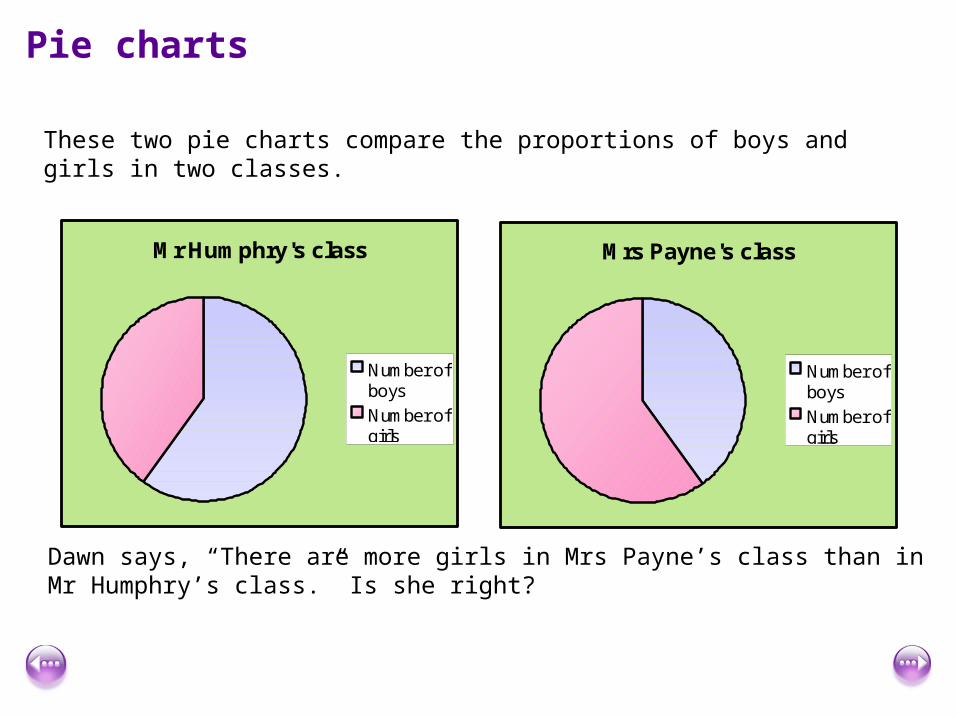
These two pie charts compare the proportions of boys and girls in two classes.
Mr Humphry's class
Number ofboys
Number ofgirls
Mrs Payne's class
Number ofboys
Number ofgirls
Dawn says, “There are more girls in Mrs Payne’s class than in Mr Humphry’s class.” Is she right?

Drawing pie charts
To draw a pie chart you need a compass and a protractor.
The first step is to work out the angle needed to represent each category in the pie chart.
This is done by working out what fraction of the total we want to represent and multiply it by 360 degrees.
Drawing pie charts
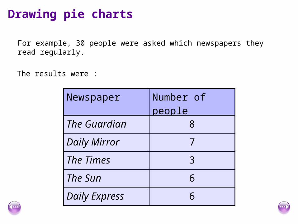
For example, 30 people were asked which newspapers they read regularly.
The results were :
Newspaper Number of people
The Guardian 8
Daily Mirror 7
The Times 3
The Sun 6
Daily Express 6

Drawing pie charts
Method:
Write each category as a fraction of the whole and find this fraction of 360º.
8 out of the 30 people in the survey read The Guardian so to work out the size of the sector we calculate
830
× 360º = 96º
7 out of the 30 people in the survey read the Daily Mirror so to work out the size of the sector we calculate
730
× 360º = 84º
AngleWorkingNo of peopleNewspaper
6Daily Express
6The Sun
3The Times
7Daily Mirror
8The Guardian
Total
Drawing pie charts
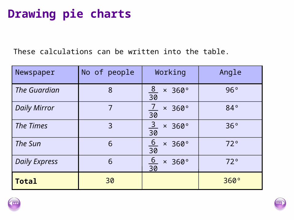
These calculations can be written into the table.
96º
84º
36º
72º
72º
30 360º
× 360º830
× 360º730
× 360º330
× 360º630
× 360º630
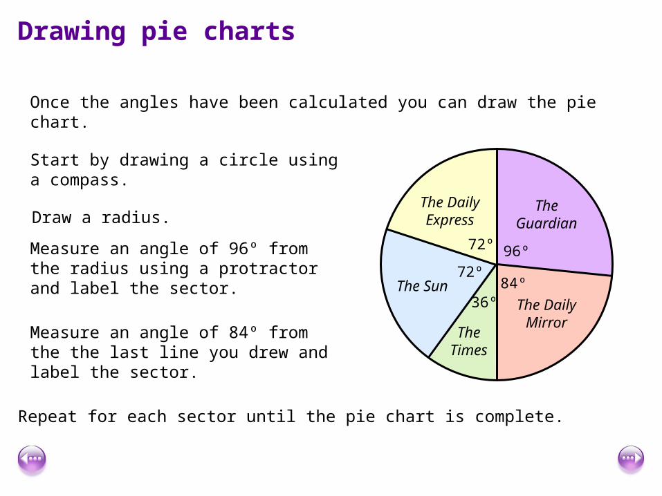
Drawing pie charts
Once the angles have been calculated you can draw the pie chart.
Start by drawing a circle using a compass.
Draw a radius.
Measure an angle of 96º from the radius using a protractor and label the sector.
96º
The Guardian
Measure an angle of 84º from the the last line you drew and label the sector.
84ºThe Daily
Mirror
Repeat for each sector until the pie chart is complete.
36º
The Times
72º
72º
The Sun
The Daily Express
Drawing pie charts
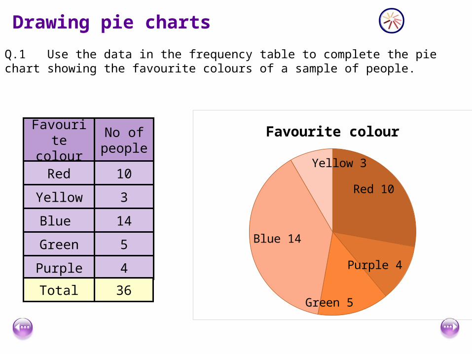
Q.1 Use the data in the frequency table to complete the pie chart showing the favourite colours of a sample of people.
No of people
10
3
14
5
4
Favourite colour
Red
Yellow
Blue
Green
Purple
Total 36
Red 10
Purple 4
Green 5
Blue 14
Yellow 3
Favourite colour
Drawing pie charts
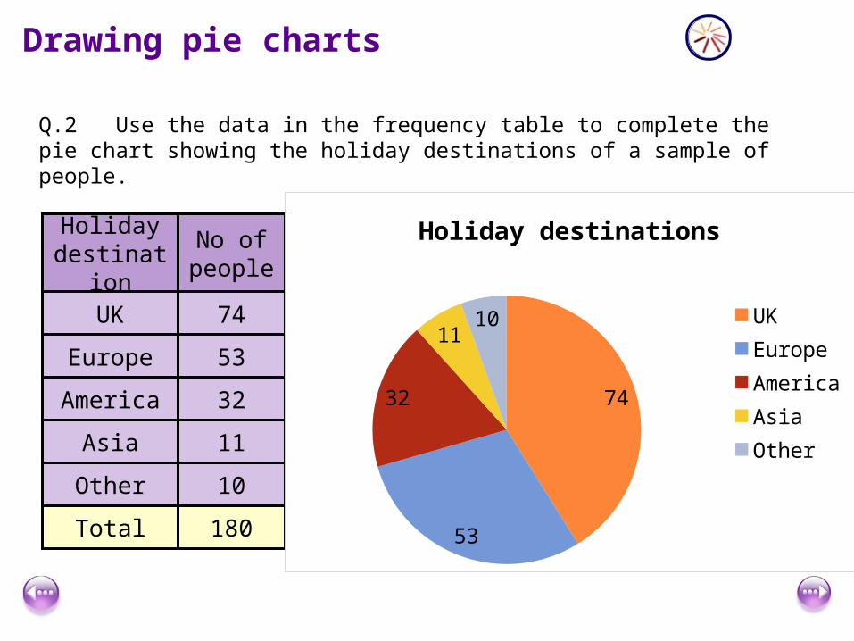
Q.2 Use the data in the frequency table to complete the pie chart showing the holiday destinations of a sample of people.
Holiday destination
No of people
UK 74
Europe 53
America 32
Asia 11
Other 10
Total 180
74
53
32
1110
Holiday destinations
UKEuropeAmericaAsiaOther
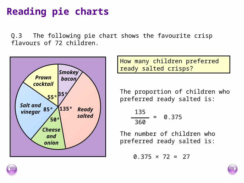
Reading pie charts
Q.3 The following pie chart shows the favourite crisp flavours of 72 children.
35º
Smokeybacon
135º Ready salted
50º
Cheese and
onion
85º
55ºSalt and vinegar
Prawn cocktail
How many children preferred ready salted crisps?
The proportion of children who preferred ready salted is:
135
360= 0.375
The number of children who preferred ready salted is:
0.375 × 72 = 27