Resumen de la historia del diseño
33
The Impact of the Industrial Revolution on Workers, Artists and Society in the 19th Century 1. Industrial Revolution First in England, later the world. James Watt's improvements to the steam engine — and its subsequent application to manufacturing in the late 18th and early 19th century— resulted in a major societal shift. Traditionally manual laborers learned their trade by progressing through stages of apprenticeship under a master craftsman. The new steam engine driven machines replaced the craftsmen system with faster and cheaper production but often greatly inferior results. The critical eye and artistry of the craftsman was sacrificed for speed. The worker now served the machine, feeding it raw materials, allowing it to determine the final product. Tradesmen and agricultural workers displaced by newly mechanized or improved farming methods flocked to cities to seek work in factories. The lives of the laborers declined as factory owners treated their workers as if they were commodities and not human beings. Lowly paid men, women and children worked 12 hour days in deplorable conditions. The new arrivals settled in cheaper areas of the city—often dangerous and disease-ridden slums. Numerous critics of this new industrialized society advocated for the rights of workers and the return to a connection between the individual craftsman and their work. 2. Great Exhibition of the Works of Industry of All Nations 1851 London, England (Also known as the Crystal Palace Exhibition) Awash with pride and profits from the Industrial Revolution the English upper class, spearheaded by Prince Albert (husband of Queen Victoria) organized a showcase for modern industrial technology and design. England and a number of invited countries displayed their achievements in four categories: Raw Materials, Machinery, Manufacturers and Fine Arts. The exhibition was a popular success but the critical reviews were not complementary of the exhibitors. Critics found the work created by industrialized methods to be shoddy and poorly designed, full of superfluous ornaments that did not enhance the product. The Victorian propensity for over-decoration and a hodgepodge of unrelated styles was seen as symptomatic of a tasteless and over-capitalistic society. Ornamentation has fallen in and out of favor over time. To read an interesting article on ornamentation check Alice Twemlow's "The Decriminalization of Ornament" in which she discusses the recent surge of ornamentation in graphic design and the inevitable connection between form, content and ornament." Looking Closer 5 Click here for a complete list of links on the Crystal Place and the Exhibition on the Victorian Web. 3. The Grammar of Ornament Owen Jones, 1856, SSeeee iitt hheerree In response to the call for better quality design, Owen Jones published an exhaustive inventory of international and historical decorative styles. Printed in colorful lithographs, the book includes 20 sections of illustrated motifs and Jones's 37 Propositions on what makes good design." Modern, scientific and devoid of deliberate historicism, operating by principles to create an ornament for every kind of decoration." (Jespersen, 2008) Proposition 5 Construction should be decorated. Decoration should never be purposely constructed." That which is beautiful is true; that which is true must be beautiful." Proposition 37 No improvement can take place in the Art of the present generation until all classes, Artists, Manufacturers, and the Public, are better educated in Art, and the existence of general principles is more fully recognized. Owens books... "pioneered new standards in chromolithography. Jones used his printing press to enter the lucrative market for illustrated and illuminated gift books ... He developed innovative new binding techniques ..., papier mâché and terracotta ...much of which could trace its aesthetic lineage back to sumptuous medieval illuminated manuscripts and religious bindings." Read more... 4. John Ruskin England, 1819 —1900 Born to wealth, John Ruskin was an author, poet and art critic whose socialist convictions were strong enough to cause him to reject his fortune to fulfill his ideologies. Ruskin's theorized that the Industrial Revolution's division of labor made work monotonous and was the main cause of the unhappiness of the poor. He looked backward to an idealized medieval period, to him it was a paradigm of the “union of art in labor in service to society.” He romanticized "The organic relationship ... between the worker and his guild, the worker and his community, between the worker and his natural environment, and between the worker and his God."Read more... Ruskin's writings greatly influenced the thinking of Victorian society in a large range of topics. His critical art reviews could make or break the careers of contemporary painters. His strong support of the Pre-Raphaelites, a group of artists who rejected the 'decadence' of the established Royal Academy, gave the group the credibility they needed to be accepted as serious artists. Both Ruskin and the Pre-Raphaelites believed that art should communicate truth not merely in a display of skill but also as expressed by the artist's whole moral outlook. William Morris and the Birth of the Arts and Crafts Movement The Arts and Crafts Movement and The Private Press http://www.designhistory.org/ArtsCrafts.html 1 de 5 05/01/10 17:29
-
Upload
luis-de-palau -
Category
Documents
-
view
171 -
download
4
Transcript of Resumen de la historia del diseño

The Impact of the Industrial Revolution on Workers, Artists and Society in the 19th Century
1.Industrial RevolutionFirst in England, later the world.
James Watt's improvements to thesteam engine — and its subsequentapplication to manufacturing in thelate 18th and early 19th century—resulted in a major societal shift.Traditionally manual laborers learnedtheir trade by progressing throughstages of apprenticeship under amaster craftsman. The new steamengine driven machines replaced thecraftsmen system with faster andcheaper production but oftengreatly inferior results. Thecritical eye and artistry of thecraftsman was sacrificed for speed.The worker now served the machine,feeding it raw materials, allowing itto determine the final product.
Tradesmen and agricultural workersdisplaced by newly mechanized orimproved farming methods flocked tocities to seek work in factories. Thelives of the laborers declined asfactory owners treated their workersas if they were commodities and nothuman beings. Lowly paid men,women and children worked 12 hourdays in deplorable conditions. Thenew arrivals settled in cheaper areasof the city—often dangerous anddisease-ridden slums.
Numerous critics of this newindustrialized society advocated forthe rights of workers and the returnto a connection between theindividual craftsman and their work.
2.Great Exhibition of the Works ofIndustry of All Nations 1851London, England (Also known as theCrystal Palace Exhibition)
Awash with pride and profits fromthe Industrial Revolution the Englishupper class, spearheaded by PrinceAlbert (husband of Queen Victoria)organized a showcase for modernindustrial technology and design.England and a number of invitedcountries displayed theirachievements in four categories: RawMaterials, Machinery, Manufacturersand Fine Arts.
The exhibition was a popular successbut the critical reviews were notcomplementary of the exhibitors.Critics found the work created byindustrialized methods to be shoddyand poorly designed, full ofsuperfluous ornaments that did notenhance the product. The Victorianpropensity for over-decoration and ahodgepodge of unrelated styles wasseen as symptomatic of a tastelessand over-capitalistic society.
Ornamentation has fallen in and outof favor over time. To read aninteresting article on ornamentationcheck Alice Twemlow's "TheDecriminalization of Ornament" inwhich she discusses the recent surgeof ornamentation in graphic designand the inevitable connectionbetween form, content andornament."Looking Closer 5
Click here for a complete list of linkson the Crystal Place and theExhibition on the Victorian Web.
3.The Grammar of OrnamentOwen Jones, 1856, SSeeee iitt hheerree
In response to the call for betterquality design, Owen Jonespublished an exhaustive inventory ofinternational and historical decorativestyles. Printed in colorful lithographs,the book includes 20 sections ofillustrated motifs and Jones's 37Propositions on what makes gooddesign." Modern, scientific anddevoid of deliberate historicism,operating by principles to createan ornament for every kind ofdecoration." (Jespersen, 2008)
Proposition 5Construction should be decorated.Decoration should never bepurposely constructed." That whichis beautiful is true; that which is truemust be beautiful."Proposition 37No improvement can take place inthe Art of the present generationuntil all classes, Artists,Manufacturers, and the Public, arebetter educated in Art, and theexistence of general principles ismore fully recognized.
Owens books... "pioneered newstandards in chromolithography.Jones used his printing press to enterthe lucrative market for illustratedand illuminated gift books ... Hedeveloped innovative new bindingtechniques ..., papier mâché andterracotta ...much of which couldtrace its aesthetic lineage back tosumptuous medieval illuminatedmanuscripts and religious bindings."Read more...
4.John RuskinEngland, 1819 —1900
Born to wealth, John Ruskin was anauthor, poet and art critic whosesocialist convictions were strongenough to cause him to reject hisfortune to fulfill his ideologies.Ruskin's theorized that the IndustrialRevolution's division of labor madework monotonous and was the maincause of the unhappiness of the poor.He looked backward to an idealizedmedieval period, to him it was aparadigm of the “union of art in laborin service to society.” Heromanticized "The organicrelationship ... between the workerand his guild, the worker and hiscommunity, between the worker andhis natural environment, andbetween the worker and hisGod."Read more...
Ruskin's writings greatly influencedthe thinking of Victorian society in alarge range of topics. His critical artreviews could make or break thecareers of contemporary painters. Hisstrong support of thePre-Raphaelites, a group of artistswho rejected the 'decadence' of theestablished Royal Academy, gave thegroup the credibility they needed tobe accepted as serious artists. BothRuskin and the Pre-Raphaelitesbelieved that art shouldcommunicate truth not merely in adisplay of skill but also as expressedby the artist's whole moral outlook.
William Morris and the Birth of the Arts and Crafts Movement
The Arts and Crafts Movement and The Private Press http://www.designhistory.org/ArtsCrafts.html
1 de 5 05/01/10 17:29

5.The Pre-Raphaelite Brotherhood
Toward the middle of the 19thcentury, a small group of youngpainters in England reacted againstwhat they felt was "the frivolous artof the day." They deeply admired thesimplicities of the early 15th centuryand wanted to bring English art backto a greater "truth to nature."
While the academy and art historiansworshiped Raphael as the greatmaster of the Renaissance, theseyoung students rebelled against whatthey saw as Raphael's theatricalityand the Victorian hypocrisy andpomp of the academic art tradition.The friends decided to form a secretsociety, the Pre-RaphaeliteBrotherhood, to emulate Renaissancepainting before Raphael developedhis grand manner. They adopted ahigh moral stance that embraced asometimes unwieldy combination ofsymbolism and realism, religious orromantic subjects with an insistenceon painting everything from directobservation.
The model for the painting above wasJane Burden, muse for thePre-Raphaelites who discovered herand proclaimed her to be a perfectexample of Renaissance beauty.(Shelater married William Morris) To readmore about the Pre-Raphaelitescheck out the Delaware Art Museumssite.
6.William Morris
William Morris, a wealthy Britishtheology student,"developed aninterest in art and literature and adeep love for everything medieval,not only art and design, but alsoarchitecture. Morris (and friendPre-Raphaelite Edward Burne-Jones) joined the gothic revivalarchitectural practice of GeorgeEdmund Street. Here they met PhilipWebb who was to become a lifelongfriend and, together with Webb, theyformed the Arts & Craftsmovement.
To members of the Arts & Crafts, theIndustrial Revolution separatedhumans from their own creativity andindividualism; the worker was a cogin the wheel of progress, living in anenvironment of shoddymachine-made goods, based moreon ostentation than function. Theseproponents sought to reestablishthe ties between beautiful workand the worker, returning to anhonesty in design not to be foundin mass-produced items. In bothBritain and America the movementrelied on the talent and creativity ofthe individual craftsman andattempted to create a totalenvironment."http://anc.gray-cells.com/Intro.html
7.Morris & Co, 1861
Morris married Jane Burden andmoved into his commissioned home,Red House. Unhappy with the qualityof products available for furnishings,Morris worked, along with his friends tocreate wallpaper, tapestries andfurniture demonstrating goodcraftsmanship and design. At theproject's end they joined together toform a business. "He then set up astudio in 1861 with several associates,including architect Philip Webb andEnglish artists Dante Gabriel Rossettiand Edward Burne-Jones. In 1875 hereorganized the partnership into Morris& Co.
Morris' designs were realistic. He pulledfrom the nature around him as did themedieval tapestry artists before him....using traditional methods, oftenobtaining dyes from vegetables. Heperfected the use of woodblocks forprinting wallpaper and textiles. Theidea of the house as a total work ofart, with all of the interior objectsdesigned by the architect, emergedfrom this studio and remained standardpractice throughout the Arts and Craftsmovement."
As part of his attempt to reintroducehandmade quality Morris used onlynatural dyes and hand productionprocesses. His refusal to use modernproduction techniques meant that hisproducts were only affordable bythe rich and therefore anathema to hissocialist beliefs."Read more
"The wallpapers and prints became the height offashion but Morris realized that he was bound tolose his one man battle against the degradation ofcapitalist production. Success itself was proof ofthis. He hated 'spending ... life ministering to theswinish luxury of the rich', and the more involvedhe became in production the more evidence hefound of the injustices and misery caused byexploitation. By the 1870s he had come up againstthe limits of artistic rebellion. 'What business havewe with art unless all can share it?' he asked."Read more
Morris was a socialist and was an active member in theHammersmith Socialist League.
William Morris and the Kelmscott Press
The Arts and Crafts Movement and The Private Press http://www.designhistory.org/ArtsCrafts.html
2 de 5 05/01/10 17:29

8. The Kelmscott PressEngland, 1890
"William Morris established the mostfamous of the private presses, theKelmscott Press, at Hammersmithin January, 1891. Over the nextseven years the press produced 53books (totaling some 18,000 copies).Kelmscott was the culmination ofMorris's life as a craftsman in manydiverse fields. The books Morrisproduced were medieval in design,modeled on his studies of incunabulaof the fifteenth century."From University of Glasgow Library
Morris was fascinated not only withthe design of books but wrote anumber of books. His fantasy storieswere a direct inspiration for C. S.Lewis, The Chronicles of Narnia andinfluenced Tolkein's,The Lord of theRings. Read more)
The Kelmscott Chaucer is consideredMorris's masterpiece. 425 copies of thebook were completed by a total of 11master printers. See this spread fromMcCune Collection, CA, USA.
The Type of the Kelmscott Press
Ever consistent in his rejection ofindustrialized processes, Morrisdesigned and produced his owntypefaces, manufactured his ownpaper, and printed using a handpress. He set out to prove that thehigh standards of the past could berepeated - even surpassed - in thepresent. His books were designedto be read slowly, to beappreciated, to be treasured, andthus made an implicit statementabout the ideal relationships whichought to exist between the reader,the text, and the author — astatement which we have, by andlarge, continued to ignore. (Source:Victorian Web)
Numerous other British presses werefounded in the style of Kelmscottincluding the Doves, Eragny,Ashendene and Vale Presses.
Troy, Chaucer, Golden
Morris's roman 'Golden' type wasinspired by the work of the earlypunch cutter Nicolas Jenson ofVenice. Troy (above left) is basedupon studies of manuscriptblackletter. Please note that theversions shown here are digitalrecreations of Morris's type.*Remember that digital designersoften try to emulate the ink spreadand paper surface from historicalletterpress work to recreate thecharacter of the original printedtype, rather than the actual typedesign.
Noteworthy for their harmony of typeand illustration, Morris' main prioritywas to have each book seen as awhole: this included takingpainstaking care with all aspects ofproduction, including the paper, theform of type, the spacing of theletters, and the position of theprinted matter on the page.Kelmscott books re-awakenedthe lost ideals of book design andinspired higher standards ofproduction at a time when theprinted page was at its poorest.
Other Private Presses Inspired by William Morris
Ashendene Printers Mark
11.Doves Press (at Bridwell Library)1900
"The Doves press was in direct reactionto Morris's strongly decorative approachto bookmaking. T. J. Cobden-Sanderson, a friend of Morris, (andEmery Walker, the proprietor of thepress) was a difficult, demanding andhighly idealistic man. He was a greatbookbinder, and designer of bookbindings who had bound for Morris. Forall the superb ornamentation of hisbindings, he chose an austere approachin his printing.
The typeface they designed... was alsobased on Jenson, but it was as if hehad looked at an entirely different bookfrom Morris. Where Morris's face wasrather heavy, with comparatively shortascenders and descenders crownedwith strong serifs, Cobden-Sanderson'sversion was much lighter in feel.Unfortunately after an internal disputethe punches and matrices of thistypeface ended up at the bottom of theThames, for Cobden-Sanderson couldnot bear the thought of anyone elseusing them, even his partner." (Quotesource)
The Dove's masterpiece is the Dove'sBible,1903. Stark in comparison toMorris, the text type was cut by EdwardPrince (also Morris's punchcutter) in aJenson style roman; the large red initialletters were by Edward Johnston. Readmore about Johnston at the EdwardJohnston Foundation site.
9.Golden Cockerel Press (link)England, 1920The Golden Cockerel Pressdistinguished itself not only for itshigh quality of printing but for therich wood cuts by various artistsincluding Eric Gill. The masterpieceof the Press is the Four Gospels,which used Gill's wood cutillustrations as well as his type facedesign.
10.Ashendene Press (link)England, 1895 - 1935Wealthy book publisher St.JohnHornby founded this small privatepress. Most Ashendene editions useda trademark font: Subiaco, whichwas based on a 15th centurysemi-humanistic Italian type createdby Sweynheim and Pannartz inSubiaco, Italy.
P.S. The English private press movement did not end with the passing of the century. After WWI was over and done, a new generation of private presses formed. The GoldenCockerel, the Nonesuch, the Shakespeare Head, the Gregynog continued the tradition. In Europe, De Zilverdistel, the Cranach, the Bremer, the Officina Bodoni and the ErnstLudwig presses produced magnificent work. The tradition continued then, and continues today, and probably will continue for as long as there are readers and lovers of bookswho understand that the printed book is more than the text it contains. (Quote source)
Two American Private Presses: Printing and Type Design by Bruce Rogers and Frederic Goudy
The Arts and Crafts Movement and The Private Press http://www.designhistory.org/ArtsCrafts.html
3 de 5 05/01/10 17:29

"Goudy's fonts were amodern marriage of craft &
technology."
Typologia. Studies in type design and typemaking", Berkeley 1940
12.Bruce RogersThe Riverside Press, 1895—1912
In 1895 Rogers began work at theRiverside Press in Cambridge,Massachusetts and appointed ashead of the department responsiblefor the production of limited-editionbooks in 1900. The freedom ofconstraints on his budget and timeallowed the production of somenotable books.
During a period in Britain from1928-32 Rogers produced some ofhis finest books, including his Bibleand The Odyssey of Homer (1932).After returning to the States, Rogerssettled in his home in New Fairfield,Connecticut. He designed some goodbooks for the Limited Editions Club ofNew York, notably an illustrated,thirty-seven-volume folio ofShakespeare.
(Above)Bruce Rogers, contribution to a typesample book entitled Peter Piper'sPractical Principles of Plain andPerfect Pronunciation, forMergenthaler Linotype Co. Brooklyn,1936. Fulltable.com
12.Bruce Rogers
In 1915 Rogers produced a translationof Maurice de Geurin’s The Centaur inhis own type design, and named it afterthe title of the book. Just the same asso many other private press fonts,Centaur was based on a design cut byNicolas Jenson in the 1400's. Theentire edition was hand-set by Rogersand printed in a limited edition of 135copies at the Montague Press inMassachusetts. The design wasoriginally commissioned by theMetropolitan Museum of Art in NewYork. Rogers hired Frederic Warde todesign the accompanying italic basedupon the work of 16th century Italiancalligrapher, Ludovico degli Arrighi
Roger's masterpiece, The Bible forOxford University Press, wascompleted in 1935. A lectern-sizedformat, the pages measured 12 x 16inches. The type is a special versionof Centaur, 22 points, set on a 19point body to save space. The typewas set using Monotype'stypecasting machine, in apioneering demonstration thatbeautiful, well-designed books couldbe produced using modern methods.
See his bible and a collection ofBruce Roger's Press Books are theMinnesota Center for Book Arts
13.Frederick GoudyThe Village Press, 1903-1939
"Frederic Goudy (1865-1947),commands a special place in theAmerican book arts. In addition tohis work as printer, book designer,and author, he was the firstAmerican to make the designingof type a separate profession. Hewas successful and prolific, designing124 different typefaces andexecuting many of these from thedrawing stage to the casting. Printingand type design for Goudy wereactivities that required all of the skillsof fine craftsmanship while stilloperating in the framework of theMachine Age."
Goudy and his wife, Bertha, operatedthe Village Press modeled after thestyle of William Morris from 1903 to1939. (Source Library of Congress)
Bertha M. Sprinks Goudy (right)cut the 24-point italic of thepresses's Deepdene font. She set thetype for much of the output of theVillage Press which the Goudy'sfounded together with Will Ransom in1903. Printing, an Essay by WilliamMorris & Emery Walker, was theirfirst publication. Their designscontinued the Morris legacy of finecraftsmanship in the book arts.(Source: Unseen hands, WomenPrinters, Binders and BookDesigners)
Above:Caricature of Goudy par CyrilLowe
Here you can watch a charming silentmovie of Goudy drawing and cuttingtype using a pantograph.
Goudy designed fonts for Americanand British foundries. He sold 8 tothe Caslon Foundry in London andseveral for Lanston Monotype Co.Some of Goudy's most well knownfonts, Copperplate Gothic and goudyOld Style.
Follow this link to a specimen ofGoudy's Monotype Kennerley fontfrom the Progressive CompositionCompany of Philadelphia. The fontwas created for a H. G. Wellsanthology published by M. Kennerly.
Image source http://tipografos.net/designers/goudy.html
The Pantograph: The Most important Advance in Type Technology after Gutenberg (It essentially ended the punch cutter)
Bored with reading abouttype? See the movies aboutMonotype, Linotype andGoudy at TypeCulture.
14The Pantograph eliminates thePunchcutterAn Interview with Matthew CarterBy:Mark Solsburg
Q. Is there a seminal event thatmarked the beginning of 20thcentury typography in America?
Q. What prompted the majorAmerican foundries to merge?
A. ... a Milwaukee engineer namedLinn Boyd Benton put the first “nailin the coffin” of local foundries in1884 when he invented apantographic punchcutter, arouter-like engraving machine for
The Arts and Crafts Movement and The Private Press http://www.designhistory.org/ArtsCrafts.html
4 de 5 05/01/10 17:29

Stanley Morison and Monotype"From 1923 to 1967 Morison was typographicconsultant for the Monotype Corporation. In the1920s and 1930s, his work at Monotype includedresearch and adaptation of historic typefaces,including the revival of the Baskerville and Bembotypes. He pioneered the great expansion of thecompany's range of typefaces and hugelyinfluenced the field of typography to the presentday."(Wikipedia link)
A typographer, scholar, and historian of printing,Morison is particularly remembered for his designof Times New Roman, later called "the mostsuccessful new typeface of the first half ofthe 20th century."He was inspired by William Morris' ideals of qualitybut at the same time aware of the need to adaptthem to the new mass-production techniques.
15. Linotype, 1886Benton´s punchcuttinenabled Ottmar MergGerman immigrant into create the LinotypInstead of setting fouthe Linotype cast a soslug, of hot-metal typmatrices brought into
16. Monotype, 1887Tolbert Lanston of Wainvented the Monotypindividual letters throdriven process. To surinroads made by LinoMonotype, the ATF (AFounders Company) wsupply precast metal nationwide.
The Arts and Crafts Movement and The Private Press http://www.designhistory.org/ArtsCrafts.html
5 de 5 05/01/10 17:29
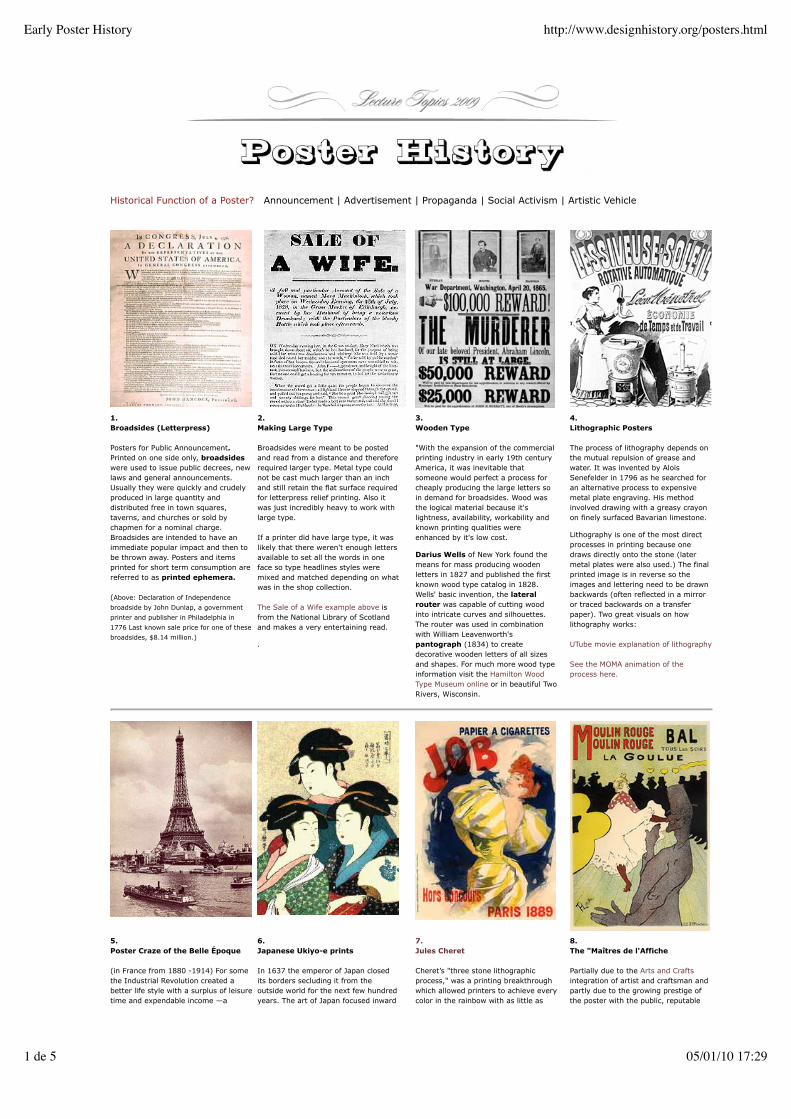
Historical Function of a Poster? Announcement | Advertisement | Propaganda | Social Activism | Artistic Vehicle
1.Broadsides (Letterpress)
Posters for Public Announcement.Printed on one side only, broadsideswere used to issue public decrees, newlaws and general announcements.Usually they were quickly and crudelyproduced in large quantity anddistributed free in town squares,taverns, and churches or sold bychapmen for a nominal charge.Broadsides are intended to have animmediate popular impact and then tobe thrown away. Posters and itemsprinted for short term consumption arereferred to as printed ephemera.
(Above: Declaration of Independence
broadside by John Dunlap, a government
printer and publisher in Philadelphia in
1776 Last known sale price for one of these
broadsides, $8.14 million.)
2.Making Large Type
Broadsides were meant to be postedand read from a distance and thereforerequired larger type. Metal type couldnot be cast much larger than an inchand still retain the flat surface requiredfor letterpress relief printing. Also itwas just incredibly heavy to work withlarge type.
If a printer did have large type, it waslikely that there weren't enough lettersavailable to set all the words in oneface so type headlines styles weremixed and matched depending on whatwas in the shop collection.
The Sale of a Wife example above isfrom the National Library of Scotlandand makes a very entertaining read.
.
3.Wooden Type
"With the expansion of the commercialprinting industry in early 19th centuryAmerica, it was inevitable thatsomeone would perfect a process forcheaply producing the large letters soin demand for broadsides. Wood wasthe logical material because it'slightness, availability, workability andknown printing qualities wereenhanced by it's low cost.
Darius Wells of New York found themeans for mass producing woodenletters in 1827 and published the firstknown wood type catalog in 1828.Wells' basic invention, the lateralrouter was capable of cutting woodinto intricate curves and silhouettes.The router was used in combinationwith William Leavenworth'spantograph (1834) to createdecorative wooden letters of all sizesand shapes. For much more wood typeinformation visit the Hamilton WoodType Museum online or in beautiful TwoRivers, Wisconsin.
4.Lithographic Posters
The process of lithography depends onthe mutual repulsion of grease andwater. It was invented by AloisSenefelder in 1796 as he searched foran alternative process to expensivemetal plate engraving. His methodinvolved drawing with a greasy crayonon finely surfaced Bavarian limestone.
Lithography is one of the most directprocesses in printing because onedraws directly onto the stone (latermetal plates were also used.) The finalprinted image is in reverse so theimages and lettering need to be drawnbackwards (often reflected in a mirroror traced backwards on a transferpaper). Two great visuals on howlithography works:
UTube movie explanation of lithography
See the MOMA animation of theprocess here.
5.Poster Craze of the Belle Époque
(in France from 1880 -1914) For somethe Industrial Revolution created abetter life style with a surplus of leisuretime and expendable income —a
6.Japanese Ukiyo-e prints
In 1637 the emperor of Japan closedits borders secluding it from theoutside world for the next few hundredyears. The art of Japan focused inward
7.Jules Cheret
Cheret’s "three stone lithographicprocess," was a printing breakthroughwhich allowed printers to achieve everycolor in the rainbow with as little as
8.The "Maîtres de l'Affiche
Partially due to the Arts and Craftsintegration of artist and craftsman andpartly due to the growing prestige ofthe poster with the public, reputable
Early Poster History http://www.designhistory.org/posters.html
1 de 5 05/01/10 17:29
middle class. In France economicgrowth coincided with a period ofpeace and frivolity known as the BelleÉpoque (Beautiful Era) Contributing tothe beauty of this period was thelithographic poster, first solely used tomarket new goods and theatricalentertainment and then embraced as apopular art form.
Gustave Eiffel (1832-1923) designedthe Eiffel Tower for the ParisExposition of 1889 at the height of theBelle Époque.
Two factors that contributed to theFrench Poster Style:• The influence of art Ukiyo-e woodprint posters recently arrived fromJapan• Jules Cheret 3 color processlithography
on the "floating world" or the culturalpleasures of theatres, restaurants,teahouses, geisha and courtesans.Many Ukiyo-e prints were postersadvertising theatre performances andbrothels, or idol portraits of popularactors and beautiful teahouse girls. Theearly woodblock prints were spare andmonochromatic, printed in black inkonly, but later grew rich in color. Japanopened its borders in the 1850's partlydue to US pressure applied by AdmiralMatthew Perry.
Western artists were deeply influencedby newly imported Japanese textiledesign, lacquer ware and wood blockprints (Ukiyo-e). Ukiyo-e stylisticcharacteristics were incorporated byimpressionist painters Degas, VanGogh and Henri Toulouse-Lautrec. Ofgreatest importance to the Europeanswas the• Black contour outline• Flat bright colors• Flat FiguresEuropeans did not adopt the ukiyo-euse of empty space or spirituality.
three separate lithographic stones —usually red, yellow and bluetransparent inks overlapping to createnew colors. His early subject matterdealt mainly with the gaieties ofParisian night life in theatres and cafes.
Cheret was among the first to useimages of pretty young women toadvertise retail products. These waspwaisted provocative beauties werenamed "Cherettes" A first step towardsmedia advocating for impossible bodytypes for women.
Starting in the 1870s in Paris, postersbecame the dominant means of masscommunication in the rapidly growingcities of Europe and America. Thestreets of Paris, Milan and Berlin werequickly transformed into the “artgallery of the street,” and ushered inthe modern age of advertising.
artists were willing to design andillustrate posters. Among those wasToulouse-Lautrec who created manytheatrical advertisements.
These artistic prints were so popularthat they were stolen off of wallsvirtually as soon as they were hung.Cheret capitalized on this by organizingthe first group exhibition of posters in1884 then published the first book onposter art 1886."Cheret's recognitionannounced to Europe that the art ofthe poster has arrived" from GraphicDesign a New History
Cheret arranged for 97 artists to createposters at reduced size suitable forin-home display and marketed themunder the name "Maîtres de l'Affiche"(Masters of the Poster). He sold serialeditions, each containing five prints, toadvance subscribers. These posters aresometimes available today fromantique print dealers. FYI here is one.
Poster Art Spreads through Europeand the United States
"The Industrial Revolution in full swing,once basic consumer need's werecovered, marketers found it profitableto create new needs, ones consumer'snever knew they had. Posters were anideal way to educate consumers aboutwhat they should want.
To convince consumers that fashion,status and convenience were as validreasons to buy as necessity, marketingexperts soon discovered the persuasivetechnique of showing products beingenjoyed by beautiful people in beautifulsettings. Pretty women soon smiledout of billboards selling everythingimaginable...
Posters for alcoholic beverages providea good example of art leading the wayto break a taboo. In the 19th century,drinking by women was regarded withscorn. As a result liquor ads wereaddressed almost exclusively to men.Knowing how persuasive men find apretty face (and a good figure), theposterists put women in liquor postersand showed them not only praising theproduct but actually sampling it (suchas Dubonnet, Vin Mariani, AbsintheRobette, and Mumm Champagne).This panel from First Ladies of thePoster: The Gold Collection, by LauraGold,
The Mucha Foundation
9.Alphonse Mucha, a Czech in Paris
Mucha was a painter who moved to Parisand found instant fame when he wasasked to make a theater poster for therenowned actress Sarah Bernhardt in1894. A brilliant series of lithographicprints followed. He was well known for hisexaggeratedly abundant hair whichexemplified the Art Nouveau style. Try tosee his work in person, the PMA hasseveral of these prints.If you are in Europe, The BelvedereMuseum in Vienna is having a showof Mucha 02.09 — 06.09. It's great.
10.Privat-Livemont, Belgium
Belgium poster designer Privat Livemontcombines the romance of thePre-Raphaelites and the sensuous style ofArt Nouveau with the line and color ofJapanese ukiyo-e prints. "An excellentexample of female sensuality used in theservice of commerce." (Laura Gold,Ladies of the Poster: The GoldCollection.)See the entire poster hereAnother ridiculously sexist illustration is hisposter advertising the Casino de Cabourg.Note the swimmer, her costume, her"companions" and the casino.
11Edward Penfield, American
Penfield, an art director of Harper'sMagazine was a prolific illustrator arteditor, graphic designer, writer, painter,educator and mentor. Along with WillBradley he brought an American spinto the European Style—and that spindid not include naked women in sheerdrapes. Quite the opposite, Americanwomen wore high collars and werechaste, sporty and independent.
L'Aliment le plus concentré 1898
Early Poster History http://www.designhistory.org/posters.html
2 de 5 05/01/10 17:29

12Henri Van de VeldeTropon Poster 1898
Van de Velde was one of the originatorsof the style known as Art Nouveau.The curved line was the dominanttheme in his architecture and furniture.This, his only poster design has gainediconic stature among art historians. Asdescribed on the American NationalGallery web site, "It was created forthe Tropon food company as part of acomprehensive design program, thefirst of its kind for a commercialenterprise. The rhythmic lines -- purelygraphic -- appeared on everything frompackages of powdered egg white toadvertisements and the company'sstationery." For more information aboutVan de Velde on the National Galleryweb site...
13The 20th Century: Beyond ArtNouveau
"Art Nouveau began to lose its vitality inFrance with the departure of the threemajor posterists. Toulouse-Lautrec died in1901; both Mucha and Cheret turnedlargely away from the poster anddedicated themselves to painting. Artistseverywhere found new ways of expressingthemselves. The Beggarstaff Brothers inEngland were the first designers toemphasize more than just the enlargedillustrations with text. They reduced thetext to a minimum and designed large,strict compositions. (Quote Source). TheBeggarstaff Brothers were WilliamNicholson & James Pryde, fine artists whoused pseudonyms when they produced"commercial art."
14Lucian Bernhard, GermanThe Sachplakat Poster, 1906
"The Priester Match poster is awatershed document of modern graphicdesign. Its composition is so stark and itscolors so starling that it captures theviewer's eye in an instant. When theposter first appeared on the streets ofBerlin, persuasive simplicity was a rarething in most advertising: posters,especially tended to be wordy andornate. No one had yet heard of itsyoung creator, who, thanks to this poster,was to influence the genre of advertisingknow as the Sachplakat, or objectposter." Quote from Steven Heller'sprofile on Bernhard on the AIGA web site.
15Russian Cinema PostersStenberg Brothers — 1928
In Russia, political ideology caused theavant-garde to reject fine arts. In anew Communist society "art for use"was in the service of the state. Key inthe evolution of the poster wasadvertising (now a morally superioroccupation with ramifications for thenew society.) Vladimir and GeorgiiStenberg were prominent members ofthis group. (*This is material quotedfrom the Museum Of Modern Art website "Stenberg Brothers.")To read more...
Most importantly posters can be usedfor ideological propaganda by anygovernment.
Posters for the Great Wars — Leveraging the Nationalistic Sense of Honor and Responsibility
12.WWI Recruiting Soldiers
At the start of WWI in 1914 there wasno draft for the British Army. As newlymechanized war equipment and gaswarfare caused huge casualties it wasincreasingly difficult to get men toenlist. Posters were used to inspire, orshame, men into joining up.
(above) After the sinking of the shipLusitania, a report circulated about thediscovery of a deceased English motherclutching her child,both innocentvictims of the attack. No explanationwas needed to connect between theimage and the word ENLIST.
(right above) Alfred Leete's craftilydesigned image looks as if it is pointingat you from any vantage point. Itdepicts England's Secretary of State forWar, Lord Kitchener, in 1914.
James Montgomery Flagg's 1916magazine cover of Uncle Sam wascirculated on 4 million posters in 1917.
There were dramatic changes in the rolesof women between WWI and WWII.Posters from WWI urge women to stayhome and conserve food for the troops orgrow victory gardens. They weredepicted as weak and too feminine to"join the navy." By WW2 women wereasked to leave home and join the workforce or the armed services.
13.German Call to Arms & War Bonds
The poster above and below weredesigned by Lucien Berhardt, the sameartist as #14 on this page. His stylehere has made a dramatic shift from aclean and modern approach back to aconservative German Gothic motifusing both traditional lettering styleand images of the motherland.
Early Poster History http://www.designhistory.org/posters.html
3 de 5 05/01/10 17:29

Niklaus Stoecklin'sBinaca (toothbrush), 1941
14PhotomontageJohn Heartfield, German ex-patriot
Various methods can be used tocombine two or more photographs intoa singe image —several negatives(combination printing) or multipleexposures. The term photomontagecame from the German Dada at theend of WWI, most notably from thework of John (Helmut) Heartfield.He would cut and paste togetherdifferent photographs often depictinghis strong objections to Hitler and theNazi Party.
Many of his best works utilize famousquotes of leading Nazis, and subtlyundermine the intended message byquite ingenious visual puns. SeeHeartfield's "Millions Stand Behind Me"showing Hitler's true "millions."
15Sachplakat or Object Poster
First introduced by The Priester MatchPoster (see #14) after World War Two, theSachplakat or Object Poster style reachednew heights in Switzerland.
"In 1923 Otto Baumberger completed auniquely Swiss variant of the object posterfor PKZ. The poster was a drawing of alife-size coat with wool fibers, silk liningand PKZ label so realistic that mostviewers assumed it was aphotograph. Aside from the label, theposter had no text. In 1934, PeterBirkhäuser's PKZ poster of a hyper-realistic button took the sachplakat to itsminimalist extreme."
Appealing to the Swiss sense of precision,and perhaps due to its use of a universallanguage of symbols, the sachplakatbecame the leading style for Swissproduct posters during and immediatelyfollowing World War II. Four artists inBasel - Birckhauser, Stoecklin, Leupin andBrun - became leaders of a style bothplayful and elegant, with lithographicstandards the envy of the world." QuoteSource :International Poster
16Herbert Matter, Swiss Tourist Posters
"Herbert Matter studied at theAcadémie Moderne in Paris in the late1920s before returning to Switzerlandto design a series of Swiss travelposters using his signaturephotomontage technique. He arrivedin the US in 1936, designing work forMuseum of Modern Art, Condé Nast,the Guggenheim Museum, KnollFurniture and the New Haven Railroad.
Matter’s advanced techniques ingraphic design and photographybecame part of a new visual narrativethat began in the 1930s, which havesince evolved into familiar designidioms such as overprinting—where animage extends beyond the frame—andthe bold use of color, size, andplacement in typography. Suchtechniques often characterize bothpre-war European Modernism and thepost-war expression of that movementin the United States." (Source,Stanford University Library)
17The Swiss International Style
Emerged in Switzerland in the 1950s tobecome the predominant graphic stylein the world by the ‘70s. Because of itsstrong reliance on typographicelements, the new style came to beknown as the InternationalTypographic Style.
The style was marked by:1.) the use of a mathematical grid toprovide an overall orderly and unifiedstructure
2.) sans serif typefaces (especiallyHelvetica, introduced in 1961) in aflush left and ragged right format
3.) black and white photography inplace of drawn illustration. Theoverall impression was simple andrational, tightly structured and serious,clear and objective, and harmonious.
The new style was perfectly suited tothe increasingly global post- WWIImarketplace. See Professor BezOcko, Hofstra University, The SwissPoster: Art of Ten Masters...link here
Social Activism in Posters
18Lester Beall
Rural Unification ProjectPhilip Meggs credits Lester Beall with"almost single-handedly launching theModern movement in Americandesign." He studied the dynamic visualform of the European avant-garde,synthesized parts into his ownaesthetic and formed graphic designapplications for business and industrythat were appropriate, bold, andimaginative.
19The Non-commercial Poster
Posters have been used to support thecauses or protests of disenfranchisedWomen, Blacks, Latinos, Gays, NativeAmericans, Environmental Activists andcountless other groups. They wereespecially abundant in the 1960's and70's when artists would labor oversilkscreens to produce strong colorfields and bold type at low cost.
The Silence = Death poster1986, Offset lithography
20Polish Political Posters
Poland has a long tradition of postersfrom ww2 until 1990.Freedom on the Fence is a documentaryproject about the history of Polish postersand their significance to the social,political and cultural life of Poland.Examining the period from WWII throughthe fall of Communism, Freedom on theFence captures the paradox of how thisunique art form flourished within aCommunist regime. The documentary
21Political Posters Today
Unfortunately there will be no end tothe need to make messages to counterwar, injustice or abuse in the world.However with competition from theinternet, television, and lack oravailable public space, can the posterstay relevant in the 21st century?
If you want to see a good internationalon line site for the current poster scenevisit Rene Wanner's Poster Page.
Early Poster History http://www.designhistory.org/posters.html
4 de 5 05/01/10 17:29
In his Rural Unification Posters his"deceptively simple message is thatrural life and American values areindistinguishable.
Act up AIDS activists
See also,The Art of ProtestCulture and Activism from the CivilRights Movement to the Streets ofSeattle)
contains interviews with older andyounger generations of poster artists,examples of past and current posterwork, historic and current film footage ofwhere and how the poster is viewed, andcommentaries from both American andPolish scholars and artists on thesignificance of the Polish poster as acultural icon.
The Artist and the Posters..
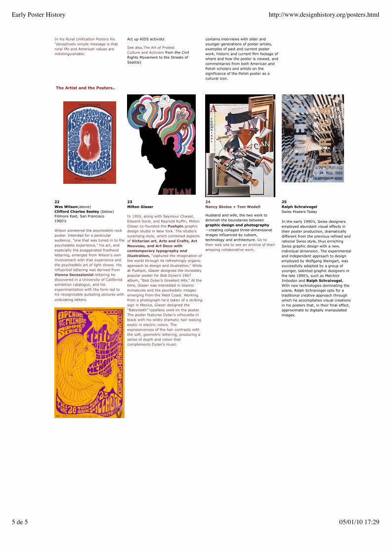
22Wes Wilson(above)Clifford Charles Seeley (below)Fillmore East, San Francisco1960's
Wilson pioneered the psychedelic rockposter. Intended for a particularaudience, "one that was tuned in to thepsychedelic experience," his art, andespecially the exaggerated freehandlettering, emerged from Wilson's owninvolvement with that experience andthe psychedelic art of light shows. Hisinfluential lettering was derived fromVienna Secessionist lettering hediscovered in a University of Californiaexhibition catalogue, and hisexperimentation with the form led tohis recognizable pulsating pictures withundulating letters.
23Milton Glaser
In 1955, along with Seymour Chwast,Edward Sorel, and Reynold Ruffin, MiltonGlaser co-founded the Pushpin graphicdesign studio in New York. The studio’ssurprising style, which combined aspectsof Victorian art, Arts and Crafts, ArtNouveau, and Art Deco withcontemporary typography andillustration, “captured the imagination ofthe world through its refreshingly organicapproach to design and illustration.” Whileat Pushpin, Glaser designed the incrediblypopular poster for Bob Dylan’s 1967album, “Bob Dylan’s Greatest Hits.” At thetime, Glaser was interested in Islamicminiatures and the psychedelic imagesemerging from the West Coast. Workingfrom a photograph he’d taken of a strikingsign in Mexico, Glaser designed the“Babyteeth” typeface used on the poster.The poster features Dylan's silhouette inblack with his wildly dramatic hair lookingexotic in electric colors. Theexpressiveness of the hair contrasts withthe soft, geometric lettering, producing asense of depth and vision thatcomplements Dylan’s music.
24Nancy Skolos + Tom Wedell
Husband and wife, the two work todiminish the boundaries betweengraphic design and photography—creating collaged three-dimensionalimages influenced by cubism,technology and architecture. Go totheir web site to see an archive of theiramazing collaborative work.
25Ralph SchraivogelSwiss Posters Today
In the early 1990’s, Swiss designersemployed abundant visual effects intheir poster production, dramaticallydifferent from the previous refined andrational Swiss style, thus enrichingSwiss graphic design with a new,individual dimension. The experimentaland independent approach to designemployed by Wolfgang Weingart, wassuccessfully adopted by a group ofyounger, talented graphic designers inthe late 1990’s, such as MelchiorImboden and Ralph Schraivogel.With new technologies dominating thescene, Ralph Schraivogel opts for atraditional creative approach throughwhich he accomplishes visual creationsin his posters that, in their final effect,approximate to digitally manipulatedimages.
Early Poster History http://www.designhistory.org/posters.html
5 de 5 05/01/10 17:29

Gesamtkunstwerk, the German work for a 'total art work' The synthesis of all arts, including painting,graphics, sculpture, decorative arts, architecture and performing arts, into a single expressive whole.
1. Art Nouveau | International Art Movement of Decorative Arts
Nature and Design (England)
Charles Darwin in The Origin of theSpecies (1859) and The Descent of Man(1871) theorized the evolution of manthrough natural selection. The influence ofthese popular works plus an influx ofJapanese art inspired strong connectionsbetween art and nature. The connection ismanifested in the work of The CenturyGuild, one of the most successful of themany guilds formed during the Arts andCrafts period. The Guild membersintegrated sensuous and natural motifs inearly examples of the Art Nouveau style.Arthur Heygate Mackmurdo foundedCentury Guild in 1882 "to render allbranches of art the sphere no longer of thetradesman but of the artist...to restorebuilding, decoration, glass-painting,pottery, wood-carving and metal to theirright place beside painting and sculpture."
Art Nouveau (1880-1910)
Work of Century Guild members wasfeatured in the fine press publication, TheHobby Horse, which introduced the Artsand Craft Movement to Europe in 1884.Although the Arts and Crafts periodoverlapped the Art Nouveau movement, itwas Art Nouveau that took holdinternationally, becoming the first popularart movement of the 20th century.Art Nouveau reacted against the 19thcentury revival styles taught in theestablished art academy. It was expressedmainly in decorative arts andarchitecture, characterized by whip lashcurves and the absence of any straightline or right angle. Artists integratedelements of living organisms (animals,insects and birds — especially swans,dragonflies, peacocks and swallows) all richwith symbolic meaning.
The term Art Nouveau first was used by agroup of modern Belgian artists known as"The XX" in 1884. By 1895 the term wasestablished and the "new art form" wasdisplayed for the public in exhibitions atprestigious galleries such as Bing'sDepartment Store in Paris. The Frenchcities of Paris and Nancy (where ÉmileGallé started the Academy in Nancy) werecenters of Art Nouveau for artists ReneLalique, Louis Majorelle, and the DaumBrothers.
In the US, Art Nouveau workshops such asthe company of Tiffany and Wheeler (LouisComfort Tiffany Studios and CandaceWheeler) adopted the French organic style.
Organic or Geometric?
Art Nouveau evolved into two distinctstyles — organic and geometric. France,Belgium, Italy, Spain and the United Statesadhered to the organic style. In Scotland,Rennie Macintosh and his associates at theGlasgow College of Art developed a moregeometric style which highly influencedartists in Vienna, Austria.
Art Nouveau had different names in severalcountries ('Jugendstil' in Austria, 'StileLiberty' in Italy, Modernista in Spain.) Thestreamlined designs favored by the geometricArt Nouveau paved the way for the abstractionand reductionism that would later dominate20th century art and design.
2 Art Nouveau Organic | England, France, Italy, Spain and the United Statesouveau Organic
Victor Horta Belgium
Architect Victor Horta interpretation of ArtNouveau into architecture included arevolutionary openness to the space, theinclusion of diffused light from walls androof and integrating the curved lines ofdecoration with the structure of thebuilding. See his work at the Horta
Henry Van de Velde Belgium
Originally a painter, Van de Velde wasinspired to turn to architecture by the Artsand Crafts movement. He adhered toWilliam Morris's utopian ideal that artistscould reform society through design. Hebelieved that 'Ugliness corrupts not onlythe eyes, but also the heart and mind'. His
Aubrey Beardsley England
Dead at age 25, prolific illustrator AubreyBeardsley left behind an extensive, albeitcontroversial body of work in the ArtNouveau style. His inked compositionsfeatured large dark areas contrasted withlarge blank ones, and areas of fine detailedpatterns and dots contrasted with areas
Candice Wheeler United States
Candice Wheeler was America's firstimportant woman textile and interiordesigner. In 1879 Wheeler co-founded theinterior-decorating firm of Tiffany &Wheeler, serving as the partnerspecializing in textiles. Wheeler was one ofthe first women to work in a field
20th Century Modernist Influences on Graphic Design http://www.designhistory.org/20th_Century.html
1 de 7 05/01/10 17:28
Museum on line or visit it in Brussels. Tropon Poster utilizes elements of theUkiyo-e, flattened surface, contour linesand negative space. A perfect example ofhow style can trump content.
A true master of the Art Nouveau posterwas Alphonse Mucha, his work is currentlyfeatured in the Belvedere Museum inVienna or see the poster page on this site.
with none at all. He was the first art editorof The Yellow Book, a leading English artspublication. Read more about Beardsley'slife and art here.
In the United States illustrators emulatedBeardsley's style. Ethel Reed, (the firstAmerican woman graphic designer)and Will Bradley (nicknamed 'TheAmerican Beardsley)
dominated by male upholsterers,architects, and cabinetmakers. She wasasked to serve as the interior decorator ofthe Woman's Building at the ChicagoWorld's Columbian Exposition, and toorganize New York's applied arts exhibition.(Source quote Harvard Library OpenCollections)
4. Art Nouveau Geometric | Scotland and Austria
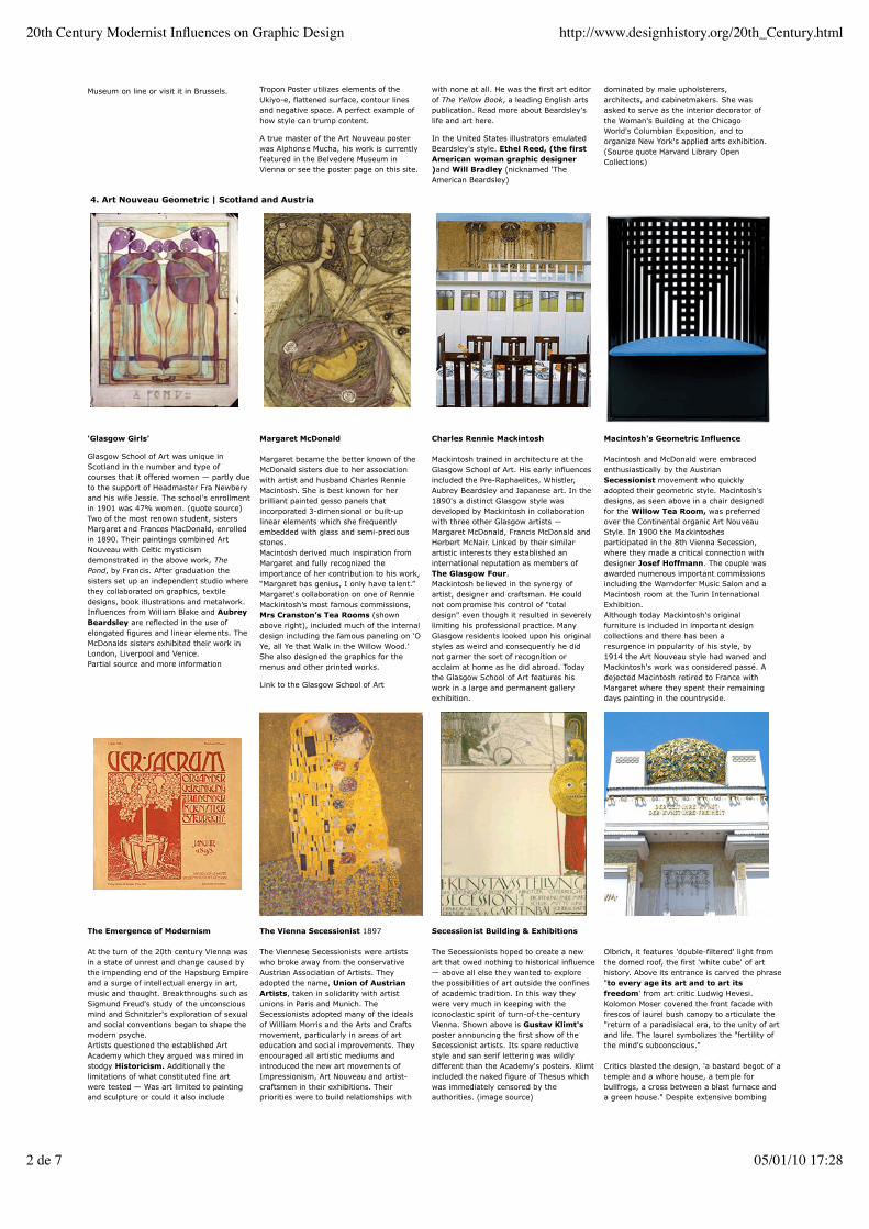
'Glasgow Girls'
Glasgow School of Art was unique inScotland in the number and type ofcourses that it offered women — partly dueto the support of Headmaster Fra Newberyand his wife Jessie. The school's enrollmentin 1901 was 47% women. (quote source)Two of the most renown student, sistersMargaret and Frances MacDonald, enrolledin 1890. Their paintings combined ArtNouveau with Celtic mysticismdemonstrated in the above work, ThePond, by Francis. After graduation thesisters set up an independent studio wherethey collaborated on graphics, textiledesigns, book illustrations and metalwork.Influences from William Blake and AubreyBeardsley are reflected in the use ofelongated figures and linear elements. TheMcDonalds sisters exhibited their work inLondon, Liverpool and Venice.Partial source and more information
Margaret McDonald
Margaret became the better known of theMcDonald sisters due to her associationwith artist and husband Charles RennieMacintosh. She is best known for herbrilliant painted gesso panels thatincorporated 3-dimensional or built-uplinear elements which she frequentlyembedded with glass and semi-preciousstones.Macintosh derived much inspiration fromMargaret and fully recognized theimportance of her contribution to his work,“Margaret has genius, I only have talent.”Margaret's collaboration on one of RennieMackintosh’s most famous commissions,Mrs Cranston’s Tea Rooms (shownabove right), included much of the internaldesign including the famous paneling on ‘OYe, all Ye that Walk in the Willow Wood.'She also designed the graphics for themenus and other printed works.
Link to the Glasgow School of Art
Charles Rennie Mackintosh
Mackintosh trained in architecture at theGlasgow School of Art. His early influencesincluded the Pre-Raphaelites, Whistler,Aubrey Beardsley and Japanese art. In the1890's a distinct Glasgow style wasdeveloped by Mackintosh in collaborationwith three other Glasgow artists —Margaret McDonald, Francis McDonald andHerbert McNair. Linked by their similarartistic interests they established aninternational reputation as members ofThe Glasgow Four.Mackintosh believed in the synergy ofartist, designer and craftsman. He couldnot compromise his control of "totaldesign" even though it resulted in severelylimiting his professional practice. ManyGlasgow residents looked upon his originalstyles as weird and consequently he didnot garner the sort of recognition oracclaim at home as he did abroad. Todaythe Glasgow School of Art features hiswork in a large and permanent galleryexhibition.
Macintosh's Geometric Influence
Macintosh and McDonald were embracedenthusiastically by the AustrianSecessionist movement who quicklyadopted their geometric style. Macintosh'sdesigns, as seen above in a chair designedfor the Willow Tea Room, was preferredover the Continental organic Art NouveauStyle. In 1900 the Mackintoshesparticipated in the 8th Vienna Secession,where they made a critical connection withdesigner Josef Hoffmann. The couple wasawarded numerous important commissionsincluding the Warndorfer Music Salon and aMacintosh room at the Turin InternationalExhibition.Although today Mackintosh's originalfurniture is included in important designcollections and there has been aresurgence in popularity of his style, by1914 the Art Nouveau style had waned andMackintosh's work was considered passé. Adejected Macintosh retired to France withMargaret where they spent their remainingdays painting in the countryside.
The Emergence of Modernism
At the turn of the 20th century Vienna wasin a state of unrest and change caused bythe impending end of the Hapsburg Empireand a surge of intellectual energy in art,music and thought. Breakthroughs such asSigmund Freud's study of the unconsciousmind and Schnitzler's exploration of sexualand social conventions began to shape themodern psyche.Artists questioned the established ArtAcademy which they argued was mired instodgy Historicism. Additionally thelimitations of what constituted fine artwere tested — Was art limited to paintingand sculpture or could it also include
The Vienna Secessionist 1897
The Viennese Secessionists were artistswho broke away from the conservativeAustrian Association of Artists. Theyadopted the name, Union of AustrianArtists, taken in solidarity with artistunions in Paris and Munich. TheSecessionists adopted many of the idealsof William Morris and the Arts and Craftsmovement, particularly in areas of arteducation and social improvements. Theyencouraged all artistic mediums andintroduced the new art movements ofImpressionism, Art Nouveau and artist-craftsmen in their exhibitions. Theirpriorities were to build relationships with
Secessionist Building & Exhibitions
The Secessionists hoped to create a newart that owed nothing to historical influence— above all else they wanted to explorethe possibilities of art outside the confinesof academic tradition. In this way theywere very much in keeping with theiconoclastic spirit of turn-of-the-centuryVienna. Shown above is Gustav Klimt'sposter announcing the first show of theSecessionist artists. Its spare reductivestyle and san serif lettering was wildlydifferent than the Academy's posters. Klimtincluded the naked figure of Thesus whichwas immediately censored by theauthorities. (image source)
Olbrich, it features 'double-filtered' light fromthe domed roof, the first 'white cube' of arthistory. Above its entrance is carved the phrase"to every age its art and to art itsfreedom' from art critic Ludwig Hevesi.Kolomon Moser covered the front facade withfrescos of laurel bush canopy to articulate the"return of a paradisiacal era, to the unity of artand life. The laurel symbolizes the "fertility ofthe mind's subconscious."
Critics blasted the design, 'a bastard begot of atemple and a whore house, a temple forbullfrogs, a cross between a blast furnace anda green house." Despite extensive bombing
20th Century Modernist Influences on Graphic Design http://www.designhistory.org/20th_Century.html
2 de 7 05/01/10 17:28
furniture, glass, textiles and functionalitems?
artists abroad and to select art on the basisof merit, not marketability. ("Only theweak and false get sponsored")Gustav Klimt was the first electedpresident of the group but left over artisticdifferences in 1905. Above, his famouspainting, The Kiss, is closely aligned instyle to Margaret McDonald.
The Secessionists were associated with theGerman Jugendstil style of Art Nouveau,evident in the decoration of their 'temple ofart' built in 1898 directly across the streetfrom the Austrian Fine Arts Academy.Designed by architect Joseph M.
damage during WWII it is was refurbished andis open to the public today. It continues in thethe spirit of the Secession, presentingexperimental work. Of course the one time Iget to see it artist Katrin Plavcak has draped agiant mustache over the dome. See it here
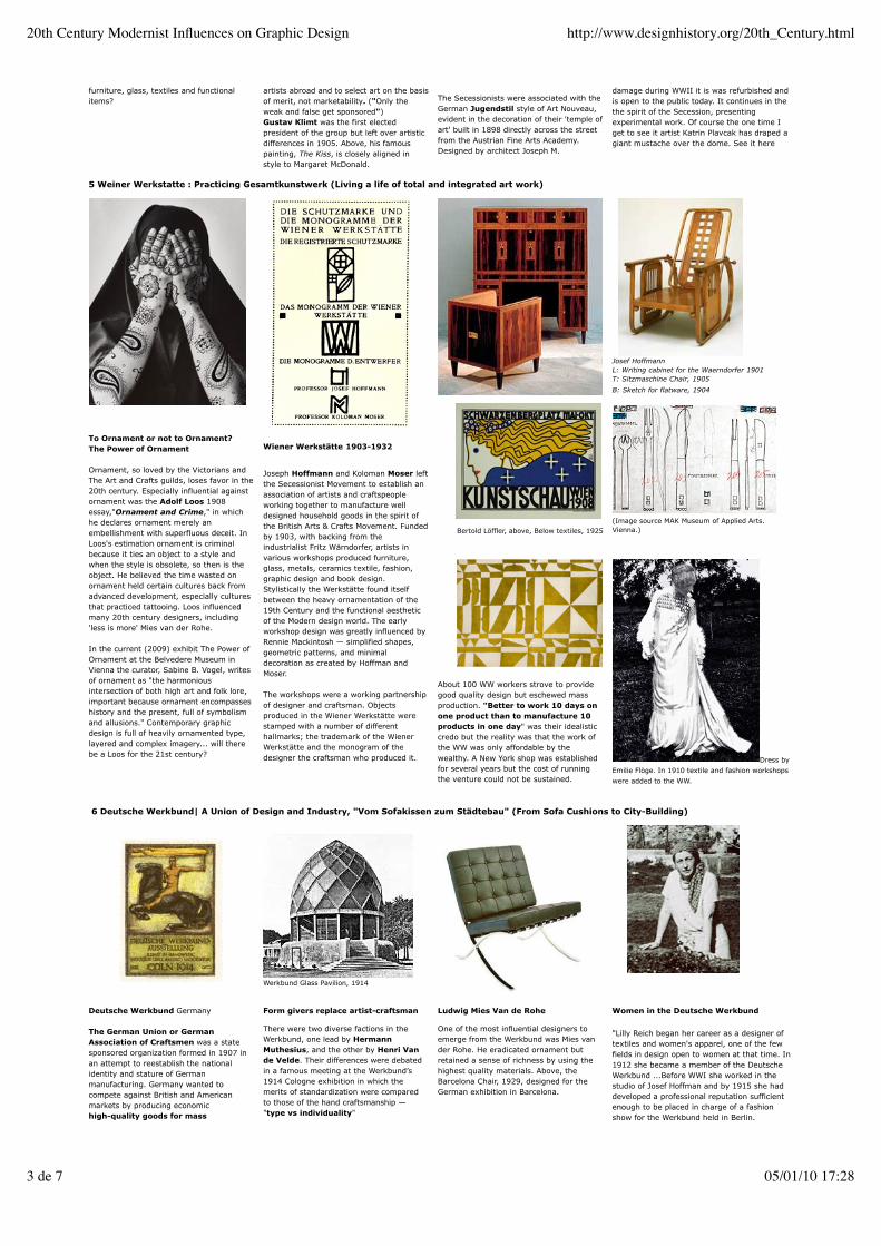
5 Weiner Werkstatte : Practicing Gesamtkunstwerk (Living a life of total and integrated art work)
To Ornament or not to Ornament?The Power of Ornament
Ornament, so loved by the Victorians andThe Art and Crafts guilds, loses favor in the20th century. Especially influential againstornament was the Adolf Loos 1908essay,"Ornament and Crime," in whichhe declares ornament merely anembellishment with superfluous deceit. InLoos's estimation ornament is criminalbecause it ties an object to a style andwhen the style is obsolete, so then is theobject. He believed the time wasted onornament held certain cultures back fromadvanced development, especially culturesthat practiced tattooing. Loos influencedmany 20th century designers, including'less is more' Mies van der Rohe.
In the current (2009) exhibit The Power ofOrnament at the Belvedere Museum inVienna the curator, Sabine B. Vogel, writesof ornament as "the harmoniousintersection of both high art and folk lore,important because ornament encompasseshistory and the present, full of symbolismand allusions." Contemporary graphicdesign is full of heavily ornamented type,layered and complex imagery... will therebe a Loos for the 21st century?
Wiener Werkstätte 1903-1932
Joseph Hoffmann and Koloman Moser leftthe Secessionist Movement to establish anassociation of artists and craftspeopleworking together to manufacture welldesigned household goods in the spirit ofthe British Arts & Crafts Movement. Fundedby 1903, with backing from theindustrialist Fritz Wärndorfer, artists invarious workshops produced furniture,glass, metals, ceramics textile, fashion,graphic design and book design.Stylistically the Werkstätte found itselfbetween the heavy ornamentation of the19th Century and the functional aestheticof the Modern design world. The earlyworkshop design was greatly influenced byRennie Mackintosh — simplified shapes,geometric patterns, and minimaldecoration as created by Hoffman andMoser.
The workshops were a working partnershipof designer and craftsman. Objectsproduced in the Wiener Werkstätte werestamped with a number of differenthallmarks; the trademark of the WienerWerkstätte and the monogram of thedesigner the craftsman who produced it.
Bertold Löffler, above, Below textiles, 1925
Josef HoffmannL: Writing cabinet for the Waerndorfer 1901T: Sitzmaschine Chair, 1905
B: Sketch for flatware, 1904
(Image source MAK Museum of Applied Arts.Vienna.)
About 100 WW workers strove to providegood quality design but eschewed massproduction. "Better to work 10 days onone product than to manufacture 10products in one day" was their idealisticcredo but the reality was that the work ofthe WW was only affordable by thewealthy. A New York shop was establishedfor several years but the cost of runningthe venture could not be sustained.
Dress by
Emilie Flöge. In 1910 textile and fashion workshops
were added to the WW.
6 Deutsche Werkbund| A Union of Design and Industry, "Vom Sofakissen zum Städtebau" (From Sofa Cushions to City-Building)
Werkbund Glass Pavilion, 1914
Deutsche Werkbund Germany
The German Union or GermanAssociation of Craftsmen was a statesponsored organization formed in 1907 inan attempt to reestablish the nationalidentity and stature of Germanmanufacturing. Germany wanted tocompete against British and Americanmarkets by producing economichigh-quality goods for mass
Form givers replace artist-craftsman
There were two diverse factions in theWerkbund, one lead by HermannMuthesius, and the other by Henri Vande Velde. Their differences were debatedin a famous meeting at the Werkbund’s1914 Cologne exhibition in which themerits of standardization were comparedto those of the hand craftsmanship —"type vs individuality"
Ludwig Mies Van de Rohe
One of the most influential designers toemerge from the Werkbund was Mies vander Rohe. He eradicated ornament butretained a sense of richness by using thehighest quality materials. Above, theBarcelona Chair, 1929, designed for theGerman exhibition in Barcelona.
Women in the Deutsche Werkbund
"Lilly Reich began her career as a designer oftextiles and women's apparel, one of the fewfields in design open to women at that time. In1912 she became a member of the DeutscheWerkbund ...Before WWI she worked in thestudio of Josef Hoffman and by 1915 she haddeveloped a professional reputation sufficientenough to be placed in charge of a fashionshow for the Werkbund held in Berlin.
20th Century Modernist Influences on Graphic Design http://www.designhistory.org/20th_Century.html
3 de 7 05/01/10 17:28

consumption.
The Werkbund promoted the developmentof crafts skills that could be used tostandardize and rationalize forms formachine production. Their challenge was toproduce manufactured goods equal inquality to hand-crafted products.
The Werkbund originally included twelvearchitects and twelve business firms. Thearchitects include Peter Behrens, TheodorFischer, Josef Hoffmann and RichardRiemerschmid. The most famous memberwas Mies Van der Rohe.
Activities of the organization includedholding exhibitions to educate the publicconsumer about good design as well asencouraging industrialists to employprofessional designers.
Muthesius prevailed with his argument thataesthetics could be independent of materialquality, standardization could be avirtue, and that abstract form could be thebasis of aesthetics in product design. Heproposed ‘modernity’, opposing ornamentand advocating for practicality as the basisfor the expression of contemporary culturalvalues. He believed that beauty camethrough form not decoration, and thatthis was not achieved individually but byusing standardized designs. Henry van deVelde unsuccessfully opposed Behrens withan argument that standardizationcompromised individual artistic creativity.
Van der Rohe was architectural director ofthe 1927 Die Wohnung (The Dwelling) atthe Weissenhof-Settlement in Stuttgart.The exhibition featured architecture,interiors and furniture showcasing theWerkbund Modernist aesthetic. The estateof working class housing was designed inconsultation with the residents as a blueprint for worker's homes. It wascontroversial due to its un-German likeappearance.
Lilly partnered with Mies van der Rohe,professionally and personally for about a dozenyears. They co-designed much of the furniturethat become icons of modern design — still inproduction today although they are usuallyattributed solely to Mies. Imagine these chairswithout the upholstery that was designed byLilly?In 1920 Reich became the first woman to bemade director of the Deutsche Werkbund,an unprecedented achievement becausewomen at that time were not expected to havethe same abilities in the arts as men."From A Chat with Lily Reich
The MR Chair, 1927, Mies van der Rohe and LillyReich. "It is interesting to note that Mies did notfully develop any contemporary furnituresuccessfully before or after his collaboration withReich." Albert Pfeiffer (Source)
Peter Behrens | Winning the Werkbund Debate on the Merits of Standardization
Peter Behrens, Typography
Originally a member of the MunichSecessionists and the Jugendstil school,architect, artist and designer Peter Behrenslater became a major force in moderncorporate identity and industrial design.Among Behrens's many talents wastypography design, especially the design ofsans serif type. He released a sans seriftype with heavy blackletter overtones,Behren Schrift, through the Klingspor typefoundry.
In 1900 the Duke of Hessen invitedBehrens to join the Mathildenhöhe artistcolony created to encourage a creativefusion of art and manufacturing. Each ofthe seven residents were granted land onwhich to build and design a home andentire contents - a Gesamtkunstwerk.Behrens's "Haus Behrens" was a sensation.
Peter Behrens, Modern Design Educator
Behrens was appointed director of theDusseldorf School of Arts and Crafts in1903. His vision to create a studiopedagogy of geometrically-based systemslead him to search for faculty in Hollandwhere mathematical systems wereemphasized. Dutch architect J.L MathieuLauweriks was hired as head of theDusseldorf architecture department.
Behrens was deeply influenced byLauwerik's proportional system ofarithmetic arrangements of cubes, squares,and rectangles based, in part, on thetheories of ancient Roman Vitruvius.
Behrens developed an introductory coursefor the modern study of art in whichstudents analyzed organic natural formsand reconstructed them into universalforms of harmony. Behrens courses andstudio were a training ground for importantModernists Mies van der Rohe andWalter Gropius. The Dusseldorf course ofstudy would influence Gropius when hestarted the Bauhaus school in 1919.
The AEG Corporate Standardization
In 1907 Behrens was appointed artisticdirector for AEG, (manufacturer ofelectrical machines). Behrens oversaw thedesign of the company, from architectureto product design to graphics. The workwas all done in a neutral and standardizedstyle, undecorated and without referenceto class or history. The AEG program's"standardization" was the perfectmanifestation of Mathesius’s ideal ofcollaboration between the artist and majorindustry. The program is one of the firstexamples of a complete corporate identity.
Behrens pioneered and defined the field ofmodern industrial design with hisproduct design for AEG. His innovation wasexpressed in the design of electric teakettles that utilized standardized andinterchangeable components. Pardoxicallyhis standardization actually allowed foreconomical variations, in the case of thetea pot, 80 different affordable variations.See one of the teapots at the MOMA.
The AEG high tension factory 1910
The factory had special meaning for theModernists. It was a site of production—associated with the worker. The purpose of afactory was clear: it housed, or was, a productof the latest technology. In his design for theAEG factory, Behrens appreciation for Classicalarchitecture was synthesized with Modernistideals in a new style—Neoclassical Modernism.Particularly striking was his use of externalsteel columns, at once referring to the classicalpast yet also to Modernism, exposing the steelskeletal structure to create a metaphoricalGreek temple to industry.(Behren's source link)
7. El Lissitzky : Linking Geometric Abstraction With Graphic Design
"In the opening decades of the 20thcentury, the printed word became
20th Century Modernist Influences on Graphic Design http://www.designhistory.org/20th_Century.html
4 de 7 05/01/10 17:28

increasingly important to the visual andverbal explorations of modern artists.Revolutions in printing, typography, andadvertising saturated modern life withprinted words. Although diverse in theirgoals and expressive strategies, artistsworking in a variety of styles and locations—including Italian Futurists, BerlinDadaists, and Russian Constructivists—cohered around a shared interest indeploying modern typography. Co-optingthe raw material of industrial, technologicalculture into their critiques of the artisticand social status quo, artists used theprinted word as a key medium forcommunicating the avant-gardeperspective. They eagerly sought out newtypographical styles, which represented thegraphic embodiment of one of the centraltenets of the artistic vanguard: fusingform with function."
Above: Cover of Die Kunstismen/Les isms del'art/the isms of art, 1925
Lissitzky's used his art to promote hisbeliefs in the political and social issues ofthe turbulent early 20th century. Hisrevolutionary typographical layouts were asynthesis of the composition of the Prounstyle and his understanding of page layoutin his earlier book designs.
In 1920 he created The Story of TwoSquares, a symbolic narrative in which theprotagonists are a red square and a blacksquare, the setting is the earth (a redcircle), and the enemy is chaos (a jumbleof geometric shapes).
The Story of Two Squares is a powerfuldemonstration that art could be used as agraphic means of communication. When itwas first published in Berlin in 1922,About 2 [Squares] presented a radicalrethinking of what a book was,demonstrating a new way oforganizing typography on a page andrelating it to visual images. It markedthe beginning of a new graphic art andis among the most importantpublications in the history of theavant-garde in typography and graphicdesign.
See all of the pages of The Story of TwoSquares on ibiblio.org
Kazimar Malevitch & El Lissitzky
In 1915 Kazimir Malevich introduced anabstract, non-objective geometric paintingstyle he named Suprematism. Malevitch'sexplorations of Impressionism andCubo-Futurism (also a fascination withaerial landscape photography) inspired his1915 manifesto From Cubism toSuprematism.* (Black Square,1915 above)
Lazar Markovich Lissitzky trained as anarchitect but started his career illustratingYiddish children's books. In 1919 he metand was greatly inspired by Malevitch andthe Suprematist style while they were bothteachers at the People's Art School. ElLissitzky adopted the reductive geometricstyle, producing in 1920 his famous posterBeat the Whites with the Red Wedge(above)
*Julia Bekman Chadaga
Proun
Lissitzky went on to develop his ownvariant of Suprematism, Proun (anacronym for "Project for the Affirmation ofthe New) Proun was Lissitzky's explorationof the visual language of Suprematism butwith 3D elements, existing half-waybetween painting and architecture, utilizingshifting axes and multiple perspectives.Prouns, initially paintings, were laterexpressed as fully dimensional works.
In 1920 he moved to Berlin as an artisticambassador for Russian art, bringing thelanguage of Constructivism andSuprematism to Europe. He beganexperimenting heavily in typographicdesign and photographic montage. For avery complete site on the work of ElLissitzky visit this link at the GettyMuseum.
Program sheet, Victory over the Sun, 1923
Victory Over the Sun, 1923
Performed in 1913, the "first Cubo-Futuristopera" Victory over the Sun was the basisfor the a 1923 German commission for aseries of lithographic prints. Lissitzkyanalyzed the text as a celebration of man'stechnological capabilities: 'the sun as theexpression of old world energy is torndown from the heavens by modern man,who by virtue of his technologicalsuperiority creates his own energy source.'The cover sheet is composed with acompositional arrangement of bold andlight type aligned on a grid. Horizontal andvertical bars are balanced with the type ina vocabulary of space and organizationalrelationships that will be emulated bymany designers in the following decades.
Lissitzky's Influence in Europe
Lissitzky's fluency in German helped himadvance his theories in Europe throughlectures, articles, and commercial graphicdesign. Dada artist Kurt Schwitterscommissioned Lissitzky to work on aspecial issue of the Dada journal Merz. Hiswork had a great deal of influence over theBauhaus school through his relationshipwith Walter Gropius and the NewTypography of Jan Tschichold. He alsoinfluenced the De Stijl movement.
Lissitzky fell ill to tuberculosis in 1923 andwent to Switzerland for treatment. Hefinanced his recovery by designingadvertisements for Günther Wagner'sPelikan division, an office supply company.
With this assignment he combined his newtypographic techniques with Proun spatialcomposition to create a new visualvocabulary for advertising.
Designing Communism
Lissitzky aligned his art with the social andpolitical goals of state—the core purpose ofthe Russian Constructivist Style. Hepromoted his country's optimism for socialwelfare and Communism via print andexhibition design. His designs for USSR inConstruction, a propaganda magazinebegun by Maxim Gorky, featured theStalinist Constitution, Soviet Georgia, andthe Red Army. Published in severallanguages, it provided foreign audienceswith information about Soviet industry,economy, and culture.
Lissitzky's poster above, designed for theRussian Exhibition in Zürich in 1929,depicts the egalitarian status ofwomen and men in the new society. Hisphotomontage style featured startlingjuxtapositions of real objects withnaturalistic and abstract forms.Alexander Rodchenko, another RussianConstructivist, broke new photographicground with his innovative use of the Leicacamera. See his work on Utube here orRodchenko Montage.
9 Futurism - Speed, Technology and (ooops!) Fascism 10 De Stijl : The Horizontal The Vertical (+ To Some the Diagonal)
20th Century Modernist Influences on Graphic Design http://www.designhistory.org/20th_Century.html
5 de 7 05/01/10 17:28
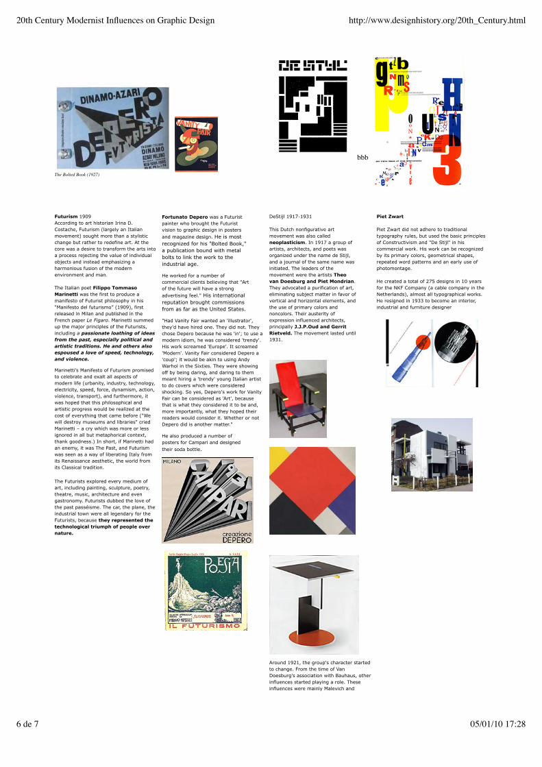
The Bolted Book (1927)
bbb
Futurism 1909According to art historian Irina D.Costache, Futurism (largely an Italianmovement) sought more than a stylisticchange but rather to redefine art. At thecore was a desire to transform the arts intoa process rejecting the value of individualobjects and instead emphasizing aharmonious fusion of the modernenvironment and man.
The Italian poet Filippo TommasoMarinetti was the first to produce amanifesto of Futurist philosophy in his“Manifesto del futurismo” (1909), firstreleased in Milan and published in theFrench paper Le Figaro. Marinetti summedup the major principles of the Futurists,including a passionate loathing of ideasfrom the past, especially political andartistic traditions. He and others alsoespoused a love of speed, technology,and violence.
Marinetti’s Manifesto of Futurism promisedto celebrate and exalt all aspects ofmodern life (urbanity, industry, technology,electricity, speed, force, dynamism, action,violence, transport), and furthermore, itwas hoped that this philosophical andartistic progress would be realized at thecost of everything that came before ("Wewill destroy museums and libraries" criedMarinetti – a cry which was more or lessignored in all but metaphorical context,thank goodness.) In short, if Marinetti hadan enemy, it was The Past, and Futurismwas seen as a way of liberating Italy fromits Renaissance aesthetic, the world fromits Classical tradition.
The Futurists explored every medium ofart, including painting, sculpture, poetry,theatre, music, architecture and evengastronomy. Futurists dubbed the love ofthe past passéisme. The car, the plane, theindustrial town were all legendary for theFuturists, because they represented thetechnological triumph of people overnature.
Fortunato Depero was a Futuristpainter who brought the Futuristvision to graphic design in postersand magazine design. He is mostrecognized for his "Bolted Book,"a publication bound with metalbolts to link the work to theindustrial age.
He worked for a number ofcommercial clients believing that "Artof the future will have a strongadvertising feel." His internationalreputation brought commissionsfrom as far as the United States.
"Had Vanity Fair wanted an 'illustrator',they'd have hired one. They did not. Theychose Depero because he was 'in'; to use amodern idiom, he was considered 'trendy'.His work screamed 'Europe'. It screamed'Modern'. Vanity Fair considered Depero a'coup'; it would be akin to using AndyWarhol in the Sixties. They were showingoff by being daring, and daring to themmeant hiring a 'trendy' young Italian artistto do covers which were consideredshocking. So yes, Depero's work for VanityFair can be considered as 'Art', becausethat is what they considered it to be and,more importantly, what they hoped theirreaders would consider it. Whether or notDepero did is another matter."
He also produced a number ofposters for Campari and designedtheir soda bottle.
DeStijl 1917-1931
This Dutch nonfigurative artmovement was also calledneoplasticism. In 1917 a group ofartists, architects, and poets wasorganized under the name de Stijl,and a journal of the same name wasinitiated. The leaders of themovement were the artists Theovan Doesburg and Piet Mondrian.They advocated a purification of art,eliminating subject matter in favor ofvertical and horizontal elements, andthe use of primary colors andnoncolors. Their austerity ofexpression influenced architects,principally J.J.P.Oud and GerritRietveld. The movement lasted until1931.
Around 1921, the group's character startedto change. From the time of VanDoesburg's association with Bauhaus, otherinfluences started playing a role. Theseinfluences were mainly Malevich and
Piet Zwart
Piet Zwart did not adhere to traditionaltypography rules, but used the basic principlesof Constructivism and "De Stijl" in hiscommercial work. His work can be recognizedby its primary colors, geometrical shapes,repeated word patterns and an early use ofphotomontage.
He created a total of 275 designs in 10 yearsfor the NKF Company (a cable company in theNetherlands), almost all typographical works.He resigned in 1933 to become an interior,industrial and furniture designer
20th Century Modernist Influences on Graphic Design http://www.designhistory.org/20th_Century.html
6 de 7 05/01/10 17:28

Russian Constructivism, to which not allmembers agreed. In 1924 Mondrian brokewith the group after Van Doesburgproposed the theory of elementarism,proposing that the diagonal line was morevital than the horizontal and the vertical.
20th Century Modernist Influences on Graphic Design http://www.designhistory.org/20th_Century.html
7 de 7 05/01/10 17:28
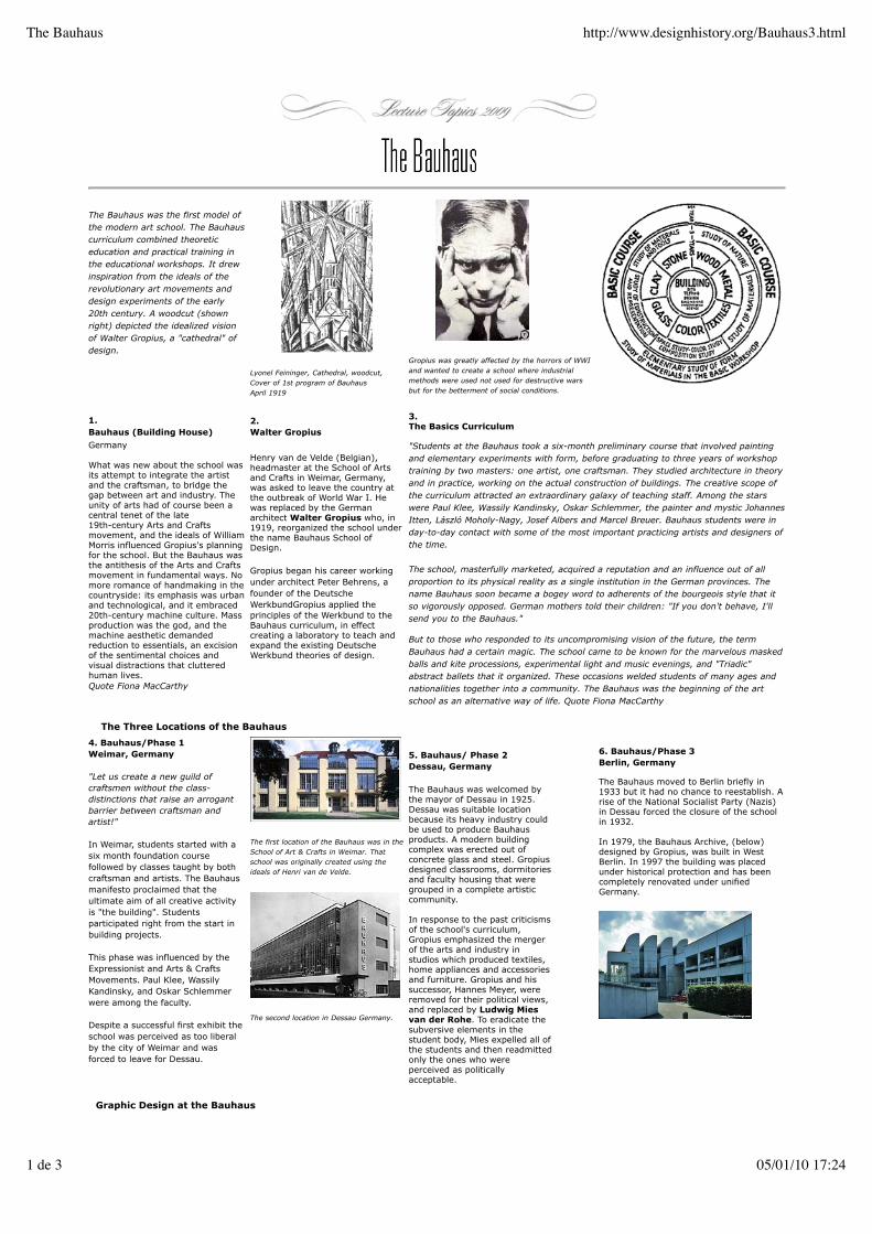
The Bauhaus was the first model ofthe modern art school. The Bauhauscurriculum combined theoreticeducation and practical training inthe educational workshops. It drewinspiration from the ideals of therevolutionary art movements anddesign experiments of the early20th century. A woodcut (shownright) depicted the idealized visionof Walter Gropius, a "cathedral" ofdesign.
Lyonel Feininger, Cathedral, woodcut,Cover of 1st program of BauhausApril 1919
Gropius was greatly affected by the horrors of WWIand wanted to create a school where industrialmethods were used not used for destructive warsbut for the betterment of social conditions.
1.Bauhaus (Building House)
Germany
What was new about the school wasits attempt to integrate the artistand the craftsman, to bridge thegap between art and industry. Theunity of arts had of course been acentral tenet of the late19th-century Arts and Craftsmovement, and the ideals of WilliamMorris influenced Gropius's planningfor the school. But the Bauhaus wasthe antithesis of the Arts and Craftsmovement in fundamental ways. Nomore romance of handmaking in thecountryside: its emphasis was urbanand technological, and it embraced20th-century machine culture. Massproduction was the god, and themachine aesthetic demandedreduction to essentials, an excisionof the sentimental choices andvisual distractions that clutteredhuman lives.Quote Fiona MacCarthy
2.Walter Gropius
Henry van de Velde (Belgian),headmaster at the School of Artsand Crafts in Weimar, Germany,was asked to leave the country atthe outbreak of World War I. Hewas replaced by the Germanarchitect Walter Gropius who, in1919, reorganized the school underthe name Bauhaus School ofDesign.
Gropius began his career workingunder architect Peter Behrens, afounder of the DeutscheWerkbundGropius applied theprinciples of the Werkbund to theBauhaus curriculum, in effectcreating a laboratory to teach andexpand the existing DeutscheWerkbund theories of design.
3.The Basics Curriculum
"Students at the Bauhaus took a six-month preliminary course that involved paintingand elementary experiments with form, before graduating to three years of workshoptraining by two masters: one artist, one craftsman. They studied architecture in theoryand in practice, working on the actual construction of buildings. The creative scope ofthe curriculum attracted an extraordinary galaxy of teaching staff. Among the starswere Paul Klee, Wassily Kandinsky, Oskar Schlemmer, the painter and mystic JohannesItten, László Moholy-Nagy, Josef Albers and Marcel Breuer. Bauhaus students were inday-to-day contact with some of the most important practicing artists and designers ofthe time.
The school, masterfully marketed, acquired a reputation and an influence out of allproportion to its physical reality as a single institution in the German provinces. Thename Bauhaus soon became a bogey word to adherents of the bourgeois style that itso vigorously opposed. German mothers told their children: "If you don't behave, I'llsend you to the Bauhaus."
But to those who responded to its uncompromising vision of the future, the termBauhaus had a certain magic. The school came to be known for the marvelous maskedballs and kite processions, experimental light and music evenings, and "Triadic"abstract ballets that it organized. These occasions welded students of many ages andnationalities together into a community. The Bauhaus was the beginning of the artschool as an alternative way of life. Quote Fiona MacCarthy
The Three Locations of the Bauhaus
4. Bauhaus/Phase 1Weimar, Germany
"Let us create a new guild ofcraftsmen without the class-distinctions that raise an arrogantbarrier between craftsman andartist!"
In Weimar, students started with asix month foundation coursefollowed by classes taught by bothcraftsman and artists. The Bauhausmanifesto proclaimed that theultimate aim of all creative activityis "the building". Studentsparticipated right from the start inbuilding projects.
This phase was influenced by theExpressionist and Arts & CraftsMovements. Paul Klee, WassilyKandinsky, and Oskar Schlemmerwere among the faculty.
Despite a successful first exhibit theschool was perceived as too liberalby the city of Weimar and wasforced to leave for Dessau.
The first location of the Bauhaus was in theSchool of Art & Crafts in Weimar. Thatschool was originally created using theideals of Henri van de Velde.
The second location in Dessau Germany.
5. Bauhaus/ Phase 2Dessau, Germany
The Bauhaus was welcomed bythe mayor of Dessau in 1925.Dessau was suitable locationbecause its heavy industry couldbe used to produce Bauhausproducts. A modern buildingcomplex was erected out ofconcrete glass and steel. Gropiusdesigned classrooms, dormitoriesand faculty housing that weregrouped in a complete artisticcommunity.
In response to the past criticismsof the school's curriculum,Gropius emphasized the mergerof the arts and industry instudios which produced textiles,home appliances and accessoriesand furniture. Gropius and hissuccessor, Hannes Meyer, wereremoved for their political views,and replaced by Ludwig Miesvan der Rohe. To eradicate thesubversive elements in thestudent body, Mies expelled all ofthe students and then readmittedonly the ones who wereperceived as politicallyacceptable.
6. Bauhaus/Phase 3Berlin, Germany
The Bauhaus moved to Berlin briefly in1933 but it had no chance to reestablish. Arise of the National Socialist Party (Nazis)in Dessau forced the closure of the schoolin 1932.
In 1979, the Bauhaus Archive, (below)designed by Gropius, was built in WestBerlin. In 1997 the building was placedunder historical protection and has beencompletely renovated under unifiedGermany.
Graphic Design at the Bauhaus
The Bauhaus http://www.designhistory.org/Bauhaus3.html
1 de 3 05/01/10 17:24
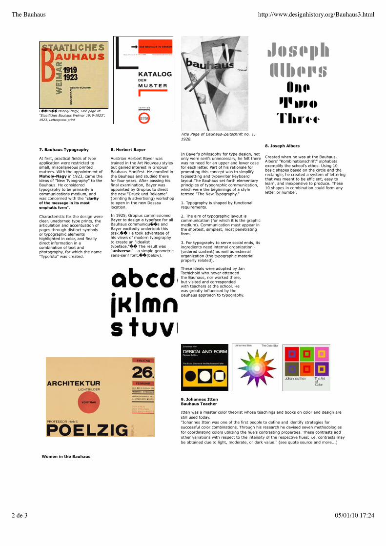
L��szl�� Moholy-Nagy, Title page of:"Staatliches Bauhaus Weimar 1919-1923",1923, Letterpress print
Title Page of Bauhaus-Zeitschrift no. 1,1928.
7. Bauhaus Typography
At first, practical fields of typeapplication were restricted tosmall, miscellaneous printedmatters. With the appointment ofMoholy-Nagy in 1923, came theideas of "New Typography" to theBauhaus. He consideredtypography to be primarily acommunications medium, andwas concerned with the "clarityof the message in its mostemphatic form".
Characteristic for the design wereclear, unadorned type prints, thearticulation and accentuation ofpages through distinct symbolsor typographic elementshighlighted in color, and finallydirect information in acombination of text andphotography, for which the name"Typofoto" was created.
8. Herbert Bayer
Austrian Herbert Bayer wastrained in the Art Nouveau stylesbut gained interest in Gropius'Bauhaus-Manifest. He enrolled inthe Bauhaus and studied therefor four years. After passing hisfinal examination, Bayer wasappointed by Gropius to directthe new "Druck und Reklame"(printing & advertising) workshopto open in the new Dessaulocation.
In 1925, Gropius commissionedBayer to design a typeface for allBauhaus communiqu��s andBayer excitedly undertook thistask.�� He took advantage ofhis views of modern typographyto create an "idealisttypeface."�� The result was"universal" - a simple geometricsans-serif font.��(below).
In Bayer's philosophy for type design, notonly were serifs unnecessary, he felt therewas no need for an upper and lower casefor each letter. Part of his rationale forpromoting this concept was to simplifytypesetting and typewriter keyboardlayout.The Bauhaus set forth elementaryprinciples of typographic communication,which were the beginnings of a styletermed "The New Typography."
1. Typography is shaped by functionalrequirements.
2. The aim of typographic layout iscommunication (for which it is the graphicmedium). Communication must appear inthe shortest, simplest, most penetratingform.
3. For typography to serve social ends, itsingredients need internal organization -(ordered content) as well as externalorganization (the typographic materialproperly related).
These ideals were adopted by JanTschichold who never attendedthe Bauhaus, nor worked there,but visited and correspondedwith teachers at the school. Hewas greatly influenced by theBauhaus approach to typography.
8. Joseph Albers
Created when he was at the Bauhaus,Albers' "Kombinationschrift" alphabetsexemplify the school's ethos. Using 10basic shapes based on the circle and therectangle, he created a system of letteringthat was meant to be efficient, easy tolearn, and inexpensive to produce. These10 shapes in combination could form anyletter or number.
9. Johannes IttenBauhaus Teacher
Itten was a master color theorist whose teachings and books on color and design arestill used today."Johannes Itten was one of the first people to define and identify strategies forsuccessful color combinations. Through his research he devised seven methodologiesfor coordinating colors utilizing the hue's contrasting properties. These contrasts addother variations with respect to the intensity of the respective hues; i.e. contrasts maybe obtained due to light, moderate, or dark value." (see quote source and more...)
Women in the Bauhaus
The Bauhaus http://www.designhistory.org/Bauhaus3.html
2 de 3 05/01/10 17:24
Women were about one quarter ofthe Bauhaus student body. Mostwere assigned to the textile shop.however some were able to breakout into other areas such as metalsand woodworking.
9.Alma BuscherAlma Buscher produced children'sfurniture and toys after she wasable to convince Gropius to allowher to transfer to the woodcarvingworkshop. She gained quick successwith her furnishing of a child's roomshown at the Bauhaus Exhibition of1923. She graduated to a successfulcareer in the furniture industry.(Toy and nursery furniture by AlmaBuscher : Bauhaus Museum)
10.Mariann Brandt
(Photo: Bauhaus Museum)
Mariann Brandt was a gifted metalsmithwho became the temporary director of themetal shops when Maholy-Nagy left theBauhaus in 1928. From the mid-1920'sand 1930's she experimented inphotomontage.
(Photo: Design Addict)
(Mariann Brandt,Photo:Busch-Reisinger Museum)
Gertrud Arndt, Mask,1930 Photo: BauhausMuseum
back to main page .
The Bauhaus http://www.designhistory.org/Bauhaus3.html
3 de 3 05/01/10 17:24
1. The Home of Advertising
In 1729 Benjamin Franklinpublished the Pennsylvania Gazettein Philadelphia with pages of "newadvertisements." By 1784 ThePennsylvania Packet & DailyAdvertiser, America's first successfuldaily newspaper, starts inPhiladelphia.
Many publications bannedadvertising while others limited thespace to one column width.However by 1870 there were over5,000 newspapers in circulationwhich carried advertising and thedemand for advertising services wasrapidly growing.
2. Newspaper Advertising Agents
Early advertising agents wereessentially resellers of newspaperspace. The field had a shady reputationfrom the unscrupulous practice ofbuying large blocks of newspaperspace at a discount and reselling tinybits at highly inflated prices.
The strategy of early advertising was toconvince the buyer of the quality of theproduct. A flattering illustration of theproduct, numerous descriptionsextolling its virtues or testimonialsfrom prominent citizens werecommonly used. Later product claimsgave way to elaborate stories ofpurchases that rewarded the buyerwith success, popularity or romance.
Image from The Duke LibraryFrom The Gilded Age, Joel ShrockGreenwood Publishing 2004
3. Early Philadelphia Agencies
Volney Palmer opened the first advertising agency in Philadelphia in 1841 and ispossibly the first person to use the term "advertising agency."
N. W. Ayers & Son. In 1869, 21 year old Francis Wayland Ayer opens a firm namedafter his father, N. W. Ayer. Despite rejecting alcoholic beverage and patent medicineaccounts, the firm was so successful that by 1877 it acquired the remains of theoriginal Volney Palmer agency and therefore laid claim to the claim "oldest advertisingfirm in the US."
N.W. Ayer & Son introduced the open contract, a practice which would alter thehistory of advertising forever. The open contract guaranteed clients the lowest possiblerates the agency could negotiate with publications. Commission was later added andranged from 8.5% to 15%. By 1909, the open contract became known as "O.C. + 15"by the agency, and the 15% commission later became an industry standard.
By 1884 the firm started to offer advertising but it was wasn't until 1892 that writersand artists worked together in creative teams. N. W. Ayer moved to New York City in1973 and closed when acquired by the Publicis Groupe (based in Paris, France) in 2002.
4. The Science of Advertising
Psychologist and professor WalterDill Scott introduced the study ofpsychology as an important elementin advertising in his book ThePsychology of Advertising in Theoryand Practice (1902). As part of hiswork he questioned consumersabout their reactions to variousadvertisements — the beginning ofmarket research.
In the advertising magazine,Printers Ink, he declared "Thesuccessful advertiser, eitherpersonally or through his advertisingdepartment, must carefully studypsychology. He must understandhow the human mind acts. He mustknow what repels and what attracts.He must know what will create aninterest and what will fall flat. Hemust be a student of human natureand he must know the laws of thehuman mind."
Ernest Elmo Calkins's BusinessTriangle from The Art of ModernAdvertising, 1905. Caukins made thelink between advertising and theconsumer, retailer andmanufacturer."The mediums have beenanalyzed and classified; the goodsmanufactured, wrapped and namedwith a better idea of the purchaser'shabits and needs, the consumerslocated and studied; their purchasingpower tabulated; their shopping habitsascertained."
"American forged from herpress a power which hasmade her shop keeping themost wonderful in the world.The shop and the newspaperjoined forces and the result ismodern advertising."...Caukins
Caukins's diagram illustrated the necessity for successful modern manufacturers toutilize both an identifiable trademark and advertising to directly reach potentialcustomers. The customers would then request the advertised products from theirretailers and remove the intermediaries —jobber, wholesaler, etc who previously
Advertising History http://www.designhistory.org/advertising_fall_08.html
1 de 5 05/01/10 17:27

determined what products would be carried by the retailer.
Excerpts from Stephen Heller's Essay "Advertising, The Mother of Graphic Design"Graphic Design History, 2001. An argument for acknowledging advertising as the root of graphic design.
5. Acknowledge Advertising
"Though graphic design as we knowit today originated in the late 19thcentury as a tool for advertising,any association with marketing,advertising or capitalism deeplyundermines the graphic designer'sself image. Graphic Design Historyis an integral part of advertisinghistory, yet in most accounts ofgraphic design's origins advertisingis virtually denied, or hidden behindmore benign words such as"publicity" or "promotion." Thisomission not only limits thediscourse but misrepresents thefacts. It is time for graphic designhistorians, and designers generally,to remove the elitist prejudices thathad perpetuated a biased history."Heller, p.294
Heller points out that in 1922 WilliamAddison Dwiggins first used the term"Graphic Designer" while describing hisdiverse practice of book, type andadvertising design. Heller also notes thatJan Tschichold's books Die NeueTypographie (1928) and TypographischeGestaltung (1935) were intended topresent "dynamic new possibilities foradvertising compositions in archaic andcluttered printed environment—not some"idealistic notion of visual communicationin an aesthetic vacuum."
Now review the poster section on thisweb site — each poster is really anadvertisement.
For those of you who watch Mad Men youmay recall Don Draper and his process ofconceptualizing the "It's Toasted"campaign. The slogan was actuallyalready in existence many decadesbefore the imaginary 60's TV show asseen at the base of the Lucky Strikead (left) aimed at women. Here wesee the cigarette offered to women asan aid for weight loss. All part of thedecades old campaign to reinforce themandate that women must stayslender at all costs.
The American Art Director Comes from Europe
6. Art Direction
"The economic interdependence ofmagazines and advertising wasreflected in the similar design of theeditorial and advertising pages.Each had headlines, text columnsand some kind of illustration. Asjournalism and advertisingdepended increasingly onimages—the 'art' element—theirreproduction and the layout as awhole became the responsibility ofan 'art director.'In America, art direction proceededthe profession of graphic design.Americans looked to Europe formodern culture and sophistication."The influx of European art directorsand artists would greatly influencegraphic design.*
* From Richard Hollis, Graphic Design, AConcise History, Thames and Hudson,2001, p 99.
7. American Graphic Design
American Graphic Design was finallyborn out of two new factors. As thetwentieth century got underway, anexplosion of new reproductivetechnologies stimulatedspecialization, separating conceptionand form-giving from the technicalproduction activities of typesettingand printing. Simultaneously theUnited States received its firstEuropean modernist emigrés, themigration reached it height in he1930's. These men understooddesign as a balanced processinvolving the powerful multiplemodes of seeing and reading,andsends the possibility of theoryand methods as guiding thecreative process—the firstrudimentarily seeds of
8. Dr. Mehemed Fehmy AghaAmerican Vogue
Born to Turkish parents in the Ukrainein 1896, Agha left behind the Russianrevolution to find work as a designer inEurope. He came to the US in 1929after being recruited from GermanVogue in Berlin by Condé Nast. Nastmade Agha the art director for CondéNast Publications."He [Agha] had acomplete understanding ofphotographic techniques and and wasaware of the avant-garde. Heencouraged his designers to plunderthe treasures of 'the temple ofConstructivism.'"
Agha introduced the use of doublepage spreads ("rather than a sequenceof single pages"), Constructivistcompositions, bleeds, and the use offamous illustrators and photographersin advertising. (See right + above)
9. Cipe Pineles(American)
As a young woman she worked under Dr.Agha at Vogue but later became "The firstautonomous woman art director of amass-market American publication(Seventeen.)" Pineles is credited with theinnovation of using fine artists to illustratemass-market publications. Importantbecause it brought fine art and modern artto the attention of the young mainstreampublic, it also allowed fine artists access tothe commercial world. Some young artists"discovered" by the magazine became wellknown: Richard Anuskiewicz and SeymourChwast. An artist and illustrator herself,Pineles was the perfect art director: sheleft the artists alone. She asked them toread the whole story and choose whatthey wanted to illustrate. Her onlydirection was that the commissioned workbe good enough to hang with their otherwork in a gallery... Read and see moreabout her on the AIGA web site.
Advertising History http://www.designhistory.org/advertising_fall_08.html
2 de 5 05/01/10 17:27

professionalism. These designers,including Bayer, Sutnar, Burtin,Maholy-Nagy and Matter, broughtwith them Modernism's dual pathsof ambiguity and objectivity. Theyshared an interest in ambiguity andthe unconscious with new work infine art, literature and psychology.Interpretive typography andasymmetrical compositions seemedmore appropriate in a new worldwhere tradition was rapidlydisappearing.
On the other hand these Europeandesigners believed that rationalismand objectivity were appropriatefor a new word ordered bycommerce and industry Theycontinued early Modernisms interestin abstraction and dynamiccompositions. For the first time inthe United States, they persuadedtheir clients to minimize copy intobrief essential statements ratherthan the text-heavy literaldescriptions favored in earlyAmerican advertising.
From Katherine McCoy's AmericanGraphic Design Expression, TheEvolution of American Typography,Design Quarterly 149, MIT Press, 1999.
Brodovitch won the first prize in aposter competition for the Bal Banal.and he began to focus on graphicdesign.
10. Alexey BrodovitchPhiladelphia + Bazaar Magazine
He started out in the Russian militaryas an officer in the Czar's ImperialHussars but by 1920 Brodovitch fledRussia for Paris. Untrained andunskilled as an artist he neverthelessfound work as a set painter for theBallet Russe, which brought him muchcloser to the spirit and thrust ofcontemporary artistic thought. Shortlythereafter he was expanded to fabricdesign and layouts for Arts et MétiersGraphiques magazine. Within a fewshort years, Brodovitch's talents wereto develop rapidly in several directions,finding their application in everythingfrom drawing to interior design toexperimental graphic design.
In 1930 he was invited by thePhiladelphia Museum of Art to createan advertising art department in itsmuseum school.(Now University of theArts.) Oddly enough, staid Philadelphiagave birth to the first of Brodovitch'srevolutionary design laboratories,whose flame of inspiration was carriedto other cities and was to illuminatenew pathways of personal vision in thedecades to come. Brodovitch resumedhis role as an advertising designer forN. W. Ayer with Charles Coiner, thecreative director.
In 1934, Carmel Snow, the editor ofHarper's Bazaar, urged Brodovitch tobecome the art director of her magazine.Brodovitch remained with Harper's Bazaarfor twenty-five years. The magazine'seffect on editorial design, style,conception, taste and visual intellectcontinues to resonate throughout thebroad compass of editorial design.
(Brodovitch segment condensed from thearticle," Brodovitch" on the Art Director's Clubsite)
Portfolio(1950-1951)
Portfolio was a general arts and culturemagazine published in Cincinnati by ZebraPress. Co-edited by Alexey Brodovitch andFrank Zachary and under the art directionof Brodovitch, Portfolio is often called thequintessential arts magazine as well asBrodovitch's best work. Portfolio containedthe work of pioneering photographers,many of whom were students ofBrodovitch and features many articles oninfluential artists and designers.
11. Herbert BayerBringing the Bauhaus Ideals to the US*
Herbert Bayer came to New York in the1938 to organize an exhibit about theBauhaus for the Museum of Modern Artand stayed. Life in NEw York did not suithim and he felt that his life was notmoving toward his Bauhaus ideal of a"complete human being." He moved toAspen, Colorado to work with patronWalter P. Paepcke, (visionary owner ofContainer Corporation of America.) Theyorganized various conferences and culturalfestivals in Aspen to promote virtues ofdemocratic values and love for nature.
Container Corporation wanted to beassociated with high-quality design as wellas social and environmental responsibility.The design program hosted avant-gardeartists to build the Corporation'strademark. Their advertisements reflectedsocial or artistic topics of their choice. As aresult, the company was hailed as having"the most creative program in today'sadvertising," thanks to its use of Bauhausdesigns.
Bayer saw working for Paepcke at acommercial company as a way in which anartist could most effectively engagesociety at large on important topics. Oneof his chief concerns was recycling andresource management. With this in mindhe designed a series of elevenadvertisements for the ContainerCorp-oration, nearly all of which focusedon the importance of recycling. * Thisarticle is condensed from Peder Anker'sfascinating piece: Herbert Bayer'sEnvironmental Design documentingBayer's global humanism andenvironmental design.Millcreek Canyon Earth Work.
Americans : No Manifestos but Plenty of Wit and Enthusiasm
Advertising History http://www.designhistory.org/advertising_fall_08.html
3 de 5 05/01/10 17:27
12. Paul Rand
Born Peretz Rosenbaum in Brooklyn,New York in 1914, Paul Rand isconsidered one of the mostinfluential designers in AmericanHistory. His work combined theEuropean Modernist aesthetic withAmerican optimism and wit. Rand’smost widely known contribution tographic design are his corporateidentities but he did his share ofprint and advertising. I cannot dojustice to his career as a designerand teacher in a short paragraph soI encourage you to visit thecomprehensive site www.paul-rand.com.
"If you want to be as good as Rand,don't look at Rand; look at whatRand looks at" Danziger
13. Lester Beall
A self-taught designer, Beall was one ofthe first American's whose work wasshown in the influential Germanmagazine, Gebrauchsgraphik. Beall'sbody of silkscreen posters for the RuralElectrification Administration during theDepression projected a simple andclear theme of a new American frontierfor energy and growth potential."
Beall proved to American business thatthe graphic designer was a professionthat could creatively solve problemsand at the same time deal withpragmatic issues of marketing andbudget. (AIGA)
14. Bradbury Thompson
Bradbury Thompson's mark is impeccabletaste applied with great elegance—anelegance of simplicity, wit, and vastlearning—and an intimate knowledge ofthe process of printing, always with style,with informed taste. "How did he become"architect of prize winning books,consulting physician to magazines,"pre-eminent typographer, designer ofstamps, multiple medallist? It all started inTopeka, where he learned the printingbusiness, from typesetting to binding. Hiscareer highlight were his 18 years withWestvaco 's Inspirations, art director forMademoiselle and Art News Annual, andteaching at Yale's School of Art andArchitecture. Excerpt from the ArtDirectors Club Hall of FameAlso see his Alphabet 26
15. Louis Danziger
An AIGA Design Award Medallist, in LouisDanziger's early career he "stood on theshoulders of pioneer Modernists." Hisdesign exemplifies the diversity ofModernism and his teaching promotes thediversity of design. He has significantlyaffected many design genres—advertising,corporate work, books and catalog design,and exhibitions—and influenced thehundreds of students who attended hisclasses. He is one of the first Americans tostudy and teach the history of graphicdesign, "One thing that I have observed isthat the students develop a greatercommitment to their work which they nowsee as a part of a continuum. They seethemselves as part of something, perhapsthe next contributors to this history."
(Excerpt from this AIGA site)
The Creative Revolution on Madison Avenue (& in Chicago)
In his classic Public Opinion,journalist Walter Lippmannmaintained that pictures are "thesurest way of conveying an idea. Aleader or an interest that can makeitself master of current symbols ismaster of the current situation.Hmmm. Joe the Plumber anyone?
16. Leo BurnettChicago
Leo Burnett could certainly beconsidered a master of symbols, hisMarlboro Man, Pillsbury Doughboy andthe Jolly Green Giant are all iconicsymbols from his career that started in1935. Burnett forged his reputationaround the idea that "share of market"could only be built on "share of mind,"the capacity to stimulate consumers'basic desires and beliefs.
Burnett was obsessed with findingvisual triggers that could effectivelycircumvent consumers' critical thought.Though an advertising message mightbe rejected consciously, he maintainedthat it was accepted subliminally.Through the "thought force" ofsymbols, he said, "we absorb itthrough our pores, without knowing wedo so. By osmosis."
Burnett employed a range of masculinearchetypes. Some were designed to appealto female consumers. With the Jolly GreenGiant, he resurrected a pagan harvest godto monumentalize "the bounty of the goodearth" — and to sell peas. Years later, withthe creation of the Doughboy, Burnettemployed a cuddly endomorph tosymbolize the friendly bounce of Pillsburyhome-baking products. Aiming at maleaudiences in the '50s, a time when filtercigarettes were viewed as effeminate,Burnett introduced a tough and silenttattooed cowboy on horseback, "the mostmasculine type of man," he explained.
To Burnett visuals appealed to the "basicemotions and primitive instincts" ofconsumers. Advertising does its best work,he argued in 1956, by impression, and hespent much of his career encouraging hisstaff to identify those symbols, thosevisual archetypes, that would leaveconsumers with a "brand picture engravedon their consciousness."
(This section is excerpted from the Time 100People of the Century)
17. William BernbachNew York
At the start of his career in the late1930's Bill Bernbach partnered withmodernist art director Paul Rand whogreatly influenced Bernbach's ideasabout ad layout. Later in hisVolkswagen headline that urged thepublic to "Think Small," the Bernbach'sconcepts had a trademark simplicitythat permeated both the copy andvisual elements.
Bernbach worked at Grey Advertising.where he chaffed at the constraints ofmarket testing and scientific analysis ofadvertising .In a now-famous 1947letter to his bosses at Grey, hecommented, "I'm worried...that we'regoing to worship techniques instead ofsubstance. Advertising isfundamentally persuasion andpersuasion happens to be not ascience, but an art."
Bernbach eventually joined withpartners to start Doyle Dane Bernbachadvertising agency in 1948. Theagency developed the 'conceptapproach' to advertising.
Bernbach eventually joined with partnersto start Doyle Dane Bernbach advertisingagency in 1948. The agency developed the'concept approach' to advertising.
Bill Bernbach was the first to team up artdirectors with copywriters. The result washigh-impact images twinned withmemorable slogans. His agency, DoyleDane Bernbach, created the "Lemon" and"Think Small" ads for Volkswagen, "Youdon’t have to be Jewish to love Levy’s real
The most famous of these is Volkswagen,for which DDB provided the quintessentialcampaign of the 1950-60s CreativeRevolution. "Think Small," "Lemon," andother self-deprecating headlines presentedthe Beetle in an offbeat manner andafforded an opportunity to make thingsright with honest, explanatory body copy.Think small in terms of price and theefficiency of a non-gas guzzler.
Advertising History http://www.designhistory.org/advertising_fall_08.html
4 de 5 05/01/10 17:27

Jewish rye" and "We try harder" for Avis.A link to the story behind the CooperBlack typeface
18. Gene FedericoNew York
Pioneered the idea of visual punsin advertising by blending copyand image. Awarded the AIGAmedal for stretching the boundariesof advertising design withtypographic elegance andconceptual acuity. His wife workedas a designer for Paul Rand whosuggested that Federico take a jobat Grey Advertising. There he metBill Bernbach and later joined him atDoyle Dane Bernbach. He was giventhe Woman’s Day magazine accountfor whom he created a series of adsmemorable ads.
11.Otto StorchNew York
Otto Storch, a graduate of Pratt,also studied at NYU, the ArtStudents League and "the school ofhard knocks." evening classes withAlexey Brodovitch, the legendary artdirector of Harper's Bazaar whotaught a course at the New School.Brodovitch emphasized conceptualthinking and pictorial storytelling.
The class was comprised of artdirectors, illustrators, fashionartists, package, stage, and setdesigners, photographers,typographers, and me.
Brodovitch would dump photostats,type proofs, colored pieces of paperand someone's shoe lace if itbecame untied on a long tabletogether with rubber cement. Hewould fold his arms and, with a sadexpression, challenge us to dosomething brilliant."Link to original on the Art Director'sclub site.
Otto Storch became an art director for whom idea,copy, art and typography were inseparable.
If people weren't crying,screaming and yelling, werarely got big ideas."
Mary Wells Lawrence, PhyllisRobinson, and Shirley Polykoff,held their own in the famously maleworld of 1950s and 1960s Mad Ave.
Question, Why — decades after shefounded Wells Rich Greene — aren'tmore women running major adagencies? "This will probably get me inhot water, but maybe women are toosmart," she says, without blinking."Maybe women have quietly decided tolet the men do all that. Women wantmore meaningful lives that are richer,with more feeling, more variety andmore possibilities." This from thewoman who ran one of MadisonAvenue's hottest ad agencies for 23years.
Coming in 2009:Helen Federico,Marget Larsen and Deborah Calkins
Advertising History http://www.designhistory.org/advertising_fall_08.html
5 de 5 05/01/10 17:27

1968
1.Computer Graphic without aScreen
The term computer graphics was firstused in the 1960's by William Fetter, agraphic designer for Boeing Aircraft Co.
Computer images were created fromplotting points on a mathematical fieldwithout the advantage of a screen.
2.The Screen
The CRT (Cathode Ray Tube) allowed forvisualization of data. At first the screenwas one color and display was a verycrude bit map image. The first bit mapswere vertical, but later square pixelsimproved screen clarity. All commandswere input by keyboard until the adventof the GUI, Graphic User Interface.
3.GUI & WYSIWYG
The Graphical User Interface (or GUIpronounced "gooey) uses picturesrather than just words to represent theinput and output of a program.A GUI allows the user to control aprogram via the use of icons, buttonsand pointers.
1981 the first consumer GUI was madeavailable and was the inspiration forthe Macintosh which followed in 1983at a cost of $9,950. ($20,000 in 2008dollars).
WYSIWYG is an acronym for What YouSee Is What You Get screen contentappears very similar to the finalproduct.
4.Digital Type is Born
In 1965, Dr. Ing. Rudolf Hell introduced theDigiset typesetting system. It was the firstdevice to produce characters on a CRTentirely from digital masters. By the 1970'sphototypesetting was replaced by storedinformation which was set as a series ofsmall dots or closely spaced vertical linesthat appeared solid in the finished product.The output speed was 1,000 to 10,000characters per second.
DigiGrotesk was the first digital type fontand was designed in 1968 by the HellDesign Studio and was available in sevenweights from light to bold. Hermann Zapf,Gudrun von Hesse and Gerard Unger wereearly type designers for this newtechnology.
"By the 1960's a "variety oftypesetting machines appearedthat could image type directlyfrom a CRT onto photographicfilm. Images were notgenerated by photographs ofletters; instead mathematicalformulas electronicallygenerated the images on thescreen. These were the firstelectronic fonts."
"The Complete Manual of Typography"A Guide to Setting Perfect Type"James Felici,Peachpit Press, 2003.
5.Bit Map Fonts
Also known as a "raster font," bitmapfonts are built from dots or pixelsrepresenting the image of each glyphin each face and size. The first bit mapfonts were crude in appearance. Sometype designers worked on improvingthe look, some created fonts thatembraced the crudeness.Currently font studios such as AtomicMedia create bit map fonts for Flash,Web and screen-based design.
6.Original Mac Screen Icons bySusan Kare
"My career in user interface graphic design began when I worked for AppleComputer between 1983 and 1986. My job: icon and font designer for a newcomputer, the Macintosh. The task: to transform small grids of black and whitepixels into a family of symbols that would assist people in operating the computer.The design process involved the search for the strongest metaphors, and the craft ofdepicting them. My work also focused on developing a set of proportionaltypefaces for the computer screen; a departure from the monospaced characterstypically found on typewriters and earlier computers. With the icon and font work, Ihoped to help counter the stereotypical image of computers as cold andintimidating."
The Digital Revolution http://www.designhistory.org/Digital_Revolution.html
1 de 4 05/01/10 17:28
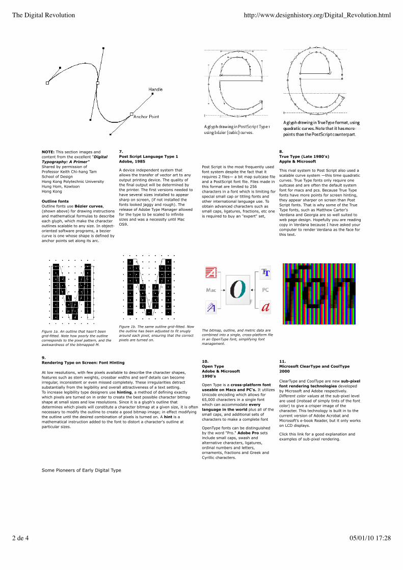
NOTE: This section images andcontent from the excellent "DigitalTypography: A Primer"Shared by permission ofProfessor Keith Chi-hang TamSchool of DesignHong Kong Polytechnic UniversityHung Hom, KowloonHong Kong
Outline fontsOutline fonts use Bézier curves,(shown above) for drawing instructionsand mathematical formulas to describeeach glyph, which make the characteroutlines scalable to any size. In object-oriented software programs, a beziercurve is one whose shape is defined byanchor points set along its arc.
7.Post Script Language Type 1Adobe, 1985
A device independent system thatallows the transfer of vector art to anyoutput printing device. The quality ofthe final output will be determined bythe printer. The first versions needed tohave several sizes installed to appearsharp on screen, (if not installed thefonts looked jaggy and rough). Therelease of Adobe Type Manager allowedfor the type to be scaled to infinitesizes and was a necessity until MacOS9.
Post Script is the most frequently usedfont system despite the fact that itrequires 2 files— a bit map suitcase fileand a PostScript font file. Files made inthis format are limited to 256characters in a font which is limiting forspecial small cap or titling fonts andother international language use. Toobtain advanced characters such assmall caps, ligatures, fractions, etc oneis required to buy an "expert" set,
8.True Type (Late 1980's)Apple & Microsoft
This rival system to Post Script also used ascalable curve system —this time quadraticcurves. True Type fonts only require onesuitcase and are often the default systemfont for macs and pcs. Because True Typefonts have more points for screen hinting,they appear sharper on screen than PostScript fonts. That is why some of the TrueType fonts, such as Matthew Carter'sVerdana and Georgia are so well suited toweb page design. Hopefully you are readingcopy in Verdana because I have asked yourcomputer to render Verdana as the face forthis text.
Figure 1a. An outline that hasn't beengrid-fitted. Note how poorly the outlinecorresponds to the pixel pattern, and theawkwardness of the bitmapped M.
Figure 1b. The same outline grid-fitted. Nowthe outline has been adjusted to fit snuglyaround each pixel, ensuring that the correctpixels are turned on.
The bitmap, outline, and metric data arecombined into a single, cross-platform filein an OpenType font, simplifying fontmanagement.
9.Rendering Type on Screen: Font Hinting
At low resolutions, with few pixels available to describe the character shapes,features such as stem weights, crossbar widths and serif details can becomeirregular, inconsistent or even missed completely. These irregularities detractsubstantially from the legibility and overall attractiveness of a text setting.To increase legibility type designers use hinting, a method of defining exactlywhich pixels are turned on in order to create the best possible character bitmapshape at small sizes and low resolutions. Since it is a glyph's outline thatdetermines which pixels will constitute a character bitmap at a given size, it is oftennecessary to modify the outline to create a good bitmap image; in effect modifyingthe outline until the desired combination of pixels is turned on. A hint is amathematical instruction added to the font to distort a character's outline atparticular sizes.
10.Open TypeAdobe & Microsoft1990's
Open Type is a cross-platform fontuseable on Macs and PC's. It utilizesUnicode encoding which allows for65,000 characters in a single fontwhich can accommodate everylanguage in the world plus all of thesmall caps, and additional sets ofcharacters to make a complete font
OpenType fonts can be distinguishedby the word "Pro." Adobe Pro setsinclude small caps, swash andalternative characters, ligatures,ordinal numbers and letters,ornaments, fractions and Greek andCyrillic characters.
11.Microsoft ClearType and CoolType2000
ClearType and CoolType are new sub-pixelfont rendering technologies developedby Microsoft and Adobe respectively.Different color values at the sub-pixel levelare used (instead of simply tints of the fontcolor) to give a crisper image of thecharacter. This technology is built in to thecurrent version of Adobe Acrobat andMicrosoft’s e-book Reader, but it only workson LCD displays.
Click this link for a good explanation andexamples of sub-pixel rendering.
Some Pioneers of Early Digital Type
The Digital Revolution http://www.designhistory.org/Digital_Revolution.html
2 de 4 05/01/10 17:28
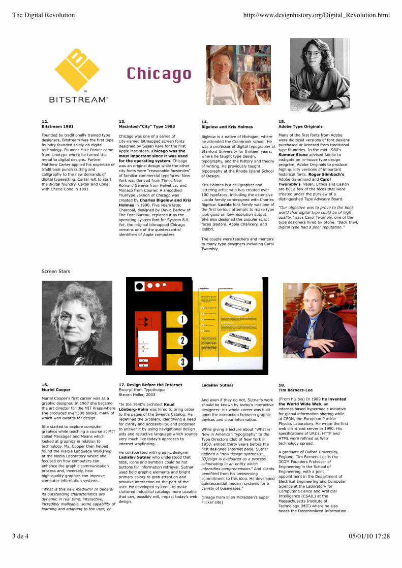
12.Bitstream 1981
Founded by traditionally trained typedesigners, Bitstream was the first typefoundry founded solely on digitaltechnology. Founder Mike Parker camefrom Linotype where he turned themetal to digital designs. PartnerMatthew Carter applied his expertise oftraditional punch cutting andcalligraphy to the new demands ofdigital typesetting. Carter left to startthe digital foundry, Carter and Conewith Cherie Cone in 1991
13.Macintosh"City" Type 1983
Chicago was one of a series ofcity-named bitmapped screen fontsdesigned by Susan Kare for the firstApple Macintosh. Chicago was themost important since it was usedfor the operating system. Chicagowas an original design while the othercity fonts were “reasonable facsimiles”of familiar commercial typefaces: NewYork was derived from Times NewRoman; Geneva from Helvetica; andMonaco from Courier. A smoothedTrueType version of Chicago wascreated by Charles Bigelow and KrisHolmes in 1990. Five years later,Charcoal, designed by David Berlow ofThe Font Bureau, replaced it as theoperating system font for System 8.0.Yet, the original bitmapped Chicagoremains one of the quintessentialidentifiers of Apple computers
14.Bigelow and Kris Holmes
Bigleow is a native of Michigan, wherehe attended the Cranbrook school. Hewas a professor of digital typography atStanford University for thirteen years,where he taught type design,typography, and the history and theoryof writing. He previously taughttypography at the Rhode Island Schoolof Design.
Kris Holmes is a calligrapher andlettering artist who has created over100 typefaces, including the extensiveLucida family co-designed with CharlesBigelow. Lucida font family was one ofthe first serious attempts to make typelook good on low-resolution output.She also designed the popular scriptfaces Isadora, Apple Chancery, andKolibri.
The couple were teachers and mentorsto many type designers including CarolTwombly.
15.Adobe Type Originals
Many of the first fonts from Adobewere digitized versions of font designspurchased or licensed from traditionaltype foundries. In the mid-1980'sSumner Stone advised Adobe toinstigate an in-house type designprogram, Adobe Originals to producehigh quality versions of importanthistorical fonts. Roger Slimbach'sAdobe Garamond and CarolTwombly's Trajan, Lithos and Caslonare but a few of the faces that werecreated under the purview of adistinguished Type Advisory Board.
"Our objective was to prove to the bookworld that digital type could be of highquality," says Carol Twombly, one of thetype designers hired by Stone. "Back then,digital type had a poor reputation."
Screen Stars
16.Muriel Cooper
Muriel Cooper's first career was as agraphic designer. In 1967 she becamethe art director for the MIT Press whereshe produced over 500 books, many ofwhich won awards for design.
She started to explore computergraphics while teaching a course at MITcalled Messages and Means whichlooked at graphics in relation totechnology. Ms. Cooper then helpedfound the Visible Language Workshopat the Media Laboratory where shefocused on how computers canenhance the graphic communicationprocess and, inversely, howhigh-quality graphics can improvecomputer information systems.
“What is this new medium? In generalits outstanding characteristics aredynamic in real time, interactive,incredibly malleable, some capability oflearning and adapting to the user, or
17. Design Before the InternetExcerpt from TypothequeSteven Heller, 2003
"In the 1940's architect KnudLönberg-Holm was hired to bring orderto the pages of the Sweet's Catalog. Heredefined the problem, identifying a needfor clarity and accessibility, and proposedto answer it by using navigational designaids and reductive language-which soundsvery much like today's approach tointernet wayfinding.
He collaborated with graphic designerLadislav Sutnar who understood thattabs, icons and symbols could be hotbuttons for information retrieval. Sutnarused bold graphic elements and brightprimary colors to grab attention andprovoke interaction on the part of theuser. He developed systems to makecluttered industrial catalogs more useablethat can, possibly will, impact today’s webdesign.
Ladislav Sutnar
And even if they do not, Sutnar’s workshould be known by today’s interactivedesigners: his whole career was builtupon the interaction between graphicdevices and clear information.
While giving a lecture about "What isNew in American Typography" to theType Directors Club of New York in1950, almost thirty years before thefirst designed Internet page, Sutnardefined a “new design synthesis:...[D]esign is evaluated as a processculminating in an entity whichintensifies comprehension.” And clientsbenefited from his unswervingcommitment to this idea. He developedquintessential modern systems for avariety of businesses."
(Image from Ellen McFadden's superFlicker site)
18.Tim Berners-Lee
(From his bio) In 1989 he inventedthe World Wide Web, aninternet-based hypermedia initiativefor global information sharing whileat CERN, the European ParticlePhysics Laboratory. He wrote the firstweb client and server in 1990. Hisspecifications of URL's, HTTP andHTML were refined as Webtechnology spread.
A graduate of Oxford University,England, Tim Berners-Lee is the3COM Founders Professor ofEngineering in the School ofEngineering, with a jointappointment in the Department ofElectrical Engineering and ComputerScience at the Laboratory forComputer Science and ArtificialIntelligence (CSAIL) at theMassachusetts Institute ofTechnology (MIT) where he alsoheads the Decentralized Information
The Digital Revolution http://www.designhistory.org/Digital_Revolution.html
3 de 4 05/01/10 17:28

to information, or to some other set ofrelationships. Our goal is to makeinformation into some form ofcommunication…Information by itselfdoes not have the level of ‘filtering’thatdesign brings to it.”
MIT Obituary for Muriel Cooper, 1994
Group (DIG). He is co-Director of thenew Web Science Research Initiative(WSRI) and is a Professor in theComputer Science Department at theUniversity of Southampton, UK. Hedirects the World Wide WebConsortium, founded in 1994
Thank you Mr. Berners-Lee.
19.The Impact of the Computer and Digital Type on Graphic Designers
"As Gerald Lang has wisely observed, the computer is not a tool but it is a simulator of tools. One of the things it simulates isa typesetting machine. With the spread of the personal computer, millions of people have found themselves transformed intosimulations of typesetters, whether or not they wished to be so."
A Short History of the Printed Word, Robert Bringhurst & Warren Chappell, Hartley & Marks, 1999.
Once "desktop publishing" wasmainstreamed there was quantum shiftin the role of the graphic designer.Many design support services closed orconverted to the digital technology.
1. Graphic designers were forced to takeon the roles of typesetting and pre-pressproduction, formerly not theirresponsibility. The graphic designer's handskills were surpassed by the need fordigital expertise.
2. As Johanna Drucker has pointedout "The tools of the designer wereconfused with the skills of the designer...The accessibility of production toolsundercut the design profession since"anyone" could make a flier or abrochure."
3. Designers were now required to spendthousands of dollars on constantly updatinghardware and software. They mustcontinually upgrade their skills --now at themercy of the industries they helpedpromote.
Return to the lecture list
The Digital Revolution http://www.designhistory.org/Digital_Revolution.html
4 de 4 05/01/10 17:28

Joseph Muller-Brockmann 1962
1.The International Style
In Switzerland, just after World War II,elements of Futurism, Constructivism and theBauhaus were distilled into a utopian systemof grids, sans serif type and neutrality knownas the International Style. The visual systemwas based upon the belief that thetypography should be totally clear allowing nodistraction from the content.This visual order had no links to historicaltraditions and eschewed any references toculture or geography. Its adaptability to anyplace and application — architecture,furniture, product and graphic design—allowed it to become a world-wide style, orinternational style.
Below: Modernism must be on everything!--a winelabel by Massimo Vignelli
The Corporate Takeover of AmericanModernism
The stylistic influences of Modernism and TheInternational Style on American graphicdesigners may have originated in the work ofthe European Futurists, the Constructivists orthe designers of the Bauhaus, but the socialutopianism of those movements neverreached the United States. Ironically this stylewas used by postwar global capitalists topromote their large multi-nationalcorporations. The abstraction and simplicity ofthis style worked well as a unifying languageof corporate identification across continents.
2.Reactions to Modernism: Pop Art
A movement that blurred the lines betweenart, commerce and popular culture. Afterthe large-scale pop art exhibition at theSidney Janis Gallery in New York in 1962,Pop Art established itself as a serious,recognized form of art. This exhibitionbecame a turning point for Modernismwhen a series of critics foresaw the end ofmodernism and the beginning of thepostmodern era. Although Pop wastreated more as entertainment, it had aserious impact on the period. LeadingAmerican artists of the Pop Art movementwere Andy Warhol (above), RoyLichtenstein (below).
1.Punk
The punk phenomenon (London, c. 1976)expressed a rejection of prevailing values inways that extended beyond the music. Britishpunk fashion deliberately outraged proprietywith the highly theatrical use of cosmeticsand hairstyles, clothing typically adapted ormutilated existing objects for artistic effect:pants and shirts were cut, torn, or wrappedwith tape, and written on with marker ordefaced with paint; safety pins and razorblades were used as jewelry.
Punk included elements of irony, absurdisthumor and genuine suspicion of mainstreamculture and values.The DIY (Do it Yourself)aesthetic of punk created a thrivingunderground press.
In March 13, 2001, an English panel ofjudges composed of editors and artists gavetheir highest honor to the controversialartwork of Jamie Reid (top), calling it the"best record cover ever produced." More...
(above) Reed poster, Anarchy in the UKauctioned by Christie's.
1.Post Modern Architecture
The term Postmodernism designates aninternational architectural movement thatemerged in the 1960's. The movementlargely has been a reaction to theorthodoxy, austerity, and formal absolutismof the International Style.
The practitioners of postmodern architecturetended to reemphasize elements ofmetaphor, symbol, and content in theircredos and their work. They share aninterest in mass, surface colors, andtextures and frequently use unorthodoxbuilding materials.
Robert Venturi and Denise Scott Brownrealized the first post -modern structure insuburban Philadelphia in 1961. (above)They used the vernacular elements ofchimney and arched doorway to signify atraditional home environment.
"In addition to the immediacy of its uniqueformal and functional qualities, the house isrich in references to historic architecture.The monumental street facade alludes toMichelangelo's Porta Pia in Rome and theback wall of the Nymphaeum at Palladio andAlessandro Vittoria's Villa Barbaro at Maser.On the other hand, the broken pedimentrecalls the 'duality' of the facade of LuigiMoretti's apartment house on the Via Parioliin Rome." See quote source
New Wave
After Modernism http://www.designhistory.org/Post_mod.html
1 de 4 05/01/10 17:28
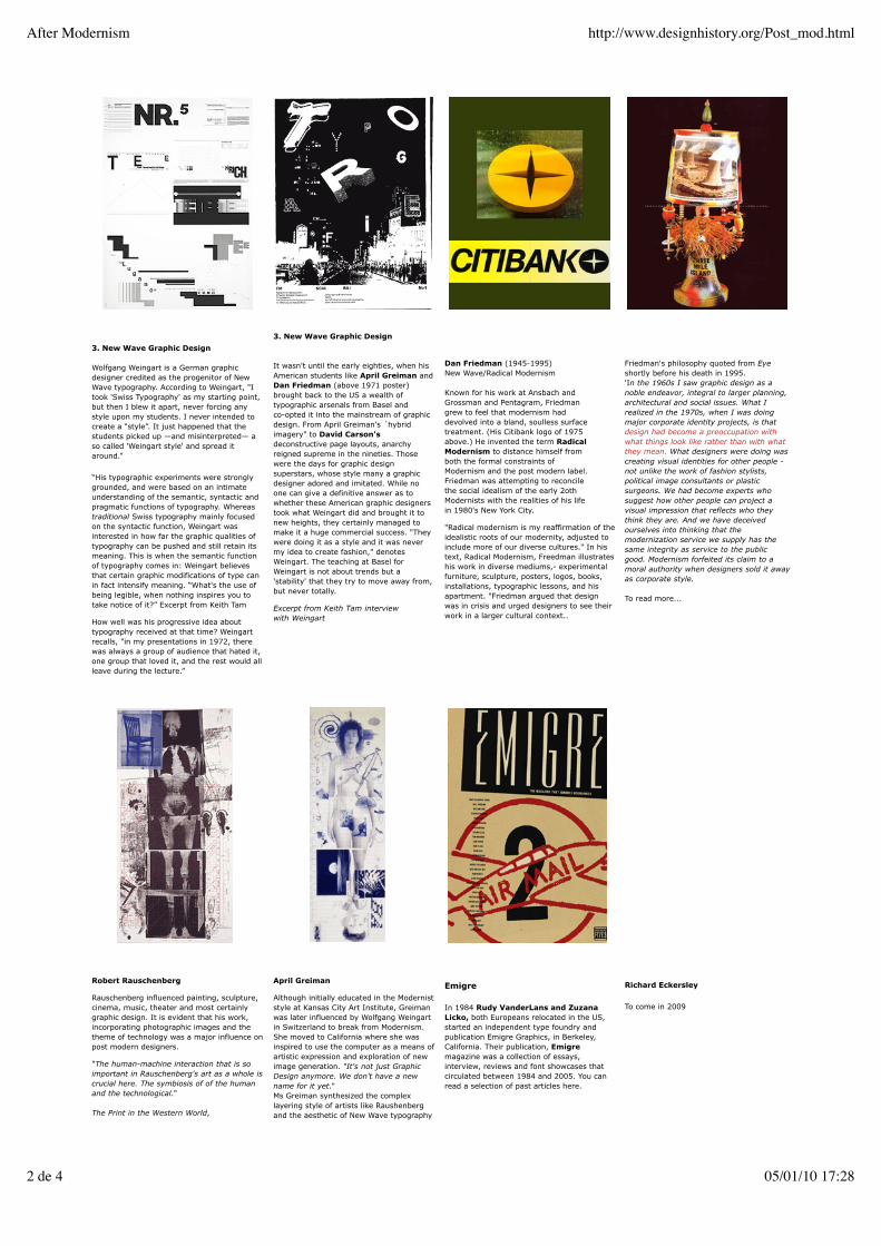
3. New Wave Graphic Design
Wolfgang Weingart is a German graphicdesigner credited as the progenitor of NewWave typography. According to Weingart, "Itook 'Swiss Typography' as my starting point,but then I blew it apart, never forcing anystyle upon my students. I never intended tocreate a “style”. It just happened that thestudents picked up —and misinterpreted— aso called 'Weingart style' and spread itaround.”
“His typographic experiments were stronglygrounded, and were based on an intimateunderstanding of the semantic, syntactic andpragmatic functions of typography. Whereastraditional Swiss typography mainly focusedon the syntactic function, Weingart wasinterested in how far the graphic qualities oftypography can be pushed and still retain itsmeaning. This is when the semantic functionof typography comes in: Weingart believesthat certain graphic modifications of type canin fact intensify meaning. “What's the use ofbeing legible, when nothing inspires you totake notice of it?” Excerpt from Keith Tam
How well was his progressive idea abouttypography received at that time? Weingartrecalls, "in my presentations in 1972, therewas always a group of audience that hated it,one group that loved it, and the rest would allleave during the lecture.”
3. New Wave Graphic Design
It wasn't until the early eighties, when hisAmerican students like April Greiman andDan Friedman (above 1971 poster)brought back to the US a wealth oftypographic arsenals from Basel andco-opted it into the mainstream of graphicdesign. From April Greiman's ´hybridimagery" to David Carson'sdeconstructive page layouts, anarchyreigned supreme in the nineties. Thosewere the days for graphic designsuperstars, whose style many a graphicdesigner adored and imitated. While noone can give a definitive answer as towhether these American graphic designerstook what Weingart did and brought it tonew heights, they certainly managed tomake it a huge commercial success. "Theywere doing it as a style and it was nevermy idea to create fashion," denotesWeingart. The teaching at Basel forWeingart is not about trends but a'stability' that they try to move away from,but never totally.
Excerpt from Keith Tam interviewwith Weingart
Dan Friedman (1945-1995)New Wave/Radical Modernism
Known for his work at Ansbach andGrossman and Pentagram, Friedmangrew to feel that modernism haddevolved into a bland, soulless surfacetreatment. (His Citibank logo of 1975above.) He invented the term RadicalModernism to distance himself fromboth the formal constraints ofModernism and the post modern label.Friedman was attempting to reconcilethe social idealism of the early 2othModernists with the realities of his lifein 1980's New York City.
"Radical modernism is my reaffirmation of theidealistic roots of our modernity, adjusted toinclude more of our diverse cultures." In histext, Radical Modernism, Freedman illustrateshis work in diverse mediums,- experimentalfurniture, sculpture, posters, logos, books,installations, typographic lessons, and hisapartment. "Friedman argued that designwas in crisis and urged designers to see theirwork in a larger cultural context..
Friedman's philosophy quoted from Eyeshortly before his death in 1995.'In the 1960s I saw graphic design as anoble endeavor, integral to larger planning,architectural and social issues. What Irealized in the 1970s, when I was doingmajor corporate identity projects, is thatdesign had become a preoccupation withwhat things look like rather than with whatthey mean. What designers were doing wascreating visual identities for other people -not unlike the work of fashion stylists,political image consultants or plasticsurgeons. We had become experts whosuggest how other people can project avisual impression that reflects who theythink they are. And we have deceivedourselves into thinking that themodernization service we supply has thesame integrity as service to the publicgood. Modernism forfeited its claim to amoral authority when designers sold it awayas corporate style.
To read more...
Robert Rauschenberg
Rauschenberg influenced painting, sculpture,cinema, music, theater and most certainlygraphic design. It is evident that his work,incorporating photographic images and thetheme of technology was a major influence onpost modern designers.
"The human-machine interaction that is soimportant in Rauschenberg's art as a whole iscrucial here. The symbiosis of of the humanand the technological."
The Print in the Western World,
April Greiman
Although initially educated in the Moderniststyle at Kansas City Art Institute, Greimanwas later influenced by Wolfgang Weingartin Switzerland to break from Modernism.She moved to California where she wasinspired to use the computer as a means ofartistic expression and exploration of newimage generation. "It's not just GraphicDesign anymore. We don't have a newname for it yet."Ms Greiman synthesized the complexlayering style of artists like Raushenbergand the aesthetic of New Wave typography
Emigre
In 1984 Rudy VanderLans and ZuzanaLicko, both Europeans relocated in the US,started an independent type foundry andpublication Emigre Graphics, in Berkeley,California. Their publication, Emigremagazine was a collection of essays,interview, reviews and font showcases thatcirculated between 1984 and 2005. You canread a selection of past articles here.
Richard Eckersley
To come in 2009
After Modernism http://www.designhistory.org/Post_mod.html
2 de 4 05/01/10 17:28

Linda Hults,1996
(above) Booster from the 'Booster andSeven Studies'Minneapolis Institute of Arts, (1970)
Soviet/American Array III, 1988
with the new capabilities of the computerto become a visionary pioneer of digitaldesign.
(Above) Her 1987 life-sized centerfold forMinneapolis Walker Art Center's DesignQuarterly has become an icon of the digitalera. Below her US Postage Stamp, 1995
Designing Outside the Lines
\
Design and Social Conscience
Tibor Kalman | M & Co.| Please read the entire article on this inspiring social activistdesigner on the AIGA Medallist web site ..here..(excerpt below)
When the clothing company Esprit, which had prided itself as being socially liberal andenvironmentally friendly, was awarded the 1986 AlGA Design Leadership award, an irateTibor anonymously distributed leaflets during the awards ceremony at the AlGA NationalDesign Conference in San Francisco protesting the company's exploitation of Asian laborers.Tibor believed that award-winning design was not separate from the entire corporate ethicand argued that many bad companies have great design. In 1989, as co-chair with MiltonGlaser of the AlGA's Dangerous Ideas conference in San Antonio, he urged designers toquestion the effects of their work on the environment and refuse to accept any client'sproduct at face value. He is most known for his work with Benetton Colors Magazine.Heused the magazine as a vehicle to explore contemporary social issues including aids, racism,power and sex.
Dared to Design Without a Licence
David Carson
David Carson did not go to art school but he did earn a degree in Sociology and he was apretty decent surfer. With a very limited exposure to formal graphic design education, henevertheless learned enough to pursue experiments with typography. Carson created someunorthodox, interesting and highly controversial work which he showcased in Ray GunMagazine in 1992. Despite some initial criticism, Carson won over the hearts and minds ofmany—as evidenced in this quote from his current web site:Typography, a title published by Graphis, lists Carson as a "Master of Typography." I.D.magazine chose Carson for their list of "America's most innovative designers". A feature innewsweek magazine said of Carson "he changed the public face of graphic design"... Emigredevoted an entire issue to Carson, the only American designer to be so honored in themagazine's history. And in April 2004, Creative Review magazine calls David, "the mostfamous graphic designer on the planet".
The "D" word + Cranbrook
After Modernism http://www.designhistory.org/Post_mod.html
3 de 4 05/01/10 17:28

Deconstruction in Literature
Jacques Derrida: French Proponent ofDeconconstruction in LiteratureFor a semi-comprehensible description gohere:
Derrida's work focuses on language. Hecontends that the traditional, or metaphysicalway of reading makes a number of falseassumptions about the nature of texts. Atraditional reader believes that language iscapable of expressing ideas without changingthem, that in the hierarchy of languagewriting is secondary to speech, and that theauthor of a text is the source of its meaning.Derrida's deconstructive style of readingsubverts these assumptions and challengesthe idea that a text has an unchanging,unified meaning. Western culture has tendedto assume that speech is a clear and directway to communicate. Drawing onpsychoanalysis and linguistics, Derridaquestions this assumption. As a result, theauthor's intentions in speaking cannot beunconditionally accepted. This multiplies thenumber of legitimate interpretations of a text.
Deconstruction shows the multiple layers ofmeaning at work in language. Bydeconstructing the works of previousscholars, Derrida attempts to show thatlanguage is constantly shifting. AlthoughDerrida's thought is sometimes portrayed bycritics as destructive of philosophy,deconstruction can be better understood asshowing the unavoidable tensions betweenthe ideals of clarity and coherence thatgovern philosophy and the inevitableshortcomings that accompany its production.More...
Deconstructed Typography
The Cranbrook Academy of Art(Michigan), under the direction ofProfessors Michael and KatherineMcCoy, became a center of Post-Modernistdiscussion from the mid 1970s. Whatemerged became know as the 'CranbrookDiscourse' widely publicized intersection ofpost-structuralism and graphic design.
Designers at Cranbrook had firstconfronted literary criticism when theydesigned a special issue of VisibleLanguage on contemporary French literaryaesthetics, published in the summer of1978. Daniel Libeskind, head of theCranbrook architecture program, providedthe graphic designers with a seminar inliterary theory, which prepared them todevelop their strategy: to systematicallydisintegrate the the series of essays byexpanding the spaces between lines andwords and pushing the footnotes into thespace normally reserved for the main text.French Currents of the Letter, whichoutraged designers committed to theestablished ideologies of problem-solvingand direct communication, remains acontroversial landmark in experimentalgraphic design."
From Ellen LuptonDesign Writing Research
Student Ed Fella, came to Cranbrookafter over 20 years as a commercialartist. His hand-crafted aestheticexplored a contrast to immaculatelyfinished computer-aided graphicdesign. Go see his work.
Elliot EarlsThe current chair of 2D design atCranbrook moves the conversationforward."Paul Rand is a pygmy walking in thefootsteps of giants. In the essay Idiscuss the idea that Paul Rand is stillthe archetype for the vast majority ofgraphic/info/interactive designers, andthat he was a pygmy raised by giants.I postulate that he fundamentallymisunderstood the work of men likeKurt Schwitters, and that theinstitutions of design (schools,museums and magazines) are bastionsof neo-conservatism that seek todefine design solely in terms of adesigner/client relationship and atraditional problem solvingmethodology...There was a period afterWorld War I where some of thegreatest artists of the time (the giantsof which I speak) were as important tothe history of architecture, painting orphotography as they were to thehistory of design. I hear all of the timethat what I do is not design. Well,frankly, I see that as a damningindictment of our times, not of mywork." More...
above Elliot Earls
Go see Cranbrook today
2000 The Designer | Artist
Stephan Sagmeister1996
“My goal for the rest of my life isto touch someone's heart withdesign”
Austrian Sagmeister's work can makeviewers feel a bit uneasy — chickens withtheir heads cut off, words scratched intohis own skin and giant cow's tongues.Sagmeister "defines how to get attention ina way that creates an idea."Now located in New York City his smallstudio, Sagmeister Inc, turns out "allthings printed."
I'd like to end the semester with a touchinglittle film about Sagmeister. "Things I HaveLearned in My Life So Far" on the HillmanCurtis web site. It is worth the 5 minutes.
(PS. There is a Things I Have Learned in MyLife web site too.)
Return to the lecture list
After Modernism http://www.designhistory.org/Post_mod.html
4 de 4 05/01/10 17:28