
QUALITY CONTROL - MDE-Labmde-lab.aegean.gr/images/stories/docs/HealthCare_Quality.pdf · Quality in...
36
Quality in Health Care Quality in general terms means meeting and exceeding customer expectations. In health care, the definition of customer and the criteria for quality are complicated matters in comparison to the meaning of those terms in industry. Obviously, it is patients who receive health care services. However, what they receive is often not understood by them, when diagnosis and therapy are purchased on their behalf by providers. Hence, quality in health care is evaluated from differing perspectives of recipients and third-party payers. Most clinicians accept the Institute of Medicine (1990) definition: “Quality is the extent to which health services for individuals and populations increase the likelihood of desired health outcomes and are consistent with current professional knowledge.” In accordance with this definition, health care organizations have developed many valid technical measures to evaluate diagnostic and therapeu- tic clinical processes. A different set of measures are based on health care out- comes that become available or are obtained at the same time or after health services were rendered. If the outcomes can be related to a process or series of processes known to improve outcomes, they also are considered to be valid measures of quality. However, an outcome measure that is related to patients’ or clinicians’ ex- perience, particularly their feelings about processes (collected using satisfaction CHAPTER TWELVE QUALITY CONTROL 272 Y
Transcript of QUALITY CONTROL - MDE-Labmde-lab.aegean.gr/images/stories/docs/HealthCare_Quality.pdf · Quality in...

Quality in Health Care
Quality in general terms means meeting and exceeding customer expectations.
In health care, the definition of customer and the criteria for quality are
complicated matters in comparison to the meaning of those terms in industry.
Obviously, it is patients who receive health care services. However, what they
receive is often not understood by them, when diagnosis and therapy are
purchased on their behalf by providers. Hence, quality in health care is evaluated
from differing perspectives of recipients and third-party payers.
Most clinicians accept the Institute of Medicine (1990) definition: “Quality
is the extent to which health services for individuals and populations increase the
likelihood of desired health outcomes and are consistent with current professional
knowledge.” In accordance with this definition, health care organizations have
developed many valid technical measures to evaluate diagnostic and therapeu-
tic clinical processes. A different set of measures are based on health care out-
comes that become available or are obtained at the same time or after health services
were rendered. If the outcomes can be related to a process or series of processes
known to improve outcomes, they also are considered to be valid measures of
quality. However, an outcome measure that is related to patients’ or clinicians’ ex-
perience, particularly their feelings about processes (collected using satisfaction
CHAPTER TWELVE
QUALITY CONTROL
272
Y

Quality Control 273
surveys), is defined as a subjective perception about the quality of care (Chassin,
1998).
Figure 12.1 illustrates Donebedian’s structure-process-outcome conceptual-
ization extended to health services. The input-throughput-output sequence fa-
cilitates conceptualizing measurements that can be taken at various stages of
providing health care services production. Applying Donebedian’s concepts, in-
puts are part of structure, comprising patients’ request for services from providers
who have facilities, staff, equipment and materials to serve them. At the next stage,
the conversion process (for example, from ill health to good health) encompasses
diagnostic and therapeutic procedures. At the third stage, outputs, patients exit
the system, at which point we assess their conditions as either treated successfully,
treated with morbidity, or mortality. Patient satisfaction surveys with follow-up give
health care managers feedback on how a patient assessed the treatment process,
the overall experience, and the final outcome.
A health care system that has less than acceptable patient satisfaction reports,
repeated morbidity, and unacceptable mortality must examine its conversion
process. That is, the health care managers must investigate what mistakes and
errors were committed systematically to produce the undesirable outcomes.
Another way to look at the maintenance of quality is how mistakes are to be
avoided—design mistake proof processes across the whole spectrum of care, to
reduce undesired outcomes. Variance in diagnostic and therapeutic interventions
and the associated errors hamper the delivery of safe, effective patient care and
add to poor outcomes. To minimize the variation and the errors—sometimes
euphemistically called “quality gaps”—and work toward completely eliminating
Structure Process Outcome
InputsConversion Process
(Throughput) Outputs
Patient,Provider, Labor,
Equipment,Supplies, Etc.
Various Hospitaland Medical Services
Transform Poor Healthto Wellness for Patients(Diagnosis, Procedures,
Treatments).
TreatedPatient
FIGURE 12.1. QUALITY MEASUREMENT.

them are major goals for health care systems. Chassin (1998) classifies the
underlying causes of “quality gaps” into three categories: 1) overutilization;
2) underutilization; and 3) misutilization.
1) Overutilization—when the potential benefit of a therapy is less than its risk,
overuse of health services affects the quality of care. Pressures for overuse of
services may come from either providers or patients. Pressures from the provider
side are: physician ownership in facilities or equipment and consequent self-
referrals, the zeal and enthusiasm of a physician to perform a procedure, specialists
performing procedures because they are expected to by their referring primary
care colleagues, and providers’ fear of malpractice suits. Pressures from the patient
side are cultural factors: expectations for physicians to perform and the desire to
have the latest, most publicized and/or technologically advanced treatment.
2) A patient’s lack of insurance or insurance that has high copayments and
deductibles can cause underutilization of necessary health care. A lack of stan-
dardization for various procedures, due to their complexity and also the over-
whelming amount of information on therapies, creates selection bias in physicians’
choices of treatment.
3) Avoidable complications, negligent care, mistakes, and mishaps create mis-
utilization of services. Health care providers who generate such conditions harm
the quality of patient care and produce poor outcomes; they also waste the
organization’s resources and increase lengths of stay (Chassin, 1998).
It is not uncommon to learn from the media about mistakes that occur in
health care facilities: patients undergoing second surgeries because something was
left in their bodies during the previous one; chemotherapy overdoses; the wrong
organs being removed; organ transplants done with mismatched blood or tissue
donors. What shows up in the media are the high profile cases, yet mistakes occur
continuously in health care organizations, and, especially in medications, with the
wrong medications given to patients or medications given before checking aller-
gies or interactions. Some of those errors occur because appropriate existing
technologies are not in place, for example, in a hospital pharmacy, use of drug
interaction software; bar coding technology to match unit dose medications to
patients; proper measurements of weight, height, age and other conditions of a
patient to avoid mistakenly calculated doses. Of course, despite the presence of
sophisticated systems, everyone must still be on guard against human error or
negligence causing such mishaps as delivering medication to a patient without
scanning, mislabeling blood tubes, ignoring the alarm sound from an IV dropper,
or not checking a patient’s oxygen supply.
Health care providers do have an arsenal of methods to deal effectively with
the problems affecting quality of care. They include the programs called quality
control (QC), total quality management (TQM), continuous quality improvement
274 Quantitative Methods in Health Care Management

Quality Control 275
(CQI), reengineering, and Six Sigma. All of these programs include data gather-
ing, analysis and statistical monitoring to identify the problem and its cause. Nev-
ertheless, the crux of the solution to quality problems lies in changing human
behavior; changing minds to perform care in new ways. That is a colossal task in
health care, especially as it involves clinicians. The hopeful aspect is that when
evidence is provided, clinicians are more willing to adopt and follow changes. Thus
health care managers and leaders should provide such evidence.
Quality Experts
The ideas behind the methodological programs listed above emanated from var-
ious experts who have contributed to and shaped contemporary methods for
improving quality. W. Edwards Deming is known for his list of fourteen items to
achieve quality in organizations. The main message of the list is that poor qual-
ity occurs as a result of the system and so should be corrected by the management.
Deming also stressed that variation in output should be reduced by identifying
particular causes that differ from random variation. Later in this chapter we will
examine statistical methods for identifying such causes in output variation. Joseph
M. Juran’s thought was geared towards what the customer wanted and he asserted
that 80 percent of quality gaps can be corrected by management through quality
planning, control, and improvement. Philip B. Crosby introduced the concept of
zero defects and stressed prevention. He pointed out that the cost of achieving
higher quality also reduces costs, hence the quality is free (Stevenson, 2002;
pp. 402–406).
Quality Certifications and Awards
Like many other organizations, health care facilities seek certifications and hope
to win prestigious quality awards so that they can gain a larger share of the market
and confidence of—in their case, their patients—and also of other customers.
Such awards are given annually to raise awareness of the desirability of quality and
to recognize those institutions that successfully pursue good quality management
in their operations. The Baldrige Award is given annually, up to two awards, for
large service organizations as well as for large manufacturers and small businesses
in the United States. The Deming Prize is given by Japan for organizations’
successful efforts to demonstrate quality.
Apart from awards, organizations can seek quality certification through the
International Organization for Standardization (ISO). The ISO is an amalga-
mation of national standardization institutes from 91 countries. The American
National Standards Institute (ANSI) is the U.S.-based participant in ISO. ISO 9000
are a set of international standards on quality management and quality assurance;

it takes one to one-and-a-half years to go through the process of documenta-
tion and on-site assessment to obtain such certification (Stevenson, 2002;
pp. 407–410).
Organizations can earn awards or achieve certifications and accreditations
by international organizations or by their own trade organizations; for instance,
hospitals are evaluated periodically by the Joint Commission on Accreditation of
Healthcare Organizations (JCAHO). For the medical group practices, the
Medical Group Management Association (MGMA) is the principal voice.
“MGMA’s 19,000 members manage and lead 11,500 organizations in which
approximately 237,000 physicians practice. MGMA leads the profession and
assists members through information, education, networking and advocacy”
(Medical Group Management Association, 2004). Quality is always a major con-
cern in those advocacy and accreditation bodies.
To comply with known standards or to establish new benchmarks, health care
providers can implement well known quality methods to improve or overhaul their
clinical care and management processes. As noted such methods include QC,
TQM and CQI as well as the more contemporary Six Sigma programs. We will
discuss the nature of those programs and examine the tools used to implement
them in health care organizations.
Total Quality Management (TQM) and Continuous
Quality Improvement (CQI)
TQM combines certain concepts introduced by the quality experts mentioned
above, to create a systematic approach for achieving better outcomes of care and
also more patient satisfaction through an organization’s continual efforts. Many
successful applications of TQM in health care have been conducted as the projects
of various provider institutions. Often the projects sought to improve the
“conversion process” through care pathways and disease management, identifi-
cation of the causes and prevention of medical errors, risk management in nurs-
ing units or in ambulatory health care, and so on.
As a systematic approach, TQM requires the dedication and combined effort
of every person in the health care organization. The success of a TQM program
depends upon how well the following steps are taken: 1) measuring patient wants
as well as needs from the providers, through surveys and focus groups; 2) designing
a process for health care service process that will meet and even exceed patient ex-
pectations; 3) designing process for health care services that is fail proof (“pókayoke”)
or fail-safe—that is, systems are designed so that they can work only one way, the safe
way (the medication system), so human error is eliminated; 4) monitoring the results
and using that information to improve the system; and 5) benchmarking the system
by comparisons to peer providers (Stevenson, 2002; pp. 470–472).
276 Quantitative Methods in Health Care Management
Quality Control 277
TQM is achieved through a team approach that creates synergies among clin-
icians, administrators and all the support staff involved in health care delivery.
TQM projects have often failed for a variety of reasons: lack of motivation, com-
munication, dedication, plan, and/or leadership; or hodgepodge implementation
of the project. To implement successful TQM projects, health care managers
see to it that standardized problem-solving techniques are adopted across the or-
ganization and for all processes. A framework for problem solving and improve-
ment activities is identified by the Deming wheel/Shewhart cycle which contains
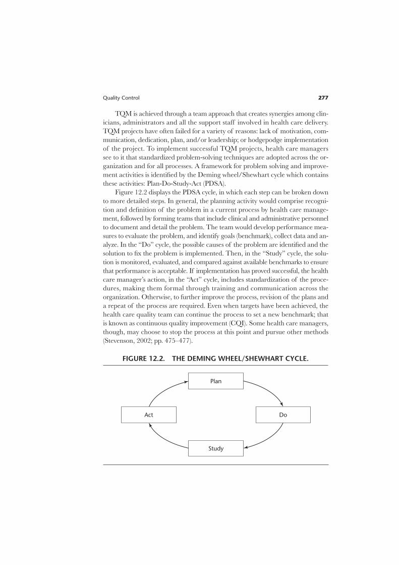
these activities: Plan-Do-Study-Act (PDSA).
Figure 12.2 displays the PDSA cycle, in which each step can be broken down
to more detailed steps. In general, the planning activity would comprise recogni-
tion and definition of the problem in a current process by health care manage-
ment, followed by forming teams that include clinical and administrative personnel
to document and detail the problem. The team would develop performance mea-
sures to evaluate the problem, and identify goals (benchmark), collect data and an-
alyze. In the “Do” cycle, the possible causes of the problem are identified and the
solution to fix the problem is implemented. Then, in the “Study” cycle, the solu-
tion is monitored, evaluated, and compared against available benchmarks to ensure
that performance is acceptable. If implementation has proved successful, the health
care manager’s action, in the “Act” cycle, includes standardization of the proce-
dures, making them formal through training and communication across the
organization. Otherwise, to further improve the process, revision of the plans and
a repeat of the process are required. Even when targets have been achieved, the
health care quality team can continue the process to set a new benchmark; that
is known as continuous quality improvement (CQI). Some health care managers,
though, may choose to stop the process at this point and pursue other methods
(Stevenson, 2002; pp. 475–477).
Plan
DoAct
Study
FIGURE 12.2. THE DEMING WHEEL/SHEWHART CYCLE.
Continuous quality improvement (CQI) of various clinical and administrative
processes is a systematic approach that also involves documentation, measurement,
and analysis. The objective for CQI is to increase patients’ and clinicians’ satis-
faction, while achieving higher quality, reducing waste and cost, and increasing pro-
ductivity. The CQI is a detailed version of a PDSA cycle that comprises: 1) selecting
a process that needs an improvement; 2) studying and documenting the current
process; 3) seeking ways to improve it; 4) designing an improved process;
5) implementing the new process, 6) monitoring and evaluation; 7) documenting
the process if it worked successfully and publicizing it through the health care
organization; or 8) if it did not achieve its goals, restarting from step 1.
Six Sigma
Six Sigma is one of the latest quality improvement concepts to have emerged dur-
ing the 1990s. Its name comes from the measure of variation from the normal dis-
tribution (six standard deviations). General Electric and Motorola are major
companies that have successfully adopted a Six Sigma quality strategy and been
examples for other organizations that followed. Adopting a Six Sigma strategy
as a quality goal sets tolerance levels for errors (defectives) to levels that occur only
3.4 times per million observations. The defect rates in health care can be de-
fined in such distinct areas as public health, inpatient care, ambulatory care, and
so on. For example, infant mortality rates can be considered as defects per million
population. Similarly, rate of deaths caused by anesthesia during surgery or of in-
juries to patients due to negligence are measures of defects for inpatient facilities
(Chassin, 1998). According to Chassin (1998), health care organizations have re-
duced the deaths caused by anesthesia from twenty-five to fifty per million cases to
five per million cases since the 1980s through improved monitoring techniques,
adaptation of practice guidelines, and other systematic approaches to reduce errors.
Hence, this is one area that comes very close to Six Sigma standards (Chassin,
1998). That example portrays the essence of the Six Sigma method: the defects are
measured in terms of deviation from the norm, and strategies are adopted to
eliminate them through a process and get as close to zero defects as possible.
Adopting Six Sigma strategies in service systems, especially in health care, has
lagged by about a dozen years. According to various sources, about one percent
of health care providers in the United States have deployed Six Sigma methods.
It is expected that the adoption rate will increase (Redinius, 2004).
Deployment of Six Sigma to improve the quality of health care and delivery
performance can be considered in the following areas: clinical excellence, service
delivery, service costs, and customer satisfaction. The deployment can use either
of these methodological sequences: DMAIC—define, measure, analyze, improve,
and control; or DMADV—define, measure, analyze, design, and verify. DMAIC is
278 Quantitative Methods in Health Care Management

Quality Control 279
generally used to improve existing systems that have fallen below Six Sigma levels,
DMADV is used to design and develop new processes or products at Six Sigma
levels (Stahl, Schultz, and Pexton, 2003).
The essence of Six Sigma methodologies is both improvement of the knowl-
edge and capability of employees, and also behavior changes through training.
Thus, Six Sigma employs a classification system that identifies education and train-
ing for employees, project managers and executives. Emulating karate honors, cer-
tification is granted at Green Belt (GB), Black Belt (BB) and Master Black Belts
(MBB) levels. Green Belts are the employees who have taken the training courses
on implementing the projects. Black Belts are the project leaders, whose training
may be more intensive; they may complete several projects a year depending upon
their size and scope. Master Black Belts are generally assigned to an area that needs
improvement (for example, human resources), to ensure that objectives are set,
targets are identified, plans are made, and resources are secured to implement the
projects in their assigned area. MBBs may oversee many Six Sigma projects at a
time, working with various BBs.
Six Sigma projects require BBs and MBBs to have expertise in basic statisti-
cal tools such as Pareto Diagrams, descriptive and higher level statistics includ-
ing regression, and statistical modeling techniques as well as control processes.
In addition to statistical concepts, they are expected to understand project man-
agement, finance, leadership, measurement through sociometric (survey) analysis,
reliability and validity.
Examples of successful Six Sigma deployments in health care include reduc-
tion of emergency room diversions, fewer errors in operating rooms’ cart materi-
als, reduced bloodstream infections in an ICU, and improved radiology turnaround
time (Stahl, Schultz, and Pexton, 2003). As health care organizations increase
scrutiny in monitoring clinical outcomes, health care managers must develop and
adopt fail proof systems to achieve the desired quality levels (Morrisey, 2004).
In order to define, measure, analyze, and monitor systems in health delivery,
managers need various quality deployment tools. These tools are useful whether
the program used is quality management through TQM or DMAIC, or quality
improvement through CQI or DMADV.
Quality Measurement and Control Techniques
Process Variability
In the delivery of health care, there are many occasions when an error can hap-
pen in the tasks performed by physicians, nurses, or allied health professionals such
as radiation or physical therapists. Often the same task may not even be performed

the same way for all patients, though minor alterations within defined limits can
be acceptable. When, however, provider performance falls beyond acceptable lim-
its, the errors that occur require investigation and correction. In order to detect
noteworthy variations in process, or tendencies that may cause unacceptable
levels of errors, health care managers must monitor the processes for quality, using
various charts. The intent of the monitoring is to distinguish between random and
nonrandom variation. The common variations in process variability that are
caused by natural incidences are in general not repetitive, but various minor fac-
tors due to chance and are called random variation. If the cause of variation
is systematic, not natural, and the source of the variation is identifiable, the process
variation is called nonrandom variation. In health care, nonrandom variation
may occur by not following procedures, using defective materials, fatigue, care-
lessness, or not having appropriate training or orientation to the work situation,
among many reasons.
Process variation is the range of natural variability in a process for which
health care managers use control charts to monitor the measurements. If the nat-
ural variability or the presence of random variation exceeds tolerances set by con-
trol charts, then the process is not meeting the design specifications.
Figure 12.3 shows a chart with design specifications to achieve a certain level of
quality as determined by the lower confidence level (LCL) and the upper confidence
280 Quantitative Methods in Health Care Management
Set DesignSpecifications forProcess Capability
Pro
cess
Vari
ab
ility
UCL
LCL
Process VariabilityMeets and ExceedsSpecifications
Process VariabilityDoes NotMeet DesignSpecifications
FIGURE 12.3. PROCESS CAPABILITY.
Quality Control 281
level (UCL). (We will show later how the LCL and UCL can be determined.) From
this chart, three possible outcomes can be seen to occur. First, the actual outcomes
can be so good that process variability would be contained in a narrower band than
the design specifications. That may be due to an excellent quality program, or on the
other hand, to design specification being too lax. In the second scenario outcomes
could occur within LCL and UCL so that the expected quality would be achieved.
However, in the third scenario, outcomes could occur beyond the design specifica-
tions, not meeting the expected quality outcomes. Then, health care managers
should focus on the causes that create such variation by conducting investigations.
Such outcomes are generally not random but systematic, and the sources in sys-
tematic factors must be found and corrected. In such situations, the health care man-
ager usually must consider redesigning the system that causes such nonrandom
outcomes. For example, high turnover and improperly trained new staff could be
one of the sources for the process variation in nursing care units. Therefore, the
health care manager may have to redesign and enforce the in-service training as well
as having to attack problems causing high staff turnovers.
Monitoring Variation through Control Charts
A control chart is a tool to display in graphic form the control limits on process
outcomes. In the hospitals, the outcomes can be staff response to patient requests,
accuracy of medications, infections, accuracy of laboratory tests, and expedience
of admissions and discharge processes, to name just some among the many that
can be monitored with control charts. The health care manager has to use the
appropriate type of control chart for the process being monitored, and that
depends on how the process is measured. For example, how many times a staff
member did not respond within the appropriate time to a patient request is a
counting process, and the variables used to measure this outcome are attributes.
Thus a c-chart for attributes is the appropriate control chart for such count-type
measurements. Similarly, if the process is measured by the percentage of the
responses received by patients that were inappropriate, or the percentage of design
specifications that were not met (for example, percentage of discharges that are
not processed within two hours of discharge orders), then the appropriate attribute-
based control chart is a p-chart. The other two commonly used charts are mean
and range charts, which monitor process mean and range. Note that mean and
range charts must be used together to monitor process variation.
Although the construction of control charts depends on the measurement
variable (monitoring attribute versus process mean/range), all control charts have
common characteristics. Each chart has a process mean and lower and upper con-
trol limits that are calculated according to the type of measurement variable. The
control limits theoretically separate random variation from nonrandom variation.
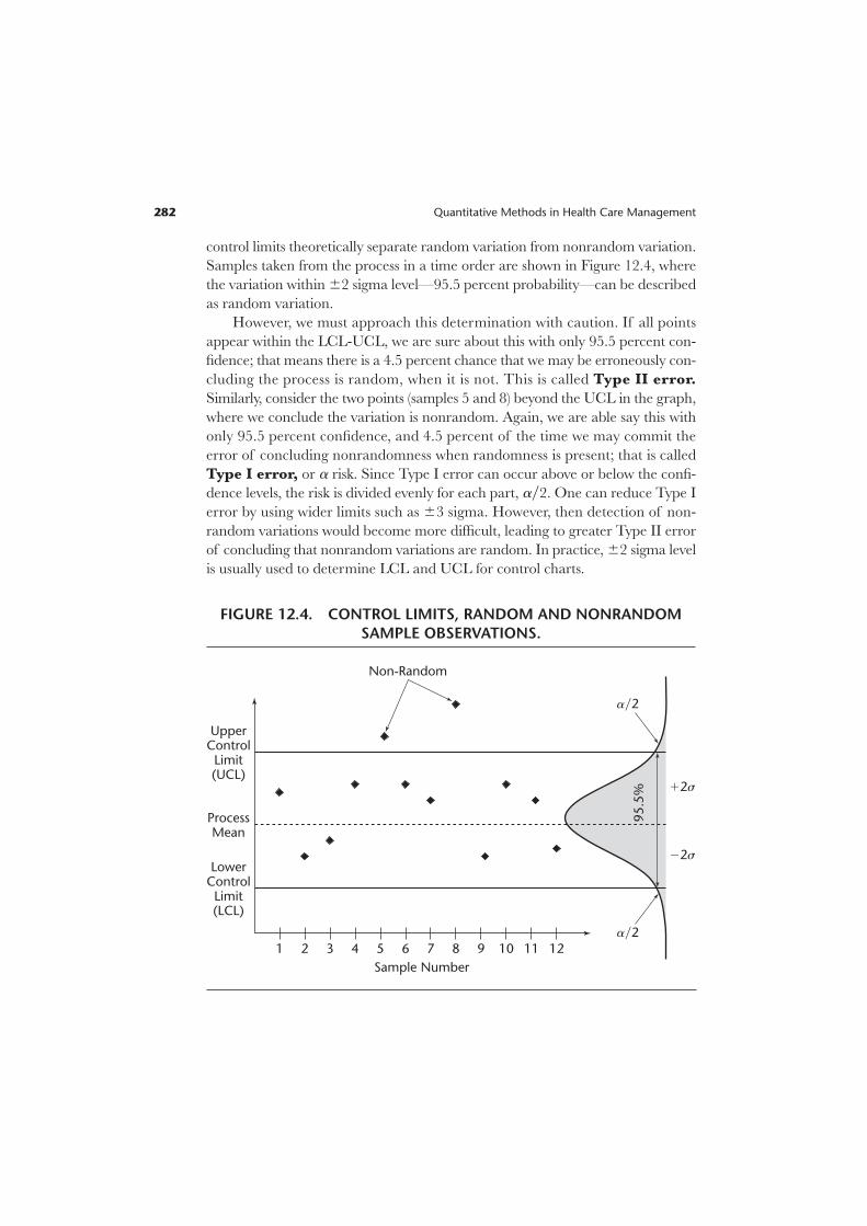
Samples taken from the process in a time order are shown in Figure 12.4, where
the variation within 62 sigma level—95.5 percent probability—can be described
as random variation.
However, we must approach this determination with caution. If all points
appear within the LCL-UCL, we are sure about this with only 95.5 percent con-
fidence; that means there is a 4.5 percent chance that we may be erroneously con-
cluding the process is random, when it is not. This is called Type II error.
Similarly, consider the two points (samples 5 and 8) beyond the UCL in the graph,
where we conclude the variation is nonrandom. Again, we are able say this with
only 95.5 percent confidence, and 4.5 percent of the time we may commit the
error of concluding nonrandomness when randomness is present; that is called
Type I error, or a risk. Since Type I error can occur above or below the confi-
dence levels, the risk is divided evenly for each part, ay2. One can reduce Type I
error by using wider limits such as 63 sigma. However, then detection of non-
random variations would become more difficult, leading to greater Type II error
of concluding that nonrandom variations are random. In practice, 62 sigma level
is usually used to determine LCL and UCL for control charts.
282 Quantitative Methods in Health Care Management
UpperControl
Limit(UCL)
LowerControl
Limit(LCL)
ProcessMean
Sample Number
1
Non-Random
95.5
% 12s
ay2
ay2
22s
2 3 4 5 6 7 8 9 10 11 12
FIGURE 12.4. CONTROL LIMITS, RANDOM AND NONRANDOM
SAMPLE OBSERVATIONS.

Quality Control 283
Control Charts for Attributes
When process characteristics can be counted, attribute-based control charts are
the appropriate way to display the monitoring process. However, counting can
be conceptualized in different ways. If the number of occurrences per unit of
measure can be counted, or there can be a count of the number of bad occur-
rences but not of nonoccurrences, then a c-chart is the appropriate tool to dis-
play monitoring. Counting also can occur for a process with only two outcomes,
good or bad (defective); in such cases, p-chart is the appropriate control chart.
The p-chart arises from binomial distribution where only two outcomes are
possible.
c-Chart. Certain processes require counting bad occurrences as quality defects.
For example, the number of wrong medications delivered in one thousand patient
days, or the number of infections occurring during a month are such occurrences.
Remember that counting occurs over a sample or over time, and that occur-
rences can be counted per unit of measure. The theoretical conceptualization of
this process is described by Poisson distribution, with a mean of c and standard
deviation of Ïcw. When there are enough samples in the quality control process,
by invoking central limit theorem we can use normal approximation to Poisson
and define the control limits of the c-chart as follows:
UCL 5 c 1 zÏcw [12.1]
LCL 5 c 2 zÏcw [12.2]
where c represents the population mean for the number of defects over a unit
(or time period). In the absence of population parameters, estimates of the sam-
ple mean and standard deviation can be used by replacing c with cw, and confidence
limits can be established as:
UCL 5 cw 1 zÏcww [12.3]
LCL 5 cw 2 zÏcww [12.4]
If LCL values are negative, for practical reasons they should be set to zero.
EXAMPLE 12.1
The number of infections from the Intensive Care Unit (ICU) at the ABC
Medical Center over a period of twenty-four months is obtained. These num-
bers are the counts of stool assay positive for toxin, segregated by month. The
patient population and other external factors such as change in provider have
been stable.
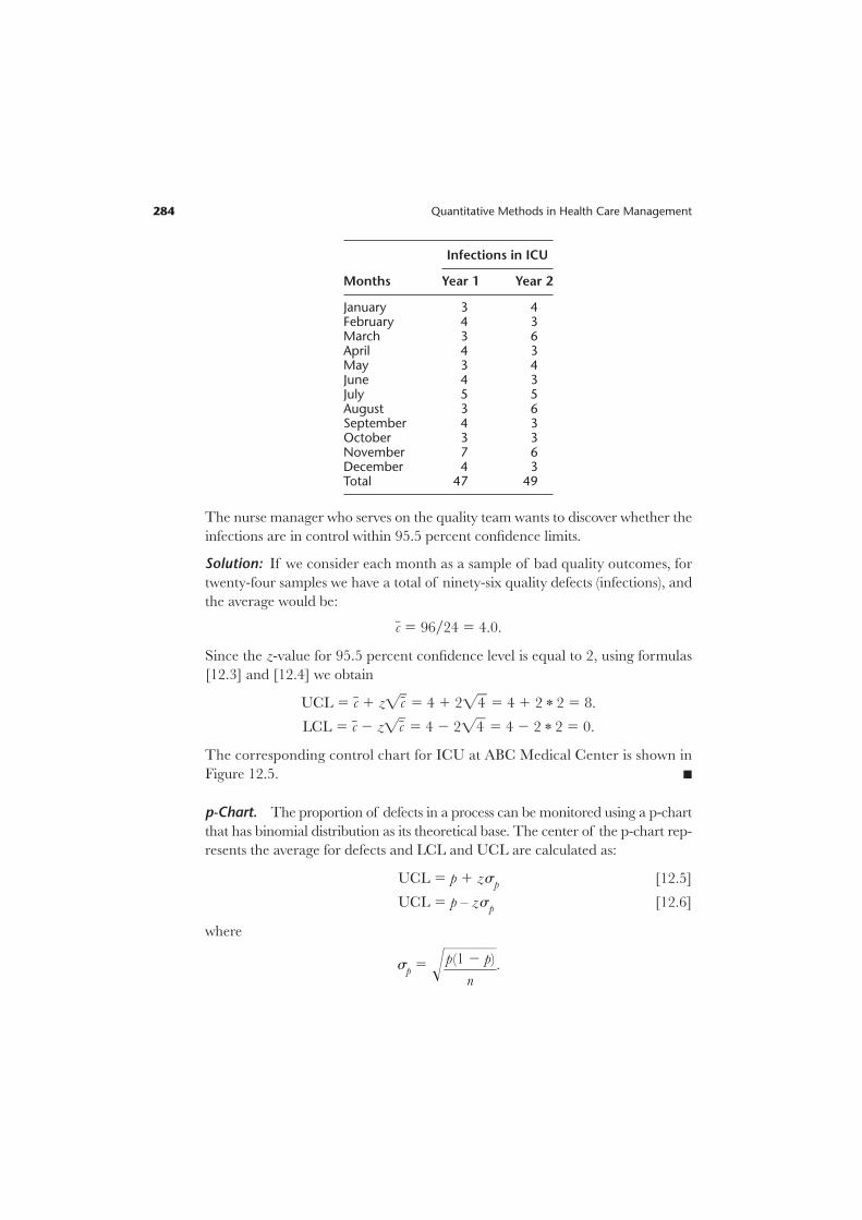
Infections in ICU
Months Year 1 Year 2
January 3 4February 4 3March 3 6April 4 3May 3 4June 4 3July 5 5August 3 6September 4 3October 3 3November 7 6December 4 3Total 47 49
The nurse manager who serves on the quality team wants to discover whether the
infections are in control within 95.5 percent confidence limits.
Solution: If we consider each month as a sample of bad quality outcomes, for
twenty-four samples we have a total of ninety-six quality defects (infections), and
the average would be:
cw 5 96y24 5 4.0.
Since the z-value for 95.5 percent confidence level is equal to 2, using formulas
[12.3] and [12.4] we obtain
UCL 5 cw 1 zÏcww 5 4 1 2Ï4w 5 4 1 2 * 2 5 8.
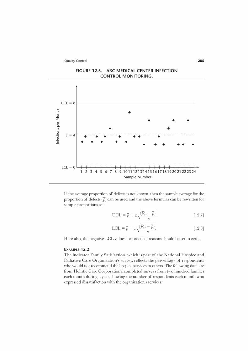
LCL 5 cw 2 zÏcww 5 4 2 2Ï4w 5 4 2 2 * 2 5 0.
The corresponding control chart for ICU at ABC Medical Center is shown in
Figure 12.5. n
p-Chart. The proportion of defects in a process can be monitored using a p-chart
that has binomial distribution as its theoretical base. The center of the p-chart rep-
resents the average for defects and LCL and UCL are calculated as:
UCL 5 p 1 zsp [12.5]
UCL 5 p – zsp [12.6]
where
sp 5 !}p(1
n
2§p)}§.
284 Quantitative Methods in Health Care Management
Quality Control 285
If the average proportion of defects is not known, then the sample average for the
proportion of defects ( pw ) can be used and the above formulas can be rewritten for
sample proportions as:
UCL 5 pw 1 z !§ [12.7]
LCL 5 pw 2 z !§. [12.8]
Here also, the negative LCL values for practical reasons should be set to zero.
EXAMPLE 12.2
The indicator Family Satisfaction, which is part of the National Hospice and
Palliative Care Organization’s survey, reflects the percentage of respondents
who would not recommend the hospice services to others. The following data are
from Holistic Care Corporation’s completed surveys from two hundred families
each month during a year, showing the number of respondents each month who
expressed dissatisfaction with the organization’s services.
pw(12 pw )}
n
pw(12 pw )}
n
UCL 5 8
LCL 5 0
c– 5 4
Sample Number
13 14 15 16 17 18 19 20 2221 23 24
Infe
ctio
ns
per
Mon
th
121110987654321
FIGURE 12.5. ABC MEDICAL CENTER INFECTION
CONTROL MONITORING.
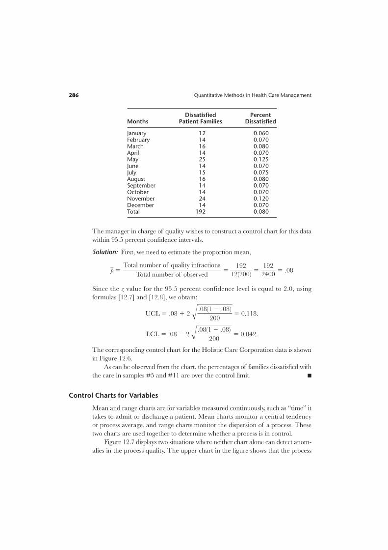
Dissatisfied PercentMonths Patient Families Dissatisfied
January 12 0.060February 14 0.070March 16 0.080April 14 0.070May 25 0.125June 14 0.070July 15 0.075August 16 0.080September 14 0.070October 14 0.070November 24 0.120December 14 0.070Total 192 0.080
The manager in charge of quality wishes to construct a control chart for this data
within 95.5 percent confidence intervals.
Solution: First, we need to estimate the proportion mean,
pw 5 5 }12
1
(
9
2
2
00)} 5 }
2
1
4
9
0
2
0} 5 .08
Since the z value for the 95.5 percent confidence level is equal to 2.0, using
formulas [12.7] and [12.8], we obtain:
UCL 5 .08 1 2 !}.08(1
20
2§0
.08)}§ 5 0.118.
LCL 5 .08 2 2 !}.08(1
20
2§0
.08)}§ 5 0.042.
The corresponding control chart for the Holistic Care Corporation data is shown
in Figure 12.6.
As can be observed from the chart, the percentages of families dissatisfied with
the care in samples #5 and #11 are over the control limit. n
Control Charts for Variables
Mean and range charts are for variables measured continuously, such as “time” it
takes to admit or discharge a patient. Mean charts monitor a central tendency
or process average, and range charts monitor the dispersion of a process. These
two charts are used together to determine whether a process is in control.
Figure 12.7 displays two situations where neither chart alone can detect anom-
alies in the process quality. The upper chart in the figure shows that the process
Total number of quality infractions}}}}
Total number of observed
286 Quantitative Methods in Health Care Management

Quality Control 287
UCL 5 .118
LCL 5 0.042
p– 5 .08
Sample Number
Pro
port
ion
of
Fam
ilies
Dis
sati
sfie
d
121110987654321
FIGURE 12.6. HOLISTIC CARE CORPORATION’S QUALITY MONITORING.
mean is stable, but that dispersion (variability) in the process is increasing. In this
situation the mean chart would not detect the shift in process variability, but the
range chart would, as the range indicator increases steadily. The lower chart shows
a process with stable range; however, the process mean increases. In this situation,
the range chart would not detect the increasing trend in the process average;
however, the mean chart would.
Mean Charts. Depending upon the available information, a mean chart can be
constructed using either standard deviation or range information.
Standard Deviation Approach. In general the population standard is unknown, and
so the average of sample means xww and the standard deviation of sample distrib-
ution sxware used to construct the confidence limits as:
UCL 5 xww 1 zs xw[12.9]
LCL 5 xww 2 zs xw[12.10]
where
sxw5 }
Ïs
nw}.

EXAMPLE 12.3
With a time-motion study, the IV start-up process has been examined in a med-
ical center nursing unit for five weekdays to determine whether in the future,
additional training of nurses is required. Each day nine new patients’ IV start-ups
were observed and the measurements recorded in minutes, as shown below. Con-
struct 99.7 percent (z 5 3) confidence limits for IV start-up times.
Observation Day 1 Day 2 Day 3 Day 4 Day 5
1 5.1 4.9 5.5 6.1 6.02 5.4 5.7 5.6 5.8 5.23 5.5 6.3 5.3 5.9 6.34 5.8 7.5 4.9 6.0 5.05 5.6 5.8 5.2 6.2 5.56 5.8 5.9 5.4 5.7 5.17 5.3 5.5 6.4 4.8 5.98 4.9 5.8 7.5 6.3 5.39 6.2 5.5 5.8 5.9 4.8
288 Quantitative Methods in Health Care Management
UCL
LCL
ProcessMean
UCL
LCL
Stable Mean, Increasing Range Process
Increasing Mean, Stable Range Process
Range IndicatorMean Indicator
FIGURE 12.7. USE OF MEAN AND RANGE CHARTS.

Solution: Observation means, xw, for each day (sample) are calculated and shown
in the last rows of the following table.
Sample Day 1 Day 2 Day 3 Day 4 Day 5
xw 5.51 5.88 5.73 5.86 5.46s 0.6
The sample standard deviation (s), for the nine observations over five days is cal-
culated to be 0.6 as shown above. The grand mean, xww, calculated over five days of
observations
xww 5 (5.51 1 5.88 1 5.73 1 5.86 1 5.46) 4 5 5 5.69.
Using formulas [12.9] and [12.10], UCL 5 xww 1 zsxw, LCL 5 xww 2 zsxw
with z 5 3,
n 5 9 observations per sample (day), and s 5 0.6, we obtain:
UCL 5 5.69 1 3(0.6yÏ9w) 5 5.69 1 3(0.2) 5 6.29.
LCL 5 5.69 2 3(0.6yÏ9w) 5 5.69 2 3(0.2) 5 5.09.
Note that on the following days the specific observations are beyond the control
limits.
Day 1: observation 8.
Day 2: observation 1.
Day 3: observations 4 and 8.
Day 4: observations 7 and 8.
Day 5: observations 3 and 8.
Managers responsible for quality would investigate the variations to determine
whether they are caused by one or more individuals who need additional in-service
training. n
Range Approach. Another way to construct a mean chart is to use the average of
sample distribution ranges, Rw. This approach requires a factor to calculate the dis-
persion of the control limits.
UCL 5 xww 1 A2Rw [12.11]
LCL 5 xww 2 A2Rw [12.12]
Where A2 is a factor from Table 12.1.
Quality Control 289
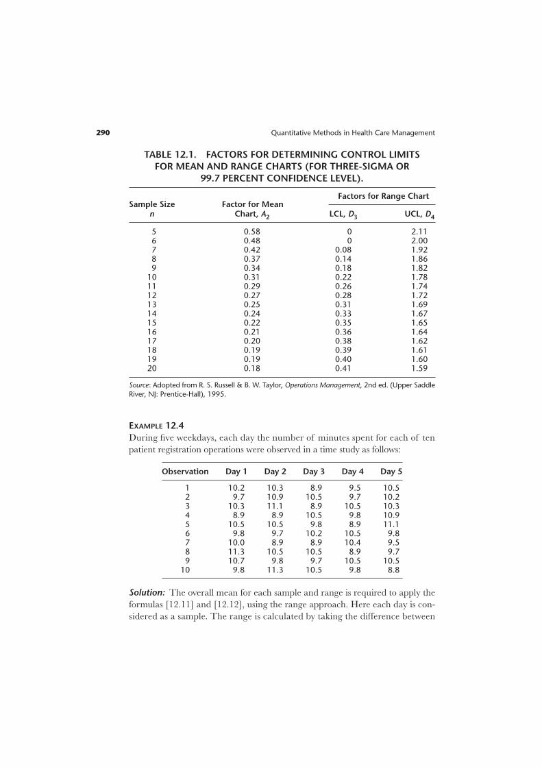
EXAMPLE 12.4
During five weekdays, each day the number of minutes spent for each of ten
patient registration operations were observed in a time study as follows:
Observation Day 1 Day 2 Day 3 Day 4 Day 5
1 10.2 10.3 8.9 9.5 10.52 9.7 10.9 10.5 9.7 10.23 10.3 11.1 8.9 10.5 10.34 8.9 8.9 10.5 9.8 10.95 10.5 10.5 9.8 8.9 11.16 9.8 9.7 10.2 10.5 9.87 10.0 8.9 8.9 10.4 9.58 11.3 10.5 10.5 8.9 9.79 10.7 9.8 9.7 10.5 10.5
10 9.8 11.3 10.5 9.8 8.8
Solution: The overall mean for each sample and range is required to apply the
formulas [12.11] and [12.12], using the range approach. Here each day is con-
sidered as a sample. The range is calculated by taking the difference between
290 Quantitative Methods in Health Care Management
TABLE 12.1. FACTORS FOR DETERMINING CONTROL LIMITS
FOR MEAN AND RANGE CHARTS (FOR THREE-SIGMA OR
99.7 PERCENT CONFIDENCE LEVEL).
Sample Size Factor for MeanFactors for Range Chart
n Chart, A2 LCL, D3 UCL, D4
5 0.58 0 2.116 0.48 0 2.007 0.42 0.08 1.928 0.37 0.14 1.869 0.34 0.18 1.82
10 0.31 0.22 1.7811 0.29 0.26 1.7412 0.27 0.28 1.7213 0.25 0.31 1.6914 0.24 0.33 1.6715 0.22 0.35 1.6516 0.21 0.36 1.6417 0.20 0.38 1.6218 0.19 0.39 1.6119 0.19 0.40 1.6020 0.18 0.41 1.59
Source: Adopted from R. S. Russell & B. W. Taylor, Operations Management, 2nd ed. (Upper Saddle
River, NJ: Prentice-Hall), 1995.
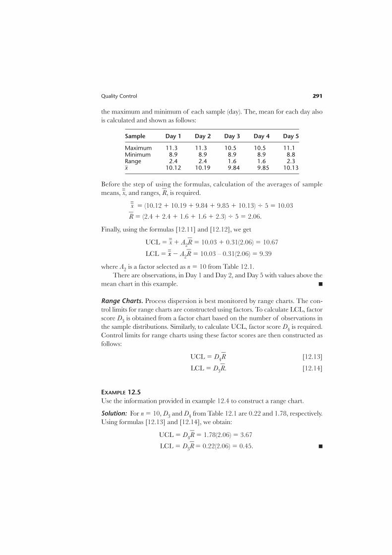
the maximum and minimum of each sample (day). The, mean for each day also
is calculated and shown as follows:
Sample Day 1 Day 2 Day 3 Day 4 Day 5
Maximum 11.3 11.3 10.5 10.5 11.1Minimum 8.9 8.9 8.9 8.9 8.8Range 2.4 2.4 1.6 1.6 2.3xw 10.12 10.19 9.84 9.85 10.13
Before the step of using the formulas, calculation of the averages of sample
means, xww, and ranges, Rw, is required.
xww 5 (10.12 1 10.19 1 9.84 1 9.85 1 10.13) 4 5 5 10.03
Rw 5 (2.4 1 2.4 1 1.6 1 1.6 1 2.3) 4 5 5 2.06.
Finally, using the formulas [12.11] and [12.12], we get
UCL 5 xww 1 A2Rw 5 10.03 1 0.31(2.06) 5 10.67
LCL 5 xxww 2 A2Rw 5 10.03 – 0.31(2.06) 5 9.39
where A2 is a factor selected as n 5 10 from Table 12.1.
There are observations, in Day 1 and Day 2, and Day 5 with values above the
mean chart in this example. n
Range Charts. Process dispersion is best monitored by range charts. The con-
trol limits for range charts are constructed using factors. To calculate LCL, factor
score D3 is obtained from a factor chart based on the number of observations in
the sample distributions. Similarly, to calculate UCL, factor score D4 is required.
Control limits for range charts using these factor scores are then constructed as
follows:
UCL 5 D4Rw [12.13]
LCL 5 D3Rw. [12.14]
EXAMPLE 12.5
Use the information provided in example 12.4 to construct a range chart.
Solution: For n 5 10, D3 and D4 from Table 12.1 are 0.22 and 1.78, respectively.
Using formulas [12.13] and [12.14], we obtain:
UCL 5 D4Rw 5 1.78(2.06) 5 3.67
LCL 5 D3Rw 5 0.22(2.06) 5 0.45. n
Quality Control 291
Investigation of Control Chart Patterns
It is necessary to evaluate control chart patterns for anomalies, even though the
observations stay within the confines of control limits. Although quality managers
expect the sample variations to occur around the average line, sometimes consis-
tent patterns can occur within control limits that are due to nonrandom causes
and may require investigation. Such behavior can be characterized as consistent
observations above or below the average (or center line); persistent zigzagging
above and below the center line may signal disturbances in the system. Further-
more, high magnitude jumps from LCL to UCL or even beyond those limits may
suggest nonrandomness and invokes investigation.
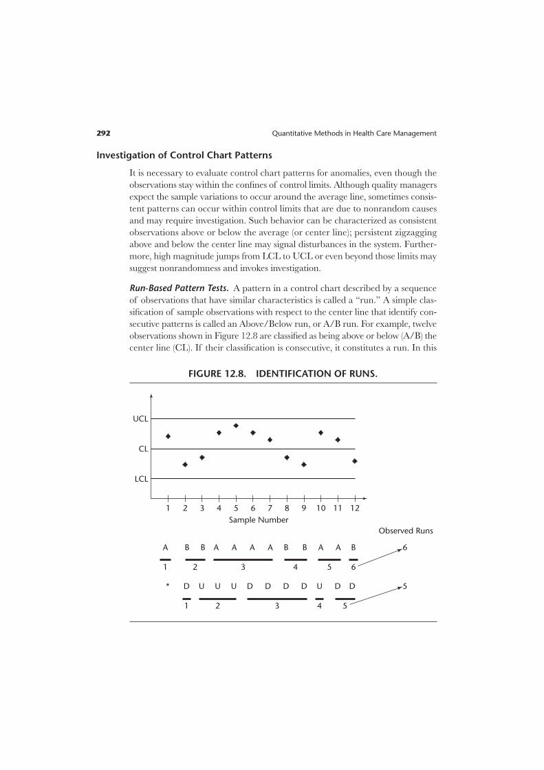
Run-Based Pattern Tests. A pattern in a control chart described by a sequence
of observations that have similar characteristics is called a “run.” A simple clas-
sification of sample observations with respect to the center line that identify con-
secutive patterns is called an Above/Below run, or A/B run. For example, twelve
observations shown in Figure 12.8 are classified as being above or below (A/B) the
center line (CL). If their classification is consecutive, it constitutes a run. In this
292 Quantitative Methods in Health Care Management
UCL
LCL
Sample Number
1
A A A AA A AB B B BB
D D D D DDDU U UU*
Observed Runs
6
5
1 432 5 6
1 2 3 4 5
CL
2 3 4 5 6 7 8 9 10 11 12
FIGURE 12.8. IDENTIFICATION OF RUNS.

example, an above (A) observation is followed by two consecutive below (B)
observations, which are followed by four consecutive above observations, and so
on. Whenever there is a switch in a classified observation, a new run starts. Hence
there are six such A/B runs in this chart.
Up (U) and down (D) runs is another way to classify and observe patterns. To
classify sample observations as U or D, the first observation is used as a refer-
ence point, shown with “*” in Figure 12.8. Starting with the second observation
one can classify each observation with respect to its predecessor. Here the second
observation as compared to the first observation has a lower value, so its position
is classified as down (D). The third observation as compared to the second
observation has a higher value, so its position is classified as up (U). Ensuing obser-
vations are classified similarly. Once all observations are classified, the runs are
identified by checking the consecutive patterns. In this example, the second
observation is a stand-alone run. The next three observations are classified as up
and constitute another run. The third run is a down run containing four obser-
vations. In total, there are five observed U/D runs in this example.
Control chart patterns identified by runs require statistical testing of whether
the runs are within expectations and hence the patterns are random, or beyond
expectations and hence nonrandomness is present. It has been shown that runs are
distributed approximately normally (Stevenson, 2002, p. 436) and using the z-test the
significance of too few or too many observed runs can be determined as follows:
z 5 . [12.15]
A z-value within 62, which provides 95.5 percent confidence level, would show
that the runs are random; however, beyond these values # 62 $, a nonrandom
presence would be shown. We already know how to determine observed runs, from
an earlier discussion (Figure 12.8). It is necessary to calculate the expected runs
and their standard deviations. The formulas for expected A/B or U/D runs and
their standard deviations are as follows:
E(run)A/B 5 1 1 [12.16]
s(run)A/B 5 !}N 2
4
1}§ [12.17]
E(run)U/D 5 [12.18]
s(run)U/D 5 !}16N
9
2
0§ 29
}§. [12.19]
2N 2 1}
3
N}2
Observed runs 2 Expected runs}}}}
Standard deviation of runs
Quality Control 293

EXAMPLE 12.6
Determine the presence/absence of nonrandomness for the example presented
in Figure 12.8, with 95.5 percent confidence limits.
Solution: The example has twelve observations, so N 5 12. Using the formulas
[12.15] through [12.19] above, we get:
E(run)A/B 5 }1
2
2} 1 1 5 7.0; s (run)A/B 5 !}
12
4
2 1}§ 5 !}
1
4
1}§ 5 Ï2.75w 5 1.66;
E(run)U/D 5 5 7.67;
s (run)U/D 5 !}(16 * 1
9§2
0
) 2 2§9}§ 5 !}
1
9
6
0
3}§ 5 Ï1.81w 5 1.35.
zA/B 5 }6
1
2
.66
7} 5 20.60; conclude that the A/B runs exhibit randomness.
zU/D 5 }5 2
1.3
7
5
.67} 5 21.98; conclude that U/D runs exhibit randomness.
However, this particular case is a close one, the quality manager should be on
the lookout in the future, and compute the z-test again after collecting more
observations. n
Zone Tests. An alternative method that is often used by quality control software
packages is called the “zone test.” The essence of the zone test rests on deviation
from the center line by one-sigma, two-sigma, or three-sigma limits. Zone C,
Zone B, and Zone A are identified by these limits, respectively. To create the zones,
the formulas for constructing mean chart with range approach, [12.11] and
[12.12] are used. Those formulas, presented earlier, use A2 from Table 12.1,
and the values for this table were calculated for three-sigma levels (or 99.7 percent
confidence level). Thus, in constructing the zones, one must reduce the A2 factor
proportionately, according to the sigma level. Since A2 is designated for three-
sigma, for two-sigma 2y3 of A2, and for one-sigma 1y3 of A2 would be appropriate.
The zone formulas can be written as:
Zone A 5 xww 6 A2Rw [12.20]
Zone B 5 xww 6 }1
2} A2Rw [12.21]
Zone C 5 xww 6 }1
3} A2Rw. [12.22]
(2 * 12) 2 1}}
3
294 Quantitative Methods in Health Care Management

Figure 12.9 displays the zones constructed this way. After determining the zones,
quality managers may use various guidelines associated with the zones to deter-
mine whether there are any nonrandom patterns in the control chart.
Sensitizing Rules for Control Charts. These rules determine whether the process
is statistically out of control. The most commonly suggested rules for detecting
nonrandom patterns are:
1. Single point outside of three-sigma limits.
2. Two out of three consecutive observations above two-sigma limits.
3. Four out of five consecutive observations above one-sigma limits.
4. Eight consecutive observations are one side of the center line.
5. Eight consecutive observations are in up or down pattern.
6. Fourteen points alternating up and down.
7. Single observation jumps four-sigma (Russell and Taylor 1995, p. 150; Chang,
2004).
EXAMPLE 12.7
Apply the pattern rules to the observations displayed in Figure 12.9.
Quality Control 295
1
LCL
UCL
CL
13s
12s
11s
21s
22s
23s
2 3 4 5 6
Sample Number
Zone A 5 x–– 1 A2R
–
Zone A 5 x–– 2 A2R
–
x––
7 8 9 10 11 12
Zone B 5 x–– 1 A2R
–12
Zone C 5 x–– 1 A2R
–13
Zone C 5 x–– 2 A2R
–13
Zone B 5 x–– 2 A2R
–12
FIGURE 12.9. ZONE TEST.

Solution:
Rule 1: no violation.
Rule 2: violation: samples #10 and #12 are over 2-sigma limits in Zone A.
Rule 3: no violation.
Rule 4: no violation.
Rule 5: no violation.
Rule 6: no violation.
Rule 7: violation: sample #2 is down by 4-sigma, from Zone B above CL to
Zone C below CL.
According to the pattern rules there are two violations, and nonrandomness
may be present. Hence an investigation is required. n
Process Improvement
Health care quality managers often face circumstances that require improvement
or reengineering of care processes. Methods and tools used in reengineering
processes are available to accomplish difficult and costly improvement tasks. One
group of methods is for generating new ideas. Another group of tools are used to
measure and display the findings, for decisions on actions.
Methods for Generating New Ideas
The 5W2H Approach. This approach takes its name from five questions start-
ing with “W” and two questions starting with “H.” Health care managers can gen-
erate questions related to quality problems by asking “What?” (subject); “Why?”
(purpose); “Where?” (location); “When?” (timing sequence); “Who?” (people);
“How?” (method); and “How much?” (cost) (Stevenson 2002, pp. 487–489). The
answers to the questions can be sought using such methods as brainstorming or
quality circles and such tools as cause-and-effect diagrams or Pareto charts, all
of which are discussed below.
Brainstorming. This is a group process: discussion to generate free-flowing ideas
that might identify causes and generate solutions to a problem. The guidelines
are that each member of the group expresses her or his ideas without receiving
criticisms from the others, and that no member should be allowed to dominate
the discussion. This approach works by focusing on a problem, and coming up
with very many radical solutions. Ideas should be developed as fast as possible,
to facilitate generating a wide spectrum, and should be very odd. The generated
ideas can be evaluated after the brainstorming session, perhaps by using nominal
group technique.
296 Quantitative Methods in Health Care Management

Nominal Group Technique. This technique is similar to brainstorming, but the
session is led by an assigned moderator who presents the topic (problem) to session
participants. Participants may ask questions, and briefly discuss the topic; then
they think of ideas and write them down. The moderator asks each participant to
read and elaborate on one of their responses. The responses usually are summa-
rized on a flip chart. After everyone has given a response, participants are asked
for second and then third responses, until all their ideas have been recorded on
flip chart sheets posted around the room.
In the next step the moderator, working with the participants, eliminates re-
dundant or similar responses. Session participants are then asked to choose five to
ten responses that they feel are the most important and rank them according
to their relative importance. If necessary, the moderator can give the results
back to the participants to stimulate further discussion for a possible readjustment
of the overall rankings of the responses. That is done, however, only when con-
sensus about the ideas’ ranking is important to the topic or the problem. The nom-
inal group technique is an alternative to both the focus group and the Delphi
techniques. It has more structure than the focus group does, but still takes
advantage of the synergy created by group participants.
Interviewing. Keeping patient satisfaction as a goal, rich information about qual-
ity defects can be obtained from interviews of patients, in addition to satisfac-
tion surveys. Benchmarked provider staff also can be interviewed for their insights
about the quality of care.
Focus Groups. Focus groups are in-depth, qualitative interviews of small groups
of carefully selected people who have been brought together to discuss a problem.
Unlike a one-to-one interview, focus groups generate data through the give-and-
take of group discussion, as people share and compare their different points of
view. The focus group participants not only express what they think about the
problem, but explain why they think that way. The composition of a focus group
is usually based on the homogeneity or similarity of the group members. Bring-
ing people with common interests or experiences together makes it easier for them
to carry on a productive discussion. When there are different issues, different
groups should be used for each issue.
Quality Circles “Kaizen Teams.” As for a focus group, a group of employees in
a health care organization come together to address issues about quality in their
facility. Their focus in the health care organizations is to improve processes so that
the best quality of care can be achieved. The strategy involved is to bring the em-
ployees’ own ideas into play to improve quality. The group works as a team
Quality Control 297

(the term Kaizen Teams was adopted from Japanese management practice), and
its results are based on consensus. The employees joining the team do so volun-
tarily, and participate under the leadership of their supervisor during normal work
hours. The team meets regularly and makes recommendations to management.
There are no formal rules for organizing a quality circle. However, meetings should
take place away from work areas to minimize distractions, and should be held
for at least one hour per week with clear agendas and objectives. The quality
circles must be of manageable size. When needed, outside experts can be brought
in (for example, a quality circle member from a different provider).
Benchmarking. The purpose of benchmarking is to identify the best in health
care processes and try to match that level. Examining the processes of the best
providers reveals invaluable information for health care managers trying to
improve their own organizations. As mentioned above, Six Sigma quality, which
many industries have adopted as a benchmark goal, has now been applied in
health care as well.
Tools for Investigating the Presence of Quality Problems and Their Causes
Health care managers who are responsible for the quality of care and their team
can use the approaches explained above to begin to understand a problem, but
they also need tools to develop a detailed analysis of it. That effort requires quan-
tification, and visualizations to develop alternative plans for a solution. The
following are tools that are essential for the effort.
Check Sheet. This is a tallying tool used for fact finding or problem identification.
It provides a format for health care managers to count the defects in the process
for a list of the causes such as have been identified earlier while generating the
ideas. For example, in an emergency room, long waiting times are recognized by
the patients as defects in quality. However, the cause of the delays may arise from
1) the wait time for registering; 2) the registration process itself; and/or 3) the wait
time to see a doctor. Figure 12.10 illustrates a check sheet developed to investigate
the causes of long emergency room wait times.
Histogram. This is a chart that displays empirical (collected) data, the frequency
distribution of a process. Examining the chart, health care managers can identify
extremes (outliers at tail ends), as well as peak occurrences (mode) in the data.
Histograms can be used to display the count data from check sheets.
Scatter Diagram. This diagram displays the possible relationships between two
variables, to identify a pattern that constitutes a problem for the quality of care.
298 Quantitative Methods in Health Care Management

Quality Control 299
//
//
///
/
/////
/////
//////
/
//////
//////
/
//////
////
///
5
4
3
2
1
A
Wait Time toRegister . 10
Minutes
B
RegistrationTime . 5Minutes
C
Wait Timefor MD . 15
Minutes
Weeks
0
1
2
3
4
5
6
Week 1
A
B
C
Week 2 Week 3 Week 4 Week 5
FIGURE 12.10. A CHECK SHEET AND CORRESPONDING
HISTOGRAM FOR EMERGENCY ROOM WAIT TIMES.
For example, medication errors or infection rates may correspond to hospital mor-
tality or morbidity rates. Figure 12.11 displays a scatter diagram illustrating the
correspondence between the number of infections per month and the hospital’s
morbidity rate.

Flow Chart. As also discussed in Chapter Six, flow charts could provide a chrono-
logical execution of processes in which a decision point—shown by a diamond
symbol—may indicate a bottleneck in the process. Rectangular shape shows pro-
cedures, and arrows show the flow of the process. A good process would minimize
the decision points without sacrificing necessary auditing requirements. Fig-
ure 12.12 is an example of a flow chart for the x-ray order process in an emergency
department.
Cause-and-Effect Diagram. Also known as a fishbone diagram or an Ishikawa
chart, a cause-and-effect diagram displays the structured results of the ideas gen-
erated from brainstorming, the nominal method, interviewing, focus groups and
quality circles. The main causes of the problem are displayed on ticker lines or
bones (such as methods or processes); then specific causes are displayed within on
thinner lines (such as, too many steps).
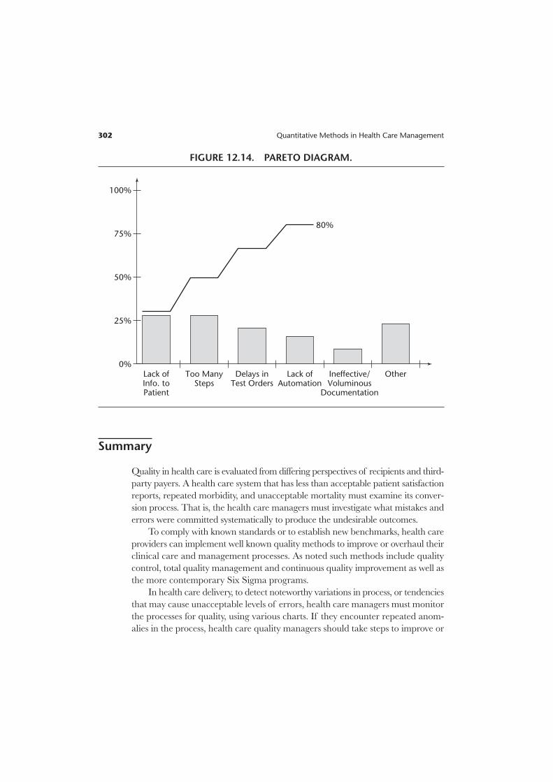
Pareto Chart. The next step in analyzing the problem is a Pareto chart. Quality
managers using nominal technique can prioritize the importance and/or contri-
bution of each cause to the problem. The aim is to identify 80 percent of the
causes and start working on the solutions. Figures 12.13 and 12.14 show a cause-
and-effect diagram and the corresponding Pareto chart, respectively.
300 Quantitative Methods in Health Care Management
00 5 10 15 20
Number of Infections per Month
Morb
idit
y R
ate
0.02
0.04
0.06
0.08
0.1
0.12
0.14
FIGURE 12.11. SCATTER DIAGRAM.

Quality Control 301
E.D. MDRequests X-Ray
Obtain Form
Hand WritePatient
DemographicInformation
No
Yes
1
PhysicianCompletes Form
Computer-Prepared Form
Available?
FIGURE 12.12. A FLOW CHART FOR THE X-RAY ORDER PROCESS
IN AN EMERGENCY DEPARTMENT.
Equipment/MaterialRewardsPeople
Methods/Processes FunctionsStructure
Tests Not Coordinated
Delays in Ordering Tests
Test Errors
Boring Environment
Lack of Supplies
Lack of ER Beds
Design isNot Efficient
Lack of AutomatedSystem
Lab/Rad./ERDepts. Reportto Different VPs
Lack ofFeedback
Lack ofIncentives
Too ManySteps
Hospital RoomNot Available ifAdmitted
Private MDsNot on Site
Lack ofTransporters
PatientWait TooLong
FIGURE 12.13. CAUSE-AND-EFFECT DIAGRAM.
Summary
Quality in health care is evaluated from differing perspectives of recipients and third-
party payers. A health care system that has less than acceptable patient satisfaction
reports, repeated morbidity, and unacceptable mortality must examine its conver-
sion process. That is, the health care managers must investigate what mistakes and
errors were committed systematically to produce the undesirable outcomes.
To comply with known standards or to establish new benchmarks, health care
providers can implement well known quality methods to improve or overhaul their
clinical care and management processes. As noted such methods include quality
control, total quality management and continuous quality improvement as well as
the more contemporary Six Sigma programs.
In health care delivery, to detect noteworthy variations in process, or tendencies
that may cause unacceptable levels of errors, health care managers must monitor
the processes for quality, using various charts. If they encounter repeated anom-
alies in the process, health care quality managers should take steps to improve or
302 Quantitative Methods in Health Care Management
100%
75%
50%
25%
0%Lack ofInfo. toPatient
Too ManySteps
Delays inTest Orders
Lack ofAutomation
Ineffective/Voluminous
Documentation
Other
80%
FIGURE 12.14. PARETO DIAGRAM.

Quality Control 303
reengineer the care processes. As discussed in this chapter, there are many methods
and tools available to health care managers for generating new ideas, measuring and
displaying the findings, and for making decisions to improve quality of care.
Exercises
Exercise 12.1
The Chief Nursing Officer (CNO) is concerned about medication errors in two hospi-
tal units. Collection of data over a year resulted in Table EX 12.1.
TABLE EX 12.1
Medication Errors Jan Feb Mar Apr May Jun Jul Aug Sep Oct Nov Dec
Unit A 4 6 2 4 3 6 3 4 5 3 4 4
Unit B 3 3 6 5 4 7 3 4 6 4 5 4
a. Using a 95.5 percent confidence level, calculate the UCL and LCL for an appropri-
ate control chart for each unit.
b. Construct the charts and identify the observations that are beyond the control limits.
Exercise 12.2
The data in Table EX 12.2 records the patient falls in three care units over a fifteen-
week period.
TABLE EX 12.2
Patient Falls Unit-I Unit-II Unit-III
Week 1 2 1 3
Week 2 1 2 1
Week 3 2 3 0
Week 4 2 2 2
Week 5 3 1 2
Week 6 1 0 1
Week 7 2 2 2
Week 8 1 0 1
Week 9 0 1 4
Week 10 1 1 3
Week 11 2 2 1
Week 12 1 0 2
Week 13 0 1 1
Week 14 2 2 2
Week 15 2 1 0
Week-14 1 0 2
Week-15 2 1 3

304 Quantitative Methods in Health Care Management
a. For each unit, calculate LCL and UCL for an appropriate control chart, using
95.5 percent confidence limits.
b. Construct a control chart for each unit.
c. Are any observations in violation of the control limits for the unit?
Exercise 12.3
Using samples of 200 observations each, a quality inspector found the results shown
in Table EX 12.3.
TABLE EX 12.3
Sample 1 2 3 4 5 6
Number of defectives 4 2 5 8 6 5
a. Determine the fraction defective in each sample.
b. Estimate the mean and standard deviation of the sampling distribution of fractions
defective.
c. Determine the control limits that would give an alpha risk of .025 for this process.
d. Construct an appropriate control chart and identify any observations that are not
within control limits.
Exercise 12.4
A medical center routinely conducts patient satisfaction surveys upon discharge and
follows up with another survey within three months. The discharge and follow-up sur-
veys, conducted on samples of five hundred discharges per month and identifying the
number of patients dissatisfied with their care, are shown in Table EX 12.4.
TABLE EX 12.4
Dissatisfied Patients Jan Feb Mar Apr May Jun Jul Aug Sep Oct Nov Dec
At discharge 24 44 36 18 16 19 17 18 27 26 29 26
3-month follow-up 17 24 15 8 11 7 11 9 10 15 12 11
a. Determine the fraction of dissatisfied patients at discharge and on follow-up, for
each month.
b. Estimate the mean and standard deviation of the sampling distribution of dissatis-
fied patients at discharge and at follow-up.
c. For both surveys, determine the control limits for 95 percent confidence limits.
d. For both surveys, construct appropriate control charts and identify any observa-
tions that are not within the control limits.

Exercise 12.5
Complaints of late responses to patient calls in a nursing unit trigger a study by the
decision support department, requested by the nursing manager. A time study team
made observations and compiled the data in Table EX 12.5.
TABLE EX 12.5
Observation Day 1 Day 2 Day 3 Day 4 Day 5 Day 6 Day 7
1 3 6 2 4 5 3 4
2 6 5 3 7 3 4 1
3 4 2 5 3 5 3 6
4 7 6 5 9 2 5 4
5 8 3 3 3 4 3 2
6 12 8 4 2 3 7 6
7 5 6 5 6 5 7 4
8 6 4 8 5 8 4 7
9 8 7 6 4 3 6 2
10 9 6 2 3 4 11 2
11 6 3 3 8 4 4 5
12 4 7 4 3 3 2 9
13 7 2 5 5 5 3 3
14 11 4 7 3 2 1 3
15 7 6 3 2 3 4 2
The measurements are recorded in minutes (rounded to the nearest minute) of
response time once the patient has pressed the call button.
a. Using the standard deviation approach, construct 99.7 percent confidence limits
for patient call response times.
b. Develop an appropriate control chart for the days.
c. Are there any days in violation of the confidence limits?
Exercise 12.6
Using the information in Exercise 12.5:
a. Calculate the range for each day and calculate LCL and UCL for a mean chart, using
the range approach.
b. Construct a corresponding control chart and identify any violations of the limits.
Exercise 12.7
Using the information in Exercise 12.5:
a. Calculate LCL and UCL for a range chart.
b. Construct a corresponding control chart and identify any violations of the limits.
Quality Control 305

306 Quantitative Methods in Health Care Management
Exercise 12.8
Consider the control chart in Exercise 12.1, part “b”:
a. Perform a median run test and an up/down run test, using 95.5 percent confidence
intervals.
b. Are the medication error patterns random?
Exercise 12.9
Consider the control chart in Exercise 12.2, part “b,” for Unit-III:
a. Perform a median run test and an up/down run test, using 95.5 percent confidence
intervals.
b. Are the patient fall patterns random in this unit?
Exercise 12.10
Analyze the control chart in Exercise 12.3, part “c”, using a median run test and an
up/down run test. What can you conclude?
Exercise 12.11
Consider the control chart in Exercise 12.4, part “d”:
a. Perform a median run test and an up/down run test, using 95.5 percent confidence
intervals.
b. Are the dissatisfaction patterns random?
Exercise 12.12
Consider the control chart in Exercise 12.5, part “b”:
a. Perform a median run test and an up/down run test, using 95.5 percent confidence
intervals.
b. Are the response patterns to patient calls random?
Exercise 12.13
The graph in Figure EX 12.13 represents sample means of delays on laboratory reports
at periodic intervals, plotted on a control chart.
a. Is the output random? Why?
b. Perform run tests for randomness, using a 95.5 percent confidence interval, and
interpret the results.

Quality Control 307
Exercise 12.14
A hospital has identified nonrandom variations in medication errors. These errors
can emanate along a process from prescription orders to delivery to a patient. Hence,
consider the departments involved in the process such as nursing, pharmacy, and
others as appropriate, to:
a. Draw a flow chart for the medication process.
b. Construct a cause-and-effect diagram showing the potential causes of errors.
c. Develop a Pareto chart to prioritize the causes (problems), for planning to solve
them.
Exercise 12.15
A hospital has identified nonrandom variations in patient falls.
a. Draw a flow chart showing under what circumstances a patient might fall.
b. Construct a cause-and-effect diagram showing the potential causes of falls.
c. Develop a Pareto chart to prioritize the causes of falls for planning to solve the
problem.
UCL
CL
LCL
Periods
FIGURE EX 12.13