Progress on magazine
18
Progress on Magazine
-
Upload
asmediac14 -
Category
Art & Photos
-
view
135 -
download
0
Transcript of Progress on magazine
Progress on Magazine
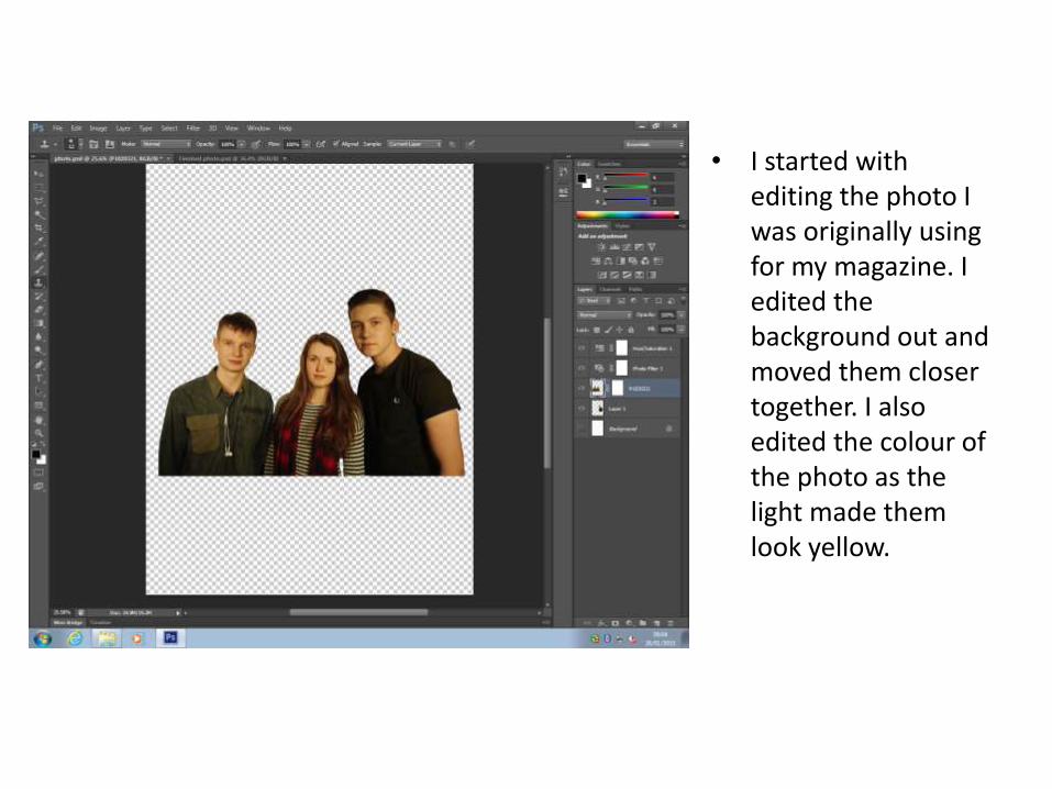
• I started with editing the photo I was originally using for my magazine. I edited the background out and moved them closer together. I also edited the colour of the photo as the light made them look yellow.
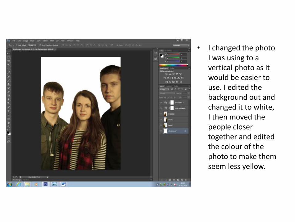
• I changed the photo I was using to a vertical photo as it would be easier to use. I edited the background out and changed it to white, I then moved the people closer together and edited the colour of the photo to make them seem less yellow.
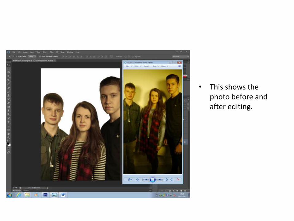
• This shows the photo before and after editing.
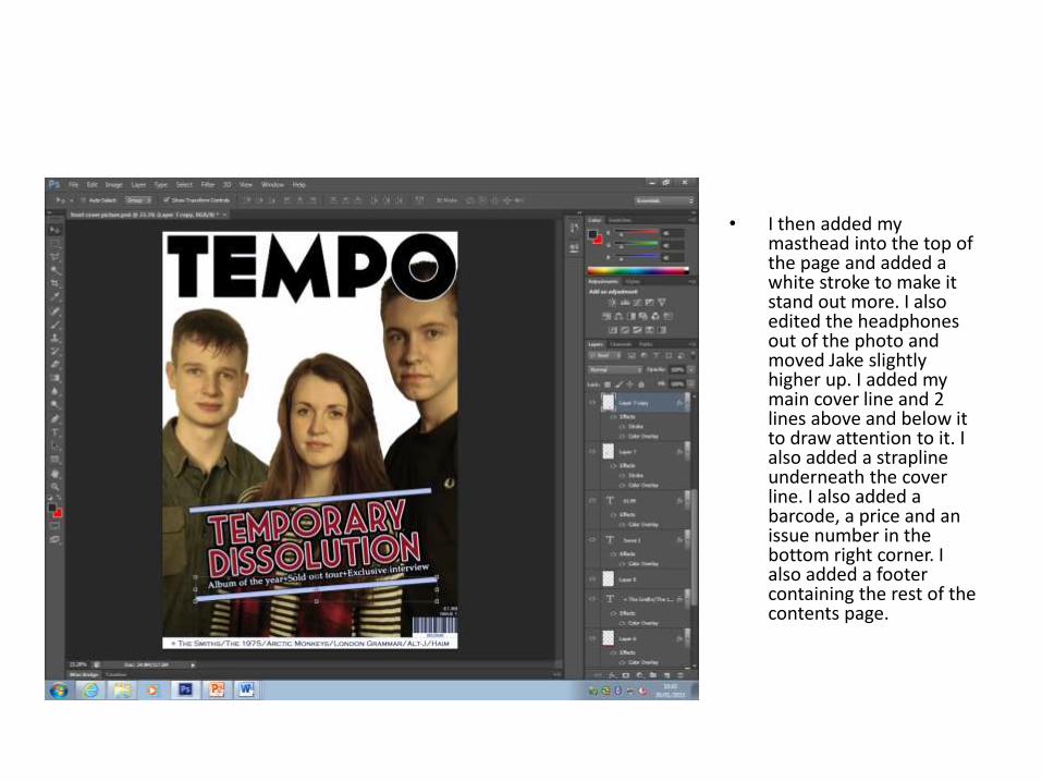
• I then added my masthead into the top of the page and added a white stroke to make it stand out more. I also edited the headphones out of the photo and moved Jake slightly higher up. I added my main cover line and 2 lines above and below it to draw attention to it. I also added a strapline underneath the cover line. I also added a barcode, a price and an issue number in the bottom right corner. I also added a footer containing the rest of the contents page.
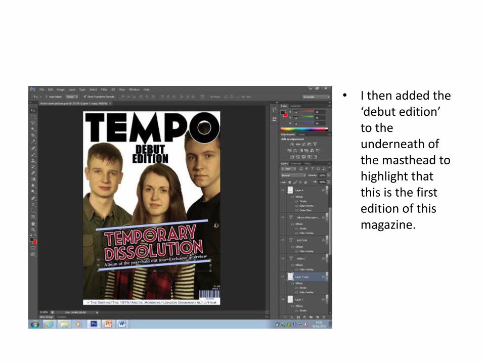
• I then added the ‘debut edition’ to the underneath of the masthead to highlight that this is the first edition of this magazine.
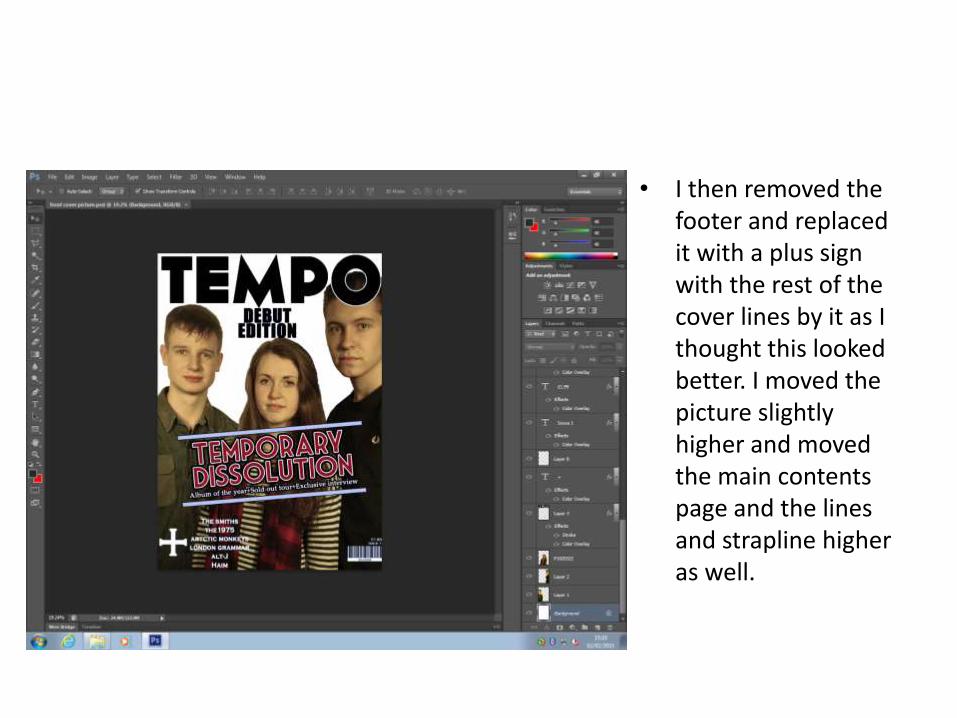
• I then removed the footer and replaced it with a plus sign with the rest of the cover lines by it as I thought this looked better. I moved the picture slightly higher and moved the main contents page and the lines and strapline higher as well.
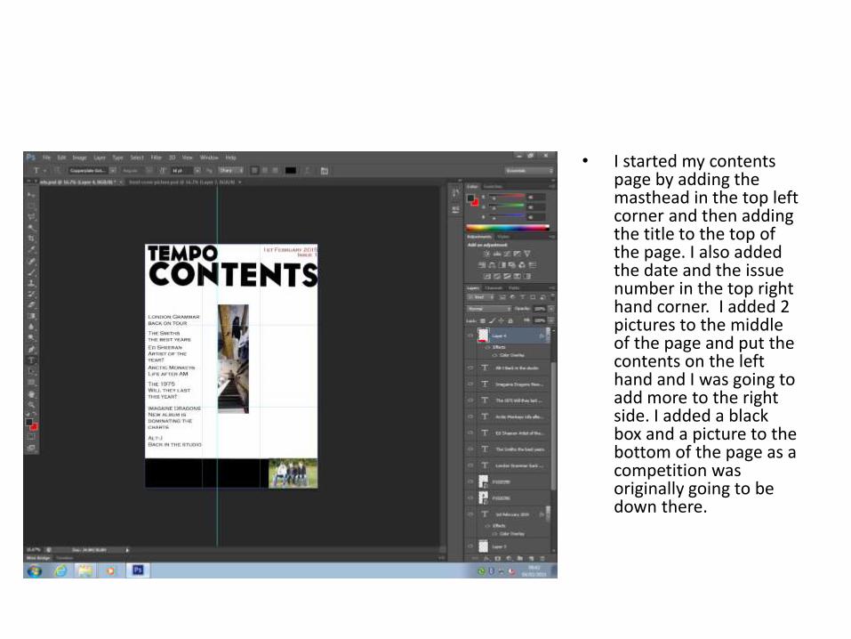
• I started my contents page by adding the masthead in the top left corner and then adding the title to the top of the page. I also added the date and the issue number in the top right hand corner. I added 2 pictures to the middle of the page and put the contents on the left hand and I was going to add more to the right side. I added a black box and a picture to the bottom of the page as a competition was originally going to be down there.
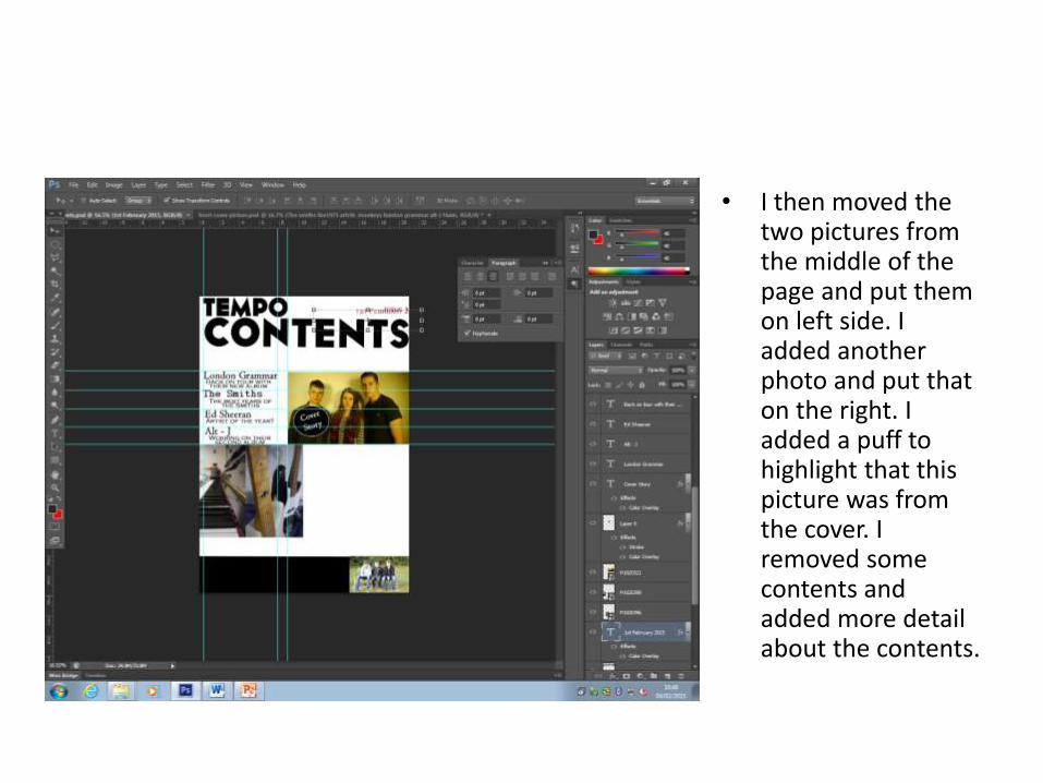
• I then moved the two pictures from the middle of the page and put them on left side. I added another photo and put that on the right. I added a puff to highlight that this picture was from the cover. I removed some contents and added more detail about the contents.
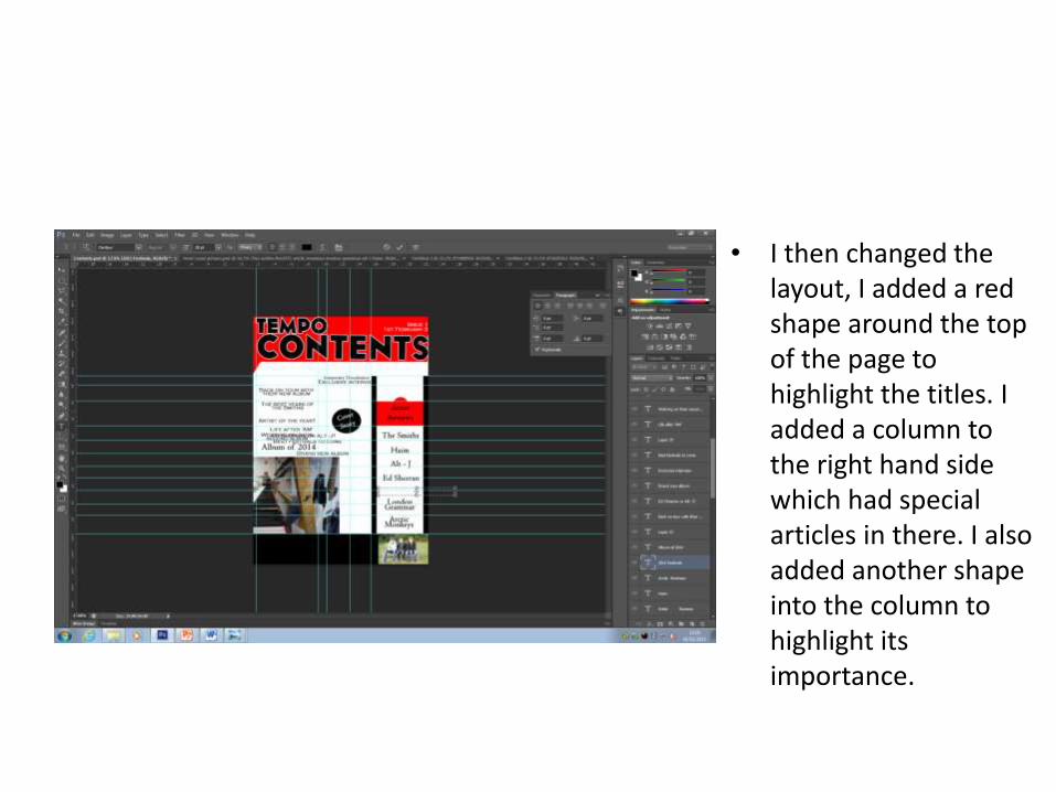
• I then changed the layout, I added a red shape around the top of the page to highlight the titles. I added a column to the right hand side which had special articles in there. I also added another shape into the column to highlight its importance.
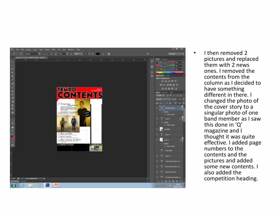
• I then removed 2 pictures and replaced them with 2 news ones. I removed the contents from the column as I decided to have something different in there. I changed the photo of the cover story to a singular photo of one band member as I saw this done in ‘Q’ magazine and I thought it was quite effective. I added page numbers to the contents and the pictures and added some new contents. I also added the competition heading.
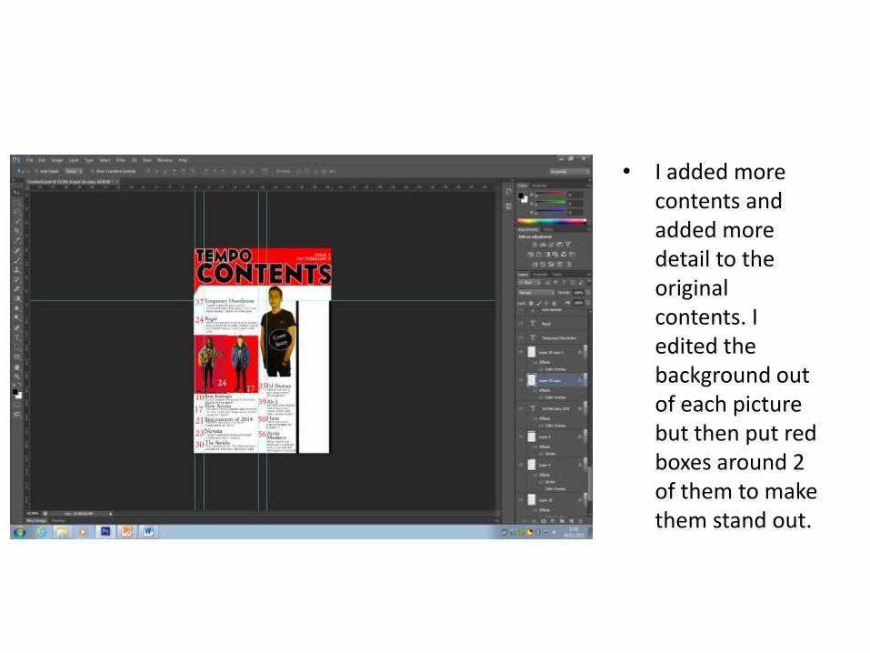
• I added more contents and added more detail to the original contents. I edited the background out of each picture but then put red boxes around 2 of them to make them stand out.
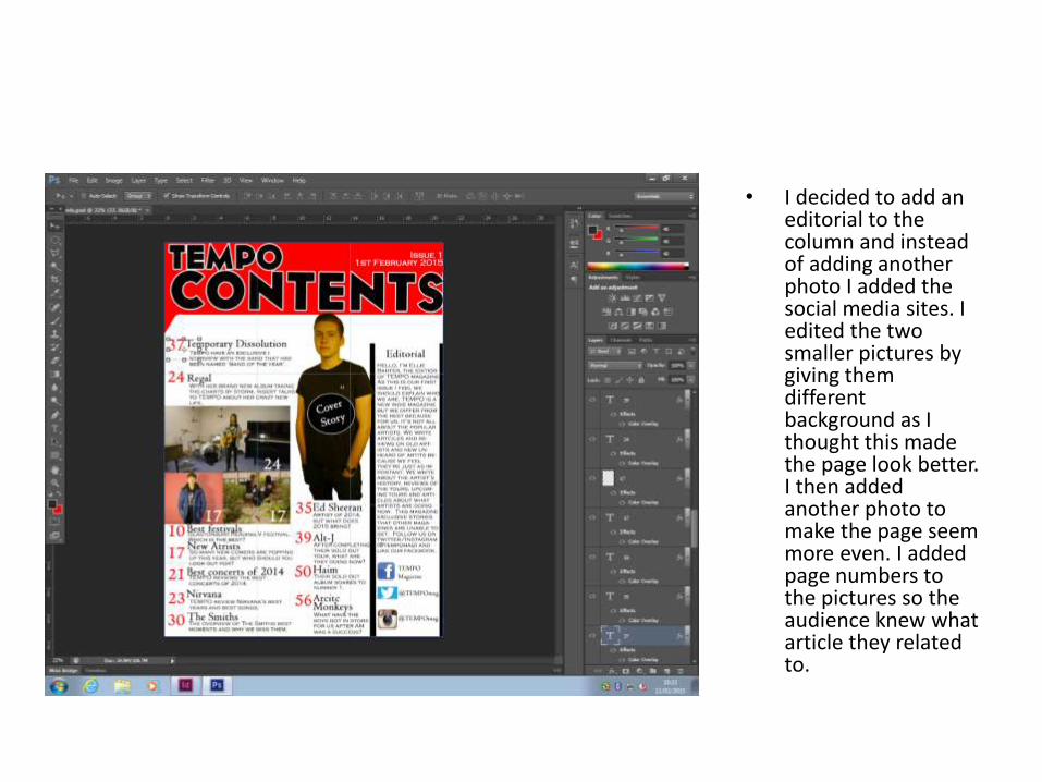
• I decided to add an editorial to the column and instead of adding another photo I added the social media sites. I edited the two smaller pictures by giving them different background as I thought this made the page look better. I then added another photo to make the page seem more even. I added page numbers to the pictures so the audience knew what article they related to.
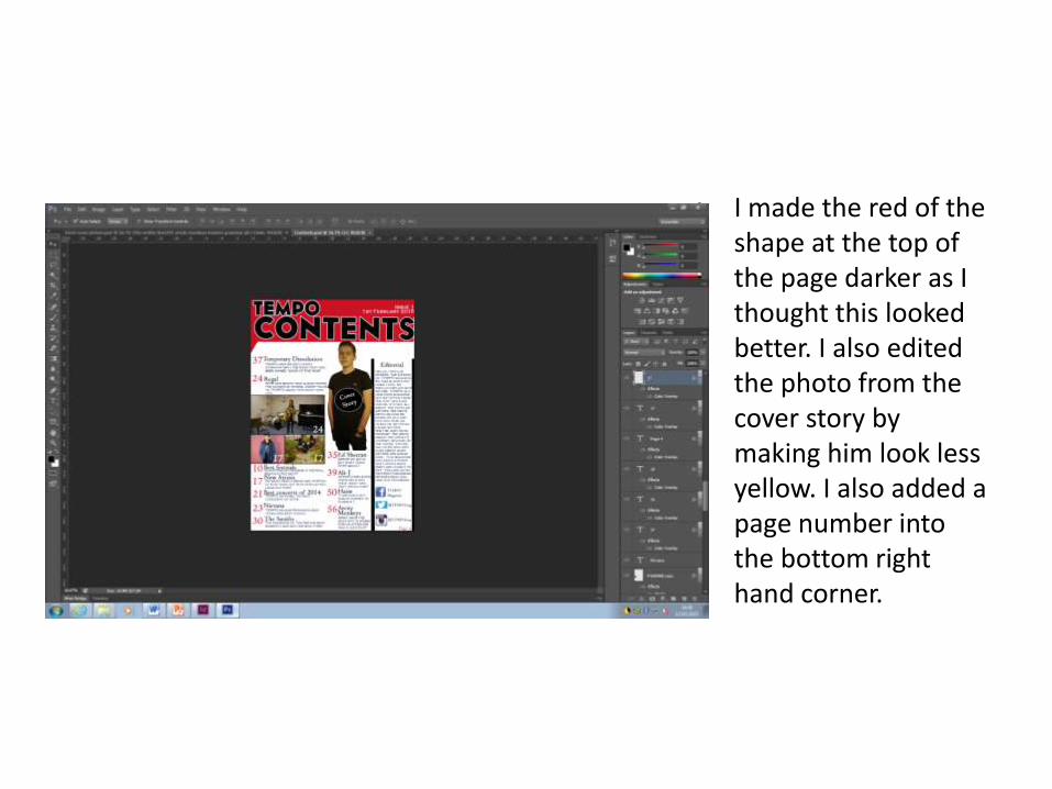
• I made the red of the shape at the top of the page darker as I thought this looked better. I also edited the photo from the cover story by making him look less yellow. I also added a page number into the bottom right hand corner.
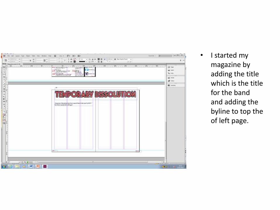
• I started my magazine by adding the title which is the title for the band and adding the byline to top the of left page.
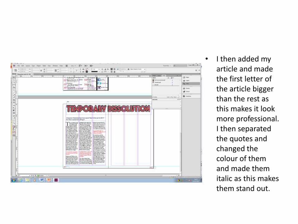
• I then added my article and made the first letter of the article bigger than the rest as this makes it look more professional. I then separated the quotes and changed the colour of them and made them italic as this makes them stand out.

• I then started to add the pictures, I first added a picture of a single member of the drums and then one of the whole band from the recording area of the music studio.
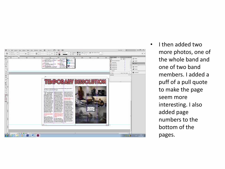
• I then added two more photos, one of the whole band and one of two band members. I added a puff of a pull quote to make the page seem more interesting. I also added page numbers to the bottom of the pages.