PETRA PETROVICS - ME-GTK - Gazdaságtudományi...
74
UNIVERSITY OF MISKOLC Faculty of Economics Institute of Business Information and Methods Department of Business Statistics and Economic Forecasting PETRA PETROVICS SPSS TUTORIAL & EXERCISE BOOK FOR BUSINESS STATISTICS MISKOLC 2012
-
Upload
nguyencong -
Category
Documents
-
view
230 -
download
2
Transcript of PETRA PETROVICS - ME-GTK - Gazdaságtudományi...
UNIVERSITY OF MISKOLC Faculty of Economics
Institute of Business Information and Methods Department of Business Statistics and Economic Forecasting
PETRA PETROVICS
SPSS TUTORIAL & EXERCISE BOOK
FOR BUSINESS STATISTICS
MISKOLC
2012

TABLE OF CONTENT
I. SPSS Tutorial .................................................................................................................... 6
1. Introduction to SPSS ................................................................................................... 6
2. Transform / Select Data ............................................................................................... 8
3. Graphs ...................................................................................................................... 12
4. Central Tendencies, Measures of Distribution, Measures of Asymmetry ................... 20
5. Estimation and Hypothesis Testing ........................................................................... 23
6. Statistical Dependence .............................................................................................. 30
7. Correlation and Linear Regression ............................................................................ 36
8. Multiple Correlation and Linear Regression .............................................................. 42
9. Curvilinear Regression .............................................................................................. 45
10. Time Series Analyzes ................................................................................................ 48
II. Exercises for SPSS ........................................................................................................... 60
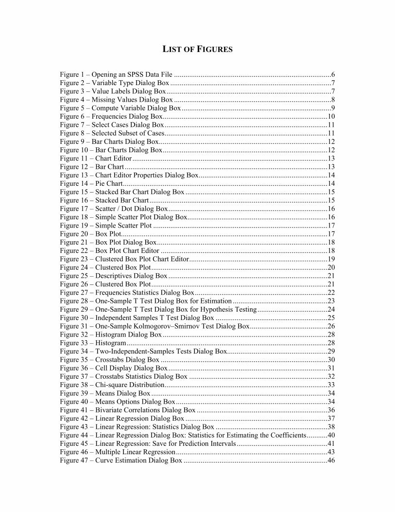
LIST OF FIGURES
Figure 1 – Opening an SPSS Data File ...................................................................................6 Figure 2 – Variable Type Dialog Box .....................................................................................7 Figure 3 – Value Labels Dialog Box .......................................................................................7 Figure 4 – Missing Values Dialog Box ...................................................................................8 Figure 5 – Compute Variable Dialog Box ...............................................................................9 Figure 6 – Frequencies Dialog Box ....................................................................................... 10 Figure 7 – Select Cases Dialog Box ...................................................................................... 11 Figure 8 – Selected Subset of Cases ...................................................................................... 11 Figure 9 – Bar Charts Dialog Box ......................................................................................... 12 Figure 10 – Bar Charts Dialog Box ....................................................................................... 12 Figure 11 – Chart Editor ....................................................................................................... 13 Figure 12 – Bar Chart ........................................................................................................... 13 Figure 13 – Chart Editor Properties Dialog Box .................................................................... 14 Figure 14 – Pie Chart ............................................................................................................ 14 Figure 15 – Stacked Bar Chart Dialog Box ........................................................................... 15 Figure 16 – Stacked Bar Chart .............................................................................................. 15 Figure 17 – Scatter / Dot Dialog Box .................................................................................... 16 Figure 18 – Simple Scatter Plot Dialog Box .......................................................................... 16 Figure 19 – Simple Scatter Plot ............................................................................................ 17 Figure 20 – Box Plot............................................................................................................. 17 Figure 21 – Box Plot Dialog Box .......................................................................................... 18 Figure 22 – Box Plot Chart Editor ........................................................................................ 18 Figure 23 – Clustered Box Plot Chart Editor ......................................................................... 19 Figure 24 – Clustered Box Plot ............................................................................................. 20 Figure 25 – Descriptives Dialog Box .................................................................................... 21 Figure 26 – Clustered Box Plot ............................................................................................. 21 Figure 27 – Frequencies Statistics Dialog Box ...................................................................... 22 Figure 28 – One-Sample T Test Dialog Box for Estimation .................................................. 23 Figure 29 – One-Sample T Test Dialog Box for Hypothesis Testing ..................................... 24 Figure 30 – Independent Samples T Test Dialog Box ........................................................... 25 Figure 31 – One-Sample Kolmogorov–Smirnov Test Dialog Box ......................................... 26 Figure 32 – Histogram Dialog Box ....................................................................................... 28 Figure 33 – Histogram .......................................................................................................... 28 Figure 34 – Two-Independent-Samples Tests Dialog Box..................................................... 29 Figure 35 – Crosstabs Dialog Box ........................................................................................ 30 Figure 36 – Cell Display Dialog Box .................................................................................... 31 Figure 37 – Crosstabs Statistics Dialog Box ......................................................................... 32 Figure 38 – Chi-square Distribution ...................................................................................... 33 Figure 39 – Means Dialog Box ............................................................................................. 34 Figure 40 – Means Options Dialog Box ................................................................................ 34 Figure 41 – Bivariate Correlations Dialog Box ..................................................................... 36 Figure 42 – Linear Regression Dialog Box ........................................................................... 37 Figure 43 – Linear Regression: Statistics Dialog Box ........................................................... 38 Figure 44 – Linear Regression Dialog Box: Statistics for Estimating the Coefficients ........... 40 Figure 45 – Linear Regression: Save for Prediction Intervals ................................................ 41 Figure 46 – Multiple Linear Regression ................................................................................ 43 Figure 47 – Curve Estimation Dialog Box ............................................................................ 46

Figure 48 – Curve Fit ........................................................................................................... 47 Figure 49 – Sequence Charts Dialog Box .............................................................................. 49 Figure 50 – Sequence Chart .................................................................................................. 50 Figure 51 – Curve Estimation for Linear Trend Model ......................................................... 50 Figure 52 – Curve Estimation: Save Dialog Box ................................................................... 51 Figure 53 – Predicted Number of Birth ................................................................................. 52 Figure 54 – Define Dates Dialog Box ................................................................................... 53 Figure 55 – Sequence Chart Dialog Box ............................................................................... 53 Figure 56 – Time Axis Reference Line Dialog Box .............................................................. 54 Figure 57 – Time Axis Reference Line Dialog Box .............................................................. 54 Figure 58 – Seasonal Decomposition Dialog Box ................................................................. 55 Figure 59 – Seasonal Decomposition Dialog Box ................................................................. 56 Figure 60 – Error Component ............................................................................................... 56 Figure 61 – SAF_1: Seasonal Component ............................................................................. 57 Figure 62 – SAS_1: Component without Seasonality ............................................................ 57 Figure 63 – STC_1: Smoothed Trend-cycle Component ....................................................... 58 Figure 64 – Forecasted Values .............................................................................................. 59 Figure 65 – Predicted Railway Transport .............................................................................. 59

INTRODUCTION
This exercise book was written for the students of the University of Miskolc within the framework of Business Statistics and Quantitative Statistical Methods. Some parts of the exercises are translated from the Hungarian book of Domán – Szilágyi – Varga: Statisztikai
elemzések alapjai II, which are supplemented by SPSS exercises on the basis of SPSS 16.0 and 19.0 Tutorial. This book is a tutorial, which includes theoretical background just to understand the examples included.
ACKNOWLEDGEMENTS The described work was carried out as part of the TÁMOP-4.2.1.B-10/2/KONV-2010-0001 project in the framework of the New Hungarian Development Plan. The realization of this project is supported by the European Union, co-financed by the European Social Fund.
6
I. SPSS TUTORIAL
1. INTRODUCTION TO SPSS1
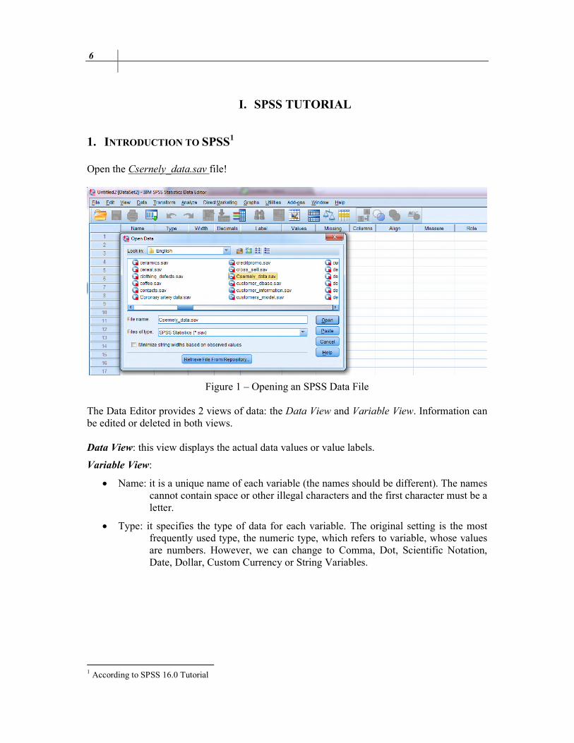
Open the Csernely_data.sav file!
Figure 1 – Opening an SPSS Data File The Data Editor provides 2 views of data: the Data View and Variable View. Information can be edited or deleted in both views. Data View: this view displays the actual data values or value labels.
Variable View:
• Name: it is a unique name of each variable (the names should be different). The names cannot contain space or other illegal characters and the first character must be a letter.
• Type: it specifies the type of data for each variable. The original setting is the most frequently used type, the numeric type, which refers to variable, whose values are numbers. However, we can change to Comma, Dot, Scientific Notation, Date, Dollar, Custom Currency or String Variables.
1 According to SPSS 16.0 Tutorial
SPSS Tutorial 7
Figure 2 – Variable Type Dialog Box
• Width: the field width.
• Decimals: number of decimals in case of Numeric type.
• Label: descriptive name of a variable (up to 256 characters). It can contain space or other characters, which we could not use in Names.
• Values: we can assign descriptive value labels for each value of a variable, thus the numeric codes represent non-numeric categories.
Figure 3 – Value Labels Dialog Box
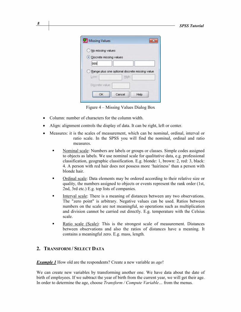
• Missing: if we do not have data, because e.g. a respondent refused to answer. User-
missing values are flagged for special treatment and are excluded from most calculations.
8 SPSS Tutorial
Figure 4 – Missing Values Dialog Box
• Column: number of characters for the column width.
• Align: alignment controls the display of data. It can be right, left or center.
• Measures: it is the scales of measurement, which can be nominal, ordinal, interval or ratio scale. In the SPSS you will find the nominal, ordinal and ratio measures.
� Nominal scale: Numbers are labels or groups or classes. Simple codes assigned to objects as labels. We use nominal scale for qualitative data, e.g. professional classification, geographic classification. E.g. blonde: 1, brown: 2, red: 3, black: 4. A person with red hair does not possess more ‘hairiness’ than a person with blonde hair.
� Ordinal scale: Data elements may be ordered according to their relative size or quality, the numbers assigned to objects or events represent the rank order (1st, 2nd, 3rd etc.) E.g. top lists of companies.
� Interval scale: There is a meaning of distances between any two observations. The "zero point" is arbitrary. Negative values can be used. Ratios between numbers on the scale are not meaningful, so operations such as multiplication and division cannot be carried out directly. E.g. temperature with the Celsius scale.
� Ratio scale (Scale): This is the strongest scale of measurement. Distances between observations and also the ratios of distances have a meaning. It contains a meaningful zero. E.g. mass, length.
2. TRANSFORM / SELECT DATA
Example 1 How old are the respondents? Create a new variable as age! We can create new variables by transforming another one. We have data about the date of birth of employees. If we subtract the year of birth from the current year, we will get their age. In order to determine the age, choose Transform / Compute Variable… from the menus.

SPSS Tutorial 9
Figure 5 – Compute Variable Dialog Box Type the name of target variable, say age. To build an expression, type components directly in the Expression field. If the date of birth is given as Date (mm/dd/yyyy), we need just the year part of this. Thus we should extract date. When we are ready with the expression, press OK, then the new variable will be ready. Example 2 What is the proportion of single people? From the menus choose: Analyze / Descriptive Statistics / Frequencies… Select the variable, which relative frequency should be calculated (Marital status), and then press OK.

10 SPSS Tutorial
Figure 6 – Frequencies Dialog Box Find the results in the Output View.
Marital status
Frequency Percent
Valid Percent
Cumulative Percent
Valid single 12 5.4 5.5 5.5
married 102 45.9 46.6 52.1
divorced 27 12.2 12.3 64.4
partner (but not married) 21 9.5 9.6 74.0
widow 57 25.7 26.0 100.0
Total 219 98.6 100.0
Missing System 3 1.4
Total 222 100.0
Therefore, 5.4% of people are single in Csernely. (5.5% of respondents are single.)
Example 3 What is the proportion of men within pensioners? Now, the statistical population is not the respondents, but just pensioners. First we should select the subset of cases (pensioner) with Data / Select cases…

SPSS Tutorial 11
Figure 7 – Select Cases Dialog Box We use a conditional expression to select men: Gender = 1 (because 1 is the code of men).
Figure 8 – Selected Subset of Cases Then choose Analyze / Descriptive Statistics / Frequencies… The relative frequencies of gender are the question, so Gender should be added to Variables. The following are the results found in the Output view:
Gender
Frequency Percent Valid Percent Cumulative Percent
Valid Male 62 50.4 50.4 50.4
Female 61 49.6 49.6 100
Total 123 100.0 100.0
50.4% of pensioners are men.
12 SPSS Tutorial
3. GRAPHS
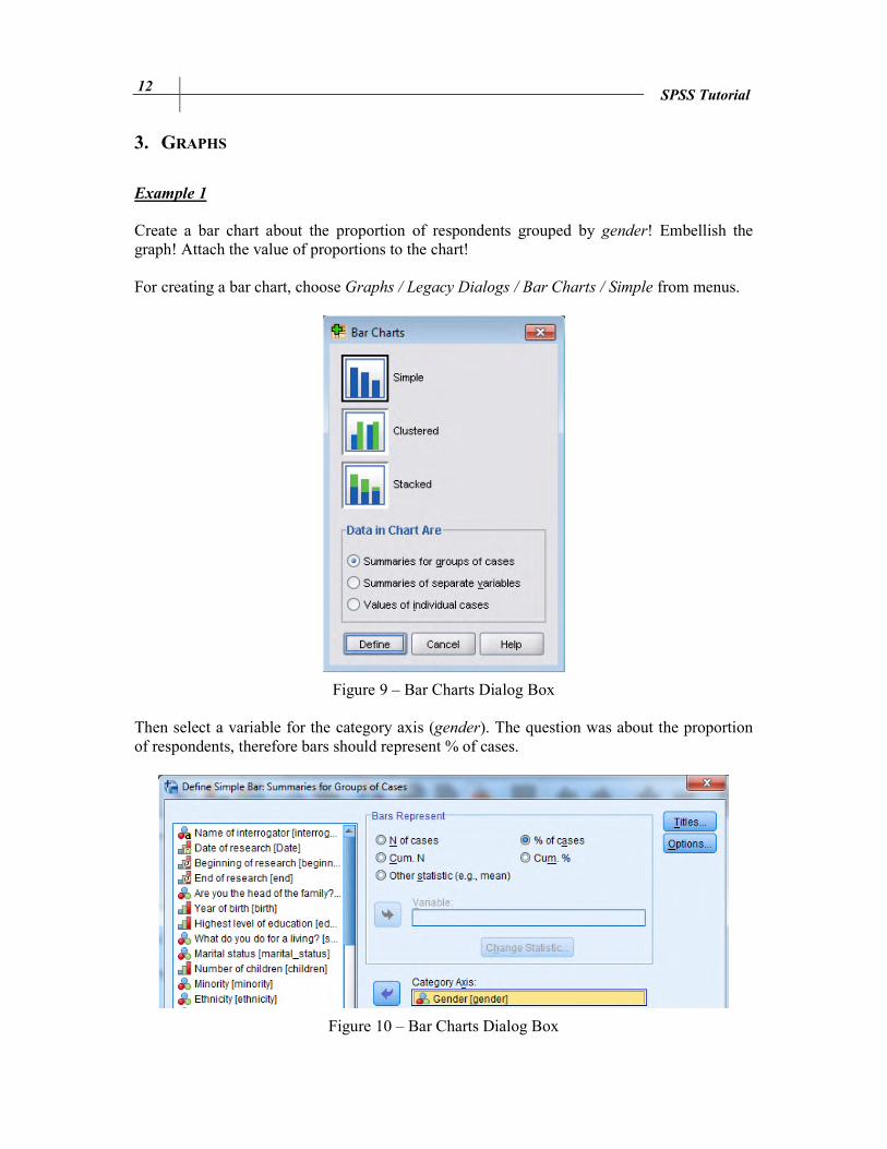
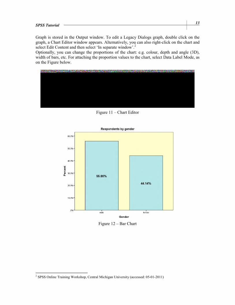
Example 1 Create a bar chart about the proportion of respondents grouped by gender! Embellish the graph! Attach the value of proportions to the chart! For creating a bar chart, choose Graphs / Legacy Dialogs / Bar Charts / Simple from menus.
Figure 9 – Bar Charts Dialog Box Then select a variable for the category axis (gender). The question was about the proportion of respondents, therefore bars should represent % of cases.
Figure 10 – Bar Charts Dialog Box
SPSS Tutorial 13
Graph is stored in the Output window. To edit a Legacy Dialogs graph, double click on the graph, a Chart Editor window appears. Alternatively, you can also right-click on the chart and select Edit Content and then select ‘In separate window’.2 Optionally, you can change the proportions of the chart: e.g. colour, depth and angle (3D), width of bars, etc. For attaching the proportion values to the chart, select Data Label Mode, as on the Figure below.
Figure 11 – Chart Editor
Figure 12 – Bar Chart
2 SPSS Online Training Workshop, Central Michigan University (accessed: 05-01-2011)

14 SPSS Tutorial
Example 2 Transform the bar chart into a pie chart! In order to transform a chart, click the previously edited bar chart in the Chart Editor and select the Properties from the menus: Edit / Properties / Variables / Element Type…
Figure 13 – Chart Editor Properties Dialog Box
Figure 14 – Pie Chart
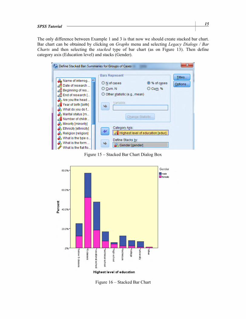
Example 3
Create a column diagram about the proportion of respondents grouped by education level stacked by gender! Embellish the graph!
SPSS Tutorial 15
The only difference between Example 1 and 3 is that now we should create stacked bar chart. Bar chart can be obtained by clicking on Graphs menu and selecting Legacy Dialogs / Bar
Charts and then selecting the stacked type of bar chart (as on Figure 13). Then define category axis (Education level) and stacks (Gender).
Figure 15 – Stacked Bar Chart Dialog Box
Figure 16 – Stacked Bar Chart
16 SPSS Tutorial
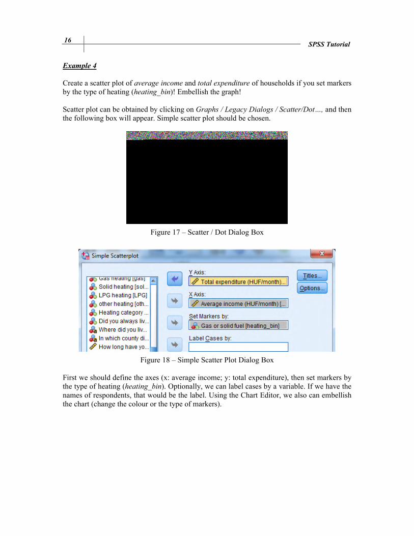
Example 4
Create a scatter plot of average income and total expenditure of households if you set markers by the type of heating (heating_bin)! Embellish the graph! Scatter plot can be obtained by clicking on Graphs / Legacy Dialogs / Scatter/Dot…, and then the following box will appear. Simple scatter plot should be chosen.
Figure 17 – Scatter / Dot Dialog Box
Figure 18 – Simple Scatter Plot Dialog Box First we should define the axes (x: average income; y: total expenditure), then set markers by the type of heating (heating_bin). Optionally, we can label cases by a variable. If we have the names of respondents, that would be the label. Using the Chart Editor, we also can embellish the chart (change the colour or the type of markers).

SPSS Tutorial 17
Figure 19 – Simple Scatter Plot
Example 5 Define a horizontal box plot of total expenditure! Embellish the graph! First of all, we should define, what a box plot means. The box plot is a set of summary measures of distributions, like median, lower quartile, upper quartile, the smallest and the largest observations, moreover, the asymmetry can be seen as well.
Figure 20 – Box Plot Source: Aczel, 1996

18 SPSS Tutorial
Turning back to the exercise, we should create a box plot: Graphs / Legacy Dialogs / Boxplot. Choose simple chart to create a plot of one variable, and clustered for a comparison of variable types. Now we need a simple box plot of current salary, where data are summaries of separate variables.
Figure 21 – Box Plot Dialog Box For a horizontal box plot we need to transpose the chart: Chart Editor / Options / Transpose Chart.
Figure 22 – Box Plot Chart Editor
SPSS Tutorial 19
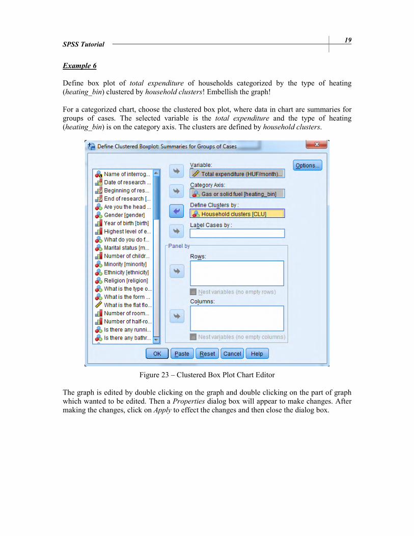
Example 6
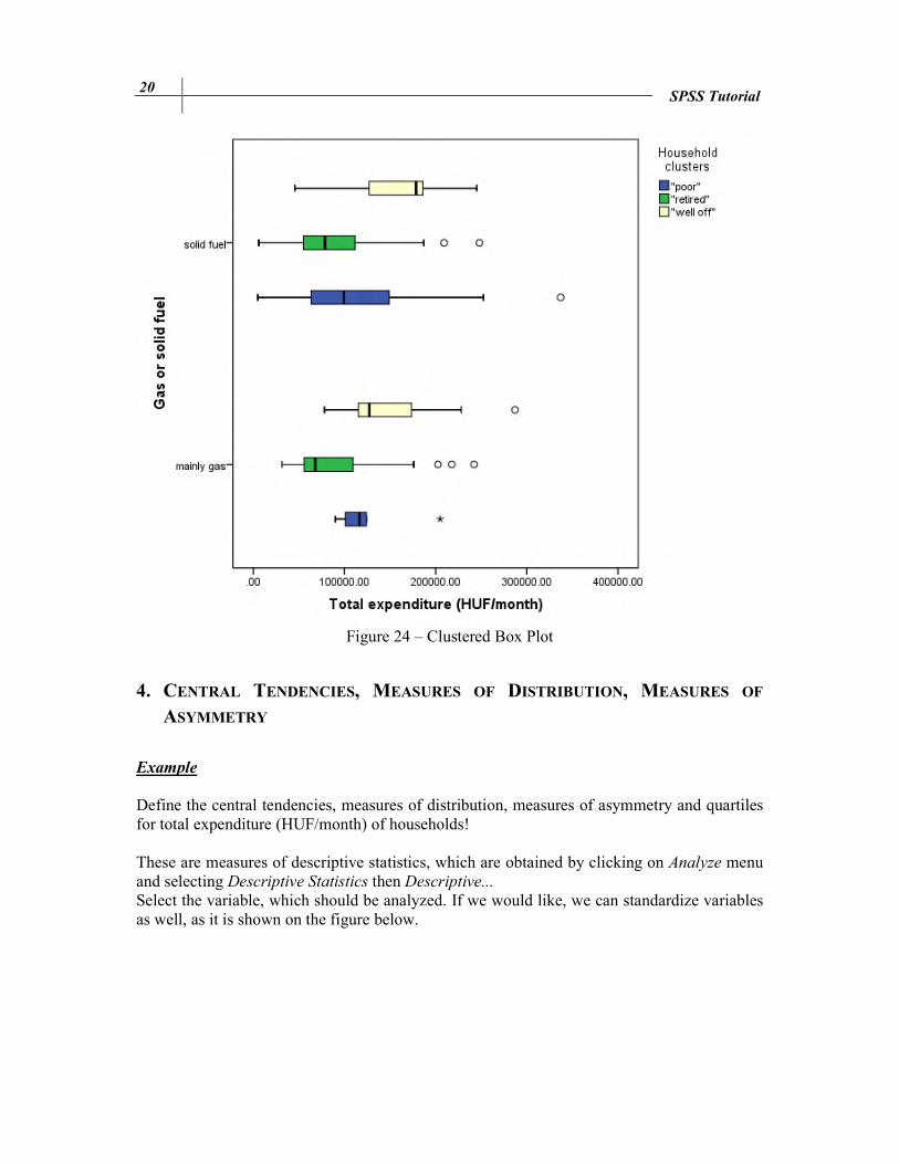
Define box plot of total expenditure of households categorized by the type of heating (heating_bin) clustered by household clusters! Embellish the graph! For a categorized chart, choose the clustered box plot, where data in chart are summaries for groups of cases. The selected variable is the total expenditure and the type of heating (heating_bin) is on the category axis. The clusters are defined by household clusters.
Figure 23 – Clustered Box Plot Chart Editor The graph is edited by double clicking on the graph and double clicking on the part of graph which wanted to be edited. Then a Properties dialog box will appear to make changes. After making the changes, click on Apply to effect the changes and then close the dialog box.
20 SPSS Tutorial
Figure 24 – Clustered Box Plot
4. CENTRAL TENDENCIES, MEASURES OF DISTRIBUTION, MEASURES OF
ASYMMETRY
Example
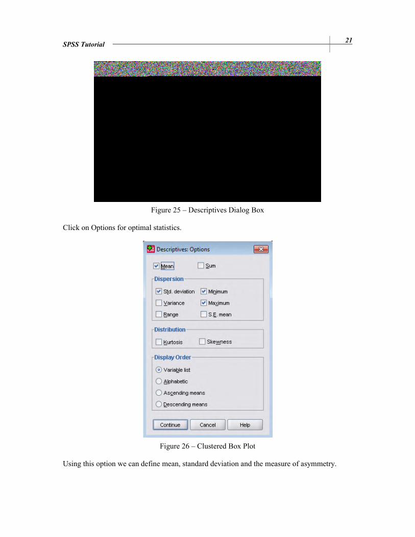
Define the central tendencies, measures of distribution, measures of asymmetry and quartiles for total expenditure (HUF/month) of households! These are measures of descriptive statistics, which are obtained by clicking on Analyze menu and selecting Descriptive Statistics then Descriptive... Select the variable, which should be analyzed. If we would like, we can standardize variables as well, as it is shown on the figure below.
SPSS Tutorial 21
Figure 25 – Descriptives Dialog Box Click on Options for optimal statistics.
Figure 26 – Clustered Box Plot Using this option we can define mean, standard deviation and the measure of asymmetry.
22 SPSS Tutorial
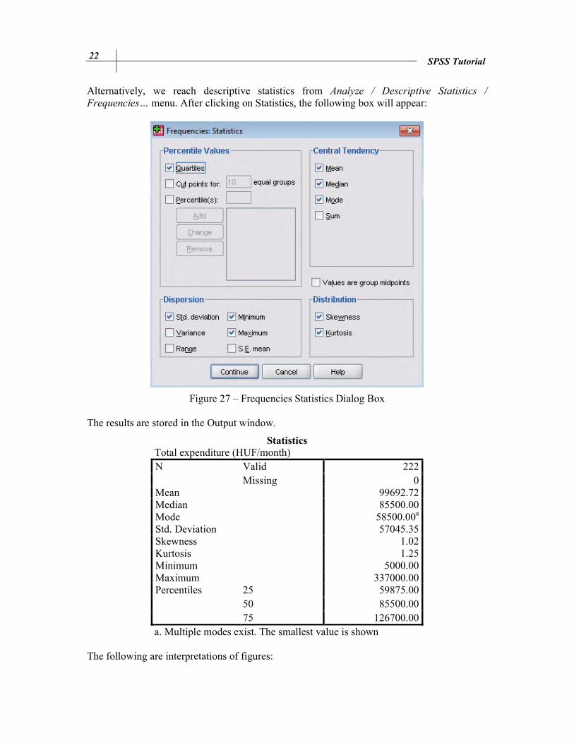
Alternatively, we reach descriptive statistics from Analyze / Descriptive Statistics /
Frequencies… menu. After clicking on Statistics, the following box will appear:
Figure 27 – Frequencies Statistics Dialog Box The results are stored in the Output window.
Statistics Total expenditure (HUF/month) N Valid 222
Missing 0 Mean 99692.72 Median 85500.00 Mode 58500.00a Std. Deviation 57045.35 Skewness 1.02 Kurtosis 1.25 Minimum 5000.00 Maximum 337000.00 Percentiles 25 59875.00
50 85500.00 75 126700.00
a. Multiple modes exist. The smallest value is shown The following are interpretations of figures:
SPSS Tutorial 23
• 222 households were examined in Csernely. (Number of cases) • The average monthly expenditure is 99 692.72 HUF. • Half of the households spend more than 85 500 HUF, the other half of them spend
less. (85 500 HUF is the value above and below which half of the cases fall.) • The most frequently occurring monthly expenditure is 58 500 HUF. Multiple mode
exist and 58 500 HUF is the smallest value. • The average dispersion around the mean is 57045.35 HUF. • Long right tail asymmetry. (A distribution with a significant positive skewness has a
long right tail.) • Positive kurtosis indicates that the observations cluster more and have longer tails than
those in the normal distribution. • The lowest total expenditure of households is 5 000 HUF. • The highest total expenditure of households is 337 000 HUF. • 25% of households have lower monthly expenditure than 59 875 HUF and 75% have
higher. • 75% of households have lower monthly expenditure than 126 700 HUF and 25% have
higher.
5. ESTIMATION AND HYPOTHESIS TESTING
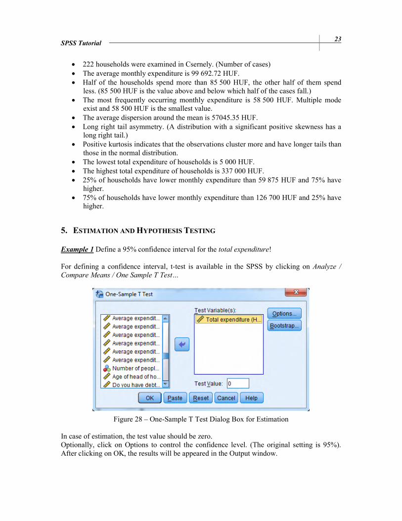
Example 1 Define a 95% confidence interval for the total expenditure! For defining a confidence interval, t-test is available in the SPSS by clicking on Analyze /
Compare Means / One Sample T Test…
Figure 28 – One-Sample T Test Dialog Box for Estimation In case of estimation, the test value should be zero. Optionally, click on Options to control the confidence level. (The original setting is 95%). After clicking on OK, the results will be appeared in the Output window.

24 SPSS Tutorial
Test Value = 0
t df Sig. (2-tailed)
Mean Difference
95% Confidence Interval of the Difference
Lower Upper
26.039 221 0.000 99692.71622 92147.4136 107238.0189
The average total expenditure of households is between 92 147.4136 and 107 238.0189 HUF at 95% confidence level.
Example 2 Test the hypothesis that the total expenditure of households equals $100 000. (α = 5%) From the menu choose Analyze / Compare Means / One Sample T Test…
Enter the test value which each mean sample is compared. This is 100 000, as you can see below.
Figure 29 – One-Sample T Test Dialog Box for Hypothesis Testing If the significance level is 5%, the confidence level will be 95%, which can be edited under the Options menu. The results are the following:
Test Value = 100000
t df Sig.
(2-tailed) Mean
Difference
95% Confidence Interval of the Difference
Lower Upper
-.080 221 .936 -307.28378 -7852.5864 7238.0189

SPSS Tutorial 25
If the p-value is less than 0.05, we reject the null. The p-value is 0.936, so we are basically declaring the null hypothesis to be true. Example 3 Test the hypothesis that the average expenditure on heating of households heating with gas and households heating with solid fuels are equal! (α = 5%) For comparing two independent means use independent t-test by clicking on Analyze /
Compare Means / Independent Samples T Test…
Figure 30 – Independent Samples T Test Dialog Box Select the type of heating (heating_bin) as a grouping variable, where the groups are gas and solid fuels (coded as 1 and 2). Cases with any other values are excluded from the analysis. By clicking on Options, the confidence level can be changed. If the population standard deviations are unknown, we have an assumption for equality of variances. Levene’s test controls the equality of variances.
Levene's Test for Equality of Variances
t-test for Equality of Means
F Sig. t df
Sig. (2-tailed)
Mean Difference
Std. Error Difference
Equal variances assumed
5.012 0.026 -1.506 190 0.134 -5617.6 3729.59
Equal variances not assumed
-1.716 189.990 0.088 -5617.6 3273.48
We should analyze the first row, because equal variances assumed, because ngas=71 and nsolid_fuel=121 (small sample size). When the F-value is large and the significance level of Levene’s Test is small (smaller than say 0.1) the hypothesis of equal variances can be

26 SPSS Tutorial
rejected. The assumption is not significantly satisfied thus we cannot analyze the results of t-test. Anyway, we are basically declaring the alternative hypothesis to be true. Typically a conditional probability (critical significance level) of less than 0.1 or 0.05 is considered significant, thus the average expenditure on heating of households heating with gas or solid fuels are not equal. Example 4 Nonparametric Tests – Hypothesis Testing for Distribution Problem: Test the normality of average expenditure on heating! α=5% Many parametric tests require normally distributed variables, thus we should test the hypotheses, whether the variable follows normal distribution or not.
H0: Normal distribution H1: Not normal distribution
Nonparametric hypothesis testing was applied to test for a normal distribution, that is why we will find this by clicking on Analyze / Nonparametric tests / 1-Sample K-S Test in the SPSS.
One-Sample Kolmogorov – Smirnov Test procedure compares the observed cumulative distribution function for a variable with a specified theoretical distribution, which can be normal as well.
Figure 31 – One-Sample Kolmogorov–Smirnov Test Dialog Box The test variable is now the average expenditure on heating and the test distribution is normal. If we want, we can generate descriptive statistics (usually including mean, standard deviation, sample size, minimum and maximum values, etc) by clicking on Options. It is good to know
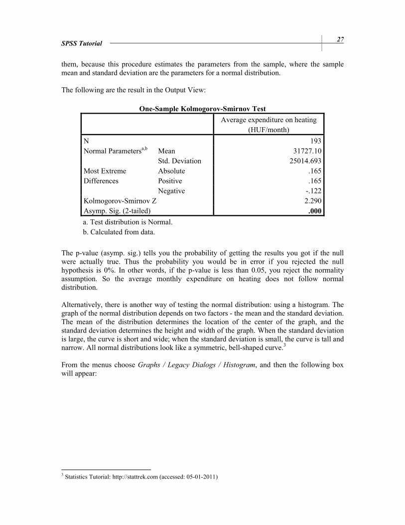
SPSS Tutorial 27
them, because this procedure estimates the parameters from the sample, where the sample mean and standard deviation are the parameters for a normal distribution. The following are the result in the Output View:
One-Sample Kolmogorov-Smirnov Test
Average expenditure on heating
(HUF/month)
N 193 Normal Parametersa,b Mean 31727.10
Std. Deviation 25014.693 Most Extreme Differences
Absolute .165 Positive .165 Negative -.122
Kolmogorov-Smirnov Z 2.290 Asymp. Sig. (2-tailed) .000
a. Test distribution is Normal. b. Calculated from data.
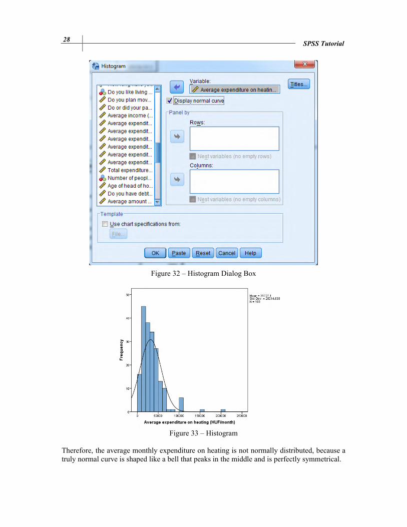
The p-value (asymp. sig.) tells you the probability of getting the results you got if the null were actually true. Thus the probability you would be in error if you rejected the null hypothesis is 0%. In other words, if the p-value is less than 0.05, you reject the normality assumption. So the average monthly expenditure on heating does not follow normal distribution. Alternatively, there is another way of testing the normal distribution: using a histogram. The graph of the normal distribution depends on two factors - the mean and the standard deviation. The mean of the distribution determines the location of the center of the graph, and the standard deviation determines the height and width of the graph. When the standard deviation is large, the curve is short and wide; when the standard deviation is small, the curve is tall and narrow. All normal distributions look like a symmetric, bell-shaped curve.3 From the menus choose Graphs / Legacy Dialogs / Histogram, and then the following box will appear:
3 Statistics Tutorial: http://stattrek.com (accessed: 05-01-2011)
28 SPSS Tutorial
Figure 32 – Histogram Dialog Box
Figure 33 – Histogram
Therefore, the average monthly expenditure on heating is not normally distributed, because a truly normal curve is shaped like a bell that peaks in the middle and is perfectly symmetrical.
SPSS Tutorial 29
Example 5
Test the hypothesis, that average expenditure on heating of households heating with gas and households heating with solid fuels are equal, if we know that the average expenditure on heating does not follow normal distribution. H0: The average expenditure on heating of households heating with gas and households
heating with solid fuels are equal. H1: The average expenditure on heating of households heating with gas and households
heating with solid fuels are not equal. In case of a non-normally distributed variable, we should use a nonparametric test for hypothesis testing. From the menus choose Analyze / Nonparametric tests / 2-Independent
Samples and then the following dialog box will appear:
Figure 34 – Two-Independent-Samples Tests Dialog Box Select the average expenditure on heating for test variable and heating category (heating_bin) for grouping variable. Click on Define Groups to split the file into two groups: Group 1: mainly gas (coded 1), Group 2: solid fuel (coded 2). Mann-Whitney U Test is the most popular two-independent-samples test. The following are the results from the Output window:
Test Statisticsa
Average expenditure on heating
(HUF/month)
Mann-Whitney U 4020.000 Wilcoxon W 6576.000 Z -.743 Asymp. Sig. (2-tailed) .458
a. Grouping Variable: Gas or solid fuel

30 SPSS Tutorial
The p-value is less than 0.1, so we reject the null hypothesis. The salary of clericals and managers are not equal.
6. STATISTICAL DEPENDENCE
Example 1 Create crosstabs from the type of heating (heating_bin) and household clusters!
Cross tabulation is the process of creating a contingency table from the multivariate frequency distribution of statistical variable. From the menus choose Analyze / Descriptive Statistics /
Crosstabs.
Figure 35 – Crosstabs Dialog Box Select the row and column variable. It is up to you, which one is selected for row or column. By clicking on cells, percentages or residuals can be displayed as well, as it is shown on the figure below.

SPSS Tutorial 31
Figure 36 – Cell Display Dialog Box Therefore, each cell of the statistical table can contain any combinations of counts, percentages (or residuals) selected. The observed counts are the frequencies (fij), while the expected counts are the frequencies for independence (f*
ij).
f f
f .ji.ij
n
⋅=
∗ , where fi. and f.j are marginal frequencies.

32 SPSS Tutorial
Example 2 Is there any dependence between the type of heating (heating_bin) and household clusters? Both variables are qualitative variables, thus we should calculate the measures of association for determining the strength of the relation. Select Analyze / Descriptive Statistics / Crosstabs, as we did in Example 1. Add heating_bin to rows, and household clusters to columns. However, now click on Statistics if measures of association requested.
Figure 37 – Crosstabs Statistics Dialog Box Chi-square should be selected to calculate the Pearson chi-square and the likelihood-ratio. Chi-square test is always a right tail test. Pearson chi-square statistic is used to test the hypothesis that the row and column variables are independent. Independence exists if the probability of their joint occurrence is equal to the product of their marginal probabilities.
H0: the two classification variables are independent of each other (Pij = Pi. · P.j) H1: the two classification variables are NOT independent (H1: ij: Pij ≠ Pi. · P.j)
The degrees of freedom are the degrees of freedom for the row variable times the degrees of freedom for the column variable. It is the product of the two degrees of freedom.

SPSS Tutorial 33
αχ −120
Pr
2χ Figure 38 – Chi-square Distribution
For general purposes, the significance value is more important than the value of the statistic. Typically, a significance value of less than 0.05 is considered significant. For large sample sizes, the Pearson and Likelihood ratio statistics are equivalent. For nominal data you can select Cramer’s V, which is the measure of association based on chi-square. If the Cramer’s measure is less than 0.3, the strength of dependence is weak. If it is between 0.3 and 0.7, the strength of dependence between variables is medium-strong. And if it is higher than 0.7, we say the dependence strong.
According to chi-square statistic, the variables are not independent.
There is a weak dependence between the type of heating & household clusters. We can accept the statement at every significance level.
34 SPSS Tutorial
Example 3 Is there any dependence between the type of heating (heating_bin) and the average expenditures on heating? The dependent variable, which is the current salary, is quantitative and the independent variable, gender is categorical. Thus it is a mixed dependence. To obtain the measures of mixed dependence, choose the Analyze menu then Compare Means / Means.
Figure 39 – Means Dialog Box We can define the subgroup means and standard deviations by clicking on Options. The measures of mixed dependence can be found here as well.
Figure 40 – Means Options Dialog Box

SPSS Tutorial 35
Because cell statistics were selected, the following table is displayed in the Output window.
This table shows the central tendency & dispersion of the dependent variable (average expenditure on heating) grouped by the independent variable (heating_bin). ANOVA table displays a one-way analysis-of-variance table to determine F-statistic. F-value is the ratio of two mean squares. A large F-value with small significance level indicates that the results probably are not due to random chance. Thus we should take the probability (Sig.) into consideration, which shows that the relationship as strong as the one observed in the data would be present, if the null hypothesis were true. Typically, a value less than 0.05 is considered significant.
Now we can say that there is no significant relationship between the heating type and average expenditure on heating. (However, at a significance level higher than 13.4% we can accept the statement, that there is relation between the variables.) The degree of strength is shown below:
Eta is the so-called H-measure, which shows the degree of strength of relationship between variables. The value is higher than 0.3 but less than 0.7, thus the relationship between the heating type and the average expenditure on heating is weak. (Values close to 1 indicate a high degree of relationship). Eta squared is often called H2-measure, which is the proportion of variance in the dependent variable explained by differences among groups. Therefore 1.2% of variance in the average expenditure on heating is explained by the heating type.

36 SPSS Tutorial
7. CORRELATION AND LINEAR REGRESSION
Example 1 Is there any relationship between the total expenditure and average income? Beginning salary and current salary are quantitative variables, so the relationship between them is a correlation, thus the correlation coefficient should be calculated. From the menus choose Analyze / Correlate / Bivariate. For quantitative, normally distributed variables, choose the Pearson correlation coefficient. If the data are not normally distributed or have ordered categories, choose Kendall’s tau-b or Spearman, which measure the relationship between rank orders. (SPSS 16.0 Tutorial)
Figure 41 – Bivariate Correlations Dialog Box
Optionally, covariance can be displayed by clicking on Options. Covariance is an unstandardized measure of the relationship between two variables, equal to the cross-product deviation divided by n-1. It shows the direction of a relationship (positive or negative relationship).
SPSS Tutorial 37
Total expenditure
(HUF/month) Average income
(HUF/month)
Total
expenditure
(HUF/month)
Pearson Correlation 1 0.539(**) Sig. (2-tailed) 0.000
Covariance 3254171744.937 2147784135.965 N 222 217
Average
income
(HUF/month)
Pearson Correlation 0.539(**) 1 Sig. (2-tailed) 0.000 Covariance 2147784135.965 4814606330.816 N 217 217
There is a positive, medium-strong and significant (Sig.=0.000) relationship between the average expenditure and income.
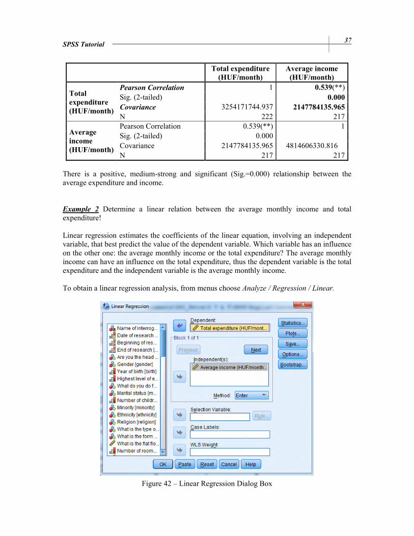
Example 2 Determine a linear relation between the average monthly income and total expenditure! Linear regression estimates the coefficients of the linear equation, involving an independent variable, that best predict the value of the dependent variable. Which variable has an influence on the other one: the average monthly income or the total expenditure? The average monthly income can have an influence on the total expenditure, thus the dependent variable is the total expenditure and the independent variable is the average monthly income. To obtain a linear regression analysis, from menus choose Analyze / Regression / Linear.
Figure 42 – Linear Regression Dialog Box

38 SPSS Tutorial
Optionally, we can display the covariance matrix and the matrix for correlation coefficients (again) by clicking on Statistics, as it is shown on the figure below.
Figure 43 – Linear Regression: Statistics Dialog Box ANOVA table is used for test the significance of the overall regression. If the significance level is close to zero (lower than 0.05), the regression is significant.
ANOVA table for bivariate regression model
Model Sum of Squares df Mean Squares F
Regression 2
iy )yy( = S −Σ 1 yS 2)-/(nS
S =F
e
y
Residual 2ie )y(y = S −Σ n-2 )2n/(S s e
2e −=
Total 2
iy )y(y = S −Σ n-1
ANOVA
b
Model Sum of Squares df Mean Square F Sig.
1 Regression 2.070E11 1 2.070E11 88.012 .000a
Residual 5.056E11 215 2.351E9
Total 7.125E11 216
a. Predictors: (Constant), Average income (HUF/month)
b. Dependent Variable: Total expenditure (HUF/month)

SPSS Tutorial 39
For analyzing the coefficients of linear regression, take a look on the table below.
Coefficients a
Model
Unstandardized
Coefficients
Standardized
Coefficients t Sig.
B Std. Error Beta
1 (Constant) 47355.059 6534.580 7.247 0.000
Average income (HUF/month)
0.446 .048 .539 9.381 0.000
The constant is the intercept point, when x=0. In general, it does not have a meaning, so we do not interpret the constant. However, it would be the average total expenditure (47355.059 HUF) in the case of zero average income. The b1 coefficient tells you how much the dependent variable is expected to increase (if the coefficient is positive) or decrease (if the coefficient is negative) when that independent variable increases by one. Therefore, when the average income increases by 1 HUF, the total expenditure is expected to increase by 0.446 HUF. Moreover, it is good to interpret the results of t-test, which test the significance of the parameters. A lower p-value than 0.05 (5%) is the generally accepted to reject the null hypothesis of using non-significant values.
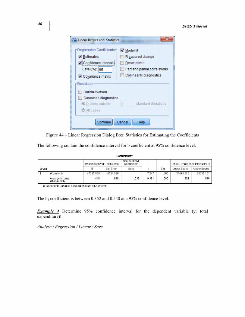
Example 3 Determine 95% confidence interval for the b1 parameter! Analyze / Regression / Linear / Statistics For displaying the confidence interval of b coefficients, click on the box next to ‘Confidence intervals’ and change the confidence level, if it is necessarily.
40 SPSS Tutorial
Figure 44 – Linear Regression Dialog Box: Statistics for Estimating the Coefficients The following contain the confidence interval for b coefficient at 95% confidence level.
The b1 coefficient is between 0.352 and 0.540 at a 95% confidence level.
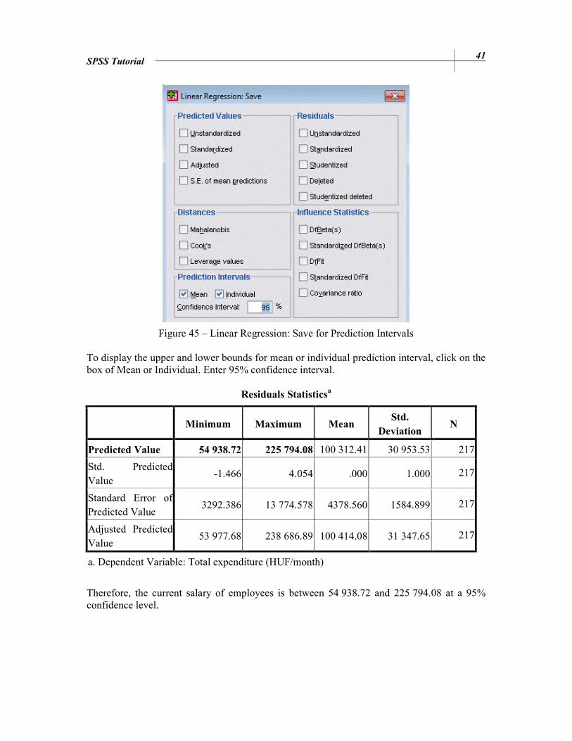
Example 4 Determine 95% confidence interval for the dependent variable (y: total expenditure)! Analyze / Regression / Linear / Save
SPSS Tutorial 41
Figure 45 – Linear Regression: Save for Prediction Intervals To display the upper and lower bounds for mean or individual prediction interval, click on the box of Mean or Individual. Enter 95% confidence interval.
Residuals Statisticsa
Minimum Maximum Mean Std.
Deviation N
Predicted Value 54 938.72 225 794.08 100 312.41 30 953.53 217
Std. Predicted Value
-1.466 4.054 .000 1.000 217
Standard Error of Predicted Value
3292.386 13 774.578 4378.560 1584.899 217
Adjusted Predicted Value
53 977.68 238 686.89 100 414.08 31 347.65 217
a. Dependent Variable: Total expenditure (HUF/month)
Therefore, the current salary of employees is between 54 938.72 and 225 794.08 at a 95% confidence level.
42 SPSS Tutorial
8. MULTIPLE CORRELATION AND LINEAR REGRESSION
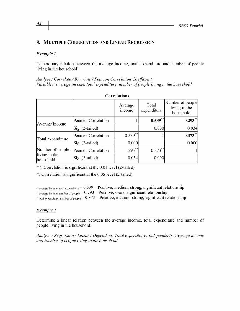
Example 1 Is there any relation between the average income, total expenditure and number of people living in the household! Analyze / Correlate / Bivariate / Pearson Correlation Coefficient
Variables: average income, total expenditure, number of people living in the household
Correlations
Average income
Total expenditure
Number of people living in the household
Average income
Pearson Correlation 1 0.539** 0.293
**
Sig. (2-tailed) 0.000 0.034
Total expenditure
Pearson Correlation 0.539** 1 0.373**
Sig. (2-tailed) 0.000 0.000
Number of people living in the household
Pearson Correlation .293** 0.373** 1
Sig. (2-tailed) 0.034 0.000
**. Correlation is significant at the 0.01 level (2-tailed).
*. Correlation is significant at the 0.05 level (2-tailed).
r average income, total expenditure = 0.539 – Positive, medium-strong, significant relationship r average income, number of people = 0.293 – Positive, weak, significant relationship r total expenditure, number of people = 0.373 – Positive, medium-strong, significant relationship
Example 2 Determine a linear relation between the average income, total expenditure and number of people living in the household! Analyze / Regression / Linear / Dependent: Total expenditure; Independents: Average income
and Number of people living in the household.

SPSS Tutorial 43
Figure 46 – Multiple Linear Regression
A multiple linear regression has more conditions:
• Assumptions for error term:
– Normally distributed error; – Expected value of error= 0; E(ε)=0; – The variance is the same for all observations (Homoscedasticity); – Uncorrelated across observations (no autocorrelation).
• Assumptions for the Independent Variables:
– The independent variable is not random; – No multicollinearity (the predictors should not correlate).
These assumptions can be tested in the SPSS; however this is the topic of MSc courses that is why we do not show them. The following are the results of linear regression:

44 SPSS Tutorial
Model Summary b
Model R R Square Adjusted R
Square Std. Error of the
Estimate Durbin-Watson
1 0.581a 0.338 0.332 46 948.77 1.780
a. Predictors: (Constant), Average income (HUF/month), Number of people living in the household
b. Dependent Variable: Total expenditure (HUF/month) R (coefficient of correlation): there is a medium-strong relationship between the dependent variable (total expenditure) and the independent variables (average income & number of people living in the household). R2 (coefficient of determination): 33.8% of variance in the total expenditure explained by average income & number of people living in the household.
2R : 33.2% of variance in the total expenditure explained by average income & number of people living in the household after a correction by the sample size and number of parameters. It corrects R2 to more closely reflect the goodness-of-fit of the model in the population. The following are the analysis of variance table for multiple regression model, which is to test the significance of the overall regression:
ANOVA table for multiple regression model
Model Sum of Squares df Mean Squares F
Regression 2
iy )yy( = S −Σ p4 yS 1)-p-/(nS
S =F
e
y
Residual 2ie )y(y = S −Σ n-p-1 )1n/(S s e
2e −−= p
Total 2
iy )y(y = S −Σ n-1
ANOVA
b
Model Sum of Squares df Mean Square F Sig.
1 Regression 2.408E11 2 1.204E11 54.627 0.000a
Residual 4.717E11 214 2.204E9
Total 7.125E11 216
a. Predictors: (Constant), Average income (HUF/month), Number of people living in the household
b. Dependent Variable: Total expenditure (HUF/month) The table above shows, that the multiple regression model is significant.
4 p: number of independent variables

SPSS Tutorial 45
Moreover, we have to give interpretations for the parameters. b0: not analyzed (generally, it is the mean for the response when all of the independent
variables (x) take on the value 0.) b1: the total expenditure is expected to increase by 0.391 when the average income increases
by 1 HUF, holding all the other independent variables constant. b2: the total expenditure is expected to increase by 8334.457 HUF when the number of people
living in the household increases by 1 people, holding all the other independent variables constant.
9. CURVILINEAR REGRESSION
Example
Which regression model fit the most on the relation total expenditure and average income? We should test the types of regression by curve estimation: Analyze / Regression / Curve
Estimation / Dependent: Total expenditure; Independent: Average income; Models: Linear,
Power, Compound. There are three methods how to test the best fitting regression model:
- Plot model (select ‘Plot Model’): it plots the values of the dependent variable and each selected model against the independent variable. In this way we can determine which model to use. If the variables appear to be related linearly, use a simple linear regression model. If the variables are not linearly related, use a curvilinear regression. The most frequently used curvilinear regressions are the power and compound regressions.
- ANOVA table (select ‘Display ANOVA table’): displays a summary analysis of variance table for each selected model. When the significance level is lower than 0.05, the model is well-fitted.
- Model summary: R2 shows the goodness-of-fit (in case of linear regression). The higher is the R2, the better is the model fitting on the data.

46 SPSS Tutorial
Figure 47 – Curve Estimation Dialog Box The results are displayed in the Output window. The significance levels of F-tests are 0 in all cases. Thus we should compare the goodness-of-fit results.
Linear Regression Model Summary
R R Square Adjusted R Square Std. Error of the Estimate
0.539 0.290 0.287 48 491.495
The independent variable is Average income (HUF/month).
Compound Regression Model Summary
R R Square Adjusted R Square Std. Error of the Estimate
0.515 0.265 0.262 0.580
The independent variable is Average income (HUF/month).
Power Regression Model Summary
R R Square Adjusted R Square Std. Error of the Estimate
0.574 0.330 0.326 0.554
The independent variable is Average income (HUF/month).
SPSS Tutorial 47
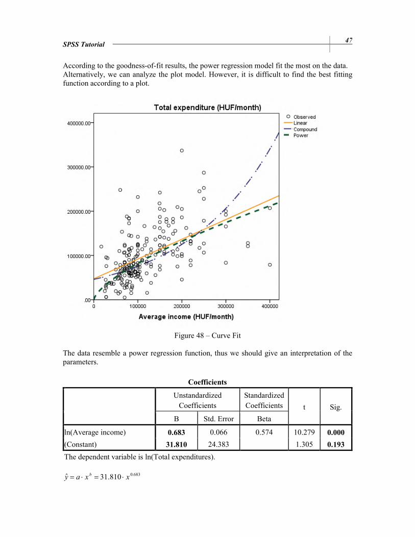
According to the goodness-of-fit results, the power regression model fit the most on the data. Alternatively, we can analyze the plot model. However, it is difficult to find the best fitting function according to a plot.
Figure 48 – Curve Fit The data resemble a power regression function, thus we should give an interpretation of the parameters.
Coefficients
Unstandardized Coefficients
Standardized Coefficients t Sig.
B Std. Error Beta
ln(Average income) 0.683 0.066 0.574 10.279 0.000
(Constant) 31.810 24.383 1.305 0.193
The dependent variable is ln(Total expenditures).
683.0810.31ˆ xxay b⋅=⋅=
48 SPSS Tutorial
a: 31.810 is the total expenditure of a household in Csernely, whose average income was 1 HUF. b: If the average income increases by 1%, the total expenditures increases by 0.683%. Note: Power regression: ŷ = a ⋅ Xb
• a: when x=1, y=a (a=10b0) • b: when x increases by 1%, we expect y to change by b% (b=b1=E).
Compound regression: ŷ = a ⋅ bx
• a: no analyzation • b: when x increases by 1 unit, we expect y to be b times of the coefficient.
10. TIME SERIES ANALYZES
Example 1 The following are data about a population in 1994.
Month Population
(thousand persons)
Number of birth
(persons)
Number of death
(persons)
1 10 273 10 238 13 888 2 10 270 9 285 12 825 3 10 267 10 105 12 516 4 10 265 9 617 11 753 5 10 262 9 548 12 328 6 10 260 9 717 11 839 7 10 258 9 965 11 848 8 10 257 9 980 11 722 9 10 256 9 844 10 968
10 10 252 9 021 12 542 11 10 249 8 740 11 743 12 10 246 9 538 12 917
Source: HCSO
Problem:
a) Create an SPSS data set! Variable View:
SPSS Tutorial 49
Data View:
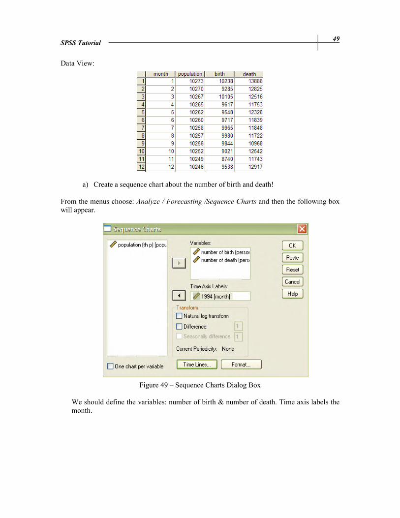
a) Create a sequence chart about the number of birth and death!
From the menus choose: Analyze / Forecasting /Sequence Charts and then the following box will appear.
Figure 49 – Sequence Charts Dialog Box
We should define the variables: number of birth & number of death. Time axis labels the month.

50 SPSS Tutorial
Figure 50 – Sequence Chart
b) Create a linear trend model for the number of birth!
From the menus choose: Analyze / Regression /Curve Estimation. The dependent variable is the number of birth; however, select Time for independent variable.
Figure 51 – Curve Estimation for Linear Trend Model
The results are displayed in the Output window.
SPSS Tutorial 51
ANOVA
536259,1 1 536259,084 3,261 ,101
1644363 10 164436,258
2180622 11
Regression
Residual
Total
Sum of
Squares df Mean Square F Sig.
According to ANOVA table, the linear regression model is not significant. (Or significant at higher significance level than 10.1%)
Coefficients
-61,238 33,910 -,496 -1,806 ,101
10031,212 249,573 40,194 ,000
Case Sequence
(Constant)
B Std. Error
Unstandardized
Coefficients
Beta
Standardized
Coefficients
t Sig.
Linear regression line: ŷ=b0+b1t=10031.212-61.238t b0: In December 1993, the average number of birth was 10031.212 persons. b1: The monthly average growth rate is -62.238 persons.
c) Give estimation for the number of birth in January 1995! We can save predicted values in the Analyze / Regression / Curve Estimation / Save menu. There are two options for predict cases. The first one is the ‘Predict from estimation period through last case’, when values are predicted for all cases in the file, based on the cases in the estimation period. The second option (‘Predict through’) can be used to forecast values beyond the last case in the time series. Now we should predict through 13 observations, because we have 12 data for 1994, and the 13th is January 1995.
Figure 52 – Curve Estimation: Save Dialog Box

52 SPSS Tutorial
The results are saved in the Data Editor window.
Figure 53 – Predicted Number of Birth Example 2 The following are data about railway transportation.
Year Quarters Railway transport
(thousand tons) Year Quarters
Railway transport
(thousand tons)
1990 1 20 516 1992 3 11 044 1990 2 20 674 1992 4 14 806 1990 3 21 736 1993 1 10 924 1990 4 24 796 1993 2 9 870 1991 1 15 510 1993 3 10 579 1991 2 14 511 1993 4 13 456 1991 3 14 557 1994 1 4 920 1991 4 18 510 1994 2 6 354 1992 1 13 974 1994 3 6 834 1992 2 13 294 1994 4 8 599
Problem
a) Create a new SPSS data set! After opening a new SPSS data, we should type the railway transportation figures in the Data View. Then select Data / Define Dates… from the menus.

SPSS Tutorial 53
Figure 54 – Define Dates Dialog Box For this exercise we need cases defined in years and quarters as well. Then select the ‘Years, quarters’ option from the box. The first case is the first quarter in 1990. Then the data set is ready with 3 new columns: Year, Quarter and Date.
b) Create a sequence chart! A Sequence Chart can be created by clicking on Analyze / Forecasting / Sequence…
Figure 55 – Sequence Chart Dialog Box

54 SPSS Tutorial
The variable which should be drawn is the transportation, and the time axis is the created date variable. We suppose that we have seasonality in the model, thus add reference lines to the chart by clicking on Time Lines.
Figure 56 – Time Axis Reference Line Dialog Box We create lines at each change of quarters. The chart will be displayed in Output window.
Figure 57 – Time Axis Reference Line Dialog Box
SPSS Tutorial 55
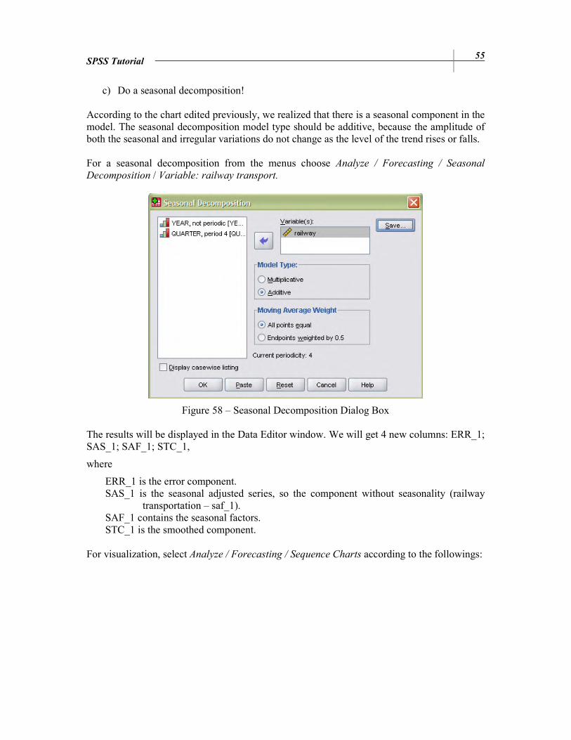
c) Do a seasonal decomposition!
According to the chart edited previously, we realized that there is a seasonal component in the model. The seasonal decomposition model type should be additive, because the amplitude of both the seasonal and irregular variations do not change as the level of the trend rises or falls. For a seasonal decomposition from the menus choose Analyze / Forecasting / Seasonal
Decomposition / Variable: railway transport.
Figure 58 – Seasonal Decomposition Dialog Box
The results will be displayed in the Data Editor window. We will get 4 new columns: ERR_1; SAS_1; SAF_1; STC_1,
where
ERR_1 is the error component. SAS_1 is the seasonal adjusted series, so the component without seasonality (railway
transportation – saf_1). SAF_1 contains the seasonal factors. STC_1 is the smoothed component.
For visualization, select Analyze / Forecasting / Sequence Charts according to the followings:
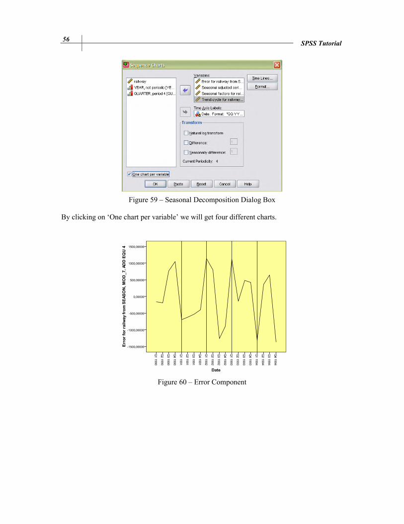
56 SPSS Tutorial
Figure 59 – Seasonal Decomposition Dialog Box
By clicking on ‘One chart per variable’ we will get four different charts.
Figure 60 – Error Component

SPSS Tutorial 57
Figure 61 – SAF_1: Seasonal Component
Figure 62 – SAS_1: Component without Seasonality
58 SPSS Tutorial
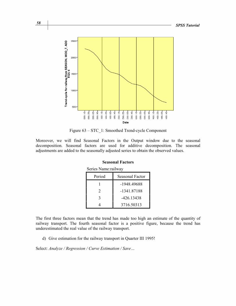
Figure 63 – STC_1: Smoothed Trend-cycle Component
Moreover, we will find Seasonal Factors in the Output window due to the seasonal decomposition. Seasonal factors are used for additive decomposition. The seasonal adjustments are added to the seasonally adjusted series to obtain the observed values.
Seasonal Factors
Series Name:railway
Period Seasonal Factor
1 -1948.49688
2 -1341.87188
3 -426.13438
4 3716.50313
The first three factors mean that the trend has made too high an estimate of the quantity of railway transport. The fourth seasonal factor is a positive figure, because the trend has underestimated the real value of the railway transport.
d) Give estimation for the railway transport in Quarter III 1995!
Select: Analyze / Regression / Curve Estimation / Save…

SPSS Tutorial 59
Figure 64 – Forecasted Values
We should just define the end of prediction period, which is the Quarter 3 in the year of 1995. Then we will get the results.
Figure 65 – Predicted Railway Transport
Note that we had seasonal component, thus we should modify the result: yQ3, 1995 = 3629.44 - 426.134 = 3203.306 According to the linear trend model, 3203.306 tons will be the railway transportation in Quarter 3, 1995.
60
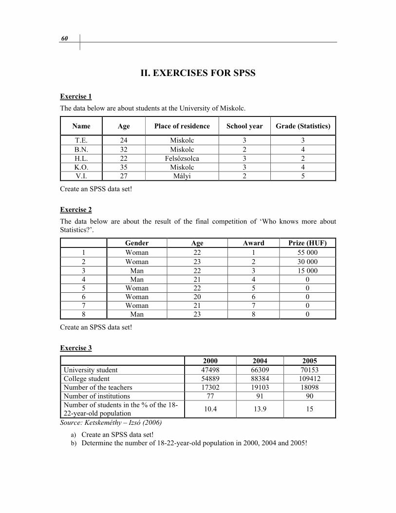
II. EXERCISES FOR SPSS
Exercise 1
The data below are about students at the University of Miskolc.
Name Age Place of residence School year Grade (Statistics)
T.E. 24 Miskolc 3 3 B.N. 32 Miskolc 2 4 H.L. 22 Felsőzsolca 3 2 K.O. 35 Miskolc 3 4 V.I. 27 Mályi 2 5
Create an SPSS data set!
Exercise 2
The data below are about the result of the final competition of ‘Who knows more about Statistics?’.
Gender Age Award Prize (HUF)
1 Woman 22 1 55 000 2 Woman 23 2 30 000 3 Man 22 3 15 000 4 Man 21 4 0 5 Woman 22 5 0 6 Woman 20 6 0 7 Woman 21 7 0 8 Man 23 8 0
Create an SPSS data set!
Exercise 3
2000 2004 2005
University student 47498 66309 70153 College student 54889 88384 109412 Number of the teachers 17302 19103 18098 Number of institutions 77 91 90 Number of students in the % of the 18-22-year-old population
10.4 13.9 15
Source: Ketskeméthy – Izsó (2006)
a) Create an SPSS data set! b) Determine the number of 18-22-year-old population in 2000, 2004 and 2005!

Exercises for SPSS 61
Exercise 4
Open the Employee_data.sav file!
Topic 1: Transform / Select Data
a) What is the proportion of custodials? b) What is the proportion of women within managers?
Topic 2: Graphs
a) Create a column diagram about the proportion of employees grouped by gender! Embellish the graph! Put the value of proportions into the chart!
b) Transform this column diagram into a pie chart! c) Create a scatter plot about month since hire and beginning salary if you set markers by
gender! Embellish the graph! d) Create a scatter plot about month since hire and previous experience if you set markers
by employment category! Embellish the graph! e) Define simple box plot about previous experience! Embellish the graph! f) Define simple box plot about the month since hire categorized by the employment
category! Embellish the graph! g) Define box plot about the previous experience categorized by the employment
category clustered by gender! Embellish the graph! h) Create a graph to test the normal distribution of beginning salary!
Topic 3: Central Tendencies, Measures of Distribution, Measures of Asymmetry
a) Define the central tendencies of month since hire! b) Define the characteristics of distribution of previous experience! c) What is the average salary of employees belonging to the minority?
Topic 4: Estimation and Hypothesis Testing
a) Define a 95% confidence interval for the previous experience! b) Define a 90% confidence interval for the beginning salary! c) Define a 98% confidence interval for month since hire! d) Test the hypothesis that the beginning salary of the employees equals $35 000. (α =
5%) e) Test the hypothesis that the beginning salary of the employees equals $15 000. (α =
10%) f) Test the hypothesis that the previous experience of employees equals 95 month. (α =
10%) g) Test the hypothesis that the previous experience of the managers equals 100 month. (α
= 10%) h) Test the hypothesis that the current salary of the custodial and manager are equal! (α =
10%) i) Test the hypothesis that the current salary of the employees belonging and not
belonging to the minority are equal! (α = 5%) j) Are the beginning salary of men and women equal? (α = 5%) k) Test the normality of beginning salary! (α = 5%) l) Test the hypothesis that the previous experience follows normal distribution! (α = 5%)

62 Exercises for SPSS
Topic 5: Statistical Dependence
a) Create a crosstabs about gender and minority classification! b) Is there any relationship between gender and minority classification? c) Is there any relationship between employment category and minority classification? d) Is there any relationship between minority classification and current salary? e) Is there any relationship between minority classification and previous experience? f) Is there any relationship between gender and previous experience?
Topic 6: Correlation and Linear Regression
a) Is there any relation between previous experience and month since hire? b) Determine a linear relation between the month since hire and previous experience of
employees! c) Define a 90% confidence interval for its b0 and b1 parameters! d) Define a 90% confidence interval for the y variable!
Topic 7: Multiple Correlation and Linear Regression
a) Is there any relation between previous experience, gender, age and month since hire? b) Determine a linear relation between the month since hire (y) and previous experience
(x1), gender (x2), and age (x3) of employees!
Topic 8: Curvilinear Regression
a) Which regression model fit the most to the relation between month since hire and previous experience?
b) Which regression model fit the most to the relation between current salary and previous experience?
Exercise 5
Open the Cars.sav file! Topic 1: Transform / Select Data
a) How old are the cars? Create a new variable as age! b) What is the ratio of American, European and Japanese cars within cars with higher
consumption than 20 miles per gallon? c) What is the ratio of those American cars which have 4-6-8 cylinders?
Topic 2: Graphs
a) Create a column diagram about the proportion of cars grouped by the county of origin! Embellish the graph! Put the value of proportions into the chart!
b) Create pie chart about the proportion of cars grouped by country of origin! Embellish the graph!
c) Create a scatter plot of horsepower and vehicle weight if you set markers by the country of origin! Embellish the graph!
d) Define simple box plot of horsepower! Embellish the graph!
Exercises for SPSS 63
e) Define simple box plot of time to accelerate categorized by the country of origin!
Embellish the graph! f) Define simple box plot of petrol consumption (miles per gallon) categorized by the
country of origin! Embellish the graph! g) Define horizontal box plot of horsepower categorized by the number of cylinders
clustered by the country of origin! Embellish the graph! h) Create a graph to check the normality of horsepower!
Topic 3: Central Tendencies, Measures of Distribution, Measures of Asymmetry
a) Define the central tendencies of horsepower! b) Define the measures of distribution of horsepower! c) Define the measures of asymmetry of horsepower! d) Define the quartiles of horsepower! e) Define the characteristics of distribution of time to accelerate! f) Define the characteristics of distribution of vehicle weight! g) Define the characteristics of distribution of engine displacement! h) Define the characteristics of distribution of consumption (miles per gallon)! i) What is the average consumption of those cars which engine displacement is higher
than 100 cubic inch? Topic 4: Estimation and Hypothesis Testing
a) Define a 95% confidence interval for the vehicle weight! b) Define a 90% confidence interval for the horsepower! c) Define a 98% confidence interval for the time to accelerate! d) Test the hypothesis that the average consumption of cars is 20 miles per gallon! (α =
5%) e) Use One Sample T Test to determine whether or not the average miles per gallon
significantly differ from 24 at 10% significance level! f) Test the hypothesis that the average horsepower of cars is 100! (α = 5%) g) Test the hypothesis that the average consumption of Japanese and American cars is the
same! (α = 5%) h) Test the hypothesis that the average consumption of European and American cars is
the same! (α = 10%) i) Check if the horsepower follows a normal distribution or not!
Topic 5: Statistical Dependence
a) Create a crosstabs from the model year and the country of origin! b) Create a crosstabs from the number of cylinders and the country of origin! c) Is there any relationship between the country of origin and engine displacement? d) Is there any relationship between the country of origin and horsepower? e) Is there any relationship between the country of origin and vehicle weight?
Topic 6: Correlation and Linear Regression
a) Is there any relationship between the horsepower and consumption (miles per gallon)? b) Is there any relationship between the engine displacement and consumption (miles per
gallon?

64 Exercises for SPSS
c) Is there any relationship between the vehicle weight and consumption (miles per
gallon? d) Determine a linear relationship between the consumption (miles per gallon) and
horsepower! 1. Estimate the average consumption! (π=95%) 2. Estimate the b0, b1 parameters! (π=95%)
e) Determine a linear relationship between the time to accelerate and horsepower! 3. Estimate the b0, b1 parameters! (π=90%) 4. Estimate the average consumption! (π=90%)
Topic 7: Multiple Correlation and Linear Regression
a) Is there any relationship between the horsepower, consumption (miles per gallon), engine displacement, and vehicle weight?
b) Determine a linear relationship between the consumption (y) and horsepower (x1), engine displacement (x2), and vehicle weight (x3)!
Topic 8: Curvilinear Regression
a) Determine the relationship between the consumption (miles per gallon) and horsepower! Which regression model fit the most?
b) Determine the relationship between the time to accelerate and the vehicle weight! Which regression model fit the most?
Exercise 6
The data below are about Ultrasound equipments:
Sequence Number Running time (year) Repair time (hour)
1 6 42 2 2 22 3 9 75 4 12 96 5 5 32 6 3 25 7 4 33 8 6 38 9 11 91
10 8 61 11 1 17 12 7 51 13 4 31 14 3 35 15 5 47 16 9 65 17 2 24 18 6 44 19 3 29 20 11 88
Exercises for SPSS 65
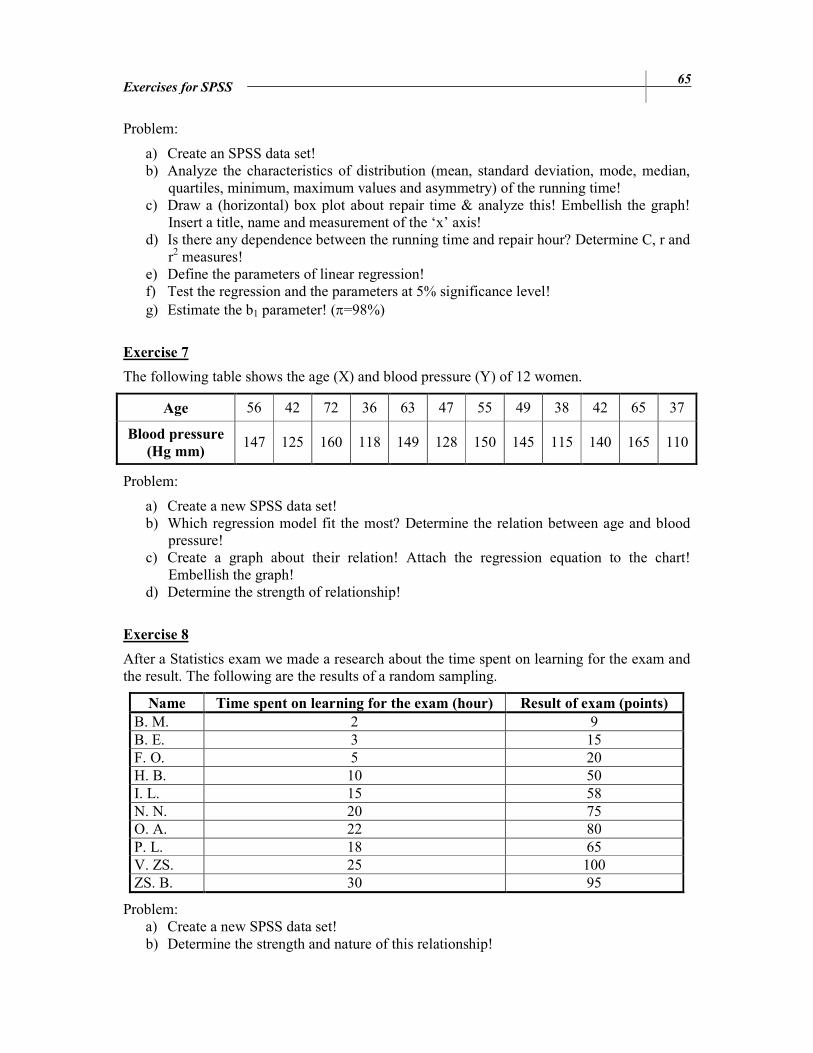
Problem:
a) Create an SPSS data set! b) Analyze the characteristics of distribution (mean, standard deviation, mode, median,
quartiles, minimum, maximum values and asymmetry) of the running time! c) Draw a (horizontal) box plot about repair time & analyze this! Embellish the graph!
Insert a title, name and measurement of the ‘x’ axis! d) Is there any dependence between the running time and repair hour? Determine C, r and
r2 measures! e) Define the parameters of linear regression! f) Test the regression and the parameters at 5% significance level! g) Estimate the b1 parameter! (π=98%)
Exercise 7
The following table shows the age (X) and blood pressure (Y) of 12 women.
Age 56 42 72 36 63 47 55 49 38 42 65 37
Blood pressure
(Hg mm) 147 125 160 118 149 128 150 145 115 140 165 110
Problem:
a) Create a new SPSS data set! b) Which regression model fit the most? Determine the relation between age and blood
pressure! c) Create a graph about their relation! Attach the regression equation to the chart!
Embellish the graph! d) Determine the strength of relationship!
Exercise 8
After a Statistics exam we made a research about the time spent on learning for the exam and the result. The following are the results of a random sampling.
Name Time spent on learning for the exam (hour) Result of exam (points)
B. M. 2 9 B. E. 3 15 F. O. 5 20 H. B. 10 50 I. L. 15 58 N. N. 20 75 O. A. 22 80 P. L. 18 65 V. ZS. 25 100 ZS. B. 30 95
Problem: a) Create a new SPSS data set! b) Determine the strength and nature of this relationship!
66 Exercises for SPSS
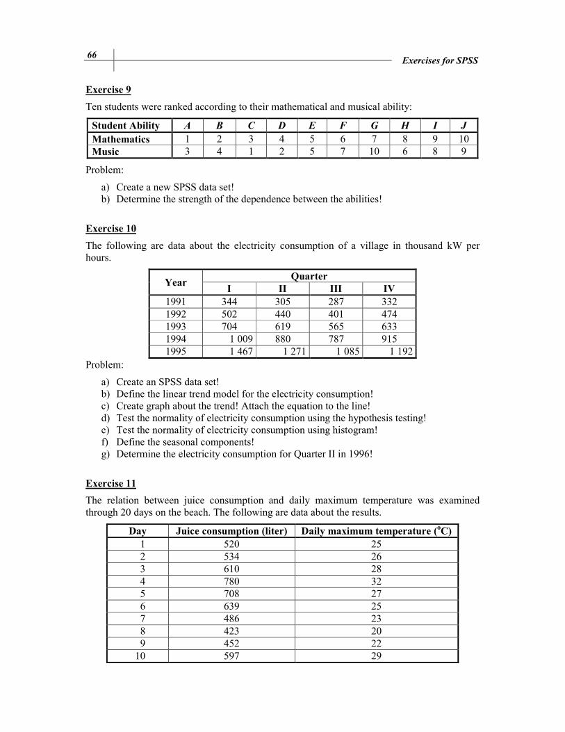
Exercise 9
Ten students were ranked according to their mathematical and musical ability:
Student Ability A B C D E F G H I J Mathematics 1 2 3 4 5 6 7 8 9 10 Music 3 4 1 2 5 7 10 6 8 9
Problem:
a) Create a new SPSS data set! b) Determine the strength of the dependence between the abilities!
Exercise 10
The following are data about the electricity consumption of a village in thousand kW per hours.
Year Quarter
I II III IV
1991 344 305 287 332 1992 502 440 401 474 1993 704 619 565 633 1994 1 009 880 787 915 1995 1 467 1 271 1 085 1 192
Problem:
a) Create an SPSS data set! b) Define the linear trend model for the electricity consumption! c) Create graph about the trend! Attach the equation to the line! d) Test the normality of electricity consumption using the hypothesis testing! e) Test the normality of electricity consumption using histogram! f) Define the seasonal components! g) Determine the electricity consumption for Quarter II in 1996!
Exercise 11
The relation between juice consumption and daily maximum temperature was examined through 20 days on the beach. The following are data about the results.
Day Juice consumption (liter) Daily maximum temperature (oC)
1 520 25 2 534 26 3 610 28 4 780 32 5 708 27 6 639 25 7 486 23 8 423 20 9 452 22
10 597 29

Exercises for SPSS 67
11 640 30 12 657 31 13 678 30 14 620 27 15 635 28 16 610 26 17 585 25 18 627 27 19 608 26 20 720 30
Problem:
a) Create a new SPSS data set! b) Determine a linear relation between juice consumption and temperature! c) Create a graph about their relation! Attach the regression equation to the chart!
Embellish the graph! d) Determine the strength of relationship!
Exercise 12
In a factory the production of a machine and the amount of faulty product were examined. The data below are about the result of 20 days.
Day Production
(1000 bottles per hour) Faulty products
(1000 bottles per day) 1 20 9.0 2 18 9.0 3 26 11.4 4 21 9.5 5 22 9.5 6 30 38.5 7 23 9.7 8 29 25.5 9 30 38.0 10 22 10.0 11 19 9.0 12 31 56.0 13 17 9.0 14 24 10.5 15 25 10.4 16 27 14.5 17 25 11.0 18 27 13.5 19 24 10.0 20 17 8.5
Problem:
a) Create a new SPSS data set!
68 Exercises for SPSS
b) Which regression model fit the most? Determine the parameters of regression! c) Create a graph about their relation! Attach the regression equation to the chart!
Embellish the graph! d) Determine the strength of relationship!
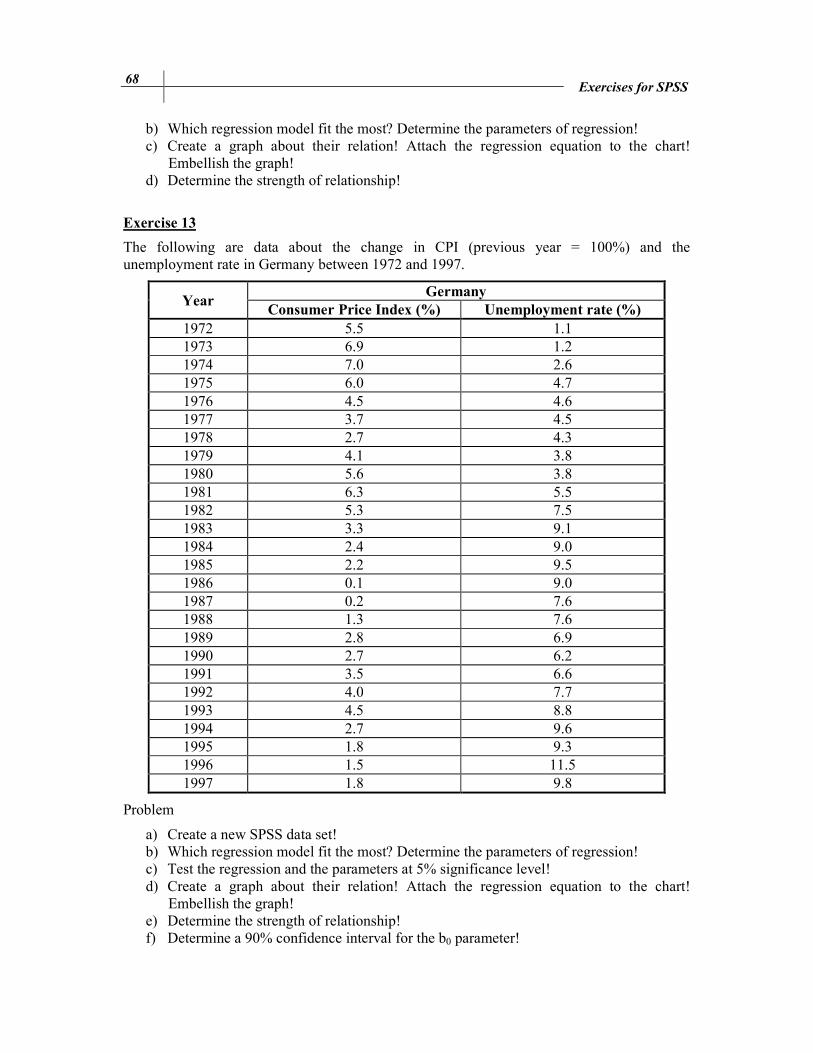
Exercise 13
The following are data about the change in CPI (previous year = 100%) and the unemployment rate in Germany between 1972 and 1997.
Year Germany
Consumer Price Index (%) Unemployment rate (%)
1972 5.5 1.1 1973 6.9 1.2 1974 7.0 2.6 1975 6.0 4.7 1976 4.5 4.6 1977 3.7 4.5 1978 2.7 4.3 1979 4.1 3.8 1980 5.6 3.8 1981 6.3 5.5 1982 5.3 7.5 1983 3.3 9.1 1984 2.4 9.0 1985 2.2 9.5 1986 0.1 9.0 1987 0.2 7.6 1988 1.3 7.6 1989 2.8 6.9 1990 2.7 6.2 1991 3.5 6.6 1992 4.0 7.7 1993 4.5 8.8 1994 2.7 9.6 1995 1.8 9.3 1996 1.5 11.5 1997 1.8 9.8
Problem
a) Create a new SPSS data set! b) Which regression model fit the most? Determine the parameters of regression! c) Test the regression and the parameters at 5% significance level! d) Create a graph about their relation! Attach the regression equation to the chart!
Embellish the graph! e) Determine the strength of relationship! f) Determine a 90% confidence interval for the b0 parameter!

Exercises for SPSS 69
Exercise 14
Create a new data file according to this questionnaire!
1. How often do you go to cinema? 2 3 1 2 4 2 3 3 4 3 4 5 1 More times a week 2 Once a week 3 Every second week 4 Once a month 5 Rarely 6 Never 2. Gender 1 1 1 1 1 1 2 2 2 2 2 2 1 Male 2 Female 3. Date of birth: … (year/month/day)
1 1985/04/12 7 1986/02/22 2 1981/12/30 8 1986/05/27 3 1991/11/11 9 1970/09/23 4 1992/08/03 10 1988/03/11 5 1985/05/14 11 1972/01/17 6 1990/07/01 12 1960/05/19
Problem:
g) How old are the people? Create a new variable as age! h) Create a bar chart about the result of the first question (%)! Embellish the chart! i) Create a pie chart about gender! Use the 3D design! Embellish the chart! j) Create a contingency table about the gender and the time how often people go to
cinema! k) Is there any dependence between the gender and the time how often people go to
cinema? l) Is there any dependence between the age and the time how often people go to cinema?
Exercise 15
The influence factors of the salary were examined at a company. The following are data about 45 employees.
Salary
(HUF/
hour)
Years
since
hire
Age Gender Qual.
Salary
(HUF/
hour)
Years
since
hire
Age Gender Qual.
188 25 45 1 1 171 9 36 1 1 157 16 45 0 0 142 7 26 1 0 165 30 51 0 0 150 10 26 0 0 124 5 39 0 0 156 15 28 0 0 139 12 31 0 0 154 20 41 0 0 165 17 34 0 1 176 25 43 1 1 158 10 31 0 1 137 13 42 0 0 224 24 44 1 1 130 7 23 0 0 169 17 45 1 1 155 7 44 0 1

70 Exercises for SPSS
114 6 25 1 0 234 33 52 1 1 160 11 48 0 0 200 25 42 1 1 154 27 46 1 0 228 24 44 1 1 150 14 30 1 0 161 16 33 0 1 130 7 23 1 0 148 5 43 0 1 198 31 56 1 1 127 2 20 0 1 159 16 33 0 1 195 22 39 1 1 154 16 32 0 0 237 27 40 1 1 174 17 35 1 0 163 21 46 0 0 126 7 44 0 0 201 18 41 1 1 162 12 29 0 1 137 5 23 1 1 181 26 46 1 1 233 27 45 1 1 146 10 47 0 0 180 15 42 1 1 152 7 30 1 1
Gender: 0 – man; 1– woman Qualification: 0 – without qualification; 1 – with qualification
Problem:
a) Create a new SPSS data set! b) Create a bar chart about the proportion of gender! Embellish the chart! c) Transform it into a pie chart! Use the 3D design! d) What is the average age of women? e) Is there any dependence between salary and gender? f) Determine an optimal regression for salary!
Exercise 16
The following are data about cars for sale:
Ordinal
number
Year of
origin Cylinder Garage Colour Price (Unit)
1 1993 75 0 1 50 000 2 1993 125 0 1 70 000 3 1993 75 0 1 60 000 4 1994 250 1 1 80 000 5 1994 75 0 1 70 000 6 1994 125 1 1 80 000 7 1995 75 0 1 60 000 8 1995 125 0 1 80 000 9 1995 250 0 2 100 000
10 1996 250 1 3 170 000 11 1996 250 1 3 168 000 12 1997 75 1 2 100 000 13 1997 125 1 2 120 000 14 1998 250 0 3 156 000 15 2004 250 1 5 560 000 16 1999 500 1 5 380 000

Exercises for SPSS 71
17 2000 500 1 5 425 000 18 2001 250 0 4 320 000 19 2002 125 1 4 300 000 20 2003 75 1 4 220 000
Codes:
Garage: 0 – The car was not kept in a garage. 1 – The car was kept in a garage.
Colour: 1 - red, 2 - green, 3 - yellow, 4 - blue, 5 - black
Problem:
a) Create a new SPSS data set! b) Create a bar chart about the proportion of the colour of cars! Embellish the chart! c) Transform it into a pie chart! Use the 3D design! Embellish the chart! d) What is the average price of yellow cars? e) Determine the central tendencies, the measures of shape, the measures of asymmetry
and the quartiles of the price! f) Define a box plot of prices! Embellish the graph! g) Is there any dependence between the price and the model year? h) Is there any dependence between the price and the colour? i) Create a crosstabs about the colour and the storage (garage) of cars! j) Use the K-S Test to test whether the price follows a normal distribution or not! k) Determine a 90% confidence interval for the average prices!
Exercise 17
The following are monthly data about the number of tourist arrived to Wonderful Country between 2009 and 2010:
2008 Number of
tourists 2009
Number of
tourists 2010
Number of
tourists
January 382 January 534 January 997 February 446 February 676 February 748 March 608 March 1012 March 1205 April 692 April 1391 April 1389 May 1029 May 1538 May 1631 June 1174 June 1848 June 1947 July 2219 July 2932 July 2918 August 3080 August 3338 August 4115 September 1597 September 2073 September 2348 October 1241 October 1730 October 1721 November 942 November 1724 November 1357 December 818 December 1669 December 1448

72 Exercises for SPSS
Problem:
a) Create an SPSS data set! b) Define a linear trend model for the number of tourists! c) Create graph about the trend! d) Test the normality of the number of tourists! e) Define the seasonal components! f) Make a prediction to May 2011! g) Make a prediction to August 2011!
Exercise 18
The following are data about the turnover of a company:
Year Quarter Turnover (Million HUF)
1994
I 15 II 24 III 26 IV 39
1995
I 20 II 28 III 30 IV 48
1996
I 26 II 32 III 33 IV 55
Problem:
a) Create an SPSS data set! b) Define the change in turnover by a linear trend model! c) Create graph about the trend! d) Test the normality of turnover! e) Define the seasonal component in Quarter 2! f) Make a prediction to Quarter 2 in 1998!
Exercise 19
The following are data about sales (million HUF) of a department store (1998-2001).
Year / Quarter I II III IV
1998 60 80 100 160 1999 70 85 95 170 2000 80 100 105 165 2001 90 105 110 185
a) Create a new SPSS data set! b) Analyze parameters of a linear trend! c) Determine the seasonal factors of the first quarter! d) Determine the sales in Quarter II., 2003!

Exercises for SPSS 73
Exercise 20
The data below are about the number of tourists in Hungary between 1988 and 1994.
Year Quarters Number of tourists
(thousand persons) Year Quarters
Number of tourists
(thousand persons)
1988 1 687.5 1990 4 1061.2 1988 2 944.7 1991 1 839 1988 3 1212.8 1991 2 1446 1988 4 999.4 1991 3 2274.7 1989 1 839.8 1991 4 1281.5 1989 2 1126.6 1992 1 868.1 1989 3 1423.4 1992 2 1374 1989 4 1164.8 1992 3 1823.9 1990 1 896.2 1992 4 1319.3 1990 2 1307.8 1993 1 854 1990 3 1887.8
a) Is there any trend in this model? (Normality test) b) Create a graph from the time series! c) Which seasonal decomposition should you use? Why? d) Do a seasonal decomposition! Analyze the parameters and the seasonal factors! e) Create graphs from the seasonal factors (saf_1, sas_1, stc_1)! f) Determine the number of tourists for the 2nd, 3rd and 4th quarter of 1993!

74
REFERENCES
[1] Aczel, A.: Complete Business Statistics. New York: Richard Irwin, 1996 [2] Brooks, C.: Introductory Econometrics for Finance. Cambridge; Second Edition:
Chapter 2., 2008 [3] Defusco, R. A. –McLeavey, D. W. –Pinto, J. E. –Runkley, D.E.: Quantitative
Investment Analysis, CFA Series; Second Edition: Chapter 6, 7, 8, 10., 2007 [4] Domán Cs. – Szilágyi R. – Varga B.: Statisztikai elemzések alapjai II. Miskolci
Egyetem, Miskolc, 2009 [5] Ketskeméthy L. – Izsó L.: Bevezetés az SPSS programrendszerbe ELTE Eötvös.
Kiadó, Budapest, 2005 [6] SPSS 16.0 Tutorial [7] SPSS 17.0 Tutorial [8] SPSS 19.0 Tutorial [9] SPSS Online Training Workshop, Central Michigan University:
http://www.cst.cmich.edu/users/lee1c/spss/index.htm (accessed: 06-01-2011) [10] Statistics Online Tutorial: stattrek.com (accessed: 05-01-2011)
Csernely_data.sav file can be downloaded from the website of the University of Miskolc / Faculty of Economics (www.gtk.uni-miskolc.hu) / Institute of Business Information and Methods / Department of Business Statistics and Economic Forecasting: http://193.6.12.228/uigtk/uise/index.html