P4 Final Report
21
Ina Arnaoudova | [email protected]| linkedin.com/in/iarnaoud Kelli Vanover | [email protected] | linkedin.com/in/kellinicholevanover
-
Upload
kelli-nichole-vanover -
Category
Documents
-
view
62 -
download
1
Transcript of P4 Final Report

Ina Arnaoudova | [email protected]| linkedin.com/in/iarnaoud
Kelli Vanover | [email protected] | linkedin.com/in/kellinicholevanover

Page 2
Table of Contents
1) Executive Summary
2) User Research
3) Comparative Analysis
4) Technical Research
5) User Flow
6) Sketches & Wireframes
7) Screen Flows

Page 3
Executive Summary
Thank you for your interest in our project. We would like to provide a brief overview of the con-tents of our case study, with insight on how we got to our final prototype.
User ResearchWe began our design process through a survey that reached a total of 55 individuals, and from our results condicted 5 in-depth interviews, all of which were crucial in understanding our user’s attitudes, habits, and behaviors as it related to their carbon footprint.Our initial user survey revealed that individuals cared about their carbon footprint, but did not take any effort to measure it. More importantly, steps that were taken by individuals that reduced thee carbon footprint, were often motivated by a personal reasons. We then put together guerrilla user test-ing to verify those behaviors in a “real life” situation. We learned ndividuals as a collective care about the environment, but a successful recycle is dependent on the perceived inconvenience in relation to benefit.
Comparative AnalysisWe completed a comparative analysis of competitor applications--determining features of each we thought would be useful to incorporate into our intial designs. We also performed a contextual inquiry of a couple of the competitor’s processes to compare the flow to our own. We cover each competitor in more detail in the report.
Technical Research & Pertner DeterminationWe completed technical research and determined a partner for the app. For this project, we will be utilizing the built-in features of iOS mobile devices--including iPhone and iPad--includ-ing the camera, accelerometer, GPS, & compass capability in order to provide an immersive experience for the user. we are also relying heavily on the ability to apply Augmented Reality display to the camera, allowing users to feel the startling contrast between the present-day streets and those same streets in the year 2100. We chose to partner with NPR’s Radiolab for this project, as they are a leader in podcast production, encourage curiousity, and emphasize content “ where sound illuminates ideas, and the boundaries blur between science, philoso-phy, and human experience”.
User Flow & Wireframes We began sketching wireframe ideas individually, and used the MOSCOW method to narrow our features we thought were most relevant to our MVP. We then determined a user flow and conducted user testing of our wireframes in order to determine which aspects of the app may need to be iterated upon.
Hi-Fi Screen Flows & PrototypeWe then solidified our design in Sketch App, and created an interactive prototype in Axure to allow for user to feel fully immersed in the 2100 experience.

Page 4
User Research
The Design Process

Page 5
1) User Survey--The Environment & You!-- + Follow-Up User InterviewsOur initial user survey revealed that individuals cared about their carbon footprint, but did not take any effort to measure it. More importantly, steps that were taken by indi-viduals that reduced theie carbon footprint, were often motivated by a personal rea-sons--most frequently mentioned personal health and financially beneficial reasons--the positive impact on the environment was usually a secondary benefit, and not the main motivation behind the task.
2) Guerrilla Testing --”Recycle the Soda Can” One exception to the personal motivations that were revealed during the user survey and subsequent interviews was an individual’s motivation to recycle. It was determined that recycling is one of the most frequently completed activities by individuals in order to reduce their carbon footprint, and the motivations were purely environmentally fo-cused. We wanted to determine just how far an individual would stray from their own personal convenience to reduce their carbon footprint.
In order to test the frequency of which individuals would recycle, we wanted to create a scenario that caused the individual to have to leave their convenience zone in order to complete their task. We asked individuals within the GA community to do the following: ”Recycle the Soda Can”. We measured the following criteria: 1) What were individuals initial reactions to the task--and how did they proceed? 2) Were individuals ultimately able to recycle their soda can? 3) How much time was spent attemtping to recycle the soda can?
The results were quite telling: •All but one of the individuals threw the soda can in a designated trash can--ultimateely not recycling their soda can--this was not surpirsing, as the building does not have des-ignated recycling bins--but the reasons behind each action were telling•Half of the individuals tested threw their soda can in the trash within 10 seconds, while the other half walked around the floor-even to another floor--in search of a recycle bin•Half of the individuals felt remorse and insecurity in their inability to successfully recycle , while the other half of individuals felt no qualms about their inability to recycle•The least amount of time it took an individual to end the task was 5 seconds, and the longest being 67 minutes, with the median time around 25 seconnds•One individual intially tried to reuse the can in a unique way--then promptly threw it in the trask when it was assumed the test was complete
User Research
Page 6
User Research
•Several individuals were aware of GA’s lack-of-recycling policy, and were upset about it, believing it needed to be remedied•Other individuals blamed the city (NYC) for their inability to recycle and contributing to any real change •Ultimately, only 1 individual was able to successfully recycle their soda can--taking 67 minutes to do so--walking 11 minutes from their original location. The individual ad-mitted that had it not been for a test, and they were already going out, the can would have be thrown in the trash as well.
So--what did we learn here? Individuals as a collective care about the environment. They know they should recycle to do their part. Regardless, the ultimate success of a single soda can is wholly dependent on the perceived inconvenience of the indivudal in question--which based on our results, seems to be a relatively high barrier to com-pletion to a very low threshold for inconvenience.
3) Contextual Inquiry--”Geocaching in the Park”Geocaching is the recreational activity of hunting for and finding a hidden object by means of GPS coordinates posted on an app or website. The experience of the Geo-cache app, both on screen and off screen, is relevant for our research as we aim to provide a similar experience by sending users to real-life locations in order to get virtu-al prizes.
For research purposes we explored the navigation of the application as well as the real world experience of Geocaching at Prospect Park, Brooklyn, and found 4 of the 5 geo-caches we pursued.
The findings are as follows:
There is an option to click Navigate to your geocache of choice. We were expecting to see the quickest route, however no real navigation was offered, and instead only a straight line formed from present location to the selected geocache.As we got closer to the target the distance (in feet) would decrease or increase de-pending on whether we were walking in the correct direction.Upon approaching a geocache, the application would show a notification that you are 30 feet away and that it’s time to start looking.Hints are available if the written description of the geocache is not enough:

Page 7
We could look at comments left by other Geocachers who had pursued the loot.We could see pictures posted by those who found the geocache.Logging information – once our geocache of choice was discovered (or not) we could log our experience and share it with the community. This information is useful for peo-ple that would go looking for it after us.Finding a geocache is extremely rewardingWe signed a physical piece of paper that lives in the geocacheSometimes there are knick knacks we could take (key chains, seashells, etc).Geocaching is also a form of exercise, and we ended up walking a couple of miles by the time we finished.
We learned that connection the real and virtual world is rewarding, not only in terms of logging our adventure, but also in the physical exercise that we got. If there is an interesting challenge people can be inspired to go out and explore. If there is a benefit, they are in turn willing to repeat the experience.
User Research

Page 8
Comparative Analysis
Directions to Geo-cache near your
Map displays Geocaches near current locationEach Geocache includes “about”, “activity” and “hint”Display feedback from past Geo-cachers
Map My Ride features and local
Individual pro-file-friends, recent, ewardsMenu to manage your workout
Review map and stats of rides
Ingress AR intro-duction
Informs the user that you will need to walk to play, which informed our process
Explain how “por-tals” work--main point gathering Further direction how to claim portal
Geocache Map My Ride
Zombies, Run! Traces

Page 9
Map My Ride
Traces
Zombies, Run sea-sons page
Episodes within each season
Airdrop allows users to collect supplies by run-ning to a real world location
Menu affords for Home, Mission, Menu and Town
Location of “trace”
Current “traces” available
Send someone a trace
Finding a trace
Product page: health, env, society
Category menu page
introduction on how the app works
ability to search, scan, and browse
Ingress
Good Guide
Comparative Analysis

Page 10
Partner Info
We chose to partner with NPR’s Radiolab for this project, as they are a leader in podcast production, encourage curiousity, and emphasize content “ where sound illuminates ideas, and the boundaries blur between science, philosophy, and human experience”. They also have a precedent of backing shows through their program which then be-come their own program with popularity. This would be great leverage for getting our app some publicity. We have determined that beginning the show with NPR local part-ner WNYC would allow our team to test the interactive podcast with a large audience in a realtively small area, before possible expansion to other cities. Radiolab is a viable long-term partner as it is heard around the country on more than 450 NPR member stations.
Top Programs Include:•Guts•Radiolab Presents: Invisibilia•Worth•Into the Abyss•Translation•Black Box•Painting in Tongues•Gut Feelings•Buttons Not Buttons
Color Swatches
Font
ArialArialArial

Page 11
Brand & Style Guide
Page 12
Technical Research
iOS Mobile Devices:
For this project, we will be utilizing the built-in features of iOS mobile devices--including iPhone and iPad--including the camera, accelerometer, GPS, & compass capability in order to provide an immersive experience for the user.
•Map—GPRS—mobile and other devices have the ability to locate the device can con-nect a geographic location with “tags”--including images, videos, and audio-- superim-posing these tags on to the specific location through utilization of these devices built-in software, sensors, compass, and small digital projectors. By utilizing the iPhone’s built-in GPS, compass, and accelerometer capability, our app will be able to perform the fol-lowing functions: -Users current location in relation to tagged locations -Ability to route where the users need to go to find the tags -Ability to place and store a “virtual clue” within specific location within the real world while displaying it through AR on the virtual map and iPhone display •Camera -Ability to display area in front of user -Ability to overlay Augmented Reality (AR) graphics on top of thereal world view -Ability to display virtual clue through the camera -Accelerometer —turn phone horizontal and vertical
iOS Human Interface Guidelines:
•Content is the most important aspect of page•Depth is important--layers are key to communication on iOS•Utilize entire screen for content•Translucent elements hint at hidden content•Negative space--what can you take away, not what can you add?•Simple color to simplify UI•Dynamic type allows iOS to adjust text to look as intended on all devices•Borderless buttons only•Utilize Tab Bar and Nav Bar•Utilize grouping and hierarchy to confer importance •Avoid start up experience if possible--or make it easy to exit from •Delay log in as long as possible, and avoid asking •Interactivity to invite touch

Page 13
Technical Research
Augmented Reality:
For this project, we are also relying heavily on the ability to apply Augmented Reality dis-play to the camera, allowing users to feel the startling contrast between the present-day streets and those same streets in the year 2100.
Augmented Reality (AR)-- the purpose of augmented reality it to enhance real life with artificial images. Without this technology, our app would not be successful in juxtapos-ing images of the decaying city of 2100 over the current view of each NYC street. The startling contrast between the two is meant to shock the user--taking the conceptual idea of global climate change, and applying it directly to the very block on the very street where the user is currently standing. The point is to utilize the AR technology to make the “reality” of 2100 feel like it could be happening to them today. The urgency of the critical cause of global climate change is intended to be reflected in a very real way through the visuals the user is interacting with in the app.
By utilizing the built-in GPRS capacity of iPhone and other iOS mobile devices, our app will be able to leverage location-specific tagging ability attached to images, video, and audio. In order to fully visually-enhance the view of the user within their 2100 “reality”, it is necessary to limit the area in which the challenges can take place. As the app expands and add further storylines in the future, it will be possible to expand the AR capacity to compliment it, but for the inital release of the app, the AR will only be available in a lim-ited manner, confined to the areas displayed on the map within the app, this we create “lost zones” of the map that are considered lost to humanity and unable to be traversed through the app, and thus unable to reflect AR capabilities. Our team is utilizing the data provided by NYC Open Data to determine the “lost zones”--which are reflected on the 100-year flood plain projections within the site.
We chose to use Mataio’s Software Development Kit (SDK) for our app’s AR experience. Metaio is the worldwide leader in Augmented Reality software, research and technolo-gy. With over 10 years of experience, Metaio serves over 100,000 developers with over 1,000 published apps. In total, Metaio’s AR software reaches over 30 Million consumers around the world.
Founded in 2003, Metaio began by offering AR to the industrial and automotive sectors for product design and factory planning. 11 years later, the company offers the most versatile and robust mobile development platform while continuing to create custom-ized AR solutions to support brands all over the world.

Page 14
User Flow2100 User Flow
Use Camera
Open App Play episodeChoose episode
Interact with episode
Conditions Resources Checklist
Complete Challenges
Complete Challenge
Menu
Achievements
Maps Per Season
Saved Locations
Photos
About
Map
Location Info Carbon Offset Activities
2
1
10
5 6
4 8
9
37
1
2
3
4
5
6
7
8
9
10
There are 4 episodes in the first season of the application: Winter, Spring, Summer and Fall.
Every episode has a set of challenges that a user must complete in order to move forward. The challenges are described in the episode and can be found through the map.
The camera is used to access the 2100 info and images through the use of Augmented Reality (AR). Users can interact with what they see on the screen, as well as take pictures.
The map allows users to view basic information about places within a 3 miles of their current location. As they move different locations become available to view. Additionally, when a user clicks on a pin, they get additional info and can navigate to it.
The Conditions screen shows the user the present weather conditions, potential disasters and the season’s survival plan. A main feature of this screen is related activities which the user can do in real life in order to offset their carbon footprint.
The Resources screen shows the user the state of their utilities (power and water) in real time. A main feature of this screen is related activities which the user can do in real life in order to offset their carbon footprint.
The Checklist is where a user can go to see the status of the items they have collected and what is still pending. This is based on the challenge presented in season they are listening to. In addition, this screen includes a progress bar showing how much of the challenge is completed, and how many Carbon Offset points the user has collected.
When a user clicks a real-life carbon offset activity form the Conditions and Resources screen, they are taken to a screen describing their activity of choice. Here the user taps on whether they are interested in the activity or not. Depending on their choice, they may receive Carbon Offset points.
Challenges are completed by going to real-life places, based on the user’s current location.
The Menu Screen contains access to a user’s Achievements gathered by completing challenges; Maps Per Season for when the user is not playing the episode; Saved Locations of places the user wants to go back to; Photos taken in-app; and About information on how 2100 works.
Page 15
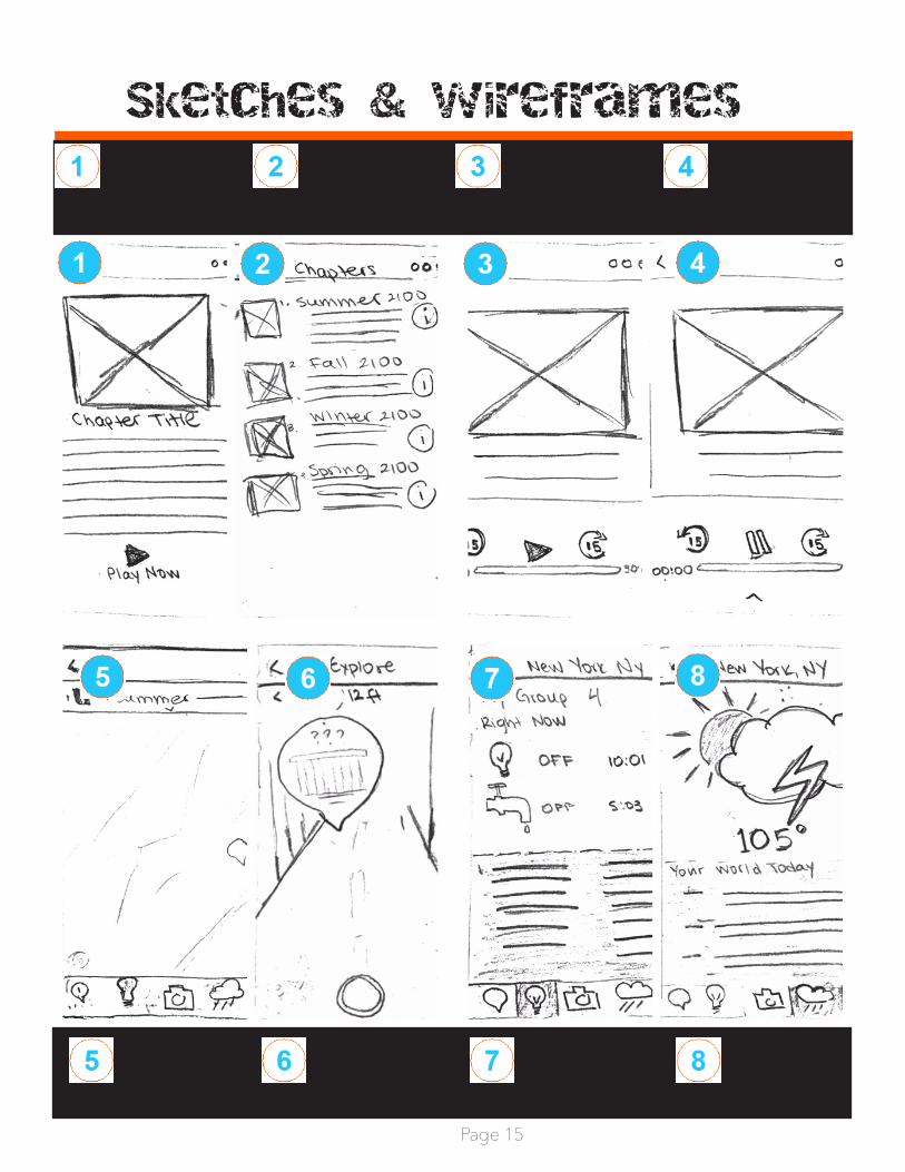
Sketches & wireframesMain screen Chapter
pages menuIndividual Chapter Page (when paused)
Individual Chapter Page (when play-ing)
Map view in individual season
Street view with clue
Utilities Page--now “resourc-es”
Weather page--now “environment)

Page 16
screen flows
1.1
1.2
1.3
3.2
2.1
1.4
3.1
1.1
1.2
1.3
1.4
Episode Navigation Bar 136 x 16 px
When picture or text is clicked, user is taken to the Play Episode screen. Screen slides left.
If the info button is clicked, user is taken to Episode Info screen. Screen slides left.Image size is 83 x 83 px
2.1
2.2
Image size is 66 x 66 px
Play Now takes you to Play Screen. No transition
3.3
3.1
3.2
3.3
Episode Navigation Bar 183 x 183 px
When play is pressed for the first time, the screen slides up and goes to the Map Screen
If the user returns to this screen to pause, or to rewind, the user presses the up arrow for the screen to slide up again.
4.1
4.2
4.3
4.4
4.1
4.2
4.4
4.3
2.3
2.3 Back Button takes you to the previous page with a Slide Right transition
2.2
This is the play screen minimized (320 x 33 px). If its tapped, user is taken back to the Play Screen
Episode Nav bar dimensions are 320 x 41. When in this section pin in menu is lit light blue.location symbol takes the blue dot to your present location
Locations are available to preview only if you are within 3 miles of them. When an item is selected an overlay first displays the name of the location, and if clicked slides left to the location info screen.
5.1
5.2
5.3
The pin turns orange once selected
Go to Location takes you to the navigation page - slides left.
Save for later, saves the location to the menu. Button turns an opaque orange once clicked
5.2
5.3
5.1
6.1
6.1 Distance to location is indicated and a path is plotted out via iOS Map application
7.1
7.2
7.3
Clock counts down in real time, and the status changes to ON when the timer reaches zero. After 2 hours utilities turn off again and timer resets.When selected, screen transition to the next page is: Slide Left
Lightbulb is lit light blue when in this page
7.2
7.1
7.3
1.5
1.5The three dots take you the the Menu Page
8.1
8.2
8.3
8.4
8.1
8.2
8.3
8.4
Number changes depends on which section below is tapped: 2, 1, and 0 respectively
If tapped color changes to 40% opaque grass green (HEX #849D58)
If tapped color changes to 40% opaque light blue (HEX #849D58)
If tapped color changes to 40% opaque light orange (HEX #FB5A1F)
9.1
9.1 In this screen and the related Offset Carbon Footprint screen the cloud is lit blue
10.5
10.1
10.3
10.4
10.2
10.6
10.1
10.2
10.3
Survival progress is calculated in relation to how many items have been picked upCarbon offset points are collected based on how many carbon offset activities the user has indicated they will doThe checkmarks are pre-filled when the user virtually collects the items
10.4
10.5
10.6
The pending items indicate what still needs to be collected and the check box is pre-filled with a line
The line of text directing the user to the map reflects how many locations the user needs to go to in order to collect all pending items. It is automated based on the number of items missing (1-2 per location)Checkmark is blue when in this screen
14.1
14.2
14.2
14.1
14.2
14.3
Mataio SDK kit - when pin is clicked AR experience is revealedThe user can still talk pictures which save in the app and their photo gallery
Camera is lit light blue when in this screen
15.3
15.2
15.1
15.1
15.2
15.3
Images are in a carousel, the middle image is the largest, and remaining images get smaller the further they are from center.
Through this screen the user collects survival item. Number of collected items must be represented in the Checklist screen. Section size is 82 x 85Each AR screen has an Audio Clipping. The user can turn the sound on and off by tapping the music notes.
16.1
The size of the Items Found box is 222 x 3216.2
The AR and Camera Screens have horizontal view. The items are rear
The AR and Camera Screens have horizontal view. The items are rear
16.3
11.3
11.1
11.5
11.2
11.4
11.1
11.2
11.3
This section contains all achievements collected through the different seasonsHere the user can access the different versions of the AR maps while not listening to the audio podcasts.This list contains all saved locations which the user’s indicated they wanted to Save for Later in the Location Info Screen
11.4
11.5
All photos taken through the App are contained hereAbout takes you the instructions of the experience
12.1
12.2
12.1
12.2
Icon height is 23 px (body)
Icon size height is 15 and 11 px respectively.
13.1
13.1 This screen is displayed only the first time the user signs in. Font is 24 pt. After tapping it, it goes staigh to the Episodes screen.
16.1
16.2
Episode Screens

Page 17
screen flows
1.1
1.2
1.3
3.2
2.1
1.4
3.1
1.1
1.2
1.3
1.4
Episode Navigation Bar 136 x 16 px
When picture or text is clicked, user is taken to the Play Episode screen. Screen slides left.
If the info button is clicked, user is taken to Episode Info screen. Screen slides left.Image size is 83 x 83 px
2.1
2.2
Image size is 66 x 66 px
Play Now takes you to Play Screen. No transition
3.3
3.1
3.2
3.3
Episode Navigation Bar 183 x 183 px
When play is pressed for the first time, the screen slides up and goes to the Map Screen
If the user returns to this screen to pause, or to rewind, the user presses the up arrow for the screen to slide up again.
4.1
4.2
4.3
4.4
4.1
4.2
4.4
4.3
2.3
2.3 Back Button takes you to the previous page with a Slide Right transition
2.2
This is the play screen minimized (320 x 33 px). If its tapped, user is taken back to the Play Screen
Episode Nav bar dimensions are 320 x 41. When in this section pin in menu is lit light blue.location symbol takes the blue dot to your present location
Locations are available to preview only if you are within 3 miles of them. When an item is selected an overlay first displays the name of the location, and if clicked slides left to the location info screen.
5.1
5.2
5.3
The pin turns orange once selected
Go to Location takes you to the navigation page - slides left.
Save for later, saves the location to the menu. Button turns an opaque orange once clicked
5.2
5.3
5.1
6.1
6.1 Distance to location is indicated and a path is plotted out via iOS Map application
7.1
7.2
7.3
Clock counts down in real time, and the status changes to ON when the timer reaches zero. After 2 hours utilities turn off again and timer resets.When selected, screen transition to the next page is: Slide Left
Lightbulb is lit light blue when in this page
7.2
7.1
7.3
1.5
1.5The three dots take you the the Menu Page
8.1
8.2
8.3
8.4
8.1
8.2
8.3
8.4
Number changes depends on which section below is tapped: 2, 1, and 0 respectively
If tapped color changes to 40% opaque grass green (HEX #849D58)
If tapped color changes to 40% opaque light blue (HEX #849D58)
If tapped color changes to 40% opaque light orange (HEX #FB5A1F)
9.1
9.1 In this screen and the related Offset Carbon Footprint screen the cloud is lit blue
10.5
10.1
10.3
10.4
10.2
10.6
10.1
10.2
10.3
Survival progress is calculated in relation to how many items have been picked upCarbon offset points are collected based on how many carbon offset activities the user has indicated they will doThe checkmarks are pre-filled when the user virtually collects the items
10.4
10.5
10.6
The pending items indicate what still needs to be collected and the check box is pre-filled with a line
The line of text directing the user to the map reflects how many locations the user needs to go to in order to collect all pending items. It is automated based on the number of items missing (1-2 per location)Checkmark is blue when in this screen
14.1
14.2
14.2
14.1
14.2
14.3
Mataio SDK kit - when pin is clicked AR experience is revealedThe user can still talk pictures which save in the app and their photo gallery
Camera is lit light blue when in this screen
15.3
15.2
15.1
15.1
15.2
15.3
Images are in a carousel, the middle image is the largest, and remaining images get smaller the further they are from center.
Through this screen the user collects survival item. Number of collected items must be represented in the Checklist screen. Section size is 82 x 85Each AR screen has an Audio Clipping. The user can turn the sound on and off by tapping the music notes.
16.1
The size of the Items Found box is 222 x 3216.2
The AR and Camera Screens have horizontal view. The items are rear
The AR and Camera Screens have horizontal view. The items are rear
16.3
11.3
11.1
11.5
11.2
11.4
11.1
11.2
11.3
This section contains all achievements collected through the different seasonsHere the user can access the different versions of the AR maps while not listening to the audio podcasts.This list contains all saved locations which the user’s indicated they wanted to Save for Later in the Location Info Screen
11.4
11.5
All photos taken through the App are contained hereAbout takes you the instructions of the experience
12.1
12.2
12.1
12.2
Icon height is 23 px (body)
Icon size height is 15 and 11 px respectively.
13.1
13.1 This screen is displayed only the first time the user signs in. Font is 24 pt. After tapping it, it goes staigh to the Episodes screen.
16.1
16.2
Map Screens

Page 18
screen flows
1.1
1.2
1.3
3.2
2.1
1.4
3.1
1.1
1.2
1.3
1.4
Episode Navigation Bar 136 x 16 px
When picture or text is clicked, user is taken to the Play Episode screen. Screen slides left.
If the info button is clicked, user is taken to Episode Info screen. Screen slides left.Image size is 83 x 83 px
2.1
2.2
Image size is 66 x 66 px
Play Now takes you to Play Screen. No transition
3.3
3.1
3.2
3.3
Episode Navigation Bar 183 x 183 px
When play is pressed for the first time, the screen slides up and goes to the Map Screen
If the user returns to this screen to pause, or to rewind, the user presses the up arrow for the screen to slide up again.
4.1
4.2
4.3
4.4
4.1
4.2
4.4
4.3
2.3
2.3 Back Button takes you to the previous page with a Slide Right transition
2.2
This is the play screen minimized (320 x 33 px). If its tapped, user is taken back to the Play Screen
Episode Nav bar dimensions are 320 x 41. When in this section pin in menu is lit light blue.location symbol takes the blue dot to your present location
Locations are available to preview only if you are within 3 miles of them. When an item is selected an overlay first displays the name of the location, and if clicked slides left to the location info screen.
5.1
5.2
5.3
The pin turns orange once selected
Go to Location takes you to the navigation page - slides left.
Save for later, saves the location to the menu. Button turns an opaque orange once clicked
5.2
5.3
5.1
6.1
6.1 Distance to location is indicated and a path is plotted out via iOS Map application
7.1
7.2
7.3
Clock counts down in real time, and the status changes to ON when the timer reaches zero. After 2 hours utilities turn off again and timer resets.When selected, screen transition to the next page is: Slide Left
Lightbulb is lit light blue when in this page
7.2
7.1
7.3
1.5
1.5The three dots take you the the Menu Page
8.1
8.2
8.3
8.4
8.1
8.2
8.3
8.4
Number changes depends on which section below is tapped: 2, 1, and 0 respectively
If tapped color changes to 40% opaque grass green (HEX #849D58)
If tapped color changes to 40% opaque light blue (HEX #849D58)
If tapped color changes to 40% opaque light orange (HEX #FB5A1F)
9.1
9.1 In this screen and the related Offset Carbon Footprint screen the cloud is lit blue
10.5
10.1
10.3
10.4
10.2
10.6
10.1
10.2
10.3
Survival progress is calculated in relation to how many items have been picked upCarbon offset points are collected based on how many carbon offset activities the user has indicated they will doThe checkmarks are pre-filled when the user virtually collects the items
10.4
10.5
10.6
The pending items indicate what still needs to be collected and the check box is pre-filled with a line
The line of text directing the user to the map reflects how many locations the user needs to go to in order to collect all pending items. It is automated based on the number of items missing (1-2 per location)Checkmark is blue when in this screen
14.1
14.2
14.2
14.1
14.2
14.3
Mataio SDK kit - when pin is clicked AR experience is revealedThe user can still talk pictures which save in the app and their photo gallery
Camera is lit light blue when in this screen
15.3
15.2
15.1
15.1
15.2
15.3
Images are in a carousel, the middle image is the largest, and remaining images get smaller the further they are from center.
Through this screen the user collects survival item. Number of collected items must be represented in the Checklist screen. Section size is 82 x 85Each AR screen has an Audio Clipping. The user can turn the sound on and off by tapping the music notes.
16.1
The size of the Items Found box is 222 x 3216.2
The AR and Camera Screens have horizontal view. The items are rear
The AR and Camera Screens have horizontal view. The items are rear
16.3
11.3
11.1
11.5
11.2
11.4
11.1
11.2
11.3
This section contains all achievements collected through the different seasonsHere the user can access the different versions of the AR maps while not listening to the audio podcasts.This list contains all saved locations which the user’s indicated they wanted to Save for Later in the Location Info Screen
11.4
11.5
All photos taken through the App are contained hereAbout takes you the instructions of the experience
12.1
12.2
12.1
12.2
Icon height is 23 px (body)
Icon size height is 15 and 11 px respectively.
13.1
13.1 This screen is displayed only the first time the user signs in. Font is 24 pt. After tapping it, it goes staigh to the Episodes screen.
16.1
16.2
Conditions & Resources Screens

Page 19
screen flows
1.1
1.2
1.3
3.2
2.1
1.4
3.1
1.1
1.2
1.3
1.4
Episode Navigation Bar 136 x 16 px
When picture or text is clicked, user is taken to the Play Episode screen. Screen slides left.
If the info button is clicked, user is taken to Episode Info screen. Screen slides left.Image size is 83 x 83 px
2.1
2.2
Image size is 66 x 66 px
Play Now takes you to Play Screen. No transition
3.3
3.1
3.2
3.3
Episode Navigation Bar 183 x 183 px
When play is pressed for the first time, the screen slides up and goes to the Map Screen
If the user returns to this screen to pause, or to rewind, the user presses the up arrow for the screen to slide up again.
4.1
4.2
4.3
4.4
4.1
4.2
4.4
4.3
2.3
2.3 Back Button takes you to the previous page with a Slide Right transition
2.2
This is the play screen minimized (320 x 33 px). If its tapped, user is taken back to the Play Screen
Episode Nav bar dimensions are 320 x 41. When in this section pin in menu is lit light blue.location symbol takes the blue dot to your present location
Locations are available to preview only if you are within 3 miles of them. When an item is selected an overlay first displays the name of the location, and if clicked slides left to the location info screen.
5.1
5.2
5.3
The pin turns orange once selected
Go to Location takes you to the navigation page - slides left.
Save for later, saves the location to the menu. Button turns an opaque orange once clicked
5.2
5.3
5.1
6.1
6.1 Distance to location is indicated and a path is plotted out via iOS Map application
7.1
7.2
7.3
Clock counts down in real time, and the status changes to ON when the timer reaches zero. After 2 hours utilities turn off again and timer resets.When selected, screen transition to the next page is: Slide Left
Lightbulb is lit light blue when in this page
7.2
7.1
7.3
1.5
1.5The three dots take you the the Menu Page
8.1
8.2
8.3
8.4
8.1
8.2
8.3
8.4
Number changes depends on which section below is tapped: 2, 1, and 0 respectively
If tapped color changes to 40% opaque grass green (HEX #849D58)
If tapped color changes to 40% opaque light blue (HEX #849D58)
If tapped color changes to 40% opaque light orange (HEX #FB5A1F)
9.1
9.1 In this screen and the related Offset Carbon Footprint screen the cloud is lit blue
10.5
10.1
10.3
10.4
10.2
10.6
10.1
10.2
10.3
Survival progress is calculated in relation to how many items have been picked upCarbon offset points are collected based on how many carbon offset activities the user has indicated they will doThe checkmarks are pre-filled when the user virtually collects the items
10.4
10.5
10.6
The pending items indicate what still needs to be collected and the check box is pre-filled with a line
The line of text directing the user to the map reflects how many locations the user needs to go to in order to collect all pending items. It is automated based on the number of items missing (1-2 per location)Checkmark is blue when in this screen
14.1
14.2
14.2
14.1
14.2
14.3
Mataio SDK kit - when pin is clicked AR experience is revealedThe user can still talk pictures which save in the app and their photo gallery
Camera is lit light blue when in this screen
15.3
15.2
15.1
15.1
15.2
15.3
Images are in a carousel, the middle image is the largest, and remaining images get smaller the further they are from center.
Through this screen the user collects survival item. Number of collected items must be represented in the Checklist screen. Section size is 82 x 85Each AR screen has an Audio Clipping. The user can turn the sound on and off by tapping the music notes.
16.1
The size of the Items Found box is 222 x 3216.2
The AR and Camera Screens have horizontal view. The items are rear
The AR and Camera Screens have horizontal view. The items are rear
16.3
11.3
11.1
11.5
11.2
11.4
11.1
11.2
11.3
This section contains all achievements collected through the different seasonsHere the user can access the different versions of the AR maps while not listening to the audio podcasts.This list contains all saved locations which the user’s indicated they wanted to Save for Later in the Location Info Screen
11.4
11.5
All photos taken through the App are contained hereAbout takes you the instructions of the experience
12.1
12.2
12.1
12.2
Icon height is 23 px (body)
Icon size height is 15 and 11 px respectively.
13.1
13.1 This screen is displayed only the first time the user signs in. Font is 24 pt. After tapping it, it goes staigh to the Episodes screen.
16.1
16.2
In-App & Real Impact Activity Screens

Page 20
screen flows
1.1
1.2
1.3
3.2
2.1
1.4
3.1
1.1
1.2
1.3
1.4
Episode Navigation Bar 136 x 16 px
When picture or text is clicked, user is taken to the Play Episode screen. Screen slides left.
If the info button is clicked, user is taken to Episode Info screen. Screen slides left.Image size is 83 x 83 px
2.1
2.2
Image size is 66 x 66 px
Play Now takes you to Play Screen. No transition
3.3
3.1
3.2
3.3
Episode Navigation Bar 183 x 183 px
When play is pressed for the first time, the screen slides up and goes to the Map Screen
If the user returns to this screen to pause, or to rewind, the user presses the up arrow for the screen to slide up again.
4.1
4.2
4.3
4.4
4.1
4.2
4.4
4.3
2.3
2.3 Back Button takes you to the previous page with a Slide Right transition
2.2
This is the play screen minimized (320 x 33 px). If its tapped, user is taken back to the Play Screen
Episode Nav bar dimensions are 320 x 41. When in this section pin in menu is lit light blue.location symbol takes the blue dot to your present location
Locations are available to preview only if you are within 3 miles of them. When an item is selected an overlay first displays the name of the location, and if clicked slides left to the location info screen.
5.1
5.2
5.3
The pin turns orange once selected
Go to Location takes you to the navigation page - slides left.
Save for later, saves the location to the menu. Button turns an opaque orange once clicked
5.2
5.3
5.1
6.1
6.1 Distance to location is indicated and a path is plotted out via iOS Map application
7.1
7.2
7.3
Clock counts down in real time, and the status changes to ON when the timer reaches zero. After 2 hours utilities turn off again and timer resets.When selected, screen transition to the next page is: Slide Left
Lightbulb is lit light blue when in this page
7.2
7.1
7.3
1.5
1.5The three dots take you the the Menu Page
8.1
8.2
8.3
8.4
8.1
8.2
8.3
8.4
Number changes depends on which section below is tapped: 2, 1, and 0 respectively
If tapped color changes to 40% opaque grass green (HEX #849D58)
If tapped color changes to 40% opaque light blue (HEX #849D58)
If tapped color changes to 40% opaque light orange (HEX #FB5A1F)
9.1
9.1 In this screen and the related Offset Carbon Footprint screen the cloud is lit blue
10.5
10.1
10.3
10.4
10.2
10.6
10.1
10.2
10.3
Survival progress is calculated in relation to how many items have been picked upCarbon offset points are collected based on how many carbon offset activities the user has indicated they will doThe checkmarks are pre-filled when the user virtually collects the items
10.4
10.5
10.6
The pending items indicate what still needs to be collected and the check box is pre-filled with a line
The line of text directing the user to the map reflects how many locations the user needs to go to in order to collect all pending items. It is automated based on the number of items missing (1-2 per location)Checkmark is blue when in this screen
14.1
14.2
14.2
14.1
14.2
14.3
Mataio SDK kit - when pin is clicked AR experience is revealedThe user can still talk pictures which save in the app and their photo gallery
Camera is lit light blue when in this screen
15.3
15.2
15.1
15.1
15.2
15.3
Images are in a carousel, the middle image is the largest, and remaining images get smaller the further they are from center.
Through this screen the user collects survival item. Number of collected items must be represented in the Checklist screen. Section size is 82 x 85Each AR screen has an Audio Clipping. The user can turn the sound on and off by tapping the music notes.
16.1
The size of the Items Found box is 222 x 3216.2
The AR and Camera Screens have horizontal view. The items are rear
The AR and Camera Screens have horizontal view. The items are rear
16.3
11.3
11.1
11.5
11.2
11.4
11.1
11.2
11.3
This section contains all achievements collected through the different seasonsHere the user can access the different versions of the AR maps while not listening to the audio podcasts.This list contains all saved locations which the user’s indicated they wanted to Save for Later in the Location Info Screen
11.4
11.5
All photos taken through the App are contained hereAbout takes you the instructions of the experience
12.1
12.2
12.1
12.2
Icon height is 23 px (body)
Icon size height is 15 and 11 px respectively.
13.1
13.1 This screen is displayed only the first time the user signs in. Font is 24 pt. After tapping it, it goes staigh to the Episodes screen.
16.1
16.2
Camera “AR Mode” Screens