Magazine covers analysis
4
FRONT COVER ANALYSIS The Masthead - big, bold, capitals, has an outline to make it stand out more. The Header – attracts the audience to it as it is bold, includes ‘special’ makes the audience feel like they are getting extra and more than what they paid for. The sell lines/cover lines – shows what type of genre magazine it is, lists the bands that are included in the magazine attracting the audience to by the magazine. The main image – artist relates to the genre of the magazine, popular and well- known artist with a large fan base which will attract the audience. His photo is took at a canted angle suggesting chaos which also relates to his type of music. He looks happy and over excited, and you can see he is wearing casual clothing showing he is relaxed – indie, hip hop – classy. The main cover line – artists name printed out in a big font to catch the readers eye. Has an affect on it where it looks like the name has been put there once in black and then on top in white, it looks slightly messy and out of line, suggesting the type of artist Dizzee is. Barcode-date/issue/price – helps the magazine find out their target audience, is there so that the magazine can be sold in shops, the issue number can help the audience to know if they have missed any issues. The footer – includes more information about what will be inside the magazine, gives the audience an idea of the genre of the magazine. Use of a pull quote - The quote said by Dizzee Rascal is a positive and happy quote relating to his expression in the main image and is a friendly comment as he says ‘man’ at the end therefore it is not formal. Background – busy and colourful background, looks like a wall with graffiti on it, suggesting that it doesn’t matter where the artist is as it doesn’t affect the artist itself. Artist crouching on what looks like a dance floor, suggesting the style of music is one you are able to dance to so may be upbeat/positive. Use of a flasher – offers something extra to target audience, makes what is written inside the flasher stand out and makes it seem important. Rule of thirds/the left third – the left third includes the flasher, title, most of the background and most of the quote, showing that the magazine cover is uneven which could suggest what the genre of music within the magazine is like.
-
Upload
holly-redmond -
Category
Entertainment & Humor
-
view
413 -
download
0
Transcript of Magazine covers analysis

FRONT COVER ANALYSISThe Masthead - big, bold, capitals, has an outline to make it stand out more.
The Header – attracts the audience to it as it is bold, includes ‘special’ makes the audience feel like they are getting extra and more than what they paid for.
The sell lines/cover lines – shows what type of genre magazine it is, lists the bands that are included in the magazine attracting the audience to by the magazine.
The main image – artist relates to the genre of the magazine, popular and well-known artist with a large fan base which will attract the audience. His photo is took at a canted angle suggesting chaos which also relates to his type of music. He looks happy and over excited, and you can see he is wearing casual clothing showing he is relaxed – indie, hip hop – classy.
The main cover line – artists name printed out in a big font to catch the readers eye. Has an affect on it where it looks like the name has been put there once in black and then on top in white, it looks slightly messy and out of line, suggesting the type of artist Dizzee is.
Barcode-date/issue/price – helps the magazine find out their target audience, is there so that the magazine can be sold in shops, the issue number can help the audience to know if they have missed any issues.
The footer – includes more information about what will be inside the magazine, gives the audience an idea of the genre of the magazine.
Use of a pull quote - The quote said by Dizzee Rascal is a positive and happy quote relating to his expression in the main image and is a friendly comment as he says ‘man’ at the end therefore it is not formal.
Background – busy and colourful background, looks like a wall with graffiti on it, suggesting that it doesn’t matter where the artist is as it doesn’t affect the artist itself. Artist crouching on what looks like a dance floor, suggesting the style of music is one you are able to dance to so may be upbeat/positive.
Use of a flasher – offers something extra to target audience, makes what is written inside the flasher stand out and makes it seem important.
Rule of thirds/the left third – the left third includes the flasher, title, most of the background and most of the quote, showing that the magazine cover is uneven which could suggest what the genre of music within the magazine is like.

The masthead – white writing stands out against the background, looks sophisticated with the white but the colour within the individual letters makes the name of the magazine memorable. Audience will recognise the style and the way the masthead is shown straight away.
The main image – the artist, Kesha, gives the audience an idea of the genre of the magazine, well know artist which may promote the magazine itself. The expression on Kesha’s face looks intense yet she is shown as attractive in the way her eyes are made up, etc. May suggest that the genre of music is relaxed yet intense at the same time.
Sell lines/cover lines - giving the readers an idea of what is inside the magazine, bands/artists that are mentioned suggests the genre of the magazine. Includes words such as ‘plus’ making the audience feel like they are getting extra.
Barcode-date/issue/price – helps the magazine find out their target audience, is there so that the magazine can be sold in shops, the issue number can help the audience to know if they have missed any issues.
Background – can see very little background but what from you can see it shows black and glitter and goes with Kesha’s eye make up. The black of her eyes and background suggests the magazine is sophisticated as it is not too full with colour.
The main cover line – the artists name is in white which stands out from the background, may attract the readers eye. The dollar sign also included is how Kesha presents her name on things such as her album etc so people are able to look at the magazine and straight away know who the artist is which may make them realise what kind of genre the magazine is also. The text is all in capitals also making it jump off the page.
Underneath the main cover line it also has text that suggests that the artist is bringing something new and they are the first to be talking about it, attracting the audience as it will make them more likely to want to find out about new and interesting things.
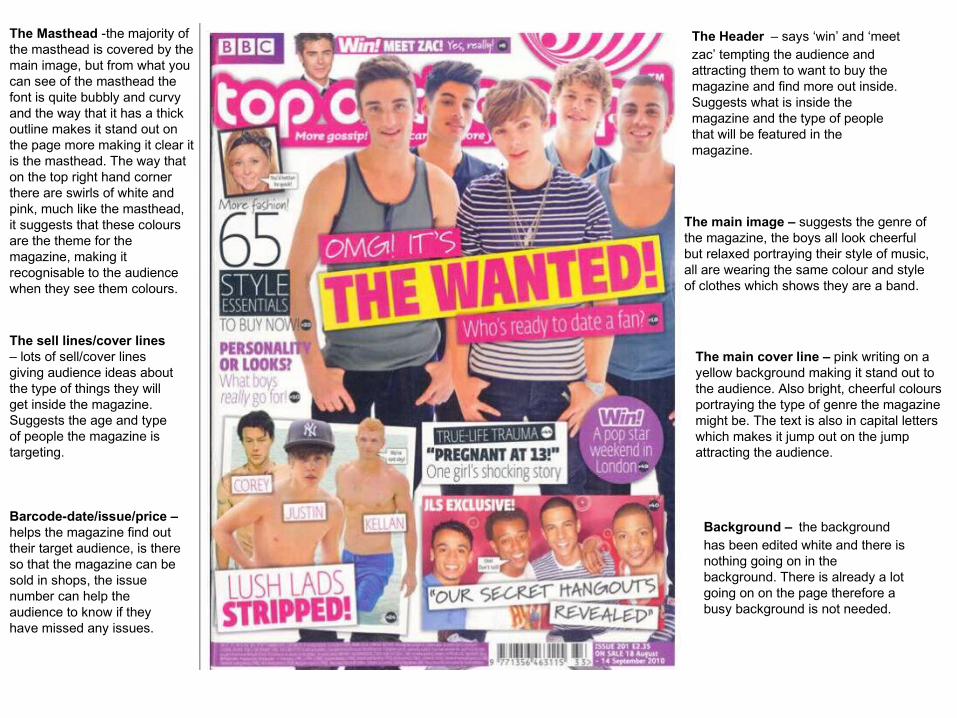
The Masthead -the majority of the masthead is covered by the main image, but from what you can see of the masthead the font is quite bubbly and curvy and the way that it has a thick outline makes it stand out on the page more making it clear it is the masthead. The way that on the top right hand corner there are swirls of white and pink, much like the masthead, it suggests that these colours are the theme for the magazine, making it recognisable to the audience when they see them colours.
Background – the background has been edited white and there is nothing going on in the background. There is already a lot going on on the page therefore a busy background is not needed.
The Header – says ‘win’ and ‘meet zac’ tempting the audience and attracting them to want to buy the magazine and find more out inside. Suggests what is inside the magazine and the type of people that will be featured in the magazine.
The sell lines/cover lines – lots of sell/cover lines giving audience ideas about the type of things they will get inside the magazine. Suggests the age and type of people the magazine is targeting.
The main image – suggests the genre of the magazine, the boys all look cheerful but relaxed portraying their style of music, all are wearing the same colour and style of clothes which shows they are a band.
The main cover line – pink writing on a yellow background making it stand out to the audience. Also bright, cheerful colours portraying the type of genre the magazine might be. The text is also in capital letters which makes it jump out on the jump attracting the audience.
Barcode-date/issue/price – helps the magazine find out their target audience, is there so that the magazine can be sold in shops, the issue number can help the audience to know if they have missed any issues.
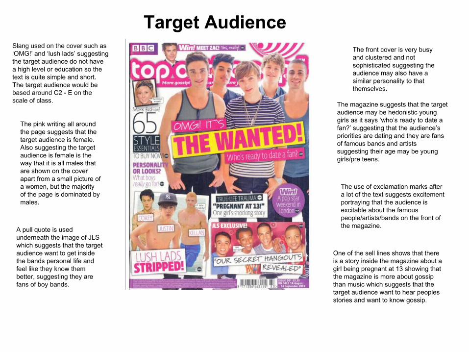
Target AudienceSlang used on the cover such as ‘OMG!’ and ‘lush lads’ suggesting the target audience do not have a high level or education so the text is quite simple and short. The target audience would be based around C2 - E on the scale of class.
The pink writing all around the page suggests that the target audience is female. Also suggesting the target audience is female is the way that it is all males that are shown on the cover apart from a small picture of a women, but the majority of the page is dominated by males.
The front cover is very busy and clustered and not sophisticated suggesting the audience may also have a similar personality to that themselves.
The magazine suggests that the target audience may be hedonistic young girls as it says ‘who’s ready to date a fan?’ suggesting that the audience’s priorities are dating and they are fans of famous bands and artists suggesting their age may be young girls/pre teens.
The use of exclamation marks after a lot of the text suggests excitement portraying that the audience is excitable about the famous people/artists/bands on the front of the magazine.
One of the sell lines shows that there is a story inside the magazine about a girl being pregnant at 13 showing that the magazine is more about gossip than music which suggests that the target audience want to hear peoples stories and want to know gossip.
A pull quote is used underneath the image of JLS which suggests that the target audience want to get inside the bands personal life and feel like they know them better, suggesting they are fans of boy bands.