Icon, layout, lighting, colour scheme, masthead ideas:
6
I was instantly attracted to this image of the Patriotic British Bulldog. If I included this in my magazine cover, It would be relevant to my genre and also be an effective way of breaking up the text. Like my genre ‘Britpop’, this is perfect for representing this. As it is connoting ‘British music’ and therefore, it can easily be recognized as Britpop. I found this image particularly appealing as it is very similar to my experimental logo. Which I included in my questionnaire. Therefore, I think it is a very recognizable design. The British colours also relevant and representational. I like this design as it has the genre clearly written and therefore, is instantly relevant. It is clearly composed and the font appears almost artsy, much like a stencil.
-
Upload
aprilmccullin123 -
Category
Education
-
view
422 -
download
0
Transcript of Icon, layout, lighting, colour scheme, masthead ideas:
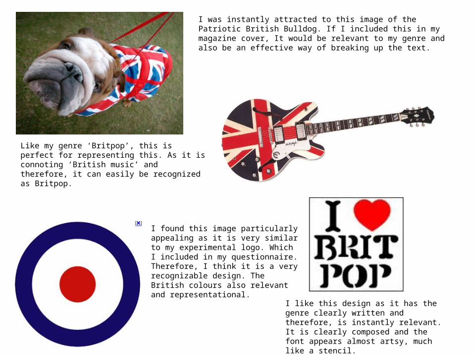
I was instantly attracted to this image of the Patriotic British Bulldog. If I included this in my magazine cover, It would be relevant to my genre and also be an effective way of breaking up the text.
Like my genre ‘Britpop’, this is perfect for representing this. As it is connoting ‘British music’ and therefore, it can easily be recognized as Britpop.
I found this image particularly appealing as it is very similar to my experimental logo. Which I included in my questionnaire. Therefore, I think it is a very recognizable design. The British colours also relevant and representational.
I like this design as it has the genre clearly written and therefore, is instantly relevant. It is clearly composed and the font appears almost artsy, much like a stencil.
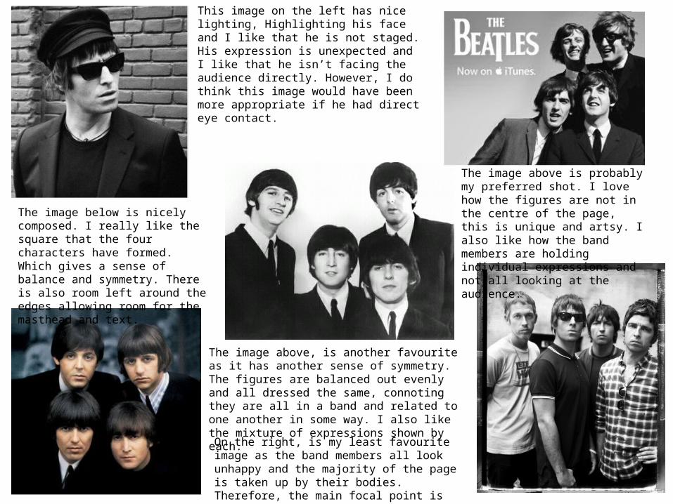
This image on the left has nice lighting, Highlighting his face and I like that he is not staged. His expression is unexpected and I like that he isn’t facing the audience directly. However, I do think this image would have been more appropriate if he had direct eye contact.
The image above is probably my preferred shot. I love how the figures are not in the centre of the page, this is unique and artsy. I also like how the band members are holding individual expressions and not all looking at the audience.
The image below is nicely composed. I really like the square that the four characters have formed. Which gives a sense of balance and symmetry. There is also room left around the edges allowing room for the masthead and text.
The image above, is another favourite as it has another sense of symmetry. The figures are balanced out evenly and all dressed the same, connoting they are all in a band and related to one another in some way. I also like the mixture of expressions shown by each.
On the right, is my least favourite image as the band members all look unhappy and the majority of the page is taken up by their bodies. Therefore, the main focal point is their clothing.
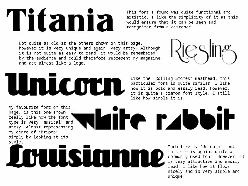
This font I found was quite functional and artistic. I like the simplicity of it as this would ensure that it can be seen and recognized from a distance.
Not quite as old as the others shown on this page, however it is very unique and again, very artsy. Although it is not quite as easy to read, it would be remembered by the audience and could therefore represent my magazine and act almost like a logo.
Like the ‘Rolling Stones’ masthead, this particular font is quite similar. I like how it is bold and easily read. However, it is quite a common font style, I still like how simple it is.
My favourite font on this page, is this one shown. I really like how the font type is very ‘musical’ and artsy. Almost representing my genre of ‘Bripop’ simply by looking at its style.
Much like my ‘Unicorn’ font, this one is again, quite a commonly used font. However, it is very attractive and easily read. I like how it flows nicely and is very simple and unique.

This colour scheme is one of my favourite, ‘Black, White and Red’ which is vibrant and bold. The red is relevant to my genre of ‘Britpop’ as it is featured in the British flag. The red text also connoted passion and warmth as well as being dramatic and dangerous. Therefore, my target audience would find this appealing and eye catching.
The ‘Black, White and Yellow’ colour scheme is attractive and appealing. The yellow connotes happiness and liveliness. Which suggests that this particular magazine is positive and therefore, will attract my t.a to read on.
This is my Favourite magazine colour scheme, the warm red/pink of the background links in well with the colour of the figures lips and the yellow greatly contrasts with the text and the red. Therefore connoting a passion for music and positivity. And the same time, also standing out to the t.a.
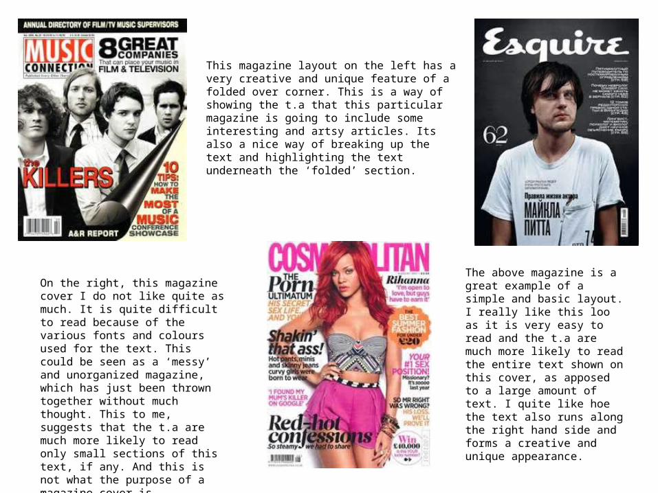
This magazine layout on the left has a very creative and unique feature of a folded over corner. This is a way of showing the t.a that this particular magazine is going to include some interesting and artsy articles. Its also a nice way of breaking up the text and highlighting the text underneath the ‘folded’ section.
The above magazine is a great example of a simple and basic layout. I really like this loo as it is very easy to read and the t.a are much more likely to read the entire text shown on this cover, as apposed to a large amount of text. I quite like hoe the text also runs along the right hand side and forms a creative and unique appearance.
On the right, this magazine cover I do not like quite as much. It is quite difficult to read because of the various fonts and colours used for the text. This could be seen as a ‘messy’ and unorganized magazine, which has just been thrown together without much thought. This to me, suggests that the t.a are much more likely to read only small sections of this text, if any. And this is not what the purpose of a magazine cover is.
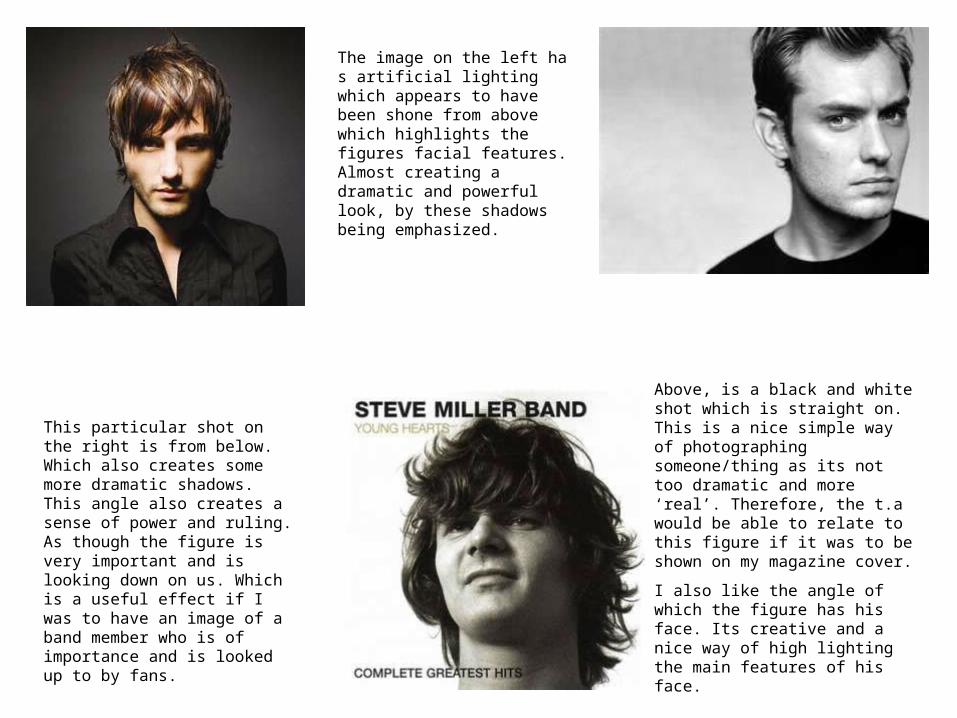
The image on the left ha s artificial lighting which appears to have been shone from above which highlights the figures facial features. Almost creating a dramatic and powerful look, by these shadows being emphasized.
This particular shot on the right is from below. Which also creates some more dramatic shadows. This angle also creates a sense of power and ruling. As though the figure is very important and is looking down on us. Which is a useful effect if I was to have an image of a band member who is of importance and is looked up to by fans.
Above, is a black and white shot which is straight on. This is a nice simple way of photographing someone/thing as its not too dramatic and more ‘real’. Therefore, the t.a would be able to relate to this figure if it was to be shown on my magazine cover.
I also like the angle of which the figure has his face. Its creative and a nice way of high lighting the main features of his face.