
How we use data creatively - HelpAge International. Creatives Group: Data visualisation, 12 May 2016
48
How we use data creatively Charity Comms event – data visualisation How we use data creatively | @helpage
-
Upload
charitycomms -
Category
Government & Nonprofit
-
view
298 -
download
0
Transcript of How we use data creatively - HelpAge International. Creatives Group: Data visualisation, 12 May 2016
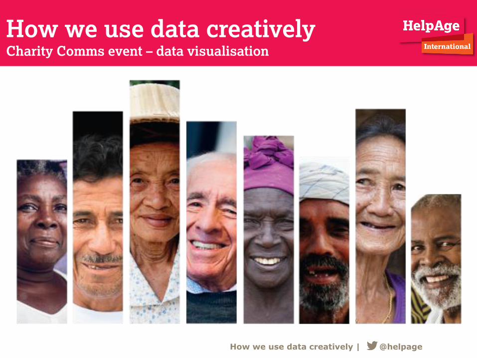
How we use data creatively Charity Comms event – data visualisation
How we use data creatively | @helpage
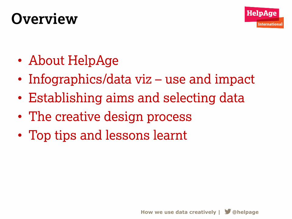
Overview
• About HelpAge
• Infographics/data viz – use and impact
• Establishing aims and selecting data
• The creative design process
• Top tips and lessons learnt
How we use data creatively | @helpage
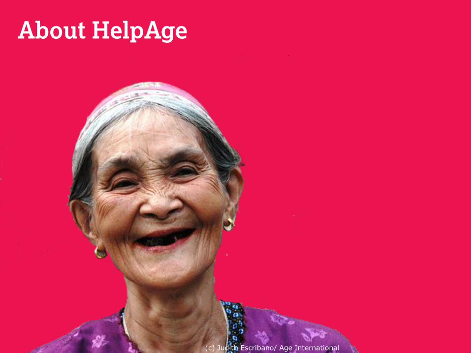
About HelpAge
(c) Judith Escribano/ Age International
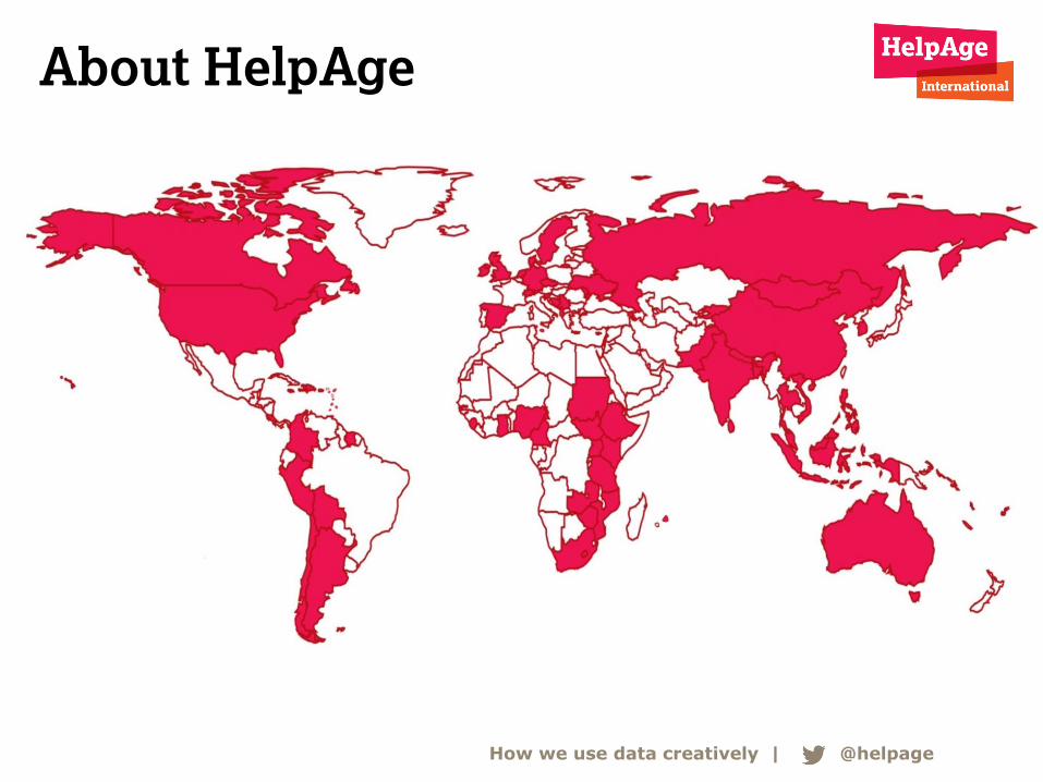
About HelpAge
How we use data creatively | @helpage
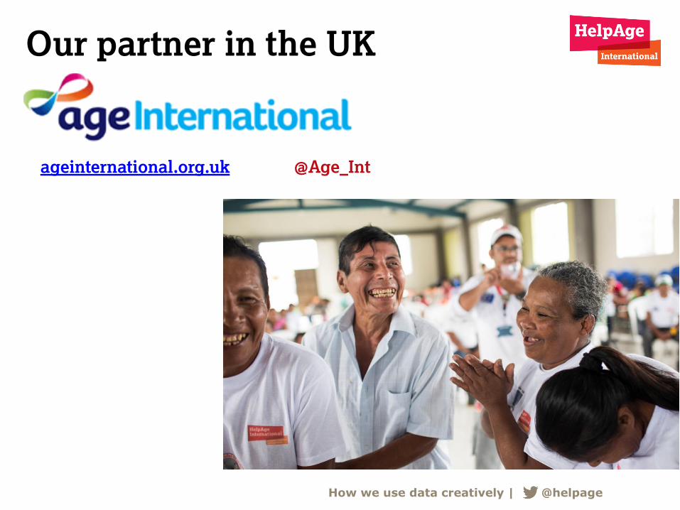
Our partner in the UK
How we use data creatively | @helpage
ageinternational.org.uk @Age_Int
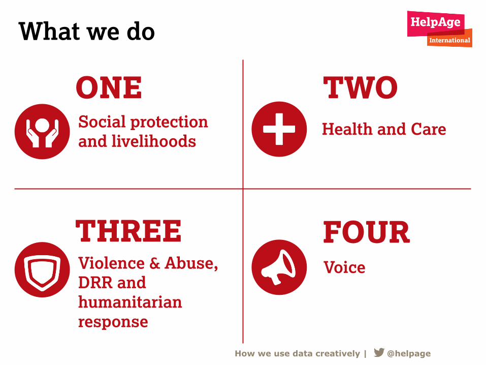
What we do
Social protection
and livelihoods Health and Care
Violence & Abuse,
DRR and
humanitarian
response
Voice
TWO ONE
THREE FOUR
How we use data creatively | @helpage
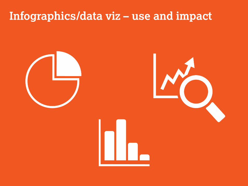
Infographics/data viz – use and impact
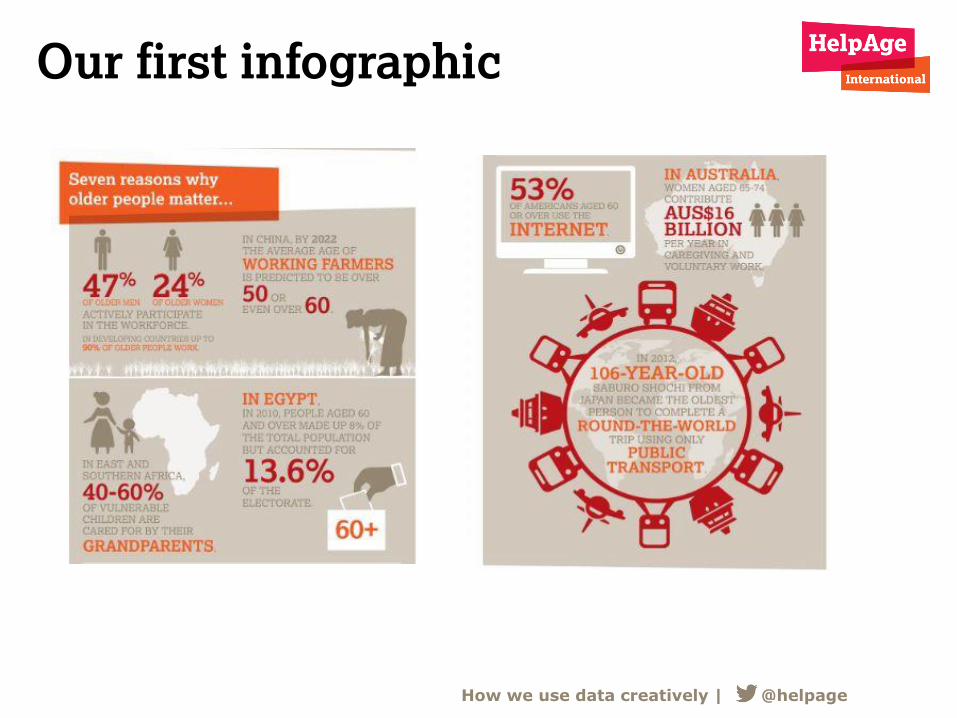
Our first infographic
How we use data creatively | @helpage
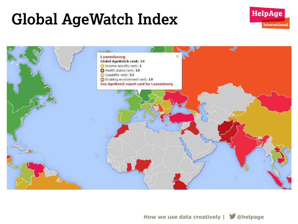
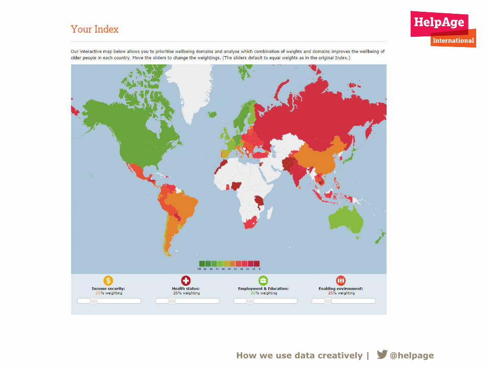
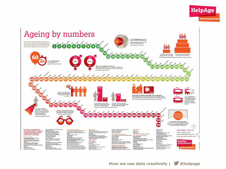
Global AgeWatch Index
How we use data creatively | @helpage
• First-ever measure of quality of life and wellbeing of
older people around the world
• Responds to the concerns of older people – focus groups
with 1,300 older men and women in 36 countries
• Uses the latest cross-national data available from World
Bank, WHO, ILO, and Gallup World View
• Covers 96 countries representing 91% of the world’s
older people
How we use data creatively | @helpage
What is the Index?
How we use data creatively | @helpage
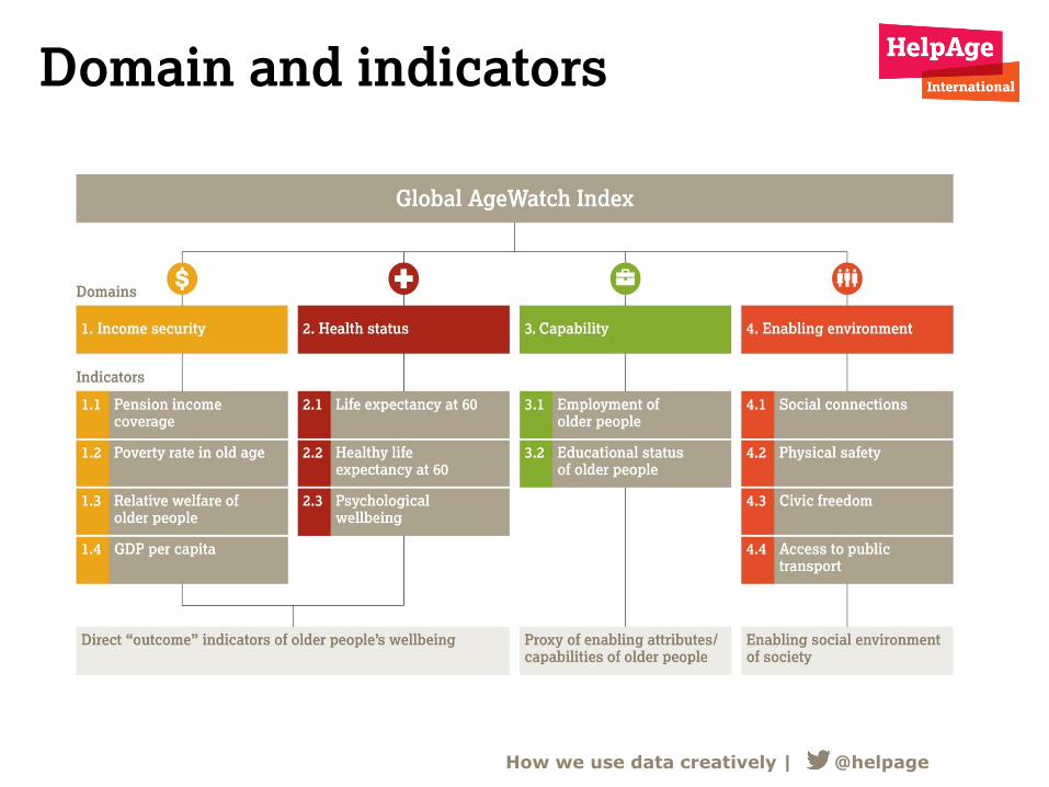
Domain and indicators
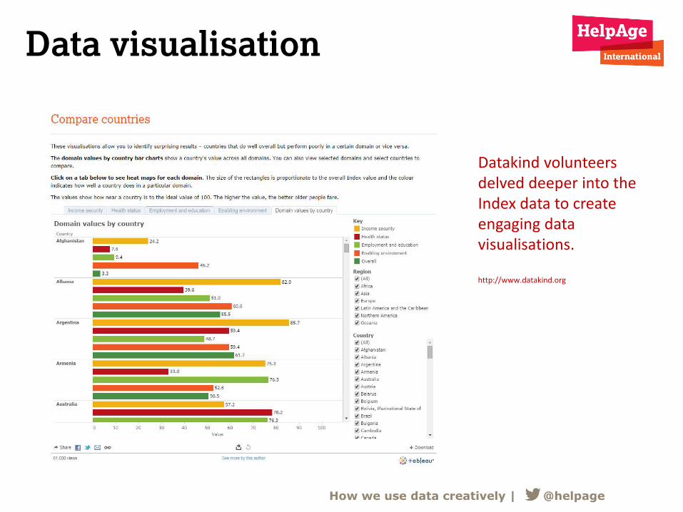
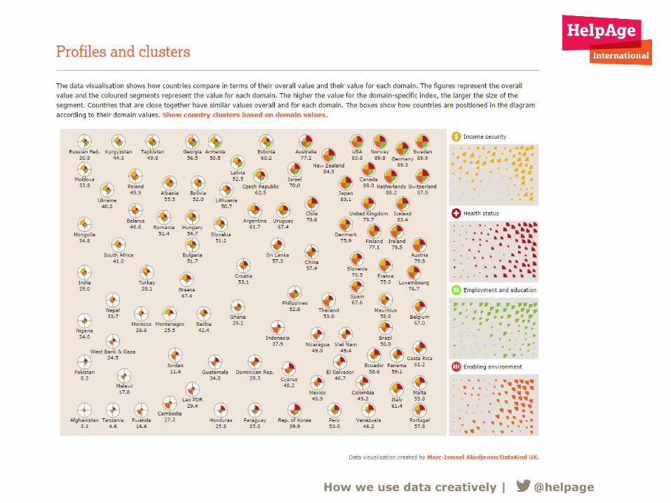
Datakind volunteers delved deeper into the Index data to create engaging data visualisations. http://www.datakind.org
How we use data creatively | @helpage
Data visualisation
How we use data creatively | @helpage
How we use data creatively | @helpage
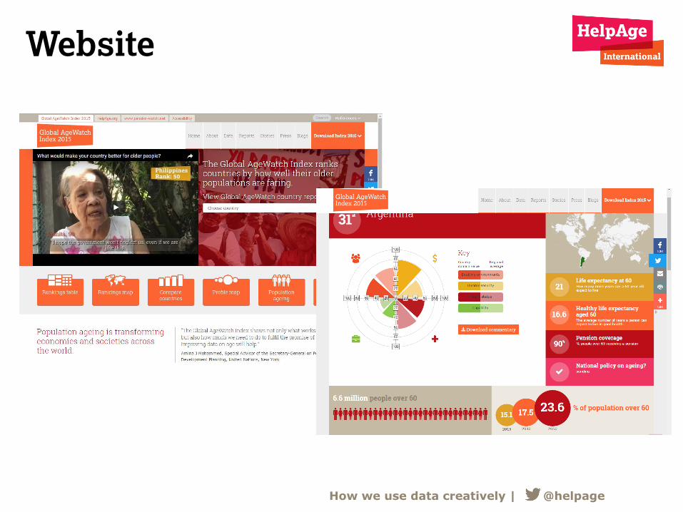
Website

Annual review
How we use data creatively | @helpage
How we use data creatively | @helpage
How we use data creatively | @helpage
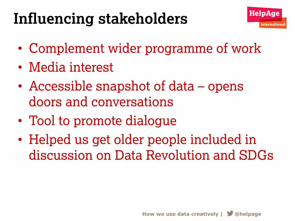
Influencing stakeholders
• Complement wider programme of work
• Media interest
• Accessible snapshot of data – opens
doors and conversations
• Tool to promote dialogue
• Helped us get older people included in
discussion on Data Revolution and SDGs
How we use data creatively | @helpage
Establishing aims and selecting data
Icon created by Milky – Digital Innovation via Noun Project
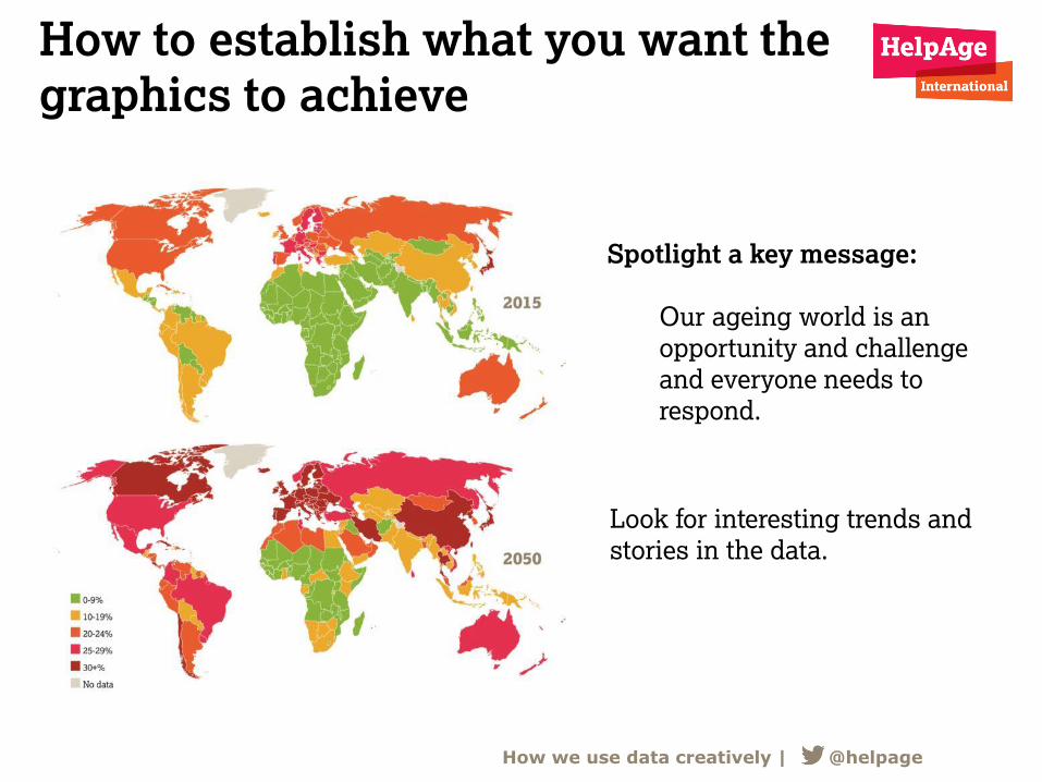
How to establish what you want the
graphics to achieve
Spotlight a key message:
Our ageing world is an
opportunity and challenge
and everyone needs to
respond.
Look for interesting trends and
stories in the data.
How we use data creatively | @helpage
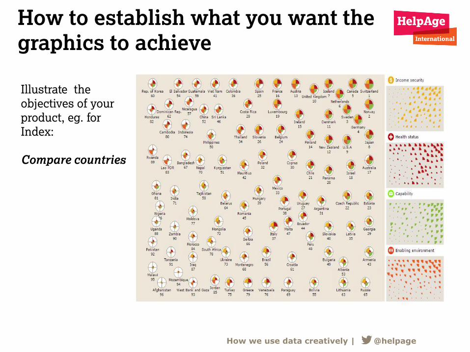
How to establish what you want the
graphics to achieve
Illustrate the
objectives of your
product, eg. for
Index:
Compare countries
How we use data creatively | @helpage
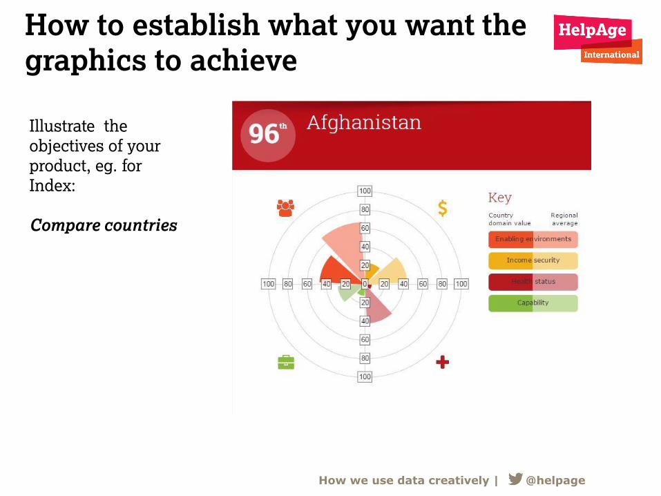
How to establish what you want the
graphics to achieve
How we use data creatively | @helpage
Illustrate the
objectives of your
product, eg. for
Index:
Compare countries
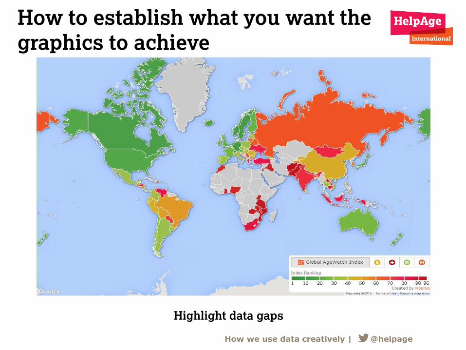
How to establish what you want the
graphics to achieve
Highlight data gaps
How we use data creatively | @helpage
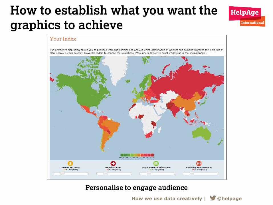
How to establish what you want the
graphics to achieve
Personalise to engage audience
How we use data creatively | @helpage
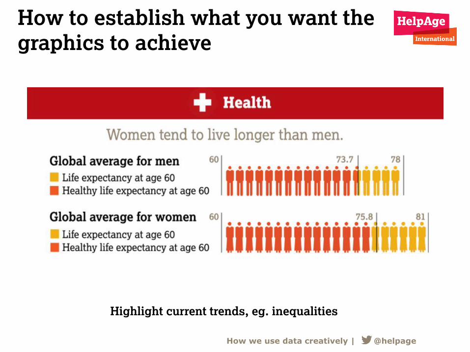
How to establish what you want the
graphics to achieve
Highlight current trends, eg. inequalities
How we use data creatively | @helpage
How to select key data
• In house brainstorming and analysis
• Datadive/Hack days
• Design agency
• What others are doing
• What worked before
Look for stories, trends, interesting
comparisons through:
How we use data creatively | @helpage
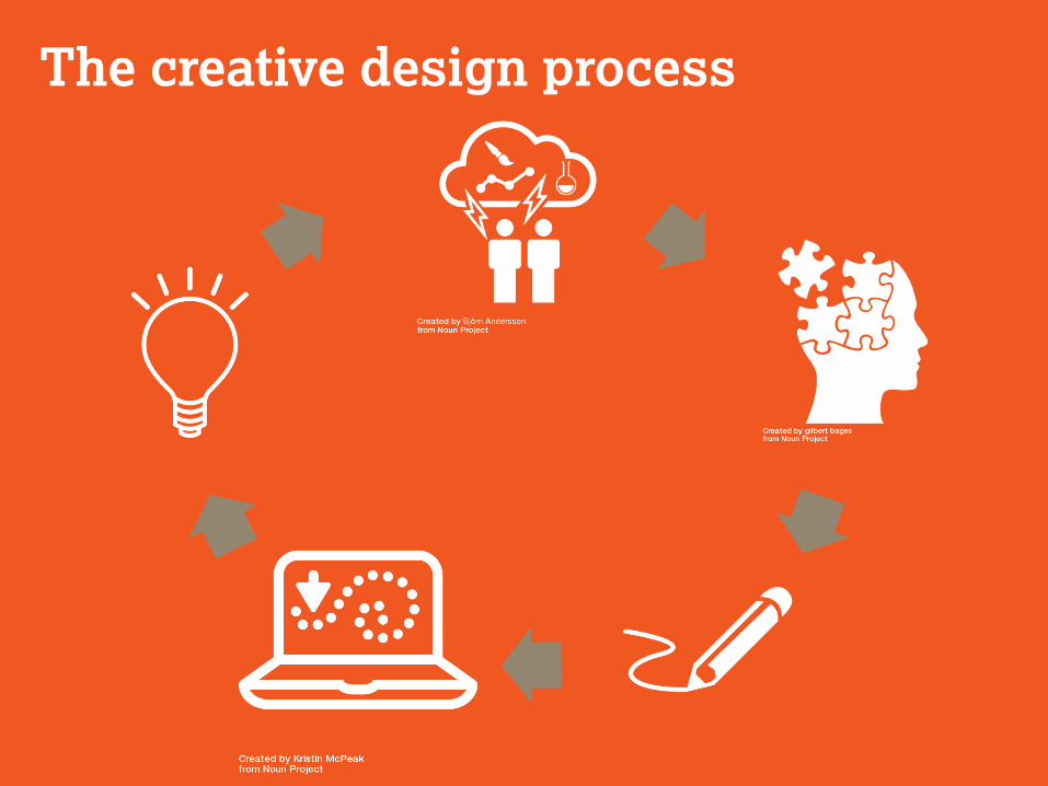
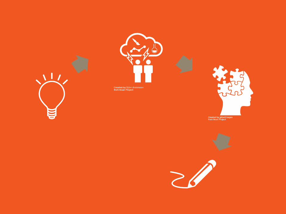
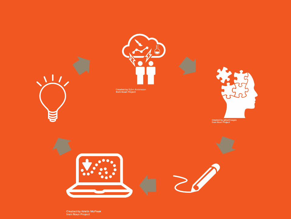
The creative design process
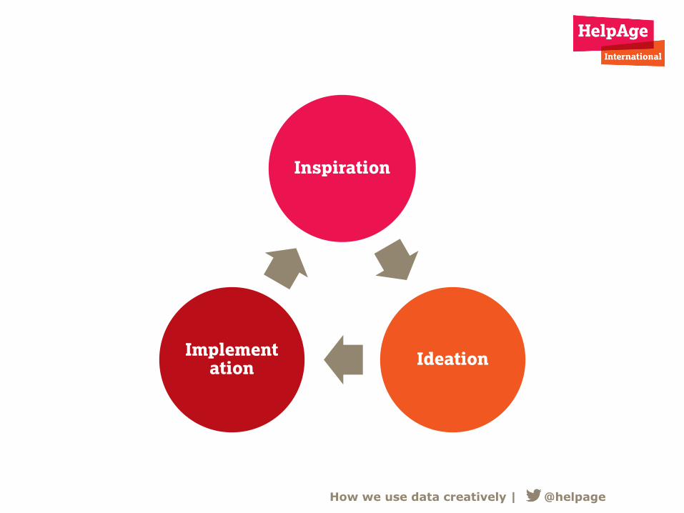
Inspiration
Ideation Implement
ation
How we use data creatively | @helpage
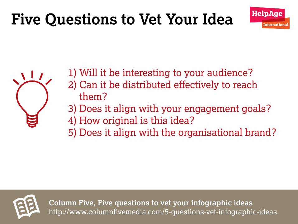
Five Questions to Vet Your Idea
1) Will it be interesting to your audience? 2) Can it be distributed effectively to reach
them? 3) Does it align with your engagement goals? 4) How original is this idea? 5) Does it align with the organisational brand?
Column Five, Five questions to vet your infographic ideas
http://www.columnfivemedia.com/5-questions-vet-infographic-ideas
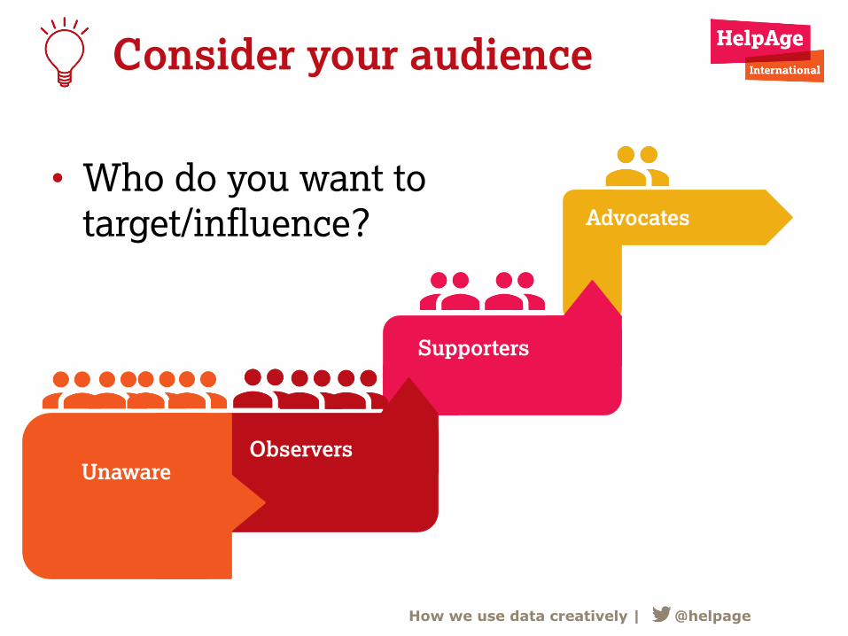
Consider your audience
• Who do you want to
target/influence?
Unaware Observers
Supporters
Advocates
How we use data creatively | @helpage
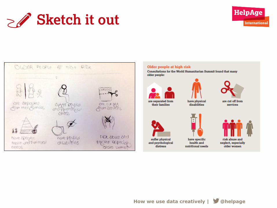
Sketch it out
How we use data creatively | @helpage
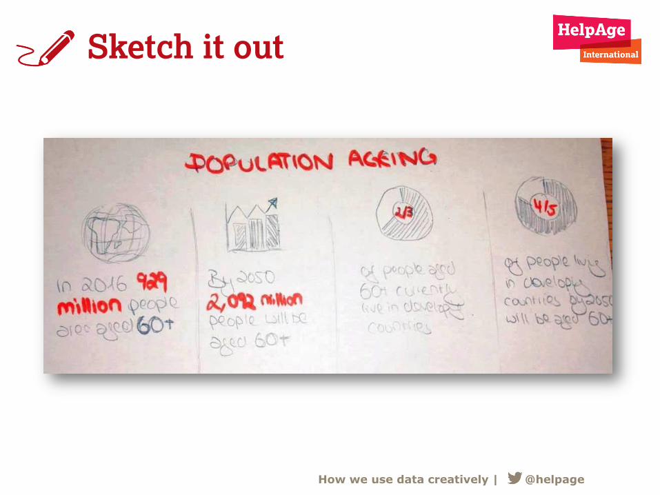
Sketch it out
How we use data creatively | @helpage
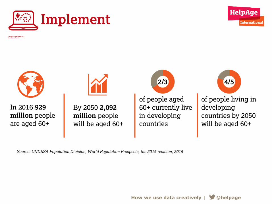
Implement
How we use data creatively | @helpage
In 2016 929
million people
are aged 60+
By 2050 2,092
million people
will be aged 60+
of people aged
60+ currently live
in developing
countries
of people living in
developing
countries by 2050
will be aged 60+
2/3 4/5
Source: UNDESA Population Division, World Population Prospects, the 2015 revision, 2015
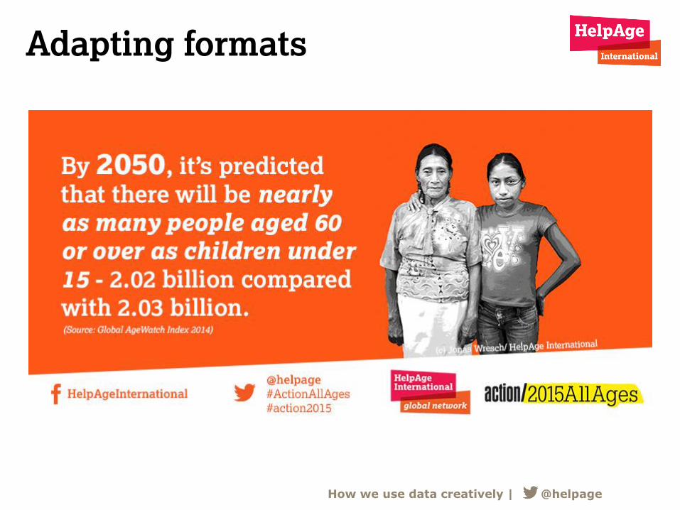
Adapting formats
How we use data creatively | @helpage
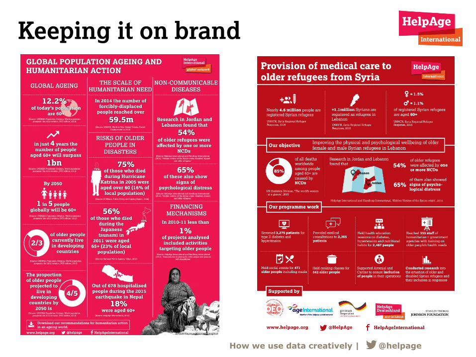
Keeping it on brand
How we use data creatively | @helpage
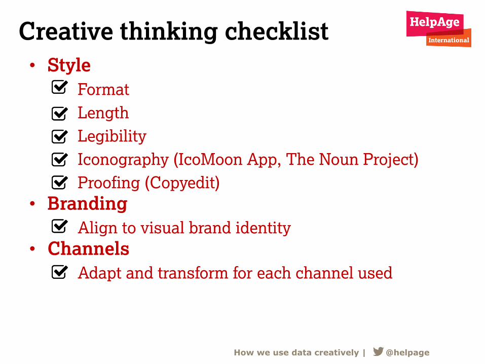
Creative thinking checklist
• Style
Format
Length
Legibility
Iconography (IcoMoon App, The Noun Project)
Proofing (Copyedit)
• Branding
Align to visual brand identity
• Channels
Adapt and transform for each channel used
How we use data creatively | @helpage
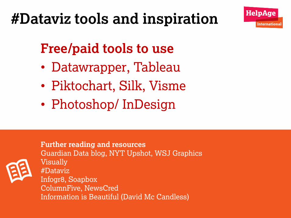
#Dataviz tools and inspiration
Free/paid tools to use
• Datawrapper, Tableau
• Piktochart, Silk, Visme
• Photoshop/ InDesign
Further reading and resources
Guardian Data blog, NYT Upshot, WSJ Graphics
Visually
#Dataviz
Infogr8, Soapbox
ColumnFive, NewsCred
Information is Beautiful (David Mc Candless)
Top tips and lessons learnt
Top tips and lessons learnt
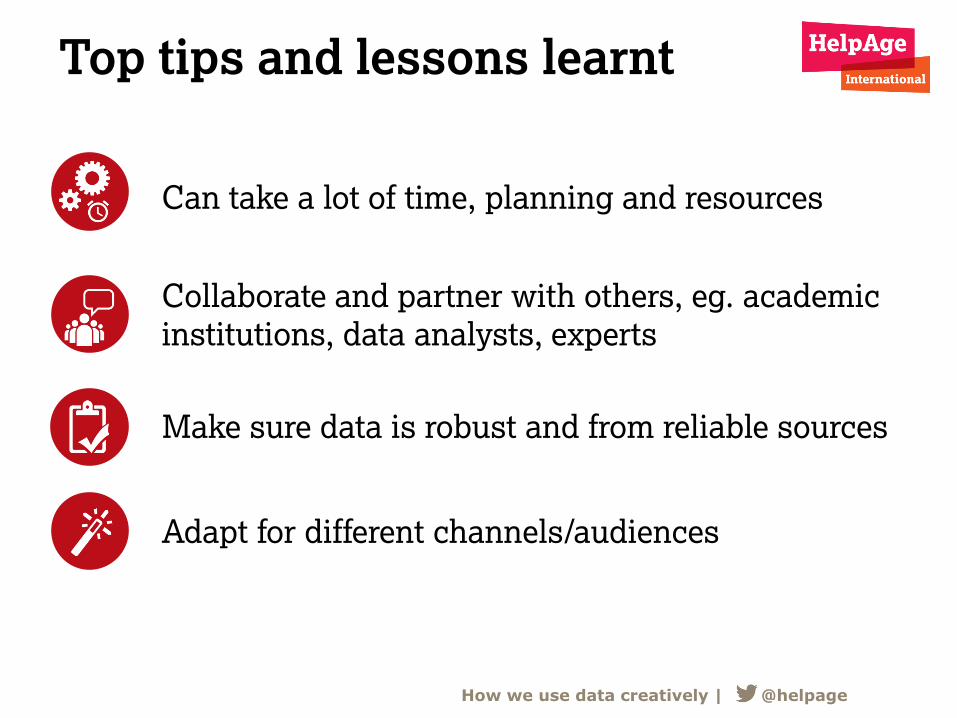
How we use data creatively | @helpage
Can take a lot of time, planning and resources
Collaborate and partner with others, eg. academic
institutions, data analysts, experts
Make sure data is robust and from reliable sources
Adapt for different channels/audiences
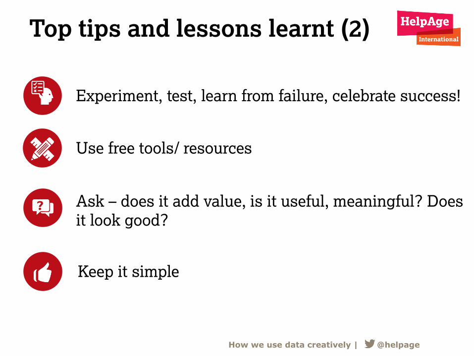
Top tips and lessons learnt (2)
How we use data creatively | @helpage
?
Experiment, test, learn from failure, celebrate success!
Use free tools/ resources
Ask – does it add value, is it useful, meaningful? Does
it look good?
Keep it simple
Questions?
How we use data creatively | @helpage
Thank You
HelpAgeInternational
@helpage
helpage.org
© J
onas W
resch/
Help
Age I
nte
rnational
How we use data creatively | @helpage
Visit the CharityComms website to view slides from past events, see
what events we have coming up and to check out what else we do:
www.charitycomms.org.uk
12 May 2016London#charitycreative
Creatives Group
Data visualisation