Official typo3.org infrastructure &the TYPO3 Server Admin Team

TYPO3 Style GuideEverything you'll need
Status: 21.02.2018

PrologueWhy We Want A Style Guide
After some years of different directions around the Design inside the TYPO3 Universe we, the Design Team, wanted to streamline the styling of TYPO3. We tried to build a Style Guide that is easy to use, easy to adopt and easy to accept for everyone.
We started this project "creating a new style guide" in November 2013 at an awesome #t3mar-ketingsprint in Bad Dürkheim. The attendees were experts from inside the TYPO3 Universe and some new folks, who wanted to join and help TYPO3 in a new way. They never had been in touch with the brand of TYPO3 before. For them it was pretty difficult to see the basic styles of TYPO3 and get everything they needed to work. At this point we started to think about a basic Style Guide that would help to avoid those prob-lems. This Style Guide is ment to be as flexible as we need it for an Open Source product like TYPO3. It is ment to help everybody inside the TYPO3 Universe to find advice for a good start of working with its design.
If you have any trouble with using this Style Guide, please don't just do it different. Just ask us and be sure that we will look at your ideas and even change the Style Guide if it is consid-ered necessary. Please stick to the Style Guide at all times when creating something for the TYPO3 Project. By doing so, we want to achieve a
streamlined layout of any Usergroup, Flyer, Con-ference, Blog or anything else inside the TYPO3 Universe.
You can be sure that we are not doing this because we like to build rules. We are setting up these basic guidelines in order to help TYPO3 showing a clear face to the world, to provide a stable and recognizable appearence. We want to achieve consistence in everything that is con-nected to TYPO3 and considered TYPO3 Com-munication.
If you have any questions concerning the do’s and don’ts of the Style Guide please do not hes-itate to ask them via (Slack: https://typo3.slack.com/messages/cig-marketing/) or mail to [email protected]
Thank you for your work.
Philipp Randt & Fabian Stein (Leaders Of The TYPO3 Design Team)
Fabian Steinfrom "punkt.de".He is the leader of the TYPO3 Design Team and Co-Lead of the TYPO3 Marketing Team.
Philipp Randtfrom "PR Creative People".Co-Leader of TYPO3 Design Team.

180221_TYPO3_Printstyleguide 3TYPO3
Table of content
Prologue 2
The Team 4
1. Logos 5What To Do 6Things You Should Not Do 6Specific guidelines for print media: 7
2. Colors 82.1 Key, Supporting and Marker Colors 82.2 Grey and Message Colors 9
3. Typography 103.1 Character Fonts 103.1.3 Code font 113.2 Paragraphs format and page layout 133.3 Text layout 143.3.1 List Elements 153.3.2 Quotations 163.3.3 Special text formats 16
4. Footer 17
5. Tables 18
6. Visual Elements 196.1 Pictures 196.2 Icons 206.3 (Color) Highlights 21

180221_TYPO3_Printstyleguide 4TYPO3
The TeamBehind the Styleguide
Philipp Randt PR Creative People
Frank Schubert Profilmacher
Riona Kuthe jweiland.net
Jan-Michael Löw punkt.de
Wolf-Nicholas Henkels medianova
Fabian Stein punkt.de
Volker Neuenhaus Pagemachine
Vaula Aalto Pagemachine
Ursula Jäger BBDOGREYJVM
This style guide is based on the basic corporate identity of TYPO3. It was created in 2005 by a work-ing group under the leadership of Rasmus Skjoldan. Apart from minor evolutionary changes, the logo (drawn by Ralph du Carrois), the Share font, and the orange color are still the same. Many thanks to Rasmus and his team for their great work.

180221_TYPO3_Printstyleguide 5TYPO3
1. LogosHow to use the TYPO3 logo
General informationThe TYPO3 logo (symbol and word mark) should always be placed in the left upper corner of documents, flyers or websites. The minimum clear space surrounding the logo is 2 times x, where the value of x is derived from a third of the height of the letters of TYPO3. Whenever possible leave more white space to let the logo breath!
The additional text line (taglines) (as shown below) should only be used to give additional information such as a name of a trade fair (with location) or TYPO3 internal events. The gridlines shown in the example indicate the area around the logo, which should be kept clear of competing text, images or other graphics.
The gridlines are not part of the logo

180221_TYPO3_Printstyleguide 6TYPO3
Do's
What To Do
TYPO3
TYPO3
What you may douse the symbol without the word mark element
Don'ts
Things You Should Not Do
Please don t ■ use the word mark element
without the symbol ■ change the position of
symbol and word mark element
■ use additional lines (taglines) when the logo is particularly small
■ use the old TYPO3 logo with the orange and green symbol
■ use any colors then the defined ones

180221_TYPO3_Printstyleguide 7TYPO3
Specific guidelines for print media: DIN A4 formatPlease leave additional free space for the logo in the header as shown in the example:
DIN long formatNo free additional space in the header is needed for the logo as the flyer is going to be folded and an alignment of the content to this white space would cause necessary space to get wasted.
180221_TYPO3_Printstyleguide 8TYPO3
2. Colors
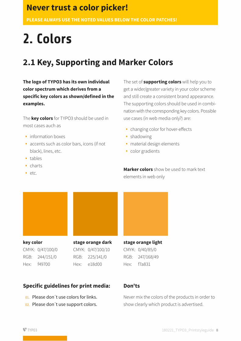
2.1 Key, Supporting and Marker Colors
stage orange darkCMYK: 0/47/100/10 RGB: 225/141/0 Hex: e18d00
key colorCMYK: 0/47/100/0 RGB: 244/151/0 Hex: f49700
stage orange lightCMYK: 0/40/85/0 RGB: 247/168/49 Hex: f7a831
The logo of TYPO3 has its own individual color spectrum which derives from a specific key colors as shown/defined in the examples.
The key colors for TYPO3 should be used in most cases auch as
■ information boxes ■ accents such as color bars, icons (if not
black), lines, etc. ■ tables ■ charts ■ etc.
The set of supporting colors will help you to get a wider/greater variety in your color scheme and still create a consistent brand appearance. The supporting colors should be used in combi-nation with the corresponding key colors. Possible use cases (in web media only?) are:
■ changing color for hover-effects ■ shadowing ■ material design elements ■ color gradients
Marker colors show be used to mark text elements in web only
Specific guidelines for print media:
01. Please don t use colors for links.02. Please don t use support colors.
Don'ts
Never mix the colors of the products in order to show clearly which product is advertised.
Never trust a color picker!PLEASE ALWAYS USE THE NOTED VALUES BELOW THE COLOR PATCHES!

180221_TYPO3_Printstyleguide 9TYPO3
validCMYK: 66/0/82/0 RGB: 90/188/85 Hex: 5abc55
errorCMYK: 4/99/67/1 RGB: 221/18/61 Hex: dd123d
warningCMYK: 0/23/93/0 RGB: 255/200/0 Hex: ffc800
informationCMYK: 80/51/0/0 RGB: 0/128/255 Hex: 0080ff
Message Colors
The additional grey shades should be used as stylistic element or in black and white docu-ments. When using grey in black and white docu-ments please make sure not to use to many dark shades and pay attention to have enough contrast.
Message colors are used in the web environ-ment only (that s why no CMYK value is given). The color description (name) shows the intendes purpose of each color. Don t use them in print media or in an other way then the specified.
dark grayCMYK: 0/0/0/68 RGB: 81/81/81 Hex: 515151
mid greyCMYK: 0/0/0/45 RGB: 140/140/140 Hex: 8c8c8c
light greyCMYK: 0/0/0/27 RGB: 185/185/185 Hex: b9b9b9
super light greyCMYK: 0/0/0/8 RGB: 244/244/244 Hex: f4f4f4
Grey
2.2 Grey and Message Colors

180221_TYPO3_Printstyleguide 10TYPO3
2.3 Gradient (web only!)
For web enviroments only, you can use an addi-tional element - the gradient. This element can be used for larger, singled out elements such as buttons or newsboxes. Use this gradient to soften the harsh look of large orange surfaces on websites.
Don’t use them in print media, for various typog-raphy purposes, or in any other way than speci-fied above.
The gradient is used from top left to the right bottom at an angle of 135°.
web key color gradientlinear-gradient (135deg, #f49700 15%, #e18d00 85%);
web blue color gradientlinear-gradient (135deg, #538bb3 15%, #426f8f 85%);
web green color gradientlinear-gradient (135deg, #75a75a 15%, #5e8648 85%);
Remember: Never trust a color picker!PLEASE ALWAYS USE THE NOTED VALUES BELOW THE COLOR PATCHES!
blueRGB: 83/139/179 Hex: #538bb3
dark blueRGB: 66/111/143 Hex: #426f8f
green RGB: 117/167/90Hex: #75a75a
dark green RGB: 95/134/72Hex: #5e8648
2.4 Secondary Colors (web only!)

180221_TYPO3_Printstyleguide 11TYPO3
3. Typography
3.1 Character Fonts
3.1.1 Headings
In order to create a unique Corporate Design for TYPO3 the character font “Share” was selected. It should be used for headings and subheadings in all print/promotional materials and in web media. When more than one heading is necessary, please use font sizes as shown on the "Headings over-view page" on next page.
Share Bold Share Regular
3.1.2 Continuous text
For the continuous text the character font “Source Sans Pro” should be used create an extra visual difference between headlines and continuous text.
Source Sans Pro Light Use for continuouse text
Source Sans Pro Bold Use for teaser and to highlight
Source Sans Pro Italic Use for quotation

180221_TYPO3_Printstyleguide 12TYPO3
3.1.3 Code fontAs TYPO3 is a code-based open source software, you might need an additional code font. Therefore the character font “Source Code Pro” was chosen.
Source Code Pro Bold
Source Code Pro Regular
Useful linksAll fonts are available as zip-file: https://fonts.google.com/specimen/Share https://github.com/adobe-fonts/source-sans-pro https://github.com/adobe-fonts/source-code-pro
Furthermore a “ready to use” InDesign template document with all fonts embedded is available here: (Links zum Download) A “ready to use” Word template document with all fonts embedded is still in progress. If you would like to support us in/by creating a word template, please contact us via: Slack (https://typo3.slack.com/messages/cig-marketing/)

180221_TYPO3_Printstyleguide 13TYPO3
Heading TitleFont Share Bold Size 34pt Line height 36pt Grid 9pt Color 100k (black) Kerning optisch Distance below 9pt Distance above 0pt
Heading ChapterFont Share Regular Size 34pt Line height 36pt Grid 9pt Color 100k (black) Kerning optisch Distance below 9pt Distance above 0pt
Teaser / SubheaderFont Source Sans Pro Bold Size 12pt Line height 27pt Grid 9pt Color 100k (black) Kerning optisch Distance below 9pt
Bodytext Font Source Sans Pro Light Size 12pt Line height 18pt Grid 9pt Color 100k (black) Kerning optisch Distance below 9pt
Heading 2Font Source Sans Pro Bold Size 22pt Line height 27pt Grid 9pt Color 100k (black) Kerning optisch Distance below 18pt Distance above 9pt
Heading 3
Font Source Sans Pro Bold Size 14pt Line height 18pt Grid 9pt Color 100k (black) Kerning optisch Distance below 18pt Distance above 9pt
A standard page can contain different text elements such as headings, subheadings or continuous text. The given examples show the InDesign attributes (font size, line hieght, grid, color and kerning) of each text element. Those attributes can be set manually.
180221_TYPO3_Printstyleguide 14TYPO3
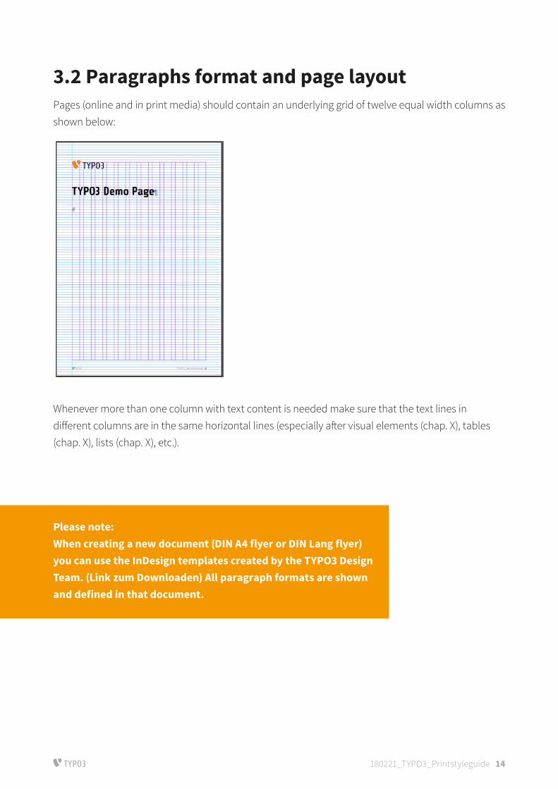
3.2 Paragraphs format and page layout Pages (online and in print media) should contain an underlying grid of twelve equal width columns as shown below:
Whenever more than one column with text content is needed make sure that the text lines in different columns are in the same horizontal lines (especially after visual elements (chap. X), tables (chap. X), lists (chap. X), etc.).
Please note: When creating a new document (DIN A4 flyer or DIN Lang flyer) you can use the InDesign templates created by the TYPO3 Design Team. (Link zum Downloaden) All paragraph formats are shown and defined in that document.

180221_TYPO3_Printstyleguide 15TYPO3
3.3 Text layout
General informationFor continuous text please use ragged left alignment. You may also use an automatic hyphenation.
Do
■ Introduction text (teaser) may be bold or formated such as continuous text. ■ Text in second layers (i.e. lists) should be smaller as the continuous text before. ■ If possible try to use the factor 1,33 (or the inverted value 0,75) when creating new documents.
That means that for example the space between two lines should be 0,75 times the hight of the continuous text? Another example: A subheadline should be 1,33 times as high as the continuous text and the headline should then be 1,33 times as high as the sub headline!
Lorem ipsum dolor sit amet, consectetuer adipiscing elit. Aenean commodo ligula eget dolor. Aenean massa. Cum sociis natoque et magnis dis t ridiculuslenteulla consequat
Lorem ipsum dolor sit amet, consectetuer adipisciparturi-
ent montes, nascetur ridiculus mus. Donec quam felis, ultric-ies nec, pellentesque eu, pre-
tium. Nnsequat
Lorem ipsum dolor sit amet, consectetuer adipiscing elit. Aenean commodo ligula eget dolor. Aenean massa. Cum sociis natoqupel-lentesque eu, pretiquis
Don ts
Please note: Don t use automatic hyphenation for headings and teaser text.

180221_TYPO3_Printstyleguide 16TYPO3
Unordered List ■ use a leading zero ■ use "abc" in 2nd layer elements
Ordered List ■ the symbol for the first layer is a large filled
square ■ the symbol for the second layer is a (ca. 70%)
smaller filled square
3.3.1 List Elements
Example01. List Level One
a. List Level Two02. List Level One
a. List Level Two
Printing note:
When you create a style that adds bullets or numbering to paragraphs (list elements), these bullets and numbers may get lost if the text is copied or exported to a different application. To avoid this problem, convert the style bullets or numbering to text.
Note: If you convert style bullets in an InCopy story linked to an InDesign layout, the change may be overwriten when the content is updated in InDesign.
In the Paragraph Styles panel, select the style that contains the bullets and numbering.
In the Paragraph Styles panel menu, choose Convert “[style]” Bullets and Numbering to Text.
If you use the InDesign template (which can be downloaded here) you don t have to worry about the obove mentioned setting. The template is ready to use as it works with flattening of transparency. The transparent pixel are applied to the master page. To generate a printable pdf it is necessary to load and use the prepared pdf-export functions. You can find these functions and the flattening of transparancy by following this link.
The bullets and the numbers in list elements should either be black or in the key color of the corre-sponding product. And please make sure that enumerations over several lines have an indentation.
Example ■ List Level One
■ List Level Two ■ List Level One
■ List Level Two

180221_TYPO3_Printstyleguide 17TYPO3
3.3.2 QuotationsUse an Italic font for quotation.
"TYPO3 is the best enterprise CMS in the World"
A block quotation (also known as a long quotation or extract) is a quotation in a written document, that is set off from the
main text as a paragraph, or block of text, and typically distinguished visually using indentation and a different typeface or
smaller size quotation.
3.3.3 Special text formats
AddressUse tabs to align lines to each other. That creates a clear paragraph/section. Use a internatinal notation when adding addresses to brochures, flyers or similar print material. Align all address lines left.
Company Name1234 Main St.Anywhere, 101010, CAU.S.A+1.888.123.4567
Phone: +41 41 511 00 35 Fax: +41 41 511 00 39
Web links in print mediaWhen adding links to print material you don t have to highlight the link in color - leave it in black.
Do Don ts typo3.org typo3.org typo3.org typo3.org typo3.org
Web links in the webtypo3.org

180221_TYPO3_Printstyleguide 18TYPO3
4. FooterIn some document types (e.g. white paper) a footer might help to get a clearer document structure. When using a footer the follwoing elements should be applied.
■ page number ■ name of the document ■ TYPO3 Logo
It is also allowed to use the footer together with the Color Highlight like described on page 21.
The downloadable InDesign template already contains a master page with a footer. To use this page you need to select master page A in the menu item "page type".

180221_TYPO3_Printstyleguide 19TYPO3
5. TablesGeneral InformationTables can help to illustrate important number-driven data or to clearly structure huge amounts or data. To get a clearer structure the follwoing setting should be added to your table:
■ a seperating line in key color will help to seperate the headline from the content elements ■ the background of all content elements should be kept in light grey to support the difference
between headline and content ■ keep the borders in white ■ content in the footer/headline should be aligned left ■ align text in content elements centred
Please Note: When tables contain list elements the rules of chapter 3.3.1 (List Elemets) apply.
TYPO3 in Numbers Hello Third Part
125
Contributors
7.6+
Million Downloads
500,000+
Websites, Intranets and Apps built with TYPO3
50+
Localizations available
6,000+
Free available Extensions
10,000+
TYPO3 Features out of the box

6. Visual Elements
6.1 Pictures
General InformationVisual elements such as pictures, icons or variouse highlights help to strengthen written messages in all kind of print material and in web applications. In order to additionally create a consistent and recognizable appearance of the TYPO3 Family we specified a few simple rules.
■ pictures may be placed in the bleed (at one side of the document)
■ captions should be aligned right (by adding the caption text into the left column of a two-columned single-lined table with white borders and a right 1pt string key color border captions will always look the same.) Don ts don t use borders and shading
BewareWhen adding pictures a misalignment/offset of different text elements can be cause by text warp. It is important to aviod that and to manually adjust those text elements so they are aligned right again.

180221_TYPO3_Printstyleguide 21TYPO3
6.2 Icons
■ without a surrounding box ■ as simple as possible (flat deisgn) ■ continuous deck ■ black ■ use Icons to highlight elements or to visualize
and strukture long text paragraphs ■ "negative Icons" should be colored in key
colors ■ functional icons: (Beispiele?)
■ place in button-like squares (surron ding box)
■ use key colors or one of the grey shade ■ Favicons you find at the Logo folder ■ Select, Checkbox, Radio: Allowed to alter if
you want, but please respect the website's style.
Buttons: Dark buttons are getting lighter by mouseover. Light-colored buttons are getting darker by mouseover. The support colors are defined for those instances.
Use "Font Awesome" when you need a font for icons and center it (if text is placed below the icon). https://fontawesome.com

180221_TYPO3_Printstyleguide 22TYPO3
6.3 (Color) Highlights
Information Boxes ■ keep them in key color or marker grey ■ information boxes behave like pictures, that
means they may be placed in the bleed ■ keep a minimum space (of around 4,5 mm)
between text boxes and the borders of the information boxes
In addition to pictures and icons further highlights (information boxes and color bars) can be applied to kind of print media and website content.
Color Bars ■ should be used to highlight a specific section
of a page by placing the color bar in the same width as the area which should be highlighted
■ keep in key color or marker grey ■ use color bars only at the bottom of a page
Use the "bold" font characteristic of Source Sans Pro to guarantee good print results. (especially when using a white font color).
Even this can be an infobox
The Box works on both sides
The box can also be used in marker grey


![Typo3 Tutorial - NDSU · Typo3 Tutorial – Overview – Typo3 Module [ Page 8 ] Last modified 01/11/2007 Figure 5 - TYPO3 context menu. You can access your content information to](https://static.fdocuments.in/doc/165x107/5ad0b5877f8b9a8b1e8e3707/typo3-tutorial-ndsu-tutorial-overview-typo3-module-page-8-last-modified.jpg)