
Draft AC 150/5360-12F, Airport Signing and Graphics, July 2012 · Circular Subject: Airport Signing...
204
U.S. Department of Transportation Federal Aviation Administration Advisory Circular Subject: Airport Signing and Graphics Date: DRAFT Initiated by: AAS-100 AC No: 150/5360-12F Change: 1. Purpose. This advisory circular (AC) provides guidance on airport terminal and landside wayfinding, signing, and graphics. 2. Cancellation. AC 150/5360-12E, Airport Signing and Graphics, dated September 18, 2008 is canceled. 3. Background. This AC incorporates the recommendations and guidelines developed under Airport Cooperative Research Program (ACRP) Report 52, Wayfinding and Signing Guidelines for Airport Terminals and Landside, completed in 2011. 4. Application. The Federal Aviation Administration (FAA) recommends the guidelines and specifications in this AC for implementation of airport terminal and landside wayfinding, signing, and graphics. It addresses systems typically installed by an airport operator and those typically installed by individual airlines. In general, use of this AC is not mandatory. However, the use of this AC is mandatory for all projects funded through the Airport Improvement Program (AIP) or Passenger Facility Charges (PFC) Program. See Grant Assurance No. 34, Policies, Standards, and Specifications, and PFC Assurance No. 9, Standards and Specifications. 5. Principal Changes. This is a substantial rewrite of this AC. Users should review the entire document. The AC focuses on four areas of the airport: roadways, parking, curbside and ground transportation, and terminal. 6. Use of Metrics. This AC includes both English and metric dimensions. The metric conversions may not be exact equivalents, and the English dimensions will govern. 7. Comments or Suggestions. Direct comments or suggestions regarding this AC to: Manager, Airport Engineering Division Federal Aviation Administration ATTN: AAS-100 800 Independence Avenue, S.W. Washington, DC 20591
Transcript of Draft AC 150/5360-12F, Airport Signing and Graphics, July 2012 · Circular Subject: Airport Signing...
U.S. Department of Transportation Federal Aviation Administration
Advisory Circular
Subject: Airport Signing and Graphics
Date: DRAFT Initiated by: AAS-100
AC No: 150/5360-12F Change:
1. Purpose. This advisory circular (AC) provides guidance on airport terminal and landside wayfinding, signing, and graphics.
2. Cancellation. AC 150/5360-12E, Airport Signing and Graphics, dated September 18, 2008 is canceled.
3. Background. This AC incorporates the recommendations and guidelines developed under Airport Cooperative Research Program (ACRP) Report 52, Wayfinding and Signing Guidelines for Airport Terminals and Landside, completed in 2011.
4. Application. The Federal Aviation Administration (FAA) recommends the guidelines and specifications in this AC for implementation of airport terminal and landside wayfinding, signing, and graphics. It addresses systems typically installed by an airport operator and those typically installed by individual airlines. In general, use of this AC is not mandatory. However, the use of this AC is mandatory for all projects funded through the Airport Improvement Program (AIP) or Passenger Facility Charges (PFC) Program. See Grant Assurance No. 34, Policies, Standards, and Specifications, and PFC Assurance No. 9, Standards and Specifications.
5. Principal Changes. This is a substantial rewrite of this AC. Users should review the entire document. The AC focuses on four areas of the airport: roadways, parking, curbside and ground transportation, and terminal.
6. Use of Metrics. This AC includes both English and metric dimensions. The metric conversions may not be exact equivalents, and the English dimensions will govern.
7. Comments or Suggestions. Direct comments or suggestions regarding this AC to: Manager, Airport Engineering Division Federal Aviation Administration ATTN: AAS-100 800 Independence Avenue, S.W. Washington, DC 20591
DRAFT AC 150/5360-12F 7/27/2012
ii
8. Copies of this AC. This and other ACs published by the FAA Office of Airport Safety and Standards are available on the FAA Office of Airports web page at http://www.faa.gov/airports/resources/advisory_circulars/.
Michael J. O’Donnell Director of Airport Safety and Standards
7/27/2012 DRAFT AC 150/5360-12F
iii
Table of Contents Chapter 1. Introduction ....................................................................................................................... 1
1.1 Purpose ...................................................................................................................................... 1 1.2 Organization .............................................................................................................................. 1 1.3 Signing and wayfinding process ................................................................................................ 2 1.4 Analysis ..................................................................................................................................... 2 1.5 Systems analysis approach ........................................................................................................ 2
1.5.1 Goal of signing system ....................................................................................................... 3 1.5.2 Airport user categories ........................................................................................................ 3 1.5.3 Structuring the signing system ............................................................................................ 3 1.5.4 Considering user limitations in sign design and location ................................................... 3 1.5.5 Evaluation methods ............................................................................................................. 5 1.5.6 Passenger circulation analysis............................................................................................. 5 1.5.7 Evaluation of current wayfinding system ........................................................................... 8 1.5.8 Asset management .............................................................................................................. 9 1.5.9 Temporary signs ................................................................................................................. 9
1.6 Developing a wayfinding strategy ........................................................................................... 10 1.6.1 Acceptance ........................................................................................................................ 10 1.6.2 Philosophy ........................................................................................................................ 10 1.6.3 Logic ................................................................................................................................. 13
Chapter 2. Airport Roadways ........................................................................................................... 21 2.1 Wayfinding philosophy and principles .................................................................................... 21
2.1.1 Considering user requirements and limitations ................................................................. 22 2.1.2 Positive guidance .............................................................................................................. 24
2.2 Applicable federal standards ................................................................................................... 24 2.2.1 Airport roadways and the MUTCD .................................................................................. 25
2.3 Airport roadway decision points ............................................................................................. 25 2.3.1 Airport exit signs .............................................................................................................. 26
2.4 Static sign design elements ...................................................................................................... 27 2.4.1 Terminology...................................................................................................................... 27 2.4.2 Symbology ........................................................................................................................ 29 2.4.3 Typography ....................................................................................................................... 29 2.4.4 Arrows .............................................................................................................................. 30 2.4.5 Color and shape ................................................................................................................ 32 2.4.6 Wayfinding sign placement, spacing and design speeds .................................................. 33
2.5 Sign structures and illumination .............................................................................................. 35 2.5.1 Sign structures ................................................................................................................... 35 2.5.2 Safety considerations ........................................................................................................ 36 2.5.3 Illumination ....................................................................................................................... 36
2.6 Changeable Message Signs (CMSs) ........................................................................................ 37 2.6.1 Appropriate use of CMSs ................................................................................................. 37 2.6.2 CMS technology ............................................................................................................... 38 2.6.3 Message design and layout ............................................................................................... 38 2.6.4 CMS display elements ...................................................................................................... 39 2.6.5 Passenger advisory CMS .................................................................................................. 40
2.7 Sign maintenance .................................................................................................................... 41
Chapter 3. Parking ............................................................................................................................. 43 3.1 Considering parking users in design (human factors) ............................................................. 43
DRAFT AC 150/5360-12F 7/27/2012
iv
3.2 Signs and wayfinding .............................................................................................................. 44 3.2.1 Planning for parking signing ............................................................................................. 44 3.2.2 Communicating parking options ....................................................................................... 45 3.2.3 Connecting parking and terminals .................................................................................... 46
3.3 Sign categories ........................................................................................................................ 46 3.3.1 Directional signs ............................................................................................................... 46 3.3.2 Identification signs ............................................................................................................ 47 3.3.3 Informational signs ........................................................................................................... 48 3.3.4 Regulatory signs ............................................................................................................... 50 3.3.5 Unique situations and systems .......................................................................................... 50
3.4 Sign design elements ............................................................................................................... 51 3.4.1 Terminology...................................................................................................................... 51 3.4.2 Symbology ........................................................................................................................ 52 3.4.3 Typography ....................................................................................................................... 52 3.4.4 Arrows .............................................................................................................................. 53 3.4.5 Color ................................................................................................................................. 53
3.5 Sign locations, structures, materials and safety ....................................................................... 53 3.5.1 Sign locations .................................................................................................................... 53 3.5.2 Illumination options .......................................................................................................... 53 3.5.3 Sign structures ................................................................................................................... 54 3.5.4 Pedestrian safety considerations ....................................................................................... 54
3.6 Sign maintenance .................................................................................................................... 55 3.7 Accessibility ............................................................................................................................ 56
3.7.1 Audit of elements .............................................................................................................. 56
Chapter 4. Curbside and Ground Transportation .......................................................................... 59 4.1 Planning for curbside signing .................................................................................................. 59 4.2 Signing areas ........................................................................................................................... 60
4.2.1 Departures ......................................................................................................................... 61 4.2.2 Arrivals ............................................................................................................................. 62 4.2.3 Ground transportation ....................................................................................................... 62 4.2.4 Passengers arriving/departing the airport .......................................................................... 63 4.2.5 External versus internal rail systems ................................................................................. 64 4.2.6 Technology ....................................................................................................................... 64 4.2.7 Accessibility...................................................................................................................... 64
4.3 Sign design elements ............................................................................................................... 64 4.3.1 Terminology...................................................................................................................... 65 4.3.2 Symbology ........................................................................................................................ 65 4.3.3 Typography ....................................................................................................................... 65 4.3.4 Arrows .............................................................................................................................. 66 4.3.5 Color ................................................................................................................................. 66
4.4 Sign locations, structures, materials and safety ....................................................................... 66 4.4.1 Sign locations .................................................................................................................... 66 4.4.2 Illumination options for night-time visibility ................................................................... 67 4.4.3 Structures and mounting ................................................................................................... 67 4.4.4 Safety ................................................................................................................................ 68
4.5 Sign maintenance .................................................................................................................... 68 4.6 Accessibility ............................................................................................................................ 69
4.6.1 Accessibility audit ............................................................................................................. 69
Chapter 5. Terminal .......................................................................................................................... 71 5.1 Wayfinding philosophy and principles .................................................................................... 71

7/27/2012 DRAFT AC 150/5360-12F
v
5.1.1 Wayfinding analysis and checklist .................................................................................... 71 5.1.2 Architectural complexity .................................................................................................. 76
5.2 Considering terminal users in design (human factors) ............................................................ 77 5.2.1 Terminal users categories ................................................................................................. 77 5.2.2 Terminal user tasks and information requirements ........................................................... 77 5.2.3 Meeting point for non-travelling visitors .......................................................................... 78 5.2.4 Visibility Index (VI) ......................................................................................................... 78
5.3 Signs and wayfinding .............................................................................................................. 79 5.3.1 Departures and arrivals sequence ...................................................................................... 79 5.3.2 Transit – internal rail system versus external ................................................................... 79 5.3.3 Security Screening Checkpoints (SSCP) .......................................................................... 80
5.4 Sign categories ........................................................................................................................ 80 5.4.1 Informational .................................................................................................................... 80 5.4.2 Directional ........................................................................................................................ 83 5.4.3 Identification ..................................................................................................................... 83 5.4.4 Regulatory ......................................................................................................................... 83
5.5 Sign design elements ............................................................................................................... 83 5.5.1 Terminology...................................................................................................................... 83 5.5.2 Symbology ........................................................................................................................ 86 5.5.3 Typography ....................................................................................................................... 97 5.5.4 Arrows ............................................................................................................................ 101 5.5.5 Color ............................................................................................................................... 106
5.6 Sign locations, databases, illumination, materials, and safety ............................................... 109 5.6.1 Sign locations .................................................................................................................. 109 5.6.2 Information databases ..................................................................................................... 113 5.6.3 Illumination ..................................................................................................................... 114 5.6.4 Mounting ......................................................................................................................... 115 5.6.5 Safety .............................................................................................................................. 115
5.7 Sign maintenance .................................................................................................................. 115 5.8 Accessibility .......................................................................................................................... 116
5.8.1 Wayfinding for the blind and visually impaired ............................................................. 116 5.8.2 Analyzing pedestrian airport wayfinding ........................................................................ 117 5.8.3 Managing codes and code compliance ........................................................................... 119 5.8.4 Types of visual impairments ........................................................................................... 119 5.8.5 Strategies for the blind .................................................................................................... 120
5.9 Accessibility audit ................................................................................................................. 128 5.9.1 Strategy ........................................................................................................................... 128
Chapter 6. Technology ..................................................................................................................... 131 6.1 Overview ............................................................................................................................... 131
6.1.1 Importance of sign manager knowledge of systems ....................................................... 131 6.1.2 Application...................................................................................................................... 131 6.1.3 Wayfinding planning process ......................................................................................... 132 6.1.4 Integration with entire sign system ................................................................................. 132 6.1.5 Integration with static signs ............................................................................................ 132
6.2 Systems and visual displays .................................................................................................. 133 6.2.1 Multiple User Flight Information Display System (MUFIDS) and Baggage Information Displays (BIDs) ................................................................................................................................ 133 6.2.2 Concourse-specific versus airport-wide MUFIDS displays ............................................ 133 6.2.3 Key decision points ......................................................................................................... 133 6.2.4 Content and display goals ............................................................................................... 134
DRAFT AC 150/5360-12F 7/27/2012
vi
6.2.5 Display mounting options ............................................................................................... 135 6.2.6 Readability of text for FIDs ............................................................................................ 135 6.2.7 Departure versus arrivals MUFIDS information ............................................................ 135 6.2.8 Visual paging .................................................................................................................. 136 6.2.9 Integration with MUFIDS ............................................................................................... 136 6.2.10 Ticketing area displays ................................................................................................... 136 6.2.11 Dedicated ticket counter positions .................................................................................. 137 6.2.12 Common-use ticket counter positions ............................................................................. 137 6.2.13 Common Use Self Service (CUSS) kiosks ..................................................................... 137
6.3 Departure area displays ......................................................................................................... 137 6.3.1 Standards for gate podium displays ................................................................................ 138 6.3.2 Multi-airline commuter gates .......................................................................................... 138 6.3.3 Dedicated commuter gates .............................................................................................. 138 6.3.4 Multi-airline domestic gates ........................................................................................... 139 6.3.5 Dedicated domestic gates ................................................................................................ 139 6.3.6 Multi-airline international gates ...................................................................................... 139 6.3.7 Dedicated international gates .......................................................................................... 139 6.3.8 Jet bridge door signage ................................................................................................... 139 6.3.9 Baggage Information Display Systems (BIDs) ............................................................... 139 6.3.10 Dynamic directories ........................................................................................................ 140 6.3.11 Interactive systems .......................................................................................................... 140 6.3.12 Flight information kiosks ................................................................................................ 140
6.4 Design elements .................................................................................................................... 141 6.4.1 Regulatory requirements – ADA and display systems ................................................... 141 6.4.2 Sign lighting controllers (dimming, groups of signs) ..................................................... 141
6.5 Open system architecture ...................................................................................................... 141 6.5.1 System testing ................................................................................................................. 141
Chapter 7. Required Regulatory and Information Signs ............................................................. 143 7.1 United States Code ................................................................................................................ 143 7.2 Code of Federal Regulations (CFR) ...................................................................................... 143 7.3 Federal agencies .................................................................................................................... 143
7.3.1 Department of Homeland Security (DHS) ...................................................................... 143 7.3.2 Federal Highway Administration (FHWA) .................................................................... 144 7.3.3 Department of Justice ..................................................................................................... 144
7.4 Signage requirements ............................................................................................................ 144 7.5 Current standards ................................................................................................................... 144 7.6 State and local requirements .................................................................................................. 145 7.7 Other codes and standards ..................................................................................................... 145
Appendix A. Evaluation Forms ................................................................................................................ 147 Appendix B. Parking — Basic Mounting Types ...................................................................................... 153 Appendix C. Curbside — Basic Mounting Types .................................................................................... 159 Appendix D. Terminals — Basic Mounting Types .................................................................................. 163 Appendix E. Roadway Signing — Additional Resources ........................................................................ 167 Appendix F. Related Federal Regulatory and Informational Signage Requirements ............................... 169 Appendix G. Acronym List ....................................................................................................................... 189 Appendix H. References ........................................................................................................................... 193
7/27/2012 DRAFT AC 150/5360-12F
vii
List of Figures
Figure 1-1. Typical circulation tree for departing passengers ....................................................................... 6 Figure 1-2. Circulation analysis diagram: Departures Level 2 - Terminal B at San Jose International
Airport (SJC)....................................................................................................................... 7 Figure 1-3. Circulation analysis diagram: Arrivals Level 2 - Terminal B at SJC ......................................... 8 Figure 1-4. An example of the connector model at John F. Kennedy International Airport (JFK) ............ 14 Figure 1-5. An example of the districts model at Atlanta where the concourses are divided into separate
zones ................................................................................................................................. 15 Figure 1-6. An example of a streets model ................................................................................................. 15 Figure 1-7. Each origination point within the airport must connect the wayfinding system ...................... 17 Figure 1-8. Exploded axonometric flow diagram for arriving passengers .................................................. 18 Figure 2-1. Color coding example from the 2009 MUTCD Figure 2D-1 ................................................... 27 Figure 2-2. Typical arrow shapes from MUTCD Figure 2D-2 ................................................................... 31 Figure 2-3. Stages of mental processing and reaction to road signs illustrating MUTCD Section 2A.13 .. 34 Figure 3-1. Overhead directional signs ....................................................................................................... 47 Figure 3-2. Forms of the customary “Parking” sign ................................................................................... 52 Figure 5-1. Typical sign grid study ............................................................................................................. 74 Figure 5-2. Examples of the same symbol used in various configurations ................................................. 89 Figure 5-3. Example grid used to establish visual consistency for placement of arrows, symbols and
messages ........................................................................................................................... 90 Figure 5-4. Current aviation symbol standards ........................................................................................... 92 Figure 5-5. Examples illustrating aspects required for a legible typeface .................................................. 97 Figure 5-6. Examples illustrating preferred characteristics for legible typefaces ....................................... 98 Figure 5-7. Fonts ......................................................................................................................................... 98 Figure 5-8. Letter spacing examples (aka kerning) ..................................................................................... 99 Figure 5-9. Word spacing example ............................................................................................................. 99 Figure 5-10. Line spacing examples ......................................................................................................... 100 Figure 5-11. Spacing example of relationship between an arrow, symbol, and message ......................... 100 Figure 5-12. Relational spacing within a sign grid with multiple messages, symbols, and arrow ........... 101 Figure 5-13. The Montreal Expo arrow style ............................................................................................ 102 Figure 5-14. Some arrow application practices for typical sign location conditions ................................ 103 Figure 5-15. Vertical circulation arrows ................................................................................................... 104 Figure 5-16. Eliminating angled arrows ................................................................................................... 105 Figure 5-17. Eliminating angled arrows ................................................................................................... 106 Figure 5-18. The percentage of area a colored sign has to exceed a white sign to be equally conspicuous is
shown here ...................................................................................................................... 107 Figure 5-19. Color contrast ....................................................................................................................... 107 Figure 5-20. Best color combinations used in lettering of outdoor advertising displays ranked in order of
legibility of letters from a distance ................................................................................. 108 Figure 5-21. Minimum sign height ........................................................................................................... 110 Figure 5-22. Typical example of the X axis wayfinding information zone .............................................. 111 Figure 5-23. Mounting heights ................................................................................................................. 112 Figure 5-24. Mounting heights for people in wheelchairs ........................................................................ 112 Figure 5-25. Approved fonts for the ADA ................................................................................................ 121 Figure 5-26. Sign height diagram ............................................................................................................. 122 Figure 5-27. Sign location diagram ........................................................................................................... 123 Figure 5-28. Americans with Disabilities Act Accessibility Guidelines (ADAAG) legibility chart ........ 124 Figure 5-29. Accessibility symbols ........................................................................................................... 125 Figure 5-30. Symbol sign .......................................................................................................................... 126 Figure 5-31. A sample of required documentations for accessible tactile signs ....................................... 130
DRAFT AC 150/5360-12F 7/27/2012
viii
List of Tables
Table 2–1. Example of trip purpose and travel path analysis ..................................................................... 26 Table 2–2. MUTCD’s Table 2A-4 “Use of Sign Shapes” .......................................................................... 33 Table 3–1. Sample parking signage checklist ............................................................................................. 44 Table 3–2. Why airport parking terminology can be confusing ................................................................. 52 Table 3–3. Possible treatments to enhance pedestrian safety ..................................................................... 55 Table 4–1. Curbside signage checklist sample ........................................................................................... 59 Table 4–2. Curbside users and associated vehicle types ............................................................................. 60 Table 4–3. Possible treatments to enhance pedestrian safety ..................................................................... 68 Table 5–1. Wayfinding experience to the gate.......................................................................................... 117 Table 5–2. Wayfinding experience from the gate ..................................................................................... 119
7/27/2012 DRAFT AC 150/5360-12F
1
Chapter 1. Introduction
Wayfinding is the act of finding your way to an intended destination. This advisory circular (AC) provides airport operators with the tools necessary to help passengers find their way in and around the airport. ACRP Report 52, Wayfinding and Signing Guidelines for Airport Terminals and Landside provides the content for this AC.
Often travelers transit through intermediate airports in addition to their origin and destination airports. Many travelers may be unfamiliar with the terminal layout or the location of gates and other facilities. It is helpful to passengers, as well as meeters and greeters, if airports have uniform wayfinding and signing systems. By adopting the recommendations in this AC, an airport’s customer, the travelling public, benefits from a transparent system of wayfinding and signs as they use the airport terminals and landsides.
1.1 Purpose
The guidance in this AC facilitates the safe and efficient movement of passengers within each airport, and from one airport to another, through the uniform application of wayfinding best practices and common design criteria. This AC addresses the following areas:
• On-airport roadways/off-airport access roads • Parking • Curbside/ground transportation • Terminal, including concourses/gates, ticketing/check-in, security checkpoints, federal inspection
services, baggage claim
This guidance also includes a systematic process for evaluating an airport ultimately yielding improvements in the passenger wayfinding experience by helping airport planners discover and understand the factor of ‘why’ passengers get lost. By understanding the ‘why,’ an airport is able to develop their own wayfinding strategy to meet their specific needs.
1.2 Organization
The AC focuses on the four primary areas of the airport – Roadway, Parking, Curbside/Ground Transportation, and Terminal. This organization allows an airport to isolate chapters of the document (e.g., Terminal) and find the recommendations for the area without searching the entire document.
Chapter 1 is the introduction and overview of the signing and wayfinding process beginning with wayfinding analysis and followed by how to develop a wayfinding strategy. Chapter 2, Chapter 3, Chapter 4, and Chapter 5 contain signing and wayfinding guidelines and recommendations specific to roadway, parking, curbside/ground transportation, and the terminal. Each of these chapters shares common information such as design elements and accessibility. The specific details associated with design elements and accessibility are concentrated into Chapter 5.
Chapter 6 focuses on technology and communications.
Chapter 7 lists applicable codes.
Error! Reference source not found. contains sample user signage evaluations.
DRAFT AC 150/5360-12F 7/27/2012
2
Appendix B, Appendix C, and Appendix D offer basic mounting information for parking, curbside, and terminal areas, respectively. Appendix E lists additional resources for roadway signs.
Appendix F details federal signage requirements.
Appendix G defines acronyms used in this AC.
Appendix H contains additional reference material.
1.3 Signing and wayfinding process
The signing and wayfinding process helps airport operators understand the need for and the benefits of a sound wayfinding system. This AC provides the tools for the airport operator to use to understand the signing and wayfinding process and to develop a wayfinding strategy meeting their specific need(s).
The airport operator also has to recognize the difference between a change and a complaint and understand how to deal with each. When requiring a “change” to the wayfinding system, there is a tendency to focus only on the extent of the changes without understanding the true impact zone of the change(s). Customer complaints pose another challenge for the airport operator because the temptation is to fix the problem area(s) without understanding how the fix fits into the overall wayfinding system. Two key principles covered in this chapter, continuity and connectivity help the airport operator solve wayfinding problems without sacrificing the integrity of the airports wayfinding system.
1.4 Analysis
To help airport users comfortably and successfully navigate from the roads to the airport gates, airports must design roadways, buildings, and signs with the user’s needs in mind.
Effective signing begins with airport layout. Simple and logical airport and building layouts require less and simpler signing than those with more complex layouts. When planners organize building layouts according to user expectations (e.g., check-in counters near the entrance) airports require less signing than those with unusual layouts.
When designing an effective signing system keep the user’s physical, perceptual and cognitive needs in mind. A systems analysis approach, described below, accommodates the majority of user needs with regard to wayfinding.
1.5 Systems analysis approach
A systems analysis approach to the signing process considers the following:
• The goal of the system • All user categories • User tasks • Information needed to carry out those tasks • User characteristics and limitations (and how those affect information presentation) • Potential errors made by users
7/27/2012 DRAFT AC 150/5360-12F
3
1.5.1 Goal of signing system
The goal for an airport signing system is to provide safe, convenient and efficient access for all users to and from nearby roadways and arterials to all areas within the airport terminals and parking facilities.
1.5.2 Airport user categories
Airports must consider the many user categories at the airport. These, among others, include:
• Unfamiliar passengers or drivers picking up or dropping off passengers • Familiar passengers or drivers picking up or dropping off passengers • Passengers with disabilities • Non-traveling visitors there to greet or send off passengers • Ground transportation drivers • Delivery drivers • Airport employees
Airports must systematically consider each user category to make sure all origin-destination signing needs are included in the planning and design of the signing system.
1.5.3 Structuring the signing system
Determine sign content by the wayfinding tasks for each category of users. First, determine the most common wayfinding chains for each airport user category. For unfamiliar passengers, the most important wayfinding chain starts with a nearby roadway or arterial, and proceeds to the desired terminal and arrivals level, and continuous to arriving at the gate. You also must determine wayfinding chains in the reverse direction (e.g., from the airport gate back to the roadway).
To avoid user information overload, you should use a hierarchy of destinations. For example, typically for arriving passengers, airports place baggage claim and ground transportation signs at the gates. Most passengers, based on experience, expect to find information about the airport exit, rental cars, taxis, limos, buses, and parking once they reach baggage claim. A simple hierarchy of signage guiding passengers from the gate to baggage claim and ground transportation simplifies the number of messages and eliminates information overload. Using such signing hierarchies greatly simplifies signing by providing information on a need-to-know basis. The wayfinding chains assist in identifying the hierarchy of destinations.
You should standardize sign systems with respect to terminology, lettering style, location, and meaning of color within any one area of the airport (e.g., roadways, parking garage, and terminal). When confronted by a complex environment, users can more easily locate sign information when it is present in a consistent format.
1.5.4 Considering user limitations in sign design and location
Airport users have visual and cognitive limitations impacting the design of signs, which you should consider these limitations to make signs effective. Human factors expertise in development and testing of signs is necessary in order to meet the following requirements for effective signs:
• Conspicuous: The color and light on the signs should contrast with their background so they are easily detected from the sign’s surroundings. Place signs where users expect to find them.

DRAFT AC 150/5360-12F 7/27/2012
4
• Concise: Select information presented at any one location in accordance with the destination hierarchy and provide information on a need-to-know basis. Passengers are unlikely to spend more than a few seconds trying to extract information from a sign.
• Comprehensible: Although the meaning of a sign may be clear to the designer, it may not be clear to airport users. To ensure users comprehend symbol signs and many text signs, evaluate signs with representative users. (Note: members not of the design team or anyone familiar with the sign design project are not “representative users”). Symbols may be in wide use, yet poorly understood. For example, various arrow shapes and directions “straight ahead” versus “go up one level” may be confusing. People comprehend signs better when planners orient signs so people can read them from the same perspective as the viewer.
• Legible: Design signs to be comfortably legible at the distance at which the user is first likely to look for them. A user with 20/20 vision can barely resolve sign information at 58 feet away for each inch of letter height. A more reasonable expectation, given a range of visual capabilities and non-optimal contrasts or lighting, is 40 feet for each inch of letter height. The Federal Highway Administration’s (FHWA) Manual on Uniform Traffic Control Devices (MUTCD)1 recommends using 30 feet of legibility distance for each inch of letter height as a design goal. To be comfortably legible, text needs to be much larger than this. For complex displays (e.g., terminal maps), take into consideration signs being used by several users at once. Make sure the text is comfortably legible from the distance each reader is likely to stand.
• Location: Consider the various pathways to reach an area. There can be a number of entrance doors to a terminal and check-in counter. Information should be visible from each, requiring a minimum amount of walking and searching. Mount signs at decision points where the user has the option of taking different paths. Signing on roadways is more challenging because of the speed at which the user is moving. The same requirements discussed above apply, but information load and location of signs is more critical. For more details about user requirements for signs intended for drivers, refer to Chapter 3.
1.5.4.1 Passenger wayfinding experience
The customer, in this case a passenger, expects to find their way through the airport, so each passenger looks for the information guiding him to the correct terminal, parking lot, etc. Information overload is too much information on one sign and or too many signs in a given area. The violation of customer expectancies and information overload can have serious consequences such as:
• Motorists weaving across lanes on a roadway to avoid missing turns or disoriented drivers make other unsafe movements in traffic because they are unsure where to go.
• Where pedestrians often share the same space with motorists. Auto-related fatalities are a major concern in parking and curbside areas.
• Lost and confused passengers inside the terminal risk missing a flight.
Several ways to avoid these consequences are:
• To present the wayfinding information in a uniform and standardized manner and place signs consistently. Violating user expectations results in lost passenger confidence in the airport’s wayfinding system, which in turn creates a negative perception of the airport.
• To establish a clear and concise messaging hierarchy and apply the hierarchy consistently throughout the wayfinding experience from roadway to gate.

7/27/2012 DRAFT AC 150/5360-12F
5
1.5.5 Evaluation methods
To increase the level of service (LOS) they provide to passengers, airports must align airport operations with the expectations of users. Airport operators and planners can use a number of methods to evaluate a wayfinding system. Among the many methods to consider, four methods are:
• Ergonomic sign assessment. Evaluate signs representative of the entire signing system with respect to conspicuousness, legibility, information load, comprehension, and placement. The ergonomic assessment establishes the major wayfinding chains and then evaluates signs along the route with respect to the qualities noted. See the wayfinding chain concept in Section 1.6.3.2.
• Frequently asked questions (FAQ) survey. Both airlines and concessionaires benefit from good signing. When passengers experience wayfinding, difficulties they are likely to ask airport or concession staff for help possibly impacting their other duties. Interview staff to identify the most common wayfinding questions in each area of the airport. Give key staff (e.g., official airport volunteers) a list with the most common questions (this reduces workload for staff assisting in the survey), and tabulate the number of times these questions are asked over a defined period. Any FAQ survey must record time of day and date since type of questions may be dependent on both.
• Task analysis. Establish major wayfinding chains. Recruit potential passengers who are unfamiliar with the airport. Ask these passengers to travel to various destinations within the airport accompanied by a researcher. Use a verbal protocol and ask each participant to voice their thoughts as they carry out the wayfinding tasks, giving the researcher insight into where and why wayfinding problems occur.
• Survey of unfamiliar passengers. In the parking garage, or other external passage, recruit passengers unfamiliar with the airport, before they enter the terminal, and ask them to complete a survey they will turn in at the gate. Focus the questions on where along the journey the participant was not confident about their path or where they got lost, where they looked for and could not find specific signs and where they had to ask someone for directions. See Error! Reference source not found. for an example survey.
Regardless of the method used, determine the survey objective using a sound system for developing and evaluating questionnaires assessing the wayfinding system.
These wayfinding evaluations determine what corrective action(s), if any, may be necessary. The list of corrective actions can be prioritized in one of several ways:
• Cost. Least expensive to most expensive. • Time. Short-term solutions versus long-term solutions. • Benefit. Which change offers the most improvement?
Resources are finite and by using the above criteria, an airport is able to develop an action plan providing the best wayfinding value for the capital dollar.
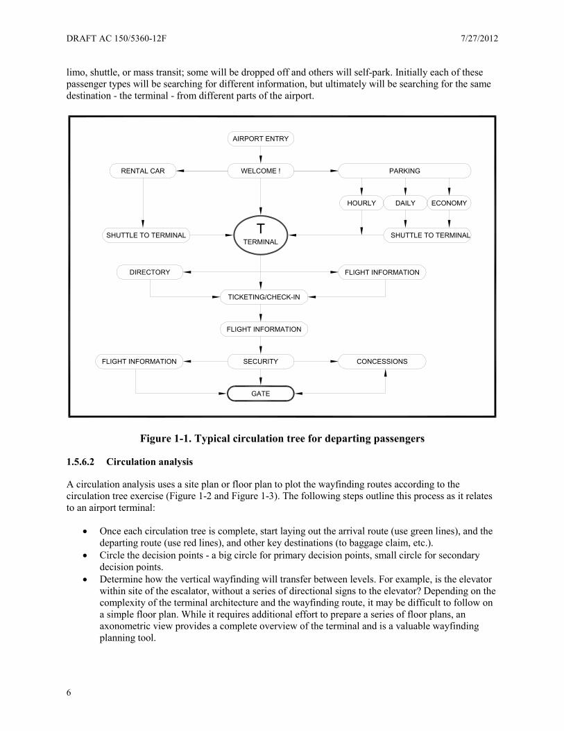
1.5.6 Passenger circulation analysis
1.5.6.1 Information trees
Passengers should be able to access wayfinding information easily and accurately, so it is important to plan a consistent sign system for each route from roadway to gate and vice versa. To help plan for the various wayfinding scenarios, create a circulation tree for departing, arriving, and connecting passengers specific to your airport (See Figure 1-1). Account for the different types of passengers on each circulation tree. For instance, on the departure circulation tree passengers will be arriving by car, rental car, taxi,
DRAFT AC 150/5360-12F 7/27/2012
6
limo, shuttle, or mass transit; some will be dropped off and others will self-park. Initially each of these passenger types will be searching for different information, but ultimately will be searching for the same destination - the terminal - from different parts of the airport.
Figure 1-1. Typical circulation tree for departing passengers
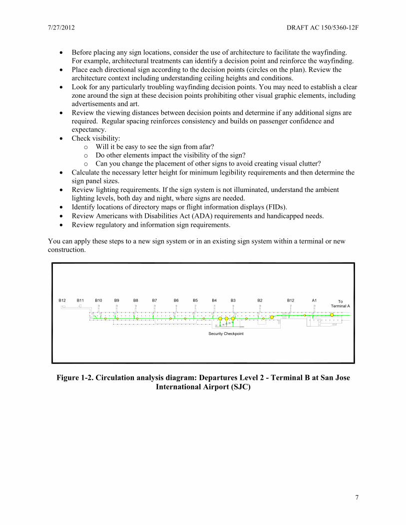
1.5.6.2 Circulation analysis
A circulation analysis uses a site plan or floor plan to plot the wayfinding routes according to the circulation tree exercise (Figure 1-2 and Figure 1-3). The following steps outline this process as it relates to an airport terminal:
• Once each circulation tree is complete, start laying out the arrival route (use green lines), and the departing route (use red lines), and other key destinations (to baggage claim, etc.).
• Circle the decision points - a big circle for primary decision points, small circle for secondary decision points.
• Determine how the vertical wayfinding will transfer between levels. For example, is the elevator within site of the escalator, without a series of directional signs to the elevator? Depending on the complexity of the terminal architecture and the wayfinding route, it may be difficult to follow on a simple floor plan. While it requires additional effort to prepare a series of floor plans, an axonometric view provides a complete overview of the terminal and is a valuable wayfinding planning tool.
ECONOMY
PARKING
DAILYHOURLY
AIRPORT ENTRY
GATE
SHUTTLE TO TERMINAL
SECURITY
FLIGHT INFORMATION
TICKETING/CHECK-IN
FLIGHT INFORMATION CONCESSIONS
FLIGHT INFORMATIONDIRECTORY
WELCOME !RENTAL CAR
TERMINALT SHUTTLE TO TERMINAL
7/27/2012 DRAFT AC 150/5360-12F
7
• Before placing any sign locations, consider the use of architecture to facilitate the wayfinding. For example, architectural treatments can identify a decision point and reinforce the wayfinding.
• Place each directional sign according to the decision points (circles on the plan). Review the architecture context including understanding ceiling heights and conditions.
• Look for any particularly troubling wayfinding decision points. You may need to establish a clear zone around the sign at these decision points prohibiting other visual graphic elements, including advertisements and art.
• Review the viewing distances between decision points and determine if any additional signs are required. Regular spacing reinforces consistency and builds on passenger confidence and expectancy.
• Check visibility: o Will it be easy to see the sign from afar? o Do other elements impact the visibility of the sign? o Can you change the placement of other signs to avoid creating visual clutter?
• Calculate the necessary letter height for minimum legibility requirements and then determine the sign panel sizes.
• Review lighting requirements. If the sign system is not illuminated, understand the ambient lighting levels, both day and night, where signs are needed.
• Identify locations of directory maps or flight information displays (FIDs). • Review Americans with Disabilities Act (ADA) requirements and handicapped needs. • Review regulatory and information sign requirements.
You can apply these steps to a new sign system or in an existing sign system within a terminal or new construction.
Figure 1-2. Circulation analysis diagram: Departures Level 2 - Terminal B at San Jose International Airport (SJC)
B9B10 B8 B7 B6 B5 B4 B3 B2 B12 A1B11B12
Security Checkpoint
ToTerminal A
DRAFT AC 150/5360-12F 7/27/2012
8
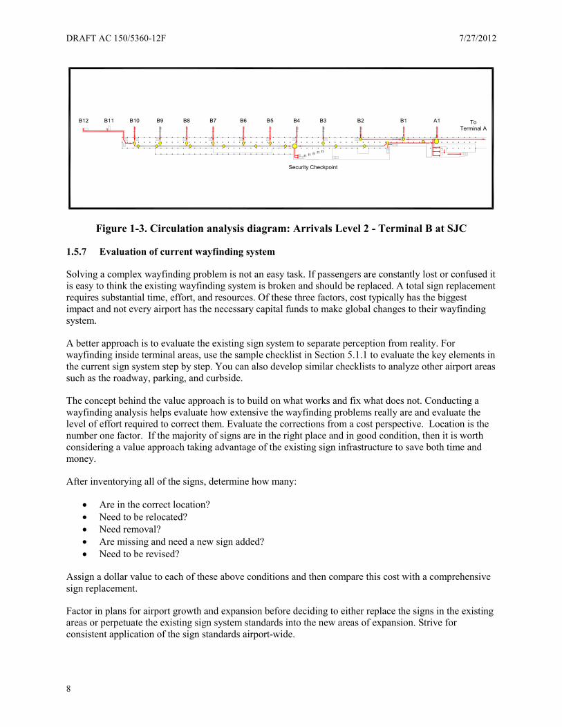
Figure 1-3. Circulation analysis diagram: Arrivals Level 2 - Terminal B at SJC
1.5.7 Evaluation of current wayfinding system
Solving a complex wayfinding problem is not an easy task. If passengers are constantly lost or confused it is easy to think the existing wayfinding system is broken and should be replaced. A total sign replacement requires substantial time, effort, and resources. Of these three factors, cost typically has the biggest impact and not every airport has the necessary capital funds to make global changes to their wayfinding system.
A better approach is to evaluate the existing sign system to separate perception from reality. For wayfinding inside terminal areas, use the sample checklist in Section 5.1.1 to evaluate the key elements in the current sign system step by step. You can also develop similar checklists to analyze other airport areas such as the roadway, parking, and curbside.
The concept behind the value approach is to build on what works and fix what does not. Conducting a wayfinding analysis helps evaluate how extensive the wayfinding problems really are and evaluate the level of effort required to correct them. Evaluate the corrections from a cost perspective. Location is the number one factor. If the majority of signs are in the right place and in good condition, then it is worth considering a value approach taking advantage of the existing sign infrastructure to save both time and money.
After inventorying all of the signs, determine how many:
• Are in the correct location? • Need to be relocated? • Need removal? • Are missing and need a new sign added? • Need to be revised?
Assign a dollar value to each of these above conditions and then compare this cost with a comprehensive sign replacement.
Factor in plans for airport growth and expansion before deciding to either replace the signs in the existing areas or perpetuate the existing sign system standards into the new areas of expansion. Strive for consistent application of the sign standards airport-wide.
B9B10 B8 B7 B6 B5 B4 B3 B2 B1 A1B11B12
Security Checkpoint
ToTerminal A
7/27/2012 DRAFT AC 150/5360-12F
9
1.5.8 Asset management
Airport operators often view their wayfinding system as consisting only of signs which once installed can be forgotten. In reality, an airport rarely operates in a static mode and, subsequently, a frequently overlooked aspect of information systems is asset management. Implementing a comprehensive wayfinding program is a substantial investment so an airport needs a strategy to protect their investment because new services and tenants are always coming and going.
The goal of an asset management plan is to perpetuate the integrity of the wayfinding system. If airports do not update the wayfinding system, it becomes an obstruction to passengers trying to find their way because for passengers, any inconsistencies make all information elements suspect. More often than not, a comprehensive wayfinding overhaul is the result of years of neglect.
Along the same lines, make sure changes conform to the design standards set forth in the existing system. If you replace the existing system, remove it entirely. Different types of signs confuse users who are unsure of why there are two systems, whether each style has a specific purpose, or whether one type of sign is wrong.
The number of signs at a medium-sized airport can easily reach into the thousands. To keep up with this amount of information, store it in an organized and logical database. Some airports maintain and service their sign needs in-house. Other airports contract out-of-house. At large airports it can even be a combination of both. Regardless of the approach, the airport must assign ownership of maintaining an accurate database. This is the key to successfully perpetuating the integrity of the wayfinding system.
Part of maintaining the integrity of the wayfinding system also requires ongoing supervision and monitoring. Use periodic surveys to analyze the airport’s strengths and weakness. Periodic surveys look at the following:
• Segments involving passenger experience (e.g., roadway, parking, curbside, or terminal) • Segments involving demographics (e.g., age or gender) • Specific surveys about problem locations • Employee observations and feedback from volunteers • Feedback from business partners.
The physical component of a wayfinding system has a lifespan. Exterior applications subject to the sun and weather require more maintenance and ultimately replacement sooner than the interior wayfinding applications. Because the sign component of the wayfinding system is a capital investment, evaluate sign systems and plan budgets accordingly.
1.5.9 Temporary signs
Airports undergoing a construction project will require temporary signs at some point during the process. The primary goal for temporary signs is to maintain the credibility of the wayfinding system.
Key points to keep in mind for temporary signs in addition to the existing signs are:
• Use the same design standards as the permanent signs to maintain a consistent image for the airport.
• Understand the temporary signs may need to be larger and more visible to compensate for the disruption.
DRAFT AC 150/5360-12F 7/27/2012
10
• Determine how long the temporary signs will be in service to determine what materials are required to maintain a good appearance throughout the construction period.
• Plan carefully to make sure the wayfinding chain is not broken during construction.
With respect to construction phasing and temporary signage, the same guidance applies as for permanent signs with respect to letter height, terminology, color, and content. The only difference is in the quality of the materials used to fabricate the sign. Once construction is complete, evaluate the signing to verify the new signage promotes improved wayfinding.
For temporary signs used in roadway construction areas, the MUTCD (Part 6) includes detailed typical layout drawings for road work areas. At a minimum, temporary signing should include key destinations such as terminal, parking, rental car return, and airport exit.
1.6 Developing a wayfinding strategy
Wayfinding in an airport environment can be extremely complex, so before any planning or design work begins, it is important to develop a wayfinding strategy. This strategy involves three elements: acceptance, wayfinding philosophy, and wayfinding logic.
1.6.1 Acceptance
Before a person is willing to buy something, they want to know what the value of the goods or services. It can be challenging to effectively measure the value of wayfinding in a tangible manner.
Research studies offer metrics you can use to evaluate wayfinding. You can also use tools like customer satisfaction surveys to help measure wayfinding. You can measure wayfinding in terms of revenue. No matter how you measure the value of wayfinding at an airport, good wayfinding equals improved performance.
Passenger frustration resulting from a difficult wayfinding experience creates high levels of stress. Once stress takes over, it takes time for the passenger to recover. In terms of business impact to an airport, this may mean the passenger prefers to wait at the gate and not return to the food court or retail areas, which equals lost revenue. Lost passengers also ask employees questions, which in turn impacts employee productivity.
1.6.2 Philosophy
Airports can be very complex; both operationally and architecturally. When looking for answers to complex wayfinding issues, the challenge is how to physically and visually define the problem. Whether on an airport roadway system, in a parking garage, curbside, or inside a terminal, the answer is to start globally. Using a terminal area as an example, view an airport with multiple levels, buildings, etc., in a manner tying them all together. Ideally, during preliminary building design discussions consider the wayfinding system in order to create effective, intuitive architecture requiring fewer signs and more architectural elements improving communication and circulation. Additionally and of equal importance, create specific information zones. For example, make sure wayfinding information inside the terminal takes priority over other types of visual information such as advertising and retail so this signage does not adversely affect the passenger wayfinding experience.
7/27/2012 DRAFT AC 150/5360-12F
11
1.6.2.1 Wayfinding begins with airport design
Many factors impact an airport’s wayfinding system. Understand what these factors are and how they relate.
The first goal of creating a well-designed signing and wayfinding system begins with the design of the airport itself. Design the signs and wayfinding as a direct response to the airport environment. The configuration of the roadways and parking, the relationship of the curbside areas to the terminal, and the architecture and layout of the terminal and gates all have a major impact on the passenger wayfinding experience. Integrate wayfinding at the beginning of the planning process and continue throughout.
The designers and engineers involved in the airport planning and design process must acknowledge, understand, and take into account the impact they have on an airport’s wayfinding system. This fundamental philosophy that wayfinding challenges are created by complex built environments is a recurring theme in the development of this AC.
The second goal of a wayfinding strategy is to value it. It is critical to think of your airport’s wayfinding system as a building system (e.g., the Heating, Ventilation, and Air Conditioning (HVAC) system, etc.). All of these systems require maintenance and service in order for your airport to operate efficiently. Your wayfinding system should not be treated differently. This is an important concept to make part of every airport’s culture. In order for the airport’s wayfinding to be successful, treat it as an integral part of the airport’s building systems.
1.6.2.2 Roadway
Drivers entering an airport roadway system bring with them all of their experience and expectations about roadway design and traffic control. Drivers gain this experience by driving on conventional roads and highways. The more an airport road looks and functions like a regular road, the more it conforms to driver expectations, which leads to a safer and less frustrating driving experience.
Many airports try to unify their roadway signs to look like their terminal interior signs presenting a unified facility identity. It is important to remember roadway signs are fundamentally different than interior signs. The users of roadway signs are moving at much higher than walking speeds and their attention is primarily directed toward the safe operation of their vehicle. Drivers more easily and safely navigate when they can rely on their previous experience with roadway signs. When airport roadway signs look and feel like other roadway signs, they better serve the need of the driver.
This guidance reflects research findings and standards for general roadway signing. Since federal and state standards apply to airport roads open to public travel, consult the original source documents for the details of implementation.
1.6.2.3 Parking
All areas of signage should be an extension of a global philosophy so the wayfinding experience is consistent as a person moves from one functional area to another. People at an airport do different things in each functional area. For instance, the activities inside a parking lot will differ from activities at the terminal curbside, and still more from activities inside the terminal. Coordinate signage for and within each of these facilities, so users learn to anticipate and look for information based on reliable sign placement, messages, colors, icons, etc.
DRAFT AC 150/5360-12F 7/27/2012
12
Parking is one of the largest sources of unencumbered revenue for an airport as well as one of its largest sources of complaints by travelers and employees. Signing as it relates to parking is now reaping the benefits of both careful planning and technology. Airports (as well as other major transportation hubs) are employing a user-perspective approach by delivering adequate information at the necessary locations in the appropriate form.
With regards to parking, signage needs to address vehicle traffic and pedestrian traffic. While a driver needs to either find a parking space or find the exit from the parking facility, pedestrians are attempting to locate themselves and determine the most direct route to the terminal or back to their vehicle. For each group place readily identifiable, succinct, and repeated signs so users receive both directions and confirmation of their travel paths. The more direct and safe the route for both drivers and pedestrians within a parking facility, the less stress and frustration users experience.
1.6.2.4 Curbside and ground transportation
The terminal curbside is often the most hectic and confusing area at an airport. Although signage cannot overcome physical limitations and geometric difficulties, a well-planned sign system at and along the terminal curbside can boost the efficiency and safety of the space. Examine regulatory and information signage as a whole and consider the philosophy that less signage may be more useful at the curbside where so much activity is already taking place. The effective management of the limited real estate at terminal curbsides becomes critical and signage may be the most important factor outside of the physical layout of the area.
The following paragraphs describe signing suggestions for the curbside/ground transportation areas while maintaining an overall design cohesion across the entire airport. This guidance is for all exterior directions, identification, and informational signs for public use at the following locations:
• Curbside • Departures Drop-off/Check-in • Arrivals Pick-up • Ground Transportation Curbsides
In addition, airports are continually taking a more customer-centric approach to their signage. Airports are replacing negative signs (conveying what users are not permitted to do) with more positive signage. For example, replace “No Parking” signs with “For Security Purposes, Emergency Vehicles Only.” In order to conform to the MUTCD, use standard parking regulatory signs as the primary signs. As sign installation space permits, consider supplemental explanatory signs aimed primarily at customer service.
1.6.2.5 Terminal
There is relevant research you can apply to develop a systematic process for evaluating an airport terminal which will yield improvements in the passenger wayfinding experience by understanding why passengers get lost. When you combine this process with consistent application of the recommended guidelines for design elements (typography, symbology, arrows, legibility, etc.) the net result is continuity within an airport as well as across the aviation industry. When airports follow the new guidelines, passengers traveling from one airport to another airport find consistent and uniform information.
7/27/2012 DRAFT AC 150/5360-12F
13
1.6.3 Logic
Successful wayfinding logic is contingent on establishing a clear wayfinding philosophy. For example, the visual clutter and distractions from advertising and retail will undermine the benefits of applying the wayfinding logic unless airports place a priority on establishing distinct information zones.
The goal is to create a supportive space with a wide range of wayfinding tools for the user. Creating a supportive environment begins by embracing redundancy.
A dynamic choice problem involves searching for or offering information on new routes. This is the type of problem first-time traveler’s face on entering an airport terminal. There is a difference between how individuals wayfind depending on their reasons for needing to reach a destination. These reasons are recreational, resolute, and emergency wayfinding. From a passenger perception point of view, the journey is just as important as the destination.
• Recreational wayfinding offers an individual the unhurried, even enjoyable and satisfactory opportunity to solve problems (where to go next, for example). An example is walking or driving for pleasure, where the traveler is not in a hurry to reach a destination and therefore the experience of wayfinding takes priority over the functional aspect of getting from point A to point B.
• In resolute wayfinding, the main purpose is to find one’s way in the most efficient manner. The complexity of the environment may have positive or negative aspects.
• Under emergency wayfinding conditions, the only important factor is reaching the destination as quickly and easily as possible. Due to pressures of time, and possible human factor elements such as stress and panic (fire evacuation of a building), wayfinding must be as simple as possible.
A typical passenger wayfinding experience inside an airport is rarely recreational, most often resolute, and on occasion when faced with the prospect of missing a flight, may be considered an emergency on the part of the passenger. Resolute wayfinding is the primary driver behind the programming and design of an airport wayfinding system.
Many studies also address wayfinding in a linear or sequential manner; for example: check-in, security, passport control, and departure gate.
Planners often neglect addressing the non-linear wayfinding scenarios a passenger may encounter. Identifying non-linear wayfinding scenarios in a multi-level, multiple-building airport requires a more investigative approach as compared to a sequential wayfinding problem.
Examples of two hypothetical non-linear wayfinding scenarios are:
• A passenger parks on level four in Garage A, checks in on level two at Terminal A, departs from Concourse B, and returns on level one at Terminal E. How does he find his car?
• Connecting passengers facing walk-versus-ride choices to get from one terminal to another.
1.6.3.1 Identify the wayfinding logic
Each airport environment is different and successful wayfinding logic at one airport may not necessarily work at another airport. Taking time to develop the wayfinding logic behind a given airport provides the key to unlocking the “why” behind the wayfinding solutions.
Another way to think of the logic is to analyze the user circulation patterns, both vehicular and pedestrian.
DRAFT AC 150/5360-12F 7/27/2012
14
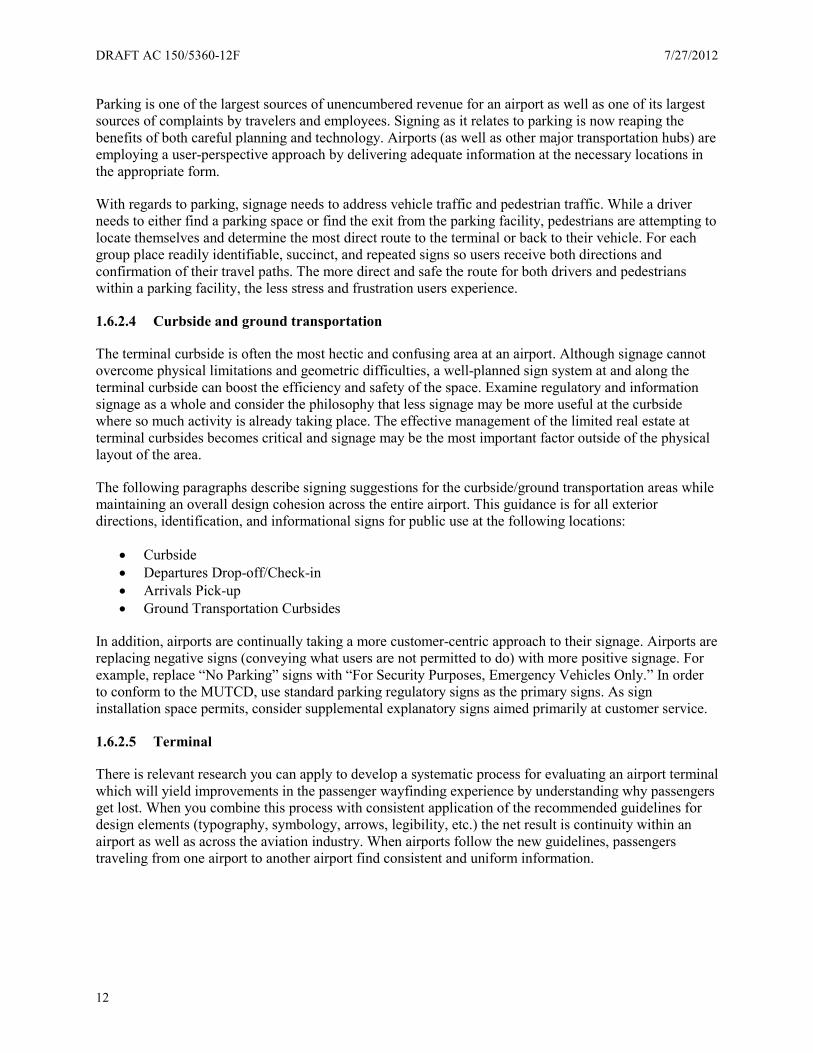
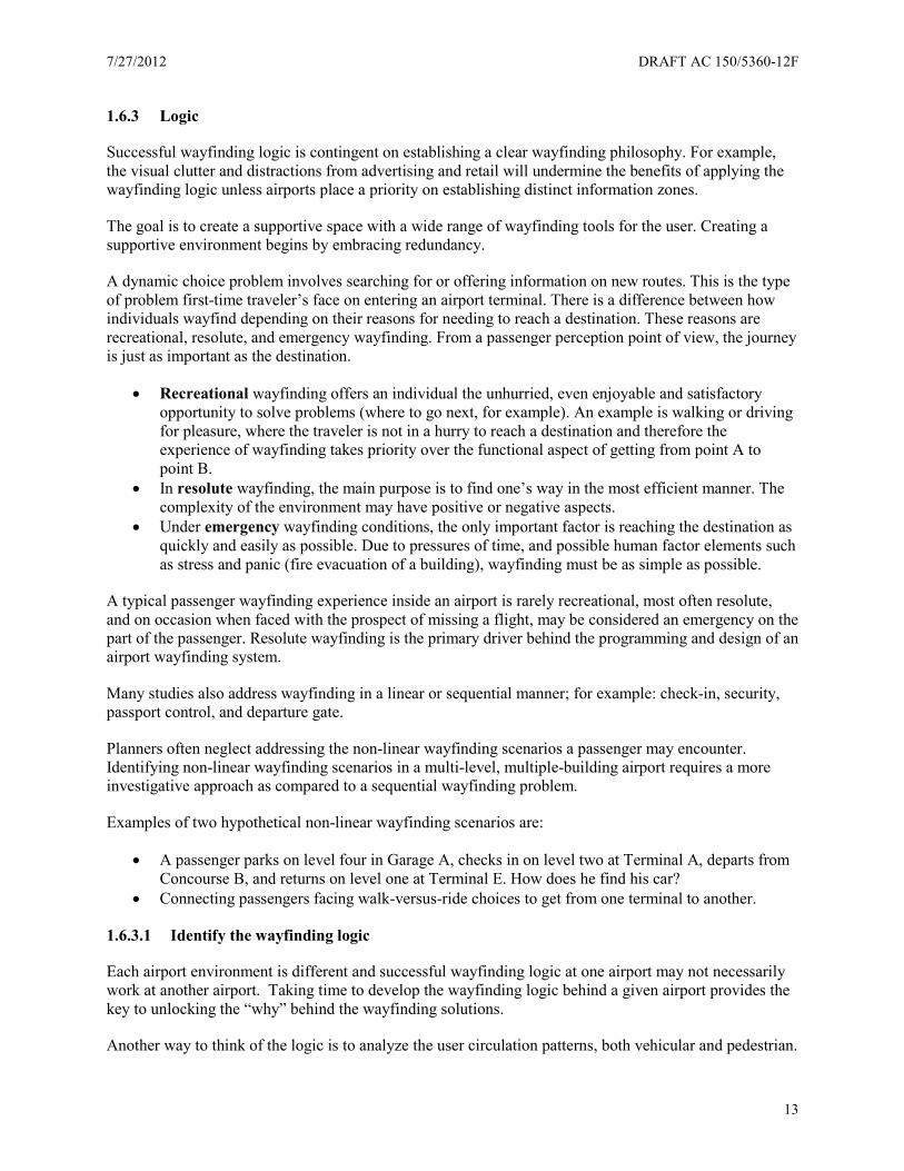
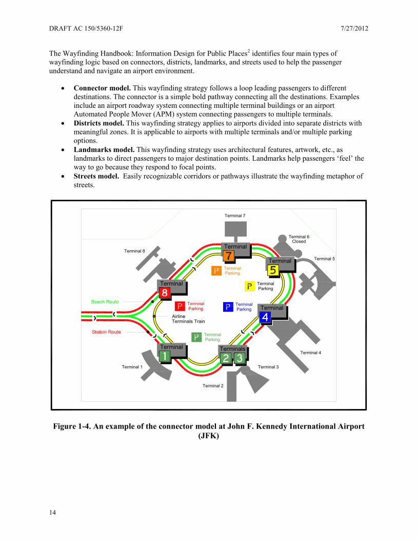
The Wayfinding Handbook: Information Design for Public Places2 identifies four main types of wayfinding logic based on connectors, districts, landmarks, and streets used to help the passenger understand and navigate an airport environment.
• Connector model. This wayfinding strategy follows a loop leading passengers to different destinations. The connector is a simple bold pathway connecting all the destinations. Examples include an airport roadway system connecting multiple terminal buildings or an airport Automated People Mover (APM) system connecting passengers to multiple terminals.
• Districts model. This wayfinding strategy applies to airports divided into separate districts with meaningful zones. It is applicable to airports with multiple terminals and/or multiple parking options.
• Landmarks model. This wayfinding strategy uses architectural features, artwork, etc., as landmarks to direct passengers to major destination points. Landmarks help passengers ‘feel’ the way to go because they respond to focal points.
• Streets model. Easily recognizable corridors or pathways illustrate the wayfinding metaphor of streets.
Figure 1-4. An example of the connector model at John F. Kennedy International Airport (JFK)
TerminalsTerminal
Terminal
Terminal
Terminal
Terminal
TerminalParking
TerminalParking
TerminalParking
TerminalParking
TerminalParking
Beach Route
Station Route
AirlineTerminals Train
Terminal 8
Terminal 7
Terminal 1
Terminal 2
Terminal 3
Terminal 4
Terminal 5
Terminal 6Closed
7/27/2012 DRAFT AC 150/5360-12F
15
Figure 1-5. An example of the districts model at Atlanta where the concourses are divided into separate zones
Figure 1-6. An example of a streets model
To understand how to identify the key touch points along the circulation routes as passengers transition through the different stages of airport wayfinding, roadway, parking, curbside, and terminal, identify the wayfinding logic within an airport and the mental process involved.
1.6.3.2 Continuity
Continuity is another key concept applying to virtually any airport wayfinding logic. There are two ways to apply the continuity concept. The first method applies mostly to linear wayfinding scenarios. Start by thinking of each decision point as a link in a wayfinding chain. In order for a chain to serve its purpose, each link must connect. The wayfinding chain is no different. Whether driving or walking, if a person
Gates 1 - 8
Gates 9 - 15
Gates 14 - 18
Gates 1 - 18
Gates 19 - 34
Gates 1 - 18
Gates 19 - 36
Gates 1 - 22
Gates 23 - 57
Gates 1 - 20
Gates 21 - 38
Gates 1 - 13
Gates 19 - 37
T A B C D EBaggage Claim Ticketing/Check-In
Baggage Claim Ticketing/Check-In
Security
Security
Security
AtriumThe
North Parking
South Parking
North Term
inalS
outh Terminal
TransportationG
round
Center
North
South
A5A3
A1
A2
A4
A7 A9 A11 A15 A17 A19 A21 A23 A25 A27 A29 A31 A33 A35 A73A43 A45 A47 A49 A51 A53 A55 A57 A59 A61 A63 A65 A67 A69 A71
A10 A12 A18 A20 A24 A28 A30 A34 A36 A38 A40 A46 A50 A54 A56 A60 A64 A66 A68 A70A6 A8 A74A72
A75
A77
A78
A76
Level 2Gates
Pedestrian Bridge
To Parking &Ground Transportation
Center
Tunnel BetweenConcourse A
and Concourses B & C
South Station North StationTerminal Station
Express TramConcourse A
Level 3 Level 1Escalators Down Escalators Down
Concourse A: 1.0 mile [1.6 km]
Lower LevelInternational ArrivalsCheck-in & Departures Domestic Arrivals
& Luggage Claim
International Arrivals Pick-upDepartures Drop-off Domestic Arrivals Pick-up
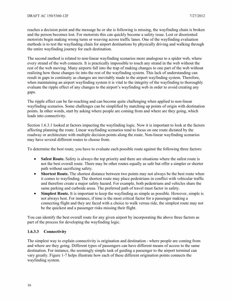
DRAFT AC 150/5360-12F 7/27/2012
16
reaches a decision point and the message he or she is following is missing, the wayfinding chain is broken and the person becomes lost. For motorists this can quickly become a safety issue. Lost or disoriented motorists begin making wrong turns or weaving across traffic lanes. One of the wayfinding evaluation methods is to test the wayfinding chain for airport destinations by physically driving and walking through the entire wayfinding journey for each destination.
The second method is related to non-linear wayfinding scenarios more analogous to a spider web, where every strand of the web connects. It is practically impossible to touch any strand in the web without the rest of the web moving. Many airports fall into the trap of making changes to one part of the web without realizing how those changes tie into the rest of the wayfinding system. This lack of understanding can result in gaps in continuity as changes are inevitably made to the airport wayfinding system. Therefore, when maintaining an airport wayfinding system it is vital to the integrity of the wayfinding to thoroughly evaluate the ripple effect of any changes to the airport’s wayfinding web in order to avoid creating any gaps.
The ripple effect can be far-reaching and can become quite challenging when applied to non-linear wayfinding scenarios. Some challenges can be simplified by matching up points of origin with destination points. In other words, start by asking where people are coming from and where are they going, which leads into connectivity.
Section 1.6.3.1 looked at factors impacting the wayfinding logic. Now it is important to look at the factors affecting planning the route. Linear wayfinding scenarios tend to focus on one route dictated by the roadway or architecture with multiple decision points along the route. Non-linear wayfinding scenarios may have several different routes to choose from.
To determine the best route, you have to evaluate each possible route against the following three factors:
• Safest Route. Safety is always the top priority and there are situations where the safest route is not the best overall route. There may be other routes equally as safe but offer a simpler or shorter path without sacrificing safety.
• Shortest Route. The shortest distance between two points may not always be the best route when it comes to wayfinding. The shortest route may place pedestrians in conflict with vehicular traffic and therefore create a major safety hazard. For example, both pedestrians and vehicles share the same parking and curbside areas. The preferred path of travel must factor in safety.
• Simplest Route. It is important to keep the wayfinding as simple as possible. However, simple is not always best. For instance, if time is the most critical factor for a passenger making a connecting flight and they are faced with a choice to walk versus ride, the simplest route may not be the quickest and a passenger risks missing their flight.
You can identify the best overall route for any given airport by incorporating the above three factors as part of the process for developing the wayfinding logic.
1.6.3.3 Connectivity
The simplest way to explain connectivity is origination and destination - where people are coming from and where are they going. Different types of passengers can have different means of access to the same destination. For instance, the seemingly simple task of guiding a passenger to the airport terminal can vary greatly. Figure 1-7 helps illustrate how each of these different origination points connects the wayfinding system.

7/27/2012 DRAFT AC 150/5360-12F
17
Figure 1-7. Each origination point within the airport must connect the wayfinding system
Multi-level buildings can create complex passenger movements with unique or overlapping paths. Map each path and identify decision point in a consistent and efficient manner for each type of passenger movement. Passenger types to consider include:
• Departing passengers • Arriving passengers – terminating • Arriving passengers – connecting
Whether tracking linear or non-linear wayfinding routes, exploded axonometric views (Figure 1-8) help map the flow of different types of passengers.
RENTALRC
TERMINALT
PARKINGP
PRIVATEPV
MASSMT
COMMERICIALCV
CAR
GARAGE
VEHICLE
TRANSIT
VEHICLE
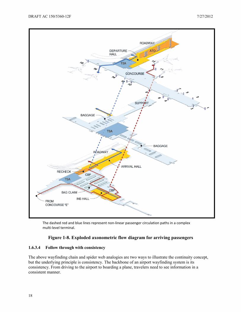
DRAFT AC 150/5360-12F 7/27/2012
18
The dashed red and blue lines represent non-linear passenger circulation paths in a complex multi-level terminal.
Figure 1-8. Exploded axonometric flow diagram for arriving passengers
1.6.3.4 Follow through with consistency
The above wayfinding chain and spider web analogies are two ways to illustrate the continuity concept, but the underlying principle is consistency. The backbone of an airport wayfinding system is its consistency. From driving to the airport to boarding a plane, travelers need to see information in a consistent manner.
7/27/2012 DRAFT AC 150/5360-12F
19
When evaluating either existing or proposed wayfinding solutions, you must first determine if it is consistent with the airport’s wayfinding strategy and consistent with proven wayfinding design principles.
For vehicular wayfinding, use consistent application of the positive guidance approach to increase the likelihood of drivers responding to situations and information quickly and correctly.
Consistency becomes visible to passengers through the following design elements:
• Terminology and message hierarchy • Visibility and legibility • Typography and symbology • Format and color
Consistent presentation of information extends to other forms of communication like maps, directories, websites, etc. Communication itself must be consistent in both verbal and written form so the public does not confuse the use of different terms for the same thing.
Consistency ties directly back to the primary objective which is to achieve uniform application of the guidelines within each airport and from one airport to another.

DRAFT AC 150/5360-12F 7/27/2012
20
This page intentionally left blank
7/27/2012 DRAFT AC 150/5360-12F
21
Chapter 2. Airport Roadways
2.1 Wayfinding philosophy and principles
For specialized destinations like airports, drivers must make multiple decisions in a relatively short span of time and distance. Although airport roadways may have grades, curves, and lane configurations similar to those of a highway, maximum posted speeds on airport roads are typically much lower. Simple and consistent signing throughout an airport’s roadway network is essential to good wayfinding and safe driving.
When designing airport wayfinding and signage, the designer and airports should reference the MUTCD for certain engineering design guidelines. The MUTCD provides information regarding letter heights, panel sizes, vehicle speed, line-of-sight readability, highway shields and symbols. Airport roadways are included as “private roads open to public travel” and are subject to the MUTCD provisions.
The challenge for both airport management and the roadway sign design professional is to find a common ground satisfying both viewpoints under the MUTCD guidelines. To summarize these differing viewpoints:
Airport Management Viewpoint Regarding Roadway Signs:
• Airport signs are an identity or branding of the airport (i.e., use of similar color and style of signs throughout), providing a sense of arrival and the beginning of the airport user’s experience.
• Airport signs should look different than freeway signs, as a means to slow down traffic and confirm entry into a different environment and essentially to say “pay attention - you have arrived at the airport.”
Roadway Sign Design Professional Viewpoint:
• Airport signs should comply with all traffic signage regulations and design criteria, including the MUTCD.
• The more an airport road looks and functions like a regular road, the more it will conform to driver expectations which will lead to a safer and less frustrating driving experience.
The basic criteria for an effective wayfinding system includes the thorough programming of all aspects of vehicular and pedestrian traffic flow, and the appropriate delivery of all pertinent information to the traveler, visitor, or employee. This chapter identifies methods and strategies for developing a roadway wayfinding system compliant with the MUTCD. This chapter also addresses the meaning of the terms “engineering judgment” and “request for experimentation” and their relevance for airport roadway design (see Section 2.2.1).
The MUTCD contains very specific terminology and direction for its proper use. Designers who use the MUTCD must understand and apply these directions appropriately. For any reference to the MUTCD within this document, do not strictly interpret the use of various terms (i.e., standards, guidance, guidelines, options, requirements, recommendations, etc.) as they are used in the MUTCD. As stated previously, the designer should understand and apply the full meaning and intent of all specific terms of use when applying the MUTCD in the sign design process.
DRAFT AC 150/5360-12F 7/27/2012
22
2.1.1 Considering user requirements and limitations
Drivers entering an airport roadway system bring with them all of their experience and expectations about roadway design and traffic control. Drivers gain this experience by driving on conventional roads and highways. The more an airport road looks and functions like a regular road, the more it will conform to driver expectations which will lead to a safer and less frustrating driving experience.
The planning and developing of many legacy airport complexes, however, result in unusual and unorthodox roadway layout and designs when compared to typical roadway systems. Airport roadway users also generally have unique characteristics due to their unfamiliarity with the roadway system and integrated facilities, coupled with potentially high levels of driver stress caused by tight flight schedules, security warnings and other factors. Finally, because airport roadway systems transition downward in speed as they terminate in high-density parking terminal environments, this creates difficult combinations of vehicular and pedestrian signing. All of these factors require airport roadway sign designers to use all their skills to plan and design a safe and efficient guidance and information signing system for both vehicles and pedestrians.
Remember roadway signs for vehicular drivers are fundamentally different than interior signs and, to some degree, even parking facility signs. The users of roadway signs are in vehicles moving at much higher speeds and their attention is directed toward the safe operation of their vehicle, including their interaction with pedestrians, such as in terminal curbside areas. Drivers can more easily and safely navigate when they can rely on their previous experience with roadway signs. Airports serve the needs of the driver by making airport roadway signs look, feel, and operate like other roadway signs. The principle of uniformity as promoted in the MUTCD does not end at the airport property line.
The MUTCD does not have a separate chapter or section on airports. Nevertheless, the principles of the MUTCD and sound engineering judgment apply to airport roadway signing. The MUTCD lays out key principles of all traffic control devices, including signs, marking, signals, and related devices.
Effective traffic control devices meet five basic requirements:
• Fulfill a need • Command attention • Convey a clear, simple meaning • Command respect from road users • Give adequate time for proper response
The MUTCD further lists five aspects engineers need to consider when ensuring a traffic control device meets these requirements:
• Design • Placement • Operation (for signals and changeable message signs (CMSs)) • Maintenance • Uniformity
One of the main challenges engineers face when designing traffic control device layouts for roadways at legacy airports are how many and how close decision points are spaced combined with unusual roadway geometrics. It is important to remember traffic control devices (including signs) are not necessarily the best remedy for all traffic operations needs. Signing and pavement markings cannot correct fundamentally poor or unusual roadway, intersection and ramp design.
7/27/2012 DRAFT AC 150/5360-12F
23
Good communication with drivers begins with good roadway design conforming to their expectations. Traffic engineers may need to conduct an engineering study of roadway, intersection and ramp design to discover if changes to the geometric design of the road to better conform to driver expectations offer a better solution than a traffic control device. In many legacy airport situations engineers may not be able to alter the geometric design. The MUTCD acknowledges this close connection between roadway design and traffic control devices. It states in Section 1A.09:
Early in the processes of location and design of roads and streets, engineers should coordinate such location and design with the design and placement of the traffic control devices to be used with such roads and streets.
Traffic safety engineering often refers to a design driver – a hypothetical person for whom the roadway is tailored. In order to provide a margin of safety traffic engineers assume the design driver is unfamiliar with the area and driving under less than ideal conditions - such as at night or in the rain. In an airport situation, engineers can assume this design driver is pressed for time and mentally distracted due to travel concerns and unfamiliar surroundings. All of these factors lead to designs which assume the driver needs longer than average response and reading times to process signs and roadway elements. It is often hard for designers to put themselves in the role of the unfamiliar driver, but it is essential for good signing decisions.
The MUTCD also stresses “vehicle speed must be carefully considered as an element that governs the design, operation, placement, and location of various traffic control devices.” Drivers need time to process the information present on road, building, and curbside signs. If the roadway design does not provide adequate distance, a speed reduction on the roadway is one way to provide drivers more time to process the information. Any changes to posted speed limits should accompany an adequate roadway and roadside design along with speed enforcement to accomplish the desired behavioral change.
Close placement of signs, excessive sign messaging and subsequent information overload, is a concern at airports due to the closely spaced access points to many destinations such as multiple terminals, multiple parking facilities, rental car facilities, curbside loading/unloading and various other airport services. The need to provide signs for each of these areas leads to shorter sign spacing and more sign information than is generally recommended in most roadway sign standards and guidance documents. It is important to remember people react in time but standards are written in distance. The MUTCD includes the standards for sign spacing and letter height. If designers can’t provide adequate distance between signs due to site and roadway characteristics, then they can lower roadway speeds to provide adequate time for drivers to respond or they can increase the size of letter heights, or both. Reducing driver speed, especially at the entrance to the airport where drivers may be transitioning from a typical freeway or arterial environment, requires road design changes to support the reduction request in speed. A change in the posted speed alone is typically ineffective. To achieve driver compliance, traffic engineers might have to alter roadway and roadside design, and employ speed management techniques including law enforcement of posted speeds.
Drivers’ visual and cognitive abilities vary greatly and these variations affect how easily drivers read and understand a sign. Vehicle and headlamp design also affect sign visibility, as does the curvature of the roadway and any horizontal or vertical elements within or adjacent to the roadway. The MUTCD legibility standards are the result of extensive research into all of these areas.
Design professionals and airports should always start with the MUTCD and its principles when designing and applying traffic control devices in the airport environment. Only after exhausting those principles and guidance should they consider an alternate traffic control device design or placement. The MUTCD

DRAFT AC 150/5360-12F 7/27/2012
24
should be the point from where airport sign designers begin their design, and designers should note any deviations and justify them in writing during the design process.
These guidelines are primarily based on the MUTCD and other research and standards for general roadway signing. Readers should always consult the original source documents for the details of implementation.
2.1.2 Positive guidance
In order for airport users to have a comfortable and efficient wayfinding experience through an airport roadway system, they need positive guidance. In other words, guide drivers by clearly laying out the proper path.
The central tenet of the positive guidance approach is designing according to driver limitations and expectations increases the likelihood of drivers responding to situations and information correctly and quickly. Conversely, not providing drivers with information in a timely fashion, overloading them with information, or surprising them because their expectations are violated, causes them to respond more slowly to traffic situation and make errors.
The positive guidance approach to road design emphasizes:
• Expectations. Design roadway configurations, geometrics, and traffic operations in accordance with driver expectations. Make sure the design conforms to long-term expectancies (e.g., there are no traffic signals on freeways, freeway exits are on the right) as well as short-term expectancies (e.g., all curves on this road are gradual).
The positive guidance approach to traffic control devices emphasizes the following:
• Primacy. Determine the placement of signs according to the importance of their information (e.g., stop signs are more important than parking payment signs, or in an airport environment, terminals are more important than cargo areas), and in such a way as to avoid presenting the driver with information when and where it is not essential.
• Spreading. When all the information the driver requires can’t fit on one sign or on a number of signs at one location, spread this information out along the road so drivers can see it in small, regular chunks, thereby reducing the information load on the driver.
• Coding. Where possible, organize pieces of information into larger units. Color and shape coding of traffic signs accomplish this by representing specific information about the message based on the color of the sign background and the shape of the sign panel (e.g., warning signs are yellow and typically diamond shaped).
• Repetition. Say the same thing in more than one way (e.g., shape, color). Consider offering the same information with two different devices (e.g., “no passing” indicated with a sign and pavement markings), or by two identical devices (e.g., STOP signs on both sides of a wide intersection).
2.2 Applicable federal standards
The FHWA oversees the standards and practices for traffic signs, signals, and markings, and produces the MUTCD under Title 23 Code of Federal Regulations (CFR), Part 655, Subpart F. The MUTCD defines the standards used by road managers nationwide to install and maintain traffic control devices on all public streets, highways, bikeways, and private roads open to public traffic.
7/27/2012 DRAFT AC 150/5360-12F
25
The MUTCD is the national standard for installation of all traffic control devices on any street, highway, or bicycle trail open to public travel. For the purpose of MUTCD applicability, open to public travel includes toll roads and roads within shopping centers, airports, sports arenas, and other similar business or recreation facilities privately owned but where the public travels without access restrictions (Refer to Title 23 CFR Part 655.603 Standards). Each state must adopt the Federal MUTCD or a state-specific alternative manual or supplemental material in substantial conformance to the National manual. The recommendations in this AC refer to the most recent edition of the MUTCD. However, the specific paragraphs of this AC reference the 2009 edition of the MUTCD and may change with future editions.
2.2.1 Airport roadways and the MUTCD
The MUTCD contains little guidance on how to apply MUTCD principles and standards to airport roadways as a unique category although it does specifically state airport roads open to public travel must comply with the MUTCD. This lack of detailed guidance does not, however, give airport sign designers and operators permission to avoid compliance with these roadway signing standards. Airports should retain the services of licensed professional engineers with roadway design experience including roadway signing design. These engineers should be able to exercise engineering judgment for particular site and traffic flow characteristics.
In Section 1A.09 of the MUTCD, the Manual addresses the issue of engineering judgment by stating as a Standard Statement, “This Manual describes the application of traffic control devices, but shall not be a legal requirement for their installation.” It provides further guidance stating engineers should exercise judgment when selecting and applying traffic control devices. Engineering judgment does not mean, in this context, engineers can substitute alternative devices at will. Follow the formal request for experimentation process, including the evaluation in the MUTCD.
The MUTCD does allow some flexibility in interpretation through engineering judgment and study. It is important to note, however, the manual clearly states engineering judgment cannot ignore or overrule any standard statement. Engineers can interpret only guidance and option statements through engineering judgment (see Section 1A.13, definition of a standard; also reference Official Ruling No. 1(09) – 1(I) issued October 1, 2010).
FHWA provides for agencies to request interpretations of MUTCD language for particular situations. An agency can also request experimentation with a new traffic control device or application of an existing device to a new situation. Experimentations require a formal evaluation of the device to demonstrate the new device provides an improvement over the current standard. The process for these types of requests is detailed in Section 1A.10 of the MUTCD.
2.3 Airport roadway decision points
Airport roadways present a unique challenge for motorists, especially for infrequent travelers or those making their first trip to the airport. Motorists face several decision points in close proximity to one another as they transition from adjacent freeways to the airport. These decision points may include the following:
• Exit ramp from freeway • Airline name/terminal listing • Split between roads leading to each terminal • Split between arrivals and departures • Split between curbside, parking, and car rental • Split between short term and long term parking
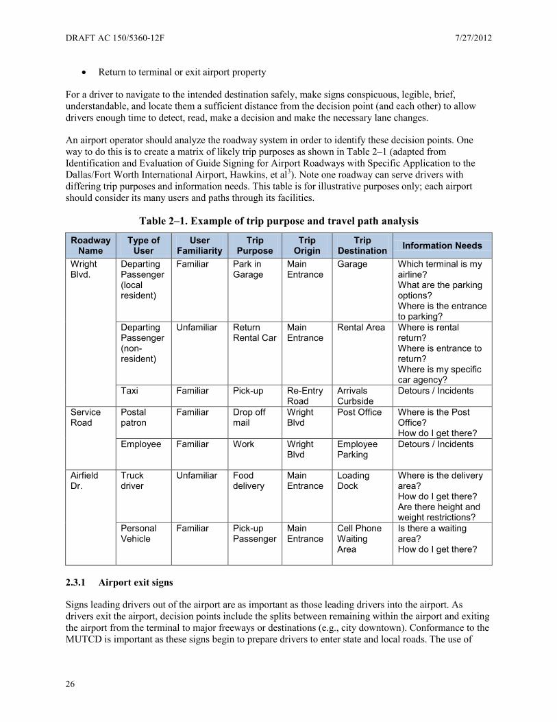
DRAFT AC 150/5360-12F 7/27/2012
26
• Return to terminal or exit airport property
For a driver to navigate to the intended destination safely, make signs conspicuous, legible, brief, understandable, and locate them a sufficient distance from the decision point (and each other) to allow drivers enough time to detect, read, make a decision and make the necessary lane changes.
An airport operator should analyze the roadway system in order to identify these decision points. One way to do this is to create a matrix of likely trip purposes as shown in Table 2–1 (adapted from Identification and Evaluation of Guide Signing for Airport Roadways with Specific Application to the Dallas/Fort Worth International Airport, Hawkins, et al3). Note one roadway can serve drivers with differing trip purposes and information needs. This table is for illustrative purposes only; each airport should consider its many users and paths through its facilities.
Table 2–1. Example of trip purpose and travel path analysis
Roadway Name
Type of User
User Familiarity
Trip Purpose
Trip Origin
Trip Destination Information Needs
Wright Blvd.
Departing Passenger (local resident)
Familiar Park in Garage
Main Entrance
Garage Which terminal is my airline? What are the parking options? Where is the entrance to parking?
Departing Passenger (non-resident)
Unfamiliar Return Rental Car
Main Entrance
Rental Area Where is rental return? Where is entrance to return? Where is my specific car agency?
Taxi Familiar Pick-up Re-Entry Road
Arrivals Curbside
Detours / Incidents
Service Road
Postal patron
Familiar Drop off mail
Wright Blvd
Post Office Where is the Post Office? How do I get there?
Employee Familiar Work Wright Blvd
Employee Parking
Detours / Incidents
Airfield Dr.
Truck driver
Unfamiliar Food delivery
Main Entrance
Loading Dock
Where is the delivery area? How do I get there? Are there height and weight restrictions?
Personal Vehicle
Familiar Pick-up Passenger
Main Entrance
Cell Phone Waiting Area
Is there a waiting area? How do I get there?
2.3.1 Airport exit signs
Signs leading drivers out of the airport are as important as those leading drivers into the airport. As drivers exit the airport, decision points include the splits between remaining within the airport and exiting the airport from the terminal to major freeways or destinations (e.g., city downtown). Conformance to the MUTCD is important as these signs begin to prepare drivers to enter state and local roads. The use of
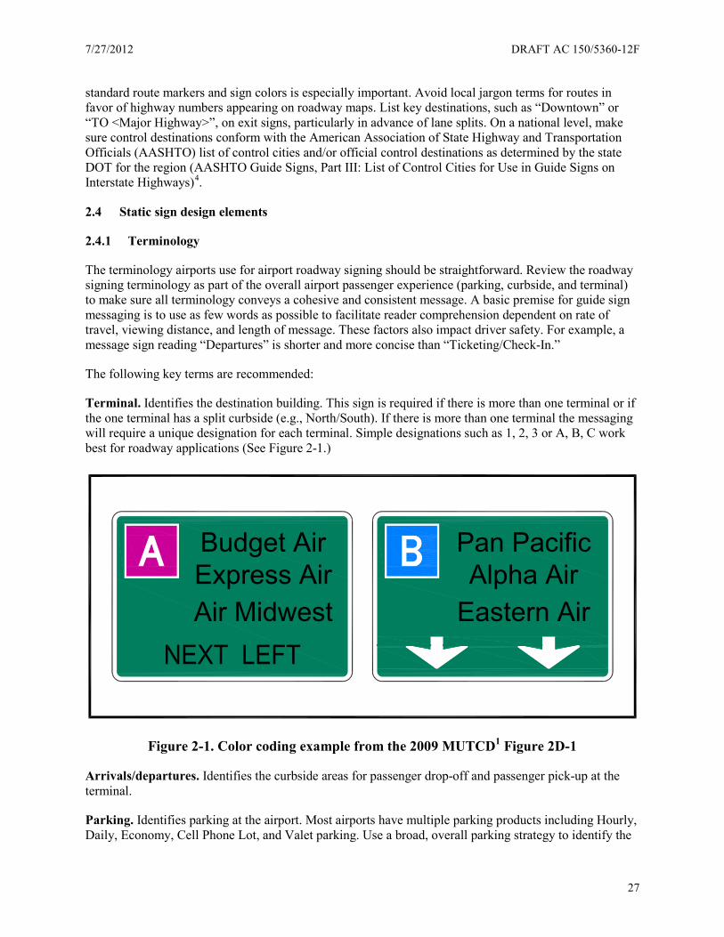
7/27/2012 DRAFT AC 150/5360-12F
27
standard route markers and sign colors is especially important. Avoid local jargon terms for routes in favor of highway numbers appearing on roadway maps. List key destinations, such as “Downtown” or “TO <Major Highway>”, on exit signs, particularly in advance of lane splits. On a national level, make sure control destinations conform with the American Association of State Highway and Transportation Officials (AASHTO) list of control cities and/or official control destinations as determined by the state DOT for the region (AASHTO Guide Signs, Part III: List of Control Cities for Use in Guide Signs on Interstate Highways)4.
2.4 Static sign design elements
2.4.1 Terminology
The terminology airports use for airport roadway signing should be straightforward. Review the roadway signing terminology as part of the overall airport passenger experience (parking, curbside, and terminal) to make sure all terminology conveys a cohesive and consistent message. A basic premise for guide sign messaging is to use as few words as possible to facilitate reader comprehension dependent on rate of travel, viewing distance, and length of message. These factors also impact driver safety. For example, a message sign reading “Departures” is shorter and more concise than “Ticketing/Check-In.”
The following key terms are recommended:
Terminal. Identifies the destination building. This sign is required if there is more than one terminal or if the one terminal has a split curbside (e.g., North/South). If there is more than one terminal the messaging will require a unique designation for each terminal. Simple designations such as 1, 2, 3 or A, B, C work best for roadway applications (See Figure 2-1.)
Figure 2-1. Color coding example from the 2009 MUTCD1 Figure 2D-1
Arrivals/departures. Identifies the curbside areas for passenger drop-off and passenger pick-up at the terminal.
Parking. Identifies parking at the airport. Most airports have multiple parking products including Hourly, Daily, Economy, Cell Phone Lot, and Valet parking. Use a broad, overall parking strategy to identify the
Budget AirExpress AirAir Midwest
Pan PacificAlpha Air
Eastern Air
DRAFT AC 150/5360-12F 7/27/2012
28
specific terminology you use to differentiate the various parking products. Reference Section 3.3 for additional information associated with the signing and naming for parking.
Return to terminal and airport exit. Use these terms to direct traffic after the motorist passes the terminal and to help them decide whether they need to go back to the terminal or exit the airport.
Airline listings. Post this information at airports with multiple terminals or a split curbside serving a single terminal. Airports with a single terminal with one common curbside don’t need to post this information.
Rental cars. Identifies rental car facilities including rental car pick-up by area residents and rental car returns, in addition to rental car use by arriving passengers. Provide separate signage for “Rental Car Return” and “Rental Car Lobby” within the facility area.
Internet addresses and phone numbers. Some airport operators may wish to place phone numbers or Internet address information on roadway signs directing drivers to call for parking or terminal information. This practice is expressly forbidden by the MUTCD because of safety concerns. It takes more mental effort for people to read and remember web addresses than for typical traffic sign words. In an option statement, MUTCD permits these materials for low speed locations “where an area is available for drivers to stop out of the traffic flow to read the message” (MUTCD Section 2A.06, paragraph 16) or for signs you design for viewing only by pedestrians or occupants of parked vehicles.
2.4.1.1 Lines of text and message hierarchy
Limit the number of lines of text on roadway signs to prevent drivers from taking their eyes off the road for too long. The MUTCD stops short of issuing a standard on the maximum number of lines of text but does offer a Guidance statement in Section 2D.07 recommending traffic designers limit signs to three lines of text.
This is a guidance statement, which is a practice MUTCD recommends and is subject to modification by engineering judgment or study. For signs listing airlines and terminal assignment, many airports list more than three airlines on a single guide sign. If you adopt this practice, it is important to:
• List the airlines alphabetically and spread out the list as much as possible to avoid information overload. If necessary, use multiple signs.
• Provide adequate letter size for easy and quick legibility of all names listed before the vehicles pass the sign at the operating speed (assume approximately ½ to 1 second reading time per major word or name and legibility of 30 feet per inch of letter height).
• Provide good letter-to-background color contrast for easy reading. • Provide adequate space (see Section 2.4.6 regarding spacing rules) between successive signs to
provide mental processing of the information you provide. • Repeat the signs to the extent possible.
Develop a uniform hierarchy of messages and information. This practice permits a consistent sign system considering location of the message on the sign (which line on the sign) and where the message resides (overhead sign or roadside sign).
Categorize messages as primary or secondary.
7/27/2012 DRAFT AC 150/5360-12F
29
• Primary messages include Terminal, Parking, Rental Cars, Airport Exit, Return to Terminal, and major access roads. Primary messages are typically placed on an overhead sign. Placement of primary messages take priority over secondary messages.
• Secondary messages include Departures, Arrivals, Terminal designations, airline names for each terminal, and specific parking destinations. Secondary messages supplement or reinforce information conveyed by the primary messages. You may also place secondary messages on the overhead sign, or consider them for placement as a roadside sign.
2.4.2 Symbology
The MUTCD distinguishes between symbols and pictographs. A symbol can stand alone as substitute for text on a sign while a pictograph is an illustration supplemented by text on a sign.
According to the MUTCD a “symbol” is “the approved design of a pictorial representation of a specific traffic control message for signs, pavement markings, traffic control signals, or other traffic control devices, as shown in the MUTCD.” Unapproved designs of pictorial representations are not “symbols.” Based on surveys, the majority of airports currently use the following pictorial representations on roadway guide signs not adopted in the MUTCD:
• Arrivals – plane descending • Departures – plane ascending • Parking – “P” • Rental cars – RC symbol
Terminal identifiers, i.e., A B C or 1 2 3 serve as important symbols at airport facilities with multiple terminals and or parking products.
The MUTCD does not list symbols for Arrivals, Departures, and Rental Cars as acceptable symbols since they have not undergone testing for legibility and comprehension. Treat these designations as pictographs with accompanying explanatory text. The MUTCD recommends trailblazer signs featuring the airport symbol on major roads leading to the airport property. The MUTCD states airports can:
• Provide guide signs for commercial service airports and non-carrier airports from the nearest Interstate, other freeway, or conventional highway intersection directly to the airport, normally not to exceed 15 miles.
• Use the Airport (I-5) symbol sign along with a supplemental plaque to indicate the specific name of the airport.
• Use an airport symbol sign, with or without a supplemental name plaque or the word AIRPORT, and an arrow as a trailblazer.
FHWA authorizes users to rotate the symbol so the airplane is “pointing” at the airport to provide additional cues to drivers, particularly at decision points like intersections. The rotation of the airport symbol does not replace the directional arrow sign you install below the airport symbol sign. In any orientation, the airport symbol should always accompany a standard directional arrow plaque (Interpretation Letter 2-564(I)-Orientation of Airport Symbol 5).
2.4.3 Typography
For roadway signing, use the fonts (also referred to as typefaces or lettering styles) listed in the MUTCD which are the FHWA Standard Alphabets. Clearview ™ Highway is for optional use.
DRAFT AC 150/5360-12F 7/27/2012
30
FHWA Standard Alphabet lettering style most typically used for guide signs having an upper and lower case letter set is called E-modified. Series D, a related font used for guide signs on conventional roads has narrower, more condensed letterforms. The use of Clearview™ is the subject of an Interim Approval by FHWA and FHWA must approve its use.
However, typical airport roadway geometry does not necessarily afford the longer tangent distances necessary to increase nighttime legibility of the Clearview™ font on non-illuminated signs.
The MUTCD recommends using the legibility index of 30 feet of legibility for every inch of letter height for static signs (e.g., a legibility distance of 180 feet for a 6 inch letter). This recommendation is based on several research projects studying nighttime sign legibility with older drivers. In this regard, it is a conservative number for most roadway situations. Because of the complexity of the airport roadway environment, the density of information, use large letter sizes. If you use smaller letter sizes, use fewer lines of text and repeat the sign whenever possible.
The MUTCD explicitly bans any letter on guide signs smaller than 6 inches, except roads with speed limits less than 25 mph. A letter size of 6 inches applies to the upper case letter, with the corresponding lower case letter height at 4.5 inches. In general, MUTCD requires mixed case (initial letter upper case, subsequent letters lower case) over all upper case letters for destinations displayed on roadways signs. Tables 2E-1 through 2E-5 of the MUTCD contain the minimum letter and numeral sizes for roadway static signs by sign type and roadway speed. This table brings up an important point. Design signs for actual operating speeds, but realize actual operating speeds are unlikely to be the posted speed limit. The one inch per 30 foot legibility index corresponds with the 20/40 visual acuity, which is the typical licensing requirement at or below which most motor vehicle agencies do not require drivers to use corrective lenses. This index is conservative for most roadway situations. Find information about letter sizes for CMSs in Section 2.6.4.1.
Do not use typefaces on interior signing on roadway signs unless you conduct a legibility study of roadway signs and file a request for experimentation with FHWA.
2.4.4 Arrows
The MUTCD specifies directional arrow designs and the accompanying Standard Highway Signs manual specifies dimensions. See examples of MUTCD standard arrows in Figure 2-2.
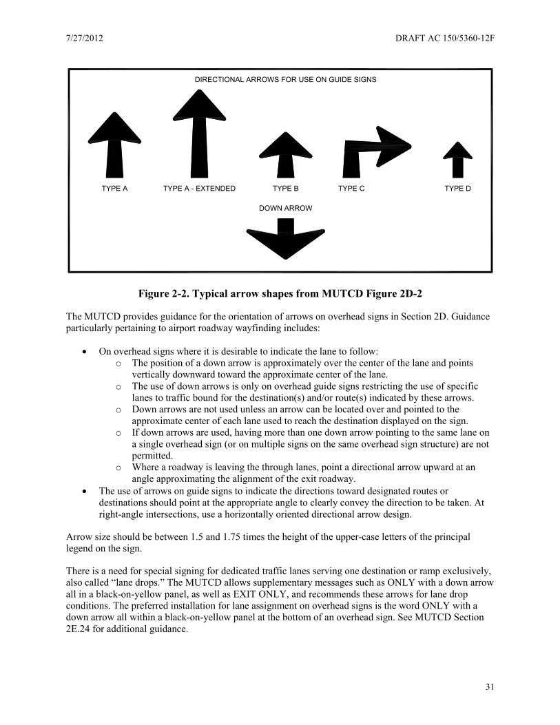
7/27/2012 DRAFT AC 150/5360-12F
31
Figure 2-2. Typical arrow shapes from MUTCD Figure 2D-2
The MUTCD provides guidance for the orientation of arrows on overhead signs in Section 2D. Guidance particularly pertaining to airport roadway wayfinding includes:
• On overhead signs where it is desirable to indicate the lane to follow: o The position of a down arrow is approximately over the center of the lane and points
vertically downward toward the approximate center of the lane. o The use of down arrows is only on overhead guide signs restricting the use of specific
lanes to traffic bound for the destination(s) and/or route(s) indicated by these arrows. o Down arrows are not used unless an arrow can be located over and pointed to the
approximate center of each lane used to reach the destination displayed on the sign. o If down arrows are used, having more than one down arrow pointing to the same lane on
a single overhead sign (or on multiple signs on the same overhead sign structure) are not permitted.
o Where a roadway is leaving the through lanes, point a directional arrow upward at an angle approximating the alignment of the exit roadway.
• The use of arrows on guide signs to indicate the directions toward designated routes or destinations should point at the appropriate angle to clearly convey the direction to be taken. At right-angle intersections, use a horizontally oriented directional arrow design.
Arrow size should be between 1.5 and 1.75 times the height of the upper-case letters of the principal legend on the sign.
There is a need for special signing for dedicated traffic lanes serving one destination or ramp exclusively, also called “lane drops.” The MUTCD allows supplementary messages such as ONLY with a down arrow all in a black-on-yellow panel, as well as EXIT ONLY, and recommends these arrows for lane drop conditions. The preferred installation for lane assignment on overhead signs is the word ONLY with a down arrow all within a black-on-yellow panel at the bottom of an overhead sign. See MUTCD Section 2E.24 for additional guidance.
TYPE A TYPE A - EXTENDED TYPE B TYPE C TYPE D
DOWN ARROW
DIRECTIONAL ARROWS FOR USE ON GUIDE SIGNS
DRAFT AC 150/5360-12F 7/27/2012
32
Exits to the left are counter to drivers’ expectations. Specially mark left exits including parking garage entrances and other exit ramps to the left. MUTCD Section 2E.31 provides guidance on the design and placement of left exit plaques for guide signs.
2.4.5 Color and shape
The color and shape of a sign helps drivers pick it out from the visual scene. For example, if a driver is actively seeking guidance information, past experience dictates this will be found on a horizontally rectangular sign, most likely with a green or blue background. In a quick visual scan of a scene a yellow diamond-shaped sign would likely not register with the driver because he or she is consciously seeking navigational information in a guide sign format. Consistency in the color and shape of signs on all roadways is important to help drivers quickly read the sign messages. Sign borders of contrasting colors help drivers identify the shape of the sign and quickly notice a sign in a cluttered environment. The MUTCD requires the use of borders the same color as the legend on all roadway signs. Section 2A.06 contains design details for the borders.
Airports often use color coding to aid in wayfinding. Unfortunately, many color coding schemes violate standards specified in the MUTCD. There are provisions for using uniquely colored boxes within a traditional green guide sign as shown in Figure 2-1. The accompanying standard language from the MUTCD explains their use:
Support: Color coding is sometimes used to help road users distinguish between multiple potentially confusing destinations. Examples of valuable uses of color coding include guide signs for roadways approaching or inside an airport property with multiple terminals serving multiple airlines, and wayfinding signs for various traffic generator destinations within a community or area.
Standard: Don’t use different color sign backgrounds to provide color coding of destinations. Use different colored square or rectangular panels on the face of the guide signs to color code.
The 2009 MUTCD1 identifies the 11 colors in current use and the 2 colors reserved for future use.
Both airports and roadways sign design professionals should know the general meaning of the 13 colors:
• Black—regulation • Blue—road user services guidance, tourist information, and evacuation route • Brown—recreational and cultural interest area guidance • Coral—unassigned • Fluorescent Pink—incident management • Fluorescent Yellow-Green—pedestrian warning, bicycle warning, playground warning, school
bus and school warning • Green—indicated movements permitted, direction guidance • Light Blue—unassigned • Orange—temporary traffic control • Purple—lanes restricted to use only by vehicles with registered electronic toll collection (ETC)
accounts • Red—stop or prohibition • White—regulation • Yellow—warning

7/27/2012 DRAFT AC 150/5360-12F
33
The provision to use colored boxes on wayfinding signs allows for the use of the assigned colors in a wayfinding system. This means that airports can carry through terminal or parking color coding used for interior signing to roadway signing through the use of these colored panels on standard green guide signs.
As noted previously, sign background color is a major source of discrepancy. Many airports use colors other than the MUTCD accepted standard green. Based on this standard airports considering alternative background colors should conduct a legibility study and file a request for experimentation with the FHWA.
Shape provides an additional cue to motorists as to the category of sign. The MUTCD provides for the following applications of sign shapes as shown in Table 2–2.
Table 2–2. MUTCD’s Table 2A-4 “Use of Sign Shapes”
Shape Signs
Octagon *Stop
Equilateral Triangle (1 point down) *Yield Circle *Highway-Rail Grade Crossing (Advance
Warning) Pennant Shape/ Isosceles Triangle (longer axis horizontal)
*No Passing
Pentagon (pointed up) *School Advance Warning Sign *County Route Sign
Crossbuck (two rectangles in an “X” configuration) *Highway-Rail Grade Crossing Diamond Warning Series Rectangle (including square) Regulatory Series
**Guide Series Warning Series
Trapezoid Recreational and Cultural Interest Area Series National Forest Route Sign
*This sign must be exclusively the shape shown. **Guide series includes general service, specific service, tourist-oriented directional, general information, recreational and cultural interest area, and emergency management signs.
2.4.6 Wayfinding sign placement, spacing and design speeds
Motorists’ visual and cognitive abilities vary greatly and affect how easily motorists read and understand a sign. Once a driver reads a sign, he or she must have time to cognitively process the information, decide whether to maneuver, and execute the maneuver. Figure 2-3 illustrates these steps.
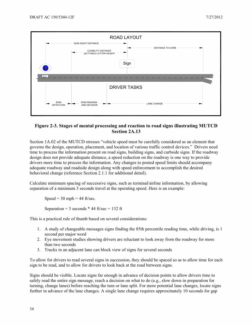
DRAFT AC 150/5360-12F 7/27/2012
34
Figure 2-3. Stages of mental processing and reaction to road signs illustrating MUTCD Section 2A.13
Section 1A.02 of the MUTCD stresses “vehicle speed must be carefully considered as an element that governs the design, operation, placement, and location of various traffic control devices.” Drivers need time to process the information present on road signs, building signs, and curbside signs. If the roadway design does not provide adequate distance, a speed reduction on the roadway is one way to provide drivers more time to process the information. Any changes to posted speed limits should accompany adequate roadway and roadside design along with speed enforcement to accomplish the desired behavioral change (reference Section 2.1.1 for additional detail).
Calculate minimum spacing of successive signs, such as terminal/airline information, by allowing separation of a minimum 3 seconds travel at the operating speed. Here is an example:
Speed = 30 mph = 44 ft/sec.
Separation = 3 seconds * 44 ft/sec = 132 ft
This is a practical rule of thumb based on several considerations:
1. A study of changeable messages signs finding the 85th percentile reading time, while driving, is 1 second per major word
2. Eye movement studies showing drivers are reluctant to look away from the roadway for more than two seconds
3. Trucks in an adjacent lane can block view of signs for several seconds
To allow for drivers to read several signs in succession, they should be spaced so as to allow time for each sign to be read, and to allow for drivers to look back at the road between signs.
Signs should be visible. Locate signs far enough in advance of decision points to allow drivers time to safely read the entire sign message, reach a decision on what to do (e.g., slow down in preparation for turning, change lanes) before reaching the turn or lane split. For more potential lane changes, locate signs further in advance of the lane changes. A single lane change requires approximately 10 seconds for gap
Sign
LEGIBILITY DISTANCE(30 FT/INCH LETTER HEIGHT
SIGN SIGHT DISTANCE
DISTANCE TO GORE
SIGNDETECTION
SIGN READING AND DECISION LANE CHANGE
DRIVER TASKS
ROAD LAYOUT
7/27/2012 DRAFT AC 150/5360-12F
35
search and recognition (followed by the physical maneuver; two lane changes require 17 seconds and 3 lane changes 24 seconds (in situ study determining lane-maneuvering distance for three- and four-lane freeways for various traffic-volume conditions6). Use the operating speed (which may be higher than the posted speed) to determine appropriate sign placement.
The MUTCD advises in Section 2A.16 that regulatory and warning signs take precedence over guidance information. This section also contains advice on how to position signs on medians for situations where the roadway curves and how to position signs relative to sidewalks.
When considering sign spacing, refer to Section 2.5 regarding sign illumination and impact on sign legibility.
2.4.6.1 Regulatory and warning signs
The MUTCD provides information related to the design, use, and placement of regulatory and warning signs. Find this information in the following chapters and sections:
• Chapter 2B of the MUTCD contains provisions for regulatory signs, which are typically rectangular shaped signs, and include Stop and Yield signs. Regulatory signs, as defined by the MUTCD, give notice to road users of traffic laws or regulations.
• Chapter 2C contains provisions for warning signs which are typically diamond shaped. Warning signs, as defined by the MUTCD, give notice to road users of a situation that might not be readily apparent.
• Section 2A.16 provides guidance for sign location in terms of distance from the edge of the road and sign height.
2.5 Sign structures and illumination
2.5.1 Sign structures
Airport planners and operators can choose various sign mounting techniques. Airports can ground mount road signs or mount signs overhead on sign structures. In general, locate signs on the right side of the roadway (MUTCD Section 2A.16) so that they:
• Are outside the clear zone unless placed on a breakaway support (see Section 2.5.2) • Optimize nighttime visibility • Minimize the effects of mud splatter and debris • Do not obscure each other • Do not obscure the sight distance to approaching vehicles on the major street for drivers who are
stopped on minor-street approaches, and • Are not hidden from view
For added emphasis, you may add supplemental signs to the left side of the roadway.
The MUTCD offers guidance on overhead sign mounting (Section 2A.17). Consider the following conditions (not in priority order) in an engineering study to determine if overhead signs are beneficial:
• Traffic volume at or near capacity • Complex interchange design • Three or more lanes in each direction • Restricted sight distance

DRAFT AC 150/5360-12F 7/27/2012
36
• Closely spaced interchanges • Multi-lane exits • Large percentage of trucks • Street lighting background • High-speed traffic • Consistency of sign message location through a series of interchanges • Insufficient space for ground-mounted signs • Junction of two freeways • Left exit ramps
For airport applications, MUTCD recommends overhead signs for lane assignment on approach to terminal buildings, particularly for multi-lane facilities, and at any other locations where traffic engineers consider lane assignment critical for safe and efficient roadway operations.
The AASHTO offers guidance on sign support materials, types, design, and wind load ratings for large and small signs (A Guide to Small Sign Support Hardware7, Standard Specifications for Structural Supports for Highway Signs, Luminaires and Traffic Signals8). Design these supports and locate them in a manner maintaining a safe roadside environment for all roadway users. Do not allow supports to distract from the primary purpose of the signs which is to guide, warn, and regulate traffic. For these reasons, limit and carefully place architectural features and graphic treatments such as banners or other messaging on sign structures.
2.5.2 Safety considerations
Mount sign structures on break-away supports or shield them by guard rails. Roadway lighting luminaires should also be breakaway. The FHWA offers an informational guide to the various types of sign and lighting structures and supports (Roadside Hardware Policy and Guidance9).
Place signs off the roadway to allow a roadside clear zone to prevent errant vehicles from striking sign structures. If a limited right of way prohibits a clear zone, protect large sign structures, including static and CMSs, with crash cushions or guardrails. Find additional information in the AASHTO Roadside Design Guide (Roadside Design Guide10). Any roadway work zone device, such as temporary signs, barricades and barrels must meet crash worthiness standards as well (Crashworthy Work Zone Traffic Control Devices11, Crashworthy Approval Process12).
2.5.3 Illumination
The MUTCD requires illuminated or retrofeclictive roadway signs for proper nighttime visibility. Because of the high ambient light levels along roadways in most major airports (from terminal buildings, parking garages, and landscaping) it may be necessary to use external or internal illumination to provide adequate nighttime visibility for roadway signs. At smaller airports or on the outlying areas of larger airports, with lower ambient light levels, high quality retroreflective materials may provide adequate visibility, particularly for ground-mounted signs. Nighttime testing on-site may be required to make these determinations.
The Illuminating Engineering Society provides guidance on roadway sign lighting (Roadway Sign Lighting13). Other factors to consider when deciding between retroreflective materials and external or internal illumination are:
• Traffic volumes
7/27/2012 DRAFT AC 150/5360-12F
37
• Complexity of road geometries (i.e., retroreflective material typically works when used head-on, and not ideal for curving roads)
• Obstructions of vehicle headlamps from one sign to the next due to closely spaced signs or landscape elements
• Need to emphasize decision points or critical information including terminal/airline listings
2.6 Changeable Message Signs (CMSs)
A CMS is a lighted matrix sign capable of displaying messages difficult to communicate with standard static signing. These signs are also referred to as Dynamic Message Signs (DMSs) or Variable Message Signs (VMS), and these terms are interchangeable throughout this chapter. You may mount these signs in a permanent manner beside or over a roadway, or place on portable trailers. Small CMS signs may also be placed within a larger static sign, such as when available parking spaces are displayed.
2.6.1 Appropriate use of CMSs
The primary function of a CMS is to alert and inform motorists of changing or temporary conditions along their travel path. Use changeable signs on major roads only to convey messages changing on an hourly, daily, or weekly basis, such as:
• Traffic conditions and roadway delays • Construction or maintenance lane closures or speed reductions • Homeland security threat level
Use CMS in other locations for:
• Parking availability • Parking fee schedules
2.6.1.1 CMS versus static sign
Use changeable signs where they are clearly beneficial to accommodate a changing state of operations and to provide convenient and timely information to the passengers and patrons.
It is FHWA policy that the appropriate use of a CMS and other types of real-time displays on the normal roadway system is limited to managing travel, controlling and diverting traffic, identifying current and anticipated roadway conditions, or regulating access to specific lanes or the entire roadway (Use of Changeable Message Sign (CMS) for Emergency Security Messages14). Airports represent a different environment not investigated by FHWA, but many of the same principles and guidance exist in those applications as well.
CMS are one of the primary links between a transportation agency and those using the transportation facility. The design, display, and management of messages on CMS introduce many challenges for transportation agencies, including airports. The Dynamic Message Sign Message Design and Display Manual15 and The Portable Changeable Message Sign Handbook16 address some of these challenges. These documents provide comprehensive information on the use of CMSs in the typical roadway environment and will be helpful in assessing the use of these signs for an airport.
In any case, the CMS should not replace permanent, static signing required in the MUTCD. For construction activities, airports can use portable, trailer-mounted CMS.
DRAFT AC 150/5360-12F 7/27/2012
38
When appropriately used and coordinated with static signing systems, the CMS is an effective permanent or temporary traffic control device. However, over-using or improperly using the CMS diminishes its efficacy. Each airport operator should establish or endorse a written policy regarding the use of CMS and limit the authority to display messages. To find helpful references, consult CMS guidelines published by many state transportation agencies.
2.6.2 CMS technology
Each CMS sign consists of a sign face, the sign housing, and a controller. The signs can be permanent or portable. Permanent signs can vary in size, but normally can display three lines of text with 12 to 18 characters per line. Portable CMS typically have a modular display consisting of three lines of eight characters each. New full matrix sign displays provide the most flexibility, including the ability to vary the height of the characters, display simple graphics, and use proportionally spaced fonts.
The most common types of lights in CMS include: light-emitting diode (LED), fiber optic, incandescent bulb, and reflective disk. The Texas Transportation Institute (TTI)’s Guidelines on the Use and Operation of Changeable Message Signs17 includes descriptions of these sign types.
Control of the sign display may be by direct connection with a laptop or any number of other methods via a remote computer communicating through an Ethernet modem connection over copper cables, fiber optic cable, radio frequency (RF) links, or cellular transmission. Note airports are required to use of National Transportation Communications for ITS Protocol (NTCIP)18 to comply with Intelligent Transportation System (ITS) industry communication standards.
2.6.3 Message design and layout
When using CMS on airport roadways, carefully construct messages to avoid information overload. A CMS must communicate a meaningful message read and understood by motorists within a very short time period. A motorist’s ability to read and understand a message depends upon the message load, which refers to the units of information in the total message. CMS messages must also “fit” within and work with the static sign system layout.
Lighting conditions vary throughout the day based on the position of the sun and driver relative to the message sign. This can impact the driver’s ability to read a CMS. Common lighting conditions include: mid-day (sun is overhead), washout (sun is behind driver), backlight (sun is behind sign), and nighttime (no sun). Make sure CMS messages are readable under prevailing lighting conditions at every location. The MUTCD requires CMS to automatically adjust their brightness levels to account for varying light conditions.
Other message design features include message content, length, and format. Message content refers to specific information displayed on a CMS. Key elements of message content include information about the event or problem ahead and what the motorist should do about it. Display messages in one or two multi-unit message phases. Although three phases are possible, MUTCD does not recommend them.
For roadway applications, FHWA recommends the following guidelines for CMS message phases:
• Single Phase Display o Line 1 – Describe the problem. o Line 2 – Identify location or distance ahead. o Line 3 – Provide motorist instruction.
7/27/2012 DRAFT AC 150/5360-12F
39
• Two-Phase Display o Phase 1 – Describe the problem. o Phase 2 – Provide motorist instruction.
Message length refers to either the number of words or the number of characters and spaces in a CMS message. With obvious limitations on CMS line capacity, sign operators must determine if the message will fit, then decide whether to use abbreviations or eliminate redundant words. Document acceptable phrases and abbreviations in the airport operator’s policy regarding the use of CMS. Table 1A-2 of the 2009 MUTCD1 gives acceptable abbreviations for use on CMSs.
Message format refers to the order and arrangement of the units of information on a CMS. Motorist’ comprehension and decision-making abilities increase when signs present proper information in the expected order. Poor formatting can increase reading times and result in driver confusion.
Find more information regarding message content, length, and format in The Dynamic Message Sign Message Design and Display Manual15, The Portable Changeable Message Sign Handbook16, and the 2009 MUTCD1.
Display each phase of a CMS long enough to allow reading by the motorist; however, avoid unnecessarily long display times. A phase refers to an individually displayed message segment. For example, the first phase may be “Road Work Ahead” and the second phase “Speed Limit 30 mph.”
Section 2L.04 of the 2009 MUTCD1 recommends the following display times:
Guidance:
• The minimum time that an individual phase is displayed should be based on 1 second per word or 2 seconds per unit of information, whichever produces a lesser value. The display time for a phase should never be less than 2 seconds.
• The maximum cycle time of a two-phase message should be 8 seconds. • The duration between the display of two phases should not exceed 0.3 seconds. • Compatible units of information should be displayed on the same message phase.
Use two phases only when absolutely necessary and when both phases contain no more than one unit of information (i.e., the answer to a What? Where? When? question constitutes one unit of information.) Since drivers may first be able to read the sign just at the moment the phase changes, design the sign letter height, in combination with operating speed, so the driver has the opportunity to read three phases per message for a two-phase message. Drivers require at least two seconds of display time per unit of information. A driver can read a 16-inch letter height sign at a distance of 480 feet (legibility distance is 30 feet per inch of letter height). To display a message with three phases each requiring two seconds, for a total of six seconds, the maximum operating speed is 55 mph (480/6 = 80 ft/sec, or 55 mph).
2.6.4 CMS display elements
2.6.4.1 Letter size
Legibility experiments of CMS character matrix technology indicate most drivers can read 18-inch characters far enough away in optimum daytime viewing conditions to provide 8 seconds of available viewing time while traveling at 70 mph. MUTCD recommends a minimum letter height of 12 inches for roadways with operating speeds of 45 mph or less, and 18 inches for roadways with operating speeds of 45 mph or more. Compose word messages on CMS of all upper-case letters.
DRAFT AC 150/5360-12F 7/27/2012
40
2.6.4.2 Font
New CMS technologies allow denser pixel placement and a wider variety of fonts and letter forms. The MUTCD does not specify a font for use on CMS. It does provide guidance statements encouraging minimum visibility and legibility distances in Section 2L.03 Paragraph 4. Additional sections (2L.04) provide guidance on letter stroke width, height to width ratio, character spacing, and use of upper and lower case letters.
2.6.4.3 Color
Typical roadway CMS signs generally contain white, yellow, amber or fluorescent yellow-green legends on a black background. Full matrix LED sign displays can also display full color text and graphics, but use of some of these colors may actually increase times for driver recognition and comprehension times. Although these colors may have greater target value than other colors, the novelty of these signs may prevent their recognition as traffic control devices.
Select the sign structural support and housing materials with care so as not to distract from the message displayed. Make sure the housing is neutral so drivers recognize the CMS as a traffic control device and not an advertisement.
In support of this concept, the MUTCD contains the following language in Section 2L.02:
“Standard: When a CMS is used to display a safety, transportation-related, emergency homeland security, or AMBER alter message, the display format shall not be of a type that could be considered similar to advertising displays.”
Research shows drivers prefer white or amber CMS letter colors. MUTCD discourages red.
In addition, Section 2L.04 of the MUTCD discourages the use of CMS in a manner that may be distracting to drivers:
“Standard: CMSs shall not include advertising, animation, rapid flashing, dissolving, exploding, scrolling, or other dynamic elements.”
2.6.5 Passenger advisory CMS
With security taking a high priority in airport activities, airports need to communicate elevated risks to travelers. The National Terrorism Advisory System (NTAS) communicates detailed information about terrorist threats to citizens and public officials. The NTAS includes clear statements describing and imminent or elevated threat. CMSs can offer an avenue for communicating NTAS alerts in the airport environment.
If public agencies decide to display emergency or security alert messages on a CMS, FHWA accepts this application if public agencies develop policies and procedures governing the messages displayed and operation of CMS. The public agency policy and procedures relating to displaying emergency or security alert messages on CMS must address these issues.
7/27/2012 DRAFT AC 150/5360-12F
41
An FHWA memorandum dated March 21, 2003 addresses the use of CMS for Emergency Security Messages:
• The criteria under which CMS will be used for emergency or security alert messages, including the necessary coordination with public safety or security agencies. Formal policies among critical stakeholders (such as law enforcement, security, transportation, and public safety) can be used to establish these agreed upon criteria.
• Protocols or hierarchy for prioritizing messages and determining which messages are to be displayed.
• Geographic area over which the information is to be displayed, to be determined in cooperation with public safety and security agencies.
• Identification of the circumstances under transportation-related messages, such as lane closures, fog alerts, detours, or other messages that may be needed because of dangerous travel conditions in the immediate vicinity, would preempt emergency or security alert messages.
• The criteria that would cause the discontinuation of use of the CMS if the emergency or security alert message creates an adverse traffic impact such as queues, markedly slowing traffic, etc.
• Methodology for developing and displaying messages appropriate for CMS display including, but not limited to, standard message sets. Agencies should follow the recommended national CMS practices related to the development, use of text, manner in which messages should be displayed, human factors related to understandability of the messages, and how CMS are operated.
2.7 Sign maintenance
Find the FHWA rules concerning minimum sign retroreflectivity values in Table 2A-3 of the MUTCD. The standards require the sign maintenance plan recommend the signs maintain minimum levels of retroreflectivity to provide adequate visibility. FHWA allows five different methods of regular inspection of sign retroreflectivity:
• Visual nighttime inspections • Measured retroreflectivity • Expected life • Blanket replacement • Control signs
You should incorporate sign retroreflectivity into an overall asset management plan. Include expected life of sign materials and structures in the plan to expedite routine replacement and maintenance. Expect the retroreflective material on a sign to last 7-12 years depending on the type of material and its sun exposure.
Provide for annual cleaning of ground-mounted signs to remove dirt and mud, particularly those in splash zones and near areas where vehicle idling may produce soot build-up. FHWA recommends annual daytime and nighttime visual drive-by inspections as part of a maintenance schedule.
Sign supports, crash cushions, and guardrails may need routine maintenance and inspection as well depending on the system. Follow manufacturer’s recommendations to check for rust, loose bolts, etc.

DRAFT AC 150/5360-12F 7/27/2012
42
This page intentionally left blank

7/27/2012 DRAFT AC 150/5360-12F
43
Chapter 3. Parking
Parking is one of an airports largest sources of complaints by travelers and the employees. Signing as it relates to parking benefits from careful planning and technology. Airports (as well as other major transportation hubs) are using a user-perspective approach to deliver adequate information at the necessary locations in the appropriate form.
3.1 Considering parking users in design (human factors)
The approach to designing a signing system for parking functions is similar to signing in other areas: understand the user’s needs. Parking signing is unique because it provides wayfinding for the driver (e.g., inside the vehicle) and pedestrians (e.g., outside the vehicle) within the same environment. Regardless of the person’s mode of travel, wayfinding should give each type of user information as to the:
• Destination (where one wants to go) • Designation (where one is currently) • Direction (how to go from one to the other)
In general, the human factor aspects of signing for parking at airports follow the same principles necessary for all signing at airports: simplicity, consistency, continuity, and redundancy. Focus groups of users are valuable sources of input as airports embark on signing makeovers.
Parking garage users include both drivers and pedestrians. Drivers require sign guidance in order to navigate to a suitable location within the parking facility. Many airport facilities offer short-term, higher-cost parking closer to the terminal, and long-term, lower-cost parking further away from the terminal. Larger airports may also divide their parking facilities into sectors such as domestic and international departures in order to provide a closer connection with the appropriate areas of the adjacent terminal building. Some airports have as many as eight different parking options. Posting rates in advance of decision points can help drivers make an informed decision about where to park. The challenge is to do so without overloading the motorist with information. In addition, drivers need to know which parking areas are full and which have parking spots available. Within the parking facility, signs and pavement markings directing drivers need to be clear about the direction of traffic (e.g., one-way only or two-way) and the direction to follow to find more parking or to find the exit.
As pedestrians, parking lot users need to remember the level, aisle, and sometimes garage or lot where they have parked their vehicle. Airports can use a number of memory aids to help parking lot users remember where they parked their car. Associate different parking levels with different colors, images, and alphanumeric characters, and in addition, number each parking spot to give drivers a number of ways to remember where they parked.
As the use of automated payment stations – often referred to as pay-on-foot stations – proliferates at airports, it becomes necessary to remind patrons to take their parking tickets with them versus leaving them in their vehicle. Since the location of pay stations is often in a consolidated area where pedestrians easily pass before returning to their vehicles, encouraging patrons to keep their parking tickets with them is as much a customer service activity as it is informational to make exiting a parking facility more efficient.
After leaving their parking spot, direct pedestrians along a safe path to access points to the appropriate terminal entrance. Signs showing the pedestrian exit and terminal access should be clearly distinguishable, by size, color, placement, and design from signs for drivers. Mark crosswalks using signs
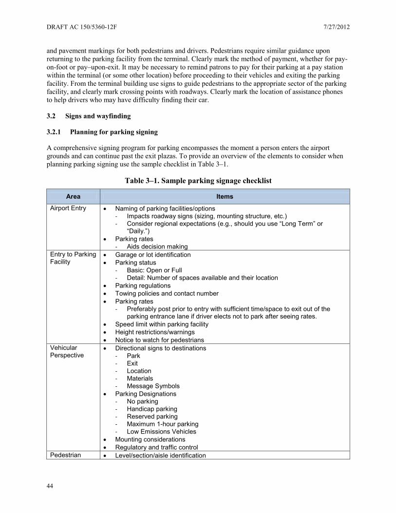
DRAFT AC 150/5360-12F 7/27/2012
44
and pavement markings for both pedestrians and drivers. Pedestrians require similar guidance upon returning to the parking facility from the terminal. Clearly mark the method of payment, whether for pay-on-foot or pay–upon-exit. It may be necessary to remind patrons to pay for their parking at a pay station within the terminal (or some other location) before proceeding to their vehicles and exiting the parking facility. From the terminal building use signs to guide pedestrians to the appropriate sector of the parking facility, and clearly mark crossing points with roadways. Clearly mark the location of assistance phones to help drivers who may have difficulty finding their car.
3.2 Signs and wayfinding
3.2.1 Planning for parking signing
A comprehensive signing program for parking encompasses the moment a person enters the airport grounds and can continue past the exit plazas. To provide an overview of the elements to consider when planning parking signing use the sample checklist in Table 3–1.
Table 3–1. Sample parking signage checklist
Area Items
Airport Entry • Naming of parking facilities/options - Impacts roadway signs (sizing, mounting structure, etc.) - Consider regional expectations (e.g., should you use “Long Term” or
“Daily.”) • Parking rates
- Aids decision making Entry to Parking Facility
• Garage or lot identification • Parking status
- Basic: Open or Full - Detail: Number of spaces available and their location
• Parking regulations • Towing policies and contact number • Parking rates
- Preferably post prior to entry with sufficient time/space to exit out of the parking entrance lane if driver elects not to park after seeing rates.
• Speed limit within parking facility • Height restrictions/warnings • Notice to watch for pedestrians
Vehicular Perspective
• Directional signs to destinations - Park - Exit - Location - Materials - Message Symbols
• Parking Designations - No parking - Handicap parking - Reserved parking - Maximum 1-hour parking - Low Emissions Vehicles
• Mounting considerations • Regulatory and traffic control
Pedestrian • Level/section/aisle identification
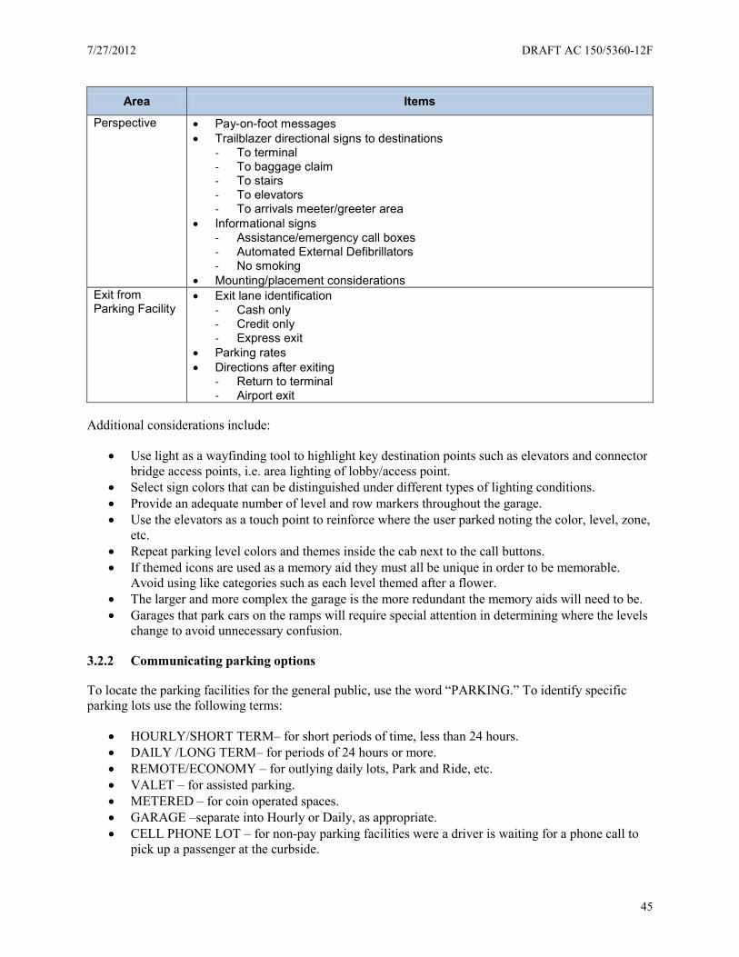
7/27/2012 DRAFT AC 150/5360-12F
45
Area Items
Perspective • Pay-on-foot messages • Trailblazer directional signs to destinations
- To terminal - To baggage claim - To stairs - To elevators - To arrivals meeter/greeter area
• Informational signs - Assistance/emergency call boxes - Automated External Defibrillators - No smoking
• Mounting/placement considerations Exit from Parking Facility
• Exit lane identification - Cash only - Credit only - Express exit
• Parking rates • Directions after exiting
- Return to terminal - Airport exit
Additional considerations include:
• Use light as a wayfinding tool to highlight key destination points such as elevators and connector bridge access points, i.e. area lighting of lobby/access point.
• Select sign colors that can be distinguished under different types of lighting conditions. • Provide an adequate number of level and row markers throughout the garage. • Use the elevators as a touch point to reinforce where the user parked noting the color, level, zone,
etc. • Repeat parking level colors and themes inside the cab next to the call buttons. • If themed icons are used as a memory aid they must all be unique in order to be memorable.
Avoid using like categories such as each level themed after a flower. • The larger and more complex the garage is the more redundant the memory aids will need to be. • Garages that park cars on the ramps will require special attention in determining where the levels
change to avoid unnecessary confusion.
3.2.2 Communicating parking options
To locate the parking facilities for the general public, use the word “PARKING.” To identify specific parking lots use the following terms:
• HOURLY/SHORT TERM– for short periods of time, less than 24 hours. • DAILY /LONG TERM– for periods of 24 hours or more. • REMOTE/ECONOMY – for outlying daily lots, Park and Ride, etc. • VALET – for assisted parking. • METERED – for coin operated spaces. • GARAGE –separate into Hourly or Daily, as appropriate. • CELL PHONE LOT – for non-pay parking facilities were a driver is waiting for a phone call to
pick up a passenger at the curbside.

DRAFT AC 150/5360-12F 7/27/2012
46
If parking lots or garages are related to multi-terminal complexes, other terminology may apply, such as: PARKING - TERMINAL 1 (or A), PARKING - TERMINAL 2 (or B), etc. The parking garage serving multiple terminals may require a “CENTRAL GARAGE” designation.
3.2.3 Connecting parking and terminals
In most cases, the terminal is the primary destination for a person entering a parking facility. Depending on the distance of the parking facility from the terminal and the physical configuration of the parking facility and the terminal, a person will use one of the following methods to move to and from parking and airport terminals:
• Shuttle buses • Cross walks • Sky bridges • Elevators/escalators/stairs • People mover systems
Place signs so after a driver has parked, he can exit his vehicle and figure out how to proceed to the terminal. Use consistent color and other graphical elements throughout the parking facility. In most cases, the only necessary identification is the phrase “To Terminal” (or “To Terminal 1,” “To Terminal A,” for example) with the appropriate directional arrow.
3.3 Sign categories
The sign type family is the catalog of all directional, identification and informational signing applications. It functions as a tool for programming signs and allows for a much more effective process. The following subparagraphs includes primary and secondary sign types for:
• Directional signs. To facilitate circulation to and/or from a specific parking facility. • Identification signs. For identification of specific parking products or areas within parking
facilities and pathways to terminals. • Informational signs. To convey airport information and services. Directories of floor plans,
levels, terminals, airlines, gates information, etc. • Regulatory signs. For traffic control, fire exits, stairs, parking reserved for people with
disabilities, etc.
Analyze viewer circulation patterns and natural lines of vision to determine the location of all signs. Locate signs to precede decision points to make sure drivers have sufficient time to react to each sign message.
3.3.1 Directional signs
Directional signs help passengers and visitors select the proper path to meet their needs, when to determine a decision point, and where to identify specific services and various functional areas such as the location of parking pay stations.
With the exception of MUTCD regulatory safety signs, directional signing is of greatest importance in airport parking facilities. All other signs are subordinate. Proper directional signing is necessary because the rapid movement of vehicles, people, and particularly the passenger is essential for maximum utilization of the parking area. Success or failure of the operations and its signing is largely measured by the ease, speed, and comfort of going from parking to the terminal or the other way around. In addition to
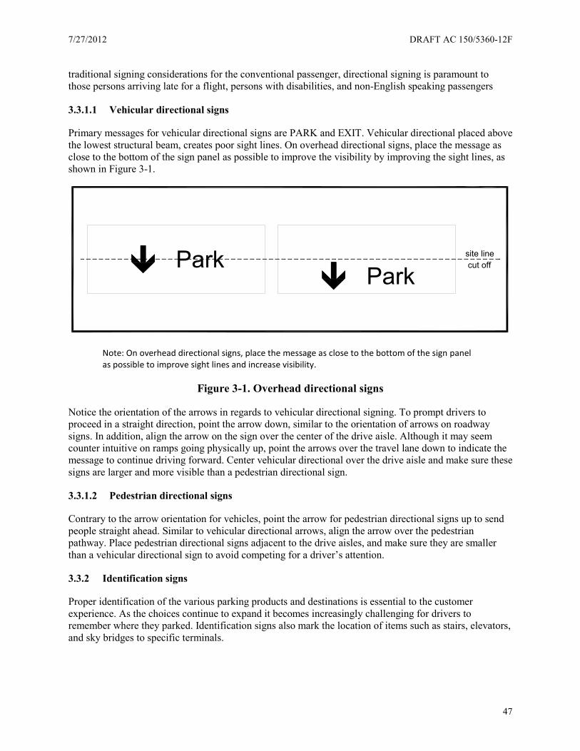
7/27/2012 DRAFT AC 150/5360-12F
47
traditional signing considerations for the conventional passenger, directional signing is paramount to those persons arriving late for a flight, persons with disabilities, and non-English speaking passengers
3.3.1.1 Vehicular directional signs
Primary messages for vehicular directional signs are PARK and EXIT. Vehicular directional placed above the lowest structural beam, creates poor sight lines. On overhead directional signs, place the message as close to the bottom of the sign panel as possible to improve the visibility by improving the sight lines, as shown in Figure 3-1.
Note: On overhead directional signs, place the message as close to the bottom of the sign panel as possible to improve sight lines and increase visibility.
Figure 3-1. Overhead directional signs
Notice the orientation of the arrows in regards to vehicular directional signing. To prompt drivers to proceed in a straight direction, point the arrow down, similar to the orientation of arrows on roadway signs. In addition, align the arrow on the sign over the center of the drive aisle. Although it may seem counter intuitive on ramps going physically up, point the arrows over the travel lane down to indicate the message to continue driving forward. Center vehicular directional over the drive aisle and make sure these signs are larger and more visible than a pedestrian directional sign.
3.3.1.2 Pedestrian directional signs
Contrary to the arrow orientation for vehicles, point the arrow for pedestrian directional signs up to send people straight ahead. Similar to vehicular directional arrows, align the arrow over the pedestrian pathway. Place pedestrian directional signs adjacent to the drive aisles, and make sure they are smaller than a vehicular directional sign to avoid competing for a driver’s attention.
3.3.2 Identification signs
Proper identification of the various parking products and destinations is essential to the customer experience. As the choices continue to expand it becomes increasingly challenging for drivers to remember where they parked. Identification signs also mark the location of items such as stairs, elevators, and sky bridges to specific terminals.
ParkPark
cut offsite line
DRAFT AC 150/5360-12F 7/27/2012
48
3.3.2.1 Toll plaza
Depending on the type of parking management system at your airport and other operational preferences, mount signing near and at toll plazas overhead and make sure these signs are highly visible.
At an entry plaza, make sure signing clearly identifies the parking facility (e.g., daily, hourly, etc.). In addition, post the fee schedule so patrons can clearly see the effective parking charges. If it is not possible to post the rates in a legible manner directly on the ticket issue machine (or card reader), then mount the fee schedule adjacent to the equipment. It is not advisable to post other regulator information at or near the entry equipment since this could reduce the efficiency of the entry plaza due to patrons attempting to read all the information and causing queues. Such regulatory signs could include information about the acceptance of liability for using the facility or similar information.
Signing at exit plazas can improve operations. By placing large signing above each lane of the exit plaza clearly identifying functions available in that lane, allows a patron to self-select where they need to go to complete their transaction. Not only should the sign indicate if a lane is “open” or “closed,” it should also identify if the lane is “cash only,” “cash and credit,” or some form of a pre-paid “express lane.” Using some form of changeable messages displays above each lane maximizes the operational flexibility of the exit plaza.
3.3.2.2 Payment options
An increasingly common feature at airports allows patrons to pay for parking prior returning to their vehicle within a parking facility. Airports often place such payment stations so patrons must pass one payment station, or a bank of payment stations, just prior to entering the parking facility. Make sure signing clearly identifies the location of the pay stations.
Since payment for parking is an operational function and not a regulatory one, the airport has more flexibility in what to call the pay station and what signing to provide. Some airports brand this type of payment and exiting option with terms such as “Express Pay” or “Pay-and-Go” and the associated signing is more in line with advertisement with specific graphics and colors. Airports should still use the conventional and internationally accepted logos in conjunction with these other forms of signing.
With pay-on-foot operations, place parking rates directly on the pay station’s placard or display rates via a monitor incorporated into the pay station. Airports need to take into consideration ADA requirements with pay stations and provide equipment at the appropriate height and legibility.
Even if airports provide pay stations are provided, it is desirable to post the parking rate schedule at the exit lanes. These signs remind individuals what they should pay for the durations of their parking and to prepare their ticket for payment. This makes for a speedier exit, increasing the efficiency of the exit plaza.
3.3.3 Informational signs
Informational signing has less importance than directional signing in parking facilities. These signs provide specific details such as: “You Are Here” maps, parking operation offices, and special assistance services and facilities. The intent of these signs is to help individuals satisfy needs not directly related to finding a parking space, exiting the parking facility, or moving to the appropriate terminal. Informational signs also address requirements issued by local, state, or federal agencies that must be posted and visible to the public.
Examples of informational signing airports should post include the following:

7/27/2012 DRAFT AC 150/5360-12F
49
• No smoking signs • Towing enforcement policies and who to contact to retrieve vehicles • Required city/local regulations and laws • ADA required signs
3.3.3.1 Directories
The primary objective of directories in airports is to provide the passenger with an overall orientation of the terminal, parking, and other facilities. Another objective is to help move passengers to and from their destinations with ease and efficiency. In most cases, directories supplement the existing sign system. Planners at each airport need to consider the individual needs of each specific airport when planning directory information units.
Color coding systems on some map directories to key terminal and parking buildings or levels, have proven very effective for complicated terminals and parking structures. However, if not carefully done, color coding can make a basically simple terminal more confusing and complex. In most cases, simple, accurate, high quality line drawings may be the best solution for representing the floor plans. In addition, it has been proven more effective if the orientation of the map matches the actual orientation of the physical environment from the perspective of the user. In other words, orienting the map so the top of the map is north may be confusing to the patron if this causes the map to be upside down compared to their actual surroundings.
Carefully review directory construction details to design a flexible and cost-efficient method for changing diagrammatic maps and alphabetical indexes. Maintaining an aesthetically acceptable appearance over the course of time is an equally important consideration in the directory unit design.
3.3.3.2 Flight Information Displays (FIDs)
FIDs provide complete flight-related information regarding arrivals and departures and are common features within the terminal at various locations. It is becoming more common to find FIDs within parking facilities. When a parking garage serves multiple terminals, locating a FID system within the garage itself at locations prior to actually accessing a terminal allows users to verify the terminal and gate area they should use (e.g., on the garage-side of a sky bridge).
FIDs are useful in remote parking facilities where shuttles, trams, or some other method transports users to terminals (e.g., when the patron needs to select a specific shuttle or tram stop to go to a certain terminal.)
3.3.3.3 Row/level markers and other visual themes
For parking garages, number each level from the ground level up with explanatory terminology added for clarification, e.g., “Terminal Level.”
Repeat aisle location signs frequently. For garages with lower ceilings, the best sign placement might be to repeat the locator signing every two to four stalls. In parking garages with higher ceiling clearances, place locator information on the support columns. In surface parking lots, mount locator information on light poles. The extra height allows patrons to see them over the tops of vehicles. Also, locate signs at the end of aisles and/or at the connection of an aisle to a walkway.
Visual themes can help a person to remember where he parked. The most basic memory devices are numbers, letters, and colors. Incorporate graphics to make these memory devices more creative and site-
DRAFT AC 150/5360-12F 7/27/2012
50
specific. Some airports are incorporating music and sound cues to further the cognitive links to a specific parking area. Regardless of the visual memory devices you use, repeat these devices on directional maps, at elevator lobbies, and even on the buttons of the elevator to further reinforce the message.
These identification systems are at your discretion and have a lot of flexibility. Practically no regulations are in place restricting how simple or elaborate the system can be. Keep in mind simple colors, symbols, and graphics are more effective. Before manufacturing and installing these types of signs, test identification schemes within focus groups. Consider schemes with images readily distinct and memorable. Avoid using images associated with a single category (e.g., where all the images are a type of flower.)
3.3.4 Regulatory signs
Regulatory signs relate to local, state, and federal requirements such as traffic signs, ADA items, and safety devices such as fire exits and automatic external defibrillators (AEDs). Refer to the MUTCD for signs, signals, markings, and other devices used to regulate, warn or guide traffic.
3.3.4.1 Emergency/assistance call box location
If your airport provides call boxes within the parking facilities, clearly identify these boxes to both drivers and pedestrians. The placement of the call boxes is critical and signing cannot overcome poor planning. Use the placement of a blue-light beacon on or adjacent to the call boxes to supplement signing.
Use signing to locate and identify call boxes and also include instructions so a user can see how to use the call box (e.g., if a code or telephone extension should be dialed to specific services such as police, fire, EMS, vehicle assistance, etc.). Both the call box and instructions should comply with ADA regulations.
3.3.4.2 AED location
Depending on local and state requirements, an airport may need to place AEDs in a parking facility. It is best to place AEDs in areas where people would instinctively look for them. Examples of such locations include elevator lobbies adjacent to emergency/assistance call boxes and near FIDs or “You are here” locator maps.
Your local or state laws may regulate signing for AED locations. At the minimum, place signing so an individual can see either the location or directional signs to AEDs over the tops of vehicles. By placing AEDs near emergency/assistance call boxes, you can also use a flashing beacon to further draw attention to these medical devices.
3.3.5 Unique situations and systems
3.3.5.1 Cell phone lots
With the proliferation of mobile phones over the past decade, the concept of just-in-time delivery has progressed to just-in-time passenger pick-up at airports. Now that people are able to receive real-time information on a flight’s arrival status, the need to guess when a flight might land and find a parking place to wait until it does arrive is dissipating. Airports have developed special areas for people to wait short periods of time in their vehicles until their family, friends, or business associates contact them via cell phone to pick them up at the terminal curbside. The terminology for these types of parking facilities varies and is often branded by airports to encourage their use.
7/27/2012 DRAFT AC 150/5360-12F
51
Because of their popularity and ability to de-congest terminal curbsides, some airports provide dedicated information and amenities within the cell phone waiting areas. FID boards, free wireless, vending machines, and restrooms are the more common items.
3.3.5.2 Advanced Parking Management Systems (APMS)
These APMS are gaining popularity at airports and FHWA provides collective guidance regarding APMS (Advanced 2007)19. This document is informative in describing the state-of-the-practice recommendations for planning APMS and other implementation items. The guidebook generally discusses signing but does not provide specific details regarding sign content, form or placement. In fact, vendors providing the APMS often suggest specifics and recommendations on signing associated with APMS. The introduction of changeable signing and guidance systems within parking facilities assists drivers in finding available parking spaces. The basic concept is a series of sensors counting vehicles as they enter and exit specific areas of a parking facility. The APMS compares these in and out counts against the known number of parking spaces within each area. As areas fill up, the APMS conveys this information to drivers via changeable signs and in-pavement markers so drivers can bypass the full areas and proceed to areas with available parking. The areas can be defined at the macro level (e.g., the entire parking facility), or at the micro level (e.g., individual parking spaces).
When identifying parking area options, place no more than four option lines on one roadway sign. If there are more than four parking options, separate the information (e.g., the first sign could be daily and hourly parking, and the second economy and remote parking, in that sequence).
3.4 Sign design elements
The MUTCD contains information regarding signs and pavement marking in the public drive aisles of parking facilities. Although the MUTCD does not specifically address parking spaces, entry plazas, exit plazas, etc., to the extent possible, parking facilities should follow the MUTCD.
As mentioned previously, regulatory signs are typically designed to more closely resemble the guidance within the MUTCD than are other sign types within parking facilities. This may be attributed to local code requirements; however, reasonable and prudent people easily recognize and quickly interpret their meaning. To meet the physical restrictions of a parking area modify the placement and mounting of regulatory signs within a parking area, such as ceiling heights and clearance within a parking garage.
3.4.1 Terminology
One of the more confusing aspects for drivers at airports is understanding the different parking options provided and the availability of parking within each option, especially when a single airport may provide seven or eight different parking choices. Terminology describing these options is not universal and adds to the confusion. Table 3–2 lists some of the wording used to describe parking area at airports. See Section 3.2.2 for a list of recommended parking terminology.
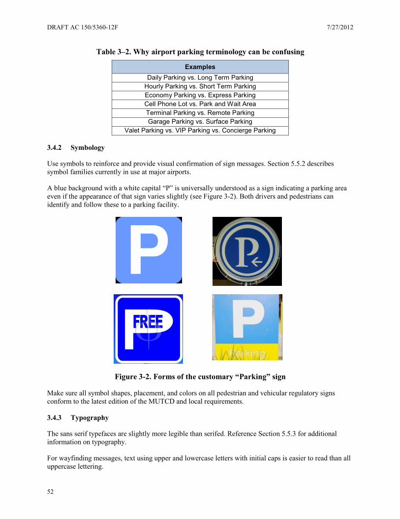
DRAFT AC 150/5360-12F 7/27/2012
52
Table 3–2. Why airport parking terminology can be confusing
Examples Daily Parking vs. Long Term Parking
Hourly Parking vs. Short Term Parking Economy Parking vs. Express Parking Cell Phone Lot vs. Park and Wait Area Terminal Parking vs. Remote Parking Garage Parking vs. Surface Parking
Valet Parking vs. VIP Parking vs. Concierge Parking
3.4.2 Symbology
Use symbols to reinforce and provide visual confirmation of sign messages. Section 5.5.2 describes symbol families currently in use at major airports.
A blue background with a white capital “P” is universally understood as a sign indicating a parking area even if the appearance of that sign varies slightly (see Figure 3-2). Both drivers and pedestrians can identify and follow these to a parking facility.
Figure 3-2. Forms of the customary “Parking” sign
Make sure all symbol shapes, placement, and colors on all pedestrian and vehicular regulatory signs conform to the latest edition of the MUTCD and local requirements.
3.4.3 Typography
The sans serif typefaces are slightly more legible than serifed. Reference Section 5.5.3 for additional information on typography.
For wayfinding messages, text using upper and lowercase letters with initial caps is easier to read than all uppercase lettering.
7/27/2012 DRAFT AC 150/5360-12F
53
3.4.4 Arrows
Make sure arrows you place on sign faces conform to a uniform standard. Use the following guidelines to decide how to place arrows:
General Arrow Placement:
• Arrows should never point into text. • Locate left-facing arrows toward the left side of signs • Locate right-facing arrows toward the right side of signs • Typically locate forward-facing and/or downward-facing arrows close to the flow of traffic. Refer
to previous discussion on the direction arrows should face for vehicle traffic versus pedestrian traffic.
General Text Alignment with Arrows:
• Left-facing arrows require left justified text • Right-facing arrows require right justified text • Forward-facing and/or downward-facing arrows require text to be justified closest to the flow of
traffic (e.g., if forward traffic is hugging the right side of a corridor, the arrow should be on the right side of the face with the text justified right, and vice versa.
Reference Section 5.5.4 for additional information on arrows.
3.4.5 Color
In order to maintain a visually unified system of signs airport-wide, apply color consistently on every element of all signing. As a starting point, use the MUTCD for color guidance and base final selection on what colors create the best contrast for text and background colors. Select colors people can read well in all lighting conditions.
3.5 Sign locations, structures, materials and safety
3.5.1 Sign locations
With the exception of roadway and terminal signing, more guidance is available for signing in parking garages than for other areas at airports. Guidance in such documents includes placement of signs, types of signs, signs for pedestrians versus vehicles, and informational needs for variation locations within the parking facility (Parking Structure Signing and Graphics20, The Dimensions of Parking21). Because every parking facility has a unique location, architecture, configuration, and geometry, it is difficult to prepare generic parking signing plans and recommendations.
3.5.2 Illumination options
Because the ambient light levels along roadways in most major airports can vary (from terminal buildings, roadways, and landscaping) it may be necessary to use external or internal illumination to provide adequate nighttime visibility for parking signs so they compete equally. At smaller airports or on the outlying areas of larger airports, with lower ambient light levels, high quality retroreflective materials may provide adequate visibilities. Perform nighttime testing on-site to make these determinations.
DRAFT AC 150/5360-12F 7/27/2012
54
Illumination options for signs include:
• Retro-reflection • External illumination (ambient light) • Internal illumination
3.5.3 Sign structures
The following lists the types of general sign mounting frequently found in parking facilities:
• Overhead suspended. Signs suspended from the ceiling using a cable of break-away fastening system. Check wind load requirements.
• Soffit mount. Signs located on an architectural soffit or wall, and mounted with the back of the sign to the soffit or wall using a mechanical fastening system.
• Ceiling mount. Signs located flush to the ceiling and mounted with the top of the sign to the ceiling using a mechanical fastening system.
• Flag mount. Signs mounted perpendicular to the attachment surface, usually on a wall and/or soffit, and attached using a mechanical fastening system.
• Post mount. Signs mounted directionally to a ground-mounted single or double post structure using a mechanical fastening system.
• Wall mount. Signs mounted with the back of the sign to the wall using a mechanical fastening system.
• Freestanding. Signs with their bases mounted directly to the ground/finished floor using a mechanical fastening system.
• Light pole mount. Signs mounted directly on the existing light pole structure. • Overhead roadway. Signs mounted directly above the lance of traffic to a ground-mounted
structure using a mechanical fastening system.
3.5.4 Pedestrian safety considerations
Specific research to analyze pedestrian and vehicle interactions within parking areas at airports has not been compiled, but research has been conducted to analyze and make safety recommendations for pedestrians at locations with high volumes of vehicles and/or pedestrians at other locations (Improving Pedestrian Safety at Unsignalized Crossings22). Once an engineering study is complete, engineers and planners can determine recommended treatments for safety improvements. These treatments fall into one of the four categories described in Table 3–3.
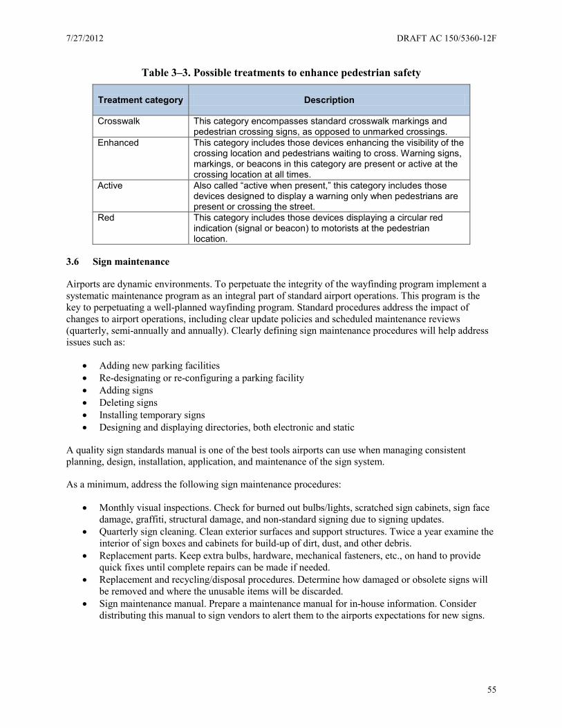
7/27/2012 DRAFT AC 150/5360-12F
55
Table 3–3. Possible treatments to enhance pedestrian safety
Treatment category Description
Crosswalk This category encompasses standard crosswalk markings and pedestrian crossing signs, as opposed to unmarked crossings.
Enhanced This category includes those devices enhancing the visibility of the crossing location and pedestrians waiting to cross. Warning signs, markings, or beacons in this category are present or active at the crossing location at all times.
Active Also called “active when present,” this category includes those devices designed to display a warning only when pedestrians are present or crossing the street.
Red This category includes those devices displaying a circular red indication (signal or beacon) to motorists at the pedestrian location.
3.6 Sign maintenance
Airports are dynamic environments. To perpetuate the integrity of the wayfinding program implement a systematic maintenance program as an integral part of standard airport operations. This program is the key to perpetuating a well-planned wayfinding program. Standard procedures address the impact of changes to airport operations, including clear update policies and scheduled maintenance reviews (quarterly, semi-annually and annually). Clearly defining sign maintenance procedures will help address issues such as:
• Adding new parking facilities • Re-designating or re-configuring a parking facility • Adding signs • Deleting signs • Installing temporary signs • Designing and displaying directories, both electronic and static
A quality sign standards manual is one of the best tools airports can use when managing consistent planning, design, installation, application, and maintenance of the sign system.
As a minimum, address the following sign maintenance procedures:
• Monthly visual inspections. Check for burned out bulbs/lights, scratched sign cabinets, sign face damage, graffiti, structural damage, and non-standard signing due to signing updates.
• Quarterly sign cleaning. Clean exterior surfaces and support structures. Twice a year examine the interior of sign boxes and cabinets for build-up of dirt, dust, and other debris.
• Replacement parts. Keep extra bulbs, hardware, mechanical fasteners, etc., on hand to provide quick fixes until complete repairs can be made if needed.
• Replacement and recycling/disposal procedures. Determine how damaged or obsolete signs will be removed and where the unusable items will be discarded.
• Sign maintenance manual. Prepare a maintenance manual for in-house information. Consider distributing this manual to sign vendors to alert them to the airports expectations for new signs.
DRAFT AC 150/5360-12F 7/27/2012
56
3.7 Accessibility
Airports are among the most difficult wayfinding environments for people with disabilities due to the multiple layers of complexity. Use the following approaches to make sure the environment maintains a high standard of accessibility:
• Develop an accessibility plan and audit. It is important to conduct a separate audit focusing on accessibility issues.
• Have clear ongoing accessibility guidelines. These guidelines will serve as both instruction and training for airport employees and guidance for system maintenance and replacement after the project is complete.
• Develop an in-house expertise. Large airports should have one person responsible for managing accessibility issues while small and medium size airports should have specific departmental responsibilities for accessibility.
• Develop a resources list. This list of designers, code officials, organizations, and internal stakeholders can provide guidance on key issues and conflicts.
3.7.1 Audit of elements
On an airport wayfinding project it is important to develop an audit of elements that must be followed to make the facility accessible. The audit consists of two parts: Strategy and Documentation.
3.7.1.1 Accessibility audit strategies
All accessibility strategies should consist of the following parts:
Managing compliance. International, National and state codes:
• Utilize the International Building Code (IBC) for projects in the United States. This will correspond with the current ADA. Check with the specific community planning or building department in your area to find out which codes apply for your project.
• List the top ADA national standards being followed at the state level regarding font, placement, and color
• List ADA issues specific to the state differing from national standards. • List the provisions in the Air Carriers Access Act.
Managing legibility. Develop a legibility plan consisting of the following elements:
• Font height based on distance in the facility • Color contrast and lighting contrast requirements • An approach to sign clutter • Symbol height based on distance and number of symbols being used
Managing the experience. Develop a narrative of the wayfinding experience:
• Write an accessibility narrative starting at the curb, and progressing to the gate describing the specific issues and recommendations for each area in the wayfinding process.
• Develop a series of recommendations based on the needs of the sensory impaired and mobility impaired.
7/27/2012 DRAFT AC 150/5360-12F
57
Specify methodologies and technologies. Materials specifications:
• Name the specific modular system (if one is used) and accessibility issues associated with that system.
• Specify materials, the material approach, vendors/manufacturers (if necessary), and paint or additional materials being applied.
• Directories and maps • Human assistance • Talking signs • Tactile floor surfaces
3.7.1.2 Accessibility documentation strategies
All accessibility documents for tactile signs for the visually impaired should consist of the following parts.
• Sign Placement: o Distance of the sign from doors and entrances o Height of perpendicular wall signs and overhead signs from the floor
• Sign dimensions: o Separation of fonts from Braille o Separation of font and Braille from the edge of the sign o Distance of the top and bottom of the font from floor
• Fonts: o Style o Height o Kerning (the process of adjusting the spacing between characters in a proportional font.)
• Specify Braille and distance of the Braille from the floor
• Sign substrate and base material: o Ensure all screws are flush if close to raised type o Show edging or rounding of materials o Show material and substrate thickness
• Paint specification: o Specify foreground and background color of materials o Specify matte finishing
Reference Section 5.8 for additional information.

DRAFT AC 150/5360-12F 7/27/2012
58
This page intentionally left blank

7/27/2012 DRAFT AC 150/5360-12F
59
Chapter 4. Curbside and Ground Transportation
Although signing cannot overcome physical limitations and geometric difficulties, signing at and along the terminal curbside can boost the efficiency and safety of the space. The terminal curbside and ground transportation areas can be some of the most diverse and complex areas at an airport. Airports need to examine identification, regulatory, and information signing as a whole and consider the philosophy that less signing may be more useful to patrons at the curbside where so much activity is already taking place.
This chapter describes signing suggestions for the curbside and ground transportation areas while maintaining an overall design cohesion across the entire airport. The signing discussed is all exterior directions, identification, and informational signs for public use at the following locations:
• Curbside (departures and arrivals) • Ground transportation curbsides
4.1 Planning for curbside signing
A comprehensive signing program for terminal curbside areas begins the moment a person approaches the terminal and continues past the terminal area. The primary objective of the curbside and ground transportation sign system is to direct the flow of vehicles and pedestrian traffic to and from the curbsides. Table 4–1 presents a sample checklist to consider when planning curbside and ground transportation signing.
Table 4–1. Curbside signage checklist sample
Area Items Departures Drop-off / Check-In (Vehicular)
Terminal identification Distinction of commercial lanes for public traffic and lanes for ground transportation traffic Identification of “drop-off” lanes and “through traffic” lanes Airline identification No stopping/standing areas Re-circulating directions to parking, other terminals, and airport exit Traffic control
Departures Drop-off/Check-In (Pedestrian)
Terminal verification Airline identification Door number/identification Informational signs No smoking Security requirements Emergency call boxes/telephones Crosswalks
Arrivals Pick-up (Vehicular)
Terminal identification Distinction of commercial lanes for public traffic and lanes for ground transportation traffic Identification of “pick-up” lanes and “through traffic” lanes Accessible passenger loading zones Exit door/zone identification No stopping/standing areas Re-circulating directions to parking, other terminals, and airport exit Traffic control
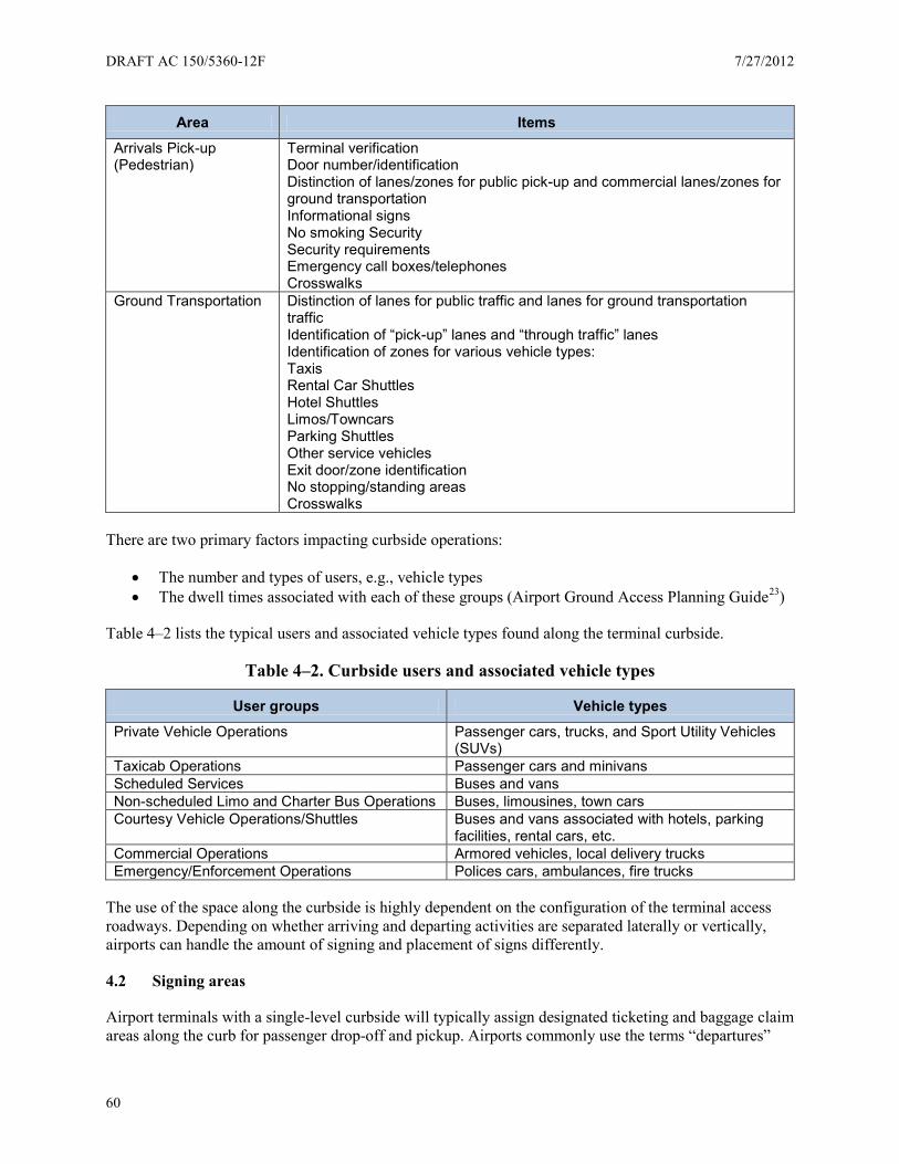
DRAFT AC 150/5360-12F 7/27/2012
60
Area Items
Arrivals Pick-up (Pedestrian)
Terminal verification Door number/identification Distinction of lanes/zones for public pick-up and commercial lanes/zones for ground transportation Informational signs No smoking Security Security requirements Emergency call boxes/telephones Crosswalks
Ground Transportation Distinction of lanes for public traffic and lanes for ground transportation traffic Identification of “pick-up” lanes and “through traffic” lanes Identification of zones for various vehicle types: Taxis Rental Car Shuttles Hotel Shuttles Limos/Towncars Parking Shuttles Other service vehicles Exit door/zone identification No stopping/standing areas Crosswalks
There are two primary factors impacting curbside operations:
• The number and types of users, e.g., vehicle types • The dwell times associated with each of these groups (Airport Ground Access Planning Guide23)
Table 4–2 lists the typical users and associated vehicle types found along the terminal curbside.
Table 4–2. Curbside users and associated vehicle types
User groups Vehicle types
Private Vehicle Operations Passenger cars, trucks, and Sport Utility Vehicles (SUVs)
Taxicab Operations Passenger cars and minivans Scheduled Services Buses and vans Non-scheduled Limo and Charter Bus Operations Buses, limousines, town cars Courtesy Vehicle Operations/Shuttles Buses and vans associated with hotels, parking
facilities, rental cars, etc. Commercial Operations Armored vehicles, local delivery trucks Emergency/Enforcement Operations Polices cars, ambulances, fire trucks
The use of the space along the curbside is highly dependent on the configuration of the terminal access roadways. Depending on whether arriving and departing activities are separated laterally or vertically, airports can handle the amount of signing and placement of signs differently.
4.2 Signing areas
Airport terminals with a single-level curbside will typically assign designated ticketing and baggage claim areas along the curb for passenger drop-off and pickup. Airports commonly use the terms “departures”
7/27/2012 DRAFT AC 150/5360-12F
61
and “arrivals” to differentiate the primary functions along the curbside. In some instances, airports can use the terms “Passenger Drop-Off” and “Passenger Pick-Up” to designate the different functions but this is more common terminology at smaller airports with a single-level terminal. It is best to use the more universal terms “Arrivals” and “Departures.”
Terminology for other items is often influenced by operational decisions and physical factors. For example, airports can combine areas used by courtesy vehicles operations into a category called “Shuttles,” however, some airports may designate these areas as “Hotel Shuttles,” “Rental Car Shuttles,” and “Airport Shuttles.” Use the term “Shuttles” or “Ground Transportation” to guide patrons to the general area of ground transportation vehicles. Create more specific signing as patrons move closer and into the ground transportation area, for example, “Hotel Shuttles” and “Rental Car Shuttles.”
4.2.1 Departures
4.2.1.1 Terminal identification
At airports with larger facilities, the design of terminals and access roads plays a significant role planners need to consider to decide what signing is necessary. For departures, terminals and airlines are the most important bits of information. At airports with multiple terminals, airports often place the designation of the terminal on the building itself. Repeat the terminal designation along the curbside to reassure drivers they are at the proper location. Regardless of the situation, having appropriate roadway signing with re-enforcing curbside signing helps direct users to the appropriate areas.
4.2.1.2 Airline identification
For airports with multiple airlines across multiple terminals, signs on the airport access roadways already provide information to help direct users to the right location for departures. As drivers approach the terminal curbside, provide additional signing to assist passengers to locate their air carrier. These signs are typically static and use the airline’s name to designate their location. Consider using the air carrier’s logo to visually re-enforce the message but display this secondary information only if the logo does not cause the airlines name to be truncated, reduce letter height, or condense letter spacing to accommodate the logo. Present the airline name on roadway signing on the airline identification sign. You may list airlines together if the ticketing desks inside the terminal are adjacent to one another; otherwise, list the airlines separately. Best practice is to define an airline naming convention to use throughout the airport complex and be consistent with policy.
Although airline identification at the curbside is mostly static, some airports and airlines have different types of technology to provide this information. Some airports use CMSs by the entrances to the terminal to indicate what airlines are located where. Both CMSs and static signs may be larger than typical directional signs to allow increased text size for visibility from a greater distance. MUTCD recommends a minimum text height of 8 inch letters for airline names. The minimum letter height permitted by the MUTCD is 6-inch tall text for post-mounted static signs in environments at or below 40 mph as shown in Table 2D-2 in the 2009 MUTCD1. For DMSs, section 2L.04 of the MUTCD1 specifies a 12-inch text height. See Section 5.5 for further details on signs and design elements.
Locate airline identity signs near or above the doors or entrances into buildings. Make sure the airline(s) listed above the entry correspond with the location of the check-in counters located nearest the door inside the building. Mount the identification signs perpendicular to the terminal building and the roadway. Place the airline names on both sides on the sign for several reasons:
DRAFT AC 150/5360-12F 7/27/2012
62
• A vehicle may pull up to the curb past the location of their airline and the disembarking passenger needs to be able to look back and identify their airline.
• Pedestrians may be walking to the terminal from a parking garage or the ground transportation drop-off areas requiring them to approach the terminal from a direction opposite to the direction of traffic.
4.2.1.3 Flight information
FIDs are not widely used along the curbside because airports do not want unnecessary congestion on the sidewalks caused by passengers with their baggage looking for their flight on a monitor. The use of FIDs is more common where there is space and time for people to examine flight information, e.g., terminals, parking facilities, rental car centers, transit stations, etc. In addition, the weather in some locales makes it problematic to operate and maintain certain technologies in an outdoor environment.
4.2.1.4 Curbside check-in
Curbside baggage check-in is a traditional service many airlines provide at airports. These areas are staffed with airline employees and typically only handle passengers with larger or multiple pieces of luggage passengers cannot carry onto the airplane. Curbside baggage check-in can be a simple counter or a larger, more permanent area with a greater amount of signing.
When airports provide baggage check-in along the departures curbside, there is a need to provide additional signing. This signing is typically regulatory and informational such as:
• Security advisories and instructions • Municipal and federal regulations • Airline baggage policies
4.2.2 Arrivals
Signing within the terminal is critical to directing arriving passengers to the appropriate area. Along the roadway and curbside, the signing should be clear enough to facilitate the desired operations. Some airports separate the “public” traffic from “other ground transportation” by placing the activities on opposite sides of the terminals. Some airports separate their curbsides laterally with island medians between public passenger pick-up and other ground transportation activities.
Make one consideration in regards to terminology at airport arrivals. Disembarking passengers are most likely being directed to “Baggage Claim” or “Ground Transportation.” Drivers are attempting to rendezvous with their party, and are commonly seeing signs indicating “Arrivals” or “Passenger Pick-Up.” This apparent disconnect in terminology can cause confusion and frustration as both parties attempt to describe the same location using different names based on their perspective. Airports must be consistent with their terminology. To address the issue of conflicting wording, label the doors on the arrivals in a logical sequence. This can be as simple as “Arrival Door 1” or more descriptive, such as “North Arrival Door 1.” For airports with multiple terminals or split curbsides, include a reference to the terminal plus the unique entrance designation. When a passenger is calling to coordinate with the driver picking them up, it makes it easy to provide a unique location to meet.
4.2.3 Ground transportation
Knowing where to locate each type of commercial vehicle usage and the amount of curbside space to allocate depends on two factors: (1) the volume of vehicles for each use, and (2) the dwell times required
7/27/2012 DRAFT AC 150/5360-12F
63
for the associated activities. Each airport is unique. Planners with direct airport operational experience should conduct a specific curb allocation study to determine commercial curbside allocations. This study is the best way to plan and implement operations and signing in a cohesive manner to reduce passenger confusion and improve efficiencies on the curbside.
Signing directing arriving passengers to the correct areas along the curbside begins inside the terminal. A typical list of services includes:
• Car rental shuttle • Parking lot shuttle • Hotel shuttle • Public transportation • Transit options • Taxi
If these services share a common curbside, use the umbrella term “ground transportation” to guide arriving passengers to the curbside. Where these services do not share a common curbside, break the information down as necessary on the directional signs inside the terminal to meet the specific needs of arriving passengers. Rental cars are a common example where passengers might go to the end of the terminal instead of the curbside.
4.2.4 Passengers arriving/departing the airport
Provide departing passengers with information directing them from the transit stop or station to the correct terminal and airline. Information aids for departing passengers approaching the airport should include the following:
• Sign(s) on or near the curbside visible from inside the transit vehicle indicating the disembarking point for the airport, or for specific terminals and airlines if transit vehicles make more than one stop at the airport. (Repeat the same information via an audio message for reinforcement and for ADA compliance.)
• Sign(s) and maps inside the transit vehicle to identify stops and airline information if the transit vehicles make more than one transit stop at the airport. (Repeat the same information via an audio message for reinforcement and for ADA compliance.)
• Directional signs to guide passengers from the transit stop to the correct terminal and airline check-in counter.
Provide deplaning passengers with information for reaching and using public transportation services available at the airport. Information aids should progress from the general (“Ground Transportation”) to the more specific (“Light rail/city bus/hotel shuttles”) at successive decision points through the terminal. A sample progression of information aids, beginning at the arrival gate might include:
• Sign(s) directing passengers from arrival gates and baggage claim areas toward ground transportation services.
• Information aids (wall-mounted signs, printed material, kiosks, or other format) to assist in planning the transit trip from the airport to the traveler’s final destination. Locate these signs at points in the terminal where passengers will make their decisions about ground transportation options. Passengers should be able to determine the following:
o Destinations reached from the airport using transit services o Routes (if more than one serves the airport) serving particular destinations
DRAFT AC 150/5360-12F 7/27/2012
64
o Schedules and departure times o Fares and purchasing options
• Sign(s) directing passengers to specific ground transportation services (local bus or rail system, hotel shuttles, taxis). If the transit service requires fare media purchased prior to arriving at the transit stop/station, directional signs should route passengers accordingly.
• Sign(s) directing passengers to the transit stop/station for the desired route, if there is more than one transit stop/station at the airport.
• Sign or display at transit stop/station indicating the route(s) served and departure times. • Sign or display on transit vehicle identifying the route.
4.2.5 External versus internal rail systems
Treat public transit services connected with the airport as one category of ground transportation service.
At airports with an internal transit system (for instance, a bus or train connecting terminals), signs and other information aids must clearly distinguish the internal transportation system located on the landside from ground transportation services leaving the airport. Signs should list more than the brand names and logos of the airport’s internal transportation system and the local public transit system. Guide signs should specify whether, for instance, the “Airport Connector” is an inter-terminal people mover versus a local bus or rail route leaving the airport. Find more discussion of transit means internal to an airport in Section 5.3.2.
4.2.6 Technology
Interactive trip planning systems and real-time information about transit services are among the technologies enhancing transit information services at airports.
Interactive transit information kiosks can provide an alternative to static transit schedule information and may also be part of a fare purchase system. Kiosks may be linked via the internet to the local transit information system, or may be a self-contained transit planning system.
Real-time bus or train arrival information can supplement or replace static signs showing bus or train schedules. Real-time arrival information at transit stops have been shown to make riders feel more confident, particularly at night, and improve riders’ overall perception of the quality of transit service provided (Airport Ground Access Planning Guide24). If the transit stop is a long distance from the terminal or from other airport services, provide signs with real-time arrival information for the transit system in the terminal well ahead of the transit stop.
4.2.7 Accessibility
Transit-related signs must conform to the same visibility and legibility requirements as other curbside or in-terminal signs and displays. Where possible, information aids for wayfinding, transit trip planning, and real-time bus and train arrivals should provide information both visually and aurally.
Information kiosks or computer stations should conform to the Federal Government’s Section 508 standards for accessibility.
4.3 Sign design elements
Although the MUTCD is a recognized standard and guide for roadway signing, airports can generally make their own decisions when it comes to signing along terminal curbsides. Some airports develop their
7/27/2012 DRAFT AC 150/5360-12F
65
own sign standards for their respective facilities for consistency, continuity, and identity. Many of the same design elements used inside the terminal can be applied on the curbside area (refer to Section 5.5).
Regulatory signs are typically designed to most closely resemble the guidance within the MUTCD than are other sign types along the curbside. This may be attributed to local code requirements, but most reasonable and prudent people can easily recognize and quickly interpret their meaning. Airports can modify the placement and mounting of regulatory signs to meet the physical restrictions of a curbside area such as awnings, canopies, columns, and other structural and/or architectural elements.
4.3.1 Terminology
Airports come in many sizes and various configurations. While one airport may have a single terminal on one level, another may have multiple terminals with two or three levels. These differences impact how airport managers designate how people access different areas of the airport. For smaller terminals on a single level, the terms “Ticketing” or “Passenger Check-In” may be sufficient to distinguish from “Baggage Claim” along the curbside. The terms “Arrivals” and “Departures” are more widely encountered at larger airports with a split curbside and are just as valid at smaller airports.
At airports with larger facilities, the terminals and access road design dictates signing. For departures, identifying terminals and airlines is most important. In North America, airports commonly use the terms “Arrivals” and “Departures” to differentiate the primary functions along the curbside. MUTCD recommends the terms “Arrivals” and “Departures,” however in some cases, airports use the terms “Passenger Drop-Off” and “Passenger Pick-Up” to designate these different functions.
Some airports combine terminology for areas influenced by operational decisions and factors, for example, areas used by courtesy vehicles operations, into a category called “Shuttles.” However, other airports break these areas into separate groups, for example “Hotel Shuttles,” “Rental Car Shuttles,” and “Airport Shuttles.” Use the term “Shuttles” or “Ground Transportation” to guide patrons to the general area of ground transportation vehicles, and as passengers approach or arrive at ground transportation areas, provide signs to call out more specific functions (e.g., “Hotel Shuttles” and “Rental Car Shuttles”).
4.3.2 Symbology
As commercial aviation allows people to travel virtually anywhere on the planet, there is an increasing need for airports to communicate with individuals from other nations, speaking different languages. Symbols can overcome the need to reproduce directions and information in multiple languages.
Use symbols to reinforce and provide visual confirmation of sign messages. Section 5.5.2 contains symbol families currently in use at major airports.
The United States Department of Transportation (USDOT) also compiled a reference of symbol signs considered internationally acceptable (USDOT Symbols and Signs25). As airport users see a standard set of symbols deployed across airports, people begin to identify them through repetition and eventually seek them out for assistance and guidance.
4.3.3 Typography
Studies show sans serif typefaces, because their letter shapes are simpler, are slightly more legible than serifed. On the departures level, the most important information patrons need to recognize is the terminal identification and the airline identifications. MUTCD recommends a minimum text height of 8 inches, if
DRAFT AC 150/5360-12F 7/27/2012
66
possible. This letter height may influence whether you can use a static sign or if the area has enough clearance for an internally illuminated sign box. Reference Section 5.5.3 for additional information.
4.3.4 Arrows
The placement of arrows on sign faces should conform to a uniform standard. Use the following suggestions for the placement of arrows:
General Arrow Placement:
• Never point arrows into text • Locate left-facing arrows toward the left side of signs • Locate right-facing arrows toward the right side of signs • Locate forward-facing and downward-facing arrows close to the flow of traffic. Refer to Section
3.3.1.2 for information explaining the direction arrows should face for pedestrian traffic.
General Text Alignment with Arrows:
• Left-facing arrows require left justified text • Right-facing arrows require right justified text • Forward-facing or downward-facing arrows require text to be justified closest to the flow of
traffic (e.g., if forward traffic is hugging the right side of a corridor, place the arrow on the right side of the face with the text justified right, and vice versa.)
Reference Section 5.5.4 for additional information on arrows.
4.3.5 Color
In order to maintain a visually unified system of signs airport-wide, apply color consistently on every element of all signing. Take care to avoid contradiction with standard colors for regulator signs. Reference the MUTCD for colors on regulatory signs. In other situations, make sure colors are distinct enough to reinforce the idea of different items.
Reference Section 5.5.5 for additional information on color.
4.4 Sign locations, structures, materials and safety
4.4.1 Sign locations
Because every terminal and associated curbside has a unique location, architecture, configuration, and geometry, it is difficult to prepare generic signing plans and recommendations. Assess viewer circulation patterns and natural lines of vision to determine the location of all signs. Locate signs prior to decision points to give people enough time to react to each sign message.
The best place for signs for vehicular traffic is perpendicular to the path of travel. Visually separate signs focused on pedestrian needs from the vehicular signs. Suspend signs for the benefit of pedestrians from canopies and awnings, or mount these signs from the terminal building itself. Place pedestrian signing in the location where only pedestrians will be circulating.
7/27/2012 DRAFT AC 150/5360-12F
67
4.4.1.1 Sign frequency and avoidance of sign clutter
Locate directional signing at decision points. Use these signs as conformational signs. In some cases, local ordinances dictate the frequency at which airports must place signs. Such signs may include “no parking” and “no loitering.”
Place identification signs only at or near the actual location of the identified place. Use signing primarily to direct traffic and pedestrians and identify areas along the curbside. Signing placed prior to decision points is necessary and signs identifying terminals and airlines are paramount. In addition, various laws and ordinances require certain regulatory signs. Airport sign managers should first lay out the placement of signs to accommodate these functions. Then sign managers can consider secondary signing. Managers should add secondary signing only if it does not deteriorate the purpose of the primary messages.
It is very tempting for airports to place – or permit others to place – advertisement along curbsides as a way to generate revenue. On the curbside, do not place signage not related to the curbside function. There is too much activity along the curbside. Keep distractions to drivers and pedestrians to a minimum. Place marketing and advertisement signage within the terminals, elevator lobbies, and other locations consistent with guidance in this AC.
4.4.2 Illumination options for night-time visibility
Because the ambient light levels along curbsides in most major airports can vary (from terminal buildings, roadways, and landscaping) external or internal illumination may be necessary to provide adequate nighttime visibility for curbside and ground transportation signs so they compete equally. At smaller airports or on the outlying areas of larger airports, with lower ambient light levels, high quality retroreflective materials may provide adequate visibilities. The only way to make these determinations is with nighttime testing on-site.
The lower level(s) of curbsides split vertically are typically darker in both day and nighttime conditions. To ensure adequate illumination of signing on lower level curbsides requires special consideration during the planning and design phases.
4.4.3 Structures and mounting
The following lists the types of general sign mounting frequently found along curbsides:
• Overhead suspended. Typically applicable to the lower level curbside conditions, these signs are suspended from the ceiling using a cable of break-away fastening system.
• Soffit mount. Signs located on an architectural soffit or wall, and mounted with the back of the sign to the soffit or wall using a mechanical fastening system.
• Ceiling mount. Typically applicable to the lower level curbside conditions, these signs are located flush to the ceiling and mounted with the top of the sign to the ceiling using a mechanical fastening system.
• Flag mount. Signs mounted perpendicular to the attachment surface, usually on a wall and/or column, and attached using a mechanical fastening system.
• Post mount. Signs mounted directionally to a ground-mounted single or double post structure using a mechanical fastening system.
• Wall mount. Signs mounted with the back of the sign to the wall using a mechanical fastening system.
• Freestanding. Signs having their bases mounted directly to the ground/finished floor using a mechanical fastening system.

DRAFT AC 150/5360-12F 7/27/2012
68
See Appendix C for information about graphic illustrations with recommended clearances for various sign types and locations.
4.4.4 Safety
Specific research to analyze pedestrian and vehicle interaction along terminal curbsides at airports has not been compiled, but research has been conducted to analyze and make safety recommendations for pedestrians at locations with high volumes of vehicles and pedestrians at other locations (Improving Pedestrian Safety at Unsignalized Crossings26). Airports can conduct and complete engineering studies to determine and recommend treatments for safety improvements. These treatments fall into one of the four categories described in Table 4–3.
Table 4–3. Possible treatments to enhance pedestrian safety
Treatment category Description
Crosswalk This category encompasses standard crosswalk markings and pedestrian crossing signs, as opposed to unmarked crossings.
Enhanced This category includes those devices enhancing the visibility of the crossing location and pedestrians waiting to cross. Warning signs, markings, or beacons in this category are present or active at the crossing location at all times.
Active Also called “active when present,” this category includes those devices designed to display a warning only when pedestrians are present or crossing the street.
Red This category includes those devices displaying a circular red indication (signal or beacon) to motorists at the pedestrian location.
4.5 Sign maintenance
Airports are dynamic environments. In order to perpetuate the integrity of the wayfinding program airports must implement a systematic maintenance program as an integral part of standard airport operations.
A strategic maintenance program is key for perpetuating a well-planned wayfinding program. Standard procedures should be in place to address the impact of changes to airport operations, including clear update policies and scheduled maintenance reviews (quarterly, semi-annually and annually). Clearly defined procedures will help address issues such as:
• Addition of a new terminal • Re-designation or re-configuring a terminal • Adding signs • Deleting signs • Temporary signs
Developing a quality sign standards manual is one of the best tools in managing consistent planning, design, installation, application and maintenance of the sign system.
As a minimum, sign maintenance procedures should address the following items:
• Monthly visual inspections. Check for burned out bulbs and lights, scratched sign cabinets, sign face damage, graffiti, structural damage, and non-standard signing due to signing updates.
7/27/2012 DRAFT AC 150/5360-12F
69
• Quarterly sign cleaning. Clean exterior surfaces and support structures. Twice a year examine the interior of sign boxes and cabinets for build-up of dirt, dust, and other debris.
• Replacement parts. Keep extra bulbs, hardware, mechanical fasteners, etc., on hand to provide quick fixes until complete repairs can be made if needed.
• Replacement and recycling/disposal procedures. Determine how to remove damaged or obsolete signs and where to discard the unusable items.
Prepare a sign maintenance manual for in-house information. Airports can distribute this manual to alert sign vendors about the airport’s expectations for new signs.
4.6 Accessibility
The complexity of airports makes them among the most difficult wayfinding environments for people with disabilities. Airports use the following approaches to make sure the environment remains at a high standard of accessibility:
• Develop an accessibility plan and audit: During the wayfinding design and development process it is important to have a separate audit focusing on accessibility issues.
• Have clear ongoing accessibility guidelines: After a project is complete these guidelines will serve as both instruction and training for airport employees and guidance for system maintenance and replacement.
• Develop an in-house expertise: Large airports should have one person responsible for managing accessibility issues while small and medium size airports should have specific departmental responsibilities for accessibility.
• Develop a resources list: This list of designers, code officials, organizations, and internal stakeholders can provide guidance on key issues and conflicts.
4.6.1 Accessibility audit
On an airport wayfinding project it is important to develop an audit of elements that must be followed to make the facility accessible. The audit consists of two parts: Strategy and Documentation.
4.6.1.1 Strategy
All accessibility strategies should consist of the following parts.
Managing compliance. International, National and state codes:
• Utilize the IBC for projects in the United States. This will correspond with the current ADA. Check with the specific community planning or building department in your area to find out which codes apply to your project.
• List the top ADA national standards being followed at the state level regarding font, placement, and color
• List ADA issues specific to the state differing from national standards. • List the provisions in the Air Carriers Access Act.
Managing legibility. Develop a legibility plan consisting of the following elements:
• Font height based on distance in the facility • Color contrast and lighting contrast requirements

DRAFT AC 150/5360-12F 7/27/2012
70
• An approach to sign clutter • Symbol height based on distance and number of symbols being used • An approach for multiple languages
Managing the experience. Develop a narrative of the wayfinding experience:
• Write an accessibility narrative starting at the curb, and progressing to the gate describing the specific issues and recommendations for each area in the wayfinding process.
• Develop a series of recommendations based on the needs of people with sensory impairment and those with mobility impairment.
Specify methodologies and technologies. Materials specifications:
• Name the specific modular system (if one is used) and accessibility issues associated with that system.
• Specify materials, the material approach, vendors/manufacturers (if necessary), and paint or additional materials being applied.
• Directories and maps • Human assistance • Talking signs • Tactile floor surfaces
4.6.1.2 Documentation
All accessibility documents for tactile signs for people with visual impairment should consist of the following parts:
• Sign Placement o Distance of the sign from doors and entrances o Height of perpendicular wall signs and overhead signs from the floor
• Sign dimensions o Separation of fonts from Braille o Separation of font and Braille from the edge of the sign o Distance of the top and bottom of the font from floor
• Fonts o Style o Height o Kerning
• Specify Braille and distance of the Braille from the floor • Sign substrate and base material
o Ensure all screws are flush if close to raised type o Show edging or rounding of materials o Show material and substrate thickness
• Paint specification o Specify foreground and background color of materials o Specify matte finishing

7/27/2012 DRAFT AC 150/5360-12F
71
Chapter 5. Terminal
5.1 Wayfinding philosophy and principles
The goal of an airport’s wayfinding system is simple - to improve the passenger experience. Begin by developing a clear wayfinding strategy (See Section 1.6). An airport creating a positive passenger experience creates a positive impression of their airport.
A key principle of any wayfinding strategy is to value it. It is critical to think of your airport’s wayfinding system as a building system (e.g., the HVAC system, etc.). All of these systems require maintenance and service in order for your airport to operate efficiently. Treat your wayfinding strategy no differently. This is a very important concept to make part of every airport’s culture. In order for the airport’s wayfinding to be successful treat it as an integral part of the airport’s building systems.
To develop a wayfinding strategy, apply these key principle concepts by asking:
• Continuity. Is your wayfinding system the one common thread that provides continuity in a diverse architectural environment as your passengers navigate from one space to another?
• Connectivity. Does your wayfinding system deliver the right message at the right location at the right time?
• Consistency. Think of wayfinding as a giant exercise in packaging information clearly communicated to the user. Does your wayfinding system communicate information in a consistent manner throughout the passenger journey? Consistency becomes visible to passengers through the following design elements:
o Terminology and message hierarchy o Visibility and legibility o Typography and Symbology o Format and color o Placement
Do not expect the wayfinding inside a terminal to overcome architectural wayfinding barriers. Evaluate every architectural project from a passenger’s wayfinding perspective and seize opportunities to correct architectural problems whenever possible.
Wayfinding information must compete with visual images such as regulatory, advertising, retail concessions, etc. Airports can rarely implement this information as a system. Develop information zones based on the airport’s architecture to avoid such visual competition.
To determine how successful an individual airport terminal building is in terms of wayfinding efficiency, consider measuring the LOS achieved for passenger wayfinding experience. Various organizations conduct annual passenger satisfaction surveys including measures for wayfinding, or conduct you own survey.
5.1.1 Wayfinding analysis and checklist
The simplest and most straight forward way to analyze a wayfinding system is to physically conduct a field survey of existing conditions by walking the terminal with floor plans and camera in hand. Mark each location on the plan and key them with the photo for easy reference later.
DRAFT AC 150/5360-12F 7/27/2012
72
5.1.1.1 Information database
Keeping track of this information can quickly become an overwhelming task. Regardless of the airport size, taking time to create (and maintain) a computerized database will yield a positive return on the time you invest. Plan early and define what information to store in the airport’s database.
Each of the items on the checklist below centers on establishing and maintaining a consistent sign system. There are many considerations going into each topic discussed in other sections. Here is a quick checklist of things to look for:
Terminology – check for consistent wording in all forms of communication.
• Signs • Directory maps • Handout maps • Website maps • Various forms of verbal communication; e.g., provided at Information desks
An example of inconsistent terminology:
A field survey of just the signs at one airport found six different messages referring to the same destination:
• Train • Transportation • Train Central City • Train to Central City • Train to Central City/Terminal A-E • Terminals A-E/Train to Central City
For airports having both mass transit trains as well as an airport train this issue can become even more complex.
To resolve the inconsistency analyze the message based on what you are trying to communicate:
• Step 1: Understand the reason for the use of each one of the six different messages. • Step 2: Separate the keywords from the unnecessary or extraneous words. • Step 3: Look for any other words not currently in use helping clarify the message. • Step 4: Cull the list into words that are accurate and clearly communicate the information
necessary for a passenger to make the correct choice. • Step 5: Test the best choice(s) for comprehension. The goal is to use the fewest words possible
while clearly communicating the message.
Hierarchy – check for consistent order and placement of messages. Establishing primary messaging versus secondary messaging will help with this task. While this list will vary from one airport to another it is helpful in understanding the concept.
Typical primary messages in a terminal are:
• Ticketing/Check-in
7/27/2012 DRAFT AC 150/5360-12F
73
• Baggage Claim • Gates • Ground Transportation
Typical secondary messages in a terminal are:
• Restrooms • Concessions • Elevators • Information (Desks or Directories) • Parking
Hierarchy also includes prioritizing what information to list at a given decision point in the route. What is the minimum amount of information necessary to move a passenger to the next decision point? The goal is to avoid information overload. (Reference Section 5.5.1.1 for additional details.)
Location. Locate the wayfinding signs consistently in the right place with the right message. It is important to think about where passengers are most likely to look for the information (e.g., they will be looking for baggage claim information as soon as they deplane), and to consider decision points. Remember that placement affects many things including visibility, legibility, arrows, etc., but ultimately it impacts a passenger making the correct decision with confidence.
Visibility. Can you see the sign from the location passengers are most likely to look for it? Consistent sign placement is important, along with lighting. Check the lighting in both day and night conditions. Another factor impacting visibility is designating information zones so advertising and retail signs do not encroach on the wayfinding information. While advertising and concessions generate revenue, passengers will not feel comfortable taking time to shop or read the ads if they are lost or confused and worried about missing their flight.
Viewing angles are also an important part of visibility. Avoid exceeding a 10-degree angle from the natural line of vision, particularly spaces with high ceilings or transition areas involving changing levels. Check for basic conformance and note any locations which seem problematic.
Legibility. Many factors impact sign legibility. For the purpose of this checklist, MUTCD recommends 40 feet of viewing distance for every inch of letter height for the vast majority of pedestrian conditions. A 3-inch tall letter is legible from 120 feet (Reference Section 2.4.3 for additional information about legibility).
Format (arrows, typography and symbology). Consistent application of the arrow, symbol, and message helps instill passenger confidence in wayfinding. Base these applications on a sign grid standard developed to insure proper legibility for each component, arrow, symbol and message. Consistently following a sign grid with pre-determined sizes for arrows, symbols and messages will also provide major dividends when making future changes.
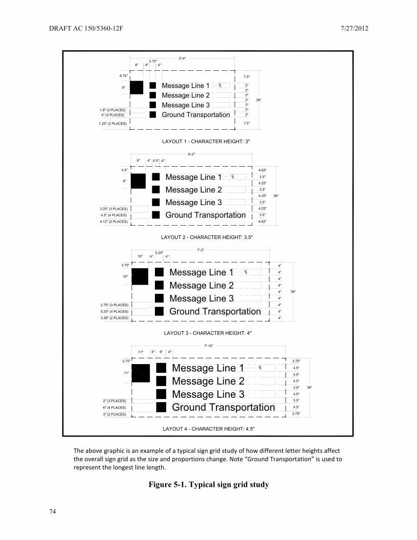
DRAFT AC 150/5360-12F 7/27/2012
74
The above graphic is an example of a typical sign grid study of how different letter heights affect the overall sign grid as the size and proportions change. Note “Ground Transportation” is used to represent the longest line length.
Figure 5-1. Typical sign grid study
LAYOUT 4 - CHARACTER HEIGHT: 4.5"
Ground TransportationMessage Line 3Message Line 2Message Line 1 CL
2" (3 PLACES)
11"
3.5"
4.5"
4.5"
3.5"
4.5"
3.5"
4.5"
4"
11"
4" 6"
3.75"
3.75"
3" (2 PLACES)
6" (4 PLACES)
3.75"
Ground TransportationMessage Line 3Message Line 2Message Line 1 CL
1.8" (3 PLACES)
4"
8"
7.25" (2 PLACES)
4" (4 PLACES)
6.75"
Ground TransportationMessage Line 3Message Line 2Message Line 1
4"
4"
4"
4"
4"
4"
4"
4"
4"
CL
10"
3.75"
4"5.25"
4"
10"
3.38" (2 PLACES)
5.25" (4 PLACES)
2.75" (3 PLACES)
Ground TransportationMessage Line 3Message Line 2Message Line 1
4.62"
3.5"
4.25"
3.5"
4.25"
3.5"
4.25"
3.5"
4.62"
CL
9" 4.5"4" 4"
4.5" (4 PLACES)
4.12" (2 PLACES)
3.25" (3 PLACES)
4.5"
9"
4"3.75"
8"
7.5"
3"
3"
3"
3"
3"
3"
3"
7.5"
7'-10"
36"
LAYOUT 3 - CHARACTER HEIGHT: 4"
7'-2"
36"
LAYOUT 2 - CHARACTER HEIGHT: 3.5"
36"
6'-2"
LAYOUT 1 - CHARACTER HEIGHT: 3"
36"
5'-4"
7/27/2012 DRAFT AC 150/5360-12F
75
Frequency. What is the right number of signs? Philosophically, the fewer signs the better because it helps simplify the wayfinding, reduce visual clutter, and it also helps reduce the cost of the sign system. However, a complex architectural space may require additional signs to compensate for the lack of a building’s intuitive wayfinding design.
To account for other users; the following reasons can lead to adding signs:
• In the concourse, not just those walking down it • Coming out of restrooms • Coming out of a concession area • And especially those arriving on a flight needing confirmation of which way to go
The goal is to be as consistent as possible and still use the same frequency because people expect it, especially for long corridors passing through visually busy graphic environments. If there are no key decision points along a given route, add signs to reassure the passengers they are still on the correct path. Consider placing these reassurance signs every 150 to 250 feet (Design That Cares: Planning Health Facilities for Patients and Visitors27).
Mounting height. The airport architecture ultimately dictates the mounting height of the overhead directional signs so it is important to survey the varying conditions in order to determine a consistent mounting height for these sign types as well as identify any exceptions such low ceilings.
Color. If the wayfinding system incorporates color as a wayfinding device then this issue becomes critical to maintaining the integrity of the system. When applied as part of a comprehensive wayfinding strategy color coding can be an effective tool to speed up visual search and help passengers locate the specific information they need on the sign. You lose any advantage to using color as a tool if you overuse it. Take care to limit the number of colors you use and make colors visibly distinct to avoid overwhelming your messaging system. Reference Section 5.5.5 on color for additional details.
Directory maps. Orient every map in a ‘heads up’ position to match the position of the viewer.
Continuity and connectivity. Create an effective wayfinding strategy to establish clear routes throughout the terminal building. Depending on the size and complexity of an airport analyzing the continuity and connectivity of the wayfinding can be a very involved process requiring time, effort and a certain level of wayfinding expertise. Reference Section 2.3 for details of the key concepts.
Evaluation. There are a number of methods to use when evaluating a wayfinding system. Four approaches to consider are:
• An ergonomic assessment in which signs representative of the entire signing system are evaluated with respect to conspicuity, legibility, information load, comprehension, and placement.
• A survey of airport staff to determine most FAQs. • A task analysis involving representative unfamiliar passengers who describe their experience as
they attempt to navigate along the more important wayfinding chains. • A survey of select passengers unfamiliar with the airport.
Ergonomic sign assessment. The ergonomic assessment establishes the major wayfinding chains and then evaluates signs along the route with respect to the qualities noted. The wayfinding chain concept is introduced in Section 1.3 and described in more detail in Section 1.6.
DRAFT AC 150/5360-12F 7/27/2012
76
FAQs survey. When passengers experience wayfinding difficulties they are likely to ask airport staff for help. Interviewing staff can be a way to identify the most common wayfinding questions in each area of the airport. FAQs will assist in identifying signing problems. Any FAQ survey must account for time of day and the actual date.
Task analysis. Establish major wayfinding chains. Potential passengers, would are unfamiliar with the airport, would be recruited and asked to travel to various destinations within the airport accompanied by a researcher. Use a verbal protocol whereby each participant voices their thoughts as they carry out the wayfinding tasks, giving the researcher insight into where and why wayfinding problems occur.
Survey of unfamiliar passengers. Recruit unfamiliar passengers willing to fill in a survey in the parking garage before they enter the terminal. Collect the survey at the gate. The questions should focus on where along the journey the participant was not confident about their path or where they got lost, where they looked for and could not find specific signs and where they had to ask someone for directions.
Recommendations. The above wayfinding evaluations will determine what corrective action(s) may be necessary. Prioritize the list of corrective actions in one of several ways:
• Cost. Least expensive to most expensive • Time. Short term solutions versus long term solutions • Benefit. What changes will yield the biggest improvement to minor improvement
Resources are finite, so by using each of the above criteria an airport should be able to develop an action plan providing the best wayfinding value for the investment.
Testing. Establishing a test area can be a beneficial process to make any final modifications and confirm the proposed corrective actions. Virtually every airport will have different wayfinding issues so consider these suggestions:
• Select a test area yielding a valid study. • Establish a baseline by surveying the existing wayfinding system in the test area using one of the
methods discussed above. • Develop a plan for the proposed changes and implement. • Administer the same survey. • Evaluate the results and make recommendations.
5.1.2 Architectural complexity
The number one factor impacting the passenger wayfinding experience is the role of the architectural configuration.
Research and studies show an increase in plan complexity and a decrease in wayfinding performance. Despite the use of signs, the plan configuration exerts significant influence on wayfinding performance, because participants with access to signing in the most complex settings still made more wrong turns than those in the simplest settings with no signs. Signs do not always compensate for wayfinding problems due to the complexity of the floor plan. However, this is the expectation of a sign system in a complex airport environment.
Airport planners must understand the importance of wayfinding as part of the design process to create more intuitive architectural spaces where passengers know things instinctively. Conversely, wayfinding systems must account for complex architectural spaces in the planning and design process.
7/27/2012 DRAFT AC 150/5360-12F
77
5.1.2.1 Linear wayfinding
Designing open spaces providing visual access to the destination creates the ideal linear wayfinding environment, and will typically decrease people’s dependence on signs. Creating visual access can reduce the number of signs needed. Linear wayfinding describes the process of connecting point A to point B, origination to destination.
5.1.2.2 Non-linear wayfinding
When looking for solutions to complex wayfinding issues the first challenge is how to physically and visually understand the problem. The answer is to start globally. An airport with multiple levels, buildings, etc., needs to be viewed in a manner that ties them all together. Using diagrams like the exploded axonometric view provides an excellent method for understanding and evaluating passenger flow. Use this type of planning diagram to evaluate linear wayfinding scenarios as well as indentify and investigate an airport’s non-linear wayfinding scenarios difficult to track on a single floor plan.
5.2 Considering terminal users in design (human factors)
5.2.1 Terminal users categories
People travel through airport terminal buildings for a number of different reasons. All of these airport users fall into specific categories including departing passengers, arriving passengers, passengers with a connecting flight, and non-travelling visitors who are picking up or dropping off passengers. These airport users include familiar and unfamiliar passengers and visitors. In addition, users may have physical, visual, cognitive disabilities making the wayfinding task more challenging. Unfamiliar passengers may have additional stress from fatigue or jetlag. The wayfinding system must consider and accommodate all terminal visitors and passengers.
The identification and support of non-linear wayfinding scenarios is difficult. However, the successful resolution of the non-linear scenarios can yield some of the biggest improvements to the passenger wayfinding experience.
5.2.2 Terminal user tasks and information requirements
Separate passengers into three basic types; departing, arriving and connecting. Within these three types, classify the passenger as a domestic or international passenger. Accounting for the information requirements for all of the various passenger combinations is a tedious but important step in developing a well-planned wayfinding system.
5.2.2.1 Departing passengers
A typical wayfinding task for the departing passenger includes the following wayfinding chain elements: entrance, ticketing counter, security checkpoint and airline gate. In addition to these, take into consideration secondary destinations. These include elevators, washrooms, telephones, frequent traveler lounges, stores, Internet stations, currency exchange counters and information kiosks. Understanding the difference between these primary and secondary destinations will help airports establish a clear message hierarchy.
Many airport terminals service a large array of airlines. The scale of the departures hall and the large number of available airline ticketing counters can easily overwhelm unfamiliar passengers entering the
DRAFT AC 150/5360-12F 7/27/2012
78
terminal. Organize airline ticketing counters systematically and use signs, directories, or maps near entrances to direct passengers to ticketing counters not directly in view.
Large airports have a number of gates, sometimes spanning several buildings. Decision points that require a change in level have a greater negative impact on wayfinding compared to same-level decision points. Guiding passengers through a complex path between origin and destination requires more wayfinding tools are such as signs, maps, and directories.
5.2.2.2 Arriving passengers
A typical wayfinding task for an international arriving passenger includes the following primary wayfinding chain elements: passport control, customs, baggage claim area, baggage carousel, exit to parking, car rental, ground transportation, or passenger pickup. Domestic passengers experience similar wayfinding tasks minus the passport control and customs. Other secondary wayfinding destinations may include elevators, washrooms, telephones, and information counters. In large airports arriving passengers may have to walk a long distance from their gate in order to reach the baggage claim area. In these cases signs should be placed every 150-250 feet along the path to remind passengers they are heading in the right direction. Carousels in the baggage claim area should be well-marked with flight number and departure city. In large terminals with several carousels, place a directory at the entrance to the baggage claim area to identify flight information for each carousel. To aid passengers as they wait for their luggage, place an information desk for ground transportation adjacent to the baggage claim area.
5.2.2.3 Connecting passengers
Many passengers arrive at an airport terminal for a layover before taking a connecting flight to their destination. For international passengers, a typical wayfinding task may include primary destinations such as: arrival gate, customs, baggage claim, security checkpoint, and departure gate. Domestic passengers experience similar wayfinding tasks minus customs. For most connections baggage automatically transfers to the connecting flight. However, connecting international flights may require passengers to claim their bags before making their connection. Maps are very useful in orienting passengers within a terminal, especially when they need to walk long distances, change levels, or change buildings or terminals.
5.2.3 Meeting point for non-travelling visitors
Arriving passengers are frequently meeting friends or relatives in the terminal. During peak hours these airport visitors can create congestion if they get lost within the terminal. Airports can have multiple exits so clearly mark the meeter/greeter area for arriving passengers on signs and directory maps.
5.2.4 Visibility Index (VI)
In order to assess the need for signs, designers should consider conducting a line of sight analysis. The simplest navigation task occurs when the destination is visible from the origin. A sight line analysis is an important tool to apply to determine the visibility of the terminal as a whole or of its subsystems and components. This analysis allows for the evaluation of changes in layout or signage in terms of their visibility. The use of VI is a common quantitative measure evaluating the ease of orientation and wayfinding within a facility. Base the establishment of the VI on the availability of sight lines between key nodes within a facility (Braaksma 198028; Dada 199929; Lam 200330). For an airport terminal there are many destinations for each origin, and a destination with many sight lines becomes very visible. Orient the users by having the various origins and destinations as visible as possible. Similarly, you can calculate the VI for a chain of nodes, such as the path originating from the curb to aircraft. For a terminal
7/27/2012 DRAFT AC 150/5360-12F
79
to be 100% visible every destination would have to be visible from every origin. Where sight lines are not available, passengers require other devices providing orientation information, such as signs, maps, and other visual cues.
5.3 Signs and wayfinding
5.3.1 Departures and arrivals sequence
A comprehensive signage program for the terminal area begins the moment a passenger enters the building. This can be either a departing, arriving terminating, or an arriving connecting passenger. To provide an overview of the elements to consider when planning a wayfinding system for the terminal, the following represents a sample checklist for the primary signs.
From ticketing
• Directional signs – overhead and or free standing to the gate • Airport directories – for orientation and information • Multiple User Flight Information Display System (MUFIDS) – for flight and gate information
Security Checkpoint
• Identification of the checkpoint • Informational • Regulatory (Transportation Security Administration (TSA) required signs. Reference Chapter 7
for details.)
Gate area
• Directional signs – overhead or free standing to the gate • Airport directories – for orientation and information • MUFIDS – for flight and gate information • Gate identification
Departing passengers can access a terminal by one of several means, for example: passenger drop-off, self-park, airport or hotel shuttle, commercial vehicle, and mass transit. For passengers checking bags or without a boarding pass, the first step is to provide necessary wayfinding to the ticketing level or area.
Use a departure circulation tree (Figure 1-1) as a generic visual representation of this wayfinding checklist. Using this information as a model, develop a circulation tree for any airport to track the connectivity of passenger movements and identify the decision points.
Develop similar checklists and circulation trees to track the connectivity and decision points for an arriving terminating passenger or an arriving connecting passenger.
5.3.2 Transit – internal rail system versus external
In the last two decades there has been a revolution in rail transit at airports. Development at a number of airports consists of train links from the airport to downtowns as well as of developing rail transit to connecting airport terminals and parking. The rise of these transit systems increases confusion between internal and external rail systems. This problem exists on the terminal landside or non-secure area. It is important for the airport to develop clear and concise signage for internal and external rail systems.
DRAFT AC 150/5360-12F 7/27/2012
80
Many airport designers see the solution in differentiation. They accomplish this by ensuring rail transit to the city looks like it is part of an overarching urban system; while the internal airport transportation system is integrated into the overall airport wayfinding, rather than looking like a unique entity.
On the airside or secure area of the airport several airports have chosen to brand their trains serving as an APM system between terminals, concourses, and gates. The odds of passengers confusing these trains with any train service on the landside are minimal because only ticketed passengers have access to these trains.
However, there is a potential for confusion for unfamiliar passengers who may not understand what this branded service is. Therefore, the signing for these types of trains can require additional information such as:
• Skylink to Gates A, B, C, D • Express Tram is the quickest route to Gates A29 through A78
5.3.3 Security Screening Checkpoints (SSCP)
Since 9/11 security checkpoints have become a destination that should be part of the wayfinding system. Security checkpoints can be one of the more stressful aspects of the passenger experience. Each airport layout is different but typically the necessity is simple identification without over exaggeration.
Areas like security and customs are operating by the TSA and Customs and Border Protection (CBP) respectively. Both areas are controlled separately from the airport and can create breaks in the wayfinding continuity. Therefore, the wayfinding to and through the security checkpoints should focus on directing passengers to the location of gates past security. Minimizing the attention given to security checkpoints will help combat the negative associations with why they are there as well as the process itself.
There can be exceptions. Some airports have added new security checkpoints creating choices for the passenger and justifying the need to include “Security Checkpoint” as part of the wayfinding system.
Throughput is a top priority and providing information in advance to prepare passengers for security activities is more important than identifying the security checkpoint itself.
5.4 Sign categories
5.4.1 Informational
Informational messages provide specific and supplementary information about the airports services and functions. Orientation messages are often graphic, such as maps, so visitors can develop a sense of the airport layout and their location within the airport. Airport personnel can provide information at information desks.
5.4.1.1 Information desks and volunteers
Information desks and kiosks provide flight information. Airports should provide training for staff and volunteers on the best methods to give clear instructions and directions on using the airport wayfinding system. Their experience consoling worried passengers provides a key component to the passenger wayfinding experience.
7/27/2012 DRAFT AC 150/5360-12F
81
Prepare an information book for volunteer use with scripted directions to ensure consistent instruction. Train volunteers and staff in giving directions by using signs and handouts. Interpreters should be able to help orient people to the facility and play a role in teaching people how to use the sign system on their own.
Developing requirements and skills for these positions could include:
• Knowledge of the airport facility and operations. • Direct people to appropriate destinations or services. • Ability to answer the commonly asked questions regarding passenger services. • Enjoy working with people of all ages. • Ability to work with large groups and deal with the possible confusion and noise often
accompanying large crowds. • Computer skills for staff stationed at an information desk with internet access. • Proficiency in English both written and verbal.
5.4.1.2 Directories
Airport directories are one of several ways passenger use navigate the airport. They are an important wayfinding tool, and are effective when implemented correctly. For many years all airport directories were static images, but with advances in technology digital directories applications are becoming available.
In general, directories
• Should be located:
o Appropriately at major decision points o Near an asymmetrical part of the building or landmark so people have some feature to
key on when possible. o Near information desks when possible
• Include orientation on two levels:
o Big picture of the overall layout of the airport. o Specific area details around the directory location.
• Align the map in a heads up orientation so forward is up and make sure the alignment of the map is with the airport’s layout.
• Incorporate memorable architectural elements and landmarks into the map design when possible. • Use terminology and symbols consistently airport wide. • Coordinate directory information with other forms of communication for consistency:
o Handout maps o Online maps
Note some passengers will not devote time to the study of maps and signs, and will opt instead to ask for verbal route directions. It is a good idea to locate directories and information desks near each other whenever possible.
DRAFT AC 150/5360-12F 7/27/2012
82
5.4.1.3 Digital directories
Options for digital applications for directories continue to evolve. You can separate digital directory applications into two basic categories, passive and interactive. Passive digital directories display a static image using a flat screen monitor. Interactive directories allow users to search for information using touch screen panels. While there are no established best practices the following is a list of considerations airports should address when considering integration of interactive wayfinding into their overall directional wayfinding schema:
Map-driven versus intent-driven organization of wayfinding content. One of the biggest opportunities in the market is to orient the content towards the viewers’ specific needs. For instance, presenting all Points of Interest (POI) available in an airport, concourse, property such as emergency, medical, administration, etc., versus POI for specific passenger needs such as Quick Serve Restaurants (QSR) and other Retail concessionaires. It may be a better use of resources to reserve Interactive Wayfinding for more heavily searched POI such as concessionaires.
The efficiency of a singular user experience versus a multi-user experience. Airport patrons have become accustomed to interactive experiences delivered via kiosk, be it check-in, rental car, etc., while they have traditionally digested directional and wayfinding information in a much less intimate manner through static signs and large, printed public display maps.
Questions to answer:
• If a large format screen provides wayfinding information, do people use it? • Does its size leave people feeling exposed, knowing others may “eavesdrop” as to what they are
seeking? • Is wayfinding more aptly handled in the manner of current interactive elements, via kiosk? If so,
how do you encourage the general public to interact with them?
Management of interactive wayfinding systems. Printed wayfinding signs have traditionally proven to be costly and have very limited life cycles. And while digital signage and interactive wayfinding are significant steps in alleviating some of those costs, administrators should realize and appropriate resources for continued management of these systems. Favor manufacturers, resellers, or agencies that provide design and content management services when you weigh these considerations. Give equal consideration to systems offering the simplicity and flexibility of being managed by airport staff.
Using an interactive wayfinding system as a value-add or revenue generating mechanism. Investment in interactive wayfinding is not an inconsequential expenditure. How do airport administrators maximize that investment and shorten the return on investment (ROI) realization term? Diligent interactive wayfinding systems will allow for value-added options like wireless coupons or ad-driven content. Administrators can also take advantage of interaction metrics reported back by the digital signage system. Use these metrics to improve user interface design, spot search trends (for use in facility planning, i.e., where to place more amenities), and to discover hidden user behavior patterns.
Buying versus leasing an interactive wayfinding system. Today, more progressive agencies and manufacturers realize the Moore’s law-type effect associated with technology and hardware - what’s cutting edge this year, may be obsolete two years after implementation. So, how do airports protect themselves from this effect? More and more end-users are electing to lease equipment for terms of 3-5 years, depending on use. The market will begin to see more facilities elect for lease options that allow them to return equipment at the end of limited terms in exchange for updated equipment. The service
7/27/2012 DRAFT AC 150/5360-12F
83
model will continue to trend towards a Software as a Service (SaaS) model popularized within other business markets.
5.4.2 Directional
Directional signs are of great importance in the facility because they are the main information source passengers and visitors choose to find the proper route to a specific destination point. People select the correct path to a destination point and determine when to change direction. Proper directional signing helps people move quickly and use the space efficiently.
Directional signs at transition points are especially important to help passengers make the correct decisions. These transition points include both horizontal and vertical movements. Horizontal transition points typically create challenges requiring careful planning to help people avoid any misdirection or gaps. Transitioning from the terminal area to a congested and confusing ground transportation area is one such example.
Vertical transition points can be even more disorienting for passengers because stairs, escalators, and elevators can physically turn passengers around. The result can be a passenger needing to re-orient themselves as they transition to a different level. Placing signs at these critical points can help passengers orient themselves. Something as simple as an elevator directory or as complex as an airport directory can re-orient the passenger and help them know where they are in relation to their destination.
5.4.3 Identification
Identification messages mark terminals, gates, ticketing, and baggage claim locations, as well as provide tenants leasing space within the airport with public exposure to their areas and other spaces governed by the airport. Directional and identification signs go hand-in-hand. Every direction must have a confirmation letting passengers know they have reached their destination.
5.4.4 Regulatory
Regulatory and safety messages relate to FAA requirements and recommendations as well as other federal, state, and city regulations. In general, these messages provide passengers with travel advice, warnings and legal restrictions. Reference Chapter 7 for a list of federally required signs.
5.5 Sign design elements
5.5.1 Terminology
The goal to provide consistent terminology goes beyond a single airport. In order to improve the passenger wayfinding experience on a national and even global level it is important to establish consistent terminology from one airport to another.
A key companion to terminology is the consistent application of the symbols. The combination of terminology and symbology form the backbone of an airport wayfinding system. A message and its accompanying symbol create a symbiotic relationship. Viewers should perceive the symbol and sign as a unit belonging together because the two elements are mutually beneficial.
Another key concept when developing terminology for informational, regulatory and security checkpoint messages is to focus on maintaining a positive voice. Many regulatory and security checkpoint signs
DRAFT AC 150/5360-12F 7/27/2012
84
convey messages with a negative voice. You should craft language to remove the negative connotations without sacrificing the intent of the message being communicated.
Airports and design professionals have suggested replacing “Concourse” with “Gate” because “Concourse” is an architectural term and not a final destination. The gate is a departing passenger’s ultimate destination. This approach simplifies the sign layout by reducing the amount of messaging and supports another goal for clean, uncluttered signs. While the wayfinding philosophy may be sound, the architectural layout of an airport has a major impact on the messaging. Planners need to assess the layout of the airport before making a change like this.
5.5.1.1 Message hierarchy
People are only able to deal with a limited number of pieces of information at one time. Prioritizing of information is critical to help people avoid psychological overloads like confusion, stress, and frustration. In airport terminals, where movement to specific gates or exit points is most important to passengers, primary directional information should be the most salient. Often, this is not the case and secondary types of information like services and concessions are placed on the level with the primary directional messages.
Secondary sign clutter slows passengers down and confuses them. Separating primary versus secondary information by their presentation is essential. In order to accomplish this, you should establish a uniform hierarchy of messaging throughout the airport to provide clear, consistent presentation of information to passengers. There are three basic lists to categorize sign messages:
• Primary • Secondary • Tertiary
Presentation of clear and concise information by primary and secondary signing systems creates efficient passenger circulation. Primary information should be the largest and most visible message on each sign.
Terminology recommendations for primary information should include directions to:
• Terminal(s) • Ticketing/Check-In • Baggage Claim • Gates • Ground Transportation
Secondary information supplements or reinforces information already conveying the primary messages listed above. It usually indicates the services and support functions of the facility.
Terminology recommendations for secondary information should include directions to:
• Restrooms • Parking • Concessions • Telephones • Elevators

7/27/2012 DRAFT AC 150/5360-12F
85
Tertiary information supplements both the primary and secondary messages and usually intends to inform visitors of regulations and warnings. Coordination of tertiary signs must be done with primary and secondary signs and interior design elements. All of the regulatory and safety signs are generally considered to be tertiary.
Terminology recommendations for tertiary information should include:
• All “No Smoking” messages • FAA-required warning and information • Other messages required by code
It is important to understand the same message may fall under a different category depending on its use. For example, a visitor on the roadway approaching the terminal may consider the term parking as the primary message. However, a visitor in the terminal will consider the same parking as a secondary destination.
In general and where possible, reduce emphasis of signs and sign content. Additionally, move the sign system from the general to the more specific, as a user traverses the terminal.
Use of the above lists is effective when you are establishing a standard message hierarchy. Every airport has a different set of variables impacting the results making this seemingly simple task of establishing a clear hierarchy very complex.
A majority of airports are using “Arrivals” and “Departures” for signing on the roadway. Most airports with a split-level curbside use “Arrivals” and “Departures.” Conversely, airports with a single-level curbside tend to use “Baggage Claim” and “Ticketing Check-In” to better align their single-level curbside with the services inside the terminal.
In relation, consider the issue of terminology use inside the airport. For instance, at a multi-level terminal, arriving passengers trying to communicate to someone picking them up see the message “Baggage Claim.” The person driving the roadway sees the message “Arrivals.” The two messages do not match. To ensure consistent communication, clearly identify each entrance to the terminal from both the inside and outside to serve as a consistent point of reference and facilitate passenger pick-up.
5.5.1.2 Bilingual and multilingual messaging
While there is a use of English worldwide, there is still a need to make foreign passengers feel welcome because our airports serve as gateways to the United States. There are also other variables factoring into how and where the use of non-English messaging and what is an acceptable LOS.
Airports need a balance between domestic and global informative and symbolic signing. The examination of leading airports in non-English speaking countries reveals three patterns:
• A totally global pattern ignoring the domestic; • A pattern treating equally the global and the domestic; • Giving preference to the domestic with the global being subordinate.
With the use of bilingual or multilingual messaging, translations should be different from, but not subordinate to, the English messages. Both messages can use the same lettering style, but present them in different colors, text weights, and copy height, and position them in a manner clearly separating

DRAFT AC 150/5360-12F 7/27/2012
86
translations from the English. Various graphic elements can assist in the clarity and legibility of the sign messages.
International airports use both approaches. The key to the answer is consistency, and what you can realistically achieve. The constraints include three major dimensions within the physical airport terminal environment:
• Architecture • Floor plan layout • Signing
Architectural space constraints like ceiling heights dictate the physical size of a sign panel, in turn limiting the amount of information you can place on the sign panel.
The constraints associated with trying to incorporate multiple languages on a sign can be challenging. Different messages (words) in different languages can vary greatly in line length, impacting the sign layout because each language does not always fit line for line from sign to sign.
Logically, the primary use of non-English languages is in the international arrivals area and promotes a higher passenger LOS. Multiple airports use DMS technology to support multi-lingual needs in the international area and avoid many of the problems associated with multiple languages on static signs.
Additional variables influence the use of other languages in areas beyond the international arrival area such as:
• A high percentage of non-English speaking travelers • Airlines • Major business corporations
Below is a list of best practices for providing appropriate and alternative non-English wayfinding tools for non-English speaking passengers:
• Consistent application of accepted international symbols adjacent to English only messaging. • Bi-lingual or multi-lingual airport guides using accepted international symbols. • Bi-lingual or multi-lingual airport directories using accepted international symbols. • Airport information attendants with bi-lingual or multi-lingual skills.
5.5.1.3 Summary
Adopting an English-only policy simplifies the wayfinding system and is appropriate for most applications. However, it may not always meet the needs in every situation (e.g., international arrival areas). Each airport should evaluate their individual needs and develop best practices for addressing bi-lingual and multi-lingual needs working successfully within a given set of constraints for their airport.
5.5.2 Symbology
This section addresses the proper use of symbols in airport wayfinding systems.
The consistent pairing of text and related symbols provides a powerful communication tool for travelers. Once symbols are learned they become visual “shorthand,” as well as a means of communication for
7/27/2012 DRAFT AC 150/5360-12F
87
those who do not understand the local language. This shorthand offers an added benefit of shortening the time required for a traveler to perceive and process the information.
When deployed properly, symbols efficiently communicate key destinations and services to non-English-speaking travelers. You can enhance this learning process by using multilingual messages linked with symbols at key selected locations (e.g., arrival gates, directories).
5.5.2.1 Symbol family
Since 1962 there have been multiple efforts to develop a single standard for a family of pictographic symbols to identify activities and services for the traveling public.
To the extent a current standard exists, the symbol family developed by the American Institute of Graphic Arts for the U.S. Department of Transportation has the most common recognition. Since adopting these symbols, multiple variations have been introduced for use by airports around the world.
Currently, these symbols and their variations are in use in majority of international airports in the U.S. In this section you will find an overview of the most commonly used symbols. In certain instances where researchers have identified potential issues and conflicts relating to specific symbols or messages, they note a recommended change in terminology or use of a recommended alternate symbol in the overview. Recommended changes in terminology are noted in the captions below each symbol; recommended alternate or new symbols are shown immediately following the existing (2001) symbol and identified as the recommended replacement or addition.
5.5.2.2 Symbol application and usage
When using symbols, it is important to keep some basic principles in mind.
A clear and consistent pairing of a symbol and the associated message reinforces the symbol’s effectiveness. Once this association has been firmly established, some of the more common symbols can function as stand-alone communicators (the “shorthand” referenced above). This may be useful for limited-space display of key destinations (e.g., flag-mounted Restroom symbol), but should be limited to the most commonly understood symbols and key destinations.
Consistency in placement and visual presentation of symbols creates the greatest level of recognition and shortens the time required to process the message. Keep variations in symbol size, placement on signs, and background colors to a minimum within an individual facility. In rare instances there may be existing cultural, environmental or architectural conditions dictating a need for customization of symbols (colors, use of field, etc.) in order to maximize the effectiveness of the system. In such cases, the goal should be to maintain the standard to the highest degree possible while remaining sensitive to any special conditions.
In addition, it is useful to conduct a periodic symbol “inventory” to make sure you are consistently using and selecting symbols throughout all of the airport’s visual communication platforms, including signage, print, and online applications. This cross-platform consistency is an important part of reinforcing the symbol language and making it recognizable for travelers.
Symbol readability is a function of many combined factors, including size, viewing angle and distance, color, background contrast, and the type, direction, and intensity of lighting. Field testing using full-scale mockups is the most reliable way to confirm the effectiveness of any symbol application, for both readability and comprehension.
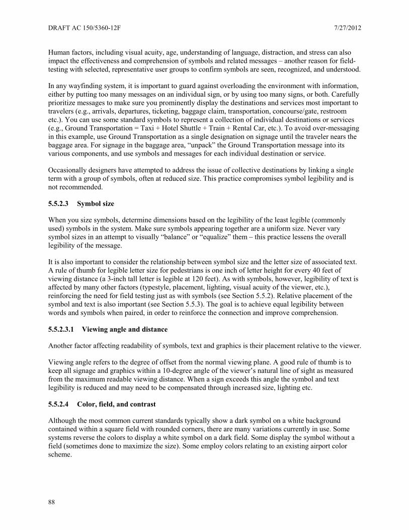
DRAFT AC 150/5360-12F 7/27/2012
88
Human factors, including visual acuity, age, understanding of language, distraction, and stress can also impact the effectiveness and comprehension of symbols and related messages – another reason for field-testing with selected, representative user groups to confirm symbols are seen, recognized, and understood.
In any wayfinding system, it is important to guard against overloading the environment with information, either by putting too many messages on an individual sign, or by using too many signs, or both. Carefully prioritize messages to make sure you prominently display the destinations and services most important to travelers (e.g., arrivals, departures, ticketing, baggage claim, transportation, concourse/gate, restroom etc.). You can use some standard symbols to represent a collection of individual destinations or services (e.g., Ground Transportation = Taxi + Hotel Shuttle + Train + Rental Car, etc.). To avoid over-messaging in this example, use Ground Transportation as a single designation on signage until the traveler nears the baggage area. For signage in the baggage area, “unpack” the Ground Transportation message into its various components, and use symbols and messages for each individual destination or service.
Occasionally designers have attempted to address the issue of collective destinations by linking a single term with a group of symbols, often at reduced size. This practice compromises symbol legibility and is not recommended.
5.5.2.3 Symbol size
When you size symbols, determine dimensions based on the legibility of the least legible (commonly used) symbols in the system. Make sure symbols appearing together are a uniform size. Never vary symbol sizes in an attempt to visually “balance” or “equalize” them – this practice lessens the overall legibility of the message.
It is also important to consider the relationship between symbol size and the letter size of associated text. A rule of thumb for legible letter size for pedestrians is one inch of letter height for every 40 feet of viewing distance (a 3-inch tall letter is legible at 120 feet). As with symbols, however, legibility of text is affected by many other factors (typestyle, placement, lighting, visual acuity of the viewer, etc.), reinforcing the need for field testing just as with symbols (see Section 5.5.2). Relative placement of the symbol and text is also important (see Section 5.5.3). The goal is to achieve equal legibility between words and symbols when paired, in order to reinforce the connection and improve comprehension.
5.5.2.3.1 Viewing angle and distance
Another factor affecting readability of symbols, text and graphics is their placement relative to the viewer.
Viewing angle refers to the degree of offset from the normal viewing plane. A good rule of thumb is to keep all signage and graphics within a 10-degree angle of the viewer’s natural line of sight as measured from the maximum readable viewing distance. When a sign exceeds this angle the symbol and text legibility is reduced and may need to be compensated through increased size, lighting etc.
5.5.2.4 Color, field, and contrast
Although the most common current standards typically show a dark symbol on a white background contained within a square field with rounded corners, there are many variations currently in use. Some systems reverse the colors to display a white symbol on a dark field. Some display the symbol without a field (sometimes done to maximize the size). Some employ colors relating to an existing airport color scheme.
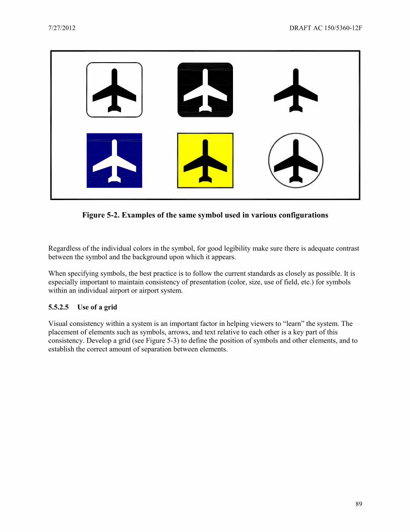
7/27/2012 DRAFT AC 150/5360-12F
89
Figure 5-2. Examples of the same symbol used in various configurations
Regardless of the individual colors in the symbol, for good legibility make sure there is adequate contrast between the symbol and the background upon which it appears.
When specifying symbols, the best practice is to follow the current standards as closely as possible. It is especially important to maintain consistency of presentation (color, size, use of field, etc.) for symbols within an individual airport or airport system.
5.5.2.5 Use of a grid
Visual consistency within a system is an important factor in helping viewers to “learn” the system. The placement of elements such as symbols, arrows, and text relative to each other is a key part of this consistency. Develop a grid (see Figure 5-3) to define the position of symbols and other elements, and to establish the correct amount of separation between elements.
DRAFT AC 150/5360-12F 7/27/2012
90
Figure 5-3. Example grid used to establish visual consistency for placement of arrows, symbols and messages
5.5.2.6 Lighting
It would be difficult to overstate the importance of proper lighting for legibility of signage and graphics, including symbols. Fixture and bulb type, placement, and intensity can significantly enhance or detract from a sign’s legibility. Some general guidelines follow; however, it is always advisable to work with a qualified lighting designer to make sure you achieve proper lighting.
When you select light sources, consider sign construction and placement. Whether the light source is external or internal to the sign may dictate how big it can be and how much heat generation is acceptable.
If the light source is external, make sure light is evenly distributed on the viewing surface, with no hot spots or glare. Avoid placing external fixtures in such a way that light is reflected directly into the viewer’s eye; this can severely degrade readability.
For internal light sources, calibrate the intensity of the light output to provide even illumination with no hot spots. Overly intense illumination can also produce an undesirable effect known as “halation,” in which illuminated graphics and characters tend to blur or merge together, becoming less distinct.
Ground TransportationMessage Line 3Message Line 2Message Line 1 CL X
.75 X (3 PLACES)
2.5 X
.75
X
4" HIGH CHARACTERS
X
X
X
X
X
X
1.5 X (3 PLACES)
2.5 X
1.5 X
.75
X
6" SYMBOL10" ARROW
7/27/2012 DRAFT AC 150/5360-12F
91
5.5.2.7 Field testing
As noted above, many factors and variables affect symbol readability and comprehension. Always field tested signage elements, including symbols, before you fully implement your signage program.
The most reliable way to test a symbol or symbol and text group for legibility is to produce a full-size mock-up of the sign and place it in the actual scheduled location. If the actual location is unavailable (e.g., not yet constructed), the alternative is to duplicate the actual viewing condition as closely as possible.
When testing for legibility, it is important to engage a representative cross section of user groups (age, nationality, etc.) to make sure the largest number of people recognizes the symbol. It is also important to remember the viewer’s state of mind can also affect the receipt and processing of information. A viewer who is stressed, distracted, or in a hurry (all common occurrences in an airport environment) will not process at a “normal” rate. To maximize the accuracy of any field test, conduct it under “real life” conditions whenever possible.
Testing for symbol comprehension – to determine whether people correctly understand what a symbol represents – can be done in more controlled environments, utilizing focus groups or surveys. This is typically undertaken only in situations where no commonly accepted single symbol standard exists, and there is a need to choose among possible alternatives or develop a new symbol.
5.5.2.8 Current standards
The following pages contain the current aviation symbol standards with some updates and additions. Symbols are listed alphabetically by their most common referent name.25, 35
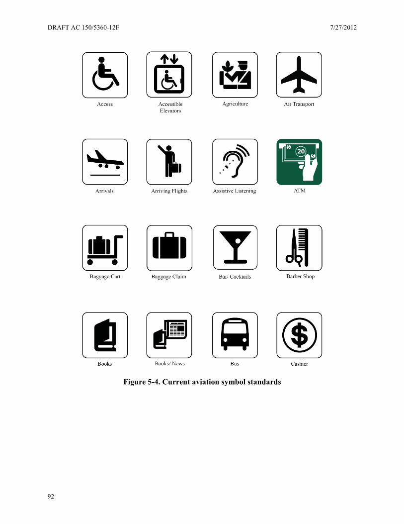
DRAFT AC 150/5360-12F 7/27/2012
92
Figure 5-4. Current aviation symbol standards

7/27/2012 DRAFT AC 150/5360-12F
93
Figure 5-4. Current aviation symbol standards (continued)
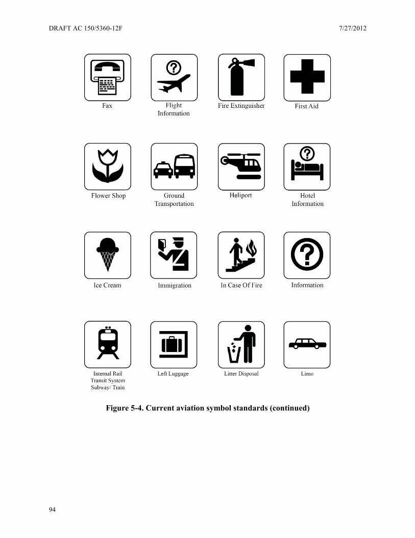
DRAFT AC 150/5360-12F 7/27/2012
94
Figure 5-4. Current aviation symbol standards (continued)
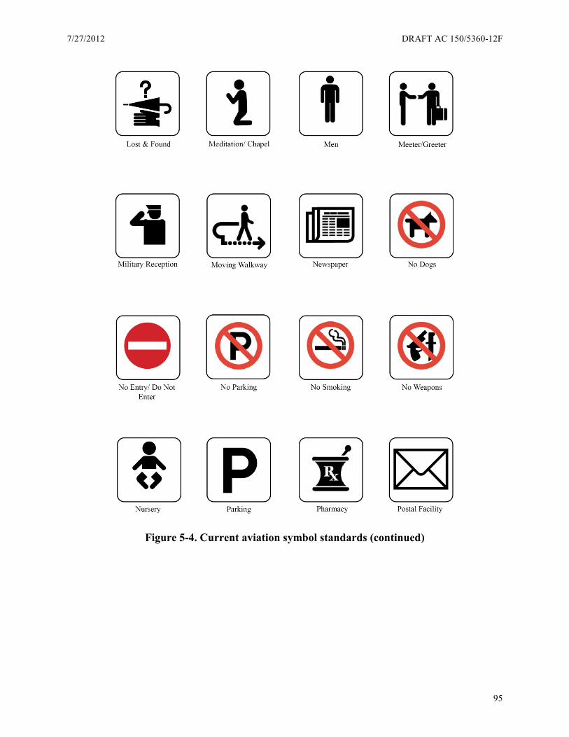
7/27/2012 DRAFT AC 150/5360-12F
95
Figure 5-4. Current aviation symbol standards (continued)
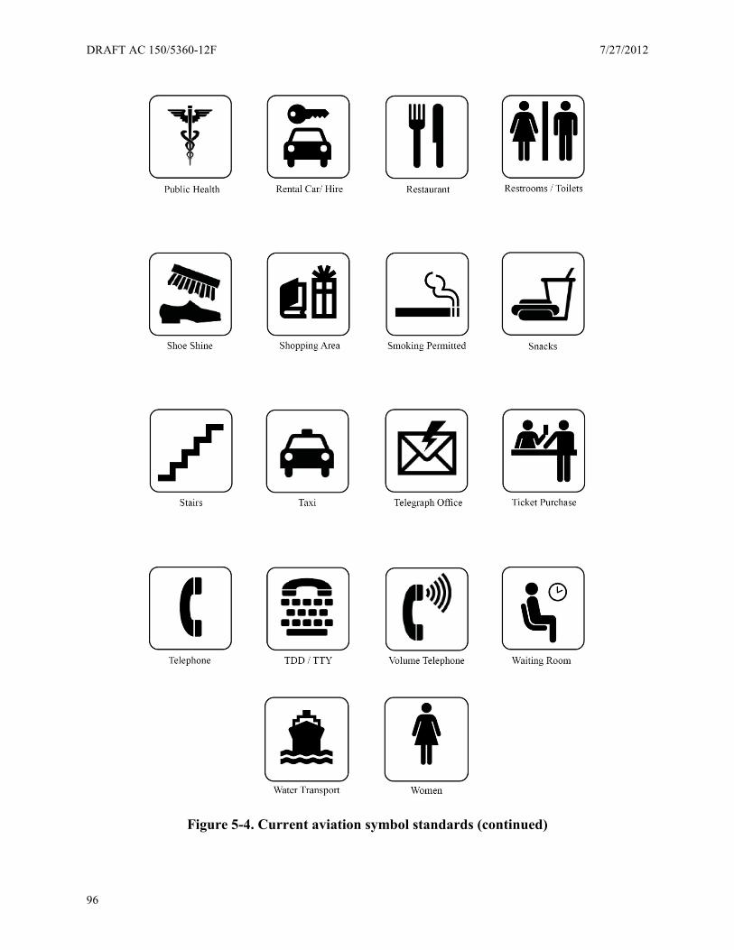
DRAFT AC 150/5360-12F 7/27/2012
96
Figure 5-4. Current aviation symbol standards (continued)
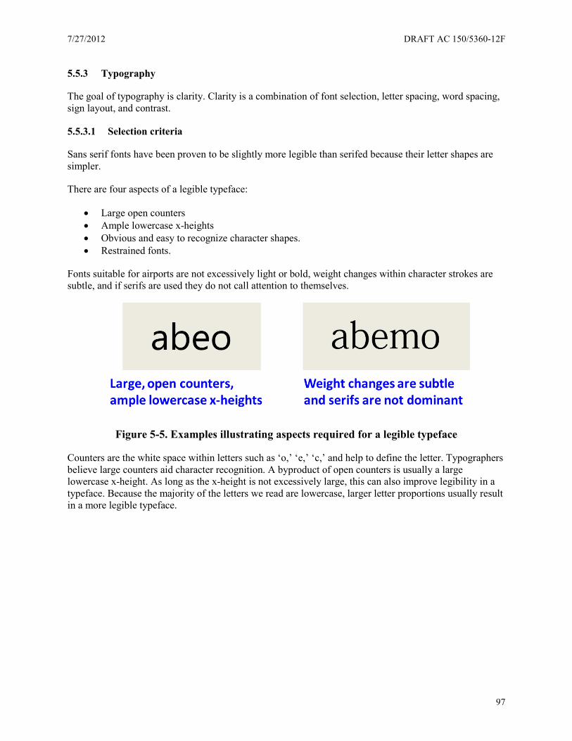
7/27/2012 DRAFT AC 150/5360-12F
97
5.5.3 Typography
The goal of typography is clarity. Clarity is a combination of font selection, letter spacing, word spacing, sign layout, and contrast.
5.5.3.1 Selection criteria
Sans serif fonts have been proven to be slightly more legible than serifed because their letter shapes are simpler.
There are four aspects of a legible typeface:
• Large open counters • Ample lowercase x-heights • Obvious and easy to recognize character shapes. • Restrained fonts.
Fonts suitable for airports are not excessively light or bold, weight changes within character strokes are subtle, and if serifs are used they do not call attention to themselves.
Figure 5-5. Examples illustrating aspects required for a legible typeface
Counters are the white space within letters such as ‘o,’ ‘e,’ ‘c,’ and help to define the letter. Typographers believe large counters aid character recognition. A byproduct of open counters is usually a large lowercase x-height. As long as the x-height is not excessively large, this can also improve legibility in a typeface. Because the majority of the letters we read are lowercase, larger letter proportions usually result in a more legible typeface.
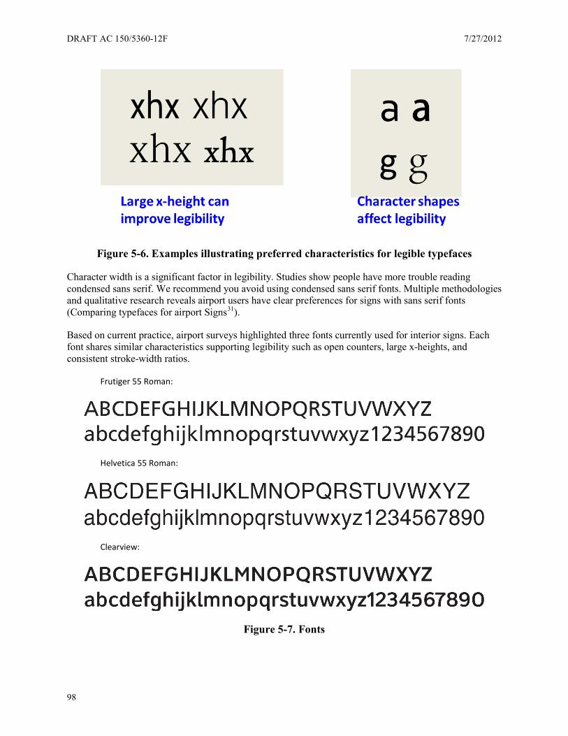
DRAFT AC 150/5360-12F 7/27/2012
98
Figure 5-6. Examples illustrating preferred characteristics for legible typefaces
Character width is a significant factor in legibility. Studies show people have more trouble reading condensed sans serif. We recommend you avoid using condensed sans serif fonts. Multiple methodologies and qualitative research reveals airport users have clear preferences for signs with sans serif fonts (Comparing typefaces for airport Signs31).
Based on current practice, airport surveys highlighted three fonts currently used for interior signs. Each font shares similar characteristics supporting legibility such as open counters, large x-heights, and consistent stroke-width ratios.
Frutiger 55 Roman:
Helvetica 55 Roman:
Clearview:
Figure 5-7. Fonts

7/27/2012 DRAFT AC 150/5360-12F
99
5.5.3.2 Spacing
Spacing is a critical component of legibility. There are four parts to spacing:
• Letter spacing/kerning • Word spacing within a message • Line spacing between messages • Relational spacing within a sign grid
Baggage Claim spacing too close
Baggage Claim spacing correct
Baggage Claim spacing too wide Figure 5-8. Letter spacing examples (aka kerning)
Basic line spacing between words of a related message is 50% of the cap height of the letter. Basic line spacing between unrelated messages is 100% of the cap height of the letter. X equals the cap height of the letter.
Figure 5-9. Word spacing example
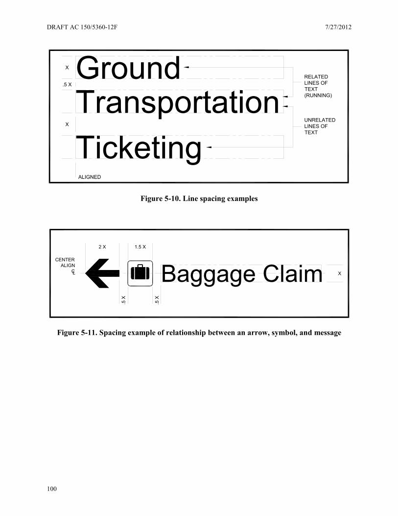
DRAFT AC 150/5360-12F 7/27/2012
100
Figure 5-10. Line spacing examples
Figure 5-11. Spacing example of relationship between an arrow, symbol, and message
GroundTransportationTicketing
RELATEDLINES OFTEXT(RUNNING)
UNRELATEDLINES OFTEXT
ALIGNED
X
X
.5 X
Baggage Claim X
.5 X
1.5 X2 X
CENTERALIGN
CL
.5 X
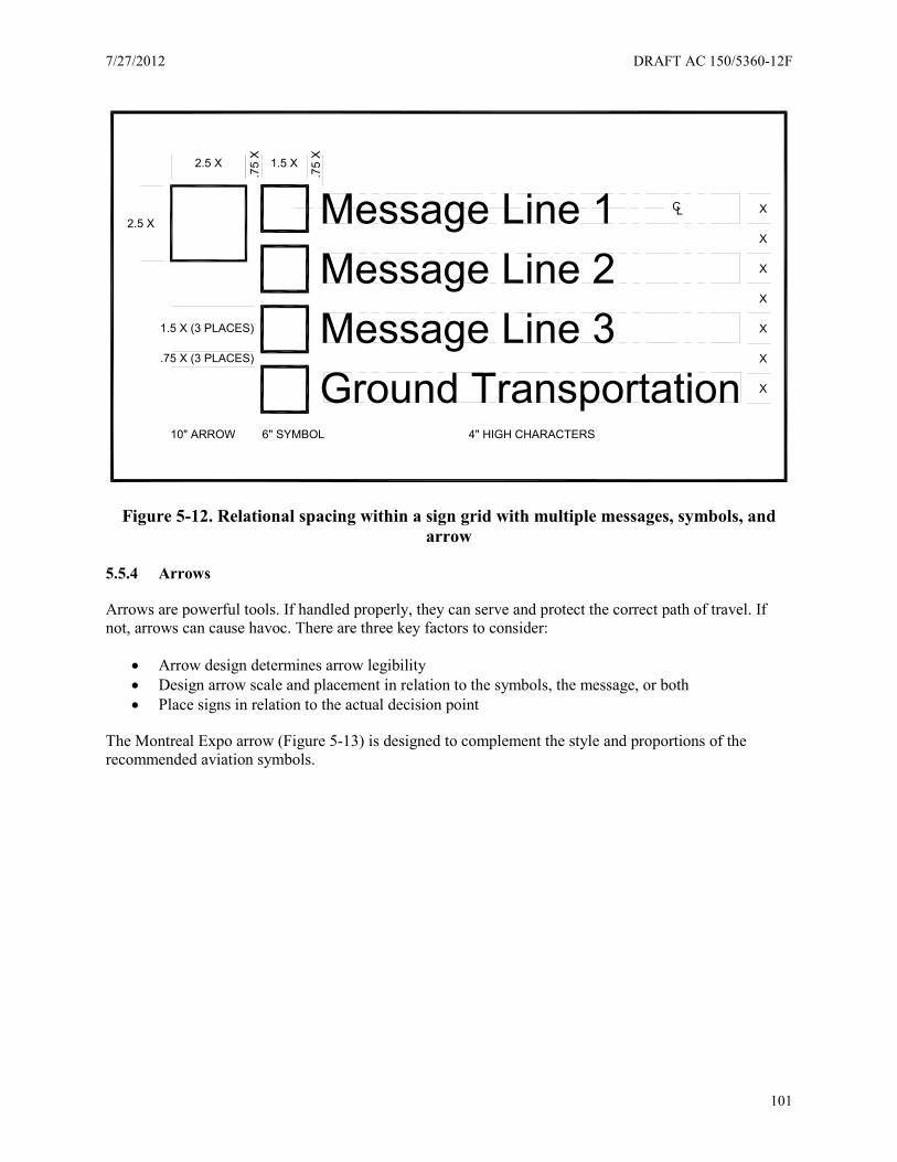
7/27/2012 DRAFT AC 150/5360-12F
101
Figure 5-12. Relational spacing within a sign grid with multiple messages, symbols, and arrow
5.5.4 Arrows
Arrows are powerful tools. If handled properly, they can serve and protect the correct path of travel. If not, arrows can cause havoc. There are three key factors to consider:
• Arrow design determines arrow legibility • Design arrow scale and placement in relation to the symbols, the message, or both • Place signs in relation to the actual decision point
The Montreal Expo arrow (Figure 5-13) is designed to complement the style and proportions of the recommended aviation symbols.
Ground TransportationMessage Line 3Message Line 2Message Line 1 CL X
.75 X (3 PLACES)
2.5 X
.75
X
4" HIGH CHARACTERS
X
X
X
X
X
X
1.5 X (3 PLACES)
2.5 X
1.5 X
.75
X
6" SYMBOL10" ARROW
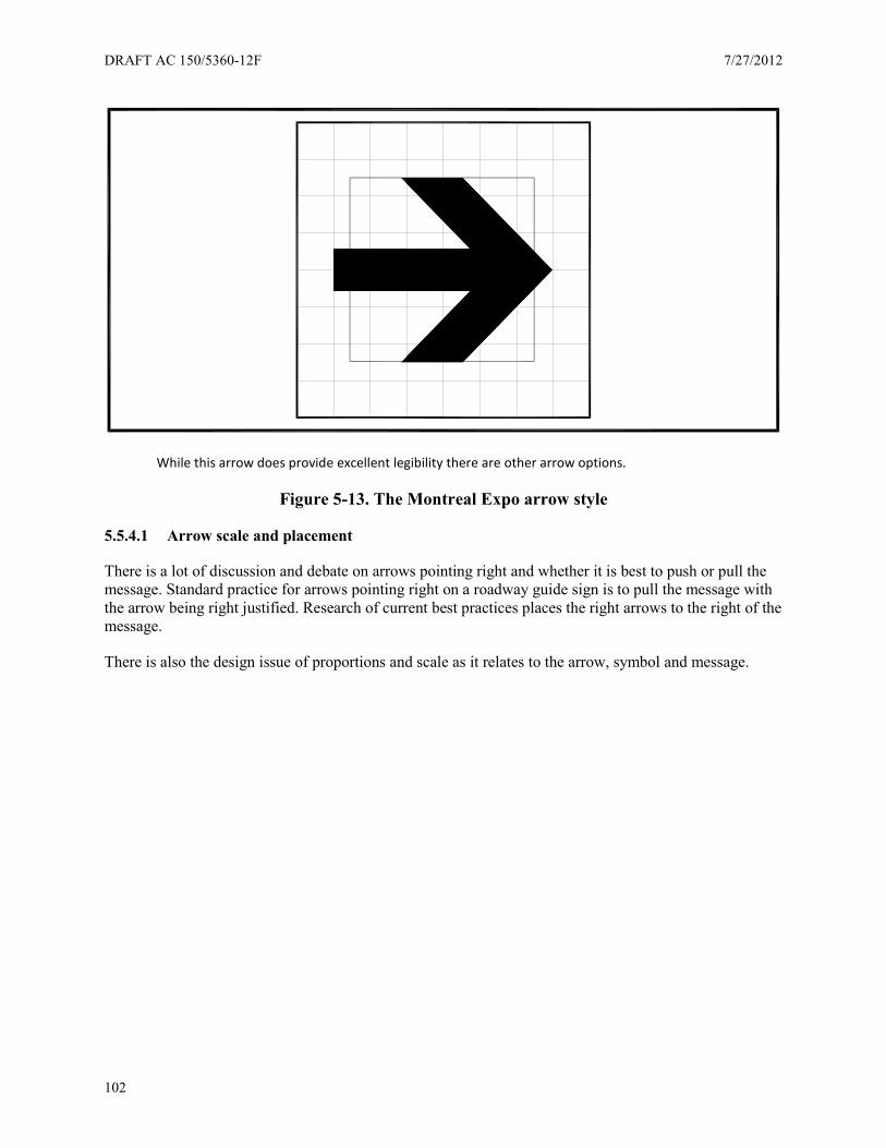
DRAFT AC 150/5360-12F 7/27/2012
102
While this arrow does provide excellent legibility there are other arrow options.
Figure 5-13. The Montreal Expo arrow style
5.5.4.1 Arrow scale and placement
There is a lot of discussion and debate on arrows pointing right and whether it is best to push or pull the message. Standard practice for arrows pointing right on a roadway guide sign is to pull the message with the arrow being right justified. Research of current best practices places the right arrows to the right of the message.
There is also the design issue of proportions and scale as it relates to the arrow, symbol and message.
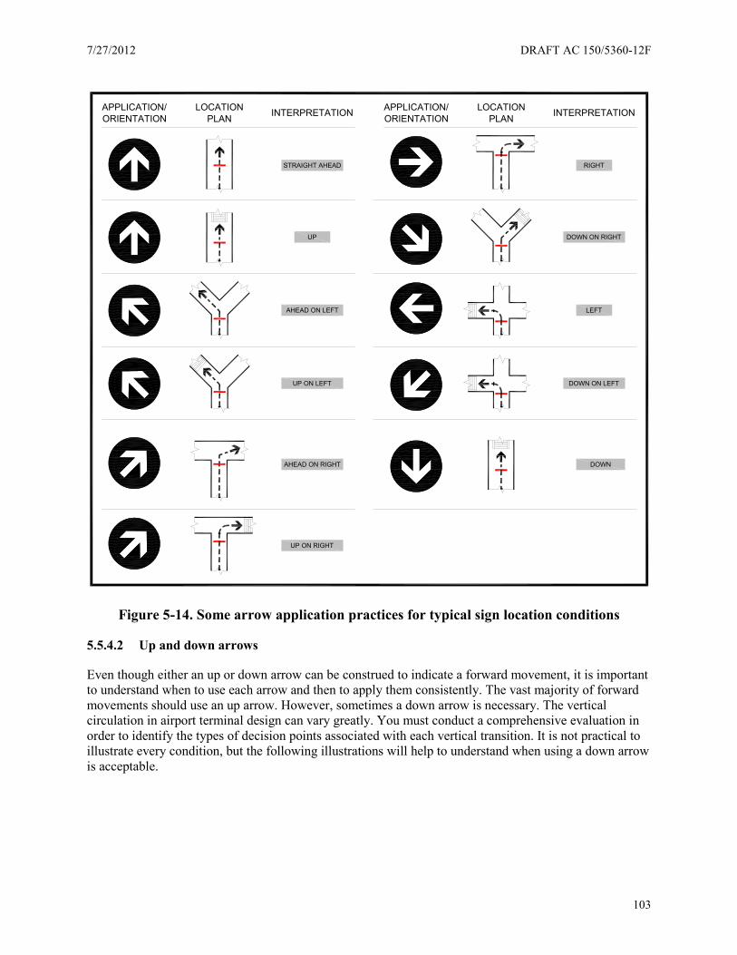
7/27/2012 DRAFT AC 150/5360-12F
103
Figure 5-14. Some arrow application practices for typical sign location conditions
5.5.4.2 Up and down arrows
Even though either an up or down arrow can be construed to indicate a forward movement, it is important to understand when to use each arrow and then to apply them consistently. The vast majority of forward movements should use an up arrow. However, sometimes a down arrow is necessary. The vertical circulation in airport terminal design can vary greatly. You must conduct a comprehensive evaluation in order to identify the types of decision points associated with each vertical transition. It is not practical to illustrate every condition, but the following illustrations will help to understand when using a down arrow is acceptable.
RIGHT
LEFT
DOWN ON LEFT
DOWN
DOWN ON RIGHT
STRAIGHT AHEAD
UP
AHEAD ON LEFT
UP ON LEFT
AHEAD ON RIGHT
UP ON RIGHT
INTERPRETATIONPLANLOCATION
ORIENTATIONAPPLICATION/ INTERPRETATIONPLAN
LOCATIONORIENTATIONAPPLICATION/
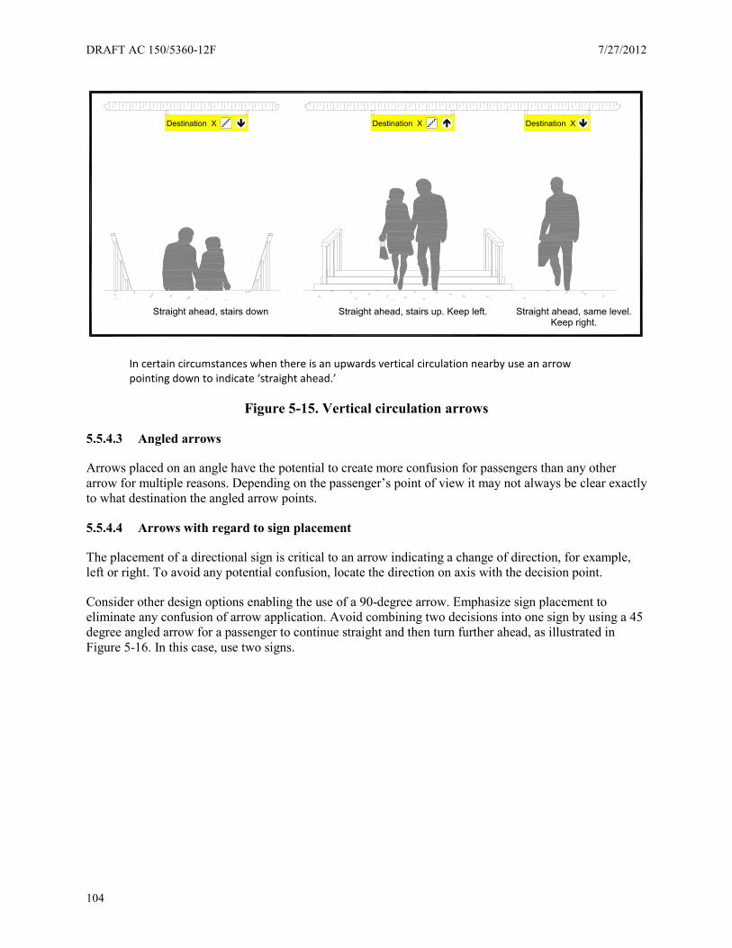
DRAFT AC 150/5360-12F 7/27/2012
104
In certain circumstances when there is an upwards vertical circulation nearby use an arrow pointing down to indicate ‘straight ahead.’
Figure 5-15. Vertical circulation arrows
5.5.4.3 Angled arrows
Arrows placed on an angle have the potential to create more confusion for passengers than any other arrow for multiple reasons. Depending on the passenger’s point of view it may not always be clear exactly to what destination the angled arrow points.
5.5.4.4 Arrows with regard to sign placement
The placement of a directional sign is critical to an arrow indicating a change of direction, for example, left or right. To avoid any potential confusion, locate the direction on axis with the decision point.
Consider other design options enabling the use of a 90-degree arrow. Emphasize sign placement to eliminate any confusion of arrow application. Avoid combining two decisions into one sign by using a 45 degree angled arrow for a passenger to continue straight and then turn further ahead, as illustrated in Figure 5-16. In this case, use two signs.
Destination X Destination X Destination X
Straight ahead, stairs down Straight ahead, stairs up. Keep left. Straight ahead, same level.Keep right.
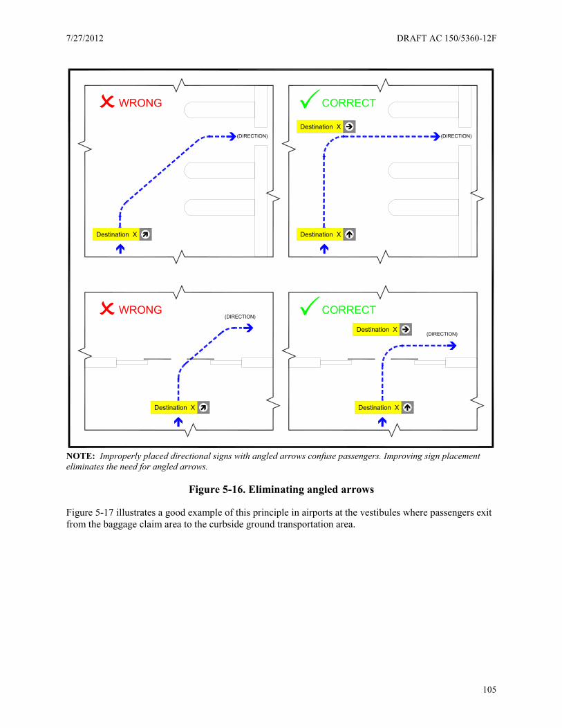
7/27/2012 DRAFT AC 150/5360-12F
105
NOTE: Improperly placed directional signs with angled arrows confuse passengers. Improving sign placement eliminates the need for angled arrows.
Figure 5-16. Eliminating angled arrows
Figure 5-17 illustrates a good example of this principle in airports at the vestibules where passengers exit from the baggage claim area to the curbside ground transportation area.
(DIRECTION)(DIRECTION)
CORRECTWRONG
(DIRECTION)
(DIRECTION)
WRONG CORRECT
Destination X Destination X
Destination X
Destination X
Destination X Destination X

DRAFT AC 150/5360-12F 7/27/2012
106
Figure 5-17. Eliminating angled arrows
5.5.5 Color
Approximately 12 percent of the population is colorblind and cannot distinguish between mixed shades of yellow, orange, red and brown, or black, blue, and green.
Color is effective in wayfinding as a secondary support element. The use of color difference alone as the primary wayfinding element is not necessarily effective. Choose color combinations carefully with light reflectance values (LRVs) in mind, and avoid certain color combinations. LRV expresses the percentage of light reflected from a surface.
For airports using a single primary color, reserve the single sign color application for wayfinding only to provide focus and clarity to the wayfinding components. This practice helps avoid forcing the sign compete with surrounding visual elements.
For airports using color coding as a wayfinding device, use color coding as a design element to support wayfinding but not as the primary wayfinding device.
Applications from airports indicating use of a color coding system include the following examples:
• Yellow is for flying activities (ticketing, gates, etc.), green is landing (parking, ground transportation, etc.), black is for services (restrooms, elevators, etc.)
• Airports limit color to designate arrivals and departures • Each terminal has its own specific color • Airports use a yellow border to highlight the alpha terminal identifiers icons
While this particular color coding system does not contain any explanation to passengers of logic behind the color coding, proponents of this approach claim passengers find the information they need more quickly and efficiently.
How well does a color stand out from its surroundings? Color conspicuity is important. Lighter colors tend to advance towards you and darker colors tend to recede into the background. The eye also reads
(DIRECTION)
(DIRECTION)Destination X
WRONG CORRECT
Destination X Destination X
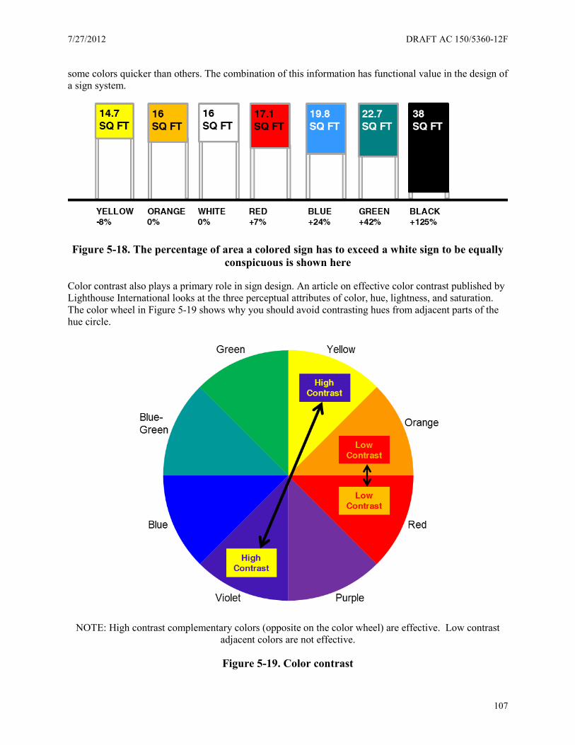
7/27/2012 DRAFT AC 150/5360-12F
107
some colors quicker than others. The combination of this information has functional value in the design of a sign system.
Figure 5-18. The percentage of area a colored sign has to exceed a white sign to be equally conspicuous is shown here
Color contrast also plays a primary role in sign design. An article on effective color contrast published by Lighthouse International looks at the three perceptual attributes of color, hue, lightness, and saturation. The color wheel in Figure 5-19 shows why you should avoid contrasting hues from adjacent parts of the hue circle.
NOTE: High contrast complementary colors (opposite on the color wheel) are effective. Low contrast adjacent colors are not effective.
Figure 5-19. Color contrast
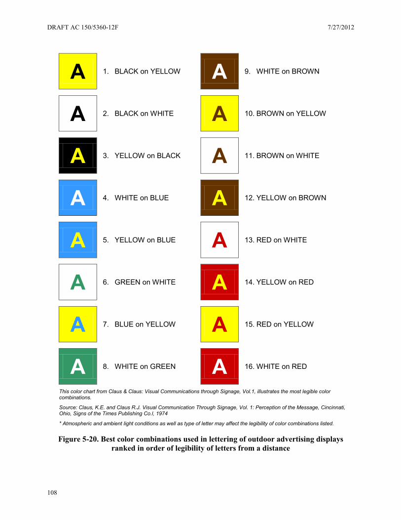
DRAFT AC 150/5360-12F 7/27/2012
108
A 1. BLACK on YELLOW A 9. WHITE on BROWN
A 2. BLACK on WHITE A 10. BROWN on YELLOW
A 3. YELLOW on BLACK A 11. BROWN on WHITE
A 4. WHITE on BLUE A 12. YELLOW on BROWN
A 5. YELLOW on BLUE A 13. RED on WHITE
A 6. GREEN on WHITE A 14. YELLOW on RED
A 7. BLUE on YELLOW A 15. RED on YELLOW
A 8. WHITE on GREEN A 16. WHITE on RED
This color chart from Claus & Claus: Visual Communications through Signage, Vol.1, illustrates the most legible color combinations.
Source: Claus, K.E. and Claus R.J. Visual Communication Through Signage, Vol. 1: Perception of the Message, Cincinnati, Ohio, Signs of the Times Publishing Co.l, 1974
* Atmospheric and ambient light conditions as well as type of letter may affect the legibility of color combinations listed.
Figure 5-20. Best color combinations used in lettering of outdoor advertising displays ranked in order of legibility of letters from a distance

7/27/2012 DRAFT AC 150/5360-12F
109
Use the above illustrations as guides for color conspicuity and contrast. Leverage this knowledge to achieve superior legibility results.
5.6 Sign locations, databases, illumination, materials, and safety
5.6.1 Sign locations
In preceding sections we discuss the importance of directional sign locations. In this section we outline basic sign location strategies.
Good features of directional signs include:
• Consistency of highly visible suspended signs viewable from a great distance • Sign location in the center of the flow and not to the side • Signs perpendicular, rather than parallel, to the flow
5.6.1.1 Sign frequency
Philosophically the fewer signs the better because fewer signs help simplify wayfinding, reduces visual clutter, and helps reduce the cost of the sign system. However, a complex architectural space may require additional signs to compensate for the lack a building’s intuitive wayfinding design.
To account for other users’ needs, you may need to add signs at the following locations:
• In the concourse, not just those paths and hallways leading to it • For people leaving restrooms • For people leaving a concession area • And especially for flight arrivals so travelers can confirm which way to go
The goal is to be as consistent as possible and to maintain sign frequency because it is expected, especially for long corridors passing through visually busy graphic environments. If there are no key decision points along a given route add signs approximately every 150 to 250 feet to reassure passengers they are still on the correct path.
Mounting height. The airport architecture ultimately dictates the mounting height of the overhead directional signs so it is important to survey the varying conditions in order to determine a consistent mounting height for these sign types as well as identify an exceptions such low ceilings.
The minimum height per ADA standards for overhead signs is 6 feet, 8 inches. However, only use this mounting height in very low ceiling conditions. The survey of current airport practices indicates a recommended minimum height of 8 feet. In large open architectural spaces with high ceilings this height may extend up to 10 feet to the bottom of the sign.
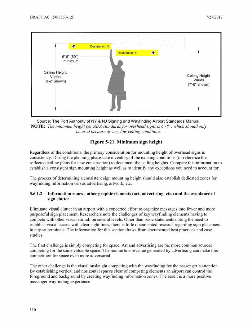
DRAFT AC 150/5360-12F 7/27/2012
110
Source: The Port Authority of NY & NJ Signing and Wayfinding Airport Standards Manual.
NOTE: The minimum height per ADA standards for overhead signs is 6’-8”, which should only be used because of very low ceiling conditions.
Figure 5-21. Minimum sign height
Regardless of the conditions, the primary consideration for mounting height of overhead signs is consistency. During the planning phase take inventory of the existing conditions (or reference the reflected ceiling plans for new construction) to document the ceiling heights. Compare this information to establish a consistent sign mounting height as well as to identify any exceptions you need to account for.
The process of determining a consistent sign mounting height should also establish dedicated zones for wayfinding information versus advertising, artwork, etc.
5.6.1.2 Information zones - other graphic elements (art, advertising, etc.) and the avoidance of sign clutter
Eliminate visual clutter in an airport with a concerted effort to organize messages into fewer and more purposeful sign placement. Researchers note the challenges of key wayfinding elements having to compete with other visual stimuli on several levels. Other than basic statements noting the need to establish visual access with clear sight lines, there is little documented research regarding sign placement in airport terminals. The information for this section draws from documented best practices and case studies.
The first challenge is simply competing for space. Art and advertising are the more common sources competing for the same valuable space. The non-airline revenue generated by advertising can make this competition for space even more adversarial.
The other challenge is the visual onslaught competing with the wayfinding for the passenger’s attention. By establishing vertical and horizontal spaces clear of competing elements an airport can control the foreground and background by creating wayfinding information zones. The result is a more positive passenger wayfinding experience.
Ceiling HeightVaries
(8'-2" shown)Ceiling Height
Varies(7'-6" shown)
6'-8" (80") minimum
Destination X
Destination X

7/27/2012 DRAFT AC 150/5360-12F
111
Figure 5-22 shows how this concept works when you apply the wayfinding information zone inside the building envelope.
Figure 5-22. Typical example of the X axis wayfinding information zone
5.6.1.3 Wall-mounted signs
While wall-mounted signs are subject to ADA guidelines, it is important to recognize the human factors applying to the viewing angles.
Figure 5-23 demonstrates the mounting heights of the 95th and 5th percentile of men and women (95m, 5m, 95w, 5w) with respect to vertical sign location. The mounting heights shown (=10° from line of sight) represent the area viewed without eye movement. The position of signing at 5-feet, 7-inches is within this mounting height for approximately 95 percent of the population. The signs falling into this category are restroom identification plaques, room (number) identification signs, elevator warning signs, door-mounted “do not enter” signs, and other regulatory and code required signs.
AMENITY
ID
AD
VE
RTI
SIN
G
ART
ARTX
Y
0'-0
" to
6'-0
"
6'-0
" to 8'-6
"
8'-6
" to
11'-6
"11
'-6"
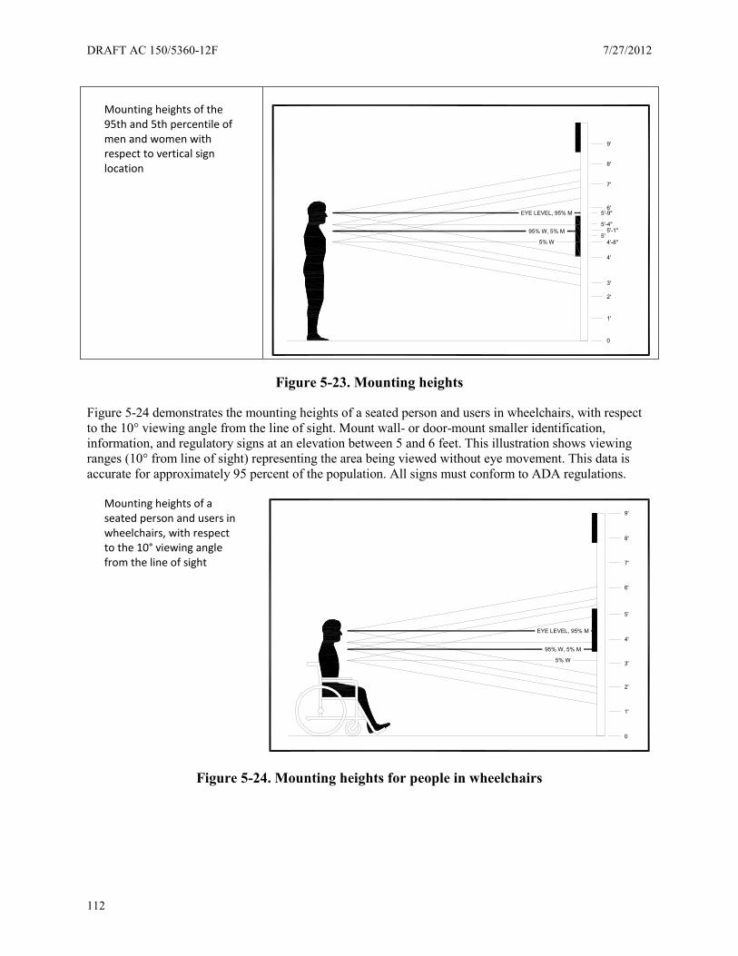
DRAFT AC 150/5360-12F 7/27/2012
112
Mounting heights of the 95th and 5th percentile of men and women with respect to vertical sign location
Figure 5-23. Mounting heights
Figure 5-24 demonstrates the mounting heights of a seated person and users in wheelchairs, with respect to the 10° viewing angle from the line of sight. Mount wall- or door-mount smaller identification, information, and regulatory signs at an elevation between 5 and 6 feet. This illustration shows viewing ranges (10° from line of sight) representing the area being viewed without eye movement. This data is accurate for approximately 95 percent of the population. All signs must conform to ADA regulations.
Mounting heights of a seated person and users in wheelchairs, with respect to the 10° viewing angle from the line of sight
Figure 5-24. Mounting heights for people in wheelchairs
0
1'
2'
3'
4'
4'-8"5'
5'-1"5'-4"
5'-9"6'
7'
8'
9'
EYE LEVEL, 95% M
95% W, 5% M
5% W
0
1'
2'
3'
4'
5'
6'
7'
8'
9'
EYE LEVEL, 95% M
95% W, 5% M
5% W
7/27/2012 DRAFT AC 150/5360-12F
113
5.6.2 Information databases
Creating an information database to manage an airport’s wayfinding system is important to help perpetuate the value of the investment. A typical database consists of three parts:
• Sign location plans. Show where each sign is located either on site plan or architectural floor plan • Message schedule. List the message for each sign along with the sign type • Sign type illustrations and or photos. Indicate sign construction details and information
Creating an information database can require a substantial amount of time and effort. When an airport creates a database, the first step is to understand how the airport uses database information. To make the best use of your airport’s resources you must determine:
• What is the mission? Define what the database will help accomplish. For example: o Changes - Know which signs are impacted by an airline change. The list can include
signs on the roadway, curbside and terminal o Maintenance - Know signs requiring regularly scheduled maintenance or inspection so
work orders can be easily generated and tracked. • Who will have access? This can be anyone from airport operations to airport planning. • Who will be responsible for keeping the database up to date? Without a designated ‘gatekeeper’
the database will quickly become obsolete and the resources spent creating the database will be lost.
• How does the airport track other systems and locate them on either outside on the roadway or inside the terminal?
• How will you track the sign information for common use space versus tenant spaces?
Other key considerations:
• Incorporate graphic standards as part of the database for easy reference for staff with access. • Develop the logic for the sign numbering system with a beginning and an end. In other words
continue the sign location numbers sheet to sheet to provide a unique sign number for each location.
• Consider adding a prefix or suffix to the sign location number to help indicate where the sign is on the airport.
• Include a logic for how new signs are added to the sign location plan and the message schedule. One method is to use the number of the closest sign and add a suffix. This symbiotic method of organizing the sign locations in a relative sequence will help later on when you or other airport employees try to locate the new sign number on a plan.
• Consider how the database software can be tailored to address maintenance issues in a proactive versus a reactive manner. This can include ticklers and reminders for scheduled maintenance or inspections helping prolong the effective life cycle. It can also list specifications for lamping and ballast for servicing illuminated signs.
• A database can include either an illustration or a photo of each sign with dimensions, materials, colors, etc.
• A database should include a ‘keyword’ search function to help facilitate message changes. • Include a key plan on every sign location plan drawing
Generate a database for the airport’s sign system in either one of two ways. An existing airport facility will require a physical inventory. Generate a database for new construction from the as-built drawings. Both of these methods are valid means to create a sign system database.
DRAFT AC 150/5360-12F 7/27/2012
114
The last point to consider is the most important. Who and how will the database be maintained? It is a living, breathing record and an airport must make a realistic evaluation on what kind of commitment and resources can be made to keeping this database up to date. Set a minimum standard for updating the database regularly; a good target is annually
5.6.3 Illumination
Lighting plays a vital role in the effectiveness of an airport’s wayfinding system, but understanding the options and determining what lighting solution will work best in a given airport is a challenge requiring a certain level of expertise.
The process of how to evaluate an airport’s needs and select the proper lighting for a given airport space begins with the basic decision of illuminated versus ambient light.
Internally illuminated directional and informational signs provide a higher level of visibility. Research indicates passengers perceive a higher LOS at airports with internally illuminated signs. However, this literature did not provide any measured research with quantitative proof passengers actually experienced an increase in wayfinding performance.
An airport must decide if the added expense of installing and maintaining an illuminated sign system is justified as a being superior wayfinding system compared to a sign system not internally illuminated.
Cost comparisons for illuminated signs include two factors – initial installation costs and the ongoing long term cost. Depending on the actual sign design an internally illuminated sign can cost substantially more than a comparable non-illuminated sign. In addition to the added cost of the light source, ballast, transformers, etc., the initial installation must also factor in the cost of the electrical service to each sign in order to understand the true total of the initial installation cost.
The three basic types of illuminated signs are:
• Internal illumination of the entire sign face • Internal illumination of the text only with an opaque sign background • External illumination washing the sign face
Choosing either method of internal illumination will require special attention to the design of the sign face to facilitate future message changes.
Other factors to consider when evaluating the type of lighting to use include:
• The overall ambient light levels maintained inside the airport (daytime and nighttime) • The maintenance and cost issues of making message changes to the sign face and how those costs
are budgeted.
Many airports successfully use the ambient lighting inside the airport to provide the necessary visibility for the wayfinding signs, which is an acceptable alternative.
The benefits of using ambient light are:
• Lower front end cost to implement • Lower cost to maintain • Typically easier and less expensive to make inevitable messaging changes.
7/27/2012 DRAFT AC 150/5360-12F
115
Regardless of what illumination method you use, make sure the illumination levels on the sign surface is uniform over the sign surface. It is also important to consider the location of signs to locate them so that the illumination level on the surface of the sign is not significantly exceeded by the ambient light or visible bright lighting source behind or in front of the sign.
5.6.4 Mounting
Mounting of signs can be synonymous with sign location in they both relate to placement; vertical, horizontal as well as in a plan view. The primary difference of mounting is the method used to physically install the sign. There are three primary categories:
• Overhead. Signs either suspended from the ceiling, mounted flush with the ceiling, or are located on an architectural soffit or wall.
• Freestanding. Signs having their bases mounted directly to the floor surface using a mechanical fastening system.
• Wall. Signs mounted with the back of the sign to the wall using either an adhesive or mechanical fastening system.
It is rare one mounting method will meet all installation conditions in a given airport. Therefore, in order to present the wayfinding information in a consistent manner as possible it is important to consider the variations in the architectural conditions when planning an airport’s sign system. Remember to make allowances for providing electrical services for mounted, illuminated directional signs.
5.6.5 Safety
Passenger safety is always the top priority. Many of the safety issues are already addressed by code requirements so it is not the purpose of this AC to review each safety-related condition and applicable codes. Airports should use available resources to research the codes associated with safety issues based on the Authorities Having Jurisdiction (AHJ).
Typical safety-related sign and wayfinding issues at the terminals include:
• Escalator signing is always an issue - tendency is to add more signs. • Signs for emergency exits, defibrillators, and fire extinguishers. • Crossing traffic lanes to access taxi and bus pickup areas.
In addition to these comments the United States uses the “EXIT” sign to identify emergency egress. Research shows a large portion of the world uses a green field with a walking man and an arrow. However, foreign passengers often mistake this sign for the airport exit. In the international arrivals terminal, recognize this issue. CPB personell report this is a daily problem. Make sure you consider this during the design process.
5.7 Sign maintenance
Wayfinding inside an airport terminal typically does not suffer from substantial degradation of sign surfaces over time like signs in an exterior application exposed to the environment. It is important to maintain the integrity of an airport’s wayfinding system to keep pace with changes in the airport.
Airports are dynamic environments. In order to perpetuate the integrity of the wayfinding program, implement a systematic maintenance program as an integral part of standard airport operations.
DRAFT AC 150/5360-12F 7/27/2012
116
A strategic maintenance program is the key to perpetuating a well-planned wayfinding program. Implement standard procedures to address the impact of changes to airport operations, including clear update policies and scheduled maintenance reviews (quarterly, semi-annually and annually). Clearly defined procedures will help address issues such as:
• Addition of a new airline • Airline relocation • Adding signs • Deleting signs • Temporary signs • Directories, both electronic and static
A quality Sign Standards Manual is one of the best tools in managing consistent planning, design, installation, application and maintenance of the sign system. Make plans to develop a Sign Standards Manual.
As a minimum, sign maintenance procedures should include the following:
• Monthly visual inspections: check for burned out bulbs/lights, scratched sign cabinets, sign face damage, graffiti, structural damage, and non-standard signing due to signing updates.
• Quarterly sign cleaning: cleaning of exterior surfaces and support structures. Twice a year the interior of sign boxes/cabinets should be examined for build-up of dirt, dust, and other debris.
• Replacement parts: extra bulbs, hardware, mechanical fasteners, etc., should be on hand to provide quick fixes until complete repairs can be made if needed.
• Replacement and recycling/disposal procedures: determine how damaged or obsolete signs will be removed and where the unusable items will be discarded.
• Sign maintenance manual: prepare a maintenance manual for in-house information but can also be distributed to sign vendors to be aware of the airports expectations for new signs.
5.8 Accessibility
Accessibility issues in an airport setting extend beyond the terminal, but are consolidated in this section for an easy single point of reference. The information contained in this section is based on the American with Disabilities Act Accessibility Guidelines and the Air Carrier Access Act.
5.8.1 Wayfinding for the blind and visually impaired
Wayfinding for the blind and visually impaired is a crucial area in the design of airport facilities. This section will review both the accessibility codes that must be followed in developing a wayfinding program in an airport facility, but also the technologies and other innovations that are being integrated into airport facilities. Finally this section will provide a road map for designers and managers looking to integrate accessible wayfinding into their facility plans.
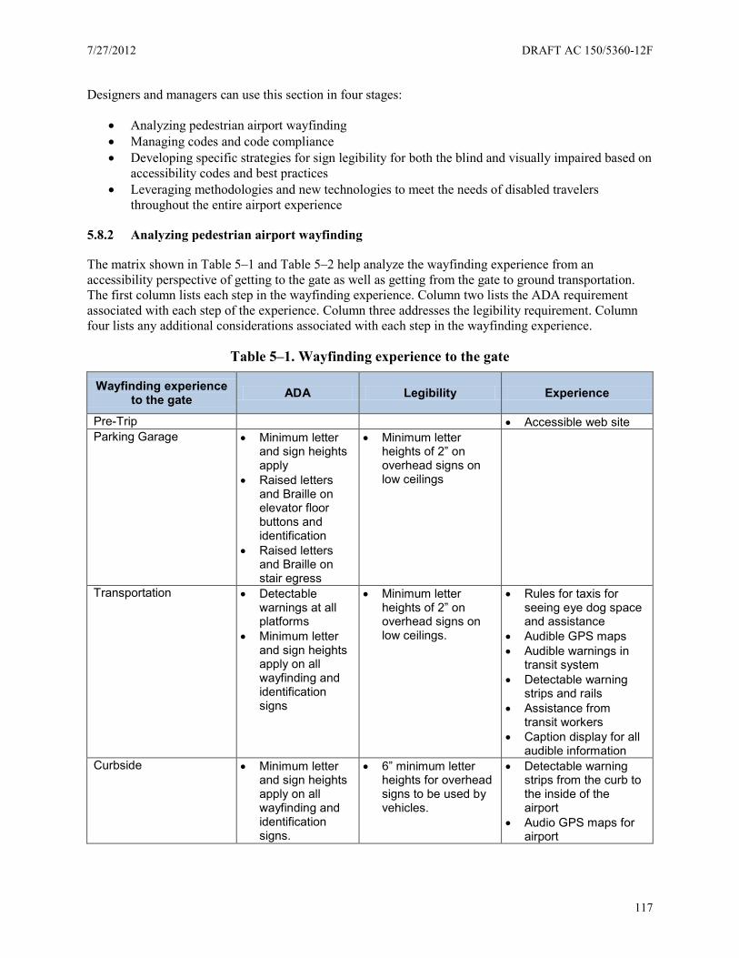
7/27/2012 DRAFT AC 150/5360-12F
117
Designers and managers can use this section in four stages:
• Analyzing pedestrian airport wayfinding • Managing codes and code compliance • Developing specific strategies for sign legibility for both the blind and visually impaired based on
accessibility codes and best practices • Leveraging methodologies and new technologies to meet the needs of disabled travelers
throughout the entire airport experience
5.8.2 Analyzing pedestrian airport wayfinding
The matrix shown in Table 5–1 and Table 5–2 help analyze the wayfinding experience from an accessibility perspective of getting to the gate as well as getting from the gate to ground transportation. The first column lists each step in the wayfinding experience. Column two lists the ADA requirement associated with each step of the experience. Column three addresses the legibility requirement. Column four lists any additional considerations associated with each step in the wayfinding experience.
Table 5–1. Wayfinding experience to the gate
Wayfinding experience to the gate ADA Legibility Experience
Pre-Trip • Accessible web site Parking Garage • Minimum letter
and sign heights apply
• Raised letters and Braille on elevator floor buttons and identification
• Raised letters and Braille on stair egress
• Minimum letter heights of 2” on overhead signs on low ceilings
Transportation • Detectable warnings at all platforms
• Minimum letter and sign heights apply on all wayfinding and identification signs
• Minimum letter heights of 2” on overhead signs on low ceilings.
• Rules for taxis for seeing eye dog space and assistance
• Audible GPS maps • Audible warnings in
transit system • Detectable warning
strips and rails • Assistance from
transit workers • Caption display for all
audible information Curbside • Minimum letter
and sign heights apply on all wayfinding and identification signs.
• 6” minimum letter heights for overhead signs to be used by vehicles.
• Detectable warning strips from the curb to the inside of the airport
• Audio GPS maps for airport

DRAFT AC 150/5360-12F 7/27/2012
118
Wayfinding experience to the gate ADA Legibility Experience
Ticketing
• Digital signs should have a letter height of 5/8” for eye level signs and 2” minimum for overhead signs.
• Airline staff trained to take the person from ticketing to the gate.
• Caption display for all audible information
Security • Minimum letter and sign heights apply on all wayfinding, identification and informational signs. Based on a 6’ distance. (Minimum 5/8” letter height).
• Short cut security procedure
• Caption display for all audible information
Restrooms and Support • Braille and tactile letter signs for all permanent identification signs in the airport including restrooms, gates, offices, and telephones.
• Two signs highly recommended. Tactile at 48”-60” and visual at 7’+.
• Symbols in a 6” field highly recommended but not required.
• Symbols should be at least 12” for overhead identification signs.
• Wayfinding signs should be minimum 3” letter heights unless symbols are used.
• Minimum letter heights and color contrast for all dynamic signage based on a 6’ viewing distance (5/8”).
• Clearly located and instructed visitor information services for the blind
Gate • Braille and tactile letter signs for all permanent identification signs in the airport including restrooms, gates, offices, and telephones.
• Two signs highly recommended. Tactile at 48”-60” and visual at 7’+.
• Minimum letter heights and color contrast for all dynamic and fixed signage based on a 3” letter height.
• Airline staff trained at the gate counter for special accommodations in boarding.
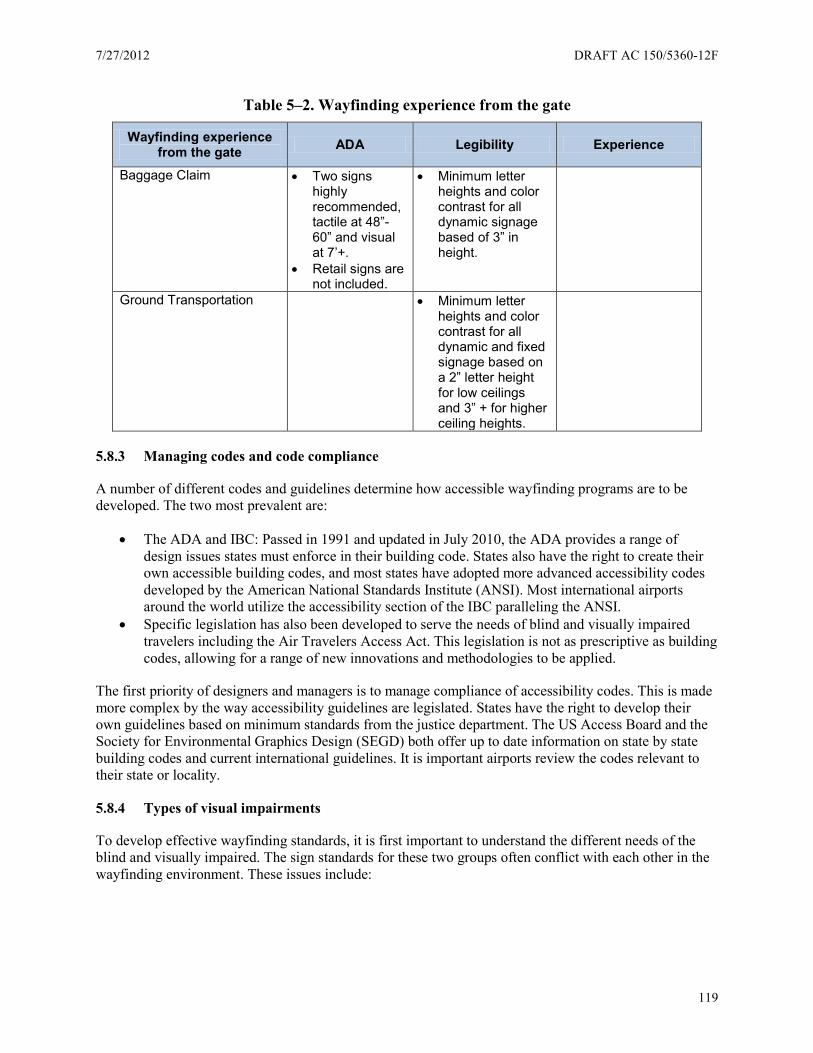
7/27/2012 DRAFT AC 150/5360-12F
119
Table 5–2. Wayfinding experience from the gate
Wayfinding experience from the gate ADA Legibility Experience
Baggage Claim • Two signs highly recommended, tactile at 48”-60” and visual at 7’+.
• Retail signs are not included.
• Minimum letter heights and color contrast for all dynamic signage based of 3” in height.
Ground Transportation • Minimum letter heights and color contrast for all dynamic and fixed signage based on a 2” letter height for low ceilings and 3” + for higher ceiling heights.
5.8.3 Managing codes and code compliance
A number of different codes and guidelines determine how accessible wayfinding programs are to be developed. The two most prevalent are:
• The ADA and IBC: Passed in 1991 and updated in July 2010, the ADA provides a range of design issues states must enforce in their building code. States also have the right to create their own accessible building codes, and most states have adopted more advanced accessibility codes developed by the American National Standards Institute (ANSI). Most international airports around the world utilize the accessibility section of the IBC paralleling the ANSI.
• Specific legislation has also been developed to serve the needs of blind and visually impaired travelers including the Air Travelers Access Act. This legislation is not as prescriptive as building codes, allowing for a range of new innovations and methodologies to be applied.
The first priority of designers and managers is to manage compliance of accessibility codes. This is made more complex by the way accessibility guidelines are legislated. States have the right to develop their own guidelines based on minimum standards from the justice department. The US Access Board and the Society for Environmental Graphics Design (SEGD) both offer up to date information on state by state building codes and current international guidelines. It is important airports review the codes relevant to their state or locality.
5.8.4 Types of visual impairments
To develop effective wayfinding standards, it is first important to understand the different needs of the blind and visually impaired. The sign standards for these two groups often conflict with each other in the wayfinding environment. These issues include:
DRAFT AC 150/5360-12F 7/27/2012
120
5.8.4.1.1 The needs of the blind
The blind navigate their environment utilizing their sense of touch either through their hands, feet or extension device like a cane, dog or navigation device. The blind need wayfinding elements to be in close range to their body, tactile, and in consistent locations. This effort to provide consistency of location and information is both the common theme in accessibility codes and design innovations for the blind like rails and tactile floor surfaces.
5.8.4.1.2 The needs of the visually impaired
The visually impaired make up a very large percentage of the population and cover a variety of impairments from color blindness to eye degradation from aging. The visually impaired utilize their eyes to navigate their environment, but need the assistance of larger and clearer visual elements contrasting with the surrounding environment. The needs of the blind and the visually impaired often conflict in building codes and often require different systems in airport environments.
5.8.4.1.3 The needs of the mobility impaired
Mobility impairment covers a range of impairments including difficulty of movement and paralysis. Access for the mobility impaired includes having dynamic and interactive wayfinding elements in close visual proximity which often conflicts with the need for more visible signs.
5.8.5 Strategies for the blind
The ADA and by extension the ANSI and IBC has extensive and specific guidance for the blind. This guidance based on the state, national and international codes is being utilized in most places. It is important to reference the code based on the specific airport jurisdiction. These are the key issues for consideration.
What signs are covered: For the blind only permanent identification signs must utilize Braille and tactile copy. In an airport environment this includes all restroom and terminal signs on concourses as well as permanent office and meeting room space. Specific airline information and retail spaces are not considered permanent space. Directional signs are not included.
Font selection and letter height: All tactile letters must be a minimum of 5/8" high and a maximum of 2" high. ½" letter heights can be used if separate larger visual type is also included.
Letter type: All raised letters must be sans serif and must have a maximum stroke width of 1/5 of the height of the letter using the height of the letter I for reference.
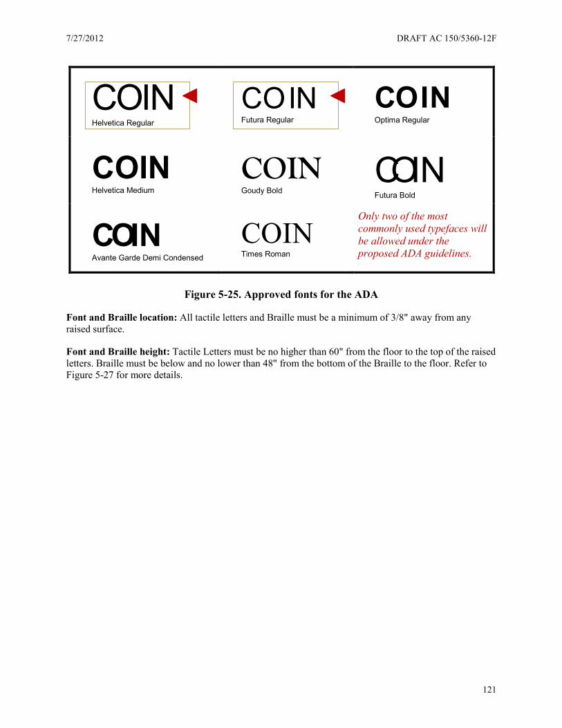
7/27/2012 DRAFT AC 150/5360-12F
121
Figure 5-25. Approved fonts for the ADA
Font and Braille location: All tactile letters and Braille must be a minimum of 3/8" away from any raised surface.
Font and Braille height: Tactile Letters must be no higher than 60" from the floor to the top of the raised letters. Braille must be below and no lower than 48" from the bottom of the Braille to the floor. Refer to Figure 5-27 for more details.
COIN Helvetica Regular
COIN Futura Regular
COIN Optima Regular
COIN Helvetica Medium
COIN Goudy Bold COIN
Futura Bold
COIN Avante Garde Demi Condensed
COIN Times Roman
Only two of the most commonly used typefaces will be allowed under the proposed ADA guidelines.
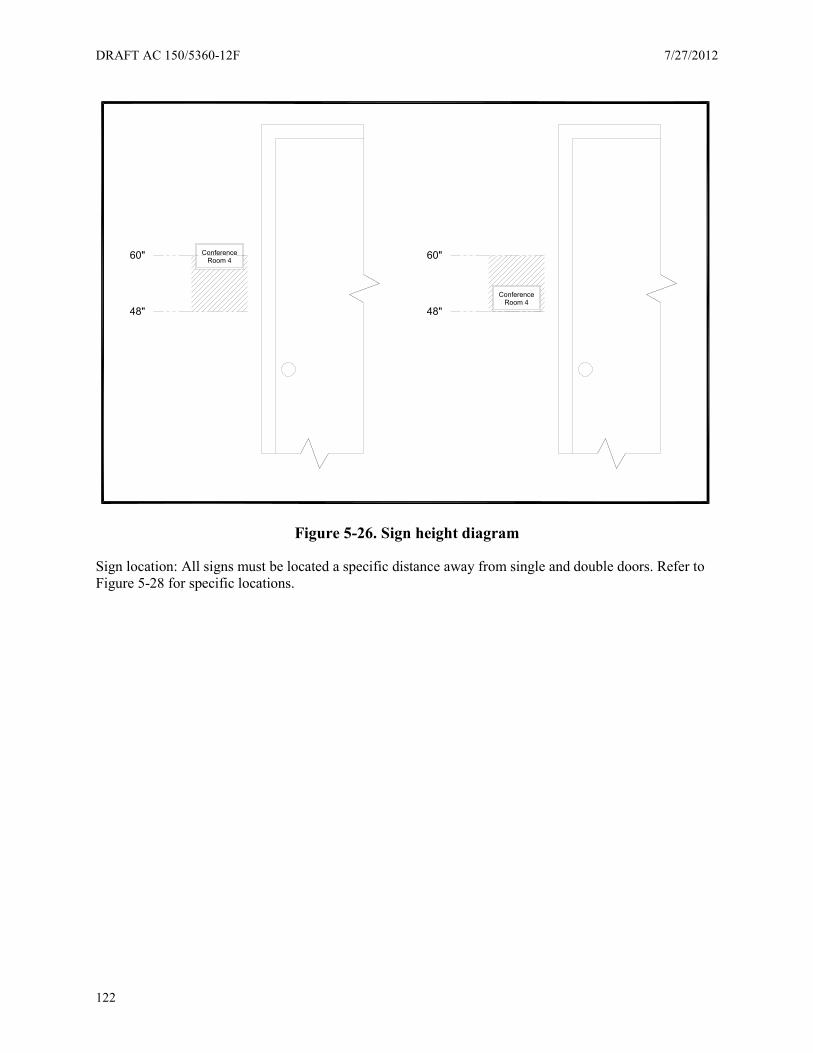
DRAFT AC 150/5360-12F 7/27/2012
122
Figure 5-26. Sign height diagram
Sign location: All signs must be located a specific distance away from single and double doors. Refer to Figure 5-28 for specific locations.
ConferenceRoom 4
ConferenceRoom 4
60"
48"
60"
48"
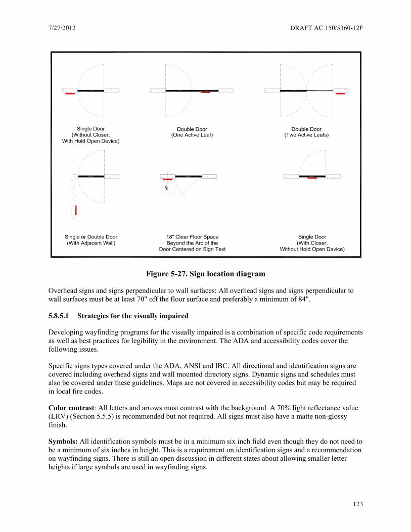
7/27/2012 DRAFT AC 150/5360-12F
123
Figure 5-27. Sign location diagram
Overhead signs and signs perpendicular to wall surfaces: All overhead signs and signs perpendicular to wall surfaces must be at least 70" off the floor surface and preferably a minimum of 84".
5.8.5.1 Strategies for the visually impaired
Developing wayfinding programs for the visually impaired is a combination of specific code requirements as well as best practices for legibility in the environment. The ADA and accessibility codes cover the following issues.
Specific signs types covered under the ADA, ANSI and IBC: All directional and identification signs are covered including overhead signs and wall mounted directory signs. Dynamic signs and schedules must also be covered under these guidelines. Maps are not covered in accessibility codes but may be required in local fire codes.
Color contrast: All letters and arrows must contrast with the background. A 70% light reflectance value (LRV) (Section 5.5.5) is recommended but not required. All signs must also have a matte non-glossy finish.
Symbols: All identification symbols must be in a minimum six inch field even though they do not need to be a minimum of six inches in height. This is a requirement on identification signs and a recommendation on wayfinding signs. There is still an open discussion in different states about allowing smaller letter heights if large symbols are used in wayfinding signs.
Single Door(Without Closer,
With Hold Open Device)
Double Door(One Active Leaf)
Single Door(With Closer,
Without Hold Open Device)
Single or Double Door(With Adjacent Wall)
Double Door(Two Active Leafs)
18" Clear Floor SpaceBeyond the Arc of the
Door Centered on Sign Text
CL

DRAFT AC 150/5360-12F 7/27/2012
124
Text height: Text can be serif and any stroke width, but must be a minimum of 5/8" height. Text height also increases based on the height off the floor and the distance viewing. This is important distance information particularly for dynamic scheduling signs. These signs must be no more than 6' away from the viewer to keep the 5/8" letter height requirement. All overhead signs generally must have text at least 2" in height and often far larger text heights are required.
ADAAG 703-5-5 Visual character height Height to finish floor or ground from baseline of
character Horizontal viewing distance Minimum character height
40 inches (1015) to less than or equal to 70 inches (1780 mm)
Less than 72 inches (1830 mm) 5/8 inch (16 mm)
72 inches (1830 mm) and greater 5/8 inch (16 mm), plus 1/8 inch (3.2 mm) per foot (305 mm) of viewing distance above 72 inches (1830 mm)
Greater than 70 inches (1780 mm) to less than or equal to 120 inches (3050 mm)
Less than 180 inches (4570 mm) 2 inches (51 mm) 180 inches (4570 mm) and greater 2 inches (51 mm), plus 1/8 inch
(3.2 mm) per foot (305 mm) of viewing distance above 180 inches (4570 mm)
Greater than 120 inches (3050 mm)
Less than 21 feet (6400 mm) 3 inches (75 mm) 21 feet (6400 mm) and greater 3.2 inches (75 mm), plus 1/8
inch (3.2 mm) per foot (305 mm) of viewing distance above 21 feet (6400 mm)
Figure 5-28. Americans with Disabilities Act Accessibility Guidelines (ADAAG) legibility chart
5.8.5.2 Best practices for the visually impaired
In addition to building codes a number of best practices have been utilized in airport facilities for visually impaired have been advised by a number of designers. These include:
The use of highly legible san serif fonts: Even though building codes do not require these fonts on wayfinding signs most airports utilize highly legible san serif fonts. The most prevalent of these fonts include Helvetica, Clearview, Futura and Frutiger. These fonts were designed to meet the needs of an aging population by mitigating halation or the diminishment of visual clarity over time. These fonts have thin lines and have been successfully tested to be visible over great distances.
Clutter reduction: A key to legibility in an airport environment is the reduction of clutter in key areas. This is especially important at airport facilities with low ceilings. Extensive visual models and prototypes should be developed to ensure a minimum of clutter in the facility, as well as rigorous guidelines to keep visual clutter to a minimum. Clear guidelines are important in preventing the proliferation of visual clutter in airport environments, and airport sign managers should require every new interior sign be reviewed based on guidelines governing clutter. Medium size airports are notable for their efforts to manage clutter by creating layered viewing corridors for retail, wayfinding, gate, and support information.

7/27/2012 DRAFT AC 150/5360-12F
125
The use of landmarks: Visual cues and landmarks are important elements for directing airport users to specific locations and also cut through the visual clutter.
Multiple languages: when multiple languages are used on a sign it is important the same standards of legibility are used for all languages. It is also important multiple languages are differentiated on a sign.
Typography strategy: Sign codes are specific about type height for various viewing distances for wayfinding signs, but are unclear about how to measure viewing distances themselves. A basic strategy evolved is about basing legibility distance on two levels of wayfinding decision:
Key destination information: Top destinations including Gates, Transportation and Baggage Claim often need priority at key decision points and in airports with long concourses often required font heights of 6 or more.
Key decision points: In an airport environment key decision points should be read from at least 120 feet away. Under the accessibility codes this would require font heights to be a minimum of 4 inches.
Assurance signs: These signs occur along pathways and are meant to assure the traveler they are moving in the right direction. These signs need to be read from 90 feet or less giving them a minimum font height of 3 inches.
5.8.5.3 Strategies for the mobility impaired
Codes oriented for wayfinding for the mobility impaired focus on the same issues addressing the blind including the height of signs off the ground and the size of sign information. Most issues related to the mobility impaired are addressed in the Air Carrier Access Act governing the support services of the airport facility as much as specific wayfinding legibility issues.
5.8.5.4 ADA symbols
Symbols are among the most crucial aspects of developing airport wayfinding program. The ADA, ANSI and IBC cover the size and application of symbols as well as the use of specific accessibility symbols. SEGD developed this group of accessibility symbols mandated for use.
Specific international accessibility symbols are mandated for use by ADAAG (703.7.2.1-703.7.2.4) and include:
(These symbols were designed by Roger Whitehouse and available through SEGD.)
Figure 5-29. Accessibility symbols
International Symbolof Accessibilty
International Symbolof TTY
Assistive ListeningSystems
Volume ControlTelephones
Braille
Braille

DRAFT AC 150/5360-12F 7/27/2012
126
Among the most important areas of guidance is the use of the international symbol of accessibility which is required to identify all accessible locations in a facility including restrooms and areas of refuge. Because the signs codes allow more than one symbol inside a six inch field most identification signs in airports pair a smaller accessibility symbol with a larger identification symbols (Figure 5-30).
Figure 5-30. Symbol sign
5.8.5.5 Dual signs
In an effort to resolve the sign standards between the blind and the visually impaired the ADA, ANSI and IBC allow for the use of dual signs or separate sign information for the blind and the visually impaired. The visual information can be any size and use a variety of fonts while tactile signs can be smaller with low color contrast. This is particularly important on airport signs because of the need for identification elements to be more legible from larger distances. Airports generally use two approaches when developing dual signs.
Perpendicular and wall mounted signs: An overhead perpendicular sign can be coupled with a wall mounted tactile sign.
Combined wall mounted sign: A large wall mounted sign containing both visual and tactile information.
Dual signs are needed particularly at restroom facilities at all airports regardless of size, but also for other support services, like gate information and telephone identification.
5.8.5.6 Strategies for hearing impaired users
These users require special assistance to find facilities servicing the hearing impaired. Wayfinding for assistive listening devices and volume control telephones are usually handled by universal ADA symbols for SEGD.
5.8.5.7 The ADA and dynamic messages
Technically the ADA does not cover temporary or variable messages, but the trend is moving in the direction of utilizing the same regulations for visual dynamic media applied to signs with permanent content. Key issues for dynamic media include:
• Accessibility: Having passenger arrival and departure information within close visual proximity to travelers, either through scrolling signs, or larger font sizes.
• Contrast: All dynamic messages are recommended to have a contrast of at least 70%.
7/27/2012 DRAFT AC 150/5360-12F
127
5.8.5.8 New approaches for accessible environments
Currently auditory technology is frequently employed in transportation facilities for the disabled including train and bus stations. Auditory technologies include push buttons, infrared transmitters, and cell phone based technologies. The newest system uses bar codes read by cell phones. The most commonly used system in airports is the ClickAndGo Wayfinding Maps and Human Network Labs software. This software is available on cell phones and Personal Digital Assistants (PDAs) and can be used by the blind through Braille converters. Airports can send map routes through web sites like www.clickandgomaps.com to be used with this system.
Cell phones are also being used to deliver greater in-flight information to the blind. Finally research has been developed for complete systems using maps, rails, floor markings, and auditory information in a transportation environment. These trails connect terminal facilities inside of airports.
5.8.5.9 Air carrier access act – overview and recommendations
Airports have been given guidance on disabilities issues with the recently enacted Air Carrier Access Act. This act specifically puts the responsibility on the airport and the airline to provide assistance and access for the disabled from curbside to airplane. One way for airports to respond to the Act is to map the experience of the disabled traveler from external transportation to the gate. These include the following areas:
• Parking: While the Air Carriers Act makes no provisions for assistance from parking, many airports require parking in short term areas instead of curbside drop-off. In these situations it is important to provide clear easily marked safe areas where the traveler can wait for assistance.
• Transit: Taxi drivers and transit attendants can be trained to assist the blind in finding their way into airline terminals. In addition transit/airport junction points can become the most forward information centers with trained staff available. This approach has been used successfully in several large international airports with transit hubs.
• Curbside assistance: Assistance must begin at curbside. Even the best wayfinding systems for the blind at the arrivals and departures areas of the airport can be stymied by the long lines and crowds at a number of the airline. This requires baggage handlers and other curbside to take responsibility when seeing a disabled person trying to enter the terminal. In addition some airports hire security guards and greeters also offering assistance.
In addition there are tactile technologies assisting the blind from curbside to check-in. One of the leading technologies utilized to direct the blind from curbside to check-ins are detectable warning systems including floor dots, domes, pavers and trails. Training areas chart the wayfinding experience from Roadway to terminal and include:
• Ticketing assistance: Ticketing is the most crucial junction point for the blind. This is the point where the airline can offer assistance all the way to the gate. Training of ticket takers is the most important aspect of the Air Carrier Access Act, since it is the first entry point where the airline takes responsibility for the traveler.
• Security: Most security lines are already set up to handle the blind through multiple layers of security assistance and clear stanchion based lines.
• Attendants: Because of the Air Carriers Act airlines must have a person on call able to take a visitor from curbside, through security and all the way to the gate. This requires pre-trip preparation on the part of the disabled visitor, but also a plan devised by the airport to connect the disabled traveler with the attendant including a call-in number and designated meeting spot.
DRAFT AC 150/5360-12F 7/27/2012
128
5.8.5.10 Airport challenges
Airports are among the most difficult wayfinding environments for the blind and visually impaired with multiple layers of complexity. Airport sign managers and design firms advise airports utilize the following approaches to ensure the environment can remain at a high standard of accessibility:
• Develop an accessibility plan and audit: During the wayfinding design and development process it is important to have a separate audit focusing on accessibility issues.
• Have clear ongoing accessibility guidelines: After a project is complete these guidelines serve as both instruction and training for airport employees and guidance for system maintenance and replacement.
• Develop an in-house expertise: Large airports should have one person responsible for managing accessibility issues while small and medium size airports should have specific departmental responsibilities for accessibility.
• Develop a resources list: This list of designers, code officials, organizations and internal stakeholders can provide guidance on key issues and conflicts.
5.9 Accessibility audit
On an airport wayfinding project it is important to develop an audit of elements that must be followed to make the facility accessible. The audit consists of two parts: Strategy and Documentation:
5.9.1 Strategy
All accessibility strategies should consist of the following parts:
Managing compliance. International, national, and state codes:
• Utilize the IBC for projects outside the United States. This will correspond with the current ADA. Check with the specific community planning or building department in your area to find out which codes apply to your project.
• List the top ADA national standards being followed at the state level regarding font, placement, and color.
• List ADA issues specific to the state differing from national standards. • List the provisions in the Air Carriers Access Act.
Managing legibility: Develop a legibility plan consisting of the following elements:
• Font height based on distance in the facility. • Color contrast and lighting contrast requirements. • An approach to sign clutter. • Symbol height based on distance and number of symbols being used. • An approach for multiple languages.
Managing the experience: Develop a narrative of the wayfinding experience:
• Write an accessibility narrative starting at the curb, and progressing to the gate, describing the specific issues and recommendations for each area in the wayfinding process.
• Develop a series of recommendations based on the needs of the blind, visually impaired and mobility impaired.
7/27/2012 DRAFT AC 150/5360-12F
129
Specify methodologies and technologies: Materials specifications:
• Name the specific modular system (if one is used) and accessibility issues associated with that system.
• Specify materials, the material approach, vendors/manufacturers (if necessary), and paint or additional materials being applied.
Include specific accessibility technologies and methodologies:
• Directories and maps • Human assistance • Talking signs • Tactile floor surface
Documentation:
All accessibility documents for tactile signs for the blind should consist of the following parts:
• Sign placement • Distance of the sign from doors and entrances • Height of perpendicular wall signs and overhead signs from the floor • Sign dimensions • Separation of fonts from Braille • Separation of font and Braille from the edge of the sign • Distance of the top and bottom of the font from floor • Fonts • Style • Height • Kerning (adjusting spacing between letters) • Specify Braille and distance of the Braille from the floor • Sign substrate and base material • Ensure all screws are flush if close to raised type • Show edging or rounding of materials • Show material and substrate thickness • Paint specification • Specify foreground and background color of materials • Specify matte finishing

DRAFT AC 150/5360-12F 7/27/2012
130
Figure 5-31. A sample of required documentations for accessible tactile signs
0.43
0.13
0.43
0.14
60" Maximum
4"
8.00
2.97
1.00
3.09
0.22
1.08
4.28
1.12
6.48
7.06
0.55
Description:
ACME INDUSTRIESChinle, AZ
Location:
Project:
Qty: Revisions ApprovedDate
Room Identifier PlaquesNew Mexico Desert
W.L. Coyote Engineering Facility
100 Sheet 1 of 1
Drawing Number:
Apvd:
Drawn: Date:
Apvd:
REV:
Do not scale drawing.
This drawing for information only and not to beused for manufacturing.
Specifications will change without notice contacthead of engineering, C. Olsen for modificationsto this plaque
Clovis, NM
NOTES:
MATERIAL: ACRYLIC PER ACME SPECIFICATION 3.1415926.
AFTER MANUFACTURING PROCESS HAS BEEN COMPLETED, BREAKALL SHARP EDGES.
PLAQUE COLOR PER OVER THE RAINBOW CHART NO. 236.
1.
2.
3.
FRONT ELEVATION ADDITIONAL SIGNING SIGN MOUNTING DETAILSSIDE ELEVATION
PLAQUE COMPONENTS
MEN TTD/ TTY
STAIR 3
STAIR 3
7/27/2012 DRAFT AC 150/5360-12F
131
Chapter 6. Technology
6.1 Overview
Airports involve constantly evolving operations. Space and facilities are at a premium in most airport terminals. To maximize the use of an airport’s assets, it is not unusual for an airport to require airlines and other leaseholders to share facilities through common use leasehold agreements. This common use environment affects the wayfinding and signing program within the terminal and concourse areas, at curbside, in the parking garages and lots, and the roadway. Airports use dynamic message signs to display the changes. Good planning is necessary to accommodate these rapid message changes.
When using DMS in a common use environment, consider:
• Communications infrastructure, allowing message changes without having to go to each sign • How static messages coordinate with dynamic messages • Ensuring dynamic signage follows the wayfinding standards adopted by the airport (e.g., fonts,
colors, pictograms, terminology, and others) • Integration with existing dynamic signage elements and other systems (e.g., FIDs, Baggage
Information Displays (BIDs), Parking, Common User Terminal Equipment (CUTE)/ Multiple User System Equipment (MUSE))
• Location of key decision points • Spacing of displays, information content, visibility of the message, legibility, and mounting • Consistency in terminology
Dynamic signs can be controlled and messages changed from remote locations. The method for getting the message data to the sign can be via direct connection with a portable computer or via a remote computer communicating through an Ethernet connection over copper cables, fiber optic cable, RF links, or cellular transmission.
This chapter, although addressing certain dynamic signage, does not address all dynamic signage. Refer to the chapters for Roadway, Parking, Curbside, and the Terminal where dynamic signage applicable to those areas is addressed.
6.1.1 Importance of sign manager knowledge of systems
In order to maximize the use of existing communication systems infrastructure and to minimize costs when implementing a new system, include a member of the Airport’s Information Technology Department in any wayfinding and signing project during planning, design, implementation, acceptance testing, and training.
Airport sign managers should participate early in the signage process to ensure consistency with the signage program in terms of the airport’s signage standards and create a signage database for quantities and deliverables. Keep airport sign managers informed about all new projects having a potential effect on existing signage – or containing a new signage element – during the planning phases to ensure signing consistency throughout the airport.
6.1.2 Application
With extensive growth within the dynamic signage markets (e.g., retail, financial, healthcare, transportation, etc.) networked digital signage solutions are beginning to appear. These are well-suited to
DRAFT AC 150/5360-12F 7/27/2012
132
handle extensive creation, management, and publishing capabilities. New dynamic signage offers the delivery of such information using existing network infrastructure.
One advantage of these types of systems is the displays merely become network addresses to which the centralized system can push a variety of display information from any number of sources. This allows those displays normally associated with one function to easily take on alternative roles. For example, a multiple user flight information display system (MUFIDS) (Section 6.2.1) display could be used to perform other functions such as emergency messaging, visual paging, advertising, etc.
6.1.3 Wayfinding planning process
Wayfinding provides a methodology for people to find their way to and around a destination within a facility. Include dynamic sign elements as part of the wayfinding planning process. Understanding the operation of the facility, its schedule, and what people in the airport need to find, planners can integrate dynamic sign applications into a plan for wayfinding signage to guide people through a facility. Requirements for the design and planning process may include:
• An onsite wayfinding analysis and wayfinding-related design review of the existing facility architecture.
• Development of a detailed wayfinding master plan. • Integration/interface with other system (e.g., MUFIDS, Common Use Self Service (CUSS),
audio/visual paging, and parking). • Determining existing wayfinding and network elements which are still useful. • Emergency procedures (e.g., keeping temporary signs in stock for when a power outage occurs). • Control systems for dimming signs – individually, or as a group. • Defining communication systems infrastructure needs. • Developing cost estimates for system implementation, operational, maintenance, staffing, and
training
6.1.4 Integration with entire sign system
Use existing facilities and infrastructure and integrate them with the new equipment to the extent possible. However, many times an existing system is installed using proprietary hardware and software that cannot support the additional new components. In addition, existing equipment or computer software may be unreliable, and/or near its end of life. In such situations, consider replacing these elements.
If this is the case, install system equipment supporting “open” system architecture standards and protocols to allow the use of several different manufacturers’ systems and devices to provide interoperability, compatibility and interchangeability within the wayfinding and signing system.
6.1.5 Integration with static signs
Use dynamic signs where necessary to accommodate a changing state of operations and to provide convenient and timely information to the passengers and patrons. Choose the type of dynamic signing device most appropriate for the specific application.
In general, dynamic message signage manufacturers have a library of MUTCD pictographs for easy insertion into a canned or custom message easily produced in a matter of minutes via drag-and-drop functions in the software provided by the sign manufacturer. The dynamic signing equipment for exterior applications should be capable of remote operation and be fully weatherproof. Dynamic signage fonts, colors, and pictographs should follow the standards adopted by the airport.
7/27/2012 DRAFT AC 150/5360-12F
133
6.2 Systems and visual displays
6.2.1 Multiple User Flight Information Display System (MUFIDS) and Baggage Information Displays (BIDs)
The MUFIDS provides display of flight information to passengers and patrons by destination city, airline, arrival and departure times, gate, and status of the flight (on-time, delayed, cancelled, boarding, or landed). BIDs, a component of MUFIDS, provide displays of baggage claim device information. FIDs/BIDs may display information to ramp personnel, on ticket and gate counter back walls, above jet bridge doors, in various back offices, and above ticket counter displays (first class/premier check-in, bag check, etc.).
FIDs/BIDs may be integrated with the airlines’ ticketing and boarding pass system (commonly called CUTE or MUSE – acronyms developed by the manufacturers), CUSS system, visual paging, and video advertising.
6.2.2 Concourse-specific versus airport-wide MUFIDS displays
Banks of MUFIDS displays conveying information about flights only within a specific concourse can be useful, but such displays are limited with regard to overall customer service. Such displays may be useful for airlines that have many flights concentrated within a specific concourse, but for most carriers there is little to be gained from concourse-specific MUFIDS displays.
Display banks showing all flights within the airport are the most beneficial for the traveling public. These display banks provide necessary information for passengers who are changing planes, connecting between carriers, or trying to determine alternate routing, and to people meeting arriving passengers. Unfortunately, the airport-wide display banks may also be the most costly to implement, due to the number of displays required to show all flights.
Locate airport-wide display banks at key decision points throughout the airport in the main terminal and all concourses, such as those identified below. Determine specific locations during the MUFIDS design phase.
6.2.3 Key decision points
Involve the airport sign manager in the following to determine key decision points for the placement of wayfinding signage.
• Placement • Content and legibility • ADA considerations
MUFIDS displays are installed at various locations throughout the terminal to provide flight information to the passengers and patrons. Select locations coinciding with pathways of passengers. Make sure selected locations are readily available for viewing, but not a deterrent to traffic flow.
Locations considered “key” or “strategic” in terms of passenger decision points include:
• Before entering the terminal o At various pedestrian exits in parking garages (e.g., inside the APM or shuttle station,
pedestrian exit ways to bus stops for rides to the terminal, exits to walkways to the
DRAFT AC 150/5360-12F 7/27/2012
134
terminal, particularly if there are decision points along the pathway to the destination) and in the cell phone waiting parking lots.
• Before ticketing o In front of ticket counters to allow passengers to know the status of flights. o Displays are typically spaced at approximately 250-foot intervals.
• After ticketing o Just prior to entering the security checkpoint. o After passing through the security checkpoint. o Near the entrance to Automatic People Mover (APM) or shuttle stations in the main
terminal, allowing the passengers to confirm they are boarding the correct train to their destination concourse
• Gates/Concourses o At the exit from the APM or shuttle stations located inside the entrance to each
concourse, allowing passengers to determine the direction to flights. o In the concourses spaced at approximately 250 foot intervals. Arriving passengers may
deplane at the far end of a concourse - a significant distance from those strategic points identified above. Consequently, MUFIDS displays may be warranted at intermittent points throughout the concourses. Arriving passengers should not have to reverse their path of travel because information is not readily available. It makes little sense to locate a display bank at the very end of a concourse due to the limited use by passengers.
o In areas where people congregate (e.g., food courts, near restrooms, close to directory maps). Think about strategic reasons for MUFIDS placement.
o In the various airline club rooms (usually airline specific only).
• Baggage Claim o Within the baggage claim area - multiple locations MUFIDS displaying arriving flights
and associated claim devices.
• Other Locations o In the meeters and greeters hall - provides people meeting arriving passengers with flight
arrival information. o In baggage tunnel areas, operations office, and back office areas - allows support
personnel to know specific airline gate and flight status information.
To comply with ADA requirements, the MUFIDS would typically display Visual Paging messages on designated monitors, as well as provide MUFIDS and other selected data in an ADA-compliant format. If visual paging is already implemented through the audio/visual paging system, then consider integrating the MUFIDS with that system. This is further discussed in the paragraph for audio and visual paging below.
6.2.4 Content and display goals
Content is the message displayed. The information must be clear, concise, and legible. Items for content consideration include:
• Available space on the display • Potential conflicts with tenants • Need for multiple languages

7/27/2012 DRAFT AC 150/5360-12F
135
• Optimization of visibility • Distance from the viewer • Avoidance of congestion • Maintenance access
6.2.5 Display mounting options
A number of factors determine whether displays are mounted vertically or horizontally. These include the type and arrangement of data to be displayed (e.g., airport-wide versus concourse-specific), arrival/departure times, readability distances, font size, and available display width (both vertically and horizontally).
Displays come in a variety of sizes with the ability to mount vertically or horizontally. Mounting orientation affects how information is displayed. In a vertical orientation, if the data fields (columns) can fit within the vertical limits of the display, more lines (rows) of information will fit on the display. Conversely, if the data fields (columns) do not fit within the vertical limits of the display, then mount the display horizontally. This can require more displays, since fewer rows will fit.
Design MUFIDS installations to complement the terminal architecture. This approach can lead to an infinite number of interpretations and potential solutions for mounting these displays. To the extent practical, design all MUFIDS display installations to allow for changes in display sizes and evolution in technology. Consider universal post and rail system display mounts because, as displays are moved horizontally or vertically, new installations will require only a simple unbolting and re-bolting. Standardize the basic support structure throughout the airport to provide a common appearance, while still allowing the basic structure to be customized to more closely match the specific architectural characteristics of each location.
Whether text is displayed in rows or columns, configure the text in each row to read left to right. In multiple row configurations, configure the text to read top to bottom in each column, then to the next column to the right.
6.2.6 Readability of text for FIDs
ANSI/HFS 100-1988, Paragraph 6.14.2 provides a formula to calculate text height for readability.
6.2.7 Departure versus arrivals MUFIDS information
At airports where this is applicable, the destination/origin cities and remarks could be shown in multiple languages. The text can be toggled sequentially among several different languages.
The recommended order of information displayed by column is origin/departure city, airline, flight number, code share airline (airline and code share airline may be displayed as a fade-in/fade out configuration), flight number, gate number, time of arrival/departure, and status remarks (on-time, delayed, landed, cancelled, etc.).
The desired time window for display of information is one of the most critical factors in determining the number of displays required in a MUFIDS display bank. This factor is driven by how long prior to/after departure and arrival information should be shown on the MUFIDS. Typically, the following time window goals for information displays have been identified:
• Domestic departures - 3 hours prior to + 0.5 hours after departure

DRAFT AC 150/5360-12F 7/27/2012
136
• International departures - 4 hours prior to + 1 hour after departure • Domestic arrivals - 2 hours prior to + 1 hour after arrival • International arrivals - 3 hours prior to + 2 hours after arrival
Information displayed should include city (departing to or arriving from – if international, may include multi-lingual descriptor), the carrier and flight number (carrier may be airline logo, airline name, and/or combination of both), code share carrier and flight number, gate number, time, and remarks (remarks include flight status, (e.g., on-time, landed, cancelled, etc., and may be multi-lingual text).
Ideally, each MUFIDS display will convey flight information for all types of operations (e.g., international departures, international arrivals, domestic departures, and domestic arrivals). However, space constraints may limit the amount of information displayed. In those areas where space is limited, consider the varying the types of information presented at each MUFIDS display bank. For example, international arrivals information may not need to be displayed at concourses dedicated to domestic arrivals only.
6.2.8 Visual paging
The MUFIDS may support visual paging capabilities. Such visual pages can be entered manually from designated MUFIDS workstations, such as those located at the Travelers Aid desks. Depending upon system configuration, such pages can temporarily occupy a complete or partial area on a designated MUFIDS display in selected display group locations. They can appear as a scrolling marquee at the bottom of one or more displays, or be displayed on a separate stand-alone display.
The use of MUFIDS displays for visual paging offers certain advantages including:
• MUFIDS displays provide all necessary infrastructure to support visual paging functions for little additional costs.
• Passengers with hearing disabilities normally have their attention drawn to such displays as part of the normal wayfinding through the airport, and
• When not in use for visual paging, designated visual paging displays can display alternate information such as additional flight information, way-finding information, advertising, etc.
Although visual paging functionality is typically provided in the MUFIDS software, this functionality may be unused, since the visual paging function may be supported by dedicated displays provided as part of the public address system. One of the strengths of the public address system is visual and audio pages can be synchronized. This is a feature not easily accomplished if the MUFIDS is used for visual paging.
6.2.9 Integration with MUFIDS
So the various systems (e.g., CUTE/MUSE, Paging, or CUSS) can interface with each other, establish software requirements for an API (Application Programmer Interface) so external modules can be integrated into the MUFIDS to meet specific needs of the airport.
6.2.10 Ticketing area displays
There are two types of ticket counters in an airport: dedicated airline ticket counters (e.g., those utilized by only one airline) and common use ticket counters (e.g., those positions equipped with CUTE/MUSE terminals utilized by any airline). The following paragraphs provide recommendations for MUFIDS displays for these two types of applications and include information for back wall displays, over-the-counter displays, and CUSS check-in.

7/27/2012 DRAFT AC 150/5360-12F
137
6.2.11 Dedicated ticket counter positions
An airline typically wants to be able to provide passengers with information about its flights right at the airline ticket counter. Some airlines do this today (e.g., FIDs displays), although there appears to be no consistency or standards about where and how this information is shown. Depending on the amount of flight traffic, this may require multiple displays for arrivals and departures, or might be a single monitor showing both arrivals and departures for a specific airline. These monitors are typically located on the back wall behind the ticket counter.
Above selected ticket counters, there may be two-line LED signs or flat panel displays used to direct the passenger to the correct ticket counter line; (e.g., First Class Only, Elite Members, “Ticket Purchase,” “Check-in,” etc.) These signs should be under the control of MUFIDS, although the individual ticket agent would have the ability to change the contents of these displays.
6.2.12 Common-use ticket counter positions
Common use ticket counter positions are becoming more prevalent. Such positions usually have MUFIDS display needs similar to dedicated positions, with the following exceptions:
• At common use ticket counter positions, MUFIDS should support back wall displays for airline logos and airline-specific flight information. Because positions are to be common use, it is necessary to associate a given position with a given airline. This may be accomplished via a dedicated display on the back wall dynamically displaying the corresponding airline logo.
• To support those airlines desiring their flight information to be displayed at a ticket counter, a second display may be provided in support of such information. Depending on the amount of flight traffic, this may require multiple displays for arrivals and departures, or a single monitor showing both arrivals and departures for a specific airline.
• At common use ticket counter positions, MUFIDS should support LED signs or flat panel displays above the ticket counter position.
• Given there will be a CUTE/MUSE terminal at such locations, controls for the back wall displays and the over-the-counter displays can be done via a MUFIDS session on the CUTE/MUSE terminal.
6.2.13 Common Use Self Service (CUSS) kiosks
For passengers with no baggage to check-in, CUSS kiosks may be located at the entrances to the terminal or at the pedestrian exits of the parking garages. These provide a boarding pass so the passenger can proceed directly to passenger screening.
For passengers checking baggage, the CUSS kiosks are located in front of the airlines ticket counter. The passengers access the CUSS terminal using a credit card, frequent flyer card or other identification, which brings up a display identifying the passenger, confirming the destination city, asking how many bags are being checked, asking whether a seat change is desired, and issuing the boarding pass. The passenger then waits to be called by the airline’s representative to check the bags.
6.3 Departure area displays
Various types of displays and locations for departure area displays in gate hold room areas include, but are not limited to, those described below.

DRAFT AC 150/5360-12F 7/27/2012
138
6.3.1 Standards for gate podium displays
Airports desire the development of standardized design criteria for the various types of gate podiums. These standards may be applied to all future gate podium installations as well as existing podiums. While such standards can only be fully developed as part of a design effort, this AC identifies basic recommendations.
As a general recommendation, consider the use of flat panel back wall displays to convey information about the next flight departing the gate.
While such displays would typically be under the control of MUFIDS, local manual control can be supported via CUTE/MUSE workstations within the limits of the airline representative’s authorization.
MUFID software should be capable of dynamically changing the displays at gates in support of various types of operations based upon schedules and operator actions (e.g., a gate designated as multi-use can easily be changed via the MUFIDS software to be a dedicated airline gate).
6.3.2 Multi-airline commuter gates
This type of gate serves commuter flights where the commuter flights are by more than one carrier. Due to the nature of commuter operations, there may be a need to display a large number of flights associated with a given gate. In addition, displays should accommodate code share information. Consequently, consider larger or multiple displays to convey the necessary flight information.
At commuter gates, the gate back wall should have a display device to display the status of the flights associated with the gate. For commuter airlines, this may require a large number of flights to be displayed. At multi-airline gates, consider installing a separate display for the logos of the airline(s) currently served by the gate.
When there is a large amount of information to be conveyed by the back wall displays (e.g., numerous flights), consider providing a separate LED sign to convey current activities (e.g., NOW BOARDING FLIGHT ...). When there are several flights leaving at approximately the same time, the LED sign may show only a line of information per flight, instead of complete information about a single flight.
Instead of providing a separate display for airline logo images, an optional consideration is for screen designs that feature airline logos in the background with flight information superimposed over the top.
6.3.3 Dedicated commuter gates
This type of gate serves commuter flights by one carrier. MUFIDS requirements for such gate podiums are identical to the multi-airline commuter gate podiums with the exception that there is no need for a display for airline logos.
• The gate back wall should have a display device showing the status of the flights associated with the gate. For commuter airlines, this may require a large number of flights to be displayed.
• The video controllers in the display banks and gate podium back walls may be capable of full-motion video (e.g., to display video advertising).
• Consider providing a separate LED sign to convey information about current and near-term flight activities.
7/27/2012 DRAFT AC 150/5360-12F
139
6.3.4 Multi-airline domestic gates
These gates serve regular domestic flights from multiple carriers. As compared to commuter airline gates, back wall displays need only display modest flight information. However, consider the display of code sharing and multiple destination flights.
Because these gates are designated as multiple-airline, consider installing a separate display for the purpose of displaying the airline logos for the airline currently served by the gate.
Instead of providing a separate display for airline logo images, an optional consideration is for screen designs that feature airline logos in the background with flight information superimposed over the top.
6.3.5 Dedicated domestic gates
This type of gate serves regular domestic flights from one carrier. MUFIDS requirements for such gate podiums are identical to the multi-use domestic gate podiums with the exception there is no need for a separate display for airline logos.
At dedicated domestic gates, the gate back wall should have a display device showing the status of the flights associated with the gate.
6.3.6 Multi-airline international gates
This type of gate serves regular international flights from multiple carriers. MUFIDS requirements for such gates should be similar to that of multi-airline domestic gate podiums with the exception that the flight displays should be designed to support foreign languages in addition to English. Such foreign language requirements create a strong argument for flat-screen displays, as opposed to LEDs, due to the need for higher resolution graphics required to support foreign language characters.
Instead of providing a separate display for airline logo images, consider screen designs that feature airline logos in the background with flight information superimposed over the top.
6.3.7 Dedicated international gates
This type of gate serves regular international flights from one carrier. MUFIDS requirements for such gate podiums are identical the multi-use international gate podiums with the exception that there is no need for a separate display for airline logos.
6.3.8 Jet bridge door signage
This is a small electronic device, typically a two-line LED sign or flat panel display, which indicates the flight number and the destination(s). This sign is located in the hold room area just above the jet bridge door. This type of sign provides passengers with a final glance at information about the flight they are about to board, to confirm they are boarding the correct flight.
6.3.9 Baggage Information Display Systems (BIDs)
Place BIDs displays within the baggage claim area and the meeters/greeters hall. Arrange a small bank of such displays at each primary entrance to the baggage claim area, and display flights having recently arrived or arriving in the near future. BIDs should serve as baggage claim directories, and should show the airline(s), flight number(s), origin city name(s), time of arrival, flight status (e.g., on-time, landed, delayed, cancelled), and the baggage claim device being used for the flight.

DRAFT AC 150/5360-12F 7/27/2012
140
Locate other baggage claim display types at each baggage claim device to affirm the airline, flight number and/or city being unloaded on the device. Use these same displays for video advertising and/or to show local interest information (places to visit, airport construction progress, and other similar items) when the baggage claim device is not delivering luggage. Additionally, display a “last bag” indication to show all baggage has been unloaded. The baggage claim device number will typically be shown on all “Arrivals” displays.
Locate additional BIDs inside the baggage claim area near the primary passenger entrances and, dependent upon the size of the baggage claim area, at 250-foot intervals along the front of the baggage claim devices. As an option, place additional displays in the baggage claim area to show directions to and location of airline baggage offices and the location for over-sized baggage pick-up.
6.3.10 Dynamic directories
In lieu of static “you are here” map directories, consider using dynamic map directories, because displays are now available in large size screen formats with high definition resolution and can contain a significant amount of wayfinding information. Airports can easily modify this type of display if the architectural layout of an airport is modified. Download and display graphical layouts from a central location to avoid replacing a static directory each time the facility is changed.
Options for digital applications for directories continue to evolve. Digital directory applications can be separated into two basic categories, passive and interactive. Passive digital directories display a static image using a flat screen monitor. Interactive directories allow users to search for information using touch screen panels.
6.3.11 Interactive systems
In the interest of expanding customer service, airports have expressed interest in expanding the existing MUFIDS beyond its current boundaries (e.g., to parking garages, rental car facilities, nearby hotels, etc.).
As previously discussed, the amount of information required to be presented by the MUFIDS decreases as passengers approach their destinations (e.g., boarding gate, bag claim device, etc.). The opposite is also true – the potential amount of information needed is increased the farther from the airport passengers are located. Obviously, it is not practical to install massive numbers of displays at these remote locations. To address this issue, there are a number of options available.
6.3.12 Flight information kiosks
To resolve the ever-increasing need to provide passengers with information on demand, some airports have elected to implement “passenger information kiosks” to help provide timely, needed information. These kiosks typically have a touch screen interface providing a convenient opportunity for passengers to obtain information from the MUFIDS. In addition to flight information, the kiosks can provide information about hotels, rental cars, tourist attractions, restaurants, airport services, wayfinding, etc. The flight information presented at these kiosks can be obtained from on-line services or the airport’s web site or through a network connection with the airport’s MUFIDS (requires local connection).
There are a number of sources for such kiosks. These units can leverage upon existing communications infrastructure or operate in a wireless environment.
7/27/2012 DRAFT AC 150/5360-12F
141
6.4 Design elements
6.4.1 Regulatory requirements – ADA and display systems
The flexible software of a modern MUFIDS and/or wayfinding signage controller system enables the user to display data to passengers with disabilities and to comply with any ADA requirements. An example is displaying visual paging messages on designated monitors.
Consider the need for Telecommunication Device for the Deaf (TDD) telephones at each display bank.
6.4.2 Sign lighting controllers (dimming, groups of signs)
Wayfinding and signing system software typically includes controls for outdoor sign lighting. The control of the lighting can be set by individual sign or by groups of signs, either manually and/or via an automatic time program. Sign lighting may also be automatically controlled locally at each sign with photocells.
6.5 Open system architecture
System architecture constitutes the framework describing how system components interact and work together to achieve total system goals. It describes the system operation, what each component of the system does, and what information is exchanged among the components. System architecture may be either “open” or “closed.”
Use “open” system architecture to allow the use of different manufacturers’ systems and devices to provide interoperability, compatibility and interchangeability within the wayfinding and signing system. This allows a facility to use commercial-off-the-shelf (COTS) equipment and other equipment meeting industry standards from multiple sources.
6.5.1 System testing
Establish test beds to support full testing of any new software, firmware and hardware. Test beds should support the full testing of components to identify and eliminate problems causing system instability prior to installation.

DRAFT AC 150/5360-12F 7/27/2012
142
This page intentionally left blank
7/27/2012 DRAFT AC 150/5360-12F
143
Chapter 7. Required Regulatory and Information Signs
This chapter contains on overview of the regulatory and informational signs required to be posted in airports, primarily in the terminal areas. Theses requirements are subject to change. Therefore, airports should review the most current requirements. The information listed in this section is current as of the publication date of this AC. The airport operator and/or its consultants should contact the individual agencies operating on the airport to determine their specific requirements. Web sites for each agency are listed in the appendices.
7.1 United States Code
The Office of the Law Revision Counsel prepares and publishes the United States Code, which is a consolidation and codification by subject matter of the general and permanent laws of the United States. The Code does not include regulations issued by executive branch agencies, decisions of the Federal courts, treaties, or laws enacted by State or local governments. Regulations issued by executive branch agencies are available in the CFR.
7.2 Code of Federal Regulations (CFR)
This is the codification of the rules published by the executive departments and agencies of the federal government. The CFR is divided into 50 titles representing broad areas subject to federal regulation. Two are referenced in this document:
• Title 14: Aeronautics and Space • Title 49: Transportation
7.3 Federal agencies
Regulatory agencies are listed below. For more information regarding sign regulations go to the listed web site for each agency.
7.3.1 Department of Homeland Security (DHS)
7.3.1.1 Transportation Security Administration (TSA)
The Transportation Security Administration (TSA) protects the nation’s transportation systems to ensure freedom of movement for people and commerce. TSA screens air travelers to ensure certain items and persons prohibited from flying do not board commercial airliners. TSA sign requirements are subject to change without notice. Specific requirements can be found in the most recently published TSA Airport Signage Guidelines32. The Federal Security Director responsible for security compliance and customer service should be contacted for latest guidelines and how those guidelines are applied to the specific airport.
7.3.1.2 Customs and Border Patrol
U.S. Customs and Border Patrol (CBP) is another component of the DHS. Signage required by CBP is identified in the document Airport Technical Design Standards - Passenger Processing Facilities33.

DRAFT AC 150/5360-12F 7/27/2012
144
7.3.2 Federal Highway Administration (FHWA)
As previous noted in Chapter 2, airports should refer to the FHWA’s MUTCD for rules and regulations associated with airport roadway signing. Airports will also need to refer to their individual state manuals.
7.3.3 Department of Justice
7.3.3.1 Americans with Disabilities Act Accessibility Guidelines (ADAAG)
The ADAAG contains scoping and technical requirements, including signage, for accessibility to buildings and facilities by individuals with disabilities under the Americans with Disabilities Act (ADA) of 1990. These scoping and technical requirements are to be applied during the design, construction, and alteration of buildings and facilities covered by Titles II and III of the ADA to the extent required by regulations issued by Federal agencies, including the Department of Justice and the Department of Transportation, under the ADA.
State accessibility requirements for signage for people with disabilites should also be consulted. In some cases, state requirements may be stricter than federal requirements.
7.4 Signage requirements
Specific requirements for each message, including where or how to post the message, message content, font size and website links for additional information should be checked to determine current requirements. Please check federal agency websites for current information regarding airport signage.
These messages include:
• Passenger Rights o Notice of Limitation of Liability for death or injury o Notice of Limitation of Liability for baggage o Overbooking
• National Threat Advisory and TSA Signs o National Threat Advisory o TSA Liquids o Checked Bag combo message
• Consent to Search/Passenger Identification o Consent to Search o Passenger Identification
• False Statements • Use of X-Ray System • Transportation of Hazardous Materials • Transportation of Firearms • Currency Reporting • Passenger Notices
o Public Inspection of Tariffs or Explanation of Contract Terms o Contract of Carriage
• Unlawful Discrimination
7.5 Current standards
Check federal agency websites to ensure you are using the most up to date standards:

7/27/2012 DRAFT AC 150/5360-12F
145
• Department of Homeland Security (DHS)- www.dhs.gov
• Transportation Security Administration (TSA)- www.tsa.gov
• U.S. Customs Border Protection (CBP)- www.cbp.gov
• Code of Federal Regulations (CFR)- http://ecfr.gpoaccess.gov/cgi/t/text/text-idx?c=ecfr&tpl=%2Findex.tpl
• Americans with Disabilities Act (ADA)- www.ada.gov
• Federal Highway Administration (FHWA)- www.fhwa.dot.gov
• Manual on Uniform Traffic Control Devices (MUTCD)- http://mutcd.fhwa.dot.gov/
7.6 State and local requirements
Please contact your state or local agencies for requirements on signage regulations.
7.7 Other codes and standards
Agencies publishing codes and standards include the following:
• ANSI American National Standards Institute • ASME American Society of Mechanical Engineers • NFPA National Fire Protection Association • IBC International Building Code • NEC National Electric Code • SBCCI Standard Building Code • UBC Uniform Building Code
The various codes listed above have a variety of sign guidelines applicable to airports. A few examples include:
• Signs for escalators or moving walkways, including restrictions of other signs in these areas (ASME A17.1)
• Signs for automatic sliding doors (ANSI) • Fire evacuation maps (various codes) • Fire exit signs (various codes) • Stair identity, for example, “Stairway A” (various codes)
Consult local building and fire officials when reviewing or developing signs required by building and fire codes or standards.

DRAFT AC 150/5360-12F 7/27/2012
146
This page intentionally left blank

7/27/2012 DRAFT AC 150/5360-12F Appendix A
147
Appendix A. Evaluation Forms
EVALUATION FORM 1a, b, c: FAQ (OBSERVATIONS OF AIRPORT USERS AND SIGNAGE EVALUATORS)
TIME DATE
LOCATION
*QUESTIONS ARE BASED ON INTERVIEW WITH USERS AND EVALUATORS ** SEPARATE FORM FOR EACH LOCATION THAT WILL BE OBSERVED Question Count
Where is baggage claim
Where are the washrooms
Where is the food court
Etc
Etc
Etc
Etc
Etc
Etc
(room for fill in Q’s)
(room for fill in Q’s)
(room for fill in Q’s)
(room for fill in Q’s)
(room for fill in Q’s)
(room for fill in Q’s)
(room for fill in Q’s)

DRAFT AC 150/5360-12F 7/27/2012 Appendix A
148
EVALUATION FORM 2a, b, c: FAQ (FOR STAFF AT INFORMATION DESKS TO FILL OUT)
TIME DATE
LOCATION
*QUESTIONS ARE BASED ON INTERVIEW WITH STAFF AT INFORMATION DESK
Question Count
Where is baggage claim
Where are the washrooms
Where is the food court
Etc
Etc
Etc
Etc
Etc
Etc
(room for fill in Q’s)
(room for fill in Q’s)
(room for fill in Q’s)
(room for fill in Q’s)
(room for fill in Q’s)
(room for fill in Q’s)
(room for fill in Q’s)

7/27/2012 DRAFT AC 150/5360-12F Appendix A
149
EVALUATION FORM 3a WAYFINDING TRIALS - DRIVER
(UNFAMILIAR VISITOR)
This questionnaire is intended for unfamiliar passengers who rely on signs and intuitive design (e.g., gates are beyond the security area) to reach their destination. If the passenger uses the airport more than once a year they should not be included in the survey.
Hi, I am on contract to CURRENT Airport – indicate name badge. We are carrying out a survey to help identify where we need signs or where the current signs might confuse passengers. Would you be willing to have me walk with you to your gate and have you identify any problems you have with the signs you see or use as we go along?
PLEASE PUT BOX AROUND EXAMPLE
EXAMPLE Curbside to Check in Gate
Sign function: list check in gates for each airline Sign location: on pillar about 15 m to right of entrance B Concern: did not see sign at first since too far from entrance B, desired airline was not listed
Curbside to Check in Gate
PLEASE REPEAT FOR EACH ITEM BELOW Sign function: Sign location: Concern:
To boarding pass machines
To oversize luggage
To currency exchange Check in Gate to Security
Security to Departure Gate To washroom
To stores
To lounges
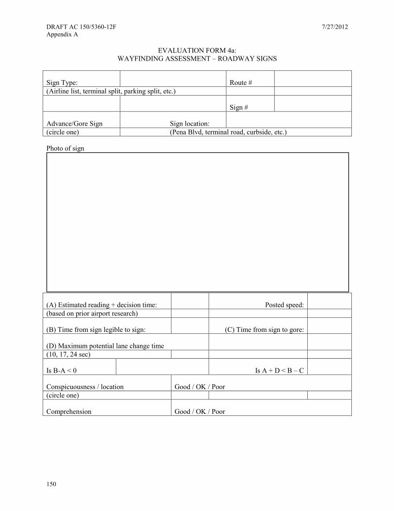
DRAFT AC 150/5360-12F 7/27/2012 Appendix A
150
EVALUATION FORM 4a: WAYFINDING ASSESSMENT – ROADWAY SIGNS
Sign Type: Route # (Airline list, terminal split, parking split, etc.)
Sign #
Advance/Gore Sign Sign location: (circle one) (Pena Blvd, terminal road, curbside, etc.)
Photo of sign
(A) Estimated reading + decision time: Posted speed: (based on prior airport research)
(B) Time from sign legible to sign: (C) Time from sign to gore:
(D) Maximum potential lane change time (10, 17, 24 sec)
Is B-A < 0 Is A + D < B – C
Conspicuousness / location Good / OK / Poor (circle one)
Comprehension Good / OK / Poor
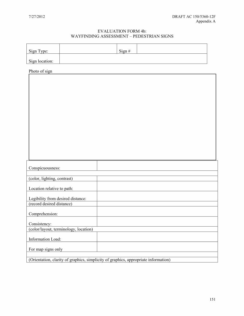
7/27/2012 DRAFT AC 150/5360-12F Appendix A
151
EVALUATION FORM 4b: WAYFINDING ASSESSMENT – PEDESTRIAN SIGNS
Sign Type: Sign #
Sign location:
Photo of sign
Conspicuousness: (color, lighting, contrast)
Location relative to path:
Legibility from desired distance: (record desired distance)
Comprehension:
Consistency: (color/layout, terminology, location)
Information Load:
For map signs only (Orientation, clarity of graphics, simplicity of graphics, appropriate information)

DRAFT AC 150/5360-12F 7/27/2012 Appendix A
152
This page intentionally left blank
7/27/2012 DRAFT AC 150/5360-12F Appendix B
153
Appendix B. Parking — Basic Mounting Types
The basic mounting types used within parking areas are overhead suspended, soffit mount, ceiling mount, flag mount, wall mount, post mount, and floor mount.
The following lists the types of general sign mounting that will be found throughout the parking areas:
A. Overhead suspended—Signs that are suspended from the ceiling using a cable or break-away fastening system
B. Soffit mount—Signs that are located on an architectural soffit or wall, and mounted with the back of the sign to the soffit or wall using a mechanical fastening system
C. Ceiling mount—Signs that are located flush to the ceiling and mounted with the top of the sign to the ceiling using a mechanical fastening system
D. Flag mount—Signs that are mounted perpendicular to the attachment surface, usually on a column, wall and / or soffit, and attached using a mechanical fastening system
E. Post mount—Signs that are mounted directly to a ground mounted single or double post structure using a mechanical fastening system
F. Column mount—Signs that are mounted with the back of the sign to the column using a mechanical fastening system
G. Wall mount—Signs that are mounted with the back of the sign to the wall using a mechanical fastening system
H. Freestanding—Signs that have their bases mounted directly to the ground/finished floor using a mechanical fastening system
I. Light pole mount—Signs that are mounted directly on the existing light pole structures
Mounting restrictions
Minimum clearance heights for overhead vehicular signs are dictated by architectural design limitations and must be coordinated with posted clearance at the entrance to the parking structure.

DRAFT AC 150/5360-12F 7/27/2012 Appendix B
154
A
MUST BE MOUNTED PERPENDICULARTO VEHICULAR TRAFFIC FLOW
B
MUST BE MOUNTED PERPENDICULARTO VEHICULAR TRAFFIC FLOW
C
MUST BE MOUNTED PERPENDICULARTO VEHICULAR TRAFFIC FLOW
OVERHEAD SUSPENDED
SOFFIT MOUNT
CEILING MOUNT

7/27/2012 DRAFT AC 150/5360-12F Appendix B
155
D
MUST BE MOUNTED PERPENDICULARTO VEHICULAR TRAFFIC FLOW
E
MUST BE MOUNTED PERPENDICULARTO VEHICULAR TRAFFIC FLOW
F
MUST PROJECT NO MORE THAN4" FROM THE FACE OF THE WALL
FLAG MOUNT
POST MOUNT
COLUMN MOUNT
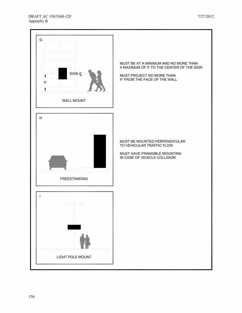
DRAFT AC 150/5360-12F 7/27/2012 Appendix B
156
G
MUST BE AT A MINIMUM AND NO MORE THAN
H
I
WALL MOUNT
5'
A MAXIMUM OF 5' TO THE CENTER OF THE SIGN
MUST PROJECT NO MORE THAN4" FROM THE FACE OF THE WALL
LIGHT POLE MOUNT
MUST BE MOUNTED PERPENDICULARTO VEHICULAR TRAFFIC FLOW
FREESTANDING
MUST HAVE FRANGIBLE MOUNTINGIN CASE OF VEHICLE COLLISION
SIGN CL
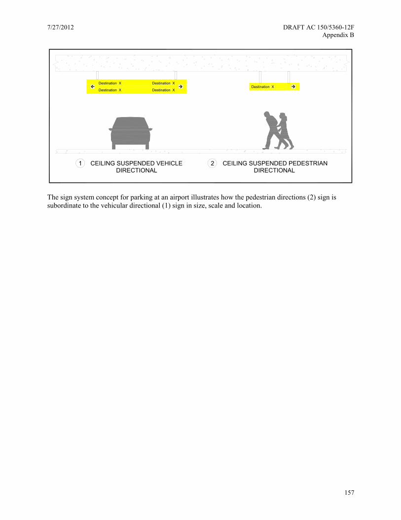
7/27/2012 DRAFT AC 150/5360-12F Appendix B
157
The sign system concept for parking at an airport illustrates how the pedestrian directions (2) sign is subordinate to the vehicular directional (1) sign in size, scale and location.
1 CEILING SUSPENDED VEHICLEDIRECTIONAL
2 CEILING SUSPENDED PEDESTRIANDIRECTIONAL
Destination XDestination X
Destination X
Destination X
Destination X

DRAFT AC 150/5360-12F 7/27/2012 Appendix B
158
This page intentionally left blank
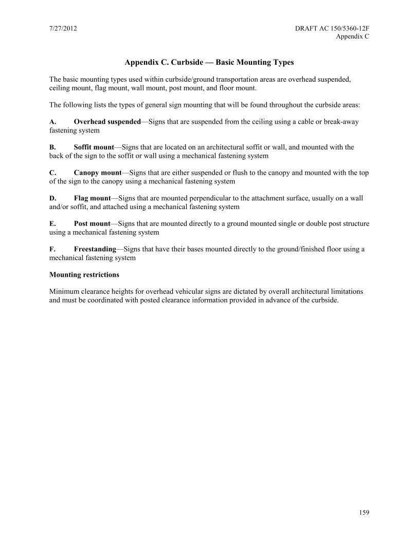
7/27/2012 DRAFT AC 150/5360-12F Appendix C
159
Appendix C. Curbside — Basic Mounting Types
The basic mounting types used within curbside/ground transportation areas are overhead suspended, ceiling mount, flag mount, wall mount, post mount, and floor mount.
The following lists the types of general sign mounting that will be found throughout the curbside areas:
A. Overhead suspended—Signs that are suspended from the ceiling using a cable or break-away fastening system
B. Soffit mount—Signs that are located on an architectural soffit or wall, and mounted with the back of the sign to the soffit or wall using a mechanical fastening system
C. Canopy mount—Signs that are either suspended or flush to the canopy and mounted with the top of the sign to the canopy using a mechanical fastening system
D. Flag mount—Signs that are mounted perpendicular to the attachment surface, usually on a wall and/or soffit, and attached using a mechanical fastening system
E. Post mount—Signs that are mounted directly to a ground mounted single or double post structure using a mechanical fastening system
F. Freestanding—Signs that have their bases mounted directly to the ground/finished floor using a mechanical fastening system
Mounting restrictions
Minimum clearance heights for overhead vehicular signs are dictated by overall architectural limitations and must be coordinated with posted clearance information provided in advance of the curbside.
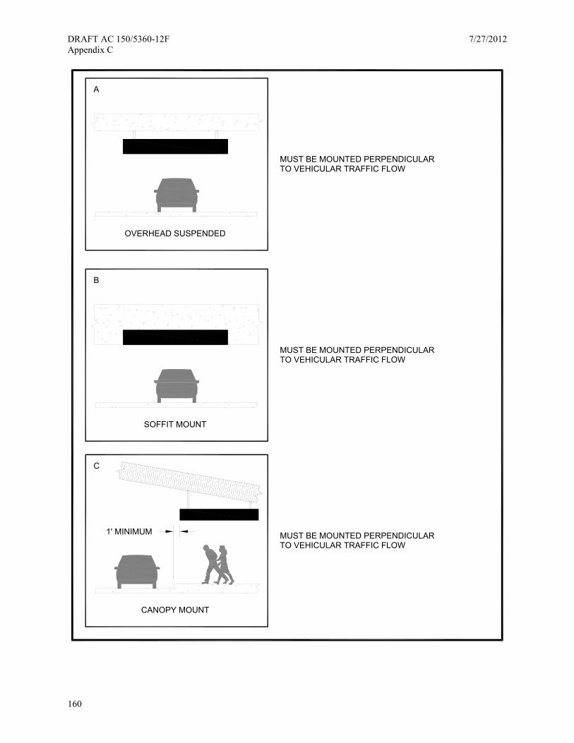
DRAFT AC 150/5360-12F 7/27/2012 Appendix C
160
A
MUST BE MOUNTED PERPENDICULARTO VEHICULAR TRAFFIC FLOW
B
MUST BE MOUNTED PERPENDICULARTO VEHICULAR TRAFFIC FLOW
OVERHEAD SUSPENDED
SOFFIT MOUNT
C
CANOPY MOUNT
MUST BE MOUNTED PERPENDICULARTO VEHICULAR TRAFFIC FLOW
1' MINIMUM
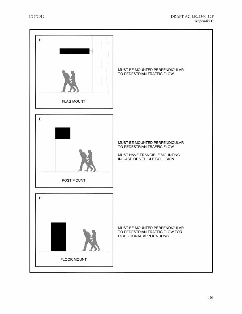
7/27/2012 DRAFT AC 150/5360-12F Appendix C
161
D
MUST BE MOUNTED PERPENDICULARTO PEDESTRIAN TRAFFIC FLOW
E
F
FLAG MOUNT
POST MOUNT
FLOOR MOUNT
MUST BE MOUNTED PERPENDICULARTO PEDESTRIAN TRAFFIC FLOW
MUST HAVE FRANGIBLE MOUNTINGIN CASE OF VEHICLE COLLISION
MUST BE MOUNTED PERPENDICULARTO PEDESTRIAN TRAFFIC FLOW FORDIRECTIONAL APPLICATIONS

DRAFT AC 150/5360-12F 7/27/2012 Appendix C
162
This page intentionally left blank
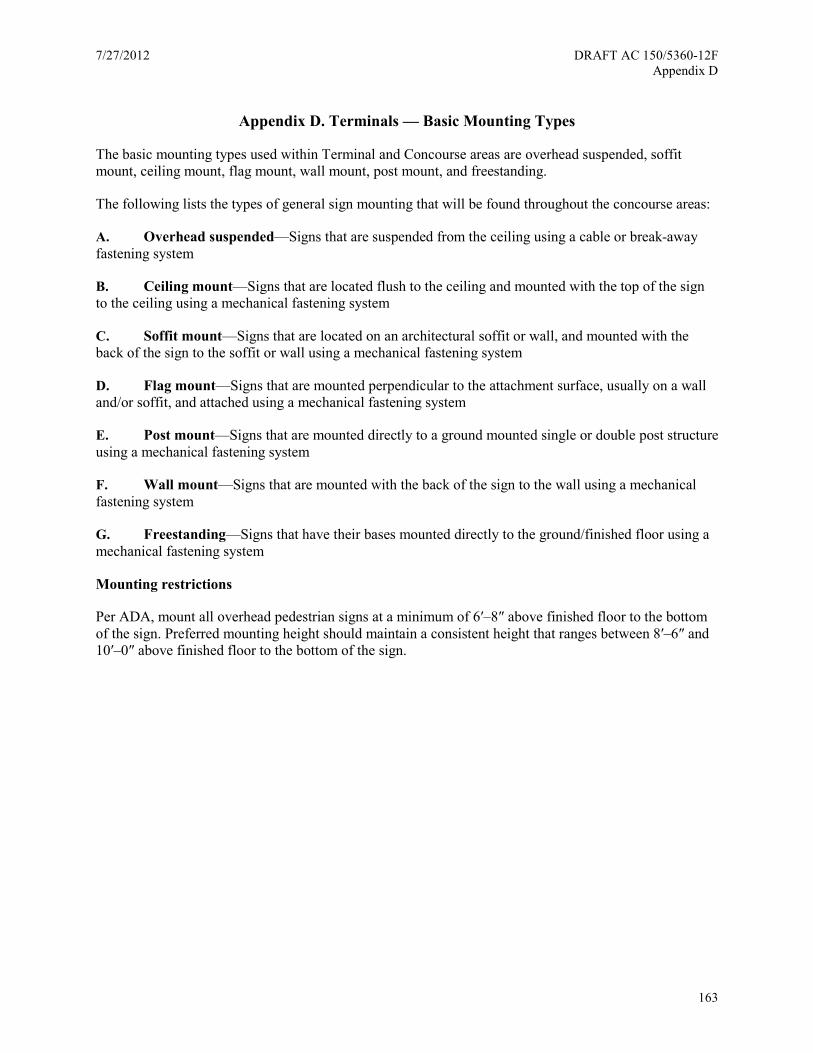
7/27/2012 DRAFT AC 150/5360-12F Appendix D
163
Appendix D. Terminals — Basic Mounting Types
The basic mounting types used within Terminal and Concourse areas are overhead suspended, soffit mount, ceiling mount, flag mount, wall mount, post mount, and freestanding.
The following lists the types of general sign mounting that will be found throughout the concourse areas:
A. Overhead suspended—Signs that are suspended from the ceiling using a cable or break-away fastening system
B. Ceiling mount—Signs that are located flush to the ceiling and mounted with the top of the sign to the ceiling using a mechanical fastening system
C. Soffit mount—Signs that are located on an architectural soffit or wall, and mounted with the back of the sign to the soffit or wall using a mechanical fastening system
D. Flag mount—Signs that are mounted perpendicular to the attachment surface, usually on a wall and/or soffit, and attached using a mechanical fastening system
E. Post mount—Signs that are mounted directly to a ground mounted single or double post structure using a mechanical fastening system
F. Wall mount—Signs that are mounted with the back of the sign to the wall using a mechanical fastening system
G. Freestanding—Signs that have their bases mounted directly to the ground/finished floor using a mechanical fastening system
Mounting restrictions
Per ADA, mount all overhead pedestrian signs at a minimum of 6′–8″ above finished floor to the bottom of the sign. Preferred mounting height should maintain a consistent height that ranges between 8′–6″ and 10′–0″ above finished floor to the bottom of the sign.

DRAFT AC 150/5360-12F 7/27/2012 Appendix D
164
A
MUST BE MOUNTED PERPENDICULARTO PEDESTRIAN TRAFFIC FLOW
B
MUST BE MOUNTED PERPENDICULARTO PEDESTRIAN TRAFFIC FLOW
C
MUST BE MOUNTED PERPENDICULARTO PEDESTRIAN TRAFFIC FLOW
OVERHEAD SUSPENDED
SOFFIT MOUNT
CEILING MOUNT

7/27/2012 DRAFT AC 150/5360-12F Appendix D
165
WALL MOUNT
5'
MUST BE AT A MINIMUM AND NO MORE THANA MAXIMUM OF 5' TO THE CENTER OF THE SIGN
MUST PROJECT NO MORE THAN4" FROM THE FACE OF THE WALL
POST MOUNT
FLAG MOUNT
MUST BE MOUNTED PERPENDICULAR
MUST BE MOUNTED PERPENDICULAR
TO PEDESTRIAN TRAFFIC FLOW
TO PEDESTRIAN TRAFFIC FLOW
D
E
F
SIGN CL
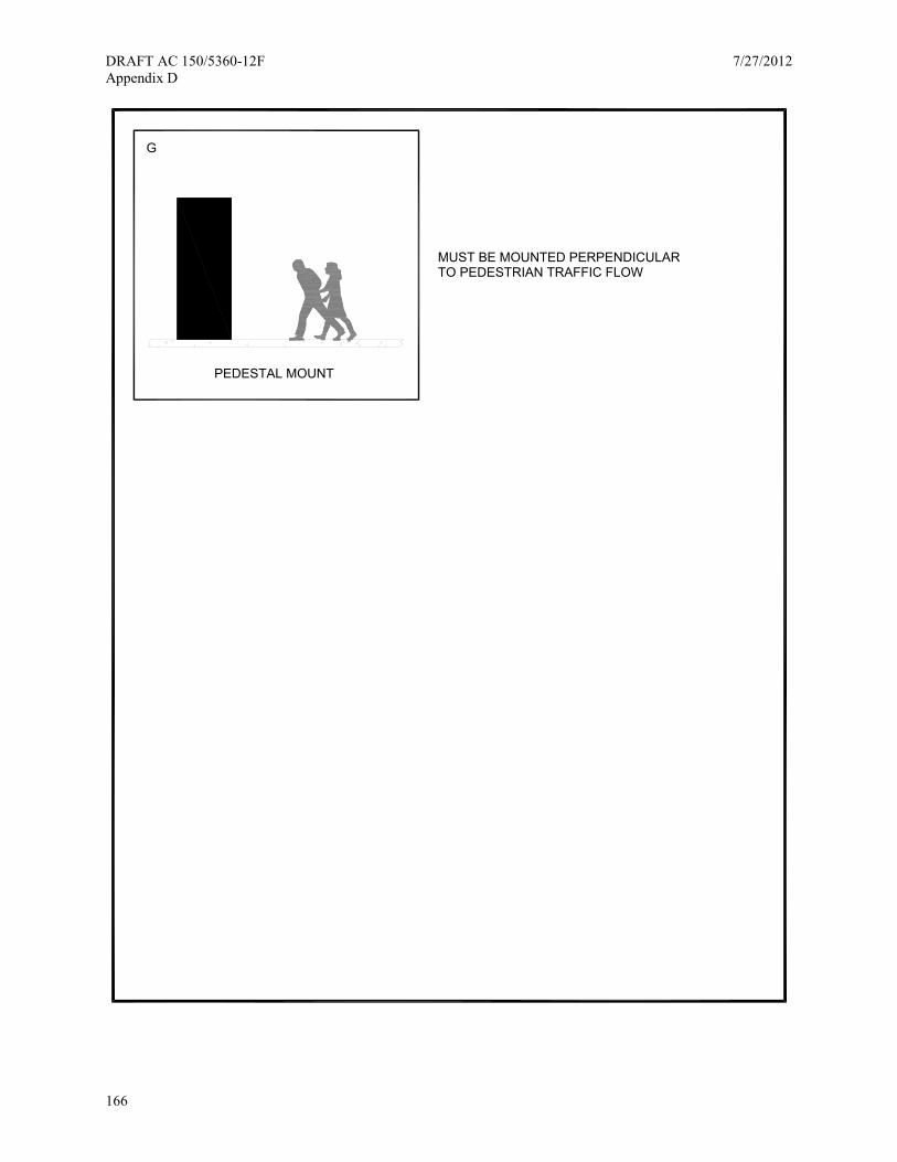
DRAFT AC 150/5360-12F 7/27/2012 Appendix D
166
PEDESTAL MOUNT
MUST BE MOUNTED PERPENDICULARTO PEDESTRIAN TRAFFIC FLOW
G

7/27/2012 DRAFT AC 150/5360-12F Appendix E
167
Appendix E. Roadway Signing — Additional Resources
AC 150/5340-18, Standards for Airport Sign Systems34, states:
Roadway signs. These are signs located on the airfield that are solely intended for vehicle operators. They should conform to the categorical color codes established by the MUTCD.
While this document refers to service vehicles operating on and around the runways and taxiways, it is important to note that even the FAA acknowledges the MUTCD as the ruling document.
For international airports, consult the International Civil Aviation Organization (ICAO) Document 9636, International Signs to Provide Guidance to Persons at Airports and Marine Terminals (1995)35.
The preparation and location of signing for terminal related roadways and other thoroughfares should comply with the FHWA’s MUTCDs for Streets and Highways.
AASHTO also publishes a 3-part series document that is intended to assist state agencies in determining how to best sign state highways for airport facilities. These documents are:
• Guide Signs, Part I: Guidelines for the Selection of Supplemental Guide Signs for Traffic Generators Adjacent to Freeways, 4th Edition
• Guide Signs, Part II: Guidelines for Airport Guide Signing
• Guide Signs, Part III: List of Control Cities for Use in Guide Signs on Interstate Highways
Part I of this revised document provides a basis for development of state policies for selection of supplemental guide signs for traffic generators adjacent to freeways, including airports. Part II, on airport guidelines specifically, has been expanded to include all highways. Part III contains the list of approved control cities for purposes of providing directional guidance on the Interstate Highway System36. This list of cities is to be used for trailblazing purposes on all signs and represents major destinations along the interstate system.
In order for airport roadway wayfinding to comply with the MUTCD there is a list of wayfinding challenges for airport users that need to be considered.
• Understanding roadway decision points • Airport terminology • Message hierarchies and lines of text • Regulatory and warning signs • Sign spacing and design speeds • Sign size, font, and colors • Use of symbols and arrows • CMSs

DRAFT AC 150/5360-12F 7/27/2012 Appendix E
168
This page intentionally left blank

7/27/2012 DRAFT AC 150/5360-12F Appendix F
169
Appendix F. Related Federal Regulatory and Informational Signage Requirements
Passenger Rights Notice of Limitation of Liability for death or injury Notice of Limitation of Liability for baggage Overbooking
National Threat Advisory and TSA Signs National Threat Advisory TSA liquids Checked Bag combo message
Consent to Search/Passenger Identification Consent to Search Passenger Identification
False Statements
Use of X-Ray Systems
Transportation of Hazardous Materials
Transportation of Firearms
Currency Reporting
Passenger Notices Public Inspection of Tariffs or Explanation of Contract Terms Contract of Carriage
Unlawful Discrimination

DRAFT AC 150/5360-12F 7/27/2012 Appendix F
170
Passenger Rights
Message: Various Passenger Rights Messages • Liability, death or injury • Liability for Baggage • Overbooking
Required by: Refer to each item and specific requirement • 14 CFR 221.105 (Liability, death or injury) • 14 CFR 221.106 (Liability for Baggage) • 14 CFR 250.11 (Overbooking)
Web Link: The electronic CFR is the preferred website for investigating further these requirements. 1. Go to: http://ecfr.gpoaccess.gov 2. Select Title 14 3. Select the appropriate link to the section you want. For example, select Section 221,
then select part 105 from the next page of links.
Font/Size: 14 CFR221.105: boldfaced type at least one-fourth of an inch high 14 CFR221.106: Legible English, bold-face, at least .635 cm (0.25 in) in height. 14 CFR250.11: Legible English, bold face, at least .635 cm (0.25 inch) in height.
Location: These signs are most commonly displayed on top of airline ticket counters or on the front of the counter podium, turret or counter shell.
Note: These notices are generally combined into one sign and located so as to be clearly readable by the traveling public.
Variable Yes, the coverage mentioned in the liability is subject to change.
14 CFR 221.105 describes a sign to be posted with a message regarding Advice to International Passengers on Limitation of Liability. Travelers may depart on a domestic flight from a terminal that does not have international flights, but still connect to an international flight. This message apparently is intended for them. Section (b) describes the message of the sign, that it is:
• To be displayed continuously in a conspicuous public place at each desk, station, and position in the United States which is in the charge of a person employed exclusively by it or by it jointly with another person, or by any agent employed by such air carrier or foreign air carrier to sell tickets to passengers.
• To be printed in boldfaced type at least one-fourth of an inch high.
Later, in Part 106, an option is given to take the Part 105 message and the Part 106 message for a combined, single message. See below for details regarding content.
14 CFR 221.106 describes a sign for Notice of limited liability for baggage. It later indicates the option of a consolidated notice of liability limitations, to “...use the following notice in full compliance with the posting requirements of this paragraph and of §221.105(b)” with the notice given as shown below. The same requirements – displayed in a conspicuous public place, and be printed in boldfaced type at least one-fourth of an inch high is still required. The message:

7/27/2012 DRAFT AC 150/5360-12F Appendix F
171
Advice to passengers on limitations of liability:
Airline liability for death or personal injury may be limited by the Warsaw Convention and tariff provisions in the case of travel to or from a foreign country.
For most international travel (including domestic portions of international journeys) liability for loss, delay or damage to baggage is limited to approximately $9.07 per pound for checked baggage and $400 per passenger for unchecked baggage unless a higher value is declared and an extra charge is paid. Special rules may apply to valuable articles.
See the notice with your tickets or consult your airline or travel agent for further information.
14 CFR 221.106 Part 106(a)(3) provides the option of including the terms of $ per kilo (i.e., $20.00 per kilo). This is not a requirement, but could be considered.
Based on the language in the regulations, and the possible wide variety of air carriers, the message stated above likely meets all air carrier requirements. If liability changes ($9.07 per pound for checked baggage and $400 per passenger), it is likely that sign patches may be necessary to avoid a complete sign replacement. Sign Managers must annually check the eCFR for updates.
14 CFR 250.11, the “Overbooking message,” has these specific requirements:
• “Every carrier shall cause to be displayed continuously in a conspicuous public place at each desk, station, and position in the United States which is in the charge of a person employed exclusively by it, or by it jointly with another person, or by any agent employed by such air carrier or foreign air carrier to sell tickets to passengers, a sign located so as to be clearly visible and clearly readable to the traveling public,...”
• “... which shall have printed thereon the following statement in boldface type at least one-fourth of an inch high” – see statement below
• There is a mid-statement requirement to choose one of two options.
o “With few exceptions, including failure to comply with the carrier’s check-in deadline (carrier shall insert either ‘of _ minutes prior to each flight segment’ or ‘(which are available upon request from the air carrier)’ here)”
o “Recommendation is to include the statement ‘(which are available upon request from the air carrier).’ Note that the grammar in the requirement appears to be in error... that one should use ‘...is available’ and not ‘...are available.’”
• Actual statement with changes as recommended above:
Notice—Overbooking of flights
Airline flights may be overbooked, and there is a slight chance that a seat will not be available on a flight for which a person has a confirmed reservation. If the flight is overbooked, no one will be denied a seat until airline personnel first ask for volunteers willing to give up their reservation in exchange for compensation of the airline’s choosing. If there are not enough volunteers, the airline will deny boarding to other persons in
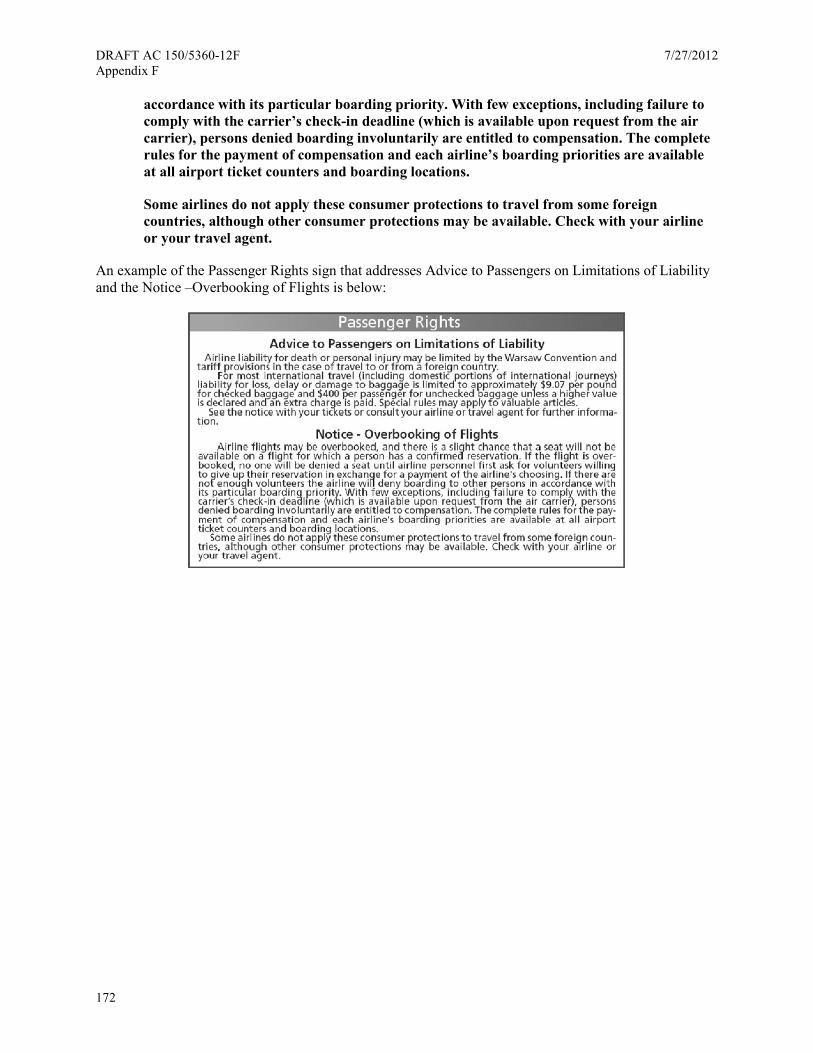
DRAFT AC 150/5360-12F 7/27/2012 Appendix F
172
accordance with its particular boarding priority. With few exceptions, including failure to comply with the carrier’s check-in deadline (which is available upon request from the air carrier), persons denied boarding involuntarily are entitled to compensation. The complete rules for the payment of compensation and each airline’s boarding priorities are available at all airport ticket counters and boarding locations.
Some airlines do not apply these consumer protections to travel from some foreign countries, although other consumer protections may be available. Check with your airline or your travel agent.
An example of the Passenger Rights sign that addresses Advice to Passengers on Limitations of Liability and the Notice –Overbooking of Flights is below:

7/27/2012 DRAFT AC 150/5360-12F Appendix F
173
National Threat Advisory and TSA Signs
Message: National Threat Advisory TSA Liquids (revised) Checked Bag Combo
Required by: Refer to each item and specific requirement • TSA Airport Signage Guidelines dated August 2008 (TSA Checked Bag Combo).
There is no known authority for these guidelines other than the TSA states they are required.
• Security directive at time of writing: Security Directive 1544-06 01D
Web Link: No known links
Font/Size: Varies • TSA Liquids (revised) and Checked Bag Combo follow the sign format (size, varying
font sizes, type of font) developed by the TSA. • National Threat Advisory text size not specified. Following text size for passenger
rights, typically use 0.25 inch font height.
Location: Curbside Check-in, Ticketing/Check-in Hall NOTE: Liquids message is often found in the security queue as well.
Variable No rates or fines are given. Likely to change due to periodic TSA updates to TSA signage guidelines or TSA issues new security directives.
TSA checked bag combo: According to the TSA Airport Signage Guidelines dated August 2008:
• The Checked Baggage Combo sign is required for each checked baggage area, as a part of the complete Checkpoint Evolution package. The sign is legally required (the TSA signage guidelines do not state the legal basis for the requirement).
• Size of Checked Baggage Combo – 22"×28" or 11"×14"
• Requirement: Required by TSA; no
• Location: Front and back of one stanchion, placed within the air carrier queue or at the entrance to the Explosives Trace Detection (ETD)/ Explosives Detection Systems (EDS) node.
• TSA has required the TSA Checked Bag Combo message at curbside check-in, though the requirement for double-sided sign did not necessarily apply since stanchions may not be used outside due to weather or safety concerns. Instead, the sign may be mounted on the surface of the podium or on the adjacent wall or column.
TSA liquids and National Threat Advisory: Security Directive 1544-06-01D (current as of the time of this writing), has four (4) advisories that the air carriers are required to provide to its passengers. Those advisories are:
1. Advise passengers that they are prohibited from taking liquids, gels, and/or aerosols through the passenger screening checkpoint into the sterile area EXCEPT one clear resealable 1 quart (1 liter)

DRAFT AC 150/5360-12F 7/27/2012 Appendix F
174
size plastic bag containing liquids, gels, and/or aerosols in travel size containers (3.4 oz./100 ml) capacity or less per container. The contents of the plastic bag must fit comfortably and the plastic bag must be completely closed/sealed and subjected to x-ray inspection separate from passengers’ carry-on bag.
2. Advise passengers that they may have the following items, but must declare them to TSA at the screening checkpoint if not contained in a clear transparent resealable 1 quart (1 liter) size plastic bag and/or the size of the containers exceed travel size (3.4 oz./100 ml).
a. Baby formula/milk (to include breast milk) and baby food/juice in containers if a baby or small child is traveling.
b. Medications (liquid, gel, and aerosol).
c. Liquids (to include juice) or gels or diabetic or other medical needs.
3. Advise passengers that they may be subjected to secondary screening if they enter the screening checkpoint with liquids, gels, and/or aerosols on their person or in their carry-on bag.
4. Advise passengers that the Secretary of the DHS has determined that there is a high risk of terrorism against U.S. civil aviation, and the need for extra restrictions to assure the security of air travel. Advise passengers to travel light. Their accessible property should have minimal clutter to expedite the screening process.
One airport evaluated the liquids message as an option to meet the security directive. TSA regulatory personnel stated the TSA Liquids Combo message was insufficient to meet the security directives requirement. The airport was also informed that the security directive language did not have to be repeated verbatim, but could be shortened as long as the intent of the message is included.
Instead of developing a second message, the airport added information to the TSA Liquids Combo message. The two messages are compared below:
• The left message is the original TSA Liquids message
• The right message, TSA Liquids (revised), was developed by the airport, meets TSA security directive for points 1 to 3 above, and was approved for deployment by TSA regulatory personnel.
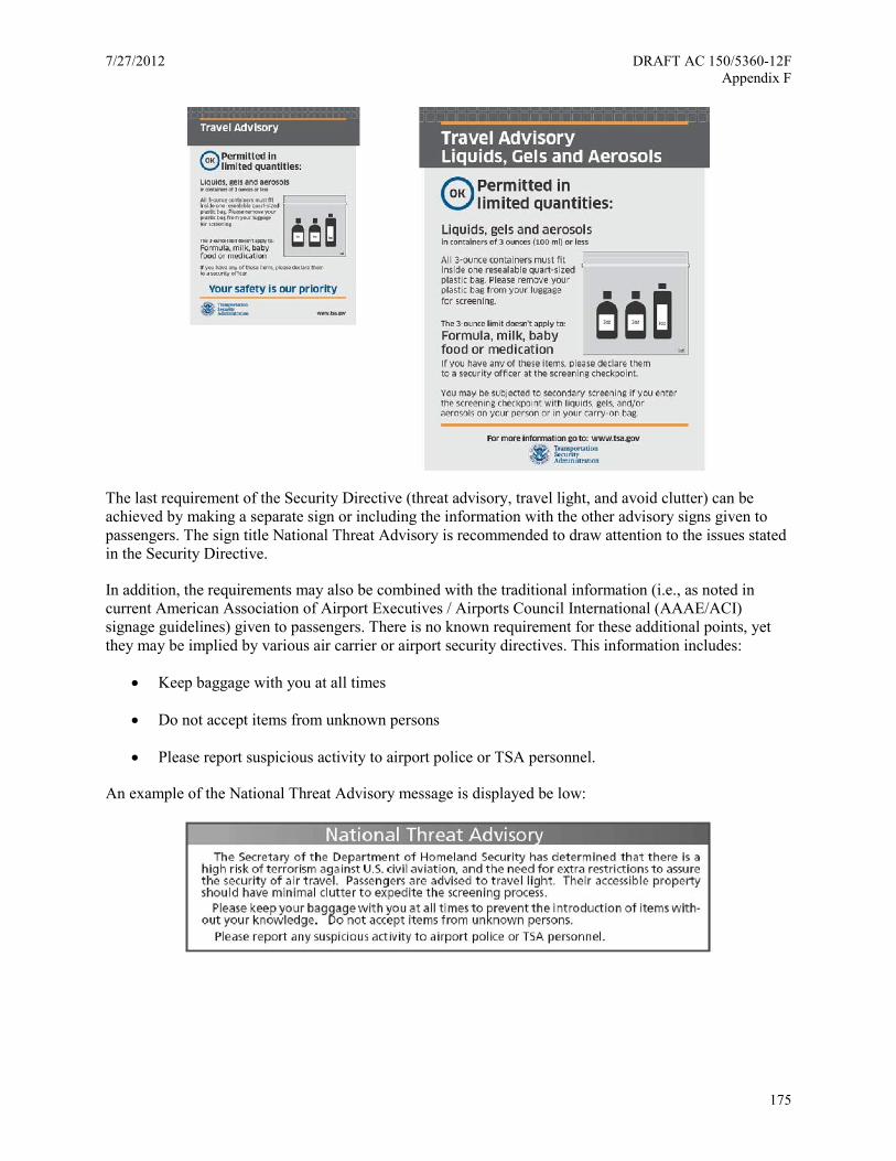
7/27/2012 DRAFT AC 150/5360-12F Appendix F
175
The last requirement of the Security Directive (threat advisory, travel light, and avoid clutter) can be achieved by making a separate sign or including the information with the other advisory signs given to passengers. The sign title National Threat Advisory is recommended to draw attention to the issues stated in the Security Directive.
In addition, the requirements may also be combined with the traditional information (i.e., as noted in current American Association of Airport Executives / Airports Council International (AAAE/ACI) signage guidelines) given to passengers. There is no known requirement for these additional points, yet they may be implied by various air carrier or airport security directives. This information includes:
• Keep baggage with you at all times
• Do not accept items from unknown persons
• Please report suspicious activity to airport police or TSA personnel.
An example of the National Threat Advisory message is displayed be low:
DRAFT AC 150/5360-12F 7/27/2012 Appendix F
176
Consent to Search / Passenger Identification
Messages: Consent to Search (including checked baggage) Passenger Identification
Required by: Aircraft operators or Airport Security Program; referenced as follows: • Title 49 C.F.R., 1540.107 Submission to screening and inspection.
Web Link: The electronic CFR is the preferred website for investigating further these requirements. 1. Go to: http://ecfr.gpoaccess.gov 2. Select Title 49 3. Select the appropriate links to the section you want. For example, select Section 1540
and then select part 107 from the next page of links.
Font/Size: Text size not specified. Recommend using consistent font as in other messages to passengers such as passenger rights, so use 0.25 inch font height.
Location: Curbside Check-in, Ticketing/Check-in Hall, Gate Podium
Fine Amount: N/A
49 CFR 1540.107 describes submission to screening and inspection. It essentially gives these definitions of what is to be submitted:
• No individual may enter a sterile area or board an aircraft without submitting to the screening and inspection of his or her person and accessible property in accordance with the procedures being applied to control access to that area or aircraft under this subchapter.
• An individual must provide his or her full name,
• An individual may not enter a sterile area or board an aircraft if the individual does not present a verifying identity document
Air carrier or airport security plans may require that individuals be informed they will be screened and be asked to provide identification. However, there is no specific sign requirement or information on where such information should be posted. It is assumed that the information ideally should be given out upon check-in (ticket hall and curbside). It is also possible that secondary searches may occur at the gate before boarding an aircraft, so the message should be posted there as well. The message may be included with other passenger advisory messages (i.e., on a single sign panel).
Without any specific sign requirement, the proposed language may be based on the AAAE/ACI signage guidelines. The suggested language to the right was accepted at one airport by TSA regulatory personnel:
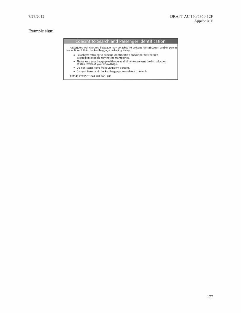
7/27/2012 DRAFT AC 150/5360-12F Appendix F
177
Example sign:
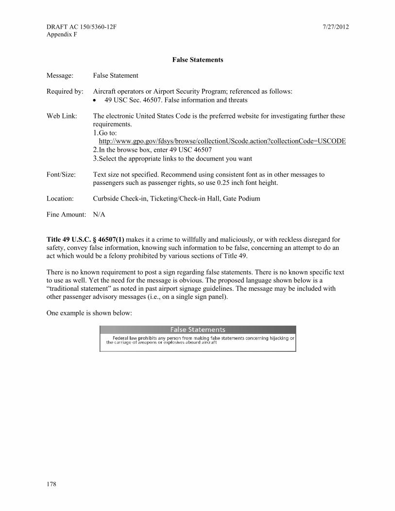
DRAFT AC 150/5360-12F 7/27/2012 Appendix F
178
False Statements
Message: False Statement
Required by: Aircraft operators or Airport Security Program; referenced as follows: • 49 USC Sec. 46507. False information and threats
Web Link: The electronic United States Code is the preferred website for investigating further these requirements. 1. Go to:
http://www.gpo.gov/fdsys/browse/collectionUScode.action?collectionCode=USCODE 2. In the browse box, enter 49 USC 46507 3. Select the appropriate links to the document you want
Font/Size: Text size not specified. Recommend using consistent font as in other messages to passengers such as passenger rights, so use 0.25 inch font height.
Location: Curbside Check-in, Ticketing/Check-in Hall, Gate Podium
Fine Amount: N/A
Title 49 U.S.C. § 46507(1) makes it a crime to willfully and maliciously, or with reckless disregard for safety, convey false information, knowing such information to be false, concerning an attempt to do an act which would be a felony prohibited by various sections of Title 49.
There is no known requirement to post a sign regarding false statements. There is no known specific text to use as well. Yet the need for the message is obvious. The proposed language shown below is a “traditional statement” as noted in past airport signage guidelines. The message may be included with other passenger advisory messages (i.e., on a single sign panel).
One example is shown below:
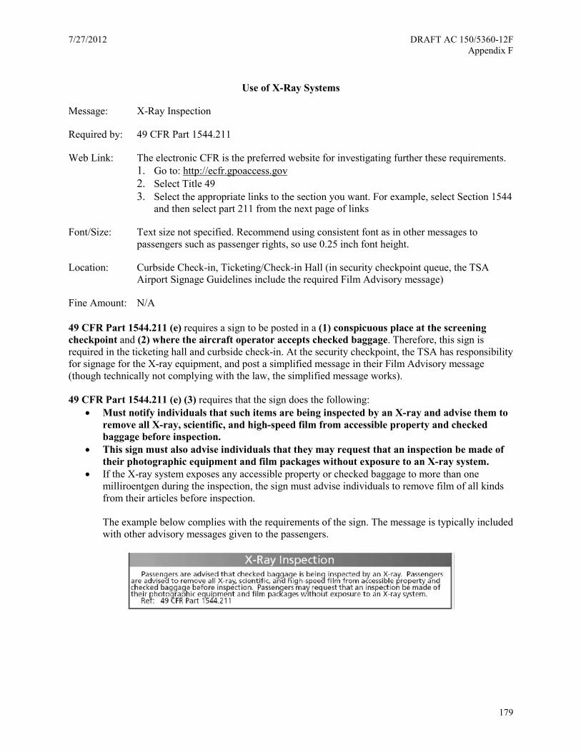
7/27/2012 DRAFT AC 150/5360-12F Appendix F
179
Use of X-Ray Systems
Message: X-Ray Inspection
Required by: 49 CFR Part 1544.211
Web Link: The electronic CFR is the preferred website for investigating further these requirements. 1. Go to: http://ecfr.gpoaccess.gov 2. Select Title 49 3. Select the appropriate links to the section you want. For example, select Section 1544
and then select part 211 from the next page of links
Font/Size: Text size not specified. Recommend using consistent font as in other messages to passengers such as passenger rights, so use 0.25 inch font height.
Location: Curbside Check-in, Ticketing/Check-in Hall (in security checkpoint queue, the TSA Airport Signage Guidelines include the required Film Advisory message)
Fine Amount: N/A
49 CFR Part 1544.211 (e) requires a sign to be posted in a (1) conspicuous place at the screening checkpoint and (2) where the aircraft operator accepts checked baggage. Therefore, this sign is required in the ticketing hall and curbside check-in. At the security checkpoint, the TSA has responsibility for signage for the X-ray equipment, and post a simplified message in their Film Advisory message (though technically not complying with the law, the simplified message works).
49 CFR Part 1544.211 (e) (3) requires that the sign does the following: • Must notify individuals that such items are being inspected by an X-ray and advise them to
remove all X-ray, scientific, and high-speed film from accessible property and checked baggage before inspection.
• This sign must also advise individuals that they may request that an inspection be made of their photographic equipment and film packages without exposure to an X-ray system.
• If the X-ray system exposes any accessible property or checked baggage to more than one milliroentgen during the inspection, the sign must advise individuals to remove film of all kinds from their articles before inspection.
The example below complies with the requirements of the sign. The message is typically included with other advisory messages given to the passengers.
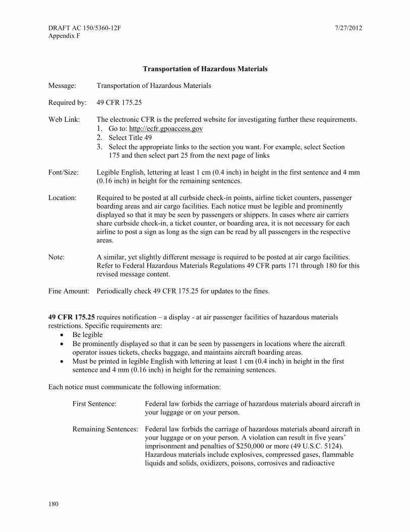
DRAFT AC 150/5360-12F 7/27/2012 Appendix F
180
Transportation of Hazardous Materials
Message: Transportation of Hazardous Materials
Required by: 49 CFR 175.25
Web Link: The electronic CFR is the preferred website for investigating further these requirements. 1. Go to: http://ecfr.gpoaccess.gov 2. Select Title 49 3. Select the appropriate links to the section you want. For example, select Section
175 and then select part 25 from the next page of links
Font/Size: Legible English, lettering at least 1 cm (0.4 inch) in height in the first sentence and 4 mm (0.16 inch) in height for the remaining sentences.
Location: Required to be posted at all curbside check-in points, airline ticket counters, passenger boarding areas and air cargo facilities. Each notice must be legible and prominently displayed so that it may be seen by passengers or shippers. In cases where air carriers share curbside check-in, a ticket counter, or boarding area, it is not necessary for each airline to post a sign as long as the sign can be read by all passengers in the respective areas.
Note: A similar, yet slightly different message is required to be posted at air cargo facilities. Refer to Federal Hazardous Materials Regulations 49 CFR parts 171 through 180 for this revised message content.
Fine Amount: Periodically check 49 CFR 175.25 for updates to the fines.
49 CFR 175.25 requires notification – a display - at air passenger facilities of hazardous materials restrictions. Specific requirements are:
• Be legible • Be prominently displayed so that it can be seen by passengers in locations where the aircraft
operator issues tickets, checks baggage, and maintains aircraft boarding areas. • Must be printed in legible English with lettering at least 1 cm (0.4 inch) in height in the first
sentence and 4 mm (0.16 inch) in height for the remaining sentences.
Each notice must communicate the following information:
First Sentence: Federal law forbids the carriage of hazardous materials aboard aircraft in your luggage or on your person.
Remaining Sentences: Federal law forbids the carriage of hazardous materials aboard aircraft in your luggage or on your person. A violation can result in five years’ imprisonment and penalties of $250,000 or more (49 U.S.C. 5124). Hazardous materials include explosives, compressed gases, flammable liquids and solids, oxidizers, poisons, corrosives and radioactive
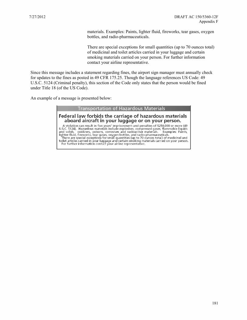
7/27/2012 DRAFT AC 150/5360-12F Appendix F
181
materials. Examples: Paints, lighter fluid, fireworks, tear gases, oxygen bottles, and radio-pharmaceuticals.
There are special exceptions for small quantities (up to 70 ounces total) of medicinal and toilet articles carried in your luggage and certain smoking materials carried on your person. For further information contact your airline representative.
Since this message includes a statement regarding fines, the airport sign manager must annually check for updates to the fines as posted in 49 CFR 175.25. Though the language references US Code: 49 U.S.C. 5124 (Criminal penalty), this section of the Code only states that the person would be fined under Title 18 (of the US Code).
An example of a message is presented below:
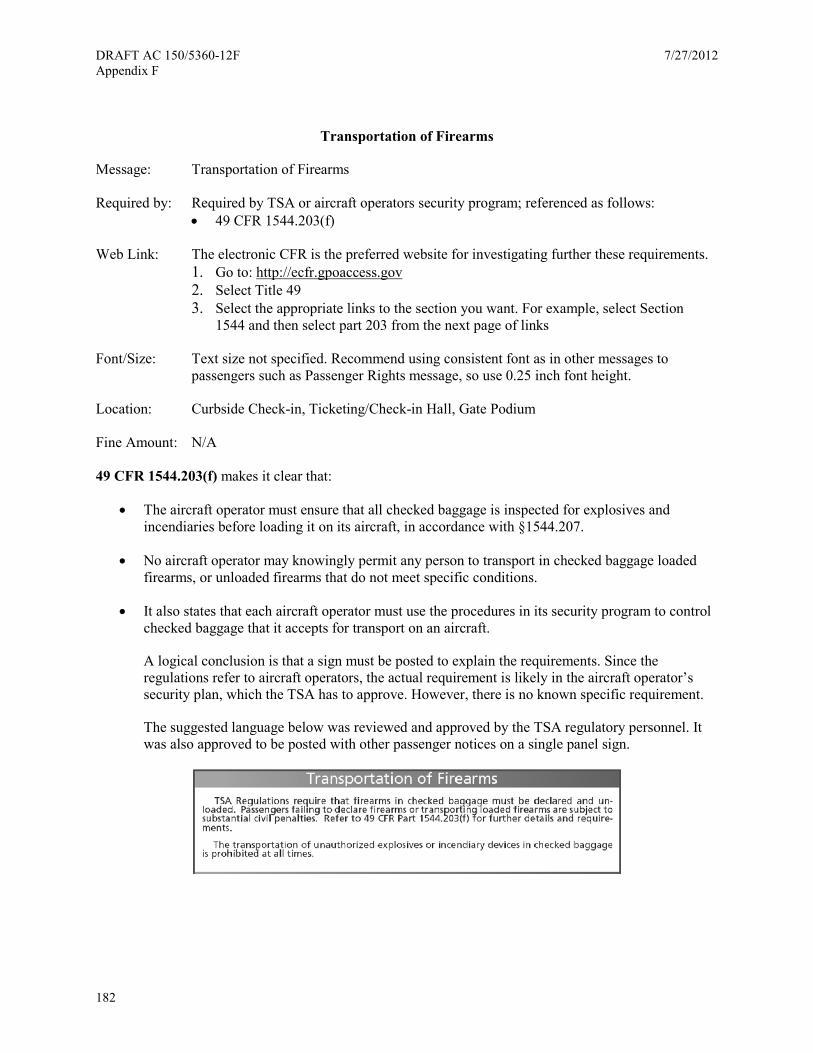
DRAFT AC 150/5360-12F 7/27/2012 Appendix F
182
Transportation of Firearms
Message: Transportation of Firearms
Required by: Required by TSA or aircraft operators security program; referenced as follows: • 49 CFR 1544.203(f)
Web Link: The electronic CFR is the preferred website for investigating further these requirements. 1. Go to: http://ecfr.gpoaccess.gov 2. Select Title 49 3. Select the appropriate links to the section you want. For example, select Section
1544 and then select part 203 from the next page of links
Font/Size: Text size not specified. Recommend using consistent font as in other messages to passengers such as Passenger Rights message, so use 0.25 inch font height.
Location: Curbside Check-in, Ticketing/Check-in Hall, Gate Podium
Fine Amount: N/A
49 CFR 1544.203(f) makes it clear that:
• The aircraft operator must ensure that all checked baggage is inspected for explosives and incendiaries before loading it on its aircraft, in accordance with §1544.207.
• No aircraft operator may knowingly permit any person to transport in checked baggage loaded firearms, or unloaded firearms that do not meet specific conditions.
• It also states that each aircraft operator must use the procedures in its security program to control checked baggage that it accepts for transport on an aircraft.
A logical conclusion is that a sign must be posted to explain the requirements. Since the regulations refer to aircraft operators, the actual requirement is likely in the aircraft operator’s security plan, which the TSA has to approve. However, there is no known specific requirement.
The suggested language below was reviewed and approved by the TSA regulatory personnel. It was also approved to be posted with other passenger notices on a single panel sign.
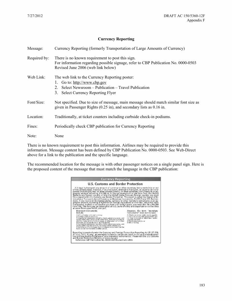
7/27/2012 DRAFT AC 150/5360-12F Appendix F
183
Currency Reporting
Message: Currency Reporting (formerly Transportation of Large Amounts of Currency)
Required by: There is no known requirement to post this sign. For information regarding possible signage, refer to CBP Publication No. 0000-0503 Revised June 2006 (web link below)
Web Link: The web link to the Currency Reporting poster: 1. Go to: http://www.cbp.gov 2. Select Newsroom – Publication – Travel Publication 3. Select Currency Reporting Flyer
Font/Size: Not specified. Due to size of message, main message should match similar font size as given in Passenger Rights (0.25 in), and secondary lists as 0.16 in.
Location: Traditionally, at ticket counters including curbside check-in podiums.
Fines: Periodically check CBP publication for Currency Reporting
Note: None
There is no known requirement to post this information. Airlines may be required to provide this information. Message content has been defined by CBP Publication No. 0000-0503. See Web-Direct above for a link to the publication and the specific language.
The recommended location for the message is with other passenger notices on a single panel sign. Here is the proposed content of the message that must match the language in the CBP publication:
DRAFT AC 150/5360-12F 7/27/2012 Appendix F
184
Passenger Notices
Messages: Public Inspection of Tariffs or Explanation of Contract Terms Contract of Carriage
Required by: 14 CFR 221.103 Notice of tariff terms OR 14 CFR 221.107 Notice of contract terms (Contract of Carriage is discussed in this section but is not a requirement)
Web Link: The electronic CFR is the preferred website for investigating further these requirements. 1. Go to: http://ecfr.gpoaccess.gov 2. Select Title 14 3. Select the appropriate links to the section you want. For example, select Section 221
and then select part 103 from the next page of links
Font “Printed in large type.” Suggested font size is similar to the Passenger Rights messages, which require font size of 0.25 in
Location: Curbside check-in; Ticketing/check-in hall
Fine Amount: N/A
14 CFR 221.100 requires that the public be notified of tariff information. Tariff by definition in 14 CFR 221 refers to fares applied to an airline ticket. Carriers must make tariff information available to the general public, and in so doing must comply with either:
• Sections 221.101, 221.102, 221.103, 221.104, 221.105, and 221.106, or
• Sections 221.105, 221.106 and 221.107 of this subpart.
Sections 221.105 and 221.106 are already addressed in Advice to Passengers on Limitations of Liability (see Exhibit 2). 14 CFR 221.103 and 14 CFR 221.107 both requires a sign to be displayed, but only one of them is actually required according to 14 CFR 221.100. About these two sections:
• 14 CFR 221.103 is Public Inspection of Tariffs and traditionally posted at airports alongside the messages regarding Advice to Passengers on Limitations of Liability (see Exhibit 2)
• 14 CFR 221.107 is Explanation of Contract Terms, and is somewhat similar to the statement in Public Inspection of Tariffs.
• The regulations do not explain which to use. Yet in both cases, the information must be displayed in a conspicuous public place and be printed in large type.
The two sign types (not including airline contract of carriage) are displayed below. For the sections of the sign which indicate an “insertion” of a specific destination or address, the following recommendations are provided:
7/27/2012 DRAFT AC 150/5360-12F Appendix F
185
• For: (Here name the point.), instead provide this message “...so far as they apply to traffic from or to any point served by this airline.”
• For: (Here indicate the place or places where tariff files are maintained...), instead provide this message “...at all airline offices.”
One the insertions are applied, the two statements, either of which may be used, read as follows:
14 CFR 221.103 Public Inspection of Tariffs
All the currently effective passenger tariffs to which this company is a party and all passenger tariff publications which have been issued but are not yet effective are on file in this office, so far as they apply to traffic from or to any point served by this airline. These tariffs may be inspected by any person upon request and without the assignment of any reason for such inspection. The employees of this company on duty in this office will lend assistance in securing information from the tariffs.
In addition, a complete file of all tariffs of this company, with indexes thereof, is maintained and kept available for public inspection at all airline offices.
14 CFR 221.107 Explanation of Contract Terms
All passenger (and/or cargo as applicable) contract terms incorporated into the contract of carriage to which this company is a party are available in this office. These provisions may be inspected by any person upon request and for any reason. The employees of this office will lend assistance in securing information, and explaining any terms.
In addition, a file of all tariffs of this company, with indexes thereof, from which incorporated contract terms may be obtained is maintained and kept available for public inspection at all airline offices.
In addition, airlines may also request to post their Contract of Carriage statement independently of the requirements of 14 CFR 221.103 or 14 CFR 221.107. Or the airline may post their Contract of Carriage statement to meet requirements of 14 CFR 253 Notice of Terms of Contract of Carriage (more on this later). In a common-use airport environment, the goal should be to comply with regulations yet avoid adding extra signs unless specifically required to be posted. An airline Contract of Carriage sign may measure up to 12"w × 12" h. Airport sign managers may need to work out a compromise with airlines for posting of information under 14 CFR 221.
Regarding 14 CFR 253 Notice of Terms of Contract of Carriage:
• Applies to direct air carrier operations in interstate and overseas air transportation
• A ticket or other written instrument that embodies the contract of carriage may incorporate contract terms by reference (i.e., without stating their full text), and if it does so will contain or be accompanied by notice to the passenger as required by this part (this latter part discussed below)
• Each air carrier will make the full text of each term that it incorporates by reference in a contract of carriage available for public inspection at each of its airport and city ticket offices.
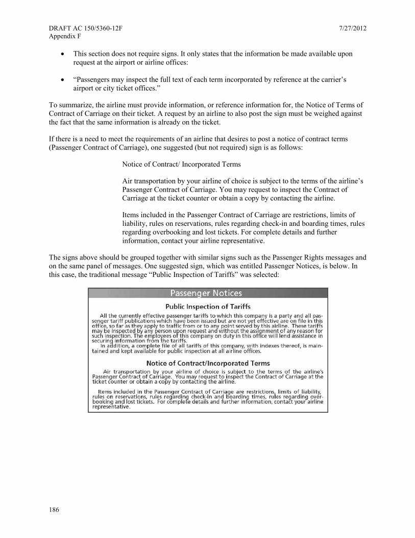
DRAFT AC 150/5360-12F 7/27/2012 Appendix F
186
• This section does not require signs. It only states that the information be made available upon request at the airport or airline offices:
• “Passengers may inspect the full text of each term incorporated by reference at the carrier’s airport or city ticket offices.”
To summarize, the airline must provide information, or reference information for, the Notice of Terms of Contract of Carriage on their ticket. A request by an airline to also post the sign must be weighed against the fact that the same information is already on the ticket.
If there is a need to meet the requirements of an airline that desires to post a notice of contract terms (Passenger Contract of Carriage), one suggested (but not required) sign is as follows:
Notice of Contract/ Incorporated Terms
Air transportation by your airline of choice is subject to the terms of the airline’s Passenger Contract of Carriage. You may request to inspect the Contract of Carriage at the ticket counter or obtain a copy by contacting the airline.
Items included in the Passenger Contract of Carriage are restrictions, limits of liability, rules on reservations, rules regarding check-in and boarding times, rules regarding overbooking and lost tickets. For complete details and further information, contact your airline representative.
The signs above should be grouped together with similar signs such as the Passenger Rights messages and on the same panel of messages. One suggested sign, which was entitled Passenger Notices, is below. In this case, the traditional message “Public Inspection of Tariffs” was selected:
7/27/2012 DRAFT AC 150/5360-12F Appendix F
187
Unlawful Discrimination
Message: Unlawful Discrimination
Required by: 49 CFR 21 Appendix C (b)(2)(ii)
Web Link: The electronic CFR is the preferred website for investigating further these requirements. 1. Go to: http://ecfr.gpoaccess.gov 2. Select Title 49 3. Select the appropriate links to the section you want. For example, select Section 21
and then select part Appendix C from the next page of links
Font/Size: Not specified
Location: Main public area or areas of the airport
Fine Amount: N/A
49 CFR 21 Appendix C (b)(2)(ii) - Obligations of the airport operator/ Notification of beneficiaries states “the airport operator shall:
Conspicuously display a sign, or signs, furnished by the FAA, in the main public area or areas of the airport, stating that discrimination based on race, color, or national origin is prohibited on the airport.”
There is no information regarding which group in the FAA provides the sign, though it is likely that responsibility belongs to the Area Manager of the FAA Area in which the airport is located.
Regarding content and form, the requirement is brief: “discrimination based on race, color, or national origin is prohibited on the airport.” However, the Department of Transportation has this statement regarding civil rights: “The Department of Transportation’s civil rights policies strictly prohibit discrimination in its programs, activities and employment on the basis of race, color, national origin, gender, religion, age (40 years and over), disability, or sexual orientation.” In this case, the areas of discrimination have been extended beyond race, color, or national origin.
The suggested language for a sign, to meet the requirements 49 CFR 21 Appendix C (b)(2)(ii), and to be aligned with the policy of the Department of Transportation regarding discrimination as well as providing a means to report on what to do with allegations, is as follows:
Unlawful Discrimination
It is unlawful for airport operators and their lessees, tenants, concessionaires, and contractors to discriminate against any person because of race, color, national origin, sex, creed, or handicap in public services and employment opportunities. Allegations of discrimination should be promptly reported to the Airport Manager or: FAA Office of Civil Rights, ACR-1 800 Independence Avenue, SW Washington, DC 20591
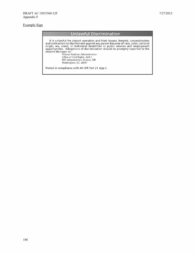
DRAFT AC 150/5360-12F 7/27/2012 Appendix F
188
Example Sign
7/27/2012 DRAFT AC 150/5360-12F Appendix G
189
Appendix G. Acronym List
AAAE/ACI American Association of Airport Executives / Airports Council International
AASHTO American Association of State Highway and Transportation Officials
AC advisory circular
ACRP Airport Cooperative Research Program
ADA Americans with Disabilities Act
ADAAG Americans with Disabilities Act Accessibility Guidelines
AED automatic external defibrillator
AHJ Authorities Having Jurisdiction
ANSI American National Standards Institute
APM Automated People Mover
APMS Advanced parking management systems
ASME American Society of Mechanical Engineers
BID Baggage Information Display
CBP Customs and Border Protection
CFR Code of Federal Regulations
CMS Changeable Message Sign
COTS common-off-the-shelf
CUSS Common Use Self Service
CUTE Common User Terminal Equipment
DHS Department of Homeland Security
DMS Dynamic Message Sign
EDS Explosives Detection Systems
ETC Electronic Toll Collection
ETD Explosives Trace Detection
FAA Federal Aviation Administration
DRAFT AC 150/5360-12F 7/27/2012 Appendix G
190
FAQ Frequently Asked Question
FAR Federal Aviation Regulations
FHWA Federal Highway Administration
FID Flight Information Display
HVAC Heating, Ventilation, and Air Conditioning
IBC International Building Code
ITS Intelligent Transportation System
JFK John F. Kennedy International Airport
LED light-emitting diode
LOS level of service
LRV light reflectance value
MUFIDS Multiple User Flight Information Display System
MUSE Multiple User System Equipment
MUTCD Manual on Uniform Traffic Control Devices
NCHRP National Cooperative Highway Research Program
NEC National Electric Code
NFPA National Fire Protection Association
NTCIP National Transportation Communications for ITS Protocol
PDA Personal Digital Assistant
POI Points of Interest
QSR Quick Serve Restaurant
RF radio frequency
RITA Research and Innovative Technology Administration
ROI Return on Investment
SaaS Software as a Service
SBCCI Standard Building Code
7/27/2012 DRAFT AC 150/5360-12F Appendix G
191
SEGD Society for Environmental Graphics Design
SJC San Jose International Airport
SSCP Security Screening Checkpoints
SUV Sport Utility Vehicle
TCRP Transit Cooperative Research Program
TDD Telecommunication Device for the Deaf
TRB Transportation Research Board
TSA Transportation Security Administration
TTI Texas Transportation Institute
UBC Uniform Building Code
USC United States Code
USDOT United States Department of Transportation
VI Visibility index
VMS Variable Message Sign

DRAFT AC 150/5360-12F 7/27/2012 Appendix G
192
This page intentionally left blank
7/27/2012 DRAFT AC 150/5360-12F Appendix H
193
Appendix H. References
1 The Federal Highway Administration’s (FHWA) Manual on Uniform Traffic Control Devices (MUTCD), 2009 Edition, http://mutcd.fhwa.dot.gov/pdfs/2009/mutcd2009edition.pdf. 2 The Wayfinding Handbook: Information Design for Public Places. 3 Hawkins Jr., H. G., A. Stoddard, K. Collins, and C. Weatherby. Identification and Evaluation of Guide Signing for Airport Roadways with Specific Application to the Dallas/Fort Worth International Airport. Texas Transportation Institute. Report No. SWUTC/98/467406-1, 1998. Available at http://swutc.tamu.edu/publications/technicalreports/467406-1.pdf. 4 American Association of State Highway and Transportation Officials.
AASHTO is a leading source of technical information on design, construction and maintenance of highways and other transportation facilities, including aviation, highways, public transit, rail, and water. 5 US Department of Transportation; Federal Highway Administration , Interpretation Letter 2-564(I)-Orientation of Airport Symbol, May 2005, http://mutcd.fhwa.dot.gov/resources/interpretations/2_564.htm. 6 McNees, R. W. (1982) In situ study determining lane-maneuvering distance for three- and four-lane freeways for various traffic-volume conditions. Transportation Research Record, 869, 37-43. 7 American Association of State Highway Transportation Officials (AASHTO), A Guide to Small Sign Support Hardware, Single User Digital Publication, 1998. https://bookstore.transportation.org/item_details.aspx?ID=1148. 8 American Association of State Highway Transportation Officials (AASHTO) Standard Specifications for Structural Supports for Highway Signs, Luminaires and Traffic Signals, 5th Edition, 2009, https://bookstore.transportation.org/item_details.aspx?ID=1319. 9 US Department of Transportation; Federal Highway Administration, Roadside Hardware Policy and Guidance, http://safety.fhwa.dot.gov/roadway_dept/policy_guide/road_hardware/breakaway/signsupports.cfm. 10 American Association of State Highway Transportation Officials (AASHTO), Roadside Design Guide, 3rd Edition, 2006, https://bookstore.transportation.org/item_details.aspx?ID=148. 11 Crashworthy Work Zone Traffic Control Devices: http://safety.fhwa.dot.gov/roadway_dept/policy_guide/road_hardware/wzd/. 12 Crashworthy Approval Process, http://www.workzonesafety.org/safety_products/nchrp_350_approval. 13 IES RP-19-01 Illuminating Engineering Society, Roadway Sign Lighting, March 3, 2001, ISBN: 0879951753. Available at www.ies.org. 14 Paniati, Jeffrey. Use of Changeable Message Sign (CMS) for Emergency Security Messages. Policy Memorandum dated March 21, 2003. Available at: http://www.fhwa.dot.gov/legsregs/directives/policy/securmemo.htm. Accessed July 31, 2009.
DRAFT AC 150/5360-12F 7/27/2012 Appendix H
194
15 Dudek, Conrad L. and Gerald L. Ullman. Dynamic Message Sign Message Design and Display Manual. Research Report FHWA/TX-04/0-4023-P3. Texas Transportation Institute, The Texas A&M University System, College Station, Texas, April 2006. 16 Portable Changeable Message Sign Handbook. Report No. FHWA-RD-03-066. Federal Highway Administration, U.S. Department of Transportation, Washington, D.C. Available at http://www.fhwa.dot.gov/publications/research/infrastructure/pavements/ltpp/reports/03066/. Accessed on December 8, 2009. 17 Dudek, Conrad L., Guidelines on the Use and Operation of Changeable Message Signs. Research Report FHWA/TX-92/1232-9. Texas Transportation Institute, The Texas A&M University System, College Station, Texas. November 1992. 18 National Transportation Communications for ITS Protocol. 19 Federal Highway Administration regarding APMS (Advanced 2007). 20 Monahan, Parking Structure Signing and Graphics. The Parking Professional, April 1990. 21 The Dimensions of Parking, Urban Land Institute/National Parking Association, 2000. 22 Improving Pedestrian Safety at Unsignalized Crossings (NCHRP 5325), Fitzpatrick, et. al, Transportation Research Board (TRB). Washington, DC, 2006. 23 Airport Ground Access Planning Guide, U.S. Department of Transportation, Research and Innovative Technology Administration (RITA), 1995. http://ntl.bts.gov/DOCS/AGAPP.html. 24 Schweiger, C. L., Transit Cooperative Research Program (TCRP) Synthesis 48: Real-Time Bus Arrival Information Systems. Transportation Research Board of the National Academies, Washington, D.C., 2003. Available at http://onlinepubs.trb.org/onlinepubs/tcrp/tcrp_syn_48.pdf.
25 USDOT Symbols and Signs, American Institute of Graphic Arts, New York, 1974. http://www.aiga.org/symbol-signs/. 26 Improving Pedestrian Safety at Unsignalized Crossings (NCHRP 5325), Fitzpatrick, et. al, Transportation Research Board. Washington, DC, 2006. 27 Carpman, J. and Grant, M., Design That Cares: Planning Health Facilities for Patients and Visitors. J-B AHA Press. 1993.
28 Braaksma, J. P., and W. J. Cook. Human Orientation in Transportation Terminals. Journal of Transportation Engineering, Vol. 106, No. 2, 1980, pp. 189–203.
29 Dada, E. S. and S. C. Wirasinghe. Development of a New Orientation Index for Airport Terminals. Transportation Research Board. Transportation Research Record No. 1662 (1999) 41–47.
30 Lam, W. H. K., Mei-ling Tam, S. C. Wong, and S. C. Wirasinghe. Wayfinding in the passenger terminal of Hong Kong International Airport. Journal of Air Transport Management, Vol. 9. No. 2 (2003) 73–81.
7/27/2012 DRAFT AC 150/5360-12F Appendix H
195
31 Comparing typefaces for airport Signs - Author: Waller, Robert. Source: Information Design Journal, Volume 15, Number 1, 2007.
32 Airport Signage Guidelines, Transportation Security Administration, 2010.
33 Airport Technical Design Standards - Passenger Processing Facilities, dated August 2006. 34 Advisory Circular 150/5340-18F, Standards for Airport Sign Systems, September 12, 2008 http://rgl.faa.gov/Regulatory_and_Guidance_Library/rgAdvisoryCircular.nsf/0/61FA83ECFB4D0F73862574D70052F9CF?OpenDocument&Highlight=150/5340-18. 35 International Civil Aviation Organization (ICAO) Document 9636, International Signs to Provide Guidance to Persons at Airports and Marine Terminals, (1995, Reprinted 2003). Available for purchase at http://icaodsu.openface.ca/documentItemView.ch2?ID=8010. 36 AASHTO Guidelines for the Selection of Supplemental Guide Signs for Traffic Generators Adjacent to Freeways, 4th Edition; Guide Signs, Part II: Guidelines for Airport Guide Signing; Guide Signs, Part III: List of Control Cities for Use in Guide Signs on Interstate Highways. AASHTO Bookstore Item # GSGLC-4. https://bookstore.transportation.org/item_details.aspx?ID=122.

DRAFT AC 150/5360-12F 7/27/2012 Appendix H
196
This page intentionally left blank