Design Basic, Design Rules, and prototyping Dr. Liu INSY211.
43
Design Basic, Design Rules, and prototyping Dr. Liu INSY211
-
Upload
neal-terry -
Category
Documents
-
view
220 -
download
0
Transcript of Design Basic, Design Rules, and prototyping Dr. Liu INSY211.
Design Basic, Design Rules, and prototyping
Dr. Liu
INSY211

Design Basic
Getting ready with Texts Graphics
Answer the following questions: What’s the purpose of the web site? Who are the users? What are they going to do there? How does a user visit this site? Sketch the site structures.
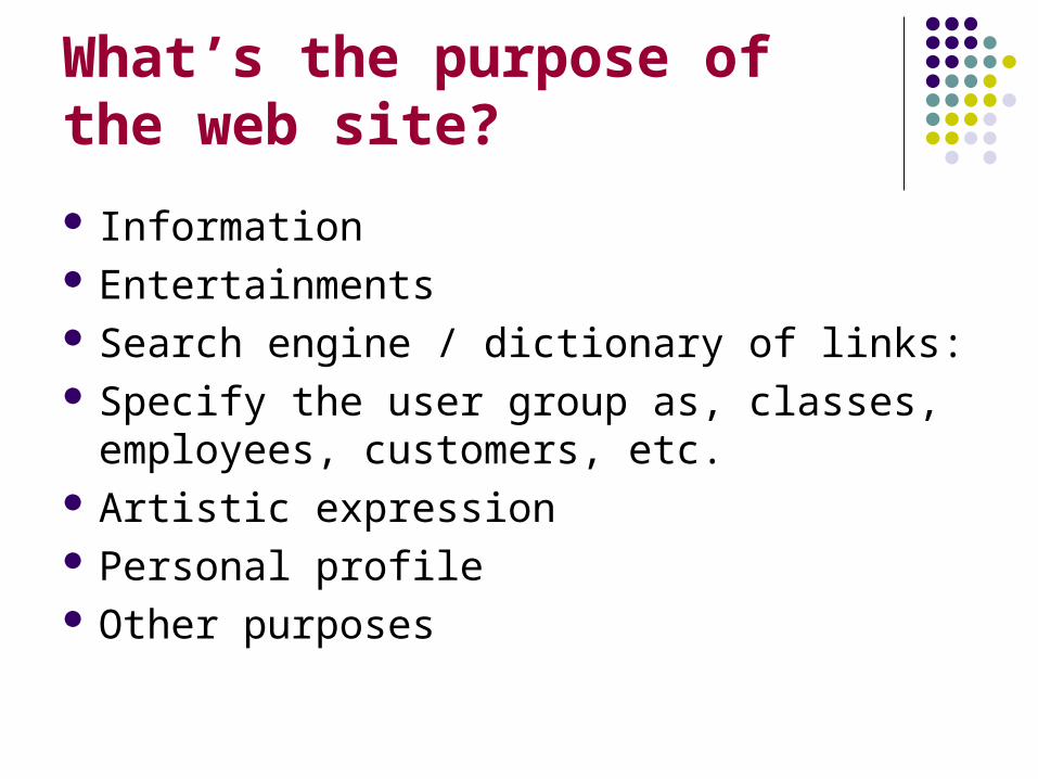
What’s the purpose of the web site?
Information Entertainments Search engine / dictionary of links: Specify the user group as, classes,
employees, customers, etc. Artistic expression Personal profile Other purposes
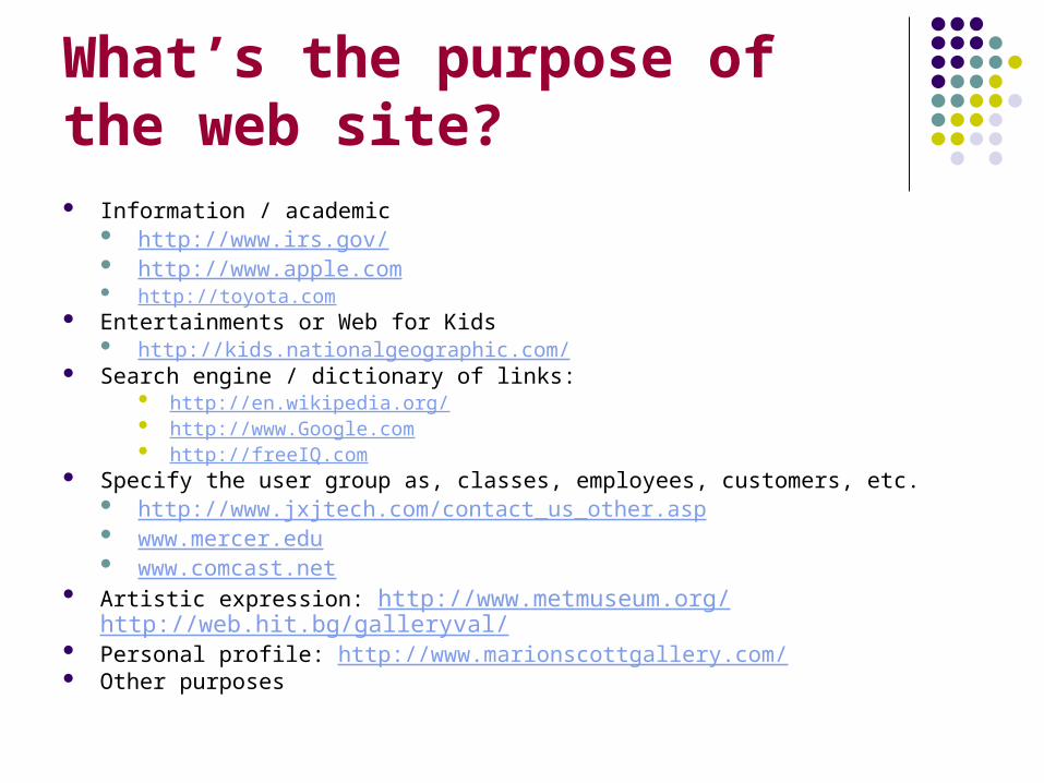
What’s the purpose of the web site? Information / academic
http://www.irs.gov/ http://www.apple.com http://toyota.com
Entertainments or Web for Kids http://kids.nationalgeographic.com/
Search engine / dictionary of links: http://en.wikipedia.org/ http://www.Google.com http://freeIQ.com
Specify the user group as, classes, employees, customers, etc. http://www.jxjtech.com/contact_us_other.asp www.mercer.edu www.comcast.net
Artistic expression: http://www.metmuseum.org/ http://web.hit.bg/galleryval/ Personal profile: http://www.marionscottgallery.com/ Other purposes

Academic discussion group: Latest News Calendar : conference/event members Related knowledge Related links Industrial Companies Forum
Site objective: case 1
Examples:www.siggraph.org http://www.siggraph.org/s2007/ http://slashdot.org/ http://www.phpbb.com/ Google blogger
Entertainment audiences need to be attracted immediately by
compelling graphic and text presentations Slate's sophisticated mix of political commentary
and social criticism depends heavily on clever, well-written headlines and teasers.
derived entirely from presentation styles used in political and current affairs magazines Kids education:
http://www.fieldmuseum.org/evolvingplanet/ http://home.disney.go.com/index
Site objective : case 2

E-commerce Flash/video?....too fancy things which take too much time?--- oh
NO! Pay more attention on PAY procedure
TELL user where they are… before they quit! News: more like newspaper INTERNET: intranet Examples:
http://www.nvidia.com/ http://www.kohls.com/ www.walmart.com http://www.amazon.com/ http://www.expedia.com/
Site objective : case 3
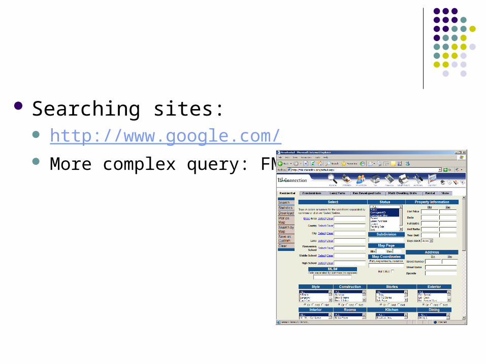
Searching sites: http://www.google.com/ More complex query: FMLS

Design site:
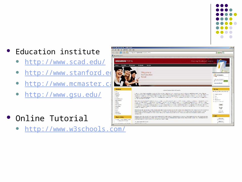
Education institute http://www.scad.edu/ http://www.stanford.edu/ http://www.mcmaster.ca/ http://www.gsu.edu/
Online Tutorial http://www.w3schools.com/
Analysis the following sample sites:
http://www.princeton.edu/main/ http://www.mercer.edu http://www.yale.edu
http://www.yale.edu/evst/ http://www.yale.edu/ycias/ http://www.yale.edu/yalecollege/publications/ycps/
chapter_iv/erm.html ….
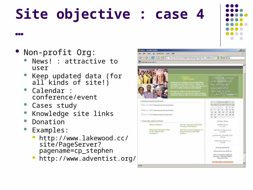
Non-profit Org: News! : attractive to user Keep updated data (for all
kinds of site!) Calendar : conference/event Cases study Knowledge site links Donation Examples:
http://www.lakewood.cc/site/PageServer?pagename=cp_stephen
http://www.adventist.org/
Site objective : case 4 …
Who is the user?
Be as specific as possible. Think about the user, act as real-person is
using your system. Decide how you going to present information. How you communicate with users.

How user visit this site?
User’s access port: speed? Dial-up / bandwidth/ T-1…
Checking each of the interaction part does work.
Site Elements Home page: Master page layout grid Menus and sub-sites Resource lists, "other related
sites" pages Site map News! / latest update time Search Contact information/directions FAQ pages / user feedback (Bibliographies and appendixes)
Homepage:
Menu home page Image menu: image map Text based menu: easy change
News-oriented home page http://www.CNN.com
Path home page: Divide user from the very first home page HTTP://WWW.GSU.EDU http://home.americanexpress.com/home/
mt_personal_cm.shtml
Are we going to have a Graphics Home Page?
Really Depends: Academics…. Museum/ gallery :
http://www.fieldmuseum.org/evolvingplanet/ + your users
Home Page layout Don’t have to be same as internal pages
Constructing a layout grid usually begins by analyzing the content structure you have worked out and deciding what (besides the all-important home page link) you will need for the most general navigation purposes.
Establish what links will be present and generally useful on every page of your Web site.
How your particular site fits into the larger context of the other Web sites in your enterprise. what links, logos, and other graphic and functional
elements reflecting your place in the larger enterprise should be present on all of your pages.
choose your words carefully for links and titles, and solicit comments and feedback

Homepage layout grid
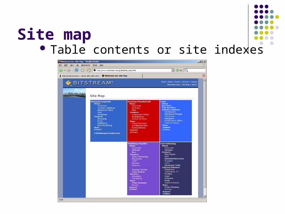
Site map Table contents or site indexes

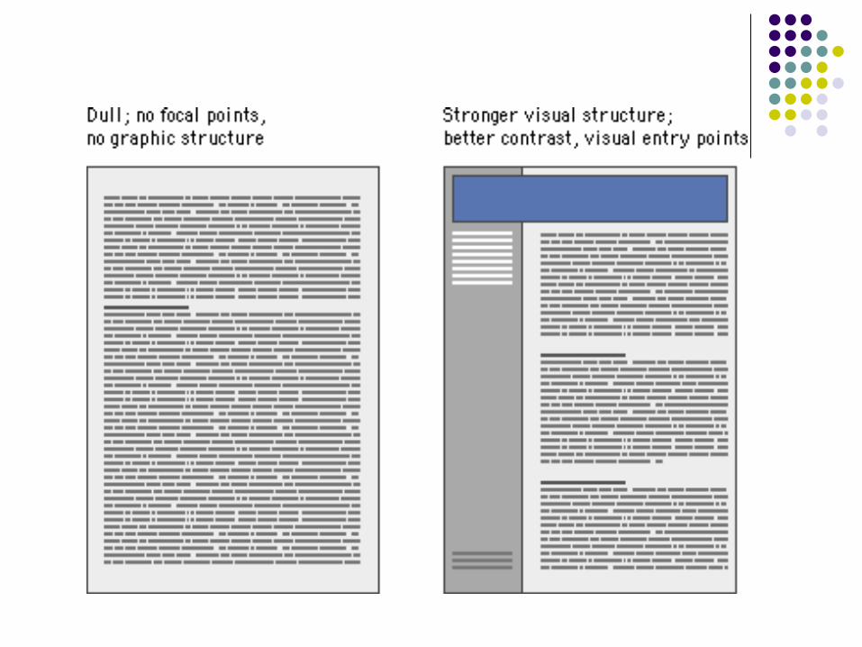
Page Design
Clarity Order Trustworthiness
Contrast

Visual hierarchy
Important elements are emphasized: emphasis everything = emphasis nothing. Do not bold all the content Do not use underline for emphasizing purpose
Confuse to hyperlink
Content is organized logically and predictably Contrast is essential

Page Design Grid
Consistency and predictability A consistent approach to layout and navigation
allows readers to adapt quickly to your design and to confidently predict the location of information and navigation controls across the pages of your site.
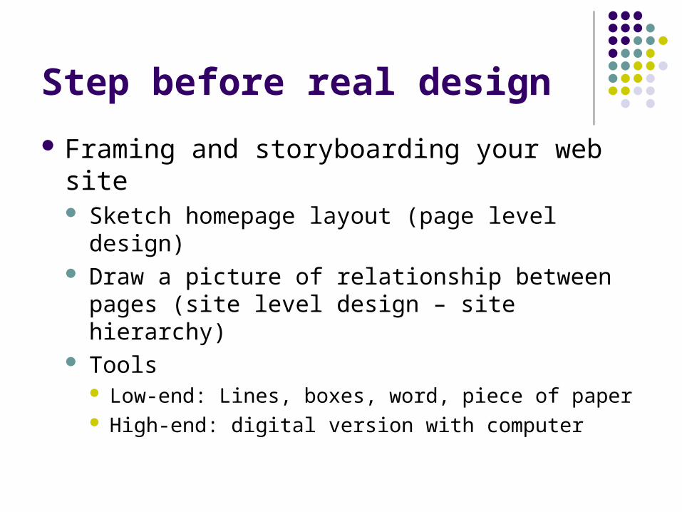
Step before real design
Framing and storyboarding your web site Sketch homepage layout (page level design) Draw a picture of relationship between pages (site
level design – site hierarchy) Tools
Low-end: Lines, boxes, word, piece of paper High-end: digital version with computer

Sample of New Frontier for Learning in Retirement

Page layout issue
Using template for all the pages
Content Body
Title area
Graphics
Footer
Sub-page Links
navigation bar
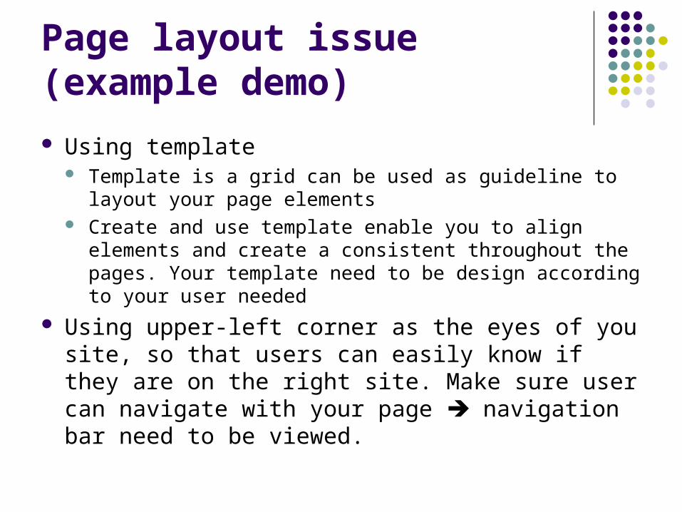
Page layout issue (example demo)
Using template Template is a grid can be used as guideline to layout your
page elements Create and use template enable you to align elements and
create a consistent throughout the pages. Your template need to be design according to your user needed
Using upper-left corner as the eyes of you site, so that users can easily know if they are on the right site. Make sure user can navigate with your page navigation bar need to be viewed.
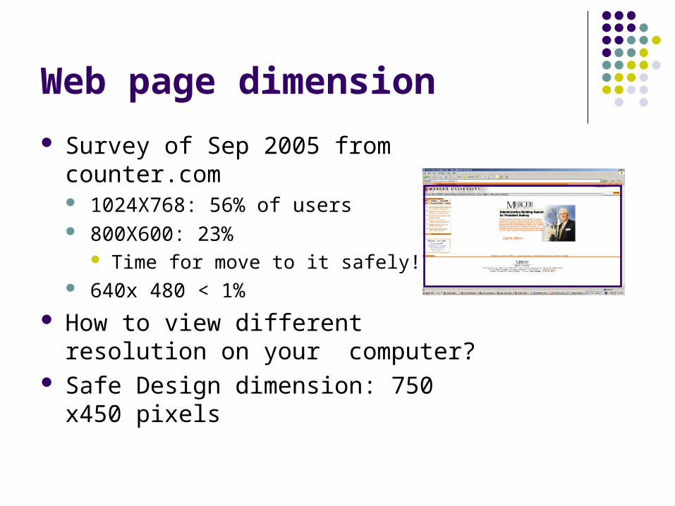
Web page dimension
Survey of Sep 2005 from counter.com 1024X768: 56% of users 800X600: 23%
Time for move to it safely! 640x 480 < 1%
How to view different resolution on your computer?
Safe Design dimension: 750 x450 pixels

Site level structure sample
Home
About NFLR Calendar gallery classes Mailing list
registration courses event student instructors

Design principles Avoid blinking text and unnecessary animation.
Use simple rollover effect for buttons.
Doing research: Search similar sites to see what's out there, and make your site unique. By looking at the similar or related sites, you can also get ideas and add something you missed
Content Keep content fresh, simple, and smart.
Avoid using too many high-tech features or you'll lose the majority of your viewers.

Ensure that your page downloads as quickly as possible; 10 second is the MAX.
Functional element should serve as a purpose.
Avoid using too much of any element or technique: Too much emphasis = no emphasis.
Don't automatically enable sound files. Make user control it Verify that your page looks good in Internet Explorer
and FireFox (at a minimum) at various resolutions on Windows and Macintosh systems.
White space Create eye relief and visual space with strategically placed blank areas (white space).

Compare two designs
http://creationguide.com/nflr-new/http://creationguide.com/nflr1/

Example2 SEFF site redesign
http://www.koolflightsystems.com/seff.htm
Color
216 safe color for the web http://creationguide.com/colorchart.html Use contrast colors especially if you use a
colored background: Limited the number of the colors no more
than 3 complementary color. http://creationguide.com/colorwheel/
Choose color fit for your content- ski site

Navigation bar, buttons and logos Navigation bar
meaningful description Simple Logic information chunks
Buttons Consistent Same dimension, color scheme Name buttons clearly Use template when design
Logo Use logo as graphics interchange format (gif) with web-safe color High quality resolution Give a small or part of logo on the sub-pages Make logo simple and readable for both color and w/b printout
Hyperlink color should be modified according to your fonts color and BG color

Texts and graphics
Texts Sans-Serif is better for read online: Arial, Veranda …
Rather than Serif crisp, clean, uncluttered lines: Time new man
Be careful underlining the unlinked text Graphics
Include alternative name of the picture Create consistency throughout the website based
on your color scheme
Standard credibility components
Attribution Contact information Copyright Up-to-date content with last modification time Personal information of the site, like a club president Special interest Spelling and grammar check!! Webmaster links
Planning your website
Why do you want a website What’s the immediately goal? What’s the long-term goal? Timeline
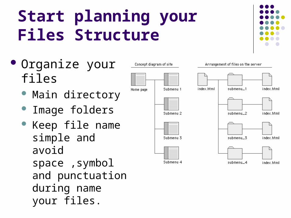
Start planning your Files Structure
Organize your files Main directory Image folders Keep file name
simple and avoid space ,symbol and punctuation during name your files.

Summery of getting into the first step of the design
User and task analysis Research on existing sites. Content logic analysis Structure of the content Structure of the site Choose color scheme Master page design Result with the prototype Rest will be adding content of each page and make
sure function right.
Reference
http://creationguide.com/