corporate identity manual 2007 -...
14
corporate identity manual 2007
Transcript of corporate identity manual 2007 -...

�
corporate identity manual 2007

�
contents
the human touch brand logointroduction
usage
logo variations
color application
color application | continued logo exceptions
logo exceptions | continued logo exceptions | continued
logo exceptions | continued incorrect logo usage
isolation area, size limitation
scaling, web specifications
03
04
05
06
07
08
09
10
11
12
13
14

�
human touch brand logo introduction
The success of the Human touch brand is dependent upon earning a reputation for high performance and superior technology. We have developed a standardized visual identity system for our marketing materials so every component will contribute to building human touch brand equity. Strict adherence to these guidelines will ensure that everything bearing the human touch brand logo consistently conveys the image of performance and comfort that the consumer is seeking.
human touch brand name
human touch logo
The primary human touch logo consists of the human touch brand mark and the words “human touch”.
The proportions of the various components of the logo must not be changed. Do not attempt to reconfigure the logo in any way - use only electronic artwork files.
The brand name, “human touch” may not translated in any language but may only be used in the written lan-guage provided, English.
human touch fonts
The font family for all human touch branding is “Trade Gothic”.
The font used in the typography of the logo is “Trade Gothic LH Extended”.
The primary font used for correspondence is “Trade Gothic Medium”, but may consist of any combination of the following: Trade Gothic Light Trade Gothic Medium Trade Gothic Bold No. 2
Correspondence colors should follow the same rules out-lined on page 6, for each specific application. If there is a situation which will not permit one of the color applica-tions listed (ie. MS Word, MS Entourage, etc.), black type will be acceptable.
human touch brand mark
�
usage
Any usage of the human touch brand logo and/or copy must be approved by your human touch account manager. Additionally, your account manager can answer any questions or concerns regarding the human touch logo and copy.
The approved style of trademark use shall be limited to the following:
human touch™human touch™ iJoy™human touch™ massage chairs™human touch™ acuvibe™human touch™ perfect chair™human touch™ ottoman™human touch™ warmair™human touch™ cervical massage system™human touch™ foot soother elite™human touch™ equalizer™human touch™ ridehuman touch™ board

�
human touch brand logo logo variations
The human touch brand logo includes three approved variations of its primary vertical configuration. These formats should not be altered in any way - use electronic artwork files when implementing variations of the primary logo.
vertical logo format
The primary human touch brand logo is presented in a vertical format that includes the human touch brand mark stacked upon the brand name.
horizontal logo format
In some situations, the horizontal human touch brand logo format may be necessary. The human touch brand name has been scaled so that it is in proper proportion to the human touch brand mark in the horizontal configuration.
horizontal subname format
When a subname is used in conjunction with the human touch brand logo in the horizontal format, the subname is scaled and right justified on the human touch brand name. In this format, the top of the subname should be positioned on the baseline of the human touch brand mark.
top of subname rests on the brand mark baseline in the horizontal format.
�
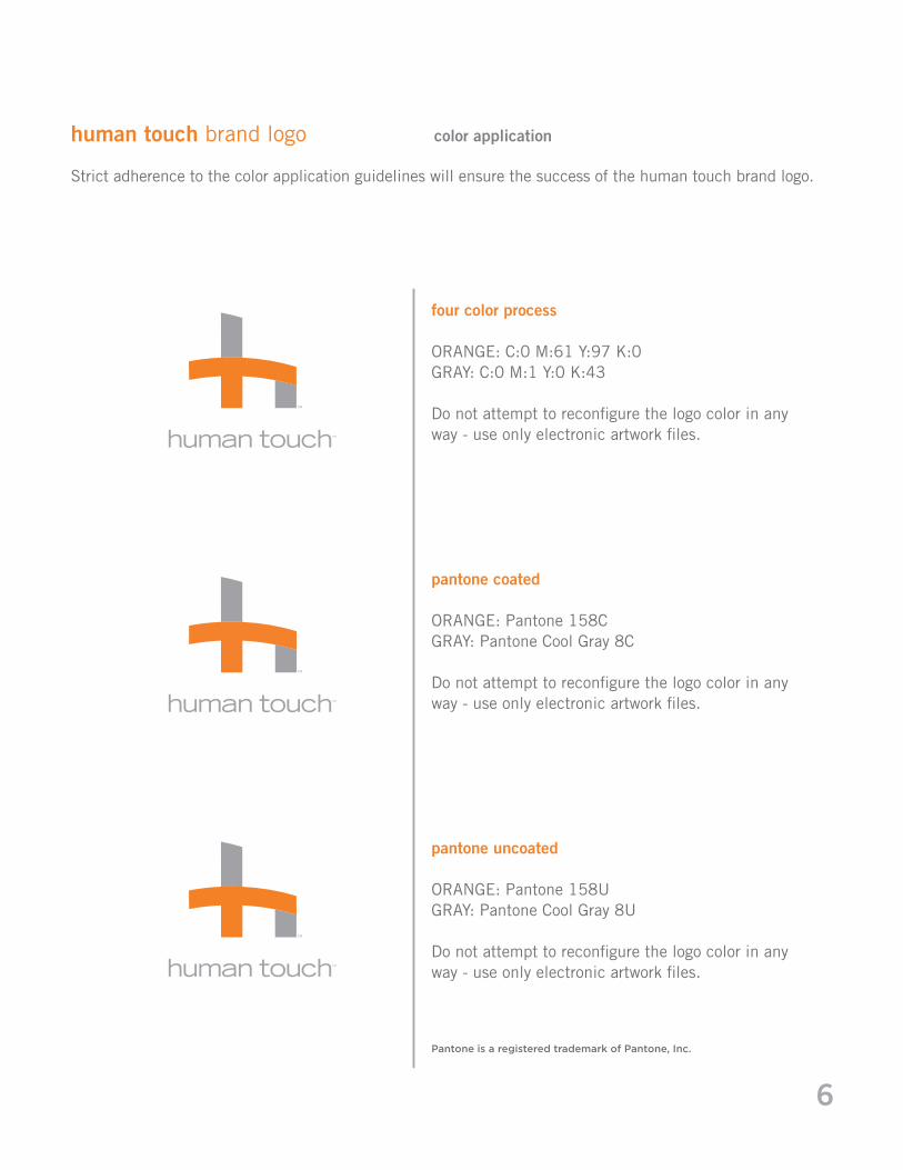
four color process
ORANGE: C:0 M:61 Y:97 K:0GRAY: C:0 M:1 Y:0 K:43 Do not attempt to reconfigure the logo color in any way - use only electronic artwork files.
pantone coated
ORANGE: Pantone 158CGRAY: Pantone Cool Gray 8C
Do not attempt to reconfigure the logo color in any way - use only electronic artwork files.
pantone uncoated
ORANGE: Pantone 158UGRAY: Pantone Cool Gray 8U
Do not attempt to reconfigure the logo color in any way - use only electronic artwork files.
Pantone is a registered trademark of Pantone, Inc.
human touch brand logo color application
Strict adherence to the color application guidelines will ensure the success of the human touch brand logo.

�
web safe color build
RGB HEXADECIMALORANGE: R:235 G:108 B:35 ORANGE: EB6C23GRAY: R:143 G:143 B:147 GREY: 8F8F93
Do not attempt to reconfigure the logo color in any way - use only electronic artwork files.
grayscale
DARK GRAY: C:0 M:0 Y:0 K:76LIGHT GRAY: C:0 M:0 Y:0 K:43 Do not attempt to reconfigure the logo color in any way - use only electronic artwork files.
grayscale (pantone)
DARK GRAY: Pantone 425C or Pantone 425ULIGHT GRAY: Pantone 423C or Pantone 423U Do not attempt to reconfigure the logo color in any way - use only electronic artwork files.
Pantone is a registered trademark of Pantone, Inc.
human touch brand logo color application

�
human touch brand logo logo exceptions
brand logo variation
It is acceptable for the human touch brand mark to be used as shown here; when it is not feasible to place it on white backing.
vertical logo grayscalePrimarily for newsprint applications
vertical logo B&WPrimarily for embroidery applications
vertical logo embossed color3D and embossed logos not to be used for print
vertical logo embossed steel3D and embossed logos not to be used for print

�
human touch brand logo logo exceptions | continued
brand logo variations | continued
circle logo flat colorMultiple uses acceptable
circle logo flat grayscalePrimarily for newsprint applications
�D circle logo color3D and embossed logos not to be used for print

�0
human touch brand logo logo exceptions | continued
brand logo variations | continued
�D circle logo embossed steel-color3D and embossed logos not to be used for print
�D circle logo embossed orange3D and embossed logos not to be used for print
�D circle logo embossed steel3D and embossed logos not to be used for print

��
human touch brand logo logo exceptions | continued
Brand Logo Variations | Continued
horizontal logo embossed color3D and embossed logos not to be used for print
horizontal logo tab color3D and embossed logos not to be used for print
horizontal logo tab steel3D and embossed logos not to be used for print
horizontal logo grayscalePrimarily for newsprint applications
��
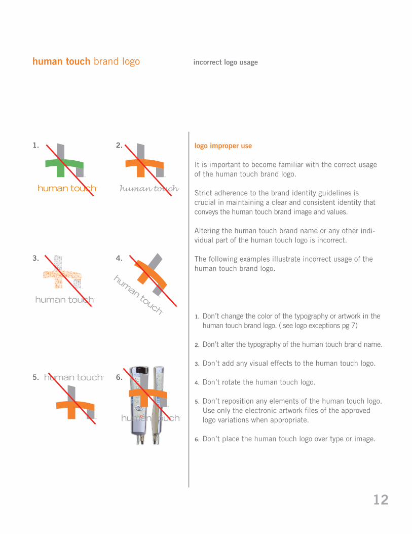
human touch brand logo incorrect logo usage
logo improper use
It is important to become familiar with the correct usage of the human touch brand logo.
Strict adherence to the brand identity guidelines is crucial in maintaining a clear and consistent identity that conveys the human touch brand image and values.
Altering the human touch brand name or any other indi-vidual part of the human touch logo is incorrect.
The following examples illustrate incorrect usage of the human touch brand logo.
�.
�.
�.
�.
�.
�.
�. �.
�. �.
�. �.
human touch
Don’t change the color of the typography or artwork in the human touch brand logo. ( see logo exceptions pg 7)
Don’t alter the typography of the human touch brand name.
Don’t add any visual effects to the human touch logo.
Don’t rotate the human touch logo.
Don’t reposition any elements of the human touch logo. Use only the electronic artwork files of the approved logo variations when appropriate.
Don’t place the human touch logo over type or image.

��
human touch brand logo isolation area, size limitation
isolation area
In all applications, the human touch logo should be surrounded by adequate clear space to maintain the integrity and clarity of the mark.
A minimum distance (the shape-height of the bottom right portion of the “h” in the vertical format; and the entire size of the “ht” mark in the horizontal format) must be allowed above, below, and on each side of the complete logo mark. Maintaining this space will ensure that the logo is not crowded or associated with other visual elements that are in close proximity.
Utilizing the shape-height to determine the proper clear space will ensure that an isolation area is maintained in correct proportion as the human touch logo is reduced, enlarged, or presented in vertical and horizontal configurations.
size limitation
To ensure legibility, never produce the human touch brand logo smaller than one half inch (0.5”) in width when in vertical format and one inch (1.0”) in horizontal format.
shape - height
vertical .5 inch
horizontal 1 inch
shape - height
*Not actual sizes

��
human touch brand logo scaling, web specifications
scaling trademark symbol
The U.S. trademark symbol “™” should always accompany the human touch brand logo. To ensure proper reproduction quality at reduced sizes, the “™” may need to be enlarged up to 150%. When doing so, the symbol should be aligned with the top of the “h” in “touch”. Additionally, it may be necessary to enlarge the “™” in the human touch brand mark up to 125%.
web specifications
To ensure legibility on the web, never produce the human touch brand logo smaller than three-quarters of an inch (0.75”) in width when in vertical format and one-and-one-half inch (1.5”) in horizontal format at 72 dpi resolution, always done in the RGB or hexadecimal color build (page 6).
vertical .75 inch
horizontal 1.5 inch
*Not actual sizes