Christian Alvarado_Winter Typography Final
16
-
Upload
randy-dunbar -
Category
Documents
-
view
217 -
download
0
description
Christian | GRAPHICDESIGN I IDENTITY Christian | GRAPHICDESIGN
Transcript of Christian Alvarado_Winter Typography Final
Christian |GRAPHICDESIGN

have a keen interest in everything to do with branding, graphic design and typography, you can call it a little bit of an obsession. My name is Christian Alvarado and I’m a graph-ic designer with an interest in various forms of art. These are just few examples to say who I am and what I do every day. In this compo-sition you will find information about me and you will see some works I have done so far. I’ve began my journey by expanding my education at The Fashion Institute of Design & Merchandising. Although young in age, I possess the potential to achieve devastating heights. Join me as I master the art of design.I
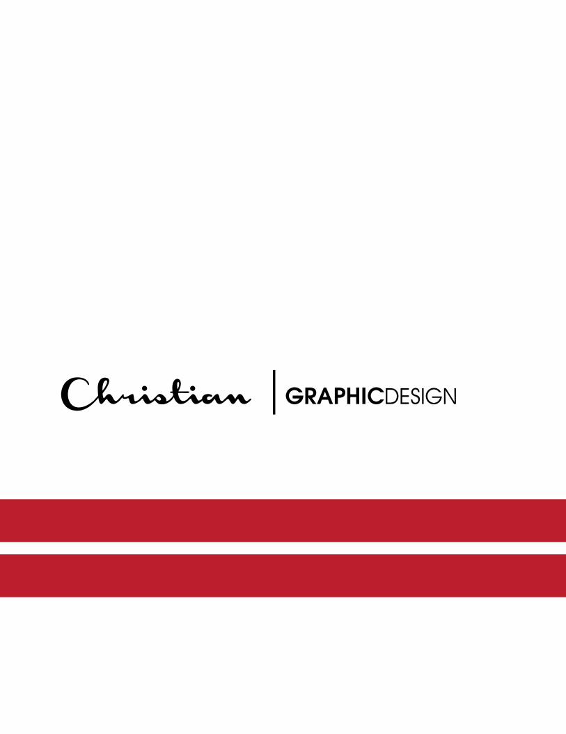
I D E N T I T Y
Christian |GRAPHICDESIGN
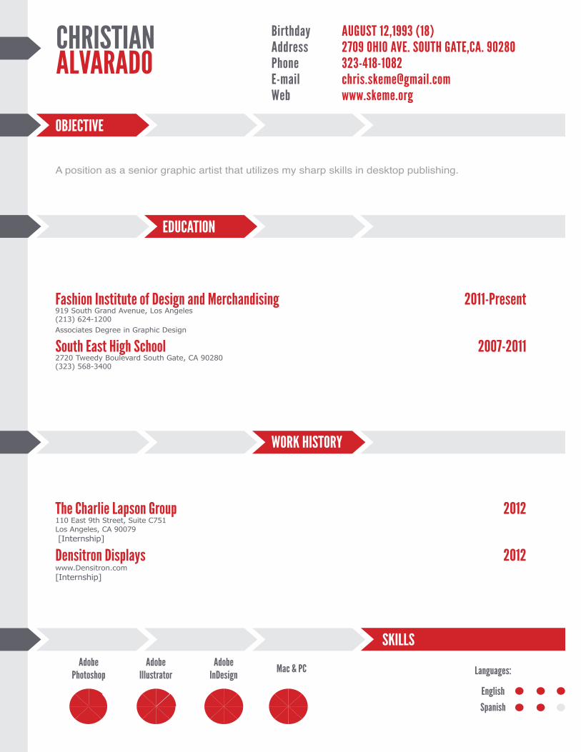
EDUCATION
Birthday AUGUST 12,1993 (18)Address 2709 OHIO AVE. SOUTH GATE,CA. 90280Phone 323-418-1082E-mail [email protected] www.skeme.org
Fashion Institute of Design and Merchandising 2011-Present919 South Grand Avenue, Los Angeles (213) 624-1200 Associates Degree in Graphic Design
South East High School 2007-20112720 Tweedy Boulevard South Gate, CA 90280(323) 568-3400
CHRISTIANALVARADO
Adobe Photoshop
A position as a senior graphic artist that utilizes my sharp skills in desktop publishing.
The Charlie Lapson Group 2012110 East 9th Street, Suite C751Los Angeles, CA 90079 [Internship]
Densitron Displays 2012www.Densitron.com[Internship]
WORK HISTORY
Adobe Illustrator
Adobe InDesign
Mac & PC Languages:
English
Spanish
OBJECTIVE
SKILLS
Christian |GRAPHICDESIGN
L O G OD E S I G N
HappyValentine’sDay
HappyValentine’sDay H a p p y V a l e n t i n e ’ s D a y
| GRAPHICDESIGND E S I G N S T U D I OAMPERSAND
A M P E R S A N D D E S I G N S T U D I O
&
ampersand
design studioBEIJINGHOL IDAY RESORTR E S T A U R A N T • S P A
ADVERT I S ING
Christian |GRAPHICDESIGN

R E S T A U R A N T • S P A
BEIJINGHOL IDAY RESORTR E S T A U R A N T • S P A
LUXURY WHERE YOU MOST EXPECT IT.

UBIQUITOUS T Y P E
T ypography makes at least two kinds of sense, if it makes any sense at all. It makes visual sense
and historical sense. � e visual side of typography is always on display, and materials for the study of its visual form are many and widespread. � e history of letter- forms and their usage is visible too, to those with access to manuscripts, inscriptions andold books, but from others it is largely hidden.� is book has therefore grown into something more than a short manual of typographic etiquette. It is the fruit of a lot of long walks in the wilderness of letters: in part a pocket � eld guide to the living wonders that are found there, and in part a meditation on the ecological principles, survival
techniques, and ethics that apply. � e principles of typography as I understand them are not a set of dead conventions but the tribal customs of the magic forest, where ancient voices speak from all directions and new ones move to unremembered forms.One question, nevertheless, has been o� en in my mind. When all right thinking human be-ings are struggling to remember that other men and women are free to be di� erent,6and free to become more di� erent still, how can one honestly write a rulebook? What reason and authority exist for these commandments, suggestions, and instructions? Surely typographers, like others, ought to be at liberty to follow or to blaze the trails they choose.Typography thrives as a shared concern - and there are no paths at all where there are no shared desires
and directions. A typographer determined to forge new routes must move, like other solitary travellers, through uninhabited country and against the grain of the land, crossing common thoroughfares in the silence before dawn. � e subject of this book is not typographic solitude, but the old, well travelled roads at the core of the tradition: paths that each of us is free to follow or not, and to enter and leave when we choose if only we know the paths are there and havea sense of where they lead.� at freedom is denied us if the tradition is concealed or le� for dead. Originality is everywhere, but much originality is blocked if the way back to earlier discoveries is cut or overgrown. If you use this book as a guide, by all means leave the road when you wish. � at is precisely the use of a road: to reach individually
chosen points of departure. By all means break the rules, and break them beautifully, deliberately, and well. � at is one of the ends for which they exist.Letterforms change constantly, yet di� er very little, because they are alive. � e principles of typographic clarity have also scarcely altered since the second half of the � � eenth century, when the � rst books were printed in roman type. Indeed, most of the principles of legibility and design explored in this book were known and used by Egyptian scribes writing hieratic script with reed pens on papyrus in 1000 B.C. Samples of their work sit now in museums in Cairo, London and New York, still lively, subtle, and perfectly legible thirty centuries a� er they were made.Writing systems vary, but a good page is not hard to learn to recognize, whether it comes
from Tang Dynasty China, � e Egyptian New Kingdom typographers set for themselves than with the mutable or Renaissance Italy. � e prin-ciples that unite these distant schools of design are based on the structure and scale of the human body the eye, the hand, and the forearm in particular and on the invisible but no less real, no less demanding, no less sensuous anatomy of the human mind. I don’t like to call these principles universals, because they are largely unique to our species. Dogs and ants, for example, read and write by more chemical means. But the underlying principles of typography are, at any rate, stable enough to weather any number of human fashions and fads.Typography is the cra� of endowing human language with a durable visual form, and thus
with an independent existence. Its heartwood is calligraphy - the dance, on a tiny stage, ofIt is true that typographer’s tools are presently changing with considerable force and speed, but this is not a manual in the use of any particular typesetting system or medium. I suppose that most readers of this book will set most of their type in digital form, using computers, but I have no preconceptions about which brands of computers, or which versions of which proprietary so� ware, they may use. � e essential elements of style have more to do with the goals the living, speaking hand - and its roots reach into living soil, though its branches may be hung each year with new machines. So long as the root lives, typography remains a source of true delight, true knowledge, true surprise.
“Typography is the cra� of endowing human language with a durable visual form, and thus with an independent existence.
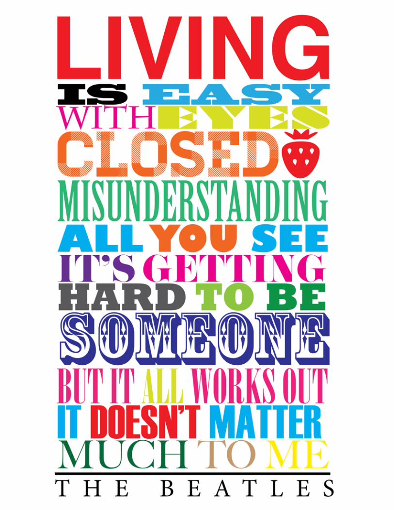
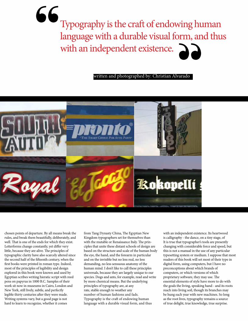
“written and photographed by: Christian AlvaradoThe presence of typography both good and bad, can be seen everywhere.
UBIQUITOUS T Y P E
T ypography makes at least two kinds of sense, if it makes any sense at all. It makes visual sense
and historical sense. � e visual side of typography is always on display, and materials for the study of its visual form are many and widespread. � e history of letter- forms and their usage is visible too, to those with access to manuscripts, inscriptions andold books, but from others it is largely hidden.� is book has therefore grown into something more than a short manual of typographic etiquette. It is the fruit of a lot of long walks in the wilderness of letters: in part a pocket � eld guide to the living wonders that are found there, and in part a meditation on the ecological principles, survival
techniques, and ethics that apply. � e principles of typography as I understand them are not a set of dead conventions but the tribal customs of the magic forest, where ancient voices speak from all directions and new ones move to unremembered forms.One question, nevertheless, has been o� en in my mind. When all right thinking human be-ings are struggling to remember that other men and women are free to be di� erent,6and free to become more di� erent still, how can one honestly write a rulebook? What reason and authority exist for these commandments, suggestions, and instructions? Surely typographers, like others, ought to be at liberty to follow or to blaze the trails they choose.Typography thrives as a shared concern - and there are no paths at all where there are no shared desires
and directions. A typographer determined to forge new routes must move, like other solitary travellers, through uninhabited country and against the grain of the land, crossing common thoroughfares in the silence before dawn. � e subject of this book is not typographic solitude, but the old, well travelled roads at the core of the tradition: paths that each of us is free to follow or not, and to enter and leave when we choose if only we know the paths are there and havea sense of where they lead.� at freedom is denied us if the tradition is concealed or le� for dead. Originality is everywhere, but much originality is blocked if the way back to earlier discoveries is cut or overgrown. If you use this book as a guide, by all means leave the road when you wish. � at is precisely the use of a road: to reach individually
chosen points of departure. By all means break the rules, and break them beautifully, deliberately, and well. � at is one of the ends for which they exist.Letterforms change constantly, yet di� er very little, because they are alive. � e principles of typographic clarity have also scarcely altered since the second half of the � � eenth century, when the � rst books were printed in roman type. Indeed, most of the principles of legibility and design explored in this book were known and used by Egyptian scribes writing hieratic script with reed pens on papyrus in 1000 B.C. Samples of their work sit now in museums in Cairo, London and New York, still lively, subtle, and perfectly legible thirty centuries a� er they were made.Writing systems vary, but a good page is not hard to learn to recognize, whether it comes
from Tang Dynasty China, � e Egyptian New Kingdom typographers set for themselves than with the mutable or Renaissance Italy. � e prin-ciples that unite these distant schools of design are based on the structure and scale of the human body the eye, the hand, and the forearm in particular and on the invisible but no less real, no less demanding, no less sensuous anatomy of the human mind. I don’t like to call these principles universals, because they are largely unique to our species. Dogs and ants, for example, read and write by more chemical means. But the underlying principles of typography are, at any rate, stable enough to weather any number of human fashions and fads.Typography is the cra� of endowing human language with a durable visual form, and thus
with an independent existence. Its heartwood is calligraphy - the dance, on a tiny stage, ofIt is true that typographer’s tools are presently changing with considerable force and speed, but this is not a manual in the use of any particular typesetting system or medium. I suppose that most readers of this book will set most of their type in digital form, using computers, but I have no preconceptions about which brands of computers, or which versions of which proprietary so� ware, they may use. � e essential elements of style have more to do with the goals the living, speaking hand - and its roots reach into living soil, though its branches may be hung each year with new machines. So long as the root lives, typography remains a source of true delight, true knowledge, true surprise.
“Typography is the cra� of endowing human language with a durable visual form, and thus with an independent existence.
“written and photographed by: Christian AlvaradoThe presence of typography both good and bad, can be seen everywhere.

B R O D Y
Brody Neuenschwander was born in Houston, Texas in 1958. He at-tended Princeton Uni-versity, where he was appointed University Scholar, graduating in 1981 with high honors for his thesis on the techniques of medieval manuscript illumina-tion. Neuenschwander completed his doctorate on the methodology of German art history in
1986 at the Courtauld Institute in London. At the same time he stud-ied calligraphy at the Roehampton Institute. � e cross-fertilization that resulted from do-ing academic and prac-tical studies simultane-ously has in� uenced all his subsequent work. � e objects studied by art historians are, for Neuenschwander,
things that were made by human hands. � e structure of the atelier and the properties of the materials are as important to him as the social context of their creation.
Neuenschwander began his professional career as assistant to Donald Jackson, an English calligrapher living on the Welsh borders. For
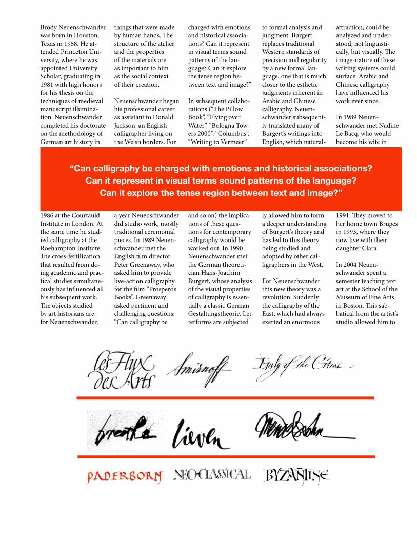
a year Neuenschwander did studio work, mostly traditional ceremonial pieces. In 1989 Neuen-schwander met the English � lm director Peter Greenaway, who asked him to provide live-action calligraphy for the � lm “Prospero’s Books”. Greenaway asked pertinent and challenging questions: “Can calligraphy be
charged with emotions and historical associa-tions? Can it represent in visual terms sound patterns of the lan-guage? Can it explore the tense region be-tween text and image?”
In subsequent collabo-rations (“� e Pillow Book”, “Flying over Water”, “Bologna Tow-ers 2000”, “Columbus”, “Writing to Vermeer”
and so on) the implica-tions of these ques-tions for contemporary calligraphy would be worked out. In 1990 Neuenschwander met the German theoreti-cian Hans-Joachim Burgert, whose analysis of the visual properties of calligraphy is essen-tially a classic German Gestaltungstheorie. Let-terforms are subjected
to formal analysis and judgment. Burgert replaces traditional Western standards of precision and regularity by a new formal lan-guage, one that is much closer to the esthetic judgments inherent in Arabic and Chinese calligraphy. Neuen-schwander subsequent-ly translated many of Burgert’s writings into English, which natural-
ly allowed him to form a deeper understanding of Burgert’s theory and has led to this theory being studied and adopted by other cal-ligraphers in the West.
For Neuenschwander this new theory was a revolution. Suddenly the calligraphy of the East, which had always exerted an enormous
attraction, could be analyzed and under-stood, not linguisti-cally, but visually. � e image-nature of these writing systems could surface. Arabic and Chinese calligraphy have in� uenced his work ever since.
In 1989 Neuen-schwander met Nadine Le Bacq, who would become his wife in
1991. � ey moved to her home town Bruges in 1993, where they now live with their daughter Clara.
In 2004 Neuen-schwander spent a semester teaching text art at the School of the Museum of Fine Arts in Boston. � is sab-batical from the artist’s studio allowed him to
“Can calligraphy be charged with emotions and historical associations? Can it represent in visual terms sound patterns of the language?
Can it explore the tense region between text and image?”
NEUENSCHWANDER
B R O D Y
Brody Neuenschwander was born in Houston, Texas in 1958. He at-tended Princeton Uni-versity, where he was appointed University Scholar, graduating in 1981 with high honors for his thesis on the techniques of medieval manuscript illumina-tion. Neuenschwander completed his doctorate on the methodology of German art history in
1986 at the Courtauld Institute in London. At the same time he stud-ied calligraphy at the Roehampton Institute. � e cross-fertilization that resulted from do-ing academic and prac-tical studies simultane-ously has in� uenced all his subsequent work. � e objects studied by art historians are, for Neuenschwander,
things that were made by human hands. � e structure of the atelier and the properties of the materials are as important to him as the social context of their creation.
Neuenschwander began his professional career as assistant to Donald Jackson, an English calligrapher living on the Welsh borders. For
a year Neuenschwander did studio work, mostly traditional ceremonial pieces. In 1989 Neuen-schwander met the English � lm director Peter Greenaway, who asked him to provide live-action calligraphy for the � lm “Prospero’s Books”. Greenaway asked pertinent and challenging questions: “Can calligraphy be
charged with emotions and historical associa-tions? Can it represent in visual terms sound patterns of the lan-guage? Can it explore the tense region be-tween text and image?”
In subsequent collabo-rations (“� e Pillow Book”, “Flying over Water”, “Bologna Tow-ers 2000”, “Columbus”, “Writing to Vermeer”
and so on) the implica-tions of these ques-tions for contemporary calligraphy would be worked out. In 1990 Neuenschwander met the German theoreti-cian Hans-Joachim Burgert, whose analysis of the visual properties of calligraphy is essen-tially a classic German Gestaltungstheorie. Let-terforms are subjected
to formal analysis and judgment. Burgert replaces traditional Western standards of precision and regularity by a new formal lan-guage, one that is much closer to the esthetic judgments inherent in Arabic and Chinese calligraphy. Neuen-schwander subsequent-ly translated many of Burgert’s writings into English, which natural-
ly allowed him to form a deeper understanding of Burgert’s theory and has led to this theory being studied and adopted by other cal-ligraphers in the West.
For Neuenschwander this new theory was a revolution. Suddenly the calligraphy of the East, which had always exerted an enormous
attraction, could be analyzed and under-stood, not linguisti-cally, but visually. � e image-nature of these writing systems could surface. Arabic and Chinese calligraphy have in� uenced his work ever since.
In 1989 Neuen-schwander met Nadine Le Bacq, who would become his wife in
1991. � ey moved to her home town Bruges in 1993, where they now live with their daughter Clara.
In 2004 Neuen-schwander spent a semester teaching text art at the School of the Museum of Fine Arts in Boston. � is sab-batical from the artist’s studio allowed him to
“Can calligraphy be charged with emotions and historical associations? Can it represent in visual terms sound patterns of the language?
Can it explore the tense region between text and image?”
NEUENSCHWANDER

POSTER WORK
Christian |GRAPHICDESIGN