Choosing a Data Visualization Tool
12
1 Choosing a Data Visualization Tool
Transcript of Choosing a Data Visualization Tool

1
Choosing a Data Visualization Tool

2
Which ToolsGeneral Data Presentation Tools
Excel Excellent for tables and many graphs (.gov)PowerPoint Excellent to produce a story about data.
Specialist Data Analytics ToolsR Precise graphics for specialists.Python Needs coding knowledge to be effective.
Knime Open Source drag and drop analytics.Alteryx Widely used drag and drop analytics.
Tableau Widely used, better analytics and mapping.PowerBI Widely used, easier interface, better layout.
*Tool costs and license arrangements frequently change.

3
General Purpose Tools for Data Visualization

4
PowerPoint
Widely used presentation software.
Has no knowledge of underlying data, purely a drawing package.
Good for creating linear stories about data.
Can combine and annotate outputs from any other tool.

5
Excel
Spreadsheet tool that has some knowledge of the data and analytics capability.
Effective table formatting tools.
Range of graphing and charting tools plus external plugins.
Department Black Gold White Total
Phones 244,099 60,000 50,000 304,099 Highest sales
Tablets 100,000 100,000 89,340 200,000 Lowest sales
Laptops 30,083 10000 10000 40,083
Totals £ 374,182.00 £ 170,000.00 £ 149,340.00 £ 544,182.00

6
Specialist tools for Data Visualization
7
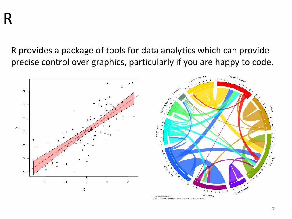
R
R provides a package of tools for data analytics which can provide precise control over graphics, particularly if you are happy to code.

#Generate a resampling grid of regular points to create the heatmap in
grid_x, grid_y = mgrid[0:1300:520j, 0:900:360j]
#Read in the irregularly placed sensor data from a file
print "CWD is: "+ os.getcwd()
print "Starting file read"
tempData = csv.reader(open('tempData.csv', 'rU'), delimiter=',')
tempData.next()
x =[]
y = []
t = []
#Loop through the data
for line in tempData:
x.append(line[0])
y.append(line[1])
t.append (line[2])
#Convert from the sample points (x,y) to an interpolated heat map on a regular grid
(grid_x, grid_y)
print "Creating heatmap using griddata"
resampled_temp = griddata( (x,y), t, (grid_x, grid_y), method = 'cubic')
#Create the visualization
print "Creating visualization"
img = imread( "theKey_Half.png" )
plt.subplot(1,1,1)
# Create labelled axes
plt.axis([0,1300,0,900], zorder=2)
#Plot the sensor locations as red circles.
plt.plot( x, y, 'o', c="red", ms=10, zorder=2)
#Plot the key building background image (at z=0 so it is behind everything else)
plt.imshow(img, cmap="gray", interpolation="none", zorder=0)
#Plot the resampled temperature data.
# vmin and vmax set the minimum to maximum temp range for the default color map.
plt.imshow( resampled_temp.T, vmin=10., cmap=colormaps.viridis, vmax=25.,
extent=(0,1300,0,900), origin='lower', alpha=0.7, zorder = 1)
#Show everything in blocking GUI window
plt.show()
8
Python
Programming language that glues together a wide range of libraries widely used for data analytics and visualization.

9
KNIME
Open source well supported drag and drop toolset for data analytics.

10
Alteryx
Similar to KNIME a dataflow/pipeline building system.Commercially licensed software, but free for academic use.

11
TableauInteractive data analytics and visualization tool.Widely used wysiwig interface, one of the leading toolsets.
12
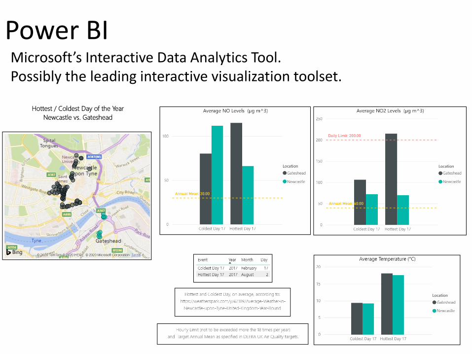
Power BIMicrosoft’s Interactive Data Analytics Tool.Possibly the leading interactive visualization toolset.