BRAND GUIDELINESLOGO LOGO GUIDELINES A brand’s logo is one of the most important advertising...
27
BRAND GUIDELINES 89618_ECHDC_BrandGuidelineLogoUpdate.indd 1 4/7/17 2:26 PM
Transcript of BRAND GUIDELINESLOGO LOGO GUIDELINES A brand’s logo is one of the most important advertising...

BRAND GUIDELINES
89618_ECHDC_BrandGuidelineLogoUpdate.indd 1 4/7/17 2:26 PM

TABLE OF CONTENTS
LOGO
FONTS
COLORS
PHOTOGRAPHY
BRAND MESSAGING
OUTDOOR
ONLINE
EVENT SPECIFIC
CANALSIDE CONCERTS
SOCIAL MEDIA
OUTDOOR
ONLINE
89618_ECHDC_BrandGuidelineLogoUpdate.indd 2 4/7/17 2:26 PM
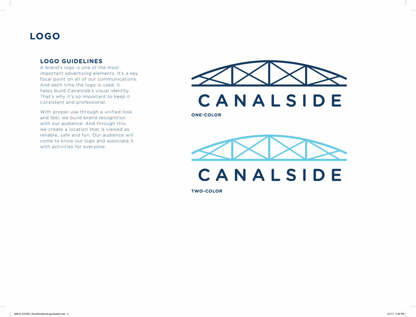
LOGO
LOGO GUIDELINESA brand’s logo is one of the most important advertising elements. It’s a key focal point on all of our communications. And each time the logo is used, it helps build Canalside’s visual identity. That’s why it’s so important to keep it consistent and professional.
With proper use through a unified look and feel, we build brand recognition with our audience. And through this, we create a location that is viewed as reliable, safe and fun. Our audience will come to know our logo and associate it with activities for everyone.
TWO-COLOR
ONE-COLOR
89618_ECHDC_BrandGuidelineLogoUpdate.indd 3 4/7/17 2:26 PM

LOGO
PRIMARY LOGO COLORSThe primary blue color for Canalside is PMS 7694. Color breakdowns are provided below for various usages. The secondary blue color is PMS 305 and should be used as a complementary color. The light blue should not be implemented for single-color usage.
SINGLE-COLOR USEIn the case of single-color usage, the Canalside logo must be used at 100%.
USE ON COLORWhen being used on color, the Canalside logo should be used in single-color format or reversed in white. See examples below.
PMS 7694C100 M57 Y9 K52R1 G66 B106HEX#01426A
PMS 305C55 M0 Y2 K0R89 G203 B232HEX#59CBE8
89618_ECHDC_BrandGuidelineLogoUpdate.indd 4 4/7/17 2:26 PM

LOGO RULES
MINIMUM SPACE RULEClear space around the logo: designs must keep the logo separated from other elements by a distance of the height of the bridge, as shown below.
NO ALTERATIONSThe Canalside logo may not be altered in any way. The font is to always remain the same, as well as the angles and proportions.
EVENTSX
DO NOT SUBSTITUTE TYPOGRAPHY
DO NOT CHANGE PROPORTIONS
DO NOT CHANGE COLORS
DO NOT APPLY SPECIAL EFFECTSDO NOT CHANGE ALIGNMENTDO NOT CHANGE ANGLE
DO NOT ADD A STROKEDO NOT SUBSTITUTE TYPEFACE
DO NOT SKEW
CANALSIDE
89618_ECHDC_BrandGuidelineLogoUpdate.indd 5 4/7/17 2:26 PM

FONTS
PRIMARY TYPEFACEOur primary typeface is Gotham Rounded. Please see the following page for optimal usages.
SECONDARY TYPEFACES Please see the following page for optimal usages.
Gotham Rounded Bold ABCDEFGHIJKLMNOPQRSTUVWXYZabcdefghijklmnopqrstuvwxyz0123456789 .,:;?!$&%‘’“”
Brothers Bold ABCDEFGHIJKLMNOPQRSTUVWXYZabcdefghijklmnopqrstuvwxyz0123456789 .,:;?!$&%‘’“”
Thirsty Script Regular ABCDEFGHIJKLMNOPQRSTUVWXYZabcdefghijklmnopqrstuvwxyz0123456789 .,:;?!$&%‘’“”
Gotham Rounded Book ABCDEFGHIJKLMNOPQRSTUVWXYZabcdefghijklmnopqrstuvwxyz0123456789 .,:;?!$&%‘’“”
ClearLineABCDEFGHIJKLMNOPQRSTUVWXYZabcdefghijklmnopqrstuvwxyz 0123456789 .,?!&‘’“”
89618_ECHDC_BrandGuidelineLogoUpdate.indd 6 4/7/17 2:26 PM

FONTS
EXAMPLEHere is an example of optimal brand font usages.
78684_ECHDC_BrandAd / WNY Family: Our Dreams 4.8125”w x 4.8125”h / 4C
78684_ECHDC_BrandPrint_0613.indd 2 6/16/14 2:14 PM
ClearLineshould be used for the first part of headlines, always set in sentence case.
Brothers Boldshould be used for the second part of headlines.
Gotham Rounded Boldshould be used in all caps for calls to action and website.
Gotham Rounded Bookshould be used for larger blocks of body copy.
Thirsty Script Regularshould be used as an alternate when the Clear Line typeface isn’t legible.
89618_ECHDC_BrandGuidelineLogoUpdate.indd 7 4/7/17 2:26 PM
COLORS
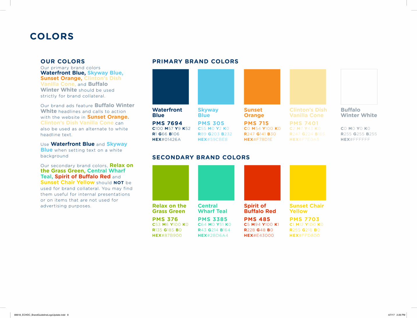
OUR COLORSOur primary brand colors Waterfront Blue, Skyway Blue, Sunset Orange, Clinton’s Dish Vanilla Cone, and Buffalo Winter White should be used strictly for brand collateral.
Our brand ads feature Buffalo Winter White headlines and calls to action with the website in Sunset Orange. Clinton’s Dish Vanilla Cone can also be used as an alternate to white headline text.
Use Waterfront Blue and Skyway Blue when setting text on a white background
Our secondary brand colors, Relax on the Grass Green, Central Wharf Teal, Spirit of Buffalo Red and Sunset Chair Yellow should NOT be used for brand collateral. You may find them useful for internal presentations or on items that are not used for advertising purposes.
PRIMARY BRAND COLORS
SECONDARY BRAND COLORS
Waterfront BluePMS 7694C100 M57 Y9 K52R1 G66 B106HEX#01426A
Relax on the Grass GreenPMS 376C53 M6 Y100 K0R135 G185 B0HEX#87B900
Central Wharf TealPMS 3385C64 M0 Y51 K0R43 G214 B164HEX#2BD6A4
Spirit of Buffalo RedPMS 485C5 M94 Y100 K1R228 G48 B0HEX#E43000
Sunset Chair YellowPMS 7703C1 M12 Y100 K0R255 G216 B0HEX#FFD800
Clinton’s Dish Vanilla ConePMS 7401C2 M7 Y43 K0R247 G224 B165HEX#F7E0A5
Buffalo Winter White C0 M0 Y0 K0R255 G255 B255HEX#FFFFFF
Skyway BluePMS 305C55 M0 Y2 K0R89 G203 B232HEX#59CBE8
Sunset OrangePMS 715C0 M54 Y100 K0R247 G141 B30HEX#F78D1E
89618_ECHDC_BrandGuidelineLogoUpdate.indd 8 4/7/17 2:26 PM
PHOTOGRAPHY
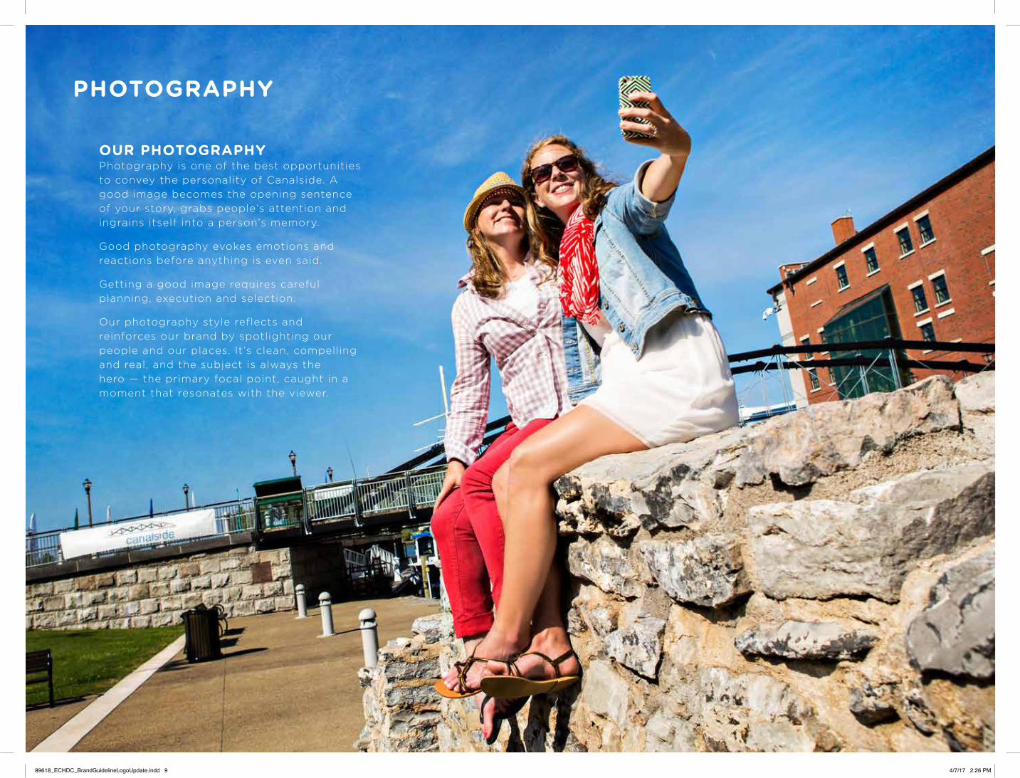
OUR PHOTOGRAPHYPhotography is one of the best opportunities to convey the personality of Canalside. A good image becomes the opening sentence of your story, grabs people’s attention and ingrains itself into a person’s memory.
Good photography evokes emotions and reactions before anything is even said.
Getting a good image requires careful planning, execution and selection.
Our photography style reflects and reinforces our brand by spotlighting our people and our places. It’s clean, compelling and real, and the subject is always the hero — the primary focal point, caught in a moment that resonates with the viewer.
89618_ECHDC_BrandGuidelineLogoUpdate.indd 9 4/7/17 2:26 PM

PHOTOGRAPHY
KEYS TO MEMORABLE IMAGERY• A person or people
prominently featured
• Natural lighting (avoid harsh light and color gels)
• Poses and facial expressions that are appropriate for the subject, including candid shots or personality poses
• The use of action, artistic representations, asymmetrical cropping, shallow depth of field, camera angles and saturated color to add visual interest
• A sense of place, using familiar Canalside locations, icons and traditions
89618_ECHDC_BrandGuidelineLogoUpdate.indd 10 4/7/17 2:26 PM
PHOTOGRAPHY
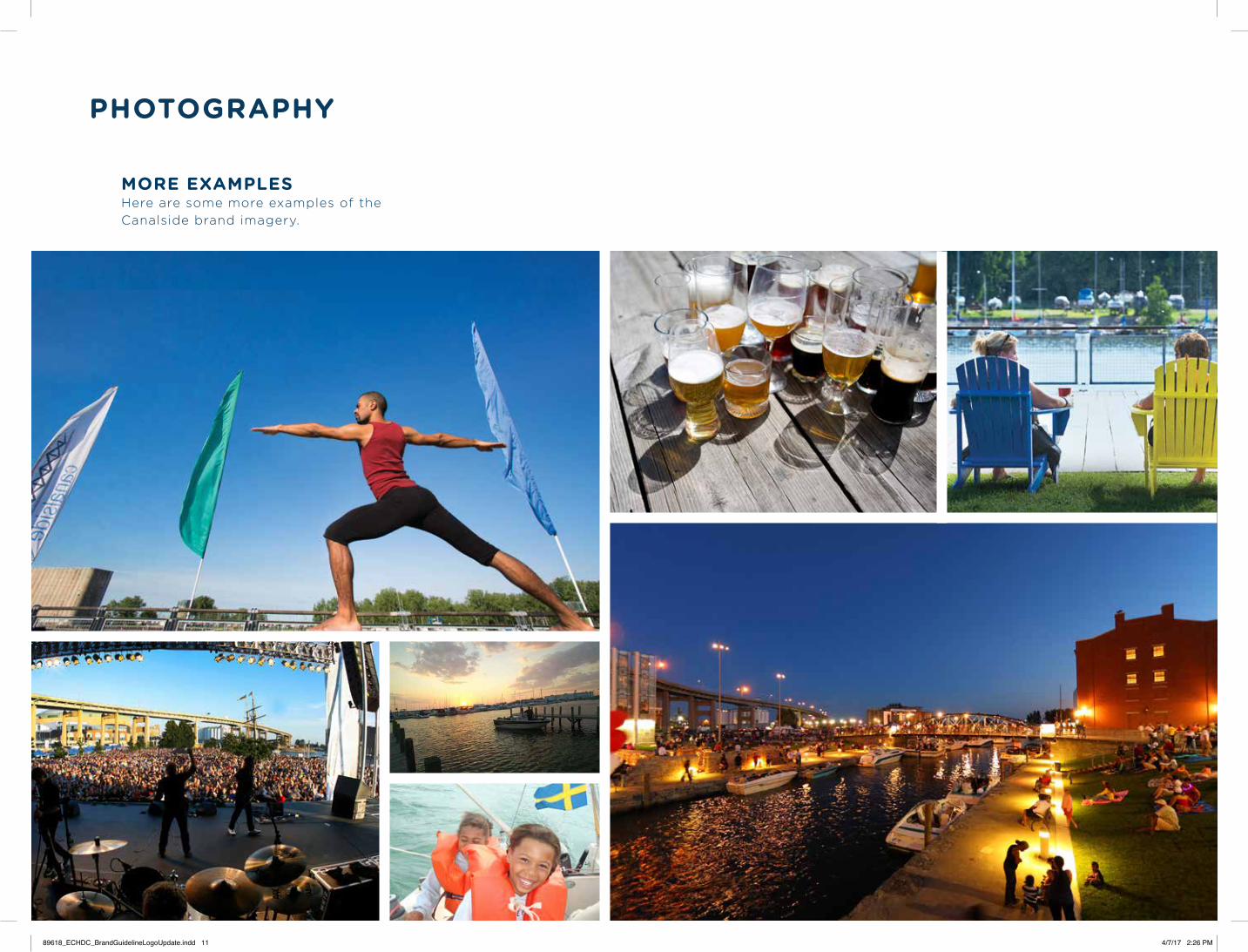
MORE EXAMPLESHere are some more examples of the Canalside brand imagery.
89618_ECHDC_BrandGuidelineLogoUpdate.indd 11 4/7/17 2:26 PM
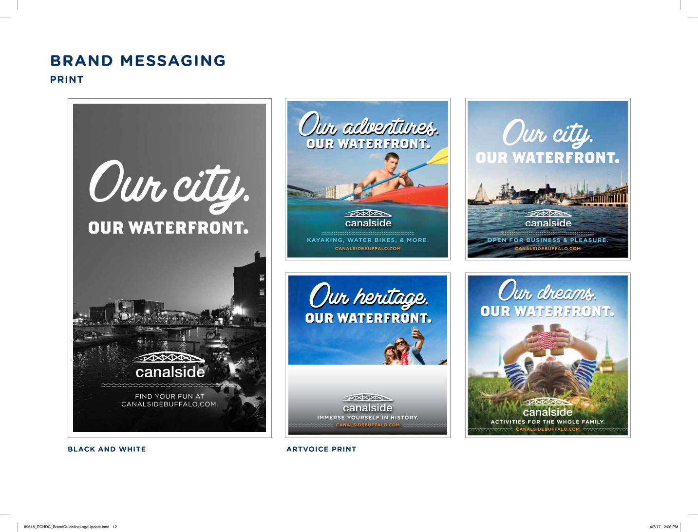
BRAND MESSAGINGPRINT
BLACK AND WHITE ARTVOICE PRINT
our waterfront.Our adventures.
CANALSIDEBUFFALO.COM
KAYAKING, WATER BIKES, & MORE.
our waterfront.Our heritage.
CANALSIDEBUFFALO.COMIMMERSE YOURSELF IN HISTORY.
CANALSIDEBUFFALO.COM
OPEN FOR BUSINESS & PLEASURE.
our waterfront.
CANALSIDEBUFFALO.COMACTIVITIES FOR THE WHOLE FAMILY.
our waterfront.Our dreams.
our waterfront.
FIND YOUR FUN AT CANALSIDEBUFFALO.COM.
89618_ECHDC_BrandGuidelineLogoUpdate.indd 12 4/7/17 2:26 PM
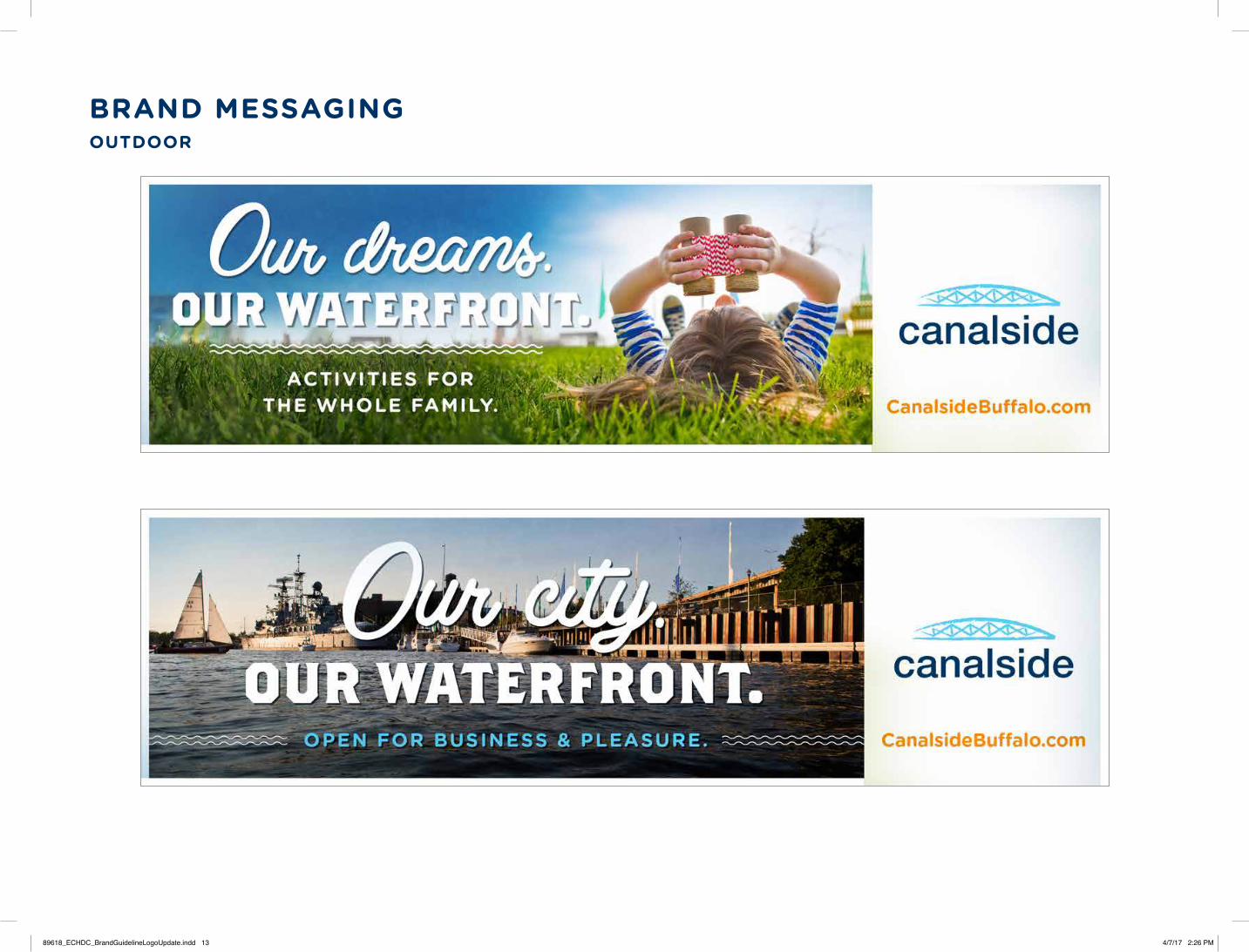
BRAND MESSAGINGOUTDOOR
89618_ECHDC_BrandGuidelineLogoUpdate.indd 13 4/7/17 2:26 PM
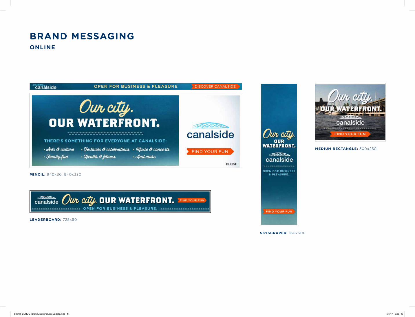
BRAND MESSAGINGONLINE
PENCIL: 940x30, 940x330
LEADERBOARD: 728x90
MEDIUM RECTANGLE: 300x250
SKYSCRAPER: 160x600
89618_ECHDC_BrandGuidelineLogoUpdate.indd 14 4/7/17 2:26 PM
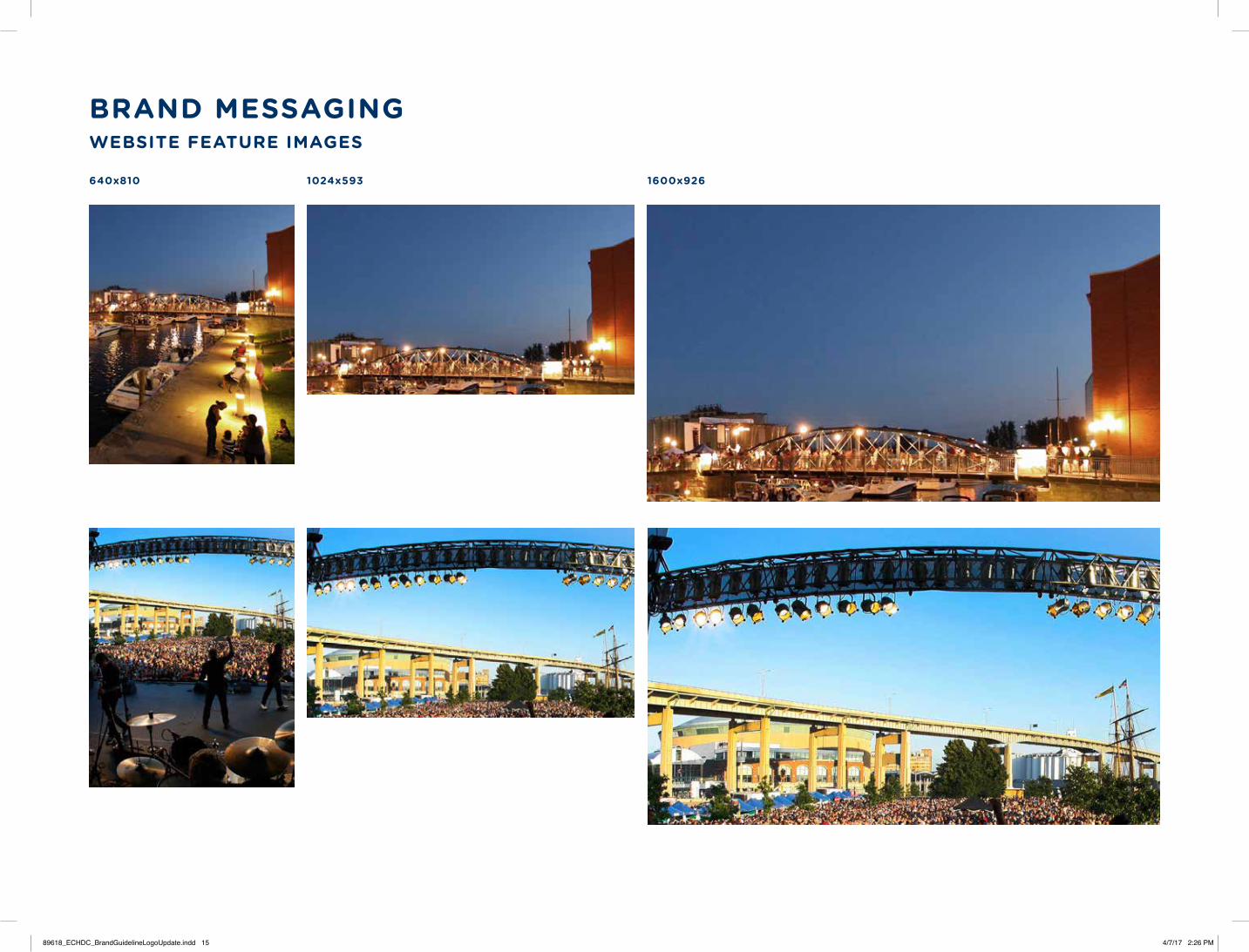
BRAND MESSAGINGWEBSITE FEATURE IMAGES
640x810 1600x9261024x593
89618_ECHDC_BrandGuidelineLogoUpdate.indd 15 4/7/17 2:26 PM

EVENT SPECIFIC
ONLINE
OUTDOOR
PRINT78684_ECHDC_BrandAd / Artvoice: 4th of July; Our Freedom 5.15”w x 5.05”h / 4C
JOIN US FOR LIVE MUSIC, FIREWORKS AND MORE.
CANALSIDEBUFFALO.COM
July 4th celebration
fireworks presented by Russell J. Salvatore
78684_ECHDC_BrandAd_Artvoice_Freedom.indd 1 7/25/14 3:06 PM
89618_ECHDC_BrandGuidelineLogoUpdate.indd 16 4/7/17 2:26 PM
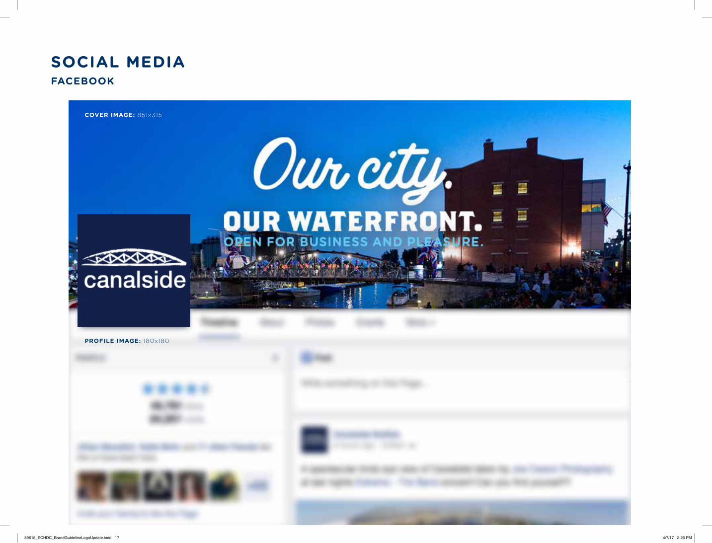
SOCIAL MEDIAFACEBOOK
COVER IMAGE: 851x315
PROFILE IMAGE: 180x180
89618_ECHDC_BrandGuidelineLogoUpdate.indd 17 4/7/17 2:26 PM
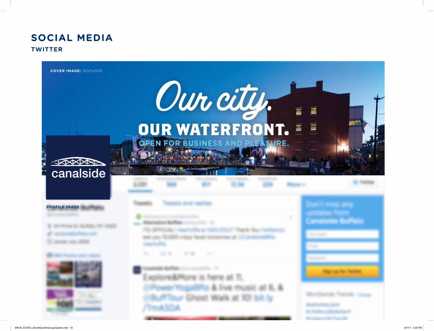
SOCIAL MEDIATWITTER
COVER IMAGE: 1500x500
PROFILE IMAGE: 400x400
89618_ECHDC_BrandGuidelineLogoUpdate.indd 18 4/7/17 2:26 PM

BRA N D G U I DE

1
TABLE OF CONTENTS
Where Buffalo Roams ......................................................................................................02
Logo .................................................................................................................................03
Logo Usage ....................................................................................................................04
Primary Color Palette .......................................................................................................05
Burgees ............................................................................................................................06
Secondary Color Palette ..................................................................................................07
Fonts ................................................................................................................................08
2
WHERE BUFFALO ROAMS
A playful take on a popular phrase, “Where Buffalo Roams” celebrates the Outer Harbor’s wide-open spaces—a new place to play, right in our backyard. The Outer Harbor offers the perfect balance between serenity and energy, from the scenic beauty of Times Beach Nature Preserve, to the tranquility of hiking and biking trails, to live music and special events. And we can’t forget the best sunset views in the city!
Sample Content:
Just when you thought that you had Buffalo all figured out, there’s a new place to play. The Outer Harbor is open. Wide open! Your oasis within the city where you can enjoy hiking, biking, boating, music, and more. A place where you can breathe—where you can get away from it all, without going far. Bring your family. Bring your friends. And, with the best sunset views in the city, bring your camera. The Outer Harbor is yours. Just beyond the buzz of downtown, it’s Where Buffalo Roams.
Extensions:
Where Buffalo Roams to hit the trails
Where Buffalo Roams to catch the view
Where Buffalo Roams to make a splash
Where Buffalo Roams to see the lights
Where Buffalo Roams to chill with friends
Where Buffalo Roams to strike a pose
Where Buffalo Roams to have some fun

3
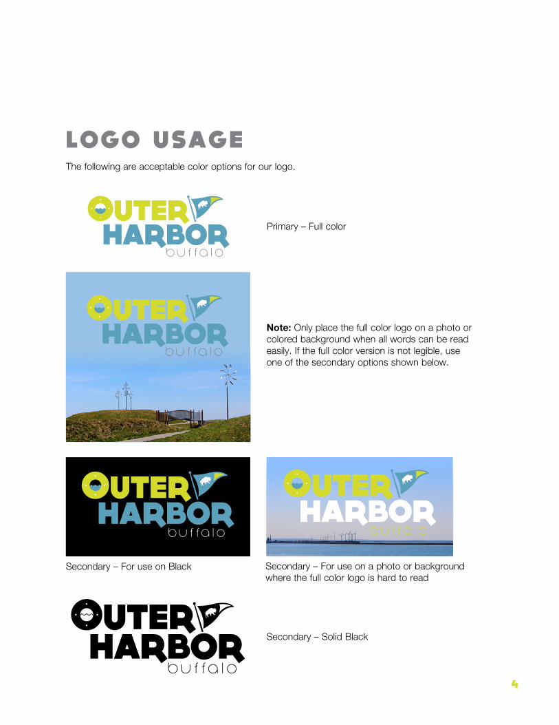
LOGOThe full color logo should be used whenever possible, but secondary options with white and solid black are available if needed. It can be used with or without “buffalo” depending on the medium. We typically will not use the “buffalo” in areas where it may not be readable.
The “OH” version can be used in circumstances where a smaller visual element would be more advantageous and/or more visible. It can be used with or without “buffalo” depending on the medium.
4
Primary – Full color
Note: Only place the full color logo on a photo or colored background when all words can be read easily. If the full color version is not legible, use one of the secondary options shown below.
Secondary – Solid Black
Secondary – For use on Black Secondary – For use on a photo or background where the full color logo is hard to read
LOGO USAGEThe following are acceptable color options for our logo.

5
PRIMARY COLOR PALETTE
Outer Harbor Blue c53 m7 y6 k20 html 5ca1bc
Outer Harbor Green c21 m1 y98 k0 html d4dc2a
Outer Harbor Gray c0 m0 y0 k60 html 808285
6
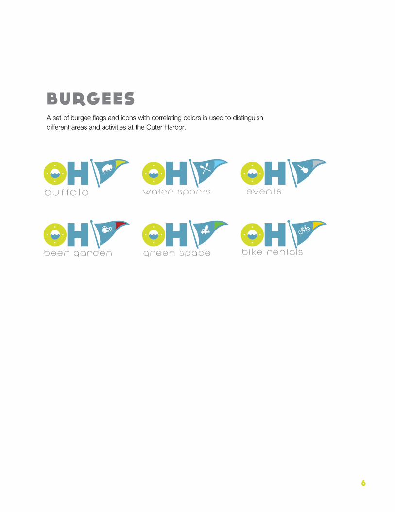
BURGEESA set of burgee flags and icons with correlating colors is used to distinguish different areas and activities at the Outer Harbor.
water sports
green spacebeer garden
events
bike rentals
7
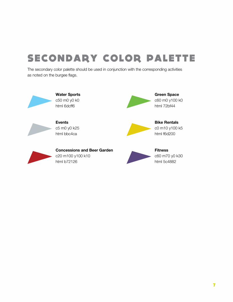
SECONDARY COLOR PALETTEThe secondary color palette should be used in conjunction with the corresponding activities as noted on the burgee flags.
Events c5 m0 y0 k25 html bbc4ca
Water Sports c50 m0 y0 k0 html 6dcff6
Concessions and Beer Garden c20 m100 y100 k10 html b72126
Green Space c60 m0 y100 k0 html 72bf44
Bike Rentals c0 m10 y100 k5 html f6d200
Fitness c60 m70 y0 k30 html 5c4882

8
FONTS
Headlines: DOCK11
DOCK 11 SHOULD BE USED FOR HEADLINES ONLY
Identifiers: Nonchalance
Nonchalance should be used for
secondary identifiers as seen in the OH burgee lockups. Note: When using Nonchalance, the letter “k” should instead be
Gotham Extended Light for easier legibility. You may need to increase the size of the Gotham “k” by roughly 3 point sizes to better align with the Nonchalance alphabet. Also, beware the kerning of the Nonchalance “t” and “f”; you’ll usually need to open it up a bit.
Body Copy
The Helvetica Neue Font Family, using a combination of six weights, plus cor re spond ing ital ics, from light to black weights.
Light, roman, medium, bold, heavy, black.