Analysing contents pages
7
Analysis of 3 music magazine contents pages
-
Upload
hilll4 -
Category
Technology
-
view
470 -
download
0
Transcript of Analysing contents pages
Analysis of 3 music magazine contents pages

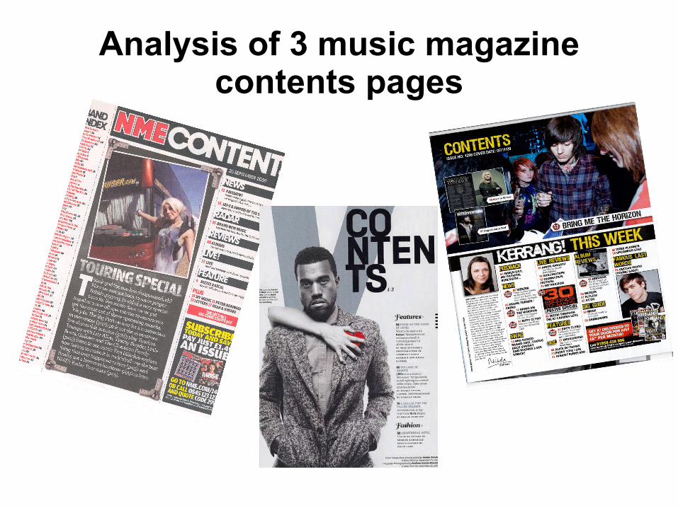
Contents page NME (SEPT 2009) ANALYSISBANNER AT TOPBy placing the masthead within a banner, still shows the importance but doesn't make it the dominant aspect of the page, also it makes the page look more neatly in layout and looks more attractive as a whole.
DATEBy inserting the date, it provides the aspect of when the news was from and gives the magazine information of the issue.
SUB HEADING BLOCKED OUT INTO BLACK SUB SECTIONS The use this allows the headings to stand out and attract the readers eye, allowing the reader to quickly find what they are interested in.
BRIEF HEADING +SUMMARY OF CONTENT WITH PAGE NUMBER IN REDThe use of this quick informative text being page numbered allows the reader to quick turn to a certain page instead of going through each individual page.
NME MASTHEAD SAME COLOUR CODE AS FRONTBy having the masthead of the front cover and contents page having the same colour code, exposes the magazine to be consistent and looks professional.
MAIN IMAGE IS…The image is a photo of a women standing next to a tour bus. This is appropriate due to the picture linking onto the text underneath.
BANDS ARE LISTED IN RED WITH PAGE NUMBER IN BLACKThe way the bans have been listed keeps to the colour house scheme of the magazine, making it look more attractive, yet lets the important information stand
out. Image is edited so it looks like a photograph. This is appropriate because…By placing the image with the appearance as a photograph, links effectively towards the idea of tour, suggesting this appropriate layout and makes the content page look more attracting towards to reader.
EDITORS INTRODUCTION TO CONTENTS OF MAGAZINE.The use of this introduction allows a interesting approach towards the magazine, by the editor introducing the magazine it allows the reader to be informed and attracted due to how the editor wants to engage them.
PREVIOUS/FUTURE EDITIONS OF NME ARE SHOWN WITH DETAILS OF WEBSITE/PHONE NUMBER ETCThis advertises the magazine, allowing the reader the opportunity to read on to the next issue if they wish to do so. This publishes and emphasises the magazine institute and increases the chance of the reader buying the next issue,

ANALYSIS OF LAYOUR/DESIGN FEATURES OF CONTENTS PAGE
INTRODUCTION TO MAGAZINE AND ARTICLE. LINKS TO THE IMAGE PLACED ABOVE.
BOLD FONT ON HEADINGS
PROMOTION AND ADVERTISMENT OF FURTHER MAGAZINE ISSUES
LIST OF BAND INDEX WRITTEN IN TWO MAIN COLOUR SCHEME. EASY GUIDE TO PAGES.
MASTHEAD AND WORD CONTENTS –BOLD AT TOP WITH DATE/ISSUE NUMBER

ANALYSIS OF CONTENTS PAGE 2
MAIN IMAGEFor this content page, Kanye West is featured who is very famous recognised rapper; this suggesting the genre of magazine towards the reader. One of the main features that stand out in this main image is the hand across him with the red heart; this is significant as it can relate to the readers as she is trying to win over Kanye West's heart this content page is also trying to win over the reader’s heart and interest the reader and encourage them to buy it.
SUB HEADINGSOne of the main headings is entitled “fashion” this implies that fashion is apart of music and has increased popularity therefore vibe have successful identified a trend and incorporated it in their music magazine to attract young people.
MASTHEADAt the back of the main image there is a large “v” this refers to vibe magazine as the logo is “v” this is very effective as it is catchy therefore helps the audience remember the magazine and as a result buy it in the future.
The title of the page “content” is not written in a straight line it starts a new line twice throughout the word this stands out as it is written in big bold black font and is very effective as it makes this magazine very original and unique which might attract potential customers as it is going against the normality which young people are often drawn to.
BRIEF HEADING AND SUMMARY OF FEATURES OF THE MAGAZINEOn the right there is a list of where to find pages of articles it is in big black font therefore making it clear and easy for the audience to read. The instructions provided are fairly simple as it tells you the article involved and the numbers needed to find the page you would like. This makes it easier for the reader to navigate to the page they wish.
EXTRA INFORMATION – DATE AND INFORMATION ON MAIN IMAGEIn the bottom right hand corner of the page, there are a couple of bullet points explaining the pictures on the front cover and also the contents page. It tells you the artist’s name and where the picture was taken for example, this extra information might be useful to people who like extra knowledge and are fans of Kanye West.
Also by featuring the date on this page, allows the reader and instutore to be aware of the issue and date it was published.

ANALYSIS OF LAYOUT CONTENTS PAGE 2
MAIN IMAGE OF KANYE WEST AS THE FOCUS OF THE MAGAZINE. HINTING THAT AN ARTICLE WITHIN THE MAGAZINE IS ABOUT HIM.
BOLD FONT ON HEADINGS
LIST OF FEATURES WITHIN THE MAGAZINE TO MAKE IT EASIER FOR THE READER TO FIND THE PAGE THEY WANT TO LOOK AT.
ANALYSIS OF CONTENTS PAGE 3
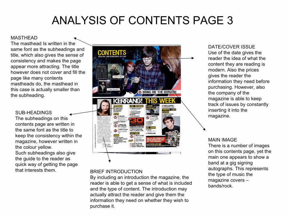
MAIN IMAGEThere is a number of images on this contents page, yet the main one appears to show a band at a gig signing autographs. This represents the type of music the magazine covers – bands/rock.
SUB-HEADINGSThe subheadings on this contents page are written in the same font as the title to keep the consistency within the magazine, however written in the colour yellow. Such subheadings also give the guide to the reader as quick way of getting the page that interests them.
MASTHEADThe masthead Is written in the same font as the subheadings and title, which also gives the sense of consistency and makes the page appear more attracting. The title however does not cover and fill the page like many contents mastheads do, the masthead in this case is actually smaller than the subheading.
DATE/COVER ISSUEUse of the date gives the reader the idea of what the content they are reading is modern. Also the prices gives the reader the information they need before purchasing. However, also the company of the magazine is able to keep track of issues by constantly inserting it into the magazine.
BRIEF INTRODUCTIONBy including an introduction the magazine, the reader is able to get a sense of what is included and the type of content. The introduction may actually attract the reader and give them the information they need on whether they wish to purchase it.

Analysis of layout contents page 3
USE OF MIXTURE OF IMAGES TO PROVIDE READER WITH AN IDEA OF WHAT THE CONENT OF THE MAGAZINE IS GOING TO FOCUS ON
BOLD FONT ON HEADINGS
LIST OF FEATURES WITHIN THE MAGAZINE TO MAKE IT EASIER FOR THE READER TO FIND THE PAGE THEY WANT TO LOOK AT.