


Languages
Pages
Legal

DESIGN WORKS

2P2 DESIGN WORKS IDEAPAINT
FOREWORDDesign works. It’s that simple.
The modern workplace offers limitless evidence. More than a repository for furniture and fixtures, its design intimately affects recruitment, productivity, and the psychological health of your employees. It also offers the unique opportunity to express what kind of company you are. And that, ultimately, is what will set you apart.
In Design Works you’ll find a sampling of businesses that are doing it right. They’ve engaged A&D partners to help them move beyond brass tacks to the larger challenge of creating a company culture. We interviewed both sides of the conversation - the architects and interior designers, as well as their client counterparts - to find out how specific business objectives manifest in the built environment, and learned that behind each decision is a philosophical underpinning. From the paint on the walls to the beers on draft, all the small things add up. And the dividends can be big.
The takeaways here are evergreen. It doesn’t matter if you’re planning for your first office or your fifth, in the end, how well your team works together will determine if the doors stay open. As these case studies illustrate, well-thought-out design is your best weapon.
Borrow as you see fit and remember, the future of work is up to you.

3
DESIGNERS KAYTE MUSE, EnvironmEntal Graphics & BrandinG DANIEllE lOIzzO, FacilitiEs manaGEr at EnErnoc
FIRM SPAGNOlO GISNESS & ASSOcIATES [SG&A], Boston, ma
clIENT ENERNOc, Boston, ma
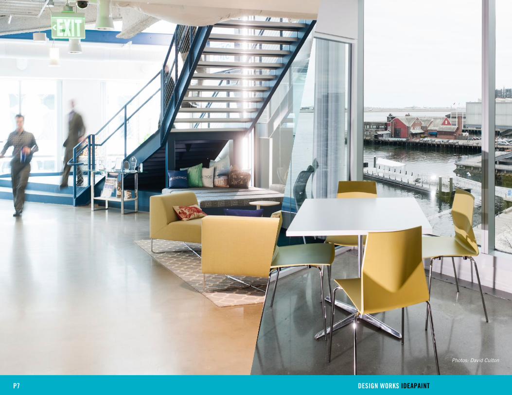
EnerNOC’s workspace in Boston’s Seaport District is a lean, green, streamlined machine.
Both visually stunning and environmentally responsible, it proves that doing good by the
environment is good for business too.
Of course, getting to optimal efficiency took some retrofitting. The first task for A&D firm
SG&A was to help EnerNOC find a new headquarters location that could be renovated
to let EnerNOC’s staff do what they do best - collaborate. As designer Kayte Muse
describes it, “The combination of exposed building materials, such as concrete and
open ceiling planes, with angular architectural features and details reflect not only the
industrial aesthetic that EnerNOC was after, but central concepts of the brand: energy
and movement. The look and feel, paired with features like the Network Operations Center
(NOC), illustrates the mechanics of what they’re helping customers do.”
When it comes to why, EnerNOC’s answer is simple. They should lead by example. Clearly
communicating the benefits of an energy-efficient operation is the crux of theirs. From
the fixtures to the fabrics to the furniture, the choices they made with SG&A represent a
new model for conscientious consumption via deliberate design.
Together, they’ve set a precedent for other companies to follow. Forget the bells and
whistles and work smarter.
P3 DESIGN WORKS IDEAPAINT

MODEl BEHAVIORIn EnerNOC‘s line of work, two heads are always better than one, so
SG&A prioritized collaborative spaces in the new HQ. Now, as Danielle
Loizzo says, “nobody’s ever not involved.” As she puts it, “The
new design allows for more of a flexible dialogue and a more open
conversation throughout the space.”
Over 8,000 sq. ft. of IdeaPaint makes huddling up even easier. And
makes their thinking process greener. Because traditional whiteboards
produce more waste and require more energy to manufacture,
IdeaPaint is one of EnerNOC’s deliberate choices to reflect the value
proposition of the company.
P4 DESIGN WORKS IDEAPAINT

“There’s definitely an overall transparency. Being more transparent in our workspace has helped everyone with
communication and opens their eyes to working with anyone who would add to the solution.”
– Danielle Loizzo
P5 DESIGN WORKS IDEAPAINT

P6 DESIGN WORKS IDEAPAINT
P7 DESIGN WORKS IDEAPAINT
Photos: David Culton

8
DESIGNERS TREVOR ABRAMSON & MARcO MARRAccINI
FIRM ABRAMSON TEIGER ARcHITEcTS, los anGElEs, ca
clIENT HUGE, los anGElEs, ca
Digital agency Huge doesn’t have clients; it has collaborators. Since 1999, they’ve
worked in tandem with teams from Google, TED, FX Networks, and MoMA to create
unparalleled digital experiences for their customers. Their nimble creative process has
generated so much business that there are now Huge outposts all around the world.
While each is unique in design, they all share a spatial framework that allows for their
trademark, creative co-conspiring with clients. As Huge Los Angeles planned for a larger
office to accommodate its rapid growth, the leadership team was faced with the challenge
of transforming space in a traditional office building into the ideal work environment.
“The space we were planning to move into was dark and cavernous,” said Todd Lefelt,
Managing Director of User Experience at Huge LA’s office. “It was originally a collection
of individual spaces, a collection of offices where you could go hide.” Far from ideal
for an agency that needs a borderless space for organic dialogue and circulation of
ideas. Designers Trevor Abramson and Marco Marraccini of Abramson Teiger Architects
were brought in for a complete overhaul. “We started thinking, ‘Just get a clean palette
that we can then develop into a creative space,’” said Trevor. After gutting the interior
and repainting, they were left with white IdeaPaint walls, glass, and natural light – a
functional workspace at its most basic.
To bring the culture of Southern California into the space, Trevor and Marco chose
reclaimed wood to reflect the region’s eco-sensitivity and to add warmth to the steel-and-
concrete skeleton. They built out collaborative areas, but chose mostly modular furniture
that employees can rearrange when necessary. Work by local artists hangs in the lobby,
and with a bustling staff of 70, the LA office has quickly become very Huge.
P8 DESIGN WORKS IDEAPAINT
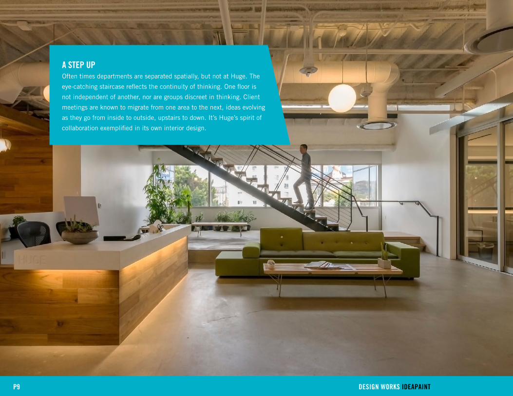
A STEP UPOften times departments are separated spatially, but not at Huge. The
eye-catching staircase reflects the continuity of thinking. One floor is
not independent of another, nor are groups discreet in thinking. Client
meetings are known to migrate from one area to the next, ideas evolving
as they go from inside to outside, upstairs to down. It’s Huge’s spirit of
collaboration exemplified in its own interior design.
P9 DESIGN WORKS IDEAPAINT

“One of the common problems in these pancake office buildings is continuity between floors. The staircase brings a sculptural element into the space and provides connectivity between the two floors to make sure that that third floor doesn’t feel like a stepchild of the second floor.”
– Marco Marraccini
“In some creative workplaces it’s common for leaders to dictate and make decisions for everyone else. The team just follows orders. We try to take a different approach. Leading isn’t about your title or seniority. It’s about your strategic and creative input in a room. That philosophy is reflected in the way our space is laid out. There’s lots of light, open space, and places to work together, but there are no individual offices. Here it’s about collaboration, the quality of your ideas and your work, bottom line.”
– Todd Lefelt, Huge
P10 DESIGN WORKS IDEAPAINT

P11 DESIGN WORKS IDEAPAINT
Photos: Kevin Smith & Matt Murray

12
DESIGNER HAlEY MclANE
FIRM HAlEY MclANE, llc
clIENT clYPD, INc. somErvillE, ma
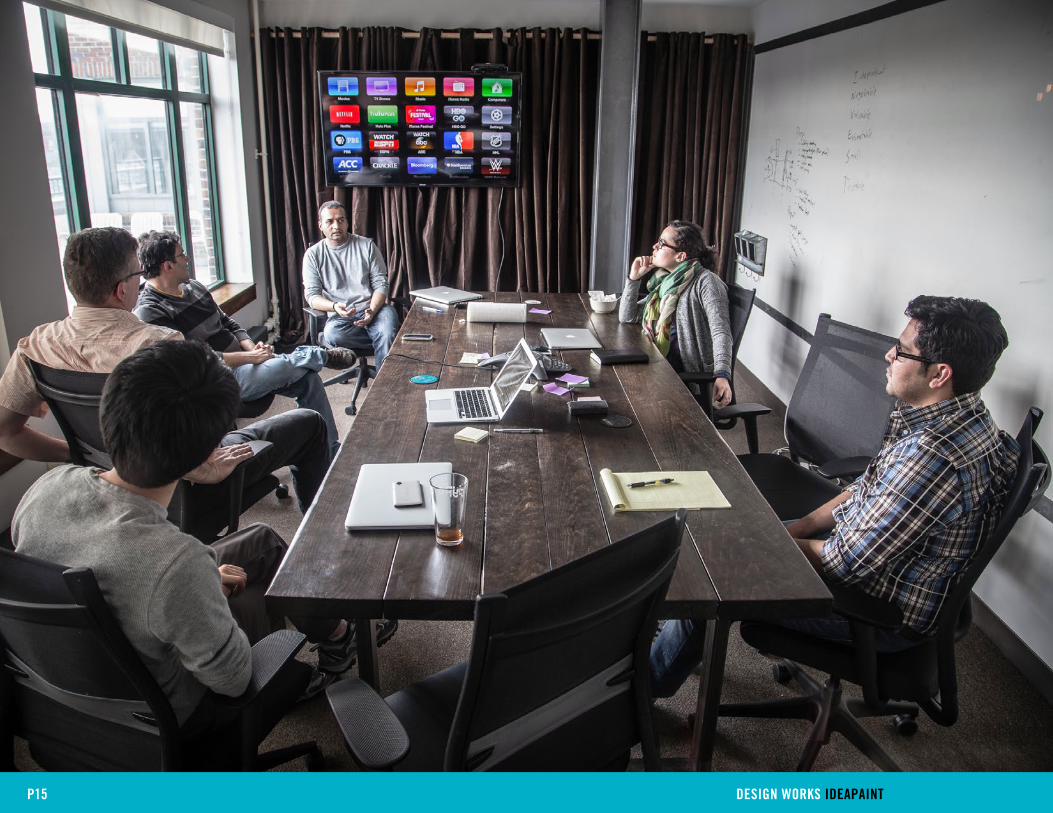
Making something from nothing is the start-up story. The same could be said for bringing
an office to life. Full of potential, spaces slowly accrue meaning, value, and utility as
more details are added, and more people begin to trickle in. At clypd, an advertising
technology start-up in Somerville, Massachusetts, people are the priority. When it came
time to design their new environment, providing for their employees was the primary
consideration.
“You read everywhere that the most important aspect of a start-up is its people. We
couldn’t agree with that more,” said Jeanne Yeh of clypd. “It’s really important to us to
build up that team camaraderie and create a place where people want to work for each
other. We see it as an important approach in building the business.”
In a very authentic way, clypd has formed a cohesive team that feels and acts like a
family; their space is like a home. Every design choice was carefully weighed to determine
if it would add to the overall community focus -- custom bar and patio furniture included.
Scale the idea up one level, and you get one of clypd’s conference rooms, designed
specifically to look and feel like a living room.
Stephanie Krier, who managed the build out of their space, put it simply, “Our space
is not just an office. We work hard together every day, so we want our team to be
comfortable and feel at home.”
P12 DESIGN WORKS IDEAPAINT
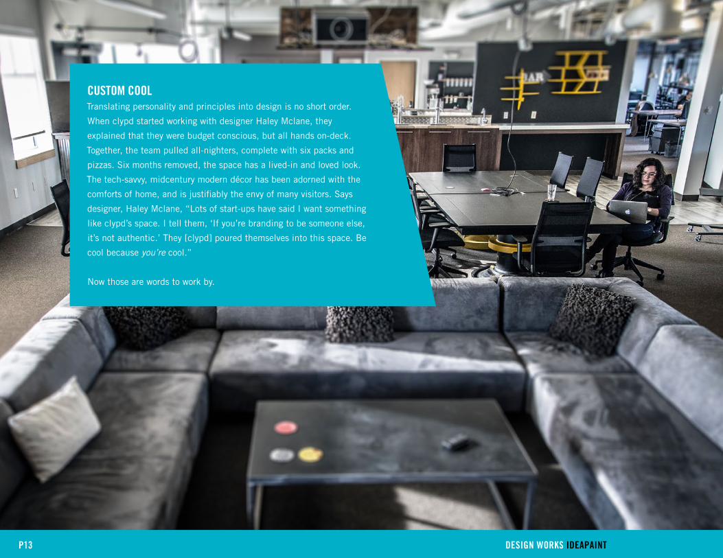
cUSTOM cOOlTranslating personality and principles into design is no short order.
When clypd started working with designer Haley Mclane, they
explained that they were budget conscious, but all hands on-deck.
Together, the team pulled all-nighters, complete with six packs and
pizzas. Six months removed, the space has a lived-in and loved look.
The tech-savvy, midcentury modern décor has been adorned with the
comforts of home, and is justifiably the envy of many visitors. Says
designer, Haley Mclane, “Lots of start-ups have said I want something
like clypd’s space. I tell them, ‘If you’re branding to be someone else,
it’s not authentic.’ They [clypd] poured themselves into this space. Be
cool because you’re cool.”
Now those are words to work by.
P13 DESIGN WORKS IDEAPAINT
P14 DESIGN WORKS IDEAPAINT
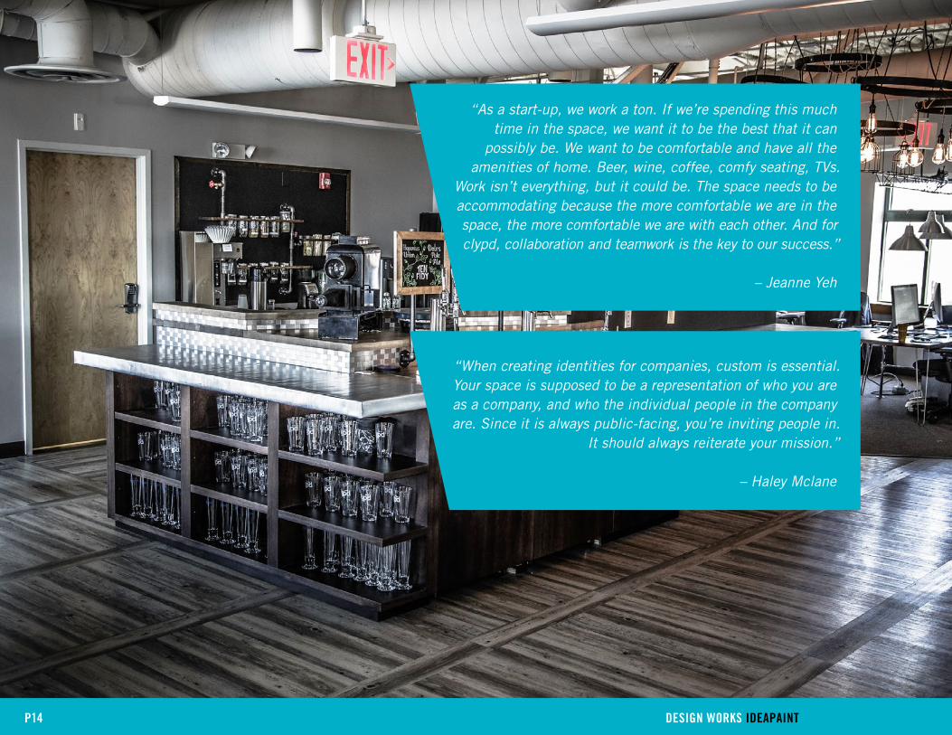
“When creating identities for companies, custom is essential. Your space is supposed to be a representation of who you are as a company, and who the individual people in the company are. Since it is always public-facing, you’re inviting people in.
It should always reiterate your mission.”
– Haley Mclane
“As a start-up, we work a ton. If we’re spending this much time in the space, we want it to be the best that it can
possibly be. We want to be comfortable and have all the amenities of home. Beer, wine, coffee, comfy seating, TVs.
Work isn’t everything, but it could be. The space needs to be accommodating because the more comfortable we are in the space, the more comfortable we are with each other. And for clypd, collaboration and teamwork is the key to our success.”
– Jeanne Yeh
P15 DESIGN WORKS IDEAPAINT

P16 DESIGN WORKS IDEAPAINT
Photos: Nate Maxfield

17
PROjEcT MANAGER KEllY REARDON
FIRM SPAGNOlO GISNESS & ASSOcIATES, [SG&A], Boston, ma
clIENT lOGMEIN, Boston, ma
LogMeIn takes the work out of work. Their suite of services, including the wildly popular
screen sharing app join.me and the team-oriented cloud storage solution, Cubby, allows
for widespread collaboration, no matter where you are. To see their wireless working world
in motion, walk into their Boston office, where a staff of 350 has breathed new life into
an old brick and beam wool factory. Their ‘work as play’ ethos is apparent around every
corner, on all six floors.
The office is a veritable playground. On one level you’ll find a putting green; on another, a
pool table. Floor-to-ceiling images of beaches in Australia and public plazas in Budapest
visually connect LogMeIn’s global offices and engender a strong sense of community
across the remote, worldwide workforce. Even though the space is designed with this
mobility in mind, it is generous to all who choose to stay.
“Because we are constantly embracing culture, we wanted to make sure we created
an environment that supported our employees, transient or not,” explained Facilities
Manager, Kelly Reardon.
The quirky perks (rooftop yoga, anyone?) respond to evolving working norms and separate
LogMeIn from the pack. Given that culture is one of the most sought after traits for
discerning employees, LogMeIn’s space is as much a recruitment tool as a place of
business. Potential employees are given a complete tour with stops in Dublin and Fenway
Park’s dugout to name a few, all to see how LogMeIn operates. It’s no surprise the Boston
staff alone has doubled in size since move-in day.
P17 DESIGN WORKS IDEAPAINT
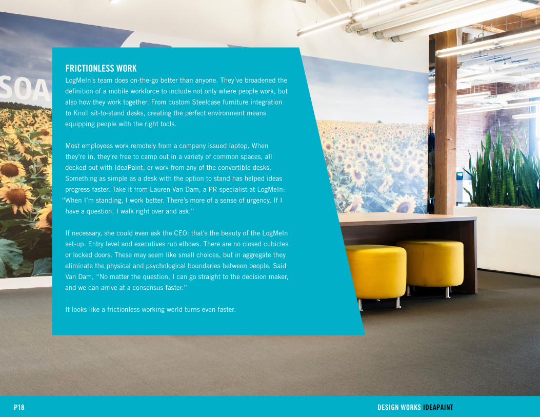
FRIcTIONlESS WORKLogMeIn’s team does on-the-go better than anyone. They’ve broadened the
definition of a mobile workforce to include not only where people work, but
also how they work together. From custom Steelcase furniture integration
to Knoll sit-to-stand desks, creating the perfect environment means
equipping people with the right tools.
Most employees work remotely from a company issued laptop. When
they’re in, they’re free to camp out in a variety of common spaces, all
decked out with IdeaPaint, or work from any of the convertible desks.
Something as simple as a desk with the option to stand has helped ideas
progress faster. Take it from Lauren Van Dam, a PR specialist at LogMeIn:
“When I’m standing, I work better. There’s more of a sense of urgency. If I
have a question, I walk right over and ask.”
If necessary, she could even ask the CEO; that’s the beauty of the LogMeIn
set-up. Entry level and executives rub elbows. There are no closed cubicles
or locked doors. These may seem like small choices, but in aggregate they
eliminate the physical and psychological boundaries between people. Said
Van Dam, “No matter the question, I can go straight to the decision maker,
and we can arrive at a consensus faster.”
It looks like a frictionless working world turns even faster.
P18 DESIGN WORKS IDEAPAINT

“We’ve observed a noticeable change in who’s applying to work with us. Applicants understand the mobile nature of
work; they’re ready to collaborate with whomever’s on their team, wherever they are. And they’re excited to work in
different ways.”
– Kelly Reardon
P19 DESIGN WORKS IDEAPAINT

P20 DESIGN WORKS IDEAPAINT

P21 DESIGN WORKS IDEAPAINT
Photos: David Culton

22
DESIGNERS MONINA jOHNSON & MIcHAEl DOlAN
FIRM STANDARD STUDIO, san Francisco, ca
clIENT EVERNOTE, rEdwood, caliFornia
Jeff Zwerner, VP of Branded Products and Experiences at Evernote, walked into a cubicle
graveyard when he first visited the proposed Evernote space at 305 Walnut St. A former
insurance sales office, the space was underwhelming and uninspiring. In one word, it was
beige.
Just a floor beneath, however, whirled the colorful, brimming world of Evernote, a
company that began as a simple, yet incredibly effective app that helps you remember
everything. When it came time to expand upward, Jeff brought in Standard Studio,
an A&D firm whose expertise lie in translating brand, design, and planning into high
performing commercial spaces.
“We were more or less adding another layer to the whole Evernote story,” said Michael
Dolan, Standard’s principal designer. Which effectively meant starting from scratch with a
blueprint. With multiple floors to use as a living case study, they found that thinking big
didn’t necessarily correlate to square feet.
Note: A 50-person auditorium was considered, but didn’t make the final designs.
P22 DESIGN WORKS IDEAPAINT

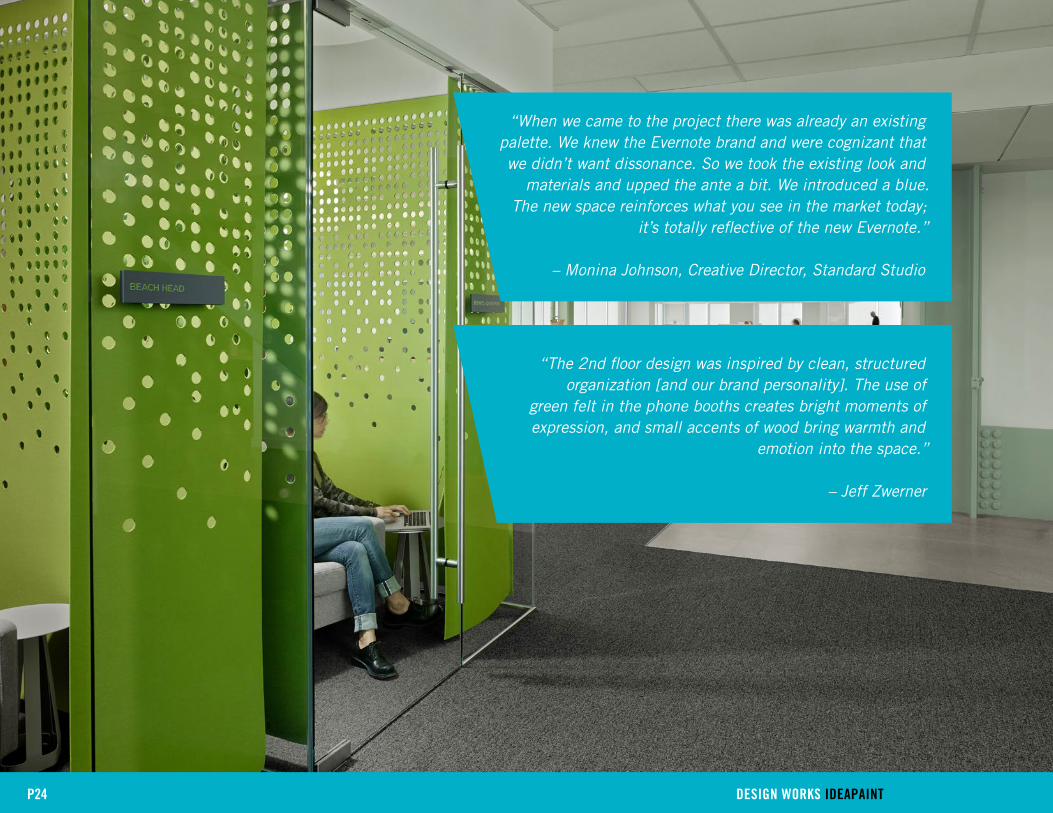
Thinking big for Evernote’s new space meant translating the over
arching tenets of the company, like transparency and trust, into
tangible spaces. In some cases, that actually meant going small. Four
phone booths were installed to create private nooks for people to
concentrate and converse. The booths counterbalance the collaborative
expanse of the open floor plan, and support Evernote’s belief that
people should work however and wherever they want. That’s their
not-so secret sauce: designing for comfort. It attracts talent, increases
productivity, and strengthens the company culture. Explained Zwerner,
“Evernote is open and free of politics.” Behind a closed door or in plain
view, in the end, they’re still working together.
P23 DESIGN WORKS IDEAPAINT
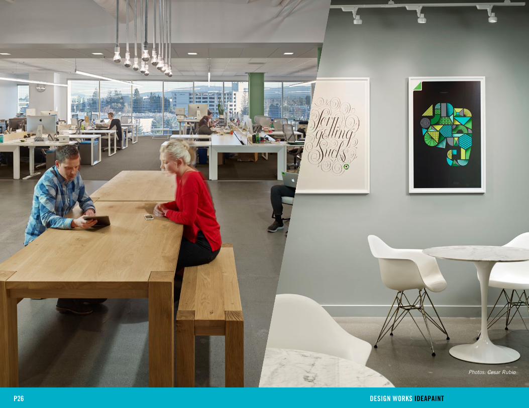
P24 DESIGN WORKS IDEAPAINT
“The 2nd floor design was inspired by clean, structured organization [and our brand personality]. The use of
green felt in the phone booths creates bright moments of expression, and small accents of wood bring warmth and
emotion into the space.”
– Jeff Zwerner
“When we came to the project there was already an existing palette. We knew the Evernote brand and were cognizant that we didn’t want dissonance. So we took the existing look and
materials and upped the ante a bit. We introduced a blue. The new space reinforces what you see in the market today;
it’s totally reflective of the new Evernote.”
– Monina Johnson, Creative Director, Standard Studio

P25 DESIGN WORKS IDEAPAINT
P26 DESIGN WORKS IDEAPAINT
Photos: Cesar Rubio

27
DESIGNERS jENNIFER PETERS & VERONIcA EMIG
FIRM FUSION DESIGN cONSUlTANTS, Boston, ma
clIENT IDEAPAINT, Boston, ma
IdeaPaint has been in the business of driving better collaboration, communication, and
results since 2008. They’ve transformed over 100,000 spaces in 40 countries, so they
know a thing or two about what makes a workspace work. This fall, however, they brought
in backup to help relocate their headquarters to downtown Boston. Tasked with creating a
space that would embody IdeaPaint’s brand, Fusion Design Consultants went to work with
the extra perk of using the company’s trademark product, a high performing dry-erase
paint, however they wanted.
“It was a real design opportunity,” explained Veronica Emig, one of Fusion’s leads on the
project. “IdeaPaint wanted a space where they could work collaboratively with prospective
clients and A&D partners, but still carry out day to day business. With their help, we
created flexible spaces that allow visitors and employees to seamlessly move between
collaborative and more individual activities.”
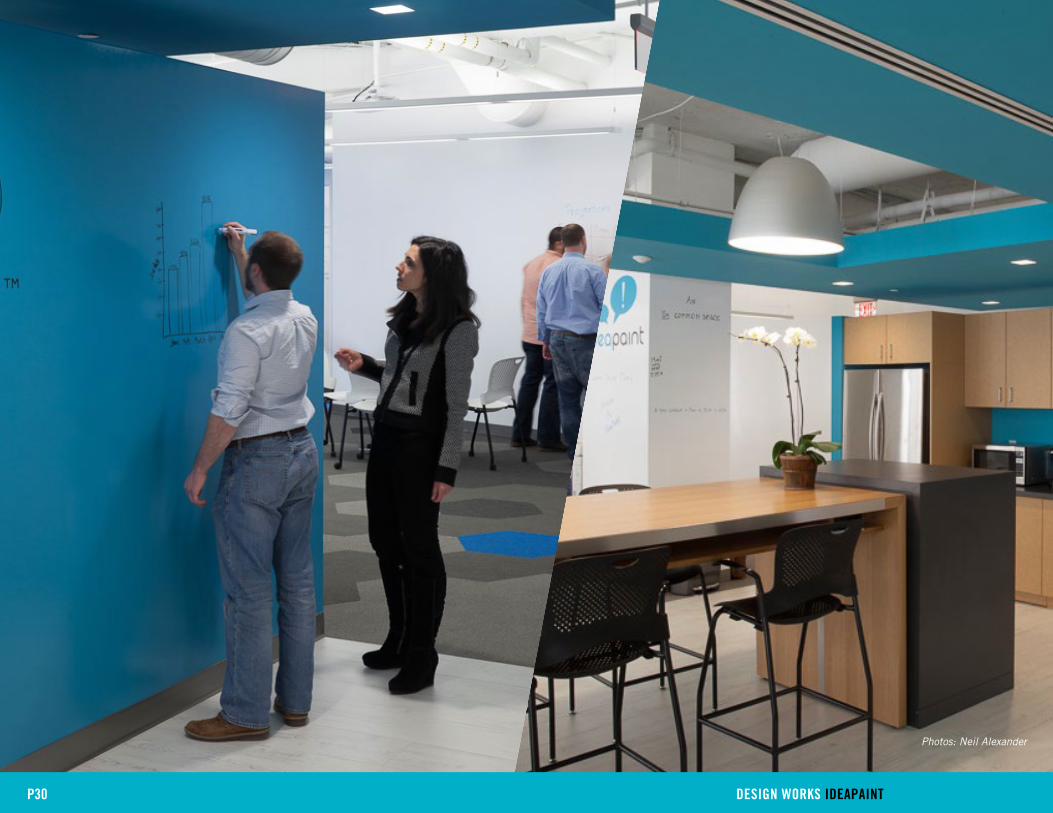
The final result is a showroom that encourages collaboration. Every vertical surface is
writable (tables, too), which means the opportunity to move an idea forward is never more
than a few feet away.
P27 DESIGN WORKS IDEAPAINT
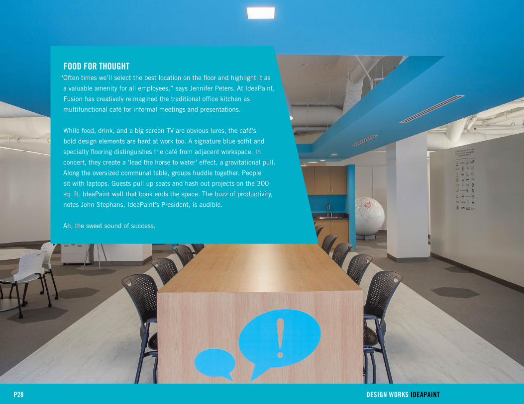
FOOD FOR THOUGHT“Often times we’ll select the best location on the floor and highlight it as
a valuable amenity for all employees,” says Jennifer Peters. At IdeaPaint,
Fusion has creatively reimagined the traditional office kitchen as
multifunctional café for informal meetings and presentations.
While food, drink, and a big screen TV are obvious lures, the café’s
bold design elements are hard at work too. A signature blue soffit and
specialty flooring distinguishes the café from adjacent workspace. In
concert, they create a ‘lead the horse to water’ effect, a gravitational pull.
Along the oversized communal table, groups huddle together. People
sit with laptops. Guests pull up seats and hash out projects on the 300
sq. ft. IdeaPaint wall that book ends the space. The buzz of productivity,
notes John Stephans, IdeaPaint’s President, is audible.
Ah, the sweet sound of success.
P28 DESIGN WORKS IDEAPAINT

P29 DESIGN WORKS IDEAPAINT
“On Broad St, we’re right where we want to be”, said Stephans. “We’re in the heart of Boston’s innovation economy, next to
leaders in technology, healthcare, financial services, education and architecture & design. We now have a space to invite our
customers to, show our product in use and work together on how rethinking our partners’ physical space and those of their
clients can help push their business forward.”
P30 DESIGN WORKS IDEAPAINT
Photos: Neil Alexander
31
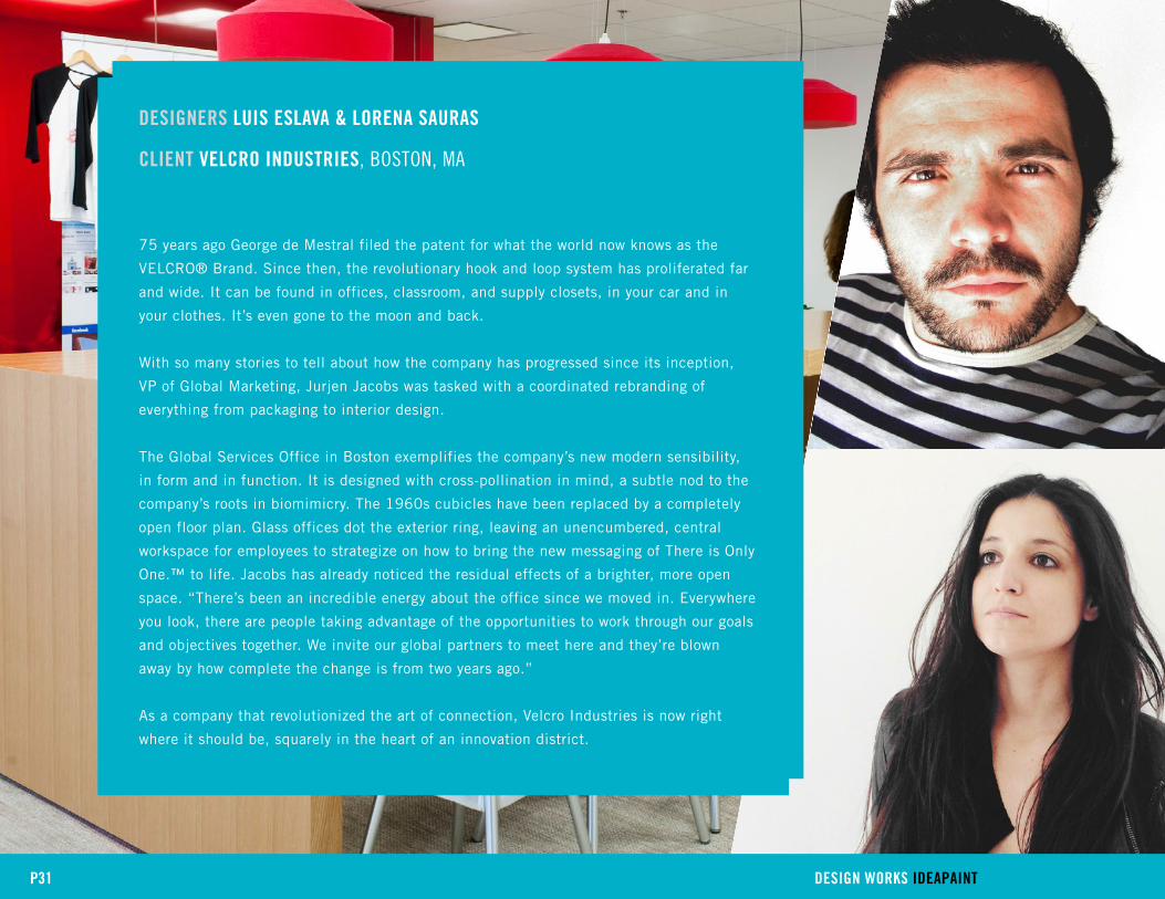
DESIGNERS lUIS ESlAVA & lORENA SAURAS
clIENT VElcRO INDUSTRIES, Boston, ma
75 years ago George de Mestral filed the patent for what the world now knows as the
VELCRO® Brand. Since then, the revolutionary hook and loop system has proliferated far
and wide. It can be found in offices, classroom, and supply closets, in your car and in
your clothes. It’s even gone to the moon and back.
With so many stories to tell about how the company has progressed since its inception,
VP of Global Marketing, Jurjen Jacobs was tasked with a coordinated rebranding of
everything from packaging to interior design.
The Global Services Office in Boston exemplifies the company’s new modern sensibility,
in form and in function. It is designed with cross-pollination in mind, a subtle nod to the
company’s roots in biomimicry. The 1960s cubicles have been replaced by a completely
open floor plan. Glass offices dot the exterior ring, leaving an unencumbered, central
workspace for employees to strategize on how to bring the new messaging of There is Only
One.™ to life. Jacobs has already noticed the residual effects of a brighter, more open
space. “There’s been an incredible energy about the office since we moved in. Everywhere
you look, there are people taking advantage of the opportunities to work through our goals
and objectives together. We invite our global partners to meet here and they’re blown
away by how complete the change is from two years ago.”
As a company that revolutionized the art of connection, Velcro Industries is now right
where it should be, squarely in the heart of an innovation district.
P31 DESIGN WORKS IDEAPAINT

EN VIVOOne of the early articulations of the rebranding effort happened abroad.
Spanish designers Lorena Sauras and Luis Eslava were commissioned
by Velcro Industries’ European office to rethink their corporate offices
in Barcelona. Like their North American HQ in Manchester, it needed
a fresh dose of design. Sauras and Eslava brilliantly wove the story of
connection through the space, using dots and tape to create maps, panels,
and even lamps. An immediate success, both in terms of how the brand
was communicated to visitors and in how employees internalized the new
commitment to their workspace, the duo then traveled to the US to create
the same magic in Boston.
In fact, the workstation where Sauras and Eslava pieced together most of
their work, is one of the office’s most popular places to meet. The room is
sparsely furnished. A huge wooden table sits at the center, bookended by
two IdeaPaint walls. Complete with product to play with, it is a dedicated
hands-on think space, and has been used like an in-house studio. Keeping
employees engaged with the tactile nature of the product was intentional,
said Lorena.
“In our research and in our own work, we’ve found people are at ease when
they’re working with their hands and experimenting, so we created a space
where people can think and make at the same time, if they want.”
In a short time, the office as a whole and each of the discreet spaces have
taken on a life of their own, but one only has to look at the walls, adorned
with Lorena and Luis’ impeccable maps, to remember it’s all connected.
P32 DESIGN WORKS IDEAPAINT

“When we decided to rebrand, we considered everything – our packaging, web presence, how we interact with customers. These were objectives that were accomplishable in relative
short order. We also knew that to sustain our long-term goals, we had to fundamentally change how we worked and that meant rethinking our culture, our relationship with the
communities we work and live in, and our space.”
– Jurjen Jacobs
P33 DESIGN WORKS IDEAPAINT
“Our challenge was to enliven the brand through design. To be inspired, we went back to the basics of VELCRO® Brand
products’ own ingenuity and sense of play. The simplicity of the product comes through in our designs and informed much of what we created and how the space was laid out.
Now there is more room to be creative.”
– Luis Eslava

P34 DESIGN WORKS IDEAPAINT

P35 DESIGN WORKS IDEAPAINT
Photos: David Culton

ABOUT IDEAPAINTIn 2008, IdeaPaint launched with just one simple goal: to improve the way people
work. Staying true to its mission, IdeaPaint created a premium dry erase paint
that turns any smooth surface into a boundless dry erase canvas. Just six years
later, IdeaPaint has over 100,000 installations in 40 countries including PayPal,
Quicken Loans, Harvard, LinkedIn, Apple, Gap and Zappos who use it to help their
teams communicate and collaborate more effectively.
Top Related