William Playfair and the Psychology of Graphspsych.utoronto.ca/users/spence/Spence (2006).pdf ·...
11
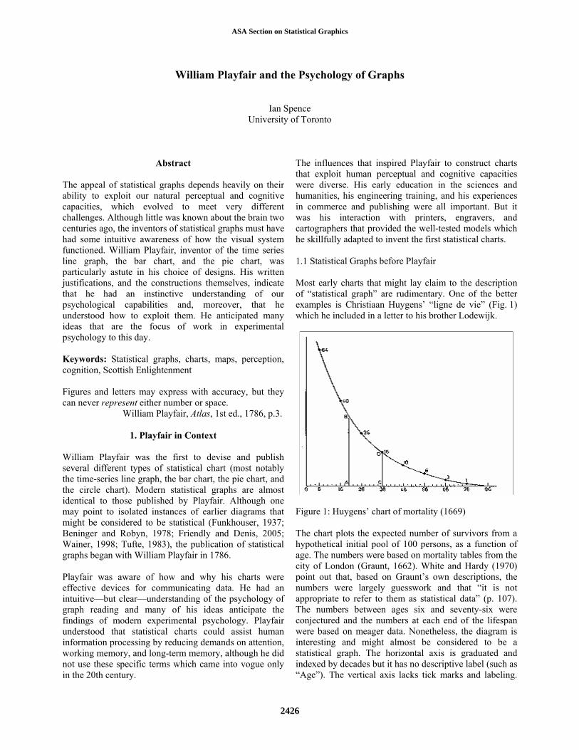
William Playfair and the Psychology of Graphs Ian Spence University of Toronto Abstract The appeal of statistical graphs depends heavily on their ability to exploit our natural perceptual and cognitive capacities, which evolved to meet very different challenges. Although little was known about the brain two centuries ago, the inventors of statistical graphs must have had some intuitive awareness of how the visual system functioned. William Playfair, inventor of the time series line graph, the bar chart, and the pie chart, was particularly astute in his choice of designs. His written justifications, and the constructions themselves, indicate that he had an instinctive understanding of our psychological capabilities and, moreover, that he understood how to exploit them. He anticipated many ideas that are the focus of work in experimental psychology to this day. Keywords: Statistical graphs, charts, maps, perception, cognition, Scottish Enlightenment Figures and letters may express with accuracy, but they can never represent either number or space. William Playfair, Atlas, 1st ed., 1786, p.3. 1. Playfair in Context William Playfair was the first to devise and publish several different types of statistical chart (most notably the time-series line graph, the bar chart, the pie chart, and the circle chart). Modern statistical graphs are almost identical to those published by Playfair. Although one may point to isolated instances of earlier diagrams that might be considered to be statistical (Funkhouser, 1937; Beninger and Robyn, 1978; Friendly and Denis, 2005; Wainer, 1998; Tufte, 1983), the publication of statistical graphs began with William Playfair in 1786. Playfair was aware of how and why his charts were effective devices for communicating data. He had an intuitive—but clear—understanding of the psychology of graph reading and many of his ideas anticipate the findings of modern experimental psychology. Playfair understood that statistical charts could assist human information processing by reducing demands on attention, working memory, and long-term memory, although he did not use these specific terms which came into vogue only in the 20th century. The influences that inspired Playfair to construct charts that exploit human perceptual and cognitive capacities were diverse. His early education in the sciences and humanities, his engineering training, and his experiences in commerce and publishing were all important. But it was his interaction with printers, engravers, and cartographers that provided the well-tested models which he skillfully adapted to invent the first statistical charts. 1.1 Statistical Graphs before Playfair Most early charts that might lay claim to the description of “statistical graph” are rudimentary. One of the better examples is Christiaan Huygens’ “ligne de vie” (Fig. 1) which he included in a letter to his brother Lodewijk. Figure 1: Huygens’ chart of mortality (1669) The chart plots the expected number of survivors from a hypothetical initial pool of 100 persons, as a function of age. The numbers were based on mortality tables from the city of London (Graunt, 1662). White and Hardy (1970) point out that, based on Graunt’s own descriptions, the numbers were largely guesswork and that “it is not appropriate to refer to them as statistical data” (p. 107). The numbers between ages six and seventy-six were conjectured and the numbers at each end of the lifespan were based on meager data. Nonetheless, the diagram is interesting and might almost be considered to be a statistical graph. The horizontal axis is graduated and indexed by decades but it has no descriptive label (such as “Age”). The vertical axis lacks tick marks and labeling. ASA Section on Statistical Graphics 2426
-
Upload
nguyennguyet -
Category
Documents
-
view
233 -
download
2
Transcript of William Playfair and the Psychology of Graphspsych.utoronto.ca/users/spence/Spence (2006).pdf ·...
William Playfair and the Psychology of Graphs
Ian Spence
University of Toronto
Abstract The appeal of statistical graphs depends heavily on their ability to exploit our natural perceptual and cognitive capacities, which evolved to meet very different challenges. Although little was known about the brain two centuries ago, the inventors of statistical graphs must have had some intuitive awareness of how the visual system functioned. William Playfair, inventor of the time series line graph, the bar chart, and the pie chart, was particularly astute in his choice of designs. His written justifications, and the constructions themselves, indicate that he had an instinctive understanding of our psychological capabilities and, moreover, that he understood how to exploit them. He anticipated many ideas that are the focus of work in experimental psychology to this day. Keywords: Statistical graphs, charts, maps, perception, cognition, Scottish Enlightenment Figures and letters may express with accuracy, but they can never represent either number or space. William Playfair, Atlas, 1st ed., 1786, p.3.
1. Playfair in Context William Playfair was the first to devise and publish several different types of statistical chart (most notably the time-series line graph, the bar chart, the pie chart, and the circle chart). Modern statistical graphs are almost identical to those published by Playfair. Although one may point to isolated instances of earlier diagrams that might be considered to be statistical (Funkhouser, 1937; Beninger and Robyn, 1978; Friendly and Denis, 2005; Wainer, 1998; Tufte, 1983), the publication of statistical graphs began with William Playfair in 1786. Playfair was aware of how and why his charts were effective devices for communicating data. He had an intuitive—but clear—understanding of the psychology of graph reading and many of his ideas anticipate the findings of modern experimental psychology. Playfair understood that statistical charts could assist human information processing by reducing demands on attention, working memory, and long-term memory, although he did not use these specific terms which came into vogue only in the 20th century.
The influences that inspired Playfair to construct charts that exploit human perceptual and cognitive capacities were diverse. His early education in the sciences and humanities, his engineering training, and his experiences in commerce and publishing were all important. But it was his interaction with printers, engravers, and cartographers that provided the well-tested models which he skillfully adapted to invent the first statistical charts. 1.1 Statistical Graphs before Playfair Most early charts that might lay claim to the description of “statistical graph” are rudimentary. One of the better examples is Christiaan Huygens’ “ligne de vie” (Fig. 1) which he included in a letter to his brother Lodewijk.
Figure 1: Huygens’ chart of mortality (1669) The chart plots the expected number of survivors from a hypothetical initial pool of 100 persons, as a function of age. The numbers were based on mortality tables from the city of London (Graunt, 1662). White and Hardy (1970) point out that, based on Graunt’s own descriptions, the numbers were largely guesswork and that “it is not appropriate to refer to them as statistical data” (p. 107). The numbers between ages six and seventy-six were conjectured and the numbers at each end of the lifespan were based on meager data. Nonetheless, the diagram is interesting and might almost be considered to be a statistical graph. The horizontal axis is graduated and indexed by decades but it has no descriptive label (such as “Age”). The vertical axis lacks tick marks and labeling.
ASA Section on Statistical Graphics
2426
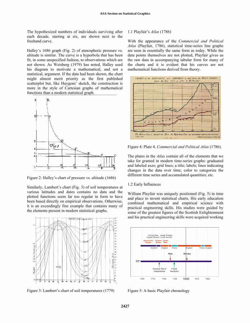
The hypothesized numbers of individuals surviving after each decade, starting at six, are shown next to the freehand curve. Halley’s 1686 graph (Fig. 2) of atmospheric pressure vs. altitude is similar. The curve is a hyperbola that has been fit, in some unspecified fashion, to observations which are not shown. As Weisberg (1979) has noted, Halley used his diagram to motivate a mathematical, and not a statistical, argument. If the data had been shown, the chart might almost merit priority as the first published scatterplot but, like Huygens’ sketch, the construction is more in the style of Cartesian graphs of mathematical functions than a modern statistical graph.
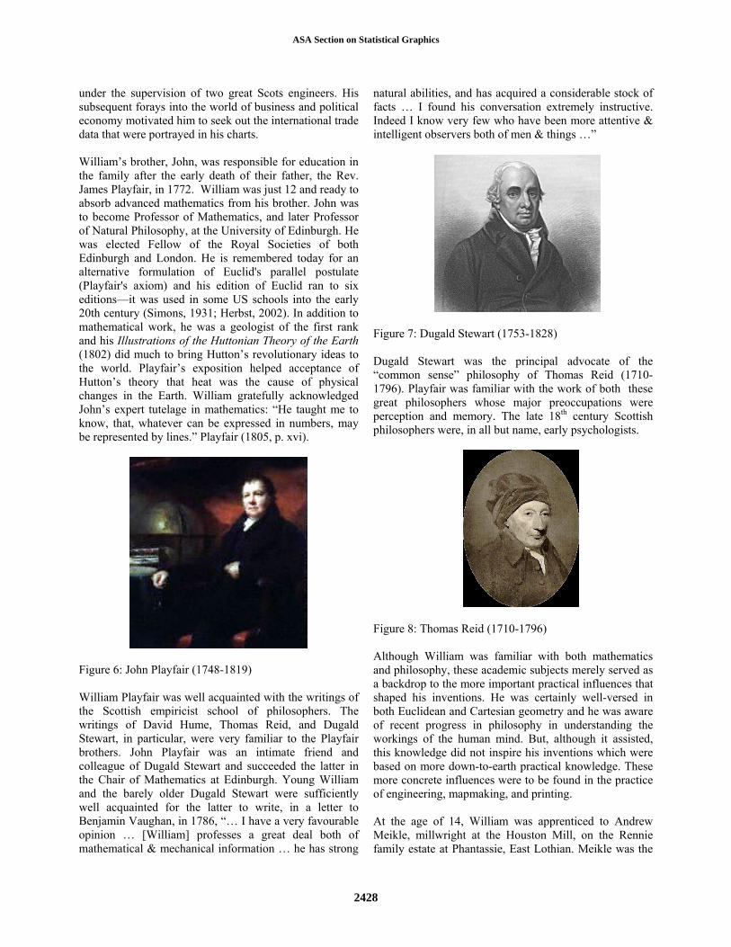
Figure 2: Halley’s chart of pressure vs. altitude (1686) Similarly, Lambert’s chart (Fig. 3) of soil temperatures at various latitudes and dates contains no data and the plotted functions seem far too regular in form to have been based directly on empirical observations. Otherwise, it is an exceedingly fine example that contains many of the elements present in modern statistical graphs.
Figure 3: Lambert’s chart of soil temperatures (1779)
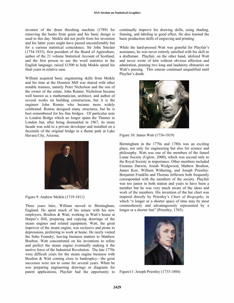
1.1 Playfair’s Atlas (1786) With the appearance of the Commercial and Political Atlas (Playfair, 1786), statistical time-series line graphs are seen in essentially the same form as today. While the data points themselves are not plotted, Playfair gives us the raw data in accompanying tabular form for many of the charts and it is evident that his curves are not mathematical functions derived from theory.
Figure 4: Plate 4, Commercial and Political Atlas (1786). The plates in the Atlas contain all of the elements that we take for granted in modern time-series graphs: graduated and labeled axes; grid lines; a title; labels; lines indicating changes in the data over time; color to categorize the different time series and accumulated quantities; etc. 1.2 Early Influences William Playfair was uniquely positioned (Fig. 5) in time and place to invent statistical charts. His early education combined mathematical and empirical science with practical engineering skills. His studies were guided by some of the greatest figures of the Scottish Enlightenment and his practical engineering skills were acquired working
1800 1810 18201790178017701760
WP
Atlas
American War ofIndependence
FrenchRevolution
Breviary
James/JohnPlayfair
Thomas Reid(Dugald Stewart)
Joseph Priestley(Lunar Society)
Scotland England France FranceEngland England
AndrewMeikle
JamesWatt
Figure 5: A basic Playfair chronology
ASA Section on Statistical Graphics
2427
under the supervision of two great Scots engineers. His subsequent forays into the world of business and political economy motivated him to seek out the international trade data that were portrayed in his charts. William’s brother, John, was responsible for education in the family after the early death of their father, the Rev. James Playfair, in 1772. William was just 12 and ready to absorb advanced mathematics from his brother. John was to become Professor of Mathematics, and later Professor of Natural Philosophy, at the University of Edinburgh. He was elected Fellow of the Royal Societies of both Edinburgh and London. He is remembered today for an alternative formulation of Euclid's parallel postulate (Playfair's axiom) and his edition of Euclid ran to six editions—it was used in some US schools into the early 20th century (Simons, 1931; Herbst, 2002). In addition to mathematical work, he was a geologist of the first rank and his Illustrations of the Huttonian Theory of the Earth (1802) did much to bring Hutton’s revolutionary ideas to the world. Playfair’s exposition helped acceptance of Hutton’s theory that heat was the cause of physical changes in the Earth. William gratefully acknowledged John’s expert tutelage in mathematics: “He taught me to know, that, whatever can be expressed in numbers, may be represented by lines.” Playfair (1805, p. xvi).
Figure 6: John Playfair (1748-1819) William Playfair was well acquainted with the writings of the Scottish empiricist school of philosophers. The writings of David Hume, Thomas Reid, and Dugald Stewart, in particular, were very familiar to the Playfair brothers. John Playfair was an intimate friend and colleague of Dugald Stewart and succeeded the latter in the Chair of Mathematics at Edinburgh. Young William and the barely older Dugald Stewart were sufficiently well acquainted for the latter to write, in a letter to Benjamin Vaughan, in 1786, “… I have a very favourable opinion … [William] professes a great deal both of mathematical & mechanical information … he has strong
natural abilities, and has acquired a considerable stock of facts … I found his conversation extremely instructive. Indeed I know very few who have been more attentive & intelligent observers both of men & things …”
Figure 7: Dugald Stewart (1753-1828) Dugald Stewart was the principal advocate of the “common sense” philosophy of Thomas Reid (1710-1796). Playfair was familiar with the work of both these great philosophers whose major preoccupations were perception and memory. The late 18th century Scottish philosophers were, in all but name, early psychologists.
Figure 8: Thomas Reid (1710-1796) Although William was familiar with both mathematics and philosophy, these academic subjects merely served as a backdrop to the more important practical influences that shaped his inventions. He was certainly well-versed in both Euclidean and Cartesian geometry and he was aware of recent progress in philosophy in understanding the workings of the human mind. But, although it assisted, this knowledge did not inspire his inventions which were based on more down-to-earth practical knowledge. These more concrete influences were to be found in the practice of engineering, mapmaking, and printing. At the age of 14, William was apprenticed to Andrew Meikle, millwright at the Houston Mill, on the Rennie family estate at Phantassie, East Lothian. Meikle was the
ASA Section on Statistical Graphics
2428
inventor of the drum threshing machine (1789) for removing the husks from grain and his basic design is used to this day. Meikle did not profit from his invention and his latter years might have passed uncomfortably but for a curious statistical coincidence. Sir John Sinclair (1754-1835), first president of the Board of Agriculture, author of the 21 volume Statistical Account of Scotland, and the first person to use the word statistics in the English language, raised £1500 to help Meikle spend his final years in relative ease. William acquired basic engineering skills from Meikle and his time at the Houston Mill was shared with other notable trainees, namely Peter Nicholson and the son of the owner of the estate, John Rennie. Nicholson became well known as a mathematician, architect, and author of several works on building construction, but it is the engineer John Rennie who became more widely celebrated. Rennie designed many structures, but he is best remembered for his fine bridges. Of particular note is London Bridge which no longer spans the Thames in London but, after being dismantled in 1967, its stone facade was sold to a private developer and installed on a facsimile of the original bridge in a theme park at Lake Havasu City, Arizona.
Figure 9: Andrew Meikle (1719-1811) Three years later, William moved to Birmingham, England. He spent much of his tenure with his new employers, Boulton & Watt, working in Watt’s house at Harper’s Hill, preparing and copying drawings of the steam engines and related equipment. Watt, the great improver of the steam engine, was reclusive and prone to depressions, preferring to work at home. He rarely visited the Soho Foundry, leaving business matters to Matthew Boulton. Watt concentrated on his inventions to refine and perfect the steam engine eventually making it the motive force of the Industrial Revolution. The late 1770s were difficult years for the steam engine business with Boulton & Watt coming close to bankruptcy—the great successes were not to come for several years. When he was preparing engineering drawings or diagrams for patent applications, Playfair had the opportunity to
continually improve his drawing skills, using shading, framing, and labeling to good effect. He also learned the basic production skills of engraving and printing. While the hard-pressed Watt was grateful for Playfair’s assistance, he was never entirely satisfied with his skill as a draftsman. Playfair, on the other hand, idolized Watt and never wrote of him without obvious affection and admiration, penning two long and laudatory obituaries on Watt’s passing. This esteem continued unqualified until Playfair’s death.
Figure 10: James Watt (1736-1819) Birmingham in the 1770s and 1780s was an exciting place, not only for engineering but also for science and philosophy. Watt was one of the members of the famed Lunar Society (Uglow, 2000), which was second only to the Royal Society in importance. Other members included Erasmus Darwin, Josiah Wedgwood, Mathew Boulton, James Keir, William Withering, and Joseph Priestley. Benjamin Franklin and Thomas Jefferson both frequently corresponded with the members of the society. Playfair was too junior in both station and years to have been a member but he was very much aware of the ideas and work of the members. His invention of the bar chart was inspired directly by Priestley’s Chart of Biography, in which “a longer or a shorter space of time may be most commodiously and advantageously represented by a longer or a shorter line” (Priestley, 1765).
Figure11: Joseph Priestley (1733-1804)
ASA Section on Statistical Graphics
2429
2. Perception and Cognition
2.1 Low-Level Processing When light falls on the retina at the back of the eye, it interacts with the specialized neurons in the retina, causing some of them to fire, depending on the intensity and wavelength of the light. These receptors are interconnected and considerable neural computation occurs in the retina. The information from upwards of 100 million receptors is separated, combined, and distilled before traveling backwards via the optic nerve, which is composed of about one million retinal ganglion cell axons and other support cells. These axons terminate at the lateral geniculate nucleus from which other fibers lead to the primary visual cortex at the at the back of the head. Considerable neural computation takes place en route. This complex system is responsible for elementary visual functions such as edge detection, orientation detection, segmentation, movement detection, and color processing (Palmer, 1999). It is important to note that these low-level operations are performed automatically without conscious awareness; these processes are sometimes referred to as “pre-attentive” because they occur without conscious intervention and control. We do not need to “pay attention” to ensure that they are completed. Despite being largely automatic, low-level operations are more or less successful depending on such things as whether edges are sharp, whether there is sufficient contrast between adjacent areas, and so forth. Playfair’s designs are constructed in such a fashion that low-level pre-attentive processes are easily completed by the human visual system. The edges and lines in his charts are sharp and clear. In most cases, areas adjacent to boundaries have been selected to contrast in both lightness and color making segmentation of distinct elements of the chart effortless. Where it is important for the reader to notice differences in rates of change, Playfair constructs the chart with an aspect ratio appropriate to the comparison of adjacent slopes (generally the angles between adjacent segments are greater than about 30 degrees). Fig. 11 presents an example where Playfair has chosen an aspect ratio (width/height) that is unusually large to highlight the differences in rates of change which would have been harder to contrast in a narrower presentation.
Figure 11: A chart that facilitates pre-attentive processing
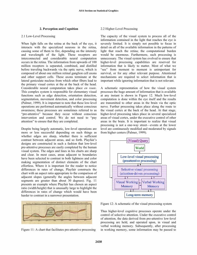
2.2 Higher-Level Processing The capacity of the visual system to process all of the information contained in the light that reaches the eye is severely limited. It is simply not possible to focus in detail on all of the available information in the patterns of light that reach the retina; the computational burden would be enormous. Furthermore, such processing is unnecessary. The visual system has evolved to ensure that higher-level processing capabilities are reserved for information that is likely to matter. Most of what we “see” from moment to moment is unimportant for survival, or for any other relevant purpose. Attentional mechanisms are required to select information that is important while ignoring information that is not relevant. A schematic representation of how the visual system processes the huge amount of information that is available at any instant is shown in Figure 12. Much low-level computation is done within the eye itself and the results are transmitted to other areas in the brain via the optic nerve. Further processing takes place along the route to the visual cortex at the back of the head. At that stage, higher-level processing takes place in several specialized areas of visual cortex, under the executive control of other areas in the brain. It is important to realize that visual processing is not a one-way street—events at the lower level are continuously modified and moderated by signals from higher centers (Palmer, 1999).
World
Low-level visual processing (preattentive processing)
Selective visual processing (attention-driven processing)
Visual Working Memory
Verbal Working Memory
Long-term memory
World
Low-level visual processing (preattentive processing)
Selective visual processing (attention-driven processing)
Visual Working Memory
Verbal Working Memory
Visual Working Memory
Verbal Working Memory
Long-term memory
(Visual) Query(Visual) Query
Figure 12: A schematic of the visual processing system Thus higher-level cognitive processes operate under the control of selective attention. Under the executive control of attention, the data derived from pre-attentive low-level processing are held, and operated upon, in visual and verbal working memory. Subsequently, after processing in working memory, some information may be passed to
ASA Section on Statistical Graphics
2430
longer term storage. This information processing activity involves continuous interaction among low-level pre-attentive processes, higher level working memory processes, and long-term memory. A significant bottleneck is the limited capacity of attentional processes and working memory. In general, these are able to handle only about 3-5 items at a time. These limitations were not burdensome in a pre-industrial society—very little of what our ancestors needed to do would have required paying attention to large numbers of objects simultaneously. Indeed, an evolutionary advantage would have accrued to those individuals who were able to focus attention on a small number of objects. Since much of the higher-level processing is attention driven, a visual query is often involved. This query may be internally generated (“Can I see anything moving?”) or it may be imposed by an object in the visual field “capturing attention” (“What just moved?”). Thus the visual query will generally direct the nature of further processing. When the visual field contains a statistical graph, the reader may bring several visual queries to the process of examination (“Does the stock rise or fall?”; “Does IBM have greater market share than HP?”; etc.) or, in many cases, the chart itself may suggest a query. As Tukey (1977) said, “The greatest value of a picture is when it forces us to notice what we never expected to see” (emphasis and italics in the original). Playfair’s charts are almost always constructed so that comparisons in different domains (lines, colors, labels, etc) do not exceed attentional and working memory capacity. Time series in the line graphs never exceed three or four in number; no more than three or four colors are used in a chart; labels are positioned next to the lines themselves rather than in legend boxes distant from the time series; similarly areas are labeled directly rather than being referenced in legends in some other region. Fig. 13 highlights the typical basic elements of a Playfair chart. TitleTitle
Caption Caption
LabelledAbscissa LabelledAbscissa
Labelled Ordinate Labelled Ordinate
GridLines GridLines
Color Color
Labels Labels
FrameFrame
Figure 13: Common basic elements in the charts
2.2 We Learn to Read Graphs Lower-level processes are not (consciously) learned—they are automatic and occur without attentional control. However, since higher-level processes are learned, consistency is important if the reader is not to be burdened with having to learn new conventions each time a chart is presented. Playfair was aware that his charts would not be intuitively apprehended and he devotes considerable care to introduce the charts with an explanation of how to use them. He wrote, “To those who have studied geography, or any branch of mathematics, these charts will be perfectly intelligible. To such, however, as have not, a short explanation may be necessary.” (Atlas, 3rd ed., 1801, p. ix). If this seems quaint, and perhaps unnecessary, it is only because we have forgotten that we too had to learn how to read graphs at some distant point in the past. 2.3 Playfair’s Intuitive Psychology There is no doubt that Playfair’s charts adhere to most of the conventions that would be advocated by a modern experimental psychologist with an interest in graphical perception (e.g. Kosslyn, 2006). Playfair was certainly aware of what he was doing although he would not have been able to justify his choices in ways that we can do today. He seems to have been able, intuitively, to select perceptual attributes that would best support efficient cognitive operations. For example, he used: 2.3.1 Color to code (and compare) categories Playfair made frequent use of color to differentiate categories. Several of the charts reproduced in this paper (Figs. 4, 11, 14, 18) show examples that employ color to code categorical information.
Figure 14: The use of color to differentiate categories Fig. 15 shows a different and interesting application of color where Playfair has created groupings by coloring the backgrounds associated with the names of sets of
ASA Section on Statistical Graphics
2431

countries and city states from ancient times (pink), contemporary times (red), and leaves the United States in a solitary category (orange).
Figure 15: The use of color to differentiate categories Since each printed chart had to be colored painstakingly by hand (Spence and Wainer, 2005), this extra element would have increased the cost of production considerably. Playfair must have felt that color conferred a significant advantage to have gone to so much trouble and expense. 2.3.2 Slope to code (and compare) trends Most of the charts in the Atlas use the slopes of lines to indicate trends—increases or decreases in exports or imports (see Figs. 4, 11, and 14 in the present paper). 2.3.3 Length to code (and compare) quantities The best example of the use of length to code quantity is to be found in Playfair’s bar chart which was inspired by Priestley’s chronological diagrams (Funkhouser, 1937; Wainer and Spence, 2005). Playfair was not enamored of this chart, which was born of necessity since he did not have sufficient data to construct a line graph. Ironically, it is the only chart in the Atlas that does not include time as a dimension. Playfair apologized, “This Chart … does not comprehend any portion of time, and it is much inferior in utility to those that do” (Atlas, 1786, p. 101).
Figure 16: The use of length to code exports and imports
2.3.4 Similar figures (areas) to code quantities Playfair appreciated that visual comparisons of size could be made more rapidly, and almost as accurately, by comparing the areas of similar figures than by comparing the numerical quantities themselves (Spence, 2005). He preferred the circle and several of his charts use this figure at varying diameters according to the quantity represented (see, for example, Fig.17).
Figure 17: The use of circles to code quantity He faced a problem when he wished to subdivide the areas of the circles and he devised three distinct solutions. He created an annulus (Fig. 18) when the division was into two parts and a pie when the number of parts was greater. For subdivisions that belonged to more than one circle, he used a Venn-like diagram, almost a century before John Venn (Spence, 2005).
Figure 18: The use of areas to code quantity 2.3.5 Playfair’s inspiration Playfair’s intuitions were certainly excellent and his choices were effective, but were they original with him? Many have assumed that all Playfair did was to apply the geometry of Descartes to financial data. I believe that this view is pedestrian and wrong. Tufte (1983) and Biderman (1990) have also expressed doubts that Cartesian geometry was a necessary precursor
ASA Section on Statistical Graphics
2432

to the development of statistical graphs. Although Playfair was more than competent in geometry, there is little evidence to suggest that his charts were directly influenced by the constructions of formal mathematics. His designs were more directly inspired by other visualizations. As in so many other activities, Playfair skillfully adapted existing forms and embraced good ideas wherever he found them. Much of his genius in inventing new representations of statistical data lay in his choice of appropriate models. He obtained inspiration from other visual representations that were common in his time, and he was strongly influenced by geographical maps and charts. Natural selection, over the centuries, had ensured the evolution of effective maps and charts. Map features that worked well from a perceptual and cognitive aspect were retained, and other less successful constructions were discarded. Particularly during the 17th and 18th centuries, cartographers had eventually arrived at psychologically sound solutions to the problem of making maps and charts easy to read and use. Playfair imitated, adapted, and synthesized the lessons learned by mapmakers when he made his first statistical charts. He did not copy Cartesian graphs of mathematical functions.
3. The Influence of Cartography Visual representations were common long before the before the late 18th century. Paintings and drawings of landscapes—both real and imagined—go back to our ancestors in their caves. Maps and nautical charts are also very ancient. Although representations of the earth were most often based on exploration and measurement, imagination also sometimes played a prominent role. Countless early maps display legends of the here-there-be-dragons variety, often with fanciful accompanying illustration. Representations of natural history (both seen by the naked eye and unseen) were common and accepted. And mechanical diagrams were not unusual in patent applications and similar documents. Except in pure mathematics, visualizations of abstractions were much less common. Geometrical diagrams were commonly published in discussions of both Euclidean and Cartesian geometry but graphs and charts to display abstract data (such as numbers) were virtually nonexistent and there were also few, if any, diagrams to illustrate statistical theory. William Playfair was aware of the many existing varieties of illustration. As the son of a Scots Presbyterian minister and the brother of one of the leading mathematicians and scientists of the day, he was well read in the arts and
humanities as well as the sciences. His books, pamphlets, and letters frequently contain literary and historical allusions and geographical references abound. We scarcely need Dugald Stewart to tell us that WP was an “attentive & intelligent [observer] both of men & things” since the breadth of his learning is evident in the writings. His curiosity about the world made him familiar with charts and maps. It is noteworthy that he used the word “atlas” to describe his first significant publication and that he called the diagrams therein “charts”. The inspiration of the geographical atlas is unmistakable. He wrote, “The amount of mercantile transactions in money, and of profit or loss, are capable of being as easily represented in drawing, as any part of space, or as the face of a country” (Playfair, 1786, p. 3) Maps are at least 8000 years old (see Fig. 19 for one example). By Playfair’s time, maps had evolved into sophisticated representations of town and country. Fig. 19 also contains a 16th century map of the area around Dundee, Scotland where Playfair was raised. By the 18th century, cartography had become highly sophisticated and accurate, at least for the better known parts of the world.
City map (Turkey), ca. 6200 BCCity map (Turkey), ca. 6200 BCTimothy Pont, ca. 1580, DundeeTimothy Pont, ca. 1580, Dundee
Willem Janszoon Blaeu, 1640Willem Janszoon Blaeu, 1640 Charles Delamarche, 1785Charles Delamarche, 1785
Figure 19: Some maps over the centuries In 1784, Playfair set up a silversmithing business in London with another ex Boulton & Watt employee. He also started to write about economics and, naturally, made the acquaintance of printers and engravers. His first engraver was a fellow countryman: John Ainslie (1745-1828) was the premier Scots cartographer of the day. He apprenticed in England but had returned to Scotland by the time Playfair was searching for an engraver. Figs. 20 and 21 show two examples—both from 1783—of Ainslie’s work. His maps of Scotland were the best depictions of the country in the late 18th century. Fig. 21 shows the area around the villages of Liff and Benvie, west of the city of Dundee, where Playfair was born and raised. The quality of this map is much superior to Pont’s
ASA Section on Statistical Graphics
2433
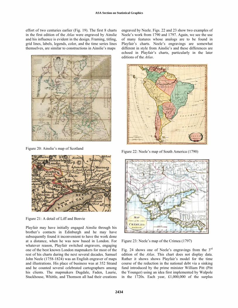
effort of two centuries earlier (Fig. 19). The first 8 charts in the first edition of the Atlas were engraved by Ainslie and his influence is evident in the design. Framing, titling, grid lines, labels, legends, color, and the time series lines themselves, are similar to constructions in Ainslie’s maps
Figure 20: Ainslie’s map of Scotland
Figure 21: A detail of Liff and Benvie Playfair may have initially engaged Ainslie through his brother’s contacts in Edinburgh and he may have subsequently found it inconvenient to have the work done at a distance, when he was now based in London. For whatever reason, Playfair switched engravers, engaging one of the best known London mapmakers for most of the rest of his charts during the next several decades. Samuel John Neele (1758-1824) was an English engraver of maps and illustrations. His place of business was at 352 Strand and he counted several celebrated cartographers among his clients. The mapmakers Dugdale, Faden, Laurie, Stackhouse, Whittle, and Thomson all had their creations
engraved by Neele. Figs. 22 and 23 show two examples of Neele’s work from 1790 and 1797. Again, we see the use of many features whose analogs are to be found in Playfair’s charts. Neele’s engravings are somewhat different in style from Ainslie’s and these differences are echoed in Playfair’s charts, particularly in the later editions of the Atlas.
Figure 22: Neele’s map of South America (1790)
Figure 23: Neele’s map of the Crimea (1797) Fig. 24 shows one of Neele’s engravings from the 3rd edition of the Atlas. This chart does not display data. Rather it shows shows Playfair’s model for the time course of the reduction in the national debt via a sinking fund introduced by the prime minister William Pitt (Pitt the Younger) using an idea first implemented by Walpole in the 1720s. Each year, £1,000,000 of the surplus
ASA Section on Statistical Graphics
2434
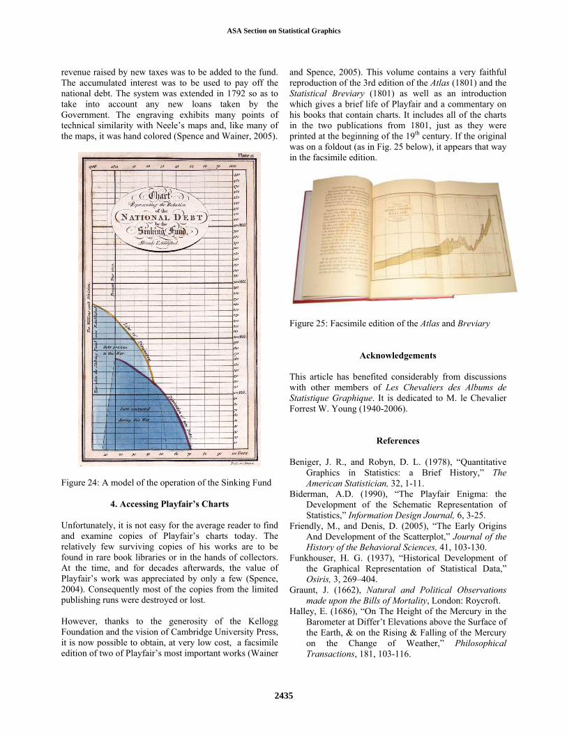
revenue raised by new taxes was to be added to the fund. The accumulated interest was to be used to pay off the national debt. The system was extended in 1792 so as to take into account any new loans taken by the Government. The engraving exhibits many points of technical similarity with Neele’s maps and, like many of the maps, it was hand colored (Spence and Wainer, 2005).
Figure 24: A model of the operation of the Sinking Fund
4. Accessing Playfair’s Charts Unfortunately, it is not easy for the average reader to find and examine copies of Playfair’s charts today. The relatively few surviving copies of his works are to be found in rare book libraries or in the hands of collectors. At the time, and for decades afterwards, the value of Playfair’s work was appreciated by only a few (Spence, 2004). Consequently most of the copies from the limited publishing runs were destroyed or lost. However, thanks to the generosity of the Kellogg Foundation and the vision of Cambridge University Press, it is now possible to obtain, at very low cost, a facsimile edition of two of Playfair’s most important works (Wainer
and Spence, 2005). This volume contains a very faithful reproduction of the 3rd edition of the Atlas (1801) and the Statistical Breviary (1801) as well as an introduction which gives a brief life of Playfair and a commentary on his books that contain charts. It includes all of the charts in the two publications from 1801, just as they were printed at the beginning of the 19th century. If the original was on a foldout (as in Fig. 25 below), it appears that way in the facsimile edition.
Figure 25: Facsimile edition of the Atlas and Breviary
Acknowledgements This article has benefited considerably from discussions with other members of Les Chevaliers des Albums de Statistique Graphique. It is dedicated to M. le Chevalier Forrest W. Young (1940-2006).
References Beniger, J. R., and Robyn, D. L. (1978), “Quantitative
Graphics in Statistics: a Brief History,” The American Statistician, 32, 1-11.
Biderman, A.D. (1990), “The Playfair Enigma: the Development of the Schematic Representation of Statistics,” Information Design Journal, 6, 3-25.
Friendly, M., and Denis, D. (2005), “The Early Origins And Development of the Scatterplot,” Journal of the History of the Behavioral Sciences, 41, 103-130.
Funkhouser, H. G. (1937), “Historical Development of the Graphical Representation of Statistical Data,” Osiris, 3, 269–404.
Graunt, J. (1662), Natural and Political Observations made upon the Bills of Mortality, London: Roycroft.
Halley, E. (1686), “On The Height of the Mercury in the Barometer at Differ’t Elevations above the Surface of the Earth, & on the Rising & Falling of the Mercury on the Change of Weather,” Philosophical Transactions, 181, 103-116.
ASA Section on Statistical Graphics
2435
Herbst, P.G. (2002), “Establishing a Custom of Proving in American School Geometry: Evolution of the Two-Column Proof in the Early Twentieth Century,” Educational Studies in Mathematics, 49, 283-312.
Kosslyn, S. (2006), Graph Design for the Eye and Mind, New York, NY: Oxford.
Lambert, J.H. (1779), Pyrometrie, Berlin: Bey Haude & Spener.
Palmer, S.E. (1999), Vision Science: Photons to Phenomenology, Cambridge, MA: MIT Press.
Playfair, J. (1802), Illustrations of the Huttonian Theory of the Earth, Facsimile Reprint, with an Introduction by G.W. White, Urbana, IL: University of Illinois Press.
Playfair, W. (1786), The Commercial and Political Atlas; Representing, by Means of Stained Copper-Plate Charts, the Exports, Imports, and General Trade of England, at a Single View. To Which are Added, Charts of the Revenue and Debts of Ireland, Done in the Same Manner by James Corry, London: Debrett; Robinson; and Sewell.
————— (1801), The Commercial and Political Atlas, Representing, by Means of Stained Copper-Plate Charts, the Progress of the Commerce, Revenues, Expenditure, and Debts of England, during the Whole of the Eighteenth Century, London: Wallis.
————— (1801), The Statistical Breviary : Shewing, on a Principle Entirely New, the Resources of Every State and Kingdom in Europe; Illustrated with Stained Copper-Plate-Charts ... to Which is Added, a Similar Exhibition of the Ruling Powers of Hindoostan. London: Wallis.
————— (1805), An Inquiry into the Permanent Causes of the Decline and Fall of Powerful and Wealthy Nations, London: Greenland & Norris.
Priestley, J. (1765), A Chart of Biography, London: J. Johnson.
Simons, L.G. (1931), “The Influence of French Mathematicians at the End of the Eighteenth Century upon the Teaching of Mathematics in American Colleges,” Isis, 15, 104-123.
Spence, I. (2004), “William Playfair,” Oxford Dictionary of National Biography, Vol. 44, 562-563, Oxford, U.K.: Oxford University Press.
————— (2005), “No Humble Pie: The Origins and Usage of a Statistical Chart,” Journal of Educational and Behavioral Statistics, 30, 353-368.
Spence, I., and Wainer, H. (2005), “Introduction,” In Wainer, H., and Spence, I. (Eds.), Playfair’s Commercial and Political Atlas and Statistical Breviary, New York, NY: Cambridge University Press, Pp. 1-35.
Tufte, E.R. (1983), The Visual Display of Quantitative Information, Cheshire, CT: Graphics Press.
Tukey, J.W. (1977), Exploratory Data Analysis, Reading MA: Addison-Wesley.
Uglow, J. (2002), The Lunar Men: Five Friends whose Curiosity Changed the World, New York, NY: Farrar, Straus and Giroux.
Wainer, H. (1998), “The Graphical Inventions of Dubourg and Ferguson: Two Precursors to William Playfair,” Chance , 11 (4):39-41.
Wainer, H., and Spence, I. (2005), “Graphical presentation of longitudinal data,” In Everitt, B., and Howell, D.C. (Eds.), Encyclopedia of Behavioral Statistics, New York, NY.: Wiley.
————— (2005), Playfair’s Commercial and Political Atlas and Statistical Breviary, New York, NY: Cambridge University Press.
Weisberg, S. (1979). Letter re: “Quantitative Graphics in Statistics: a Brief History,” The American Statistician, 33, 163.
White, C., and Hardy, R.J. (1970), “Huygens’ Graph of Graunt’s Data,” Isis, 61, 107-108.
ASA Section on Statistical Graphics
2436