
Visualizing Public Health Data - Ana's Research … · Visualizing Public Health Data ......
72
Visualizing Public Health Data Anamaria Crisan, MSc PhD student with Drs. Jennifer Gardy & Tamara Munzner UBC School of Population and Public Health
Transcript of Visualizing Public Health Data - Ana's Research … · Visualizing Public Health Data ......

Visualizing Public Health DataAnamaria Crisan, MSc
PhD student with Drs. Jennifer Gardy & Tamara MunznerUBC School of Population and Public Health

Why am I giving this talk?

3
MasterofScience(Bioinformatics)
PhD(“ComputationalPublicHealth”)
GenomeDx Biosciences
BritishColumbiaCentreforDiseaseControl
2010 2013 20152008
@amcrisan http://cs.ubc.ca/~acrisan

4
I’m not an artist. I’m a data analyst.
http://blog.framed.io/
Computer Science Skills
+ Data Visualization Skills!

5
Disclaimer
I’ll be talking about a project I worked on while employed at GenomeDx Biosciences.
Everything I am presenting is publically available, but this doesn’t mean that I endorse their products or the products of their competitors.
Furthermore, I am relaying high level details of my own thought process during and after this project, not the thoughts of others at the organization.

6
Eventually I had Explain my Work to Experts with Different Backgrounds
I often used data visualization to explain the results of data mining and statistical techniques
But one day I got tasked with a rather challenging problem…

7
The Question:
The task: We had developed a genomic biomarker panel to assess a man’s risk of metastatic prostate cancer following prostatectomy
How do we communicate “risk”?
XKCD Comic #881

8
I wanted to take more ownership of the question “how do we communicate risk?”

9
I wanted to take more ownership of the question “how do we communicate risk?”
There wasn’t a simple answer

10http://bit.ly/1Knrj19
Just show a Number …
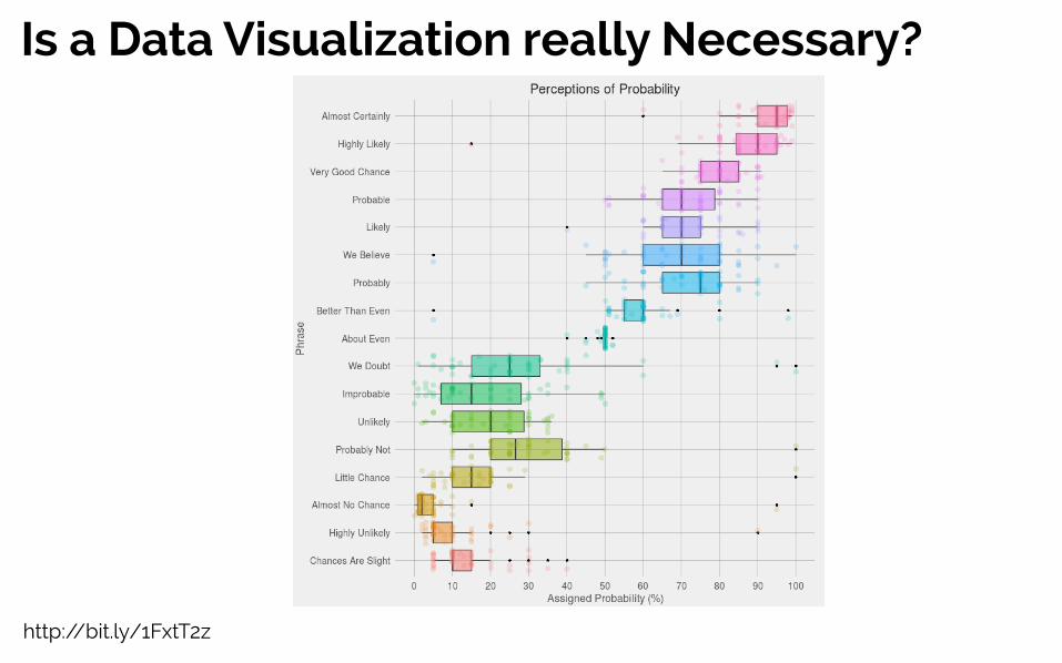
http://bit.ly/1FxtT2z
Is a Data Visualization really Necessary?

12
60%
Probability Frequency Visualization
6 in 10
< <(difficulttounderstand) (easiertounderstand)
Evidence from Risk Communication Literature
Whiting et. al (2015) “How well do health professionals interpret diagnostic information? A systematic review”
Numeracy : the ability to reason with numbers
Individuals with low numeracy have a difficulty interpreting numbers and probabilities
Visualizations can help people with low numeracy make sense of data,
But, there is some evidence that low numeracy affects reasoning with graphs as well.

13
Example : Data Visualization in Shared decision Making
Garcia-Retamero et. al (2013) “Visual representation of statistical information improves diagnostic inferences in doctors and their patients”
RANDOMIZE
Probability
Frequency
RND
Visual Aid
No Visual Aid
RND
Visual Aid
No Visual Aid
Patients+
Doctors
STUDY DESIGN RESULTSVisualization improved comprehension of both doctors and patientsVisualization improved concordance between doctors and patients
Quasi-randomized trial with four conditionsOutcome : correctly calculating the risk (essentially a math test)
Yes! Data visualization was more than a “nice to have”!

15
Example Report: OncotypeDx DCIS report
Show a Number and a Picture
16
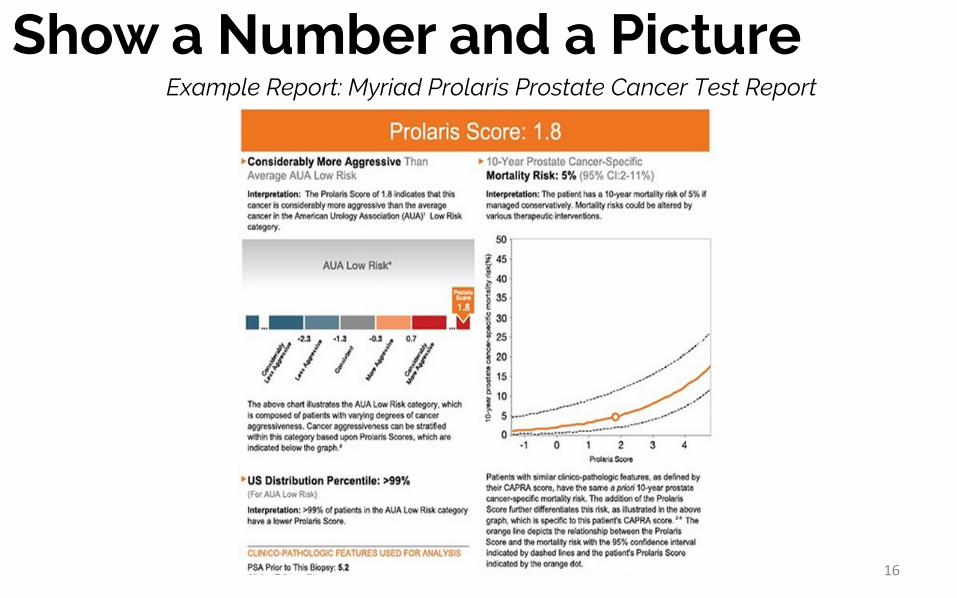
Example Report: Myriad Prolaris Prostate Cancer Test Report
Show a Number and a Picture

17
ExampleReport:DecipherProstateCancerTestReport
Primary population: Men, who are susceptible to red-green colour blindness
Show a Number and a Picture

18
Example : Deciding upon an InterventionBaseline Visualization
Alternative 1 Alternative 2
Zikmund-Fisher (2013). A demonstration of ''less can be more'' in risk graphics.
Zikmund-Fisher (2008). Improving understanding of adjuvant therapy options by using simpler risk graphics
Helping breast cancer patients decide between multiple treatment options.

SO… what is data visualization?
19

20
Data visualization is not art
Beyond Building Pretty & Cool Visualizations

Design Art
Ideas taken from @rachelbinx’s 2016 Open Vis talkAnd http://featureguru.com/art-vs-design.html
Data Visualization(I argue data visualization is much more about design)
21
Defining Data VisualizationBeyond Building Pretty & Cool Visualizations

22
There’s more to data visualization than simply communicating numerical data
BUT WAIT!

23
Example : Hypothesis Generation
John Snow’s Visualization of the 1854 Cholera Outbreak
Allowed John Snow to form the hypothesis of what may be leading to the cholera outbreak

24
Example : Hypothesis Generation
John Snow’s Visualization of the 1854 Cholera Outbreak
Allowed John Snow to form the hypothesis of what may be leading to the cholera outbreak
25
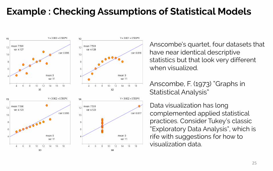
Example : Checking Assumptions of Statistical Models
Anscombe’s quartet, four datasets that have near identical descriptive statistics but that look very different when visualized.
Anscombe, F. (1973) “Graphs in Statistical Analysis”
Data visualization has long complemented applied statistical practices. Consider Tukey’s classic “Exploratory Data Analysis”, which is rife with suggestions for how to visualization data.

So what should be think about when designing data visualizations?
26

Why?Why do you need to visualize data?
What?What kind of data is being visualized?
How?How is data being visualized?
A Data visualization in 3 Questions:
27
(Motivation)
(Data)
(Visual and Interaction Design)

Why?
A Data visualization in 3 Questions:
28
What?
How?
Design EvaluationDoes the visualization solve a relevant problem?
Are you using the right data, or deriving the right data?
Are the visual and interactive design choices appropriate?

Why
What
How
How
Steps to Design and Evaluate a Data Visualization
DESIGN
EVALUATION
29Munzner (2014) “Visualization Analysis and Design”

Why
What
How
How
Steps to Design and Evaluate a Data Visualization
Qualitative Methods,Domain Knowledge
Qualitative &Quantitative Methods
Design & Cognitive Science
Computer Science
Methodology
30

31
The “Design Space” metaphor
Sedlmair 2012https://www.cs.ubc.ca/nest/imager/tr/2012/dsm/dsm-talk.pdf

32
The “Design Space” metaphor
Sedlmair 2012https://www.cs.ubc.ca/nest/imager/tr/2012/dsm/dsm-talk.pdf
OPTIMIZATION!How Data Visualization is like Statistical Modelling

33Sedlmair 2012
https://www.cs.ubc.ca/nest/imager/tr/2012/dsm/dsm-talk.pdf
The “Design Space” metaphor
Progressively Identify the Right Visualization
Use “why, what, and how” framework to guide the selection of the optimal design choice

34
The Importance of Thinking Broadly
Munzner (2014)“VisualizationAnalysisandDesign”
Use “why, what, and how” framework to guide the selection of the optimal design choice
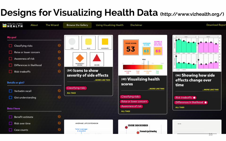
Designs for Visualizing Health Data (http://www.vizhealth.org/)
35

A preview of some things I am working on
36

How do we design good visualizations for publichealth?
37
BUT…..

38
To what extent and in what ways does the visualization of genomic, administrative, and contact network data support decision making for communicable disease prevention and control
Primary Research Question

39
To what extent and in what ways does the visualization of genomic, administrative, and contact network data support decision making for communicable disease prevention and control
Primary Research Question
aka. “How is visualization of communicable disease (public health) data useful? Can I quantify how useful it is?”
40
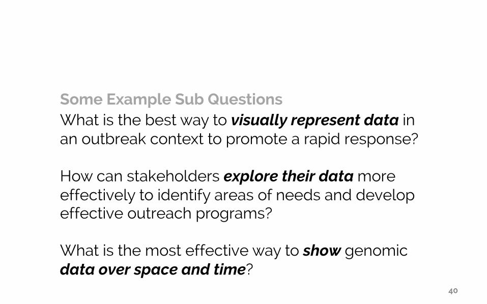
What is the best way to visually represent data in an outbreak context to promote a rapid response?
How can stakeholders explore their data more effectively to identify areas of needs and develop effective outreach programs?
What is the most effective way to show genomic data over space and time?
Some Example Sub Questions

41
Example 1 Visualizing Tuberculosis data at the British Columbia Centre for Disease Control

WHY42

Clinical
Social
Lab
Combining Data will Prepare us for the Pandemics of the Future
43

44
But, that’s a lot of data….
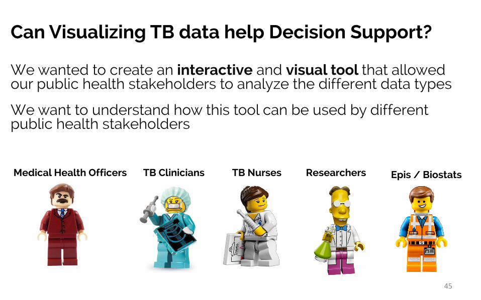
Can Visualizing TB data help Decision Support?
We wanted to create an interactive and visual tool that allowed our public health stakeholders to analyze the different data types
We want to understand how this tool can be used by different public health stakeholders
TB NursesTB CliniciansMedical Health Officers
45
Researchers Epis / Biostats

WHAT46

Treatment
Genomic
Contact Network
Patient Data
Outcomes
Geography /Location
47

Treatment
Genomic
Contact Network
Patient Data
Outcomes
Geography /Location
48
TB whole genomeGenotyping

Treatment
Genomic
Contact Network
Patient Data
Outcomes
Geography /Location
time49

HOW50

An Iterative Approach to Development
51
An iterative approach to development allows us to get feedback before committing to ineffective design choices

Introducing EpiCOGs
DEMO
52
EpiCogs is a data viewer and currently a sandbox environment for developing data visualizations
Technology Changes
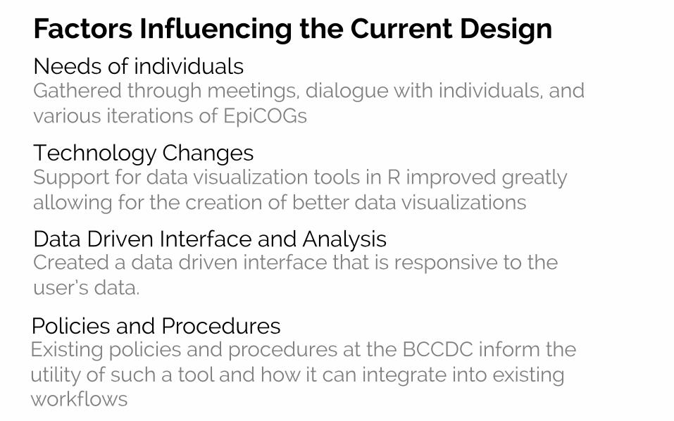
Factors Influencing the Current Design
Support for data visualization tools in R improved greatly allowing for the creation of better data visualizations
Data Driven Interface and AnalysisCreated a data driven interface that is responsive to the user’s data.
Policies and ProceduresExisting policies and procedures at the BCCDC inform the utility of such a tool and how it can integrate into existing workflows
Needs of individualsGathered through meetings, dialogue with individuals, and various iterations of EpiCOGs

Much initial work was to understand the tool’s feasibility
Initial Work & Next Directions
Could it meet the needs of stakeholders?How could it integrate (security & workflow)?How could it be supported long term? (Choice of R)Could we build a useful tool in R?
Next phases will explore genotypes, genomics, and contact networks
Right now, users can filter based on assigned genotype clusters (which will show patients on map), but we’re working towards better visual and interactive design for these data

TRY THE DEMO:https://amcrisan.shinyapps.io/EpiCOGSDEMO/
GET THE CODE (& contribute to the project!) :https://github.com/amcrisan/EpiCOGS/
This is an Open Source Project

Call for Guinea Pigs!
To make relevant tools I need feedback!If you want to be involved and get project updates let me know!
E-mail: [email protected]
Twitter: @amcrisan
Web : cs.ubc.ca/~acrisan

57
Example 2Visualizing the Ebola Outbreak – An example of a design process

58
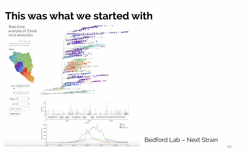
This was what we started withA very familiar layout, all the information is there, but you have to do some work to put it together
59
This was what we started with
Bedford Lab – Next Strain

Can we improve the Design of the Visualization?• How do different public health stakeholders use the data?
• Epidemiologists want to know:
– Where is it spreading?– How is it spreading?– How many people are impacted?
• Researchers want to know:
– What’s spreading?– How similar are the outbreak clusters?– How is changing over time?
60
61
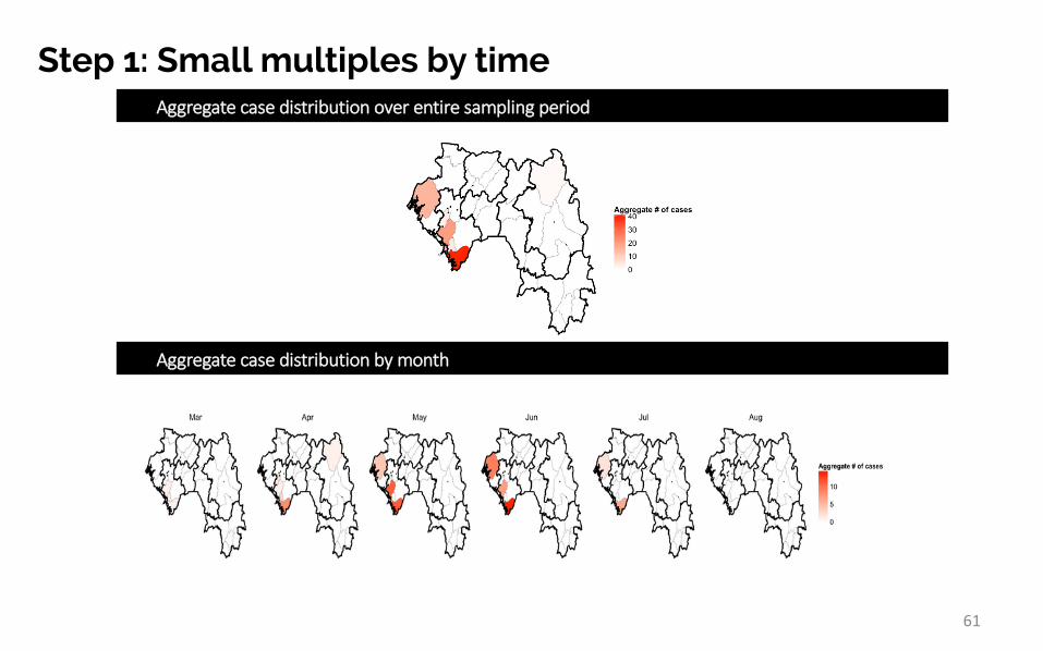
Step 1: Small multiples by timeAggregatecasedistributionoverentiresamplingperiod
Aggregatecasedistributionbymonth
62
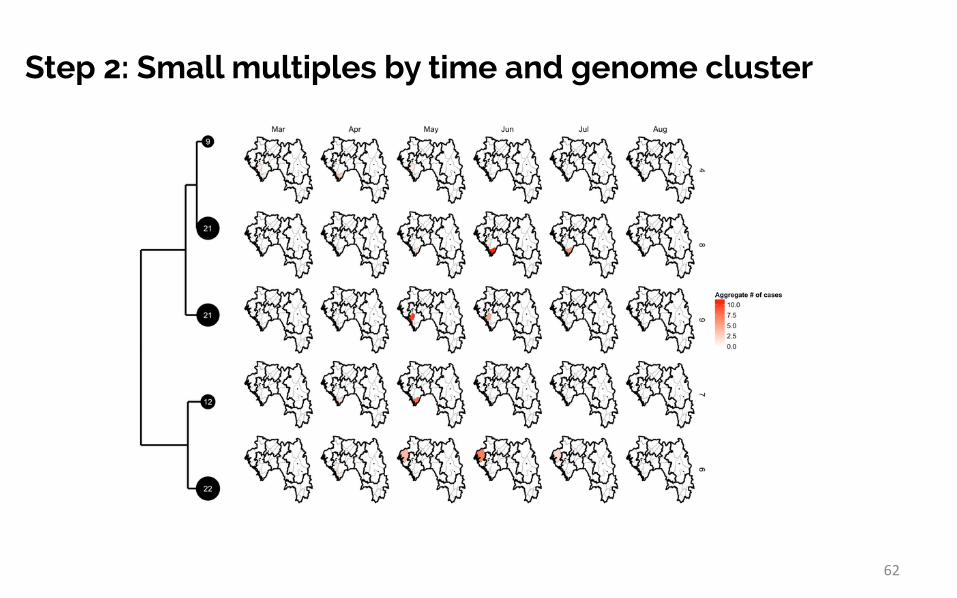
Step 2: Small multiples by time and genome cluster

63
Step 3: Small multiples by time and genome clusterand with sequence similarity
White:dominantnucleotideGrey:lessdominantnucleotide

64
Highly populous capital is very difficult to see
By abstracting the geography, we can represent more data more easily

65
Capital city gets a more prominent view
By abstracting the geography, we can represent more data more easily

66
X-axis ordering
Alphabetically within high level administration regions
Geographic distance

Part 3:
Take home messages
67

Beyond Building Pretty & Cool Visualizations
68
Data visualization is not artIt is a research process.

69
Data Visualization is not an art or graphic design project
Take Home Messages
Relevance (utility) and usability trump aesthetics

70
Data Visualization is not an art or graphic design project
Deciding upon the most appropriate data visualization can be a research problem
Think about ”why, what, and how” frameworkParallels to finding the right statistical model
Relevance (utility) and usability trump aesthetics
Design & Evaluation
Take Home Messages

71
Data Visualization is not an art or graphic design project
Deciding upon the most appropriate data visualization can be a research problem
Relevance (utility) and usability trump aesthetics
Think broadly, progressively find the right data visualizationThe Design Space Concept Iterative development
Think about ”why, what, and how” frameworkParallels to finding the right statistical model
Design & Evaluation
Take Home Messages

PHSA Reference LaboratoryDr. Patrick TangHope LapointeClare Kong
BCCDC CDPACSCiaran AikenLaura MacDougallMike CossSunny MakMike OtterstatterRobert Balshaw
BCCDC Clinical TB Clinical TeamCliniciansDr. Maureen MayhewDr. James JohnstonDr. Jason Wong (CPS)Dr. Victoria Cook
NursesNash DhallaMichelle Mesaros
EpidemiologistsDr. David Roth
The Gardy LabDr. Jennifer GardyJennifer Guthrie
UBC Computer ScienceDr. Tamara MunznerThe InfoVis group
This would work not be possible without these fine people
72
The large team of individual’s from BC’s HAs and HSDAs without whom there would be no data.