Visualizing pattern from cross risk factors scenario information
Upload
margarida-andradeCategory
view
218download
3description

Information for Advocacyan Introduction to Information Design
VisualizingInformation for Advocacyan Introduction to Information Design
Visualizing Information for AdvocacyAn Introduction to Information Design

2 3
This manual offers an introduction to
information design. It is intended to provide
NGOs with a useful and powerful tool for
advocacy and research.
The manual was written and designed by
John Emerson, Principal at Apperceptive LLC.
http://backspace.com, http://apperceptive.com
It was coordinated and produced by the
Tactical Technology Collective.
http://tacticaltech.org
Thanks to Caroline Kraabel, as well as Colleen
Macklin, Jane Pirone and Jesus Farcierth of
Parsons the New School for Design for their
comments and help.
Sponsored by the Open Society Institute
Information Program.
Printed in India, January 2008.
This work is licensed under a Creative
Commons Attribution-Share Alike 3.0 License
http://creativecommons.org/licenses/by-sa/3.0
» On the cover: Illustrations designed by
Nigel Holmes for the Citizens Guide to the
Airwaves use different types of land use
as a metaphor for how the U.S. government
mismanages licensing of the public
radiofrequency spectrum to private
corporations. See pages 36 and 37 inside for
more on this example.
The politics of spectrum
1
2
3
4
Contents
Introduction
What is Information Design?
How Can You Use Information Design?
Information Design for Advocacy
Information Design for Analysis
Information Design for Consumer Education
Information Design for Strategy How to Begin
Planning Your Information Design
Assessing Your Data
Sorting and Sketching
Assessing Your Media
Designing Your Graphics
Clarifying Your Graphics
More Tips
Evaluate and Iterate
Additional Resources
Free Software Tools
1
4
8
10
11
14
15
20
21
24
25
28
32
34
35
40
41
42

4 1
Just Vision tells the stories of Palestinians and Isaelis working together for peace. Instead
of presenting a single account of the history of the conflict, the site hosts a collaborative,
subjective timeline composed of personal recollections. See http://justvision.org
A project of Greenpeace, Exxon Secrets charts funding by the Exxon Foundation to
institutions and individual “climate change skeptics” working to undermine solutions to global
warming and climate change. The interface makes it easy to visualize and navigate the research.
See http://exxonsecrets.org
»
»
Advocacy organizations tend to collect a lot of information.
They often package this information into detailed written reports. While these reports support policy recommendations and are valuable reference tools, they may not be the most effective way to make an impact within a campaign.
We live in an information-rich environment and in our daily lives constantly receive messages conveyed through design. Many of these messages seek to influence as well as inform, serving a variety of commercial and non-commercial interests. How do you make your message heard?
Your campaign has vital information on an urgent issue.
How do you tell your story effectively?
How can NGOs make their messages as attractive and compelling as other, competing, information?
By using information design.
Information design can help tell your story to a variety of constituencies. You can use it as an advocacy tool, for outreach or for education. You can facilitate strategic planning by making a visual map of a given situation.
This pamphlet is divided in two parts: first an overview of information design, what it is and how it can be used for social change, followed by some basic principles, tips and advice to help you get started.
The examples included in this pamphlet were made by advocacy organizations, media companies and individuals around the world. The graphics show some of the many ways information can be designed and how information design can be used in your campaign.
Introduction

2 3
Kofi Annan, speaking for the United Nations, said yesterday, “The collective punishment of the
Lebanese people must stop. What is urgently needed is the immediate cessation of hostilities.”
This editorial information graphic ran on the cover of the Belfast Telegraph in July 2006.
It dramatically illustrates the world reaction to the Israeli bombing of Lebanon.
Middle East Crisis: Who backs an immediate cease-fire?
Margaret Beckett, Foreign Secretary, addressing the Cabinet yesterday, said:
“What people are really saying is they want a ceasfire with rockets still going into Israel.”
At a glance, it effectively shows the stark contrast between the majority and the minority —
and invites examination of the relationships between the countries in the minority.

4 5
Information Design Tells a StoryWhat is Information Design?
Information design uses pictures, symbols, colors, and words to communicate ideas, illustrate information or express relationships visually.
Effective design is not just a matter of making text pretty or entertaining, but of shaping understanding and clarifying meaning. Information design adds seeing to reading to make complex data easier to understand and to use.
It can help illustrate complexity, showing relationships between ideas or actors, or providing a snapshot of changing systems. It takes many forms and appears in many media. Some familiar forms include charts, graphs, maps, diagrams or timelines. These can be big or small, simple or complex, published in print or electronic media.
Information design can help you present your information in a clear and compelling way, persuasively convey facts or ideas or discover something new in your data.
Web of Alliances in Ituri
Please note that alliances change frequently. This is accurate as of May 2003.
MLC Movement for the
Liberation of Congo
RCD-National Congolese Rally for
Democracy–National
RCD-GCongolese Rally for Democracy–Goma
PUSICParty for Unity and Safeguarding
of the Integrity of Congo ( Hema )
FPDCPopular Force for
Democracy in Congo( Alur / Lugbara )
FNIFront for National
Integration ( Lendu )
FRPIPatriotic Force of Resistance in Ituri
( Ngiti )
FAPCPeople’s Armed Forces of Congo
( Cmdt Jerome )
RCD-MLCongolese Rally for Democracy-
Liberation Movement
FIPIFront for Integration
and Peace in Ituri collpased in May 2003
national governments
national rebel movements
RwandaUgandaDemocratic Republic of Congo( Kinshasa Government )
Helps train and arm
Helps armand support
Formed, helped train and arm
Formed, helped train and arm
Helps train and arm
Helps train and arm
UPCUnion of Congolese
Patriots( Hema / Gegere )
Official political and military alliance
Possible alliance
Formed and armed, but relationship
broken
Helps train and arm
Formed and helped arm members of the former FIPI platform
local armed groups in ituri
The July 2003
Human Rights Watch
report Ituri: “Covered
in Blood,” Ethnically
Targeted Violence in
Northeastern Congo
implicates national
governments in local
violence.
The accompanying
diagram illustrates
government
relationships, trade,
and training of armed
political groups in
Ituri.
Information design tells a story with pictures.
It can tell “how many?” “when?” or “where?” It can show trends over time, compare elements or reveal hidden patterns.
Information design brings form and structure to information.
It is not the same as graphic design, nor is it only about making something aesthetically pleasing. It’s not about branding, style, making a glossy product or something that looks “corporate.”
Information design is about making your data:
ClearIt makes complex information easier to understand.
CompellingVisuals grab people’s attention.
ConvincingPeople who might not be persuaded by raw numbers or statistics may be more likely to understand and believe what they see in a chart or graphic.
This graph generated on the
web site Many Eyes shows the
large number of prisoners jailed
on drug-related charges in the
United States.
It allows the reader to compare
the number of people jailed
for drug charges versus those
jailed for other offenses.
It reveals the disproportionate
impact of drug laws, and points
to a failure of mandatory
sentencing legislation.

6 7
The Highline is an abandoned
elevated-train railway which
runs along the edge of New York
City. The railway was neglected
for decades and was slated
for demolition when a coalition
formed a campaign to save the
unique structure and convert
it into an innovative, elevated
public park.
As part of its strategy, the
coalition to save the Highline
held a series of open meetings
where they used a wide
variety of photos, illustrations
and diagrams to present the
audience, the media and public
officials with a vision of how the
park could be revitalized and
developed.
The two timeline graphics
shown here were a part of these
presentations. Designed by the
landscape architecture firm Field
Operations, the graphics artfully
evoke the evolution of flora and
fauna, and public usage, over the
course of four years.
After years of campaigning,
the coalition has successfully
won the legislative and financial
support needed to save the Line
and start converting it into 1.5
miles of new public space.
Images © 2004. Field Operations
with Diller Scofidio + Renfro.
Courtesy the City of New York.

8 9
How Can You Use Information Design?
Here are just a few ways you can use information design:
Tell Your Story• Toyourconstituencies• Tofunders• Togovernmentofficials• Tothemedia• Tootherorganizations• Tothegeneralpublic
Analyze Your Data• Discoverhiddenpatterns• Findtrendsinchangingsystems
Make a Plan• Analyzerelationshipsofpower• Illustratesocialnetworks• Findoutwhereyourissuehasthemostimpact• Projectfuturetrends
Make Information Visible• Showinfluenceandcausality• Illustratetheconsequencesofspecificchoices• Compareandcontrast
Simplify and Clarify• Illustrateanalysisofanabstractidea• Showtheflowofaprocessorchangingsystem• Makeyourconclusionsvisibleandeasytonavigate• Showstructureandorderinapparentlychaoticdata
The 2004 Global Witness report on
corruption and extortion affecting
Cambodia’s forest sector, entitled Taking
a Cut, uses two different types of graphics
to provide an overview of individuals with
command responsibility and personal
relationships with illegal logging syndicates.
The chart above illustrates specific
relationships between individuals. » The list
view presents the officials in order by rank
from the National Government to the Military
to the local police and local Government. Six
months after being implicated in the report,
the World Bank announced an investigation
of its Forest Concession Management and
Control Pilot Project in Cambodia.
Download the complete report at
http://globalwitness.org
Images © Global Witness, Taking a Cut, 2004
«

10 11
Information Design for Analysis
Information design can be integrated into the research process by illuminating data visually, or providing a neutral platform with which to identify trends or targets.
Translating data into a visual format may help reveal patterns that might not otherwise be apparent. Representing data visually on a chart or graph can reveal wider trends and unexpected clusters around specific demographics, geographies or time-periods.
Using information design to examine larger networks and systems can complement and provide context to individual case studies and testimonies.
In a campaigning context, information design can transform raw data into a powerful advocacy tool to motivate an outcome.
Graphics can tell your story in a compelling, immediate and powerful way to move your intended audience. Information design can simplify and summarize a complex story — and add impact.
Information design should be considered within your overall strategy for achieving policy change or increasing awareness. When and how you use information design will depend on the information you want to convey and the context in which you work.
Information Design for Advocacy
12 Costs to the smoker CYAN MAGENTA YELLOW BL ACK
The cost of smoking
$5 and above
$4 – $4.99
$3 – $3.99
$2 – $2.99
$1 – $1.99
less than $1
no data
Cost of a pack of 20 Marlboro cigarettes or an equivalent international brand 2003-05selected countries US$
20 imported cigarettes cost more than half average daily income
4544
Costs to the smoker 12
S
“Smoking makes the poor poorer, it takes away not just health but wealth.”
Dr Bill O'Neill, Secretary of the British Medical Association Scotland, 2004
mokers waste vast amounts of money on their tobacco
addiction that could otherwise be invested in productive economic activity or used to obtain food, clothes and education. In poverty-stricken households where a large proportion of the household income is spent on food, tobacco addiction can lead to malnutrition for the smoker’s family.
Smokers also may suffer significant loss of income due to illness, and ill health can trigger a slide into extreme poverty. Tobacco kills one quarter of all smokers during their most productive years of employment, depriving their families of vital income. Family members must expend valuable time and scarce resources caring for their sick and dying smoking relatives. In many developing countries, a visit to the hospital can consume days of travel and a family’s life savings.
Smokers must shoulder higher health insurance premiums and many other miscellaneous costs, such as increased wear and tear on their home, as well as increased fire risk.
A U S T R A L I A
RREP.KOREAOREA
PUERTO RICOUERTO RICOU
WEZIMBABWEW
UZBEKISTANNGEORGIAGIAABAIJANAZERBAIJANAAAZERBAIJAN
JAMAICACA
DOMINICANREP.REP.
BRUNEI DAR.R
M A L A Y S I AM
SAUDI ARABIA
C H I N A
VIET NAMVIET NAM
IABODIACAMBODIABODIA
THAILANDDDAI N D I A
GLADESHHBANGLADESH
ISL . REP .IRAN
PPAKISTANNNP
T U R K E Y
CYPRUSSCYPRUS
ISRAEL
ORDANJORDANORDAN
NBAHRAIN
UAEUAE
KUWAITWAITKKLNEPALLN
K A Z A K H S T A N
U S A
C A N A D A
ALGERIA
S U D A N
NIGERIA PIAETHIOPIAHIOPIAH
ANGOLA
E G Y P T
MOROCCOO
SENEGAL
CÔTE D’IVOIRE
GH
AN
A
C NCAMEROONN
SOUTH AFRICA
ZAMBIA
P.UNITED REP.TANZANIA
KENYA
TOG
OTO
GO
TOG
O
GUATEMALAA
MEXICO
PARAGUAYAYPP AY
B R A Z I L
VENEZUELA
COLOMBIA
COSTA RICACA
PANAMA
ECUADORDOR
PERU
ARGENTINA
UAYURUGUAYUAYUAY
CHHILE
PHILIPPINESN SPINESPHILIPPINES
ngHong Kong RSAR
NEW
ZEALANDND
APAPUANEW
GUINEAGUINEA
I N D O N E S I AI N
JAPANAPAN
R U S S I A N F E D E R A T I O N
SINGAPOREINGAPORE
TU SIATUUNISTU
L
ROATIATTIACROATIA
YITALY
REP.REP.REP.OLDOVAMOLDOVAOLDOVA
UKRAINE
LITHUANIAANIAAA
ESTONIATONIASTONIAONIA
AUSTRIAAUSTRIAAUSTRIA HUNGARYYY
ARIABULGARIA
ROMANIA
GREECEG ECEGREECE
A &SERBIA &&S &AEGROMONTENEGROMONTENEGROMONTENEGROEGRO
POLAND
LOVENIANIAOVENIASLOVENIASLOVENIAOVENIASLOVENIANIA
RUSSIANFED.U TEDUNITED
KINGDOMKINGDOMKI
IRELANDLAND
DENMARKARRKNMARK
FRANCE
SPAINPORTUGALGAL
GERMANY
ZSWITZ.SSWITZ.Z.
BELGIUMUMIUMB UM
LUX.
NETH.ETH.
DICELAND
NORWAYNORWAY
FINLANDNLAND
ENSWEDEN
AAKIAOVAKIASLOVAKIAASLOVAKIAAKCZECHCHCHREP.
MALTA
RUSSIAN FED.R SSIAN FED.
In 2004, for the cost of a pack of 20 Marlboro cigarettes or equivalent international brand,a person could buy:
…two and a half small fish
in Sri Lanka…
…ten litres of milk
in Algeria…
…five to eight kilogrammes of apples
in Armenia…
…seven kilogrammes of tomatoes in Jordan…
…nine kilogrammes of potatoes in Armenia
and Uruguay…
…four pairs of cotton socks in Lao People’s Democratic Republic.
S h an gh aiChina
3529
10 1015
42
16 13 14 16
7
25
46 46
71
18
94
70
1088
96
MumbaiIndia
TokyoJapan
NairobiKenya
Kuala LumpurMalaysia
Mexico CityMexico
KarachiPakistan
WarsawPoland
GenevaSwitzerland
DubaiUAE
Marlboro
1 kg of rice
A hard day’s smokeAverage minutes of labour required to purchase 20 cigarettes or 1kg of rice2003selected cities
The Tobacco Atlas is a publication of the World Health Organization designed to influence
national policy. The map contextualizes data to give it more impact. It shows places in
the world where the cost of 20 cigarettes is higher than half an average days income and
compares the cost of a packet of cigarettes to locally available produce. See http://who.int/
tobacco/statistics/tobacco_atlas/en/
Mapping Poverty in New York City
From a case study produced by the Community Mapping Assistance Project (CMAP):
“[The Robin Hood Foundation] used CMAP’s expertise
with Census data to identify which of many possible
measures of poverty would best reveal the answers
they needed. Next, CMAP staff organized the data in
the ways most relevant to the foundation’s planning
process, including breakdowns by age, race, ethnicity
and single parent household. Finally, CMAP produced
a series of maps for study and display that illustrated
the geographic relationship between the foundation’s
current funding sites and current patterns of poverty.
What the maps revealed was striking, prompting Robin Hood to initiate a major redirection
of resources. The maps enabled the board to visualize the complexity of focusing Robin
Hood’s grants where in the city they can do the most good. In addition to their use in
planning, the maps have become a vital tool for orienting staff and donors. They visually
convey complex information to all kinds of people, making the point forcefully and
immediately. As a result, Michael Weinstein says, program officers ‘don’t even talk to me
about a new project unless it starts with Bed-Stuy, or one of the other high poverty areas
where we need to increase our impact.’”
Source: http://www.cmap.nypirg.org/case_studies/CS2/robin_hood_case_study.pdf

12 13
Historical Examples of Information Design and Advocacy
Information design is not a new communication technique. These historic examples, from
campaigns for social change, show information design applied to analysis and advocacy
respectively. In both cases, information design was used to tell a powerful, persuasive story
on behalf of a cause.
In 1859, physician John Snow mapped deaths from a devastating cholera outbreak in
London to determine its cause. Snow gathered data by talking to local residents. His map
revealed a pattern of infections around the Broad Street water pump. Despite skepticism,
he collected enough evidence to prompt officials to shut down the pump, after which the
epidemic quickly ended. Snow’s work promoting the idea that the disease was spread
through contaminated water became a major turning point in the history of public health.
Thomas Clarkson’s 1786 “Essay on the Slavery and Commerce of Human Species”
influenced the abolition movement in England. This diagram shows how hundreds of
enslaved Africans were crammed into ships. The image and accompanying description
of the conditions shocked and appalled readers. The slave trade was abolished in British
empire by the Slave Trade Act in 1807.
The images clarify key concepts in an experiential, and in the case of the slave ship image,
highly emotional way. These two examples show how vital information can be presented
powerfully and accessibly. They also remind us that strong design does not require high
technology or expensive computer software.
»
»

14 15
NGOs can also use information design internally to help with their planning and self-assessment.
For instance:
• Mapping places and issues of significance can help groups to pinpoint where and how they should focus their efforts.
• Creating diagrams of advocacy targets and constituencies, and of their relationships, can help to illuminate strengths and weaknesses and thus how best to organize supporters or apply political pressure.
• Charting the flow of information within an organization can reveal bottlenecks and opportunities.
Information design acts as a force for change when making information visible at the point of action.
For example, consumers change their purchasing decisions when presented with informational graphics about a product’s health impact, energy efficiency or other long-term costs.
Information Design for StrategyInformation Design for Consumer Education
Energy use (kWh/year) range of all similar models
Clothes washers using more energy cost more to operate.This model’s estimated yearly operating cost is:
Based on standard U.S. Government tests
Compare the Energy Use of this Clothes Washerwith Others Before You Buy.
Important: Removal of this label before consumer purchase violates the Federal Trade Commission's Appliance Labeling Rule(16 CFR Part 305).
Energy use (kWh/year) range of all similar models
Clothes washers using more energy cost more to operate.This model’s estimated yearly operating cost is:
Based on standard U.S. Government tests
Compare the Energy Use of this Clothes Washerwith Others Before You Buy.
Energy use (kWh/year) range of all similar models
Clothes washers using more energy cost more to operate.This model’s estimated yearly operating cost is:
Based on standard U.S. Government tests
Compare the Energy Use of this Clothes Washerwith Others Before You Buy.
Energy use (kWh/year) range of all similar models
Clothes washers using more energy cost more to operate.This model’s estimated yearly operating cost is:
Based on standard U.S. Government tests
Compare the Energy Use of this Clothes Washerwith Others Before You Buy.
Important: Removal of this label before consumer purchase violates the Federal Trade Commission's Appliance Labeling Rule(16 CFR Part 305).
Important: Removal of this label before consumer purchase violates the Federal Trade Commission's Appliance Labeling Rule(16 CFR Part 305).
Important: Removal of this label before consumer purchase violates the Federal Trade Commission's Appliance Labeling Rule(16 CFR Part 305).
$23 $11
Uses LeastEnergy177
Uses MostEnergy
1298
kWh/year (kilowatt-hours per year) is a measure of energy (electricity) use.Your utility company uses it to compute your bill. Only standard size clotheswashers are used in this scale.
4619 7020 6601
Clothes WasherCapacity: Standard
Whirlpool CorporationModel 9FLg0SM(3B)
when used with an electric water heater when used with a natural gas water heater
Based on eight loads of clothes a week and a 2000 U.S. Government national average costof 8.03¢ per kWh for electricity and 68.80¢ per therm for natural gas. Your actual operatingcost will vary depending on your local utility rates and your use of the product.
This Model Uses282kWh/year
▼ENERGY STARA symbol of
energy efficiency
ENERGY STAR clothes washers mustbe rated with a modified Energy Factor
of 1.26 or higher.
The food pyramid is
a classic information
graphic promoting
public health. The
graphic makes it easy
to understand the
relative quantities of
food types required for
a healthy diet. Shown
here, a painted mural
at a school yard in Hue,
Viet Nam.
The Hannaford
Brothers chain of
markets in the U.S. rate
the health benefits
of the foods on their
shelves with a system
called Guiding Stars.
Labels designed by
Burkey Belser for U.S.
government agencies
inform consumers at
the point of purchase
about energy efficiency
and nutrition.
«
««
«
In a September 2006 workshop, members of the Malawi Economic Justice Network made
this map of information’s life-cycle in their campaign, in order to identify how information
flows through their organization.

16 17
Tactical Mapping for Analysis and Planning
Tactical mapping is a visualization exercise used to analyze circumstances surrounding an issue and to form a strategic plan.
Tactical maps clarify the relationships between the parties in a given situation. They can be used to identify:
• Which key relationships need to be affected to move your strategy forward
• What tactics are currently being used or potentially available
• How these tactics might affect key institutions, relationships, social groups and contexts that you want to target
• Which key groups, relationships or contexts are not affected by current tactics
• What tactics might be brought into play to engage targets that are not currently affected
• Who are your potential allies for building a more comprehensive and effective strategy
Tactical map on torture by U.S. military in Guantamo Bay.
To create a tactical map, start by identifying a human rights issue. The affected community is drawn in the center. From there, identify the individuals and organizations that affect the situation. Then draw direct and indirect relationships, with arrows showing who has influence over whom. Identify your allies and opponents.
With this in place, you can start devising a strategy. Examine what connections and resources you already have. With a strategic goal in mind, you can determine tactics you have access to or would like to explore.
Both paper and interactive versions of the map allow the users to manipulate the map dynamically, changing and moving actors to visually represent different relationships and scenarios.
For more information on tactical mapping, visit http://www.newtactics.org/main.php/TrainingTools
A tactical map
on domestic
violence in the
process of being
created.
Sticky notes
and marker
on a white
board provide
a flexible,
changeable
surface on
which to
develop a map
in progress.

18 19
In 2005, the Human Rights Watch report The
Curse of Gold documented how the gold trade
fueled massive atrocities in northeast Congo.
It included the map above, which illustrated
the relationships between local paramilitary
groups, international corporations benefitting
from access to gold rich areas, and local
towns where people suffered from ethnic
slaughter, torture and rape. See http://hrw.org/
reports/2005/drc0505/ This
gra
phic
, des
igne
d by
Adr
iana
Lin
s de
Alb
uque
rque
and
Alic
ia C
heng
, ran
in th
e N
ew Y
ork
Tim
es in
Feb
ruar
y 2
00
7 to
illu
stra
te Ir
aqi c
ivili
an
deat
hs in
the
mon
th o
f Jan
uary
. The
figu
rativ
e de
pict
ions
giv
e a
bett
er s
ense
of t
he m
agni
tude
of t
he tr
aged
y th
an w
ould
a s
impl
e lis
t of n
ames
or
num
bers
. The
use
of t
he m
ap il
lust
rate
s th
e la
ck o
f saf
ety
and
secu
rity
acro
ss th
e en
tire
coun
try
durin
g th
e U
.S. o
ccup
atio
n.
20 21
Planning Your Information Design
There are many ways to tell a story or to present data. How do you know what kind of presentation to use?
The main thing to consider is: how will your information design be used?
Is it for planning? Or advocacy? Are you trying to tell a specific story? Or are you trying to create a more neutral map to guide a process of discovery?
Keeping your purpose in mind can help guide your development process as well as your decisions about the most effective format and medium. The following pages focus on practical tips, suggestions and things to bear in mind when creating your information design.
How to Begin
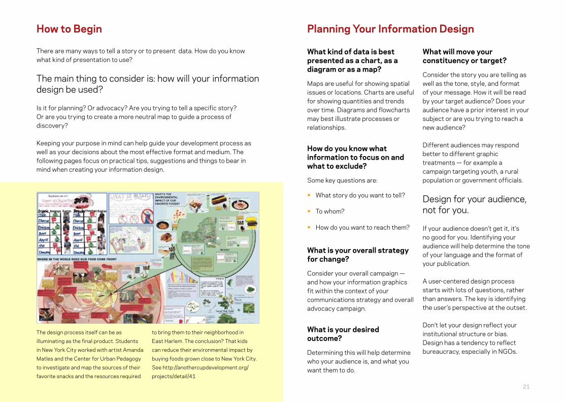
The design process itself can be as
illuminating as the final product. Students
in New York City worked with artist Amanda
Matles and the Center for Urban Pedagogy
to investigate and map the sources of their
favorite snacks and the resources required
to bring them to their neighborhood in
East Harlem. The conclusion? That kids
can reduce their environmental impact by
buying foods grown close to New York City.
See http://anothercupdevelopment.org/
projects/detail/41
What kind of data is best presented as a chart, as a diagram or as a map?
Maps are useful for showing spatial issues or locations. Charts are useful for showing quantities and trends over time. Diagrams and flowcharts may best illustrate processes or relationships.
How do you know what information to focus on and what to exclude?
Some key questions are:
• What story do you want to tell?
• To whom?
• How do you want to reach them?
What is your overall strategy for change?
Consider your overall campaign — and how your information graphics fit within the context of your communications strategy and overall advocacy campaign.
What is your desired outcome?
Determining this will help determine who your audience is, and what you want them to do.
What will move your constituency or target?
Consider the story you are telling as well as the tone, style, and format of your message. How it will be read by your target audience? Does your audience have a prior interest in your subject or are you trying to reach a new audience?
Different audiences may respond better to different graphic treatments — for example a campaign targeting youth, a rural population or government officials.
Design for your audience, not for you.
If your audience doesn’t get it, it’s no good for you. Identifying your audience will help determine the tone of your language and the format of your publication.
A user-centered design process starts with lots of questions, rather than answers. The key is identifying the user’s perspective at the outset.
Don’t let your design reflect your institutional structure or bias. Design has a tendency to reflect bureaucracy, especially in NGOs.
22 23
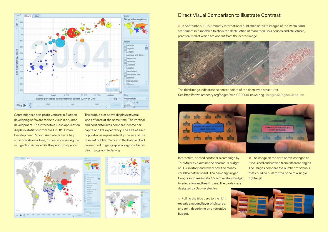
Gapminder is a non-profit venture in Sweden
developing software tools to visualize human
development. The interactive Flash application
displays statistics from the UNDP Human
Development Report. Animated charts help
show trends over time; for instance seeing the
rich getting richer while the poor grow poorer.
The bubble plot above displays several
kinds of data at the same time. The vertical
and horizontal axes compare income per
capita and life expectancy. The size of each
population is represented by the size of the
relevant bubble. Colors on the bubble chart
correspond to geographical regions, below.
See http://gapminder.org.
Direct Visual Comparison to Illustrate Contrast In September 2006 Amnesty International published satellite images of the Porta Farm
settlement in Zimbabwe to show the destruction of more than 850 houses and structures,
practically all of which are absent from the center image.
The third image indicates the center points of the destroyed structures.
See http://news.amnesty.org/pages/zwe-080906-news-eng. Images © DigitalGlobe, Inc.
Interactive, printed cards for a campaign by
TrueMajority examine the enormous budget
of U.S. military and reveal how the money
could be better spent. The campaign urged
Congress to reallocate 15% of military budget
to education and health care. The cards were
designed by Sagmeister, Inc.
Pulling the blue card to the right
reveals a second layer of pictures
and text, describing an alternative
budget.
The image on the card above changes as
it is turned and viewed from different angles.
The images compare the number of schools
that could be built for the price of a single
fighter jet.«
»
»

24 25
Card SortingOne of the first steps in organizing information according to topic or theme. Card Sorting is an exercise used by designers and information architects to help structure data in groupings that make sense.
To start, put notes on a wall describing aspects of your information. Arrange these notes freely into shapes and clusters that make sense. Rearranging these clusters should help you start to form an organizing scheme that you can use as the basis for your initial designs.
Personas & ScenariosNow try putting yourself in the role of your audiences. Identify your various constituencies. What are they looking for? What is their point of view? What do they already know about the issue? In what context will they read your graphics? How much time do they have? Are they more likely to be reached by posters, reports, or other media? Distill this information into profiles of “typical” users. These profiles and scenarios should help inform how your design should be structured.
SketchingFinally, before turning to computer software, sketch your idea on paper or on a white-board. Think in broad strokes at first, saving detail for later. Sketching out your ideas first will help you think outside the confines of the page or the screen. It will free your ideas from the limitations of your design program and tools.
Card sorting and sketching are also useful for testing your assumptions and your design with a test audience before investing time and resources in producing final, polished graphics. Testing with a rough draft allows you to make changes to your graphics quickly and cheaply, and to test several variations without having to redo expensive production work.
Sorting and Sketching
What information should I collect?Do you have what you need to tell your story? We require a context to understand the meaning and importance of facts. It’s often easier to remember a story than to remember raw data.
What types of information do I have?Information design can illuminate quantitative or qualitative data.
Do I have information worth using?One way to assess this is to try to put yourself in the place of your audience. Is your information persuasive?
What is my key message or desired outcome? Are you trying to project a holistic picture of a situation? Or one specific aspect of it? You may not need to include everything in a single graphic. It may be more effective to create multiple graphics.
What can I leave out?Prioritize the importance and usefulness of your data. What is the key message, what is the most important thing? Without sacrificing clarity, simplify and decide what to remove.
When planning your information graphics, you may discover that the data you have is not sufficient. You might need to collect additional data, for instance, if you are comparing your data to information from another source.
For example, you may have data relating to populations that you work with directly, but people in other areas might be affected as well. Taking the time to amass this additional information may improve your graphics considerably. The process of assessing your data and designing your graphics may raise useful questions about the larger geographic, demographic or policy context of your organization and your data — it may even extend the scope of your work.
Assessing Your Data

26 27
A map of satellite coverage of Africa
published by the International Development
Research Centre reveals that policy not
technology holds back greater connectivity.
The map illustrates the conclusion that
“Every square inch of Africa is covered by
satellite bandwidth, but restrictive telecom
policies stop this from supporting Africa’s
development.” See http://www.idrc.ca/en/
ev-53486-201-1-DO_TOPIC.html
A cartogram is a cross between a map
and a diagram. Cartograms distort the
area of a given country to represent
data. Worldmapper displays a collection
of cartograms illustrating a variety of
economic and social indicators in dramatic
global patterns. The map below shows the
proportion of all children worldwide with
evidence of trachoma, or “blinding disease.”
See http://worldmapper.org
Mapping and Advocacy in Africa
»
This poster, published by
Myriad Editions for UNIFEM,
charts the impact of war and
peace on women in Africa,
illustrating the refugee
population, statistics on HIV/
AIDS, current and former UN
peacekeeping operations, and
the growing number of women
in parliament.
The interactive map at http://
kitab.nl/tunisianprisonersmap
plots prisons in Tunisia with links
to audio and video to expose the
stories of prisoners, their cases
and the brutality of the Tunisian
police. The map uses Google
Maps to plot the data and
YouTube to host the audio and
video files. The government of
Tunisia is notoriously secretive
about its penal system.
»
»
»
Maps are a useful way of representing data – and there are many ways to use a map.

28 29
What is it for? How will it be published or distributed?Media formats vary widely in cost, reach and audience. What medium works best for your campaign, your audience and for your graphics?
Graphics that work well in one medium may not be as effective in another. Pamphlets, posters, web sites, video and other media each have their strengths and weaknesses for conveying information.
Will people be able to stop and read the graphics? Or will it fly by in a few seconds? A faster medium may require a simpler, bolder approach. A slower medium may allow for more detail and density of information.
The medium in which you design your graphics is usually not the medium in which you finally publish your graphics. Information is read differently at different sizes. Colors and grays also render differently in different media. Where possible, it is always best to test your graphics in the final size and format in which they will appear.
How will your design live over time?While graphics may be targeted towards a specific moment in a campaign, they often live on. Posters, for instance, may be ephemeral, printed quickly and cheaply to promote an event, but they can also linger on walls for days, even years. Beautiful posters are often kept and cherished, even becoming an iconic part of a movement’s history. Posters illuminate the history of many struggles.
Printed reports and other publications may also have a long shelf life. With this in mind, be careful when printing web addresses that may not last as long as the document that contains them. Consider how graphics or web pages will live on.
One benefit of online information is that it can be kept up-to-date. A consequence of this is that readers may expect the data to be current. As such, it is helpful to show a visible date stamp that indicates when the page or data was last updated.
Assessing Your Media
A combination chart, form and script walks the reader through the process of gathering
information used to combat invasive telemarketers in the Netherlands. The layout makes the
otherwise tedious task fun.

30 31
Posters and StickersThe size of your final publication also determines the amount of information you can convey. Smaller formats like postcards and stickers may be cheaper to print and easier to distribute than larger formats. Given the smaller format, images should have a very simple and direct message.
Posters provide the luxury of space to display a range of information and fine detail. Posters may also be viewed from a distance as well as close up. This provides an opportunity to catch readers from afar and draw them in. This is not a reason to fill the space with information, but rather to consider the hierarchy implicit in your material and how different levels of information will be revealed as your reader approaches.
On PaperPrinted graphics can be bold and simple or complex and detailed. Print can convey more detail and provide the luxury of time for viewers to study the graphics. Print can be distributed in person at an event or location, via postal mail, or posted to the walls of an urban environment.
Black-and-white printing on paper is cheaper to produce than color, but limits the amount of visual information. Some printing methods (like photocopying) may not produce subtle ranges of grays.
Printing methods and materials also make a statement about your work and your organization. Materials and techniques — visibly cheap or luxurious printing or paper, the use of recycled paper or soy-based inks — as well as the location and conditions under which your graphics are produced are also part of the story your graphics tell.
On ScreenTelevision, computer screens, video and slide projectors are very different from print. Screens are generally much lower resolution than print and do not offer a large area. Larger type, fewer words, and simpler imagery work best in these media. Depending on your constituency, publishing on the Internet may have a broader reach than printed matter, though this requires web access to publish and does assume a web-connected constituency.
Both the sequence of screens and the printed pages of a brochure or book can selectively reveal information bit by bit over time to build your story progressively. However, the web also makes it possible to design interactive graphics that allow users to explore your data in a non-linear sequence, or perhaps to filter the information they are accessing. The addition of audio to interactive or video graphics creates a more immersive and emotional experience.
Information can be conveyed through the context of a design. This campaign promoting
breast cancer awareness in Brazil placed stickers on fruit reading “You see? It is easy to
do auto-examination.” The sticker makes an analogy between self-examination and how
shoppers routinely examine fruit. The campaign was developed by the advertising agency
JWT for Hospital do Cancer, Sao Paulo.

32 33
Designing Your Graphics
Innovative design ideas come from embracing your constraints. Being obliged to adjust your graphics to your medium of publication, budget and technology of reproduction may lead you to discover unexpected opportunities.
ColorWhile color can be used to convey additional layers of meaning and emotion, black-and-white may be more cost-effective and more readable at high contrast. Color also disappears when photocopied or printed in black-and-white. When designing your graphics, consider using contrasting thicknesses, tints, line styles or shapes first, before considering color.
You don’t have to use all the colors of the rainbow. Instead, choose a limited color scheme that relates to your data. Make sure colors vary in intensity, not just hue — some of your readers may be color-blind.
TypographyUse text in a way that makes it readable. Placing text over a patterned background or photograph is a difficult art. Use headlines that draw the readers’ eye and entice them to read more.
Charts can focus
on one type of
information,
or can display
multiple kinds of
information at one
time.
These sample
charts show a few
possibilities for
combining one,
two, three, and
four types of data
using position,
size, and color.
Data along a single axis
reveals where data clusters
and shows the range of a
measurement.
Data plotted on two axes make a
comparison. For instance showing
GDP vs. life expectancy in different
countries.
StructureThe way information is presented and organized is as important as the content. What information is presented first? How will your reader’s eye move across the design? Structure your design so that the most important information is the most prominent. Consider using a visual hierarchy to capture the reader’s attention and direct it across the page. Most people start reading at the top of the page and move in the direction their language is read.
ElementsThe style of your elements can convey meaning. Objects can be differentiated by size, color, pattern, and placement. However, too many styles may clutter the page. Thin lines are generally preferable to thick lines, which may compete with text and other information.
TechnologyComputers are great for producing professional-looking graphics, but you don’t necessarily need a computer to create great design. Designing graphics with pen, paper or collage can be fast and inexpensive.
To reflect additional information, such
as the relative size of a country’s
population, increase the size of your
data points.
Here color reveals a fourth variable.
In this case, population divided by
demographic or gender.

34 35
More Tips
Here are a few more tips for data presentation:
• Sketch out ideas on paper first, before you turn on the computer. All graphics used to be drawn by hand. Software reduces creativity; good graphics are created despite your software.
• People will look at your pictures before they read your text, if they read it at all. Graphics have to be self-contained. Put your conclusion right there in the caption.
• The graphic has to tell a story (if it doesn’t, don’t use it) and your job is to keep redesigning it until the story is as clear as possible.
• Show the actual data, as much as you can. People can deal with much greater information density than you think. Your job is to help them see the patterns in the data, but…
• Show as few non-data elements as you can. Remove boxes, lines, colored backgrounds, grids, shadows, and other decoration, except where it’s essential to understanding the data. If you can’t remove it, fade it out or make it smaller, thinner, or dotted.
• Minimize the number of steps required to interpret your graphic. Don’t put required information in the text that could go in the caption, or in the caption if it could go in a key, or in a key if you could just label the points or lines directly.
• Provide context. Always use a scale and give sources. Six small, related graphs juxtaposed in the space we’d usually use for just one provide more than six times as much content.
• Learn some basic typography and a graphics application like Illustrator, Photoshop, or Free Software tools like GIMP or Inkscape. It’s not hard to find tutorials, and they’re wonderful transferable skills.
Adapted from Mike Dickison’s Tip List, http://numberpix.com/2007/02/mikes_tip_list.html
Design that is easy to understand can be better evaluated for its credibility. Below are a few principles, suggestions, and questions for improving your information graphics.
• What is most important? If some information is more important to your story than other information, consider giving it greater prominence. This can be done with size, color, line, bold or other type treatment.
• Keep it simple. What you leave out is as important as what you leave in. Every element you add to a page competes with every other. Is everything in your graphic crucial to the story you are telling? Without sacrificing clarity, consider removing detail.
• Show comparisons, contrasts, and differences. This is both a vivid way of displaying information and a primary way we perceive and understand information. Visible variation can convey meaning.
• Is the language clear and easy to understand?
• Is the choice of typeface clear and legible at a glance? The size and style of your text can also convey information, but should not be at the expense of clarity.
• Is your title clear? Is it easy to understand? Does it convey the story you are telling?
• Do your graphics require a legend to label the patterns and symbols you use?
• Is your documentation clear? Listing your data sources makes your data authoritative and verifiable. Disclosing funding sources for your campaign or project also creates transparency and credibility.
• Consider the limitations and opportunities inherent in your medium of publication.
Clarifying Your Graphics

36 37
The Citizen’s Guide to the Airwaves was published
by the New America Foundation to educate the
public, media and political leaders about the value
and mismanagement of the nation’s radiofrequency
spectrum.
Designed by Nigel Holmes, the guidebook is full of
illustrations depicting economic, social and political
aspects of spectrum policy and is accompanied by
a color poster with a visual map of the spectrum.
The Foundation describes the airwaves as: “the
most valuable natural resource of the information
economy.”
The pamphlet uses a variety of graphics and
techniques within a consistent overall style to tell
many different stories which explain various aspects
of the issue.
See http://www.newamerica.net/publications/policy/
citizens_guide_to_the_airwaves
A graphicdepiction
of the uses—and misuses—
of the radiofrequencyspectrum
“They used to rob trains in the Old West.Now we rob spectrum.”
Senator John McCain,Chairman, Senate Commerce Committee
Sourcesand furtherreading areincluded inthe separatereport thataccompaniesthis chart.
SPECTRUMPOLICYPROGRAM
*
Thecitizen’s
guideto the
airwaves
Notes anddefinitions
“The wireless spectrumbelongs to the public, and thus
should be made to serve the public.”Senator Ernest Hollings, former Chairman,
Senate Commerce Committee The value of thespectrum if it were
thought of asreal estate
Obstacles frequenciescan overcome
(propagation characteristics)
Frequencyassignments used by
everyday devices
CBradio
FM radio
BroadcastTV
BroadcastTV
Cordlessphones
Remote-controlledtoys
C
Short-wave
Radio:AM
Citizen’s accessspectrum
(unlicensed, amateur, personal radio)
FREQUENCIES100
megahertz (MHz) 200 30(see note* at bottom of page)
100 MHz
The valueof the airwaves
(vertical scale)varies with frequency
(horizontal scale)
$1.00billionperMHz
$0.75billionperMHz
$0.50billionperMHz
$0.25billionperMHz
Potential windfallif the spectrum
is privatized ( )
Market value ofcurrent use ( )
Radio waves are transmitted at differentfrequencies measured in hertz (Hz). A sliceof spectrum contains a band of frequencies.The wider the band, the more informationcarrying capacity it has. (It has more “bandwidth”).
The electromagnetic spectrum has longwavelengths (low frequency) at one end and shortwavelengths (high frequency) at the other end.kilohertz (1,000 hertz) is written as kHz,
megahertz (1 million hertz) is written as MHz, and
gigahertz (1 billion hertz, or 1,000 megahertz) is written as GHz.
Abbreviations:
A wavelength is the distancebetween the
recurring peaksof a wave.
F I F T H A V E N U E , N E W Y O R K C I T Y
BroadcastTV
ar alarms
Garage dooropeners
Medicalimplants
FamilyRadioService(walkietalkies)
Wirelessmedicaltelemetry
Mobilephones Highway
toll tags*
Cordlessphones* Wireless
medicaltelemetry
BroadcastTV
Mostof thewhitespaceis spectrumreserved formilitary, federalgovernmentand industry use.
GPS(Global PositioningSystem)
*overlappinguse
00 400 600 700 800 900 1.1
1 GHz500 MHz
$26 billion
$60 billionThe light areas ( )represent:1. The windfall an incumbentspectrum licensee could receive ifgranted flexibility to use it for anypurpose or to sell it (i.e., ownershiprights).
2. The compensation taxpayerscould receive if governmentcharged market rates for use ofthis public asset.
3. The efficiency loss from notallowing this spectrum to be usedfor services most highly valued byconsumers.
500MHz
1 GHz 1.2 1.3 1.4(1,000 MHz)
Pagers
Mobilephones
$453 billion($6.7 billion per channel)
BROADCAST TV(67 channels)
The size of the wavelength influences the ability of a wave to pass through objects.Generally, as a wavelength decreases in size, its value also decreases.
Wireless bandwidth is generally counted in megahertz.
Mobile phones(Narrowband-PCS)
The valueof today’srestricted
usagerights
The value ofcompletely
flexibleusage rights
(i.e., ownershiprights); number
based onrecent auctions
Today, the governmentrestricts the use of this6 MHz to broadcasting oneTV signal (this example ischannel 14). The marketvalues this limited licenseat $390 million.
If the license allowed thesame 6MHz to be put to itsmost highly valued use (e.g.,cellular telephone service),its market value jumps to$7.2 billion. The difference($6.8 billion) is the potentialvalue of spectrum flexibilityon channel 14. Note that ifall broadcasters were grant-ed flexibility, the greatersupply of spectrum wouldlower this value considerably.
Permeable zone: signals, which carry information, can easily traverse through dense objects such as buildings, mountains, forests, and storms.
microwaves infraredvisiblelight ultraviolet x rays gamma rays
300 GHz3 kHzTHE RADIO SPECTRUM
The radio spectrum(enlarged in the charts above)is the portion of the totalelectromagnetic spectrumdistinguished by its valuefor communication.
Satellitephones
Satelliteradio(SDARS)
Weather radar
Wirelessnetworking(Wi-Fi,Bluetooth)*
Microwave*ovens
Mobilephones Cordless*
phones
Satellitephones
*overlappinguse
UnlicensedPCS
1.5 GHz 3 GHz
$1 b.
$30 b.
$1 b.
$42 b.
$2 billion
$18 billion
$2 billion
$18 billion
$143 billion
1.6 1.7 1.8 1.9 2.2 2.4 2.6 2.8 3.2 3.4
Semi-permeable (transition) zone:
2GHz
2 GHz
3GHz
1.5GHz
2.4 GHz is unlicensed—a “public park” free to a widevariety of consumer devices (300 and growing fast).
Non-geostationarymobile satelliteservice (NGSO-MSS)
Non-geostationarymobile satelliteservice (NGSO-MSS)
Satelliteradio
Electronicnews-gathering(Broadcast TV)
Mobile phones(Broadband PCS)
GPS
Thearea underthis curve is$4.5 trillion, whichshould not be interpretedas the total market value ofspectrum. The curve showsthe marginal value of par-ticular bands based on recentauctions, which only fetchedas much as they did becausemost spectrum cannot bepurchased at any price or ismandated for inefficient use.
If government allowedspectrum to be used for anypurpose—or allowed theunlicensed sharing of under-utilized bands (see otherside)—its supply wouldincrease and market valuedecrease. The $782billion estimate for thespectrum’s total value, atright, assumes reforms areinstituted to allow flexibleuse. Without reform, theauction value of primespectrum will remainartificially high.
Voice (e.g., telephone quality)Music (e.g., CD quality)Standard definition TV (e.g., VCR quality)High definition TV (e.g., movie theater quality)Super high definition TV* (e.g., glossy magazine quality)
The amount of spectrum requiredfor everyday communications
“The basic problem is thatdemand for spectrum is
outstripping the supply.”U.S. General Accounting Office
Report, September 2002*Super high definition video in 3D or holography would require additional bandwidth.
10 kHz100 kHz1,000 kHz (=1 MHz)
5,000 kHz (=5 MHz)
50,000 kHz (=50 MHz)
“[Spectrum is]the mostvaluable naturalresource of theinformation age.”William Safire,New York Times
AP
PR
OX
IMA
TE
LY
Today, most wireless communication is low fidelityaudio. In the future, high fidelity video could requireup to 5,000 times as much bandwidth.
LOW FIDELITYCOMMUNICATIONS
HIGH FIDELITYCOMMUNICATIONS
Securityalarms
SatelliteTV
Driver safety warning
30 GHz20 GHz 40 GHz
Highway toll tags
Securityalarms
Policespeed radar
Policespeed radar
Wi-Fi
Thespectrum’sworthcomparedto otherthings
each = $1 billion
Temporaryassistancefor needyfamilies (TANF)$24 billionannually
McDonalds$31.2 billion
All the goldstored inFort Knox$45.5 billion
Bill Gates$52.8 billion
GovernmentMedicaidspending$147 billionannually
EmpireStateBuilding$1 billion
3kHz 300 GHz2GHz 5GHz 50GHz
3kHz 300 GHz200 GHz100 GHz
Higher frequencies are less valuable thanlower ones because popular consumer
services (broadcasting and cellphones) need to penetrate
buildings, and this getsharder as you move
up the spectrum.
3.6 3.8 4.2 4.4 4.6 4.8 3020 4510
Fixed satellitecommunications (cableTV networks are carriedon these bands)
signals have difficulty traversing dense objects.Long line-of-sight zone: signals cannot traverse dense
objects but can be sent long distances through the atmosphere.
5GHz
50GH
4GHz
In order to emphasize the most valuableparts of the spectrum, this scale givesthe lower frequencies disproportionate space.
Using an unadjusted linear scale,the values part of the chart would appear like this:
U P S C A L E S U B U R B H I G H L Y P R O D U C T I V E F A R M L A N D B A R R E N F A R M L A N D S O U T H W E S T
Note: Spectrumvaluations, which are
notoriously volatile, areas of December 31, 2001.
15 25 35 40
The airwavesneeded for allthe everydayuses shown hereamount to lessthan 2% of thetotal RadioSpectrum.
“[The spectrum allocation] system is inefficient,unresponsive to consumer demand, and a hugebarrier to entry for new technologies anxious tocompete in the marketplace.”Thomas Hazlett, Former Chief Economist, FCC
U.S. militarybudget$357 billionannually
U.S. radio spectrum $771 billion (est.)
300GHz
100 150 200 2500Hz
Short line-of-sight zone: signalscan only be sent very short distances.
S A H A R A D E S E R T S C R U B L A N D

38 39
The Map of Tashkent was part of an advocacy
campaign by Human Rights Watch (HRW)
around the European Bank for Reconstruction
and Development’s (EBRD) decision to hold
its annual meeting in Tashkent, Uzbekistan
in 2003. Countries hosting the meeting
historically stand to gain significant
investment and international legitimacy. The
goal of the HRW campaign was to move the
Bank to link human rights progress to the
decision to hold the meeting in Tashkent.
The campaign included letter-writing, media
advocacy, coalition-building with other NGOs
and personal meetings with EBRD officials in
2002 and 2003.
Realizing that participants would be
anticipating information about Tashkent
and that the Uzbek government would be
promoting their country, HRW worked with
a graphic designer to develop an alternative
map of Tashkent. The map mimics the style
of tourist brochures, marking out tourist
sites as well as locations where human rights
violations had taken place in the city.
By linking data from HRW’s research to data
about well-known tourist sites, the map invited
the target audience to take a walk through
the campaign’s data. The map was posted
online as well as printed and distributed to the
meeting’s attendees.
As a result of the campaign, the Bank faced
public criticism for its decision to hold the
meeting in Uzbekistan. On its web site, HRW
notes:
“The Bank’s annual meetings usually center
on investment opportunities in the host
country. But this year, the coalition’s campaign
turned the meeting into a debate of the Uzbek
government’s poor human rights record and
the Bank’s commitment to addressing these
concerns.... In keynote speeches, broadcast
live on Uzbek television, EBRD President
Jean Lemierre and U.K.’s then-Development
Minister Clare Short emphasized the need
for the Uzbek leadership to make progress
on human rights. They raised in particular the
recent recommendations by the U.N. Special
Rapporteur on Torture, which found torture in
the country to be ‘systematic.’ This amounted
to a public scolding of President Karimov’s
broken promise, and it did not go unnoticed.
As Lemierre and Short delivered their critical
speeches, President Karimov removed his
headphones and demonstratively covered his
ears.”
See http://hrw.org/campaigns/uzbekistan

40 41
Additional Resources
Dickison, Mike. Pictures of Numbers. Illustrated techniques for improving your data
graphics. http://www.numberpix.com
Emerson, John. Social Design Notes. Writing and clippings on design and activism.
http://backspace.com/notes
Friendly, Michael and Daniel J. Denis. Milestones in the History of Thematic Cartography,
Statistical Graphics, and Data Visualization. An extensive catalog of visualization
techniques used throughout history. http://www.math.yorku.ca/SCS/Gallery/milestone
IDEO Methods Cards. Tips and techniques for user testing.
http://www.ideo.com/methodcards/MethodDeck/index.html
Krygier, John and Denis Wood. Making Maps, A Visual Guide to Map Design for GIS. The
Guilford Press; New York, NY. http://makingmaps.owu.edu
Lengler, Ralph and Martin J. Eppler. A Periodic Table of Visualization Methods.
http://www.visual-literacy.org/periodic_table/periodic_table.html
Lindenbaum, Stephanie. Mapping for Advocacy, Case studies. April 2006. http://www.
soros.org/initiatives/information/focus/communication/articles_publications/
publications/gis_20060412
Many Eyes. A web service allowing users upload and render their data in a variety of
interactive, visual formats. http://services.alphaworks.ibm.com/manyeyes/browse/
visualizations
Moere, Andrew Vande. Information Aesthetics. A gallery of dramatic experiments in the
translation of data into images. http://infosthetics.com
Nielsen, Jakob. Writings about usability and user-centered design. http://useit.com
Swivel. A web service for uploading, visualizing, and sharing data and designs.
http://swivel.com
Tufte , Edward. Author of several beautiful, informative books on information design.
http://www.edwardtufte.com
Williams, Robin. The Non-Designer’s Design Book: Design and Typographics Principles for
the Visual Novice. Peachpit Press; September, 2003.
How do you know if your graphics are working? Just ask your audience. Testing your graphics with even a small number of typical users can provide useful insight for revising and improving your work.
For instance, the meaning of images is often a matter of interpretation. An image in one context may have an entirely different meaning in another. The representation of ideas, individuals or groups of people may be affected by assumptions and pre-conceptions. As with any visual representation, different communities may ascribe different meanings to the same image. One way of addressing this is to test your design with a sample group from your audience. Testing can be as simple as showing your design to your audiences, soliciting their feedback and revising your graphics accordingly.
Information design is not just presenting information in a pretty way, but making it easier to understand and providing new routes to understanding. Your audience completes the design, bringing their interpretation and taking action. Cycles of testing and revising your graphics bring your audience into the design process and help ensure your design meets your goals.
Evaluate and Iterate
Above, alternative cover designs tested while producing this report. Each mock-up employs
a good example of information design, but the one that was chosen for the cover best
achieves a combination of simplicity, clarity and visual narrative.
Visualizing Information for AdvocacyAn Introduction to Information Design
Visualising SocialInformation
A s
mall a
ccred
itati
on t
o t
he v
isual can c
om
e h
ere.
Visualising SocialInformation
A s
mall a
ccred
itati
on t
o t
he v
isual can c
om
e h
ere.
Visualising Social Information
A s
mall a
ccred
itati
on t
o t
he v
isual can c
om
e h
ere.
Visualizing Information for AdvocacyAn Introduction to Information Design

42 43
Free Software Tools
Below is brief list of Free Software and Open Source tools you can download or use online to help with your information graphics. Once you’ve planned your graphics, these tools can help render, polish and prepare them for printing.
OpenOfficeOpenOffice is an office productivity suite. It includes a word processor, spreadsheet, presentation manager and drawing program. OpenOffice also works with a variety of file formats, including those of Microsoft Office and open formats such as .odt. OpenOffice runs on Linux and Windows and on Mac OS X under X11.http://openoffice.org
NeoOfficeNeoOffice is a fully-featured set of office applications (including word processing, spreadsheet, presentation and drawing programs) for Mac OS X. Based on OpenOffice, NeoOffice has integrated dozens of native Mac features and can import, edit and exchange files with other popular office programs such as Microsoft Office. http://neooffice.org
Ajax13Ajax13 is a web-based Office Suite that allows you to create and share documents, spreadsheets and presentations. Ajax13 also has a sketch tool to do basic diagrams and a media player. The tool supports files in a variety of formats. http://us.ajax13.com
InkScapeInkscape is a vector graphics editor with capabilities similar to Illustrator, Freehand or CorelDraw. It supports rendering of shapes, paths, text, markers, clones, transparency, transformations, gradients, patterns and grouping. Available for Windows, Linux and Mac. http://inkscape.org
PDFCreatorPDFCreator is a free tool to create PDF files from nearly any Windows application that can print. http://sourceforge.net/projects/pdfcreator
ScribusScribus can be used to create layouts for newsletters, stationery, posters, training manuals, technical documentation, business cards and other documents that need flexible layout or sophisticated image handling. It has precise typography controls and image sizing not available in current word processors. Available for Windows, Linux and Mac. http://www.scribus.net
The GimpGIMP is the GNU Image Manipulation Programme. Typical uses include creating graphics and logos, resizing and cropping photos, changing colors, combining images, removing unwanted image features and converting between image formats. GIMP can also be used to create animated images. GIMP is a powerful image editor supporting advanced image editing, manipulation and professional graphics creation. For Windows, Linux and Mac. http://gimp.org
GimpShopGIMPShop is a version of the GIMP image editor modified to be more user-friendly for Photoshop users. The interface is adapted to look and feel more like Photoshop and act more like a single, unified program. Available for Windows and Mac. http://gimpshop.com

44
If you would like to send us examples of your information design or learn more about information design, please write to [email protected]
You’ve got data, now what do you do with it?
How do you tell your story effectively?
How can you move your audience?