VISUAL ESSAY DR ROB TOVEY Coventry University, UK …
7
PHOTOMAPS: A VISUAL TAXONOMY Multiple viewpoint photo composites, or photomaps, are commonplace, but critically and popularly overlooked. ey bring together principles from information graphics and geographic visualisation and combine them with the image-making technologies of photography. Well known examples include the ubiquitous panorama and aerial composites such as Google Map’s satellite view (fig.1). Forerunners are as old as photography itself including examples from Henry Fox-Talbot and Eadweard Muybridge. In this visual essay the formal possibilities of photomaps are explored through practical enquiry. Alternate visual schemas are used to arrange photographic information with the purpose of setting out some of the parameters and possibilities of this mode of representation. What follows is a visual taxonomy of photomaps covering cartographic, scanned, diagrammatic, peripheral and topological approaches. is is not an exhaustive list by any means but does set out the territory for what has been an under-theorised visual approach. Texts on the subject are limited, with the majority focusing on technological innovations in optics and compositing, geographic information systems (GIS) and, less oſten, Google Earth. e only major texts to explicitly address photo-composite representations include Nicholas Felton’s recent PhotoViz: Visualizing information through photography (2016) and Dawn Ades’ Photomontage (1976), both of which have a very different emphasis to this study. Rather than frame the photomap as an isolated visual mode, it is conceptualised here as being part of an expanded field of visual media, which merges into photography, film, digital imagery and information graphics. George Baker in ‘Photography’s Expanded Field’ argues that the blurring of boundaries between diverse visual forms has meant ‘photography has been thoroughly transformed today’ but that ‘something like a photographic effect still remains’ (2005: 123). is is echoed in statements from Costello (2007), Fried (2008) and Green and Lowry (2005). is ‘photographic effect’ is present, and indeed fundamental, to photomaps. Baker sets out an expansive structure, arguing: ‘Perhaps, indeed, photography’s expanded field... might even have to be imagined as a group of expanded fields, multiple sets of oppositions and conjugations, rather than any singular operation’ (ibid: 124, his emphasis). It is within this framework that the study is situated, with the “photomap” at that liminal point between photography, information graphics and mapping, and it is the parameters of this expanded field that are explored here. Fig.1 Google Maps satellite view features hundreds of photographs composited together following Mercator’s projection. VISUAL ESSAY DR ROB TOVEY Coventry University, UK KEY WORDS photography • mapping • photomap • information design • representation • digital composite
Transcript of VISUAL ESSAY DR ROB TOVEY Coventry University, UK …

PHOTOMAPS: A VISUAL TAXONOMYMultiple viewpoint photo composites, or photomaps, are commonplace, but critically and popularly overlooked. They bring together principles from information graphics and geographic visualisation and combine them with the image-making technologies of photography. Well known examples include the ubiquitous panorama and aerial composites such as Google Map’s satellite view (fig.1). Forerunners are as old as photography itself including examples from Henry Fox-Talbot and Eadweard Muybridge.
In this visual essay the formal possibilities of photomaps are explored through practical enquiry. Alternate visual schemas are used to arrange photographic information with the purpose of setting out some of the parameters and possibilities of this mode of representation. What follows is a visual taxonomy of photomaps covering cartographic, scanned, diagrammatic, peripheral and topological approaches. This is not an exhaustive list by any means but does set out the territory for what has been an under-theorised visual approach.
Texts on the subject are limited, with the majority focusing on technological innovations in optics and compositing, geographic information systems (GIS) and, less often, Google Earth. The only major texts to explicitly address photo-composite representations include Nicholas Felton’s recent PhotoViz: Visualizing information through photography (2016) and Dawn Ades’ Photomontage (1976), both of which have a very different emphasis to this study.
Rather than frame the photomap as an isolated visual mode, it is conceptualised here as being part of an expanded field of visual media, which merges into photography, film, digital imagery and information graphics. George Baker in ‘Photography’s Expanded Field’ argues that the blurring of boundaries between diverse visual forms has meant ‘photography has been thoroughly transformed today’ but that ‘something like a photographic effect still remains’ (2005: 123). This is echoed in statements from Costello (2007), Fried (2008) and Green and Lowry (2005). This ‘photographic effect’ is present, and indeed fundamental, to photomaps. Baker sets out an expansive structure, arguing: ‘Perhaps, indeed, photography’s expanded field... might even have to be imagined as a group of expanded fields, multiple sets of oppositions and conjugations, rather than any singular operation’ (ibid: 124, his emphasis). It is within this framework that the study is situated, with the “photomap” at that liminal point between photography, information graphics and mapping, and it is the parameters of this expanded field that are explored here.
Fig.1
Google Maps satellite view features hundreds of photographs composited together following Mercator’s projection.
VISUAL ESSAY
DR ROB TOVEYCoventry University, UK
KEY WORDSphotography • mapping •photomap • information design • representation • digital composite

GRATICULAR PHOTOMAP OF THE ARCHITECTURAL ASSOCIATION GALLERY
R D TOVEY | SITUATING PHOTOMAPS: A PRACTICE-BASED INQUIRY INTO MULTIPLE VIEWPOINT PHOTO COMPOSITES | © COPYRIGHT 2014 ROBERT TOVEY
Cartographic Projection
From any static point looking out in all directions we have, in effect, a sphere-of-vision. This sphere, much like a globe, can be mapped onto a flat plane using a projection. In the imagery shown here various cartographic projections are used to ‘map’ a sphere-of-vision, taken from the centre point of the Architectural Association gallery. Considered this way, the underlying schema in a panoramic photograph (top right) is similar to a Mercator Projection, translating a sphere into a broad rectangle, and a wide-angle photograph (opposite) uses a similar schema to an Azimuthal Projection, where a hemisphere is translated into a circle. In the imagery above a Graticular Projection is used where the sphere is sliced into twelve double pointed ovals. Unlike wide-angle photography this projection minimises distortion whilst preserving angles between points, but with the effect of visual interrupts.
Mercator Projection
The image above shares many qualities with Mercator’s famous projection of the Earth. In this the globe is modelled as an unravelled cylinder, creating dramatic distortion at the poles where a singular point is stretched to become a continuous line. The Cylindrical Graticular Projection (left) is similar, with a globe unravelled, but the pointed tips of the graticules mean the top of the sphere is depicted as a singular point with very little distortion.
Graticular Projections
The imagery can be arranged to form various Graticular Projections, including azimuthal (left), conical (both middle) and cylindrical (right).
Related works
David Hockney, The Grand Canyon South Rim with Rail, Oct 1982 (1982)
Gordon Matta-Clark, Splitting (photos, various)
Sohei Nishino, Diorama Map Series (2003–2015)
Azimuthal Projection
The projected plane is tangential to the sphere’s surface and is usually centred on one of the poles. The further from the centre the more distorted it is.
Graticular Photomap of the Architectural Association Gallery (2012), R. Tovey

Scanning: Lateral Movement
An alternate schema is to have the camera itself moving through space, as in, for example, scanning methodologies, where the camera shifts across one plane at a set distance from the subject.
In Cambridge Summer Fair (above), a camera moves in a straight line, perpendicular to the direction it faces. Photographs are taken at 2 metre intervals, with 30-second exposures. The camera travels the length of one of the fairground strips – a wide pathway created by the positioning of fairground attractions. In the process of creating Cambridge Summer Fair the camera moves 144 metres laterally in 73 separate photographs. Across the exposures 31.5 minutes were documented, with short gaps between photographs. The real-world time between the first photograph and the last was 90 minutes, although only a third of that time was recorded in camera.
Panorama
Whilst a panorama has a similar format to a lateral scan, the implied space is fundamentally different.
Alignment
Each of the photographs making up the image have been cropped to a central band, a quarter of the negative’s total width. This crop results in images aligning where the subject is a set distance away from the camera (at around 10 metres), where all other distances result in misalignments. These take the form of repetitions for objects further away and fragmentary shearing for closer objects.
Tiled photographs
The imagery is constructed from numerous separate photographs, each captured at a high resolution. The resulting composited imagery is very detailed. The image below is roughly the equivalent of a 220 mega-pixel photograph.
Scanning: Planometric
In the image above scanning methods are used to move across the surface of the subject, much like a flatbed scanner or photocopier. 54 separate photographs are digitally composited together following a grid schema. The distance between camera and subject is relatively static, meaning the majority of individual photographs align. This falters however, in the top left and bottom right corners where the height of the door and shelves depicted results in a fractured representation that shears into the component photographs. For the majority of the image however, the method of image construction creates the impression that perspective is flattened, with echoes of aerial photography or images captured from distance with a telescopic lens where there is a similar apparent compression of perspective.
Related works
Andreas Gefeller, Supervisions series (2002-2016)
Aneta Grzeszykowska and Jan Smaga, Plan (2004)
Related works
Ed Ruscha, Every Building on the Sunset Strip (1966)
Josef Schulz, Centre Commercial (1999-2000)
Christoph Keller (various works, 1998-2005)
The Elms, Houghton (2014), R. Tovey
Cam
brid
ge S
umm
er F
air (
2013
), R.
Tov
ey
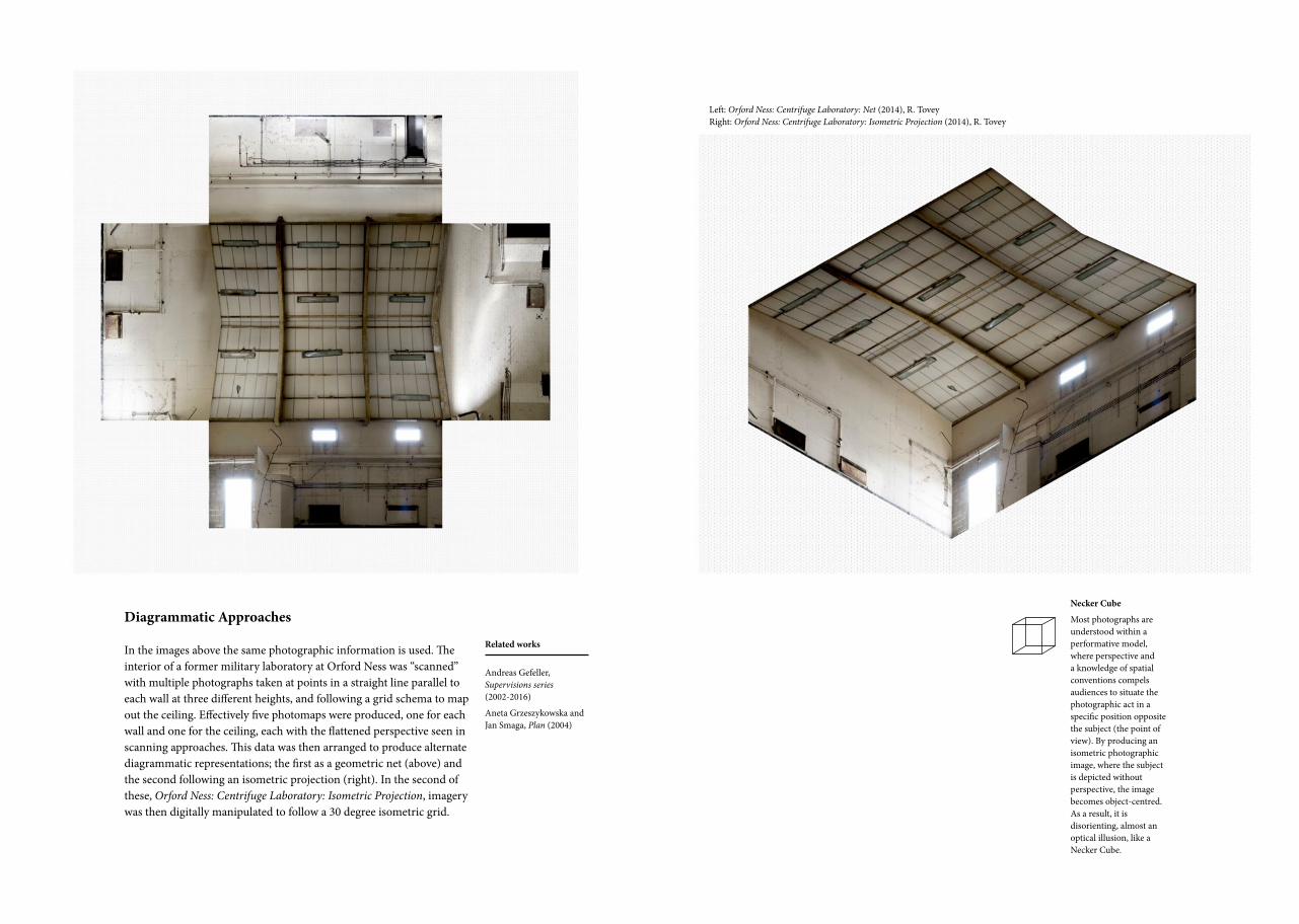
Diagrammatic Approaches
In the images above the same photographic information is used. The interior of a former military laboratory at Orford Ness was “scanned” with multiple photographs taken at points in a straight line parallel to each wall at three different heights, and following a grid schema to map out the ceiling. Effectively five photomaps were produced, one for each wall and one for the ceiling, each with the flattened perspective seen in scanning approaches. This data was then arranged to produce alternate diagrammatic representations; the first as a geometric net (above) and the second following an isometric projection (right). In the second of these, Orford Ness: Centrifuge Laboratory: Isometric Projection, imagery was then digitally manipulated to follow a 30 degree isometric grid.
Necker Cube
Most photographs are understood within a performative model, where perspective and a knowledge of spatial conventions compels audiences to situate the photographic act in a specific position opposite the subject (the point of view). By producing an isometric photographic image, where the subject is depicted without perspective, the image becomes object-centred. As a result, it is disorienting, almost an optical illusion, like a Necker Cube.
Related works
Andreas Gefeller, Supervisions series (2002-2016)
Aneta Grzeszykowska and Jan Smaga, Plan (2004)
Left: Orford Ness: Centrifuge Laboratory: Net (2014), R. Tovey Right: Orford Ness: Centrifuge Laboratory: Isometric Projection (2014), R. Tovey

Peripheral Photography
The technique of photographing a subject from positions around its perimeter has similarities to both diagrammatic approaches and scanning methods. Perspective is distorted, with the point-of-view circling around on itself. Variations in the distance between camera and subject create misalignments between constituent imagery and parallax is a constant factor. The technique is used in a range of niche applications including the archival recording of artifacts in a process known as rollout photography. In this context slit-scan photography is used where the aperture is a thin vertical band which is moved horizontally across the negative as the subject rotates. Rollout photography usually requires the subject to be circular, small and opaque to avoid distortion and repetition. A broader range of approaches are shown here.
Peripheral Tree
In a technique similar to rollout photography, the trunk of a tree is depicted from around its perimeter as a continuous image with minimal distortion.
Orford Ness: Vibration Test Building
Photographs were taken at 45-degree intervals around the perimeter of the subject. Rather than project the imagery in a line like a panorama, the photographic units are oriented relationally. This creates a projection where opposite sides of the building face one another, with the horizon line rotating round from image to image.
St Ives Summer Fairground
A carousel is depicted from points around its perimeter; seven photographs are used with wider crops on the first and last photographs to include the carousel edges. The background has been digitally removed, revealing complex parallax effects.
1
5
2
37
46
Related works
Andrew Davidhazy (various works, 1998-2010)
Michael D Coe and Justin Kerr, Lords of the Underworld. Masterpieces of Classic Maya Ceramics (1978)
Tim Macmillan, Time Slice (1980)
Middle: St Ives Summer Fairground (2014), R. Tovey Top, right: Peripheral Tree (2014), R. Tovey Bottom, right: Orford Ness: Vibration Test Building (2014), R. Tovey

Related works
Gordon Matta-Clark Number 26 + 27 ‘Splitting’ (1975)
Southend Fairground
In the example opposite (left), fairground attrac-tions are depicted from a point-of-view, but arranged as if mapped from above. Scanning and topological ideas are used together, with the horizon line curving and distorting in one continuous image along the path of the subject’s journey.
Topological Rationales
In this final grouping environments are not described as spatial volumes but in terms of the relationships between points. For example, in Alexandre Park Summer Fair (directly above), each of the fairground attractions along one “strip” is depicted as a discrete point, and is arranged next to and opposite the others. Each of the individual attractions has its own local linear perspective. All other visual information is removed isolating the attractions and facilitating their transformation into a network of points. Similarly, in the artwork opposite (crop, right) a journey is depicted from only those moments where the subject is walking. As a result, the movement of vehicles is removed, so that two train platforms become connected by a single train carriage, revealing the experiential reality of a transport network.
Left, top: Southend Fairground (2014), R. Tovey Left, middle: Alexandre Palace Summer Fair (2013), R. Tovey Right: Journey Map (2014), R. Tovey

ACKNOWLEDGEMENTS
This body of practice would not have been possible without the kind support of the Architectural Association, the National Trust, and various fairground owners.
REFERENCES
Ades, D. (1976) Photomontage. London: Thames & Hudson. Baker, G. (2005) Photography’s Expanded Field. October 114 (Fall): 120–40.Costello, D. (2007) After Medium Specificity Chez Fried: Jeff Wall as a Painter; Gerhard Richter as a Photographer. In Photography Theory, ed. J. Elkins, 75–89. New York: Routledge. Felton, N., S. Ehmann and R. Klanten (2016) PhotoViz: Visualizing Information Through Photography. Berlin: Gestalten. Fried, M. (2008) Why Photography Matters As Art As Never Before. New Haven: Yale University Press. Green, D., and J. Lowry, eds. (2005) Stillness and Time: Photography and the Moving Image. Brighton: Photoworks.
BIOGRAPHICAL NOTE
DR ROB TOVEY is a Senior Lecturer in Graphic Design at Coventry University. He is a lead member of the Visual Arts Research Group and a Senior Fellow of the Higher Education Academy. His research investigates photo-composites in the context of information design, mapping and the digital image. He is currently working on funded projects across health, communication design and photography alongside writingvarious publications. His practice has won and been short-listed for awards including The Searle Prize, Fresh Awards, D&AD, Digital Innovation Awards and the George Jackson Prize.
Address: Coventry UniversityPriory Street, Coventry, UK, CV1 5FB
Email: [email protected]


![[K.S. Elliott, A.K. Tovey, Kim S. Elliot] Precast (BookZZ.org)](https://static.fdocuments.in/doc/165x107/577cc7071a28aba7119fcee3/ks-elliott-ak-tovey-kim-s-elliot-precast-bookzzorg.jpg)