
ViewBuilder v6.5 Helpdms.hvacpartners.com/docs/1000/Public/06/11-808-556-01.pdf · A member of the...
152
V V i i e e w w B B u u i i l l d d e e r r v v 6 6 . . 5 5 H H e e l l p p CARRIER CORPORATION ©2016 A member of the United Technologies Corporation family · Stock symbol UTX · Catalog No. 11-808-556-01 · 5/9/2016
Transcript of ViewBuilder v6.5 Helpdms.hvacpartners.com/docs/1000/Public/06/11-808-556-01.pdf · A member of the...

VViieewwBBuuiillddeerr vv66..55 HHeellpp
CARRIER CORPORATION ©2016 A member of the United Technologies Corporation family · Stock symbol UTX · Catalog No. 11-808-556-01 · 5/9/2016

Verify that you have the most current version of this document from www.hvacpartners.com or your local Carrier office.
Important changes are listed in Document revision history at the end of this document.
CARRIER CORPORATION © 2016. All rights reserved throughout the world. i-Vu is a registered trademark of Carrier Corporation. BACnet is a registered trademark of ASHRAE. All other trademarks are the property of their respective owners.
The contents of this guide and the associated Carrier software are property of Carrier Corporation and its respective licensors, and are protected by copyright. For more information on the software and licensing, see the About section in the software's Help menu.
The content of this guide is furnished for informational use only and is subject to change without notice. Carrier Corporation assumes no responsibility or liability for any errors or inaccuracies that may appear in the informational content contained in this guide. This document contains no technical data controlled by the EAR or ITAR.

Contents What is ViewBuilder?................................................................................................................................................... 1 What's new in ViewBuilder v6.5 ................................................................................................................................. 2 Working with graphics ................................................................................................................................................. 3
Getting to know ViewBuilder's Graphics interface .......................................................................................... 3 To select objects.................................................................................................................................... 4 To move objects .................................................................................................................................... 4 To align, group, or layer objects............................................................................................................ 4 To copy an object .................................................................................................................................. 5 To lock or unlock objects ...................................................................................................................... 5 To undo or redo actions ........................................................................................................................ 5
Editing a graphic ................................................................................................................................................... 5 To edit a graphic from the i-Vu® application in ViewBuilder .............................................................. 6 To upload a graphic in the i-Vu® interface .......................................................................................... 6
Creating a graphic ................................................................................................................................................ 7 To change the graphic size ................................................................................................................... 7 To change a graphic’s background color ............................................................................................. 8
Working with images on a graphic .................................................................................................................... 8 To add an image to your graphic .......................................................................................................... 8 To resize an image ................................................................................................................................ 9 Editing an image in a graphic ............................................................................................................... 9
Creating a CCN Universal or Comfort Controller graphic ................................................................................ 9 To map points from custom equipment files ....................................................................................... 9
Working with graphic controls ......................................................................................................................... 10 To add a control................................................................................................................................... 10 Controls and their properties .............................................................................................................. 11 To use an Equipment Color control .................................................................................................... 22 To add variable color to a text control ................................................................................................ 22 To use variable color expressions for gauges.................................................................................... 23 To set a control to enable/disable ..................................................................................................... 23
Working with symbols on a graphic ................................................................................................................ 24 To add a symbol to your graphic ........................................................................................................ 24 To create a symbol in ViewBuilder ..................................................................................................... 24
Working with tables on a graphic ................................................................................................................... 25 To add a table ...................................................................................................................................... 25 To add text to a table .......................................................................................................................... 25 To add a control to a table cell ........................................................................................................... 25 Using the Table Editor ......................................................................................................................... 26
Working with gauges on a graphic ................................................................................................................. 27 Working with Linear Gauges ............................................................................................................... 27 Working with Angular Gauges ............................................................................................................. 31
Working with layers on a graphic .................................................................................................................... 34 To show/hide a layer in the i-Vu® interface ...................................................................................... 35
Drawing lines and shapes on a graphic ......................................................................................................... 35 To define drawing attributes ............................................................................................................... 35 To draw a line ...................................................................................................................................... 36 To draw a polygon ............................................................................................................................... 36 To draw a rectangle, square, ellipse, or circle ................................................................................... 36 To resize or reshape a drawing .......................................................................................................... 36
Adding links to a graphic .................................................................................................................................. 37 To add a link ........................................................................................................................................ 37 To add a link to an external file .......................................................................................................... 38 To add a link to a i-Vu® add-on .......................................................................................................... 39

Contents
Setting objects on a graphic to show/hide in the i-Vu® interface ............................................................. 39 To set an image or control to show/hide ........................................................................................... 39 To set a table row to show/hide ......................................................................................................... 40
Finding and replacing text ................................................................................................................................ 40 Editing an image in a graphic .......................................................................................................................... 41
To export an image .............................................................................................................................. 41 Advanced topics ................................................................................................................................................. 42
Miscellaneous ViewBuilder menu commands and features ............................................................ 42 Defining i-Vu® paths ........................................................................................................................... 42
Absolute path............................................................................................................................ 42 Relative path ............................................................................................................................. 43 To have ViewBuilder write microblock path ............................................................................ 43 Determining a path or microblock property ............................................................................ 44
Conditional expressions in a graphic ................................................................................................. 45 Show/hide or enable/disable expressions ............................................................................. 46 Variable color expressions ....................................................................................................... 46 Variable text expressions ......................................................................................................... 48 Combining expressions ............................................................................................................ 49 Operators .................................................................................................................................. 49
Using local variables ........................................................................................................................... 51 To set objects to show/hide based on radio button selection .............................................. 51 To set an object to show/hide based on toggle button selection ......................................... 53 To use a local variable to test the setup of a control ............................................................. 55
Troubleshooting graphics ................................................................................................................... 56 To find an expression or path in ViewBuilder ......................................................................... 56 Error: Cannot be evaluated ..................................................................................................... 57 Error: Path is invalid ................................................................................................................ 57 Error: Wrong data type ............................................................................................................ 58 Error: Set definition for location not found ............................................................................ 58 Error: PrimitiveExpr - Cannot evaluate expression ................................................................ 59
Language features for i-Vu® Pro only ................................................................................................ 59 Creating a non-English graphic in ViewBuilder ....................................................................... 59
Working with Equipment Touch screens ................................................................................................................. 62 Getting to know ViewBuilder's Equipment Touch interface ........................................................................ 63
To move objects .................................................................................................................................. 63 To align, group, and layer objects....................................................................................................... 64 To copy an object ................................................................................................................................ 64 To lock or unlock controls ................................................................................................................... 64 To undo or redo actions ...................................................................................................................... 64
Creating a new Equipment Touch screen file or open an existing file ...................................................... 65 Equipment Touch screen types .......................................................................................................... 65 To customize the Home screen .......................................................................................................... 67 To create additional screens .............................................................................................................. 68 To add navigation ................................................................................................................................ 68 To save, assign, and download the touchscreen file ........................................................................ 68
Adding controls to Equipment Touch screens ............................................................................................... 69 Equipment Touch screen controls and their properties............................................................................... 69
Text and images on Equipment Touch screens ................................................................................. 71 Text ............................................................................................................................................ 72 Images ...................................................................................................................................... 73 Conditional items in a list ........................................................................................................ 73
Number control on Equipment Touch screens .................................................................................. 74 Duration control on Equipment Touch screens ................................................................................. 75 Linked button on Equipment Touch screens ..................................................................................... 75 On-Off-Auto control on Equipment Touch screens ............................................................................ 76

Contents
Timed Local Override control on Equipment Touch screens ............................................................ 76 Checkbox control on Equipment Touch screens ............................................................................... 77 Time control on Equipment Touch screens ....................................................................................... 77 Text Toggle control on Equipment Touch screens ............................................................................. 78 View Port on Equipment Touch screens ............................................................................................ 79
To add a View Port .................................................................................................................... 80 To navigate in the View Port window ....................................................................................... 80 To customize a View Port ......................................................................................................... 80
Setpoint control on Equipment Touch screens ................................................................................. 80 Radio buttons on Equipment Touch screens..................................................................................... 81 Date control on Equipment Touch screens ....................................................................................... 81 Multi-State control on Equipment Touch screens ............................................................................. 82 Working with tables on Equipment Touch screens ........................................................................... 83
To add a table ........................................................................................................................... 83 To add a control to a table cell ................................................................................................ 84 To align objects in a table ........................................................................................................ 85 To hide objects in a table ......................................................................................................... 85
Primary Value control on Equipment Touch screens ........................................................................ 86 Linking Equipment Touch screens .................................................................................................................. 86 Defining paths for the touchscreen ................................................................................................................ 86
To define paths for .touch file ............................................................................................................. 87 Setting items on an Equipment Touch to show/hide .................................................................................. 87
To set items to show/hide .................................................................................................................. 88 To add a condition to an Equipment Touch screen file..................................................................... 88 To edit a show/hide condition ............................................................................................................ 89 To remove a condition from a control ................................................................................................ 89 Operators ............................................................................................................................................. 89
Password-protecting an Equipment Touch .................................................................................................... 90 To allow password management on a touchscreen .......................................................................... 92 To lock passwords on a touchscreen ................................................................................................. 92
Setting up alarms for Equipment Touch devices .......................................................................................... 92 Creating non-English Equipment Touch screens .......................................................................................... 93
To add non-English text in the ViewBuilder interface ........................................................................ 93 To export/import language files ......................................................................................................... 94
Working with System Touch screens ....................................................................................................................... 95 Getting to know ViewBuilder's System Touch interface .............................................................................. 96
To move objects .................................................................................................................................. 96 To align, group, and layer objects....................................................................................................... 97 To copy an object ................................................................................................................................ 97 To lock or unlock controls ................................................................................................................... 97 To undo or redo actions ...................................................................................................................... 97
Creating a new System Touch screen file or open an existing file ............................................................ 98 System Touch screen types ................................................................................................................ 98 To customize the Home screen ....................................................................................................... 100 To create additional screens ........................................................................................................... 101 To add navigation ............................................................................................................................. 101
Adding controls to System Touch screens ................................................................................................... 101 System Touch screen controls and their properties ................................................................................... 102
Text and images on System Touch screens ................................................................................... 104 Text ......................................................................................................................................... 104 Images ................................................................................................................................... 105 Conditional items in a list ..................................................................................................... 106
Number control on System Touch screens ..................................................................................... 106 Text Toggle control on System Touch screens................................................................................ 107 View Port on System Touch screens ............................................................................................... 108

Contents
To add a View Port ................................................................................................................. 109 To navigate in the View Port window .................................................................................... 109 To customize a View Port ...................................................................................................... 109
Checkbox control on System Touch screens .................................................................................. 110 Time control on System Touch screens .......................................................................................... 110 Multi-State control on System Touch screens ................................................................................ 111 Working with tables on System Touch screens .............................................................................. 111
To add a table ........................................................................................................................ 112 To add a control to a table cell ............................................................................................. 112 To align objects in a table ..................................................................................................... 113 To hide objects in a table ...................................................................................................... 113
Radio buttons on System Touch screens ....................................................................................... 114 Date control on System Touch screens .......................................................................................... 114 Linked button control on System Touch ......................................................................................... 115 Primary Value control on System Touch screens ........................................................................... 116
Linking System Touch screens ...................................................................................................................... 116 Defining paths for a System Touch screen .................................................................................................. 117
To define paths for .stv file .............................................................................................................. 117 Setting items on a System Touch to show/hide ......................................................................................... 118
To set items to show/hide ............................................................................................................... 118 To add a condition to a System Touch screenfile........................................................................... 119 To edit a show/hide condition ......................................................................................................... 119 To remove a condition from a control ............................................................................................. 119 Operators .......................................................................................................................................... 120
Password-protecting a System Touch .......................................................................................................... 120 To allow password management on a touchscreen ....................................................................... 122 To lock passwords on a touchscreen .............................................................................................. 123
Creating a non-English System Touch screen ............................................................................................. 123 To add non-English text in the ViewBuilder interface ..................................................................... 123 To export/import language files ...................................................................................................... 124
Working with BACview® screens .......................................................................................................................... 126 Getting to know ViewBuilder's BACview® interface .................................................................................. 127
To move the cursor in a screen ....................................................................................................... 128 To add lines to a screen ................................................................................................................... 128 To select or move objects ................................................................................................................ 128 To copy an object ............................................................................................................................. 129 To undo or redo actions ................................................................................................................... 129
To create a new BACview® file or open an existing file ............................................................................ 129 Making BACview® screens ............................................................................................................................ 130
Default screens ................................................................................................................................ 130 To add new screens ......................................................................................................................... 132
Adding text, controls, headers, and footers to BACview® screens .......................................................... 133 To add text ........................................................................................................................................ 133 To add a BACview control ................................................................................................................ 133 BACview controls and their properties ............................................................................................ 133 To have ViewBuilder insert object names ....................................................................................... 135 To add headers and footers ............................................................................................................ 135
Setting items on a BACview screen to show/hide ..................................................................................... 136 To set items to show/hide ............................................................................................................... 136 To edit or remove a show/hide condition ....................................................................................... 137
Adding navigation to BACview® screens ..................................................................................................... 137 To add a link ..................................................................................................................................... 138 To add a softkey link ........................................................................................................................ 138 To assign a hotkey to a screen ........................................................................................................ 139 To test the navigation ...................................................................................................................... 139

Contents
Password-protecting a BACview® screen .................................................................................................... 140 To create the Admin password ........................................................................................................ 140 To create the User password ........................................................................................................... 140
Setting up alarms for a BACview® device ................................................................................................... 140 To save, assign, and download the BACview® file ..................................................................................... 141
Document revision history ..................................................................................................................................... 142


ViewBuilder v6.5 Carrier Proprietary and Confidential CARRIER CORPORATION ©2016 Help All rights reserved 1
ViewBuilder is a tool used as an adjunct to create graphics and drawings that i-Vu® does not already have in its Library, or to change existing graphic views. Operators can use these graphics to monitor and control their building automation system.
You can also:
• Create Equipment Touch screens (page 62). An Equipment Touch is an interactive device that you can attach to a controller to view or change its property values or its real-time clock without having to access the system's server.
or Create System Touch screens (page 95). A System Touch is an interactive device that can act as a front-end interface to controllers on a BACnet network.
• Create BACview® screens (page 126). A BACview device is a combination keypad/display that you can attach to a controller to view or change its property values or its real-time clock without having to access the system's server.
What is ViewBuilder?

What's new in ViewBuilder v6.5
ViewBuilder v6.5 Carrier Proprietary and Confidential CARRIER CORPORATION ©2016 Help All rights reserved 2
Feature Improvement
New in v6.5:
New Linear and Angular Gauge controls (page 27)
You can now quickly and easily create and configure a linear or angular Gauge.
System Touch screens (page 95)
You can create a custom interface for the System Touch, an interactive device that can act as a front-end interface to controllers on a BACnet network.
Layers (page 34) You can now create a graphic in layers. This allows you to turn off or lock a layer in ViewBuilder to simplify the workspace. You can also show or hide a layer's objects in i-Vu® based on a single microblock's value.
Table fill color and border style (page 26)
You can define a fill color for the entire table, and a style (squared or rounded) for the table border.
Local variables (page 51) You can use variables in conditional expressions to make various controls react to user interaction in i-Vu®. You can also use local variables to test your graphic.
Export/Import language files for Equipment Touch and System Touch screens (page 93)
You can now create screens in one language, export a language file containing the text, translate the file into one or more languages, and then import the new language files back into ViewBuilder.
For i-Vu® Pro only:
Non-English graphics (page 59) You can now create a single graphic for multiple languages. In i-Vu®, the graphic will display the operator's language defined on the My Settings page.
What's new in ViewBuilder v6.5

ViewBuilder v6.5 Carrier Proprietary and Confidential CARRIER CORPORATION ©2016 Help All rights reserved 3
Although Carrier provides graphics for i-Vu® systems, you can use ViewBuilder to edit existing graphics (page 5) or create new graphics (page 7).
Getting to know ViewBuilder's Graphics interface
Working with graphics

Working with graphics
ViewBuilder v6.5 Carrier Proprietary and Confidential CARRIER CORPORATION ©2016 Help All rights reserved 4
TIPS
• ViewBuilder has a right-click menu that includes keyboard shortcuts for most commands.
• To show or hide the Tools , Control Properties , or System windows, click the toolbar button that matches the window's icon.
• To make the Tools, Control Properties, and System windows fade to transparent when not in use, select Configure > Preferences > Application.
• Hold down the space bar and the left mouse button, then move the graphic around in the workspace using the hand tool.
• Press Home on the keyboard to align the top left corner of the graphic with the top left corner of the workspace.
• Hold down F9 to hide all handles and lock icons.
To select objects
You must select an object to perform any action on it.
• To select a single object, click it.
• To select multiple objects, hold down Shift while you click them. Or, click and drag a rectangle around the objects, then release the mouse button.
• To select every object, select Edit > Select All.
• To clear all selections, select Edit > Deselect All.
• To deselect a single object from a group of selected objects, hold down Ctrl as you click the object.
To move objects
To move a selected object(s):
• Click and drag the object to the new location. Hold down Shift as you drag an object to constrain its movement to horizontal or vertical.
• Use the arrow keys to nudge the selected object one pixel at a time, or hold down Shift while using the arrow keys to move the object ten pixels at a time.
• Select Edit > Move to move the object to specific coordinates. The coordinates of the cursor and the selected object are shown at the bottom of ViewBuilder's window.
To align, group, or layer objects
Select the object(s) you want to align, group, ungroup, or arrange (front to back), then use the right-click menu
commands or the options on the tab in the Tools window.
NOTES
• Objects align in relationship to the last selected item, the one with the green handles.
• You can select an individual control in a group to edit its properties in the Control Properties window.
Working with graphics
ViewBuilder v6.5 Carrier Proprietary and Confidential CARRIER CORPORATION ©2016 Help All rights reserved 5
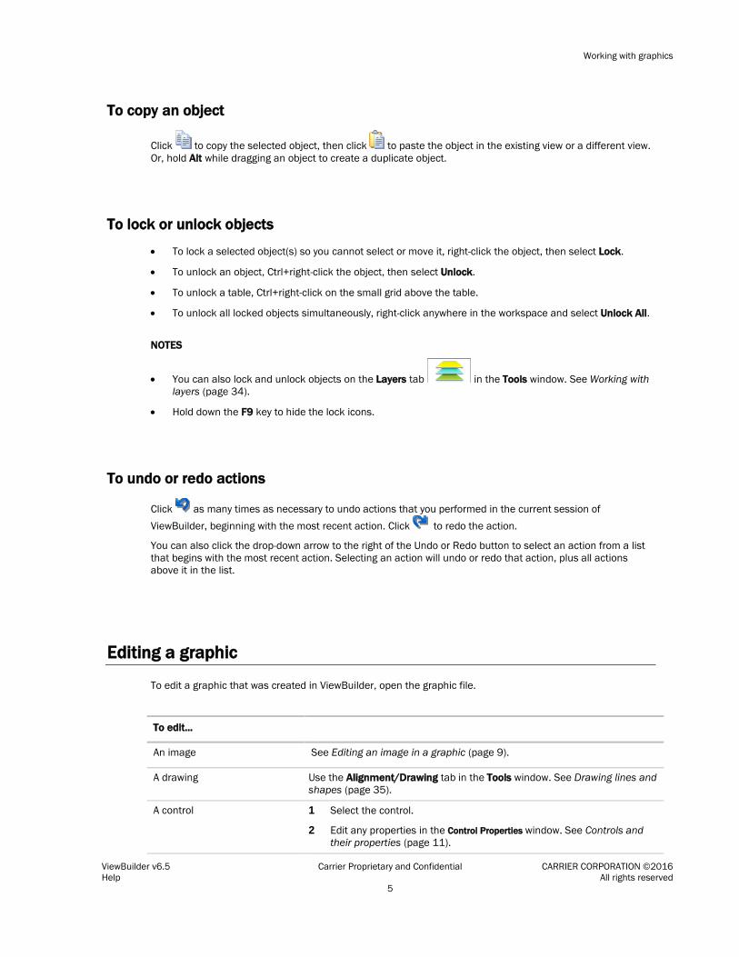
To copy an object
Click to copy the selected object, then click to paste the object in the existing view or a different view. Or, hold Alt while dragging an object to create a duplicate object.
To lock or unlock objects
• To lock a selected object(s) so you cannot select or move it, right-click the object, then select Lock.
• To unlock an object, Ctrl+right-click the object, then select Unlock.
• To unlock a table, Ctrl+right-click on the small grid above the table.
• To unlock all locked objects simultaneously, right-click anywhere in the workspace and select Unlock All.
NOTES
• You can also lock and unlock objects on the Layers tab in the Tools window. See Working with layers (page 34).
• Hold down the F9 key to hide the lock icons.
To undo or redo actions
Click as many times as necessary to undo actions that you performed in the current session of ViewBuilder, beginning with the most recent action. Click to redo the action.
You can also click the drop-down arrow to the right of the Undo or Redo button to select an action from a list that begins with the most recent action. Selecting an action will undo or redo that action, plus all actions above it in the list.
Editing a graphic
To edit a graphic that was created in ViewBuilder, open the graphic file.
To edit...
An image See Editing an image in a graphic (page 9).
A drawing Use the Alignment/Drawing tab in the Tools window. See Drawing lines and shapes (page 35).
A control 1 Select the control.
2 Edit any properties in the Control Properties window. See Controls and their properties (page 11).

Working with graphics
ViewBuilder v6.5 Carrier Proprietary and Confidential CARRIER CORPORATION ©2016 Help All rights reserved 6
A link 1 Right-click the control that is a link.
2 Select Link.
3 Edit the fields in the dialog box as needed. See Adding links (page 37) for a description of each field
A table See Working with tables. (page 25)
To edit a graphic from the i-Vu® application in ViewBuilder
1 In the i-Vu® interface, double-click the controller in the navigation tree or right-click and select Configure.
2 Select appropriate options.
3 Click Edit Existing button under Views.
4 Click Save and place the file in an appropriate folder.
5 Open ViewBuilder.
6 Select File > Open. Browse to your saved graphic and click to open.
7 Edit and save with a new name - the original system name is locked and cannot be used for an edited graphic.
NOTE Names are case sensitive and should not have spaces and/or special characters.
To upload a graphic in the i-Vu® interface
1 Double-click the controller in the navigation tree or right-click and select Configure.
2 Click the Add New button under Views.
3 Browse to your .view graphic file that you created in ViewBuilder.
4 Click Continue.
5 Click Close when message appears File added successfully.
6 Click Close again. The graphic should appear on your i-Vu® screen.
Field Assistant can upload and display multiple graphics (.views) that were downloaded to a controller. However, Field Assistant can only download a single .view to the controller. If you edit one of the .views and download to the controller, you will only download the edited .view. Information for the other .views are removed from the controller. You can reattach and re-download those .views from your i-Vu® system.

Working with graphics
ViewBuilder v6.5 Carrier Proprietary and Confidential CARRIER CORPORATION ©2016 Help All rights reserved 7
Creating a graphic
A graphic can be created to display the status of multiple zones or equipment from a single view. The area or floorplan graphics can be set up with Equipment Color controls to provide a visual representation of the comfort level in each zone.
Values, text, and links can also be added to area and floorplan graphics. Clicking on a link zooms in on an individual zone or individual piece of equipment for closer examination.
To create a graphic:
1 In a graphics program, create any custom images (page 8) such as floorplans.
2 In ViewBuilder, click or File > New and then select Area.
3 Select File > Save As and browse to a convenient location on your computer.
4 Name the .view file.
5 Click Save.
6 Add a beginning image (page 8), such as a duct or floorplan.
CAUTION Keep items within the gray lines that define the graphic size. If the items exceed the gray lines, change the graphic's size (page 7).
7 Add images (page 8), controls (page 10), and symbols (page 24) as needed.
NOTE Use the Equipment Color control to display the temperature in a zone relative to the designated setpoints for that zone.
8 Test your graphic in the i-Vu® interface.
NOTES
• Save your work often.
• To record information about the graphic, select Configure > View Properties, then type your name and comments on the Summary tab. Revision History shows each time the graphic was saved, the computer it was saved on, and the version of ViewBuilder it was saved in.
To change the graphic size
The gray lines in the ViewBuilder interface show the size of the graphic. The default size of a new graphic is 746 x 626 pixels. This size graphic fits in the i-Vu® action pane when the navigation tree is displayed, the screen resolution is set at 1024 x 768, and the web browser is maximized with the toolbars and status bar hidden. A graphic that is 980 x 652 pixels fits the action pane when the tree is hidden.
To change the size of your graphic:

Working with graphics
ViewBuilder v6.5 Carrier Proprietary and Confidential CARRIER CORPORATION ©2016 Help All rights reserved 8
1 Select Configure > View Properties.
2 Under View Size, select the size you want or enter a custom size (in pixels).
NOTE If you enter a size greater than the i-Vu® action pane, i-Vu® will display scroll bars.
3 Click OK.
To change a graphic’s background color
1 Select Configure > View Background Color.
2 Select the color you want.
3 Click OK.
Working with images on a graphic
You can add images, such as floorplans or site maps, to your graphic. In a graphics program, create a floorplan image as a .gif or .png; create any other image as a .gif, .png, or .jpg.
To add an image to your graphic
1 Click the Add Image tab in the Tools window.
2 In the Look in field, browse to the folder that contains the image you want.
TIP Click one of the five buttons at the left of the file list to jump to a location quickly. Hold the cursor over a button to see its destination.
3 Select the image.
4 Click in the workspace to place the image.
TIP You can also double-click a file name in the Tools window to add the image to the workspace.
5 Enter an image in the Mouseover Image field in the Control Properties window if you want the i-Vu® interface to display a different image when the cursor is over the image.
NOTE The mouseover image must be the same size as the other image.
NOTES
• To add the image multiple times, select the image, then Shift+click the workspace for each image.
• To set an image to show or hide in the i-Vu® interface based on the value of a microblock property, see Setting objects on a graphic to to show/hide in the i-Vu® interface (page 39).
• To make an image link to another page in the i-Vu® interface or to the Internet, see Adding links to a graphic (page 37).
Working with graphics
ViewBuilder v6.5 Carrier Proprietary and Confidential CARRIER CORPORATION ©2016 Help All rights reserved 9
To resize an image
To resize an image, you can type the desired Width and Height (in pixels) in the Control Properties window or do the following:
1 Select a single, ungrouped image.
2 Click and drag one of the green handles.
NOTE Hold down the Shift key as you drag to maintain the image's proportions.
Editing an image in a graphic
1 Edit the original image (.gif, .png, or .jpg) in a graphics program.
2 If the image in your graphic has no functionality in ViewBuilder, such as linking, delete the image, then add the revised image.
3 If the image has functionality in ViewBuilder that you want to retain, follow the procedure in To add an image (page 8).
Creating a CCN Universal or Comfort Controller graphic
A graphic can be created to display links to the points in your Universal or Comfort Controller. An image that you create can also be added. Add as many points as you would like to connect to.
To create a graphic for your Universal or Comfort Controller:
1 In ViewBuilder, click to start a new graphic file.
2 Place images, symbols, drawings, and controls.
3 Save the file as a .view in a folder you will remember or place on your desktop.
NOTE Save your work often.
4 See the following section to map the points.
NOTE To record information about the graphic, select Configure > View Properties, then type your name and comments on the Summary tab. Revision History shows each time the graphic was saved and the workstation it was saved on.
To map points from custom equipment files
1 Use EquipmentBuilder to make your custom equipment file. Save the file in a convenient folder.
2 Open ViewBuilder and prepare your graphic.
3 If you do not already see the System window, click on the toolbar.
4 Click next to Equipment File.
5 Browse to the .equip file that you made in EquipmentBuilder, then click Select, and Next. You will see a list of the points that you mapped in EquipmentBuilder.

Working with graphics
ViewBuilder v6.5 Carrier Proprietary and Confidential CARRIER CORPORATION ©2016 Help All rights reserved 10
6 Select the item whose path you want.
7 Open the Control Properties window by selecting Window > Control Properties.
8 Right-click the Microblock Path field in a Control Properties window, then click on Set Microblock Path Expression.
9 Click Show Prime Variable to display that value on your graphic. (If using an Equipment Color control, select a large oval.)
Working with graphic controls
You can add controls to a graphic that can retrieve and allow editing of data in the system’s controllers, for example, status values, the date and time, trend graphs, or setpoint graphs.
NOTES
• To set a control to show or hide in the i-Vu® interface based on the value of a microblock property, see Setting objects on a graphic to show/hide in i-Vu® interface (page 39).
• To make some controls link to other pages in the i-Vu® interface or to the Internet, see Adding links to a graphic (page 37).
• Hold down F8 to see an indicator beside all controls that need to have a microblock path defined in the Control Properties window.
To add a control
1 Click the Add Control tab in the Tools window.
2 Select the control you want to add. See Controls and their properties (page 11) for a description of each control.
3 Click in the workspace where you want to add the control.
NOTE To cancel the action, press Esc before clicking the workspace.
4 Edit properties for the control in the Control Properties window. See Controls and their properties (page 11).
5 Click anywhere in the workspace to apply the properties.
TIPS
• To add a control multiple times, select the control, then press Shift+click the workspace for each copy.
• Hold Alt while dragging a control to create a copy of it.

Working with graphics
ViewBuilder v6.5 Carrier Proprietary and Confidential CARRIER CORPORATION ©2016 Help All rights reserved 11
Controls and their properties
When you add a control to a graphic, you define properties in the Control Properties window to define what data the control will retrieve or how the control will behave in the i-Vu® interface. Most controls have the following three properties.
Microblock Path The path to the microblock you want the control to read from or write to. You can determine the path yourself (page 44).
NOTES • If this field is outlined in red, you entered invalid syntax or characters. • See Defining i-Vu® paths (page 42) for more information on paths.
Property The microblock property you want to read from or write to. Click the down arrow to select a common property (usually present_value) or type the property you want. Editable microblocks usually require the relinquish_default property. See Microblock Reference help for a complete list of properties.
Editable Check to make the control editable in the i-Vu® interface. The microblock must have editable properties.
The following table lists all the controls you can add to a graphic and any other properties besides the three described above.
Use this control... To... Properties
Static Text Display text that
does not change. Example: A description of a control
Text—The text you want the control to display in the i-Vu® interface.
Single-line Text
Display text from the character string field in a microblock. Example: Point name
Preview Text—Text that is displayed only in ViewBuilder to help you place the control. Type the preview text or select from the drop-down list.
NOTE To display the Notes defined in the i-Vu® application for an area or piece of equipment, enter the path to the area or piece of equipment in the Microblock Path field, then type .notations in the Property field.
Multi-line Text
Place a multi-line text box on a page. Example: Long text of an alarm
Wrap text—Wraps text from line to line inside the text area box.
Provide Scrolling—Includes scrollbars.
Visible Row Count—The number of rows the text area will display.
Visible Column Count—The estimated number of characters a row will display. This estimate helps you avoid overlapping other page elements when positioning the control in ViewBuilder.

Working with graphics
ViewBuilder v6.5 Carrier Proprietary and Confidential CARRIER CORPORATION ©2016 Help All rights reserved 12
Use this control... To... Properties
Text Toggle Display active and inactive text values for a binary microblock. When editable, can be toggled between multiple states by clicking on it. Example: Chiller is enabled or disabled
Preview Text—Text that is displayed only in ViewBuilder to help you place the control. Type the preview text or select from the drop-down list.
Droplist Display the text
values for BACnet multi-state microblocks. A droplist can also display the active and inactive text values for a binary microblock. When editable, appears as a droplist with multiple options. Example: Units of measure (°F)
Preview Text—Text that is displayed only in ViewBuilder to help you place the control. Type the preview text or select from the drop-down list.
The fields on this tab provide a method of substituting the microblock property values with different text. For example, display Yes/No in the droplist instead of the On/Off values defined in the Snap application.
Toggle Button Display two different images to represent the on and off states of a microblock property. Example: The control reads a fan status value, then displays a static image of a fan to indicate the fan is off and an animated image to indicate it is on.
Images—To use images other than a checkbox, click to locate the On and Off image files.
If you want to display custom images for the following conditions,
click to locate the image.
Mouseover Image—The image to be displayed when the cursor is over the button to indicate a clickable link.
Pressed Images—The images to be displayed when the cursor is on the button and the mouse button is pressed down, but not yet released.
Disabled Images—The images to be displayed when buttons are not editable.

Working with graphics
ViewBuilder v6.5 Carrier Proprietary and Confidential CARRIER CORPORATION ©2016 Help All rights reserved 13
Use this control... To... Properties
Number Display any numerical value from an analog microblock. Example: Zone temperature
Max Right Digits—The maximum number of digits to be displayed to the right of the decimal. Type 0 to display whole numbers.
Min Left Digits—The minimum number of digits to be displayed to the left of the decimal (usually 1).
Expected Left Digits—The number of digits that might appear to the left of the decimal. These digits are only displayed in ViewBuilder to help you position the control.
Create Units Control—Adds a Droplist control to the right of the Number control. The microblock must have a units field that identifies the number (for example, RPM). The Microblock Path is the same as the Number control. Type or select a Preview Text option. This text is only displayed in ViewBuilder to help you place the control.
Scaling Factor—To display a microblock property value in a different format, type the necessary multiplication factor. For example, to display watts as kilowatts, type .001 in this field.
Show plus sign—Displays a plus sign when the value is positive.
NOTE You can use the Number control to display the number of alarms pending a return-to-normal state for an area or equipment. To do this, enter the path to the area or equipment in the Microblock Path field, then type .alarm_count in the Property field.
Image List Show various states
of an analog microblock using images. Example: A closed damper is shown when the analog value is 0; a half-open damper is shown when the value equals 50; and a fully open damper is shown when the analog values equals 100.
Default Image—Click to locate the image you want the control to display when a communication problem or error occurs. Use a different image from the others in the image list so that the i-Vu® operator will know when an error occurs. For example, some
symbols that use image lists have default images with in the center of the image.
Click to add the images the control displays under normal
conditions. Use and to reorder the list. Click to delete an image from the list.
Expression—Enter an expression for each image (except the default image) to define the condition for displaying the image. See Conditional expressions (page 45). When the graphic is displayed in the i-Vu® interface, each expression is evaluated in the order of your list and the first image whose expression returns true is displayed. If no expression returns true, the default image is displayed.

Working with graphics
ViewBuilder v6.5 Carrier Proprietary and Confidential CARRIER CORPORATION ©2016 Help All rights reserved 14
Use this control... To... Properties
Slider Display a horizontal
or vertical slider bar that can be used to adjust an editable point. Example: Editing a setpoint
Display Orientation—Displays the slider horizontally or vertically.
Minimum Value—The minimum value on the slider.
Maximum Value—The maximum value on the slider.
Tick Interval—The number of units from one tick to another. NOTE To have the slider divisions appear correctly, the slider range (maximum value minus minimum value) should be evenly divisible by the tick interval.
Slide By This Increment—The number of units the slider jumps when you move it.
To use custom images for the slider, click to locate the image files.
Date Display a date,
typically read from a History microblock. Example: Date of the highest zone temperature
Show day of week—Adds the day to the right of the date.
NOTE To display a controller's current date on:
• the equipment graphic, type ~device/driver/device/local_date in the Microblock Path field.
• an area graphic, type <equipment_ref_name>/~device/driver/device/local_date in the Microblock Path field.
In either case, delete the text in the Property field.
Working with graphics
ViewBuilder v6.5 Carrier Proprietary and Confidential CARRIER CORPORATION ©2016 Help All rights reserved 15
Use this control... To... Properties
Time Display a time of day,
typically read from a History or Wire Lock microblock. Example: Time of the day's highest temperature
Display Format—Choose how to display time.
NOTE To display a controller's current time on:
• the equipment graphic, type ~device/driver/device/local_time in the Microblock Path field.
• an area graphic, type <equipment_ref_name>/~device/driver/device/local_time in the Microblock Path field.
In either case, delete the text in the Property field.
Duration Display a time period. Example: Override time remaining
Select the microblock value's unit in the Microblock Unit field.
Check Show Hours and Show Seconds to display these with the minutes.
NOTES
• The Duration control must reference an analog value.
• This control's Microblock Unit must match the unit of the microblock value.
• Digital and analog wirelock microblocks output a value in milliseconds.
Trend Graph Place a BACnet trend
on a graphics page. Example: Trend graph of zone temperature
Trend location—To add a point or wire trend graph, type the microblock path. To add a trend graph that shows multiple points, type the reference name of the graph. To find the reference name, navigate to the graph in the i-Vu® interface, then click the Configure tab. The reference name appears at the top of the page.
Panel Serve as a backdrop
for other objects. Move the handles to adjust the shape of the panel.
Table Align multiple
controls in rows and columns. Example: Fan status table
See Working with tables on a graphic (page 25).

Working with graphics
ViewBuilder v6.5 Carrier Proprietary and Confidential CARRIER CORPORATION ©2016 Help All rights reserved 16
Flow Layout Add text, controls, or
images to a resizable container that wraps the objects to fit the container.
To add content to the Flow Layout control:
• Double-click it to type text. NOTE Press Esc to exit the control without saving the text.
• Drag and drop other controls or images into it. NOTE You cannot insert a Panel, Table, HTML, or another Flow Layout control.
Click and drag the Flow Layout's handles to resize it.
Use the options in the Control Properties window to: • Align the contents in the Flow Layout control • Wrap the text • Change the border's thickness • Change the border or background color
On-Off-Auto Provide a method to
lock a piece of equipment on, lock it off, or let the control program control it (Auto). Example: To control fans or pumps
Microblock Path—Type the path in this field only if this control is to read one microblock.
Type: Select... To display...
Dial
Vertical Panel
Horizontal Panel
Order—Select the order of the control labels. The order is left to right for Dial and Horizontal Panel, or top to bottom for Vertical Panel.
Use State Text—Check to use the binary microblock's Active text and Inactive text instead of the control's defaults.
Use Advanced Path—Check if you want this control to read two microblocks, one for Auto and one for On/Off (Hand/Off). Enter the microblocks in the following fields.
Automatic Microblock Path and Property—The microblock that contains the Auto values.
Manual Microblock Path and Property—The microblock that contains the On/Off values.

Working with graphics
ViewBuilder v6.5 Carrier Proprietary and Confidential CARRIER CORPORATION ©2016 Help All rights reserved 17
Radio Button A set of radio buttons
provide a method to view or edit the various states of a microblock property. Example: Manual and Auto
Enter the same Microblock path and Property for each radio button in the set.
Radio Button Value—If the button is not editable, type the value that will turn the button on. If the button is editable, type the value that the property will change to if an operator selects the button.
For an analog microblock, type the specific value the button is to represent.
For a binary microblock, type true or 1 (depending on the property) for one button's value and false or 0 for the other button's value.
The remaining fields for this control are the same as those for the Toggle Button.
Setpoint Provide a method to view or edit setpoints.
Setpoint Type— The control's appearance depends on the following:
Select... To display...
Actual Occupied and unoccupied setpoints programmed into the setpoint microblock.
In ViewBuilder, you see
In the i-Vu® interface, you see
Effective Effects of factors such as overrides, adjustments, and hysteresis.
In ViewBuilder, you see
In the i-Vu® interface, you see
Interactive Zone Sensor
Provide a method to adjust or override a setpoint.
Zone Sensor Type—Select whether the image is to be an SPT Sensor or ZS Sensor. The control in the workspace will show your selection.
BACnet Object ID
Place a BACnet object ID on a graphics page.
Instance Number Only—Check to allow an operator to edit only the instance number of the BACnet object ID on a graphic.
Working with graphics
ViewBuilder v6.5 Carrier Proprietary and Confidential CARRIER CORPORATION ©2016 Help All rights reserved 18
HTML Add any Standards- compliant HTML to the graphic. For example, to embed a: • Video • Flash movie • Flash application • Live video feed from security cameras
Move the handles to adjust the shape of the HTML control.
Preview Image—Click to locate an image that will display only in ViewBuilder.
Insert HTML—Enter any HTML and resource file references that are acceptable within the HTML <body> tag. Add any resource file on the Resources tab. In the HTML, type the file path as resources/<filename.extension>.
Click to add files to the Resources list. Click to delete files from the list.
To embed a video, see http://www.w3schools.com/html/html5_videos.asp.
To embed Flash files, see http://www.w3schools.com/tags/tag_embed.asp.
To embed live video feed from security cameras, see the camera system's manual.
Add-on Content
Add content from a i-Vu® add-on application to a graphic
Add-on Name—Get this from the i-Vu® interface on the System Options or System Settings > Add-ons tab. Use value in the Path column, minus the leading /. For example, if the Path column shows /TenantBilling, type TenantBilling in the Add-on Name field.
Content Path—If the add-on's documentation specifies a content path, enter it in this field. Otherwise, leave this field blank.
Location—Where the add-on application will retrieve i-Vu® data. Select:
• Attached if the data will come from the location where the graphic is attached.
• Alternate if the data will come from an alternate location, and then type the path to the alternate location.
Size—Type the desired width and height of the Add-on Content box, or drag its corners to resize it.
Parameters—If the add-on specifies parameters, you can add them as described below. Otherwise, leave this section blank.
1 Click to add a row.
2 Click the Name cell and type the name of the parameter.
3 Click the Value cell, and then type the new value.
NOTE To delete a row, select the row, and then click .

Working with graphics
ViewBuilder v6.5 Carrier Proprietary and Confidential CARRIER CORPORATION ©2016 Help All rights reserved 19
Equipment color
To view the state of the Prime Variable
In i-Vu®, the oval will display colors to indicate the status of the equipment in relation to its prime variable (for example, ideal, warm, occupied, etc.).
Equipment Path - To determine equipment path:
1. Open i-Vu®.
2. Right-click on equipment in navigation tree and click Copy Path.
3. Open ViewBuilder.
4. Paste.
Size - Choose the size of the oval that you wish to appear on your graphic.
Show Prime Variable - Displays the prime variable.
For more information, See To use an Equipment Color control (page 22).

Working with graphics
ViewBuilder v6.5 Carrier Proprietary and Confidential CARRIER CORPORATION ©2016 Help All rights reserved 20
Angular Gauge
Display a circular gauge that graphically shows a value.
The properties of this control are defined below. See Working with Angular Gauges (page 31) for ideas on using this control.
Size—Type the width and then press Enter, or drag the gauge's corners to resize it.
* Minimum and Maximum—Set values for the range that the gauge is to display.
* Tick Increment—If you have Ticks checked under Display Options, enter the number of units between each tick.
Display Options—Check the items that you want the gauge to show.
• If you checked Show Numbers, select the Number Orientation.
• For any other item that you checked, click its color box to select a color.
• * Text Style—Select Automatic to let ViewBuilder determine the font, size, and color of the numbers. To create a different style, select Custom, and then click on the toolbar to choose your options.
NOTES
• beside the Needle or Bar colors indicates that you can create a variable color expression (page 23) that changes the color of the item based on the control's value.
• The gauge will not update in ViewBuilder to show the Tick Increment or Display Options. You will need to view these selections in the i-Vu® interface.
* Check Use Background Color Bands to have the gauge show multiple colors, each color representing a range of values.
* Your selections for these options will not be shown on the gauge in ViewBuilder, but will be shown on the gauge in the i-Vu® interface.

Working with graphics
ViewBuilder v6.5 Carrier Proprietary and Confidential CARRIER CORPORATION ©2016 Help All rights reserved 21
Linear Gauge Display a horizontal or vertical bar that graphically shows a value.
The properties of this control are defined below. See Working with Linear Gauges (page 27) for ideas on using this control.
Orientation—Select Horizonal or Vertical. Check Reverse Axis to switch the direction that the bar grows.
Size—Type the desired width and height, or drag the gauge's corners to resize it.
Minimum and Maximum—Set values for the range that the gauge is to display.
TIP Use the Static Text control to add labels at each end of the gauge.
Tick Increment—If you have Ticks checked under Display Options, enter the number of units between each tick.
Display Options—Check Bar, Gauge Border, Gauge Background, or Ticks to show that item, then click the color box to select a color.
NOTE beside the Bar color indicates that you can create a variable color expression (page 23) that changes the color of the item based on the control's value.
Check Use Background Color Bands to have the gauge show
multiple colors, each color representing a range of values. Click to define the Start-Stop values and color for each color band.
NOTE Click to remove a color.
TIPS
• The symbol library contains preconfigured, commonly used controls. See Working with symbols on a graphic (page 24).
• To change the font color, size, or style for any control that displays alphanumeric characters, right-click the control, then select .
• Several controls let you select an image file that the control will display. To quickly locate an image that
you previously added to your graphic, click , then select the image on the Resources tab. NOTE Use this feature if you need to swap the Off/On images of a control such as the Toggle Button.
• You can enter the full path to a microblock property in the Microblock Path field and then leave the Property field blank. Example of full path: #oa_conditions/oa_humidity/present_value

Working with graphics
ViewBuilder v6.5 Carrier Proprietary and Confidential CARRIER CORPORATION ©2016 Help All rights reserved 22
To use an Equipment Color control
When you add an Equipment Color control to a graphic, you link the oval to the equipment, choose the size of the oval, and select the Prime Variable in the Control Properties window in ViewBuilder. In the i-Vu® interface, the oval will display colors to indicate the status of the equipment (for example, ideal, warm, occupied, etc.).
1 Open i-Vu®.
2 Right-click the controller in the navigation tree and select Copy Path from the drop down menu.
3 Open ViewBuilder. Create a new view or open an existing one.
NOTE To place an Equipment Color control in your graphic, open the Add Control tab in the Tools window. Click the and then click in the view to place it.
4 Open the Control Properties window (Window > Show Control Properties).
5 Paste (Ctrl+V) in the Equipment Path field.
6 Select a large or small oval to appear on your graphic.
NOTE You must choose a large oval to display the Prime Variable.
7 Optional: Check Show Prime Variable to display the prime variable in i-Vu®.
8 Save your view.
9 In i-Vu®, right-click on the site or area in the navigation tree and select Configure from the drop-down menu.
10 Select your view and click Add.
To add variable color to a text control
For any control that displays alphanumeric characters, you can enter an expression that causes the text to change color in the i-Vu® interface based on the value of a microblock property.
1 Select the control.
2 Click on the toolbar.
3 Enter the expression. See Conditional expressions (page 45) and examples below.
NOTE Click a color in the Color Insertion Tool to add its hexadecimal value in the expression.
4 Click OK.
NOTE To remove the conditional expression, delete the text in the Expression field.
EXAMPLES:
To...
Enter the expression...
Add a Text Toggle control that will determine a filter status and show the word Clean in green or Dirty in red
(($filter/present_value$==true)?’#FF0000’:’#00FF00’)
Add a Static Text control that displays red text to indicate an alarm or white text to indicate a normal condition
(($alarm/present_value$==true)?’#FF0000’:’#FFFFFF’)

Working with graphics
ViewBuilder v6.5 Carrier Proprietary and Confidential CARRIER CORPORATION ©2016 Help All rights reserved 23
To use variable color expressions for gauges
You can use variable color expressions to change the color of the following items based on microblock property values: • Linear gauge's bar • Angular gauge's bar or needle
1 Select the gauge.
2 Click on the toolbar.
3 Enter the expression. See Conditional expressions (page 45) and examples below.
NOTE Click a color in the Color Insertion Tool to add its hexadecimal value in the expression.
4 Click OK.
NOTE To remove the conditional expression, delete the text in the Expression field.
EXAMPLES:
To...
Enter the expression...
Add a linear gauge that will display green if the microblock property's value is from 0 to 24, yellow if 25 to 49, orange if 50 to 74, red if greater than 75, or red if less than 0.
$damper/present_value$>=0 ? ($damper/present_value$<25 ? '#00FF00' : ($damper/present_value$<50 ? '#FFFF00' : ($damper/present_value$<75 ? '#FF8800' : '#FF0000')))
To set a control to enable/disable
You can enter a conditional expression that determines whether the i-Vu® interface enables or disables a control based on another control’s microblock property value.
1 Select the control that you want to enable/disable.
2 Click on the toolbar.
3 Enter the expression. See Conditional expressions (page 45) and example below.
4 Select Enable When True or False.
5 Click OK.
NOTE To remove the conditional expression, delete the text in the Expression field.
EXAMPLE:
To...
Enter the expression...
Add an editable Number control after Lock value at: that will be enabled only when
an operator clicks the checkbox
$m006/locked$==true and select Enable when True to enable when true.

Working with graphics
ViewBuilder v6.5 Carrier Proprietary and Confidential CARRIER CORPORATION ©2016 Help All rights reserved 24
TIPS
• You can simultaneously set multiple controls to enable/disable using the same conditional expression.
Each of the controls must have enable/disable capability. Select the controls, then click .
• You can use local variables in conditional expression (page 51) to enable/disable objects.
Working with symbols on a graphic
Symbols are commonly used combinations of images, controls, and text that have been preconfigured and grouped. You can create your own symbols.
To add a symbol to your graphic
1 Click the Add Symbol tab in the Tools window.
2 In the Look in field, browse to the folder that contains the symbol you want.
TIP Click one of the five buttons at the left of the file list to jump to a location quickly. Hold the cursor over a button to see its destination. Click the last button to jump to the symbol library.
3 Select the symbol and then click in the workspace where you want to add the symbol.
TIP You can also double-click a symbol's name in the Tools window to add it to the workspace.
4 In the Control Properties window, edit properties as needed for the individual controls in the symbol.
TIP To add a symbol multiple times, select the symbol, then Shift+click the workspace for each symbol.
To create a symbol in ViewBuilder
1 In ViewBuilder, click , then select Area.
2 Add the objects to the workspace that you want to include in your symbol.
3 Enter control properties, if needed.
4 Select File > Save As.
5 In the Files of type field, select Symbol (*.viewsymbol).
6 Type a File name, then click Save.
TIP When adding a symbol you created, double-click the symbol in the Tools window to have it added at the same location in the workspace that it was in when you created it.

Working with graphics
ViewBuilder v6.5 Carrier Proprietary and Confidential CARRIER CORPORATION ©2016 Help All rights reserved 25
Working with tables on a graphic
You can add a table to a graphic and then add controls or images in the table cells. The table maintains the alignment of the objects in the cells.
To add a table
1 Click the Add Control tab in the Tools window.
2 Select the Table control.
3 Click in the workspace where you want to add the table.
4 Do one of the following: Select Pre-Defined Table, then select the style you want to add. Select Custom Table, then enter the initial number of rows and columns. You can add or delete rows later in the Table Editor (page 26).
5 Click OK.
To add text to a table
Do one of the following:
• Add a static text control in a table cell.
• Double-click a table cell, then type the text. Optional: Double-click the table icon at the top of the table to open the Table Editor, then align the text.
To add a control to a table cell
1 Click the control in the Tools window.
2 Click the cell where you want to add the control.
3 Enter the control’s properties.
NOTE You can add multiple objects to a table cell, then click and drag an object to rearrange them.
TIP To prevent a table from overlapping nearby objects as its content expands in the i-Vu® interface, set preview text or expected digits for each control in the table to be as wide as the widest value the i-Vu® interface might display. Then position your table. Or, set a minimum row height or a minimum column width in the Table Editor.

Working with graphics
ViewBuilder v6.5 Carrier Proprietary and Confidential CARRIER CORPORATION ©2016 Help All rights reserved 26
Using the Table Editor
Use this menu command... To...
Table Align the table. A table can expand or shrink in the i-Vu® interface based on the values in its cells. You can align a table so that the left, right, or center of the table remains in a fixed position, regardless of the cell contents.
Table > Table Attributes • Set a fill color • Set a border thickness, color, and style
TIP To create padding between the contents of a squared table and the edges of the table:
1 Set Border Thickness to the padding depth that you want.
2 Set Border Color and Background Fill Color to the same color.
Table > Use Automatic Column Spacers
Maintain a fixed amount of unused space between each column.
TIP To increase or decrease the amount of space, turn off this option, add a column as a spacer, then set a minimum column width.
Row > Show/Hide Show or hide the selected row in the i-Vu® interface based on the value of a microblock property. See Setting objects on a graphic to show/hide in the i-Vu®'s interface (page 39).
Cell > Cell Attributes • Align the cell contents • Wrap text • Set a fill color • Set a border thickness and color

Working with graphics
ViewBuilder v6.5 Carrier Proprietary and Confidential CARRIER CORPORATION ©2016 Help All rights reserved 27
Working with gauges on a graphic
ViewBuilder has two controls that let you create angular and linear gauges.
Angular gauge Linear gauge
See Controls and their properties (page 11) for help creating a basic gauge.
See the topics below for examples of ways to use these gauges.
Working with Linear Gauges
Below are examples of linear gauges that can be created with ViewBuilder tools and images created in a graphics program.
Gradient gauge
This gradient color effect is achieved by overlaying a semi-transparent gradient image over the basic gauge.
1. Place a linear gauge in ViewBuilder's workspace.
2. In a graphics program, create a semi-transparent gradient image (the example above is 40% visible) with the same dimensions as the gauge.
3. Place the image on top of the gauge. The gauge should show through the transparent gradient.
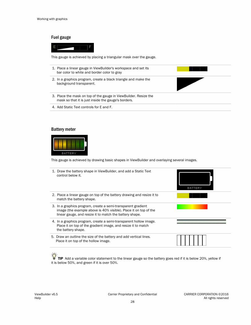
Working with graphics
ViewBuilder v6.5 Carrier Proprietary and Confidential CARRIER CORPORATION ©2016 Help All rights reserved 28
Fuel gauge
This gauge is achieved by placing a triangular mask over the gauge.
1. Place a linear gauge in ViewBuilder's workspace and set its bar color to white and border color to gray
2. In a graphics program, create a black triangle and make the background transparent.
3. Place the mask on top of the gauge in ViewBuilder. Resize the mask so that it is just inside the gauge's borders.
4. Add Static Text controls for E and F.
Battery meter
This gauge is achieved by drawing basic shapes in ViewBuilder and overlaying several images.
1. Draw the battery shape in ViewBuilder, and add a Static Text control below it.
2. Place a linear gauge on top of the battery drawing and resize it to match the battery shape.
3. In a graphics program, create a semi-transparent gradient image (the example above is 40% visible). Place it on top of the linear gauge, and resize it to match the battery shape.
4. In a graphics program, create a semi-transparent hollow image. Place it on top of the gradient image, and resize it to match the battery shape.
5. Draw an outline the size of the battery and add vertical lines. Place it on top of the hollow image.
TIP Add a variable color statement to the linear gauge so the battery goes red if it is below 20%, yellow if it is below 50%, and green if it is over 50%.

Working with graphics
ViewBuilder v6.5 Carrier Proprietary and Confidential CARRIER CORPORATION ©2016 Help All rights reserved 29
Advanced battery meter
This meter is ten vertical gauges inside a battery outline. All point to the same value, but represent different ranges of the value.
1. Place a vertical linear gauge in ViewBuilder's workspace, and then set its properties. Make 10 copies of the control and place them side-by-side.
2. Draw a white rectangle to cover the border of the gauges, and draw a second rectangle to act as the battery terminal.
3. Set the Minimum and Maximum values for the first gauge on the left to 0 to 10, the next gauge's Minimum and Maximum to 11 to 20, and so on. The last gauge will be 91 to 100.
Small battery meter
This small battery gauge is achieved by drawing shapes and using variable color expressions.
1. Place a linear gauge in ViewBuilder's workspace, set its orientation to vertical, and its size to 12 x 25.
2. Draw a white rectangle large enough to have 1 pixel of black between the rectangle and the gauge. Draw a second rectangle to act as the battery terminal.
3. Add a number control for the value and a static text control for %.
Thermometer
This thermometer is achieved by placing a mask over a vertical gauge, and using variable color and show/hide expressions.

Working with graphics
ViewBuilder v6.5 Carrier Proprietary and Confidential CARRIER CORPORATION ©2016 Help All rights reserved 30
1. Place a linear gauge in ViewBuilder's workspace, set its orientation to vertical, and its size to 25 x 100.
2. Create a mask in a graphics program.
3. Place it on top of the gauge in ViewBuilder.
4. Add a number control for the value and a static text control for %.
5. Select the linear gauge and add the following variable color expression to turn the gauge red when it reaches 80 degrees: $ai/present_value$>80?'#FF0000':'#FFFFFF'
6. Add the static text "MELTDOWN WARNING!", and then define the following show/hide expression to show it at 90 degrees: $ai/present_value$>90
Bar graph
This bar chart is achieved by placing individual vertical linear gauges on a background that you can draw in ViewBuilder.

Working with graphics
ViewBuilder v6.5 Carrier Proprietary and Confidential CARRIER CORPORATION ©2016 Help All rights reserved 31
Working with Angular Gauges
Below are examples of angular gauge variations that can be created with ViewBuilder tools and images created in a graphics program.
Gradient bar color EXAMPLE 1
This gradient color effect is achieved by placing a semi-transparent gradient image on top of the basic gauge.
1. Place an angular gauge in ViewBuilder's workspace, and: • Set the Tick Increment to 5. • Set the Number Orientation to Radial. • Keep the remaining default settings.
2. In a graphics program, create a semi-transparent gradient image the same size as the bar.
3. Place the image on top of the gauge. The bar should show through the transparent gradient.
EXAMPLE 2
You can use a thinner overlay so that the gradient and bar color show.

Working with graphics
ViewBuilder v6.5 Carrier Proprietary and Confidential CARRIER CORPORATION ©2016 Help All rights reserved 32
Overlays
The gauges above are achieved by overlaying a semi-transparent image over the basic gauge.
1. Place an angular gauge in ViewBuilder's workspace.
2. In a graphics program, create a semi- transparent image the same size as the gauge.
3. Place the image on top of the gauge. The gauge should show through the transparent gradient.

Working with graphics
ViewBuilder v6.5 Carrier Proprietary and Confidential CARRIER CORPORATION ©2016 Help All rights reserved 33
Glass lens effects You can use the overlays shown below to create different lighting effects.
Bubble
Crescent 1
Crescent 2
Flat lens
Raised lens

Working with graphics
ViewBuilder v6.5 Carrier Proprietary and Confidential CARRIER CORPORATION ©2016 Help All rights reserved 34
Working with layers on a graphic
You can create a graphic with multiple layers. By adding objects to different layers, you can:
• Turn off a layer in ViewBuilder to simplify the workspace.
• Lock a layer so that it's objects cannot be edited or moved.
• Show or hide a layer's objects in the i-Vu® interface based on a single microblock's value.
NOTES
• Locked items cannot be edited or moved.
• To move an object to a different layer, right-click the object, and then select Move To Layer. The status bar at the bottom of the ViewBuilder window shows the layer of the selected object, the one with the green handles.
• If you attempt to delete a layer that contains objects, ViewBuilder will ask you which layer you want to merge the objects into.

Working with graphics
ViewBuilder v6.5 Carrier Proprietary and Confidential CARRIER CORPORATION ©2016 Help All rights reserved 35
To show/hide a layer in the i-Vu® interface
If you have multiple items on a graphic that you need to show or hide based on a single microblock's value or on a local variable (page 51), you can place all of those items on a layer and then define a show/hide condition for the layer.
1 Select the layer on the Layers tab in the Tools window.
2 Click on the Layers tab.
3 Enter a conditional expression. See Conditional expressions (page 45).
4 Select Show When True or False.
5 Click OK.
NOTE To remove the conditional expression, delete the text in the Expression field.
EXAMPLE Expression example
You may want to reuse a graphic with reheat for multiple locations in your system, but one of the locations does not support reheat. To hide the reheat objects at that location, you would put those objects on a separate layer in your graphic and then enter a Show/Hide conditional expression for the layer.
??hw_valve?? and select Show when True
Drawing lines and shapes on a graphic
ViewBuilder’s drawing tools let you draw vector lines and shapes. These tools are on the tab in the Tools window.
To define drawing attributes
On the tab, set the following Default Attributes that ViewBuilder will use for each new line or shape. After you draw the line or shape, you can change its attributes in the Control Properties window.
Check any of the following:
• Line Thickness if drawing a line or giving a shape a border. Select the thickness and Line Color.
• Background Fill Color to fill a shape with a color. Select the color.
• Fill Pattern to fill a shape with a pattern. Select the pattern. The Background Fill Color is the pattern’s first color. Select a Fill Pattern Color as the second color.

Working with graphics
ViewBuilder v6.5 Carrier Proprietary and Confidential CARRIER CORPORATION ©2016 Help All rights reserved 36
To draw a line
1 Select .
2 Click in the workspace, but do not release the left mouse button. Drag the cursor to draw.
NOTE Hold down the Ctrl key as you draw to restrict the line to vertical or horizontal.
3 Optional: To add a line segment: While still holding the left mouse button, click and release the right mouse button, then drag in a new direction.
4 Release the left mouse button to complete the drawing.
5 If needed, change the line’s attributes (page 35) in the Control Properties window.
To draw a polygon
1 Select .
2 Click in the workspace, but do not release the left mouse button. Drag the cursor to draw the first side of the polygon.
3 While still holding the left mouse button, click and release the right mouse button, then drag in a new direction to draw the next side of the polygon.
NOTE Hold down the Ctrl key as you draw to restrict angles to right angles.
4 Repeat step 3 as many times as needed.
5 Release the left mouse button to complete the shape.
6 If needed, change the shape’s attributes (page 35) in the Control Properties window.
To draw a rectangle, square, ellipse, or circle
1 Select to draw a rectangle or square, or select to draw an ellipse or circle.
2 Click in the workspace, but do not release the left mouse button. Drag the cursor to draw.
NOTE Hold down the Ctrl key as you draw to form a square or circle.
3 Release the left mouse button to complete the shape.
4 If needed, change the shape’s attributes (page 35) in the Control Properties window.
To resize or reshape a drawing
1 Select the line or shape in the workspace.
2 Double-click the shape, or click Edit Drawing button in the Control Properties window. The drawing’s
points change from to .

Working with graphics
ViewBuilder v6.5 Carrier Proprietary and Confidential CARRIER CORPORATION ©2016 Help All rights reserved 37
3 Edit the line or shape.
○ To resize a rectangle, square, ellipse, or circle, click a corner point and drag it. NOTE To maintain a circle or square, hold down Ctrl while dragging.
○ To reshape a line or polygon:
- To move a point, click it and drag it.
- To delete a point, right-click it.
- To add a point, move the cursor on top of a line or border until the cursor changes to +, then right-click.
NOTE You can press Esc to remove your edits.
4 Left-click in the workspace to save edits.
Adding links to a graphic
You can make images and some controls link to other pages in the i-Vu® interface or to the Internet.
To add a link
1 Select the object that is to be a link.
NOTE You can select multiple objects to link them to the same destination. The objects must all have linking capability.
2 Click on the toolbar.
3 Enter the requested information. See table below.
4 Click OK.
NOTE To remove the link from the control, delete the text in the Link field.
Field Notes
General tab
Link Enter one of the following: • The path (page 42) to an item on the navigation tree • A URL to link to an Internet web page • The path to an external file. See To add a link to an external file. • An * if you are linking from one graphic to another graphic for the same tree item
Scope Select: • system to link to another page in the i-Vu® interface • external to link to a URL address or an external file. An external link opens in a separate
window. Action Button Choose the action button to be selected when the operator clicks the link.

Working with graphics
ViewBuilder v6.5 Carrier Proprietary and Confidential CARRIER CORPORATION ©2016 Help All rights reserved 38
Advanced tab
Enter the reference name for the Tab and Category that the i-Vu® interface will display when the operator clicks the link. To find these names, go to the location in the i-Vu® interface that you want to link to and use the whereami manual command. See “Manual Commands” in i-Vu® Help.
If the location that you want to link to does not have categories, type default in the Category field.
Instance If you are linking to a graphic and the tree item has more than one graphic, type the name of the .view file that you want the i-Vu® interface to display, omitting the .view file extension. For example, second_floor_1801.
Type Navigation—links to an item on the navigation tree.
Source—links to heat or cool source.
Interactive-popup—opens a pop-up window such as a microblock pop-up.
Underline Link Check to underline the link. Uncheck to remove the underline.
To add a link to an external file
i-Vu® Pro application only:
You can add a link that opens an external file such as a PDF or an XLS spreadsheet. External links open in a separate window.
1 Put the file you want to link to in the webroot\<system_name>\linked_resources folder.
2 In ViewBuilder, select the object you want to be a link.
3 Click on the toolbar.
4 In the Link field, type: \%system\linked_resources\<file name> For example, \%system\linked_resources\ac12.pdf
NOTE This field is case-sensitive and requires the file extension (.pdf in the example).
5 In the Scope field, select external.
6 Click OK.

Working with graphics
ViewBuilder v6.5 Carrier Proprietary and Confidential CARRIER CORPORATION ©2016 Help All rights reserved 39
To add a link to a i-Vu® add-on
You can add a link that opens a i-Vu® add-on application such as Tenant Override Billing.
1 Select the object that is to be a link.
2 Select Edit > Add-on Link.
3 Enter the requested information. See table below.
4 Click OK.
Field Notes
Link Type the part of the add-on's web browser address that follows the i-Vu® server's address. For example, if the add-on's web browser address is http://172.16.2.163/TenantOverrideBilling, type /TenantOverrideBilling in the Link field.
Open In Select Current Window to have the add-on replace the i-Vu® interface in the web browser, or select New Window to open a new web browser window.
Underline Link Select to underline the linking object in the graphic.
Setting objects on a graphic to show/hide in the i-Vu® interface
You can set images, most controls, and table rows on a graphic to show or hide in the i-Vu® interface based on the value of a microblock property.
TIPS
• To show/hide multiple objects based on a single microblock value, add the objects to a layer. See To show/hide a layer in the i-Vu® interface (page 35).
• You can use local variables (page 51) in conditional expressions to show/hide objects.
To set an image or control to show/hide
1 Select the image or control.
2 Click on the toolbar.
3 Enter a conditional expression. See Conditional expressions (page 45) and examples below.
4 Select Show When True or False.
5 Click OK.
NOTE To remove the conditional expression, delete the text in the Expression field.
EXAMPLES:
To...
Enter the expression...
Add a Static Text control that shows "freezestat" when freezestat is in alarm
$air_flow/full_open$==true and select Show when True

Working with graphics
ViewBuilder v6.5 Carrier Proprietary and Confidential CARRIER CORPORATION ©2016 Help All rights reserved 40
Add a Toggle Button control that shows an alarm reset button (up and down image) only when an alarm occurs
$alarm/present_value$==true and select Show when True
Add a hot water valve image to an AHU graphic that appears only if the associated control program has a microblock called hw_valve
??hw_valve?? and select Show when True
TIPS
• If you do not see an object when you test your graphic in the i-Vu® interface, look for the show/hide icon to the left of the object in ViewBuilder. This icon helps you quickly determine that the object is hidden, not missing.
• To simultaneously set multiple objects to show/hide using the same conditional expression, select the
objects, then click .
NOTE Each of the objects must have show/hide capability.
To set a table row to show/hide
1 Open the Table Editor. See Working with tables (page 25).
2 Click in the row.
3 Select Row > Show/Hide.
4 Enter a conditional expression. See Conditional expressions (page 45).
5 Select the Show or Hide when True option.
6 Click OK.
NOTE To remove the conditional expression, delete the text in the Expression field.
Finding and replacing text
You can search for every instance of specific text that you entered in expressions and control properties. You can then replace selected instances with other text.
1 Select Edit > Find/Replace.
2 Type the word or phrase in the Find What field, or click the drop-down arrow to select from text recently entered in this field.
3 Click Find.
4 Select which Found items you want to change.
5 Enter the replacement text in the Replace With field.
6 Click Replace.

Working with graphics
ViewBuilder v6.5 Carrier Proprietary and Confidential CARRIER CORPORATION ©2016 Help All rights reserved 41
Editing an image in a graphic
1 Edit the original image (.gif, .png, or .jpg) in a graphics program.
NOTE If you do not have the original image, follow the procedure below in “To export an image”.
2 If the image in your graphic has no functionality in ViewBuilder, such as show/hide or linking, delete the image, then add the revised image.
To export an image
To export an image from your .view file:
1 Right-click the image in the workspace, select Export Image,
2 Save the file in any folder.

Working with graphics
ViewBuilder v6.5 Carrier Proprietary and Confidential CARRIER CORPORATION ©2016 Help All rights reserved 42
Advanced topics
Miscellaneous ViewBuilder menu commands and features
Menu command Notes
Tools > Configure Use this command if directed by Technical Support to install an added ViewBuilder feature.
Help > Apply Update Use this command to install service packs or patches.
Defining i-Vu® paths
A path tells the i-Vu® application the route through the system hierarchy to an item in the system. For example, a path tells the i-Vu® application where to find a microblock property value to display on a graphic or where to jump to when the operator clicks a link on a graphic.
In ViewBuilder, you use paths in: • Controls (page 10) • Links (page 37) • Conditional expressions (page 45) In i-Vu®, you use paths in :
• The source field code in alarm actions and messages • An Equipment Values report • The go manual command • i-Vu® Pro only: Autopilot You can do one of the following to get the path: • In ViewBuilder, let ViewBuilder write the path (page 43). • In the i-Vu® interface, determine the path yourself (page 44). A path consists of the reference name of each tree item included in the path, separated by a forward slash (/). For example, first_floor/zone_1/rs.
A path can be absolute (page 42) or relative (page 43).
i-Vu® paths are based on parent-child hierarchy.
Absolute path An absolute path begins at a specific point in the system hierarchy and is followed by the children below it down to the object or property of interest. An absolute path can begin with either of the following:
• A global reference name—a reference name that is unique within the entire system and begins with a # sign. EXAMPLE If OA Conditions has a global reference name of #oa_conditions, the absolute path to OA Conditions is simply #oa_conditions. The absolute path to any child of OA Conditions, such as OA Temperature, begins with #oa_conditions. For example, #oa_conditions/oa_temp.
• The top of the i-Vu® tree.

Working with graphics
ViewBuilder v6.5 Carrier Proprietary and Confidential CARRIER CORPORATION ©2016 Help All rights reserved 43
Relative path A relative path is useful for items such as graphics or alarm messages that you will reuse in multiple i-Vu® locations because the path is relative to the item that contains the path.
A relative path going down the tree A relative path going down the tree begins with the reference name of the item below the location where the path is used. Examples using the system shown above: • To display the Lobby’s zone temperature on the Lobby’s graphic, the path is rs. • To display the Lobby’s zone temperature on the Atlanta-R&D Facility graphic, the path is
first_floor/zone_1/rs.
A relative path going up the tree A relative path going up the tree begins with a ~ followed by one of the options below:
Use... To go... Examples using the system shown above
~parent Up one level 1 To put a link on the Lobby graphic that goes to the First Floor graphic, the path is ~parent.
2 To put a link on the Lobby graphic that goes to the Atlanta R&D Facility (up 2 levels), the path is ~parent/~parent.
3 To display the Lobby’s zone temperature on the Boiler graphic, the path is ~parent/~parent/ first_floor/zone_1/rs/present_value.
~equipment To the microblock's control program
To display the Lobby zone temperature in a High Temp alarm message, the path is ~equipment/rs/present_value.
~device From a control program to its device
To show the device name on an equipment graphic, use ~device.display-name.
To have ViewBuilder write microblock path ViewBuilder can create the path for a control, link, or conditional expression.
1 If you do not see the System window, click on the toolbar.
2 Select Database, then select the system you want from the drop-down list.
3 Click Next.
4 In the Name field, select your user name from the drop-down list.
5 Type your Password.
6 Click Next.
7 To get a relative path (page 43), right-click the area or piece of equipment whose graphic you are creating or editing, select Set Base Path.
8 Select the item whose path you want.

Working with graphics
ViewBuilder v6.5 Carrier Proprietary and Confidential CARRIER CORPORATION ©2016 Help All rights reserved 44
9 Do one of the following:
○ If the path is for a link or conditional expression, copy the path shown in the field below the system tree.
○ If the path is for a control, right-click the control in the workspace or the Microblock Path field in a Control Properties window, then select Set Microblock Path Expression.
Determining a path or microblock property A path tells the i-Vu® application the route through the system hierarchy to an item in the system. Paths are used in graphics, links, alarm messages, alarm actions, network microblock address, and other items.
To get the path to an area, equipment, or microblock In the i-Vu® interface, right-click the item on the tree, then select Copy Path. Paste the path where you need it.
To get the path to a microblock property value 1 In the i-Vu® interface, right-click the value, then select Global Modify.
2 Click Show Advanced to see the full path to the property value.

Working with graphics
ViewBuilder v6.5 Carrier Proprietary and Confidential CARRIER CORPORATION ©2016 Help All rights reserved 45
Conditional expressions in a graphic
You can type a conditional expression in ViewBuilder to do one of the following based on a microblock property value or the existence of a path: • Show or hide an object • Enable or disable an object • Display text in variable colors • Display variable text You can also use local variables in conditional expressions (page 51) to make various controls react to user interaction in a running system.
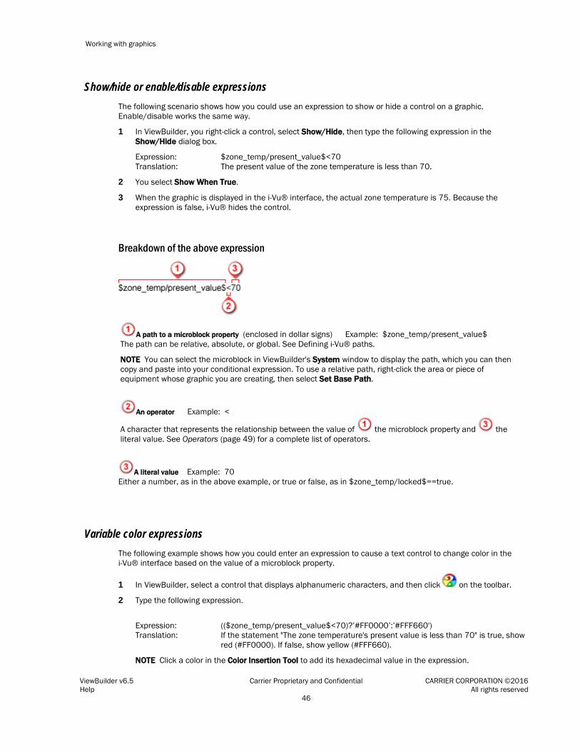
Working with graphics
ViewBuilder v6.5 Carrier Proprietary and Confidential CARRIER CORPORATION ©2016 Help All rights reserved 46
Show/hide or enable/disable expressions The following scenario shows how you could use an expression to show or hide a control on a graphic. Enable/disable works the same way.
1 In ViewBuilder, you right-click a control, select Show/Hide, then type the following expression in the Show/Hide dialog box.
Expression: Translation:
$zone_temp/present_value$<70 The present value of the zone temperature is less than 70.
2 You select Show When True.
3 When the graphic is displayed in the i-Vu® interface, the actual zone temperature is 75. Because the expression is false, i-Vu® hides the control.
Breakdown of the above expression
A path to a microblock property (enclosed in dollar signs) Example: $zone_temp/present_value$ The path can be relative, absolute, or global. See Defining i-Vu® paths.
NOTE You can select the microblock in ViewBuilder's System window to display the path, which you can then copy and paste into your conditional expression. To use a relative path, right-click the area or piece of equipment whose graphic you are creating, then select Set Base Path.
An operator Example: <
A character that represents the relationship between the value of the microblock property and the literal value. See Operators (page 49) for a complete list of operators.
A literal value Example: 70 Either a number, as in the above example, or true or false, as in $zone_temp/locked$==true.
Variable color expressions The following example shows how you could enter an expression to cause a text control to change color in the i-Vu® interface based on the value of a microblock property.
1 In ViewBuilder, select a control that displays alphanumeric characters, and then click on the toolbar.
2 Type the following expression.
Expression: Translation:
(($zone_temp/present_value$<70)?’#FF0000’:’#FFF660') If the statement "The zone temperature's present value is less than 70" is true, show red (#FF0000). If false, show yellow (#FFF660).
NOTE Click a color in the Color Insertion Tool to add its hexadecimal value in the expression.

Working with graphics
ViewBuilder v6.5 Carrier Proprietary and Confidential CARRIER CORPORATION ©2016 Help All rights reserved 47
3 When the graphic is displayed in the i-Vu® interface, the actual zone temperature is 75. Because the expression is false, the control is yellow in the i-Vu® interface.
Breakdown of the above expression
A path to a microblock property (enclosed in dollar signs) Example: $zone_temp/present_value$ The path can be relative or absolute. See Defining i-Vu® paths (page 42).
NOTE You can select the microblock in ViewBuilder's System window to display the path, which you can then copy and paste into your conditional expression. To use a relative path, right-click the area or piece of equipment whose graphic you are creating, then select Set Base Path.
An operator Example: <
A character that represents the relationship between the value of the microblock property and the literal value. See Operators (page 49) for a complete list of operators.
A literal value Example: 70 Either a number, as in the above example, or true or false, as in $zone_temp/locked$==true.
A result Example: ?’#FF0000’:’#FFF660’ Variable color expressions include a color if the expression is true (#FF0000) and another color if the expression is false (#FFF660). The format of this part of the equation is ?’true color’:’false color’.
NOTE In a variable color expression, you enter a hexadecimal value for a color, such as #FF0000 for the color red. Color values must be enclosed in single quotation marks. For example, ’#FF0000’.
To find the hexadecimal value of a color 1 Right-click on any text control and select Variable Color.
2 Click Custom.
3 Select the color you want.
4 Click OK.
5 Copy the hexadecimal value in the Expression field.

Working with graphics
ViewBuilder v6.5 Carrier Proprietary and Confidential CARRIER CORPORATION ©2016 Help All rights reserved 48
Variable text expressions The following example shows how you can use a single-line text control to display varying text in the i-Vu® interface based on the value of a microblock property.
1 In ViewBuilder, type the following expression in the Microblock Path field of the Control Properties window, and clear the Property field.
Expression: Translation:
(($sfan/present_value$==true)?’Running’:’Not running') If the statement "The supply fan's present value is true (on)" is true, show Running. If false, show Not running.
2 When the graphic is displayed in the i-Vu® interface, the supply fan is off. Because the expression is false, Not running is displayed.
Breakdown of the above expression
A path to a microblock property (enclosed in dollar signs) Example: $sfan/present_value$ The path can be relative or absolute. See Defining i-Vu® paths (page 42).
NOTE You can select the microblock in ViewBuilder's System window to display the path, which you can then copy and paste into your conditional expression. To use a relative path, right-click the area or piece of equipment whose graphic you are creating, then select Set Base Path.
An operator Example: ==
A character that represents the relationship between the value of the microblock property and the literal value. See Operators (page 49) for a complete list of operators.
A literal value Example: true A value such as true as in the above example, or a number such as 70 in the example $zone_temp/present_value$<70.
A result Example: ?’Running’:’Not running’ Variable text expressions include the text to show if the expression is true (Running) and text to show if the expression is false (Not running). The format of this part of the equation is ?’true text’:’false text’.

Working with graphics
ViewBuilder v6.5 Carrier Proprietary and Confidential CARRIER CORPORATION ©2016 Help All rights reserved 49
Combining expressions Below are three methods, with examples, that you can use to combine expressions.
Method 1: Use the And (&&) or the Or (||) operator Expression using the And operator:
$zone_temp/locked$==false &&$zone_temp/present_value$>75 ?'#FF0000':'#FFF660'
Translation: The zone temperature is not locked and the current value of the zone temperature is greater than 75. If both of these statements are true, show red ('#FF0000'); if either is false, show yellow ('#FFF660').
Method 2: Use the Ternary (? :) operators Expression: $zone/M001/present_value$==1
?’FF0000’:$zone/M001/present_value$==2 ?’#FFF660’:$zone/M001/present_value$==3 ?’#FFFFFF’:’#FF00FF’
Translation: The present value of M001 is 1. If this is true, show red ('#FF0000). If false, evaluate the next statement. The present value of M001 is 2. If this is true, show yellow ('#FFF660'). If false, evaluate the next statement. The present value of M001 is 3. If this is true, show white ('#FFFFFF'). If false, show magenta ('#FF00FF').
Method 3: Nest expressions Expression: $zone_temp/locked$==true
?($zone_temp/locked_value$>75?'#FF0000:'#FFF660') :'#00FF00'
Translation: The zone temperature is locked. If this statement is false, show green ('#00FF00'). If true, evaluate the nested statement that the locked value is greater than 75. If this statement is true, show red ('#FF0000'); if false, show yellow ('#FFF660').
Operators An operator defines how each piece of an expression is to be handled. For example, an operator can compare or perform an action between the value of a microblock property, a literal value, or the result of an expression. The following table lists operators that can be used in expressions.
Path Operators
$path$ Get value Gets the value of the path
??path?? Check for presence Checks for the existence of the path. If it exists, the expression is true. If it does not, the expression is false.
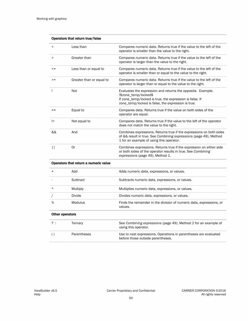
Working with graphics
ViewBuilder v6.5 Carrier Proprietary and Confidential CARRIER CORPORATION ©2016 Help All rights reserved 50
Operators that return true/false
< Less than Compares numeric data. Returns true if the value to the left of the operator is smaller than the value to the right.
> Greater than Compares numeric data. Returns true if the value to the left of the operator is larger than the value to the right.
<= Less than or equal to Compares numeric data. Returns true if the value to the left of the operator is smaller than or equal to the value to the right.
>= Greater than or equal to Compares numeric data. Returns true if the value to the left of the operator is larger than or equal to the value to the right.
! Not Evaluates the expression and returns the opposite. Example: !$zone_temp/locked$ If zone_temp/locked is true, the expression is false. If zone_temp/locked is false, the expression is true.
== Equal to Compares data. Returns true if the value on both sides of the operator are equal.
!= Not equal to Compares data. Returns true if the value to the left of the operator does not match the value to the right.
&& And Combines expressions. Returns true if the expressions on both sides of && result in true. See Combining expressions (page 49), Method 1 for an example of using this operator.
|| Or Combines expressions. Returns true if the expression on either side or both sides of the operator results in true. See Combining expressions (page 49), Method 1.
Operators that return a numeric value
+ Add Adds numeric data, expressions, or values.
- Subtract Subtracts numeric data, expressions, or values.
* Multiply Multiplies numeric data, expressions, or values.
/ Divide Divides numeric data, expressions, or values.
% Modulus Finds the remainder in the division of numeric data, expressions, or values.
Other operators
? : Ternary See Combining expressions (page 49), Method 2 for an example of using this operator.
( ) Parentheses Use to nest expressions. Operations in parentheses are evaluated before those outside parentheses.

Working with graphics
ViewBuilder v6.5 Carrier Proprietary and Confidential CARRIER CORPORATION ©2016 Help All rights reserved 51
Using local variables
You can use local variables in conditional expressions (page 45) to make various controls react to user interaction in i-Vu®. For example, you could have a panel show or hide in i-Vu® based on a checkbox.
Although local variables can be used in any type of conditional expression, the following examples show how to: Set objects to show/hide based on radio button selection (page 51) Set an object to show/hide based on checkbox selection (page 53)
You can also use a local variable to test the setup of a control in your graphic before the graphic is in a live system. See: To use a local variable to test the setup of a control (page 55)
To set objects to show/hide based on radio button selection Using a variable in a conditional expression, you can show/hide objects based on the value of a radio button.
EXAMPLE In the image below, the i-Vu® operator can show zone temperature or airflow by choosing the appropriate radio button.
Step 1: Create the variable in ViewBuilder 1 Select Configure > View Properties.
2 On the Local Variables tab, click .
3 On the row that was added, double-click the Type column, then select Integer.
4 Double-click the Name column and type a name for the variable. For example, zonetemp_airflow.
NOTE The name must be lowercase letters, numbers, hyphens, and underscores (no spaces), and it cannot begin with a number.

Working with graphics
ViewBuilder v6.5 Carrier Proprietary and Confidential CARRIER CORPORATION ©2016 Help All rights reserved 52
5 Click OK.
Step 2: Define the properties for the radio buttons 1 Add the radio buttons to the workspace.
2 For each radio button, select the button and in the Microblock Path field, type: $$<the variable>$$. See the image below.
3 For each radio button, enter a value for the button in the Radio Button Value field. For example, enter 0 for the first button, 1 for the second button, etc.
Step 3: Create a show/hide conditional expression for the objects that you want to show/hide 1 Select the object that you want i-Vu® to show when the first radio button is selected.
2 Click on the toolbar.
3 In the Expression field, type: $$<the variable>$$==<the radio button's value that you assigned in the Properties window>. See the image below.
4 Select Show When True.

Working with graphics
ViewBuilder v6.5 Carrier Proprietary and Confidential CARRIER CORPORATION ©2016 Help All rights reserved 53
5 Repeat steps 1 through 4 for the second radio button.
To set an object to show/hide based on toggle button selection Using a variable in a conditional expression, you can show/hide objects based on the selection of a toggle button.
EXAMPLE The i-Vu® operator can select a checkbox (toggle button control) to show an object or clear the checkbox to hide the object.
Step 1: Create the variable in ViewBuilder 1 Select Configure > View Properties.
2 On the Local Variables tab, click .
3 On the row that was added, double-click the Type column, then select Boolean.
4 Double-click the Name column and type a name for the variable. For example, toggle_panel.
NOTE The name must be lowercase letters, numbers, hyphens, and underscores (no spaces), and it cannot begin with a number.
5 Click OK.

Working with graphics
ViewBuilder v6.5 Carrier Proprietary and Confidential CARRIER CORPORATION ©2016 Help All rights reserved 54
Step 2: Define the properties for the toggle button 1 Add the toggle button to the workspace.
2 In the Microblock Path field, type: $$<the variable>$$. See the image below.
Step 3: Create a show/hide conditional expression for the objects that you want to show/hide 1 Select the object that you want i-Vu® to show when the checkbox is selected.
2 Click on the toolbar.
3 In the Expression field, type: $$<the variable>$$. See the image below.
4 Select Show When True.

Working with graphics
ViewBuilder v6.5 Carrier Proprietary and Confidential CARRIER CORPORATION ©2016 Help All rights reserved 55
To use a local variable to test the setup of a control You can use a local variable to test the configuration of a control. For example, you could test the configuration of an angular gauge as described below.
Step 1: Create the variable in ViewBuilder 1 Select Configure > View Properties.
2 On the Local Variables tab, click .
3 On the row that was added, double-click the Type column, then select Integer.
4 Double-click the Name column and type a name for the variable. For example, aa.
NOTE The name must be lowercase letters, numbers, hyphens, and underscores (no spaces), and it cannot begin with a number.
5 Click OK.
Step 2: Add an angular gauge and a slider control 1 Add the 2 controls.

Working with graphics
ViewBuilder v6.5 Carrier Proprietary and Confidential CARRIER CORPORATION ©2016 Help All rights reserved 56
2 In each of their Microblock Path fields, type $$aa$$.
3 Delete present_value from the Property field.
4 Give both controls the same Minimum and Maximum values.
5 Configure the remaining fields the way you want.
6 Save your graphic and add it to your i-Vu® system.
Step 3: Test the graphic in the i-Vu® interface 1 Go to the graphic in the i-Vu® interface.
2 Move the slider back and forth to see how the angular gauge looks at different values.
TIP To see how the gauge reacts to a value that exceeds the minimum and maximum limits, go back to ViewBuilder and make the slider’s minimum/maximum range larger than the gauge’s, then retest in the i-Vu® interface.
Troubleshooting graphics
Graphic errors are displayed when running the i-Vu® application. The error may be indicated by a small red triangle in the lower right corner of the i-Vu® action pane. Click the triangle to see the error.
Many error messages contain an expression or path that is incorrect, so you must determine which control in the .view file has the incorrect expression or path. See To find an expression or path in ViewBuilder (page 56) below.
i-Vu® Pro only: Make sure your graphic is in the i-Vu_Pro_x.x\webroot\<system_name>\views\graphics folder.
Common errors and their solutions are listed below.
To find an expression or path in ViewBuilder 1 Select Edit > Find/Replace.
2 Type the expression or path in the Find What field, or click the drop-down arrow to select from recent entries in this field.
3 Click Find.
4 Select a Found item to have ViewBuilder select the control in the workspace.

Working with graphics
ViewBuilder v6.5 Carrier Proprietary and Confidential CARRIER CORPORATION ©2016 Help All rights reserved 57
Error: Cannot be evaluated
Indicates the microblock path for a control is incorrect.
Solution: Correct the path. See Determining a path or microblock property (page 44).
Error: Path is invalid
Indicates that a path in the Link dialog box is invalid.
Solution: Correct the path. See Determining a path or microblock property (page 44).

Working with graphics
ViewBuilder v6.5 Carrier Proprietary and Confidential CARRIER CORPORATION ©2016 Help All rights reserved 58
Error: Wrong data type
Indicates that you used a non-binary control to read a binary value. For example, a number control to read a binary value.
Solution: Determine if you need to change the control or the microblock property value.
Error: Set definition for location not found
Indicates that you used a non-analog control to read an analog value. For example, a droplist to read an analog value.
Solution: Determine if you need to change the control or the microblock property value.

Working with graphics
ViewBuilder v6.5 Carrier Proprietary and Confidential CARRIER CORPORATION ©2016 Help All rights reserved 59
Error: PrimitiveExpr - Cannot evaluate expression
Indicates an invalid variable color or show/hide expression.
Solution: Correct the expression. See Conditional expressions (page 45).
Language features for i-Vu® Pro only
Creating a non-English graphic in ViewBuilder To create a non-English system, see “Setting up your system for non-English languages” in i-Vu® Help.
To create a non-English graphic in ViewBuilder:
1 Install the non-English language pack(s). See "Installing a language pack" in i-Vu® Help.
2 Set the language font (page 59).
3 Create the graphic. (page 60)
4 Save the .view file.
NOTE The names of your .view file and any inserted image files must contain only ASCII characters.
Setting the language font If your system has language packs installed, you can select a font for each language. Your selection affects only how text in your graphic appears in ViewBuilder.
To set the font for each language 1 Select Configure > Preferences > Graphic (.view).
2 On the Language tab, check the language that you want to be the default for all new graphics.

Working with graphics
ViewBuilder v6.5 Carrier Proprietary and Confidential CARRIER CORPORATION ©2016 Help All rights reserved 60
To select the default language font for all new graphics In the Preview Font column, click the font name to select a different font.
To select the active language when creating a view If you will use multiple language fonts in a single view, you can switch to a different language font as follows:
1 Select Configure > View Properties.
2 In the Language field, select the language you want to use.
3 Click OK.
To create a Non-English graphic The method you use to create a graphic that will be displayed in a non-English i-Vu® system depends on the following:
• If the i-Vu® system will display only a single non-English language, create the graphic in that language.
• If the i-Vu® system will display multiple non-English languages, use either of the following methods:
○ Create the graphic in layers (one layer for each language), and then assign a show/hide conditional expression (see format below) to each layer so that it displays in i-Vu® based on the operator language. See "To show/hide a layer in the i-Vu® interface (page 35)" in ViewBuilder Help.
○ Create each piece of the graphic in the different languages, and then assign a show/hide conditional expression (see format below) to each piece so that it displays in i-Vu® based on the operator language. See "Setting objects on a graphic to show/hide in the i-Vu® interface (page 39)" in ViewBuilder Help.

Working with graphics
ViewBuilder v6.5 Carrier Proprietary and Confidential CARRIER CORPORATION ©2016 Help All rights reserved 61
Show/Hide conditional expression format $$operator_language$$='language'
where language is the language code from the list below. For example, the conditional expression to display French would be: $$operator_language$$='fr_FR'
Language Language code
Brazillian Portuguese English Canadian French French German Italian Japanese Korean Russian Spanish Swedish Simplified Chinese Traditional Chinese Thai Vietnamese
pt_BR en fr fr_FR de it ja ko ru es sv zh zh_TW th vi

Working with Equipment Touch screens
ViewBuilder v6.5 Carrier Proprietary and Confidential CARRIER CORPORATION ©2016 Help All rights reserved 62
The Equipment Touch is a touchscreen device that you can attach to a controller to view or change its property values, schedule equipment, view trends, and more, without having to access the system's server.
In ViewBuilder, you: • Create the screens that the touchscreen displays • Test the navigation between screens • Save the screens in a single .touch (for Equipment Touch) file that will be downloaded to the controller
Perform as many of the actions below, as needed, to create your screens.
1 Make a new touchscreen file or open an existing file (page 65).
2 Edit the Home screen (page 67).
3 Make additional screens (page 68).
4 Add controls (page 69).
5 Add navigation (page 68).
6 Password-protect the screens (page 90).
7 Set up alarms (page 92).
8 Add support for multiple languages (page 123).
9 Save, assign, and download the touchscreen file (page 68).
Working with Equipment Touch screens

Working with Equipment Touch screens
ViewBuilder v6.5 Carrier Proprietary and Confidential CARRIER CORPORATION ©2016 Help All rights reserved 63
Getting to know ViewBuilder's Equipment Touch interface
You make a touchscreen file in ViewBuilder using a simulation of the touchscreen device. You design your screens directly in the display area, and you set up linked buttons to navigate between the screens.
To move objects
To move a selected object(s):
• Click and drag the object to the new location. Hold down Shift as you drag an object to constrain its movement to horizontal or vertical.
• Use the arrow keys to nudge the selected object one pixel at a time, or hold down Shift while using the arrow keys to move the object ten pixels at a time.

Working with Equipment Touch screens
ViewBuilder v6.5 Carrier Proprietary and Confidential CARRIER CORPORATION ©2016 Help All rights reserved 64
To align, group, and layer objects
Select the objects that you want to align or reorder (front to back), then use the right-click menu commands or
the options on the Add Control tab in the Tools window.
NOTES
• Objects align in relationship to the last selected object, the one with the green handles.
• You can select an individual control in a group to edit its properties in the Control Properties window.
To copy an object
Alt+click and drag a control to create a copy of it on the same screen.
To copy a selected object(s) from one screen to another:
1 Select the object(s), then click .
2 On the new screen, click .
3 Click and drag the object(s) to the desired location.
To lock or unlock controls
To lock a selected object(s) so you cannot select or move it, right-click the object, then select Lock.
To unlock an object, Ctrl+right-click the object, then select Unlock.
NOTE To unlock all locked objects simultaneously, right-click anywhere in the workspace and select Unlock All.
To undo or redo actions
Click on the toolbar as many times as necessary to undo actions that you performed, beginning with the most recent action. Click to redo the action.
You can also click the drop-down arrow to the right of the Undo or Redo button to select an action from a list that begins with the most recent action. Selecting an action will undo or redo that action, plus all actions above it in the list.

Working with Equipment Touch screens
ViewBuilder v6.5 Carrier Proprietary and Confidential CARRIER CORPORATION ©2016 Help All rights reserved 65
Creating a new Equipment Touch screen file or open an existing file
1 Do one of the following:
To... Select...
Create a new touchscreen file File > New, then select Touchscreen.
Open an existing touchscreen file created in ViewBuilder
File > Open, then select the file.
NOTE If the file is not listed, verify that the Files of Type selection lists Touchscreen files.
2 Select File > Save As.
NOTE If using i-Vu® Pro, browse to i-Vu_Pro_x.x\webroot\<system_name>\views\touchscreens.
3 Type a File name, then click Save. ViewBuilder adds the .touch extension to your file name.
NOTES
• To record information about the file, select Configure > View Properties, then type your name and comments on the Summary tab. Revision History shows each time the file was saved and the workstation it was saved on.
• A .touch file (including all text, screens, images, and controls) is comprised of a set of compressed files and cannot exceed 512 KB. In addition, the total size of the uncompressed files cannot exceed 1MB and the size of any single uncompressed file cannot exceed 512KB.
Equipment Touch screen types
Every touchscreen file contains both custom and system screens. To navigate between the screens, you must provide a Button, Text, or Image control to act as a screen link. See Equipment Touch controls and their properties (page 69).
NOTE The Home and custom screens are editable; system screens are not editable. System screens are easily identified by their name appearing in blue in the Screens list.
Custom screens Screen name Description
Standby If included in the touchscreen file, the Standby screen displays when the Equipment Touch has had no user activity for the time specified on the Inactivity Timeout screen. This screen is not interactive, and as soon as the user touches the screen, the Home screen displays. To include this screen in your file, check Include Standby Screen on the Screen Properties window.
NOTE If you do not include a Standby screen, the Home screen displays after a period of inactivity.
untitled A blank screen that you design, configure, and name. Add controls and buttons that link to the other screens.

Working with Equipment Touch screens
ViewBuilder v6.5 Carrier Proprietary and Confidential CARRIER CORPORATION ©2016 Help All rights reserved 66
Home A screen that you design and configure. If you do not include a Standby screen (see above), the Home screen displays after a period of inactivity.
System screens System Displays the BACnet device instance number, the controller's time, temperature read from
the Equipment Touch sensor, and zone color, and provides links to the Module Status, Alarms, Trends, Schedules, Setup, and Browser screens.
Module Status Displays the following sections of a Module Status report: Device Data, Driver Data, Reset Counters, System Errors, Warnings, Information, Hardware, Database, Network.
Schedule Lets the user view, add, edit, or delete BACnet schedules in the controller.
NOTE The controller firmware has a setting to disallow adding, editing, or deleting schedules from the touchscreen device, limiting the user to only viewing schedules entered in the server.
Setup Displays links to the Module Setup, Touchscreen Setup, and Login screens.
Login Displays if the screen the operator selected requires a password.
Alarm Lets the user view alarms from the controller.
You must define the alarms in ViewBuilder to have them display. See Setting up alarms (page 92).
Browser Provides links to the following network-visible BACnet object types found in the controller: AI, AO, AV, BI, BO, BV, MSI, MSO, MSV. Each list shows the BACnet Object Name, Current Value, and BACnet Object Instance number.
IP Lets the user view or edit network addresses, if enabled by the driver.
NOTE If the controller's driver does not support this screen, the button on the Module Setup screen will be inactive.
Router Lets the user view or edit the router's ARC156, MS/TP, or Ethernet network number.
NOTE If the controller's driver does not support this screen, the button on the Module Setup screen will be inactive.
Communication Lets the user edit the following: BACnet Device Instance number Base BACnet Device ID number Auto Generate Device ID - Yes/No Number of Max Masters Number of Max Info Frames
Time Master If the controller can be a BACnet Time Master, this screen lets a technician configure how it sends time synchronization broadcasts.
NOTE If the controller's driver does not support this screen, the button on the Module Setup screen will be inactive.
Module Setup Displays links to the Set Time and Date, Communication, Router, IP, and Time Master screens.

Working with Equipment Touch screens
ViewBuilder v6.5 Carrier Proprietary and Confidential CARRIER CORPORATION ©2016 Help All rights reserved 67
Touchscreen Setup
Screen links:
Inactivity Timeout - Lets the user define the time it will take for the touchscreen device to return to the Standby screen and log out the user when no activity is detected.
About - Displays information about the touchscreen firmware.
Clean Screen - Displays a screen with a one-minute countdown timer so that the user can clean fingerprints from the display window without touching something that would affect the operation of the controller.
Key Click Off/On - A toggle button that turns the sound for screen touches off and on.
Alarm Sound Off/On - A button that turns the sound for a critical alarm off.
Reload Firmware - Erases the current firmware so that the user can load new firmware through the USB port.
Language - If optional languages are defined in ViewBuilder when the touchscreen file is created, the Language screen lets the user select the language for displaying system screens. If custom screens are included in the touchscreen file, they will display in the language in which they are created.
Passwords - Lets the user change the Admin or User password.
Calibrate Touch Panel - Lets the user recalibrate the screen by touching targets.
Trends Lets the user view trends for points that have trending enabled.
NOTE System screens are a part of the touchscreen firmware. If a screen in the firmware is changed between releases of ViewBuilder, the ViewBuilder screen may look different than the actual touchscreen screen.
To customize the Home screen
1 Click the Screens tab in the Tools window.
2 Select Home from the list of screens.
3 Arrange the header items in the Header Aspects list:
○ Add or delete items by selecting or clearing the checkbox; all can be removed except the Back button.
○ Re-order the selected items as they appear on the header using the up and down arrows.
○ The Alarm button on the touchscreen appears red if in alarm state and gray if not.
4 Password-protect (page 90) this screen, if necessary.
5 Add controls (page 69) to the screen as necessary.
6 Edit the font and alignment in the Control Properties window for the currently selected control. If no control is selected, the properties window is empty.

Working with Equipment Touch screens
ViewBuilder v6.5 Carrier Proprietary and Confidential CARRIER CORPORATION ©2016 Help All rights reserved 68
To create additional screens
1 Click the Screens tab in the Tools window.
2 Do one of the following:
○ In the Screens list, double-click untitled, then type a descriptive screen name.
○ Click to add a new blank screen, then change its name.
○ Select an existing screen, click to make a copy of it, then change the copy's name.
NOTE You cannot copy a system screen.
3 Edit the header and password level at the bottom.
4 Add controls.
NOTES
• To delete a screen, select the screen name, then click . You cannot delete the Home or system screens.
• To rearrange the screen's order in the list, select the screen name, then click or .
To add navigation
To give a user the ability to move from one screen to another:
1 Add a linked Button, Text, or Image control.
2 In the Control Properties window, select a screen from the Link to Screen drop-down list.
NOTE The Link to Screen field is located on either the control's Properties window or on its Link tab
.
3 To test the navigation, hold F9 and click the linked control.
To save, assign, and download the touchscreen file
1 Save the .touch or .bacview file to a convenient location on your computer.
Then, in the i-Vu® interface:
2 Right-click the controller and select Driver Properties to attach the screen file.
3 Download All Content to the controller.
NOTE If the controller has an Router Config Mode DIP switch, make sure that this DIP switch is off when connecting a touchscreen device.

Working with Equipment Touch screens
ViewBuilder v6.5 Carrier Proprietary and Confidential CARRIER CORPORATION ©2016 Help All rights reserved 69
Adding controls to Equipment Touch screens
You can add controls to a touchscreen that allow you to display such things as date and time, text and graphics, and information about microblock properties.
To add a control
1 Click the Add Control tab in the Tools window.
2 Select the control you want to add.
3 Click in the workspace where you want to add the control.
NOTE To cancel the action, press Esc before clicking the workspace.
4 Edit properties for the control in the Control Properties window.
TIPS
• To move a control, click and drag it to another location.
• To create a copy of a control, hold Alt while dragging the control.
• To add a control multiple times, select the control, then Shift+click the workspace for each copy.
• To delete a control, select the control and click or press Delete.
• See Equipment Touch screen controls and their properties (page 69) for a description of each control.
NOTE Many factors affect how many controls you can put on a screen before exceeding memory limitations. You may be able to put as many as 130 simple controls (numbers, text, etc.) on a screen.
Equipment Touch screen controls and their properties
Each control, its usage, and the properties you define are described in the tables below. Many controls share the following properties and may appear on their own tab in the Control Properties window.
Condition Set controls in a screen to show or hide based on password levels, a microblock property's value, or the existence of its path. See Setting items on a touchscreen to show/hide (page 118).
Font Select font size, color, and alignment.
Link to Screen Select a screen in the drop-list so that the control becomes a link to that screen. Hold F9 and click the control to test the link. See Linking Equipment Touch screens (page 86).
NOTE If a control will reference a BACnet Object, the point must be set as Network Visible in the Snap or i-Vu® application.

Working with Equipment Touch screens
ViewBuilder v6.5 Carrier Proprietary and Confidential CARRIER CORPORATION ©2016 Help All rights reserved 70
Controls Use this control... To...
Text Display text.
See Text and images on an Equipment Touch screen (page 71).
Text List Display text based on a list of text values which are assigned to conditional
values. The condition is tested against either a number, text, or a microblock property's value. The value whose Condition is true displays.
See Text and images on an Equipment Touch screen (page 71) to add a Text List control to add conditions to the list.
Number Display any numerical value from an analog microblock.
Example: Zone temperature.
See Number control on an Equipment Touch screen (page 74).
Duration Display a time period. Example: Override time remaining.
See Duration control on an Equipment Touch screen (page 75).
Button Display a navigation button that links to another screen.
See Linked button on an Equipment Touch screen (page 75).
On-Off-Auto Provide a method to lock a binary input or output on, lock it off, or let the control
program control it (Auto). Example: To control fans or pumps.
See On-Off-Auto control on an Equipment Touch screen (page 76).
Timed Local Override Provide a method to view or edit a Timed Local Override.
See Timed Local Override control on an Equipment Touch screen (page 76).
Image Display an image.
See Text and images on an Equipment Touch screen (page 71).
Checkbox Provide a method to choose between two states.
See Checkbox control on an Equipment Touch screen (page 77).
Time Display time of day.
See Time control on an Equipment Touch screen.
Text Toggle Display active and inactive text values for a binary microblock. Example: Chiller is enabled or disabled.
See Text Toggle control on an Equipment Touch screen (page 78).
View Port Add controls or images to a resizable, scrollable container.
See View Port on an Equipment Touch screen (page 79).
Setpoint Provide a method to view or edit setpoints.
See Setpoint control on an Equipment Touch screen (page 80).

Working with Equipment Touch screens
ViewBuilder v6.5 Carrier Proprietary and Confidential CARRIER CORPORATION ©2016 Help All rights reserved 71
Use this control... To...
Image List Shows various states of an analog microblock using images.
See Text and images on an Equipment Touch screen (page 71) to add an Image List control and define conditions.
Radio Button Provide a method to select one option from a set of alternatives.
Example: Manual and Auto.
See Radio buttons on an Equipment Touch screen (page 81).
Date Displays:
• System date from the controller
• A date, typically read from a History microblock. Example: Date of the highest zone temperature.
See Date control on an Equipment Touch screen (page 81).
Multi-State Display the text values for multi-state microblocks. The Preview Text drop-list can
also display the active and inactive text values for a binary microblock. Example: Units of measure (°F).
See Multi-State control on an Equipment Touch screen (page 82).
Table Add controls or images to a resizable, scrollable table.
See Working with tables on an Equipment Touch screen (page 83).
Primary Value Display any numerical value from an analog microblock in a larger font than other controls for readability.
See Primary Value control on an Equipment Touch screen (page 86).
Text and images on Equipment Touch screens
You can add Text and Image controls to a touchscreen file.
Customize the Text control
• Make it a link to another screen on the Link tab . See Linking Equipment Touch screens (page 86).
• Change the font size, color, and alignment on the Font tab.
• Set the control to show or hide based on password levels, a microblock property's value, or the existence
of its path on its Condition tab . See Setting items on a touchscreen to show/hide (page 118).
Customize the Image control
• Make it a link to another screen on the Link tab . See Linking Equipment Touch screens (page 86).
• Set the control to show or hide based on password levels, a microblock property's value, or the existence
of its path on its Condition tab . See Setting items on a touchscreen to show/hide (page 118).

Working with Equipment Touch screens
ViewBuilder v6.5 Carrier Proprietary and Confidential CARRIER CORPORATION ©2016 Help All rights reserved 72
Text and Image Lists You can also create lists of either text or images to assign different conditions to multiple values. Each condition is evaluated, one after another, and the first one to be evaluated as true is displayed on the touchscreen device. If none of the values are true, default text or a default image is displayed.
Text
To add text
1 Select the Add Control tab , click Text Field, then click in the screen.
2 Double-click on Preview text inside the control's field, select the text to delete it, then type the text to be displayed on the touchscreen.
Optional: Copy text from another application, then paste it in the field.
3 Select Word Wrapping if text overflows the text field.
4 NOTE Text cannot extend past the constraint of the width of the control and borders of the display.
5 Click OK.
To add a Text List
1 Select the Add Control tab , click Text List, then click in the screen.
2 In the Default Value field, type the text that will display if none of the conditions are true. Select one:
○ Static Text and type text to display.
○ Path To Microblock Property to display the Preview Text.
3 Click .
4 Select one:
○ Static Text and type text to display if the condition is true.
○ Path To Microblock Property and type the path to display the value from the microblock.
5 Select a condition or add a new one. See Setting items on a touchscreen to show/hide (page 118).
6 Check Autosize to adjust the size of the control to the length of the longest condition value displayed.
To manually adjust the width of the control, grab a handle on the left or right side of the control box:
7 Repeat steps 4–6 for additional conditions.
NOTES
• The Text List can be set up to use different text for each condition and can have different font style properties assigned to each one.
• See Conditional items in a list (page 73) to arrange the conditions according to which displays.

Working with Equipment Touch screens
ViewBuilder v6.5 Carrier Proprietary and Confidential CARRIER CORPORATION ©2016 Help All rights reserved 73
Images
To add an image
1 Select the Add Control tab , click Image, then click in the screen.
2 Select a new image or click the Active Images tab to see images already used in the .touch file.
3 Click OK.
4 Click in the screen.
5 Click and drag a corner to resize it.
NOTE Hold Shift as you drag to maintain the image's proportions.
To add an Image List
1 Select the Add Control tab , click Image List, then click in the screen.
2 Select a new image or click the Active Images tab to see images already used in the .touch file.
This is the Default Image displayed when none of the other conditions is true or when a communication problem or issue occurs.
3 Click OK.
4 Click in the screen.
5 Click and drag a corner to resize it.
NOTE Hold Shift as you drag to maintain the image's proportions.
6 Click to add an image that the control displays under normal conditions.
7 Select an image, then click OK.
8 Select a condition or add a new one. See Setting items on a touchscreen to show/hide (page 118).
9 Repeat steps 6–8 for additional conditions.
See Conditional items in a list (page 73) to arrange the conditions according to when each should display.
Conditional items in a list
Purpose:
Text List and Image List allow the operator to assign text or images to indicate different conditions. Each condition in the list is evaluated, one after another, and the first one to be evaluated as true will be displayed on the touchscreen device. If no expression returns true, the Default Text or Default Image is displayed.
For example, a damper can be displayed as Closed, Half-open, or Open depending on the Show/Hide
conditions assigned to a microblock's property. Either or can be used to show these states.

Working with Equipment Touch screens
ViewBuilder v6.5 Carrier Proprietary and Confidential CARRIER CORPORATION ©2016 Help All rights reserved 74
1 Create a text list or image list.
2 Arrange your conditions using and to reorder the list.
TIPS
• The control property's window does not automatically expand, so you can resize it to display all items in the list.
• Click to delete an image from the list.
• Click to change the image assigned to a condition.
Number control on Equipment Touch screens
Purpose: Display any numerical value from an analog microblock.
Example: Zone temperature.
Properties: Path to Microblock Property—Enter the path to the microblock property you want the control to read from or write to. See Defining paths for the touchscreen (page 86).
Format—Select the appropriate number formatting, such as decimal places and comma separators.
Scaling Factor—To display a microblock property's value in a different format, type the necessary multiplication factor. Example: To display watts as kilowatts, type .001 in this field.
Show Units—Check to display the unit associated with the property in the control program. The selected unit's value in the list are just to estimate size.
Editable—When selected, this field is outlined by a white box on the screen. When selected on the touchscreen device, a numeric keypad pops up allowing the user to enter a value.
Autosize—Check to adjust the size of the control to the length of the value displayed. To manually adjust the width of the control, grab a handle on the left or right side of the control box:
Limits—To display a minimum/maximum range of values defined in the microblock or in the custom values fields.
Font tab: Change the font size, color, and alignment on the Font tab.
Condition tab: Set controls in a screen to show or hide based on password levels, a microblock property's value, or the existence of its path. See Setting items on a touchscreen to show/hide (page 87).
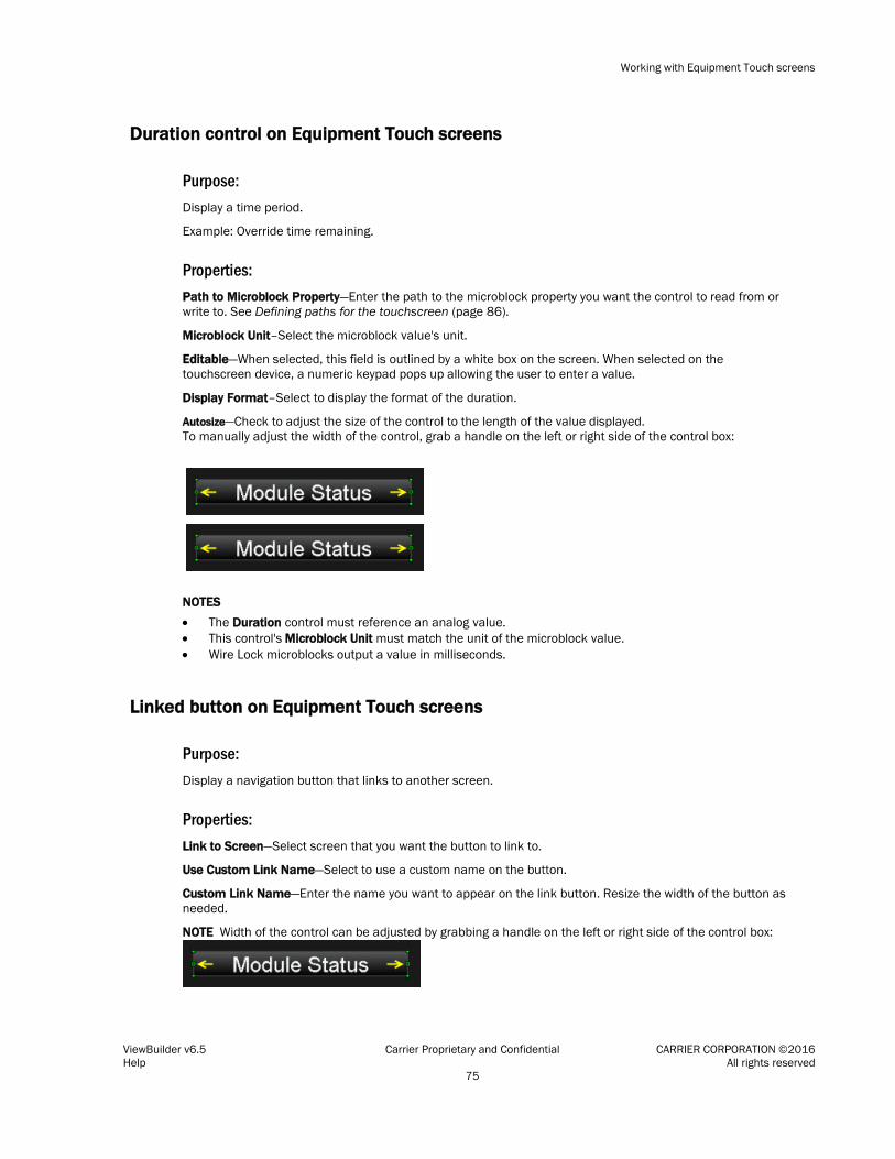
Working with Equipment Touch screens
ViewBuilder v6.5 Carrier Proprietary and Confidential CARRIER CORPORATION ©2016 Help All rights reserved 75
Duration control on Equipment Touch screens
Purpose: Display a time period.
Example: Override time remaining.
Properties: Path to Microblock Property—Enter the path to the microblock property you want the control to read from or write to. See Defining paths for the touchscreen (page 86).
Microblock Unit–Select the microblock value's unit.
Editable—When selected, this field is outlined by a white box on the screen. When selected on the touchscreen device, a numeric keypad pops up allowing the user to enter a value.
Display Format–Select to display the format of the duration.
Autosize—Check to adjust the size of the control to the length of the value displayed. To manually adjust the width of the control, grab a handle on the left or right side of the control box:
NOTES • The Duration control must reference an analog value. • This control's Microblock Unit must match the unit of the microblock value. • Wire Lock microblocks output a value in milliseconds.
Linked button on Equipment Touch screens
Purpose: Display a navigation button that links to another screen.
Properties: Link to Screen—Select screen that you want the button to link to.
Use Custom Link Name—Select to use a custom name on the button.
Custom Link Name—Enter the name you want to appear on the link button. Resize the width of the button as needed.
NOTE Width of the control can be adjusted by grabbing a handle on the left or right side of the control box:

Working with Equipment Touch screens
ViewBuilder v6.5 Carrier Proprietary and Confidential CARRIER CORPORATION ©2016 Help All rights reserved 76
Font tab: Change the font size, color, and alignment on the Font tab.
Condition tab: Set controls in a screen to show or hide based on password levels, a microblock property's value, or the existence of its path. See Setting items on a touchscreen to show/hide (page 87).
On-Off-Auto control on Equipment Touch screens
Purpose: Provide a method to lock a binary input or output on, lock it off, or let the control program control it (Auto).
Example: To control fans or pumps.
Properties: Path to Binary Microblock—Type the path in this field if this control is to read only one microblock.
Show As—Select the default to display on the touchscreen: On, Off, or Auto.
Use Advanced Path—Check if you want this control to read two microblocks, one for Auto and one for On/Off (Hand/Off). Enter the microblocks in the following fields.
• Automatic Microblock Path—The microblock that contains the Auto values.
• Manual Microblock Path—The microblock that contains the On/Off values.
TIP Best use for this control is when the Equipment Touch will serve as the front-end for the controller. If your system will have a i-Vu® front end and you use this control in both your .touch file and a .view file for the same equipment, the graphic in the i-Vu® system may not reflect changes made at the Equipment Touch unless the user initiates a parameter upload from the controller.
Timed Local Override control on Equipment Touch screens
Purpose: Provide a method to override the occupied or unoccupied state of a piece of equipment from the touchscreen device.
Properties: Path to Binary Microblock—Type the path in this field if this control is to read only one microblock.
Display Format—Choose to display time in AM/PM or 24 hour.
Always show time to next schedule transition (if unchecked, this will only show when overridden)—Select to always show next transition.

Working with Equipment Touch screens
ViewBuilder v6.5 Carrier Proprietary and Confidential CARRIER CORPORATION ©2016 Help All rights reserved 77
Show As—Select one of the following states to display on the equipment:
• Occupied
• Unoccupied
• Occupied Override
Checkbox control on Equipment Touch screens
Purpose: Provide a graphical method to show or choose between two states.
Properties: Path to Microblock Property—Enter the path to the microblock property you want the control to read from or write to. See Defining paths for the touchscreen (page 86).
Editable—When selected, the control is editable on the touchscreen device.
Show Selected—When selected, the control displays as "selected" in ViewBuilder NOTE This doesn't affect how the control displays on the touchscreen device.
Condition tab: Set controls in a screen to show or hide based on password levels, a microblock property's value, or the existence of its path. See Setting items on a touchscreen to show/hide (page 87).
Time control on Equipment Touch screens
Purpose: Display time of day.
Properties: Use System Time—Check to use the time coming from the controller instead of the time pulled from the microblock.
Display Format—Choose to display various time formats such as AM/PM, 24 hour, or minutes and seconds.
Editable—When selected, this field is outlined by a white box on the screen. When selected on the touchscreen device, a numeric keypad pops up allowing the user to enter a value.
For this type... use this path...
equipment ~device/driver/device/local_time
area <equipment_ref_name>/~device/driver/device/local_time

Working with Equipment Touch screens
ViewBuilder v6.5 Carrier Proprietary and Confidential CARRIER CORPORATION ©2016 Help All rights reserved 78
Autosize—Check to adjust the size of the control to the length of the value displayed. To manually adjust the width of the control, grab a handle on the left or right side of the control box:
Font tab: Change the font size, color, and alignment on the Font tab.
Condition tab: Set controls in a screen to show or hide based on password levels, a microblock property's value, or the existence of its path. See Setting items on a touchscreen to show/hide (page 87).
Text Toggle control on Equipment Touch screens
Purpose: Display active and inactive text values for a binary microblock. Example: Chiller is enabled or disabled.
Properties: Path to Microblock Property—Enter the path to the microblock property you want the control to read from or write to. See Defining paths for the touchscreen (page 86).
Editable—When selected, this field is outlined by a white box on the screen. When selected on the touchscreen device, a numeric keypad pops up allowing the user to enter a value.
Preview Text—Text that is displayed only in ViewBuilder to help you place the control. Type the preview text or select from the drop-down list.
Autosize—Check to adjust the size of the control to the length of the value displayed. To manually adjust the width of the control, grab a handle on the left or right side of the control box:
Font tab: Change the font size, color, and alignment on the Font tab.
Condition tab: Set controls in a screen to show or hide based on password levels, a microblock property's value, or the existence of its path. See Setting items on a touchscreen to show/hide (page 87).

Working with Equipment Touch screens
ViewBuilder v6.5 Carrier Proprietary and Confidential CARRIER CORPORATION ©2016 Help All rights reserved 79
View Port on Equipment Touch screens
Purpose: Increase the viewing area of a touchscreen device's window. The View Port's canvas can hold many more controls than the touchscreen can display at one time.
Controls and text are added to the canvas and horizontal and vertical scrollbars appear, as needed, allowing you to view the other areas of the canvas.
NOTE When the View Port control is initially placed on the canvas, the width is set to take up the full width of the screen and the height is set to fit between the header bar and buttons at the bottom of the screen.
Properties: View Port window—Display area, including scrollbars, seen on the touchscreen device. The scrollbars allow the designer to see what the layout looks like on the touchscreen device.
To move the View Port window, click and drag the window.
To change the size of the View Port control, drag one of the green corner markers.
View Port Editor—The area outlined in white is the canvas design area and the area outlined in yellow is the display area visible on the touchscreen. The display area includes horizontal and vertical scrollbars.
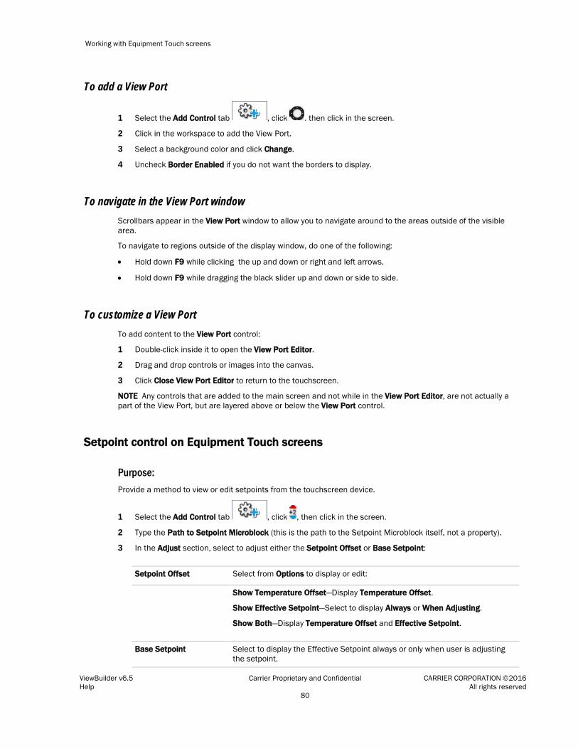
Working with Equipment Touch screens
ViewBuilder v6.5 Carrier Proprietary and Confidential CARRIER CORPORATION ©2016 Help All rights reserved 80
To add a View Port
1 Select the Add Control tab , click . then click in the screen.
2 Click in the workspace to add the View Port.
3 Select a background color and click Change.
4 Uncheck Border Enabled if you do not want the borders to display.
To navigate in the View Port window Scrollbars appear in the View Port window to allow you to navigate around to the areas outside of the visible area.
To navigate to regions outside of the display window, do one of the following:
• Hold down F9 while clicking the up and down or right and left arrows.
• Hold down F9 while dragging the black slider up and down or side to side.
To customize a View Port To add content to the View Port control:
1 Double-click inside it to open the View Port Editor.
2 Drag and drop controls or images into the canvas.
3 Click Close View Port Editor to return to the touchscreen.
NOTE Any controls that are added to the main screen and not while in the View Port Editor, are not actually a part of the View Port, but are layered above or below the View Port control.
Setpoint control on Equipment Touch screens
Purpose: Provide a method to view or edit setpoints from the touchscreen device.
1 Select the Add Control tab , click , then click in the screen.
2 Type the Path to Setpoint Microblock (this is the path to the Setpoint Microblock itself, not a property).
3 In the Adjust section, select to adjust either the Setpoint Offset or Base Setpoint:
Setpoint Offset Select from Options to display or edit:
Show Temperature Offset—Display Temperature Offset.
Show Effective Setpoint—Select to display Always or When Adjusting.
Show Both—Display Temperature Offset and Effective Setpoint.
Base Setpoint Select to display the Effective Setpoint always or only when user is adjusting the setpoint.

Working with Equipment Touch screens
ViewBuilder v6.5 Carrier Proprietary and Confidential CARRIER CORPORATION ©2016 Help All rights reserved 81
4 Type the Path To Occupied Status—a path to a microblock property that provides the occupied state of a zone.
5 Type the Path To HVAC Mode—a path to a microblock property that provides the current mode of the HVAC system. For example, is it in Heat or Cool mode?
Radio buttons on Equipment Touch screens
Purpose: Provide a method of selecting one option from a set of alternatives. Example: Manual and Auto.
Enter the same Path to Microblock Property for each radio button in the set.
Purpose: Path to Microblock Property—Enter the path to the microblock property you want the control to read from or write to. See Defining paths for the touchscreen (page 86).
Editable—When selected, the radio buttons are interactive on the touchscreen device.
Radio Button Value—Type the value that represents the active or true state for this radio button.
For an analog microblock, type the specific value the button is to represent.
For a binary microblock, type true or 1 (depending on the property) for one button's value and false or 0 for the other button's value.
Show Selected—When selected, the control displays as "selected" in ViewBuilder NOTE This doesn't affect how the control displays on the touchscreen device.
Condition tab: Set controls in a screen to show or hide based on password levels, a microblock property's value, or the existence of its path. See Setting items on a touchscreen to show/hide (page 87).
Date control on Equipment Touch screens
Purpose: Display a date, typically read from a History microblock. Example: Date of the highest zone temperature.
Properties: Path to Microblock Property—Enter the path to the microblock property you want the control to read from or write to. See Defining paths for the touchscreen (page 86).
Use System Date—Check to use the System date, retrieved from the controller, instead of the date pulled from the microblock.
Date Format—Select the appropriate format.

Working with Equipment Touch screens
ViewBuilder v6.5 Carrier Proprietary and Confidential CARRIER CORPORATION ©2016 Help All rights reserved 82
For this type... use this path...
equipment ~device/driver/device/local_date
area <equipment_ref_name>/~device/driver/device/local_date
Editable—When selected, the control is editable on the touchscreen device.
Autosize—Check to adjust the size of the control to the length of the value displayed. To manually adjust the width of the control, grab a handle on the left or right side of the control box:
Font tab: Change the font size, color, and alignment on the Font tab.
Condition tab: Set controls in a screen to show or hide based on password levels, a microblock property's value, or the existence of its path. See Setting items on a touchscreen to show/hide (page 87).
Multi-State control on Equipment Touch screens
Purpose: Display the text values for multi-state microblocks. The Preview Text drop-list can also display the active and inactive text values for a binary microblock. Example: Units of measure (°F).
Properties: Path to Microblock Property—Enter the path to the microblock property you want the control to read from or write to. See Defining paths for the touchscreen (page 86).
Editable—When selected, this field is outlined by a white box on the screen. When selected on the touchscreen device, a numeric keypad pops up allowing the user to enter a value.
Preview Text—Text that is displayed only in ViewBuilder to help you place the control. Type the preview text or select from the drop-down list.
Autosize—Check to adjust the size of the control to the length of the value displayed. To manually adjust the width of the control, grab a handle on the left or right side of the control box:

Working with Equipment Touch screens
ViewBuilder v6.5 Carrier Proprietary and Confidential CARRIER CORPORATION ©2016 Help All rights reserved 83
Use Custom Defined States—Select to add analog values and display names to the list.
Font tab: Change the font size, color, and alignment on the Font tab.
Condition tab: Set controls in a screen to show or hide based on password levels, a microblock property's value, or the existence of its path. See Setting items on a touchscreen to show/hide (page 87).
Working with tables on Equipment Touch screens
You can add a table to a touchscreen and then add controls or images in the table cells. To customize the table:
• Select the table to move it within the touchscreen display area.
• Adjust the size of the table by selecting the table and dragging one of the green corner markers.
• Change the background and border colors by clicking Change.
To add a table
1 Select the Add Control tab , click , then click in the screen.
2 Click in the workspace where you want to add the table.
3 Click Change to select a different background color.
4 Uncheck Border Enabled if you do not want the borders to display.
Adjusting the table NOTE To add, delete, or adjust rows and columns, double-click inside the table to open the Table Editor.
To add a row or column to the end of a table:
1 Right-click anywhere in the table.
2 Select Insert Row or Insert Column.
To add a row or column before the last one:
1 Click column or row gray header bar to select it.
2 Right-click the gray header bar to insert one before the selected row or column.
3 Select Insert Row or Insert Column.

Working with Equipment Touch screens
ViewBuilder v6.5 Carrier Proprietary and Confidential CARRIER CORPORATION ©2016 Help All rights reserved 84
To delete a row or column:
1 Right-click its gray header bar.
2 Select Delete Row or Delete Column.
To adjust column width:
Drag the ends of the column's gray header bar.
NOTES
• A dashed yellow box outlines the perimeter of the table.
• As more controls are added, the table may become larger than will display on the touchscreen. Horizontal or vertical scrollbars appear and can be used to simulate what the user will be able to view in the table by pressing F9 and dragging the black box or scrollbars.
• Minimum width and height is 25 pixels.
• Row height is determined by the tallest control in the row.
To add a control to a table cell 1 Double-click the table in the touchscreen to open the Table Editor.
TIP If gray bars do not appear above each column and to the left of each row, the table is not active and cannot be edited. See note below.
2 Click the control in the Tools window.
3 Click the cell where you want to add the control.
NOTE Cell resizes to the area needed to display the control.
4 Enter the control’s properties.
5 Click Close Table Editor to return to the touchscreen.
NOTE Adding controls to the touchscreen without opening the Table Editor places the control directly on the touchscreen—not in the table. The table will not resize accordingly and the control will be on a different layer than the table. See step 1 above.
TIPS
• To move an object and its condition, click and drag the item.
• To copy an object and its condition, hold down Alt as you drag the item.
• Objects moved or added into cells that have a show/high condition may or may not assume the condition. If you do not get the results you want, change the show/hide condition or click to undo the action.
• Placing objects in a cell that already contains a control replaces the original object.

Working with Equipment Touch screens
ViewBuilder v6.5 Carrier Proprietary and Confidential CARRIER CORPORATION ©2016 Help All rights reserved 85
To align objects in a table To align a control within its cell:
1 Double-click the control in the table to open the Table Editor.
2 Right-click a control and then select Align.
3 Select how you want to align it from the list.
TIP Ctrl-click to select multiple objects to align.
To align all controls within a row or column:
1 Select the row or column's gray bar.
2 Right-click and then select Align.
3 Select how you want to align it from the list.
To hide objects in a table If you hide part of a row, the cells will be blank when the screen is viewed in the touchscreen device.
If you hide an entire row, the row will not appear on the screen when viewed in the touchscreen device.
Hide a control in a cell 1 Double-click the table to open the Table Editor.
2 Select the control you want to hide under certain circumstances.
3 In the Control Properties window, click the Condition tab.
4 Select an existing condition from the list or create a new one.
Hide a row in a table 1 Double-click the table to open the Table Editor.
2 Select the gray bar of the row you want to hide under certain circumstances.
3 In the Control Properties window, click the Row Condition tab.
4 Select an existing condition from the list or create a new one.

Working with Equipment Touch screens
ViewBuilder v6.5 Carrier Proprietary and Confidential CARRIER CORPORATION ©2016 Help All rights reserved 86
Primary Value control on Equipment Touch screens
Purpose: Display any numerical value from an analog microblock in a larger font than other controls for readability. Example: Zone temperature.
Properties: Path to Microblock Property—Enter the path to the microblock property you want the control to read from or write to. See Defining paths for the touchscreen (page 86).
Format—Select the appropriate number formatting, such as decimal places and comma separators.
Show Units—Check to display the unit associated with the property in the control program. The selected unit's value in the list are just to estimate size.
Font tab: Change the font size, color, and alignment on the Font tab.
Condition tab: Set controls in a screen to show or hide based on password levels, a microblock property's value, or the existence of its path. See Setting items on a touchscreen to show/hide (page 87).
Linking Equipment Touch screens
The Link to Screen drop-down list, which is located either on the Link tabs ( or ), provides a way of moving from one screen to another in the touchscreen file by selecting a screen from the list. The link can be a button, text, or image.
1 Select the screen to link to, then save the file.
2 Hold F9 and click the text, button, or image to test the link.
Defining paths for the touchscreen
A path tells the i-Vu® application the route through the system hierarchy to an item in the system. For example, a path tells the i-Vu® application where to find a microblock property value to display on a graphic or where to jump to when the operator clicks a link on a graphic.
In ViewBuilder, you use paths in controls and conditional expressions.
You can do one of the following to get the path:
• In the ViewBuilder interface, navigate to the point using the System dialog box. • In the i-Vu® interface, determine the path yourself (page 44). A path consists of the reference name of each tree item included in the path, separated by a forward slash (/). For example, first_floor/zone_1/lstat.
NOTES
• If this field is outlined in red, you entered invalid syntax or characters.
• See Defining i-Vu® paths (page 42) for more information on paths.

Working with Equipment Touch screens
ViewBuilder v6.5 Carrier Proprietary and Confidential CARRIER CORPORATION ©2016 Help All rights reserved 87
To define paths for .touch file
A path consists of the control program number, reference name, and property separated by a forward slash (/).
Example: cp1/zone_temp/zone_value.
You can determine the path in ViewBuilder or in the i-Vu® interface.
In ViewBuilder The following applies only to an i-Vu® Pro database.
1 Click System on the toolbar.
2 Select the database, then click Next.
3 Enter or select your username and password, then click Next.
4 Select a device, then click Show Device.
5 Expand the control program, then select the point.
NOTE If the path appearing in the Microblock Path field contains a point different from the one needed, select from the Property drop-down list. If the point you need is not available in the list, determine the path from the i-Vu® interface; see below.
6 Click Close System.
7 Close the System window.
8 Right-click in the Path To Microblock Property field and click Set Path Value.
In the i-Vu® interface Paths can be found on the Properties, or Graphics pages in the i-Vu® interface.
1 Right-click a value, then select Global Modify.
2 Copy the microblock and property from the Expression field, then paste into ViewBuilder's Show/Hide Conditional window's Path to Microblock Property field.
3 Place your cursor in front of the path and type the control program number followed by a "/" into the Path to Microblock Property field.
Setting items on an Equipment Touch to show/hide
You can set a control, or an item in a control such as a table row or cell, to show or hide on the touchscreen device based on the user's password level or by creating a conditional expression that tests the value of a microblock property.
You can also create a set of expressions using the Text List or Image List controls to indicate different conditions of the microblock property. See Conditional items in a list (page 73).
EXAMPLE To display various states in a damper, you can create a series of expressions ranging from Open to Closed with various states in between. These states could be displayed in various ways:
• Using a Text List: Closed, Half-Open, Open
• Using a Text List with colored font: Closed indicated by red, Half-Open by yellow, Open by green
• Using an Image List using images of the damper in each of the states

Working with Equipment Touch screens
ViewBuilder v6.5 Carrier Proprietary and Confidential CARRIER CORPORATION ©2016 Help All rights reserved 88
To set items to show/hide
Based on the user's password level 1 Select the item(s) you want to show/hide.
2 Click the Condition tab.
3 From the Condition drop-down list, select one of the following:
○ Logged in as User to show the items only when user is logged in with the User password
○ Logged in as Admin to show the items only when user is logged in with the Admin password
NOTE See Password-protecting a touchscreen (page 90) for information on the Admin and User passwords.
4 Click OK.
Based on a microblock property's value 1 Select the item(s) you want to show/hide.
TIP To add conditional expressions to the list, see To add a condition to an Equipment Touch screen (page 88).
2 Click the Condition tab.
3 From the Condition drop-down list, select a custom condition to show when the condition is true.
4 Click OK.
To add a condition to an Equipment Touch screen file
1 In the Control Properties window, click the Condition tab.
2 Click .
3 Type the path to the microblock's property; see To define paths for .touch file (page 87).
4 Select an operator (page 89) from the drop-down list.
5 Optional: If selecting an operator other than is TRUE or is FALSE, select an option in the Value 2 field and enter a value in the box.
6 Click OK.
Working with Equipment Touch screens
ViewBuilder v6.5 Carrier Proprietary and Confidential CARRIER CORPORATION ©2016 Help All rights reserved 89
To edit a show/hide condition
1 Select the control whose condition you want to edit or remove.
2 Click the Condition tab.
3 Select the condition to edit from the Condition drop-down list.
4 Click the Condition button.
5 In the Value 1 field, enter the path to the microblock property.
6 Select an operator from the drop-down list.
7 In the Value 2 field, select an option and enter the value.
NOTE This field is active only if you selected an operator other than is TRUE or is FALSE in step 6.
8 Select one of the following:
○ Selected Item Only to have the change apply only to the item you opened the Show/Hide Condition window from. The new condition is added to the Condition list when you close the window.
○ Wherever Used to have the change apply to all controls using this condition.
9 Click OK.
To remove a condition from a control
1 Select the control whose condition you want to remove.
2 Click the Condition tab.
3 Select None from the Condition drop-down list.
NOTE You cannot remove a condition from the list. But, if it is not assigned to anything, ViewBuilder removes it from the list the next time you close the file.
Operators
An operator defines how each piece of an expression is to be handled. For example, an operator can compare or perform an action between the value of a microblock property, a literal value, or the result of an expression. The following table lists operators that can be used in expressions.
NOTE Only one operator can be used at a time. For example, it is not possible for the touchscreen to put ">30 and <60".
Operators that return true/false
is TRUE Is true Compares data. Returns true if the value of the expression or condition is true.
is FALSE Is false Compares data. Returns true if the value of the expression or condition is false.

Working with Equipment Touch screens
ViewBuilder v6.5 Carrier Proprietary and Confidential CARRIER CORPORATION ©2016 Help All rights reserved 90
== Equal to Compares data. Returns true if the value on both sides of the operator are equal.
!= Not equal to Compares data. Returns true if the value to the left of the operator does not match the value to the right.
> Greater than Compares numeric data. Returns true if the value to the left of the operator is larger than the value to the right.
>= Greater than or equal to Compares numeric data. Returns true if the value to the left of the operator is larger than or equal to the value to the right.
< Less than Compares numeric data. Returns true if the value to the left of the operator is smaller than the value to the right.
<= Less than or equal to Compares numeric data. Returns true if the value to the left of the operator is smaller than or equal to the value to the right.
Password-protecting an Equipment Touch
To provide security for your touchscreen device, you can assign different password levels to your screens and to individual controls, values, or objects. Security levels are set on the Tools > Screens dialog box and on the control's Condition tab.
A user with this password level...
Can view or gain access to all screens, controls, values, or objects...
Factory regardless of security levels assigned. NOTE This password is intended for a factory-authorized technician and can only be changed in the ViewBuilder application.
Admin except those that have Factory assigned.
User except those that have Factory or Admin assigned. NOTE A touchscreen device has a single User password shared by its operators.
None that have no security level assigned to them. NOTE No password required.
To assign a security level to a control
1 With a control selected, click the Condition tab in the Tools window.
2 Select a security level from the Condition drop-list.
3 Click File > Save.
Example: Duration control set to Admin.

Working with Equipment Touch screens
ViewBuilder v6.5 Carrier Proprietary and Confidential CARRIER CORPORATION ©2016 Help All rights reserved 91
To assign a security level to a screen 1 On the Tools > Screens dialog box, select the screen.
2 Select one of the password levels.
3 Click File > Save.
Example: Module Status screen set to User.
To create a Factory password for a touchscreen 1 Select Configure > View Properties.
2 Type a valid password in the Factory Password field and confirm it.
3 Click OK.
Create, edit, or lock the Admin and User passwords using the instructions below.
Working with Equipment Touch screens
ViewBuilder v6.5 Carrier Proprietary and Confidential CARRIER CORPORATION ©2016 Help All rights reserved 92
To allow password management on a touchscreen
To allow passwords to be changed on a touchscreen device:
1 Select Configure > View Properties.
2 Check Allow password management on touchscreen.
3 Check the Reset touchscreen to these passwords.
4 Type or edit valid passwords in the User and Admin Password fields.
5 Click OK.
To lock passwords on a touchscreen
To lock the User and Admin passwords on a touchscreen device:
1 Select Configure > View Properties.
2 Check Always use these passwords.
3 Type or edit valid passwords in the User and Admin Password fields.
4 Click OK.
Setting up alarms for Equipment Touch devices
The touchscreen device's buzzer sounds when the alarm is set up in the .touch file with the Horn option selected. You set up an alarm on the Alarms tab in the Tools window. A user can view the alarm description on the ALARM screen.
To set up an alarm:
1 Click the Alarms tab in the Tools window.
2 Click the to add an alarm.
TIP To add all alarms from a control program, click , select the control program, then click Open.
3 Double-click that alarm's Alarm ID cell, then change the existing text to the alarm's BACnet Object ID.
4 Double-click the alarm's Description cell, then change the existing text to the description you want to appear on the ALARM screen.
5 Double-click to check the Use Horn? option; this allows the touchscreen device to audibly notify an operator when it receives an alarm.
NOTES
• To delete an alarm, select the alarm, then click .
• Click a column heading on the Alarms tab to sort the alarms.
• You should enable each alarm's Return to Normal field in the i-Vu® interface to prevent the Alarm buzzer from remaining on until an operator can clear the alarm.

Working with Equipment Touch screens
ViewBuilder v6.5 Carrier Proprietary and Confidential CARRIER CORPORATION ©2016 Help All rights reserved 93
Creating non-English Equipment Touch screens
NOTE If the non-English language uses non-ASCII characters, the names of your touchscreen file and any inserted image files must contain only ASCII characters.
To create a touchscreen file that can show multiple languages, use one of the following methods to create the non-English screens in ViewBuilder.
○ Add the non-English text in the ViewBuilder interface (page 93)
○ Export a language file, translate the terms, then import the new language file (page 94)
To add non-English text in the ViewBuilder interface
1 Select Configure > View Properties.
2 Under Supported Languages, select the languages you want to use in the touchscreen file. The languages you select will appear in the droplist on ViewBuilder's toolbar.
CAUTION Do not uncheck English. Although you may not use this language in your screen file, some versions of the touchscreen device's firmware require that English be checked.
3 Click OK.
4 On ViewBuilder's toolbar, select the active language you want to use.
5 Create the screens, typing all static text in the language you selected in step 4.
6 If you want the touchscreen device to display multiple languages, select another language in the active language droplist.
7 Select each control in the project and type its text in the new language.
TIP You can switch back and forth between the languages in the droplist to verify the current screen's text in the different languages.
8 Save your touchscreen file.
NOTE Some controls, such as the Date control, have formatting that might differ in various parts of the world. Be sure to select the appropriate format for the active language you selected.

Working with Equipment Touch screens
ViewBuilder v6.5 Carrier Proprietary and Confidential CARRIER CORPORATION ©2016 Help All rights reserved 94
To export/import language files
1 On ViewBuilder's toolbar, select the active language you want to use.
2 Create the screens, typing all static text in the language you selected in step 1.
3 Select Edit > Language > Export Active Language Resource. The file is exported to i-Vu_Pro_x.x\webroot\language_resources\language.map, where language is the actual name of the language. For example, english.map.
TIP In the window that appears, highlight the path, and then press Ctrl+C to copy it. You can later paste it into Windows Explorer to locate the file.
4 Click OK.
5 In Windows Explorer, locate and open the language.map file in a text editor such as Notepad.
6 Translate each term into the language you want to use.
7 Save the file to i-Vu_Pro_x.x\webroot\language_resources\language.map, replacing language with the actual language name. For example, french.map.
8 Repeat steps 5–7 for any other languages the touchscreen device is to display.
9 In ViewBuilder, select Edit > Language > Import Language Resources. This imports all .map files in the language_resources folder.
10 The import process adds the language(s) to the project's supported languages and to the toolbar droplist. Select each language in the droplist and then view each screen to verify the controls are spaced correctly and do not overlap.
11 Save your touchscreen file.

Working with System Touch screens
ViewBuilder v6.5 Carrier Proprietary and Confidential CARRIER CORPORATION ©2016 Help All rights reserved 95
The System Touch is a touchscreen device that lets you control your HVAC equipment, view alarms, or link to screens for individual controllers on the network.
In ViewBuilder, you: • Create the screens that the touchscreen displays • Test the navigation between screens • Save the screens in a single .stv file that will be installed in the System Touch
NOTE The System Touch must have v2.00-015 or later firmware to display screens created in ViewBuilder.
Perform as many of the actions below, as needed, to create your screens.
1 Make a new touchscreen file or open an existing file (page 98).
2 Edit the Home screen (page 100).
3 Make additional screens (page 101).
4 Add controls (page 101).
5 Add navigation (page 101).
6 Password-protect the screens (page 120).
7 Add support for multiple languages (page 123).
Working with System Touch screens

Working with System Touch screens
ViewBuilder v6.5 Carrier Proprietary and Confidential CARRIER CORPORATION ©2016 Help All rights reserved 96
Getting to know ViewBuilder's System Touch interface
You make a touchscreen file in ViewBuilder using a simulation of the touchscreen device. You design your screens directly in the display area, and you set up linked buttons to navigate between the screens.
To move objects
To move a selected object(s):
• Click and drag the object to the new location. Hold down Shift as you drag an object to constrain its movement to horizontal or vertical.
• Use the arrow keys to nudge the selected object one pixel at a time, or hold down Shift while using the arrow keys to move the object ten pixels at a time.

Working with System Touch screens
ViewBuilder v6.5 Carrier Proprietary and Confidential CARRIER CORPORATION ©2016 Help All rights reserved 97
To align, group, and layer objects
Select the objects that you want to align or reorder (front to back), then use the right-click menu commands or the
options on the Add Control tab in the Tools window.
NOTES
• Objects align in relationship to the last selected object, the one with the green handles.
• You can select an individual control in a group to edit its properties in the Control Properties window.
To copy an object
Alt+click and drag a control to create a copy of it on the same screen.
To copy a selected object(s) from one screen to another:
1 Select the object(s), then click .
2 On the new screen, click .
3 Click and drag the object(s) to the desired location.
To lock or unlock controls
To lock a selected object(s) so you cannot select or move it, right-click the object, then select Lock.
To unlock an object, Ctrl+right-click the object, then select Unlock.
NOTE To unlock all locked objects simultaneously, right-click anywhere in the workspace and select Unlock All.
To undo or redo actions
Click on the toolbar as many times as necessary to undo actions that you performed, beginning with the most recent action. Click to redo the action.
You can also click the drop-down arrow to the right of the Undo or Redo button to select an action from a list that begins with the most recent action. Selecting an action will undo or redo that action, plus all actions above it in the list.

Working with System Touch screens
ViewBuilder v6.5 Carrier Proprietary and Confidential CARRIER CORPORATION ©2016 Help All rights reserved 98
Creating a new System Touch screen file or open an existing file
1 Do one of the following:
To... Select...
Create a new touchscreen file File > New, then select Touchscreen.
Open an existing touchscreen file created in ViewBuilder
File > Open, then select the file.
NOTE If the file is not listed, verify that the Files of Type selection lists Touchscreen files.
2 Select File > Save As.
NOTE If using i-Vu® Pro, browse to i-Vu_Pro_x.x\webroot\<system_name>\views\touchscreens.
3 Type a File name, then click Save. ViewBuilder adds the .touch extension to your file name.
NOTES
• To record information about the file, select Configure > View Properties, then type your name and comments on the Summary tab. Revision History shows each time the file was saved and the workstation it was saved on.
• A .stv file (including all text, screens, images, and controls) is comprised of a set of compressed files and cannot exceed 512KB. In addition, the total size of the uncompressed files cannot exceed 1MB and the size of any single uncompressed file cannot exceed 512KB.
System Touch screen types
Every touchscreen file contains both custom and system screens. To navigate between the screens, you must provide a Button, Text, or Image control to act as a screen link. See System Touch controls and their properties (page 102).
NOTE The Home and Custom screens are editable; System screens are not editable. System screens are easily identified by their name appearing in blue in the Screens list.

Working with System Touch screens
ViewBuilder v6.5 Carrier Proprietary and Confidential CARRIER CORPORATION ©2016 Help All rights reserved 99
Custom screens
CAUTION All Custom screens must link to either a System screen or another Custom screen that links to a System screen. See Linking System Touch screens (page 116).
Screen name Description
Standby If included in the touchscreen file, the Standby screen displays when the System Touch has had no user activity for the time specified on the Inactivity Timeout screen. This screen is not interactive, and as soon as the user touches the screen, the Home screen displays. To include this screen in your file, check Include Standby Screen on the Screen Properties window.
NOTE If you do not include a Standby screen, the Home screen displays after a period of inactivity.
untitled A blank screen that you design, configure, and name. Add controls and buttons that link to the other screens.
Home A screen that you design and configure. If you do not include a Standby screen (see above), the Home screen displays after a period of inactivity.
System screens Alarm Manager Lets the user view all alarms in the system.
Communication Lets the user select the baud rate of the MS/TP network that the System Touch is on.
Lets the user edit the following: My Network number My address number Destination Network number
Schedule Groups Lets the user create or delete Schedule Groups in the system.
System View Displays the BACnet device instance number, the controller's time, temperature read from the System Touch sensor, and zone color.
Provides links to the Alarm, Schedules, and Setup screens.
Working with System Touch screens
ViewBuilder v6.5 Carrier Proprietary and Confidential CARRIER CORPORATION ©2016 Help All rights reserved 100
Touchscreen Setup
Screen links:
About - Displays information about the touchscreen firmware.
Inactivity Timeout - Lets the user define the time it will take for the touchscreen device to return to the Standby screen and log out the user when no activity is detected.
Sensor Setup - Lets the user set up System Touch temperature and humidity sensors.
Clean Screen - Displays a screen with a one-minute countdown timer so that the user can clean fingerprints from the display window without touching something that would affect equipment operation.
Key Click Off/On - A button that turns the sound for screen touches off.
Alarm Sound Off/On - For future use.
Reload Firmware - Erases the current firmware so that the user can load new firmware through the USB port.
Language - If optional languages are defined in ViewBuilder when the touchscreen file is created, the Language screen lets the user select the language for displaying system screens. If custom screens are included in the touchscreen file, they will display in the language in which they are created.
Passwords - Lets the user change the Admin or User password, if allowed.
Calibrate Touch Panel - Lets the user recalibrate the screen by touching targets.
Language Displays languages used in the system. Select language to display on the touchscreen.
Login Displays if the screen the operator selected requires a password.
NOTE System screens are a part of the touchscreen firmware. If a screen in the firmware is changed between releases of ViewBuilder, the ViewBuilder screen may look different than the actual touchscreen screen.
To customize the Home screen
1 Click the Screens tab in the Tools window.
2 Select Home from the list of screens.
3 Arrange the header items in the Header Aspects list:
○ Add or delete items by selecting or clearing the checkbox; all can be removed except the Back button.
○ Re-order the selected items as they appear on the header using the up and down arrows.
○ The Alarm button on the touchscreen appears red if in alarm state and gray if not.
4 Password-protect (page 120) this screen, if necessary.
5 Add controls (page 101) to the screen as necessary.
6 Edit the font and alignment in the Control Properties window for the currently selected control. If no control is selected, the properties window is empty.

Working with System Touch screens
ViewBuilder v6.5 Carrier Proprietary and Confidential CARRIER CORPORATION ©2016 Help All rights reserved 101
To create additional screens
1 Click the Screens tab in the Tools window.
2 Do one of the following:
○ In the Screens list, double-click untitled, then type a descriptive screen name.
○ Click to add a new blank screen, then change its name.
○ Select an existing screen, click to make a copy of it, then change the copy's name.
NOTE You cannot copy a system screen.
3 Edit the header and password level at the bottom.
4 Add controls.
NOTES
• To delete a screen, select the screen name, then click . You cannot delete the Home or system screens.
• To rearrange the screen's order in the list, select the screen name, then click or .
To add navigation
To give a user the ability to move from one screen to another:
1 Add a linked Button, Text, or Image control.
2 In the Control Properties window, select a screen from the Link to Screen drop-down list.
NOTE The Link to Screen field is located on either the control's Properties window or on its Link tab .
3 To test the navigation, hold F9 and click the linked control.
Adding controls to System Touch screens
You can add controls to a touchscreen that allow you to display such things as date and time, text and graphics, and information about microblock properties.
To add a control
1 Click the Add Control tab in the Tools window.
2 Select the control you want to add.
3 Click in the workspace where you want to add the control.
NOTE To cancel the action, press Esc before clicking the workspace.
4 Edit properties for the control in the Control Properties window.

Working with System Touch screens
ViewBuilder v6.5 Carrier Proprietary and Confidential CARRIER CORPORATION ©2016 Help All rights reserved 102
TIPS
• To move a control, click and drag it to another location.
• To create a copy of a control, hold Alt while dragging the control.
• To add a control multiple times, select the control, then Shift+click the workspace for each copy.
• To delete a control, select the control and click or press Delete.
• See System Touch controls (page 102) and their properties for a description of each control.
NOTE Many factors affect how many controls you can put on a screen before exceeding memory limitations. You may be able to put as many as 130 simple controls (numbers, text, etc.) on a screen.
System Touch screen controls and their properties
Each control, its usage, and the properties you define are described in the tables below. Many controls share the following properties and may appear on their own tab in the Control Properties window.
Condition Set controls in a screen to show or hide based on password levels, a microblock property's value, or the existence of its path. See Setting items on a touchscreen to show/hide (page 118).
Font Select font size, color, and alignment.
Link to Screen Select a screen in the drop-list so that the control becomes a link to that screen. Hold F9 and click the control to test the link. See Linking System Touch screens (on page 116).
NOTE If a control will reference a BACnet Object, the point must be set as Network Visible in the Snap or i-Vu® application.
Controls Use this control... To...
Text Field Display text.
See Text and images on a System Touch (page 104) screen.
Text List Display text based on a list of text values which are assigned to conditional values.
The condition is tested against either a number, text, or a microblock property's value. The first value whose Condition is true displays.
See Text and images on a System Touch (page 104) screen to add a Text List control to add conditions to the list.
Number Display any numerical value from an analog microblock.
Example: Zone temperature.
See Number control on a System Touch (page 106) screen.

Working with System Touch screens
ViewBuilder v6.5 Carrier Proprietary and Confidential CARRIER CORPORATION ©2016 Help All rights reserved 103
Use this control... To...
Text Toggle Display active and inactive text values for a binary microblock. Example: Chiller is enabled or disabled.
See Text Toggle control on a System Touch (page 107) screen.
View Port Add controls or images to a resizable, scrollable container.
See View Port on a System Touch (page 108) screen.
Image Display an image.
See Text and images on a System Touch (page 104) screen.
Checkbox Provide a method to choose between two states.
See Checkbox control on a System Touch (page 110) screen.
Time Display time of day.
See Time control on a System Touch (page 110) screen.
Multi-State Display the text values for multi-state microblocks. The Preview Text drop-list can
also display the active and inactive text values for a binary microblock. Example: Units of measure (°F).
See Multi-State control on a System Touch (page 111) screen.
Table Add controls or images to a resizable, scrollable table.
See Working with tables on a System Touch (page 111) screen.
Image List Shows various states of an analog microblock using images.
See Text and images on a System Touch (page 104) screen to add an Image List control and define conditions.
Radio Button Provide a method to select one option from a set of alternatives.
Example: Manual and Auto.
See Radio buttons on a System Touch (page 114) screen.
Date Displays:
• System date from the controller
• A date, typically read from a History microblock. Example: Date of the highest zone temperature.
See Date control on a System Touch (page 114) screen.
Button Display a navigation button that links to another screen.
See Linked button on a System Touch (page 115) screen.
Primary Value Display any numerical value from an analog microblock in a larger font than other controls for readability.
See Primary Value control on a System Touch (page 116) screen.

Working with System Touch screens
ViewBuilder v6.5 Carrier Proprietary and Confidential CARRIER CORPORATION ©2016 Help All rights reserved 104
Text and images on System Touch screens
You can add Text and Image controls to a touchscreen file.
Customize the Text control
• Make it a link to another screen or to a BACnet Device Id on the Link tab . See Linking System Touch screens (page 116).
• Change the font size, color, and alignment on the Font tab.
• Set the control to show or hide on its Condition tab based on password levels, a microblock property's value, or if a path exists. See Setting items on a touchscreen to show/hide (page 118).
Customize the Image control
• Make it a link to another screen or to a BACnet Device Id on the Link tab . See Linking System Touch screens (page 116).
• Set the control to show or hide based on password levels, a microblock property's value, or the existence of
its path on its Condition tab . See Setting items on a touchscreen to show/hide (page 118).
Text and Image Lists You can also create lists of either text or images to assign different conditions to multiple values. Each condition is evaluated, one after another, and the first one to be evaluated as true is displayed on the touchscreen device. If none of the values are true, default text or a default image is displayed.
Text
To add text
1 Select the Add Control tab , click Text Field, then click in the screen.
2 Double-click on Preview text inside the control's field, select the text to delete it, then type the text to be displayed on the touchscreen.
Optional: Copy text from another application, then replace Preview text.
3 Select Word Wrapping if text overflows the text field.
4 NOTE Text cannot extend past the constraint of the width of the control and borders of the display.
5 Click OK.
To add a Text List
1 Select the Add Control tab , click Text List, then click in the screen.
2 In the Default Value field, type the text that will display if none of the conditions are true. Select one:
○ Static Text and type text to display.
○ Path To BACnet Property to display the Preview Text.

Working with System Touch screens
ViewBuilder v6.5 Carrier Proprietary and Confidential CARRIER CORPORATION ©2016 Help All rights reserved 105
3 Click .
4 Select one:
○ Static Text and type text to display if the condition is true.
○ Path To BACnet Property and type the path to display the value from the microblock.
5 Select a condition or add a new one. See Setting items on a touchscreen to show/hide (page 118).
6 Check Autosize to adjust the size of the control to the length of the longest condition value displayed.
To manually adjust the width of the control, grab a handle on the left or right side of the control box:
7 Repeat steps 4–6 for additional conditions.
NOTES
• The Text List can be set up to use different text for each condition and can have different font style properties assigned to each one.
• See Conditional items in a list (page 106) to arrange the conditions according to which displays.
Images
To add an image
1 Select the Add Control tab , click Image, then click in the screen.
2 Select a new image or click the Active Images tab to reuse images already used in the .touch file.
3 Click OK.
4 Click in the screen.
5 Click and drag a corner to resize it.
NOTE Hold Shift as you drag to maintain the image's proportions.
To add an Image List
1 Select the Add Control tab , click Image List, then click in the screen.
2 Select a new image or click the Active Images tab to see images already used in the .touch file.
This is the Default Image displayed when none of the other conditions is true or when a communication problem or issue occurs.
3 Click OK.
4 Click in the screen.
5 Click and drag a corner to resize it.
NOTE Hold Shift as you drag to maintain the image's proportions.
6 Click to add an image that the control displays under normal conditions.

Working with System Touch screens
ViewBuilder v6.5 Carrier Proprietary and Confidential CARRIER CORPORATION ©2016 Help All rights reserved 106
7 Select an image, then click OK.
8 Select a condition or add a new one. See Setting items on a touchscreen to show/hide (page 118).
9 Repeat steps 6–8 for additional conditions.
See Conditional items (page 106) in a list to arrange the conditions according to when each should display.
Conditional items in a list
Text List and Image List allow the operator to assign text or images to indicate different conditions. Each condition in the list is evaluated, one after another, and the first one to be evaluated as true will be displayed on the touchscreen device. If no expression returns true, the Default Text or Default Image is displayed.
For example, a damper can be displayed as Closed, Half-open, or Open depending on the Show/Hide conditions
assigned to a microblock's property. Either or can be used to show these states.
1 Create a text list or image list.
2 Arrange your conditions using and to reorder the list.
TIPS
• The control property's window does not automatically expand, so you can resize it to display all items in the list.
• Click to delete an image from the list.
• Click to change the image assigned to a condition.
Number control on System Touch screens
Purpose: Display any numerical value from an analog microblock.
Example: Zone temperature.
Properties: Path to BACnet Property—Enter the path to the BACnet property you want the control to read from or write to. See Defining paths for the touchscreen (page 86, page 117).
Format—Select the appropriate number formatting, such as decimal places and comma separators.
Scaling Factor—To display a microblock property's value in a different format, type the necessary multiplication factor. Example: To display watts as kilowatts, type .001 in this field.
Show Units—Check to display the unit associated with the property in the control program. The selected unit's value in the list are just to estimate size.

Working with System Touch screens
ViewBuilder v6.5 Carrier Proprietary and Confidential CARRIER CORPORATION ©2016 Help All rights reserved 107
Editable—When selected, this field is outlined by a white box on the screen. When selected on the touchscreen device, a numeric keypad pops up allowing the user to enter a value.
Autosize—Check to adjust the size of the control to the length of the value displayed. To manually adjust the width of the control, grab a handle on the left or right side of the control box:
Limits—To display a minimum/maximum range of values defined in the microblock or in the custom values fields.
Font tab: Change the font size, color, and alignment on the Font tab.
Condition tab: Set controls in a screen to show or hide based on password levels, a microblock property's value, or the existence of its path. See Setting items on a touchscreen to show/hide (page 118).
Text Toggle control on System Touch screens
Purpose: Display active and inactive text values for a binary microblock. Example: Chiller is enabled or disabled.
Properties: Path to BACnet Property—Enter the path to the BACnet property you want the control to read from or write to. See Defining paths for the touchscreen (page 86, page 117).
Editable—When selected, this field is outlined by a white box on the screen. When selected on the touchscreen device, a numeric keypad pops up allowing the user to enter a value.
Preview Text—Text that is displayed only in ViewBuilder to help you place the control. Type the preview text or select from the drop-down list.
Autosize—Check to adjust the size of the control to the length of the value displayed. To manually adjust the width of the control, grab a handle on the left or right side of the control box:
Font tab: Change the font size, color, and alignment on the Font tab.
Condition tab: Set controls in a screen to show or hide based on password levels, a microblock property's value, or the existence of its path. See Setting items on a touchscreen to show/hide (page 118).

Working with System Touch screens
ViewBuilder v6.5 Carrier Proprietary and Confidential CARRIER CORPORATION ©2016 Help All rights reserved 108
View Port on System Touch screens
Purpose: Increase the viewing area of a touchscreen device's window. The View Port's canvas can hold many more controls than the touchscreen can display at one time.
Controls and text are added to the canvas and horizontal and vertical scrollbars appear, as needed, allowing you to view the other areas of the canvas.
NOTE When the View Port control is initially placed on the canvas, the width is set to take up the full width of the screen and the height is set to fit between the header bar and buttons at the bottom of the screen.
Properties: View Port window—Display area, including scrollbars, seen on the touchscreen device. The scrollbars allow the designer to see what the layout looks like on the touchscreen device.
To move the View Port window, click and drag the window.
To change the size of the View Port control, drag one of the green corner markers.

Working with System Touch screens
ViewBuilder v6.5 Carrier Proprietary and Confidential CARRIER CORPORATION ©2016 Help All rights reserved 109
View Port Editor—The area outlined in white is the canvas design area and the area outlined in yellow is the display area visible on the touchscreen. The display area includes horizontal and vertical scrollbars.
To add a View Port
1 Select the Add Control tab , click . then click in the screen.
2 Click in the workspace to add the View Port.
3 Select a background color and click Change.
4 Uncheck Border Enabled if you do not want the borders to display.
To navigate in the View Port window Scrollbars appear in the View Port window to allow you to navigate around to the areas outside of the visible area.
To navigate to regions outside of the display window, do one of the following:
• Hold down F9 while clicking the up and down or right and left arrows.
• Hold down F9 while dragging the black slider up and down or side to side.
To customize a View Port To add content to the View Port control:
1 Double-click inside it to open the View Port Editor.
2 Drag and drop controls or images into the canvas.
3 Click Close View Port Editor to return to the touchscreen.
NOTE Any controls that are added to the main screen and not while in the View Port Editor, are not actually a part of the View Port, but are layered above or below the View Port control.

Working with System Touch screens
ViewBuilder v6.5 Carrier Proprietary and Confidential CARRIER CORPORATION ©2016 Help All rights reserved 110
Checkbox control on System Touch screens
Purpose: Provide a graphical method to show or choose between two states.
Properties: Path to BACnet Property—Enter the path to the BACnet property you want the control to read from or write to. See Defining paths for the touchscreen (page 86, page 117).
Editable—When selected, the control is editable on the touchscreen device.
Show Selected—When selected, the control displays as "selected" in ViewBuilder NOTE This doesn't affect how the control displays on the touchscreen device.
Condition tab: Set controls in a screen to show or hide based on password levels, a microblock property's value, or the existence of its path. See Setting items on a touchscreen to show/hide (page 118).
Time control on System Touch screens
Purpose: Display time of day.
Properties: Use System Time—Check to use the time coming from the controller instead of the time pulled from the microblock.
Display Format—Choose to display various time formats such as AM/PM, 24 hour, or minutes and seconds.
Editable—When selected, this field is outlined by a white box on the screen. When selected on the touchscreen device, a numeric keypad pops up allowing the user to enter a value.
For this type... use this path...
equipment ~device/driver/device/local_time
area <equipment_ref_name>/~device/driver/device/local_time
Autosize—Check to adjust the size of the control to the length of the value displayed. To manually adjust the width of the control, grab a handle on the left or right side of the control box:

Working with System Touch screens
ViewBuilder v6.5 Carrier Proprietary and Confidential CARRIER CORPORATION ©2016 Help All rights reserved 111
Font tab: Change the font size, color, and alignment on the Font tab.
Condition tab: Set controls in a screen to show or hide based on password levels, a microblock property's value, or the existence of its path. See Setting items on a touchscreen to show/hide (page 118).
Multi-State control on System Touch screens
Purpose: Display the text values for multi-state microblocks. The Preview Text drop-list can also display the active and inactive text values for a binary microblock. Example: Units of measure (°F).
Properties: Path to BACnet Property—Enter the path to the BACnet property you want the control to read from or write to. See Defining paths for the touchscreen (page 86, page 117).
Editable—When selected, this field is outlined by a white box on the screen. When selected on the touchscreen device, a numeric keypad pops up allowing the user to enter a value.
Preview Text—Text that is displayed only in ViewBuilder to help you place the control. Type the preview text or select from the drop-down list.
Autosize—Check to adjust the size of the control to the length of the value displayed. To manually adjust the width of the control, grab a handle on the left or right side of the control box:
Use Custom Defined States—Select to add analog values and display names to the list.
Font tab: Change the font size, color, and alignment on the Font tab.
Condition tab: Set controls in a screen to show or hide based on password levels, a microblock property's value, or the existence of its path. See Setting items on a touchscreen to show/hide (page 118).
Working with tables on System Touch screens
You can add a table to a touchscreen and then add controls or images in the table cells. To customize the table:
• Select the table to move it within the touchscreen display area.
• Adjust the size of the table by selecting the table and dragging one of the green corner markers.
• Change the background and border colors by clicking Change.

Working with System Touch screens
ViewBuilder v6.5 Carrier Proprietary and Confidential CARRIER CORPORATION ©2016 Help All rights reserved 112
To add a table
1 Select the Add Control tab , click , then click in the screen.
2 Click in the workspace where you want to add the table.
3 Click Change to select a different background color.
4 Uncheck Border Enabled if you do not want the borders to display.
Adjusting the table NOTE To add, delete, or adjust rows and columns, double-click inside the table to open the Table Editor.
To add a row or column to the end of a table:
1 Right-click anywhere in the table.
2 Select Insert Row or Insert Column.
To add a row or column before the last one:
1 Click column or row gray header bar to select it.
2 Right-click the gray header bar to insert one before the selected row or column.
3 Select Insert Row or Insert Column.
To delete a row or column:
1 Right-click its gray header bar.
2 Select Delete Row or Delete Column.
To adjust column width:
Drag the ends of the column's gray header bar.
NOTES
• A dashed yellow box outlines the perimeter of the table.
• As more controls are added, the table may become larger than will display on the touchscreen. Horizontal or vertical scrollbars appear and can be used to simulate what the user will be able to view in the table by pressing F9 and dragging the black box or scrollbars.
• Minimum width and height is 25 pixels.
• Row height is determined by the tallest control in the row.
To add a control to a table cell 1 Double-click the table in the touchscreen to open the Table Editor.
TIP If gray bars do not appear above each column and to the left of each row, the table is not active and cannot be edited. See note below.
2 Click the control in the Tools window.

Working with System Touch screens
ViewBuilder v6.5 Carrier Proprietary and Confidential CARRIER CORPORATION ©2016 Help All rights reserved 113
3 Click the cell where you want to add the control.
NOTE Cell resizes to the area needed to display the control.
4 Enter the control’s properties.
5 Click Close Table Editor to return to the touchscreen.
NOTE Adding controls to the touchscreen without opening the Table Editor places the control directly on the touchscreen—not in the table. The table will not resize accordingly and the control will be on a different layer than the table. See step 1 above.
TIPS
• To move an object and its condition, click and drag the item.
• To copy an object and its condition, hold down Alt as you drag the item.
• Objects moved or added into cells that have a show/high condition may or may not assume the condition. If you do not get the results you want, change the show/hide condition or click to undo the action.
• Placing objects in a cell that already contains a control replaces the original object.
To align objects in a table To align a control within its cell:
1 Double-click the control in the table to open the Table Editor.
2 Right-click a control and then select Align.
3 Select how you want to align it from the list.
TIP Ctrl-click to select multiple objects to align.
To align all controls within a row or column:
1 Select the row or column's gray bar.
2 Right-click and then select Align.
3 Select how you want to align it from the list.
To hide objects in a table If you hide part of a row, the cells will be blank when the screen is viewed in the touchscreen device.
If you hide an entire row, the row will not appear on the screen when viewed in the touchscreen device.
Hide a control in a cell 1 Double-click the table to open the Table Editor.
2 Select the control you want to hide under certain circumstances.
3 In the Control Properties window, click the Condition tab.

Working with System Touch screens
ViewBuilder v6.5 Carrier Proprietary and Confidential CARRIER CORPORATION ©2016 Help All rights reserved 114
4 Select an existing condition from the list or create a new one.
Hide a row in a table 1 Double-click the table to open the Table Editor.
2 Select the gray bar of the row you want to hide under certain circumstances.
3 In the Control Properties window, click the Row Condition tab.
4 Select an existing condition from the list or create a new one.
Radio buttons on System Touch screens
Purpose: Provide a method of selecting one option from a set of alternatives. Example: Manual and Auto.
Enter the same Path to BACnet Property for each radio button in the set.
Properties: Path to BACnet Property—Enter the path to the BACnet property you want the control to read from or write to. See Defining paths for the touchscreen (page 86, page 117).
Editable—When selected, this field is outlined by a white box on the screen. When selected on the touchscreen device, a numeric keypad pops up allowing the user to enter a value.
Editable—When selected, the radio buttons are interactive on the touchscreen device.
Radio Button Value—Type the value that represents the active or true state for this radio button.
For an analog microblock, type the specific value the button is to represent.
For a binary microblock, type true or 1 (depending on the property) for one button's value and false or 0 for the other button's value.
Show Selected—When selected, the control displays as "selected" in ViewBuilder NOTE This doesn't affect how the control displays on the touchscreen device.
Condition tab: Set controls in a screen to show or hide based on password levels, a microblock property's value, or the existence of its path. See Setting items on a touchscreen to show/hide (page 118).
Date control on System Touch screens
Purpose: Display a date, typically read from a History microblock. Example: Date of the highest zone temperature.

Working with System Touch screens
ViewBuilder v6.5 Carrier Proprietary and Confidential CARRIER CORPORATION ©2016 Help All rights reserved 115
Properties: Path to BACnet Property—Enter the path to the BACnet property you want the control to read from or write to. See Defining paths for the touchscreen (page 86, page 117).
Use System Date—Check to use the System date, retrieved from the controller, instead of the date pulled from the microblock.
Date Format—Select the appropriate format.
For this type... use this path...
equipment ~device/driver/device/local_date
area <equipment_ref_name>/~device/driver/device/local_date
Editable—When selected, the control is editable on the touchscreen device.
Autosize—Check to adjust the size of the control to the length of the value displayed. To manually adjust the width of the control, grab a handle on the left or right side of the control box:
Font tab: Change the font size, color, and alignment on the Font tab.
Condition tab: Set controls in a screen to show or hide based on password levels, a microblock property's value, or the existence of its path. See Setting items on a touchscreen to show/hide (page 118).
Linked button control on System Touch
Purpose: Display a navigation button that links to another screen.
Properties: Link to Screen—Select screen that you want the button to link to.
Link to BACnet Device Id—Enter the path.
Use Custom Link Name—Select to use a custom name on the button.
Custom Link Name—Enter the name you want to appear on the link button. Resize the width of the button as needed.
NOTE Width of the control can be adjusted by grabbing a handle on the left or right side of the control box:

Working with System Touch screens
ViewBuilder v6.5 Carrier Proprietary and Confidential CARRIER CORPORATION ©2016 Help All rights reserved 116
Font tab: Change the font size, color, and alignment on the Font tab.
Condition tab: Set controls in a screen to show or hide based on password levels, a microblock property's value, or the existence of its path. See Setting items on a touchscreen to show/hide (page 118).
Primary Value control on System Touch screens
Purpose: Display any numerical value from an analog microblock in a larger font than other controls for readability. Example: Zone temperature.
Properties: Path to Microblock Property—Enter the path to the microblock property you want the control to read from or write to. See Defining paths for the touchscreen (page 86).
Format—Select the appropriate number formatting, such as decimal places and comma separators.
Show Units—Check to display the unit associated with the property in the control program. The selected unit's value in the list are just to estimate size.
Font tab: Change the font size, color, and alignment on the Font tab.
Condition tab: Set controls in a screen to show or hide based on password levels, a microblock property's value, or the existence of its path. See Setting items on a touchscreen to show/hide (page 118).
Linking System Touch screens
CAUTION At least one Custom screen must link out to a System screen. All other Custom screens must link to either:
• A System screen
• Another Custom screen that links to a System screen
Otherwise, you will not be able to navigate to any of the System screens when you install the .stv file.
The Link to Screen drop-down list, which is located either on the Link tabs ( or ), provides a way of moving from one screen to another in the touchscreen file by selecting a screen from the list. The link can be a button, text, or image.
1 Select the screen to link to, then save the file.
2 Hold F9 and click the text, button, or image to test the link.

Working with System Touch screens
ViewBuilder v6.5 Carrier Proprietary and Confidential CARRIER CORPORATION ©2016 Help All rights reserved 117
The Link to BACnet Device Id drop-down list, which is located either on the Link tabs ( or ), provides a way of moving from one screen to a another by selecting a BACnet Device Id from the list. The link can be a button, text, or image.
1 Select the BACnet Device Id to link to, then save the file.
2 Hold F9 and click the text, button, or image to test the link.
Defining paths for a System Touch screen
A path tells the i-Vu® application the route through the system hierarchy to an item in the system. For example, a path tells the i-Vu® application where to find a microblock property value to display on a touchscreen device or where to jump to when the user touches a link on a touchscreen device.
In ViewBuilder, you use paths in controls and conditional expressions.
You can do one of the following to get the path: • In the ViewBuilder interface, navigate to the point using the System dialog box. • In the i-Vu® interface, determine the path yourself (page 44). A path consists of the BACnet Device Id number, microblock reference name, and property, separated by a forward slash (/). For example, 240101/sat/present_value.
NOTE If this field is outlined in red, you entered invalid syntax or characters.
To define paths for .stv file
A path consists of the BACnet Device Id number, microblock reference name, and property, separated by a forward slash (/). For example, 240101/sat/present_value.
You can determine the path in ViewBuilder or in the i-Vu® interface:
In ViewBuilder 1 Click System on the toolbar.
2 Select the database, then click Next.
3 Enter or select your username and password, then click Next.
4 Select a device, then click Show Device.
5 Expand the control program, then select the point.
NOTE If the path appearing in the Path to BACnet Property field contains a point different from the one needed, select from the Property drop-down list. If the point you need is not available in the list, determine the path from the i-Vu® interface; see below.
6 Click Close System.
7 Close the System window.
8 Right-click in the Path to BACnet Property field and click Set Path Value.
NOTE If the path does not appear in the field, the point selected is not a valid BACnet point.

Working with System Touch screens
ViewBuilder v6.5 Carrier Proprietary and Confidential CARRIER CORPORATION ©2016 Help All rights reserved 118
In the i-Vu® interface Paths can be found on the Properties, or Graphics pages in the i-Vu® interface.
1 Right-click a value, then select Global Modify.
2 Copy the microblock and property from the Expression field, then paste into ViewBuilder's control window's Path to BACnet Property field.
3 Place your cursor in front of the path and type the control program number followed by a "/" into the Path to BACnet Property field.
Setting items on a System Touch to show/hide
You can set a control, or an item in a control such as a table row or cell, to show or hide on the touchscreen device based on the user's password level or by creating a conditional expression that tests the value of a microblock property.
You can also create a set of expressions using the Text List or Image List controls to indicate different conditions of the microblock property. See Conditional items in a list (page 106).
EXAMPLE To display various states in a damper, you can create a series of expressions ranging from Open to Closed with various states in between. These states could be displayed in various ways:
• Using a Text List: Closed, Half-Open, Open
• Using a Text List with colored font: Closed indicated by red, Half-Open by yellow, Open by green
• Using an Image List using images of the damper in each of the states
To set items to show/hide
Based on the user's password level 1 Select the item(s) you want to show/hide.
2 Click the Condition tab.
3 From the Condition drop-down list, select one of the following:
○ Logged in as User to show the items only when user is logged in with the User password
○ Logged in as Admin to show the items only when user is logged in with the Admin password
NOTE See Password-protecting a touchscreen (page 120) for information on the Admin and User passwords.
4 Click OK.
Based on a microblock property's value 1 Select the item(s) you want to show/hide.
TIP To add conditional expressions to the list, see To add a condition to a System Touch screen (page 119).
2 Click the Condition tab.
Working with System Touch screens
ViewBuilder v6.5 Carrier Proprietary and Confidential CARRIER CORPORATION ©2016 Help All rights reserved 119
3 From the Condition drop-down list, select a custom condition to show when the condition is true.
4 Click OK.
To add a condition to a System Touch screenfile
1 In the Control Properties window, click the Condition tab.
2 Click .
3 Type the path to the microblock's property; see To define paths for .stv file (page 117).
4 Select an operator (page 120) from the drop-down list.
5 Optional: If selecting an operator other than is TRUE or is FALSE, select an option in the Value 2 field and enter a value in the box.
6 Click OK.
To edit a show/hide condition
1 Select the control whose condition you want to edit or remove.
2 Click the Condition tab.
3 Select the condition to edit from the Condition drop-down list.
4 Click the Condition button.
5 In the Value 1 field, enter the path to the microblock property.
6 Select an operator from the drop-down list.
7 In the Value 2 field, select an option and enter the value.
NOTE This field is active only if you selected an operator other than is TRUE or is FALSE in step 6.
8 Select one of the following:
○ Selected Item Only to have the change apply only to the item you opened the Show/Hide Condition window from. The new condition is added to the Condition list when you close the window.
○ Wherever Used to have the change apply to all controls using this condition.
9 Click OK.
To remove a condition from a control
1 Select the control whose condition you want to remove.
2 Click the Condition tab.
3 Select None from the Condition drop-down list.
NOTE You cannot remove a condition from the list. But, if it is not assigned to anything, ViewBuilder removes it from the list the next time you close the file.

Working with System Touch screens
ViewBuilder v6.5 Carrier Proprietary and Confidential CARRIER CORPORATION ©2016 Help All rights reserved 120
Operators
An operator defines how each piece of an expression is to be handled. For example, an operator can compare or perform an action between the value of a microblock property, a literal value, or the result of an expression. The following table lists operators that can be used in expressions.
NOTE Only one operator can be used at a time. For example, it is not possible for the touchscreen to put ">30 and <60".
Operators that return true/false
is TRUE Is true Compares data. Returns true if the value of the expression or condition is true.
is FALSE Is false Compares data. Returns true if the value of the expression or condition is false.
== Equal to Compares data. Returns true if the value on both sides of the operator are equal.
!= Not equal to Compares data. Returns true if the value to the left of the operator does not match the value to the right.
> Greater than Compares numeric data. Returns true if the value to the left of the operator is larger than the value to the right.
>= Greater than or equal to Compares numeric data. Returns true if the value to the left of the operator is larger than or equal to the value to the right.
< Less than Compares numeric data. Returns true if the value to the left of the operator is smaller than the value to the right.
<= Less than or equal to Compares numeric data. Returns true if the value to the left of the operator is smaller than or equal to the value to the right.
Password-protecting a System Touch
To provide security for your touchscreen device, you can assign different password levels to your screens and to individual controls, values, or objects. Security levels are set on the Tools > Screens dialog box and on the control's Condition tab.
A user with this password level...
Can view or gain access to all screens, controls, values, or objects...
Factory regardless of security levels assigned. NOTE This password is intended for a factory-authorized technician and can only be changed in the ViewBuilder application.
Admin except those that have Factory assigned.
User except those that have Factory or Admin assigned. NOTE A touchscreen device has a single User password shared by its operators.
None that have no security level assigned to them. NOTE No password required.

Working with System Touch screens
ViewBuilder v6.5 Carrier Proprietary and Confidential CARRIER CORPORATION ©2016 Help All rights reserved 121
To assign a security level to a control
1 With a control selected, click the Condition tab in the Tools window.
2 Select a security level from the Condition drop-list.
3 Click File > Save.
Example: Duration control set to Admin.
To assign a security level to a screen 1 On the Tools > Screens dialog box, select the screen.
2 Select one of the password levels.
3 Click File > Save.
Example: Module Status screen set to User.
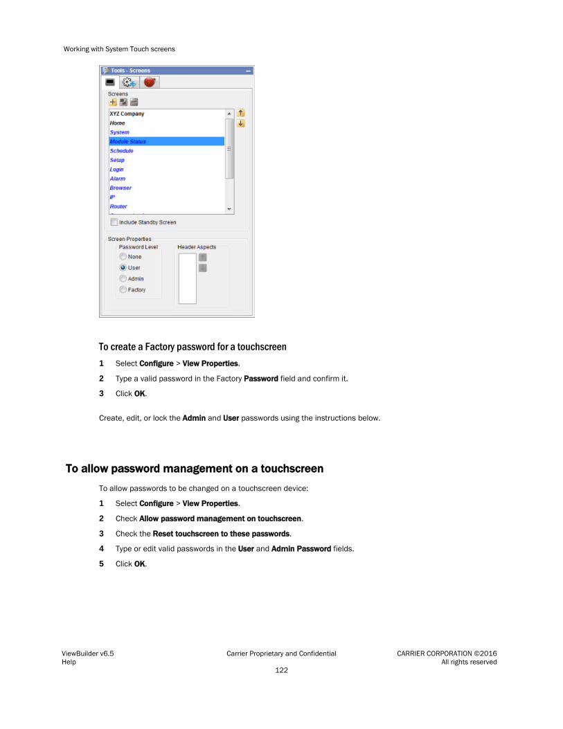
Working with System Touch screens
ViewBuilder v6.5 Carrier Proprietary and Confidential CARRIER CORPORATION ©2016 Help All rights reserved 122
To create a Factory password for a touchscreen 1 Select Configure > View Properties.
2 Type a valid password in the Factory Password field and confirm it.
3 Click OK.
Create, edit, or lock the Admin and User passwords using the instructions below.
To allow password management on a touchscreen
To allow passwords to be changed on a touchscreen device:
1 Select Configure > View Properties.
2 Check Allow password management on touchscreen.
3 Check the Reset touchscreen to these passwords.
4 Type or edit valid passwords in the User and Admin Password fields.
5 Click OK.

Working with System Touch screens
ViewBuilder v6.5 Carrier Proprietary and Confidential CARRIER CORPORATION ©2016 Help All rights reserved 123
To lock passwords on a touchscreen
To lock the User and Admin passwords on a touchscreen device:
1 Select Configure > View Properties.
2 Check Always use these passwords.
3 Type or edit valid passwords in the User and Admin Password fields.
4 Click OK.
Creating a non-English System Touch screen
NOTE If the non-English language uses non-ASCII characters, the names of your touchscreen file and any inserted image files must contain only ASCII characters.
To create a touchscreen file that can show multiple languages, use one of the following methods to create the non-English screens in ViewBuilder.
○ Add the non-English text in the ViewBuilder interface (page 93)
○ Export a language file, translate the terms, then import the new language file (page 94)
To add non-English text in the ViewBuilder interface
1 Select Configure > View Properties.
2 Under Supported Languages, select the languages you want to use in the touchscreen file. The languages you select will appear in the droplist on ViewBuilder's toolbar.
CAUTION Do not uncheck English. Although you may not use this language in your screen file, some versions of the touchscreen device's firmware require that English be checked.
3 Click OK.
4 On ViewBuilder's toolbar, select the active language you want to use.
5 Create the screens, typing all static text in the language you selected in step 4.
6 If you want the touchscreen device to display multiple languages, select another language in the active language droplist.
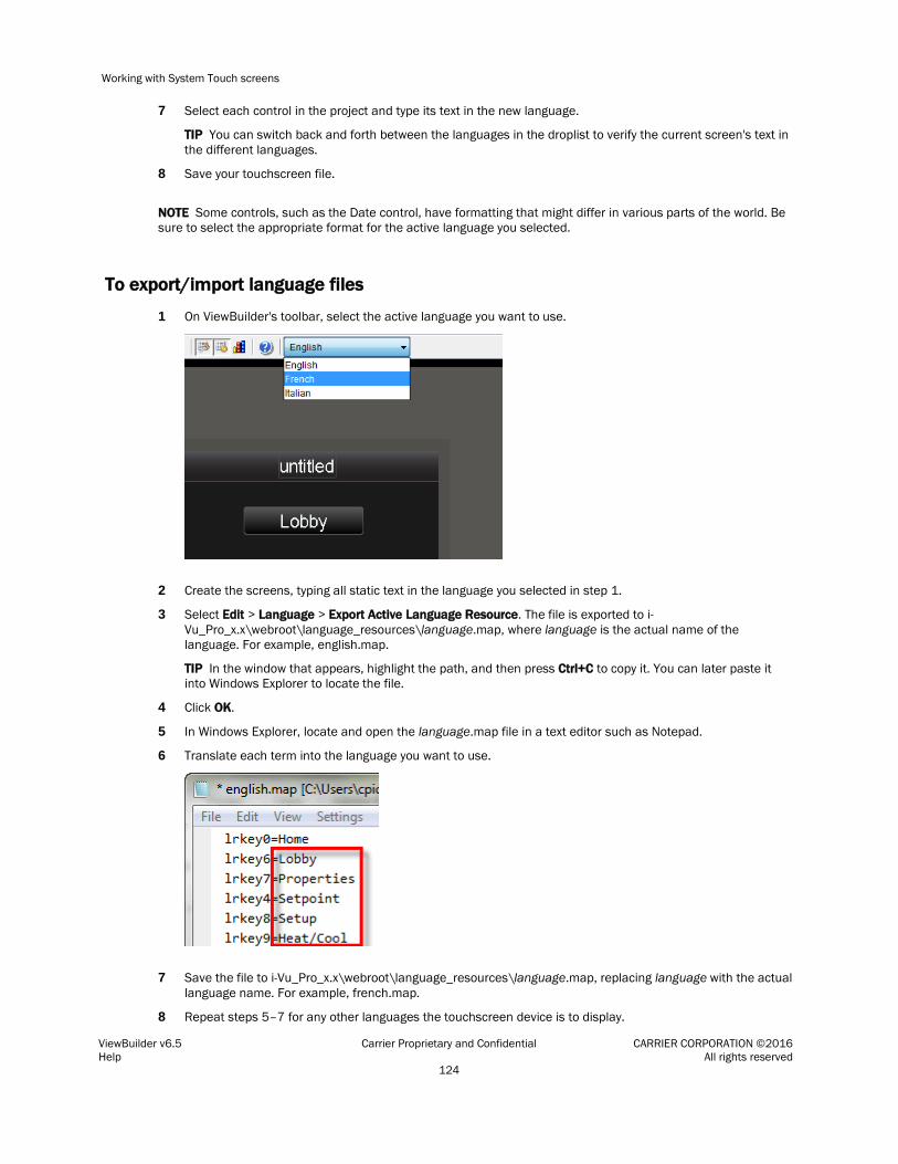
Working with System Touch screens
ViewBuilder v6.5 Carrier Proprietary and Confidential CARRIER CORPORATION ©2016 Help All rights reserved 124
7 Select each control in the project and type its text in the new language.
TIP You can switch back and forth between the languages in the droplist to verify the current screen's text in the different languages.
8 Save your touchscreen file.
NOTE Some controls, such as the Date control, have formatting that might differ in various parts of the world. Be sure to select the appropriate format for the active language you selected.
To export/import language files
1 On ViewBuilder's toolbar, select the active language you want to use.
2 Create the screens, typing all static text in the language you selected in step 1.
3 Select Edit > Language > Export Active Language Resource. The file is exported to i-Vu_Pro_x.x\webroot\language_resources\language.map, where language is the actual name of the language. For example, english.map.
TIP In the window that appears, highlight the path, and then press Ctrl+C to copy it. You can later paste it into Windows Explorer to locate the file.
4 Click OK.
5 In Windows Explorer, locate and open the language.map file in a text editor such as Notepad.
6 Translate each term into the language you want to use.
7 Save the file to i-Vu_Pro_x.x\webroot\language_resources\language.map, replacing language with the actual language name. For example, french.map.
8 Repeat steps 5–7 for any other languages the touchscreen device is to display.

Working with System Touch screens
ViewBuilder v6.5 Carrier Proprietary and Confidential CARRIER CORPORATION ©2016 Help All rights reserved 125
9 In ViewBuilder, select Edit > Language > Import Language Resources. This imports all .map files in the language_resources folder.
10 The import process adds the language(s) to the project's supported languages and to the toolbar droplist. Select each language in the droplist and then view each screen to verify the controls are spaced correctly and do not overlap.
11 Save your touchscreen file.

Working with BACview® screens
ViewBuilder v6.5 Carrier Proprietary and Confidential CARRIER CORPORATION ©2016 Help All rights reserved 126
A BACview device is a combination keypad/display that you can attach to a controller to view or change its property values or its real-time clock without having to access the system's server. BACview devices are available in the two sizes shown below.
The Virtual BACview application is a software version of the large BACview device shown below. The Virtual BACview application runs on a laptop connected to a controller's Local Access port, and it has the same functionality as the BACview device.
In ViewBuilder, you: • Create the screens that a BACview device or the Virtual BACview application will display • Test the navigation between screens • Save the screens in a single .bacview file
Follow the process below to create screens.
1 Make a new BACview file or open an existing file (page 129).
2 Make the BACview screens (page 130).
3 Add text, controls, headers, and footers (page 133).
Working with BACview® screens

Working with BACview® screens
ViewBuilder v6.5 Carrier Proprietary and Confidential CARRIER CORPORATION ©2016 Help All rights reserved 127
4 Add navigation (page 137).
5 Password-protect the screens (page 140).
6 Set up alarms (page 140).
7 Save, assign, and download the BACview file (page 141).
Getting to know ViewBuilder's BACview® interface
When you make a BACview file in ViewBuilder, ViewBuilder displays a simulation of a BACview device. You make your screens directly in the simulation's display, and you click the simulation's keys to test the navigation between screens.
Working with BACview® screens
ViewBuilder v6.5 Carrier Proprietary and Confidential CARRIER CORPORATION ©2016 Help All rights reserved 128
To move the cursor in a screen
Use your keyboard's arrow keys to move the cursor in the screen. You can also use the following keys on your keyboard.
Press... To jump to...
Home The first cell of the line the cursor is in
End The last cell of the line the cursor is in
Ctrl+Home The first cell of the screen's first line
Ctrl+End The last cell of the screen's last line
NOTE Hold down Shift while pressing the above keys to select everything from the cursor's current position to the new position.
To add lines to a screen
1 Click the Screens tab in the Tools window.
2 In the Number Of Lines field, click to add a line below the line the cursor is in.
NOTES
• Click to delete the line the cursor is in.
• To see all of a screen that exceeds the length of the BACview display, select Extended View.
To select or move objects
Objects on a screen are either text that you typed on the screen or controls that you added to the screen. See Adding text, controls, headers, and footers (page 133).
You must select an object to perform any action on it. • Click a control to select it. • Click and drag across text to select it. • Click and drag across multiple objects in a screen to select the objects.
To move a selected object, click and drag it to a new location in the screen.

Working with BACview® screens
ViewBuilder v6.5 Carrier Proprietary and Confidential CARRIER CORPORATION ©2016 Help All rights reserved 129
To copy an object
Alt+click and drag a control to create a copy of it on the same screen.
To copy a selected object(s) from one screen to another:
1 Select the object(s), then click .
2 On the new screen, click .
3 Click and drag the object(s) to the desired location.
To undo or redo actions
Click on the toolbar as many times as necessary to undo actions that you performed, beginning with the most recent action. Click to redo the action.
You can also click the drop-down arrow to the right of the Undo or Redo button to select an action from a list that begins with the most recent action. Selecting an action will undo or redo that action, plus all actions above it in the list.
To create a new BACview® file or open an existing file
1 Do one of the following:
To... Select...
Create a new BACview file File > New, then select one of the following:
• BACview (4x40) to make screens for a large BACview device
• BACview (2x16) to make screens for a small BACview device
Open an existing BACview file created in ViewBuilder
File > Open, then select the file.
NOTE If the file is not listed, verify that the Files of Type selection lists BACview files.

Working with BACview® screens
ViewBuilder v6.5 Carrier Proprietary and Confidential CARRIER CORPORATION ©2016 Help All rights reserved 130
To... Select...
Import a BACview HTML file that was not created in ViewBuilder
File > Import > BACview HTML, then select the file.
NOTES
• If the HTML file is for a small BACview (2x16), add type="small" to the HTML file's <BODY> tag before importing. EXAMPLE: <BODY type="small">
• If appears in ViewBuilder's lower right corner, click the triangle to see import errors or warnings. These details are available until you save the file.
• If your BACview file was created in BACview Artist, export it to HTML in BACview Artist, then import the HTML file in ViewBuilder.
2 Select File > Save As.
3 Browse to a convenient location on your computer.
4 Type a File Name, then click Save. ViewBuilder adds the .bacview extension to your file name.
NOTE To record information about the file, select Configure > View Properties, then type your name and comments on the Summary tab. Revision History shows each time the file was saved and the workstation it was saved on.
Making BACview® screens
A .bacview file includes the default screens listed below and any screens that you create in ViewBuilder.
Default screens
Every BACview file contains the screens listed below. The standby and home screens automatically display in the BACview device, but you must provide navigation to a system screen to have it display. See Adding navigation (page 137). The home and standby screens are editable; system screens are not editable.
NOTE The Clockset and Comm screens contain links to other screens that are not listed in the Tools window in ViewBuilder because you do not edit them or provide navigation to them. These linked screens are also shown below.
Screen name
Description
standby Displays when the BACview device has had no operator activity for the time specified in the Keypad inactivity timeout field in the controller driver. Leave this screen blank or add controls or text (page 133) to display information such as the date and time. Do not add lines to the standby screen.

Working with BACview® screens
ViewBuilder v6.5 Carrier Proprietary and Confidential CARRIER CORPORATION ©2016 Help All rights reserved 131
home Displays when an operator presses a key while the BACview device is in standby mode.
CAUTION Because this is the first screen that you see when the BACview device is activated, you must add navigation (page 137) to other screens in the system.
System screens
LOGIN
Displays if the screen the operator selected requires a password.
USERPW Lets the administrator set the user-level password.
ALARM Displays alarms received by the controller. You must define the alarms in ViewBuilder to have
them display. See Setting up alarms (page 140).

Working with BACview® screens
ViewBuilder v6.5 Carrier Proprietary and Confidential CARRIER CORPORATION ©2016 Help All rights reserved 132
CLOCKSET Lets an operator adjust the current time and date in the controller’s real-time clock.
The [–>DST] link jumps to the following screen where an operator can adjust the beginning and ending dates for daylight savings time.
KEYPAD Lets an operator define:
• The amount of time of inactivity before the standby screen is displayed
NOTE This time can also be defined in the driver.
• The priority (1–16) the BACview device uses to write to BACnet properties. 1 is the highest priority, 16 is the default.
NOTE System screens are a part of the BACview firmware. If a screen in the firmware is changed between releases of ViewBuilder, the ViewBuilder screen may look different than the actual BACview screen.
To add new screens
1 Click the Screens tab in the Tools window.
2 Do one of the following:
○ In the screen list, double-click "untitled", then type a descriptive name.
○ Click to add a new blank screen, then change its name.
○ Select an existing screen, click to make a copy of it, then change the copy's name. You cannot copy a system screen (page 130).
NOTE To delete a screen, select the screen name, then click . You cannot delete any default screen (page 130).
Working with BACview® screens
ViewBuilder v6.5 Carrier Proprietary and Confidential CARRIER CORPORATION ©2016 Help All rights reserved 133
Adding text, controls, headers, and footers to BACview® screens
You can add text, controls, headers, and footers to a BACview screen. If needed, you can increase the size of a screen by adding up to 100 lines.
CAUTION Typing text or placing a control on top of an existing control deletes the existing control.
To add text
Click in the cell where you want the text, then begin typing.
You can also copy text from another application and then paste it into a BACview screen.
To delete text, click and drag across the text to select it, then click or press Delete.
To add a BACview control
1 Click the Add Control tab in the Tools window.
2 Select a control. See BACview controls and their properties for a description of each control.
3 Click on the screen where you want the control.
NOTE If you select a control and then decide you do not want to add it to the screen, press Esc.
4 Edit properties for the control in the Control Properties window. See BACview controls and their properties.
5 Click on the screen or press Enter on your keyboard to apply the properties.
NOTE To copy a control or text: • Press Ctrl+c to copy the item and Ctrl+v to paste it on the same screen or a different screen. • Press Alt as you drag the item to a new location on the same screen.
BACview controls and their properties
Each control, its usage, and the properties you define are described in the table below.
The first three controls have the following properties in common.
Object Name Use ViewBuilder's System window to insert the Object Name (page 135) in this field. Or, you can find the point's Object Name in the i-Vu® interface on the point's Properties page > Details tab, under BACnet Configuration.
NOTE You must check Network Visible on the point's Details tab.
Editable Select to make the control editable in the BACview device.

Working with BACview® screens
ViewBuilder v6.5 Carrier Proprietary and Confidential CARRIER CORPORATION ©2016 Help All rights reserved 134
Use this control... To... Properties
Number Display any numerical value from an analog microblock.
Digits Left (or Right) of Decimal - Type the maximum number of digits that can appear to the left (or right) of the decimal.
Show Degree Symbol - Select to display with a temperature.
Range for Value - Type a Minimum and Maximum Value to define the acceptable range of values for the control.
Multi-State Control
Display the status of a microblock.
Field Width - Select Use the length of the longest display value to have the full text from the Display column shown in the BACview device, or select Use the following value and then type a number to have ViewBuilder truncate the displayed text to that number of characters.
In the Value-Display table, edit the entries in the Value column to show the actual values that the microblock will
produce. Click to add a row to the table or to delete a row. For each value, change the Display column text to what you want that value to display in the BACview device.
NOTE If this control is used in a large BACview device, it is editable, and the operator has selected it, the softkeys give him the following options: OK, CANCEL, DECR(EMENT), INCR(EMENT).
Advanced Multi-State Control
(Large BACview device only)
Display the status of a microblock and assign point values to softkeys.
Field Width - Select Use the length of the longest display value to have the full text from the Display column shown in the BACview device, or select Use the following value and then type a number to have ViewBuilder truncate the displayed text to that number of characters.
In the Value-Display-Softkey table, edit the entries in the Value column to show the actual values that the microblock
will produce. Click to add a row to the table or to delete a row. For each value, change the Display column text to what you want that value to display in the BACview device.
NOTE The last value, NOP, gives the operator a means to cancel editing the control. You cannot delete this row.
If you make the control editable, you can assign values to softkeys that the BACview operator can use to edit the point's value. To do this, select a Softkey in the table for each value.
Click to add values to the table, or to delete values.
Date Display the date in the controller's real-time clock.
Date Format - Choose how to display the date.
Time Display the time in the
controller's real-time clock. Time Format - Choose how to display the time.
Link Add a link to another
screen. See To add a link to a screen (page 138).
NOTE If editing a control's property causes the control to overlap another control or to expand past the edge of the screen, the control appears in red to indicate the error. Drag the control to a new location.

Working with BACview® screens
ViewBuilder v6.5 Carrier Proprietary and Confidential CARRIER CORPORATION ©2016 Help All rights reserved 135
EXAMPLE In the figure below, the date format was changed from MM/YYYY to MM/DD/YYYY.
To have ViewBuilder insert object names
Use the System window to insert the Object Name in the Control Properties window.
1 If you do not see the System window, click on the toolbar.
2 In the System window, select the system you want from the drop-down list.
3 Click Next.
4 In the Name field, select your user name from the drop-down list.
5 Type your Password.
6 Click Next.
7 In the system tree, select the point for the control you want to program.
8 Do one of the following:
○ Right-click the Object Name field in the Control Properties window, then select Set Object Name.
○ Select Edit > Set Object Name in ViewBuilder's menu.
To add headers and footers
A header is an area at the top of a screen that does not scroll; a footer is at the bottom.
1 Click the Screens tab in the Tools window.
2 Set the number of rows for a header or footer in the Header or Footer field.
EXAMPLE Set the Header field to 1 to have the first row be a header; set the Footer field to 2 to have the last 2 rows of the screen be a footer.
NOTE The total number of lines you can use for a header and footer are 3 on large BACview device and 1 on a small BACview device.

Working with BACview® screens
ViewBuilder v6.5 Carrier Proprietary and Confidential CARRIER CORPORATION ©2016 Help All rights reserved 136
Setting items on a BACview screen to show/hide
You can set controls, text, or complete rows on a BACview® screen to show or hide based on one of the following:
• The value of a microblock property
• The password level of the user
EXAMPLE You want to create a single control program and screen file that can be used in multiple applications. In the control program, you enable a microblock for one application, but disable it for another application. In the screen file, you set information that applies to that microblock to show when the microblock is enabled and hide when it is disabled.
To set items to show/hide
Based on a microblock property's value 1 Select the item(s) you want to show/hide.
2 Click on the toolbar.
3 In the Object Name field, type the microblock property's object name or select it from the drop-down list. You can use ViewBuilder's System window to find the object name (page 135).
4 In the Show When field, select:
○ True to show the information when the value of a binary microblock is 1 or the value of an analog microblock is anything other than 0.
○ False to show the selection when the value is 0.
5 Click OK.
Based on the user's password level 1 Select the item(s) you want to show/hide.
2 Click on the toolbar.
3 In the Object Name field, select one of the following from the drop-down list:
○ Sys.Exec.IsAdminLevel to show/hide the selected items to a user logged in with the Admin password
○ Sys.Exec.IsUserLevel to show/hide the selected items to a user logged in with the User password
NOTE See Password-protecting a BACview screen (page 140) for information on the Admin and User passwords.
4 In the Show When field, select True.
5 Click OK.
NOTES
• The cells that you assigned the show/hide condition to are highlighted by a color. A different color is used for each unique condition.
• To move an item and its condition, hold down Ctrl as you drag the item.
• To copy an item and its condition, hold down Alt as you drag the item.
Working with BACview® screens
ViewBuilder v6.5 Carrier Proprietary and Confidential CARRIER CORPORATION ©2016 Help All rights reserved 137
• Items moved or added into cells that have a show/high condition may or may not assume the condition. If you do not get the results you want, change the show/hide condition or click to undo the action.
• If you hide part of a row, the cells will be blank when the screen is viewed in a BACview device. If you hide an entire row, the row will be completely removed from the screen. Design your screen so that a large BACview device will never have less than 4 rows and a small BACview device will never have less than 2 rows.
To edit or remove a show/hide condition
1 Select the cells whose condition you want to edit or remove.
2 Click on the toolbar.
3 Do one of the following:
○ To edit a condition, change the Object Name or Show When field.
○ To remove a condition, delete the text in the Object Name field.
4 In the Apply To field, select:
○ Selections only to have the changes apply only to the selected cells.
○ Wherever Used to have the changes apply everywhere that the condition is used.
5 Click OK.
Adding navigation to BACview® screens
You can give an operator the following methods of moving from one screen to another:
When you provide a... The operator...
Link Uses the arrow keys to select the link, then presses Enter to go to the linked screen
Softkey link (Large BACview device only)
Presses the softkey below the link
Hotkey (Large BACview device only)
Presses FN plus the number key assigned to a particular screen

Working with BACview® screens
ViewBuilder v6.5 Carrier Proprietary and Confidential CARRIER CORPORATION ©2016 Help All rights reserved 138
To add a link
If you place a link on a screen, the operator can use the arrow keys to select the link, and then press Enter to go to the linked screen.
To add a link:
1 Click the Add Control tab in the Tools window.
2 Select Link.
3 Click in the screen where you want the link.
4 In the Control Properties window, do one of the following:
If you want the link to go to...
Then...
A specific screen In the Link to Screen field, select the screen the link will jump to.
The previous screen Check Previous Screen.
5 In the Link text field, type the text that you want your screen to show for the link.
NOTE This field is not editable if you link to a system screen (page 130).
To add a softkey link
If you assign a softkey number to the link directly above the softkey, the operator can press that softkey to jump to the linked screen.
To add a softkey link:
1 Click the Add Control tab in the Tools window.
2 Select Link.
3 Click in the screen directly above the softkey that you want to be the link. See figure below.
4 In the Control Properties window, do one of the following:
If you want the link to go to...
Then...
A specific screen In the Link to Screen field, select the screen the link will jump to.
The previous screen Check Previous Screen.
5 In the Link text field, type the text that you want your screen to show for the link.
NOTE This field is not editable if you link to a system screen (page 130).

Working with BACview® screens
ViewBuilder v6.5 Carrier Proprietary and Confidential CARRIER CORPORATION ©2016 Help All rights reserved 139
6 Select the softkey number in the Assign to Softkey field.
To assign a hotkey to a screen
If you assign a hotkey number to a screen, an operator can press FN plus that number to jump to the screen.
If you want a hotkey to go to...
Then...
A specific screen 1 Click the Screens tab in the Tools window.
2 Select the screen name.
3 Select the hotkey number in the Hotkey field.
The previous screen Select a hotkey number in the Previous Screen Hotkey field.
TIP Create a screen that shows all the hotkeys and their destinations.
To test the navigation
To test a... Click anywhere outside the BACview screen and then click...
Link The arrow keys to select the link (the link will have brackets around it). Then click Enter.
Softkey link (Large BACview device only)
The softkey below the link.
Hotkey link (Large BACview device only)
FN and then the hotkey number assigned to a screen.

Working with BACview® screens
ViewBuilder v6.5 Carrier Proprietary and Confidential CARRIER CORPORATION ©2016 Help All rights reserved 140
Password-protecting a BACview® screen
To provide security for your i-Vu® system, you can assign a password level to a screen on the Screens tab in the Tools window.
A screen with this password level...
Can be accessed by...
None Anyone, but to edit a field in this screen, the operator must log in with either the User or Admin password.
User An operator logged in with the User or Admin password.
Admin An operator logged in with the Admin password.
Create the 4-digit Admin and User passwords using the instructions below.
To create the Admin password
1 In ViewBuilder's menu, select Configure > View Properties.
2 Type any 4-digit number in the Admin Password field.
To create the User password
A BACview device has a single User password shared by its operators. You do not create this password in ViewBuilder. The person with the Admin password creates the User password on the BACview device after the .bacview file has been downloaded to the controller.
To create the User password:
1 Navigate to the USERPW screen on the BACview device.
2 Log in with the Admin password.
3 Type any 4-digit number as the User password.
Setting up alarms for a BACview® device
The BACview Alarm LED turns on (and the BACview horn may sound) when its controller receives a BACnet alarm that you set up on the Alarms tab in the Tools window. An operator can view the alarm description on the ALARM screen.

Working with BACview® screens
ViewBuilder v6.5 Carrier Proprietary and Confidential CARRIER CORPORATION ©2016 Help All rights reserved 141
To set up an alarm:
1 Click the Alarms tab in the Tools window.
2 Click the to add an alarm.
3 Double-click that alarm's Alarm Name cell, then change the existing text to the alarm's BACnet Object Name.
4 Double-click the alarm's Description cell, then change the existing text to the description that you want to appear on the ALARM screen.
5 Check Use Horn? to have the BACview device audibly notify an operator when it receives an alarm.
NOTES
• To delete an alarm, select the alarm, then click .
• Click a column heading on the Alarms tab to sort the alarms.
• You should enable each alarm's Return to Normal field in the i-Vu® interface to prevent the Alarm LED and horn from remaining on until an operator can clear the alarm.
To save, assign, and download the BACview® file
1 Save the .touch or .bacview file to a convenient location on your computer.
Then, in the i-Vu® interface:
2 Right-click the controller and select Driver Properties to attach the screen file.
3 Download All Content to the controller.
NOTE If the controller has an Router Config Mode DIP switch, make sure that this DIP switch is off when connecting a touchscreen device.

Document revision history
ViewBuilder v6.5 Carrier Proprietary and Confidential CARRIER CORPORATION ©2016 Help All rights reserved 142
Important changes to this document are listed below. Minor changes such as typographical or formatting errors are not listed.
Date Topic Change description Code*
No changes yet
* For internal use only
Document revision history


CARRIER CORPORATION ©2016 A member of the United Technologies Corporation family · Stock symbol UTX · Catalog No. 11-808-556-01 · 5/9/2016