Variable An item of data Examples: –gender –test scores –weight Value varies from one...
60
Variable An item of data Examples: – gender – test scores – weight Value varies from one observation to another
-
Upload
chloe-hawkins -
Category
Documents
-
view
217 -
download
2
Transcript of Variable An item of data Examples: –gender –test scores –weight Value varies from one...
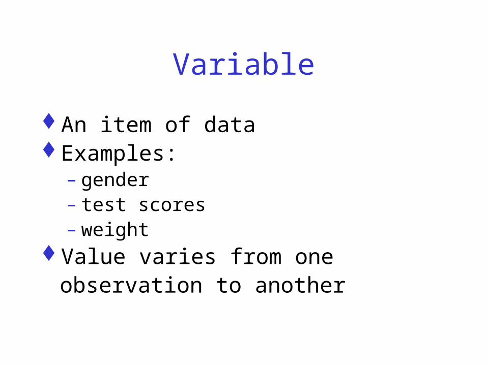
Variable
An item of data Examples:
– gender– test scores– weight
Value varies from one observation to another

Types/Classifications of Variables
QualitativeQuantitative
– Discrete– Continuous
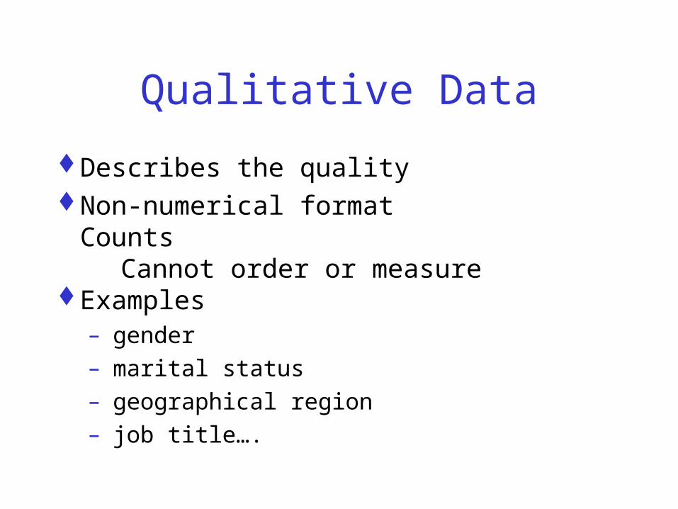
Qualitative Data
Describes the quality Non-numerical format
Counts Cannot order or measure Examples
– gender– marital status– geographical region – job title….

Categorical data
Non-overlapping categories or characteristics
Examples:– Completes/Incompletes
– Professions
– Gender

Quantitative Data
Frequencies
Measurements

Discrete
Measurements are integers
Examples:
– number of employees of a company
– number of incorrect answers on a test
– number of participants in a program…

Continuous
Measurements can take on any value - usually within some range
Examples:
– Age
– Income
Arithmetic operations such as differences and averages make sense.
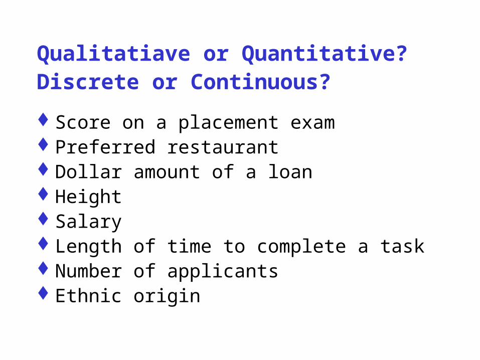
Qualitatiave or Quantitative?Discrete or Continuous?
Score on a placement examPreferred restaurantDollar amount of a loanHeight SalaryLength of time to complete a taskNumber of applicantsEthnic origin

Treatment as Ranks
Natural order Not strictly measuredExamples:
– Age group – Likert Scale data
Distinction between adjacent points on the scale is not necessarily the same

AnalysisQualitative Data
Frequency tables
Modes - most frequently occurring
Graphs: Bar Charts and Pie Charts
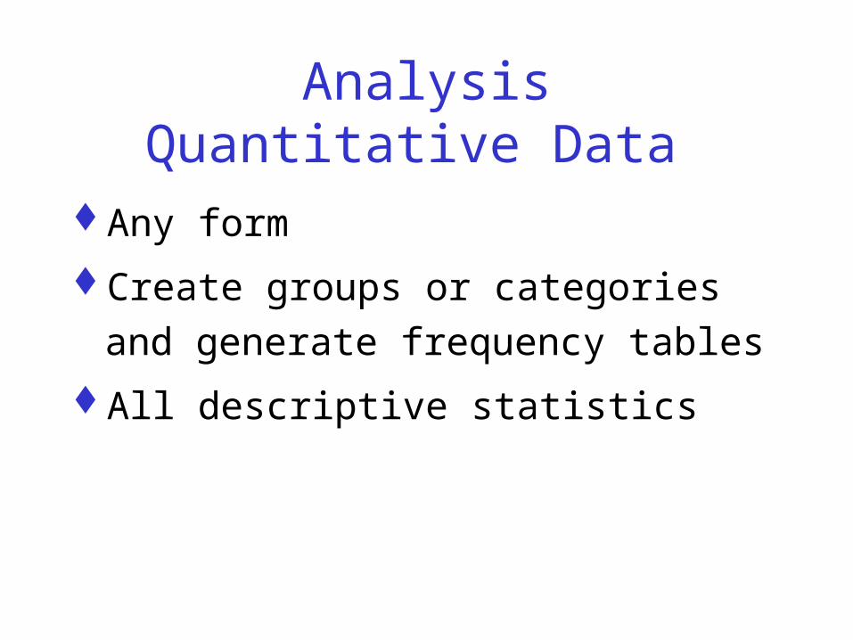
AnalysisQuantitative Data
Any form
Create groups or categories and generate
frequency tables
All descriptive statistics

Effective Graphs: Quantitative Data
Histograms
Stem-and-Leaf plots
Dot Plots
Box plots
XY Scatter Plots (2 variables).

Examples of Graphs

Pie Chart
Performance Appraisals
10%
14%
33%
38% More Difficult
Difficult
Same
Much Easier
Easier

0
10
20
30
40
50
60
70
80
90
1st Qtr 2nd Qtr 3rd Qtr 4th Qtr
EastWestNorth

Histogram
Histogram
0
2
4
6
8
10
12
49 59 69 79 89 99
Score
Fre
qu
ency
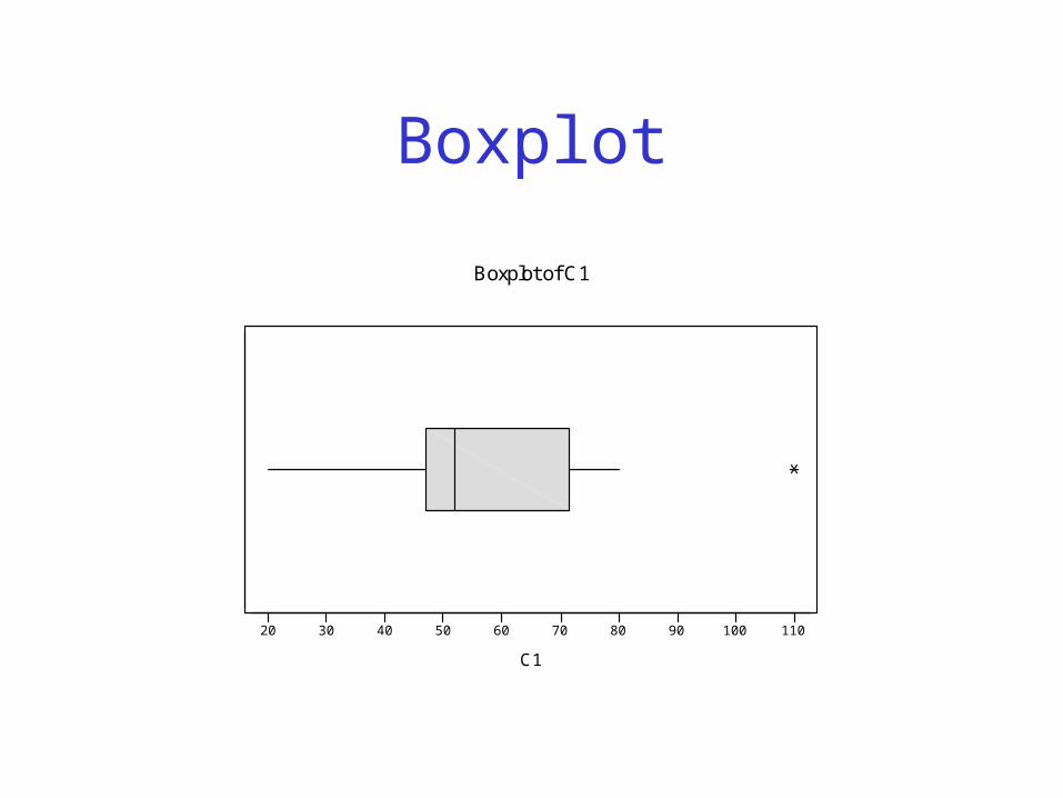
Boxplot
20 30 40 50 60 70 80 90 100 110
C1
Boxplot of C1

Stem and Leaf PlotStem and Leaf PlotWeight of Meat
7 58 38 79999 239 66789
1010 68811 224411 78812 412 81313 814 1

Analyze Ranked Data
Frequency tables Mode, Median, Quartiles Graphs:
– Bar Charts– Dot Plots, Pie Charts– Line Charts (2 variables)

Data Example
Suggest some ways you could analyze these items.
Score on a placement exam Preferred restaurant Dollar amount of a loan Height Salary Length of time to complete a task Number of applicants Ethnic origin
Tables and Graphs
Note Excel will create any graph that you specify
Consider the type of data before selecting your graph.

Frequency Table/Frequency Distribution
Summarize data:categoricalnominal Continuous data - the data set has been
divided into meaningful groups
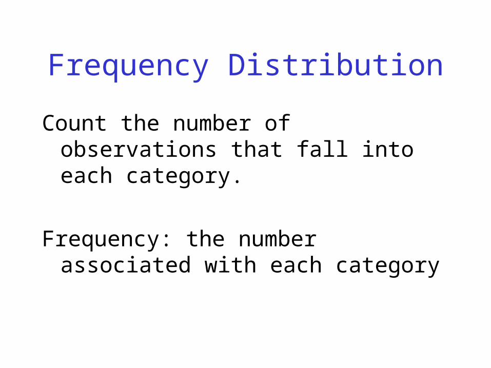
Frequency Distribution
Count the number of observations that fall into each category.
Frequency: the number associated with each category
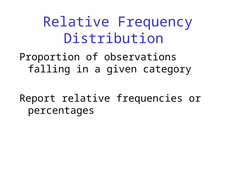
Relative Frequency Distribution
Proportion of observations falling in a given category
Report relative frequencies or percentages
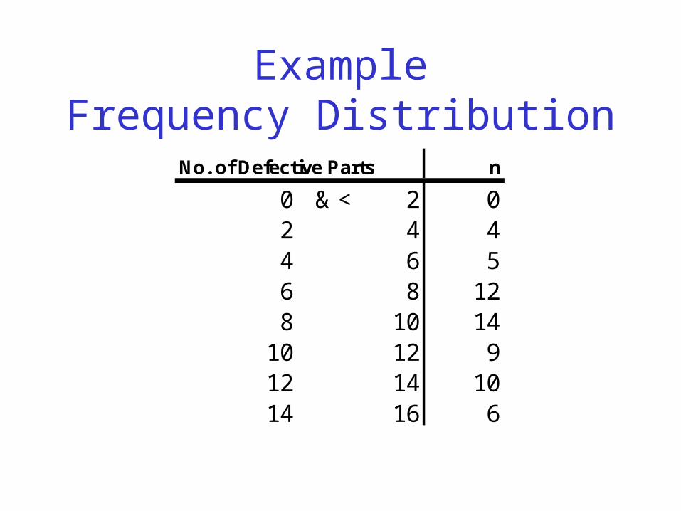
ExampleFrequency Distribution
No. of Defective Parts n
0 & < 2 02 4 44 6 56 8 128 10 14
10 12 912 14 1014 16 6

GraphsCategorical/Qualitative Data

Pie Charts
Circle - divided
proportionately
Segment - percentage of
the whole that falls into
each category Native Language
English55%
Viet Namese
15%
Swedish5%
Spanish25%

Bar Charts
Bar charts - % in various
categories Vertical scale -
frequencies, relative
frequencies Horizontal scale -
categories Allows comparisons
Ave ra ge Units Sold (pe r pe rs on) by Produc t
0
5
10
15
20
B41 BA42 B41F C21 Other
Product
Ave
rag
e S
old
/Pe
rso
nBefore Training
A f ter Training

Constructing Bar Charts
All boxes should have the same width Gaps between the boxes - no connection
between Any order. Use to represent two categorical variables
simultaneously

Graphs: MeasuredContinues Quantitative Data
Histograms Stem and LeafBox plotsLine GraphsXY Scatter Charts (2 variables)

Histograms
Frequency distributions of continuous variables
Drawn without gaps between the bars
Grade Distribution
02468
1012
59 69 79 89 99Grade
Fre
qu
ency

Constructing Histograms
Non-overlapping intervals
Intervals - generally the same length
Number of values in each interval -class frequency
Relative frequencies o
Grade Distribution
02468
1012
59 69 79 89 99Grade
Fre
qu
ency
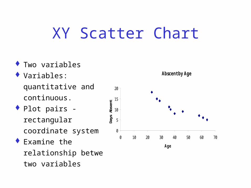
XY Scatter Chart
Two variables Variables: quantitative
and continuous. Plot pairs - rectangular
coordinate system Examine the relationship
between two variables
Abscent by Age
0
5
10
15
20
0 10 20 30 40 50 60 70
Age
Days
Abs
ent

Line Chart
Similar to the scatter chart
Values of the independent variable (shown on the horizontal axis) can be ranked values (i.e.. they do not have to be continuous variables).
1997 Monthly Sales
125130135140145150155160165170
Jan
Feb
Mar
Apr
May
June
Month
Sale
s (x
$10,
000)

Basic Principles for Constructing All Plots
Data should stand out clearly from background
The information should be clearly labeled – title– axes, bars, pie segments, etc. - include units
that are needed to interpret data– scale including starting points.
Principles cont.
Source No clutter Minimize information or data on one graph.Try several approaches

Describing Data
Shape of the Distribution– Symmetry– Skewness– Modality: most frequently occurring value – Unimodal or bimodal or uniform

Right Skewed Left Skewed
Histogram
0
2
4
6
8
10
12
59 69 79 89 99
Grade
Fre
qu
ency
Histogram
0
2
4
6
8
10
12
59 69 79 89 99
Grade
Fre
qu
ency
Histogram
0
2
4
6
8
10
12
59 69 79 89 99
Grade
Fre
qu
ency
Symmetrical

Describing Data
CentralitySpreadExtreme values

Measures of Centrality
MeanMedianMode

Mean
Most common measure
Extremely large values in a data set will
increase the value of the mean
Extremely low values will decrease it.

Calculating the Mean
T1 T2 T3
85 85 85
90 90 90
75 35 75
90 90 110
340 300 360 Sum
85 75 90 Mean

Median
Central point .Half of the data has a value than the medianHalf of the data has a higher value than the
medianNot affected by extremely large or small
values

Find the Median
85 90 75 92 95 Data
75 85 90 92 95 Sorted Data
Median is 90.

Find the Median
95 90 92 85 Data
85 90 92 95 Sorted Data
Median:
(90 + 92)/2 = 91

Measures of Spread
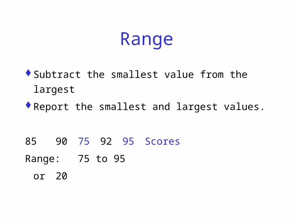
Range
Subtract the smallest value from the largest
Report the smallest and largest values.
85 90 75 92 95 Scores
Range: 75 to 95
or 20
Variance/Standard Deviation
Average variation of the data values from
the mean of the valuesVariance.

The Empirical Rule
Symmetrical DataAt least:
68% of the data values are within one standard deviation of the mean
90% of the data values are within two standard deviation of the mean
99% of the data values are within three standard deviations of the mean

Tchybychef’s Inequality
Skewed DataAt least:
75% of the data values are within two standard deviation of the mean.
90% of the data values are within one standard deviation of the mean.

Measures of Relative Standing
Percentiles
Quartiles

Quartiles
The lower quartile is the same as the 25th percentile.– 25% of the scores are lower and– 75% of the scores are higher than the lower
quartile.
The upper quartile is the same as the 75th percentile.– 75% of the scores are lower and

Correlation
Describes the strength of the relationship
between two (or more) variables
Pearson Product-moment Correlation
Coefficient - assumes continuous
quantitative data

Relationship between Variables
Positive Negative No relationship.

Interpreting Correlation Coefficients.
0.20 to 0.35- show a slight relationship(little value in practical prediction situations)
0.50 - crude group prediction
(Correlations this low do not suggest a good relationship)
0.65 to 0.85 - group predictions that are good
Over 0.85 - a close relationship between the two
variables.

Even a high correlation coefficient does not establish a
cause and effect relationship!!!!!

Coefficient of Determination
Square root of the correlation coefficient
Gives the percent of variation in the
dependent variable that is ‘explained’ by
the independent variable.
Look at an XY scatter plot

Least Square Line
Describe the relationship between the two
variables
Make predictions of the dependent variable
from the independent variable

Positive Relationship
0
1
2
3
4
5
6
7
8
0 2 4 6
X
Y
r will be a positive number.

Negative Relationship
0
1
2
3
4
5
6
7
8
0 2 4 6
X
Y
r will be a negative number.