UX Psychology Case Studies
39
UX Psychology Case Studies Attention · Perception · Memory · Motivation · Self-image · Social Influence Yihan Lin COMMLD 517 The Psychology Of User Experience Instructor: David C. Evans Ph.D. & Brendan Baird Ph.D.
Transcript of UX Psychology Case Studies

UX Psychology Case StudiesAttention · Perception · Memory · Motivation · Self-image · Social Influence
Yihan LinCOMMLD 517 The Psychology Of User Experience
Instructor: David C. Evans Ph.D. & Brendan Baird Ph.D.

CatalogueAttention: F-shaped Pattern Vs. Layer-cake Pattern
Perception: Signal Detection Challenge
Memory: Working Memory Decay & Displacement
Motivation: Schedules of Reinforcement
Self-Image: Big Five Personality Model
Social Influence: Group Polarization
References

AttentionF-shaped Pattern Vs. Layer-cake Pattern

F-shaped Pattern Vs. Layer-cake PatternThe F-shaped pattern and the layer-cake pattern refer to two types of gaze patterns that users would generally use when they are scanning the content on a website. According to the psychological research of the usability expert Jakob Nielsen in 2006, we found that people would like to scan the website and grasped information in a way with the least cost of effort and attention resources, which was called F-shaped reading pattern. It meant that we tended to read in a horizontal movement across the left-upper part of the page first, and then move down the page a bit and read across in a second horizontal movement, and finally concentrate on the page’s left side in a vertical movement, which was like a “F”. Thus, contents locating on the right-bottom of the page had less possibility to fall in the foveal sight of people.
Based on the principle of F-shaped reading pattern, many websites would like to design their information hierarchy in a F-shaped, which means to put the most important content on the top and left side of the page. However, further researches approves that this is not effective for conveying information because people can miss large chunks of content unconsciously when they read in a F-shaped pattern.
Here comes the layer-cake reading pattern, the most efficient scanning pattern until now. In a layer-cake reading pattern, people tend to concentrate on the headings and subheadings to locate the information they are seeking, and then read the body text carefully under the corresponding heading/subheading. With an appropriate design to make the headings and subheadings stand out, a website developer can reflect the information structure of the page and guide people to browse the page in a way he desire. For a business, improving the site design from a F-shaped gaze pattern to a layer-cake gaze pattern can not only help users find useful information as quickly as possible, but increase users’ senses of trust to the site and increase the 2nd degree recommendations.

Case Study: citypass.com/seattle● The seattle page of Citypass.com shows in a tropical F-shaped design, who locates
main contents on the top and left side of the page. The designer of the page sets “Save 49%” on the first horizontal bar of “F”. Several links of attractions and buying tickets window are on the second horizontal bar of “F”. On the vertical bar of “F”, the page allocates the basic introduction of citypass ticket and pictures with the links of attractions again.
● However, this page does not have any descriptive headings or subheadings to help users locate the information they need quickly. Although some outstanding CTAs (like the red button of Add to Cart) in the page could prevent users from losing totally in the site, users cannot understand what kind of information they can get and what they can do on the page after the first 5 seconds browsing.
● In the page without a clear information structure, users tend to browse in a F-shaped pattern and simply grasp the most important information (or the information the business hopes users to know), such as “Save 49%” and the price of tickets, but it is also simple to miss content like How it Works and What You Save. People who care these detailed information need to spend more time reading the page. Fig. 1

Case Study: citypass.com/seattle● After clicking the How it Works link, a window (Fig.2) pops up to navigate users find more information through
Learn More link. The Learn More link will bring user to another window introducing the detailed process of citypass ticket using small font-size (Fig.3). However, these information shows only after 1 or 2 clicks, which is not noticeable for users. They may think they need to find these information someplace else.
Fig. 2 Fig. 3

Recommendations● Using headings and subheadings in concise and highly generalized language and separating the page into several
horizontal sections.
○ For example, Buy and Save (including buying tickets window and saving info), What does it Include? (including 1 or 2 descriptive sentences and a slide of attractions including in a citypass ticket), How it Works? (Briefly introducing the process of buying and using the citypass ticket), Reviews (Including the customer reviews), Explore more about Seattle! (including some videos and posts introducing seattle), and Contact Us! (offering help). To make these headings and subheads stand out, I recommend to use a larger font-size, bolding, and a different color for headings/subheadings. Consistency of the headings/subheadings design is also necessary for users to understand the structure of the page.
● A top navigation is also helpful in reflecting the information structure of the page. So that users can know what they can get from the page at the first glance.
● A layer-cake gaze pattern can help users locate information quickly without missing any content they may need to know and create a smooth user-experience by providing users a sense of control.
● With the faster information seeking process and clear information structure, firstly, users will be willing to explore the website deeper, instead of quickly scanning, confusing about what is citypass, and leaving to Google.
● Additionally, the business can create a brand impression of well-organized and credible travel company. Users tend to trust the website and believe that they would have a similar smooth travel experience after buying the citypass tickets.
Benefits

PerceptionSignal Detection Challenge: False Negative & False Positive

Signal Detection Challenge: False Negative & False PositiveSignal detection challenges refers to the difficulty users are facing when distinguish the good, useful memes from the bad, distracting memes, which are analogous to “signal” and “noise”. According to the signal detection theory of psychologists David Green and John Swets in 1966, we tend to raise our thresholds to ignore more information when we want to concentrate and to lower our thresholds to accept more information when we are waiting or looking for something important. However, each adjustment has a cost. To raise the thresholds means that we will miss some good memes at the same time while lowering the thresholds results in accepting the same volume of spam. What a helpless and painful dilemma!
The higher similarity between the useful information and spams today even makes the situation worse. To increase the exposures and click rate of Ads, more and more browsers, social media and email websites camouflage spam as the normal searching results, posts from friends, and emails. It is reasonable that businesses need to make money from advertisements. However, from the point of long-term benefits, it is helping users overcome the bottleneck of signal detection that can win users’ hearts and increase their trust of the brand, instead of taking advantage of signal detection theory and fooling users. Because, if the website designer fails to help users detecting useful information, users have to experience the effortful and annoying process of distinguishing by themselves, which may finally drive users to close their attention channels to the whole website (abandon and leave).
There are two type of falses in signal detection challenge: false negative and false positive, which are originally from two error types of the statistic test. A false negative means that users falsely mark useful information as negative while a false positive means that users falsely mark spams as positive. For example, reading every email in the email box to avoid missing important messages but wasting lost of time and attention on spams is a false positive. Conversely, marking all emails as spams and leaving them in the inbox to save attention but missing some cool stuff is a false negative.

Case Study: msn.com● In the homepage of msn.com, a website portal powered by Microsoft,
news sections occupy a large percentage of the content. It collects various news from both national news media, like CNN and the New Yorker Times and local media based on the location of users, which aims to inform users of current news around the world.
● There are several chunks of different news to help users to navigate themselves to the desired section and also a “From Our Partners” chunk (Fig. 1) that shows advertisements. By using signal detection theory, this ads section is camouflaged with the similar layout, font size, and bold title as the other news sections and is difficult for users, especially novices, to distinguish ads from informative articles. However, this ads section aggregates advertisements together and is editable (showed in Fig.2), so that experienced users can skip this section or remove this section to avoid false positive, which improves user experience by increasing the feeling of controlling.
Fig. 1
Fig. 2

Case Study: msn.com● However, while experienced users feel that they can decide
to see ads or skip ads and lower their thresholds to attend to more information, msn.com still hides some advertisements in the middle of other news sections. As Fig.3 shows, with the similar layout as other news and strict news-style images and titles, the ads successfully hide themselves in the middle of news and only provide a small green icon to indicate their true identity. Especially the lower one with the title “Post Fed Meeting, Americans Urged to Refinance” is linked to a website comparing mortgage rates. This seriously challenges users in detecting signals and wasting time on spams not aligning with expectations (false positive).
Fig. 3

Problems● Challenge for Novices: it is easily to falsely mark advertisements in “From Our Partner” section as normal news section and wasting
time on spams.● Challenge for Both Experienced Users and Novices: Having an effortful time of detecting hidden advertisements from true news due
to their similar layouts and misleading titles. ● With these troubles in distinguish news from advertisements, users will suffer in using msn.com for reading news and probably
choose to close their attention channels to the whole news section, which damages the benefits of msn.com and its stakeholders in the long-term.
Recommendations● Centralizes all advertisements in one section and positively reminds users (especially novices) that it is editable and can be removed. Most
importantly, do not create a promotion section and hide advertisements in other places at the same time. This may deceive users to lower thresholds at first, but as soon as users realize this trick, the negative emotions of being fooled will damage their trust to the site.
● Engages users in deciding the types and the positions of advertisements. ○ A more transparent information about advertisements, such as why we think placing this advertisement will interest you (the user) and
why click this advertisement will benefit you. ○ A more controllable advertisements system that allows users to choose what ads they are interested and what are not.

Benefits● Increasing the engagement of users in deciding the types and positions of advertisements can create positive emotions when users
are reading both news and advertisements on msn.com. ○ For users, the definitions of signals and noises are not absolute but relative based on their current goals. When they are
reading news about the Super Bowl, for example, msn.com can ask them if they want to see more about the Super Bowl from their sponsors, instead of directly placing an advertisement about the Super Bowl (in some worse cases, the ads even not related to the corresponding news). When users are reading news about the Super Bowl, the advertisements about the Super Bowl are more likely not spams for them.
● Since users are active participants in signal detection, a more transparent and controllable attention economy model will involve users in deciding what are good memes and what are bad memes positively and help website understand the users in a more efficient and friendly way.
● Avoiding to create a promotion section and hide advertisements in other places at the same time can increase the credibility of msn.com. In the current version of website, there are many ads hidden in the middle of news as well as a centralized ads section, which may deceive users to lower thresholds at first, but as soon as users realize this trick, the negative emotions of being fooled will damage their trust to the site.
● Increasing the click rate of advertisements and so that increasing the benefits of both msn.com and its stakeholders. A more delightful process of reading ads can increase the click rate of ads since users will create an impression that the ads on msn.com are always useful/interesting to see.
MemoryWorking Memory: Decay & Displacement

Working Memory: Decay & DisplacementWorking memory refers to a field of brain that human use to hold and process information relevant to the current task. Compared with the iconic memory (which stores the whole field of vision) and the long-term memory, the capacity of our working memory is very limited, about 6 letters at a time, or 4-5 words, which is next to nothing. When the amount of information coming in exceeds the ability of our working memory to hold it, we will get overwhelmed, miss important details, or even abandon and leave the site. This inherent limitation of holding current information causes the memory bottleneck that designers need to help users overcome in their products.
There are two key constraints of working memory: decay and displacement. Decay means that if we do not work hard to keep them, all of the information in the working memory will decay in about 30 seconds. Thus, UX designers should help users create external memory on the interface that provides info needed to complete the final task, or at least, should avoid designs that require users to recall info from other pages. Automatically typing the sms verification code into the bar and remembering name, address, and password in the browser are good examples of overcoming information decay from the working memory.
Another constraint is the displacement of new information with old information. Since the limited capacity of the working memory, once it has been filled up (which often happens in the age of information explosion), the old information has to be squeezed out to allow new information coming in. A new email will squeeze out the old one, and a coming phone call will squeeze out the new email. As for those information squeezed out, they are not forgotten by us but simply uncoded into our mind. Preventing information from being displaced is a even more harder challenge for designers and advertisement companies.

Case Study: Expedia.com/HotelsIn the hotels search results page of Expedia, hotels are listed in the card form (Fig. 1) with basic information (like the name, images, location and the rating) and highlighted information (like breakfast included and free cancellation). Users can easily compare different hotels with these brief bullet-point information and save their candidate hotels by clicking the heart icon on each hotel card. After deciding the hotel, users need to choose suitable units in the specific hotel page and then check out (Fig. 2). A “viewed” icon will appear once users open the link of a hotel and update the search results page.
To prevent users from forgetting what hotels they think is good and help users find what hotels they recently browse, Expedia designs the “Saved” function and the “Recent Searches” list (Fig. 3). However, there are still some problems in the Expedia hotels that will tax users working memory load and make users suffer when making a decision.
Fig. 1
Fig. 2
Fig. 3

Case Study: Expedia.com/HotelsThe biggest problem is lacking the comparison function for users to compare several hotels with more detailed information. In most cases, users would like to compare as many features of hotels as possible before making decisions, such as the nearby attractions, cancellation policy, parking fee, and etc. The process of comparing will occupy lots of working memory of users if they have to switch between different pages, remember the pros and cons of different hotels, and try to make a decision. Expedia has done a good job assisting users to compare hotels in the search results page but fails to achieve this assistance in the “All Saved Items” and “Recent Searches” page, where the comparisons always happen. Especially for the unit features, such as the amount of bedrooms and the amount of beds, comparisons are difficult to do and will increase the working memory burden.
Problems● Comparing the detailed information of different hotels still requires users to switch between several pages, especially for the unit features,
which increases the working memory burden.● On the search result page, the “Viewed” icon only appears after updating the page and is unobvious, which taxes users working memory to
remember which hotel has been clicked. ● Extra information, such as the membership discount and the nearby attractions, does not appear on the “All Saved Items”, which requires users
to open the specific hotel page again for detailed information.

Recommendations● Design a comparison function in the “All Saved Items” page to help users compare different hotels intuitively and
release users working memory from remembering several information of different hotels. ○ A comparison table of the candidate hotels with the selected unit will be helpful. The important
information, like the amount of bedrooms and beds, the cancellation policy, the location, and the discounts, can be listed briefly.
○ A map marking the locations of famous attractions and the candidate hotels can also be a good idea. Since a line of address does not make sense for users and they have to search the address in another App (e.g. Google Map), providing a map with detailed information of hotels is helpful for releasing users’ working memory for remembering and comparing the location of different hotels.
● Change the color of the viewed hotel imeditately after users opening it. This improvement can help users distinguish the viewed hotels with those unviewed quickly without occupying their working memory.

MotivaitonSchedules of Reinforcement: Variable-Interval & Variable-Ratio

Schedules of Reinforcement: Variable-Interval & Variable-RatioSchedules of reinforcement are a tactic often used in operant psychology to strengthen a specific behavior, which is firstly researched by psychologists Burrhus Frederic Skinner and C.B. Ferster and described in their 1957 book. There are four types of reinforcement schedules: fixed-interval, fixed-ratio, variable-interval and variable-ratio, among which variable-interval and variable-ratio reinforcement schedules are most often applied by nowadays digital meme-makers and make their memes addictive. The variable-interval reinforcement schedule refers to a rule that when the exact time of rewards coming is unknown for users (that is, the time is variable), users tend to review the page again and again to check rewards. The "rewards" here can be posts from friends, an important email from the boss, or the online discounts for Black Friday (which often comes earlier). According to the experiments of Skinner and Ferster, in the timing pattern of the variable-interval reinforcement schedule, the user has very frequent sustained checking and moderately rapid extinction.For the variable-ratio reinforcement schedule, comparatively, the variable is the action, which means that the exact number of steps before rewards is unknown for users so that they will click again and again until they find rewards. For example, the tactic YouTube uses to increase clicks: as soon as the video ended, an array of related thumbnails will show to encourage users to watch more and unaware users use much longer time than they expect on YouTube. In this case, users have moderately frequent responses but very resistant to extinction. So, this is one of the reasons why it is hard for us to stop watching YouTube once we open it. However, we should avoid to abuse reinforcement schedules in our memes. Because our neurological bottlenecks exist for protecting us from unwanted memes that make us lose control, and when the addiction changes to digital dependence, the outcomes will make users suffer.
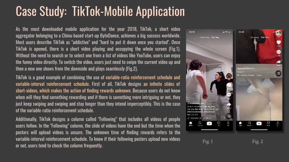
Case Study: TikTok-Mobile ApplicationAs the most downloaded mobile application for the year 2018, TikTok, a short video aggregator belonging to a China-based start-up ByteDance, achieves a big success worldwide. Most users describe TikTok as "addictive" and "hard to put it down once you started". Once TikTok is opened, there is a short video playing and occupying the whole screen (Fig.1). Without the need to search or to select one from a list of videos like YouTube, users can enjoy the funny video directly. To switch the video, users just need to swipe the current video up and then a new one shows from the downside and plays seamlessly (Fig.2). TikTok is a good example of combining the use of variable-ratio reinforcement schedule and variable-interval reinforcement schedule. First of all, TikTok designs an infinite slides of short-videos, which makes the action of finding rewards unknown. Because users do not know when will they find something rewarding and if there is something more intriguing or not, they just keep swiping and swiping and stay longer than they intend imperceptibly. This is the case of the variable-ratio reinforcement schedule.Additionally, TikTok designs a column called "Following" that includes all videos of people users follow. In the "Following" column, the slide of videos have the end but the time when the posters will upload videos is unsure. The unknown time of finding rewards refers to the variable-interval reinforcement schedule. To know if their following posters upload new videos or not, users tend to check the column frequently.
Fig. 1 Fig. 2

Problems● With the overuse of variable-ratio and variable-interval reinforcement schedules and lack of a feature helping users pause, users
are addicted to it easily. This is beneficial for a start-up but makes users suffer due to unintended long time used and feeling of losing control. Based on the study of Hoge E, 2017, overuse of digital media associates with psychiatric or behavioral problems such as depression, anxiety, and attention deficit hyperactivity disorder.
● When users find that it is hard for them to control themselves from pausing and that using TikTok has influenced their regular lives, they may choose to uninstall the application for self-discipline, which influences the long-term business goal of ByteDance.
Recommendations● Designing a feature to help users regulate their use of TikTok.
○ Allowing users to preset their using time or the number of videos they are going to watch. According to the market research, 41% of TikTok users are aged between 16 and 24 (Globalwebindex, 2019) who have relatively pool self-control and easily fall into digital dependency. A feature pausing the infinite slides of videos can weaken the force of reinforcement schedules and prevent users from depressive symptoms caused by overuse of TikTok.
● Providing a Notification when the people who users follow upload videos.○ Notifying users when the people they follow upload videos by sending text or popping-up a red circle next to the “Following”
header, which prevents users from experiencing “the fear of missing out” and reduces their potential anxiety caused by uncertainty.

Benefits● Creating a positive social identity for TikTok.
○ Actively weakening the use of reinforcement schedules and reducing self-interest to help users regulate their use of TikTok can improve the social identity of the brand as an ethical and humane caring company.
○ Additionally, it is helpful for TikTok to gain the praise from the mainstream of society and reduce the criticism of applying the operant psychology and consuming users attention without abstinence at the same time.
● Improving the creativity and sustainability of the online community. ○ Overuse of the digital media will result in several depressive symptoms, such as depression, anxiety, and
attention deficit hyperactivity disorder, which has negative influence for the TikTok community. This will impair the creativity of users, which violates the brand value of TikTok as a place allowing users to express themselves in a most creative way.
○ Preventing users from digital dependency and improving their mental health can improve the creativity and sustainability of the community of TikTok.
● Keeping the number of users growing and the company developing in a longer period with the above beneficial results.

Self-ImageBig Five Personality Model in UX design

Big Five Personality ModelBorn with different genes and growing up in different environments, everyone has his/her own disposition: Tomy is more irritable, while David is more steady; Emma is more empathetic, while Isabella is more trenchant. Their typical behaviors in one similar scenario are different as well. When Emma enjoys expressing her views in group discussion, David can be a better listener who prefers to know others’ opinions rather than talking about his views. All these different dispositions, behaviors and emotions blend together into what we call a personality that makes everyone unique.
Personality can also be defined as a person’s consistent patterns of responses (Marcus, 2007). With its relative stableness over time and across situations, personality is an important element that influences an individual’s purchasing behaviors and memetic preferences in the marketplace. What and how a consumer buys, what articles and images an audience repels or resonates with, and what products a user prefers are influenced by his/her personality types (Evans, 2017).
So, is there any model or metrics assessing personalities that can help us understand someone’s personality better? The answer from the psychologist is the Big Five model. The Big five model contains five basic personality variables: openness, conscientiousness, extraversion, agreeableness, and neuroticism (which is also known as OCEAN traits). Noticeably, each personality variable is bipolar, which means that it represents a range between two extremes. For example, openness represents a continuum from more abstract to more concrete. Everyone has a score on all five personality variables that may lie somewhere in between the two polar ends of each dimension (Evans, 2017).

Big Five Traits
more abstract more concrete
more disciplined more casual
more extraverted more introverted
more cooperative more competitive
more neurotic more placid
Openness
Conscientiousness
Extraversion
Agreeableness
Neuroticism

Targeting by personalities in advertisingTargeting content to audiences by personality types is not a fresh story in the marketplace. From the application of Freudian theory in advertising in the 1960s to Buzzfeed-style quizzes shared on Facebook and Twitter, applying personality theories to advertisement and market research has had a long and rich history.
Bunch of research and practical projects in different kinds of business have proved that understanding personality types of audiences is helpful in identifying consumer preferences and behaviors and revealing the behind motivations and emotions, and so that resulting in more effective marketing strategies and more robust conversion rates.
In her research about the attitudes of different personality types toward ads in 2010, Susan D. Myers found that more extraverted people prefer transformational ads rather than informational ads and tend to have a stronger purchase intention to their favorable ads (Myers, 2010). A relatively small-scale research about the relationship between personality and responses to the marketing ads conducted by students at the University of Washington in 2011 also founds that an ad for scuba diving resonated with the more extraverted but repelled the more neurotic people, while an ad for a dog shelter resonated with the more neurotic and the more concrete people (Evans, 2017). These studies reveal the truth that targeting audiences by personality types can produce positive emotions and contribute to persuade them to demand the product.

The research of S. C. Matz provides more direct evidence and data support of the statement that targeting content to different personality types can produce significant growth in consuming. By collecting and analyzing myPersonality dataset via Facebook app between 2007 and 2012, Matz found that by matching persuasive content to people’s extraversion or openness level, a website can gain up to 40% more clicks and up to 50% more purchases than mismatching or un-personalized counterparts (Matz, 2017).
What is more, psychologists found that targeting content to the appropriate personality types could improve brand loyalty as well. Based on the implementation of 528 self-administered questionnaires, the research of Samuel K. Doss in 2014 indicates that extraversion and openness are positively related to brand evangelism (Doss, 2014). This means that customers who are more extraverted and abstract are more likely to develop a strong relationship with the brand and become a brand evangelist that aggressively promotes the brand to others. Thus, targeting content to this personality type can result in higher brand loyalty.
All of these research have proved that psychological targeting--such as targeting by personality--is an effective approach to marketing persuasion and have a positive influence on improving customer satisfaction and brand loyalty.
Targeting by personalities in advertising

It should not be surprising that people are attracted to things that share similar personalities with them or brands that represent the way they are. When it comes to the field of user experience, similar things are happening. There is nothing more important than knowing our users to the success of UX design. The Big Five model is an important resource for UX designers to understand their audiences and then do more work with less effort to improve the user experience.
One popular tool in UX design that aims to define users is “Persona”, a fictional character created to help UX designers emphasize with specific users. Although it is great at understanding the needs and desires of groups of people and preventing designers from designing for themselves, persona is still flawed in that it ignores the real users to some extends. When creating personas, many designers fail to go deeper than superficial data and demographics to represent what real users think and feel, what troubles they are in, and what jobs they hope to be done by the products (Christin, 2019).
One reason could be that many designers include demographics that are non-essential to the project. For example, the persona of a tourism project may mention demographic information like shopping at Target and eating at Chipotle, which are hard to be helpful in the practice. These meaningless demographics not only cannot represent the potential behaviors and preferences of users intuitively but may even mislead designers by forcing the person reading it to fill in their own stereotypes and assumptions about what the information means.
What the Big Five can improve in UX design

This problem would be solved by taking the Big Five model into account in the development of a persona. There are two reasons. Firstly, not like demographics, the Big Five model of an individual is relatively stable across the life and situations (Jule, 2011). Thus, the user research results based on the Big Five are more stable and reliable than other demographic data. It also means that the user experience designed based on the Big Five have stronger anti-interference ability and broader applicability. Secondly, the Big Five model directly shows the potential behaviors of target users. As explained above, the Big Five provides a good indication of how individuals will interact with the rest of the world and their feelings and motivations. The readers of the persona do not need to assume what a more cooperative person will behave or what a more casual people prefer because all this information has been implied in the personality type with enough scientific research as support.
What the Big Five can improve in UX design

Now, we have known that considering the Big Five personality traits is super helpful when designing a user-friendly product and increasing purchases. The next question is how to measure users’ personalities effectively and ethically? The first answer came to our mind could be a questionnaire. However, it is not exactly ideal to require users to answer a full personality test questionnaire that usually contains hundreds of questions. And it is certainly inappropriate to gather users’ data in any way that violates a user’s privacy. Thus, monitoring a user’s behaviors on the website without informing users and giving users chances to opt-out is not ideal either.
One solution that the majority of websites adopt is “Cookies”. The purpose of the cookie is to help the website keep track of your visits and activities. In some cases, the cookie is very helpful for users. For example, it can record the login information and the recent visit so that it helps users overcome their memory bottlenecks. It can also help online retailers to keep track of the items in a user’s shopping cart as they explore the site, which makes online shopping possible. To solve the ethical problem of using cookies, many websites will pop-ups a banner on the page when users browse it for the first time to inform them the cookie is adopted and allow them to opt-in or opt-out. This is a good way to gather the personality data of users after their permission.
Ethical Analysis: Gathering Data
Greenbookblog.org | The banner informing users the cookie is adopted and giving users chances to opt-in or opt-out

Another smart and attractive way is to use games, puzzles and Buzzfeed quizzes. It provides a more interesting and comfortable way to engage users in the measurement of personality types than questionnaires and cookies. For example, Airbnb has cooperated with BuzzFeed to create a Buzzfeed-style quiz like “Become an Airbnb host and we’ll guess what your rating would be”. Players will be happy to take quizzes and answer questions revealing their personality types without resistant feelings. Of course, taking ethics into account, the company should ask for users’ permission first and keep their privacy. It is great to start by saying “The results of the quizzes will only be used to personalize and optimize your experience on our website and will not be sold or shared with others”.
Ethical Analysis: Gathering Data
Many research and practical projects have proved that applying psychological targeting--such as the Big Five personality traits--is an effective approach to create a more friendly experience for users and improve their consuming behaviors to benefit the company. Including the Big Five model in the development of personas is an application of personality traits in UX design. It can enhance the persona’s ability to represent real users’ potential behaviors and implied motivations intuitively and help designers understand their users precisely. Although the Big Five is such a help, the ethical issues are critical as well. The users should have the right to know their data is gathered and its usage.
Summary

Social InfluenceGroup Polarization

Group PolarizationAlthough everyone despises and hates them, trollers are almost everywhere in the internet world. They detract people, companies, or others' works with irrational arguments and offensive tones. We used to expect the internet world as an ideal country that is equal, democratic, and harmonious until the appearance of trollers brock our dreams and make the web environment even worse than the real world. Who should we blame? Those trollers? No. Most trollers online are kind and ordinary people in the real world, just like you and I. It is the inappropriate interface design that exacerbates trolling, involves everyone who participates in the conversation in the troll and makes us evils.In the psychology world, there is a terminology called group polarization indicates the phenomenon of trolling. Group polarization, as Moscovici and Zavalloni describe in 1969, refers to a phenomenon that our attitudes toward a topic tend to become more extreme or polarized to both the positive and negative sides after the group discussion. According to the research on polarization, the online environment is much more suitable and ripe for polarization, because, on the web, we are deindividuated, psychologically distanced from others, discussing a topic with as many people as possible at length and easy to be predisposed and hear only one-sided arguments. All of these are pre-conditions for group polarization. Since the environment leans toward polarization, it is hard for users to control themselves from trolling. To avoid detracting comments cause irreparable harm to our memes, UX designers should change the interface design to encourage more reasonable voices.

Case Study: Instagram-Comments SystemAs one of the most famous social media, Instagram had reached one billion monthly active users in June 2018, which was a great success for a company but also a risk of being a battlefield of trolling since it contained a large number of people into a group discussion. The screenshots were the comments of one post from Torm Ford that advertised its new seasonal underwear using the photo of two men who were making love. This advertising post finally caused a big trolling between homosexuals supporters and anti-gay people. Anti-gay people detracted Torm Ford by the "awful" emoji while those irritated Tom supporters fought back and insulted their level of education or parents. The post could be a chance to promote equality people and helped heterosexuals understand homosexuals. However, the result was triggering a trolling and exacerbating disagreements, which is a good example of group polarization. With the insulting responses from Tom supporters, anti-gay people would even insist more on their points, rather than tried to understand homosexuals. For Tom supporters, as a group of people who attacked anti-gay people having a lower level of education together, they would tend to deepen their perspectives as well.
Fig. 1 Fig. 2 Fig. 3

Problems of Comments System● Low immediacy
○ Instagram does not have a strategy to increase the immediacy between commenters● Competition is encouraged
○ The first few comments are sorted by the numbers of thumbs up and replies● Infinite time of discussion
○ There is no limit in the time of discussion or the number of comments.
Recommendations● Increasing the closeness and a sense of togetherness of commenters by showing their locations or personal interests
○ Instagram can design a feature to allow users to add two to three tags describing their interests (e.g. Hacker; Makeup Lover) next to usernames. These tags can increase the immediacy between users who have similar interests.
● Sorting comments by usefulness or showing comments chosen by the author○ Stop sorting comments by the number of thumbs up can reduce the implied competition between commenters and
reduce the comments that detract others deliberately for catching eyeballs. ● Limiting the time of comment
○ Instagram can impair group polarization by limiting the time of discussion, like NYT who closes comments 24 hours after an article is published.

Benefits● Impairing the pre-conditions of group polarization and so to reduce the happening of trolling.
○ These recommendations weaken group polarization by fixing the inappropriate UX design that implicitly encourages trolling.
● Improving the harmony and sustainability of Instagram's online community.
○ Creating a relatively harmonious online environment for users to increase positive emotions.
● Helping Instagram promote positive social influences and create an ethical social identity.
○ Group polarization is making the web environment more and more aggressive and full of ridicule, which makes users suffer. Through suitable strategies to reduce group polarization, Instagram will become a positive model for other media and create an ethical social identity.

ReferencesDate: 2020.03.15
[1] Evans, D. C. (2017). Bottlenecks: Aligning UX Design with user
psychology. New York, NY: Apress
[2] Jule Specht, Stefan C. Schmukle, Boris Egloff (2011). Stability and
Change of Personality Across the Life Course: The Impact of Age and Major
Life Events on Mean-Level and Rank-Order Stability of the Big Five
[3] Christin Roman (2019). The Problem with Personas. Medium.
[4] S. C. Matz, M. Kosinski, G. Nave, and D. J. Stillwell (2017). Psychological
targeting as an effective approach to digital mass persuasion. PNAS.
[5] Samuel K. Doss, Deborah S. Carstens (2014). Big Five Personality Traits
and Brand Evangelism. International Journal of Marketing Studies; Vol. 6,
No. 3
[6] Susan D. Myers, Sandipan Sen, Aliosha Alexandrov (2010). The
Moderating Effect of Personality Traits on Attitudes toward Advertisements:
A Contingency Framework. Management & Marketing; Bucharest Vol. 5.


![Conversion UX: The Psychology of Color [Infographic]](https://static.fdocuments.in/doc/165x107/5888d53d1a28aba1058b5611/conversion-ux-the-psychology-of-color-infographic.jpg)