Using effective visualization in maps and diagrams to better...
50
Menno-Jan Kraak Faculty of Geoinformation Science and Earth Observation Using effective visualization in maps and diagrams to better understand the SDGs
Transcript of Using effective visualization in maps and diagrams to better...

Menno-Jan Kraak
Faculty of Geoinformation Science and Earth Observation
Using effective visualization in maps and diagrams to better understand the SDGs

Menno-Jan Kraak
Faculty of Geoinformation Science and Earth Observation
My maps, The good, the bad and the ugly

Workshop

• IntroductionExercise: Who is who?
• SDG Indicator characteristicsExercise: design your own map: Gender Inequality Index
• Cartographic workflowExercise: define your own world view
• Design choices• Conclusions
Using effective visualization in maps and diagrams to better understand the SDGs

Exercise: Who is Who?

Draw the contour of your country
Ask your neighbor if she / he can tell were you’re from

SDG
Indicator characteristics

Sustainable Development Goals

• Goals
Example: Goal 4 Education
http://www.un.org/sustainabledevelopment/education/
4.1 4.2 4.3 4.4 4.5 4.6 4.7• Targets
4.1.1
4.1.2
4.2.1
4.2.2
4.4.1
4.4.2
4.3.1 4.5.1 4.6.1
4.6.2
4.7.1
4.7.2• Indicators

• 4.1 By 2030, ensure that all girls and boys complete free, equitable and quality primary and secondary education leading to relevant and effective learning outcomes
• 4.2 By 2030, ensure ……..• …..
https://sustainabledevelopment.un.org/content/documents/6754Technical%20report%20of%20the%20UNSC%20Bureau%20(final).pdf
Goal 4: Education - Sample Targets

• 4.1 By 2030, ensure that all girls and boys complete free, equitable and quality primary and secondary education leading to relevant and effective learning outcomes
• Indicator 4.1.1 Percentage of children who achieve minimum proficiency standards in reading and mathematics at end of: (i) primary (ii) lower secondary
• Indicator 4.1.2 Completion rate (primary, lower secondary, upper secondary)
Goal 4: Education - Sample Indicators

Goal 4: Education - Analyzing the data
% minimum proficiency Completion rate levels of education
Participation rate in organized learning
Early Childhood Development Index
Enrollment ratios by level and typeParticipation rate among 25-65 years
% of computer and information literate
Parity indices (female/male, urban/rural, .
% of proficient
Youth/adult literacy rate
% of 15yrs proficiency of environmental science and geoscience
% of 13yrs promoting governance

Indicators and data types
nominal value in SDG indicator all: yes/noone
variable
ordinal valueonevariable level or rank
index (calculated
manyvariables formula
X per Y, other than population or timeother rate
onevariable change rate (per time unit) % change or count X per time
rate per population unit count X per capita / populationonevariable
% of X, other than populationother proportion
proportion % of total populationproportion of total populationonevariable
count Xonevariable
absolute(one value)
description (X and Y are variables)data type
(name)variablesabsolute / relativescale type
rate
proportion
data type (name)
onevariable
relative(calculatedusing twoor more values)
nominal
ratio
ordinal
twovariables
absolute value
index (calculated)
ordinal value
nominal value

Incomplete indicators• Tier I: internationally established methodology and standards• Data regularly produced for at least 50 percent of countries and of the
population in every region• Tier II: data not regularly produced by countries• Tier III: methodology or standards are being (or will be)
established
SDG indicator tiers

Indicators and their TIER level
1 2 3 4 5 6 7 8 9 10 11 12 13 14 15 16 17No poverty Zero Hunger Good health well-being Quality education Gender equality Clean Water
and sanitation
Affordable and
clean energy
Decent work andeconomic growth
Industry, innovation and infrastructure
Reduced inequalities
Sustainable cities and communities
Responsible production and consumption
Climate action Life below water Life on land Peace, justice and
strong institutions Partnerships for there goals
Tier IIITier IITier I
Multiple Tiersgoal
target g1…gn
indicator t1…
tn

Nature of the indicators
Absolute value Proportion Rate Index Ordinal value Nominal value
1 2 3 4 5 6 7 8 9 10 11 12 13 14 15 16 17

Exercise: design your own map

Gender inequality index

Design & draw the map legend

Your work


Cartographic Workflow
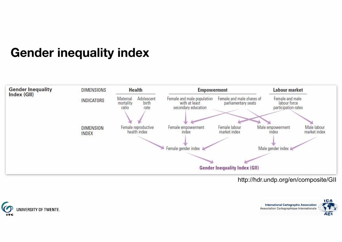
Gender inequality index
http://hdr.undp.org/en/composite/GII

Gender inequality index

Perception

Perception

4.find
required perceptual properties
nominalordinalintervalratio
geography
differentiation
order
distance
proportion
ratio distance
sizevalue
texturecolor
orientationshape
value
diagram
mapmap
pointlineareatextarea
2.select map or diagram
6.select
symbology
7.select
map type
chorochromaticisoline
choroplethproportional pt.
other
choropleth
topography
satellite
admin unitadmin units
3.select base map
1.data
analysis
5.select visual
variables
8.apply design style
geography

Gender inequality index
No Data0.04 - 0.140.15 - 0.330.34 - 0.500.51 - 0.77
Gender Inequality Index

Base Maps

No Data
0.51 - 0.770.34 - 0.500.15 - 0.330.04 - 0.14
Gender Inequality IndexGender Inequality Index
No Data
0.51 - 0.770.34 - 0.500.15 - 0.330.04 - 0.14
No Data
0.51 - 0.770.34 - 0.500.15 - 0.330.04 - 0.14
Gender Inequality Index
Map projections

Not visible: Small Island Developing States (SIDS)?180 °
0 °
No data 0 - 9 10 - 29 30 - 49 50 - 69 70 +
Proportion of population below the international poverty line, 2016 (%

Visible SIDS180°
0°
CHINA
SOLOMON
CHINA
No data 0 - 9 10 - 29 30 - 49 50 - 69 70 +
Jessica Gosling-Goldsmith

Moving central meridian
Exercise: define your own world view

Go to: https://worldview.calisto.pt
Move the central meridian on the scroll bar below each map into a position you think gives your best
global perspective, and click save
Select your country

https://worldview.calisto.pt
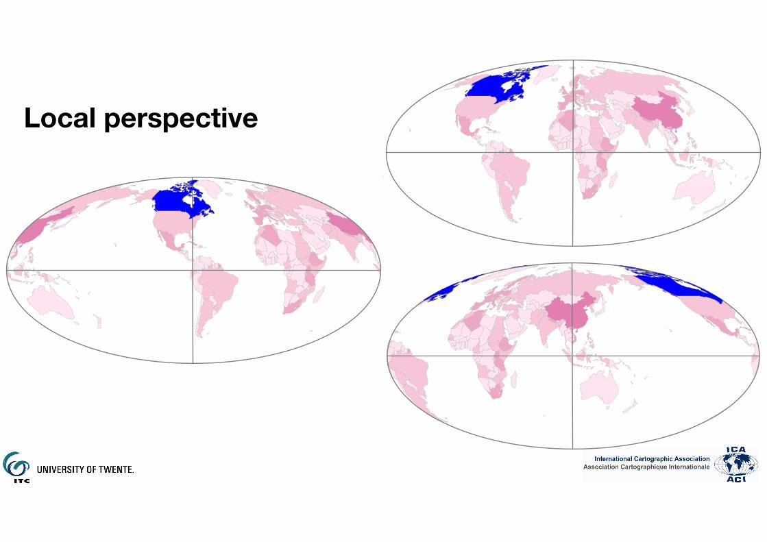
Local perspective

New York
Enschede
Deqing
‘Local’ point for global perspective
But what about comparing?

Design choices

Gender inequality index
No Data0.04 - 0.140.15 - 0.330.34 - 0.500.51 - 0.77
Gender Inequality Index

Choice of color - what do you want to tell?
No Data
0.51 - 0.770.34 - 0.500.15 - 0.330.04 - 0.14
No Data
0.51 - 0.770.34 - 0.500.15 - 0.330.04 - 0.14
No Data
0.51 - 0.770.34 - 0.500.15 - 0.330.04 - 0.14
No Data
0.51 - 0.770.34 - 0.500.15 - 0.330.04 - 0.14

Choice of color - bivariate solution
0.01–0.310.32-0.460.47-0.620.63-0.77
no data

Different patterns because of number of classes
0.01-0.500.51-1.00
no data
0.01–0.220.23-0.330.34-0.440.45-0.550.56-0.660.67-0.77
no data
2 6

0.15–0.300.31-0.460.47-0.620.63-0.77
no data
0.01–0.230.24-0.390.40-0.530.54-0.77
no data
Different patterns because of classification
Equal class size
Same amount of observations per
class

Population related topics

Alternative representations
19-3215-189-140-9No data
Infant Mortality per 1000(Indicator 3.2.1)
a) Choropleth b) Cartogram c) Choropleth and nightlight basemap

Conclusions

• Base map• Projection (web services work with Mercator projection….)• Content (often satellite imagery / open street map are used….)
• Administrative units• Size• Distribution within unit (people, other)
• Design flaws• Choice projection / adm. units• Data handling• Application of visual variables
• There is a limited use of the available graphic representations
Mapping problems

Offer guidelines and best practices for mapping the UN SDGs to…• Best support the SDGs through
Cartography with help of the cartographic community
• Transfer knowledge and expertise via the book Mapping a sustainable world and various training related activities
ICA’s objective

Let’s make the world a better place with maps


![WELCOME [ggim.un.org]ggim.un.org/meetings/GGIM-committee/9th-Session... · unggim.academicnetwork.org Building Technical Capacities for Resilience and Sustainability - Challenges](https://static.fdocuments.in/doc/165x107/5f722ed7fc8eb66790307bb1/welcome-ggimunorgggimunorgmeetingsggim-committee9th-session-building.jpg)


