
McAfee ePolicy Orchestrator version 4.6.0 Software Installation Guide

1
Engineering the Policy–making Life Cycle
Seventh Framework Programme – Grant Agreement 288147
Document Type: Deliverable
Dissemination Level: PU (Public)
Editor: Tobias Ruppert
Document state: Final version
Document version: 1.0
Contributing Partners: Fraunhofer IGD
Contributing WPs: WP7
Estimated P/M (if applicable): 0
Date of Completion: 20.02.2015
Date of Delivery to EC:
Number of Pages: 16
ABSTRACT
This user manual shall help users of the ePolicy platform during their first usage of the system. The contains
three components: the integrated social simulation and incentive design component, the global optimisation
component, and the opinion mining component.
User Manual: ePolicy Demonstrator
The project is co-funded by the European Community under the Information and Communication Technologies
(ICT) theme of the Seventh Framework Programme (FP7/2007-2013). Grant Agreement n°288147.

Author of this document:
Tobias Ruppert
Fraunhofer IGD
Email: [email protected]
Copyright © by the ePolicy Consortium
The ePolicy Consortium consists of the following partners: University of Bologna; University College Cork, National University of
Ireland, Cork; University of Surrey; INESC Porto, Instituto de Engenharia de Sistemas e Computadores do Porto, Fraunhofer-
Gesellschaft zur Foerderung der Angewandten Forschung E.V; Regione Emila-Romagna; ASTER – Società Consortile per Azioni;
Università degli Studi di Ferrara.
Possible inaccuracies of information are under the responsibility of the project team. The text reflects solely the views of its
authors. The European Commission is not liable for any use that may be made of the information contained therein.

Contents
Introduction ............................................................................................................................... 5 1
General GUI Design ................................................................................................................ 6 1
Visual Interface to the Social Simulation/Incentive Design Component ..................... 8 2
2.1 Short Introduction to the Analytical Component ...................................................................................... 8
2.2 Description of Visual Interface ..................................................................................................................... 8
Visual Interface to the Global Optimisation Component .............................................. 11 3
3.1 Short Introduction to the Analytical Component .................................................................................... 11
3.2 Description of Visual Interface ................................................................................................................... 11
Visual Interface to Opinion Mining Component ............................................................. 14 4
4.1 Short Introduction to the Analytical Component .................................................................................... 14
4.2 Description of Visual Interface ................................................................................................................... 14
Summary .................................................................................................................................. 16 5

This page has been intentionally left blank.

Introduction 1
This user manual shall help users of the ePolicy platform during their first usage of the system.
The contains four components:
the login and start screen,
the integrated social simulation and incentive design component,
the global optimisation component, and
the opinion mining component.
In the following, we will briefly describe for each visual interface the underlying technical
component and explain how the web-based visual analytics system enables the visual access to the
analytical components.

General GUI Design 1
In the following we will briefly describe the overall GUI design of the web. On the start page of the
web application (see Figure 1) the login functionality and a short introductory text describing the
ePolicy project is provided. The user can register as a new user or login if he is already registered.
Moreover, a contact formular and a a “admin”-button for administrators is provided.
Figure 1: Login screen for integrated ePolicy web application
After the login, the overview page is shown (see Figure 3). Here, a short textual description of the
three visual interfaces is shown. The user can navigate to the individual interfaces via the
respective buttons. Moreover, a navigation panel is shown on top of the page. This panel is used as
a static navigation tool being also present when switching to the individual interfaces. The
intermediate results generated by one of the analysis component are also displayed on the
overview page. An example is shown in Figure 4 where an energy plan calculated by the global
optimiser is shown in the overview.
Finally, the overall GUI also includes an account panel where the user can get informaton about
his user profile and the current session. This panel can be reached by clicking on the “Account
Panel” button on the top right of the overall GUI. An example is shown in Figure 2.
Figure 2: Account Panel: By clicking on the account panel arrow basic user management features (e.g. user name,
duration of session, etc.) are provided.

Figure 3: Overview showing the three visual interfaces to the three analytical components. A small overview panel is
shown on top of the web application. This enables the navigation, if the user has selected one of the three interfaces.
Figure 4: Overview showing the three visual interfaces to the three analytical components. A small overview panel is
shown on top of the web application. This enables the navigation, if the user has selected one of the three interfaces.
By clicking on the simulation button the user is forwarded to the visual interface of the
simulation/incentive design component.

Visual Interface to the Social Simulation/Incentive Design Component 2
2.1 Short Introduction to the Analytical Component
The purpose of this module is to estimate the public adoption of photovoltaic systems given the
subsidy strategies implemented by the government. It tries to simulate how much energy would
be added by private photovoltaic panels if the government spends a certain budget on financially
supporting their private installations. Besides the added power capacity with a given budget, the
simulation also considers demographic information about the supported households.
2.2 Description of Visual Interface
The visual interface consists of three main views: an overview (Figure 5), a temporal view (Figure
7), and a demographics-based view (Figure 8).
The overview (Figure 5) shows a 2D scatterplot with the cost on the x-axis and the installed
capacity on the y-axis. In the visualisation the black dots reflect the output of the simulation. To
the left, the user can filter the simulation runs with respect to the selected region (Bologna or
Region Emilia Romagna), installed capacity, costs for the region, budget distribution (first come
first serve, flat distribution, increasing or decreasing distribution), or the activated policy
instruments.
Figure 5: Visual interface to the integrated social simulation and incentive design component: overview.
By clicking on one of the black dots (simulation results), a popup shows some information about
the respecitve simulation run (see Figure 6). By clicking on “show details”, more detailed
information can be explored in the Time tab (see Figure 7) or the Demographics Tab (see Figure 8).
These two views reflect the specific characteristics of agent-based simulation models: iterative
simulation steps in discrete points in time and agent-level information.
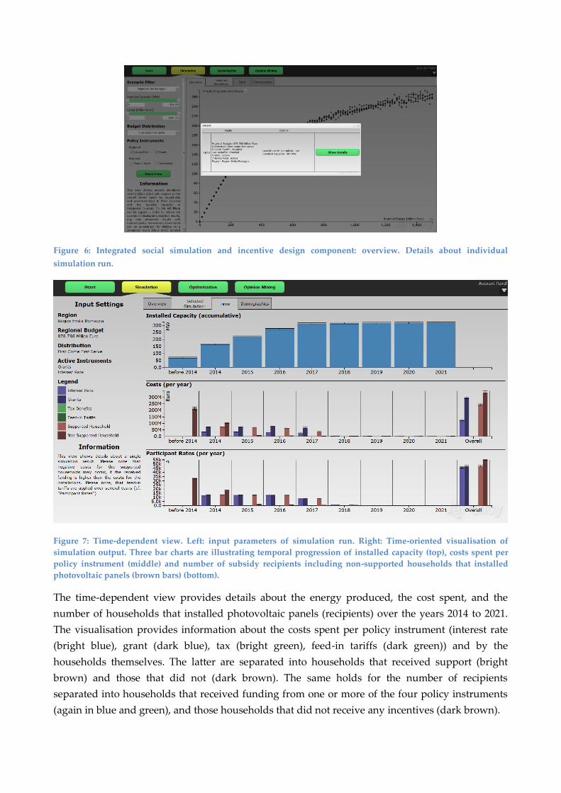
Figure 6: Integrated social simulation and incentive design component: overview. Details about individual
simulation run.
Figure 7: Time-dependent view. Left: input parameters of simulation run. Right: Time-oriented visualisation of
simulation output. Three bar charts are illustrating temporal progression of installed capacity (top), costs spent per
policy instrument (middle) and number of subsidy recipients including non-supported households that installed
photovoltaic panels (brown bars) (bottom).
The time-dependent view provides details about the energy produced, the cost spent, and the
number of households that installed photovoltaic panels (recipients) over the years 2014 to 2021.
The visualisation provides information about the costs spent per policy instrument (interest rate
(bright blue), grant (dark blue), tax (bright green), feed-in tariffs (dark green)) and by the
households themselves. The latter are separated into households that received support (bright
brown) and those that did not (dark brown). The same holds for the number of recipients
separated into households that received funding from one or more of the four policy instruments
(again in blue and green), and those households that did not receive any incentives (dark brown).

Figure 8: Demographics-based view. Left: input parameters. Right: Nine bar charts illustrating installed capacity,
costs spent, and number of subsidy recipients (vertically arranged), separated into demographic categories age,
education and income (horizontally arranged).
The demographics-based view presents details about installed capacity, costs per policy
instrument, and number of recipients per policy instrument sorted by the affiliation to
demographic groups. In the visualisation these groups are separated by the agents' age, education
status and income. The color mapping is identical to the one described for the time-dependent
view.

Visual Interface to the Global Optimisation Component 3
3.1 Short Introduction to the Analytical Component
The purpose of the global optimisation module is to calculate an optimal energy plan for a given
target function with specified constraints (e.g. constraints on budget or environmental impacts).
The optimised energy plan quantifies the amount of energy to be additionally produced per
energy source in the future. Moreover, for each energy plan, information about the costs and the
impact on the environment is calculated.
3.2 Description of Visual Interface
The visual interface of the global optimiser consists of three main views: the specify plan view, the
energy plan view, and the compare plans view.
The specify plan view’s primary target is to enable the visual access to all possible degrees of
freedom of the optimisation module. The optimisation model accepts a set of variables that can be
used in the optimisation function as well as multiple constraints. Thus, three areas can be spotted:
a) target function, b) constraints, c) labeling of energy plan.
Figure 9: Specify plan view: (a) definition of (multiple) target function(s), (b) definition of constraints based on
budget, sources, and environmental impacts, (c) Labeling of energy plan
a) b)
c)

Figure 10: Energy plan view: (a) overview of costs and produced energy/installed capacity, (b) impacts on
environment, (c) required infrastructure per energy source, (d) quantitative emmissions generated by plan.
The energy plan view presents the calculated energy plan by visualising the output data. It gives a
fast overview over the important values cost, energy and environmental impacts. Moreover, the
additionally required infrastructure may be displayed by selecting the respective one in the drop-
down menu. This separates the view into the following four parts:
a) Amount of installed capacity or produced energy (to be selected by radio button)
and costs per source
b) Overview of impacts on environment
c) Required infrastructure per energy source
d) Quantitative emmissions generated by plan
a) b)
c) d)

Figure 11: Compare plans view: User can customize views by selecting the variables to be displayed via the check
boxes. (a) comparison of six energy plans in total installed capacity energy (top left) and overall cost (top right). (b)
energy (bottom left) and cost (bottom right) split up on the different energy sources used by the energy plan. (c)
comparison of emissions (d) comparison of environmental impacts caused by the energy plan. “Show Details”
forwards the user to the Optimised Plan View.
The compare plans view (see Figure 11) has the target to compare energy plans calculated by the
global optimiser. This view enables the comparison and exploration of energy plans. Multiple
visualisations display the crucial variables separately. The view is organized in four layers of
information.
a) Compare energy and cost
b) Compare energy produced per plan per sources
c) Compare emissions produced by plans
d) Compare caused impacts on environment
Layer a) allows the user to get a fast overview of the compared plans by presenting overall energy
produced and overall costs of each plan with bar charts. Layer b) splits the costs onto all energy
sources and displays them as grouped bar charts allowing the comparison of the value of an
energy source of one energy plan to the value of another energy plan. In layer (c), the user can
compare the emissions that are induced by the plans. And finally in layer (d) the heat map shows
the different impacts on environment, society and economy. The sidebar to the right displays the
legend with the color encoding. Moreover, the user can select an energy plan from the combo box
or simply click on a bar in the charts. By selecting the “Show Details” button the selected energy
plan is displayed in the enery plan view (see Figure 10).
a)
b)
c) d)

Visual Interface to Opinion Mining Component 4
4.1 Short Introduction to the Analytical Component
The purpose of the public opinion mining component is to estimate the public opinion towards
predefined policy topics. In the current tool, the public opinion about photovoltaic systems is
investigated. In order to do this, internet forums about renewable energies are analysed, and the
posts are automatically classified into thematic categories. Then a sentiment score (between -2 and
+2) that denotes the negative or positive sentiment towards this category is assigned to each post.
Besides the text of the blog post and the calculated sentiment score, the topic affiliation, the date of
post, the author name, the source, and a link to the source URL are stored. This information is
calculated on a daily basis and should help the user to get an overview of the current public
sentiment on a given policy topic (e.g. photovoltaic energy). Currently the opinion mining
component analyses only documents in Italian, but the results and the interface is in English.
4.2 Description of Visual Interface
The visual interface to the Opinion Mining technique is structured into four different visualisations
(Figure 12). On the left side the user can spot different topics (categories) and the temporal
progression of their sentiment scores. By clicking on one or several of these categories their
sentiment charts can be compared in the overview visualisation (top). In this line chart
visualisation the position on the y-axis and the color reflect the moving average of the sentiment
score for the respective category. The individual sentiment scores of the crawled text segments are
displayed as dots in the scatterplot and lie within a range +2 for positive sentiment and −2 for
negative sentiments. The user can select different aggregation schemes for the moving average
from daily to half year intervals. In order to reduce overplotting effects, the user can zoom into an
interesting time interval (middle) (e.g. from 2011 to 2012) and see individual posts in the selected
time interval. Specific posts can be selected to be displayed in a table visualisation at the bottom of
the visual interface. In the table visualisation the user can look-up detailed information about the
selected posts (e.g. date of post, title, author, sentiment score, raw text, source, etc.). Moreover, the
original source can be accessed via a provided URL (see Figure 13).

Figure 12: Visual interface to Opinion Mining component. Left: Categories are displayed by a moving average of the
respective sentiment score over time (green denotes positive sentiment, red denotes negative sentiment). Middle top:
Moving average of sentiment scores for selected category. Middle middle: Zooming into time interval. Middle
middle: Zooming into selected time interval. Individual posts are displayed by dots. Middle bottom: Table with
selected individual posts including link to original source.
Figure 13: Orignal source - Blog www.energeticambiente.it/. By clicking on a link of the table visualisation in Figure
12 the user is forwarded to the original source where the crawled text comes from.

Summary 5
This user manual shall help users of the ePolicy platform during their first usage of the system. For
more details about the system the user can contact:
Tobias Ruppert (visualisation)
Michela Milano (optimisation component)
Peter Johnson (simulation component)
Lars Kotthoff (incentive design component)
Luis Torgo (opinion mining component)