UNIT 6 Measurement 1111 and Data Analyzing and...
56
CAREERS IN MATH UNIT 6 Unit 6 Performance Task At the end of the unit, check out how entomologists use math. Entomologist An entomologist is a biologist who studies insects. These scientists analyze data and use mathematical models to understand and predict the behavior of insect populations. If you are interested in a career in entomology, you should study these mathematical subjects: • Algebra • Trigonometry • Probability and Statistics • Calculus Research other careers that require the analysis of data and use of mathematical models. Measurement and Data Analyzing and Comparing Data 7.6.G, 7.12.A Random Samples and Populations 7.6.F, 7.12.B, 7.12.C MODUL E 1 1 1 1 1 1 1 1 1 1 1 1 1 1 MODULE 11 11 MODUL E 2 2 2 2 1 1 1 1 1 1 1 2 MODULE 12 12 343 Unit 6 © Houghton Mifflin Harcourt Publishing Company • Image Credits: ©Science Source/Photo Researchers
Transcript of UNIT 6 Measurement 1111 and Data Analyzing and...

CAREERS IN MATH
UNIT 6
Unit 6 Performance Task
At the end of the unit, check
out how entomologists use
math.
Entomologist An entomologist is a
biologist who studies insects. These scientists
analyze data and use mathematical models to
understand and predict the behavior of insect
populations.
If you are interested in a career in entomology,
you should study these mathematical subjects:
• Algebra
• Trigonometry
• Probability and Statistics
• Calculus
Research other careers that require the analysis
of data and use of mathematical models.
Measurement and Data
Analyzing and Comparing Data
7.6.G, 7.12.A
Random Samples and Populations
7.6.F, 7.12.B, 7.12.C
MODULE 11111111111111MODULE 1111
MODULE 222211111112MODULE 1212
343Unit 6
© H
ough
ton
Miff
lin H
arco
urt P
ublis
hing
Com
pany
• Im
age
Cred
its: ©
Scie
nce
Sour
ce/P
hoto
Res
earc
hers
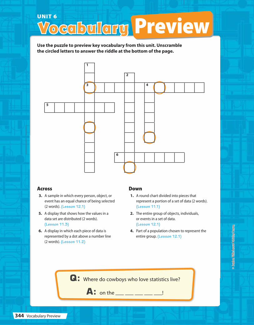
Vocabulary PreviewUNIT 6
1
2
3 4
5
6
Q: Where do cowboys who love statistics live?
A: on the !
Across 3. A sample in which every person, object, or
event has an equal chance of being selected
(2 words). (Lesson 12.1)
Down 1. A round chart divided into pieces that
represent a portion of a set of data (2 words).
(Lesson 11.1)
Use the puzzle to preview key vocabulary from this unit. Unscramble
the circled letters to answer the riddle at the bottom of the page.
5. A display that shows how the values in a
data set are distributed (2 words).
(Lesson 11.3)
6. A display in which each piece of data is
represented by a dot above a number line
(2 words). (Lesson 11.2)
2. The entire group of objects, individuals,
or events in a set of data.
(Lesson 12.1)
4. Part of a population chosen to represent the
entire group. (Lesson 12.1)
344 Vocabulary Preview
© H
ough
ton
Miff
lin H
arco
urt P
ublis
hing
Com
pany
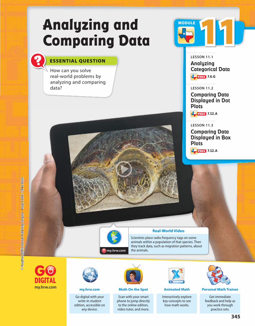
ESSENTIAL QUESTION?
Real-World Video
my.hrw.com
my.hrw.com
How can you solve real-world problems by analyzing and comparing data?
Analyzing and Comparing Data
Get immediate feedback and help as
you work through practice sets.
Personal Math Trainer
Interactively explore key concepts to see
how math works.
Animated Math
Go digital with your write-in student
edition, accessible on any device.
my.hrw.com
Scan with your smart phone to jump directly to the online edition,
video tutor, and more.
Math On the Spot
Scientists place radio frequency tags on some animals within a population of that species. Then they track data, such as migration patterns, about the animals.
11MODULE
LESSON 11.1
Analyzing Categorical Data
7.6.G
LESSON 11.2
Comparing Data Displayed in Dot Plots
7.12.A
LESSON 11.3
Comparing Data Displayed in Box Plots
7.12.A
345
© H
ough
ton
Miff
lin H
arco
urt P
ublis
hing
Com
pany
• Im
age
Cred
its: ©
Mik
e Ve
itch

Personal Math Trainer
Online Assessment and
Interventionmy.hrw.com
YOUAre Ready?Complete these exercises to review skills you will need
for this chapter.
Fractions, Decimals, and PercentsEXAMPLE
Write each fraction as a decimal and a percent.
1. 7 _ 8
2. 4 _ 5
3. 1 _ 4
4. 3 __ 10
5. 19 __
20 6. 7 __
25 7. 37
__ 50
8. 29 ___
100
Find the Median and ModeEXAMPLE 17, 14, 13, 16, 13, 11
11, 13, 13, 14, 16, 17
median = 13 + 14
______ 2
= 13.5
mode = 13
Find the median and the mode of the data.
9. 11, 17, 7, 6, 7, 4, 15, 9 10. 43, 37, 49, 51, 56, 40, 44, 50, 36
Find the MeanEXAMPLE 17, 14, 13, 16, 13, 11
mean = 17 + 14 + 13 + 16 + 13 + 11
_____________________ 6
= 84 __
6
= 14
Find the mean of the data.
11. 9, 16, 13, 14, 10, 16, 17, 9 12. 108, 95, 104, 96, 97,106, 94
Write 13 __
20 as a
decimal and a
percent.
0.65 20 ⟌
⎯ 13.00 -12 0 1 00 -1 00 0
0.65 = 65%
Write the fraction as a division problem.Write a decimal point and zeros in the dividend.Place a decimal point in the quotient.
Write the decimal as a percent.
Order the data from least to greatest.
The median is the middle number or the average of the two middle numbers.The mode is the number or numbers, if any, that appear most frequently.
The mean is the sum of the data values divided by the number of values.
Unit 6346
© H
ough
ton
Miff
lin H
arco
urt P
ublis
hing
Com
pany
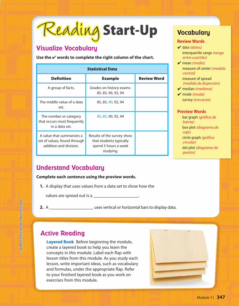
Reading Start-Up
Active ReadingLayered Book Before beginning the module,
create a layered book to help you learn the
concepts in this module. Label each flap with
lesson titles from this module. As you study each
lesson, write important ideas, such as vocabulary
and formulas, under the appropriate flap. Refer
to your finished layered book as you work on
exercises from this module.
VocabularyReview Words
✔ data (datos) interquartile range (rango
entre cuartiles)✔ mean (media) measure of center (medida
central) measure of spread
(medida de dispersión)✔ median (mediana)✔ mode (moda) survey (encuesta)
Preview Words bar graph (gráfica de
barras) box plot (diagrama de
caja) circle graph (gráfica
circular) dot plot (diagrama de
puntos)
Visualize VocabularyUse the ✔ words to complete the right column of the chart.
Understand VocabularyComplete each sentence using the preview words.
1. A display that uses values from a data set to show how the
values are spread out is a .
2. A uses vertical or horizontal bars to display data.
Statistical Data
Definition Example Review Word
A group of facts. Grades on history exams:
85, 85, 90, 92, 94
The middle value of a data
set.
85, 85, 90, 92, 94
The number or category
that occurs most frequently
in a data set.
85, 85, 90, 92, 94
A value that summarizes a
set of values, found through
addition and division.
Results of the survey show
that students typically
spend 5 hours a week
studying.
347Module 11
© Houghton Miff
lin Harcourt Pub
lishing
Company

Football28%
Soccer23% Baseball
19%
Basketball16%
Hockey14%
30 40 50 6020 8070
Number of f ish
Reel-to-Reel
Charters
=
Mud PuppyCharters
=
Unpacking the TEKSUnderstanding the TEKS and the vocabulary terms in the TEKS
will help you know exactly what you are expected to learn in this
module.
What It Means to YouYou will solve problems using data provided in bar graphs, dot
plots, and circle graphs.
UNPACKING EXAMPLE 7.6.G
Antonia asked students at her school which of five professional
sports they enjoyed watching the most. Her results are shown in
the circle graph.
Which two sports were favored by more than half of the students
in the survey?
football and soccer, 28% + 23% = 51%
What It Means to YouYou will compare two groups of data using dot plots or box plots.
UNPACKING EXAMPLE 7.12.A
The box-and-whisker plots show the distribution of the number of
fish caught per trip by two fishing charters.
Which fishing charter appears to be more predictable in the
number of fish that might be caught on a fishing trip?
Mud Puppy Charters
MODULE 11
my.hrw.com
7.6.G
Solve problems using data
represented in bar graphs,
dot plots, and circle graphs,
including part-to-whole and
part-to-part comparisons and
equivalents.
7.12.A
Compare two groups of numeric
data using comparative dot
plots or box plots by comparing
their shapes, centers, and
spreads.
Visit my.hrw.com to see all
the
unpacked.
Unit 6348
© H
ough
ton
Miff
lin H
arco
urt P
ublis
hing
Com
pany
?
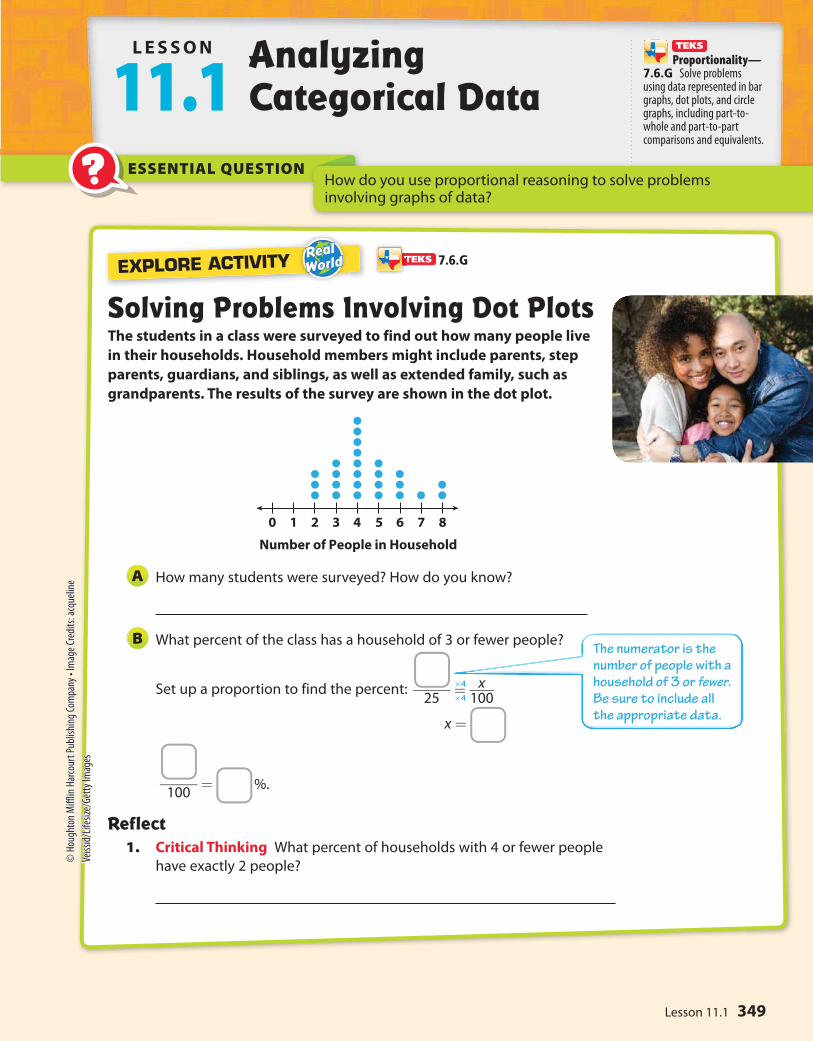
EXPLORE ACTIVITY
0 1 2 3 4
Number of People in Household
5 6 7 8
ESSENTIAL QUESTION
Solving Problems Involving Dot PlotsThe students in a class were surveyed to find out how many people live
in their households. Household members might include parents, step
parents, guardians, and siblings, as well as extended family, such as
grandparents. The results of the survey are shown in the dot plot.
How many students were surveyed? How do you know?
What percent of the class has a household of 3 or fewer people?
Set up a proportion to find the percent:
x =
Reflect1. Critical Thinking What percent of households with 4 or fewer people
have exactly 2 people?
A
B
_____ 25
= x ____ 100
_____ 100
= %.
L E S SON
11.1Analyzing Categorical Data
How do you use proportional reasoning to solve problems involving graphs of data?
×4
×4
7.6.G
Proportionality—7.6.G Solve problems using data represented in bar graphs, dot plots, and circle graphs, including part-to-whole and part-to-part comparisons and equivalents.
The numerator is the number of people with a household of 3 or fewer. Be sure to include all the appropriate data.
349Lesson 11.1
© H
ough
ton
Miff
lin H
arco
urt P
ublis
hing
Com
pany
• Im
age
Cred
its: a
cque
line
Veiss
id/L
ifesiz
e/Ge
tty
Imag
es

Votes for 7th Grade President165
150
135
120
105
90
75
0
Dora
Mig
uel
Trish
a
Num
ber
of
votes
CandidateAndre
w
Derrick
Becky
Math On the Spotmy.hrw.com
Solving Problems Involving Bar GraphsBar graphs organize data into categories, and show the frequency for each
category. You identify the frequency for each category by comparing the
height of each bar to its scale.
Three boys and three girls ran for 7th grade class president. The boys are
Andrew, Derrick, and Miguel. The girls are Becky, Dora, and Trisha. The
results of the election are shown in the bar graph. Which is greater — the
percent of total votes for boys that Derrick received, or the percent of
total votes for girls that Dora received?
Calculate the percent of total votes for boys that Derrick received.
Set up a ratio:
Set up a proportion to find the percent: 135 ___ 300
= x ___ 100
: x = 45
Derrick received 45% of the total votes for boys.
Calculate the percent of total votes for girls that Dora received.
Set up a ratio:
Set up a proportion to find the percent: 150 ____
375 = x ___
100 : x = 40
Dora received 40% of the total votes for girls.
Compare the percents calculated in the previous two steps.
Because 45% is greater than 40%, the percent of votes for boys
that Derrick received is greater.
EXAMPLE 1
STEP 1
Number of votes for Derrick ______________________________
Total number of votes for boy candidates = 135
___________ 75 + 135 + 90 = 135 ___
300
STEP 2
Number of votes for Dora _____________________________
Total number of votes for girl candidates = 150
_____________ 105 + 150 + 120
= 150 ___ 375
STEP 3
÷3
÷3
÷ 3.75
÷ 3.75
Math TalkMathematical Processes
7.6.G
Who won the election? By how many
votes?
Unit 6350
© Houghton Miff
lin Harcourt Pub
lishing
Company
Math Trainer
Online Assessment and Intervention
Personal
my.hrw.com
Upperlevel44%
Lowerlevel30%
Platinum2%
Club8% Floor
16%
Ticket Types
Math On the Spot
my.hrw.com
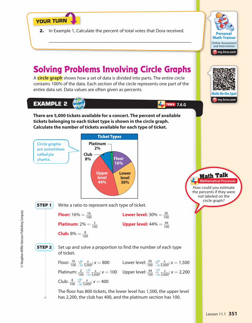
2. In Example 1, Calculate the percent of total votes that Dora received.
YOUR TURN
Solving Problems Involving Circle GraphsA circle graph shows how a set of data is divided into parts. The entire circle
contains 100% of the data. Each section of the circle represents one part of the
entire data set. Data values are often given as percents.
There are 5,000 tickets available for a concert. The percent of available
tickets belonging to each ticket type is shown in the circle graph.
Calculate the number of tickets available for each type of ticket.
Write a ratio to represent each type of ticket.
Floor: 16% = 16 ___
100 Lower level: 30% = 30
___ 100
Platinum: 2% = 2 ___
100 Upper level: 44% = 44
___ 100
Club: 8% = 8 ___
100
Set up and solve a proportion to find the number of each type
of ticket.
Floor: 16 ___
100 = x
____ 5,000
; x = 800 Lower level: 30 ___
100 = x
____ 5,000
; x = 1,500
Platinum: 2 ___
100 = x
____ 5,000
; x = 100 Upper level: 44 ___
100 = x
____ 5,000
; x = 2,200
Club: 8 ___
100 = x
____ 5,000
; x = 400
The floor has 800 tickets, the lower level has 1,500, the upper level
has 2,200, the club has 400, and the platinum section has 100.
EXAMPLEXAMPLE 2
STEP 1
STEP 2
×50
×50
×50
×50
×50
×50
×50
×50
×50
×50
Math TalkMathematical Processes
7.6.G
How could you estimate the percents if they were
not labeled on the circle graph?
Circle graphs are sometimes called pie charts.
351Lesson 11.1
© H
ough
ton
Miff
lin H
arco
urt P
ublis
hing
Com
pany

Family30%
Individual60%
Supporter2.5%
Contributor7.5%
Zoo Memberships
Writing Hand
21
18
15
12
9
6
3
0
Nu
mb
er
of s
tud
en
ts
Writing hand
LeftNo
prefe
rence
Right
Math Trainer
Online Assessment and Intervention
Personal
my.hrw.com
3. What percentage of sold tickets not on the floor were platinum tickets?
Round to the nearest percent.
YOUR TURN
Guided Practice
1. The students in a class were asked which hand they
preferred to use for writing. The bar graph shows the
results. Of the students who had a preference, what
percent chose the left hand? (Example1)
Find the total number of students who
had a preference.
Left Right Total
Set up a proportion and find the percent.
Of the students that had a preference, chose
the left hand.
2. There are 20,000 members of a zoo. The percent of
members having each membership type is shown in the
circle graph. How many members have a contributor
membership? What percentage of the noncontributory
memberships are individual memberships? Round to the
nearest percent. (Example 2)
3. When solving proportions based on data from graphs, why do you often
convert from fractions and percents to decimals?
STEP 1
STEP 2
ESSENTIAL QUESTION CHECK-IN??
Unit 6352
© H
ough
ton
Miff
lin H
arco
urt P
ublis
hing
Com
pany

Math Coach
Icon to come
Mond
ay
Tuesday
Wed
nesday
Thursday
Friday
Saturday
Sunday
Number of Computers Sold
States in Each Time Zone
Pacific
Mountain
Hawaii
Eastern
Central
Alaska
40 8 12 16
Number of States
Tim
e Z
on
e
20 24
Personal Math Trainer
Online Assessment and
Interventionmy.hrw.com
Name Class Date
Independent Practice11.1
The number of computers sold at an electronics store for each day of
a week is shown in the dot plot.
4. What percent of all computers sold during the entire week
were sold on Friday?
5. What percent of computers sold on weekdays were sold on
Tuesday? Round to the nearest percent.
6. Multiple Representations Suppose the data described
above for the electronics store were represented with a bar
graph instead of a dot plot. Would there be any advantages or
disadvantages?
The number of states in the United States that are primarily in each of the
time zones is shown in the bar graph.
7. The continental United States is all states except Hawaii
and Alaska. What percent of the continental states are
primarily in the Eastern time zone?
8. Is the percent of the continental states primarily in the
Eastern time zone greater than or less than the percent of
all states that are in the Mountain or Central time zone?
9. What If? Suppose the horizontal scale of the bar graph
had intervals of 1 instead of 4. Would there be any
advantages to having that scale? Would there be any
disadvantages?
Independent Practice11.17.6.G
353Lesson 11.1
© H
ough
ton
Miff
lin H
arco
urt P
ublis
hing
Com
pany
Work Area
22
18
13 8
66
2548
Bow Tie Colors Worn to Prom
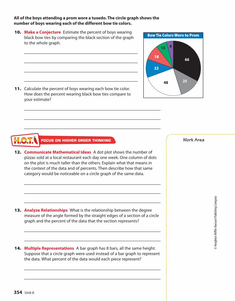
All of the boys attending a prom wore a tuxedo. The circle graph shows the
number of boys wearing each of the different bow tie colors.
10. Make a Conjecture Estimate the percent of boys wearing
black bow ties by comparing the black section of the graph
to the whole graph.
11. Calculate the percent of boys wearing each bow tie color.
How does the percent wearing black bow ties compare to
your estimate?
12. Communicate Mathematical Ideas A dot plot shows the number of
pizzas sold at a local restaurant each day one week. One column of dots
on the plot is much taller than the others. Explain what that means in
the context of the data and of percents. Then describe how that same
category would be noticeable on a circle graph of the same data.
13. Analyze Relationships What is the relationship between the degree
measure of the angle formed by the straight edges of a section of a circle
graph and the percent of the data that the section represents?
14. Multiple Representations A bar graph has 8 bars, all the same height.
Suppose that a circle graph were used instead of a bar graph to represent
the data. What percent of the data would each piece represent?
FOCUS ON HIGHER ORDER THINKING
Unit 6354
© H
ough
ton
Miff
lin H
arco
urt P
ublis
hing
Com
pany

?
28 29 30 31 32 33 34 35
Length from Nose to Thumb (in.)
ESSENTIAL QUESTION
EXPLORE ACTIVITY
How do you compare two sets of data displayed in dot plots?
Analyzing Dot PlotsYou can use dot plots to analyze a data set, especially with respect to
its center and spread.
People once used body parts for measurements.
For example, an inch was the width of a man’s
thumb. In the 12th century, King
Henry I of England stated that a yard
was the distance from his nose to his
outstretched arm’s thumb. The dot plot
shows the different lengths, in inches,
of the “yards” for students in a 7th grade class.
Describe the shape of the dot plot. Are the dots evenly distributed or
grouped on one side?
What value best describes the center of the data? Explain how you
chose this value.
Describe the spread of the dot plot. Are there any outliers?
Reflect1. Calculate the mean, median, and range of the data in the dot plot.
A
B
C
L E S S O N
11.2Comparing Data Displayed in Dot Plots
7.12.A
Measurement and data—7.12.A Compare two groups of numeric data using comparative dot plots or box plots by comparing their shapes, centers, and spreads.
355Lesson 11.2
© H
ough
ton
Miff
lin H
arco
urt P
ublis
hing
Com
pany
5’0”4’10” 5’2” 5’4” 5’6”Softball Players’ Heights
5’2” 5’4” 5’6” 5’8” 5’10” 6’0”Basketball Players’ Heights
Math On the Spotmy.hrw.com
5’0 5’2 5’4 5’6Field Hockey Players’ Heights
Math Trainer
Online Assessment and Intervention
Personal
my.hrw.com
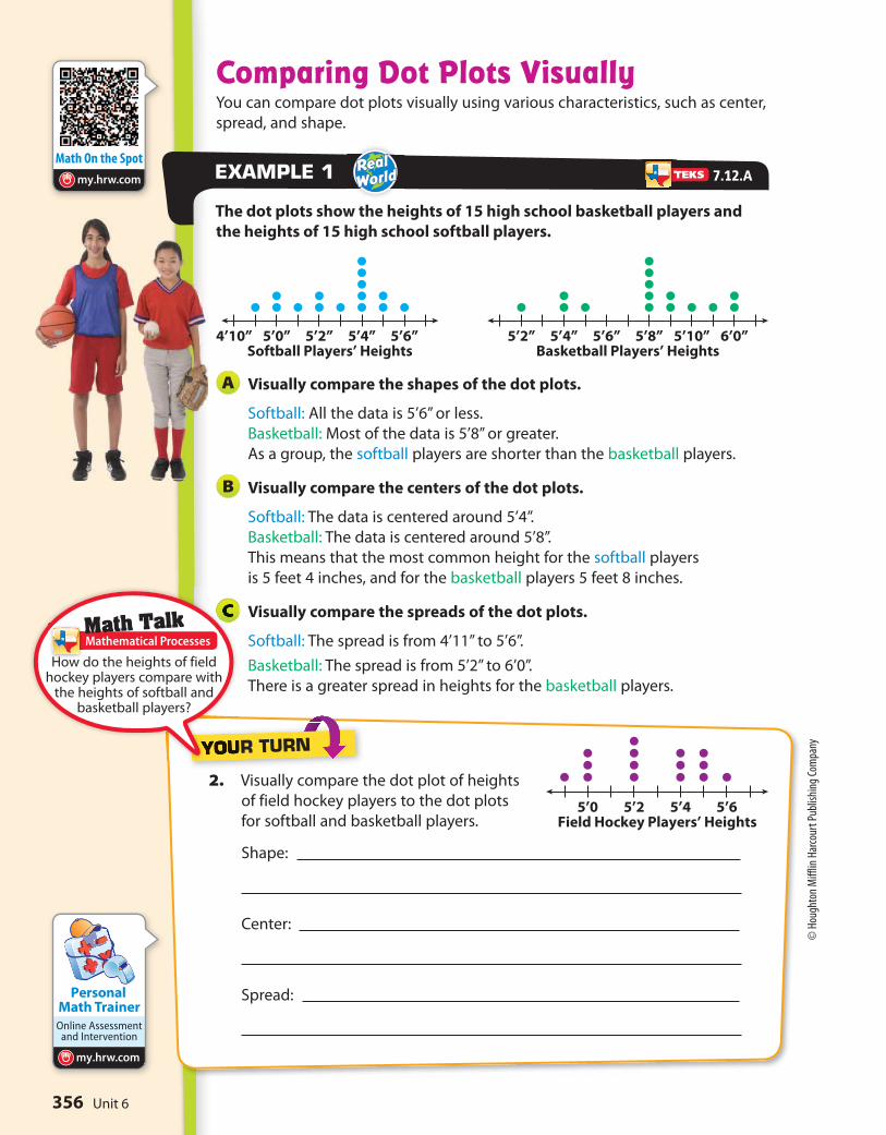
Comparing Dot Plots VisuallyYou can compare dot plots visually using various characteristics, such as center,
spread, and shape.
The dot plots show the heights of 15 high school basketball players and
the heights of 15 high school softball players.
Visually compare the shapes of the dot plots.
Softball: All the data is 5’6” or less.
Basketball: Most of the data is 5’8” or greater.
As a group, the softball players are shorter than the basketball players.
Visually compare the centers of the dot plots.
Softball: The data is centered around 5’4”.
Basketball: The data is centered around 5’8”.
This means that the most common height for the softball players
is 5 feet 4 inches, and for the basketball players 5 feet 8 inches.
Visually compare the spreads of the dot plots.
Softball: The spread is from 4’11” to 5’6”.
Basketball: The spread is from 5’2” to 6’0”.
There is a greater spread in heights for the basketball players.
EXAMPLE 1
A
B
C
2. Visually compare the dot plot of heights
of field hockey players to the dot plots
for softball and basketball players.
Shape:
Center:
Spread:
YOUR TURN
Math TalkMathematical Processes
7.12.A
How do the heights of field hockey players compare with
the heights of softball and basketball players?
Unit 6356
© H
ough
ton
Miff
lin H
arco
urt P
ublis
hing
Com
pany
Math On the Spot
my.hrw.com
0 2 4 6 8 10 12Internet Usage (h)
Math Trainer
Online Assessment and Intervention
Personal
my.hrw.com
Animated Math
my.hrw.com
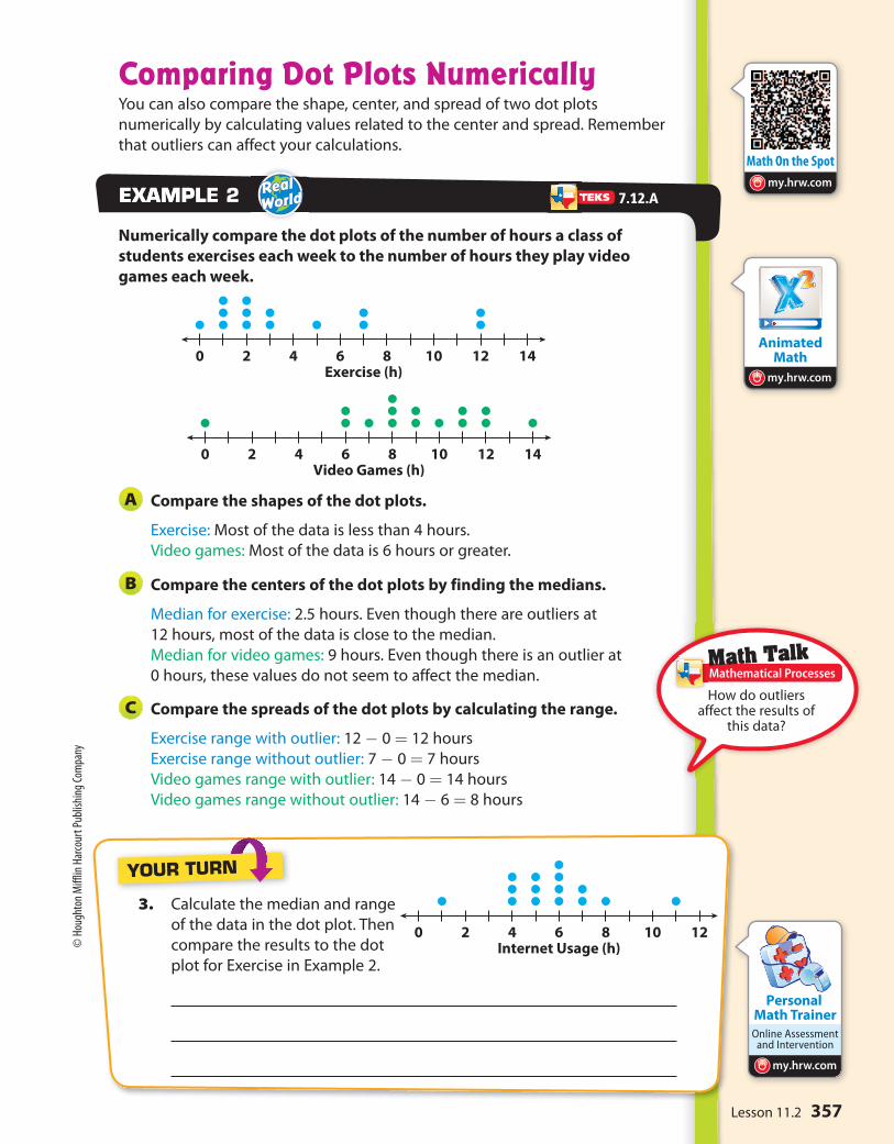
0 2 4 6 8 10 12 14Exercise (h)
0 2 4 6 8 10 12 14Video Games (h)
Comparing Dot Plots NumericallyYou can also compare the shape, center, and spread of two dot plots
numerically by calculating values related to the center and spread. Remember
that outliers can affect your calculations.
Numerically compare the dot plots of the number of hours a class of
students exercises each week to the number of hours they play video
games each week.
Compare the shapes of the dot plots.
Exercise: Most of the data is less than 4 hours.
Video games: Most of the data is 6 hours or greater.
Compare the centers of the dot plots by finding the medians.
Median for exercise: 2.5 hours. Even though there are outliers at
12 hours, most of the data is close to the median.
Median for video games: 9 hours. Even though there is an outlier at
0 hours, these values do not seem to affect the median.
Compare the spreads of the dot plots by calculating the range.
Exercise range with outlier: 12 - 0 = 12 hours
Exercise range without outlier: 7 - 0 = 7 hours
Video games range with outlier: 14 - 0 = 14 hours
Video games range without outlier: 14 - 6 = 8 hours
EXAMPLEXAMPLE 2
A
B
C
3. Calculate the median and range
of the data in the dot plot. Then
compare the results to the dot
plot for Exercise in Example 2.
YOUR TURN
Math TalkMathematical Processes
7.12.A
How do outliers affect the results of
this data?
357Lesson 11.2
© H
ough
ton
Miff
lin H
arco
urt P
ublis
hing
Com
pany
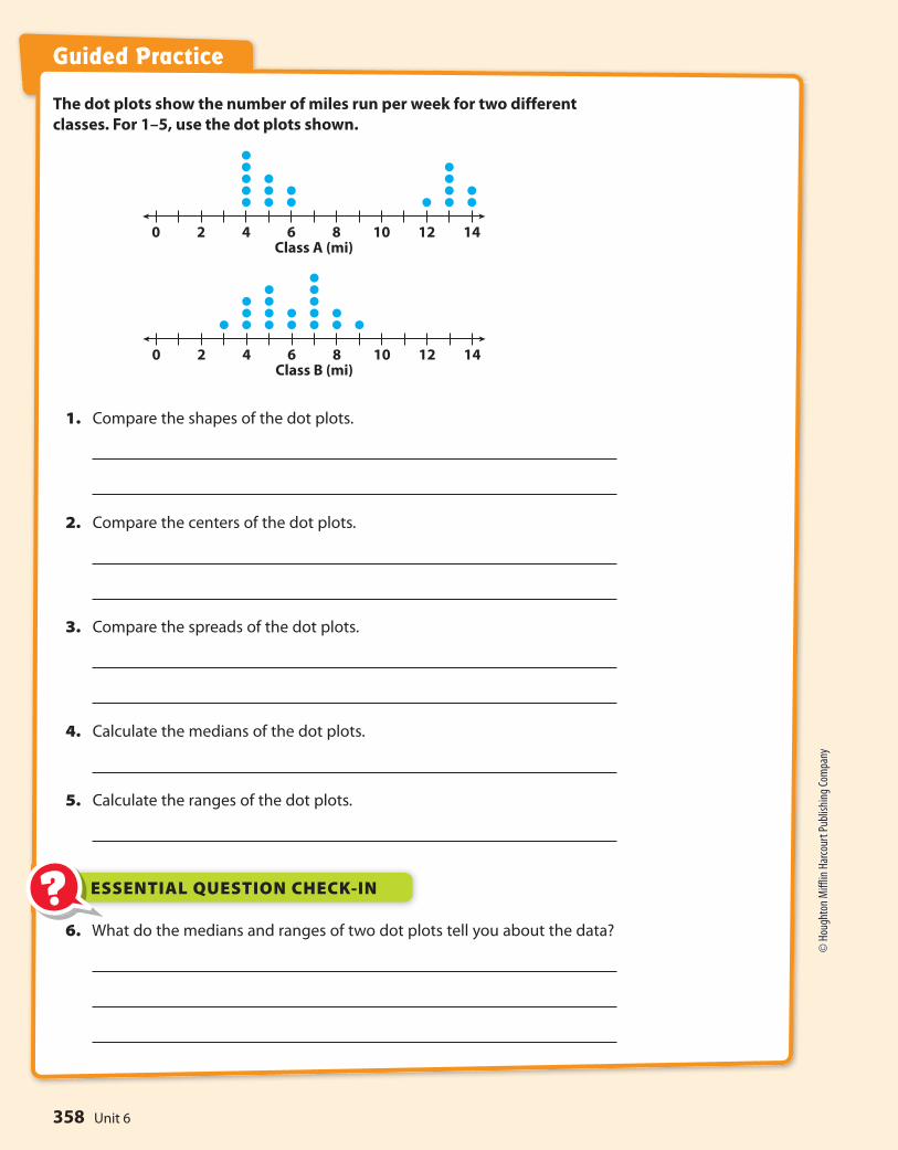
0 2 4 6 8 10 12 14Class A (mi)
0 2 4 6 8 10 12 14Class B (mi)
Guided Practice
The dot plots show the number of miles run per week for two different
classes. For 1–5, use the dot plots shown.
1. Compare the shapes of the dot plots.
2. Compare the centers of the dot plots.
3. Compare the spreads of the dot plots.
4. Calculate the medians of the dot plots.
5. Calculate the ranges of the dot plots.
6. What do the medians and ranges of two dot plots tell you about the data?
ESSENTIAL QUESTION CHECK-IN??
Unit 6358
© H
ough
ton
Miff
lin H
arco
urt P
ublis
hing
Com
pany
Math Coach
Icon to come
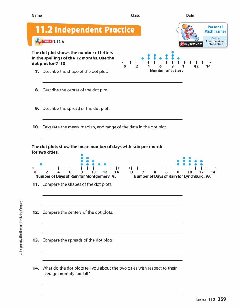
0 2 4 6 8 1 012 14Number of Letters
Personal Math Trainer
Online Assessment and
Interventionmy.hrw.com
0 2 4 6 8 10 12 14Number of Days of Rain for Montgomery, AL
0 2 4 6 8 10 12 14Number of Days of Rain for Lynchburg, VA
Name Class Date
The dot plot shows the number of letters
in the spellings of the 12 months. Use the
dot plot for 7–10.
7. Describe the shape of the dot plot.
8. Describe the center of the dot plot.
9. Describe the spread of the dot plot.
10. Calculate the mean, median, and range of the data in the dot plot.
The dot plots show the mean number of days with rain per month
for two cities.
11. Compare the shapes of the dot plots.
12. Compare the centers of the dot plots.
13. Compare the spreads of the dot plots.
14. What do the dot plots tell you about the two cities with respect to their
average monthly rainfall?
Independent Practice11.27.12.A
359Lesson 11.2
© Houghton Miff
lin Harcourt Pub
lishing
Company
Work Area
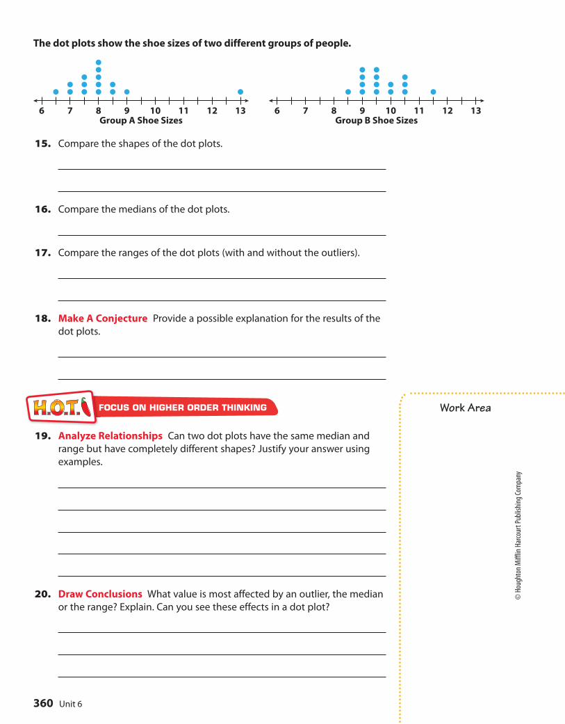
6 7 8 9 10 11 12 13Group A Shoe Sizes
6 7 8 9 10 11 12 13Group B Shoe Sizes
The dot plots show the shoe sizes of two different groups of people.
15. Compare the shapes of the dot plots.
16. Compare the medians of the dot plots.
17. Compare the ranges of the dot plots (with and without the outliers).
18. Make A Conjecture Provide a possible explanation for the results of the
dot plots.
19. Analyze Relationships Can two dot plots have the same median and
range but have completely different shapes? Justify your answer using
examples.
20. Draw Conclusions What value is most affected by an outlier, the median
or the range? Explain. Can you see these effects in a dot plot?
FOCUS ON HIGHER ORDER THINKING
Unit 6360
© Houghton Miff
lin Harcourt Pub
lishing
Company

?
2015 25 30
Points Scored
ESSENTIAL QUESTION
L E S S O N
11.3Comparing Data Displayed in Box Plots
How do you compare two sets of data displayed in box plots?
Analyzing Box PlotsBox plots show five key values to represent a set of data, the least and greatest
values, the lower and upper quartile, and the median. To create a box plot,
arrange the data in order, and divide them into four equal-size parts or quarters.
Then draw the box and the whiskers as shown.
The number of points a high school basketball player scored during the
games he played this season are organized in the box plot shown.
Find the least and greatest values.
Least value: Greatest value:
Find the median and describe what it means for the data.
Find and describe the lower and upper quartiles.
The interquartile range is the difference between the upper and
lower quartiles, which is represented by the length of the box.
Find the interquartile range.
Q3 - Q1 = - =
A
B
C
D
EXPLORE ACTIVITY
Math TalkMathematical Processes
Measurement and data—7.12.A Compare two groups of numeric data using comparative dot plots or box plots by comparing their shapes, centers, and spreads.
7.12.A
How do the lengths of the whiskers compare? Explain
what this means.
361Lesson 11.3
© H
ough
ton
Miff
lin H
arco
urt P
ublis
hing
Com
pany
• Im
age
Cred
its: ©
Rim
Lig
ht/
Phot
oLin
k/Ph
otod
isc/G
etty
Imag
es

My Notes
10 20 30 40 700 50
Shopping Time (min)
Group B
Group A
60
Math On the Spotmy.hrw.com
Math TalkMathematical Processes
Which store has the shopper who shops longest? Explain
how you know.
EXPLORE ACTIVITY (cont’d)
Reflect 1. Why is one-half of the box wider than the other half of the box?
Box Plots with Similar VariabilityYou can compare two box plots numerically according to their centers, or medians, and their spreads, or variability. Range and interquartile range (IQR) are both measures of spread. Data sets with similar variability should have box plots of similar sizes.
The box plots show the distribution of times spent shopping by two
different groups.
Compare the shapes of the box plots.
The positions and lengths of the boxes and whiskers appear to be very
similar. In both plots, the right whisker is shorter than the left whisker.
Compare the centers of the box plots.
Group A’s median, 47.5, is greater than Group B’s, 40. This means that the
median shopping time for Group A is 7.5 minutes more.
Compare the spreads of the box plots.
The box shows the interquartile range. The boxes are similar in length.
Group A: 55 - 30 = 25 min Group B: 59 - 32 = 27 min
The length of a box plus its whiskers shows the range of a data set.
The two data sets have similar ranges.
Reflect 2. Which group has the greater variability in the bottom 50% of shopping
times? The top 50% of shopping times? Explain how you know.
EXAMPLE 1
A
B
C
7.12.A
362 Unit 6
© H
ough
ton
Miff
lin H
arco
urt P
ublis
hing
Com
pany
Math Trainer
Online Assessment and Intervention
Personal
my.hrw.com
30 40 50 6020 70
Number of Team Wristbands Sold Daily
Store B
Store A
80
180 200 220 240 340320160 260
Football Players’ Weights (lb)
Group B
Group A
280 300
Math On the Spot
my.hrw.com
Box Plots with Different VariabilityYou can compare box plots with greater variability, where there is less overlap of the median and interquartile range.
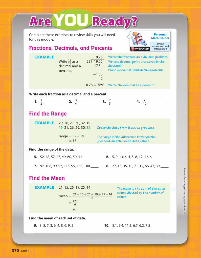
The box plots show the distribution of the number of team wristbands sold
daily by two different stores over the same time period.
Compare the shapes of the box plots.
Store A’s box and right whisker are longer than Store B’s.
Compare the centers of the box plots.
Store A’s median is about 43, and Store B’s is about 51. Store A’s median
is close to Store B’s minimum value, so about 50% of Store A’s daily sales
were less than sales on Store B’s worst day.
Compare the spreads of the box plots.
Store A has a greater spread. Its range and interquartile range are
both greater. Four of Store B’s key values are greater than Store A’s
corresponding value. Store B had a greater number of sales overall.
EXAMPLEXAMPLE 2
A
B
C
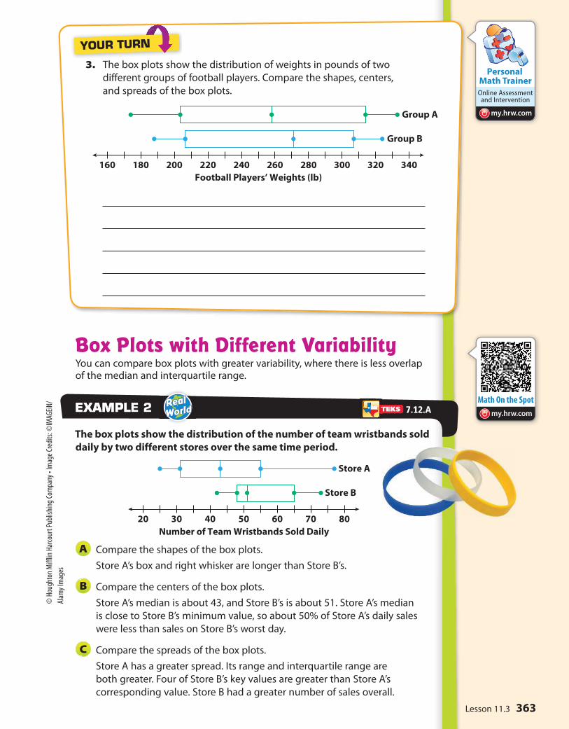
3. The box plots show the distribution of weights in pounds of two
different groups of football players. Compare the shapes, centers,
and spreads of the box plots.
YOUR TURN
7.12.A
363Lesson 11.3
© H
ough
ton
Miff
lin H
arco
urt P
ublis
hing
Com
pany
• Im
age
Cred
its: ©
IMAG
EiN/
Alam
y Im
ages

74 78 82 8670 90 94
Math Test Scores
64 68 72 7660 8480
Heights (in.)
Volleyball Players
Hockey Players
88
Math Trainer
Online Assessment and Intervention
Personal
my.hrw.com
30 40 50 6020 70
Number of Team Wristbands Sold
80
For 1–3, use the box plot Terrence created for his math test scores. Find
each value. (Explore Activity)
1. Minimum = Maximum =
2. Median =
3. Range = IQR =
For 4–7, use the box plots showing the distribution of the heights of hockey
and volleyball players. (Examples 1 and 2)
4. Which group has a greater median height?
5. Which group has the shortest player?
6. Which group has an interquartile range of about 10?
Guided Practice
4. Compare the shape, center, and spread of the data in the box plot with the
data for Stores A and B in the two box plots in Example 2.
YOUR TURN
7. What information can you use to compare two box plots?
ESSENTIAL QUESTION CHECK-IN??
364 Unit 6
© H
ough
ton
Miff
lin H
arco
urt P
ublis
hing
Com
pany

Personal Math Trainer
Online Assessment and
Interventionmy.hrw.com
170 180 190 200160 220210
Distance Jumped (in.)
Car B
Car A
400 450 500 550350 650600
Cost ($)
City B
City A
Name Class Date
For 8–11, use the box plots of the distances
traveled by two toy cars that were jumped
from a ramp.
8. Compare the minimum, maximum, and
median of the box plots.
9. Compare the ranges and interquartile
ranges of the data in box plots.
10. What do the box plots tell you about the
jump distances of two cars?
11. Critical Thinking What do the whiskers
tell you about the two data sets?
For 12–14, use the box plots to compare the
costs of leasing cars in two different cities.
12. In which city could you spend the least
amount of money to lease a car? The
greatest?
13. Which city has a higher median price? How
much higher is it?
14. Make a Conjecture In which city is it
more likely to choose a car at random
that leases for less than $450? Why?
Independent Practice11.37.12.A
365Lesson 11.3
© H
ough
ton
Miff
lin H
arco
urt P
ublis
hing
Com
pany

Work Area
15. Summarize Look back at the box plots for 12–14 on the previous page.
What do the box plots tell you about the costs of leasing cars in those
two cities?
16. Draw Conclusions Two box plots have the same median and equally
long whiskers. If one box plot has a longer box than the other box plot,
what does this tell you about the difference between the data sets?
17. Communicate Mathematical Ideas What can you learn about a data set
from a box plot? How is this information different from a dot plot?
18. Analyze Relationships In mathematics, central tendency is the tendency
of data values to cluster around some central value. What does a measure
of variability tell you about the central tendency of a set of data? Explain.
FOCUS ON HIGHER ORDER THINKING
366 Unit 6
© H
ough
ton
Miff
lin H
arco
urt P
ublis
hing
Com
pany

Ready
Snake
24%
Hamster
12%
Bird
56%
Class Pet Vote
Ferret
8%
180 190
Airplane A
Airplane B
200 210 220
Length of Flight (in.)
230 240 250
5 6 7 8 9 10
Start of School Year
5 6 7 8 9 10
Miles Run Miles Run
End of School Year
Math Trainer
Online Assessment and Intervention
Personal
my.hrw.com
MODULE QUIZ
11.1 Analyzing Categorical DataThe circle graph shows the results of 25 student
votes for the new class pet. Find the number of
votes for each animal.
1. bird 2. hamster
3. ferret 4. snake
11.2 Comparing Data Displayed in Dot Plots
The two dot plots show the number
of miles run by 14 students at the
beginning and at the end of the
school year. Compare each measure
of the two dot plots.
5. means
6. medians 7. ranges
11.3 Comparing Data Displayed in Box PlotsUse the box plots of inches flown by
two different model airplanes
for the following exercises.
8. Which has a greater median
flight length?
9. Which has a greater interquartile range?
10. Which appears to have a more predictable flight length?
11. How can you use and compare data to solve real-world problems?
ESSENTIAL QUESTION
367Module 11
© H
ough
ton
Miff
lin H
arco
urt P
ublis
hing
Com
pany

Pa
ge
s
Chapter
1 2 3 4 50
10
20
30
40
50
60
70
Number of Pages per Chapter10 20 30 40 50 60
Set A
10 20 30 40 50 60
Set B
1 2 3 4 5 6
Number of Pencils at Desk
Personal Math Trainer
Online Assessment and
Interventionmy.hrw.com
MODULE 11 MIXED REVIEW
Selected Response
Chelsea is reading a 250-page book that is
divided into five chapters. For 1–3, use the
bar graph below.
1. What percent of the book’s pages are in
Chapter 4?
A 24% C 35%
B 28% D 70%
2. What percent of the book’s pages are in
Chapters 3 and 4?
A 24% C 52%
B 28% D 65%
3. If Chelsea has read through the first half of
Chapter 3, what percent of the book has
she read?
A 25% C 44%
B 40% D 52%
4. What is -3 1 _ 2
written as a decimal?
A -3.05 C -0.35
B -3.5 D -0.035
5. Which is a true statement based on the dot
plots below?
A Set A has the lesser range.
B Set B has the greater median.
C Set A has the greater mean.
D Set B is less symmetric than Set A
Gridded Response
6. The dot plot shows the number of pencils
each boy has at his desk in class.
Find the median for the number of pencils.
.0 0 0 0 0 0
1 1 1 1 1 1
2 2 2 2 2 2
3 3 3 3 3 3
4 4 4 4 4 4
5 5 5 5 5 5
6 6 6 6 6 6
7 7 7 7 7 7
8 8 8 8 8 8
9 9 9 9 9 9
Texas Test Prep
B
C
B
2
B
B
368 Unit 6
© H
ough
ton
Miff
lin H
arco
urt P
ublis
hing
Com
pany

ESSENTIAL QUESTION?
Real-World Video
my.hrw.com
How can you use random samples and populations to solve real-world problems?
Random Samples and Populations 12
Get immediate feedback and help as
you work through practice sets.
Personal Math Trainer
Interactively explore key concepts to see
how math works.
Animated Math
Go digital with your write-in student
edition, accessible on any device.
Scan with your smart phone to jump directly to the online edition,
video tutor, and more.
MODULE
my.hrw.commy.hrw.com Math On the Spot
Scientists study animals like dolphins to learn more about characteristics such as behavior, diet, and communication. Acoustical data (recordings of dolphin sounds) can reveal the species that made the sound.
LESSON 12.1
Populations and Samples
7.6.F
LESSON 12.2
Making Inferences from a Random Sample
7.6.F, 7.12.B
LESSON 12.3
Comparing Populations
7.12.B, 7.12.C
369
© H
ough
ton
Miff
lin H
arco
urt P
ublis
hing
Com
pany
• Im
age
Cred
its: ©
Kev
in S
chaf
er/
Alam
y
Personal Math Trainer
Online Assessment and
Interventionmy.hrw.com
YOUAre Ready?Complete these exercises to review skills you will need
for this module.
Fractions, Decimals, and PercentsEXAMPLE
Write 19
__ 25
as a
decimal and a
percent.
0.76 25 ⟌
⎯ 19.00 -17 5
1
50 -1 50 0
0.76 = 76%
Write each fraction as a decimal and a percent.
1. 1 _ 2
2. 3 _ 4
3. 2 _ 5
4. 7 __ 10
Find the RangeEXAMPLE 29, 26, 21, 30, 32, 19
19, 21, 26, 29, 30, 32
range = 32 – 19
= 13
Find the range of the data.
5. 52, 48, 57, 47, 49, 60, 59, 51 6. 5, 9, 13, 6, 4, 5, 8, 12, 12, 6
7. 97, 106, 99, 97, 115, 95, 108, 100 8. 27, 13, 35, 19, 71, 12, 66, 47, 39
Find the MeanEXAMPLE 21, 15, 26, 19, 25, 14
mean = 21 + 15 + 26 + 19 + 25 + 14 _____________________
6
= 120 ___
6
= 20
Find the mean of each set of data.
9. 3, 5, 7, 3, 6, 4, 8, 6, 9, 5 10. 8.1, 9.4, 11.3, 6.7, 6.2, 7.5
The mean is the sum of the data values divided by the number of values.
Order the data from least to greatest.
The range is the difference between the greatest and the least data values.
Write the fraction as a division problem.
Write a decimal point and zeros in the dividend.
Place a decimal point in the quotient.
Write the decimal as a percent.
Unit 6370
© H
ough
ton
Miff
lin H
arco
urt P
ublis
hing
Com
pany

Reading Start-Up
Active ReadingThree-Panel Flip Chart Before beginning the
module, create a three-panel flip chart to help
you organize what you learn. Label each flap
with one of the lesson titles from this module.
As you study each lesson, write important
ideas, such as vocabulary, properties, and
formulas, under the appropriate flap.
VocabularyReview Words
✔ box plot (diagrama de caja)
data (datos) dot plot (diagrama de
puntos) interquartile range
(rango entre cuartiles)✔ lower quartile
(cuartil inferior)✔ median (mediana) mode (moda) spread (dispersión) survey (encuesta)✔ upper quartile
(cuartil superior)
Preview Words biased sample
(muestra sesgada) population (población) random sample
(muestra aleatoria) sample (muestra)
Visualize VocabularyUse the ✔ words to complete the right column of the chart.
Understand VocabularyComplete each sentence, using the preview words.
1. An entire group of objects, individuals, or events is a
.
2. A is part of the population chosen to
represent the entire group.
3. A sample that does not accurately represent the population is a
.
Box Plots to Display Data
Definition Review Word
A display that uses values
from a data set to show how
the values are spread out.
The middle value of a data set.
The median of the lower
half of the data.
The median of the upper
half of the data.
371Module 12
© Houghton Miff
lin Harcourt Pub
lishing
Company
Average Daily Hours of Sleep
5 6 7 8 9 10 11
Anderson Hall
5 6 7 8 9 10 11
Jones Hall
Unpacking the TEKSUnderstanding the TEKS and the vocabulary terms in the TEKS
will help you know exactly what you are expected to learn in this
module.
What It Means to YouYou will use data collected from a random sample to make
inferences about a population.
UNPACKING EXAMPLE 7.12.B
Alexi surveys a random sample of 80 students at his school and
finds that 22 of them usually walk to school. There are 1,760
students at the school. Predict the number of students who usually
walk to school.
number in sample who walk _____________________
size of sample =
number in population who walk _____________________
size of population
22 __
80 = x ____
1,760
x = 22 ___
80 · 1,760
x = 38,720
_____ 80
= 484
Approximately 484 students usually walk to school.
What It Means to YouYou will compare two populations based on random samples.
UNPACKING EXAMPLE 7.12.C
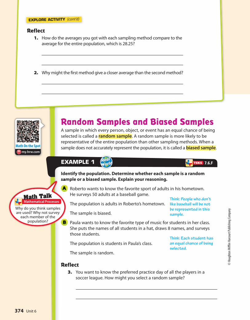
Melinda surveys a random sample of 16 students from two college
dorms to find the average number of hours of sleep they get. Use
the results shown in the dot plots to compare the two populations.
Students in Jones Hall tend to sleep more than students in
Anderson Hall, and the variation in the amount of sleep is greater
for students in Jones Hall.
MODULE 12
my.hrw.com
7.12.B
Use data from a random sample
to make inferences about a
population.
Key Vocabularypopulation (población)
The entire group of objects or
individuals considered for a
survey.
sample (muestra) A part of the population.
random sample (muestra aleatoria) A sample in which each
individual or object in the
entire population has an equal
chance of being selected.
7.12.C
Compare two populations based
on data in random samples from
these populations, including
informal comparative inferences
about differences between the
two populations.
Visit my.hrw.com to see all
the
unpacked.
Unit 6372
© H
ough
ton
Miff
lin H
arco
urt P
ublis
hing
Com
pany

?
EXPLORE ACTIVITY
ESSENTIAL QUESTIONHow can you use a sample to gain information about a population?
Random and Non-Random SamplingWhen information is being gathered about a group, the entire group of objects,
individuals, or events is called the population. A sample is part of the
population that is chosen to represent the entire group.
A vegetable garden has 36 tomato plants
arranged in a 6-by-6 array. The gardener
wants to know the average number of
tomatoes on the plants. Each white cell
in the table represents a plant. The number
in the cell tells how many tomatoes are on
that particular plant.
Because counting the number of tomatoes on all
of the plants is too time-consuming, the gardener
decides to choose plants at random to find the
average number of tomatoes on them.
To simulate the random selection, roll two number
cubes 10 times. Find the cell in the table identified
by the first and second number cubes. Record the
number in each randomly selected cell.
What is the average number of tomatoes
on the 10 plants that were randomly
selected?
Alternately, the gardener decides to choose the plants in the first
row. What is the average number of tomatoes on these plants?
A
B
L E S S O N
12.1Populations and Samples
First Number
Cube
8 9 13 18 24 15 1
34 42 46 20 13 41 2
29 21 14 45 27 43 3
22 45 46 41 22 33 4
12 42 44 17 42 11 5
18 26 43 32 33 26 6
Second Number
Cube
1 2 3 4 5 6
Math TalkMathematical Processes
7.6.F
Proportionality—7.6.F Use data from a random sample…
How do the averages you got with each sampling
method compare?
373Lesson 12.1
© H
ough
ton
Miff
lin H
arco
urt P
ublis
hing
Com
pany
Math On the Spotmy.hrw.com
EXPLORE ACTIVITY (cont’d)
Random Samples and Biased SamplesA sample in which every person, object, or event has an equal chance of being
selected is called a random sample. A random sample is more likely to be
representative of the entire population than other sampling methods. When a
sample does not accurately represent the population, it is called a biased sample.
Identify the population. Determine whether each sample is a random
sample or a biased sample. Explain your reasoning.
Roberto wants to know the favorite sport of adults in his hometown.
He surveys 50 adults at a baseball game.
The population is adults in Roberto’s hometown.
The sample is biased.
Paula wants to know the favorite type of music for students in her class.
She puts the names of all students in a hat, draws 8 names, and surveys
those students.
The population is students in Paula’s class.
The sample is random.
Reflect 3. You want to know the preferred practice day of all the players in a
soccer league. How might you select a random sample?
EXAMPLE 1
A
B
Reflect 1. How do the averages you got with each sampling method compare to the
average for the entire population, which is 28.25?
2. Why might the first method give a closer average than the second method?
Math TalkMathematical Processes
7.6.F
Why do you think samples are used? Why not survey
each member of the population?
Think: People who don’t like baseball will be not be represented in this sample.
Think: Each student has an equal chance of being selected.
Unit 6374
© H
ough
ton
Miff
lin H
arco
urt P
ublis
hing
Com
pany

Math On the Spot
my.hrw.com
Math Trainer
Online Assessment and Intervention
Personal
my.hrw.com
Math Trainer
Online Assessment and Intervention
Personal
my.hrw.com
Bias in Survey QuestionsOnce you have selected a representative sample of the population, be sure
that the data is gathered without bias. Make sure that the survey questions
themselves do not sway people to respond a certain way.
In Madison County, residents were surveyed about a new skateboard park.
Determine whether each survey question may be biased. Explain.
Would you like to waste the taxpayers’ money to build a frivolous
skateboard park?
This question is biased. It discourages residents from saying yes to a new
skateboard park by implying it is a waste of money.
Do you favor a new skateboard park?
This question is not biased. It does not include an opinion on the
skateboard park.
Studies have shown that having a safe place to go keeps kids out
of trouble. Would you like to invest taxpayers’ money to build a
skateboard park?
This question is biased. It leads people to say yes because it mentions
having a safe place for kids to go and to stay out of trouble.
EXAMPLEXAMPLE 2
A
B
C
Determine whether each sample is a random or biased sample. Explain
your reasoning.
4. A librarian randomly chooses 100 books from the library’s database to
calculate the average length of a library book.
YOUR TURN
Determine whether each question may be biased. Explain.
5. When it comes to pets, do you prefer cats?
6. What is your favorite season?
YOUR TURN
7.6.F
375Lesson 12.1
© Houghton Miff
lin Harcourt Pub
lishing
Company
• Image Credits:
PhotoSpin
, Inc./
Alamy Limited

Random Sample of SeventhGrade Male Students
Student Shoe Size
1. Follow each method described below to collect data to estimate the
average shoe size of seventh grade boys. (Explore Activity)
Method 1
Randomly select 6 seventh grade boys
and ask each his shoe size. Record your
results in a table like the one shown.
Find the mean of this data. Mean:
Method 2
Find the 6 boys in your math class with the largest shoes and ask their
shoe size. Record your results in a table like the one shown in Method 1.
Find the mean of this data. Mean:
2. Method 1 produces results that are more / less representative of the
entire student population because it is a random / biased sample.
(Example 1)
3. Method 2 produces results that are more / less representative of the
entire student population because it is a random / biased sample.
(Example 1)
4. Heidi decides to use a random sample to determine her classmates’
favorite color. She asks, “Is green your favorite color?” Is Heidi’s question
biased? If so, give an example of an unbiased question that would serve
Heidi better. (Example 2)
A
B
A
B
Guided Practice
5. How can you select a sample so that the information gained represents
the entire population?
ESSENTIAL QUESTION CHECK-IN??
Unit 6376
© Houghton Miff
lin Harcourt Pub
lishing
Company
Personal Math Trainer
Online Assessment and
Interventionmy.hrw.com
Name Class Date
Independent Practice12.1
6. Paul and his friends average their test
grades and find that the average is 95.
The teacher announces that the average
grade of all of her classes is 83. Why are the
averages so different?
7. Nancy hears a report that the average
price of gasoline is $2.82. She averages the
prices of stations near her home. She finds
the average price of gas to be $3.03. Why
are the averages different?
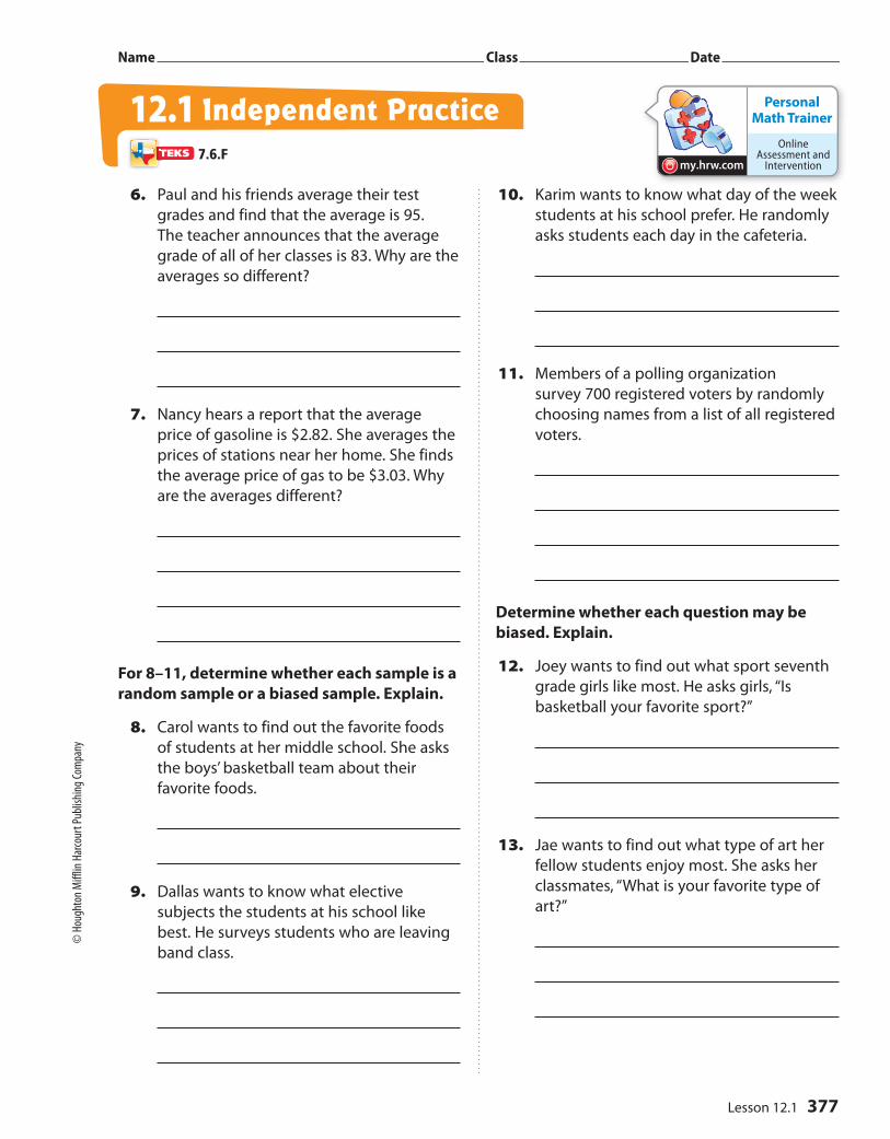
For 8–11, determine whether each sample is a
random sample or a biased sample. Explain.
8. Carol wants to find out the favorite foods
of students at her middle school. She asks
the boys’ basketball team about their
favorite foods.
9. Dallas wants to know what elective
subjects the students at his school like
best. He surveys students who are leaving
band class.
10. Karim wants to know what day of the week
students at his school prefer. He randomly
asks students each day in the cafeteria.
11. Members of a polling organization
survey 700 registered voters by randomly
choosing names from a list of all registered
voters.
Determine whether each question may be
biased. Explain.
12. Joey wants to find out what sport seventh
grade girls like most. He asks girls, “Is
basketball your favorite sport?”
13. Jae wants to find out what type of art her
fellow students enjoy most. She asks her
classmates, “What is your favorite type of
art?”
7.6.F
377Lesson 12.1
© H
ough
ton
Miff
lin H
arco
urt P
ublis
hing
Com
pany
Work Area
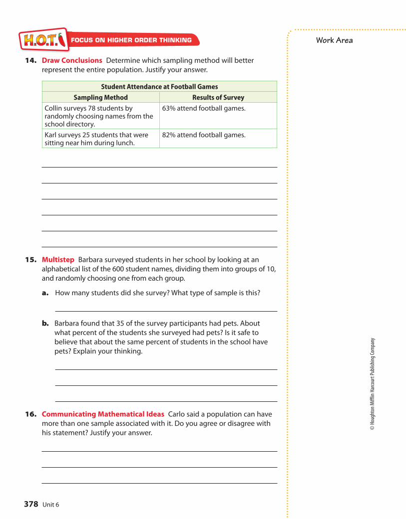
14. Draw Conclusions Determine which sampling method will better
represent the entire population. Justify your answer.
Student Attendance at Football Games
Sampling Method Results of Survey
Collin surveys 78 students by randomly choosing names from the school directory.
63% attend football games.
Karl surveys 25 students that were sitting near him during lunch.
82% attend football games.
15. Multistep Barbara surveyed students in her school by looking at an
alphabetical list of the 600 student names, dividing them into groups of 10,
and randomly choosing one from each group.
a. How many students did she survey? What type of sample is this?
b. Barbara found that 35 of the survey participants had pets. About
what percent of the students she surveyed had pets? Is it safe to
believe that about the same percent of students in the school have
pets? Explain your thinking.
16. Communicating Mathematical Ideas Carlo said a population can have
more than one sample associated with it. Do you agree or disagree with
his statement? Justify your answer.
FOCUS ON HIGHER ORDER THINKING
Unit 6378
© Houghton Miff
lin Harcourt Pub
lishing
Company
? ESSENTIAL QUESTIONHow can you use a sample to gain information about a population?
L E S S ON
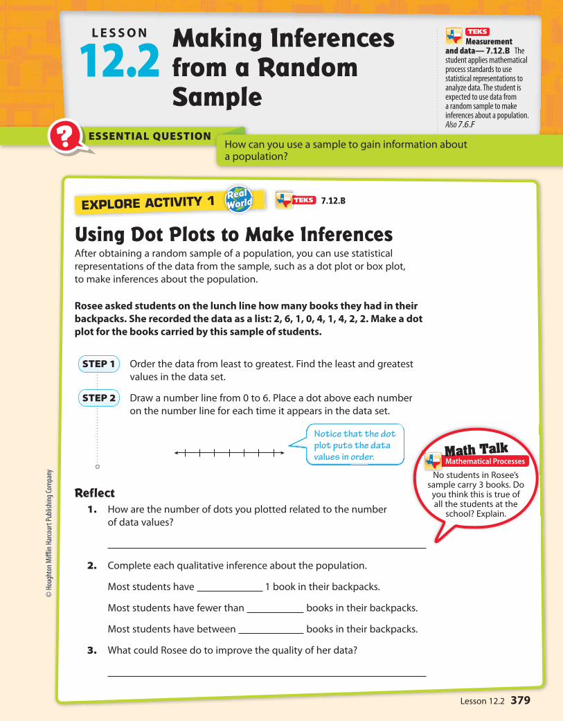
12.2Making Inferences from a Random Sample
Using Dot Plots to Make InferencesAfter obtaining a random sample of a population, you can use statistical
representations of the data from the sample, such as a dot plot or box plot,
to make inferences about the population.
Rosee asked students on the lunch line how many books they had in their
backpacks. She recorded the data as a list: 2, 6, 1, 0, 4, 1, 4, 2, 2. Make a dot
plot for the books carried by this sample of students.
Order the data from least to greatest. Find the least and greatest
values in the data set.
Draw a number line from 0 to 6. Place a dot above each number
on the number line for each time it appears in the data set.
Reflect1. How are the number of dots you plotted related to the number
of data values?
2. Complete each qualitative inference about the population.
Most students have 1 book in their backpacks.
Most students have fewer than books in their backpacks.
Most students have between books in their backpacks.
3. What could Rosee do to improve the quality of her data?
STEP 1
STEP 2
EXPLORE ACTIVITY 1
Math TalkMathematical Processes
Measurement and data— 7.12.B The student applies mathematical process standards to use statistical representations to analyze data. The student is expected to use data from a random sample to make inferences about a population. Also 7.6.F
7.12.B
No students in Rosee’s sample carry 3 books. Do you think this is true of all the students at the
school? Explain.
Notice that the dot plot puts the data values in order.
379Lesson 12.2
© Houghton Miff
lin Harcourt Pub
lishing
Company

Math On the Spotmy.hrw.com
Least value
Greatest valuequartile quartile
0
20
EXPLORE ACTIVITY 2
Using Box Plots to Make InferencesYou can also analyze box plots to make inferences about a population.
The number of pets owned by a random sample of students at Park
Middle school is shown below. Use the data to make a box plot.
9, 2, 0, 4, 6, 3, 3, 2, 5
Order the data from least to greatest. Then find the least and
greatest values, the median, and the lower and upper quartiles.
The lower and upper quartiles can be calculated by finding the
medians of each “half” of the number line that includes all the
data.
STEP 1
STEP 2 Draw a number line that includes all the data values.
Plot a point for each of the values found in Step 1.
Draw a box from the lower to upper quartile. Inside the box, draw
a vertical line through the median. Finally, draw the whiskers by
connecting the least and greatest values to the box.
Reflect4. Complete each qualitative inference about the population.
A good measure for the most likely number of pets is .
50% of the students have between and 3 pets.
Almost every student in Parkview has at least pet.
STEP 3
Math TalkMathematical Processes
7.6F
What can you see from a box plot that is not readily apparent in a
dot plot?
The lower quartile is the mean of 2 and 2. The upper quartile is the mean of 5 and 6.
380 Unit 6
© H
ough
ton
Miff
lin H
arco
urt P
ublis
hing
Com
pany
• Im
age
Cred
its: S
erge
y Ga
lush
ko/
Alam
y

Math On the Spot
my.hrw.com
Math Trainer
Online Assessment and Intervention
Personal
my.hrw.com
Animated Math
my.hrw.com
Using Proportions to Make InferencesA random sample has a good chance of being representative of the population.
You can use data about the sample and proportional reasoning to make
inferences or predictions about the population.
A shipment to a warehouse consists of 3,500 MP3 players. The manager
chooses a random sample of 50 MP3 players and finds that 3 are defective.
How many MP3 players in the shipment are likely to be defective?
It is reasonable to make a prediction about the population because this sample
is random.
Set up a proportion.
defective MP3s in sample ___________________
size of sample =
defective MP3s in population _____________________
size of population
Substitute values into the proportion.
3 __ 50
= x ____ 3,500
3·70 _____
50·70 = x ____
3,500
210 ____
3,500 = x ____
3,500
210 = x
Based on the sample, you can predict that 210 MP3 players in the
shipment would be defective.
EXAMPLEXAMPLE 1
STEP 1
STEP 2
5. What If? How many MP3 players in the shipment would you
predict to be damaged if 6 MP3s in the sample had been damaged?
Reflect6. How could you use estimation to check if your answer is reasonable?
YOUR TURN
7.6.F
Substitute the values you know. Let x represent the number of defective MP3 players in the population.
Think: What number times 50 equals 3,500?50 ∙ 70 = 3,500Multiply the numerator and denominator by 70.
381Lesson 12.2
© H
ough
ton
Miff
lin H
arco
urt P
ublis
hing
Com
pany

Guided Practice
Patrons in the children’s section of a local branch library were randomly
selected and asked their ages. The librarian wants to use the data to
infer the ages of all patrons of the children’s section so he can select age
appropriate activities. (Explore Activity 1 and 2)
7, 4, 7, 5, 4, 10, 11, 6, 7, 4
1. Make a dot plot of the sample population data.
2. Make a box plot of the sample population data.
3. The most common age of children that use the library is and .
4. The range of ages of children that use the library is from to .
5. The median age of children that use the library is .
6. A manufacturer fills an order for 4,200 smart phones. The quality inspector
selects a random sample of 60 phones and finds that 4 are defective. How
many smart phones in the order are likely to be defective? (Example 1)
About smart phones in the order are likely to be defective.
7. Part of the population of 4,500 elk at a wildlife preserve is infected with
a parasite. A random sample of 50 elk shows that 8 of them are infected.
How many elk are likely to be infected? (Example 1)
8. How can you use a random sample of a population to make predictions?
ESSENTIAL QUESTION CHECK-IN??
382 Unit 6
© H
ough
ton
Miff
lin H
arco
urt P
ublis
hing
Com
pany

Personal Math Trainer
Online Assessment and
Interventionmy.hrw.com
Name Class Date
9. A manager samples the receipts of every
fifth person who goes through the line.
Out of 50 people, 4 had a mispriced item.
If 600 people go to this store each day,
how many people would you expect to
have a mispriced item?
10. Jerry randomly selects 20 boxes of crayons
from the shelf and finds 2 boxes with at
least one broken crayon. If the shelf holds
130 boxes, how many would you expect
to have at least one broken crayon?
11. A random sample of dogs at different
animal shelters in a city shows that 12 of
the 60 dogs are puppies. The city’s animal
shelters collectively house 1,200 dogs each
year. About how many dogs in all of the
city’s animal shelters are puppies?
12. Part of the population of 10,800 hawks at a
national park are building a nest. A random
sample of 72 hawks shows that 12 of them
are building a nest. Estimate the number of
hawks building a nest in the population.
13. In a wildlife preserve a random sample of the
population of 150 raccoons was caught and
weighed. The results, given in pounds, were
17, 19, 20, 21, 23, 27, 28, 28, 28 and 32. Jean
made the qualitative statement, “The average
weight of the raccoon population is 25
pounds.” Is her statement reasonable? Explain.
14. Greta collects the number of miles run
each week from a random sample of
female marathon runners. Her data is
shown below. She made the qualitative
statement, “25% of female marathoners run
13 or more miles a week.” Is her statement
reasonable? Explain. Data: 13, 14, 18, 13,
12, 17, 15, 12, 13, 19, 11, 14, 14, 18, 22, 12
15. A random sample of 20 of the 200 students
at Garland Elementary is asked how many
siblings each has. The data was ordered as
shown. Make a dot plot of the data. Then
make a qualitative statement about the
population. Data: 0, 1, 1, 1, 1, 1, 1, 2, 2, 2, 2,
2, 3, 3, 3, 3, 4, 4, 4, 6
16. Linda collects a random sample of 12 of
the 98 Wilderness Club members’ ages. She
makes an inference that most wilderness
club members are between 20 and 40 years
old. Describe what a box plot that would
confirm Linda’s inference should look like.
12.2 Independent Practice7.12.B, 7.6.F
383Lesson 12.2
© Houghton Miff
lin Harcourt Pub
lishing
Company
Work Area
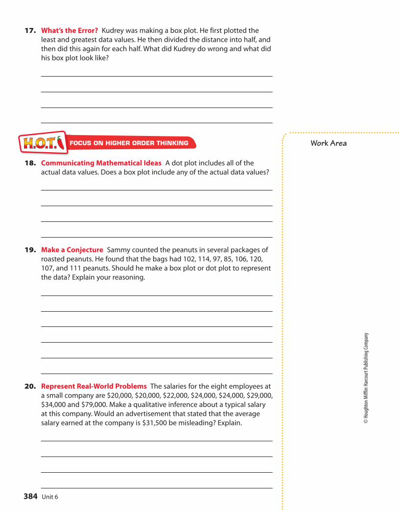
17. What’s the Error? Kudrey was making a box plot. He first plotted the
least and greatest data values. He then divided the distance into half, and
then did this again for each half. What did Kudrey do wrong and what did
his box plot look like?
18. Communicating Mathematical Ideas A dot plot includes all of the
actual data values. Does a box plot include any of the actual data values?
19. Make a Conjecture Sammy counted the peanuts in several packages of
roasted peanuts. He found that the bags had 102, 114, 97, 85, 106, 120,
107, and 111 peanuts. Should he make a box plot or dot plot to represent
the data? Explain your reasoning.
20. Represent Real-World Problems The salaries for the eight employees at
a small company are $20,000, $20,000, $22,000, $24,000, $24,000, $29,000,
$34,000 and $79,000. Make a qualitative inference about a typical salary
at this company. Would an advertisement that stated that the average
salary earned at the company is $31,500 be misleading? Explain.
FOCUS ON HIGHER ORDER THINKING
Unit 6384
© H
ough
ton
Miff
lin H
arco
urt P
ublis
hing
Com
pany

?
460 480 500 520 540 560 580 600 620 640 660 680
460 480 500 520 540 560 580 600 620 640 660 680
Using Dot Plots to Compare PopulationsYou can compare two populations by taking a random sample of each
population and comparing the samples using dot plots.
A test prep company gives its students a Pretest before the course and
a Posttest after the course is completed. The test prep company picks a
random sample of 10 students from each testing session.
Pretest Scores
520, 510, 550, 580, 600, 480, 480, 460, 460, 640
Posttest Scores
510, 480, 510, 610, 590, 670, 550, 560, 600, 610
Make a dot plot for the sample of Pretest scores.
Make a dot plot for the sample of Posttest scores.
Compare the dot plots. The plots have a similar center / spread,
but the Posttest values are shifted to the .
Reflect1. What can you infer about the populations by comparing the dot plots
for the samples?
A
B
C
ESSENTIAL QUESTION
L E S SON
12.3Comparing Populations
How can you use random samples to compare two populations?
EXPLORE ACTIVITY 1
Math TalkMathematical Processes
7.12.C
What single statistic could you use to describe the score change from the
Pretest to Posttest?
Measurement and data—7.12.C Compare two populations based on data in random samples from these populations, including informal comparative inferences about differences between the two populations.
385Lesson 12.3
© H
ough
ton
Miff
lin H
arco
urt P
ublis
hing
Com
pany
0 5 10 15 20
0 5 10 15 20
Using Box Plots to Compare PopulationsYou can also compare two populations using random samples and box plots.
A survey of 7th graders asks girls and boys how many baseball caps
they own.
Girls
8, 6, 4, 18, 3, 7, 5, 8, 8, 7
Make a box plot for the number of baseball caps girls own.
Make a box plot for the number of baseball caps boys own.
A
B
EXPLORE ACTIVITY 2
Boys
9, 18, 9, 7, 10, 15, 18, 10, 9, 12
Compare the box plots.
The plot for boys has a lesser / greater range, but a
lesser / greater interquartile range. The middle 50% of caps
was less spread out for the .
Reflect2. What can you infer about the populations by comparing the box plots
for the samples? Justify your answer.
C
7.12.B, 7.12.C
Unit 6386
© H
ough
ton
Miff
lin H
arco
urt P
ublis
hing
Com
pany

Math TalkMathematical Processes
Using Statistical Measures to Compare PopulationsYou can use the means and ranges of two random samples to compare
the populations that the random samples represent.
Paula and Daniel wanted to determine the average word length in two
books. They took a random sample of 12 words each and counted the
length of each word from each book.
Book 1 Word length Book 2 Word length
3, 7, 5, 2, 4, 3, 1, 6, 4, 8, 2, 3 5, 4, 3, 6, 4, 5, 5, 2, 3, 4, 2, 5
Calculate the mean for Book 1.
The mean for Book 1 is letters long.
Find the range for Book 1.
Calculate the mean for Book 2.
The mean for Book 2 is letters long.
Find the range for Book 2.
You can infer from the mean of each population that the overall average word
length for Book 1 is less than / the same as / greater than the average
word length for Book 2.
You can infer from the range of each population that the length of the
words in Book 1 varies less than / in the same way as / more than
Book 2.
STEP 1
______________________________________________________ = _____ =
STEP 2
- =
STEP 3
______________________________________________________ = _____ =
STEP 4
- =
EXPLORE ACTIVITY 3
3 + 7 + 5
5 + 4 + 3
7.12.B, 7.12.C
Will the mean of whole number data values always
be a whole number? Explain.
Subtract the least word length from the greatest word length.
Subtract the least word length from the greatest word length.
387Lesson 12.3
© H
ough
ton M
ifflin
Har
cour
t Pub
lishin
g Com
pany
6 7 8 9 10510 2 3 4 6 7 8 9 10510 2 3 4
Reflect3. What are the populations from which the samples were taken?
Guided PracticeCarol wants to know how many people live in each household in her town.
She conducts two random surveys of 10 people each and asks how many
people live in their home. Her results are listed below. Use the data for 1–6.
(Explore Activities 1, 2 and 3)
Sample A: 1, 6, 2, 4, 4, 3, 5, 5, 2, 8
1. Make a dot plot for Sample A.
Sample B: 3, 4, 5, 4, 3, 2, 4, 5, 4, 4
2. Make a dot plot for Sample B.
3. Find the mean and range for Sample A.
Mean: Range:
4. Find the mean and range for Sample B.
Mean: Range:
5. What can you infer about the population
based on Sample A? Explain.
6. What can you infer about the population
based on Sample B? Explain.
7. How can you use random samples to compare two populations?
ESSENTIAL QUESTION CHECK-IN??
EXPLORE ACTIVITY 3 (cont’d)
Unit 6388
© H
ough
ton
Miff
lin H
arco
urt P
ublis
hing
Com
pany

6 7 8 9 1051 2 3 4
Class A
6 7 8 9 1051 2 3 4
Class B
Personal Math Trainer
Online Assessment and
Interventionmy.hrw.com
5 6 7 8 9 10 11 12 13 14
Football
1 2 3 4 5 6 7 8 9 10
Soccer
Name Class Date
Independent Practice12.3
The high school is buying shoes for the boy’s football team and boy’s soccer
team. The sizes of a random sample of the players’ feet is shown.
Football Team Shoe Sizes Soccer Team Shoe Sizes
6, 8, 9, 10, 10, 10, 10, 10, 11, 11, 13 3, 5, 5, 6, 6, 6, 6, 6, 7, 8, 10
8. Find the mean for both lists. What can you infer about the populations by
comparing the means?
9. Find the range of both lists. What can you infer about the populations
by comparing the ranges?
10. Make a box plot for each sample.
11. Draw Conclusions Compare the box plots. What do you notice from
the visual comparison?
Mrs. Garcia asked a random sample of her students the number of books
they read over the summer. Use these data for 12–14.
Number of Books Read by Class A Number of Books Read by Class B
9, 7, 10, 9, 9, 2, 3, 4, 4, 8 1, 3, 9, 9, 1, 10, 2, 3, 4, 10
12. Make dot plots for each sample to illustrate the books read in each class.
7.12.C
389Lesson 12.3
© H
ough
ton
Miff
lin H
arco
urt P
ublis
hing
Com
pany
Work Area
13. Describe two similarities and two differences between the dot plots.
14. Make a Conjecture Without doing any calculations, can you tell which
class has read more books? Explain. What calculation would you perform
to verify your response?
15. Communicate Mathematical Ideas Compare plotting points on
a number line with plotting points on a dot plot.
16. Analyze Relationships If you are given a box plot without any numbers
on the number line, what can you tell about the data used to make
the plot?
17. Draw Conclusions Using at least ten points, create two distinct data sets
with the same mean and range. Will their dot plots be the same? Could
their box plots be the same?
FOCUS ON HIGHER ORDER THINKING
Unit 6390
© H
ough
ton
Miff
lin H
arco
urt P
ublis
hing
Com
pany

Math Trainer
Online Assessment and Intervention
Personal
my.hrw.com
Ready
5
Player 1
10 15 200 25 30 35 40 45 50
Player 2
MODULE QUIZ
12.1 Populations and Samples
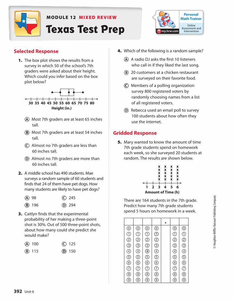
1. A company uses a computer to identify their 600 most loyal customers
from its database and then surveys those customers to find out how
they like their service. Identify the population and determine whether
the sample is random or biased.
12.2 Making Inferences from a Random Sample
2. A university has 30,330 students. In a random sample of 270 students,
18 speak three or more languages. Predict the number of students at
the university who speak three or more languages.
12.3 Comparing Populations
3. The box plot shows data that was
collected on two basketball players over
20 randomly selected games in order
to analyze the number of points each
player has scored per game over his
career. Make an inference from this data.
4. How can you use random samples to compare populations and make
inferences?
ESSENTIAL QUESTION
391Module 12
© H
ough
ton
Miff
lin H
arco
urt P
ublis
hing
Com
pany
Personal Math Trainer
Online Assessment and
Interventionmy.hrw.com
MODULE 12 MIXED REVIEW
Selected Response
1. The box plot shows the results from a
survey in which 50 of the school’s 7th
graders were asked about their height.
Which could you infer based on the box
plot below?
A Most 7th graders are at least 65 inches
tall.
B Most 7th graders are at least 54 inches
tall.
C Almost no 7th graders are less than
60 inches tall.
D Almost no 7th graders are more than
60 inches tall.
2. A middle school has 490 students. Mae
surveys a random sample of 60 students and
finds that 24 of them have pet dogs. How
many students are likely to have pet dogs?
A 98 C 245
B 196 D 294
3. Caitlyn finds that the experimental
probability of her making a three-point
shot is 30%. Out of 500 three-point shots,
about how many could she predict she
would make?
A 100 C 125
B 115 D 150
4. Which of the following is a random sample?
A A radio DJ asks the first 10 listeners
who call in if they liked the last song.
B 20 customers at a chicken restaurant
are surveyed on their favorite food.
C Members of a polling organization
survey 800 registered voters by
randomly choosing names from a list
of all registered voters.
D Rebecca used an email poll to survey
100 students about how often they
use the internet.
Gridded Response
5. Mary wanted to know the amount of time
7th grade students spend on homework
each week, so she surveyed 20 students at
random. The results are shown below.
There are 164 students in the 7th grade.
Predict how many 7th grade students
spend 5 hours on homework in a week.
.0 0 0 0 0 0
1 1 1 1 1 1
2 2 2 2 2 2
3 3 3 3 3 3
4 4 4 4 4 4
5 5 5 5 5 5
6 6 6 6 6 6
7 7 7 7 7 7
8 8 8 8 8 8
9 9 9 9 9 9
35 40 45 5030 55 60 65 70 75 80
Height (in.)
Amount of Time (h)
xxxxx
xxxxx
xxxxx
xxxxx
1 2 3 4 5 6
Texas Test Prep
B
D
C
1
4
B
392 Unit 6
© H
ough
ton
Miff
lin H
arco
urt P
ublis
hing
Com
pany
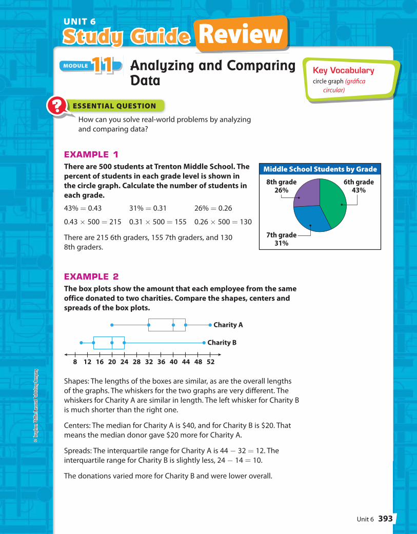
Middle School Students by Grade
6th grade43%
7th grade31%
8th grade26%
8 12 16 20 24 28 32 36 40 44 48 52
Charity A
Charity B
Study Guide ReviewUNIT 6
Study Guide ReviewKey Vocabularycircle graph (gráfi ca
circular)
Analyzing and Comparing Data
How can you solve real-world problems by analyzing
and comparing data?
EXAMPLE 1There are 500 students at Trenton Middle School. The
percent of students in each grade level is shown in
the circle graph. Calculate the number of students in
each grade.
43% = 0.43 31% = 0.31 26% = 0.26
0.43 × 500 = 215 0.31 × 500 = 155 0.26 × 500 = 130
There are 215 6th graders, 155 7th graders, and 130
8th graders.
EXAMPLE 2The box plots show the amount that each employee from the same
office donated to two charities. Compare the shapes, centers and
spreads of the box plots.
Shapes: The lengths of the boxes are similar, as are the overall lengths
of the graphs. The whiskers for the two graphs are very different. The
whiskers for Charity A are similar in length. The left whisker for Charity B
is much shorter than the right one.
Centers: The median for Charity A is $40, and for Charity B is $20. That
means the median donor gave $20 more for Charity A.
Spreads: The interquartile range for Charity A is 44 - 32 = 12. The
interquartile range for Charity B is slightly less, 24 - 14 = 10.
The donations varied more for Charity B and were lower overall.
MODULE 11111111111111MODULE 1111
? ESSENTIAL QUESTION
© H
ough
ton
Miff
lin H
arco
urt P
ublis
hing
Com
pany
393Unit 6

Votes90
80
70
60
0A
Nu
mb
er
of
vote
s
C
CandidatesD EB
0 1 2 3 4 5 6 7
Time Online (h)0 1 2 3 4 5 6 7
Time Reading (h)
2 4 6 8 10 12 14 16 18 20 22
Math Scores
Reading Scores
EXERCISES
1. Five candidates are running for the position of School
Superintendent. Find the percent of votes that each
candidate received. (Lesson 11.1)
The dot plots show the number of hours a group of students
spend online each week, and how many hours they spend reading.
Compare the dot plots visually. (Lesson 11.2)
2. Compare the shapes, centers, and spreads of the dot plots.
Shape:
Center:
Spread:
3. Calculate the medians of the dot plots.
4. Calculate the ranges of the dot plots.
The box plots show the math and
reading scores on a standardized test
for a group of students. Use the box
plots shown to answer the following
questions. (Lesson 11.3)
5. Compare the maximum and minimum values of the box plots.
6. Compare the interquartile range of the box plots.
© H
ough
ton
Miff
lin H
arco
urt P
ublis
hing
Com
pany
Unit 6394
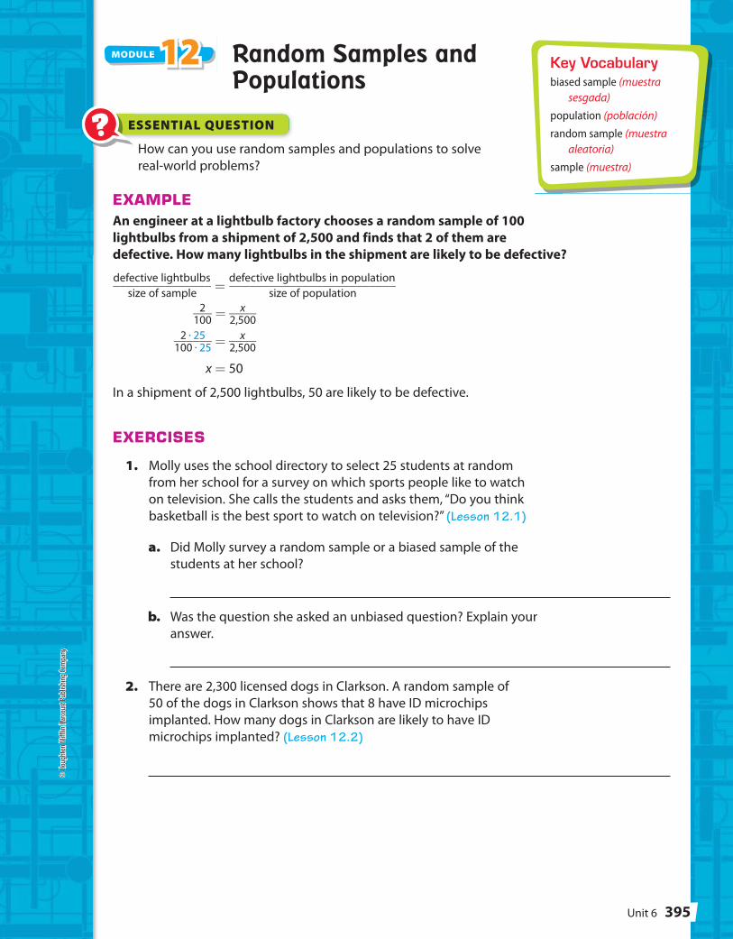
Key Vocabularybiased sample (muestra
sesgada)
population (población)
random sample (muestra aleatoria)
sample (muestra)
Random Samples and Populations
How can you use random samples and populations to solve
real-world problems?
EXAMPLEAn engineer at a lightbulb factory chooses a random sample of 100
lightbulbs from a shipment of 2,500 and finds that 2 of them are
defective. How many lightbulbs in the shipment are likely to be defective?
defective lightbulbs
_______________ size of sample
= defective lightbulbs in population
_________________________ size of population
2 ___
100 = x ____
2,500
2 · 25 ______
100 · 25 = x ____
2,500
x = 50
In a shipment of 2,500 lightbulbs, 50 are likely to be defective.
EXERCISES
1. Molly uses the school directory to select 25 students at random
from her school for a survey on which sports people like to watch
on television. She calls the students and asks them, “Do you think
basketball is the best sport to watch on television?” (Lesson 12.1)
a. Did Molly survey a random sample or a biased sample of the
students at her school?
b. Was the question she asked an unbiased question? Explain your
answer.
2. There are 2,300 licensed dogs in Clarkson. A random sample of
50 of the dogs in Clarkson shows that 8 have ID microchips
implanted. How many dogs in Clarkson are likely to have ID
microchips implanted? (Lesson 12.2)
MODULE 222211111112MODULE 1212
? ESSENTIAL QUESTION
© H
ough
ton
Miff
lin H
arco
urt P
ublis
hing
Com
pany
395Unit 6

0 1 2 3 4 5 6 7
Algebra 1
0 1 2 3 4 5 6 7
Geometry
7 9 11 13 15 17
Type A
Type B
Number of Butterflies
Unit 6 Performance Tasks
3. Mr. Puccia teaches Algebra 1 and Geometry. He randomly selected
10 students from each class. He asked the students how many hours
they spend on math homework in a week. He recorded each set of
data in a list. (Lesson 12.3)
Algebra 1: 4, 0, 5, 3, 6, 3, 2, 1, 1, 4
Geometry: 7, 3, 5, 6, 5, 3, 5, 3, 6, 5
a. Make a dot plot for Algebra 1. Then find the mean and
the range for Algebra 1.
b. Make a dot plot for Geometry. Then find the mean and
the range for Geometry.
c. What can you infer about the students in the Algebra 1
class compared to the students in the Geometry class?
1. Entomologist An
entomologist is studying how two different
types of flowers appeal to butterflies. The
box-and-whisker plots show the number of
butterflies who visited one of two different
types of flowers in a field. The data were
collected over a two-week period, for one
hour each day.
a. Find the median, range, and interquartile range for each data set.
b. Which measure makes it appear that flower type A had a more
consistent number of butterfly visits? Which measure makes it
appear that flower type B did? If you had to choose one flower as
having the more consistent visits, which would you choose? Explain
your reasoning.
CAREERS IN MATH
© H
ough
ton
Miff
lin H
arco
urt P
ublis
hing
Com
pany
Unit 6396
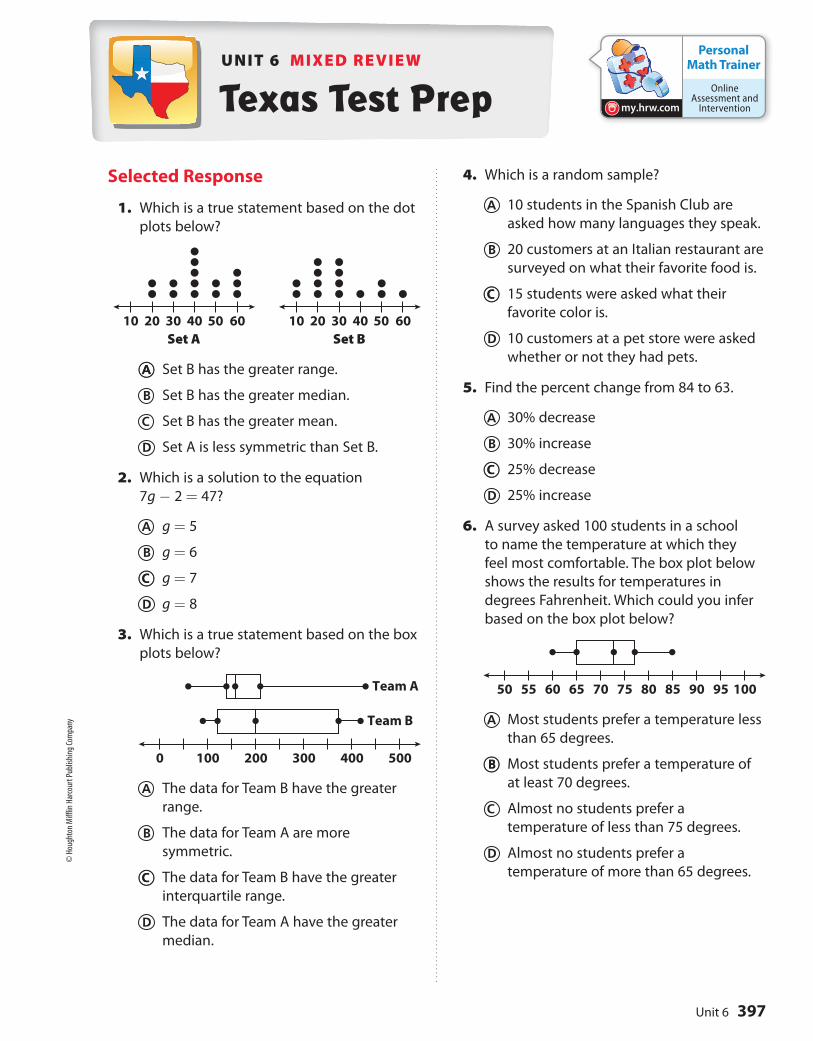
10 20 30 40 50 60 10 20 30 40 50 60
Set A Set B
0 100 200 300 400 500
Team A
Team B
50 55 60 65 70 75 80 85 90 95 100
Personal Math Trainer
Online Assessment and
Interventionmy.hrw.com
Selected Response
1. Which is a true statement based on the dot
plots below?
A Set B has the greater range.
B Set B has the greater median.
C Set B has the greater mean.
D Set A is less symmetric than Set B.
2. Which is a solution to the equation
7g - 2 = 47?
A g = 5
B g = 6
C g = 7
D g = 8
3. Which is a true statement based on the box
plots below?
A The data for Team B have the greater
range.
B The data for Team A are more
symmetric.
C The data for Team B have the greater
interquartile range.
D The data for Team A have the greater
median.
4. Which is a random sample?
A 10 students in the Spanish Club are
asked how many languages they speak.
B 20 customers at an Italian restaurant are
surveyed on what their favorite food is.
C 15 students were asked what their
favorite color is.
D 10 customers at a pet store were asked
whether or not they had pets.
5. Find the percent change from 84 to 63.
A 30% decrease
B 30% increase
C 25% decrease
D 25% increase
6. A survey asked 100 students in a school
to name the temperature at which they
feel most comfortable. The box plot below
shows the results for temperatures in
degrees Fahrenheit. Which could you infer
based on the box plot below?
A Most students prefer a temperature less
than 65 degrees.
B Most students prefer a temperature of
at least 70 degrees.
C Almost no students prefer a
temperature of less than 75 degrees.
D Almost no students prefer a
temperature of more than 65 degrees.
UNIT 6 MIXED REVIEW
Texas Test Prep
A
C
C
C
C
B
© H
ough
ton
Miff
lin H
arco
urt P
ublis
hing
Com
pany
397Unit 6
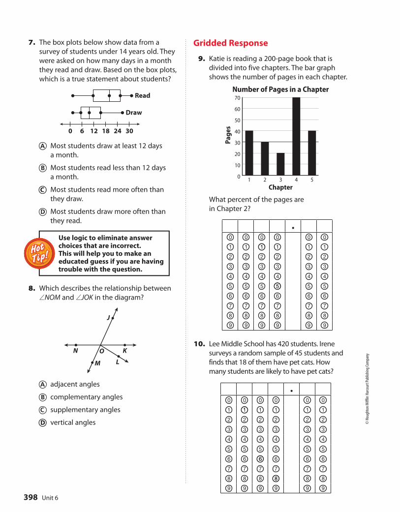
0 6 12 18 24 30
Read
Draw
N KO
J
LM
Page
s
Chapter
Number of Pages in a Chapter70
60
50
40
30
20
10
01 3 4 52
7. The box plots below show data from a
survey of students under 14 years old. They
were asked on how many days in a month
they read and draw. Based on the box plots,
which is a true statement about students?
A Most students draw at least 12 days
a month.
B Most students read less than 12 days
a month.
C Most students read more often than
they draw.
D Most students draw more often than
they read.
8. Which describes the relationship between
∠NOM and ∠JOK in the diagram?
A adjacent angles
B complementary angles
C supplementary angles
D vertical angles
Gridded Response
9. Katie is reading a 200-page book that is
divided into five chapters. The bar graph
shows the number of pages in each chapter.
What percent of the pages are
in Chapter 2?
.0 0 0 0 0 0
1 1 1 1 1 1
2 2 2 2 2 2
3 3 3 3 3 3
4 4 4 4 4 4
5 5 5 5 5 5
6 6 6 6 6 6
7 7 7 7 7 7
8 8 8 8 8 8
9 9 9 9 9 9
10. Lee Middle School has 420 students. Irene
surveys a random sample of 45 students and
finds that 18 of them have pet cats. How
many students are likely to have pet cats?
HotHotTip!Tip!
Use logic to eliminate answer choices that are incorrect. This will help you to make an educated guess if you are having trouble with the question.
.0 0 0 0 0 0
1 1 1 1 1 1
2 2 2 2 2 2
3 3 3 3 3 3
4 4 4 4 4 4
5 5 5 5 5 5
6 6 6 6 6 6
7 7 7 7 7 7
8 8 8 8 8 8
9 9 9 9 9 9
C
D
1
5
1
6
8
© H
ough
ton
Miff
lin H
arco
urt P
ublis
hing
Com
pany
Unit 6398