Understanding Hierarchical Clustering Results by ... · Understanding Hierarchical Clustering...
15
- 1 - Understanding Hierarchical Clustering Results by Interactive Exploration of Dendrograms: A Case Study with Genomic Microarray Data Jinwook Seo and Ben Shneiderman {jinwook, [email protected]} Department of Computer Science & Human-Computer Interaction Laboratory, Institute for Advanced Computer Studies University of Maryland, College Park, MD 20742 USA (April 10, 2001) Abstract: Hierarchical clustering is widely used to find patterns in multi-dimensional datasets, especially for genomic microarray data. Finding groups of genes with similar expression patterns can lead to better understanding of the functions of genes. Early software tools produced only printed results, while newer ones enabled some online exploration. We describe four general techniques that could be used in interactive explorations of clustering algorithms: (1) overview of the entire dataset, coupled with a detail view so that high-level patterns and hot spots can be easily found and examined, (2) dynamic query controls so that users can restrict the number of clusters they view at a time and show those clusters more clearly, (3) coordinated displays: the overview mosaic has a bi-directional link to 2-dimensional scattergrams, (4) cluster comparisons to allow researchers to see how different clustering algorithms group the genes. 1. Introduction Molecular biologists and geneticists are working energetically to understand the function of genes, including the more than 6,000 genes in the yeast genome and the estimated 40,000 genes in the human genome. One of the recently developed research tools for analyses of genomes has been DNA microarrays, sometimes known as gene arrays or gene chips. These chips are usually 1 x 3 inch or smaller substrates (glass or nylon) that contain specific DNA gene samples that are spotted in an array by a robotic printing device. Then fluorescently labeled messenger RNA (mRNA) from an experimental condition is spread on the DNA gene samples in the array. The mRNA from the experimental condition interacts strongly with some DNA gene samples and weakly with others. A laser scans the array and sensors detect the levels of fluorescence, indicating how strongly each gene was expressed. Experimental conditions may be types of cancers, diseased organisms, or normal tissues. Microarray experiments, which have 100-20,000 DNA samples and 2-40 experimental conditions, produce data sets that contain an expression level for each gene. Each profile contains a series of values, indicating the expression level for the given gene under each of the experimental conditions. To identify genes with similar regulation and possibly similar function, researchers often use mathematical clustering methods [1][2][3].
Transcript of Understanding Hierarchical Clustering Results by ... · Understanding Hierarchical Clustering...

- 1 -
Understanding Hierarchical Clustering Results by Interactive Exploration of Dendrograms:
A Case Study with Genomic Microarray Data
Jinwook Seo and Ben Shneiderman {jinwook, [email protected]} Department of Computer Science &
Human-Computer Interaction Laboratory, Institute for Advanced Computer Studies University of Maryland, College Park, MD 20742 USA
(April 10, 2001) Abstract: Hierarchical clustering is widely used to find patterns in multi-dimensional
datasets, especially for genomic microarray data. Finding groups of genes with similar expression patterns can lead to better understanding of the functions of genes. Early software tools produced only printed results, while newer ones enabled some online exploration. We describe four general techniques that could be used in interactive explorations of clustering algorithms: (1) overview of the entire dataset, coupled with a detail view so that high-level patterns and hot spots can be easily found and examined, (2) dynamic query controls so that users can restrict the number of clusters they view at a time and show those clusters more clearly, (3) coordinated displays: the overview mosaic has a bi-directional link to 2-dimensional scattergrams, (4) cluster comparisons to allow researchers to see how different clustering algorithms group the genes.
1. Introduction Molecular biologists and geneticists are working energetically to understand the
function of genes, including the more than 6,000 genes in the yeast genome and the estimated 40,000 genes in the human genome. One of the recently developed research tools for analyses of genomes has been DNA microarrays, sometimes known as gene arrays or gene chips. These chips are usually 1 x 3 inch or smaller substrates (glass or nylon) that contain specific DNA gene samples that are spotted in an array by a robotic printing device. Then fluorescently labeled messenger RNA (mRNA) from an experimental condition is spread on the DNA gene samples in the array. The mRNA from the experimental condition interacts strongly with some DNA gene samples and weakly with others. A laser scans the array and sensors detect the levels of fluorescence, indicating how strongly each gene was expressed. Experimental conditions may be types of cancers, diseased organisms, or normal tissues. Microarray experiments, which have 100-20,000 DNA samples and 2-40 experimental conditions, produce data sets that contain an expression level for each gene. Each profile contains a series of values, indicating the expression level for the given gene under each of the experimental conditions. To identify genes with similar regulation and possibly similar function, researchers often use mathematical clustering methods [1][2][3].

- 2 -
A variety of clustering methods have been used in many areas to discover interesting patterns in large datasets. Among the methods, hierarchical clustering has been shown to be effective in microarray data analysis. This approach finds the pair of genes with the most similar expression profiles, and iteratively builds a hierarchy by pairing genes (or existing clusters) that are most similar. The resulting hierarchy is shown using dendrograms (Figure 1). The binary trees lead down to the leaves, which are typically shown at the bottom as a sequence of red and green tiles in a mosaic, with each tile representing an expression level for one of the experimental conditions. The binary tree has joining points whose distance from the root indicates the similarity of subtrees – highly similar nodes or subtrees have joining points that are farther from the root.
However, several limitations hinder biologists from recognizing important patterns in datasets. The volume of the microarray experiment data makes it impossible to show the dendrogram of a large microarray experiment in one screen. Researchers also struggle to understand the implications of a clustering result for their research. Since the clusters are in a high-dimensional space (typical results have from 2-40 conditions), it is difficult to see patterns on a 2D (or even 3D) display. Another problem is that there may be hundreds of clusters of various sizes; so spotting the meaningful clusters for biologists is a challenge, especially when a static display is used. Users need an efficient visualization tool to facilitate pattern extraction from microarray datasets.
Current visualization tools for hierarchical clustering that provide static outputs on screens or even large printouts can be improved by adding interactive exploration tools. Our goals were to provide four new features:
- overview of the entire dataset, coupled with a detail view so that high-level patterns and hot spots can be easily found and examined
- dynamic query controls[5][6] so that users can restrict the number of clusters they view at a time and show those clusters more clearly
- coordinated displays: the overview mosaic has a bi-directional link to 2-dimensional scattergrams
- cluster comparisons to allow researchers to see how different clustering algorithms group the genes.
We implemented the Hierarchical Clustering Explorer (HCE) using Visual C++. This
paper describes its features and application to gene expression profile data. Additional information, more screen images, a user manual, and the software are available at http://www.cs.umd.edu/hcil/multi-cluster .
Our effort is in tune with the current trend to take the substantial effort in data mining algorithms and give users more than just a print out of results. With novel information visualization techniques [4], they now have the opportunity to control the processes and interact with the results. For example, recent decision tree packages allow users to manipulate the incoming data, the rules used, and then examine the results with color and size-coded visualizations. The capacity to interact and explore enables domain experts to apply their knowledge by quickly testing hypotheses and performing exploratory data analysis.

- 3 -
---Side Bar----
Visualization software for clustering in bioinformatics As computing became widespread statistical analysts quickly developed the technique
of hierarchical clustering [1]. Extensions included alternative ways to compute distances between items in a multidimensional dataset (Euclidean, correlation coefficient, Manhattan distance, etc.) the similarity values between groups of items, called linkage (average, complete, single). Refinements to the presentation were largely oriented to producing effective color print outs for publication.
Software tools for hierarchical clustering have been developed in many disciplines and become part of a variety of software products. The widely used TreeView [2], which was developed especially for genetic research generates a dendrogram and a color mosaic. Users can get an overview and detail view by selecting a contiguous region of the color mosaic, which is magnified in a second view. Because the main purpose of TreeView is to produce a good image in many formats for publications, the current version of TreeView does not allow direct manipulation on the visualization.
GeneMaths [3] developed by Applied Maths, Inc. (http://www.applied-maths.com/ge/ge.htm), displays dendrograms for genes and conditions in a single screen. Users can select a cluster by clicking the root of a subtree. Their clustering algorithm is one of the fastest. The visual design is appealing, but it only shows a small number of genes at a time, so it is not easy to see the overview of the entire dataset. The Spotfire Array Explorer (now included in the DecisionSite product [http://www.spotfire.com/]) does the hierarchical clustering, and users can see the entire green-black-red color mosaic using a technique called heat maps. Users can select a subtree in the dendrogram by clicking on the root of the subtree, or select a group of subtrees by selecting a similarity threshold. Scattergrams and barcharts can be coordinated with the dendrogram display to help users understand the clustering results.
The European Bioinformatics Institute made a set of tools called the Expression Profiler for clustering, analysis and visualization of gene expression and other genomic data (http://ep.ebi.ac.uk/ ). Among the tools, EPCLUST allows users to do a hierarchical clustering with many different distance measures and linkage methods. When users select a node of the dendrogram, it shows detail information about the node in a new window. Users can load their own data, and try many kinds of hierarchical clustering algorithms. In the website, users can also see the great diversity in outcomes for different correlation-related distance metrics.
In recent years many varieties of clustering methods have been developed and implemented in software products. Popular methods include k-means clustering which identifies starting points for a fixed number of clusters and then grows the region around the clusters. Recent work seeks to get beyond the limitation of spherical clusters [3] by using graph representations and developing clusters of arbitrary shapes, even interlocking geometries [4].
All clustering methods face the challenges of validity [5]: Does the clustering reflect known classifications? How many clusters are best? What should be done about outliers or intruders to clusters? What metrics could confirm or reject a perceived cluster?

- 4 -
1. S.C. Johnson. “Hierarchical clustering schemes”. Psychometrika 32, 1967, pp. 241-254.
2. M.B. Eisen, P.T. Spellman, P.O. Brown and D. Botstein, “Cluster Analysis and Display of Genome-Wide Expression Patterns,” Proc. Natl Acad Sci U S A, Vol. 95(25), 1998, pp. 14863-14868. http://www.pnas.org/cgi/content/full/95/25/14863
3. G. Karypis, Eui-Hong Han, V. Kumar, “CHAMELEON: A Hierarchical Clustering Algorithm Using Dynamic Modeling,” IEEE Computer, Vol. 32(8), 1999, pp. 68 –75.
4. D. Harel, Y. Koren, “Clustering Spatial Data Using Random Walks,” Proc. 7th ACM SIGKDD Int. Conf. On Knowledge Discovery and Data Mining(KDD-2001), ACM Press, 2001, pp. 281-286.
5. G.S. Davidson, B.N. Wylie, and K.W. Boyack, “Cluster stability and the use of noise in interpretation of clustering,” INFOVIS 2001. IEEE Symposium on Information Visualization, 2001, pp. 23 –30.
---End Side Bar----

- 5 -
2. Overview in a Limited Screen Space Overviews are important because they enable researchers to identify hot spots and
understand the distribution of data. However, there are significant screen limitations when visualizing large data sets on commonly used displays that are 1600 pixels wide. Even limiting each item to a single pixel means that for data sets larger than 1600 points the corresponding dendrogram (and color mosaic) does not fit in a single screen. To accommodate large datasets, HCE provides a compressed overview based on replacing leaves with average values of adjacent leaves. This view shows the entire hierarchy, at the cost of some lost detail at the leaves (Figure 2). A second overview allocates two pixels per item, but requires scrolling to view all items. In this scrolling overview, users can adjust the level of detail shown in the overview by moving the slider to change the item widths from 2 to 10 pixels. With either overview, HCE users can click on a cluster and view the detailed information at the bottom of the display, which also includes the item names.
To enable researchers to identify hot spots and understand the distribution of data, they examine the color mosaic. In general, a dendrogram is displayed with a color mosaic at the leaves to show the graphical pattern of underlying data by coloring each tile on the basis of the measured fluorescence ratio (level of expression for that gene) [7]. The gene expression profile data consists of the ratio, or the relative amount of each specific gene in the two mRNA or DNA samples (one of which is a normal sample, and the other is a test sample). Some datasets, including melanoma and yeast mutants, are more complicated. These data show expression levels for several mutants or cancer cell lines relative to a control. Common practice is to use the log of ratio values and display the result using a color mapping in form of 2D color mosaic.
The HCE control panel, which is to the right of the dendrogram visualization, shows the histogram of data by expression level. User control is necessary to enable subtle differences to be seen in the ranges of interest. For skewed data distributions, this is essential to prevent large areas of all green or red, indicating all low or all high gene expression. Users can change the color mapping for color mosaic display by adjusting the range of color stripe displayed over the histogram. Users can instantly see the result of new color mapping on the color mosaic display, so that they can identify the proper color mapping for the dataset.
3. Dynamic Query Controls One of the main reasons to perform clustering on the microarray experiment data is to
find a group of genes that are very similar in their expression levels. Once we find a tightly related group of genes, we can infer, for example, that an unknown gene clustered together with a known gene may have a similar biological function to the known gene [1].
HCE users select a dataset, apply their desired clustering algorithm, and then begin the process to understand the output. First they adjust the color mapping, to get a clearer presentation of similarities and differences in expression levels. Then they can study the main groupings (the two high-level clusters), which may not be interesting because they may combine interesting subgroups. For example, a set of 800 genes may be composed

- 6 -
of 6 or 16 interesting subgroups, so looking at a simple two-group clustering does not reveal the relevant subgroups. Currently users of static dendrograms use their eyes and fingers to traverse the hierarchy and identify interesting clusters.
HCE provides a dynamic query on the dendrogram in the form of a filtering bar whose y coordinate determines the minimum similarity value (Figure 3). As the users pull the minimum similarity bar down, the mosaic display splits into two, three, four, etc. groups. As the bar moves further down, items that are distant from a cluster are removed from the mosaic display, but users can still see the overall dendrogram structure. As more and more items are removed, the tighter clusters can be seen more easily. User understanding of the domain guides them in determining how far to go and how many clusters to examine.
To prevent users from losing global context during dynamic filtering, we maintain the entire dendrogram on the background. Users can see the position of a cluster in the original data set by just clicking the cluster, which causes it to highlight in yellow (Figure 4). Each cluster is easily identified by the alternating colors (blue and red lines in the dendrogram) and the one-pixel gaps placed between clusters. The selected cluster is highlighted by a yellow rectangle. The corresponding gene names are also highlighted in the detailed color mosaic (displayed in the lower pane) together with the other dendrogram produced by clustering the conditions. All interactions and updates are almost instantaneous for a moderate sized data set (up to 4000 genes in 40 experimental treatments) on a Windows 2000 environment with Pentium II. Having an overview is as important as obtaining enough detail. It reveals the overall patterns of the whole data set, which guides users to the next step in their search. One of the generally accepted visualization schemes is to start with an overview, and then allow users to dynamically access detail information [4]. It is important to keep providing an overview of the entire data set, while allowing detailed analysis of a selected part. However, too much detail can also be a problem. If the set of 800 genes fits nicely into 6 to 16 clusters then seeing details of 800 genes below the cluster level can be confusing. HCE allows users to represent highly similar items with the same coloring. This is accomplished by a second dynamic query control that allows users to adjust the level of detail by dragging up with the detail cutoff bar. All the subtrees below the bar are rendered using the average of leaf node values belonging to the subtree. In this way, users can hide the detail below the bar so that they can concentrate on more global structures. Especially for a large dendrogram, the detail cutoff bar helps to visually present the structures of the clusters satisfying the current minimum similarity. Once users find an interesting cluster in the dendrogram, they can restore detail by dragging down the detail cutoff bar again.
4. Coordinated Displays The hierarchy shown in the dendrogram and the linear presentation in the color mosaic help reveal clusters that represent important patterns. However, they can hide some aspects of the high dimensional nature (typically 2-40 conditions) of the data. High-dimensional displays such as parallel coordinates [8] and other novel techniques [9] could be useful but many users have difficulty comprehending these visualizations. Even three-dimensional displays can be problematic because of the disorientation brought on by the
- 7 -
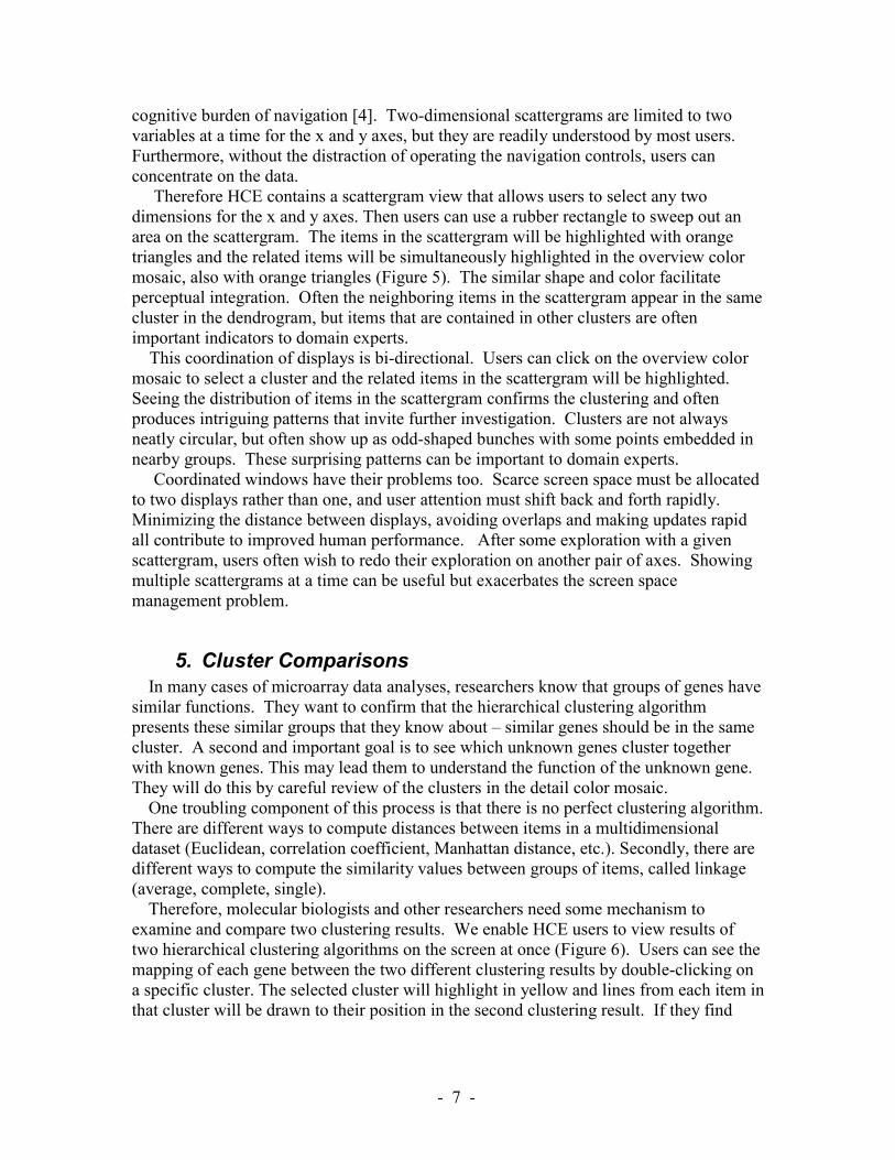
cognitive burden of navigation [4]. Two-dimensional scattergrams are limited to two variables at a time for the x and y axes, but they are readily understood by most users. Furthermore, without the distraction of operating the navigation controls, users can concentrate on the data. Therefore HCE contains a scattergram view that allows users to select any two dimensions for the x and y axes. Then users can use a rubber rectangle to sweep out an area on the scattergram. The items in the scattergram will be highlighted with orange triangles and the related items will be simultaneously highlighted in the overview color mosaic, also with orange triangles (Figure 5). The similar shape and color facilitate perceptual integration. Often the neighboring items in the scattergram appear in the same cluster in the dendrogram, but items that are contained in other clusters are often important indicators to domain experts. This coordination of displays is bi-directional. Users can click on the overview color mosaic to select a cluster and the related items in the scattergram will be highlighted. Seeing the distribution of items in the scattergram confirms the clustering and often produces intriguing patterns that invite further investigation. Clusters are not always neatly circular, but often show up as odd-shaped bunches with some points embedded in nearby groups. These surprising patterns can be important to domain experts. Coordinated windows have their problems too. Scarce screen space must be allocated to two displays rather than one, and user attention must shift back and forth rapidly. Minimizing the distance between displays, avoiding overlaps and making updates rapid all contribute to improved human performance. After some exploration with a given scattergram, users often wish to redo their exploration on another pair of axes. Showing multiple scattergrams at a time can be useful but exacerbates the screen space management problem.
5. Cluster Comparisons In many cases of microarray data analyses, researchers know that groups of genes have
similar functions. They want to confirm that the hierarchical clustering algorithm presents these similar groups that they know about – similar genes should be in the same cluster. A second and important goal is to see which unknown genes cluster together with known genes. This may lead them to understand the function of the unknown gene. They will do this by careful review of the clusters in the detail color mosaic.
One troubling component of this process is that there is no perfect clustering algorithm. There are different ways to compute distances between items in a multidimensional dataset (Euclidean, correlation coefficient, Manhattan distance, etc.). Secondly, there are different ways to compute the similarity values between groups of items, called linkage (average, complete, single).
Therefore, molecular biologists and other researchers need some mechanism to examine and compare two clustering results. We enable HCE users to view results of two hierarchical clustering algorithms on the screen at once (Figure 6). Users can see the mapping of each gene between the two different clustering results by double-clicking on a specific cluster. The selected cluster will highlight in yellow and lines from each item in that cluster will be drawn to their position in the second clustering result. If they find

- 8 -
some genes that are mapped to different clusters, they can examine the genes more carefully to understand what made the difference.
This strategy is tedious and the criss-crossing lines can be confusing, but this is a first step in giving users tools to address the complex nature of such comparisons. Showing relationships between non-proximal items is a basic problem in information visualization research. Color-coding, blinking, and drawing lines are the three basic methods, but each has its problems. HCE already uses color-coding heavily and blinking would add distraction to an already complex display, so drawing lines was our best alternative.
Our biology users are excited to have this capability and spend hours probing the clusters to see which genes have switched into other clusters by use of an alternate clustering algorithm. Metrics for measuring similarity and tools to highlight important changes would be further improvements.
Another possible verification method is to select a subset of the conditions (samples), and do the clustering on the reduced set. It is easier to verify the correctness of a clustering method in a low dimension (2-4 conditions) than in higher dimensions (5-40 conditions). HCE users can use a dialog box to select a subset of the conditions to take part in the clustering. The resulting color mosaic has a white space between the selected conditions and the others. Users can concentrate their inspection on the selected conditions and see the clusters more clearly in the scattergram. The capacity to redo the clustering using different conditions helps users gain an understanding of the relationships among conditions and helps identify which conditions have a strong effect on the outcomes.
6. Conclusion Hierarchical clustering has become a standard technique with algorithms published in
most software libraries. Researchers can view the outcome on screens or on large printouts. This paper describes a novel software tool, the Hierarchical Clustering Explorer, which includes four ways to interactively explore the outcomes to gain a stronger understanding of the significance of the clusters. Users start with an overview to see the entire dataset that helps them spot the distribution of values and hot spots, and then they can examine members of each cluster in detail. They can use dynamic query slider bars to view clusters of varying sizes and reduce clutter from too much detail. Next they can see how the hierarchical clusters are presented in a familiar and easy to understand 2-dimensional scattergram. The coordination between the overview color mosaic and the scattergram is bi-directional, that is, users can select a group of items in either view and see where they fall in the other view. This often leads to interesting questions about why certain items are or are not in a given cluster.
Since there is much discussion of which of the many distance and similarity metrics to use, we provide users with the capacity to display two hierarchical outcomes on the screen at once. Then by selecting a cluster they can see where those items appear in the other clustering result.
These powerful visualization methods enrich the possibilities for users, but also reveal the inherent complexity of the algorithms and the multi-dimensional data. Future improvements would provide guidance to users about which algorithms are most appropriate and metrics for identifying meaningful clusters.
- 9 -
Microarrays, sequenced genomes, and the explosion of bioinformatics research have led to astonishing leaps in our understanding of molecular biology. To date, work in these fields has largely focused on algorithmic methods for processing and manipulating vast sets of biological data. These efforts have made impressive gains, but additional help may be needed. Hybrid approaches that combine powerful algorithms with interactive tools will combine the strengths of fast processors with the detailed understanding of domain experts. Further research in BioInfoVis - BioInformatics Visualization - is needed to develop tools to meet upcoming challenges in bioinformatics.
Acknowledgements: We appreciate thoughtful comments from Eric Baehrecke, Harry Hochheiser, and the anonymous reviewers. Partial support of this project came from the University of Maryland Institute for Advanced Computer Studies. An early contributor to the software development was Bongshin Lee.
References 1. M.B. Eisen, P.T. Spellman, P.O. Brown and D. Botstein, “Cluster Analysis and
Display of Genome-Wide Expression Patterns,” Proc. Natl Acad Sci U S A, Vol. 95(25), 1998, pp. 14863-14868. http://www.pnas.org/cgi/content/full/95/25/14863
2. M.Bitter, P.Meltzer, Y.Chen, et al., “Modecular classification of cutaneous malignant melanoma by gene expression profiling,” Nature 406, 2000, pp. 536-540. http://www.nhgri.nih.gov/DIR/Microarray/selected_publications.html
3. I. Hedenfalk, D. Duggan, Y. Chen, et al., “Gene-Expression Profiles in Hereditary Breast Cancer,” The New Journal of Medicine, Vol. 344(8), 2001, pp. 539-548. http://www.nhgri.nih.gov/DIR/Microarray/selected_publications.html
4. S. K. Card, J. D. Mackinlay, and B. Shneiderman, Readings in Information Visualization, Morgan Kaufmann Publishers, Inc. 1999.
5. B. Shneiderman, “Dynamic Queries: for visual information seeking,” IEEE Software, Vol. 11(6), 1994, pp. 70-77.
6. C. Williamson and B. Shneiderman, “The dynamic HomeFinder: Evaluating dynamic queries in a real-estate information exploration system,” Proc. ACM SIGIR `92, 1992, pp. 338-346.
7. P. O. Brown and D. Botstein, “Exploring the new world of the genome with DNA microarrays”, Nature Genetics Supplement Vol. 21, 1999, pp. 33-37.
8. A. Inselberg and T. Avidan, “Classification and visualization for high-dimensional data,” Proc. 6th ACM SIGKDD International Conference on Knowledge Discovery and Data Mining, ACM Press, New York, 2000, pp. 370 - 374
9. E. Kandogan, “Visualizing Multi-dimensional Clusters, Trends, and Outliers using Star Coordinates,” 7th ACM SIGKDD International Conference on Knowledge Discovery and Data Mining, ACM Press, New York, 2001.

- 10 -
Figure 1. Dendrogram. Distance from the root to a subtree indicates the similarity of
subtrees – highly similar nodes or subtrees have joining points that are farther from the root.

- 11 -
Figure 2. A compressed overview. Melanoma gene expression profile data (3614
genes, 38 samples). This overview shows the entire hierarchy in one screen. The detail information of a selected cluster (yellow highlight in upper left) is provided below the overview together with the gene names and the other dendrogram (at lower right) by clustering the 38 samples (conditions).
- 12 -
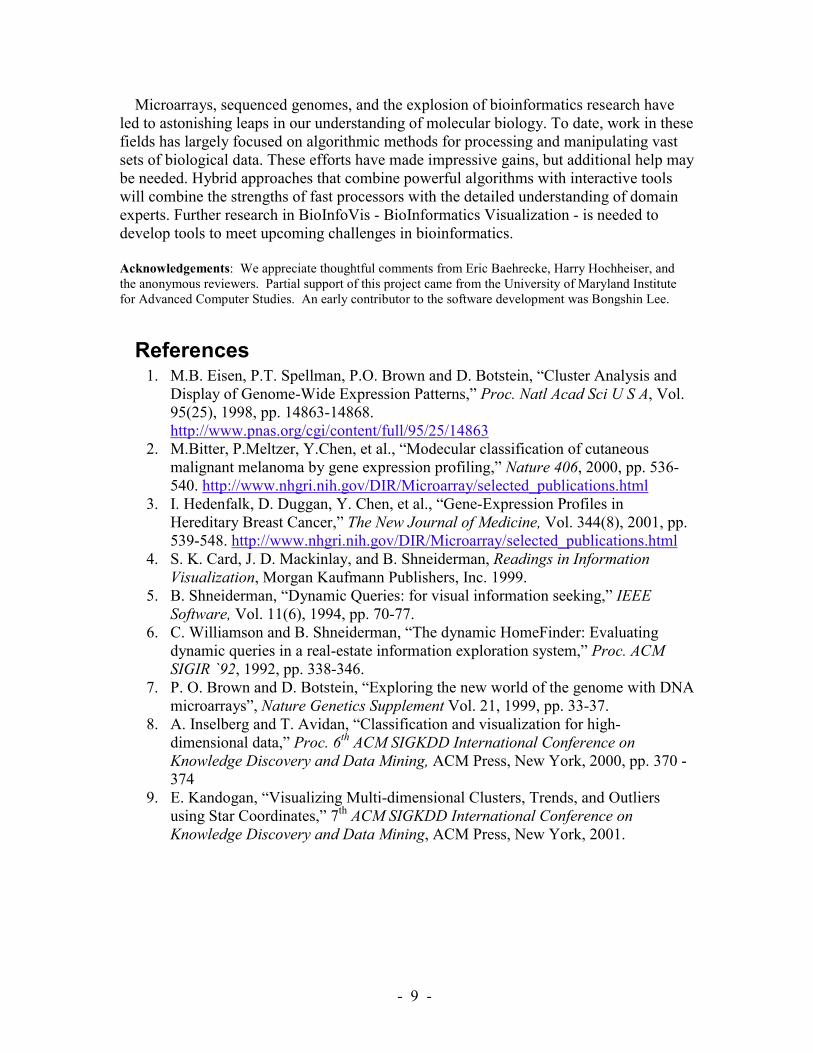
Figure 3. A use of Minimum Similarity Bar. The y coordinate of the bar determines
the minimum similarity value. Users can drag down the bar to filter out items that are distant from a cluster. The minimum similarity values changed from 0.13 to 0.89 in this example to separate 2 large clusters into 8 small clusters.

- 13 -
Figure 4. Highlighting a cluster. Each cluster is easily identified by the alternating
colored lines (blue and red just below the Minimum Similarity Bar) and the one-pixel white gaps placed between clusters. Users can select a cluster by just clicking on the cluster, which causes it to be highlighted by a yellow rectangle. The corresponding gene names are also highlighted in the detailed color mosaic together with the other dendrogram produced by clustering the data in the transposed dimension (on lower left side).

- 14 -
Figure 5. Two-dimensional scattergram and the coordination with other displays.
Users can select a group of items by sweeping out a rectangular area on the scattergram. The selected items will be highlighted with orange triangles in the scattergram and the related items will be simultaneously highlighted just below the overview color mosaic, also with orange triangles.
2D scattergram Coordination with other displays
- 15 -
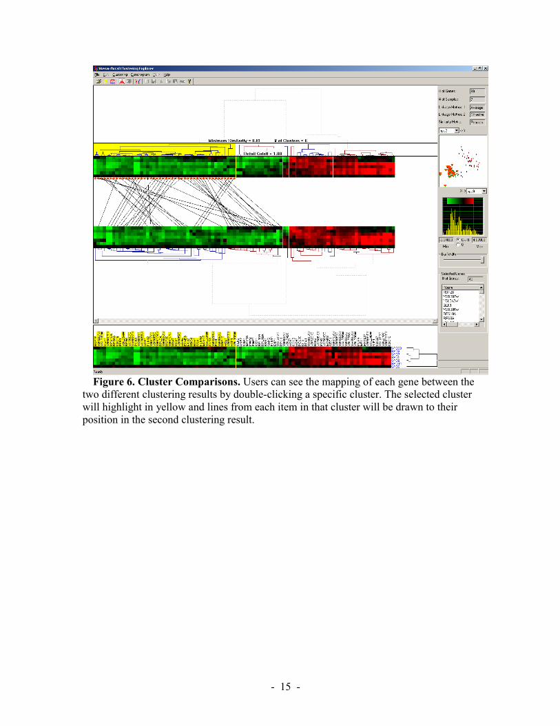
Figure 6. Cluster Comparisons. Users can see the mapping of each gene between the
two different clustering results by double-clicking a specific cluster. The selected cluster will highlight in yellow and lines from each item in that cluster will be drawn to their position in the second clustering result.