Topcer. Cerámica
16
The Choice of Architects The Choice of Architects ISO 9001 & ISO 14001 Certified ®
description
Topcer. Cerámica
Transcript of Topcer. Cerámica
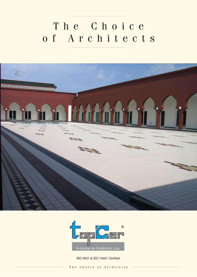
T h e C h o i c e o f A r c h i t e c t s
T h e C h o i c e o f A r c h i t e c t s
ISO 9001 & ISO 14001 Certified
®
T h e C h o i c e o f A r c h i t e c t s
T o p C e rFounded in 1991, Topcer is already a worldwide brand well known by the quality of their unique and innovative products. Topcer is specialised in the manufacturing of unglazed porce-lain tiles in small modular sizes (10x10, 7.5x15, 15x15, 10x30 and 30x30) in various textures and shapes, complemented by a considerable line of matching trim pieces (49), all available in 30 colours.
The continuous research of traditional sizes, components and patterns used in the last two centuries, led Topcer to develop the collections “Victorian Designs and Borders” and “Contemporaneo Series”, which offer traditional and modern innovative designs, back mesh mounted in modular sheets. These made possible in some markets to develop specific niches for their use in Palaces, Museums, Hotels, Restaurants and Pubs, Cruise Ships, private homes, restoration of old floors, etc.
Topcer tiles, due to their high breaking strength, resistance to wear and frost and non-slipping properties, are mostly used in all types of highly demanding areas.
Carlos R. Miguel
Managing Director, TopCer

T h e C h o i c e o f A r c h i t e c t s
T o p C e r c o l o u r p r o g r a m
01
06
11
16
21
26
02
07
12
17
22
27
03
08
13
18
23
28
04
09
14
19
24
29
05
10
15
20
25
30
Colours shown are as accurate as the limitations of the printing will allow.

T h e C h o i c e o f A r c h i t e c t sT h e C h o i c e o f A r c h i t e c t s
I c h o s eTo p C e r t i l e s
The station in Woerden, which dates from 1911, deserves its status as a listed building on account of its distinctive architectural qualities. However it was too small to cope with increasing passenger flows. This necessitated a number of functional adjustments which were implemented in the form of an extensive programme of reno-vation and a partial extention.
Apart from the functional aspect, our design drawn up in close consul tation with the Building Inspectorate and Commission for Listed Buildings - aimed particularly to show the
building’s architectural value to the best possible advan-tage. The Choice of colour for the main building - both the interior and exterior - is influ-enced by the original colour scheme of 1911. This was one of the determining factors in the choice of finishing materials, such as floor tiles.
Not only that, but the tiles also fitted in with the new colour scheme adopted by the Netherlands Railways.
But our choice was also influenced by functional considerations: we liked the durability and easy maintenance offered by TopCer tiles. These are very important considerations in inten-sively utilised public spaces, here hundreds and thousands of passengers should not be able to make their mark…
W.Rijnders BV Articon, Amersfoort
T h e C h o i c e o f A r c h i t e c t sT h e C h o i c e o f A r c h i t e c t s
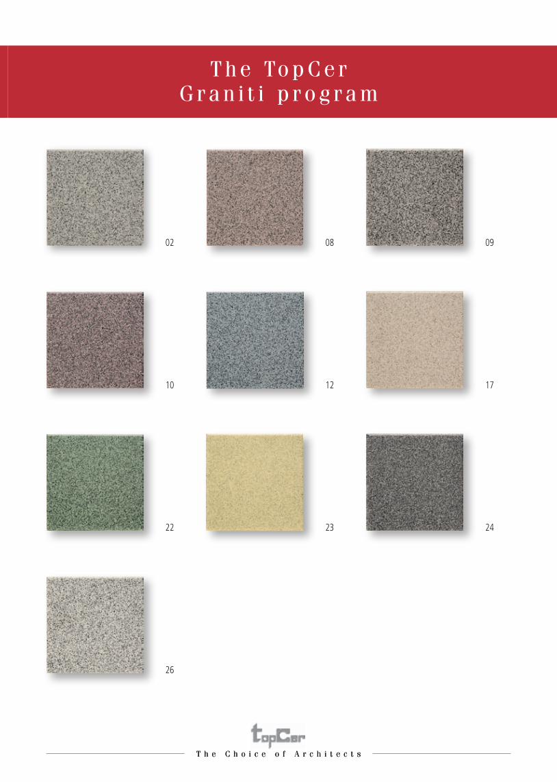
T h e To p C e r G r a n i t i p r o g r a m
22 23 24
10 12 17
02 08 09
26
T h e C h o i c e o f A r c h i t e c t s
I c h o s eTo p C e r t i l e s
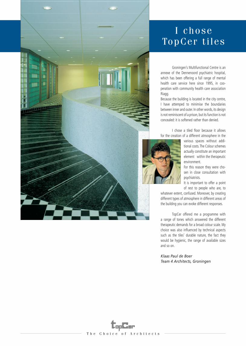
Groningen’s Multifunctional Centre is an annexe of the Dennenoord psychiatric hospital, which has been offering a full range of mental health care service here since 1995, in coo-peration with commu nity health care association Riagg.Because the building is located in the city centre, I have attemped to minimise the boundaries between inner and outer. In other words, its design is not reminiscent of a prison, but its function is not concealed: it is softened rather than denied.
I chose a tiled floor because it allows for the creation of a different atmosphere in the
various spaces without addi-tional costs. The Colour schemes actually constitute an important element within the therapeutic environment.For this reason they were cho-sen in close consultation with psychiatrists.It is important to offer a point of rest to people who are, to
whatever extent, confused. Moreover, by creating different types of atmosphere in different areas of the building you can evoke different responses.
TopCer offered me a programme with a range of tones which answered the different therapeutic demands for a broad colour scale. My choice was also influenced by technical aspects such as the tiles’ durable nature, the fact they would be hygienic, the range of available sizes and so on.
Klaas Paul de BoerTeam 4 Architects, Groningen

T h e C h o i c e o f A r c h i t e c t s
T h e To p C e r A c c e n t p r o g r a m
16 18
14 15
04 11
20 21
29
30

T h e C h o i c e o f A r c h i t e c t s
I c h o s eTo p C e r t i l e s
VSB bank has experienced explosive growth in recent years. The company wanted today’s strong position to be reflected in the character of its new office complex. Increasing efficiency was also a key objec-tive. For these reasons, the new head office in Utrecht, completed in 1995, fulfils a range of different functions. Alongside office space it contains a conference centre, a restaurant, a branch of the bank and an auditorium which may also be hired by third parties.
We chose TopCer tiles both for aesthetic and functional rea-sons. On one hand, we opted for TopCer tiles because they sui- ted the building’s representative function, and on the other hand because we like to work with the 96x96 and 146x146 mm formats.
The opportunities for combining the tiles with other materials used in the interior, such as undressed stone, carpet, parquet and marble was also appealing. Furthermore we find TopCer tiles have a good finish which is certainly not uneven or rough. Last but not least the price is also very attractive.Consequently we are very happy to lend our sup-port to TopCer tiles!
A. Dreissen,Van MourikArchitectenbureau van Mourik, Vermeulen

T h e C h o i c e o f A r c h i t e c t s
T h e To p C e r E a r t h C o l o u r s p r o g r a m
19 25 27
06 07 13
28
01 03 05
T h e C h o i c e o f A r c h i t e c t s
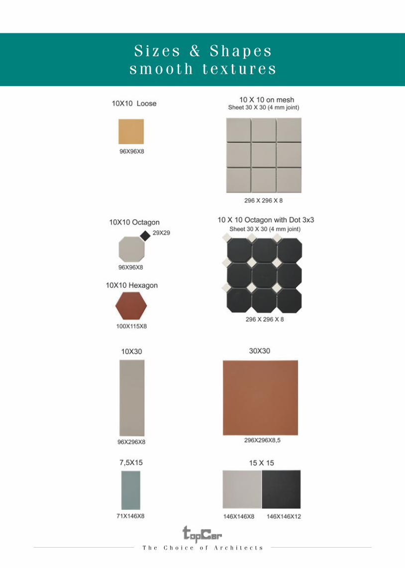
S i z e s & S h a p e ss m o o t h t e x t u r e s
T h e C h o i c e o f A r c h i t e c t sT h e C h o i c e o f A r c h i t e c t s
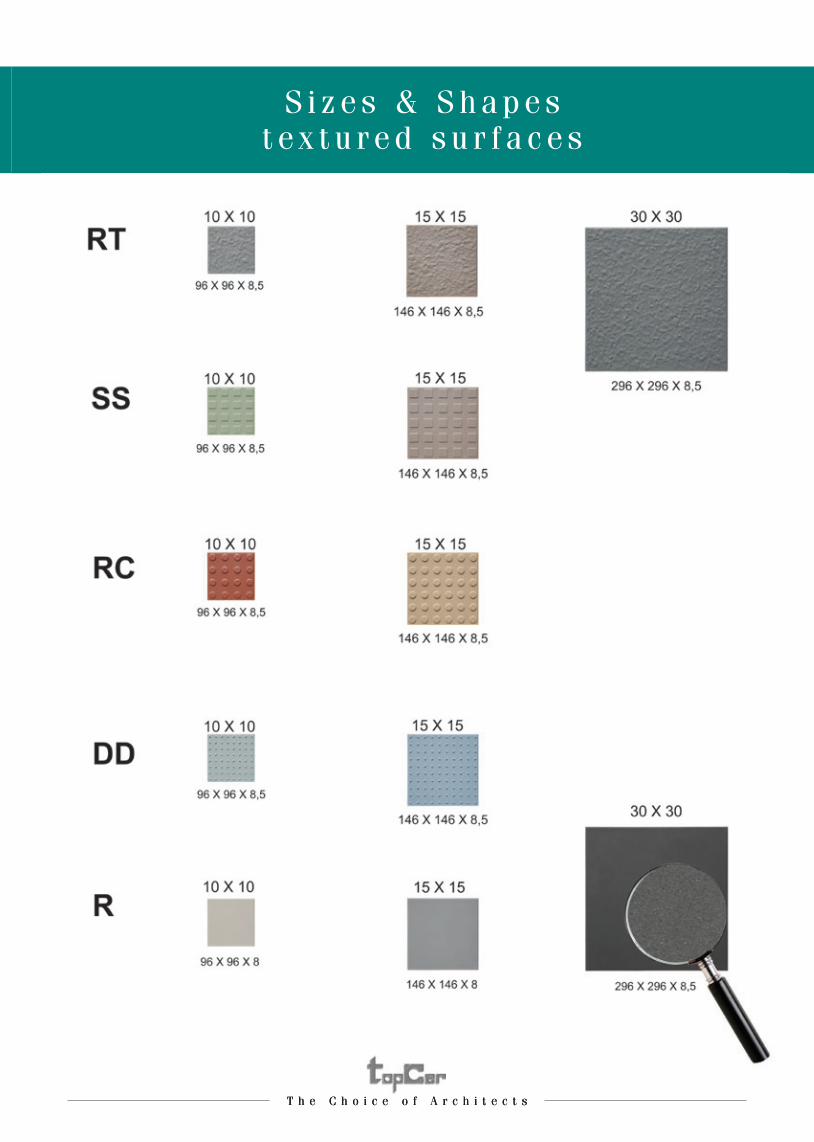
S i z e s & S h a p e st e x t u r e d s u r f a c e s

T h e C h o i c e o f A r c h i t e c t s
T r i m S h a p e s( m e a s u r e s : m m )
T h e C h o i c e o f A r c h i t e c t s
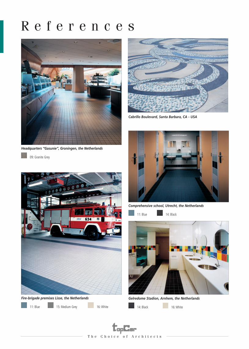
R e f e r e n c e s
11: Blue 15: Medium Grey 16: White
Fire-brigade premises Lisse, the Netherlands
Cabrillo Boulevard, Santa Barbara, CA - USA
09: Granite Grey
Headquarters “Gasunie”, Groningen, the Netherlands
11: Blue
Comprehensive school, Utrecht, the Netherlands
14: Black
Gelredome Stadion, Arnhem, the Netherlands
14: Black
16: White
T h e C h o i c e o f A r c h i t e c t s
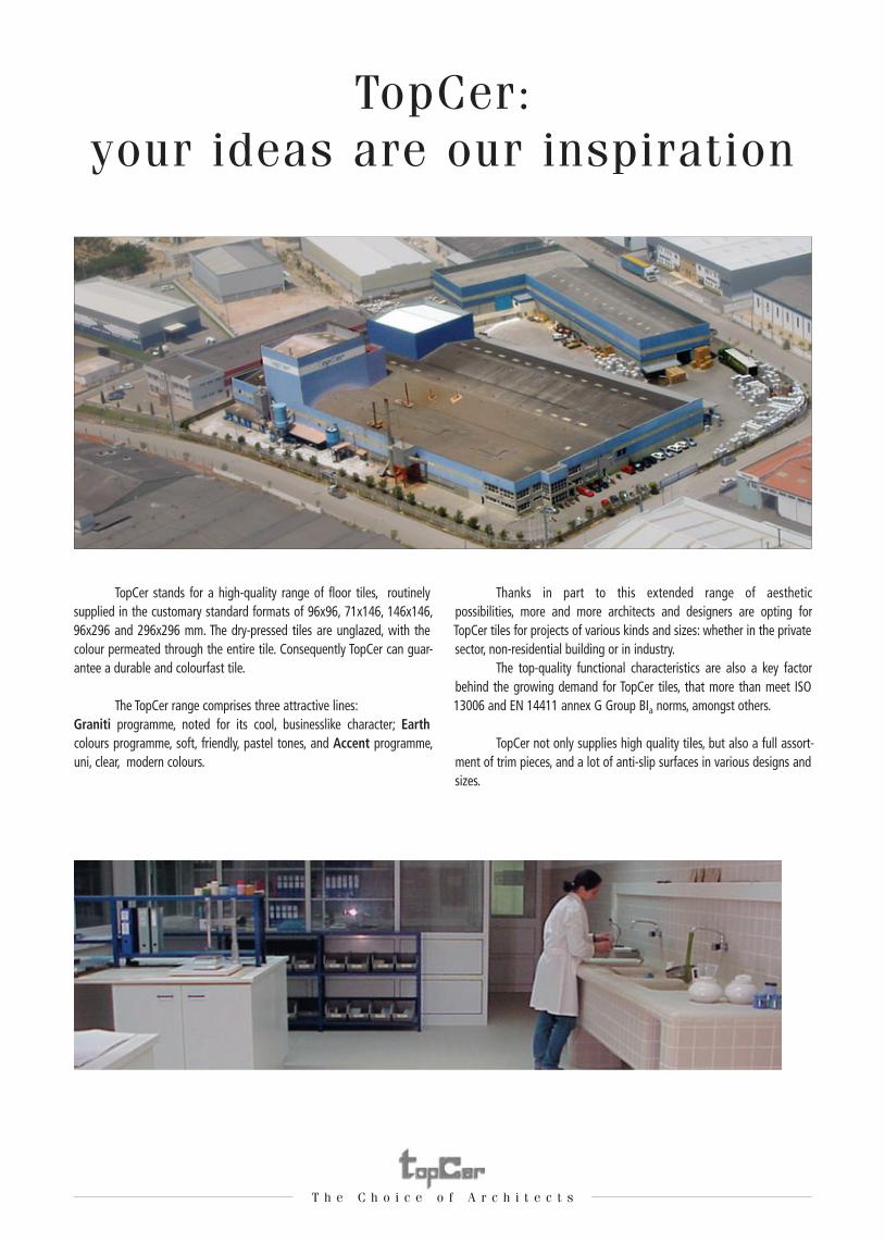
TopCer:your ideas are our inspiration
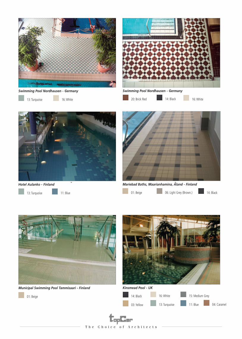
13: Turquoise
Swimming Pool Nordhausen - Germany
20: Brick Red
Swimming Pool Nordhausen - Germany
13: Turquoise
Hotel Aulanko - Finland
01: Beige
Mariebad Baths, Maarianhamina, Aland - Finland
01: Beige
Municipal Swimming Pool Tammisaari - Finland
14: Black
Kinsmead Pool - UK
16: White 14: Black 16: White
11: Blue 06: Light Grey (Brown.)
03: Yellow
16: White
13: Turquoise
15: Medium Grey
11: Blue 04: Caramel
14: Black
T h e C h o i c e o f A r c h i t e c t s
TopCer:your ideas are our inspiration
TopCer stands for a high-quality range of floor tiles, routinely supplied in the customary standard formats of 96x96, 71x146, 146x146, 96x296 and 296x296 mm. The dry-pressed tiles are unglazed, with the colour permeated through the entire tile. Consequently TopCer can guar-antee a durable and colourfast tile.
The TopCer range comprises three attractive lines: Graniti programme, noted for its cool, businesslike character; Earth colours programme, soft, friendly, pastel tones, and Accent programme, uni, clear, modern colours.
Thanks in part to this extended range of aesthetic possibilities, more and more architects and designers are opting for TopCer tiles for projects of various kinds and sizes: whether in the private sector, non-residential building or in industry. The top-quality functional characteristics are also a key factor behind the growing demand for TopCer tiles, that more than meet ISO 13006 and EN 14411 annex G Group BIa norms, amongst others.
TopCer not only supplies high quality tiles, but also a full assort-ment of trim pieces, and a lot of anti-slip surfaces in various designs and sizes.
04: Caramel
14: Black
EXPORT OFFICE:Largo da Estação, 8-2° Fte • 2750-340 Cascais • PortugalTel. +351 214 844 788/9 - Fax +351 214 841 091 E-mail: [email protected]
FACTORY:Zona Industrial de Oiã • 3770-908 Oiã • PortugalTel. +351 234 722 395 - Fax +351 234 722 397 E-mail: [email protected] M
PCN0
001E
N 10
th is
sue,
April
201
2
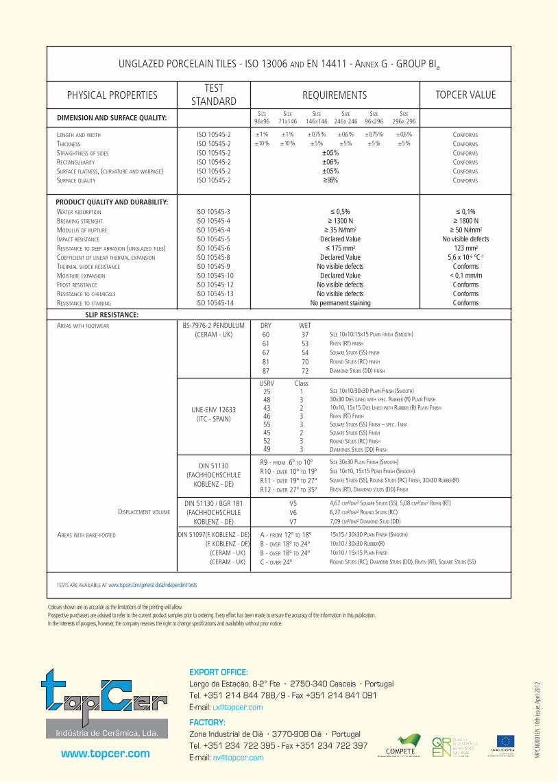
PHYSICAL PROPERTIESTEST
STANDARD REQUIREMENTS TOPCER VALUE
DIMENSION AND SURFACE QUALITY:SIzE
96x96SIzE
71x146SIzE
146x146SIzE
246x 246SIzE
96x296SIzE
296x 296
LENgTH AND wIDTH
THICkNESS
STRAIgHTNESS Of SIDES
RECTANgULARITY
SURfACE fLATNESS, (CURVATURE AND wARPAgE)SURfACE QUALITY
ISO 10545-2ISO 10545-2ISO 10545-2ISO 10545-2ISO 10545-2ISO 10545-2
± 1 %± 10 %
± 1 %± 10 %
± 0,75 %± 5 %
± 0,6 %± 5 %
± 0,75 %± 5 %
± 0,6 %± 5 %
± 0,5 %± 0,6 %± 0,5 %≥ 95%
CONfORMS
CONfORMS
CONfORMS
CONfORMS
CONfORMS
CONfORMS
PRODUCT QUALITY AND DURABILITY:wATER AbSORPTION
bREAkINg STRENgHT
MODULUS Of RUPTURE
IMPACT RESISTANCE
RESISTANCE TO DEEP AbRASION (UNgLAzED TILES)COEffICIENT Of LINEAR THERMAL ExPANSION
THERMAL SHOCk RESISTANCE
MOISTURE ExPANSION
fROST RESISTANCE RESISTANCE TO CHEMICALS
RESISTANCE TO STAININg
ISO 10545-3 ISO 10545-4 ISO 10545-4 ISO 10545-5 ISO 10545-6 ISO 10545-8 ISO 10545-9 ISO 10545-10 ISO 10545-12 ISO 10545-13 ISO 10545-14
≤ 0,5%≥ 1300 N
≥ 35 N/mm2
Declared Value ≤ 175 mm3
Declared ValueNo visible defectsDeclared Value
No visible defectsNo visible defects
No permanent staining
≤ 0,1%≥ 1800 N
≥ 50 N/mm2
No visible defects123 mm3
5,6 x 10⁻⁶ ºC-1
Conforms< 0,1 mm/mConformsConformsConforms
SLIP RESISTANCE:AREAS wITH fOOTwEAR bS-7976-2 PENDULUM
(CERAM - Uk)
DIN 51130(fACHHOCHSCHULE
kObLENz - DE)
DIN 51097(f. kObLENz - DE) (f. kObLENz - DE)
(CERAM - Uk) (CERAM - Uk)
DRY6061678187
R9 - fROM 6º TO 10ºR10 - OVER 10º TO 19ºR11 - OVER 19º TO 27ºR12 - OVER 27º TO 35º
A - fROM 12º TO 18ºb - OVER 18º TO 24ºb - OVER 18º TO 24ºC - OVER 24º
wET3753547072
SIzE 10x10/15x15 PLAIN fINISH (SMOOTH)RIVEN (RT) fINISH
SQUARE STUDS (SS) fINISH
ROUND STUDS (RC) fINISH
DIAMOND STUDS (DD) fINISH
SIzE 30x30 PLAIN fINISH (SMOOTH)SIzE 10x10, 15x15 PLAIN fINISH (SMOOTH)SQUARE STUDS (SS), ROUND STUDS (RC) fINISH, 30x30 RUbbER(R)RIVEN (RT), DIAMOND STUDS (DD) fINISH
15x15 / 30x30 PLAIN fINISH (SMOOTH)10x10 / 30x30 RUbbER(R)10x10 / 15x15 PLAIN fINISH
ROUND STUDS (RC), DIAMOND STUDS (DD), RIVEN (RT), SQUARE STUDS (SS)
DISPLACEMENT VOLUME
AREAS wITH bARE-fOOTED
TESTS ARE AVAILAbLE AT www.topcer.com/general data/independent tests
UNgLAzED PORCELAIN TILES - ISO 13006 AND EN 14411 - ANNEx g - gROUP bIa
Colours shown are as accurate as the limitations of the printing will allow.Prospective purchasers are advised to refer to the current product samples prior to ordering. Every effort has been made to ensure the accuracy of the information in this publication.In the interests of progress, however, the company reserves the right to change specifications and availability without prior notice.
DIN 51130 / bgR 181(fACHHOCHSCHULE
kObLENz - DE)
V5V6V7
4,67 CM³/DM² SQUARE STUDS (SS), 5,08 CM³/DM² RIVEN (RT)6,27 CM³/DM² ROUND STUDS (RC)7,09 CM³/DM² DIAMOND STUD (DD)
www.topcer.com
®
UNE-ENV 12633 (ITC - SPAIN)
USRV2548434655455249
Class13233233
SIzE 10x10/30x30 PLAIN fINISH (SMOOTH)30x30 DIES LINED wITH SPEC. RUbbER (R) PLAIN fINISH
10x10, 15x15 DIES LINED wITH RUbbER (R) PLAIN fINISH
RIVEN (RT) fINISH SQUARE STUDS (SS) fINISH – SPEC. 1MM
SQUARE STUDS (SS) fINISH
ROUND STUDS (RC) fINISH DIAMONDS STUDS (DD) fINISH